Embed Size (px)
DESCRIPTION
Sabai celebrates sensual enlightenment of Thai philosophy and cuisine experienced through the fusion of art, tradition and natural elements. Collaboration between Ashley Morgan, Emily Verhagen , Kyle Warfield, Whitney Yehling, Reagan Yeoman.
Citation preview

Core ValuesCore Values
Julie luu Ashley MorgAn eMily VerhAgen Kyle WArfield Whitney yehling reAgAn yeoMAn


Core Values Mission Statement
Thai PhilosophySensual experienceEpicureInnovationSustainability
Sabai celebrates sensual enlightenment of
Thai philosophy and cuisine experienced
through the fusion of art, tradition and
natural elements.


Table of ContentsCultural Research
Naming Phases
Logo Development
Logo Type Development
Color Systems
Poster Systems
Collateral & Branding
Programming
Schematics
Design Development
Rendered Perspectives
Design Palette
Code Summary
1 – 4
7 – 8
11 – 28
31 – 35
37 – 41
43 – 50
53 – 57
59 – 61
63 – 66
69 – 70
73 – 80
83 – 86
89 – 90


Cultural ResearchThe first step in our research was deciding on a cul-
ture to focus on. Early in our quest we came across a
very intriguing philosophy in the Thai culture called
Sanuk. That is, the idea that all things should be done
in good nature and with fun spirits or they are not
worth doing in the first place. This philosophy got us
more interested in Thailand and their abundance of
lightheartedness throughout their culture. They are
very much centered around family, food, art and tra-
dition. Therefore, we focused primarily on these topics
in our research to bring their traditional culture to our
restaurant.
1
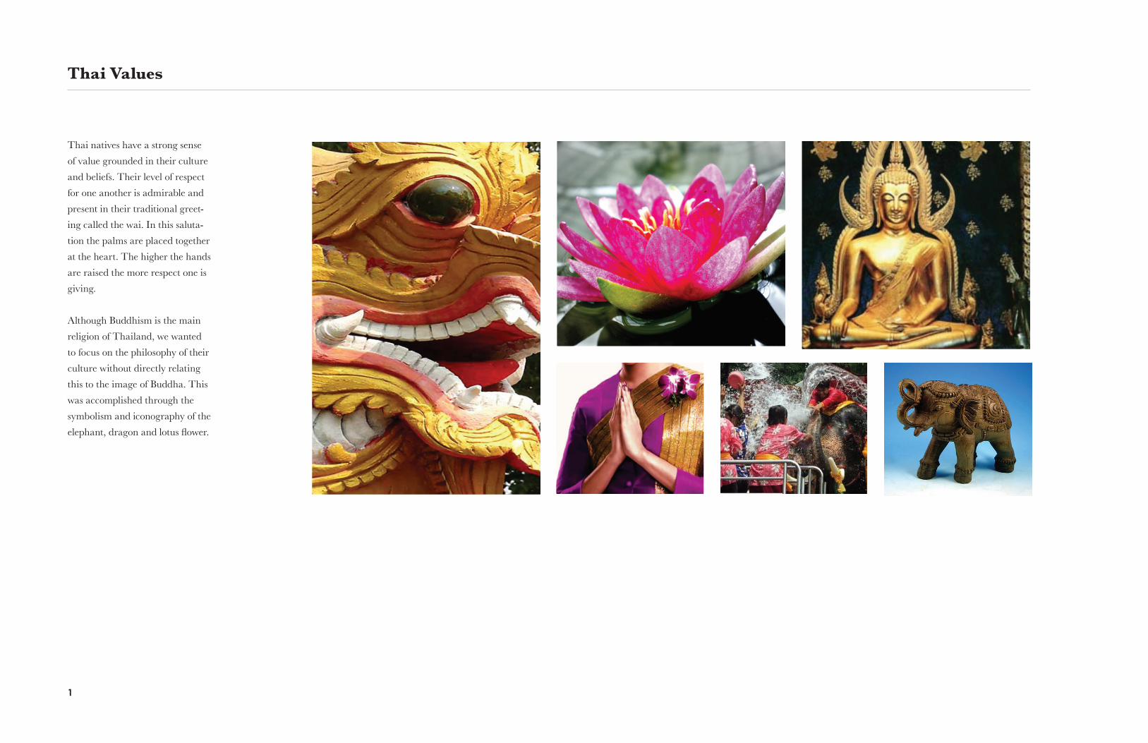
Thai Values
Thai natives have a strong sense
of value grounded in their culture
and beliefs. Their level of respect
for one another is admirable and
present in their traditional greet-
ing called the wai. In this saluta-
tion the palms are placed together
at the heart. The higher the hands
are raised the more respect one is
giving.
Although Buddhism is the main
religion of Thailand, we wanted
to focus on the philosophy of their
culture without directly relating
this to the image of Buddha. This
was accomplished through the
symbolism and iconography of the
elephant, dragon and lotus flower.

CulturAl reseArCh 2
Thai Art
We were very inspired by the
vibrant colors and intricate designs
of traditional Thai art and archi-
tecture. Referring back to these
works, we were able to accomplish
a modern twist to traditional Thai
design throughout our process.

3
Thai Cuisine
Thai culture is very much cen-
tered around their exotic cuisine.
Known primarily for their spicy
entrees, Thai food is more than
merely a meal. The first tropical
plants and flowers were used by
the ancient Thai people to create a
work of art through their cuisine,
both in taste and aesthetics.

CulturAl reseArCh 4
Thailand
We considered all aspects of Thai
culture in our research process,
from art to cuisine. We focused
on shedding a modern light to
traditional ideas and beliefs.
The country of Thailand is very
cultural oriented, centered heavily
around their strong philosophy of
enjoying every aspect of life with
lightheartedness. In Thai culture,
if something is not fun than it is
not worth doing.
Thailand is a very green and
luscious island with nature
being of great importance to
their everyday way of life. As a
way of honoring nature, ancient
Thai’s began using exotic flowers
as flavorful additions to their
traditional food.


Naming PhasesOne of the most crucial steps in beginning a new
brand is the naming phase. The naming phase serves
as part of the foundation for the brand. The name
must be able to communicate more than just a title for
a company. The name needs to communicate or sym-
bolize an important idea, evoke emotion, and directly
relate back to everything the brand stands for.

7
Thai Words
Sanuk
sanook
sanu
SabaiSala
salah sabi
One of the first names we came up with was Sanuk. This
is commonly translated into English as meaning “fun”
but there is a whole philosophy behind this idea. Sanuk is
about achieving satisfaction and pleasure from whatever
you do. It is so important that it is a rule in Thai living
and everything you do must have Sanuk or else it is not
worth doing.
Sala is the Thai word for large gathering or meeting
place. We considered this name because our cultural
center was a meeting place for people coming to Denver
looking for the Thai cultural experience.
Sabai translated to English means “happy”, but just as
sanuk, there is more to it. It can also mean “comfortable”,
“relaxed”, or “well.” In the Thai culture, happiness is not
the opposite state or sorrow. It is more like tranquillity.
The opposite of Sabai would be mai Sabai which means
sick or ill. Repeating the word such as Sabai Sabai means
“everything’s chill” or “not a care in the world.” This is
the Thais’ piece of heaven on earth.

Color systeMs 8
Pronunciation Tests
We decided to print the word
Sabai and go around campus to
see how people pronounced the
word. This exercise would let us
know whether we need to change
the spelling of our name or not.
We also asked students what they
thought of when they read the
word and what feelings they as-
sociated with it.
The majority of our feedback was
very positive. Sabai came off as
a word that was not only easy to
pronounce, but easy to say and

Logo DevelopmentKeeping the Thai philosophy of Sanuk in mind as well
as continuously referring back to our cultural re-
search, we began our sketching process. First, working
as individual minds, we began designing in separate
directions, each focusing on a different aspect of Thai
culture from architecture to cuisine. After individual
experimentation with picture marks, we came together
as a group and narrowed down our focus based on our
mission and core values.

11
Picture Marks Julie luu
For my picture marks, I wanted to
focus on the flowers of Thailand.
I was inspired by the lotus flower,
Lai Thai, and the orchid because
of the concepts found in Thai
culture. I chose flowers because
they represent different powerful
meanings. I have examples of the
orchid flower, the lotus flower and
a Lai Thai flower. Each flower has
different meaning, and would be
useful to use as a logo.
Here I did a study on putting the flower
marks inside circles to stand out and
make the symbol iconic. The circle is also
represented as a sensual atmosphere.

logo deVeloPMent 12
Here I have a defined sketch of the flower
that I have put on tracing paper. I started
with tracing the actual shape of each flower
for further development in logo marks.

13
Logo Transformation
Julie luu
I focused more on the lotus flower
because of the organic shapes. The
lotus flower goes back to our core
values; bringing in Thai tradition,
sustainability through nature,
and the overall sensual shapes. It
expresses Thai Buddhism with out
showing the religious icon itself.
I started with the first picture mark and
broke it down into organic shapes. I started
using negative space to create a sensual logo.

logo deVeloPMent 14
Vector Enhancements
After sketching, I took the organic shapes and vectorized
them for sharper and smoother edges. I made the negative
spaces wider and made the edges softer, to create semantic
when looking at the logo of the lotus flower.

15
Picture Marks emily Verhagen
For my picture marks I wanted to
focus on the traditional design and
architecture of Thailand. Lai Thai
is an ancient form of Thai design
that consists of intricate curves
and repeating designs.
I thought they would be perfect
symbols that represents traditional
art with a modern, sensual and
smooth look.
logo deVeloPMent 16
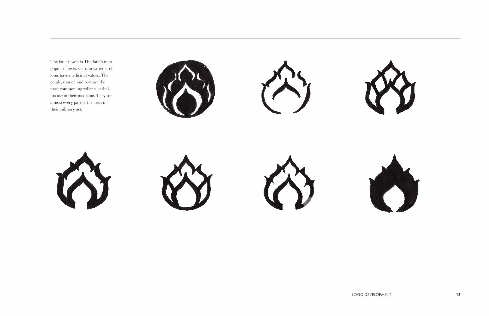
The lotus flower is Thailand’s most
popular flower. Certain varieties of
lotus have medicinal values. The
petals, stamen and root are the
most common ingredients herbal-
ists use in their medicine. They use
almost every part of the lotus in
their culinary art.

17
These were inspired by the Lai
Thai form known as Bai Thet.
They are also to represent flowers
in the Thai culture. These designs
can be found in paintings, on
tapestries, fabric, furniture, and
traditional Lai Thai paintings.
One of Thailand’s most well
known architectural feature is the
sala. It is known to be a meeting
place and to protect people from
the sun and rain. A person who
builds a sala would gain religious
merit in Thailand.
eMily VerhAgen

logo deVeloPMent 18
The sacred animal in Thailand is
the elephant. There are hundreds
of trained elephants in Thailand.
They are known to be intelligent,
powerful, patient, and good at rec-
ognizing familiar people. I thought
this symbol should be part of our
logo because it holds such value to
the people of Thailand.

19
Picture Marks Kyle Warfield
Logo Transformation
Sketching picture marks that
resemble the cultural and stylistic
qualities of Thailand was important
in determining how to develop the
logo mark. I started by sketching
Thai-related animals, architecture,
patterns, and nature based on imag-
ery found online and in Thai books.
In this phase of logo development, I
chose certain aspects of the picture
marks to focus and elaborate on.
This allowed me to experiment with
different logo styles. Some ideas are
present in the final logo, and some
had to be eliminated due to lack of
syntax with our mission statement.
logo deVeloPMent 20
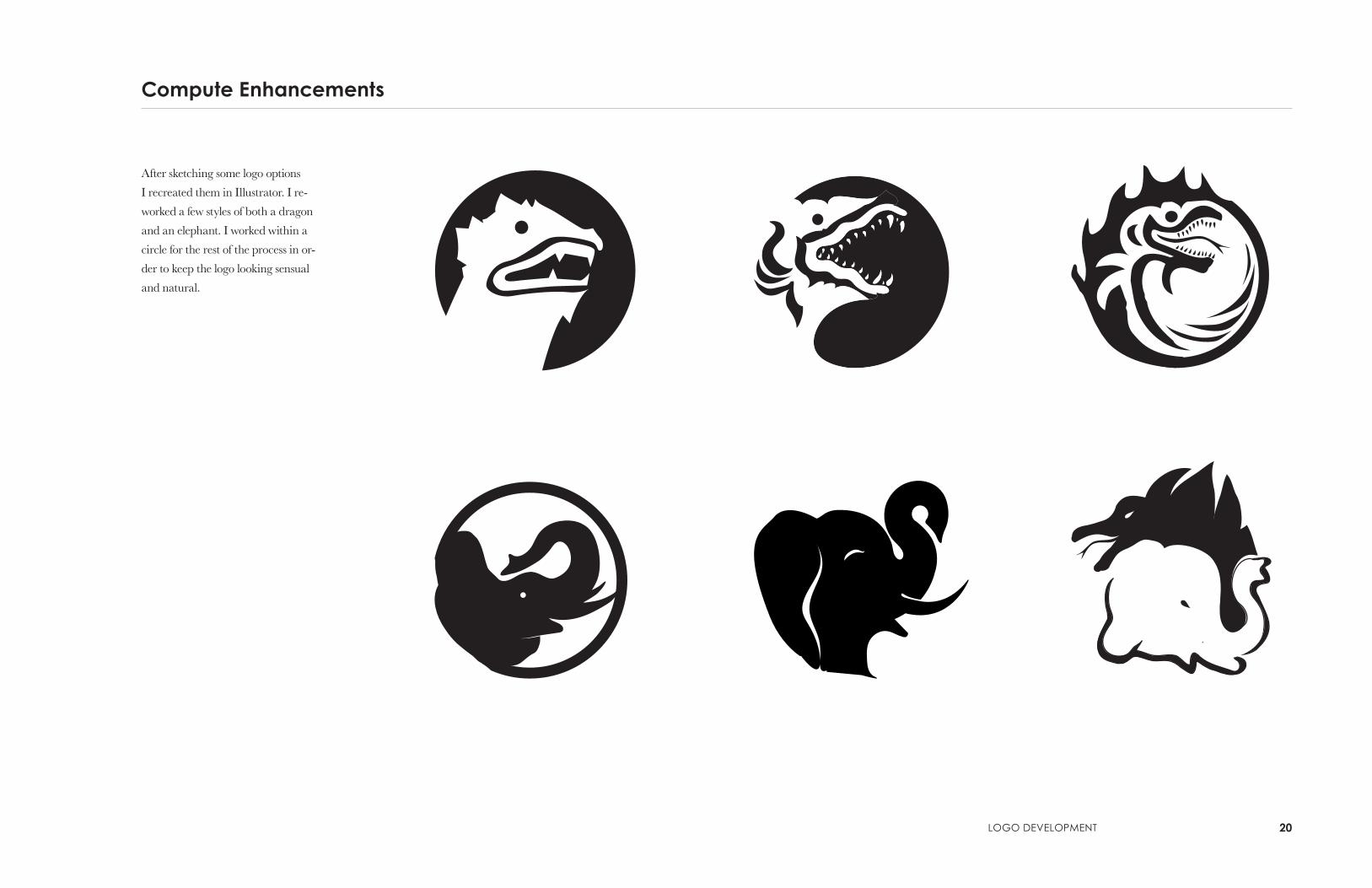
Compute Enhancements
After sketching some logo options
I recreated them in Illustrator. I re-
worked a few styles of both a dragon
and an elephant. I worked within a
circle for the rest of the process in or-
der to keep the logo looking sensual
and natural.

21
Refinements
As a group, we decided to work
with a dragon/elephant combi-
nation for our main restaurant
logo. Creating a logo with a 50%
balance of black and white with a
symbolic negative space was a dif-
ficult task that required countless
reiterations.
Kyle WArfield

logo deVeloPMent 22
Final Logos
My personal final logos consisted
of the dragon/elephant mark for
the restaurant, the sala and clouds
for our bar, and a lotus flower for
the retail section.

23
Picture Marks Whitney yehling
I began my process working with
picture marks by first referring
back to our cultural research and
pulling from things of importance
to the Thai culture.
In this design I concentrated on the basic
shape of the native and sacred elephant,
merely studying the form of the figure.
Later, I pulled from this to create more
abstract marks.
Using traditional Thai architecture and de-
sign as inspiration, I conformed a simple Lai
Thai piece into an abstract elephant form,
with the trunk of the elephant mimicking
the sala architecture.
This basic image representing again the
sacred elephant is enclosed within a circle
to symbolize the sensual atmosphere Sabai
represents.

logo deVeloPMent 24
I abstracted this organic shape of Thailand
to create an animal feeling creature, curling
into itself and creating strong movement
within the mark itself.
In Thai culture flowers, the lotus in par-
ticular, are very important as both religious
symbols and in cuisine, Thailand being the
first culture to use natural elements such as
flowers as spices.
This traditional architectural element
from the sala also takes on the shape of an
elephant truck in this rendition.

25 Whitney yehling
Pulling from architectural elements of
Thailand, I simplified the shape of the sala
to two single lines, creating an arch that is
also representing the natural mountainous
lands of Thailand.
Experimenting with positive and negative
space within an enclosed area, I combined
the sala architectural design with the trunk
of an elephant.
I was really inspired by the typography of
Thailand and thought it would be fun and
playful to turn a basic type element into the
sala shape, also complementing the sharp
angles and curves as in Thai type.

logo deVeloPMent 26
I combined a dragon, elephant and lotus
to show Thai concepts merging into one
philosophy at Sabai. Again, working with
positive and negative space to achieve this.
This study of the dragon eye was a very
simplistic approach to representing the im-
portance of the dragon in the Thai culture.
This traditional architectural element
from the sala also takes on the shape of an
elephant truck in this rendition.

27
Final Sabai Logo Mark
Our final logos came together
by working as a group and pull-
ing from each of our individual
ideas and designs. We worked
as a design team to perfect even
the smallest details for optimum
results.
The Sabai logo was refined to
the point that every single sharp
corner has been transformed into
smooth rounded corners. This
close-up of the logo shows the or-
ganic details throughout the piece,
complimenting our sensual values.

logo deVeloPMent 28
Final Black & White Logo Marks
The Skylounge logo refers back to Thai architecture and philosophy
with its representation of the sala, translating to ‘gathering place’.
The Sabai logo merges the sacred Thai dragon and elephant into a
united image, showing the fusion of ying and yang. The elephant in
Thai culture is thought to bring good luck and the dragon is a power-
ful image representing faith, strength and selfless courage, giving
humans the potion of everlasting life.
The market logo is represented by the lotus flower, tying together
Thai spices and natural elements. The lotus flower is also a symbolic
reference to the Buddhist religion as it is believed to have the power
to transfer the world into paradise.


Logo Type DevelopmentWe began our typographic process by first referring to
the native typography of Thailand. Inspired by their
typography’s organic and sensual movement, we cre-
ated a custom logo type to accentuate our logo mark.
Then, concentrating on a more modern approach,
we decided to use Century Gothic to complement our
custom logo type.

31
Sans Serif Typeface Choices
In deciding on a typeface to fit the
proposed Sabai brand, we found it
necessary to compile a list of pos-
sible serif and sans serif typefaces.
Some typefaces have more per-
sonality than others, and though
some have a Thai style, they don’t
appear to have the natural and or-
ganic characteristics that represent
Sabai’s core values.
Century gothic regular

logo tyPe deVeloPMent 32
Serif Typeface Choices
The serif choices have a more sen-
sual feel, but also don’t have a close
relationship to the Thai style that
we are looking for.

33
Typeface Combination
Typeface Manipulation
In order to establish truly iconic
and unique branding we experi-
mented with customized our logo
type treatment. First, we worked
with a fusion of two similar type-
faces. By adding the favorable
aspects of one typeface to another,
we discovered some interesting
combinations.
Taking the customization idea
further, we experimented with
manipulating part of a typeface to
represent innovation.
Museo sans 500
Museo 500
oblik Bold
Archer Medium
sabaisabai

logo tyPe deVeloPMent 34
Custom Typeface
Again, expanding on the idea of
customization and innovation, we
developed a custom typeface from
scratch. We experimented with a
few custom Sabai type sketches,
and proceeded to perfect the
sketches using vector editing soft-
ware. The connection of the a and
the b resemble fusion – the fusion
between tradition and innovation.
The Market and Skylounge logos
were designed around the final-
ized Sabai typography. The same
smooth contours, rounded edges,
and general shape of the charac-
ters remains consistent throughout
the three logos.
Refinements on this custom typog-
raphy were very extensive; but in
the end, they proved to be impor-
tant in establishing a certain look
and feel that we wanted to repre-
sent our restaurant/retail center.

35
Final Logo and Typography
With the typography applied to the
logo marks, we see the final logo
come together as one cohesive de-
sign representing all that is Sabai.
Minor changes to the typography
include eliminating swash-like fea-
tures from the M and t of Market,
and reducing the size and shape of
the tails of the y and g.
Century Gothic turned out to be
a great choice for the positioning
statement typeface. It does a good
job of complimenting the custom
typography because of its round,
sensual, and modern appearance.

Color SystemsColor can represent so many different things, especially
in Thai culture. So color combinations were carefully
chosen based off of Thai-related imagery and ide-
als. Thailand is a geographically appealing culture of
vibrant and luscious colors found mostly in nature and
cultural practices. We concentrated on utilizing these
warm, fun colors to portray both nature and the tradi-
tional Thai philosophy of fun and lightheartedness.

37
Color Sampling
After compiling a hefty amount
of image research and exploring
the many forms of Thai art, we’ve
selected a series of photos that rep-
resent several different Thai char-
acteristics. We sampled colors from
the images ourselves and used
Adobe Kuler as well. We received
a lot of interesting results and also
began to see a trend in reappear-
ing reds, oranges and greens.

Color systeMs 38
For our final color system, we
wanted our colors to be influenced
by nature, as well as food and
people. The reoccurring colors
we noticed appeared much more
vivid after sampling this photo of
the Buddha statue at Phutthamon-
thon. We focused on incorporat-
ing the traditional “Thai red and
oranges.” Overall it represents
nature and warm elements of
Thailand, and the tradition.
Initial self-color sampling

39
Final Color System
PANTONE297 U % R 114 G 205 B 244
C 49 M
1
Y
0 K 0
PANTONE276 U
% R 198 G 63
B 140
C 50 M
0 Y
100 K 0
PANTONE312 U
% R 0 G 175 B 219
C 96 M
0
Y
11 K 0
PANTONE382 U
% R 193 G 216 B 47
C 29 M
0 Y
100 K 0
PANTONE151 U
% R 248 G 152 B 40
C 0
M
48 Y
95 K 0
PANTONE1795 U
% R 238 G 52 B 36
C 0
M
94 Y
100 K 0
PANTONE4645 U
% R 190 G 133 B 76
C 37
M
68 Y
28 K 0
% R 255 G 225 B 79
C 0
M
9 Y
80 K 0
PANTONE115 U
PANTONE412 U
% R 39 G 17 B 0
C 0
M
30 Y
66 K 98
Referring again to our cultural
research we pulled inspiration
from or final color systems from
all things Thai. We worked with
colors of Thai nature art and
food. Noticing several similarities
throughout our cultural research,
we were able to narrow our color
palette down to nine effective
choices.
Our cool blues and greens reflect
natural elements whereas the
warmed red tones show the heat
and spice of Thailand. These
vibrant colors compliment one an-
other while imitating Thai culture.
Examples of different values of each Pantone color.
Color systeM 40
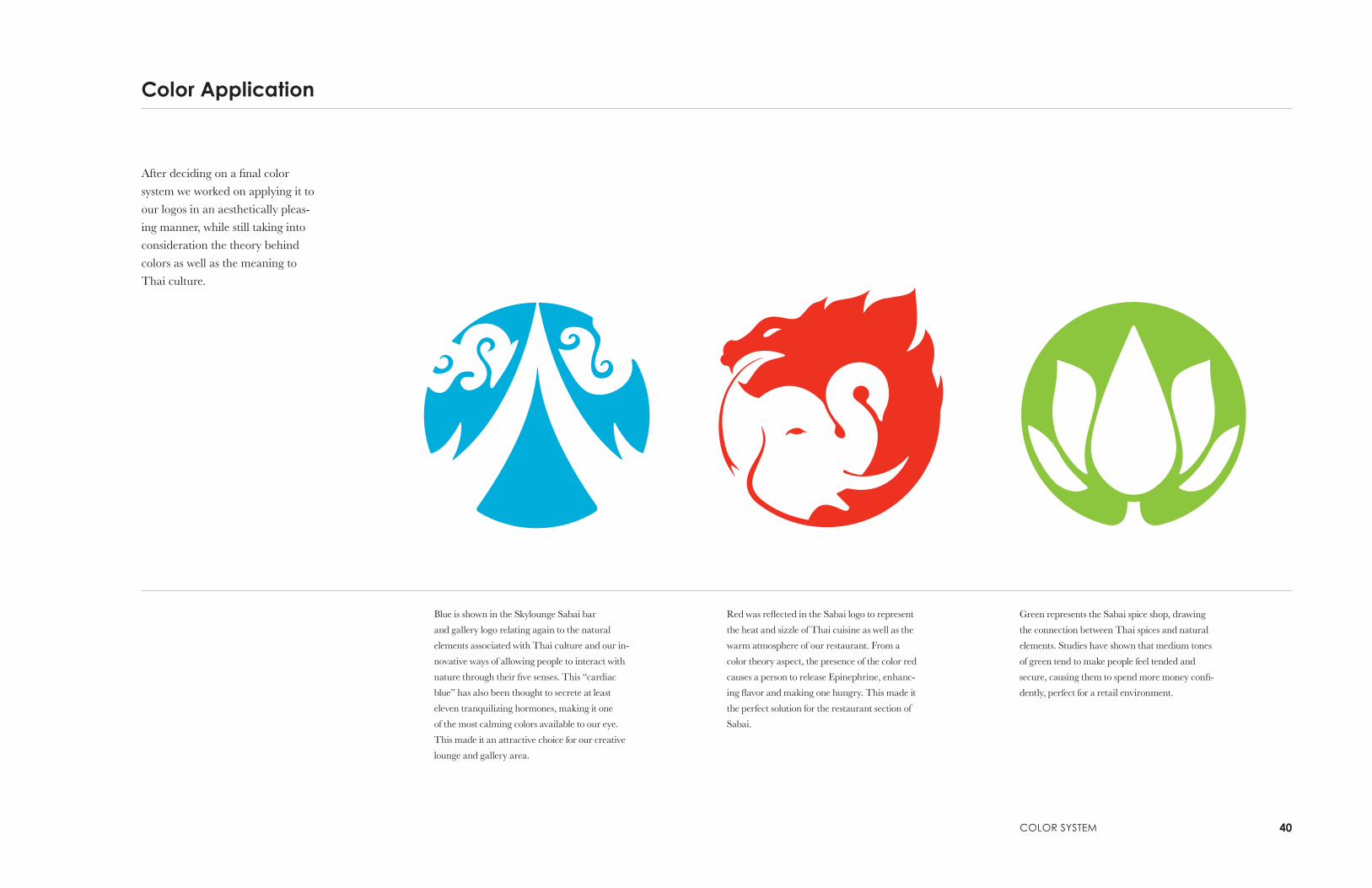
Color Application
After deciding on a final color
system we worked on applying it to
our logos in an aesthetically pleas-
ing manner, while still taking into
consideration the theory behind
colors as well as the meaning to
Thai culture.
Blue is shown in the Skylounge Sabai bar
and gallery logo relating again to the natural
elements associated with Thai culture and our in-
novative ways of allowing people to interact with
nature through their five senses. This “cardiac
blue” has also been thought to secrete at least
eleven tranquilizing hormones, making it one
of the most calming colors available to our eye.
This made it an attractive choice for our creative
lounge and gallery area.
Red was reflected in the Sabai logo to represent
the heat and sizzle of Thai cuisine as well as the
warm atmosphere of our restaurant. From a
color theory aspect, the presence of the color red
causes a person to release Epinephrine, enhanc-
ing flavor and making one hungry. This made it
the perfect solution for the restaurant section of
Sabai.
Green represents the Sabai spice shop, drawing
the connection between Thai spices and natural
elements. Studies have shown that medium tones
of green tend to make people feel tended and
secure, causing them to spend more money confi-
dently, perfect for a retail environment.

41
Final Color Logo Marks
The final logo marks each contain
a slight gradient from one color to
another. Rather than gradiating a
red to a light red, the gradient is a
transformation from our yellow to
our red; this symbolized the fusion
and innovation that we are trying
to accomplish with Sabai. Stylisti-
cally, the gradient also makes the
logo look more smooth and sensual.
In cases where the gradient logos
can not be used, the solid color
logos will take their place – and still
uphold the wide variety of symbol-
ism.

Poster SystemsWe worked individually on creating innovative poster
systems that represent the Thai experience in a mod-
ern, playful manner. Imagining this collateral as being
a series of three as well as standing on its own,
we created unity in these pieces through repetition,
color and conceptual ideas.

www.sabaiexperience.com
800.427.2224
4120 Brighton Blvd.denver, Co 80216
43
Poster Design Julie luu
For my poster system, I did
different approaches, such as
blowing up the logo, centering the
logo, putting a border, and using
just type.
www.sabaiexperience.com
800.427.2224
4120 Brighton Blvd.denver, Co 80216
www.sabaiexperience.com
800.427.2224
4120 Brighton Blvd.denver, Co 80216
800.427.2224 4120 Brighton Blvd. Denver, CO 80216
4120 Brighton Blvd. Denver, CO 80216 • 800.427.2224
4120 Brighton Blvd. Denver, CO 80216 • 800.427.2224
“Bangkok is Thailand’s hottest city, both in temperature and night life.”
Come enjoy a Bangcock Cooler at skylounge.

Poster systeM 44
I focused on creating modern
posters by putting a simple fact
about the bar and gallery, the
restaurant and retail. By using just
type, I feel that the viewer would
read them and want to come to the
cultural center to learn more.
4120 Brighton Blvd. Denver, CO 80216 • 800.427.2224
“Bangkok is Thailand’s hottest city, both in temperature and night life.”
Come enjoy a Bangcock Cooler at skylounge.
4120 Brighton Blvd. Denver, CO 80216 • 800.427.2224
“Letting petty matters get in the way of enjoying life just isn’t acceptable.”
Celebrate thai philosophy and cuisine at sabai.
4120 Brighton Blvd. Denver, CO 80216 • 800.427.2224
“Ginger is used in different ways in Thaidish as food, flavoring and spice.”
Come visit the Market for spices and cookbooks.

45
Poster Design emily Verhagen
For my poster design I decided to
focus on the logos and try to add
some Lai Thai into the design.
The Lai Thai posters didn’t work
well because it created a new
identity and drifted from our style
we’ve created through the process.
The logo image posters are more
abstract and they create a bet-
ter balance between positive and
negative space. I chose our colors
combined with black so the colors
of the logo mark really pop out.
sabaiexperience.com 800.427.2224 4120 Brighton Blvd. Denver, CO 80216 sabaiexperience.com 800.427.2224 4120 Brighton Blvd. Denver, CO 80216 sabaiexperience.com 800.427.2224 4120 Brighton Blvd. Denver, CO 80216
sabaiexperience.com 800.427.2224 4120 Brighton Blvd. Denver, CO 80216sabaiexperience.com 800.427.2224 4120 Brighton Blvd. Denver, CO 80216
sabaiexperience.com 800.427.2224 4120 Brighton Blvd. Denver, CO 80216

Poster systeMs 46
sabaiexperience.com 800.427.2224 4120 Brighton Blvd. Denver, CO 80216sabaiexperience.com 800.427.2224 4120 Brighton Blvd. Denver, CO 80216 sabaiexperience.com 800.427.2224 4120 Brighton Blvd. Denver, CO 80216
t h e t h a i e x p e r i e n c e
sabaiexperience.com 800.427.2224 4120 Brighton Blvd. Denver, CO 80216
t h e t h a i e x p e r i e n c e
sabaiexperience.com 800.427.2224 4120 Brighton Blvd. Denver, CO 80216sabaiexperience.com 800.427.2224 4120 Brighton Blvd. Denver, CO 80216
t h e t h a i e x p e r i e n c e

47
Poster Design Kyle Warfield
For my poster series. I really
wanted to focus on innovation and
take a more modern approach to
the Lai Thai designs. In doing
this, I illustrated a set of shapes
that represented the three parts of
our brand. I then combined the
illustrations

Poster systeMs 48

49
Poster Design Whitney yehling
For my poster systems I focused on
bold, graphic images to represent
the playfulness of Sabai. Utilizing
our color palette I first concentrat-
ed on a strong contrast, making
our logos come to life against the
black background.
Then, taking a different approach,
I used traditional Thai designs as
inspiration for the repetition post-
ers. The reappearing logos act as
a branding strategy in that their
imagery resonates with the viewer.
�

Poster systeMs 50
w w w . s a b a i . c o m 8 0 0 . 4 2 7 . 2 2 2 4 4 1 2 0 B r i g h t o n B l v d . d e n v e r , C o 8 0 2 1 6
�
w w w . s a b a i . c o m 8 0 0 . 4 2 7 . 2 2 2 4 4 1 2 0 B r i g h t o n B l v d . D e n v e r , C O 8 0 2 1 6 w w w . s a b a i . c o m 8 0 0 . 4 2 7 . 2 2 2 4 4 1 2 0 B r i g h t o n B l v d . d e n v e r , C o 8 0 2 1 6 �


Collateral & BrandingBuilding up the identity consists of figuring out how to
approach each audience. Brand placement is extreme-
ly important, so it is ideal to expose Sabai as many
ways as possible. We wanted to brand unique products
for our cultural center to stand out and remain eco-
friendly. Our collateral ranges from a digital menu, to
spice packaging, to transportation.

53
Digital Media
Here is an example of our home page. The
center graphic would ideally be a mov-
ing carousel that features the restaurant’s
specials for the week.
Here is an example of our digital menu
boards, it will be animated to show the bar
menu as well.

CollAterAl & BrAnding 54
Packaging Design
The spice market will have big
buckets with different spices that
costumers can grab recycled bags
and pick which spice they want.
We decided to have the costumers
grab their own bags because it will
be cost efficient.
Made with 100% RECYCLED MATERIALS and 2.25 gauge meets CA minimum reusable bag thickness standard.

55
Transportation
Here are examples of transporta-
tion brands. We used a bus, light
rail, and tuk tuk. These transpor-
tation will be going by and to our
cultural center.
We are using this tuk tuk to take our costumers from the
light rail to our cultural center. It is eco-friendly and cost
efficient.

CollAterAl & BrAnding 56
Here are examples of brands for
transportation that people will be
able to see when walking by or in
the sky. We used a bus stop, an
airplane banner and billboard.
800.427.2224

57
Microsoft Tags
This billboard example shows a large-
scale version of our Sabai logo along with
a Microsoft Tag. A Microsoft Tag is the
future within the design and marketing
industry. It acts like a bar code and a scan-
ner. The audience is urged to snap a photo
of this ‘barcode’ in order to be directed to
a website. This could serve as a great tool
for communicating more effectively and
sustainably.

ProgrammingProgramming is the first stage in the design process,
which involves finding inspiration, developing a con-
cept, and beginning to develop the layout of the space.

59
Inspiration
In order to design the space
effectively it was important for the
designers to research all cultural
aspects that are essential to
Thailand, focusing on geography,
philosophy, cuisine and art.
Inspiration was also drawn from
books, photographs, colors,
architecture, and landscape.

ProgrAMMing 60
Criteria Matrix
Concept Statement
The first step in space plan
development is the completion
of the Criteria Matrix. This
spreadsheet allows the designers
to establish the needs and wants of
the client. These factors include;
square footages, adjacencies, public
access, daylight requirements,
acoustical and visual privacy,
plumbing, special equipment, and
any other special considerations
that need to be implemented into
the design.
Criteria
Matrix Area
Qua
ntity
Squ
are
Foo
tage
Adj
acen
tcie
s
Pub
lic A
cces
s
Day
light
Aco
ustic
Priv
acy
Vis
ual P
rivac
y
Plu
mbi
ng
Spe
cial
Equ
ipm
ent
Spe
cial
Con
side
ratio
ns
Restaurant 1 Kitchen 1 1,275 2,4,5,7 Low Low Yes Some Yes Yes Commercial Appliances
2 Dining Area 1 3,176 1,3,6,7,15 High Medium Yes No No No Sunken Seating
3 Hostess Station 1 2,6, Entrance High Medium No No No No Phone
4 Break Room 1 156 4,5 None Low Yes Yes Yes Maybe
5 3. Office 1 100 1,4 None Low Yes Yes No Maybe
Computer, Safe. Copier,
printer, faxer
6 Bar 1 184 2,3,7 None Medium No No Yes No
7 Server Station 1 1,2,6 None None Low Some No Yes
Retail 8 Cash Wrap 1 9,12 Low Medium None No No Yes
Computer wired to office
computer and printer.
ADA counter
9 Sales Floor 1 896 8,10,11,12 High Medium Yes No No No
10 Office 1 120 8, 11 None Low Yes Yes No No
Computer and printer
connected to computer
at cashwrap. Safe,
11 Storage 1 242 9,10 None None None Yes No No
12 Entrance 1 432 8,9 High Low No No No No
Gallery 13 Display Floor 1 96 11,14 High High Some No No No
14 Information Desk 1 13 Medium Medium No No No No
Restrooms 15 Restaurant Restroom 2 236 1,2 High None Yes Yes Yes no ADA
16 Retail/Gallery Restroom 2 64 Retail, Gallery High None Yes Yes Yes No ADA
Total
Circulation at 25%
The fusion of Thai cuisine, art and natural landscapes within a sustainable envelope
actualized through innovative and biophilic design. Connection to nature in the space will be
achieved through active solar, day-lighting, ventilation, renewable resources, natural materials,
organic products, and a living roof. Water and energy conservation will be achieved through
the selection of environmentally conscious appliances, fixtures, and surfaces as well as the
utilization of geothermal power sources. Color, lighting, and texture will complete this bond
between the space and the surrounding natural environment.

61
Bubble Diagrams & Relationship Diagrams
Once the Criteria Matrix has been
solidified and the designers have
factored in all the requirements
for each area of the overall space
rough bubbles and diagrams are
created to begin visualizing the
space plan. These sketches further
the development of the adjacencies
and square footages of the space.
Upon completion of the relation-
ship diagrams it is determined
that a second floor is necessary to
accommodate the art gallery as
well as a roof top bar with outdoor
lounge area.

SchematicsDuring this phase the designers further develop indi-
vidual spaces focusing on the hierarchy of the spaces
and necessities of day lighting, acoustic absorption and
human dimensions.

63
Prototypicals
After adjacencies have been
decided, the sketches are further
refined and spaces are drawn at
accurate scale, taking into account
circulation, spatial requirements,
built-ins, and furniture. At this
stage the designers roughly de-
velop the means of egress, views,
day-lighting, seating arrange-
ments, stair and elevator location,
and fenestration. These prototypi-
cals lead to the implementation of
a larger skylight over the gallery, a
living roof that can be viewed from
the rooftop bar, and fire-pits in the
outdoor lounge area.
Restaurant Retail

sCheMAtiCs 64
Gallery Rooftop Lounge

65
Space Plan
The space plans that have been created reflect
the needs and wants of the client and incor-
porate the concept of the design to all spaces.
The completed plan includes a restaurant
and bar, a retail space, art gallery and rooftop
bar with an outdoor lounge area. All spaces
are effectively connected through curvilinear
lines, seamless circulation, innovative elements,
unique materials, and connection to the natu-
ral environment.

sCheMAtiCs 66


Design DevelopmentIn design development the designers choose finishes,
furniture and fixtures that emphasize the concept.
Renderings are made to aid the clients visualization of
the finished design.

69
Rendered Space Plan
Recreating finishes and materials
with color on the space plan visu-
ally defines as well as connects the
different spaces within the plan.

design deVeloPMent 70


Rendered PerspectivesTwo dimensional rendered drawings communicate
the vibrancy, color, depth, and texture of the finishes,
furniture, materials and textiles utilized in the design
of each space.

73
Entry
The main focal points of the
restaurant entry are the water wall
feature behind the hostess stand
and the woven wall treatment
behind the built-in bench. Both of
these elements create an inviting
atmosphere that is stimulating as
well as serene and reflects the con-
cept of landscape within the space.

rendered PersPeCtiVes 74
Gallery
The gallery is visually and acousti-
cally private while maintaining
an open plan and efficient circula-
tion. It is a welcoming space that
incorporates curvilinear lines,
day-lighting, a connection to the
outside environment with views of
the living roof, and a seamless flow
throughout.

75
Lounge
This intimate space is a comfort-
able waiting area for restaurant
customers that offers relaxation,
views, and is conducive to con-
versation. Rich, warm colors, soft
textiles, and day-lighting create an
environment that allows custom-
ers to unwind while waiting to be
seated. A partial wall separates the
space from the bar, but still allows
a clear view of the scene.

rendered PersPeCtiVes 76
Dining & Bar Area
This space is sophisticated while
maintaining a fun and entertain-
ing atmosphere. The dining area
offers views of both the open
kitchen and the bar as well as
sculpture and artwork throughout
the space. Booth seating is condu-
cive for intimate conversation, and
adjacent to the bar, a large table
with sofa seating provides a fun
casual setting for a group of six.
Earthy, rich colors balance unique
textures and a variety of finishes
such as concrete, glass, unique
wood grains, and textiles.

77
Rooftop Bar & Outdoor Lounge
The space exudes urban cool with
sleek finishes and materials, moun-
tain views and an outdoor patio
complete with fire-pits surrounded
by lounge seating. Colors in blue
and gray tones reflect the view
outside and complete the bond
between the space and the outdoor
environment.

rendered PersPeCtiVes 78
Exterior
The shape of the building as well
as the awnings at each entrance
interprets the curves of the Thai
Sala. The roof angles up towards
the sky allowing for maximum
day-lighting, mountain views and
maintaining a direct connection
with the outdoor environment.
Paper stone on the façade and aw-
nings creates a sleek exterior that is
urban and unique.

79
Model
A three-dimensional model com-
municates the dynamic structure
of the rooftop bar and lounge,
focusing on elements of the space,
including; shape, line, symmetry,
fenestration, materials, circulation,
and views.

rendered PersPeCtiVes 80


Design PaletteThe design palette shows the finishes, furniture and
fixtures that make up the restaurant & retail space.

83
Design Palette first floor

design PAlette 84

85
Design Palette second floor

design PAlette 86


Code Summary

Project requirements for the client include:
• Utilizing natural light
• Energy efficiency
• Composting
• Printing materials with soy-based inks
• Greenery
• Water conservation
• Renewable energy sources (solar radiation, wind, plant-by-
products, or geothermal sources)
• LED or compact fluorescent lighting
89
LEED & Sustainability
Codes & ADA Analysis
Occupancies:
• Non-separated Mixed Occupancies (Assembly, Mercantile,
Business, Storage)
• Assembly (A-2) requirements are applied to the entire building
• NFPA- A-B Assembly, OL greater than 300 needs to be less than
or equal to 1000
Occupant Load:
• 7,310 (Floor Area) / 15 (Occupant Load) = 488
Plumbing Fixture Calculations:
• Water Closets- Male = 7
• Water Closets- Female = 7
• Lavatories-Male = 2
• Lavatories-Female = 2
• Drinking Fountain = 1
• Service Sink = 1
Mezzanine Requirements:
• Cannot exceed more than 1/3 of the room or space
• Only one mezzanine is allowed in a space
• Appropriate headroom must be provided
• Must be open to the room in which it is located and
requires one or two exists to the room or space below
ADA Requirements:
• Restroom accessories and grab bars
• Signage
• Parking spaces
• Clear floor space
• Handrails
• Separate ADA accessible male and female stalls or a
unisex restroom

Code suMMAry 90
Finishes:
• Class A- interior wall and ceiling finish- flame spread 0-25, (new
applications) smoke developed 0-450
• Class I- interior floor finish- critical radiant flux, not less than 0.45
/w/cm2
Problem Statement
Form- To incorporate three different public facilities into one space while
maintaining a unified concept and design scheme.
Function- The space is required to provide entertainment, education, visual
stimulation, and ease of movement, therefore adjacency requirements and
efficient circulation need to be met in the design.
Economy- Steps to utilize the existing plumbing and structure of the
building should be taken when at all possible.
Time- Project should be scheduled accurately to accommodate all
subcontractor deadlines.


eMily VerhAgen
92
Core Values


