Embed Size (px)
Citation preview


•Rhythm and blues is also known as R&B or also written as R'n'B.
•This popular genre of was created in the late 1940s and early 1950 by African Americans.
• Rhythm and Blues is a term that has never had a clear single meaning, but was broadcasted as ‘black pop’ music.
•However, as black pop music changes, it has become a term that is often used define whatever black musical style it is attached to it at specific point in time.
•In the 1960s, the term "R&B" was used particularly by white groups to refer to music styles that developed by incorporating electric blues, gospel and soul music.
•By the 1970s, the term "rhythm and blues" was being used as a term for soul and funk.
•The 1990s came with the term "Contemporary R&B" used to refer to a modern version of soul and funk-influenced pop music.

Black Beat Magazine was the ultimate music source for teens and young adult fans of the urban music scene.
The magazine was packed with features on the hottest stars, in-depth interviews, photo spreads and all the latest gossip on urban.
Black Beat was a bit hit with the African-American music fans.

Big bold read Masthead. The red contrasts the blue
background, drawing attention and making it
stand out.
Another featured artist. As she is a female artist it make the cover more
unisex.
Lyrics from the artists in the central image . Makes
the audience think that this is a special cover because he doesn’t
appear in them, which will make them want to
buy it.
The name of the artist used as the central image. Lets
the audience know who he is.
Left side column, it shows what will feature in the
magazine.Central image of an attractive
hip hop artist that would attract the female audience.
He is wearing a lot of jewellery that shows a wealthy life style which
would appeal to the male audience, making them want
to buy the magazine.

Word Up Magazine is an American magazine focusing on teen entertainment and music. It was very popular in the 1980s.
The magazine mostly covers information concerning rap, Hip-hop and R&B music. Its main focus is African American teen singers, rappers, models, and prodigies.
The magazine comes out monthly and usually has many posters and competitions for the fans.

Mast head is covered partially covered by the urban writing telling the reader that it is the 200th
issues.
The name of the artist featured in central image.
The red is writing is made to stand out as it lets us know
who the main feature is, which is also connoted by
the central image.
Even though the cover is full of pictures, there is
still a central images which is much bigger than the rest in the
centre.
Having many images is effective because it s
target audience are young meaning that much writing wouldn’t appeal to them.
The cover is packed with images. Much more than
text.

I chose to do this genre, because I enjoy the music and I have a broad knowledge on it. There are many artists that make
music in this genre which is an advantage because I should be able to get enough information when researching for my
magazine.

Gender: MaleName: Aiden MurphyAge: 16
Lifestyle and interests: Aiden is a laid back teenage boy in college. He lives in the suburbs of London and goes to a multi-cultural college and tries to work hard and be focused. Aiden is very versatile when it comes to the music he listens to but he prefers R’n’B. He studies music and is a good singer as well as producer and has made a few R’n’B tracks where he has rapped and sang to. His favourite artist at the moment is Drake.
Social network sites: Facebook and Myspace. He keep in contact with his friends through Facebook and promotes his music through MySpace.
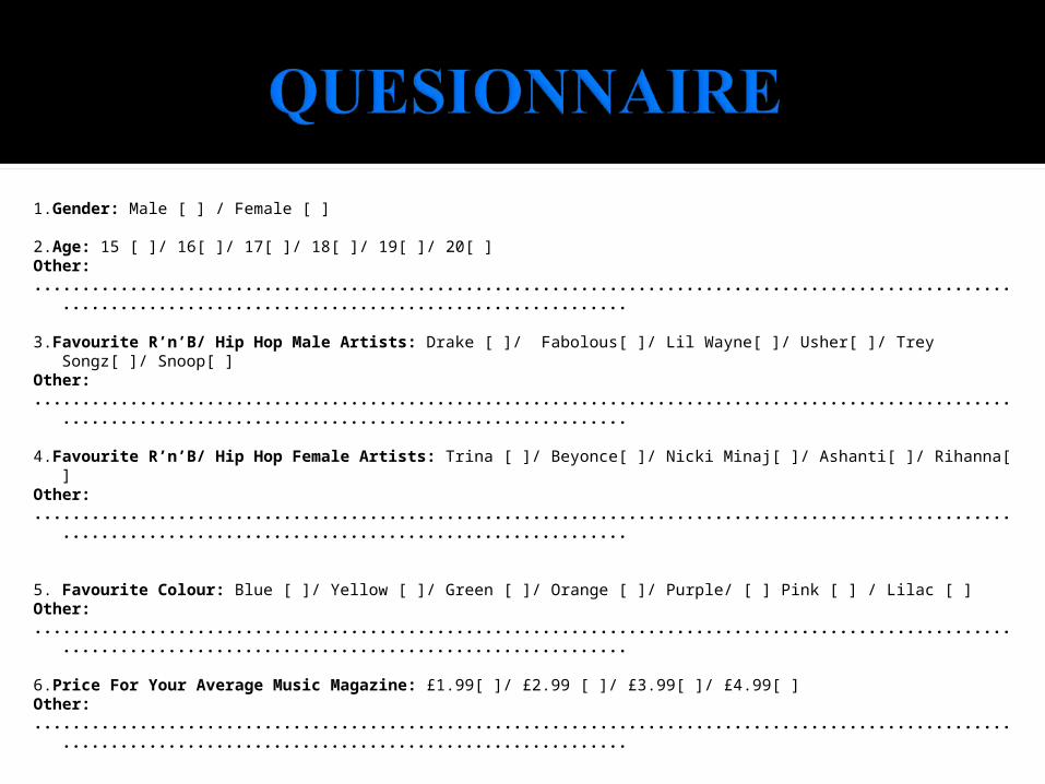
1.Gender: Male [ ] / Female [ ]
2.Age: 15 [ ]/ 16[ ]/ 17[ ]/ 18[ ]/ 19[ ]/ 20[ ] Other:.................................................................................................................................................................
3.Favourite R’n’B/ Hip Hop Male Artists: Drake [ ]/ Fabolous[ ]/ Lil Wayne[ ]/ Usher[ ]/ Trey Songz[ ]/ Snoop[ ]Other:.................................................................................................................................................................
4.Favourite R’n’B/ Hip Hop Female Artists: Trina [ ]/ Beyonce[ ]/ Nicki Minaj[ ]/ Ashanti[ ]/ Rihanna[ ]Other:.................................................................................................................................................................
5. Favourite Colour: Blue [ ]/ Yellow [ ]/ Green [ ]/ Orange [ ]/ Purple/ [ ] Pink [ ] / Lilac [ ]Other:.................................................................................................................................................................
6.Price For Your Average Music Magazine: £1.99[ ]/ £2.99 [ ]/ £3.99[ ]/ £4.99[ ]Other:.................................................................................................................................................................


The conventions I met were:
Matching the colour scheme to what the artist is wearing, which is shown in the ‘Vibe’ magazine.
I also have features on both sides, left and right.
I have an exclusive article to draw the reader to want to buy the magazine, similar to ‘Vibe’ who have an ‘exclusive on-set report’.
The name challenges the conventions of a traditional magazine as it is a number rather than words or letters like majority of magazines.

The target audience for my magazine originally was young teenagers between 15 to young adults of the age 20. Although after reviewing when it was done I found that it looked much sophisticated for a younger audience such as 15 which is why it is more targeted to older teens from the age of 17 to mid 20’s audiences. My media product represents my niche market as the artist I chose to feature is young at the age of 18 she has become very popular among the young people.
To attract my target audience I featured big artists in the R’n’B as well as Hip Hop industry, both male and female artists. This allows me to attract both R’n’B as well as Hip Hop fans even though this particular issue is aimed more for the female audiences. The exclusive interview is also to draw the fans to buy it in order to read it.

The skills I have learned from the technology I used was, using the spot healing tool to edit the photos in Photoshop and also I learned a number of things from Indesign; e.g. Using the swatches to colour different things on my page like the text and boxes around them. I have also learned how to make things transparent and I have used it on the boxes on the heading of my magazine and also on my feature page.
Transparent box. This is done by clocking on ‘object’ at the top of the page, selecting ‘effects’. The selecting ‘transparency’.
This is done by selecting the ‘spot healing brush’ then clicking on the imperfections. This is a technique used in real magazines to make sure that the stars look flawless.

I needed to change the colour to match the purple with what the artist is wearing. I decided to leave the orange as works well with the purple.
The name of the magazine had to be much larger, in order for it to stand out. The difficulty I met was trying to enlarge the text as it was cut out of rectangular box, with a stroke around it. The text couldn't be rescaled alone, so I had to enlarge the box to make the text bigger and rescale the stroke. I then had to fit the stroke over the cut out ‘808’ and make the stoke thicker to make it bolder than before.
The name of the artist had to change to something more suitable to the genre.
I tried to make the text follow the artists hair. I thought it would look more effective.
I needed to advertise the main cover story in order to attract the fans to want to buy it.
I needed an issue date and to add more things to fill the space after enlarging the name of the magazine, which was done by adding a tag line.
I had to remove the tickets as you would find that in a real magazine, and if so it wouldn’t be of the same quality
There was too much text on the left side, I had to break it down and put some on the right.

I used Publisher to create my school magazine. It looks very basic compared to my music magazine. The software may be appropriate for a school magazine but not for my music magazine. I had to make it look more sophisticated and similar to other music magazines, which is why I used Indesign to create it.
I cropped the image on Photoshop but in my music magazine I couldn’t because of her hair, which is why I left it. I used the spot healing brush in my music magazine, which I didn't need to in school magazine.
The price on the school magazine is only 50p as
I could only use images that I have taken in my Music magazine.
The school magazines have the school logo.
Music magazine has to show the name of the artist on the cover.
Music magazine is more expensive more to cover the costs for printing and publishing.
They both had to have a barcode and a issue date.
Music magazine contains more features, both on the left and right side.
Magazine tagline.

I reviewed the magazine by asking a few people what they think and the most common thing that was brought up was the magazine looked a little bit older for the target audience.
The colours I chose are dark but contrast each, the purple matches the artist’s clothing and the orange makes the important information stand out for the page, both colours working well together. They are quite sophisticated which is why they make the magazine more appealing to an older audience from the age of 17- mid 20’s appose to the original 15-20.
The layout also makes the magazine look more mature as all the text is in a formal fonts. The features are also neatly placed one after the other.

http://www.magazine-agent.com/black-beat/magazine
http://en.wikipedia.org/wiki/Rhythm_and_blues
www.google.com (google images)