Embed Size (px)
Citation preview

Responsive Web Design for Digital Libraries 1
Responsive Web Design for Digital Libraries Accessing information anywhere, anytime
Sigrid Thoresen Sandnes Department of Product Design
Norwegian University of Science and Technology
ABSTRACT
Digital libraries (DLs) have greatly influenced the accessibility of scientific and academic material. They bring the library to the user and offer the opportunity to access information anywhere, anytime. With the rapid growth of Internet accessible devices, like smartphones and tablets, issues related to accessibility of web-‐based material are more important than ever. The diversity of devices, both in size and features, creates new challenges for how digital libraries should deliver content and services to their users. Responsive web design (RWD) is one approach that tries to address these challenges by developing one single website that adapts automatically to the device. The aim is to provide easier reading and navigation, and create a more consistent user experience. This article is a literature review dealing with the major issues and opportunities related to the user-‐interface and the user experience when making digital libraries accessible over a wide range of devices. Responsive web design is discussed as a possible approach for web development in this context. The study shows that responsive web design addresses many of the challenges today’s web environment is faced with, but there are still issues to be solved in order to make the mobile experience fully functional and pleasant for the digital library user.
KEYWORDS: Digital library, responsive web design, user interface, usability, user experience
1. INTRODUCTION The digital library is in an area of significant growth and change. Better and cheaper Internet accessible devices, improved global network speeds, changing customer expectations and social media are all a part of the change we experience in the way people consume, produce and share information. Only a few years ago we could assume that a user would access a digital library through a web browser on a standard desktop display, but with the rapidly increasing number of Internet accessible devices, like smartphones and tablets, this is changing dramatically. The library users expect to access information anywhere and anytime, and they
want to find content quickly and easily whatever device they are using. A user might search for an article in a digital library on a smartphone while eating breakfast, read the article on a tablet on the way to work and maybe recommend the article to a colleague while sitting at a laptop in the office. All these tasks from the same website, but by using different devices. This raises the issues of how the content of digital libraries should be presented on different screens and how the devices should work together to create a holistic unified experience for the users at every step of their online journey. Responsive web design is one approach that tries to address these challenges, by developing one
Responsive Web Design for Digital Libraries 2
single website that responds to users behavior and environment based on screen size, platform and orientation. The aim is to provide easier reading and navigation and create a more consistent user experience regardless of the users choice of device [22]. Some designers and developers state responsive web design is the way to go for future web development, while others thinks there are still issues with the approach before it can be a final answer to the ever-‐changing mobile world. Several digital libraries have already launched a responsive website and some stands at a crossroad where they must choose which strategy that will be most appropriate for their users. Even though there has been done a great number of usability studies of digital libraries and some research on making digital libraries available on mobile phones, there is a lack of research on how digital libraries should deliver their content to all devices in today’s web environment. Responsive web design is major trend, but can this approach be an appropriate solution for digital libraries, and can a responsive website alone fulfill all the digital library users' needs on all devices? 1.1 Research method This article is based on a literature review, i.e. an attempt to sum up the current state of the research and knowledge on design principles of digital libraries and come up with ideas of where research and design development might go next [2]. This article focuses on the design of the user interface of digital libraries in today’s web environment. By exploring the different aspects of user interface design related to digital libraries from a user-‐centered perspective, this article aims to identify whether or not responsive web design is an appropriate approach for digital library websites. Responsive web design is a relatively new field of web design. Even though there exist articles and books about the topic, much of the most recent discussions and ideas are to be found in
conference papers, blog posts and discussions in forums online. A combination of various sources has therefore provided the basis of this article, but literature searches in databases like Scopus and Emerald, and searches in Google scholar have been the main contribution. Although the topic is relatively new, a responsive website must still address fundamental concepts like usability, efficiency, consistency and visibility in order to create a meaningful user experience [34]. Older sources related to web development in general and in relation to digital libraries have therefore also been valuable. The discussion is directed towards digital libraries, but some of the topics covered will be relevant for similar research areas as well. Delivering content and services to the current and the future mobile market in a meaningful and pleasant way affects everyone that delivers web experiences. 1.2 Structure of the article The main part of this article is divided into seven sections. The following section looks at the characteristics of digital libraries and the importance of access to information in today’s society. Essential terms like user interface, usability, user experience and user-‐centered design are then explained. Section 3 highlights the growth of web traffic from mobile devices and what that means for information retrieval. This leads to a discussion about which strategy digital libraries should take to deliver content to all devices. Responsive web design is then discussed as a possible strategy. Issues related to the digital library user and the importance of user testing is discussed in section 5. Section 6 looks at the most common user interface elements in a digital library, which are discussed in relation to responsive web design. The last section of the main part discusses how the devices should provide the same level of experience and how they can complement each other to create a coherent and consistent product. The findings and results are then summarized and evaluated in the discussion and conclusion.
Responsive Web Design for Digital Libraries 3
2. THE DIGITAL LIBRARY The term ‘digital library’ has been defined differently within research communities and has changed over the years, reflecting the technology and the digital library research [26]. This article does not aim to create an overview over the definitions, since the details separating individual definitions are irrelevant for the following discussion. However aspects that all definitions have in common is that a digital library is a collection that is both digitalized, organized and accessible over a network.
Digital libraries address traditional problems such as organizing information, distributing it to the users and preserving it for the future. They can include everything from databases, journals, e-‐books and articles, to music, videos and audio. Digital libraries give the users possibilities that never would have been possible with traditional libraries. First of all they bring the information to the users wherever there is a device with a network connection. The information is therefore likely to be available when and where the users want it [7]. Digital content is also much easier to search, browse, update and maintain due to computer automation [7]. As the amount of information grows solutions about how content should be stored and maintained so it is preserved for the future are critical, as well as how users should find and consume the stored information. 2.1 User interface and usability The user interface is one of the most important elements of a digital library. According to Arms digital libraries are of little value unless they are easy to use efficiently and they are only as good as the interface they provide to their users [7]. The term user interface (UI) is used to explain the interaction between a machine and a human (user) and is related to everything the user can see and interact with. The goal of user interface design is to facilitate the users to complete their tasks as simple and efficient as possible. Ensuring that interactive products are easy to learn,
effective to use, and enjoyable from the users’ perspective is often referred to as the usability of the product [11]. According to Horton and Lynch the most common method for achieving usability on web is user-‐centered design (UCD) [5]. UCD includes methods such as task analysis, focus groups and user testing. The method involves determining what functionality users want in a product and how they will use it. This is often done through iterative cycles of design, testing and refinement [5].
According to Chowdhury usability of a digital library relates primarily to its accessibility. In other words it relates to how easily users can interact with the interface, how easily they can find useful information and how easily they can use retrieved information to accomplish their specific tasks [26]. Providing information quickly and efficiently is one of the goals of libraries and the user should not use time on struggling with the interface to find what they need [14]. 2.2 User experience It is well known that usability is a key aspect when creating and delivering web content. However as user interfaces get better, websites have to offer something more than just being easy to use. The whole user experience of the website needs to be taken into account. The user experience is concerned with all aspects of the end-‐user's interaction with the company, its services, and its products [20]. It is not only about facilitating the user in achieving goals, but to give the users a meaningful and pleasant experience before, during and after use. 3. THE ANYWHERE, ANYTIME WEB The user experience and the user interface are highly depended on the device that is being used. Due to the improved web experience across a wide range of mobile devices, there has been a shift in the way people access content on the web [6] and therefore also the way designers and developers create user interfaces.

Responsive Web Design for Digital Libraries 4
3.1 Mobile Internet growth Mobile devices, such as smartphones and tablets, are the fastest growing segment of the web access market. Research shows that mobile sales have already overtaken desktop sales, and mobile Internet usage is predicted to overtake desktop Internet usage by 2014 [19]. The mobile device has in many ways become a handheld information retrieval device and gives the user an instant access to information. They are taking an increasing part in our daily lives and are always on and always with us. Digital libraries will want to have a significant presence in offering content and services suitable for those devices [28]. One of the challenges with this is the fragmentation of the mobile devices market. There exist a huge amount of devices, which are able to connect to the Internet, and they are becoming smaller and larger simultaneously [1]. The problem is that there are no standardized sets of features common to all these devices. The screen size and orientation is different, as well as network speeds, software, methods of input and output and context of use [14]. Designers and developers are at a point of being unable to keep up with the endless new devices and resolutions, and it is impossible to build and maintain separate web sites for all devices and screen sizes [22]. The technology evolves so quickly that it is difficult to keep up if you are designing for a specific device or operating system. With the emerging number of Internet capable devices digital libraries have to make a decision about how they should offer their online information products and services to satisfy their users. 3.2 Mobile strategy There is a common perception that content should be available on mobile devices, but there are different strategies for how this should be done in order to make the mobile experience fully functional and pleasant. Mobile and tablet devices differ from desktop computers, both in behavior and capabilities. Nielsen argues that
desktop computers and mobile devices are so different that the only way to offer a great user experience is to create two separate design, typical with fewer features for mobile [21]. A possibility is to build a separate mobile-‐optimized site or a native or hybrid mobile application, which serve a specific customized task for a specific device. A so-‐called native application is built specially for a given platform and installed on the device through an application store. They can take full advantage of all the device features, use the device’s notification system and can work offline [25]. An hybrid application is built using web technologies, but is installed through an application store just like a native application and can take advantage of the many device features available [25]. According to Nielsen the measured usability are much higher for mobile sites and native applications than for full websites [21]. McGrane, a designer in the field of user experience design and content strategy, states that a mobile website should not be a «light» version of the desktop website. If a mobile site links to the «full site», the user might think the mobile experience is somehow impaired. One should never force the users to go to the desktop website for content they are seeking on a mobile device [16]. She argues that today you cannot tell anything about the user’s intent by knowing the type of device the user is holding and that it is a common misconception that mobile devices should deliver only task-‐based functionality, rather than information-‐seeking content [16]. As discussed might users have other needs when browsing a website on a desktop or a mobile device, but as people use their mobile device in all kinds of contexts, even at home when they have access to a desktop computer, it gets almost impossible to make assumptions about what users on mobile devices would like to do. If there are certain tasks or features that cannot be covered by a website, developing an application that can fulfill this can be a solution, but having a great native application is a good solution only when users have it installed. It is not likely that a native application is the only source for a digital

Responsive Web Design for Digital Libraries 5
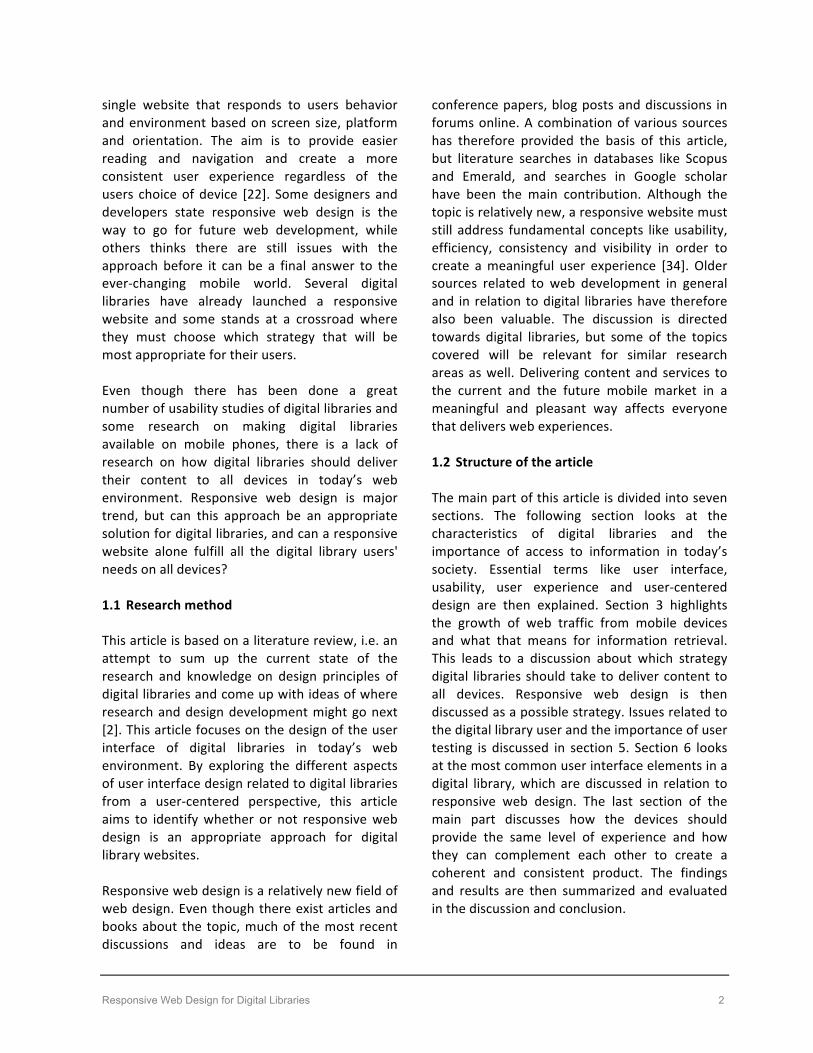
library, and as long as a website exist it should be optimized for different devices. Digital library websites require a solution where users get access to all content and functionality appropriately structured, defined and formatted for the device they are using. Responsive web design is an approach that tries to address this by adapting «one experience» for all devices. Could this approach be suitable for digital libraries? 4. RESPONSIVE WEB DESIGN The term Responsive Web Design (RWD) was first defined by the developer and web designer Marcotte in an article for “A list apart” in May 2010 [4]. Marcotte coined three existing techniques (flexible grid layout, flexible images and media, and media queries) into a unified approach and named it responsive web design [4]. A flexible grid allows the layout to resize in response to the browser window. The pixel width might change, but the proportions of the design remains. Flexible images and media will scale within the grid, while media queries will optimize the display of content to meet the needs of the device, creating alternate layouts tailored to different resolution ranges [1]. The aim of RWD is to provide an optimal viewing experience across a wide range of devices, from widescreen desktops to small mobile phones. Figure 1. shows an example of how a responsive website will adapt depending on whether it is a browsed on a smartphone, a tablet or a desktop. As the screen or browser gets wider or narrower, the website will respond by adjusting the layout. Another advantage with RWD is that the developer only needs to build and maintain one version of the websites, instead of many separate websites. There is also only need for one link to the website, compared to a solution where there is one for the mobile site and one for the full site, which can be frustrating for multiple-‐device users [16].
Figure 1: Sample website made by Marcotte that illustrates how the same webpage automatically adapts according to the dimensions of the device.
[23]. 4.1 Technical challenges This article does not focus on the technical development of responsive web design, but there are technical aspects that influence the user experience of a website. A major issue with RWD is that older browsers do not support media queries and can therefore cause problems on some devices. On the other hand do almost all new versions offer full support [1]. Another concern is speed and page loading time. When a mobile user opens a responsive website, all of the elements of the desktop site are downloaded and resized to fit the screen. This makes the site slow to load. Page loading time is an integral part of providing a good user experience, and correlates directly to how long users will stay on a website [32]. Network charges and unavailability of Wi-‐Fi/mobile network can also become a problem, as well as slow connection speed. In addition are responsive websites unable to take advantage of some device-‐specific capabilities like push-‐notification, offline-‐accessibility and local storage that can be useful for the digital library user. Today’s web development is a rapidly changing landscape, so it is easy to get caught up in discussions about new devices and technical requirements and possibilities. However, to be able to create a meaningful library experience on mobile devices, it is the users that should be in the center of the discussion.

Responsive Web Design for Digital Libraries 6
4.2 Method for responsive design In his article Marcotte states that RWD is not only about the technology, but that the approach requires a whole new way of thinking [2]. It is also a method for how a website should be structured and build. The pervasive approach for web development was to take a desktop website and then adjust the site to fit a mobile view, but as the web trends are shifting, should the design process reflect this shift as well? One of the approaches related to RWD is «mobile first», first coined by Wroblewski [6]. The idea behind this strategy is that instead of starting to develop the laptop or desktop version of a website, you start with the smallest portable Internet accessible device, in most cases the smartphone [13]. Wroblewski argues that the constrains the mobile device have forces the designer to prioritize what really matters to the user and that the result can lead to a cleaner websites with more focus on content. That it is not just an opportunity to create a mobile version of the web product, but an opportunity to provide an improved overall experience for the users [3]. Digital library users are often exposed to a lot of information at the same time, and this approach may help the designer to prioritize what kind of information that is important in different situations. Simplifying the interface can thereby reduce the cognitive load for the user [31]. There is a possibility to make adjustments on existing websites, but to get the full potential of a responsive site starting from scratch with the basics is probably the best approach [14]. Most digital libraries have an existing desktop version of their website and choosing a “mobile first” approach means the designer and developer would have to start from scratch. This could be rather time-‐consuming. For digital libraries with strict budgets and limited resources this could be a challenge. As mentioned can a “mobile first” approach create a more customized mobile experience, but as the site is scaled up to the desktop it could end
up being rather simple. In some cases this could be beneficial, but at the same time it is important that the desktop version uses its full potential. If a responsive approach is chosen it is important that it does not end up with being a half way solution on all devices. In order words it is not useless on any device, but not optimal either. An approach that pushes the constraints even further than “mobile first” is working from a content strategy rather than a device strategy. Instead of designing for a specific device or software, the focus is on the content and message that should be delivered to the user. McGrane, in her book “Content strategy for Mobile”, tells us that content should guide the entire design process and the focus should not be on layout or navigation, because it changes from device to device [16]. Content strategy is an important part of the whole design process and the structure of web content is becoming increasingly important because it is the core of what is provided no matter what device is used to access that content [14]. Even tough this is a useful process of prioritizing and structuring the content of a website, the content has to be put in context of a device at some point. Because the content is the core service of the library, this should be in focus during the design process. The information itself is the product. A possible approach is therefore to see how the content could be placed in a small screen width environment. This will then be the basis from which content and services is based upon [14]. 5. USER-‐CENTERED DESIGN User-‐centered design revolves around the user and it is therefore important to have a solid understanding of the users needs, preferences and intentions. This insight can then create the basis for how the content and functionality of the digital library are prioritized and structured.

Responsive Web Design for Digital Libraries 7
5.1 The digital library user As mentioned earlier will a user-‐centered approach improve the usability of digital libraries [5]. However one of the challenges with digital libraries is that they usually have a wide range of users. DLs often contain diverse collections of information for use by many different users with different preferences and familiarity with research [7]. Much of the development of digital libraries has come out of universities, where there are many experts. However with the spread of the Internet, people who may not be experts are using digital libraries. In addition does technical knowledge vary greatly among users and the rapid change in technology requires constantly new skills [7]. The mental model of a user who knows the system behind a search function may vary from a user that does not have any insights in digital library technology. DLs must therefore attain high standards of usability over an extreme broad audience and support both novice and experienced users [29]. According to Norman’s usability principles interfaces should accommodate a range of learning styles and confidence levels [34]. 5.2 User testing User testing is a critical part of the design process when developing user interfaces for digital libraries [26]. Conducting usability studies with real users can reveal if users are able to accomplish their goals, how efficiently they can use various features and how satisfied they are with the overall digital library service [26]. However this may vary from device to device. The purpose of using a responsive layout is to make the website useful on any type of device, but without extensive testing it is impossible to know how the website meets real users needs. Responsive web design includes change in flow of page objects, hiding and showing different types of menus and resizing objects and text. This could have a great impact on usability on different devices and testing for only one device would therefore not cover all the possible issues and errors that usually are revealed during user tests.
Because a responsive layout involves many different screen sizes, orientations and browsers on a great variety of devices, it is an endless amount of interfaces that should be tested [18]. Add the variety in technical knowledge and preferences among the digital library users, and the number of tests is rapidly increasing. A possible solution is to test the website for the most common break points, such as small-‐mobile, tablet and large-‐desktop. It is important to target the most distinct devices, as the touch and feel is so variable. Input modes such as touch versus mouse are also an important difference that should be taken into account as it affects the user experience. Even with this restriction there are many factors to be tested. Responsive web design could therefore be a rather complex and time-‐consuming way of creating a website [18]. On the other hand designing and building separate websites for different devices and screens sizes would also include a lot of work regarding the face of building and testing, not to mention maintaining the site. There exist already different tools for the responsive web design process, which aims to help designers and developers while designing, testing and building websites. Responsive web design is a relatively new field of web design and better tools and techniques will probably be developed. 6. USER INTERFACE ELEMENTS Even though digital libraries differ from each other, there are certain standards regarding what they contain and how the information is exposed. Finding and retrieving information is central to digital libraries and search and browse features are therefore one of the most important user interface elements of such websites. Searching and browsing are the two models of interaction present in information-‐rich systems. Search is a goal-‐orientated seeking of information, while browse is a non-‐goal-‐based searching or following links and navigating on a page [8]. According to Fleming search is an essential feature of information sites, because seeking precise information is an integral part of our behavior [33].

Responsive Web Design for Digital Libraries 8
New technology has made searching in large databases extremely fast, but if the user cannot interact with the user interface in an efficient way and make use of the information this is of little value. Figure 2. shows some typical interactions when using a digital library. The next section takes a look at some of the key interface elements connected to these interactions and how they can be addressed in responsive web design.
Figure 2: Search interaction model
6.1 Search field First of all is it important to address the scope of the site, so the user knows what kind of information they can expect to find and whether the site will meet their needs [33]. When users visit a digital library they often have a specific question or an intention of a certain kind of information they are looking for. A search box is therefore often the first thing the users expect to find on such websites [33]. Because there are clear differences in search approaches between skilled and novice users, it is important to facilitate for both users. A typical example of this is the multiple search options that provide alternate options of how a user approaches the interface. Advanced features are valuable to specialists, and they able skilled users to work faster and be more efficient [7]. On the other side are novice users more likely to search intuitively than to use advanced search features intended to make searches more efficient and effective. Necessary support, functionality and information should be given so the users can take full advantage of the digital library.
When making a website accessible from mobile devices a typical approach is to cut down on some content and features to make the website easier to navigate and read. Hardesty, a metadata analyst and librarian, wrote a comment about how they made the responsive website for the Indiana University Libraries. One of the design solutions was to remove features that were too cumbersome to use on small devices, such as advanced search with multi-‐field search forms [24]. If this decision was based on user insights that indicated that the feature was not used, this solution might have improved the site. However if it was removed only because it was difficult to implemented in a good way, users that prefer this way of searching do not have this options anymore, even if it only were used when browsing the website from a desktop. A challenge with responsive web design is that some features can be too cumbersome too use on a small screen, but still useful on a desktop. 6.2 Search results page When users have executed a query the result will be presented on a search results page. According to Horton the results of a user’s search query should appear on a page that looks like the rest of the website [5]. How this page is presented is highly influenced by the screen size. Readability, the ability to read and comprehend information, becomes a critical issue. The user interface should provide a clear path through the information and have a clear visual hierarchy of contrast, so the user can see at a glance if the information is of interest [17]. On a desktop the user can see many search results at the same time, and if designed properly it is easy for the user to scan the site and compare the results. However on a mobile device with a small screen you might only see a limited number of results. A common problem with RWD is that you can end up with an extremely long page filled with too much content, navigation items or links when the site is viewed on small screen devices. If the user has to scroll a lot to find the desired information it might decrease the possibilities of a smooth interaction.
Create the query Review search results
Select and examine an item
Save or download item
Consume/useitem
Try againRefine/filter search
share/recommenditem

Responsive Web Design for Digital Libraries 9
Search can deliver the user to pages deep inside a web site and it can therefore be a challenge to maintain the understanding of where the user are in the architecture. This is even more challenging with small screen devices. The pages need to address typical navigation questions like; Where am I?, Where can I go?, How will I get there? And how can I get back to where I once was? [33], without taking to much attention from what really matters, the content. The designer does not want to spend valuable screen space on extra information regarding architecture and navigation. Finding the balance between information and navigation elements can be a challenge. Too many details can make the interface cluttered and confusing, while to little can cause frustration because the users cannot find what they are looking for. An observational note is that many digital libraries have a well-‐designed responsive homepage, but as soon as the user are directed to the search results page or to other library resources, the site is not optimized for mobile devices. Either cannot the whole page be viewed in the browser window, or the page is just scaled down to fit a mobile screen and the site becomes impossible to read and navigate. This leads to a poor mobile experience and usually an annoying amount of zooming and panning. This can break the user’s workflow and create an inconsistent experience. Ideally there would be a seamless transition between digital library resources, regardless of the device used to access them.
6.3 Filtering search
A search results page often ends up with information that is not relevant for the user. Filtering the search is one approach helping the user to limit the search and increase likeliness of success [33]. Relevancy ranking of search results or faceted browsing can help the user to limit or adjust search options. Many users are known with the left-‐hand faceted browse panel that allows them to refine their results by categories like author, year of publication, format, language or similar. For mobile devices there is usually not
enough space for this element, but it can often be accessed from the top of the page by a side panel. 6.4 Save search and information Creating a useful DL is not just about facilitating the user to find desired information. For people doing research on the web, storage is a huge issue. People may want to store searches, results and filtering preferences for later use [33]. The user should not get the feeling of beginning all over again when they are doing a new search, visiting the website at a later point or changing device. It can also be difficult for the user to remember which documents that previously have been read, rejected or downloaded. Solving solutions related to the ability to save information and searches is often done through a user account, where the user is provided with more functionality. This should however not be a criterion to access the digital library, but an offer to frequent users. 6.5 Consume information DLs often contain items that can be difficult to consume and read on some devices. Reading on small devices can be a challenge, as well as making annotations and taking notes. Some research studies state that small screen devices are being used primarily to find, collect and share articles [15]. However, advances in screen design will give sharper and brighter images that make them better for reading. In addition will consumption devices, like tablets, create new ways to present and consume content. Another limitation with responsive design, compared to native or hybrid applications, is the possibility to save items for offline reading. The user can save items locally on their device, but they cannot obtain the material through the website as long as they are offline. 6.6 Share information One of the advantages with digital libraries is the ability to share knowledge and opinions with

Responsive Web Design for Digital Libraries 10
other users. The mobile device is in many ways a very social tool and digital libraries can use this for their advantage. Emerging social media applications have found their way into digital library user interfaces, and they can be used to share ideas and knowledge [26]. If users find articles they think everyone else in the community should read, it should be easy to distribute the information. Increasingly, users find new content and information through shared resources and links by friends and acquaintances. With a responsive website the DL can engage communication regardless of where the user is located or which device he or she is using. Even though social interaction is popular for websites like facebook and twitter, it is important to maintain the reputation digital libraries have in serving trustworthy sources of information. Tools like creating lists of favorite topics, writing reviews, making recommendation and create personal profiles can help both the user and others interested in same topics. A DL could also introduce the users to new materials and give them information beyond what the thought they were looking for. For many users the possibility to keep them updated in their field of study is important. Users can for example subscribe for push-‐notifications when new material is added that matches their interest or search criteria. This is another example where RWD lack of functionality, compared to native or hybrid applications. 7. CONSISTENT EXPERIENCE Many people own several Internet capable devices and choose them fluidly. The user will therefore often access the same website from different devices. To be able to optimize the experience across a wide range of the devices the content and layout cannot be presented the exact same way, but the user should get a feeling of a consistency. When switching between devices the user should not feel like starting from scratch, neither when it comes to completing their tasks or learning the sites navigation. For
users who are familiar with the library website on a desktop and know exactly how to navigate to get the desired information, a change in layout on a small-‐screen device can be disorientating and confusing. The user should therefore know they are visiting the same site, and they should be able to apply the same cues they have learned interacting through one device when changing to a different device [35]. How can you then minimize the cognitive load and learning time for all devices and create one single, cohesive website?
7.1 Visual consistency One way of creating a unity is keeping a certain level of visual consistency across the whole of the design system [35]. There are some components of a website that can be used across viewports, while other components need to vary in order to display the content in the most meaningful way [36]. Typeface, shape and form, colors, imagery and tone of voice are typical elements that can be used across viewports. In order to create consistency the content has to be the same, but to make sense the content needs to be displayed in different ways. Components that often differentiate are therefore grids and layouts, font size, measure (line-‐length) and leading (line-‐length) [36]. Content strategist Erin Kissane states that consistency of language and presentation acts as a consistent interface, reducing the users’ cognitive load and making it easier for readers to understand what they read. Inconsistency, on the other hand, adds cognitive effort, hinders understanding, and distracts readers [30]. 8. DISCUSSION Digital libraries are faced with many challenges when making content and services available on a wide range of devices. At the same time creates the mobile web new opportunities for how information can be accessed and distributed. Responsive web design has been suggested as a possible approach and both positive and negative aspects have been identified.

Responsive Web Design for Digital Libraries 11
One of the advantages with RWD is that the digital library user will get a full website experience regardless of their device, not a stripped down version with less content and functionality than the desktop version. The library users expect to access information anywhere and anytime, and they want to find content quickly and easily whatever device they are using. A responsive approach can contribute to make the website easier to navigate and read, and thereby improve the usability of the website. There is only need to maintain on website, which can be cost-‐effective and less time-‐consuming. On the other hand it is challenging to develop a good responsive website and it is a long process to optimize a website for all mobile devices and resolutions. In addition is responsive websites difficult to test because the approach involves so many devices with different viewing experiences and navigational elements. A disadvantage with responsive websites is that they cannot take advantage of some device-‐specific capabilities that can be useful for the digital library user, like offline-‐storage and push-‐notifications. Developing a native or hybrid application that can cover these features or special tasks can be a solution. However it is important to highlight that having a native or hybrid application can no longer be the only strategy for meeting the mobile library user. Users will access the website from different devices and would not necessary download an application even if it is available. Content is a lot more discoverable on the web than through an application and installing a native or hybrid application takes more effort from the user. If there exist applications in addition to the website it is important to make clear for the user why this is the case. When making a website accessible from mobile devices a typical approach is to cut down on some content and features to make the website easier to navigate and read. However it is important that content and functionality is not removed because it is challenging to present it in a good way on mobile devices. For example
advanced search techniques and features that are valuable for skilled users, should be taken into account also when implementing a responsive website. The users needs and the context in which they act should be in focus, so the website correlates to what the users is trying to accomplish, whether it is to find the newest edition of their favorite journal on their smartphone or do an advanced search procedure on a desktop. Delivering content and services to mobile devices do not automatically mean that valuable content should be excluded, but rather prioritized and formatted. Designers and developers should ask themselves the question; what makes the library meaningful to the users and what functionality do they need to complete their tasks? Today’s methods may not have that answer and new ways to interact with the user interface and new ways to present search techniques and search results should be explored. There are differences between the mobile and desktop experience, and the advantages of both should be utilized in a better way, even if the website is responsive and should deliver the same content and functionality. Digital libraries usually contain links to other libraries or resources that not necessary have mobile optimized websites. This can break the users workflow and create an inconsistent experience. Having a mobile friendly homepage that leads to other sites that is not optimized creates false expectations for the users. Ideally there would be a seamless transition between digital library resources, regardless of the device used to access them. The whole online journey needs to be taken into account and the discussion is therefore not just important for each individual library, but for everyone that delivers library resources. Digital libraries often facilitate task specific interaction, and help users to accomplish a focused goal, usually finding the right information they are searching for. However digital libraries could be something more than just a search tool and easy access should not be the only criteria. The mobile device will