Embed Size (px)
Citation preview

© 2012 ForeSee
RESPONSIVE DESIGN: OPTIMIZING THE CUSTOMER WEB EXPERIENCE ACROSS DEVICES FORESEE RESPONSIVE DESIGN REPORT
Author: Bruce Shields, Usability, ForeSee
FORESEE RESPONSIVE DESIGN REPORT 2
Just how big is the mobile market? By any standard, the answer is that it is huge. Adoption rates for
smartphones are off the charts and are not likely to slow down any time soon. A report released by Nielsen in
March of 2012 says the majority of mobile users in the U.S. now own smartphones.
The types of tasks they’re doing on their phones are also changing. A report by the Pew Research Center’s
Internet & American Life Project says mobile users do things as diverse as coordinating meetings, settling
arguments, retrieving sports scores, and looking for real-time traffic information on their mobile devices.
That’s in addition to the millions of consumers carrying their phones into brick and mortar stores to compare
prices and/or read reviews. Users are now more connected than ever before, and the ability to have unlimited
information at their fingertips has already changed society in ways no one could have anticipated just a few
years ago.
The question for most companies isn’t whether to have a mobile site, but how to implement it. Increasingly,
the question we at ForeSee hear from our clients is, “should we use responsive design on our site?” The
advantages of using one set of code to serve content to all of your customers is certainly alluring. But is it the
right solution?
The best answer to that question is a resounding, “It depends.” While this paper will not attempt to answer
that question for every site, it will present some issues that need to be thought through carefully as you
consider whether to implement a responsive design on your site or not.
The most important thing, however, is to listen to the customers and prospects who are actually using your
mobile sites and apps. Their voices, if measured correctly, will lead you to making the right decision. After all,
companies that provide a good customer experience enjoy better sales, loyalty, recommendations, and even
financial results.

FORESEE RESPONSIVE DESIGN REPORT 3
WHAT IS RESPONSIVE DESIGN?
Simply put, responsive design allows you to create experiences that are optimized for the device visitors are
using to view your site, and the size of the window they have open. Essentially, a responsive site provides a
dynamic layout and sometimes content or functionality to fit the screen and context of visitors. This is more
than just hiding content for the mobile experience. Since entirely new layout rules are applied at critical
screen size and resolution breakpoints, it is possible to tailor one site to suit the desktop, tablet, and mobile
experiences. These breakpoints are the predetermined size at which new layout rules are applied. For
instance, sites may be laid out very differently for devices with a screen width of 320 pixels, as opposed
to a width of 1200 pixels.
Common Resolution Breakpoints Type of Device
320 px Mobile devices in portrait mode
480 px Mobile devices in landscape mode
600 px Tablets in portrait mode
768 px Tablets in landscape mode
1024 px iPad 1 and 2 in landscape, as well as desktop. (iPad 3 is 2048 x 1080)
1200 px Large desktop displays
This is fundamentally different than earlier liquid designs. Those designs were coded using flexible elements
that could resize the content as the user changed the size of their browser window. However, they could not
query the device. Responsive sites use CSS3 media queries to determine the screen size and then call differ-
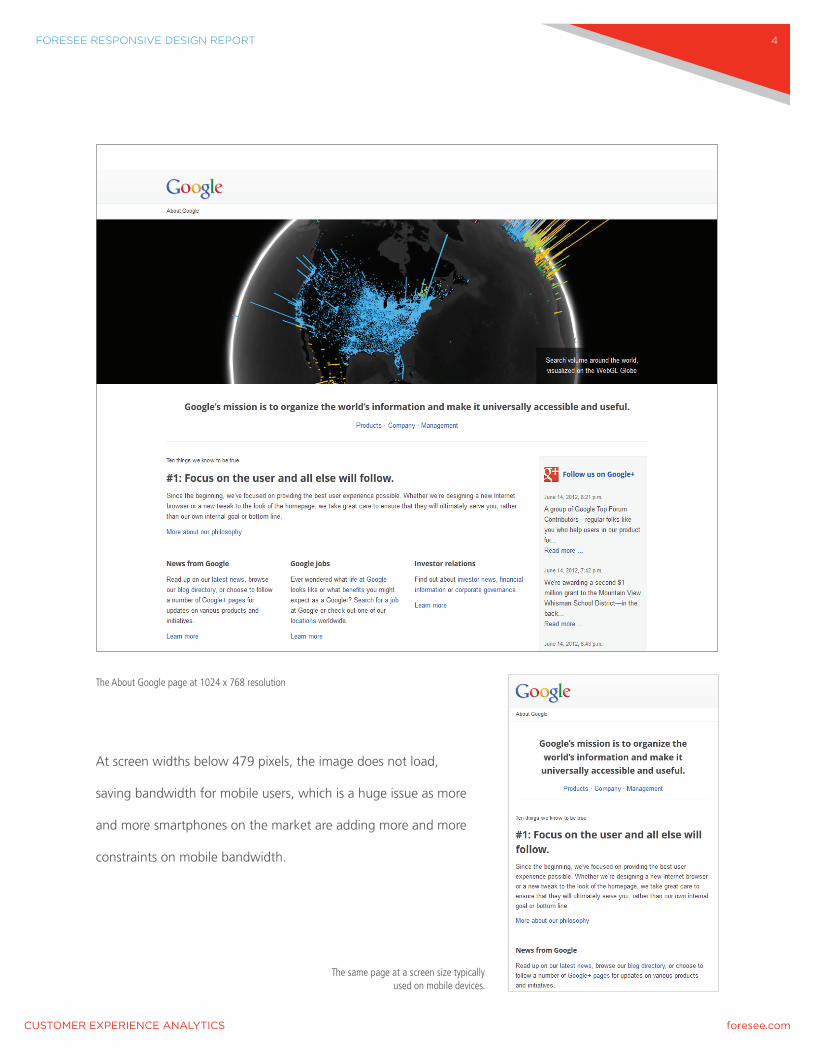
ent rules to change the layout in order to optimize for each screen size. A good example of this is the “About
Google” page. At resolutions above 1024 pixels wide, there is a large image at the top of the page.
FORESEE RESPONSIVE DESIGN REPORT 4
The About Google page at 1024 x 768 resolution
At screen widths below 479 pixels, the image does not load,
saving bandwidth for mobile users, which is a huge issue as more
and more smartphones on the market are adding more and more
constraints on mobile bandwidth.
The same page at a screen size typically used on mobile devices.

FORESEE RESPONSIVE DESIGN REPORT 5
HOW IT WORKS
The principles that underlie responsive design seem simple enough, but require browser support for a new
web standard – HTML 5 along with CSS3.
There are three basic elements that make this technique possible:
1.) A Flexible Grid
2.) CSS3 Media Queries
3.) Flexible Images and Media
Flexible Grids
Traditionally, sites have been designed for a specific minimum screen size, and as a consequence,
millions of web pages in existence today are optimized for the 1024 x 768 screen resolution. While this
approach ensures that sites work on the vast majority of devices, the experience is only optimal on some
desktop displays.
The resolution and size of desktop displays has continuously increased through the years. In the late 1990s,
screen resolutions of 800 x 600 were common. For a number of years, the most common screen resolution
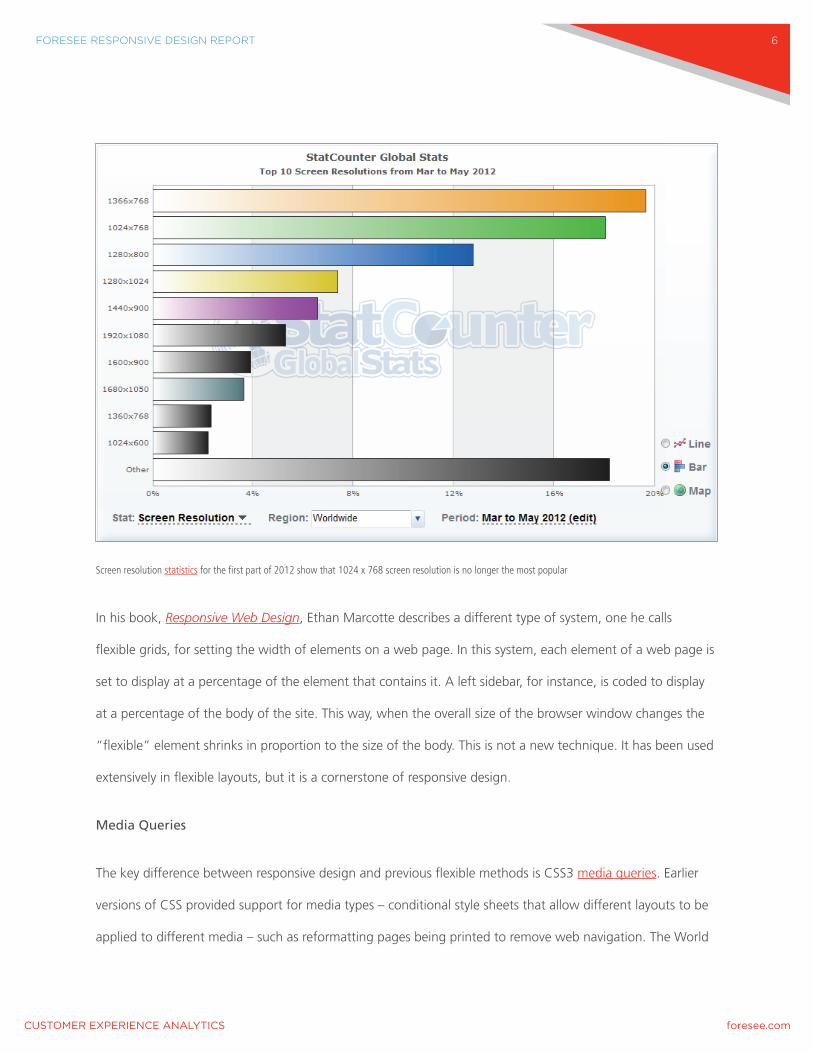
world-wide was 1024 x 768. In April of 2012, StatCounter reported for the first time that a new resolution
of 1366 x 768 is now the most commonly used. The physical size of computer monitors has grown as well.
While 800 x 600 sites were commonly displayed on 12 to 15 inch Cathode-ray Tube monitors, sites today
are displayed on desktop monitors as large as 30 inches. In addition, the arrival of new devices, such as the
iPad, are shifting the screen resolution picture, making it difficult to design sites for every possible device and
resolution combination.
FORESEE RESPONSIVE DESIGN REPORT 6
Screen resolution statistics for the first part of 2012 show that 1024 x 768 screen resolution is no longer the most popular
In his book, Responsive Web Design, Ethan Marcotte describes a different type of system, one he calls
flexible grids, for setting the width of elements on a web page. In this system, each element of a web page is
set to display at a percentage of the element that contains it. A left sidebar, for instance, is coded to display
at a percentage of the body of the site. This way, when the overall size of the browser window changes the
“flexible” element shrinks in proportion to the size of the body. This is not a new technique. It has been used
extensively in flexible layouts, but it is a cornerstone of responsive design.
Media Queries
The key difference between responsive design and previous flexible methods is CSS3 media queries. Earlier
versions of CSS provided support for media types – conditional style sheets that allow different layouts to be
applied to different media – such as reformatting pages being printed to remove web navigation. The World

FORESEE RESPONSIVE DESIGN REPORT 7
Wide Web Consortium (W3C) specification for CSS2 included a handheld media type, but the specification
did not provide the ability to query the device to detect screen size.
CSS3 media queries add a completely new capability level to web pages. Now, designers can code pages that
sense the size of the window being used to view the site and create new layout rules accordingly. Designers
can set resolution break points in their style sheets that serve up completely new layouts based on the device
and the size of the browser window. For instance, a site may be designed to display with three
columns of content at 1200 pixels and wider, reduce to two columns when the resolution falls below 800
pixels, and display content in one column for devices with less than 500 pixels wide resolution.
The list of device attributes that can be detected is extensive. The most important ones impacting responsive
designs are the width and height of the browser window, the device width and height, and the orientation of
the device – portrait or landscape.
Detecting both the size of the browser window and device width is an important consideration for mobile.
Many mobile browsers, including both iOS and Android, set the default viewport at around 1000 pixels to
accommodate zooming on sites that are not optimized for mobile. Detecting the device width means that
designers can create pages that fill the screen on devices with small displays.
Flexible Images and Media
The ability to resize images and media to fit the screen of mobile devices is critical to responsive designs.
Traditionally, pages are coded to display images using the HTML <img> tag and set to display at a fixed
width. Responsive designs require images that can be dynamically resized based on the device. This is also
one of the biggest technological hurdles to implementing responsive designs and will be discussed in more
depth later in this paper.

FORESEE RESPONSIVE DESIGN REPORT 8
PROS AND CONS OF RESPONSIVE DESIGN
As with all design patterns, responsive design has both advantages and disadvantages that organizations
need to think about before making the decision to implement it or not.
Pros
> Common Code Base – Responsive sites use one set of code for all devices, which means there is only
one site to maintain, which can translate to less cost over time.
> Accommodating Future Device Release – Responsive designs make it easy to adjust layouts for new
devices and screen resolutions such as Apple’s Retina Display. Rather than redesigning the site to fit
new technology, existing or new layout rules can be applied to optimize content.
> Partial Window Browsing – Users may have a 1920-pixel wide monitor, but may have their browser
window set to a width of 800 pixels. Responsive designs optimize content for any window size.
> Unified URL Structure – Using one URL throughout the experience eliminates the need for
complicated redirects and eliminates the possibility of mobile users accidentally being sent to the
desktop version of the site. One link is easily sharable for all devices.
Cons
> Development Costs – Responsive designs add costs to the development phase. Rather than
designing one interface, developers now need to code several and test them all.
> Mobile Bandwidth – Many mobile users have limited data plans. Designs that hide content and
resize large images for display on small screens can quickly eat up quotas. This also means that it
might take minutes to download something on a phone. With mobile users as impatient as they are,
slow download times might drive them to a faster site – a competitor’s site.

FORESEE RESPONSIVE DESIGN REPORT 9
> Cross Browser Compatibility – Older browsers, including IE 8 and earlier versions, which still account
for more than 20% of browsers in the U.S., do not support media queries.
> Image Resizing – Current HTML markup does not support dynamically resizing images based on the
resolution of the device. In addition, many modern browsers pre-fetch images before loading pages,
so it is not possible to serve images based on browser window size. This means that you must create
multiple versions of the same image to accommodate the range of breakpoints you intend to present
them within. This can result in a large database.
TECHNICAL CHALLENGES
New technologies always have implementation challenges, and responsive design is no exception. There are
two primary technical challenges that developers need to contend with in the foreseeable future:
cross-browser compatibility, and image resizing.
Cross-browser Compatibility
It is ironic that an industry that changes at lightning speed introduces new standards at a glacial pace. The
first working draft for CSS3 was published by the W3C in June of 1999. More than a decade later, it is still
considered a new standard and does not enjoy universal browser support.
While the newest browsers do support CSS3, IE 8.0, which still accounts for more than 20% of browsers
worldwide, does not have native CSS3 support. That means organizations need to think about how to
handle the almost 25% of visitors who won’t be able to view their sites as designed. It’s important to
note that technical errors on sites reflect badly on a company’s brand. To a majority of users, the company’s
website IS the brand. And a poor experience can have a significant impact on satisfaction at which
point the visitor’s likelihood to visit the site again, make a purchase, or recommend the site to others
drastically decreases.

FORESEE RESPONSIVE DESIGN REPORT 10
Internet Explorer 8 still accounts for nearly a quarter of all web browsers worldwide.
While the problem of browser compatibility will certainly abate with time, it will be years before users of
non-compliant browsers become a small enough group where it won’t be crucial to support them. As a frame
of reference, Internet Explorer 6 was introduced in 2001, and it was only recently, in June of 2011, that usage
statistics showed that it accounted for less than 5% of the browser market in the U.S. and Europe.
At that point many companies deemed it safe to stop supporting it.
Image Resizing
The hardest technical challenge for designers working on responsive sites is dynamically resizing images.
Using CSS2 to code images in flexible containers that resize for different sized windows is easy. The problem
is that mobile devices have to download the full-size image before sizing it to fit the display. In a world
where there are more and more constraints on mobile bandwidth due to rising adoption rates, this is a
huge problem.
FORESEE RESPONSIVE DESIGN REPORT 11
Unfortunately, designers can’t hack their way out of this situation. To address the issue of page load times,
browser manufacturers have designed a look ahead pre-parser that fetches the page assets before parsing
the CSS file that lays out the page. Jason Grigsby, who has created mobile apps for both the Obama
administration and The Wall Street Journal, says “We have an existential problem here. A chicken and egg
conundrum.” Images cannot be resized until the browser has parsed the CSS file, but browsers need to
fetch the images before parsing the code. New browser behavior and HTML markup are required to resolve
this problem.
There are currently several groups within the W3C that are working to solve this conundrum. The official
team working on the problem is the Web Hypertext Application Technology Working Group, which includes
representatives of most major browser manufacturers. They have proposed modifications to the <img> tag
that would allow designers to specify a range of resolution break points, and which does not depend on
media queries, as shown below.
<img src=”[email protected]” alt=””
set=”[email protected] 600w 200h 1x,
[email protected] 600w 200h 2x,
face-icon.png 200w 200h”>
Another team within the W3C debating the issue is the Responsive Images Community Group (RICG),
primarily composed of web designers. They have proposed a different solution involving a new HTML
element, the <picture> tag, which would depend on CSS3 media queries. Other designers have proposed
setting resolution breakpoints as a variable in the page <head> element.

FORESEE RESPONSIVE DESIGN REPORT 12
Regardless of the eventual solution, for the foreseeable future, anyone wishing to design a responsive site
will have to grapple with the problem of serving appropriately sized images for each device. Combine that
with the fact that, according to a 2012 Cisco study, 4G devices generated 28 times more traffic than non 4G
devices last year and it is clear that bandwidth is a major issue for mobile devices. The current path of
downloading full-size images on mobile devices and then resizing them is not a workable solution.
MOBILE FIRST
One design aspect receiving a lot of attention recently – often paired with responsive design – is the concept
of starting the design process by thinking about the mobile context first. While this was unnecessary just a
few short years ago, it now makes sense with the explosive growth in adoption of mobile devices.
The idea is simple. Rather than initially designing for the desktop experience and then shrinking or hiding
content to fit mobile devices, designers should first consider the mobile experience, and then progressively
add content and functionality for larger screens and higher screen resolutions.
In his 2011 book, Mobile First, Luke Wroblewski describes the advantages of using this technique, whether
you have a separate mobile site or a responsive one. Designing within the constraints of the mobile device
forces companies to have laser-like focus on the needs, wants, and expectations of their users. This means
you need to measure, learn, and understand how customers use your services while in a mobile context –
whether at home or elsewhere – and then designing for their needs.
Designing for the mobile context first and then progressively adding content and functionality means the
appropriate assets for the mobile experience are loaded by default. This means larger images are downloaded
only when the CSS file is parsed, thus getting around the issue of image resizing. In addition to saving
mobile bandwidth, this provides a reasonably usable interface if a customer is browsing your site on a
desktop browser where all of the media queries fail. This interface may not be pretty in IE6, but customers
can still accomplish their goals using it.

FORESEE RESPONSIVE DESIGN REPORT 13
SO, SHOULD YOU, OR SHOULDN’T YOU HAVE A RESPONSIVE SITE?
The answer to that largely depends on who you ask. The ForeSee credo is that you should always ask your
customers first, but customer response is not the only factor to consider.
Google recently announced in an official blog post that it prefers producing mobile sites using a responsive
design strategy. In the entry on their Webmaster Central Blog, they tout the advantages of having one URL
which makes content more discoverable by their web crawlers and making content discoverable is at the
heart of SEO.
The natural question is: will responsive sites rank higher than non-responsive pages in organic search results?
While they don’t address that question directly, they do say, “For responsive web design pages, any Google-
bot user-agents needs to crawl your pages once, as opposed to crawling multiple times with different user-
agents, to retrieve your content. This improvement in crawling efficiency can indirectly help Google index
more of the site’s contents and keep it appropriately fresh.”
One would think that Google’s endorsement would seal the deal and point to a future of all responsive sites.
However, there are some contrary opinions from some of the biggest players in the usability arena. Jakob
Nielsen, a pioneer and definitive voice in the field, argues against responsive designs. Nielsen views responsive
design as “repurposing” designs that almost always result in substandard user experiences.
Nielsen argues that the differences between desktop vs. mobile interfaces goes way beyond layout issues. He
notes that mobile use not only demands different layouts, it can often demand different content, and even
writing styles. He cites, for example, the success of sites such as The Huffington Post and Drudge Report over
sites that simply repurpose content originally designed for print.
FORESEE RESPONSIVE DESIGN REPORT 14
He also argues that in addition to interaction differences, most mobile sites demand a different – and
carefully thought out – content strategy to ensure that visitors can easily find the information they need.
Finally, he argues the decision about what type of mobile site to provide is not purely a usability decision. If a
company derives significant revenue from several platforms, and the primary use is different on each, it might
make sense to create different optimized sites for each experience.
Obviously, the decision about whether to use a responsive design or not is complex and will require extensive
thought. The list of issues to think through is long, but there are a few key ones that need extra attention:
Context
What are your users doing when accessing your site on a mobile device? Are they rushing for a train, killing
time in a doctor’s office, or trying to find the nearest claims center to assess the damage to their car after an
accident? Each of these cases may require different content, functionality, and site structure.

FORESEE RESPONSIVE DESIGN REPORT 15
The Geico desktop site is focused on the quote and policy purchase processes.
Unique Content
How similar is your mobile content vs. your desktop content. If your mobile site contains substantially dif-
ferent content than your desktop site, you may need a separate mobile site rather than a responsive site. A
good example is the Geico insurance site.

FORESEE RESPONSIVE DESIGN REPORT 16
The desktop users have all the tools they need to
research insurance, get a quote, or find an agent.
Mobile users are provided prominent linkage to Ac-
cident Assistance, including a section about what to
do while at the scene of an accident. This is content
that doesn’t exist on the desktop site.
Redesign
Implementing a responsive design means
redesigning all of your sites. If you have a desktop
site that is working well for you and satisfying
your customers, it may be more cost effective to
build a separate mobile site rather than redesign
your desktop site.
FINAL THOUGHTS
Responsive design has the potential to make
browsing across devices a seamless experience.
But after carefully considering all the options, the
answer to the question of whether to implement it on your site is simple: It depends.
The only way you can truly know is by asking your customers, measuring their experiences the right way –
with a scientific, proven methodology – and make the changes they dictate.
The mobile site has linkage to accident assistance.

FORESEE RESPONSIVE DESIGN REPORT 17
ABOUT THE AUTHOR
Bruce Shields is a Usability Team Lead at Foresee. He holds a master’s degree in Human Computer
Interaction from the University of Michigan, and has led an internal research taskforce focusing on
responsive design. Prior to joining Foresee, Bruce was a career journalist and helped lead web and
multimedia efforts for several publications.
ABOUT FORESEE
As a pioneer in customer experience analytics, ForeSee continuously measures satisfaction and delivers
powerful insights on where to prioritize improvements for maximum impact. ForeSee applies its trusted
technology across channels and customer touch points, including websites, contact centers, brick-and-mortar
locations, mobile experiences, and social media interactions. Because ForeSee’s proven methodology
measures satisfaction in a manner that is predictive of customer loyalty, purchase behavior, future financial
success, and even stock prices, executives and managers are able to drive future success by confidently
prioritizing the efforts that they know will achieve business goals.
Working across the public and private sectors, with deep expertise in a range of business and consumer
-industries, ForeSee combines the best in customer satisfaction measurement, proven predictive analytics,
actionable usability analysis, and rich observational data to work with large and small organizations around
the world. The result of measuring success through the customers’ eyes is better outcomes for businesses
and a better experience for consumers.
Visit www.foresee.com for customer experience solutions.
FS-1269-414


![Cascading Style Sheets, Level 2 · PDF fileCascading Style Sheets, level 2 ... A brief CSS2 tutorial for XML [p. 20] 3. The CSS2 processing model ... Font specification [p. 149]](https://img.dokumen.tips/doc/110x75/5aade7257f8b9a59478b5fb7/cascading-style-sheets-level-2-style-sheets-level-2-a-brief-css2-tutorial.jpg)