Embed Size (px)
Citation preview

Resonant Laboratory and Candela: Spreading Your Visualization Ideas tothe Masses
Alex Bigelow∗
University of UtahRoni Choudhury†
Kitware, Inc.Jeffrey Baumes‡
Kitware, Inc.
1 INTRODUCTION
Visualization practitioners are constantly developing new, innova-tive ways to visualize data. However, while many of these new tech-niques are general enough to be useful to a wide audience, many ofthem do not make it into production in professional systems.
There are many reasons that this happens. Academic researchersoften don’t have the funding or time to continue work on tools oncea paper has been published. Many tools aren’t engineered to handlereal-world datasets—software that we see at conferences like IEEEVIS are often designed as demonstrations of research concepts, notas tools for real data analysts to use. Furthermore, connecting datato these tools is often non-trivial—to even try out a tool with theirown data, users often have to follow complex setup procedures, in-cluding running shell scripts, moving files to special places, settingup servers or databases, or even programming.
In recent years, we have seen dramatic improvements with regardto archiving and reusing basic information visualization techniquesthrough efforts such as bl.ocks.org and Treevis [14]. How-ever, while these archival demonstrations of techniques are givingnew users exposure to the rich world of data visualization, actuallyconnecting a dataset to one of these visualizations still requires adegree of expertise beyond most users.
We have developed and informally tested two systems that canhelp solve these two inter-related problems. Candela is a frame-work and API for creating visualization components for the webthat can wrap up new or existing visualizations as needed. BecauseCandela’s API generalizes the inputs to a visualization, we havealso developed a system called Resonant Laboratory that makes itpossible for novice users to connect arbitrary datasets to Candelavisualizations. Together, these systems enable novice users to ex-plore and share their data with the growing library of state-of-the-artvisualization techniques.
2 RELATED WORK
The scope of this work is limited to the problem of connecting adataset to a visualization and sharing the result. While some over-lap exists, its primary focus is not attempt to address the problemsof data reshaping [16, 11], visualization creation [13, 6], or visu-alization customization [10, 7]. For example, Resonant Laboratorysupports some data reshaping tasks, such as paging and filtering—but it only provides these features as far as they assist in the con-nection problem. Instead, the goal is for Resonant Laboratory towork alongside data reshaping tools, such as those cited above.
Our systems come closest to functionality present in tools likeTableau [15], Plotly [5], Raw [8], and Polestar / Voyager [17]. Com-pared to these systems, there are three significant advantages thatCandela and Resonant Laboratory bring:
∗e-mail: [email protected]†[email protected]‡[email protected]
1. Candela can incorporate new visualization techniques verysoon after code is available. For example, anyone can create aCandela wrapper for the published source code of UpSet [12]directly (see Figure 5), rather than wait for a professional teamto re-implement the technique as part of a proprietary system.
2. Resonant Laboratory adds database connectivity with filter-ing and sampling features (see Figure 4). Cutting-edge vi-sualization techniques that weren’t designed to work at scalecan now use these features right out of the box.
3. Candela and Resonant Laboratory are open source projects,released under a permissive Apache License.
Naturally, each of the tools mentioned above have slightly differ-ent objectives, that are in turn slightly different from those of Can-dela and Resonant Laboratory. Powerhouse programs like Tableautake a different approach to visualization design, emphasizing dif-ferent sets of features for different target audiences, and the tech-niques for matching data attributes to visual encoding channels dif-fer across each of these tools. Observing the differences betweenexisting approaches to the matching problem is not without prece-dent [17], and future research can and should be conducted in thisdirection.
3 CANDELA
Candela [2] is a JavaScript framework library for creating, running,and sharing visualization components for the web using a standard-ized API that aims for simplicity and generality. It serves as theengine for driving visualizations in Resonant Laboratory.
Components are simple: the VisComponent class has a construc-tor for initializing a component with the DOM element where it willlive, and a render() method to specify how it is drawn. Other com-monly needed functionality, such as automatic resize behavior andevent management, is provided via mixin classes; traditional OOPtechniques such as subclassing can also extend functionality.
A component can declare its expected inputs by describing thetypes of input data fields that are meant for certain visual channels.For instance, as shown in Figure 1, a scatterplot might require twonumeric data column inputs, one for each axis, and additional op-tional inputs, such as text labels. Resonant Laboratory uses suchspecifications to build its matching UI, enabling users to match dif-ferent columns with visual channels on demand.
Candela ships with several predesigned, general-purpose com-ponents. Several are driven with Vega specifications [3] to createbasic chart types such as scatterplots, bar charts, and line charts.Others wrap around existing, independently developed visualiza-tions such as LineUp [9] and UpSet [12], using the input specifi-cation approach to allow them to be interactively driven from Res-onant Laboratory. Doing so takes some manual work to identifyhow the foreign component is instantiated, how it receives input,and what kinds of events or signals it expects to respond to. De-spite the fact that the process is currently not automatable, we havehad success in “porting” several such components into Candela, in-clude LineUp, UpSet, and OnSet. Candela’s general and flexibleAPI enables the creation of varied and unanticipated visualizationcomponents, whether general purpose offerings such as those that
ship with the library (e.g. bar charts, scatter plots, etc.), or project-specific components that take advantage of the API and standardmixins for consistency and reusability. Examples might includea survivability plot for visualizing experimental drug therapy out-comes, using mixins to make such a chart automatically resize inthe space provided to it, or to connect and deliver external UI eventsto the component to highlight one drug therapy course or another.Many such components can be automatically exposed via ResonantLaboratory, widening their appeal to general audiences who are un-willing or unable to do the programming to use such tools underordinary circumstances.
4 RESONANT LABORATORY
Resonant Laboratory1 is a web application with a Girder [1] back-end that consequently has support for user account administration.As shown in Figure 2, it provides a secure location for users to storeand manage their datasets in the cloud.
In Resonant Laboratory, users create projects, which we defineas a dataset, a Candela component, and the matchings betweenthem. As shown in Figures 1 and 3, Resonant Laboratory includesthree collapsible views: a Dataset panel, a Matching panel, and aVisualization panel.
A major bottleneck in visualization is simply the amount of datathat can be displayed at a time. This is especially true of web-basedvisualizations where data must pass over a network, and fit inside abrowser’s available memory. Resonant Laboratory’s Dataset panel,outlined in Figure 4, includes basic tools for specifying how data isto be parsed and interpreted. It includes paging tools for control-ling how many data items are loaded and passed to the visualiza-tion. Overview histograms provide tools for filtering every attributein the dataset. These work together to help users understand theeffect of any filters on the whole dataset, and provide context as towhere the current page of data exists within the filtered set. By giv-ing users the power to filter and page their data in this way, thesetools make it possible to work with datasets that are an order ofmagnitude larger than what could traditionally fit in a browser.
Figures 1, 3, and 5 showcase its simple interface for establish-ing a many-to-many matching between the attributes of a datasetand the visual encodings available in a visualization. We conductedvery informal user tests with eleven employees at Kitware Inc., anopen source software company specializing in visualization, amongother things. Participants ranged in expertise from programmersto communications specialists to graphic designers—all users wereable to understand and use this interface with little to no difficulty,and in most cases users were able to perform the interactions with-out any instruction or demonstration. We are planning formal re-search in this direction, comparing Resonant Laboratory to otherdataset-to-visual encoding matching interfaces.
The visualization panel embeds a Candela component. Figure 6shows that, in addition to the ability to share projects via a URL,Resonant Laboratory exposes Candela’s ability to export vector andbitmap images, as well as self-contained, interactive HTML files.This makes it possible to share visualizations in almost any con-ceivable way: a static image of the visualization can be customizedand annotated in bitmap or vector drawing programs. Because theinteractive HTML file can simply be opened in a browser, it can beshared via email, hosted via file sharing services, or embedded in aniframe in existing web pages—without any server configuration.A link to the original project in Resonant Laboratory and its asso-ciated dataset can be shared, enabling improved data provenance:recipients of the link can explore and change their own copies ofthe visualization for themselves. The possibilities for connectingvisualization prototypes to bigger audiences than even before seemendless.
1A public deployment is available at http://resonantlab.kitware.com
5 FUTURE WORK
Candela and Resonant Laboratory are projects that are focused ondoing one thing, and doing it well. Candela makes it possible toreuse cutting-edge visualizations with arbitrary datasets, and Reso-nant Laboratory provides an intuitive and powerful, yet simple in-terface for novice users to connect datasets to a Candela component.
These technologies have additional features, such as parsing set-tings that can help with data cleaning, paging and filtering that ad-dress some data scalability problems, and export capabilities thathelp smooth the process of sharing or presenting a visualization.However, these features are not the focus—Resonant Laboratorydoes not solve scalability issues that cannot be addressed via filter-ing and paging, nor does Candela address the problems of designingor customizing visualizations. Instead, future work will likely in-volve separate applications dedicated to these separate tasks, suchas another Girder plugin that reshapes or aggregates a dataset priorto exploration in Resonant Laboratory, or integration with existingtools that could be used to interactively design and customize Can-dela components. We also plan to explore ways to improve thesetwo systems’ main focus, including support for creating multiplelinked views, embedding views in external pages, and support forgraph visualizations.
ACKNOWLEDGEMENTS
This work is sponsored in part by the Air Force Research Labora-tory and the DARPA XDATA program.
REFERENCES
[1] http://girder.readthedocs.io.[2] https://github.com/kitware/candela.[3] https://github.com/vega/vega/wiki.[4] https://jsfiddle.net.[5] https://plot.ly/.[6] A. Bigelow, S. Drucker, D. Fisher, and M. Meyer. Iterating between
tools to create and edit visualizations. Visualization and ComputerGraphics, IEEE Transactions on, 2016. To appear.
[7] S. Carter, G. Aisch, and M. Bostock. Svg crowbar, 2015.[8] G. Caviglia, M. Mauri, M. Azzi, and G. Uboldi. Raw: The missing
link between spreadsheets and vector graphics, 2013.[9] S. Gratzl, A. Lex, N. Gehlenborg, H. Pfister, and M. Streit. Lineup:
Visual analysis of multi-attribute rankings (best paper award). IEEETransactions on Visualization and Computer Graphics (InfoVis ’13),19(12):2277–2286, 2013.
[10] J. Harper and M. Agrawala. Deconstructing and restyling d3 visual-izations. In Proceedings of the 27th Annual ACM Symposium on UserInterface Software and Technology, UIST ’14, pages 253–262, NewYork, NY, USA, 2014. ACM.
[11] S. Kandel, A. Paepcke, J. Hellerstein, and J. Heer. Wrangler: Interac-tive visual specification of data transformation scripts. In ACM HumanFactors in Computing Systems (CHI), 2011.
[12] A. Lex, N. Gehlenborg, H. Strobelt, R. Vuillemot, and H. Pfister. Up-set: Visualization of intersecting sets. IEEE Transactions on Visual-ization and Computer Graphics, 20(12):1983–1992, Dec 2014.
[13] A. Satyanarayan and J. Heer. Lyra: An interactive visualization designenvironment. Comput. Graph. Forum, 33(3):351–360, June 2014.
[14] H. J. Schulz. Treevis.net: A tree visualization reference. IEEE Com-puter Graphics and Applications, 31(6):11–15, Nov 2011.
[15] C. Stolte, D. Tang, and P. Hanrahan. Polaris: a system for query,analysis, and visualization of multidimensional relational databases.IEEE Transactions on Visualization and Computer Graphics, 8(1):52–65, Jan 2002.
[16] R. Verborgh and M. De Wilde. Using OpenRefine. Packt PublishingLtd, 2013.
[17] K. Wongsuphasawat, D. Moritz, A. Anand, J. Mackinlay, B. Howe,and J. Heer. Voyager: Exploratory analysis via faceted browsing ofvisualization recommendations. Visualization and Computer Graph-ics, IEEE Transactions on, 22(1):649–658, Jan 2016.
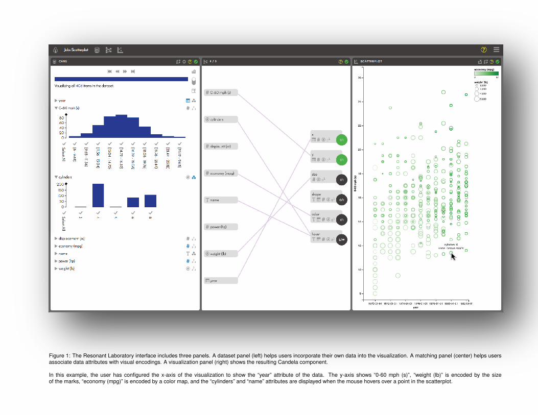
Figure 1: The Resonant Laboratory interface includes three panels. A dataset panel (left) helps users incorporate their own data into the visualization. A matching panel (center) helps usersassociate data attributes with visual encodings. A visualization panel (right) shows the resulting Candela component.
In this example, the user has configured the x-axis of the visualization to show the “year” attribute of the data. The y-axis shows “0-60 mph (s)”, “weight (lb)” is encoded by the sizeof the marks, “economy (mpg)” is encoded by a color map, and the “cylinders” and “name” attributes are displayed when the mouse hovers over a point in the scatterplot.
Figure 2: Users can control the visibility of datasets and projects. Even more advanced controls, such as file organization or granting user-specific access permissions, can be accessed inthe Girder interface. When users interact with a project that they do not own, a copy is automatically created. When users are logged out or do not have an account, a public scratch space isused, similar in spirit to online services such as JSFiddle [4].
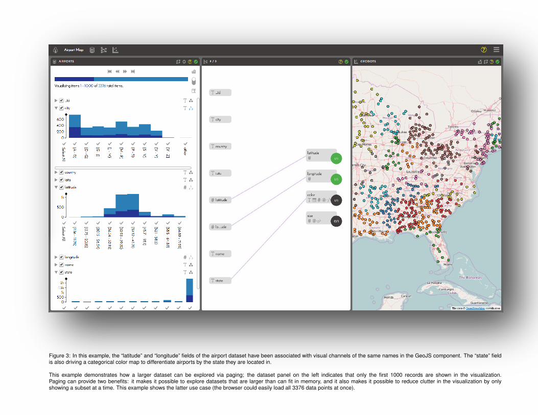
Figure 3: In this example, the “latitude” and “longitude” fields of the airport dataset have been associated with visual channels of the same names in the GeoJS component. The “state” fieldis also driving a categorical color map to differentiate airports by the state they are located in.
This example demonstrates how a larger dataset can be explored via paging; the dataset panel on the left indicates that only the first 1000 records are shown in the visualization.Paging can provide two benefits: it makes it possible to explore datasets that are larger than can fit in memory, and it also makes it possible to reduce clutter in the visualization by onlyshowing a subset at a time. This example shows the latter use case (the browser could easily load all 3376 data points at once).
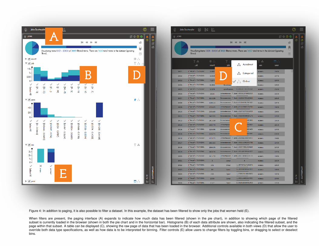
Figure 4: In addition to paging, it is also possible to filter a dataset. In this example, the dataset has been filtered to show only the jobs that women held (E).
When filters are present, the paging interface (A) expands to indicate how much data has been filtered (shown in the pie chart), in addition to showing which page of the filteredsubset is currently loaded in the browser (shown in both the pie chart and in the horizontal bar). Histograms (B) of each data attribute are shown, also indicating the filtered subset, and thepage within that subset. A table can be displayed (C), showing the raw page of data that has been loaded in the browser. Additional controls available in both views (D) that allow the user tooverride both data type specifications, as well as how data is to be interpreted for binning. Filter controls (E) allow users to change filters by toggling bins, or dragging to select or deselectbins.
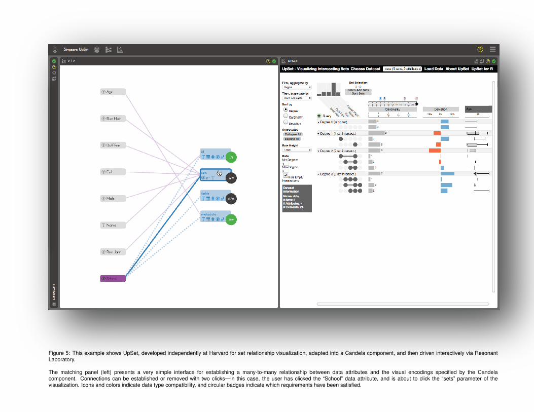
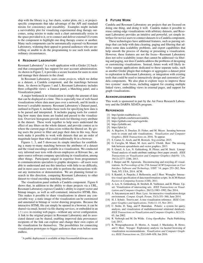
Figure 5: This example shows UpSet, developed independently at Harvard for set relationship visualization, adapted into a Candela component, and then driven interactively via ResonantLaboratory.
The matching panel (left) presents a very simple interface for establishing a many-to-many relationship between data attributes and the visual encodings specified by the Candelacomponent. Connections can be established or removed with two clicks—in this case, the user has clicked the “School” data attribute, and is about to click the “sets” parameter of thevisualization. Icons and colors indicate data type compatibility, and circular badges indicate which requirements have been satisfied.
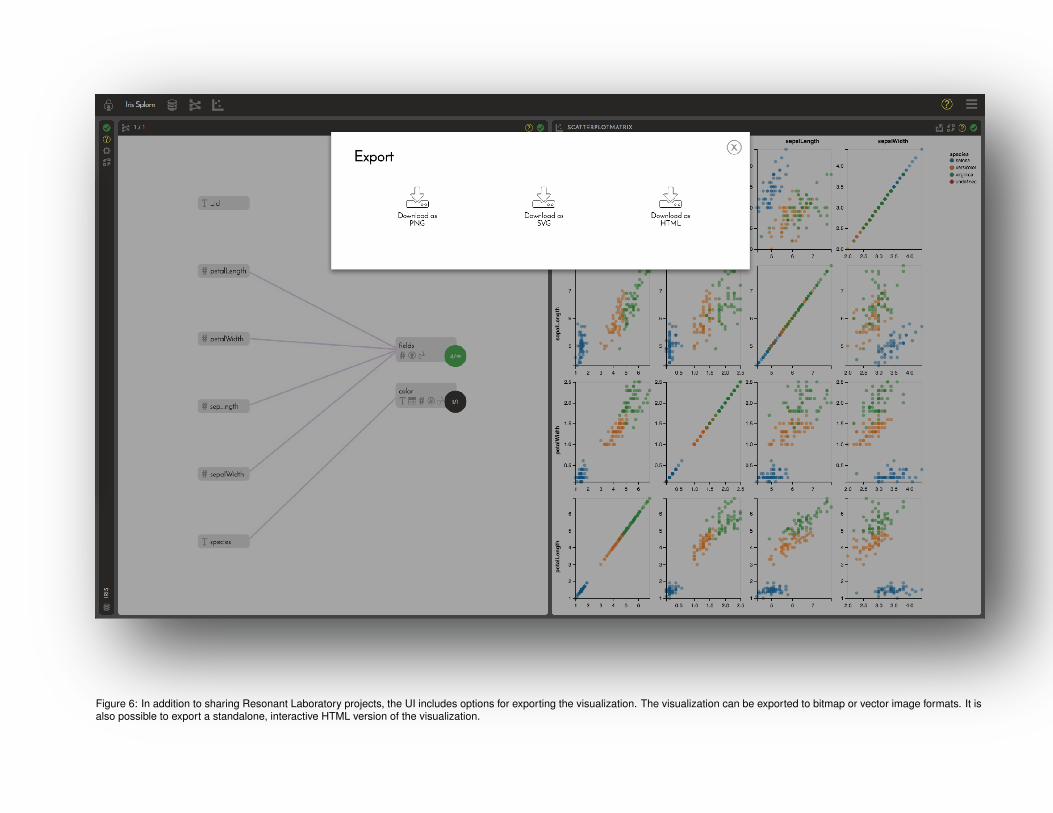
Figure 6: In addition to sharing Resonant Laboratory projects, the UI includes options for exporting the visualization. The visualization can be exported to bitmap or vector image formats. It isalso possible to export a standalone, interactive HTML version of the visualization.