Embed Size (px)
Citation preview
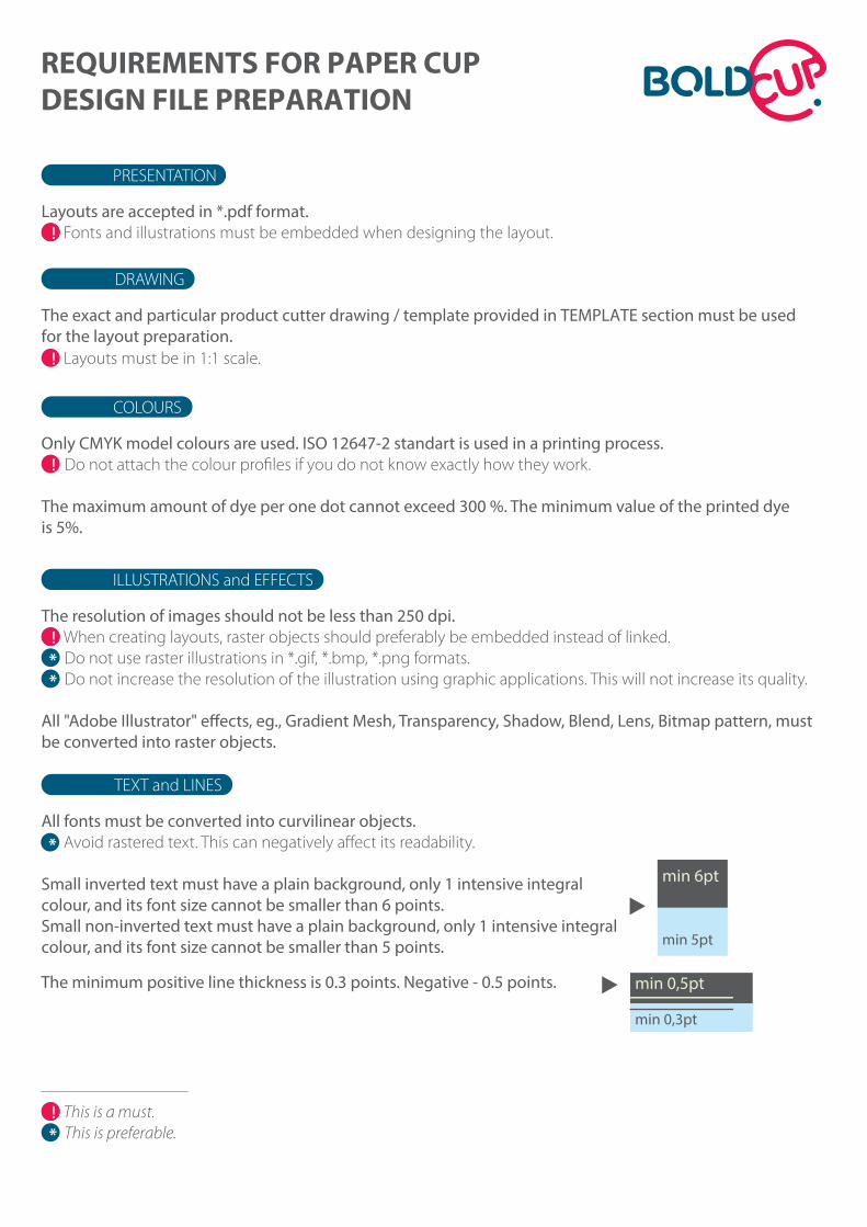
Layouts are accepted in *.pdf format. Fonts and illustrations must be embedded when designing the layout.
REQUIREMENTS FOR PAPER CUPDESIGN FILE PREPARATION
PRESENTATION
The exact and particular product cutter drawing / template provided in TEMPLATE section must be usedfor the layout preparation. Layouts must be in 1:1 scale.
DRAWING
Only CMYK model colours are used. ISO 12647-2 standart is used in a printing process. Do not attach the colour profiles if you do not know exactly how they work.
The maximum amount of dye per one dot cannot exceed 300 %. The minimum value of the printed dye is 5%.
COLOURS
The resolution of images should not be less than 250 dpi. When creating layouts, raster objects should preferably be embedded instead of linked.
Do not use raster illustrations in *.gif, *.bmp, *.png formats. Do not increase the resolution of the illustration using graphic applications. This will not increase its quality.
be converted into raster objects.
ILLUSTRATIONS and EFFECTS
All fonts must be converted into curvilinear objects.Avoid rastered text. This can negatively affect its readability.
Small inverted text must have a plain background, only 1 intensive integral colour, and its font size cannot be smaller than 6 points.Small non-inverted text must have a plain background, only 1 intensive integral colour, and its font size cannot be smaller than 5 points.
TEXT and LINES
min 6pt
min 5pt
The minimum positive line thickness is 0.3 points. Negative - 0.5 points. min 0,5pt
min 0,3pt
*
This is a must.This is preferable.*
*
*

*
Bleed requirements indicated in the drawing must be followed. There should be no objects outside the bleed zone.
BLEED AND ADHESIVE ZONES
LAYOUT BENDING
1 42-3
1
2 3
4 Visible zone Bleed zone
Visible zoneBleed zone Guide lines
Method 1. We recommend preparing layouts with complex back-ground structure and graphic elements that must match by the adhesive line (more information in the Object Matching section) by using our rectangular pattern.
Do not move the rectangular and the bent template in terms of each other. After finishing the rectangular layout, bend it based on the bleedzone line of the bent layout (eg., Adobe Illustrator function Object>Envelope Distort>Make with top object by setting the Fidelity value to 100 in the Envelope options section before that)
Bleed zoneVisible zone
OBJECT MATCHING
It is necessary to know a few principles in order to achieve cup object integrity by the adhesive line. Remem-ber that technical discrepancies (which are unavoidable) may occur due to the possibility of minor errors during the formation of cups. Therefore, it is recommended to avoid linking elements by the adhesive line.
Method 2. We recommend bending objects of layouts with simple or plain background one at a time, based on the guide lines.
When bending object one at a time, a more accurate projection is obtained (eg., when using Adobe Illustrator function Effect>Warp>Arc and selecting Bend percentage value, bending the object evenly according to the guide lines).
cc
aa
bb
Objects are matched based on the visible area, but must be continued to the bleed zone.
design is not matched in the adhesive area. The matching is not mandatory and is entirely your choice.
It is necessary to pay attention to the distance from the object to the top and bottom of the visible zone of the cup. The width of an object must be even in the matched areas.All distances (in example: a, b, c) must be even.
See example, when the
Clarification of bleed used in the production of cups
*
This is a must.This is preferable.*
2. Bleed for the cut-o�zone
1. Inward bleed for the turn zone 3. Bleed for the adhesive zone 4. Bleed for the bottom folding zone

This is a very fast and easy way. Most designs are prepared according to a similar principle, however, in certain cases, those with a sharper eye will often find drawbacks in this method.Pay attention to the structure of the background and the arrange-ment of its objects by the visible zone (green) line. All objects are perfectly aligned. However, when viewing the two small logos on the bottom left corner, we can clearly see that they are visually compressed. Just like the COFFEE inscription. Whereas the VILNIUS inscription is visually stretched out. This is a natural conical cup design effect, which isperfectly reflected in the vertical text Taste it Taste it..... By looking more closely you will see that the text fragment in the middle is not stretched out nor compressed. Whereas the fragment is stretched out at the top and compressed at the bottom. You will also be able to notice the same stretching and compressing effect in the background circles, however, this is normal practice in terms of background, when the aim is to achieve a smooth texture by the adhesive line. Objects in the middle of the cup are least affected, just like the circle with the word loves, and the already mentioned Taste it text fragment in the middle. However, we should not forget that we are now looking at a flat layout. If the circle with the word loves now looks nearly perfectly round to us, on the cup it will look more like a slightly com-pressed oval, as the surface of the cup is not flat but convex. It is difficult to estimate this, however, we can check this by simply print-ing out the layout with a household printer and twisting the supposed cup.
This method requires more time, but is considered to be a better alternative in certain cases. All objects in this figure, i.e., VILNIUS, COFFEE, circle with the word loves, small logos, Taste it... and the back-ground were bent one at a time according to the guide lines, as described in method 2. All objects are slightly stretched, but the stretching effect visually disappears when the layout is formed into a cup, on a convex surface. Therefore, nearly all of the objects are left with their original proportions. With the exception of the background, which, using the Arc function, is quite difficult to match with the visible zone (green) line and maintain the integrity of the texture.
Good Bad
But no matter which method you choose, always pay attention to the guide (yellow) lines. Objects in the layout should be formed/bent parallel to the vertical and horizontal guide lines.
1
2
3
4
METHOD USAGE EXAMPLES
METHOD ONE
METHOD TWO
WARP GUIDE LINES
Let's say that we have prepared a design (Fig. 1) based on the dimensions of the rectangular pattern. We also have a rather tricky background texture and a number of individual elements in the layout.
Let's bend the layout (Fig. 2) as described in method 1.
Let's bend the layout (Fig. 3) as described in method 2.
Thus, after evaluating all the advantages and disadvantages of methods 1 and 2, we can decide which method should be used in which situation. In this case it is clear that the background should be bent using method 1, while the remaining objects - using method 2. The result is shown in figure 4.
The examples are shown on the right.

![Pet cup Paper Bakeware...Pet cup Paper Bakeware. PTC05030 [1503001] ペットカップ (ポルカドット ピンク). PTC05030 [1503005] ペットカップ (ストライプ](https://img.dokumen.tips/doc/110x75/6125762e126d42668e401fe6/pet-cup-paper-bakeware-pet-cup-paper-bakeware-ptc05030-1503001-fffffff.jpg)