Embed Size (px)
Citation preview

COMP10120 Lab Session3
Report writing andDigital Typography
Contents3.1 Introduction . . . . . . . . . . . . . . . . . . . 83.2 Getting started . . . . . . . . . . . . . . . . . 9
Exercise 1: A closer look . . . . . . . . 9Exercise 2: A larger example . . . . . 12
3.3 Common formatting features . . . . . . . . . 223.3.1 Enumerated and bulleted lists . . . . 223.3.2 Changing the appearance of text . . . 233.3.3 Cross referencing . . . . . . . . . . . . 233.3.4 Figures and pictures . . . . . . . . . . 25
Exercise 3: Including images . . . . . 26Exercise 4: A reflection on your studies 27
October 13, 2017 7

COMP10120 Report writing and Digital Typography
3.4 Typesetting Mathematics . . . . . . . . . . . 283.4.1 A longer piece of mathematics . . . . 32
Exercise 5: Formatting mathematics . 343.5 Some optional extras . . . . . . . . . . . . . . 35
Exercise 6: Exploring more LATEX fea-tures (optional, but easy) . . . . . . . . 35Exercise 7: A neat directory listing(optional, more challenging) . . . . . 36Exercise 8: A cleaning rota (optional,even more challenging) . . . . . . . . 37
3.5.1 Marking Scheme . . . . . . . . . . . . 373.6 Next steps . . . . . . . . . . . . . . . . . . . . 383.7 Acknowledgements . . . . . . . . . . . . . . 39
These notes are available online atstudentnet.cs.manchester.ac.uk/ugt/COMP10120/labscripts/101lab3.pdf
3.1 Introduction
LATEX is a document preparation system that is funda-mentally different to anything that you are likely to haveseen before. It’s used worldwide by publishers, aca-demics and scientists and it happens to be very goodfor writing CVs too.
8

COMP10120 Report writing and Digital Typography
3.2 Getting started
Please complete all the exercises in thislab in your COMP10120/ex3 directory. Whenyou have completed as much as youare going to do, you should run submitand (when next in the School) labprint.
Exercise 1: A closer look
Fire up your favourite editor, enter the following text(it’s important that you enter it exactly as it is below fornow), and then save it as a file called fire-and-ice.tex
(in case you’re wondering, it’s the first line from a shortpoem called ‘Fire and Ice’ by American poet RobertFrost (R. Frost, 1924); the whole poem is on the PoetryFoundation website if you’re interested.)
\documentclass[a4paper]{article}\begin{document}Some say the world will end in fire,\end{document}
Next, run the command pdflatex fire-and-ice.tex(for now it’s sufficient to say that pdflatex invokesLATEX to create a PDF file as the output; the full story isa bit more complicated.)
9

COMP10120 Report writing and Digital Typography
LATEX will process your file, and print out a surpris-ingly large amount of text into the shell window as itdoes so. If all is well, the last two lines printed out willbe something like:
Output written on fire-and-ice.pdf (1 page, 11853 bytes).Transcript written on fire-and-ice.log.
after which LATEX will return you to the command prompt.If you’ve made a mistake typing in the file, LATEX willstop part way through processing your work, and dis-play an error (possibly, quite an obscure one) and showa ‘?’ prompt. The best thing to do at this stage is topress <ctrl>d, or x, to tell LATEX to give up trying toprocess your file. Then fix the mistake, and try again.
If you now list the directory contents, you shouldsee that a file fire-and-ice.pdf has been created (alongwith two other files, fire-and-ice.aux and fire-and-ice.log
both of which we will ignore for now). Use one of thePDF readers (such as evince
evince
) to look at the contentsof fire-and-ice.pdf. Admittedly, it’s not the most ex-citing result; if everything has worked properly so far,you should see a single-page document with the words‘Some say the world will end in fire,’ a little way downfrom the top of the page1.
1If you have been carried away with the sheer excitement and joy of learningto use LATEX and improvised the text rather than typing the first line of ‘Fire and
10
COMP10120 Report writing and Digital Typography
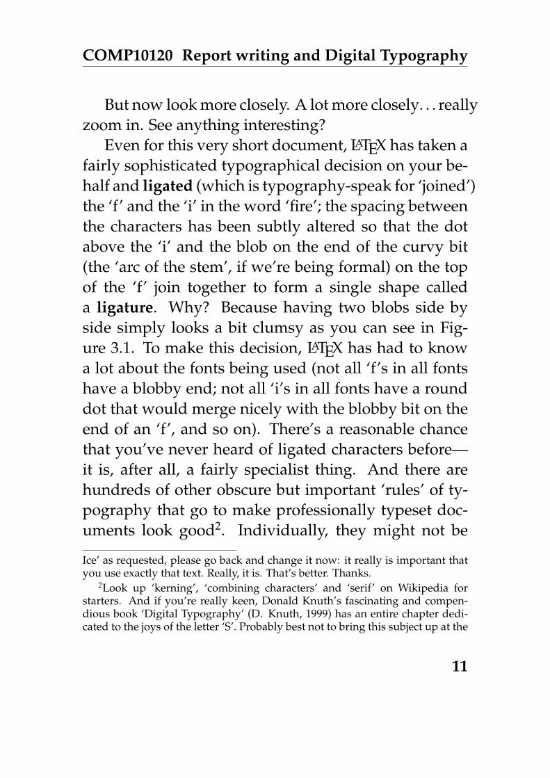
But now look more closely. A lot more closely. . . reallyzoom in. See anything interesting?
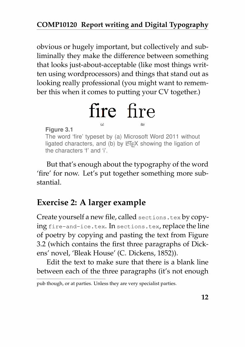
Even for this very short document, LATEX has taken afairly sophisticated typographical decision on your be-half and ligated (which is typography-speak for ‘joined’)the ‘f’ and the ‘i’ in the word ‘fire’; the spacing betweenthe characters has been subtly altered so that the dotabove the ‘i’ and the blob on the end of the curvy bit(the ‘arc of the stem’, if we’re being formal) on the topof the ‘f’ join together to form a single shape calleda ligature. Why? Because having two blobs side byside simply looks a bit clumsy as you can see in Fig-ure 3.1. To make this decision, LATEX has had to knowa lot about the fonts being used (not all ‘f’s in all fontshave a blobby end; not all ‘i’s in all fonts have a rounddot that would merge nicely with the blobby bit on theend of an ‘f’, and so on). There’s a reasonable chancethat you’ve never heard of ligated characters before—it is, after all, a fairly specialist thing. And there arehundreds of other obscure but important ‘rules’ of ty-pography that go to make professionally typeset doc-uments look good2. Individually, they might not be
Ice’ as requested, please go back and change it now: it really is important thatyou use exactly that text. Really, it is. That’s better. Thanks.
2Look up ‘kerning’, ‘combining characters’ and ‘serif’ on Wikipedia forstarters. And if you’re really keen, Donald Knuth’s fascinating and compen-dious book ‘Digital Typography’ (D. Knuth, 1999) has an entire chapter dedi-cated to the joys of the letter ‘S’. Probably best not to bring this subject up at the
11
COMP10120 Report writing and Digital Typography
obvious or hugely important, but collectively and sub-liminally they make the difference between somethingthat looks just-about-acceptable (like most things writ-ten using wordprocessors) and things that stand out aslooking really professional (you might want to remem-ber this when it comes to putting your CV together.)
Figure 3.1The word ‘fire’ typeset by (a) Microsoft Word 2011 withoutligated characters, and (b) by LATEX showing the ligation ofthe characters ‘f’ and ‘i’.
But that’s enough about the typography of the word‘fire’ for now. Let’s put together something more sub-stantial.
Exercise 2: A larger example
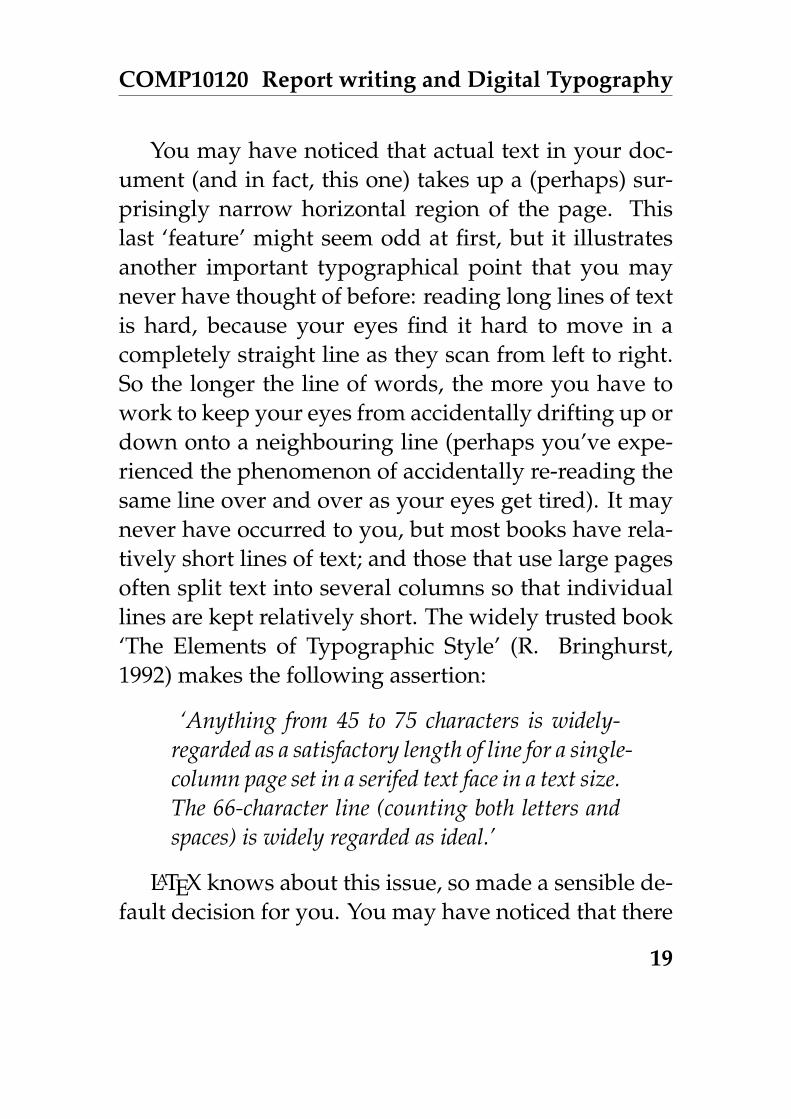
Create yourself a new file, called sections.tex by copy-ing fire-and-ice.tex. In sections.tex, replace the lineof poetry by copying and pasting the text from Figure3.2 (which contains the first three paragraphs of Dick-ens’ novel, ‘Bleak House’ (C. Dickens, 1852)).
Edit the text to make sure that there is a blank linebetween each of the three paragraphs (it’s not enough
pub though, or at parties. Unless they are very specialist parties.
12

COMP10120 Report writing and Digital Typography
London. Michaelmas term lately over, and theLord Chancellor sitting in Lincoln’s Inn Hall.Implacable November weather. As much mud inthe streets as if the waters had but newly retiredfrom the face of the earth, and it would not bewonderful to meet a Megalosaurus, forty feetlong or so, waddling like an elephantine lizardup Holborn Hill. Smoke lowering down fromchimney-pots, making a soft black drizzle, withflakes of soot in it as big as full-grownsnowflakes–gone into mourning, one mightimagine, for the death of the sun. Dogs,undistinguishable in mire. Horses, scarcelybetter; splashed to their very blinkers. Footpassengers, jostling one another’s umbrellas in ageneral infection of ill temper, and losing theirfoot-hold at street-corners, where tens ofthousands of other foot passengers have beenslipping and sliding since the day broke (if thisday ever broke), adding new deposits to the crustupon crust of mud, sticking at those pointstenaciously to the pavement, and accumulatingat compound interest.
Fog everywhere. Fog up the river, where it flowsamong green aits and meadows; fog down theriver, where it rolls defiled among the tiers ofshipping and the waterside pollutions of a great(and dirty) city. Fog on the Essex marshes, fogon the Kentish heights. Fog creeping into thecabooses of collier-brigs; fog lying out on theyards and hovering in the rigging of great ships;fog drooping on the gunwales of barges andsmall boats. Fog in the eyes and throats ofancient Greenwich pensioners, wheezing by thefiresides of their wards; fog in the stem and bowlof the afternoon pipe of the wrathful skipper,down in his close cabin; fog cruelly pinching thetoes and fingers of his shivering little ’prenticeboy on deck. Chance people on the bridgespeeping over the parapets into a nether sky offog, with fog all round them, as if they were upin a balloon and hanging in the misty clouds.
Gas looming through the fog in divers places inthe streets, much as the sun may, from thespongey fields, be seen to loom by husbandmanand ploughboy. Most of the shops lighted twohours before their time—as the gas seems toknow, for it has a haggard and unwilling look.
Figure 3.2Some sample text from the opening of the Dickens’ novel‘Bleak House’ (C. Dickens, 1852).
13

COMP10120 Report writing and Digital Typography
that each paragraph starts on a new line of its own,there has to be an empty line in between them). That’show paragraphs are distinguished in LATEX (in fact, itdoesn’t matter how many blank lines you put as longas there is at least one. . . for the most part LATEX ignoresspare whitespace). After the ‘Bleak House’ text, typea paragraph of gibberish by randomly hitting keys onthe keyboard, and putting spaces in to make ‘words’ inthe text file. You should end up with something like thefollowing, but about three times as long (don’t cut andpaste this from here. . . it’s important that you actuallycreate some unique gibberish yourself!):
Oisjdf oqweqwe oi soijs hbweo kbsd oijsdfoijqwknpiouh iusbdfspb sifuhygwqeb usgweijfblimqwoq oieuerwefwiu aokqjw uioshiufdsqiqks odfubfi psdiweneq.
Be careful at this stage to only include letters (upper-case and lowercase), commas, full-stops and perhapsnumbers in your gibberish text: if you use any othersymbols, you may upset LATEX.
Next go to the website www.lipsum.com and fol-low the instructions to generate yourself three para-graphs of what’s called Lorem Ipsum text. Copy andpaste that text into your LATEX document too (don’t worryabout what it means at this stage), again making surethat you have a blank line between the paragraphs.
14

COMP10120 Report writing and Digital Typography
Run pdflatex and look at the resulting sections.pdf.Again, at first glance, there’s nothing hugely excitinggoing on here: the text from your .tex file has beenassembled into a (probably) two page PDF document.But in fact quite a few things have happened:
• The blank lines that separate the paragraphs inyour source file are gone, and instead LATEX hasindented the first line of each paragraph. There’snothing profound here about the decision to in-dent paragraphs rather than (say) to leave a gapbetween them (so called block paragraphs); it’sjust LATEX’s default paragraph style, and can bechanged easily enough.3
• There are page numbers at the bottom of each page(except page 1). This is a very sensible default, al-lowing you in meetings to ask people to ‘turn topage 4’ and so on (it’s a bit odd, and a source ofsome annoyance, that most wordprocessors don’tdo this by default too). But you can easily switchpage numbers off, change their style or move themelsewhere if you need to.
• The text is fully justified so that it’s flush on boththe left and right hand edges.
3Though apparently, there is some evidence in M. A. Tinker, 1963 that in-dented paragraphs increase readability
15

COMP10120 Report writing and Digital Typography
• Certain words that fall at the end of lines havebeen hyphenated, even if they weren’t originallysplit by hyphens in the source text.
These last two points about justification and hyphen-ation might seem utterly trivial, but getting these fac-tors right turns out to be an important part of mak-ing readable documents; readability is not just aboutwhich font you choose, but about how the charactersand spaces are distributed on each line. It’s somethingthat you will have seen happen so often in profession-ally typeset materials that you’ll have taken it for granted,and you may not have spotted that it doesn’t happenin quite the same way when you use a wordproces-sor. The principle behind justifying text seems easyenough at first glance: you simply have to take any ‘leftover’ space that would be at the end of a line, and re-distribute it between the words in some way to ‘spacethem out’ a bit more so that they take up all the avail-able horizontal room. But it turns out to be much harderthan it seems, and all the simple ways you might thinkof for doing this on a per-line basis give results thatare visually quite unsatisfactory, with nasty patternsmade up of neighbouring whitespace appearing in thelayout and ruining everything. The added complica-tion here is that to do the optimum job of shuffling thewords round on their lines, you really need the flex-
16

COMP10120 Report writing and Digital Typography
ibility of being able to hyphenate words to give youextra space on lines that would otherwise be tightlypacked with characters. But if you hyphenate wordsbadly, by breaking them in inappropriate places, or doit too often then that makes the text hard to read too.It’s all deeply inconvenient and inter-related. The bestsolution to this aesthetic conundrum so far was devel-oped by Knuth and Plass, 1981 and later improved byFrank Liang during his PhD research (F. M. Liang,1983), and it’s a technique that tries to optimise the lay-out of whole paragraphs rather than individual lines.The algorithm takes into account all manner of differ-ent things: language-specific character patterns, the num-ber of consecutive lines that end with hyphens, the word‘tightness’ on each line. . . and many others. The detailsdon’t really matter here, but the really important in-sight is that you get better results by working on a big-ger chunk of the document (in this case a paragraph at atime) rather than trying to independently optimise lotsof small bits (say, lines) and hoping that the result ofjoining them all together turns out nicely. This idea ofoptimising things globally versus locally is somethingyou’ll see many times throughout your Computer Sci-ence degree; watch out for it in all the algorithms courses.
This highlights a fundamental difference betweenthe WYSIWYG paradigm and the way that documentsare produced using LATEX. As we’ve seen, small changes
17

COMP10120 Report writing and Digital Typography
down at the level of individual characters can have fairlylarge knock-on consequences for the optimal layout ofa document: changing one letter for another affects thelength of a line, which in turn affects the hyphenationoptions, which then affects the length of a paragraph,which means that the best place for a figure that was onpage 99 might now be on page 100, but that means thatall references to ‘page 99’ now need a bit more room toaccount for the extra digit which means that the someline lengths have changed which means. . . well, you getthe idea. It’s more complicated than it first seems. LATEXgets to see the whole of your document at once, and cantherefore make decisions about how best to hyphen-ate lines, position figures or whatever else it likes beforeit shows you the results; so it can make solutions thatare optimal for the whole document, as well as lookingat details such as ligated characters. Wordprocessorscan’t afford to do this since it would be deeply distract-ing if every time you typed a character, the whole lay-out of the document flapped around in front of youreyes. Wordprocessors can only sensibly make little op-timisations at a local (probably per-line level). It’s notthat wordprocessors are rubbish, or that the people thatprogrammed them were lazy: it’s a fundamentally dif-ferent way of working, and knowing the pros and consof the different approaches will help you pick the righttool for the job.
18
COMP10120 Report writing and Digital Typography
You may have noticed that actual text in your doc-ument (and in fact, this one) takes up a (perhaps) sur-prisingly narrow horizontal region of the page. Thislast ‘feature’ might seem odd at first, but it illustratesanother important typographical point that you maynever have thought of before: reading long lines of textis hard, because your eyes find it hard to move in acompletely straight line as they scan from left to right.So the longer the line of words, the more you have towork to keep your eyes from accidentally drifting up ordown onto a neighbouring line (perhaps you’ve expe-rienced the phenomenon of accidentally re-reading thesame line over and over as your eyes get tired). It maynever have occurred to you, but most books have rela-tively short lines of text; and those that use large pagesoften split text into several columns so that individuallines are kept relatively short. The widely trusted book‘The Elements of Typographic Style’ (R. Bringhurst,1992) makes the following assertion:
‘Anything from 45 to 75 characters is widely-regarded as a satisfactory length of line for a single-column page set in a serifed text face in a text size.The 66-character line (counting both letters andspaces) is widely regarded as ideal.’
LATEX knows about this issue, so made a sensible de-fault decision for you. You may have noticed that there
19

COMP10120 Report writing and Digital Typography
is a subtle difference in appearance of this chapter fromprevious ones: the lines are shorter and paragraphs areindented. We wanted to use the default LATEX layoutfor this chapter, but changed it for earlier chapters inan effort to save paper.
There’s one last unusual thing to note: your para-graph of gibberish text in between the real words fromBleak House and the Lorem Ipsum almost certainly standsout and looks really quite odd (it might even have con-fused LATEX’s hyphenation rules enough to have endedup with one or more lines sticking out proud of theright hand margin). Let your eyes relax so that yourvision blurs for a moment: you can still probably spotthat the gibberish paragraph looks out of place. It’squite likely that you even found creating the gibber-ish unexpectedly hard. The interesting thing here isthat as humans, we spend so much time reading andwriting ‘proper’ natural language that we become at-tuned to the patterns of letters words and the underly-ing ‘rhythm’ of our written language that its very hardto artificially reproduce something that looks plausible;the frequency of the letters you chose by randomly hit-ting keys, and the length and patterns of the words youput in place most likely don’t match the natural pat-terns of real languages, so they just look plain wrong.Curiously the Lorem Ipsum text that you got from thewebsite probably doesn’t look so bad, in spite of it not
20

COMP10120 Report writing and Digital Typography
being made up of real words. But that’s not surprisingsince Lorem Ipsum is specifically created to be used asa placeholder for real text when typesetting. While thewords are meaningless Latin-like things, their length,and the distribution of characters and word lengths arechosen to mimic patterns in real language.
Next let’s give our document some structure by di-viding it up into sections. On the line before BleakHouse starts, add the command
\section{Bleak House}
making sure it appears on a line of its own. Then justbefore your paragraph of gibberish, put a similar in-struction (again, on its own line), and then create a finalsection before the Lorem Ipsum. Rerun pdflatex andlook at the results. You should see the section headingsappear in the appropriate places in the PDF, automati-cally having been given section numbers. Experimentby adding in a couple of sub-sections towards the endof the document using the \subsection command,which like the \section command above takes as aparameter some text contained in curly brackets.
Now, at the top of your document after the \begin{document}line and before the command defining the first section,add the following two commands, each on their ownline:
21

COMP10120 Report writing and Digital Typography
\tableofcontents\newpage
Re-run pdflatex twice, and check that the effect is whatyou’d expect. You need to process the source twice be-cause on the first run, LATEX gathers and stores informa-tion about what to put in the table of contents, and onlycreates it on the second run.
3.3 Common formatting features
Before we give you some more exercises to do, here is abrief introduction to some commonly used features ofLATEX.
3.3.1 Enumerated and bulleted lists
Creating bulleted or numbered lists in LATEX is straight-forward, and is done like this:
\begin{enumerate}\item My first item\item My second item\item The last thing on my list\end{enumerate}
22

COMP10120 Report writing and Digital Typography
You must make sure that you both begin and end yourlist, and that each item is terminated by a newline. Chang-ing enumerate to itemize gives you a bulleted ratherthan numbered list (note the American spelling of ‘item-ize’).
3.3.2 Changing the appearance of text
Text can be typeset in bold font using the \textbf,in italics using \textitand in a fixed-width fontusing \texttt as in the example below:
Some \texttt{say} the \textbf{world} will end in \textit{fire},
which is typeset as
Some say the world will end in fire,
3.3.3 Cross referencing
LATEX allows you to cross-reference almost anything inthe document, which includes sections, sub-sections andfigures. To use the cross-referencing feature you simplyinsert the command
\label{mymarker}
at the point in the document you want to refer to, andthen use the command
23

COMP10120 Report writing and Digital Typography
\ref{mymarker}
when you want to use the reference. Obviously youreplace the text mymarkerwith something more mean-ingful. An important tip here is to call the marker some-thing that refers to the content of that part of the doc-ument, and to avoid the temptation to use numbers(so don’t call your marker section1, instead call itintroduction; if you reorder your document, it’s stilllikely to be the introduction, but it may no longer beSection 1). For example:
\section{Reflection on Welcome Week}\label{welcomeweek}I spent most of welcome week getting to know my wayaround campus. I should have made more effort to joinsocieties I think; I must remember to get to theStudents’ Union and take a look around there.
\subsection{Things I enjoyed}Everything so far has been wonderful, with the caveat Imentioned in Section \ref{welcomeweek}.
\subsection{Things I didn’t enjoy}I’ve discovered that I don’t like soggy chips.
The really useful thing about cross-referencing in LATEXis that you’ll get warnings when you compile your doc-
24

COMP10120 Report writing and Digital Typography
Figure 3.3Some men, possibly Dutch, looking at cheeses.
ument if cross-references are undefined or used incor-rectly. This means you don’t have to manually checkevery reference in your document to make sure it’s stillright. You do, however, have to run LATEX twice, forsimilar reasons to those given above.
3.3.4 Figures and pictures
Including figures and pictures in your document is easy.You do it like this:
\begin{figure}\centerline{\includegraphics[width=10cm]{images/men-and-cheese.jpg}}\caption{Some men, possibly Dutch, looking at cheeses.}\label{figure:menandcheeses}\end{figure}
25

COMP10120 Report writing and Digital Typography
which is the code we used to create Figure 3.3. You canprobably see what’s happening. The command \includegraphics{}gets your image, which can be PDF, PNG, JPG, GIF orPostScript. The \begin{figure}...\end{figure}code ‘wraps’ up whatever picture you’re including, andallows LATEX to treat it as an unbreakable floating thingthat it will position for you as best it can in the docu-ment, while maintaining an overall nice typographicallayout. This floating of figures can sometimes result inthe figure ending up in a place you didn’t expect, but inmost cases LATEX will make the most sensible choice. It’spossible to employ finer control over figure placement,but that’s beyond the scope of this introduction.
The \includegraphics command is not built into core LATEX but is in an additional package, whichneeds to be explicitly loaded. We load this package byusing the command \usepackage{graphicx} in thedocument preamble, i.e. after the \documentclasscommand, but before \begin{document}. There arehundreds of such packages that extend LATEX’s func-tionality; the lab scripts you are reading now use over30 of them.
Exercise 3: Including images
Create a document image.tex, that contains some text(maybe from ’Lorem Ipsum’), together with a figure
26

COMP10120 Report writing and Digital Typography
containing an image of your choice, perhaps the oneyou made in Intro Lab 2 like Steve’s Mr Noodle. Thereshould also be a reference to the figure in the text. Youshould first use the program convert
convert
(check its manpage) to create a PDF version of the image.
Exercise 4: A reflection on your studies
Your first proper LATEX document will be a very briefreflection on your studies so far.
Write a hand-crafted LATEX document called courses-reflection.tex
(exact name as usual please, otherwise submitwill notwork). It will have the following structure.
1. A table of contents.
2. A brief paragraph saying what the document isabout.
3. A section, appropriately titled, for one of your courseunits, containing:
• a brief paragraph saying what the unit is about.
• A sub-section, appropriately titled, contain-ing an enumeration of the three things youlike the most about the unit.
27

COMP10120 Report writing and Digital Typography
• A sub-section, appropriately titled, contain-ing an enumeration of the three things youlike the least about the unit.
A repeat of item 3 for each other unit you are study-ing. These sections should appear in alphabeticalorder by course code (e.g. COMP10120).
After completing and successfully compiling and view-ing your document, you should spell-check it as fol-lows.
ispell courses-reflection.tex
Once you are completely satisfied with it, produce ahard copy ready for marking.
3.4 Typesetting Mathematics
Earlier we saw this formula:
x =−b±
√b2 − 4ac
2aIt looks nice, doesn’t it? To tell LATEX to display this,you have to type a bit of magic, but it’s easily-learnedmagic. To create such a formula in a WYSIWYG edi-tor, there is also magic involved, but it usually involves
28

COMP10120 Report writing and Digital Typography
a lot of mouse-clicking, and remembering special keycombinations like ’control-this’ and ’alt-that’. In LATEXit doesn’t. You simply type this:
\[ x = \frac{-b \pm \sqrt{b^2-4ac}}{2a} \]
You can probably work out how most of this createsthe formula, but it won’t be obvious that the \[ and \]symbols that enclose the formula mean ‘typeset this asa displayed formula, giving it some vertical space fromthe surrounding text’. If we’d used \( and \) insteadto enclose the formula it would appear in-line, like this:x = −b±
√b2−4ac2a . It still looks very nice, and observe
how it’s automatically been resized to fit, and that thelines of text have had their spacing changed a bit. Thisall looks simple, but the implementation inside LATEXand TEX is complex. It involves parsing the descrip-tion of the formula to create a corresponding tree datastructure, which is then recursively walked to workout the horizontal and vertical typographical spacingsneeded. You’ll meet these ideas in COMP11120 andCOMP26120 Algorithms and Imperative Programming.
Here’s another example, taken from COMP27112Computer Graphics (it’s a ‘simple’ local illuminationmodel incorporating ambient, diffuse and specular re-flection by multiple lights):
29

COMP10120 Report writing and Digital Typography
I = kaIa +
M∑i=1
Ipid′i[kd(N̂ · L̂i) + ks(R̂i · V̂ )n]
We write this in LATEX as follows:
\[ I = k_a I_a + \sum_{i=1}^M { \frac{{I_p}_i}{d’_i} }[ k_d(\hat{N} \cdot \hat{L_i})+ k_s(\hat{R_i} \cdot \hat{V})^n] \]
Try to match the LATEX commands with the formula dis-played above. You’ll see lots of curly brackets, and thisexample illustrates their two uses in LATEX. The firstis to provide an argument to a command; for exam-ple \hat{N} means ‘apply the \hat command to N ’,which creates N̂ , the vector N with a little hat on.
The second use of curly brackets is to group thingstogether to avoid ambiguities. In the example you cansee \sum_{i=1}^M, which creates a summation signand its lower and upper limits:
∑Mi=1. We wrap the
lower bound, i=1, in curly brackets to group it into anindivisible unit. If we were to omit the brackets, writ-ing \sum_i=1^M, LATEX would then produce
∑i = 1M ,
which is not at all what we want (even LATEX can’t al-ways know what we really want).
One final example. If we tell LATEX:
30

COMP10120 Report writing and Digital Typography
\[ T_1 = \left[\begin{array}{cccc}\cos \theta & -\sin \theta & 0 & \delta \\\sin \theta & \cos \theta & 0 & \epsilon \\0 & 0 & 1 & \eta \\\alpha & \beta & \gamma & 1\end{array}\right] \]
we’ll get a splendid matrix which expresses a particu-lar 3D geometrical transformation. (Don’t worry if youdon’t recognise this, you’ll be introduced to matrix no-tation in the latter part of COMP11120: MathematicalTechniques for Computer Science. For now you can justtreat it as some mysterious maths):
T1 =
cos θ − sin θ 0 δ
sin θ cos θ 0 ε
0 0 1 η
α β γ 1
In the LATEX code, \left[means ‘big opening square
bracket please’; {cccc}means ‘an array with 4 columnsplease, with the items in each column centred’; &means‘start a new column’; and \\ means ‘start a new row’.You’ll notice that LATEX knows about greek letters; itknows about most standard maths symbols too, andalso the ways they’re usually used.
31

COMP10120 Report writing and Digital Typography
There are some symbols that you might need (forexample \therefore, which produces the usual threedots symbol ∴) that are not part of standard LATEX. Manysuch symbols are provided by the amssymb package ofsymbols compiled by the American Mathematical Soci-ety. Details of the many symbols provided by this pack-age can be found online at
mirror.math.ku.edu/tex-archive/fonts/amsfonts/doc/amssymb.pdf
To use these extra symbols, you need to have \usepackage{amssymb}in the document preamble.
3.4.1 A longer piece of mathematics
We conclude this section with an example of a longerpiece of mathematics, that shows how you might type-set a complete mathematical argument rather than asingle formula. The example is Euclid’s proof of thefact that
√2 is irrational. It’s an argument that has been
covered in COMP11120 and is an example of proof bycontradiction. It starts by making the assumption thatit is not the case that
√2 is irrational, in other words that
we can find integers p and q with√2 = p/q.
We can assume, without losing anything, that p and
32

COMP10120 Report writing and Digital Typography
q have no common factors (Why?)√2 = p/q
q√2 = p
2q2 = p2
This means that p2 is even, from which we can also de-duce that p is even. (Why?)
This means that p = 2k, for some k, so . . .
2q2 = (2k)2
∴ 2q2 = 4k2
so q2 = 2k2
But this means that q2, and hence q is even. Since p andq are both even we have a contradiction to our initialassumption, so no such p and q exist.
The way this is formatted is shown here:
It starts by making the assumption that it is \emph{not the case}that $\sqrt{2}$ is irrational, in other words that we can findintegers $p$ and $q$ with $\sqrt{2} = p/q$.
We can assume, without losing anything, that $p$ and $q$ have\emph{no common factors} (Why?)
\[\begin{array}{lcl}
\sqrt{2} & = & p/q \\q\sqrt{2} & = & p \\2q^2 & = & p^2 \\
\end{array}
33

COMP10120 Report writing and Digital Typography
\]This means that $p^2$ is even, from which we can also deduce that $p$is even. (Why?)
This means that $p = 2k$, for some $k$, so \ldots\[\begin{array}{llcl}
& 2q^2 & = & (2k)^2 \\\therefore & 2q^2 & = & 4k^2 \\\text{so} & q^2 & = & 2k^2 \\
\end{array}\]
But this means that $q^2$, and hence $q$ is even. Since $p$ and $q$are both even we have a contradiction to our initial assumption,so no such $p$ and $q$ exist.
Notice the use of the array environment for gettingthings lined up. You can find much more informationabout this on the web.
LATEX really shines at typesetting mathematics, andit would take pages and pages to describe all the fea-tures. Have a look at:
en.wikibooks.org/wiki/LaTeX/Mathematics
for a flavour.
Exercise 5: Formatting mathematics
Now for an exercise that involves some mathematics.Please create a file f-w.tex which typesets the follow-
34

COMP10120 Report writing and Digital Typography
ing piece of text and mathematics.
There are many positive integer solutions tothe equation
x2 + y2 = z2
which can be rewritten as
z =√x2 + y2
For example (3, 4, 5) or (5, 12, 13). Such solu-tions are called Pythagorean triples.
However, for higher powers the situation isvery different, and we have:-
Theorem: Fermat-WilesFor all natural numbers n ≥ 3, there are nointegers x, y, z satisfying the equation
xn + yn = zn
3.5 Some optional extras
Exercise 6: Exploring more LATEX features (op-tional, but easy)
This exercise reinforces some of the things you’ve donealready, but also introduces some features of LATEX that
35

COMP10120 Report writing and Digital Typography
will be new to you. It is labelled as optional because itisn’t marked but we would recommend that you all tryit.
Take a copy of the file /opt/info/courses/COMP10120/ex3/latex-intro.texand follow the instructions it contains. You should readit before you process it with LATEX.
Exercise 7: A neat directory listing (optional,more challenging)
The fact that LATEX source files are just text makes it easyto have them generated by a program. You are going toexploit this and use LATEX to produce a neat documentcontaining a listing of the files in any directory.
Find how to create tables in LATEX tables using thetabular environment. Make a LATEX document by handthat uses a table to neatly show the information aboutthe files in some (small) directory (as produced by ls
-l). Write a shell script, called neat-ls, that takes anargument which is the path name of a directory, andproduces a LATEX document containing the above tablefor the given directory. The script could also process theLATEX and display the resulting pdf file. Finally, find outabout the longtable package and change your script touse that instead.
36

COMP10120 Report writing and Digital Typography
Exercise 8: A cleaning rota (optional, evenmore challenging)
Now you will write a shell script, called make-rota, thatgenerates a house cleaning rota. (Very handy for nextyear ...). This is a table with columns such as Kitchen,Bathroom and Lounge. The rows will be weeks in theyear, labelled with a date (e.g. always a Sunday). Theidea is that house mates can write their initials in theboxes, promising to clean the corresponding room inthat particular week. Start by making a sample tableby hand.
Your script should take a single argument which isthe date of the first day of the first row, e.g.10/20/13(the US format for 20 Oct 13). The result will be a docu-ment that contains as many rows as fit on a single page(find out by experimenting).
The dates of each row should be generated from thefirst. See the manual page for date to figure out howyou can generate a date that is a number of weeks anddays later than an existing one.
3.5.1 Marking Scheme
You can view a copy of the marking scheme used bysubmit and labprint at
37

COMP10120 Report writing and Digital Typography
studentnet.cs.manchester.ac.uk/ugt/lp/ms.php?unit=COMP10120&ex=ex3.xml
3.6 Next steps
LATEX is a very powerful tool, and it does take a littlegetting used to. But it’s not as scary as it might initiallyseem, and you should find that it doesn’t take long tolearn the common commands and techniques to makeyour documents well-structured and readable. As youbecome more comfortable with the basics and under-stand the principles of typesetting, finding out how todo more complex and sophisticated things is easy—there are hundreds of tutorials on the web.
Don’t get carried away though, and use the featuresjudiciously: just because you’ve found a cool new com-mand doesn’t mean that you should use it just to showoff your LATEX skills: content and structure always trumpstypographic twiddlings4.
4For example, footnotes like this are, for some reason, a really tempting fea-ture to use in LATEX, and in this document we have abused them mercilessly toillustrate a point. Footnotes were originally a means for mechanical typeset-ters to insert comments, corrections or additions to existing documents withouthaving to adjust the layout of a whole page, and of course in digital typographythis is no longer necessary. They can justifiably be used for citations (though it’snot common to do so these days) and URLs if you don’t want these intrudinginto the body of your text. And in some very very rare cases, they can be usedas an aside to the main flow of the text (which is what has been done in this doc-ument). But this should be used sparingly. . . . If something is important to say,put it in the main body of your text. If it’s not, then perhaps you should thinkabout leaving it out completely, or find some other way of including it. Asking
38

COMP10120 Report writing and Digital Typography
3.7 Acknowledgements
Figure 3.3 is from the Wikipedia article on cheese.
References
C. Dickens (1852). Bleak House. Bradbury & Evans.
D. Knuth (1999). Digital Typography. Cambridge Uni-versity Press. ISBN: 1575860104.
F. M. Liang (1983). “Word Hy-phen-a-tion by Com-pu-ter”. PhD thesis. Department of Computer Science,Stanford University.
Knuth, Donald E. and Michael F. Plass (1981). “Break-ing paragraphs into lines”. In: Software: Practice andExperience 11.11, pp. 1119–1184. ISSN: 1097-024X. DOI:10.1002/spe.4380111102.
M. A. Tinker (1963). Legibility of Print. Iowa State Uni-versity Press. ISBN: 978-0813824505.
the reader to look down at the bottom of a page to find out whether somethingis important or not is irritating, and as you’ve probably found out already, oftenmeans you lose track of your reading position. They also give the impressionthat the author isn’t clear about whether something is important or not, whichis never good. And long footnotes like this one—while LATEX will typeset themperfectly well—are just plain silly. Best avoid.
39

COMP10120 Report writing and Digital Typography
R. Bringhurst (1992). The Elements of Typographic Style.Hartley & Marks Publishers. ISBN: 0-88179-110-5.
R. Frost (1924). New Hampshire: A poem with notes andgrace notes. Henry Holt and Company.
40