Embed Size (px)
Citation preview
Report - Mandatory Assignment 03
LAYOUTTina Konradsen, GRA1 - 02.01.16 - 27.01.16
IntroductionIn this report I will go in depth of the research, work progress and idea development for a recipe booklet made for the Norwegian Enlightenment office for Egg and Meat, with seven recipes based on eggs. In the booklet there is also some additional information about eggs, like facts about the egg and easy, quick and common preparation methods of it.
The target audience is students and young adults, so for this booklet I wanted to use a bit informal, friendly and light language, as well as having a vibrant, modern and trendy look to it. It also has to be simple but comprehensive enough for the target group to become and stay interested in it and get inspired by it. I also wanted to highlight the pictures in this boo-klet and let them have quite a lot of attention, especially on the recipe pages. The pictures do have a lot going on (various colours and elements), so to otherwise keep it simple and trendy, a bright and warm colour theme with a bright orange/yellow colour (to go with the egg-theme) combined with only black and white has been used throughout the booklet.
I want this booklet to be engaging and inspiring for the intended target audience, as well as having a good and appropriate layout, and a design with a modern, fresh and appealing look. I also want to keep some of the focus on the publishers of this booklet, the Enlighten-ment Office for Egg and Meat, and have their social media/homepage links and contact information be very visible and easily recognizable in the booklet. This report will include the sketches I did during the idea development with some explana-tory text, research of existing cookbooks/booklets and research of their grid system, and research of the target audience intended for the booklet. The idea development from sketching with pencil to the digital work performed is also included, and in the last part of the report I will go in depths of the design choices made including style/genre, colours, typography and composition/grid/layout.
1
RESEARCH.......................................................................................
IDEA DEVELOPMENT...........................................................................
DESIGN.................................................................................................
SOURCES.........................................................................
2-8
9-16
17-20
21
CONTENTS
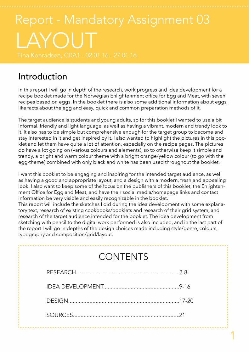
ResearchEXISTING COOKBOOKS - GRID/LAYOUT - TARGET AUDIENCE
Existing cookbooks/bookletsWhen starting out the research for the egg-booklet, I decided to go online and look at PDF-formats of cookbooks and booklets rather than checking out a cookbook as I felt this would be more re-levant to the way I was going to present my booklet. I wanted to find cookbooks where the target audience was students and young adults, the same target audience I would design for, and I also wanted to find some booklets that were based on eggs like my booklet would be. After checking out many different versions of cookbooks and booklets online (I got many results I didn’t feel was relevant to the way I wanted to approach this research), I felt like I had managed to find some examples of cookbooks in PDF-format I thought would be appropriate for the research. I have taken screenshots of these cookbooks/booklets and put them together in a collage, and to the right of the collage is the analysis/research of the corresponding book/booklet.
The overall design style in this cook-booklet is very simple, with small pictures, focus on the text (which is in two different colours - a dark burgundy and orange) and a curved line on each page (going from the left side of the page to the right). There is no clear division of a left/right page, so the left and right page seems like one entire page. It’s mainly used a two-columned grid in the recipe pages, and because of the simple design the focus is mainly on the headings and the body texts. The back cover consists of a one-columned grid. The pictures on the recipe pages are small squares on the opposite side of the body text (pictures are on the left/verso page and body text on the right/recto page, with equal margins to the corresponding edges) and they don’t exceed the height or width of the columns with body text.
2

ResearchEXISTING COOKBOOKS - GRID/LAYOUT - TARGET AUDIENCE
This booklet is one of the ones that were based on eggs (excerpt of a few pages). The yellow colour is probably used because it’s the colour we associate with eggs and it’s a natural colour to use in a booklet consisting of recipes based on eggs. The colour has been consistently used throughout the booklet, ranging from on the front page, the colour of the headings, to a full-coloured background (contents and back cover) and in the borders on the recipe pages. In this booklet there are a bit more detail than the first booklet, as there are more details and elements on the pages.
The pages mainly consist of a one-columned grid to make the text easy to read. The recipe pages consists of a big picture of the dish above the heading and body text on the left/verso page, all with the same width. The heading has been enlarged or sized-down to fit the width of the picture and body text. On the right/recto page there are three small instructional pictures showing how to make the dish on top of the page, with the body text with numbered paragraphs explaining the approach, and tips/additional information under it. In all of the recipe pages the «you will need» list has borders around them, the text with the approach and three small pictures has borders around them (and in between, sectioning off the pictures and paragraphs), and the tips/additional information text has a borders around them. This helps se-ction off the different parts of the recipe and it also adds some detail. In addition to using the yellow colour on the borders, there is used a magenta colour around the serving suggestions texts, and a cyan colour around the tips texts. This have been done to add a bit of difference to the various «boxes» with text on each page, which makes it easier to tell the content of the «box» with just a glance.
3

ResearchEXISTING COOKBOOKS - GRID/LAYOUT - TARGET AUDIENCE
This is a cookbook made for students with many recipes inside (excerpt of a few pa-ges). This is a pretty straight-forward cookbook, where it doesn’t seem like there has been done anything special or exiting in relation to design. The front page consists of a big picture with a easy and short heading (with a sub-heading under) left-aligned above it. There is also a wordmark (Nottingham Trent University) right-aligned above the picture. The recipe pages are very simple, it has a big picture on the left side of the page with the heading left-aligned above it, and aligned a bit to the right from the picture you find the body text. The body text has two headings inside (one for ingredients and one for approach), which is of a bigger font size than the body text itself. The font weight of the ingredient list is also heavier than the approach text on all of the recipe pages, and it is used a simple sans serif typeface.
To add some more information to the recipe without cluttering it with more text, there has been placed four (five) circled icons in specific colours above the body text. The first (red) circle shows the number of servings, the second circle (orange) shows how much time it takes to prepare, the third circle (green or green and red) shows if it’s suitable for vegetarians (green) or if it’s vegetarian option available (green and red), and the last circle (blue) shows if it’s suitable for freezing. There is also a square on the left side of the circles in a light blue colour, where it is stated which kind of meal it is (breakfast, main meal, dessert). The light blue square is on some pages also used as a box containing hint/tips/«how-to» texts, under the body text. The font sizes are all the same on each element on the different pages throughout the booklet.
4

ResearchEXISTING COOKBOOKS - GRID/LAYOUT - TARGET AUDIENCE
This is a cookbook targeted towards students (excerpt of a few pages) with a two-co-lumned grid. The pages in this cookbook are big A4 pages, with a background picture of a «real» (the picture looks animated/illustrated) coil-binding book lying on a table, covering the entire page. The headlines, pictures and body text are all pla-ced inside the book so it seems like you are turning a page in a book for each page in the PDF-file. There is used two different fonts with a handwritten style to them in this design, one for the headings (and on the title on the front page) and one for the body text. The columns in this layout is, on the left side of the page, containing the heading and a picture of the dish under it, as well as a part of the body text beneath that again, and on the right side is the rest of the body text.
The division of the text on the recipe pages seems a bit messy (in addition to the font being quite busy and chaotic, making it more difficult to read), as the different parts of the recipes isn’t really placed where you would expect them to be. The ingredi-ent/«you will need» list is aligned to the right side where the picture is on the left, and the approach is divided into two columns beneath the picture and the ingredient list. Above the «you will need» list is also a small heading with the name of the submitter of the dish (by who), as well as a brief text about the dish in a bit smaller italic font size under the «by-who»heading. The headings of the instructions and «you will need list» are in a bit bigger font size than the rest of the body text. The back cover consists of a «thank you» list, with the names of the contributors of the book and a bold-font link to their home pages under their names. It is consistently used a dark blue colour on all text and on all illustrations throughout the booklet.
There are small hand-drawn illustrations on some of the pages to up the «real-cook-book» feeling which has been the main feeling and approach throughout the entire book. This has been achieved by using fonts that look like they are hand-written, having the background picture a book, and having hand-drawn illustrations on the front/back cover and on various pages throughout the book. The pictures in the reci-pe pages have «bits» of tape on the left top corner and on the right bottom corner as well, so it looks like it’s been taped down.
5
ResearchEXISTING COOKBOOKS - GRID/LAYOUT - TARGET AUDIENCE
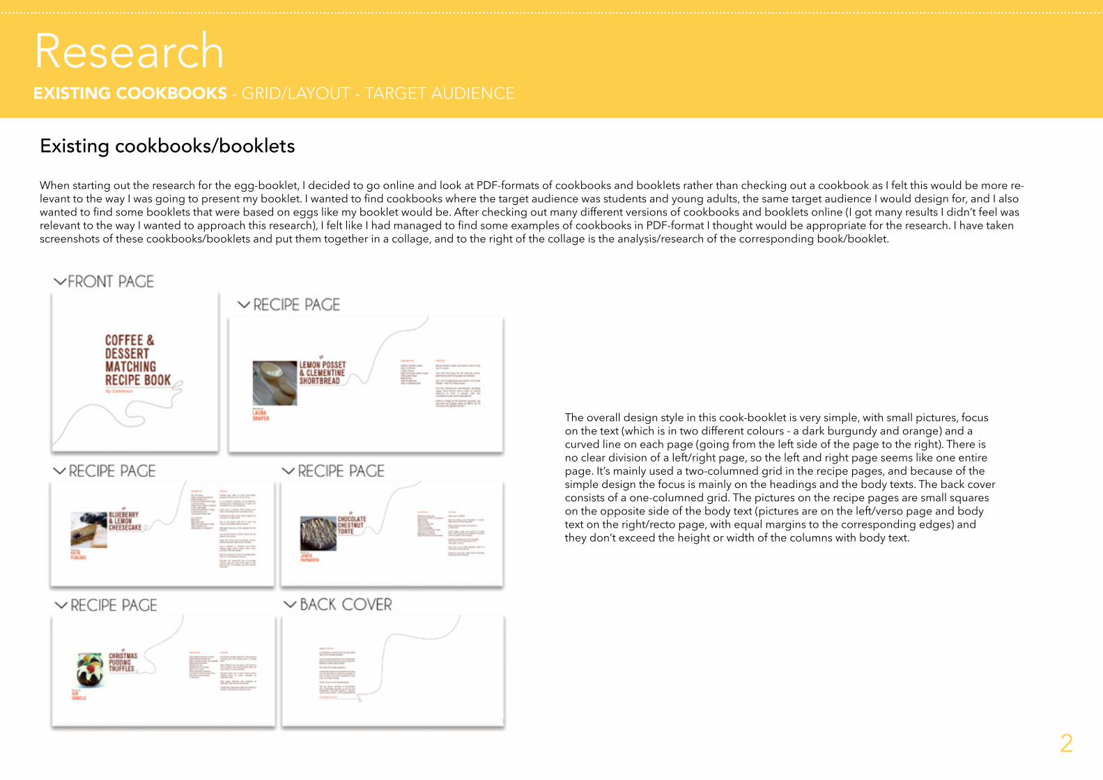
The last cook-booklet I included in my research was one based on eggs (entire boo-klet). The layout in this booklet consists of both a one-columned and a two-columned grid divided into two fields - one on the top half of the page and one on the bottom half of the page. On the recipe pages there is a big squared picture of the dish on the left side, covering a bit more than 1/3 of the page. The rest of the space on the right side is containing the body text, with the ingredient list going over two columns (on the top half of the page), and the directions in one column (on the bottom half of the page). Above the ingredient list is the heading with the name of the dish, and a «icon list» with the numbers of servings the dish has (small icon of a knife and a fork), how much time it takes to prepare (small icon of a clock) and how much time it takes to cook (small icon of thermometer).
The headings are of the same size on every recipe page, and the longest heading aligns with the width of the first and second column with body text. The font type used in this booklet is a sans serif type, making it easier to read even though the text size are relatively small in some places. The background on these pages are also split in half, where the bottom field body text has a white background, and the top field body text/heading has a coloured background. The colours are changing from side to side, picking up the background colour of the dish-picture. Where the background on the picture is green, the background of the heading/body text is green, where the background on the picture is purple the background of the heading/body is purple, and so on. This is done on all of the recipe pages, along with a picture of a world map (in a deeper colour within the same hue) - highlighting the country where the dish is from with a white colour. The map is placed on the right side in the top field, so the body text doesn’t overlap it too much as the text is left-aligned in the top field. The front- and back-cover is fully covered with a yellow colour which, as mentioned earli-er, is a natural colour to use when designing a booklet based on eggs.
On the front cover there is also added a map with a darker colour hue of the yellow (used as background on entire front cover) as done in the recipe pages, as well as four «pins» with four different colours (corresponding to the colours in the recipe pages of the booklet), pinned on the country where the different dishes are from. The back cover is simply a yellow background with a link and logo centred on it, without any other elements on the entire page. There aren’t many different elements, de-tails, or even pages in this booklet, so it has a very simple, clean and uncomplicated feeling to it, and the use of fresh colours brightens the booklet and makes it more refreshing and exiting. The maps gives a nice and interesting touch to the booklet.
6

ResearchEXISTING COOKBOOKS - GRID/LAYOUT - TARGET AUDIENCE
Grid and layoutThe cookbooks/booklets I decided to use in my research was quite varying in design/layout, but the main thing I noticed was the use of only one or two columns. I didn’t find any booklets with three columns, and it was for the most part used only one column in the booklets I included in my research. The text and the pictures are in focus, and the designs were overall pretty simple. Something I noticed quite early in the process was that it looked much more clean and «logical» with only one recipe pr. second page, as both pictures of the dish (if you want big and clear pictures) and the recipe text usually wouldn’t fit into one left or right page. It is also much easier to get what pictures goes with what text when you limit the recipes to one pr. second page.
The grid system in cookbooks/booklets should give enough space for the body text to be separated into different parts, as there is several different «sections» of a recipe, one for ingredients, one for approach, one for tips/additional information, etc.. These different parts of the recipe should be easy to distinguish and tell apart when looking at the recipe as a whole. The length of the recipes does also vary, sometimes minimal-ly, but at times there are big differences in the length of the texts, and therefore it is sometimes easiest (in relation to font sizes, widows and orphans and overall looks) to use a one or two-columned grid as the layout when designing a recipe book/booklet. It is mainly used a one-columned grid when designing a book, and it is normal that a recipe book/booklet follow the same idea.
One column grid
Two column grid
7

ResearchEXISTING COOKBOOKS - GRID/LAYOUT - TARGET AUDIENCE
Target audienceThe target audience for the booklet from the Enlightenment Office for Egg and Meat is students and young adults. When designing a booklet for this target group, I want to keep the design clean, modern, trendy and vibrant. The use of sans serif typeface, bright colours and simple illustrations/decorative elements will help keep the design looking modern and fresh. Because this recipe booklet is based on eggs, it will be natural to have the design reflect this in some way, and have it look both modern and vibrant at the same time to be engaging enough for students and young adults. This target group is used to browse through huge amounts of information and material on a daily basis, they are used to multitasking and they are very active when browsing through various material, so I believe it’s crucial to keep the booklet simple and con-sistent without too much information or unnecessary elements.
It is also important that the recipes are easy to understand and easy to follow step-by-step, and I want to keep the language (on the text elements I am allowed to edit, like the headings) short and to-the-point with a friendly tone. I really don’t want to fall in the pit of trying too hard to sound hip and cool, as this would probably just work against its case and seem silly and exaggerated to the target group. By using famili-ar elements (to the target audience) like social media/Facebook/Twitter etc. icons, it «speaks» to the reader and provides something familiar, which may both encourage and comfort in some sort.
TARGET AUDIENCE KEY POINTS
Youthful
FreshFriendly
Modern
Trendy
SimpleVibrant Clean
Inspiring
Engaging
Bright
8
Idea developmentSKETCHES - ILLUSTRATIONS
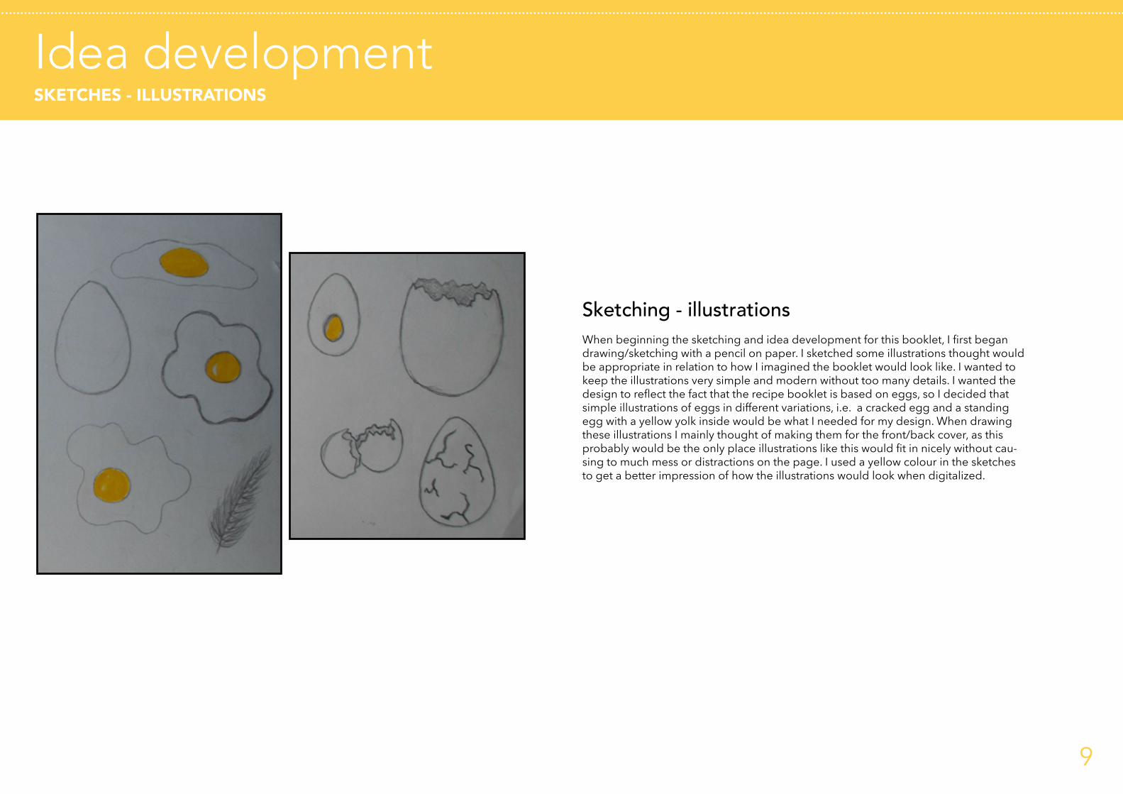
Sketching - illustrationsWhen beginning the sketching and idea development for this booklet, I first began drawing/sketching with a pencil on paper. I sketched some illustrations thought would be appropriate in relation to how I imagined the booklet would look like. I wanted to keep the illustrations very simple and modern without too many details. I wanted the design to reflect the fact that the recipe booklet is based on eggs, so I decided that simple illustrations of eggs in different variations, i.e. a cracked egg and a standing egg with a yellow yolk inside would be what I needed for my design. When drawing these illustrations I mainly thought of making them for the front/back cover, as this probably would be the only place illustrations like this would fit in nicely without cau-sing to much mess or distractions on the page. I used a yellow colour in the sketches to get a better impression of how the illustrations would look when digitalized.
9

Idea developmentSKETCHES - GRID/LAYOUT + IMAGE/TEXT PLACEMENT
When starting out with sketching the layout/grid, I began with sketching some diffe-rent options of how the page could look. I wanted to include the placement of both pictures and headings in these sketches as well, to get a better impression of how it all would work together. I decided early in the process that I wanted a landscape format for my booklet, as I felt this would allow me things such as being able to have big pictures, several columns of body text, two headings etc., and I just really liked the way it looked so I was very decisive when I went for the landscape format. For these de-tailed (and coloured) sketches I decided to only draw up the recipe page layout. The other pages (content, about eggs, etc.) are included in the entire page-setup layout sketch on page 13 of this report.
< OPTION 1The first option has one column on the left/verso page, and two columns on the right/recto page. It has two headings (on on each page), and a picture is covering half of the left page. There are yellow borders around the body text, and on the page en-dings (thumb space). I didn’t think this design could work because of the placements of the headings, and the picture would be too small for what I envisioned for the boo-klet.
< OPTION 2The second option has a three-columned grid because I just wanted to try it out even though I really didn’t think it would work if put into use in a design of a recipe booklet. I wanted to experiment a bit with adding a small picture of the dish beside the body text in addition to the big picture, which in this option is one big picture covering the entire recto page. There is only one heading in this option, and there is a yellow background on the head of the page, as well as a thick yellow frame around the big picture. The placement of the text is a bit unusual in this option, as the body text is on the left page. For us who read from left to right, it is most common to have the text on the right page and picture(s) on the left page, as well as the right page being the first page you look at when you open a booklet, so therefore it’s most common to have the text there.
< OPTION 3For the third option I tried to develop the second option with three columns and a small picture among the body text to see if I could make it work. Here the body text has been moved to the right/recto page, and the big picture is on the left page. The picture now also has a heading on top (with the title of the recipe), to sort of ”name the picture”. There is also a heading above the body text, and there are yellow thumb spaces (left and right edges) on both pages.
10
Idea developmentSKETCHES - GRID/LAYOUT + IMAGE/TEXT PLACEMENT
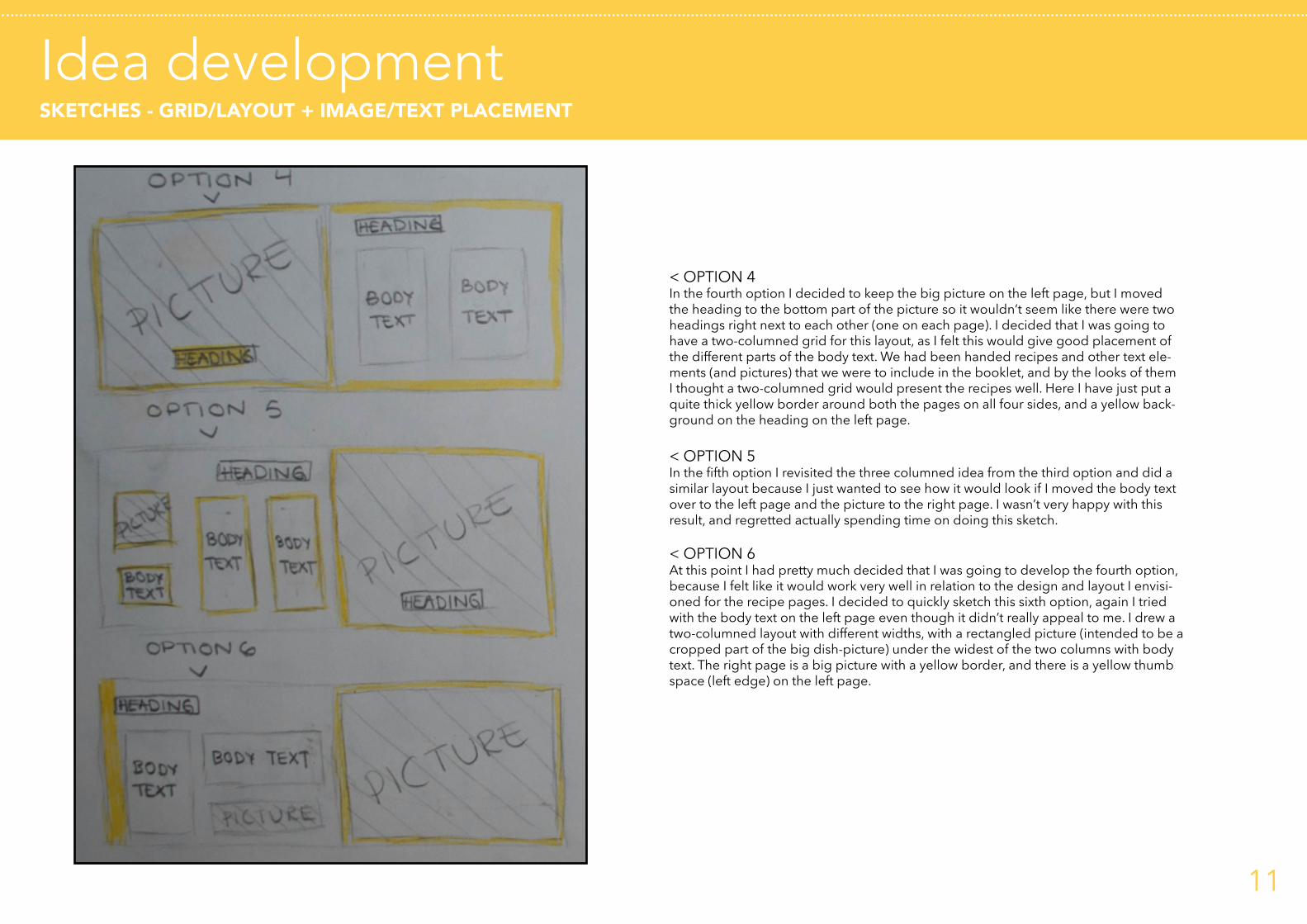
< OPTION 4In the fourth option I decided to keep the big picture on the left page, but I moved the heading to the bottom part of the picture so it wouldn’t seem like there were two headings right next to each other (one on each page). I decided that I was going to have a two-columned grid for this layout, as I felt this would give good placement of the different parts of the body text. We had been handed recipes and other text ele-ments (and pictures) that we were to include in the booklet, and by the looks of them I thought a two-columned grid would present the recipes well. Here I have just put a quite thick yellow border around both the pages on all four sides, and a yellow back-ground on the heading on the left page.
< OPTION 5In the fifth option I revisited the three columned idea from the third option and did a similar layout because I just wanted to see how it would look if I moved the body text over to the left page and the picture to the right page. I wasn’t very happy with this result, and regretted actually spending time on doing this sketch.
< OPTION 6At this point I had pretty much decided that I was going to develop the fourth option, because I felt like it would work very well in relation to the design and layout I envisi-oned for the recipe pages. I decided to quickly sketch this sixth option, again I tried with the body text on the left page even though it didn’t really appeal to me. I drew a two-columned layout with different widths, with a rectangled picture (intended to be a cropped part of the big dish-picture) under the widest of the two columns with body text. The right page is a big picture with a yellow border, and there is a yellow thumb space (left edge) on the left page.
11

Idea developmentSKETCHES - GRID/LAYOUT + IMAGE/TEXT PLACEMENT
< DEVELOPING OPTION 4
When I had sketched the fourth option I really liked the way the layout looked and I thought it would be a good layout to use for my booklet. I wasn’t all to happy with where I had placed the colours though, so I decided to take the layout and change up where I used the yellow colour. I liked that the heading on the picture had a yellow background so I didn’t want to change that. But I decided that the heading would look good with a yellow background, so I limited the yellow to the headspace of the right page. I also thought that it would be a good idea to have borders around the body text to make the different parts of the recipe be a little easier to separate.
LAYOUT AND GRID DRAWN DIGITALLY:
H E A D I N G
BODYTEXT
BODYTEXTPICTURE
H E A D I N G
12

Idea developmentSKETCHES - GRID/LAYOUT + IMAGE/TEXT PLACEMENT
< LAYOUT OF ALL PAGESIn this sketch I have quickly established the basic layout of all the pages. This isn’t too detailed, like the front and back cover doesn’t really have any set placements of elements or any perticular grid in this sketch, but it shows the basic idea and thought behind the layout used throughout my booklet.
The front cover doesn’t have any given layout in this sketch, as this is something I fi-gured (from previous experiences) I would play around with it for some time (digitally) before I came up with a front cover that I was happy with and would be appropriate for my booklet.
The preface pages I intented to go over two sides (because of it’s length), and I made a simple layout with a heading left aligned (on both pages), with the body text in one column on each page. I also drew a picture in with the preface, as I felt it would be quite boring and uninteresting with only text on these pages. It is easy to skip through pages that you see are much text, so it is important to have some interesting elements to go with the lengthy text.
The contents pages would be a picture(s) on the left/verso side, with the contents (body text) on the right/recto page. A heading is left aligned above the body text. On the about eggs pages, I wanted to include pictures that was relevant to the about eggs text we had been provided, and still just keep it simple and follow the layout I had made on the preface and contents pages, with the heading left aligned above the body text on the right page.
The recipe pages has been sketched on page 12, and I figured I would have to have 14 pages (7 left pages + 7 right pages) to get enough space for the recipes. The back cover didn’t get any particular layout in this sketch either, I only imagined it would contain a body text with the company information, and some pictures or illustrations.
1313
14
Idea developentMOODBOARD

Idea developmentWORKING DIGITALLY
1
>
2
>
3
>
4
>
5 >6
>
7
>
When I started out with the work process on the computer, I began with first making all the pages that I was going to need for this booklet in Adobe InDesign. We had been provided text and images that we were to use, so I first started off with giving the pages their headings so I knew which page was which, and then I placed the various contents (of text) on their correspon-ding pages. I then placed the pictures of the dishes on the left side of the recipe pages, I made a picture collage (of pictures found online) on the «about eggs» pages, and put together two of the pictures we were provided and added them to the left page of the contents pages. I also added the coloured head and foot space in all of the pages, as well as the decorative dotted borders on them.
I now figured I had to open Adobe Illustrator to get started on some illustrations I wanted to make for the front cover (and originally for the back cover too, but I decided to have a collage of all the dishes in the booklet there instead), so I could get a front cover in place. I made some illustrations based on the sketches I had made, and I did have a pretty hard time deciding which illustrations to use, but after some consideration and testing on the front cover, I decided to go with the two that looked most modern and fun to me - the simple egg (illustration #2) and the uncracked egg with the yolk in the middle (illustration #6).
When I had figured out which illustrations to use, I had already started a bit on the front cover, so I just kept on working with it, placing the illustrations, title and the publishers name (Enligh-tenment Office for Egg and Meat) around, shifting and adding copies of one of the illustrations, and trying to find good placements for them. I wanted to keep the front cover looking appea-ling, simple and modern, so I kept the title of the booklet short and to-the-point. I experienced with some different typefaces, and I quickly found one I really liked and thought was appropri-ate, a simple sans serif typeface with many different weights. I would eventually end up using this typeface throughout the entire booklet except in the headings on top of the pictures in the recipe pages. I added some borders and a coloured background so it seems like the front cover is split in half, one half with text and illustrations, and the other half with only one simple and cle-an illustration. To reflect the other half of the front cover, I added two borders around the single illustration as well to make them look more related. After working with the cover for a while I felt like I had achieved a simple, but pretty trendy and stylish look, and I felt satisfied with the result so I quickly moved on to the preface pages.
When working with the preface pages, I first centred the body text (with headings left aligned) but when seeing it together with the other pages when they were finished, made me decide that it looks better if the body text is aligned to the left like it is on the other pages. The preface pages gave me some troubles when it came to picture placement, as I really wanted to have some pictures combined with all that text. I first tried to place a rectangular picture on the right side of the body text on the right page, but this looked a bit off and it didn’t really fit in with all the text.
15

Idea developmentWORKING DIGITALLY
I tried out some different pictures and placements that didn’t work at all, before I came up with the idea of simply putting transparent pictures of eggs barely showing behind the text. I tried placing some of my illustrations (illustration #1 and #7) and with the same transparency at the same place, but it didn’t look as good as the realistic pictures did. I also added two headings on these pages, both with a light and friendly feel to it. I also wanted to add some familiar elements (for students/young adults), so I thought the preface pages was the perfect place to have some known icons to go with the links to the different social media Enlightenment Office for Egg and Meat are on/their homepage.
The contents pages was quick and easy to design, as I used the left page for two cropped pictu-res (of the ones we were provided) and the right page just displays the list of contents with page numbers. This body text is like the heading over it aligned to the left.
On the «about eggs» pages I continued trying to use a light and friendly language in the hea-ding, and have the right page consist of a left aligned body text. For the left page I made a picture collage with pictures of the different preparation-methods mentioned in the body text on the right page. I added a thin border around the collage and a thicker border on the right page - both in the yellow colour. I felt the body text looked a bit lost among the collage and the borders, so I put a yellow background/rectangle under the body text, and added a white dotted border to follow the way of design in the head/foot space, and for pure decorational purposes as I really just tried it out and liked the outcome. It gave the body text a nice frame within the coloured frame/background without causing to much mess or distraction.
The recipe pages was probably the pages I used the most time on. When starting out designing how the recipes would be presented, I first drew up the borders (to go around the body text) and made them look how they were supposed to look (in colour - dotted). I then started placing the different text elements where they were supposed to go, and I then had to adjust the bor-ders. I used a lot of time on getting the font sizes right and same, to get everything to fit in nice-ly and have the same placements, as you can see on the «baconis» recipe I had to «steal» some part of the left page for parts of what I intended the right pages was to be used for (because of a lengthy explanation of approach), so I did really try to be careful and considerate to all the elements on the page when adjusting sizes on both columns and fonts. I wanted the font sizes, border sizes, placements etc. to be consistent throughout the entire booklet so I did pay much attention to this on every page. I added some small details like colour on the headings inside the body text boxes, and a different font weight on the measurements (black) and ingredients (light) in the ingredient lists.
The back cover was created by the same idea as the front cover. One «half» of the page has a coloured background behind the body text (black) and two headings (white), with a dotted white border inside, and the other half was intended to have a illustration like the front cover, put I decided that a picture collage of all the dishes in the booklet with a coloured border aro-und would sum this booklet up nicely on the back, together with the company information and social media links.
16
1. ONLY HEADING, BACK-GROUND HEAD/FOOT AND BORDERS FOR BODY TEXT. >
2. HEADING INSIDE BODY TEXT BORDERS IS ADDED. >
2. BODY TEXT IS ADDED. DIFFERENT FONT SIZES, VARYING FONT WEIGHTS
>

DesignSTYLE/GENRE - TYPOGRAPHY - COLOUR - COMPOSITION/LAYOUT/GRID
17
STYLE/GENRE
The way colour, borders, backgrounds, typography and illustrations have been used, as well as the placement of the pictures, helps making the booklet have a informal, young, cheerful and inspirational look to it. The layout and design of this booklet have a informal and somewhat casual look to it, as well as looking inspiring, bright and happy. In relation to the target audience, which is students and young adults, I feel like I have managed to keep the design looking attractive and relevant for them with not over-cluttering the design (with decorative or serifed fonts etc.), using only one, fresh colour throughout the booklet and keeping it consistent, and having the illustrations (on the front page) be very simple and «modern» with clean lines. The use of coloured tops and bottoms, and the coloured borders around the body text (in the recipe pages), helps divide the different parts of the contents and makes it look neater and easier to read. The back cover and the front cover have been given a bit more details (like several borders) than the other pages in the recipe booklet has.
I feel like the way I have chosen to present some of the content and the headings (like the prepare those eggs! heading and the icon use above the social media links on the preface pages) may speak more to students and young adults than it would to adults and elderly people.
SIMPLE AND TRENDY/MODERN ILLUSTRATIONS
SHORT AND TO-THE-POINT TITLE

DesignSTYLE/GENRE - TYPOGRAPHY - COLOUR - COMPOSITION/LAYOUT/GRID
FONT NUMBER 1 > USED ON THE HEADINGS ON TOP OF THE PICTURES (RECIPE PAGES).
NEOTERIC regular
FONT NUMBER 2 > USED ON THE REMAINING HEADINGS AND ALL BODY TEXT.
Avenir light
DIFFERENT FONT WEIGHTS (BLACK AND LIGHT) USED IN THE INGREDIENT LISTS.
>>
>
TYPOGRAPHY
The typefaces I have used in this booklet are sans serif typefaces, to go with the yout-hful, clean and informal look I wanted the booklet to radiate. It is also very easy to read sans serif typefaces, and when the text is very small (as it actually is some places in my booklet), it will be easier to read when using a sans serif typeface. I have used two different typefaces throughout the booklet, but there is mainly used only one of the two overall the booklet (main headings and all body text + front/back cover), as the second typeface is only used on the headings in the yellow rectangles (on the pictures of the dishes on the recipes pages). I think these two fonts work great together, and they accentuate the happy, informal and «playful» theme of the booklet well.
I have used two different font weights in the body text (on the ingredients lists), a light and a black version, as I felt the need to create a «breach» in all the text on the pages (design-wise), as well as separating the measurements from the ingredient to make it a bit easier to read. I tried out having a medium and a light font weight, but the diffe-rence was too small so I went with it and gave the measurements a black font weight, and the ingredients behind the measurements a light font weight. I decided to add an ellipsis in front of all the main headings and keep it all in lowercase letters, which I did to add a unique and youthful feeling to it and make it a bit more interesting and not so traditional. The ellipsis’ also kind of «picks up» the white dotted lines on the yellow top/bottom which makes some sort of a «connection» between the elements.
18

DesignSTYLE/GENRE - TYPOGRAPHY - COLOUR - COMPOSITION/LAYOUT/GRID
COLOURED DOTTED BORDERS
COLOURED HEAD SPACE WITH WHITE DOTTED DECOR LINE AND WHITE HEADING
COLOURED HEADINGS
COLOURED FOOT SPACE WITH WHITE DOTTED DECOR LINE AND WHITE PAGE NUMBER
COLOURED BACKGROUND WITH WHITE DOTTED BORDER INSIDE, WHITE HEADINGS, BLACK BODY TEXT
COLOURED BORDER AROUND ENTIRE PAGECOLOURED BORDER AROUND PICTURE COLLAGE
COLOUR
Since this booklet is about recipes based on eggs and it contains quite a lot of infor-mation about eggs and how to prepare them, it was natural for me to use the bright yellow/orangey colour that we find in the egg as the main colour of this booklet. The yellow colour is a great colour to use for this booklet, as it is a very happy, joyful, friendly and inspirational colour - the kind of relationship you would want to have to a cookbook/booklet. I wanted the colour to be dark enough to have white text on it, but still be a bright and happy colour, as I thought white text on the colour looked better and was more «easy on the eye» than black text on the yellow colour. I have mainly used black for the body text throughout the booklet, only the headings of the list of ingredients and the approach is coloured in the yellow colour. It has also been used as a background for both black body text and white headings in the about eggs pages and on the back cover.
Other than that, all text is black (on white background + yellow on about eggs page and back page). The colours used in the booklet is therefore only three colours (not including pictures), but because the yellow colour is so rich and steals a lot of atten-tion I feel like I didn’t have to incorporate any more colours as I thought it only would just be distracting if I did. So I decided to use the yellow colour to the full extent I felt was appropriate, without having it overpowering the design and overall looks of the booklet. By consistently using the colour throughout the booklet (on the cover, head and foot space of the pages, in the decorated square on top of the big dish-pictures on the recipe pages, in the headings ingredients/this is what you do, in the borders containing body text etc.), I feel like I managed to get a continuous, but fresh and fri-endly «flow» throughout the booklet, with the pages having a consistent, and to some extent quite a lot of, colour use (for one single colour).
I think I managed to use the colour as much as possible without having it steal too much attention from the reader or become too much in any way. It also paired nice with white lines/dotted lines used various places throughout the booklet, and I think the white lines on the yellow/orange colour gave a nice and detailed touch to the overall design which is basically quite simple.
19
DesignSTYLE/GENRE - TYPOGRAPHY - COLOUR - COMPOSITION/LAYOUT/GRID
(LEFT) PREFACE PAGE - ONE COLUMN
(RIGHT) RECIPE PAGE - TWO COLUMNS
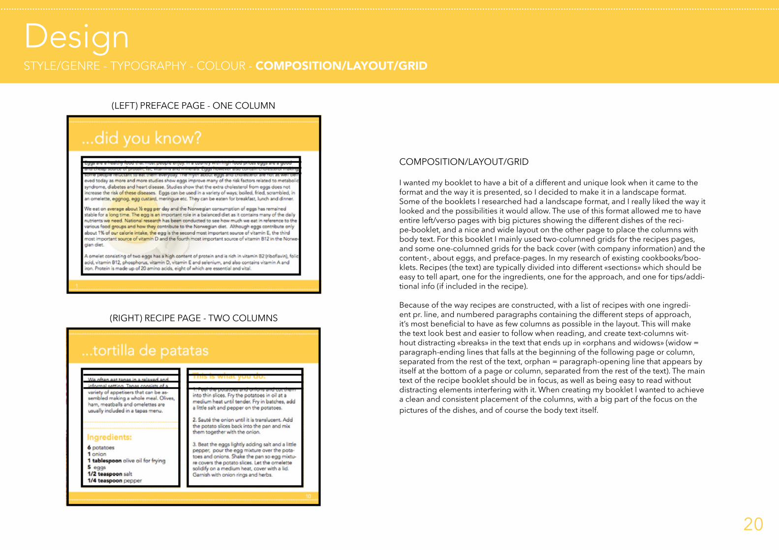
COMPOSITION/LAYOUT/GRID
I wanted my booklet to have a bit of a different and unique look when it came to the format and the way it is presented, so I decided to make it in a landscape format. Some of the booklets I researched had a landscape format, and I really liked the way it looked and the possibilities it would allow. The use of this format allowed me to have entire left/verso pages with big pictures showing the different dishes of the reci-pe-booklet, and a nice and wide layout on the other page to place the columns with body text. For this booklet I mainly used two-columned grids for the recipes pages, and some one-columned grids for the back cover (with company information) and the content-, about eggs, and preface-pages. In my research of existing cookbooks/boo-klets. Recipes (the text) are typically divided into different «sections» which should be easy to tell apart, one for the ingredients, one for the approach, and one for tips/addi-tional info (if included in the recipe).
Because of the way recipes are constructed, with a list of recipes with one ingredi-ent pr. line, and numbered paragraphs containing the different steps of approach, it’s most beneficial to have as few columns as possible in the layout. This will make the text look best and easier to follow when reading, and create text-columns wit-hout distracting «breaks» in the text that ends up in «orphans and widows» (widow = paragraph-ending lines that falls at the beginning of the following page or column, separated from the rest of the text, orphan = paragraph-opening line that appears by itself at the bottom of a page or column, separated from the rest of the text). The main text of the recipe booklet should be in focus, as well as being easy to read without distracting elements interfering with it. When creating my booklet I wanted to achieve a clean and consistent placement of the columns, with a big part of the focus on the pictures of the dishes, and of course the body text itself.
20

SourcesALL SOURCES USED IN THIS REPORT
Graphic Design School: The Principles and Practice of Graphic Design, David Dabner, Sandra Stewart, Eric Zempol, Unit Two: Fundamentals of composition (p. 32-60), Thames and Hudson 2014 edition
PDF COOK-BOOKLETS:http://currys.cdn.dixons.com/css/themes/email/Assets/TheHungryStudent.pdf?utm_source=techtalk.currys.co.uk&utm_medium=referralhttps://www.ntu.ac.uk/__data/assets/pdf_file/0035/169685/student-cookbook.pdfhttp://www.eggs.ca/assets/RecipeBookletPDFs/eggs-101.pdfhttp://cafedirect.co.uk/wp-content/uploads/downloads/2012/01/Recipe_Book_FINAL.pdfhttp://www.eggs.ca/assets/RecipeBookletPDFs/travel-the-world-with-eggs.pdfhttps://www.nottingham.ac.uk/currentstudents/documents/healthyu-recipe-book-web.pdf
EGG PICTURES IN THE BOOKLET:https://www.eggrecipes.co.uk/sites/default/files/poached-egg-2.jpghttps://40.media.tumblr.com/7205be223995381724374633e696b6b5/tumblr_inline_nov1jtZ9KL1ryw2sn_540.jpghttp://atmedia.imgix.net/eedcd390804e4ef2464134c934f8cee650344af3?auto=compress&w=800.0&fit=maxhttp://i.huffpost.com/gen/1406512/images/o-FRIED-EGG-MISTAKES-facebook.jpghttp://www.centralfoods.co.uk/Portals/0/Products/898/prod_898.jpghttp://www.burgerrestaurants.info/wp-content/uploads/2015/09/scrambled-eggs.jpghttp://mjskitchen.com/wp-content/uploads/2013/02/SoftBoiledEgg_Web.jpghttp://www.gimmesomeoven.com/wp-content/uploads/2015/08/Hard-Boiled-Eggs-1.jpghttp://www.moins-depenser.com/images/uploadMembre/534174/bon-plan/216427.jpghttp://img1.cookinglight.timeinc.net/sites/default/files/styles/300x300/public/image/Oxmoor/oh-hard-boiled-egg-1-m.jpg?itok=QPjk4H2m
EGG PICTURES MOODBOARD:https://lbb.in/bangalore/wp-content/uploads/sites/2/2016/02/eggstory.jpghttp://i.ndtvimg.com/i/2015-11/boiled-eggs_625x350_61447756040.jpghttp://images.matprat.no/hjz6gbals3-jumbotron/largehttps://www.hututoo.com/upload/A1Y2qoJXTtWzbB9yE80a.pnghttps://s-media-cache-ak0.pinimg.com/originals/ad/7b/de/ad7bdee6b6dcdbfa5c04efdbea2d166a.jpghttp://i.huffpost.com/gadgets/slideshows/323746/slide_323746_3079600_free.jpghttp://del.h-cdn.co/assets/16/12/980x1470/gallery-1458569837-delish-chipotle-deviled-eggs.jpghttps://encrypted-tbn1.gstatic.com/images?q=tbn:ANd9GcTV-htIPv8thSPAStZD0FXt8quTyJtbGWxsbzQ0D2dmC0d4eer6Pg
Facebook/Twitter/Instagram/Youtube icons:https://cdn3.iconfinder.com/data/icons/free-social-icons/67/facebook_square-128.pnghttps://cdn3.iconfinder.com/data/icons/free-social-icons/67/twitter_square-128.pnghttps://cdn2.iconfinder.com/data/icons/capsocial-square-flat-3/500/youtube3-128.pnghttps://cdn4.iconfinder.com/data/icons/liu-square-blac/60/instagram-square-social-media-128.pnghttp://www.matprat.no/modules/OEK.MatPrat.AddOn/Content/Images/matprat_logo_desktop.png
21