Embed Size (px)
Citation preview

Project Goals Related Work Data Tools Used in Visualization Steps Required to Accomplish Goals
Generative User Research OkCupid’s Questions Match Percentage Thresholds Responses to How Many Fish? Concept
Design Selection of OkCupid personality questions for users to interact with Selection of aggregate demographic variables to show
Programming Introductory pages Interactive visualization
The Sliders The Server The Visualization Brushing & Highlighting
Usability Testing and Heuristic Evaluation Algorithm Transparency Evaluation
Final Visualization Limitations & Future Work Contributions by Group Members Appendix A Related Work Screenshots Appendix B User Interview Questions and Responses Appendix C Design & Prototyping Screenshots Appendix D Question Selection Rationale

Project Goals Motivated by our own and friends’ experiences using online dating services, our goals for this project revolved around improving the experience of users of these websites and apps. We chose OkCupid in particular because of it’s popularity and its use of a matching algorithm. As we discuss in our related work, algorithms are often implemented on behalf of users without users understanding their inner workings. Thus, our first goal in this project was to design a visualization that brings some transparency to OkCupid algorithm that is used as a basis for forming meaningful human connections. Also in the realm of online dating, we were aware of a variety of recent news and research reports indicating a high prevalence of prejudice in online dating environments. While we recognize it isn’t ours or anyone’s place to decide who people date, we wanted to encourage users of online dating services to more deeply consider the preferences they use to determine their potential matches. Our second goal then was to have our project serve as a gentle nudge against prejudice in online dating practices by allowing users to play around with preference settings and explore the effects on their pool of matches. Our final goal was for ourselves: we wanted to implement a creative design based on thoughtful user research using the tools and concepts we’ve learned and practiced throughout this course.
Related Work Algorithm Transparency Research Dating sites like OkCupid present users with match percentages to assist in finding romantic partners. The users are not always aware of the inner workings of these algorithms, even though they directly affect the formation of meaningful human connections. This phenomenon remains underexplored in online dating, however, it has been examined in other systems in which algorithms influence social interactions. Studies on Facebook’s news feed selection algorithm found that 25 out of the 40 users 1 2
surveyed were not aware their news feed was curated at all, and others who were aware of the algorithm’s presence held “unfounded beliefs about algorithms” that the researchers found affected behavior. After revealing the algorithm’s inner workings however, the researchers also “discovered that strong initial negative reactions to the mere presence of an algorithmic filter
1 Hamilton, Kevin, et al. "A path to understanding the effects of algorithm awareness." CHI'14 Extended Abstracts on Human Factors in Computing Systems. ACM, 2014. 2 Eslami, Motahhare, et al. "I always assumed that I wasn't really that close to [her]: Reasoning about Invisible Algorithms in News Feeds." Proceedings of the 33rd Annual ACM Conference on Human Factors in Computing Systems. ACM, 2015.
often subsided once users understood who and what was being hidden.” Twitter’s “trending” algorithm has been similarly criticized, highlighting that "the workings of these algorithms are political, an important terrain upon which political battles about visibility are being fought". The 3
same author also points out that "beyond search, we are surrounded by algorithmic tools that offer to help us navigate online platforms and social networks, based not on what we want, but on what all of their users do". One method by which to instantiate this understanding is to allow users to play with inputs and outputs and readily see their effects. Hamilton and Mueggenburg describe Ross Ashby’s 4
implementation of this method with a system of levers and lights in the 1950’s, “Ashby would challenge his students to deduce the relationship of inputs to outputs – which was impossible without opening the device. Instead, the device enabled students to study the process of deduction itself." This same method can be applied to more modern examples of algorithms to help users understand their inner workings, a concept we’ve tried to incorporate into our final OkCupid visualization tool. Racial Preferences in Online Dating Background One example of a pervasive and unchallenged bias in online dating that may be either hidden or reinforced through online dating algorithms is that Americans display strong racial biases in their online dating practices. Recently this phenomenon has been covered in news media by The Daily Show , NPR , and Buzzfeed . 5 6 7
Christian Rudder, founder of OkCupid and author of Dataclysm: Who We Are (When We Think No One's Looking) found that Asian men and Black men and women are rated lowest by potential matches despite data showing that actual compatibility (as measured by number of messages exchanged) has very little to do with race or ethnicity. 8
A team of sociologists at Stanford and Yale found that “a large proportion of our population states a samerace preference and acts on it and that even individuals who state that they do not have a preference act as if they do.” 9
3 Gillespie, T. Can an Algorithm Be Wrong? http://limn.it/cananalgorithmbewrong/ 4 http://openhumanitiespress.org/feedback/sciencetechnology/livelyartifacts/ 5 http://www.cc.com/videoclips/ev2j0j/thedailyshowwithtrevornoahsexualracismwhenpreferencesbecomediscrimination 6 http://ww2.kqed.org/news/programs/truthbetold, http://www.npr.org/sections/codeswitch/2013/11/30/247530095/areyouinteresteddatingoddsfavorwhitemenasianwomen 7 This article found that even when people did not state preferences, some dating apps assumed samerace preferences for them. https://www.buzzfeed.com/katienotopoulos/coffeemeetsbagelracialpreferences?utm_term=.txwJQn442#.if9Ken33m 8 http://oktrends.okcupid.com/ 9 Anderson, Ashton, Sharad Goel, Gregory Huber, Neil Malhotra, and Duncan J. Watts. 2014. “Political Ideology and Racial Preferences in Online Dating.” Sociological Science 1: 2840. DOI: 10.15195/v1.a3

Kevin Lewis, a sociologist at UC San Diego found that once a person received a message from someone of a different ethnicity, their interactions with other people of that race or ethnicity increased on average by 115%, illustrating that messaging assuages fears that someone of a different race or ethnicity will not have shared similar experiences or values. “There are 10
arguments on both sides: The Internet dissolves boundaries because it makes identity more fluid/less salient, the Internet recreates boundaries because it makes it so much easier to be biased without personal/social penalty….it seems that just by throwing so many people into one giant pot, online dating has the potential to put more of them into a shared virtual space they wouldn’t otherwise inhabit. It’s a world where preexisting, overlapping social networks don’t matter quite as much.” 11
David Amodio, who pioneered research using Implicit Association Testing, which measures the power of a person’s automatic associations with images, has said that "the human mind is extremely adept at control and regulation, and the fact that we have these biases should really be seen as an opportunity for us to be aware and do something about them." However, much 12
of OkCupid’s matching happens behind the scenes, giving users few opportunities to gain awareness of or challenge their own assumptions and implicit biases. Description of OkCupid’s compatibility match algorithm 13
OkCupid’s compatibility matching algorithm calculates a percentage match of how likely a user is to be compatibility with a potential person. The match percentage is based on questions the user answers aiming to understand (a) the user’s personality traits (ex: if you like beer, how messy you are, sports you play, creative pursuits, preferred lifestyle, etc.); (b) how the user prefers their ideal match to answer the questions; and (c) the level of importance each question is to the user (e.g. irrelevant, a little important, somewhat important, and very important). How two people (A and B) would have answered two questions as follows:
10 Sankin, Aaron. “The Weird Racial Politics of Online Dating.” Kernel Mag. January 2015. 11 ibid. 12 Viskontas, Indre, Chris Mooney. “The Science of Your Racist Brain.” Mother Jones. 2014. 13 OkCupid Support: https://www.okcupid.com/help/matchpercentages

OkCupid then assigns a weight to each importance level.
Importance level Weight
Irrelevant 0 pts
A little important 1 pt
Somewhat important 10 pts
Very important 250 pts
TABLE 1: Point weights associated with importance levels of questions.

We note here the significant difference in point weightings between ‘very important’ and the other levels of importance. This is an assumption used by OkCupid in their algorithm, which is publicly available, but is not common knowledge as evidenced by our user interviews. One of the aims of our visualization is to shed light on this. For all of the questions (there are thousands possible) that the user and a potential match have answered in common, OkCupid calculates the total points achieved divided by the total points possible, where if a potential match answers a question as the user would prefer their ideal match to have answered, that potential match will have the full points achieved for that question. The number of points is determined by the question importance weight. As an example:
Caption: Person A prefers someone with an average level of messiness. Person B self identifies as an average level. From Person A’s perspective, Person B achieves the full 250 pts out of the possible 250 pts (because the question was very important to Person A). On the other hand, Person B prefers someone with an average level of messiness. Person A self identifies as very organized. From Person B’s perspective, Person A does not achieve any points out of the possible 1 pt (because the question was a little important to Person B).

Caption: OkCupid’s algorithm does the same process for each question.
Caption: OkCupid’s algorithm then calculates the match % from the perspective of both Person A and Person B. The geometric mean is then calculated between the two match %’s to find a compatibility %. (See Appendix A for related work visualizations)

Data We use a publicly available dataset of OkCupid profiles containing details such as username, 14
gender, orientation, race, income, age, religion, etc. (see complete list in Table 2) for approximately 60,000 users within the Bay Area. This publicly available dataset does not contain preference data, which is vital to our visualization. As such, we generated fake preference data for each profile serving as a placeholder for visualization purposes. OkCupid’s matching algorithm (see description in Related Work section) takes user question answers, user question preferences, and user question importance levels as inputs and calculates against question answers, question preferences, and question importance levels of all potential matches. As such, we randomly generated question answers, question preferences, and question importance levels for all 60,000 users in our dataset. We did so for 10 OkCupid questions.
Tools Used in Visualization Multiple tools and sources were used in the construction of the visualization. At a high level, d3.js and Twitter Bootstrap were critical components in both creating the visualization itself and rendering the pages for the introductory text and the visualization. JQuery and JQuery UI were important for both addressing elements within the javascript of the visualization and rendering controls on the page, such as the sliders. A JQuery plugin, pips, provided the tooltips that appear on the sliders explaining the slider value and importance. Finally, Mike Bostock’s site, bl.ocks, and StackOverflow provided invaluable guidance in the development of the site and the visualization, and citations appear within the code at all points where either tool was used to inform code creation, particularly in the file script.js.
Steps Required to Accomplish Goals To create the visualization, we started by interviewing OkCupid users to understand how and why they used OkCupid, their understanding of OkCupid’s match percentage algorithm, and their thoughts on racial basis existing in online dating. Once we had a better understanding of how the user, we generated multiple design ideas for the visualization aiming to (a) show the pool of potential dating matches, (b) provide transparency into OkCupid’s matching algorithm, and (c) provide an interactive experience for the user to discover the relationships (or lack thereof) between OkCupid’s questions and demographic variables such as race and education. Once our design was settled on, we selected the appropriate OkCupid questions to include and aggregate profile demographic variables to include in the visualization. The fabricated question answer and preference data was then randomly generated for the OkCupid questions. Scripts
14 https://github.com/everettwetchler/okcupid

were written to calculate compatibility scores per OkCupid’s algorithm, and scripts were written to extract, normalize, and categorize the profile data. The interactive visualization was then put together using d3, using Ajax to communicate with python scripts performing real time calculations based on user inputs in the backend. An intro narrative was also built out in illustrator to walk the user through the motivation for the visualization. Once we built out an initial interactive prototype, we conducted usability testing, had users complete a heuristic evaluation of the design, and went back to our interview subjects to evaluate whether the visualization had achieved our goal of making the algorithm more transparent. We then iteratively incorporated feedback into the design.
Generative User Research We conducted semistructured interviews, mostly over video chat, with 10 current or former users of OKCupid. Interviews ranged from 15 to 30 minutes long and covered topics including answering questions on OKCupid, awareness of how the matching process works, what is most important in a potential match and a dating site, and a general impression of the idea of visualizing the dating pool. (See Appendix B for interview questions and transcribed responses) Algorithm Transparency Only one interview subject out of eight mentioned the importance level assigned to questions in their description of the algorithm. Most were unsure how OkCupid assigned match percentages, but knew that it was related in some way to the questions they answered. From our interviews, it is inconclusive whether most people care that they do not understand the algorithm. One person said he didn’t care at all, one said he would like to know more, and the rest did not indicate strong feelings one way or the other.
OkCupid’s Questions
These was a range or variation in our subject’s understanding of how many questions you have to answer in order to get started using the match percentage to find matches. Most people skip many questions, but for different reasons: Questions were overly sexual and they were afraid of answers being made public; Didn’t like the answers available; Had a high degree of ambivalence about the question and no appropriately ambivalent answer; The question seemed stupid; Embarrassed by their own answer; Felt the question was problematic. People were all over the map in their opinions of whether the questions were helpful in finding matches some think the questions are important and some not at all. Those who said they were not important said their answers change all the time based on what mood they’re in or

whether it’s been a few months since they used OKC. Those who said they were important described using the match percentage as a starting point for which profiles to look at, but said they would not discount matches based on their answers to specific questions. Most people said they do not change their answers to attract people, but they do think about which questions they’re answering, skipping contentious questions so as not to be ruled out by people. Two subjects said that you might as well just be honest with your answers to questions because it feels so random in terms of the impact the questions have on matching anyway. Several interview subjects talked talked about shared values being the most important thing in a romantic relationship, yet didn’t feel that the OKC questions/algorithm allowed them to match based on specific values they cared about. We used insights from our interviews to choose the sample questions to include in our visualization prototype. In future iterations, the user would be able to choose the questions themselves.
Match Percentage Thresholds Two people said they didn’t have a threshold, one said they looked at people over 50%, and everyone else had thresholds above 75%. We set the default for our visualization at 50% based on this.
Responses to How Many Fish? Concept
Two people didn’t really get it or weren’t interested, however, in both cases it seemed they had a difficult time imagining/visualizing what this could/would look like, and therefore couldn’t imagine the usefulness. Though it was anonymous, one interview subject in the algorithm transparency survey expressed that they could not at first see the benefit, but after using the tool, their experience was “Very positive. If I was currently an OKC user and the visualization was an option I would likely use it.” Most people said they would be interested, for different reasons: To easily compare people; To see how the questions change the pool and be able to play with it; Seeing the whole pool could build confidence because knowing the pool size could make someone more optimistic and could be encouraging; Can be more discriminating if you know there are lots more people available. Several subject expressed a desire for a tool that would allow them to compare matches more easily for example, to see what makes one 80% match stand out more than another. One user described wanting to be able to track her own matches over time and see how compatible she was with people on different variables based on actual dates she went on. A few said they would be interested for algorithmic transparency purposes.

Quotes from Interviews “I used Match % to immediately rule someone out if it was below 65% or 70%. But, the match % gave me no more information than a photo did.” “I don’t have a match percentage threshold. I distinctly remember looking at people with match percentages in the 30s, and looking through their profile and questions and being like ‘oh that’s why that makes sense’. As far as the threshold I was willing to give everyone a thorough review but it was pretty apparent why our match was so low. For a lot of people though it was really high, there were very few that were even below 50%. Even if I did have a threshold it wouldn’t have discounted many people.” “I’d like to know how the data points are matched up between people.” “I would have liked more algorithmic transparency. I would have liked to know what levels of my input were being broadcasted out and vice versa and I would have liked to know to how matches were made.” “I’m not sure how it matched me with people, I filled out a lot of those questions and I guess those were supposed to have matched me algorithmically or something like that but I don’t know if I ever saw connections between the people it tried to match me with.”
Design Concurrently with research involving our targeted users, we began our design process with each group member contributing one or two design ideas to discuss as a group. We chose this route to maximize the diversity in our approach and ideally to take the best concepts from each design to integrate into a single idea. After talking through the strengths and weaknesses of each design as a group, we used white boards to iteratively design as our discussion moved us toward a final design. At this stage did not focus on either technical limitations or aesthetics, instead honing our core idea to ensure the final product best addressed our goals. To accomplish our goal We drew from a variety of existing visualizations for inspiration including Sankey diagrams, the Stanford Dissertation Browser, the People of the World visualization, and Sunburst charts. We discussed different ways of showing filters applied to a large pool of data, but were most attracted to the circular depiction of the pool because it allowed for the display of a large number of data points on a singular axis of match percentage. We felt this was the best way to accomplish showing the pool of potential dating matches. While direct comparisons between data radially plotted points is difficult to do, this was an intentional decision as we felt match percentage was not an exact science and the visualization should reflect that.

We wanted a big component of our project to provide transparency to OKCupid’s matching algorithm, and we felt the best way to do that best on other work helping users understand algorithms was to allow users to interact with the variables that go into the calculation of match percentage. From our first conception we decided to have sliders that would move along the importance rankings that go into the match percentage, and we wanted users to clearly see the nonintuitive weights given to each response. Adjusting these sliders, we wanted to animate the pool’s change to provide immediate feedback for the user on how their change affected the outcomes.
As our final major component of the visualization, we wanted to allow users to explore aggregate statistics of their match pool. We originally thought to have the aggregate statistics display in rings around this circular pool, but decided that separate bar charts would be more clear and less confusing for users in conveying trends. We chose stacked bar charts to simply represent fractions of a whole. We had originally planned to have 10 to 15 stacked bar charts showing both demographic variables and the question preferences of those in the pool, but we had to scale back due to time and space constraints on our visualization. We purposefully did not want users to be able to choose specific demographic characteristics they were interested in and to only show them in aggregate statistics after the question manipulations had been settled on. (See Appendix C for design and prototyping screenshots)
Selection of OkCupid personality questions for users to interact with
We selected the OkCupid personality questions to include in our visualization according to insights from our interviews with users regarding personality traits and values they look for in a partner. (see Appendix D for question selection rationale)
Selection of aggregate demographic variables to show
Profile variable Included / Not included ?
Comments
Age No Indicated in future work that this should be a second dimension in the circular visualization pool given some of the people we interviewed said that age was a deal breaker for dating purposes. This second dimension (degrees in circle) would allow people to quickly identify people that fit in their age range, without specifically filtering by age. Additionally, this would allow the distribution of age to be shown as a continuous variable, as opposed to a categorical one.
Body type Yes There were 13 response options, which we elected to group into 5 categories for visualization purposes.

Education Yes There were 27 response options, which we elected to group into 5 categories for visualization purposes.
Ethnicity Yes We had a lot of debate over the most appropriate way to show ethnicity. Users ‘check all that apply’ from a list of ethnicities. This poses challenges in presenting data in a stacked bar chart format. It may not be visually meaningful to have every combination of ethnicities shown as its own bar in the stacked bar chart. As an alternative, we considered showing the proportion of people that identified with each ethnicity, such that the proportions summed to over 100%. Even if we normalized the proportions to a 100% scale, this was not consistent with the other stacked bar charts, and therefore misleading without further explanation. Ultimately, we decided to group the users who identified with two or more ethnicities into a single group. This is not ideal as it hides the true ethnicities that a proportion of the users identify with. In future iterations, we hope to show this diversity with a tooltip displaying the percentages of users identifying with each combination of ethnicities, or have a tree map structure where the user can click into the ‘identified with two or more ethnicities’ category to further drill down for more granularity.
Height Yes The continuous variable was grouped into 4 categories for visualization purposes.
Income No Elected not to show, because the majority of respondents did not answer this question.
Smokes No We plan to show this variable in future iterations. We did not include in the current iteration given sometimes OkCupid’s questions ask about smoking.
Drugs No We plan to show this variable in future iterations. We did not include in the current iteration given sometimes OkCupid’s questions ask about drugs.
Drinking No We plan to show this variable in future iterations. We did not include in the current iteration given sometimes OkCupid’s questions ask about drinking.
Religion No We plan to show this variable in future iterations. We did not include in this iteration given the correlation with ethnicity. The data in this variable is also not cleanly divided into categories as users indicate both a religion and the seriousness level (ex: ‘laughing about it’).
Likes dogs/cats No We did not include given this is not demographic information.
Language No We did not include given the correlation with ethnicity.
Relationship status No We plan to have this as a filter in future iterations, as users may strictly not want to date someone in a certain relationship type (ex: married). The data is unusual in that respondents indicated both a relationship and a seriousness level (ex: ‘laughing about it’), which is not conducive to the stacked bar chart visualization.

Offspring No We plan to include this in future iterations.
Diet No We plan to include this in future iterations.
Zodiacal sign No We plan to include this in future iterations. The data is unusual in that respondents indicated both their sign and a seriousness level (ex: ‘laughing about it’), which is not conducive to the stacked bar chart visualization.
Job No There were too many jobs to meaningfully show in the stacked bar chart visualization. We hope to find a way to group jobs such that we can include them in future iterations of the visualization.
TABLE 2: Description of usage of profile variables.
Programming There are two main technical components to the overall project: The introductory narrative pages and the visualization itself.
Introductory pages
Given this is a visualization course and not a frontend development course, the introductory pages were created in Illustrator and placed as svgs into an html framework. There was one visualization in the introductory narrative including a heatmap of racial trends in online dating. The data in the visualization was from OkCupid’s blog . The visualization was built out using 15
highcharts.
Interactive visualization
The visualization itself is primarily written from scratch in d3.js, i.e., no d3based packages are used. It has three main parts: the circle, the bars and the sliders, all of which interact with one another and communicate via ajax requests with a Python Flaskbased web server that uses Pandas to update calculations on the fly.
The Sliders
The sliders allow the user to control the importance they place on their preferred answer to the OkCupid questions, which are from previously answered questions. Upon loading the page, and every time any of the sliders is changed, an ajax request is made to an endpoint on the server consisting of the values of the sliders.
15 http://oktrends.okcupid.com/

The Server
The Flask server is necessary to make dynamic calculations based on the inputs provided from the user on the page. Three files are key to these calculations:
Data.py: This script loads the full dataset from remote storage and holds it in memory so that a full refresh of the data is not necessary each time the inputs change.
Calc_compatibility_loc.py This script takes the full dataset and calculates the match compatibility percentage between a specified user and all of the potential people the user could be matched with. (See Related Work section for full details of compatibility calculation). This script also normalizes the profile data into categories that are more suited for the stacked bar chart visualization.
Aggregate_profile_data.py The script takes the normalized data and compatibility matches (from calc_compatibility_loc.py) and returns only the people who are above a user specified compatibility match % threshold.
These scripts are initiated by an ajax request to the web address “/_calc_compatibility” with arguments of both the current values of each slider and the “compatibility threshold,” which is set by the draggable circle in the main visualization. Upon completion of the calculations (which takes ~0.5 seconds with a universe of 5,000 possible matches (although this can spike as high as 2s when using free remote hosting provided by heroku due to the lack of computing power allocated to the “Hobby” tier dynos) the server sends back a json file to the browser, which is consumed by d3. This json file contains data for both the compatibility and characteristics of each individual potential match, as well as the aggregate statistics of the pool above the match compatibility threshold. Example json for the aggregated statistics. Specifically, this is the ‘education’ variable grouped into 5 education categories and a proportion of the pool of people above the compatibility threshold for each category: "education": "not answered": 0.1111111111111111, "high school": 0.026143790849673203, "bachelors degree": 0.5163398692810458, "advanced degree": 0.28104575163398693, "some college": 0.06535947712418301 Example json for the compatibility and characteristics of an individual potential match: "username":"w","compatibility":0.4517508701,"ethnicity_norm":"Indicated 2 or more ethnicities","body_type_norm":"a little extra","height_norm":"over 6'","education_norm":"bachelors degree"

The Visualization
The main visualization consists of two components: the circle coordinate chart and the stacked bar chart. Both are created in “raw” d3, that is, no outside package was used (although they are informed by several other visualizations). The circle visualization is created by drawing several circular axes on an svg canvas, then populating the canvas with svg circle objects which we refer to as dots, each representing a potential OkCupid match. The function circleUpdateWithData in static/script.js contains the relevant code to this step. The dots are placed on the canvas using the d3.line.radial function, which translates an angle and radius into the x, y plane. Each dot is positioned with the radius equal to its compatibility, with higher values for compatibility closer to the center of the circle. The angle is not meaningful to our visualization, although we hope to add age as a second dimension using angle in future iterations (see Future Work for complete discussion). The circle UpdateWithData function is called each time a new ajax request is fulfilled and initiates a d3.transition to animate the movement of the dots as the inputs to and outputs of the algorithm change. Finally, in addition to the compatibility, the characteristic data about each potential match (education, ethnicity, etc.) is bound to the dot and displayed via the tooltip. The second aspect of the visualization is the stacked bar charts, which display aggregate statistics of the portion of the pool above the “compatibility threshold.” Technically, this visualization is slightly less sophisticated than the circles visualization, but works based on similar principles. The same ajax response that contains data about the compatibility with each of the potential matches also provides aggregate statistics, calculated by the server. Since the server’s response reports the percentage of the pool that matches each statistic, few additional calculations are required on the client side to determine the size of the bar. In particular, the client javascript code was responsible for calculating the length in pixels of each component of the stacked bar, by multiplying the percentage that segment represented by the total length of the bar, and for keeping track of where to place each bar of the stack, by keeping track of the cumulative length of the bars previously placed in the visualization. A simple d3.transition() provides smooth animation when the data changes. Finally, a tooltip displays the proportion of the filtered pool within each category of the stacked bar charts.

Brushing & Highlighting
The final main programming/technical challenge was creating a clear link between the circle and stacked bar visualizations. This was accomplished through affordances for brushing and highlighting. On the circle visualization, there is the functionality to adjust the size of the inner circle to change the compatibility threshold. The pool of people that are contained within the resized circle are then reflected in the stacked bar charts. A more traditional highlighting system would potentially let the user draw a box around boxes in one area of the circle, but since there is not a dimension of the chart based on the angle each dot falls, this would invite a false preference to dots in a certain area of the circle at the expense of others with a similar compatibility percentage. This brushing works by using the current radius of the inner, draggable circle as an argument to the ajax request to the server telling it the threshold for calculating the aggregate statistic data. The ajax request is initiated whenever the user finishes dragging the circle, and the response initiates an update of the stacked bar charts to reflect proportions for each category within the new compatibility threshold. The brushing itself is a fairly straightforward technical problem. D3 provides event listeners on objects that include functions which can run when an object is being dragged and when dragging is completed. While the inner circle is being dragged, d3 captures the position of the mouse and uses the pythagorean theorem to calculate and adjust the radius of the circle so it stays under the mouse. Upon completing the drag, the final radius is read, converted into a compatibility threshold, and the ajax request to the server is initiated. Highlighting takes place when a user clicks a specific part of the stacked bar chart resulting in every dot in the circle visualization that shares the selected characteristic being colored with the same color as that bar. Technically, this was slightly more challenging, since it was not an initial design consideration when the visualization was coded. Through a series of lookup objects, however, it became possible to identify exactly which piece of each bar chart had been clicked and color the dots accordingly with relatively simple javascript function calls.
Filename Purpose
calc_compatibility_loc.py Main python script for performing OkCupid Algorithm calculations
aggregate_profile_data.py Supplementary script that calculates aggregate stats
data.py Loads profile data from remote server and holds in memory
index_intro.html Introductory page explaining problems and motivation

index_QA.html Page displaying OkCupid questions and answers for visualization
index.html Main visualization page using Twitter Bootstrap
script.js Javascript file controlling ajax requests and d3 visualizations
main.css/styles.css/circles.css Stylesheets for page and visualization elements
TABLE 3: Purpose of files used in visualization.
Usability Testing and Heuristic Evaluation We conducted usability testing and heuristic evaluations on our visualization. In our heuristic evaluations, we had users do a cognitive walkthrough, with the tester observing, and concluded with the user completing the following heuristic evaluation survey questions (responses included):
1. The visualization makes important information visually salient.
2. The visualization uses visual components appropriately.
3. The visualization could make you pause and question an assumption you previously
had.
4. The visualization successfully presents multiple dimensions of the topic in a coherent
manner.
5. Explain your reasoning for these responses.
“Very good flow going from explaining the current data and then going into an exploratory tool.”

“there could be additional methods to explain certain visualization clearer.” “While it took me time to figure out the exact message from the visualization, I found it super interesting once I figured the message.” “I really liked this visualization because it exposed things I didn't know about the algorithm, and how biased it can be. As someone who is unfamiliar with online dating, I wish I had been given more context, as well as the ability to filter for certain categories that are nonstarters (ex: age). As for the multiple dimensions, I expected more visualizations talking about the problem space. Great job!”
From this testing, including observation, interviewing, and the heuristic evaluation, we identified several improvements that we made in our final version:
1. Circle scatter plot changes: a. Added Permanent double sided arrow on inner circle as it wasn’t apparent to
users they could change the compatibility threshold by dragging it b. Changed label for compatibility threshold to say ‘inner circle’ instead of ‘bold
circle’ for the same reason. c. Removed Emily’s and Paul’s faces, as most people thought the presences of
faces implied those were potential dates/matches, rather than a standin for their own face. Instead, we added a “your face here” image to the center of the circle scatter plot.
d. Labelled radial xaxis with “Proximity by Match Percentage” 2. Couldn’t change the visual distance distribution of the slider points for this iteration, so
we added “OKC points” to the 1,10,250 on the tooltip. It wasn’t immediately clear to users what those represented.
3. Bar chart colors we removed the coloration of the scatter plot using all gradients in a bar chart, because we could not differentiate enough to make the brushing and highlighting useful. Instead, a user can now choose a particular dimension of each bar chart to brush and link with. Though we are concerned this could have the unintended consequence of users using the tool to reinforce an existing biased preference, we received some user feedback that if a user saw how many dots were being grayed out (ie. disappearing from the pool) he/she might question that particular preference even more critically.
a. We added guidance above the bar charts to highlight the brushing and highlighting functionality
4. Removed age bar chart See future work section for more information. 5. Added a link to a page with the questions AND answers from OkCupid to give more
context to users. a. Furthermore, we changed the slider’s labels to be phrased as answers, rather
than questions, so users can more easily see how the question has already been

answered, in order to better determine what importance level to assign to the question.
Algorithm Transparency Evaluation We sent our visualization out to our interview subjects from our generative research phase. All of these subjects had answered the questions “Please describe how OkCupid matches you” with varying degrees of “I don’t know how it works”. We included instructions on how to interact with the tool, as we were not doing usability testing for this evaluation, and asked them a series of followup questions about the transparency of the algorithm. We currently have ⅓ of our interview subjects responding to this survey, as several of them are currently travelling without email access. The three people who did respond expressed some level of increased understanding about the algorithm after using the visualization. For example: “250?! Had no idea it was weighted so heavily. This knowledge would make me much more selective in categorizing questions as "Very important"”

“I had an idea that this is how OKC matches users, but seeing everything visually made it much easier to understand.” “Great, Very intuitive and easy to understand how my selections impacted my matches”
Final Visualization Link to visualization: https://howmanyfish.herokuapp.com/ Note, sometimes the site needs to be refreshed using commandshiftR when initially loaded
Limitations & Future Work While the visualization was well received by many users, there are limitations to the tool. These include:
OkCupid preference data is not readily available. Integrating this tool which is conducive to seeing trends across an entire dating tool with
the specific task of finding a potential partner. The data set we were using contained 60,000 profiles across the bay area. The
visualization selects a random subset of this entire pool given screen space limitations. OkCupid has thousands of possible questions available for users to answers, and users
typically answered ~100 questions (based on our user interviews). Our visualization shows 10 questions, so there are limitations in the screen space for showing all of the questions for a specific user. Our vision for the tool would be that the user could select the questions they want to see in the visualization.
Despite our efforts, this visualization could potentially be used to “game” the system, reinforcing the biases that we are seeking to confront. We tried to mitigate this by only allowing the user to alter the importance level of each question, as opposed to their answers and preferences themselves.
In future iterations of the visualization, we hope to implement the following, based on usability testing:
Include aggregated bar charts of the pool’s answers to OkCupid’s questions, as opposed to just demographic data.
Include ‘age’ as a variable on the circular pool visualization. Given age is often a deal breaker for some relationships (e.g. a 40 year old may not want to date an 18 year old), we think it would be suitable to organize the pool of people by age as a second dimension on the circular visualization pool. For example, the 18 year olds would be

grouped towards the top of the circle, and as moving around the circle clockwise, the ages would be increasing. This would order the pool of people by the continuous variable (as opposed to grouping ages into categories), such that the 18 year olds would be followed by the 19 year olds, and then the 20 year olds, etc.
Include a tooltip on the ‘indicated 2 or more ethnicities’ category that displays the further granularity of percentage of the pool that contains each combination of ethnicities.
Include filters that allow the user to filter out people shown in their pool by (a) location and (b) gender and orientation combination.
Based on user interviews, the location was a filter often used purely for logistical reasons. Therefore, we deemed it appropriate to filter by this variable, as opposed to including it in the demographic proportions.
Each profile in our data specifies their gender (male, female) and their orientation (gay, straight, bisexual). Our data is from 2012, and OkCupid has since updated their gender categories to include (woman, man, agender, androgynous, bigender, cis man, cis woman, genderfluid, genderqueer, gender nonconforming, hijra, intersex, nonbinary, other, pangender, transfeminine, transgender, transmasculine, transsexual, trans man, trans woman, two spirit) and updated their orientation categories to include (gay, straight, bisexual, asexual, demisexual, heteroflexible, homoflexible, lesbian, pansexual, queer, questioning, and sapiosexual). In future iterations we hope to filter the pool to show the appropriate potential matches, given the gender and orientation of the user. The following table provides a mapping that we would like to implement. Although, even this mapping doesn’t not account for all of the appropriate granularities.
Potential pool of people by orientation/gender
Straight female
Straight male
Gay female
Gay male Not gay or straight female
Not gay or straight male
User orientation /gender
Straight female
X
Straight male
X
Gay female
X
Gay male
X
Not gay or straight female
X X
Not gay or straight male
X X

TABLE 4: Mapping of user gender/orientation to filtering of their relevant pool.
Have the question importance sliders show the 0, 1, 10, and 250 points associated with the importance level of each question placed on the slider relative to their points position. We were unable to achieve this in the current iteration of the visualization due to technical constraints.
Have a toggle for the user to both use the sliders with discrete values of 0, 1, 10, and 250 points (consistent with OkCupid’s algorithm) or continuous values. This would aim to shed more light on the points weights that are implemented in the algorithm that OkCupid assumes are appropriate.
Include functionality to click on a specific person within the pool of people to click into their profile. This would help bridge the gap between visualizing tends of an entire pool of people and finding specific people for potential dates.
Contributions by Group Members
Andrea Emily Max Paul
Conducting user interviews 33% 33% 33%
User interview analysis 100%
Background & relevant work research 15% 35% 35% 15%
Proposal and midproject presentation 25% 25% 25% 25%
Iterative design and discussions 25% 25% 25% 25%
Generating preference data 100%
Introduction page design & information 40% 40% 20%
Introduction page dating preferences visualization 100%
Visualization page wireframing 50% 50%
Back end server 100%
Back end data calculations and aggregations 75% 25%
Pool visualization in D3 100%
Aggregate statistics visualization 100%
Integration of pool, aggregations, & sliders 25% 75%
Organization, layout, & styling 25% 25% 25% 25%
Evaluation 75% 25%
Final report preparation 25% 25% 25% 25%
TABLE 5: Group member contributions
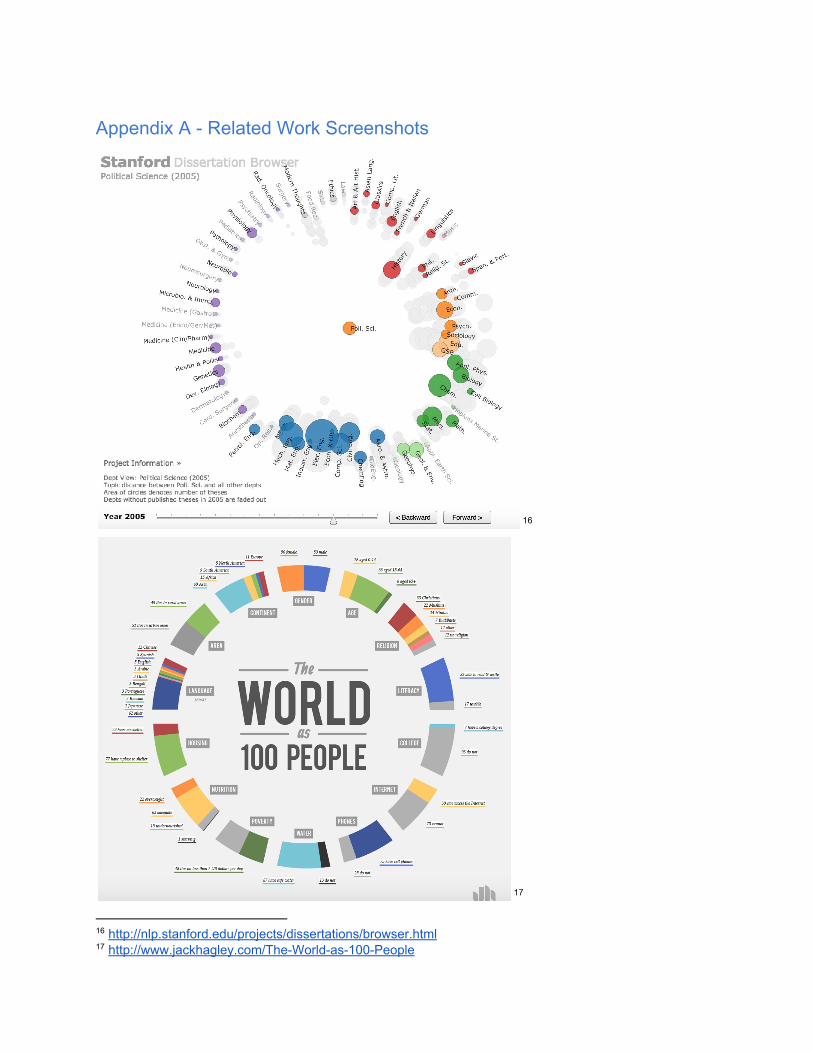
Appendix A Related Work Screenshots
16
17
16 http://nlp.stanford.edu/projects/dissertations/browser.html 17 http://www.jackhagley.com/TheWorldas100People

Appendix B User Interview Questions Interviews Protocol
Target Subject: Individuals who have used or are using OkCupid 3 interviews each (Emily 13, Max 46, Andrea 79) Input answers under each question
Ex. Q1: How often do you use OkCupid? P1 (female): Answer P2 (male): Answer
Q2: ... Introductory Questions
1. How often do you use OkCupid? (Note, we want people who use it frequently) 2. Can you describe how OKCupid matches you? 3. Do you answer questions on OkCupid? 4. When you use OKCupid, do you use quickmatch or match search? (toggle at the top)
Do you feel like you understand the difference? (only ask if comfortable with Q2) 5. Is there anything about the OKCupid experience you would change?
Values Questions
1. What is most important to you in a partner? a. If you feel comfortable, can you tell me the top 3 things you look for when
searching for matches online? b. What personality traits are most important?
2. What is most important to you in a dating site? 3. When using OKCupid, what percentage match range do you look for? (What is your
minimum threshold?) 4. In online dating, in comparison to offline dating, do you feel that you focus more or less
on demographic characteristics, such as race or income? a. In what ways? b. If you don’t mind sharing, have you or someone you know experienced prejudice
in online dating?
Needs and Usability Questions 1. Would you go to a site outside of OkCupid just to explore what your pool of potential
matches looks like? For example, seeing how your potential pool changes based on the priority you give to the questions you answer.
2. If so, how often would you visit? a. Never b. Once c. More than once

d. Every time I’m looking for matches on OKCupid 3. Why did you choose your answer to Question 2? 4. What else would you want to be able to do?

Appendix C Design & Prototyping Screenshots


Appendix D Question Selection Rationale As detailed in User Interview section, we chose real questions from OkCupid based on insights from our user interviews (see below). In the future, the questions included in the visualization would be chosen by the user.