Embed Size (px)
Citation preview
Real-Time Visualizations of Ocean Data Collected By The NORUS GliderDaniel Medina
Cal PolyZoe J. Wood
Cal Poly
ABSTRACT
NORUS, the North America-Norway educational program, has ascientific focus on how climate-induced changes impact the livingresources and ecosystems in the Arctic. In order to obtain the neces-sary science data, the NORUS program utilizes the Slocum Glider,a form of Autonomous Underwater Vehicle (AUV). This projectaims to create a compelling, efficient, and easy to use interactivesystem for visualizing large sets of science data collected by theglider. This goal is obtained through the implementation of vari-ous methods taken from scientific visualization, real time rendering,and scattered data interpolation. Methods include visualizations ofthe surrounding terrain, the ability to map various science data toglyphs, control over color mapping, scattered data interpolation andinteractive camera control.
1 INTRODUCTION
The oceans are an important focus of scientific study and explo-ration. NORUS, the North America-Norway educational program,has a scientific focus on how climate-induced changes impact theliving resources and ecosystems in the Arctic. In order to obtain thenecessary science data, the NORUS program utilizes the SlocumGlider, a form of Autonomous Underwater Vehicle (AUV). Thisproject aims to create a compelling, efficient, and easy to use in-teractive system for visualizing large sets of science data collectedby the Slocum Glider. This goal is obtained through the imple-mentation of various methods taken from scientific visualization,real-time rendering, and scattered data interpolation. The systemwas written entirely in C++, using OpenGL and GLSL for graphicsand Qt for rapid development of a platform independent graphicaluser interface. It allows for the real-time rendering of offline oceandata. The primary dataset used is from a glider deployment in afjord of Svalbard, Norway. The glider’s mission spanned from lon-gitude 13.3042◦ East to 16.6875◦ East and latitude 78.1042◦ Northand 78.7042◦ North. The 17 day mission began on June 30, 2009,during which time the glider collected 242,693 measurements foreach of the 20 different on-board sensors.
The system uses a generic mesh loader to generate an accurateand compelling environment. The look of the environment is ob-tained through the use of multitexturing to produce detailed terrain,a quasi-realistic ocean surface with reflection, refaction, and specu-lar highlighting, and simple animated clouds generated by 3-D per-lin noise. Also, various user configured scientific visualizations al-low the user to analyze the measurements taken by the glider. Theyinclude glyphs that display the discrete data measurements and in-terpolated visualizations such as isosurfaces, gradient planes, andvolume slices that provide interpolated values across continous sur-faces. An interactive camera control allows the user to freely movethrough the environment and a virtual glider retraces the physicalglider’s mission path. Finally, an intutive graphical user interfaceprovides the user with the highest possible level of customizabilityacross the entire system. Initial feedback from NORUS biologistsworking on the project conveyed enthusiasm for a tool that allowedthem to visualize their data in a virtual environment. Many of the
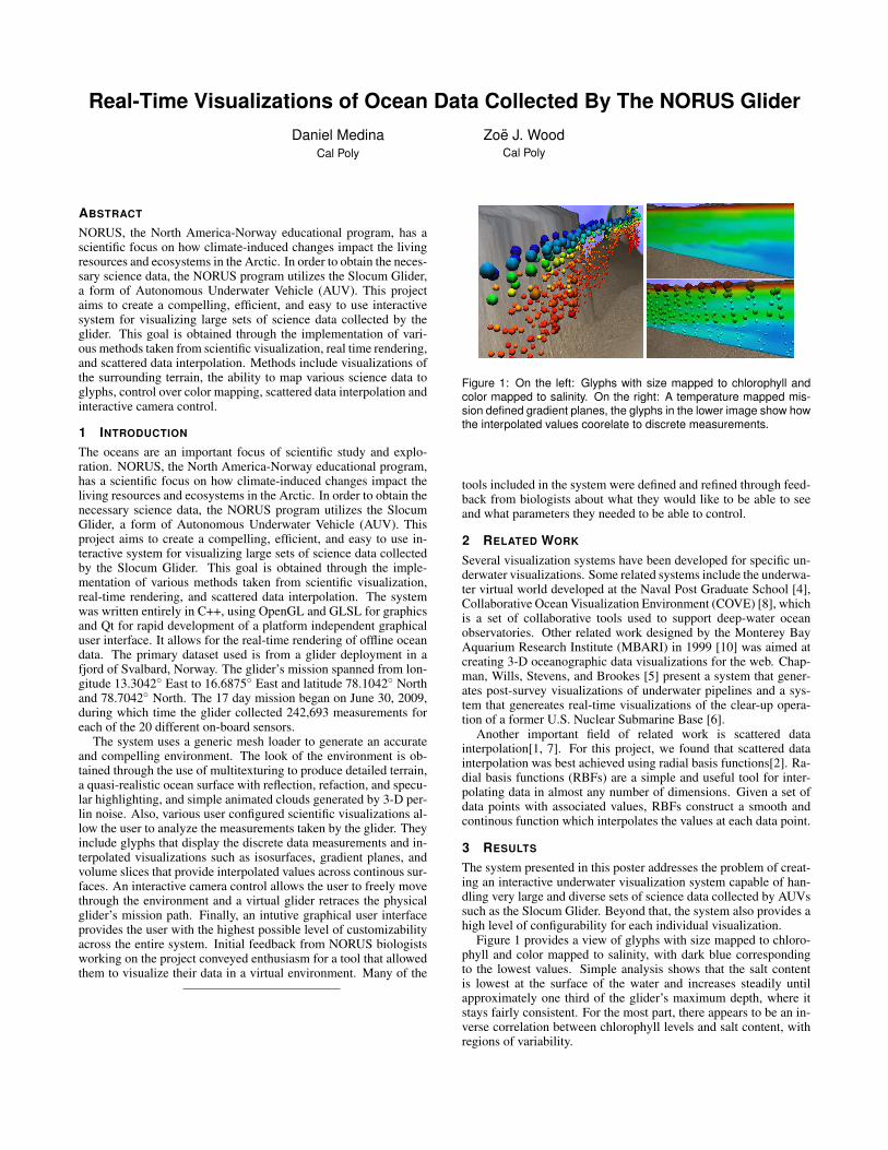
Figure 1: On the left: Glyphs with size mapped to chlorophyll andcolor mapped to salinity. On the right: A temperature mapped mis-sion defined gradient planes, the glyphs in the lower image show howthe interpolated values coorelate to discrete measurements.
tools included in the system were defined and refined through feed-back from biologists about what they would like to be able to seeand what parameters they needed to be able to control.
2 RELATED WORK
Several visualization systems have been developed for specific un-derwater visualizations. Some related systems include the underwa-ter virtual world developed at the Naval Post Graduate School [4],Collaborative Ocean Visualization Environment (COVE) [8], whichis a set of collaborative tools used to support deep-water oceanobservatories. Other related work designed by the Monterey BayAquarium Research Institute (MBARI) in 1999 [10] was aimed atcreating 3-D oceanographic data visualizations for the web. Chap-man, Wills, Stevens, and Brookes [5] present a system that gener-ates post-survey visualizations of underwater pipelines and a sys-tem that genereates real-time visualizations of the clear-up opera-tion of a former U.S. Nuclear Submarine Base [6].
Another important field of related work is scattered datainterpolation[1, 7]. For this project, we found that scattered datainterpolation was best achieved using radial basis functions[2]. Ra-dial basis functions (RBFs) are a simple and useful tool for inter-polating data in almost any number of dimensions. Given a set ofdata points with associated values, RBFs construct a smooth andcontinous function which interpolates the values at each data point.
3 RESULTS
The system presented in this poster addresses the problem of creat-ing an interactive underwater visualization system capable of han-dling very large and diverse sets of science data collected by AUVssuch as the Slocum Glider. Beyond that, the system also provides ahigh level of configurability for each individual visualization.
Figure 1 provides a view of glyphs with size mapped to chloro-phyll and color mapped to salinity, with dark blue correspondingto the lowest values. Simple analysis shows that the salt contentis lowest at the surface of the water and increases steadily untilapproximately one third of the glider’s maximum depth, where itstays fairly consistent. For the most part, there appears to be an in-verse correlation between chlorophyll levels and salt content, withregions of variability.

Figure 2: On the left, an image of chlorophyll mapped volume slicealong the ocean surface, while on the right is an image of chlorophyllmapped volume slice in the YZ plane.
Figure 3: A sequence of views for a chlorophyll mapped isosurfacewith temperature mapped to color.
3.1 Scattered data interpolation visualizationsThe system generates interpolated data using a radial basis functioninterpolation from the scattered data gathered by the glider. This in-terpolated data can be visualized as gradient planes, volume slicesor isosurfaces. Each gradient plane is constructed so that it spansvertically from the sea level to the deepest depth reached by theglider. Figure 1 shows gradient planes following the gliders path.Volume slices are shown in Figure 2, where a chlorophyll mappedvolume slice is shown along the ocean surface. The slice is beingrendered at a resolution of 50x50 with a value range of 0.8712 to3.4606. The glyphs represent discrete data samples used to gener-ate the interpolation function for the region. The important thingto note is the coorelation between color of the glyphs and the colorof the volume slice. Figure 2 also provides a view of a chlorophyllmapped volume slice along the YZ plane. The slice generates inter-polated values for the area inbetween the two distinct glider passesthat are defined by the position of the glyphs.
Figure 3 provides a sequence of views for a chlorophyll mappedisosurface with temperature mapped to color. Figure 3A is definedwith an isovalue of 0.9, and in each successive image the isosvalueis increased by 0.05, resulting in figure 3D being mapped to anisovalue of 1.05. The color of each isosurface is mapped to thetemperature within the region. Figure 4 provides two views for achlorophyll mapped isosurface with salinity mapped to color. Fig-ure 4A is mapped to an isovalue of 0.9 and figure 4B is mapped to0.95. The color of both isosurfaces are mapped to the salinity levelswithin the region.
4 CONCLUSION
This project has presented a compelling, efficient, and easy to useinteractive system for visualizing large sets of science data collectedby the Slocum Glider. An interactive camera allows the user tonavigate through accurate terrain generated from bathymetry data.The visualization system constructs glyphs, mission defined gradi-ent planes, user defined gradient planes, volume slices, and isosur-
Figure 4: Two views for a chlorophyll mapped isosurface with salinitymapped to color.
faces. Although the glyphs are generated from discrete data mea-surements taken by glider, all other visualizations, known as inter-polated visualizations, use scattered data interpolation to allow con-tinous sampling over regions containing a discrete number of datameasurements. The system was developed iteratively to ensure thatit would be a useful tool for the biologists involved in analyzing andinterpreting the glider data. At the completion of each iteration, thesystem was presented to NORUS biologists to obtain user feedbackand gather additional requirements for the next iteration. Overall,user feedback was extremely positive, and the biologists were ex-cited to have an additional tool for visualizing the glider data.
ACKNOWLEDGEMENTS
The science data for the Svalbard, Norway mission was collectedand made available by the Rutgers University, Coastal Ocean Ob-servation Lab (COOL).
REFERENCES
[1] P. Alfeld. Scattered data interpolation in three or more variables. InMathematical Methods in Computer Aided Geometric Design, pages1–33. Academic Press, 1989.
[2] J. A. Baerentzen and K. Gebal. Shape reconstruction using compactlysupported radial basis functions. Using compactly supported RBFs toreconstruct surfaces.
[3] J. G. Bellingham and M. Godin. Exploring ocean data. SIGMOD Rec.,37(2):78–82, 2008.
[4] D. P. Brutzman. A virtual world for an autonomous underwater vehi-cle. PhD thesis, Naval Postrgraduate School, December 1994.
[5] P. Chapman, D. Wills, P. Stevens, and G. Brookes. Whole field mod-elling (case study): effective real-time and post-survey visualizationof underwater pipelines. In VIS ’99: Proceedings of the conferenceon Visualization ’99, pages 445–448, Los Alamitos, CA, USA, 1999.IEEE Computer Society Press.
[6] P. Chapman, D. Wills, P. Stevens, and G. Brookes. Real-time visual-ization of the clear-up of a former u.s. naval base. In VIS ’00: Pro-ceedings of the conference on Visualization ’00, pages 505–508, LosAlamitos, CA, USA, 2000. IEEE Computer Society Press.
[7] R. Franke. Scattered data interpolation: Tests of some method. Math-ematics of Computation, 38(157):181–200, 1982.
[8] K. Grochow. Cove: a visual environment for multidisciplinary sciencecollaboration. In GROUP ’09: Proceedings of the ACM 2009 inter-national conference on Supporting group work, pages 377–378, NewYork, NY, USA, 2009. ACM.
[9] G. G. L. L. L. Schumaker and C. K. Chui. Fitting surfaces to scattereddata. In Approximation Theory II, pages 203–268, New York, NY,USA, 1976. Academic Press.
[10] M. P. McCann. Creating 3d oceanographic data visualizations for theweb. In Web3D ’02: Proceedings of the seventh international con-ference on 3D Web technology, pages 179–184, New York, NY, USA,2002. ACM.
[11] J. R. R. R. E. Barnhill. Representation and approximation of surfaces.In Mathematical Software III, pages 69–120, New York, NY, USA,1977. Ed. Academic Press.