Embed Size (px)
Citation preview
rare and beautiful books
Bibliography Week 2018
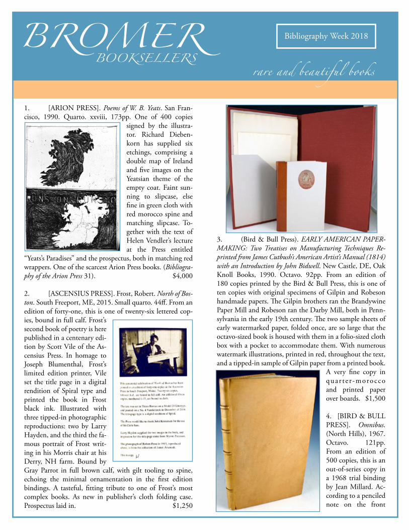
1. [ARION PRESS]. Poems of W. B. Yeats. San Fran-cisco, 1990. Quarto. xxviii, 173pp. One of 400 copies
signed by the illustra-tor. Richard Dieben-korn has supplied six etchings, comprising a double map of Ireland and five images on the Yeatsian theme of the empty coat. Faint sun-ning to slipcase, else fine in green cloth with red morocco spine and matching slipcase. To-gether with the text of Helen Vendler’s lecture at the Press entitled
“Yeats’s Paradises” and the prospectus, both in matching red wrappers. One of the scarcest Arion Press books. (Bibliogra-phy of the Arion Press 31). $4,000
2. [ASCENSIUS PRESS]. Frost, Robert. North of Bos-ton. South Freeport, ME, 2015. Small quarto. 44ff. From an edition of forty-one, this is one of twenty-six lettered cop-ies, bound in full calf. Frost’s second book of poetry is here published in a centenary edi-tion by Scott Vile of the As-censius Press. In homage to Joseph Blumenthal, Frost’s limited edition printer, Vile set the title page in a digital rendition of Spiral type and printed the book in Frost black ink. Illustrated with three tipped-in photographic reproductions: two by Larry Hayden, and the third the fa-mous portrait of Frost writ-ing in his Morris chair at his Derry, NH farm. Bound by Gray Parrot in full brown calf, with gilt tooling to spine, echoing the minimal ornamentation in the first edition bindings. A tasteful, fitting tribute to one of Frost’s most complex books. As new in publisher’s cloth folding case. Prospectus laid in. $1,250
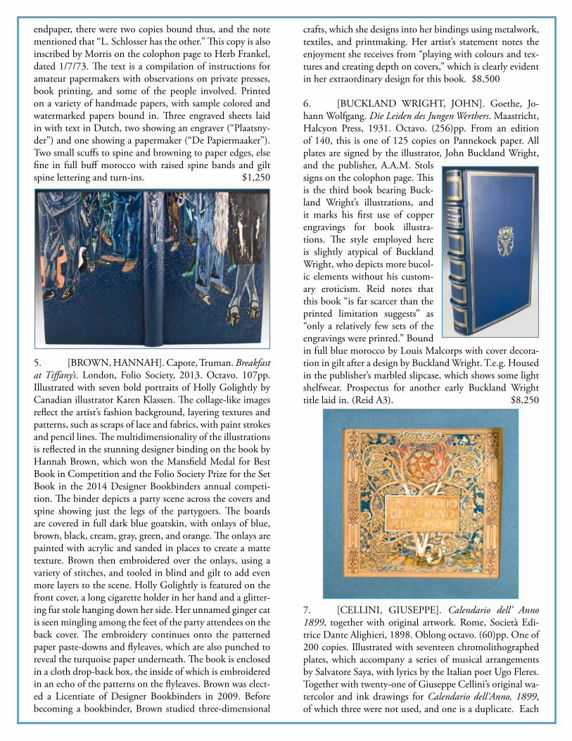
3. (Bird & Bull Press). EARLY AMERICAN PAPER-MAKING: Two Treatises on Manufacturing Techniques Re-printed from James Cutbush’s American Artist’s Manual (1814) with an Introduction by John Bidwell. New Castle, DE, Oak Knoll Books, 1990. Octavo. 92pp. From an edition of 180 copies printed by the Bird & Bull Press, this is one of ten copies with original specimens of Gilpin and Robeson handmade papers. The Gilpin brothers ran the Brandywine Paper Mill and Robeson ran the Darby Mill, both in Penn-sylvania in the early 19th century. The two sample sheets of early watermarked paper, folded once, are so large that the octavo-sized book is housed with them in a folio-sized cloth box with a pocket to accommodate them. With numerous watermark illustrations, printed in red, throughout the text, and a tipped-in sample of Gilpin paper from a printed book.
A very fine copy in quar t e r -morocco and printed paper over boards. $1,500
4. [BIRD & BULL PRESS]. Omnibus. (North Hills), 1967. Octavo. 121pp. From an edition of 500 copies, this is an out-of-series copy in a 1968 trial binding by Jean Millard. Ac-cording to a penciled note on the front
endpaper, there were two copies bound thus, and the note mentioned that “L. Schlosser has the other.” This copy is also inscribed by Morris on the colophon page to Herb Frankel, dated 1/7/73. The text is a compilation of instructions for amateur papermakers with observations on private presses, book printing, and some of the people involved. Printed on a variety of handmade papers, with sample colored and watermarked papers bound in. Three engraved sheets laid in with text in Dutch, two showing an engraver (“Plaatsny-der”) and one showing a papermaker (“De Papiermaaker”). Two small scuffs to spine and browning to paper edges, else fine in full buff morocco with raised spine bands and gilt spine lettering and turn-ins. $1,250
5. [BROWN, HANNAH]. Capote, Truman. Breakfast at Tiffany’s. London, Folio Society, 2013. Octavo. 107pp. Illustrated with seven bold portraits of Holly Golightly by Canadian illustrator Karen Klassen. The collage-like images reflect the artist’s fashion background, layering textures and patterns, such as scraps of lace and fabrics, with paint strokes and pencil lines. The multidimensionality of the illustrations is reflected in the stunning designer binding on the book by Hannah Brown, which won the Mansfield Medal for Best Book in Competition and the Folio Society Prize for the Set Book in the 2014 Designer Bookbinders annual competi-tion. The binder depicts a party scene across the covers and spine showing just the legs of the partygoers. The boards are covered in full dark blue goatskin, with onlays of blue, brown, black, cream, gray, green, and orange. The onlays are painted with acrylic and sanded in places to create a matte texture. Brown then embroidered over the onlays, using a variety of stitches, and tooled in blind and gilt to add even more layers to the scene. Holly Golightly is featured on the front cover, a long cigarette holder in her hand and a glitter-ing fur stole hanging down her side. Her unnamed ginger cat is seen mingling among the feet of the party attendees on the back cover. The embroidery continues onto the patterned paper paste-downs and flyleaves, which are also punched to reveal the turquoise paper underneath. The book is enclosed in a cloth drop-back box, the inside of which is embroidered in an echo of the patterns on the flyleaves. Brown was elect-ed a Licentiate of Designer Bookbinders in 2009. Before becoming a bookbinder, Brown studied three-dimensional
crafts, which she designs into her bindings using metalwork, textiles, and printmaking. Her artist’s statement notes the enjoyment she receives from “playing with colours and tex-tures and creating depth on covers,” which is clearly evident in her extraordinary design for this book. $8,500
6. [BUCKLAND WRIGHT, JOHN]. Goethe, Jo-hann Wolfgang. Die Leiden des Jungen Werthers. Maastricht, Halcyon Press, 1931. Octavo. (256)pp. From an edition of 140, this is one of 125 copies on Pannekoek paper. All plates are signed by the illustrator, John Buckland Wright, and the publisher, A.A.M. Stols signs on the colophon page. This is the third book bearing Buck-land Wright’s illustrations, and it marks his first use of copper engravings for book illustra-tions. The style employed here is slightly atypical of Buckland Wright, who depicts more bucol-ic elements without his custom-ary eroticism. Reid notes that this book “is far scarcer than the printed limitation suggests” as “only a relatively few sets of the engravings were printed.” Bound in full blue morocco by Louis Malcorps with cover decora-tion in gilt after a design by Buckland Wright. T.e.g. Housed in the publisher’s marbled slipcase, which shows some light shelfwear. Prospectus for another early Buckland Wright title laid in. (Reid A3). $8,250
7. [CELLINI, GIUSEPPE]. Calendario dell’ Anno 1899, together with original artwork. Rome, Società Edi-trice Dante Alighieri, 1898. Oblong octavo. (60)pp. One of 200 copies. Illustrated with seventeen chromolithographed plates, which accompany a series of musical arrangements by Salvatore Saya, with lyrics by the Italian poet Ugo Fleres. Together with twenty-one of Giuseppe Cellini’s original wa-tercolor and ink drawings for Calendario dell’Anno, 1899, of which three were not used, and one is a duplicate. Each
measures about 9 1/2 by 8 3/4 inches; the panels for the months of the year have, in almost all cases, placeholder text handwritten by the artist that was replaced by type in the final version. Cellini is perhaps best known for the frescoes that decorate the Galleria Sciarra in Rome, which blend in-fluences of English Pre-Raphaelitism with the artistic tradi-tions of the Italian Renaissance. These lovely, intricate calen-dar illustrations also clearly demonstrate the sway that the Renaissance aesthetic had on the Arts and Crafts movement, with elaborate floral and foliate designs, initials decorated with interlacing, and symbols for each sign of the zodiac, all in regal shades of red, blue, green, and gold. In the design for April, daisies bloom and birds perch amidst the inter-lace of branches that adorn the letter “A.” Printed Calendario bound in stab-sewn printed stiff card wrappers, which have been neatly repaired at the spine and edges, and placed in a cloth chemise. Drawings mounted to paper mats and kept together in another cloth chemise. Both housed in a custom silk-covered drop-back box with a gilt-stamped leather spine and edges. $16,500
8. [DARTON, WILLIAM]. The Kings of England, from William the Conqueror to George III. London, c. 1821. 16mo. (36) pp. Illustrated with thirty-three wood engraved portraits of English monarchs. Includes George III’s 1820 death date, hence the estimate on the date of publication. Unrecorded variant of Darton’s British Soverigns (H102), which bears a title similar to that of Robert Dodsley’s earlier historical survey (G259). The present title bears Darton’s 58, Holborn Hill address, where he was active between 1817 and 1823. Minor soiling to publisher’s printed wrappers. Overall, a near fine copy of a rare chapbook, known only in two institutional copies. (Not in Darton). $1,150
9. [DENCHINE, ALEXEI IVANOVITCH]. Vyats-kaya glinyanaya igrushka v risunkakh: raskraska risunkov ruchnaya, yachnymi kraskami, tochno skopirovannymi s pod-linnikov (Clay Toys from the Region of Viatka. Drawings hand-coloured by the Author, colour in egg, exact reproduc-tion of the originals). Moscow, Alexei Ivanovitch Denchine, 1917. Small quarto. Title-page with limitation on verso, 21pp. of Russian text lithographed in sepia from the author’s
calligraphy. Cover illustration and fifty tipped-in plates of terra cotta toys, hand-colored by Denchine and heightened with gold. The plates are numbered 1-51. First edition of the first monograph on one of the most famous symbols of Russian folk art. Despite a stated limitation of 300 copies, it is likely that fewer were actually produced considering the amount of work required for each copy. The graphic artist, painter, illustrator and author Alexei Ivanovitch Denchine (or Den’shin) (1893-1948) exhibited paintings from the age of seventeen; he participated, along with Kandinsky, Rod-chenko and others, in the great travelling exhibition of 1921. A great rarity of Russian book art. Original green wrappers, first side illustrated in lithography with pasted illustration hand-colored by the artist, stab-sewn with a thick multi-colored cord. Minor soiling and wear to wrappers, else an extraordinary copy that retains its original hand-decorated board slipcase. (Lévèque & Plantureux, p. 42). $4,500
10. (Binding Designs). [MEUNIER, NICOLAS-ADOLPHE CHARLES, LÉON GRUEL, AND PAUL GRUEL]. Six original designs for bookbindings. (Paris, c. 1910-1914). 6ff., loose. A collection of six designs for bind-ing elements, three completed in pencil and watercolor, and the others incorporating pencil, ink, watercolor, gouache, and gilt accents. Two of the designs are monogrammed “CM” for Charles Meunier and were likely made into bind-

ings by the bindery of Léon Gruel. The first, inspired by Moorish architecture and vividly colored in blue, green, and purple, is stamped “Léon Gruel...Paris” on the back with the title “Chariot de Terre Cuite” written in pencil below. Only half of the border and background are shown in the design, with the other half simply sketched in pencil. The other design, which depicts a central floral pattern colored in blue and green with gilt accents, bears a penciled note at the bottom that reads, “Jardin des Caresses a M Renevey.” Eugène Renevey was a French collector and bibliophile, and a binding by Gruel for Le Jardin des Caresses, the descrip-tion for which matches the design and colors of the binding depicted here, is documented in Renevey’s library catalogue (Bibliothèque de M. Eugène Renevey 320).
The four remaining binding designs are mixed media and in-corporate pencil, ink, watercolor and gouache paint, and, in some cases, ink and gilt stamping directly from the binder’s tools onto the paper. The largest of these is partially col-ored in pale blues, yellows, greens, and oranges, with vis-ible corrections in pencil to the design. Six small pieces of paper are adhered to the back of the page and show a pencil drawing for the spine of the book, which is titled “Yvonne.” The three smaller designs were possibly made for doublures and show different floral borders, one a pink rose vine, an-other a partially-colored pen-and-ink drawing of blue and white flowers, and the last a full gouache painting of a red and white ribbon entwined with blue-flowered vines on a brown background. The first of these designs bears the ini-tials “P.G.”, possibly for Paul Gruel, Léon Gruel’s son and partner at the bindery.
Léon Gruel (1840-1923) was the most well-known in a family of binders. His grandfather founded their bindery in 1811, and Léon became sole owner of the business in 1891, joined by his son Paul in 1900. The firm was known for their excellently executed fine bindings, exhibiting their artistry at the Paris Exposition in 1889 and attracting a worldwide audience. Charles Meunier (1865-1948) began binding in Paris in 1877. He worked in the bindery of Marius-Michel in 1882 and, in 1885, established his own workshop. He was closely associated with Robert de Montesquiou, who lauded Meunier’s talents in both prose and verse. Meunier, in turn, published some of Montesquiou’s writings and bound nu-merous works for his library. Meunier and Léon Gruel col-laborated on bindings, such as an example by Meunier with finishing by Gruel sold by Pierre Berès, and another, in the collection of the Folger Shakespeare Library, by Gruel after a design by Meunier. Together, these two master artisans are among the most important French bookbinders from the turn of the 20th century.
The largest design is 12 5/8 inches tall by 9 7/8 inches wide, while the smallest measures 7 inches tall by 5 5/16 inches wide. Light soiling and edgewear to some leaves, open tear approximately 1cm deep to lower edge of one drawing and
small closed tear to another, neither affecting the images, adhesive stains to back of three leaves, and fold marks visible on three leaves, possibly to aid the artist in locating the cen-ter axes. (Bibliothèque de M. Eugène Renevey 320; Duncan and de Bartha, Art Nouveau and Art Deco Bookbinding, pp. 191, 194; Folger Shakespeare Library, call no. PQ1581 .T7 1508 Cage; Pierre Berès Cat. 83 Livres Rares—Six Siècles de Reliures, no. 275). $3,500

11. [DOVES PRESS]. Keats. (Hammersmith), 1914. Large octavo. 203pp. One of 200 copies. Printed in red and black. This collection was first mentioned as a tentative fu-
ture project along with the collec-tion by Shelley in March, 1913, with a publication date eventually set for October, 1914. However, T. J. Cobden-Sand-erson’s long illness and the outbreak of war in August, 1914 pushed the publication date to January, 1915. This was the last anthology of Eng-
lish poetry printed at the Press. Enclosed in chemise and matching half-leather slipcase. Very fine in the original full vellum. (Tidcombe DP36). $2,000
12. [DOVES PRESS]. Sartor Resartus: The Life and Opinions of Herr Teufelsdroeckh. (Hammersmith, 1907). Octavo. (342)pp. One of 300 copies printed by T. J. Cob-den-Sanderson and Emery Walker at the Doves Press. The main text body is printed in black; shoulder notes, chapter headings, and Edward John-ston’s calligraphic initials are print-ed in red. Finely bound at the Doves Bindery in full navy blue morocco, with gilt floral decora-tions to spine and turn-ins. Light wear to extremities, else a fine copy. From the collection of Cor-tlandt F. Bishop, with his bookplate to front paste-down. (Tidcombe DP13). $3,500
13. [DOVES PRESS]. Shelley. (Hammersmith), 1914. Large octavo. 181pp. One of 200 copies. Printed in red and black. This collection was first mentioned as a tentative fu-ture project along with the collection by Keats in March, 1913, with a publication date eventually set for June, 1914. After T. J. Cobden-Sanderson’s long illness, he became very sensitive to any imperfections in his printing, blaming his age for his “growing inability to energize the Press to its fin-
ger-tips.” Despite his fears, this work lives up to the high standards and fine quality one expects from the Press. En-closed in chemise and matching half leather slipcase. With the morocco booklabel of re-nowned bibliophile Charles C. Kalb-fleisch to inside front cover, which has offset to the front flyleaf. Very fine in the original full vellum. (Tidcombe DP35). $1,750
14. (Fröbel, Friedrich). KINDERGARTEN TEACH-ER TRAINING ALBUM. Mayberry, PA, c. 1900. Quarto. Nine-fold concertina-style book featuring artwork on both sides. The artwork includes many of the “gifts” that formed the Fröbel educational approach, including paper weaving, patterned embroidery on paper, and paper folding. With a printed cover label indicating ownership of Miss Rachel C. Reeves of Mayberry PA. This album contains an array of Fröbel gifts, including 4 pages of captioned cut-paper shapes arranged to create objects, 4 pages of stitch work, 12 pages of woven work, 11 pages of elaborate paper folds and 12 pages of captioned objects created from folded papers. Lesson or section titles using elements from nature include; Develop-ment from Circle to Square, Sequence of Life Forms from Salt Cellar Ground Form, Circular Beauty Form, Beauty Forms on Square Form Inventions, Beauty Form Sequence Salt Cellar Ground Form, Sequence of Life Forms from table Cloth Ground Form, Beauty Forms - Hexagonal Ba-sis, Beauty Forms - Trapezium Basis and Knowledge Forms. Blind stamped brown cloth with fore-edge ties. Bit of wear to spine ends and a touch of rubbing to corners, else unusu-ally fine and bright. $1,350
15. [GERRY, LESLIE]. Havana. (Gloucestershire), Leslie Gerry Editions, (2016). Folio. (60)pp. From an edi-

tion of 80 copies, this is one of 70 copies bound in cloth. Illustrated with twenty-two full color double-page spreads of the people and scenery of Havana. Includes extracts from Irene A. Wright’s “Cuba,” written in 1910. Gerry’s paintings, inspired by a two week visit to the city in December 2015, attempt to capture the “one of the oldest and finest cities in the Americas... a city with an earthy authenticity, full of con-tradictions.” Gerry’s art is created digitally by “cutting out” sections of flat color and layering them on top of each other, creating an overall effect of a vibrant, graphic paper collage. Bound in sky blue cloth with the title in gigantic letters, heat printed in red, orange, and yellow. Housed in a matching clamshell box. Mint. $2,250
16. GILL, ERIC. An Essay on Typography. London, Sheed & Ward, (1931). Octavo. iv, 121pp. First edition. One of 500 copies signed by Eric Gill and Rene Hague and print-ed by Hague & Gill. This is a presentation copy, in-scribed on the colophon. Illustrated with twenty-five figures, including ten type specimens and four illustra-tions from wood engrav-ings by Gill. According to the bibliography, there were twenty-five copies specially bound by Donald Attwater
in full Welsh sheepskin tooled in blind. The present copy appears to be one of those specially bound copies, as it is in full sheepskin with blind tooling, though with very subtle differences from the bibliographical description. Evan Gill notes, for instance, that “the blind tooling on front and back was not uniform in design” and that on the present copy is uniform. He also notes that “GILL TYPOGRAPHY” reads downward on the spine, where here, the author’s name is not on the spine. Slight fading to spine, very minor bump
to spine head, minute scuffs to soft leather, as is typical of sheepskin. A fine copy, nevertheless, of a seminal work on typography, in a rarely seen binding state. (Gill 21). $2,250
17. [GOLDEN COCKEREL PRESS]. Chaucer, Geof-frey. The Canterbury Tales. With Wood Engravings by Eric Gill. Waltham St. Lawrence, 1929-1931. Four quarto volumes. 151; 189; 197; 219pp. One of 485 copies printed in red, black, and blue on handmade paper. Illustrated on every page with wood engravings by Gill, including leafy borders with figures, vignettes, and decorated initials. All of these are beautifully described by Colin Franklin as “affectionate and cheeky, erotic, enjoyable and relevant, decorative and explanatory, a balance of taste and eye.” Bound in original morocco-backed patterned paper boards by Sangorski & Sutcliffe. Rubbing and light bumps to some corners, spines of volumes 1, 2, and 4 show uniform fading. Few light scuffs to spine of volume 4. Boards are bright and spines are evenly colored. Overall, a near fine copy of a landmark press book that is seldom encountered without flaws. T.e.g. Bookplate. (Chanticleer 63; Gill 281; Franklin, The Private Presses, p. 144). $9,500
18. [GOREY, EDWARD]. Figbash Beanbag. Figbash stands (if he could stand) about six inches tall with an arm-span of about 19 1/2 inches. Hand-sewn by Edward Go-rey himself in a black holiday fabric patterned with bright Christmas ornaments. With the original tag reading “De-signed life-size and sewn by hand and filled with rice by Edward Gorey.” “Edward Gorey” has been crossed out and signed in ink by the artist. Fine. $1,500

19. ( J u n i p e r u s -Presse). SHAKESPEARE, WILLIAM. The Tragedy of Hamlet, Prince of Den-mark. Stuttgart, Union Deutsche Verlagsgesell-schaft, 1925. Quarto. 200pp. From an edition of 225 copies, this is one of 200 numbered copies of-fered for sale. Though the text is in English, this edi-tion, printed at the Juni-perus-Presse in Stuttgart, is a supremely German production in the style of
the Bremer and Ernst-Ludwig Presses. The founder and di-rector of the Juniperus-Presse, Professor F. H. Ernst Schnei-dler, studied under Fritz Helmuth Ehmcke, co-founder of the Steglitzer Werkstatt with Friedrich Wilhelm Kleukens, and Schneidler drew on their tradition of typographically significant works and fine craftsmanship for the books the Presse produced. The Juniperus-Presse was established in 1921 and operated out of the Württembergischen Staatli-chen Kunstgewerbeschule (Württemberg State Art College) in Stuttgart. Schneidler taught at the college, and his stu-dents also worked at the Presse under the supervision of the managing director Walther Veit, printer Julius Heilemann, illustrator Josef Wenzky, and binder Wilhelm Schlemmer. The Presse produced 15 books before closing in 1925, and each book was entirely conceived and fabricated in-house before being distributed by Julius Hoffmann of Stuttgart. Schneidler developed new fonts for the texts, including the one used in Hamlet, which was later issued as Schneidler-Mediaeval in 1936. A larger format version of this text was printed by the Presse in 1923, but this smaller 1925 version, one of the last books produced there, was issued under the Union Deutsche Verlagsgesellschaft imprint, a Stuttgart-based publisher known for publishing particularly attractive editions of children’s books. This edition, with its emphasis on fine typogra-phy and excel-lent craftsman-ship, continues in this vein and is a worthy example of the German tradition of fine printing.
Beautifully bound in an unsigned Art Deco binding of full tan crushed morocco with a linear geometric
design formed from rules stamped in gilt and blind across both boards. The turn-ins are also stamped in gilt and blind and accompany raw silk endpapers. The title is gilt-stamped in an Art Deco-style typeface on the front board and spine. The design is reminiscent of the work of German bookbind-er Ignatz Wiemeler, who bound another copy of this text using the same title typeface and the linear stamped design that is a distictive element in his work. Housed in a paste paper-covered slipcase edged in morocco. Faint rubbing to lower edge of book from slipcase and a bit of sunning to spine; slipcase shows some edgewear; otherwise, a fine Ger-man production. (Rodenberg, Deutsche Pressen, pp. 97-100; Londenberg, Ignatz Wiemeler: Werkverzeichnis 168). $2,750
20. [KAT RAN PRESS]. Knapp, Tracey. Match in a Bottle. North Andover, MA, 1997. Quarto. (48)pp. One of fifty numbered copies signed by the poet and the artist. First book of the press. Eight poems about burning and fire-men, each illustrated with a full-page unique drawing by Kurt Gohde. Ghode creates haunting images of smoke by controlling the smoking and singeing of the paper itself, us-ing matches, kerosene lamps, gun powder, and lighters. Very fine in crimson cloth with matching drop-back box. An-nouncement laid in. (Kat Ran Press Checklist A1). $1,750
21. [KELMSCOTT PRESS]. The Poetical Works of Per-cy Bysshe Shelley. (Hammersmith, 1895). Three octavo vol-umes. 399; 412; 421pp. One of 250 copies. Ornate wood-engraved double-page opening in Volume I and initials and borders throughout the three volumes by William Morris. In a letter to a friend in 1855, William Morris wrote that he had just been reading Shelley’s works and that he liked what he had read very much. He was particularly impressed by the poet’s ode “To a Skylark,” writing, “WHAT a gorgeous thing it is! utterly different to anything else I ever read... ‘The Skylark’ makes one feel happy only; I suppose because it is nearly all music...” This set in lovely matched bindings by G.P. Putnam’s Sons Knickerbocker Press of gilt-stamped full green morocco. Gilt rule borders frame a central panel filled with a repeating “S” design, decorated with dots, flow-ers, and hints of leaves. Spine in six compartments with five

raised bands. Gilt turn-ins highlight brown leather dou-blures. Binding signed “G.P. Putnam and Sons” on the low-er front turn-in and “The Knickerbocker Press” on the lower rear turn-in. T.e.g. Each volume is protected by lined cloth jackets, and they are housed together in a slipcase. In addi-tion to publishing books, the Albany-based Knickerbocker Press also produced fine bindings on par with British con-temporaries Prideaux and Rivière. Bookplate of Veryl Pres-ton, designed in 1902 by artist Joseph Winfred Spenceley. Preston was a Vice President of the American Steel Hoop Company, and held a high position in the steel trust after the company’s absorption. Spines a bit darkened, else a fine set in beautiful bindings. (Peterson A29). $12,500
22. [LANSKOY, ANDRÉ]. Cortège. Paris, Pierre Le-cuire, 1959. Folio. (28)pp., + 23 plates. From an edition of 170 copies, this is one of twenty-five deluxe copies with an additional suite of pochoir plates. Signed by the author/publisher and the artist below the colophon. Illustrated with twenty-three brightly colored pochoir plates, one of which is double-page, after paintings by André Lanskoy, executed by Maurice Beaufumé, who was responsible for Matisse’s Jazz. Lanskoy was a Russian-born painter of the Tachism move-ment in Paris, where he lived and worked from 1921 until
his death in 1976. Tachism, part of the larger Art Informel movement, focused on the intuitive and spontaneous ex-pression of the art-ist. Cortège is true to form for Lan-skoy and Tachism, with its richly col-ored and boldly arranged abstract shapes—Lanksoy’s own interpretation of Lecuire’s prose
poem. At the time, Lecuire was still early in his career; this was only his fourth published work. Lecuire continued to publish illustrated poetic compositions through the 1980s. Major exhibitions of his work were organized at the French House in Oxford, England in 1977 and at the National Li-brary of France in 2001. Lecuire died in 2013. Issued loose in a multi-colored pochoir wrapper designed by Lanskoy, and housed in a cloth chemise backed in lithographed pat-terned paper after a design in the book and a cloth slipcase. Visible offsetting from the pochoir, now mitigated by inter-leaved tissue; chemise and slipcase both show some rubbing and marking, and slipcase splitting at corners. A near fine copy. $22,500
23. (Leaf Book). WILLIAM CAXTON. Chicago, (Lakeside Press), 1905. Quarto. 118pp. One of 252 cop-ies printed for the Caxton Club by the Lakeside Press. This copy contains a leaf from Caxton’s first edition of Chaucer’s Canterbury Tales, but it is not one of the148 copies originally issued with the leaf in an envelope at the rear, and a limita-tion page. Illustrated with 26 collotype plates, which further demonstrate the breadth of Caxton’s technique. Housed in a plastic sheet, the leaf is inserted at the rear, bearing the text of “The Tale of Melibius.” A fine sample of Caxton’s print-ing, which shows several small marginal repairs. In publish-er’s binding of gray-green boards backed in red cloth, paper label on spine. Lower rear corner a trifle bumped, else a fine, bright copy with very clean text. Booklabel and bookplate on front paste-down. Housed in a contemporary blue cloth slipcase. (BCC #9; Chalmers 11). $7,500
24. (Miniature Book). BROMER, ANNE C. XI LXIV-MOS: Memoirs of a Bibliomidget. Boston & Vancouver, Bro-mer Booksellers & HM Editions, 2015. 72pp. From an edi-tion of 120, this is one of 85 copies that make up the regular edition. Designed and printed at Heavenly Monkey, this lovely miniature memoir and bibliography contains stories of pleasure, coincidence, and difficulty for each of the eleven miniature books published by Anne and David Bromer be-tween 1977 and 1989, followed by detailed bibliographic descriptions. The text is set in eight-point Centaur and Ar-righi types and printed on dampened Somerset Book paper. Bound by Sarah Creighton in a printed vine-patterned pa-

per over boards. The de-sign for the vine pattern was created by Franc-esca Lohmann, who also drew the book’s interior foliage. An elegant pro-duction. (2 3/4 by 2 1/4; 72x58mm). $150
25. ( M i n i a t u r e Book). DARD HUNT-ER. Miscellaneous Thoughts and Reflections.
New Britain, CT, Massmann, Robert, 1984. Two volumes. (20); (8)ff. One of 100 copies printed, designed, entirely constructed, and signed by Robert E. Massmann. Volume one is in the shape of the front of Dard Hunter’s Lime Rock paper mill. Volume two, which contains paper samples, is bound as a disc with half-round pages opening two ways. The text was printed separately, then cut out and mounted on the leaves. Both vol-umes are housed in a sculptured construction of the paper mill, a hand-painted cardboard model complete with chimney, mansard roof, landscaping, and front gate. According to Massmann, the papers used in the book and the imaginative paper mill slipcase are from the unfinished, last lot produced at Dard Hunter’s Lime Rock Mill. This ingenious artist’s book is in very fine condition. (Bromer/Edison pp.40-42). (Volume I: 2 3/8 by 2 1/8, 60x53mm; volume II: 2 1/8, 55mm. diameter). $650
26. (Miniature Book). [FOX, GABRIELLE]. Q.R.V. Boston, Anne & David Bromer, 1989. (32)ff. This Gorey rarity features a one-of-a-kind designer binding by Gabrielle Fox, one of the leading artisans in binding and conservation. Signed by Fox and the artist, Edward Gorey. With twenty-nine illustrations accompanied by rhyming couplets, Q.R.V is an homage to Isaac Watts, and the text is obscurely akin to Divine Songs for Children. Edward Gorey (1925-2000), the
quirky, macabre fabulist, wrote and illustrated nearly 100 offbeat books. Gorey was introduced to millions of Ameri-cans through his opening and closing credits for the PBS Mystery! series and his Tony Award-winning costume design for the Broadway production of Dracula. Bromer Booksell-ers collaborated with him on two miniature books, the pres-ent title being one of them. Words stamped in gilt on the front and back covers, and on the inside paste-downs ask the question on everyone’s mind: “What can it be, this Q.R.V.?” Bound in sienna morocco with brightly-colored onlays of blue, green, purple, orange, and yellow, and with dots of the same colors with gilt accents on the spine. Doublures of teal leather are stamped with “Q.R.V.” in variously colored foils. Housed in an orange and green morocco slipcase. A.e.g. (1 1/2 by 1 5/8; 37x40mm). $1,500
27. (Miniature Book). SEKERE MANIERE DES GE-BEDS, EN BEWEGINGE VAN DIEN. Door M.D. (Secure Manner of Prayer and its Movement, by M.D.). (Holland), B. de Later, 1676. 48pp. Printed in 5-point black-letter type. Each opening shows a four-line devotional poem, the text going across two adjoining pages. In an extraordinarily beautiful binding of seventeenth-century brown calf, with spine in compartments, gilt fillets and floral corner tools. Each corner, front and back, has an ornamental filigree re-inforcement, delicately carved of solid gold. The exquisite hinged clasp, in floral and butterfly shapes, is also of gold filigree. Intact, and extremely fine. A.e.g. The rarest, and the second smallest, of all the seventeenth-century miniatures. “A uniquely beautiful and finely preserved miniature book of utmost rarity, of which no record has been found.” (Spiel-mann 454). The book is also not recorded in the Centrale Catalogus, housed in the Koninklijke Bibliotheek in Den Haag. Accompanied by a tiny gold-edged and gold-decorated card-board box, only 1/2 by 3/8 inches, which opens to reveal a pair of tiny turquoise hearts. Both are housed in a sterling silver case, about 1 1/4 inches in diameter, with a screw-on lid, and decorated with beaded edges. The case has glass top and bottom; the top glass insert was replaced at some point by a plastic lens. (11/16 by 1/2; 17x13mm). $12,000
28. (Miniature Book). LE SENTIMENT ANALYSÉ OU L’ÉCOLE DE L’ADOLESCENCE. Paris, Chez Janet Libraire, (1806). 1-16, 1-24, 17-32pp., + (12)ff. engraved illustrations. Title page also engraved. This miniature alma-nac includes calendar tables for the year 1806 and a list of eclipses, as well as twelve short educational poems. Each of the rhyming poems, consisting of three stanzas of eight lines each, seeks to instruct innocent growing children on how to behave as they enter adolescence. The calendar is bound, as

usual, around the main text, with January through May be-fore and June through December after. Bondy comments on a group of French almanacs, of which this title is a part: “Of particular rarity are some of the slightly larger volumes... published between 1790 and 1814 by Jubert, Janet, Mar-cilly or Le Fuel in Paris. They all have engraved titles and most of them contain twelve full-page plates executed with the greatest care and delicacy, representing elegant scenes of contemporary life.... Collectors who succeed in finding any of these magnificent almanacs all of which are now exceed-ingly rare, must deem themselves very fortunate.” Hand-somely bound in gilt-tooled red morocco, and housed in a matching slipcase lined in light blue silk. A.e.g. Light wear and some oxidation to the gilt edges, else a fine copy of an “exceedingly rare” item. (Bondy, pp. 48-50). (2 5/8 by 1 3/4; 67x45mm). $2,000
29. (Miniature Book). [ST. ONGE, ACHILLE J.]. King George VI, The Prime Minister’s Broadcast February 7, 1952, by Winston S. Churchill. Worcester, MA, 1952. 27pp. One of 750 copies. Inscription in ink by St. Onge. Illustrat-ed with a portrait frontispiece of King George VI by Karsh of Ottawa. First American edition of Winston Churchill’s speech. Printed by the Chiswick Press and bound by San-gorski & Sutcliffe. Very fine in blue morocco with gilt-stamping. A.e.g. (Massmann 8; Bradbury, p. 252). (2 1/4 by 1 1/2; 57x37mm). $850
30. ANOTHER COPY. Very fine in red morocco with gilt-stamping. A.e.g. (Massmann 8; Bradbury, p. 252). (2 1/4 by 1 1/2; 57x37mm). $800
31. [PORTER, VERNON C.]. Archive of original de-signs for department store display fixtures. NY, Lansha Stu-dios, c. 1922-1934. This collection contains 128 individual pencil designs and 51 photographs of manufactured fixtures used to create department store window and floor displays. The bulk of the designs were made for Lansha Studios, a New York firm established by Lionel Schacht and Eugene P. Lan-franchi as part of Schacht Lanfranchi Inc., which specialized in designing and manufacturing wrought iron furniture and decorations. Schacht was a prolific inventor, who achieved commercial success with a new, shatter-resistant glass door designed for department stores. Lafranchi was a well-known designer of wrought iron, who operated multiple studios in the United States, including in New York and Palm Beach, Florida.
Perhaps due to Schacht’s connections with department stores, Lansha Studios developed a market for designing and manufacturing the pieces used to showcase items in depart-ment store window and floor displays. They needed to be beautiful and stylish, while not detracting from the goods they were displaying. The designs in the collection reflect this balance, embracing a variety of styles, from Art Deco and Art Nouveau to Greek Revival and even Arts & Crafts. The stands, shelves, hangers, and tables were developed in coordinating lines to allow for a more cohesive window dis-play, and they were specially developed to show off a num-ber of popular consumer goods, including jewelry, gloves, hats, ties, belts, shoes, and more. The fixtures were made from shiny, reflective materials to draw attention and dazzle the eye, most prominently aluminum, brass, black glass, and mirrors, though a few featured wood surfaces for warmth. Department stores, such as Lord & Taylor, Avedon’s Fifth Avenue, and Best & Co, used individual or grouped piec-es to develop and enhance their window displays, and the collection includes photographs of displays at the former two stores utilizing Lansha fixtures. Three designs, two for belt stands and one for a tie stand, are labeled “Best & Co. N.Y.C.”, suggesting that they were created specifically for the company.Item 29 Item 30
The bulk of the original designs in the collec-tion were ex-ecuted on thin, o n i o n - s k i n paper, some on folio-sized sheets that have been folded, and some on smaller sheets that have been grouped and
pasted to cardstock measuring 19 inches wide by 12 inches tall. Each design bears an item number, and most have ad-ditional information written in the margins, such as dimen-sions, materials, price, and/or customizations available. A few of the drawings are accented with colored pencil, and several cardstock sheets have sketches in the margins or on the back. Fifteen of the drawings are stamped in purple by Lansha Studios, perhaps indicating that these designs were approved for production. Three blueprints of bases for stands of different types are also marked by Lansha Studios.
Forty-eight black & white photographs show manufactured examples of the fixtures and, with the exception of three prints that are smaller than the others, are not represented in the original designs. The majority of the photographs are stamped in purple on the back with the same Lansha Stu-dios mark described above, and also bear item numbers and descriptive information, suggesting that the photographs were used for ordering purposes.
Also contained in the collection are sketched logo designs for 1 Fifth Avenue and the Eighth Street Playhouse. De-signed in 1927, 1 Fifth Avenue was one of the first Art Deco skyscrapers in Manhattan, with commercial space at street level and residences above. The three pages of logo designs for the building range from the very stylized to traditional, and some indicate that an art gallery was in the commer-cial space at the time. The Eighth Street Playhouse, located
just down the street from 1 Fifth Avenue, was established in 1929 as the Film Guild Playhouse. It was originally built to accommodate Symon Gould’s Film Guild and was designed by “architect Frederick Kiesler to resemble the bellows-like interior of a still camera” (MacDonald). The cinema was re-named the Eighth Street Playhouse in 1930. A rough sketch of the cinema’s distinctive interior is on the back of one of the pages, and the designs include variations on a repeating image for a generic logo and a dated drawing, possibly for an event poster.
Another small group of drawings appear to be sample de-signs for fixtures that were not executed under the auspices of Lansha Studios, as they do not have item numbers, di-mensions, or notations included with the bulk of the oth-er designs. A further three folio-sized sheets show rough sketches for what appears to be a heated ottoman that could be raised or lowered electronically.
A final blueprint for an electric master clock gives a clue as to the artist behind the designs in this collection. The blue-print is dated October 1, 1934 and indicates that a patent for the clock was applied for by V. C. Porter. This is most likely Vernon Carroll Porter (1896-1982), who was a de-signer and artist best known for founding the Washington Square Outdoor Art Exhibit in 1931, with the objective of helping artists during the Great Depression. Porter worked as a freelance designer in New York City from 1925 to 1932, and, while none of the designs in the collection are signed, the back of one of the cardstock sheets bears what looks like Porter’s monogram and address.
General wear to drawings and photographs, with a few onion-skin pages torn at margins. Otherwise a fine archive of designs reflecting the confluence of style trends found in New York department stores in the 1920s and 30s. $7,500
32. [ROGERS, BRUCE]. The Odyssey of Homer. Trans-lated by T.E. Lawrence with a three-page note by him at the end of the text. (London), 1932. Quarto. Unpaginated. One of 530 copies, printed and published by Rogers, Sir

Emery Walker, and Wilfred Merton. Illustrated with 26 decorations of Homeric figures printed in black on round backgrounds of gold. It was Rogers who, upon reading Sev-en Pillars of Wisdom, decided that T.E. Lawrence would be an ideal translator for a new edition of the Odyssey—a pro-cess that was expected to take two years and ended up tak-ing four. The famous gold roundels—one of the signature features of this edition—were based on Rogers’s drawings of figures from Greek vases, each one depicting a scene from Homer’s epic. These illustrations famously required seven passes through the press. Even the ink was specially made from an early 19th-century formula, using an oily resinous balsam that resulted in “a depth of black without gloss” in the roundels, as well as lending the book a slightly spicy aroma. A BR30 title, this is one of Rogers’ most beautiful books and, according to Joseph Blumenthal, “indisputably among the most beautiful books ever produced ... with only type and paper and ink, with consummate skill, Rogers cre-ated a masterpiece.” Two small tears to rear free endpaper, else a fine copy housed in the original slipcase, which shows some paper loss to edges. (Warde 157; Blumenthal p.134; O’Brien A141). $8,500
33. (Science Fiction). BRADBURY, RAY. Fahrenheit 451. NY, Ballantine Books, (1953). First edition, first hard-bound trade issue. Laid in to this copy is Joseph Mugnaini’s original preliminary cover art for the novel, which Bradbury personally owned. The watercolor and sketch work features the same elongated human figure dressed in newspapers and surrounded by flames. Mugnaini collaborated with Brad-bury to interpret and illustrate the covers and interiors of many of his works, including The October Country, A Medi-cine for Melancholy, and Twice 22. This, however, is his most famous piece, and this original artwork is entirely unique.
Fahrenheit 451 has long been regarded as a high point of the science fiction genre. Written in the peak of McCarthyism, it grapples with the consequences of censorship and the de-struction of knowledge. The novel has been celebrated since its first publication. In 1954 it won the American Academy of Arts and Letters Award in Literature, and in 2004 it was granted a 1954 Retro Hugo Award, one of only four Retro Hugos ever given. Bound in red cloth with gold stamping (Currey binding D) with light edgewear. Binding and wrap-per in fine condition. (Barron 3-31; Pringle 8). $9,500

34. (Science Fiction). THE HISTORY OF A VOY-AGE TO THE MOON, WITH AN ACCOUNT OF THE ADVENTURERS’ SUBSEQUENT DISCOVERIES. An Exhumed Narrative, Supposed to Have Been Ejected from a Lunar Volcano. London, Lockwood & Co., 1864. Octavo. (4), 204pp. First edition. Inscription on recto of frontispiece identifies author: “Geo. Evans presented to him by the Au-thor H. Cowen the 20 Sept. 1866.” In standard references and OCLC previous to this copy’s discovery, the book was recorded as anonymous or according to the names of its pseudonymous authors (Stephen Howard and Carl Geister) or editor (Chrysostom Trueman). Cowen presented the tale
in two parts, “The Voyage” and “The Ideal Life.” The former follows the protagonists as they learn how to create a new gravity-resistant power source and travel to the moon. In the latter, they discover a utopian society inhabited by “am-nesiac reincarnations of select Earthmen,” miniature in stat-ure and communitarian in ethos. The narrative is as much a philosophical exercise as a scientific one. Thus, while not as ambitious in scope or innovative in detail as other proto-science fiction texts, its grasp of larger ethical and societal issues has made it highly influential. Shortly after its first publication, The History of the Voyage to the Moon appeared in France as Voyage a la Lune, making its influence on Jules Verne’s From the Earth to the Moon highly plausible. Bound in pebble-grain green cloth with blind-stamped ornamenta-tion to covers and gilt-lettering to spine. Slightly shaken, spine and corners bumped, edges of text block show minor soiling. Housed in box with green morocco exterior and gilt stamping. A fine copy of a genre rarity. $15,000
35. (Science Fiction). STAPLEDON, W. OLAF. Odd John. London, Methuen, (1935). First edition, first issue, with ads at rear dated “535” (i.e., May, 1935); later issues bear an August date. One of 3096 copies printed. A novel that explores the idea of a Nietzschean “Super-man” with great mental prowess living among ordinary human beings. John Wainwright, the titular character, winds up feeling op-pressed, and, together with fellow “Homines Superiores” he locates in mental asylums and other far-flung places, flees to an island where they form a colony. Eventually, the activi-ties of the colonists are looked upon by the rest of humanity with suspicion, and when the island is invaded, the colonists deliberately destroy it. The theme of misunderstood intellec-tualism was a recurring one for Stapledon, whose first book dealt with similar ethics. Stapledon was inducted into the Science Fiction and Fantasy Hall of Fame in 2014. Light foxing along edge of text block, some shelfwear to bottom edge, faint toning to spine, Dublin bookseller’s label on lower front paste-down. Overall, a near fine copy in light blue cloth with dark blue lettering, in the extremely rare first issue dust wrapper, with the 7s/6d price intact on the lower front flap. Dust wrapper shows light soiling to back panel and a few small chips at the top of the spine and upper cor-ners, but is quite bright, showing almost none of the fading to the pink spine color to which this title is subject. Housed in a white cloth folding case. (Barron 2-120). $3,500
36. [SHEPPARD, WILLIAM LUDWELL]. The Old Fashioned Mother Goose Melodies Complete with Magic Col-ored Pictures. NY, G.W. Carleton, 1879. Octavo. 48ff. Fea-tures forty-eight color lift-the-flap illustrations (including the title page) in which the closed image illustrates the be-ginning of a verse and the open image depicts its conclusion. With numerous classic rhymes by Mother Goose, includ-

Bromer Booksellers, Inc.607 Boylston Street, At Copley Square | Boston, MA 02116Phone 617.247.2818 | Fax 617.247.2975 | Email [email protected] | www.bromer.com
ing the full versions of Old Mother Hubbard, and a rather unusual retelling of “Ten Little Indians,” which adds sev-eral US-specific regional references (“Six Nantucket whal-ers” and “Five Nevada miners”), as well as two stereotypical and derogatory views of African-American youth (“Four naughty colored boys” robbing an apple tree and “Two little Nigs in Florida”). The illustrations are signed “WLS” in the plates, leading to the conclusion that they are by William Ludwell Sheppard, a southern illustrator whose drawings of African Americans are noted by Hamilton as having “a sym-pathetic truthfulness to nature born perhaps of the artist’s Southern origin.” The construction of this book makes the text block bulk only half the length of the boards, resulting in structural issues when combined with youthful use. This copy is, perhaps, the closest to new condition as one could hope for—the violet publisher’s cloth, decorated in gilt and black, is unfaded and nearly unworn. Aside from a few very short marginal tears where the thin part of the text block meets the bulk in the middle, the book is internally fresh and bright. $2,500
Terms of Sale
All books are guaranteed as described and may be returned, with prior notice, within ten days.
All bills are payable within thirty days from the date of the invoice. We accept Visa, MasterCard, and American Express.
Shipping and insurance are additional. Overseas shipments will be sent by air mail unless otherwise instructed.