Embed Size (px)
Citation preview

Page 1 of 7
Quick Start Guide: OASIS Mapping Tool Ver 8.1
Example 1 Question: “Show me which counties in Georgia have a high percentage of low birthweight (<2500 grams), and then, for one of those counties, show me the areas within that county that are contributing most to the county’s overall high percentage.” The rationale is to practice more efficient allocation of resources. 1) Begin by opening OASIS at http://oasis.state.ga.us/. 2) Under the Maternal / Child Health section, click on Births (Figure 1).
Figure 1
3) Choose “Get Map” (Figure 2)
Figure 2

Page 2 of 7
4) Query Screen: On the left hand side of the screen, make selections following the 4 steps shown below (Figure 3).
Figure 3

Page 3 of 7
5) Figure 4 below shows the output. At this point you can zoom by using the scroll wheel or any of the tools shown below the map. With the zoom tool, you draw a box around the area you wish to zoom into with your mouse.
Figure 4
6) Let’s say you wanted more geographic detail for a particular county. In this example, Muscogee County is chosen for a closer look…
IIff yyoouu lliivvee iinn CCoolluummbbuuss,, yyoouu mmaayy bbee iinntteerreesstteedd ttoo sseeee iiff tthheerree iiss ssppaattiiaall vvaarriiaattiioonn ooff LLooww BBiirrtthhwweeiigghhtt wwiitthhiinn MMuussccooggeeee CCoouunnttyy.. BBuutt wwhheerree wwiitthhiinn MMuussccooggeeee ccoouunnttyy aarree ppeerrcceennttaaggeess tthhee hhiigghheesstt?? AArree tthheerree cceerrttaaiinn ‘‘hhoott ssppoottss’’ tthhaatt ccoonnttrriibbuuttee aa ddiisspprrooppoorrttiioonnaattee sshhaarree ooff LLBBWW ttoo tthhee oovveerraallll ccoouunnttyy ppeerrcceennttaaggee,, oorr iiss tthhee ddiissttrriibbuuttiioonn ooff LLBBWW sspprreeaadd eevveennllyy tthhrroouugghhoouutt tthhee ccoouunnttyy??
7) The first step to answer questions about spatial variation within a county is to change the Mapping Unit. Notice the options. In Figure 5 we chose Census Tract.
Figure 5

Page 4 of 7
8) Once the Mapping Unit is changed from County to Census Tract, make the remaining choices as shown below in Figure 6.
Under Geography, you can type the letter “M” to get you quickly to counties that start with M. Select Muscogee. When Census Tract is your Mapping Unit, Years become pre-aggregated into 5-year groups (with 2-year overlaps). Selecting more than one set of overlapping groups will not double-count events. Under Time, select both 2005-2009 and 2008-2012. Your birthweight selection remains the same. Finally, click Get Map.
Figure 6

Page 5 of 7
9) The result shows Census Tracts within Muscogee County that have the highest percentages of Low Birthweight (Figure 7). (These areas *may* be contributing most to the overall county rate. A separate query on number of LBW births would help answer this question.)
Figure 7
Page 6 of 7
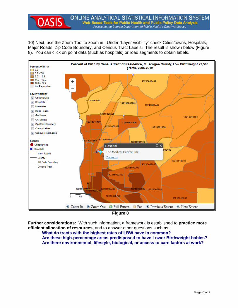
10) Next, use the Zoom Tool to zoom in. Under “Layer visibility” check Cities/towns, Hospitals, Major Roads, Zip Code Boundary, and Census Tract Labels. The result is shown below (Figure 8). You can click on point data (such as hospitals) or road segments to obtain labels.
Figure 8
Further considerations: With such information, a framework is established to practice more efficient allocation of resources, and to answer other questions such as: WWhhaatt ddoo ttrraaccttss wwiitthh tthhee hhiigghheesstt rraatteess ooff LLBBWW hhaavvee iinn ccoommmmoonn??
AArree tthheessee hhiigghh--ppeerrcceennttaaggee aarreeaass pprreeddiissppoosseedd ttoo hhaavvee LLoowweerr BBiirrtthhwweeiigghhtt bbaabbiieess?? AArree tthheerree eennvviirroonnmmeennttaall,, lliiffeessttyyllee,, bbiioollooggiiccaall,, oorr aacccceessss ttoo ccaarree ffaaccttoorrss aatt wwoorrkk??

Page 7 of 7
11) Once you get the map with the options you want, click on the button. You will see a formatted map open in a new tab suitable for using in a presentation or other documents. You can right-click the image and ‘file save as’ a *.png image.
The button will provide more detail on the measures and indicators found in the OASIS Mapping Tool.
END.
9.20.06; updated 7.15.14; Gordon Freymann Office of Health Indicators for Planning (OHIP)
Georgia Department of Public Health