Embed Size (px)
Citation preview
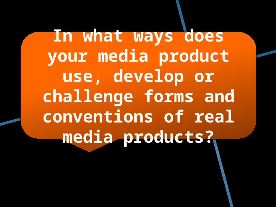
In what ways does your media product
use, develop or challenge forms and conventions of real
media products?

Certain aspects of our plot help the audience to string events together, much like the flash backs. The flashbacks, as used in a lot of horror productions, help the audience to understand the narrative with changes in shot angle/size there is a clear difference between the two scenes. Another way the audience is able to distinguish between what is a flashback and what isn't is the gruesome nature of the flashbacks with preproduction used to paint the victim in blood.
The plot depicts the lives of the murdering couple who are on the run from the police after a string of gruesome murders, we mainly based our idea on the well known production of Bonnie and Clyde (Penn, 1967). From this we can deduce that our plot doesn’t challenge any conventions of real horror as it follows and is highly inspired by
Penn’s 1967 production.
Plot
Bonnie and Clyde (Penn, 1967)
One of the flashback shots
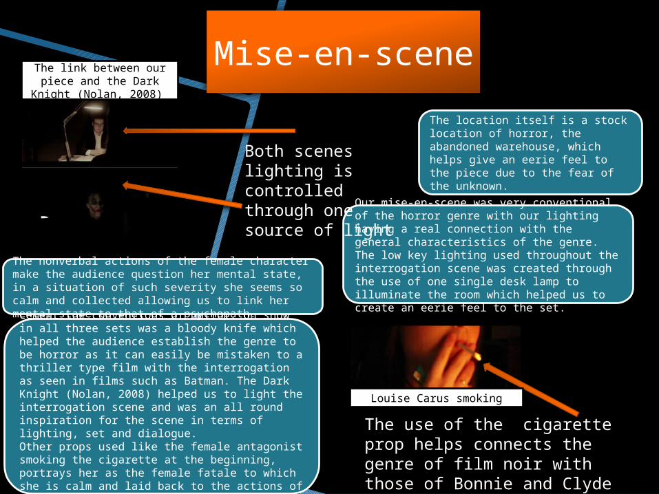
Not only this but the use of props helped cement the conventions of horror. On show in all three sets was a bloody knife which helped the audience establish the genre to be horror as it can easily be mistaken to a thriller type film with the interrogation as seen in films such as Batman. The Dark Knight (Nolan, 2008) helped us to light the interrogation scene and was an all round inspiration for the scene in terms of lighting, set and dialogue.Other props used like the female antagonist smoking the cigarette at the beginning, portrays her as the female fatale to which she is calm and laid back to the actions of the male interrogator. Very similar to the film Pulp Fiction.
The nonverbal actions of the female character make the audience question her mental state, in a situation of such severity she seems so calm and collected allowing us to link her mental state to that of a psychopath.
The location itself is a stock location of horror, the abandoned warehouse, which helps give an eerie feel to the piece due to the fear of the unknown.
Our mise-en-scene was very conventional of the horror genre with our lighting having a real connection with the general characteristics of the genre. The low key lighting used throughout the interrogation scene was created through the use of one single desk lamp to illuminate the room which helped us to create an eerie feel to the set.
Mise-en-scene
Both scenes lighting is controlled through one source of light
The use of the cigarette prop helps connects the genre of film noir with those of Bonnie and Clyde
The link between our piece and the Dark
Knight (Nolan, 2008)
Louise Carus smoking

The character of the detective is not as important in the scheme of our story an is
simply a stock character as he is seen to be out witted by the female character, this does sort
of defy conventions as the female is seen to be more powerful than the male where as ideologies in society say otherwise. The
character of the husband defies convention as we never actually see his face, simply POV shots of his actions. This ultimately creates
enigma around the character.
As for the characters, they didn’t challenge any of our sub-genre. The main antagonist, who is female, fits the description of a femme fatale,
she commits hideous crimes and is very nonchalant and upfront when questioned on her
character and situation. She seems to always have the upper hand on the male character and appears to have no remorse for the deceased she is questioned about. Most of our ideas for the female antagonist originated from films
such as Pulp Fiction and Basic Instinct.
Character
Female antagonist from Causation
Murdered male from Causation
Female actor from Basic Instinct
Pulp Fiction
Detective
In horror films there tends to be a slow beat through out the production with sound emphasized on action areas enabling the audience to experience visceral pleasure from the piece. So in this respect, yes our productions sound is conventional of horror.
It was vital that we got the sound mix just right so by allowing the soundtrack to be lower in volume than the dialogue when the actors are speaking then it allows the audience to focus on what is going on in the scenes. Also we used the sound of the camera flashing to emulate the effect of pictures being taken in a police investigation, to create an inquisitive nature to the piece for the audience, as if they know the police were involved.
We searched the internet through sites such as FreeSounds.org and YouTube to find the most appropriate sound effects as possible.
When selecting the soundtrack to play through out the piece we wanted to establish a mood in the piece where by the audience was kept engaged even during the interrogation scene where the dialogue would become slightly repetitive. So we found a track on YouTube, it was in general a droning sound however peaked when the action was about to take place I the visuals such as the flash backs, we transferred it from YouTube to a mp3 file then into our production.
Sound

Key: • Used • Not used
The main camera angles used in a horror production are :• Birds eye/high angle• Close ups • Tracking or panning shots • Tilted angle or canted angle • Extreme long shot/long shot• Low angles • POV• Zooming in/out• Over the shoulder
Camera Work
High angle…
Close up…

Tracking or panning shots…
Tilted/canted angle …
POV shots…
1
3
2

Overall, when comparing our piece with a blockbuster horror production the camera work doesn’t vary too much with our inclusion of six of the nine conventional camera movements/ angles in our final piece in order to create verisimilitude. As shown above in the examples, the examples of the different shots were done professionally and to the highest standard in order to be up amongst other horror productions
You can see that the 180 degree rule is being obeyed
Over the shoulder…
We challenged the typical conventions of horror when it came to the editing style. In the majority of fast paced horror films its popular to include a fast cutting rate in order to keep up with what's going on in the plot and different scenes. However in our piece we did not use a fast cutting rate when editing, however used a slower one so that the audience are able to understand the dialogue as this limited us to a slower rate of cutting due to the length of the individual reams of speech. Overall this allowed us to challenge the general conventions of horror, however in the flashback scene to the body on the floor we used a faster cutting rate with the sound of the flashes working with the rate of cuts ultimately supporting general connotations of horror in this single scene.
Editing style
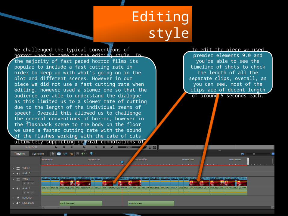
To edit the piece we used premier elements 9.0 and
you're able to see the timeline of shots to check the length of
all the separate clips, overall, as you can see, most of the clips
are of decent length of around 5 seconds each.

However we took inspiration for our titles from Monster (Edwards, 2010). In monsters, the titles are white against black and are placed in the center which would create unease amongst the audience as it breaks the rule of thirds as the title gets bigger as it moves out toward the audience.
Our typography challenges the conventions of horror because they don’t necessarily have connotations of blood and murder. They are very simple titles, with white text against a black back ground, which in no way tells the audience that it’s a horror film.
We also had a good understanding of the hierarchy needed to be portrayed with our film. The titles go from showing the less relevant actors first, then producer, director and the name of the film. We made the name of the each individual that was in the titles larger than their job in the production to make them stand out. However, overall the title for the name of the the film was the most important so was in the largest font size.
We went for a serif font called Adobe Caslon Pro. We decided to go with this font as it gave out piece a period association to which that is what we wanted to portray. Our film was always going to be a pastiche of film noir, so a period association was vital.
Typography

Visual techniques were vital in our piece to align it with the generic conventions of horror. Where in horror the set tends to be dark, it wasn’t the case in some of our shots as there was too much back ground light so we had to alter the saturation in order to both make it seem more conventional of horror and to black out any background light.We used image controls to give our film an eerie atmosphere. We did this by almost completely de-saturating our footage, with took the orange wash from the lamp out. This gave a more basic, dull look, to the piece which ultimately suited our piece better.
Visual techniques