Embed Size (px)
Citation preview
[email protected] Universitas Gadjah Mada, Faculty of Medicine, Department of Public Health
Exploratory Data Analysis
Prof. dr. Siswanto Agus Wilopo, M.Sc., Sc.D.Department of Biostatistics, Epidemiology and
Population HealthFaculty of Medicine
Universitas Gadjah Mada
1
Biostatistics I: 2013 [email protected] Universitas Gadjah Mada, Faculty of Medicine, Department of Biostatistics, Epidemiology and Popualtion Health
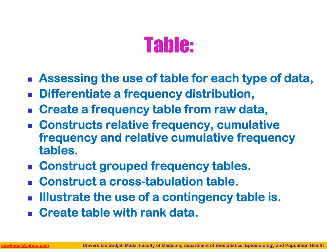
Table:
Assessing the use of table for each type of data, Differentiate a frequency distribution, Create a frequency table from raw data, Constructs relative frequency, cumulative
frequency and relative cumulative frequency tables.
Construct grouped frequency tables. Construct a cross-tabulation table. Illustrate the use of a contingency table is. Create table with rank data.
Biostatistics I: 2013 [email protected] Universitas Gadjah Mada, Faculty of Medicine, Department of Biostatistics, Epidemiology and Popualtion Health
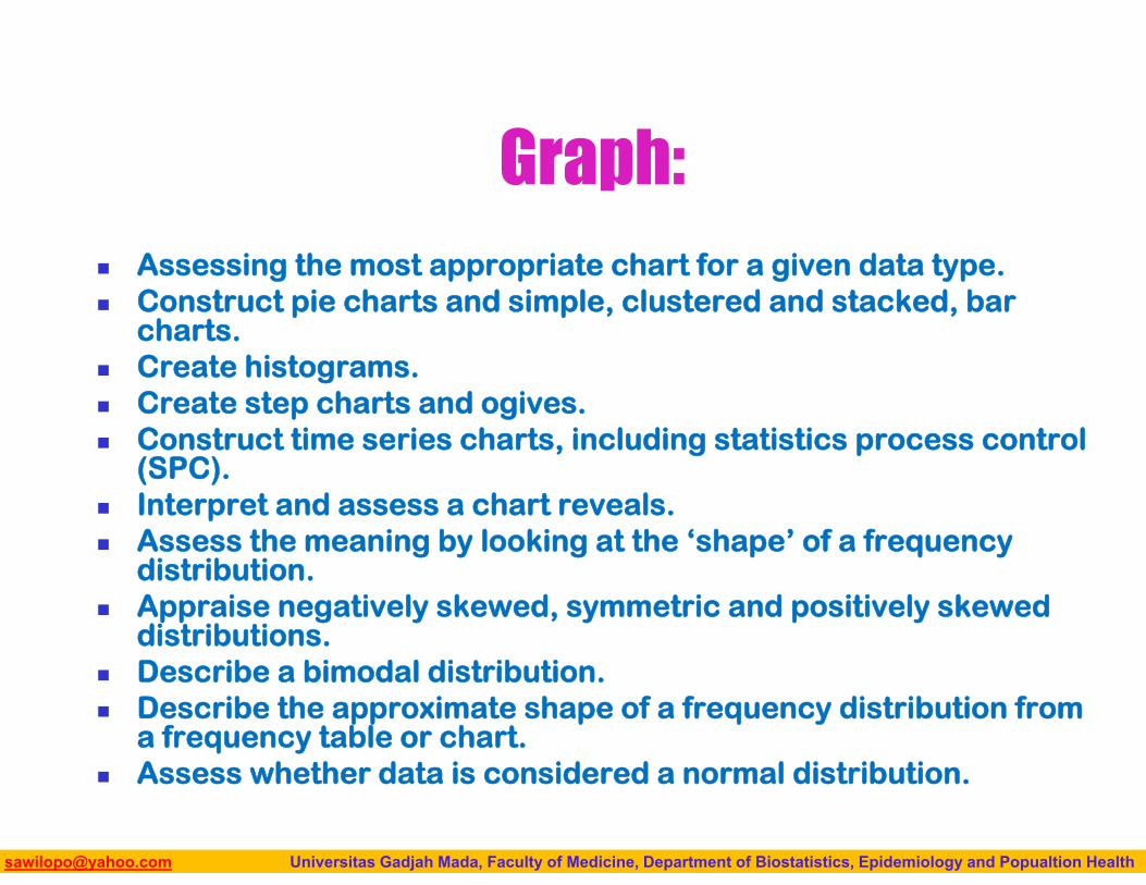
Graph: Assessing the most appropriate chart for a given data type. Construct pie charts and simple, clustered and stacked, bar
charts. Create histograms. Create step charts and ogives. Construct time series charts, including statistics process control
(SPC). Interpret and assess a chart reveals. Assess the meaning by looking at the ‘shape’ of a frequency
distribution. Appraise negatively skewed, symmetric and positively skewed
distributions. Describe a bimodal distribution. Describe the approximate shape of a frequency distribution from
a frequency table or chart. Assess whether data is considered a normal distribution.
Biostatistics I: 2013 [email protected] Universitas Gadjah Mada, Faculty of Medicine, Department of Biostatistics, Epidemiology and Popualtion Health
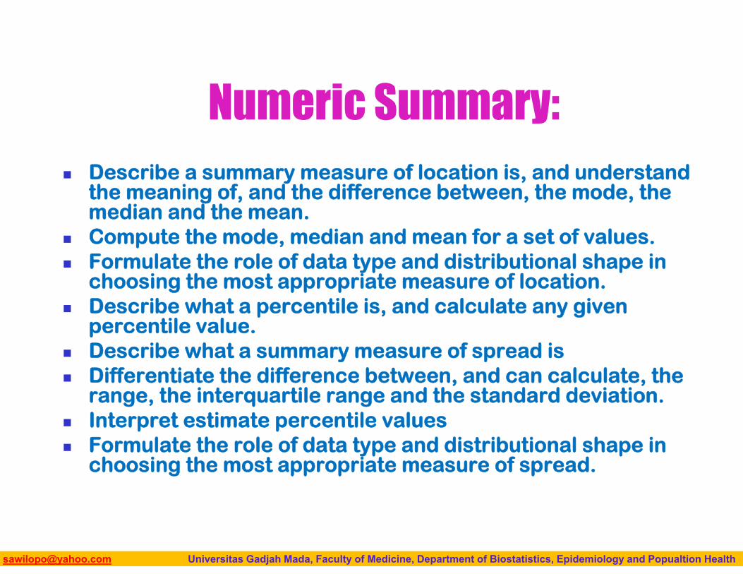
Numeric Summary: Describe a summary measure of location is, and understand
the meaning of, and the difference between, the mode, the median and the mean.
Compute the mode, median and mean for a set of values. Formulate the role of data type and distributional shape in
choosing the most appropriate measure of location. Describe what a percentile is, and calculate any given
percentile value. Describe what a summary measure of spread is Differentiate the difference between, and can calculate, the
range, the interquartile range and the standard deviation. Interpret estimate percentile values Formulate the role of data type and distributional shape in
choosing the most appropriate measure of spread.
Biostatistics I: 2013 [email protected] Universitas Gadjah Mada, Faculty of Medicine, Department of Biostatistics, Epidemiology and Popualtion Health
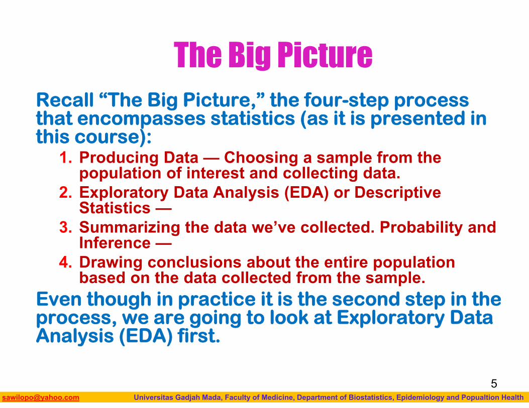
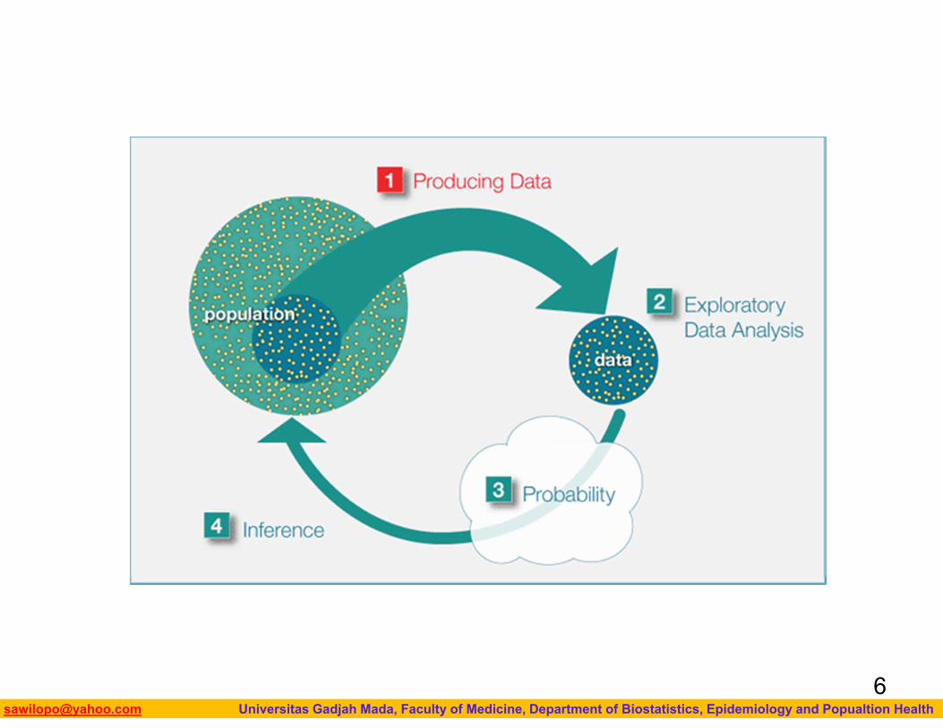
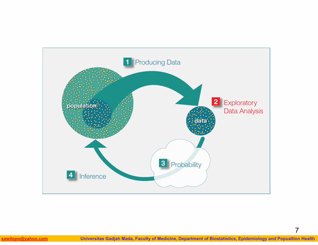
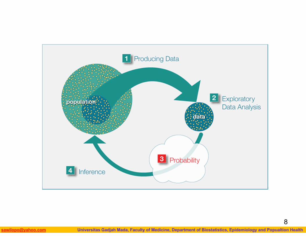
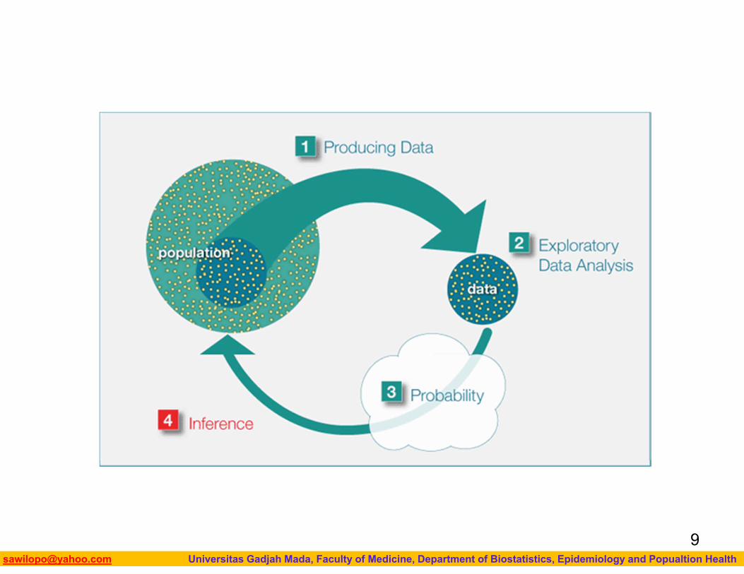
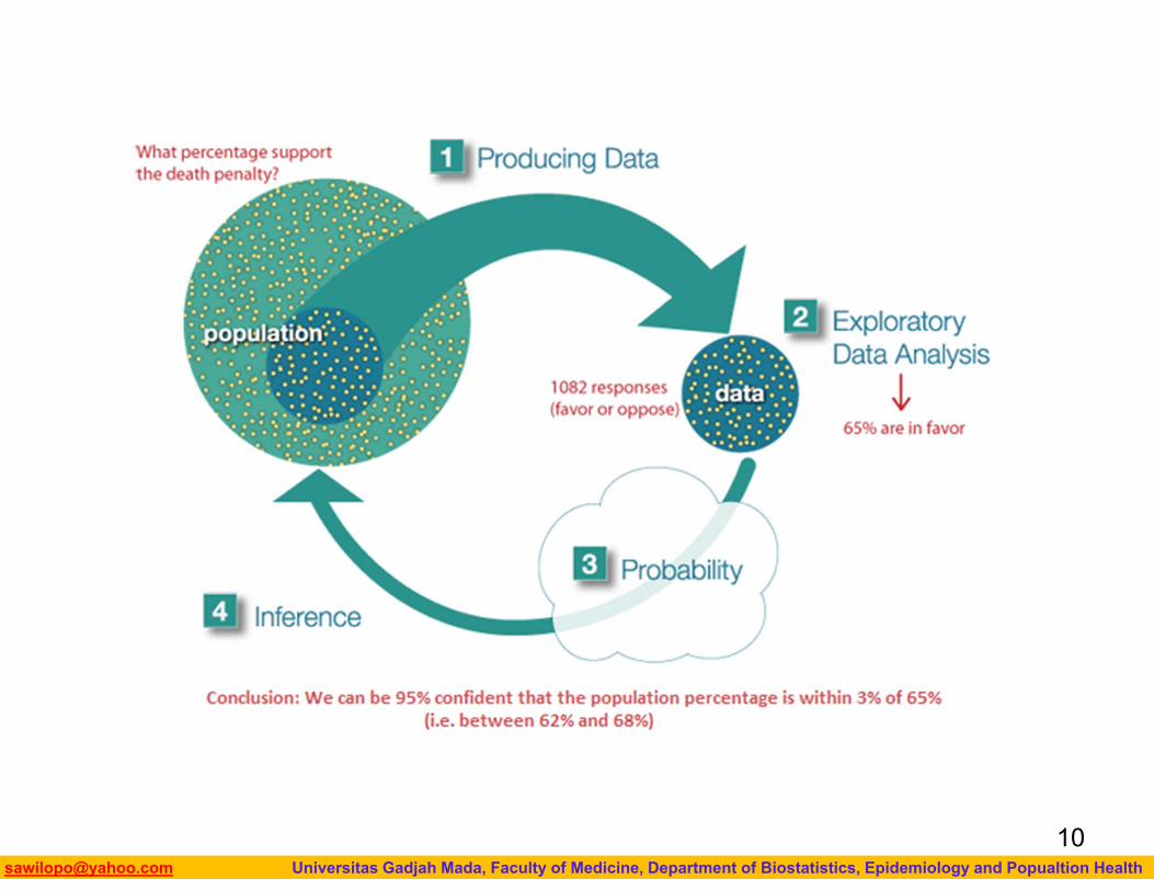
The Big PictureRecall “The Big Picture,” the four-step process that encompasses statistics (as it is presented in this course):
1. Producing Data — Choosing a sample from the population of interest and collecting data.
2. Exploratory Data Analysis (EDA) or Descriptive Statistics —
3. Summarizing the data we’ve collected. Probability and Inference —
4. Drawing conclusions about the entire population based on the data collected from the sample.
Even though in practice it is the second step in the process, we are going to look at Exploratory Data Analysis (EDA) first.
5
Biostatistics I: 2013 [email protected] Universitas Gadjah Mada, Faculty of Medicine, Department of Biostatistics, Epidemiology and Popualtion Health6
Biostatistics I: 2013 [email protected] Universitas Gadjah Mada, Faculty of Medicine, Department of Biostatistics, Epidemiology and Popualtion Health7
Biostatistics I: 2013 [email protected] Universitas Gadjah Mada, Faculty of Medicine, Department of Biostatistics, Epidemiology and Popualtion Health8
Biostatistics I: 2013 [email protected] Universitas Gadjah Mada, Faculty of Medicine, Department of Biostatistics, Epidemiology and Popualtion Health9
Biostatistics I: 2013 [email protected] Universitas Gadjah Mada, Faculty of Medicine, Department of Biostatistics, Epidemiology and Popualtion Health10
Biostatistics I: 2013 [email protected] Universitas Gadjah Mada, Faculty of Medicine, Department of Biostatistics, Epidemiology and Popualtion Health
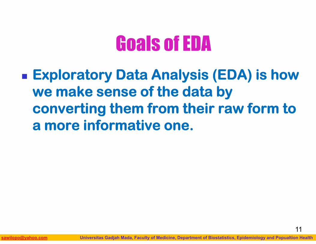
Goals of EDA
Exploratory Data Analysis (EDA) is how we make sense of the data by converting them from their raw form to a more informative one.
11
Biostatistics I: 2013 [email protected] Universitas Gadjah Mada, Faculty of Medicine, Department of Biostatistics, Epidemiology and Popualtion Health
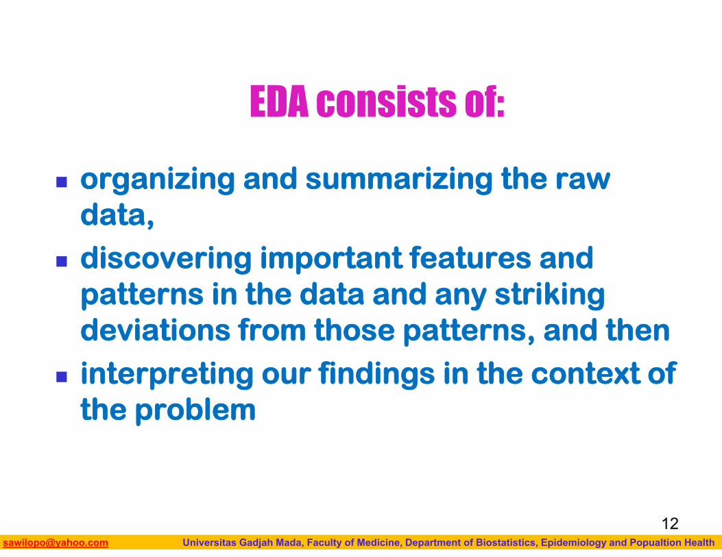
EDA consists of:
organizing and summarizing the raw data,
discovering important features and patterns in the data and any striking deviations from those patterns, and then
interpreting our findings in the context of the problem
12
Biostatistics I: 2013 [email protected] Universitas Gadjah Mada, Faculty of Medicine, Department of Biostatistics, Epidemiology and Popualtion Health
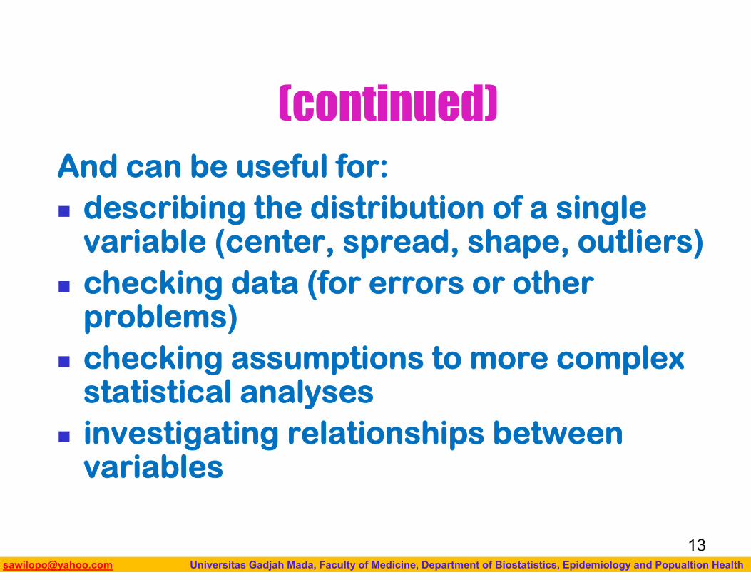
(continued)And can be useful for: describing the distribution of a single
variable (center, spread, shape, outliers) checking data (for errors or other
problems) checking assumptions to more complex
statistical analyses investigating relationships between
variables
13

Biostatistics I: 2013 [email protected] Universitas Gadjah Mada, Faculty of Medicine, Department of Biostatistics, Epidemiology and Popualtion Health
EDA Exploratory data analysis (EDA) methods are
often called Descriptive Statistics due to the fact that they simply describe, or provide estimates based on, the data at hand.
Comparisons can be visualized and values of interest estimated using EDA but descriptive statistics alone will provide no information about the certainty of our conclusions.
14
Biostatistics I: 2013 [email protected] Universitas Gadjah Mada, Faculty of Medicine, Department of Biostatistics, Epidemiology and Popualtion Health
Important Features of Exploratory Data Analysis
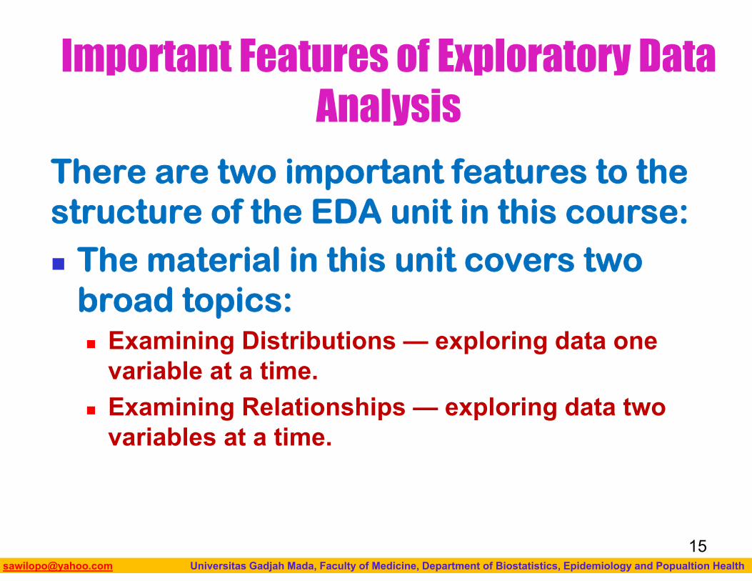
There are two important features to the structure of the EDA unit in this course: The material in this unit covers two
broad topics: Examining Distributions — exploring data one
variable at a time. Examining Relationships — exploring data two
variables at a time.
15
Biostatistics I: 2013 [email protected] Universitas Gadjah Mada, Faculty of Medicine, Department of Biostatistics, Epidemiology and Popualtion Health
Important Features of Exploratory Data Analysis
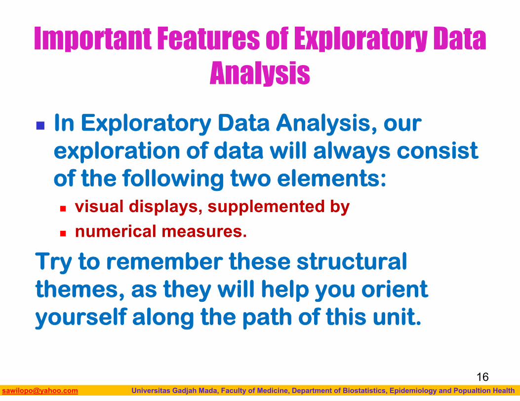
In Exploratory Data Analysis, our exploration of data will always consist of the following two elements: visual displays, supplemented by numerical measures.
Try to remember these structural themes, as they will help you orient yourself along the path of this unit.
16
Biostatistics I: 2013 [email protected] Universitas Gadjah Mada, Faculty of Medicine, Department of Biostatistics, Epidemiology and Popualtion Health
EXAMINING DISTRIBUTIONS
17
Biostatistics I: 2013 [email protected] Universitas Gadjah Mada, Faculty of Medicine, Department of Biostatistics, Epidemiology and Popualtion Health
Examining Distributions
We will begin the EDA part of the course by exploring (or looking at) one variable at a time. As we have seen, the data for each
variable consist of a long list of values (whether numerical or not), and are not very informative in that form.
18
Biostatistics I: 2013 [email protected] Universitas Gadjah Mada, Faculty of Medicine, Department of Biostatistics, Epidemiology and Popualtion Health
Examining Distributions In order to convert these raw data into
useful information, we need to summarize and then examine the distribution of the variable.
By distribution of a variable, we mean: what values the variable takes, and how often the variable takes those values.
We will first learn how to summarize and examine the distribution of a single categorical variable, and then do the same for a single quantitative variable.
19
Biostatistics I: 2013 [email protected] Universitas Gadjah Mada, Faculty of Medicine, Department of Biostatistics, Epidemiology and Popualtion Health
ONE CATEGORICAL VARIABLE
Biostatistics I: 2013 [email protected] Universitas Gadjah Mada, Faculty of Medicine, Department of Biostatistics, Epidemiology and Popualtion Health
Example:Distribution of One Categorical Variable
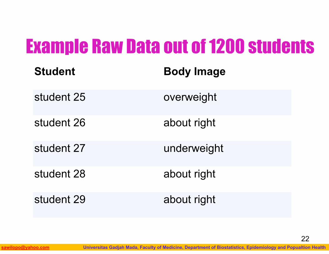
What is your perception of your own body? Do you feel that you are overweight, underweight, or about right?
A random sample of 1,200 college students were asked this question as part of a larger survey. The following table shows part of the responses:
21
Biostatistics I: 2013 [email protected] Universitas Gadjah Mada, Faculty of Medicine, Department of Biostatistics, Epidemiology and Popualtion Health
Example Raw Data out of 1200 students Student Body Image
student 25 overweight
student 26 about right
student 27 underweight
student 28 about right
student 29 about right
22
Biostatistics I: 2013 [email protected] Universitas Gadjah Mada, Faculty of Medicine, Department of Biostatistics, Epidemiology and Popualtion Health
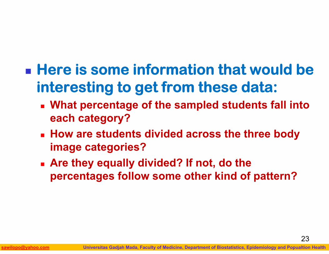
Here is some information that would be interesting to get from these data: What percentage of the sampled students fall into
each category? How are students divided across the three body
image categories? Are they equally divided? If not, do the
percentages follow some other kind of pattern?
23
Biostatistics I: 2013 [email protected] Universitas Gadjah Mada, Faculty of Medicine, Department of Biostatistics, Epidemiology and Popualtion Health
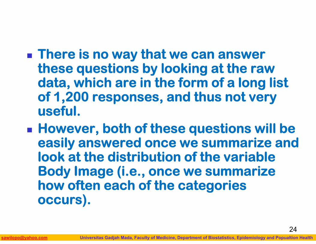
There is no way that we can answer these questions by looking at the raw data, which are in the form of a long list of 1,200 responses, and thus not very useful.
However, both of these questions will be easily answered once we summarize and look at the distribution of the variable Body Image (i.e., once we summarize how often each of the categories occurs).
24
Biostatistics I: 2013 [email protected] Universitas Gadjah Mada, Faculty of Medicine, Department of Biostatistics, Epidemiology and Popualtion Health
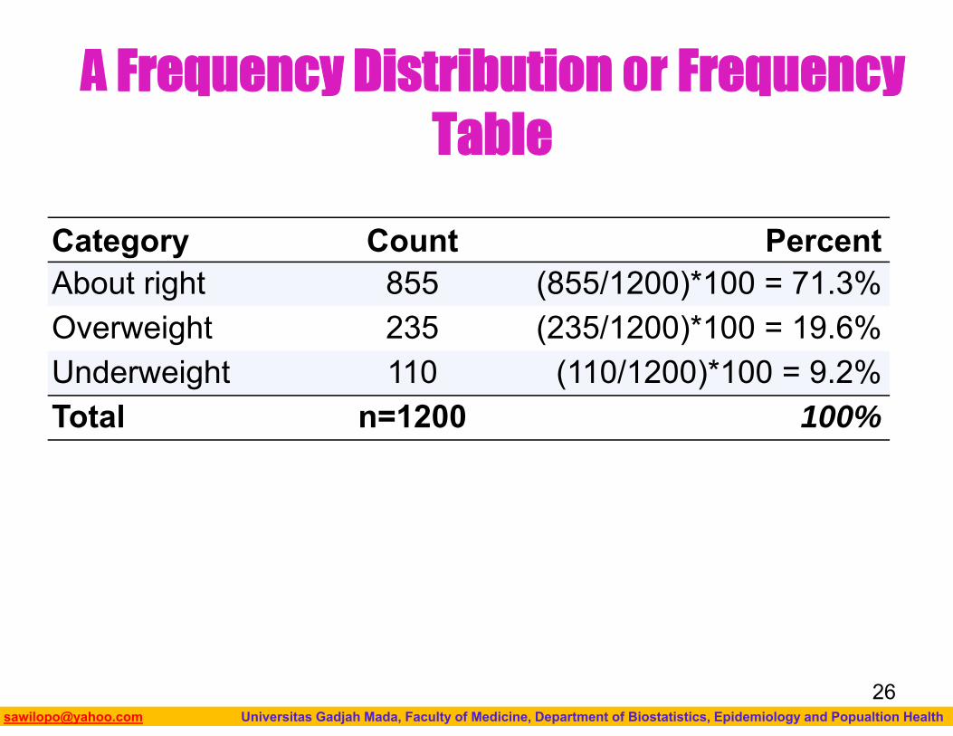
Numerical Measures
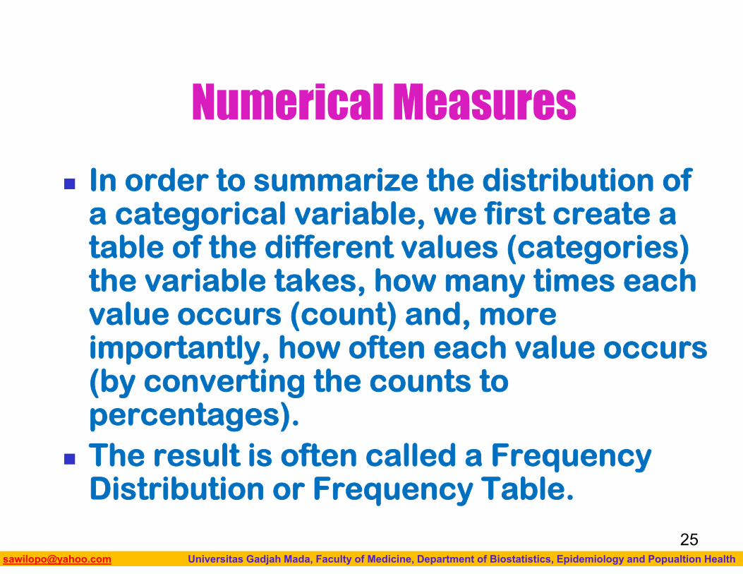
In order to summarize the distribution of a categorical variable, we first create a table of the different values (categories) the variable takes, how many times each value occurs (count) and, more importantly, how often each value occurs (by converting the counts to percentages).
The result is often called a Frequency Distribution or Frequency Table.
25
Biostatistics I: 2013 [email protected] Universitas Gadjah Mada, Faculty of Medicine, Department of Biostatistics, Epidemiology and Popualtion Health
A Frequency Distribution or Frequency Table
Category Count PercentAbout right 855 (855/1200)*100 = 71.3%Overweight 235 (235/1200)*100 = 19.6%Underweight 110 (110/1200)*100 = 9.2%Total n=1200 100%
26
Biostatistics I: 2013 [email protected] Universitas Gadjah Mada, Faculty of Medicine, Department of Biostatistics, Epidemiology and Popualtion Health
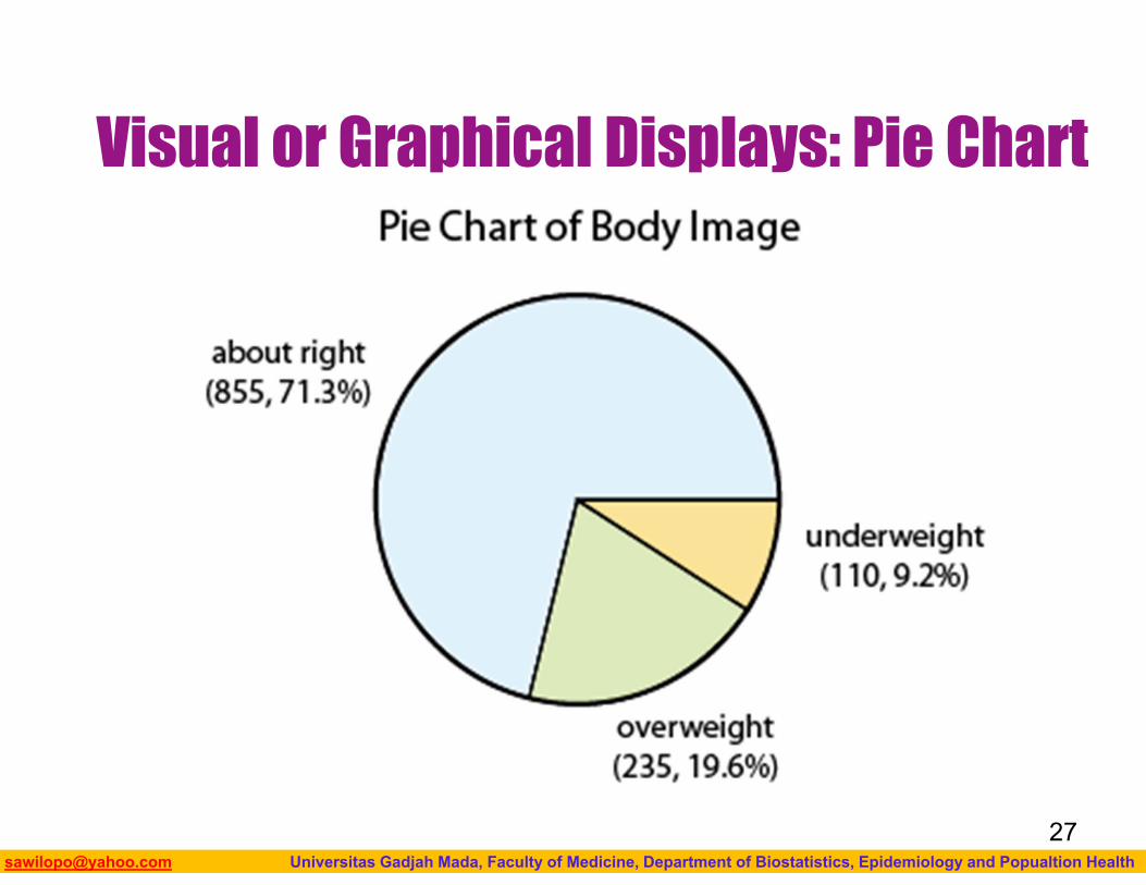
Visual or Graphical Displays: Pie Chart
27
Biostatistics I: 2013 [email protected] Universitas Gadjah Mada, Faculty of Medicine, Department of Biostatistics, Epidemiology and Popualtion Health
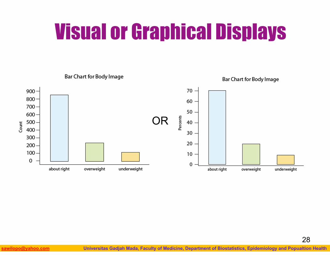
Visual or Graphical Displays
28
OR

Biostatistics I: 2013 [email protected] Universitas Gadjah Mada, Faculty of Medicine, Department of Biostatistics, Epidemiology and Popualtion Health
ONE QUANTITATIVE VARIABLE
Biostatistics I: 2013 [email protected] Universitas Gadjah Mada, Faculty of Medicine, Department of Biostatistics, Epidemiology and Popualtion Health
To display data from one quantitative variable graphically, we can use either a histogram or boxplot.
We will also present several “by-hand” displays such as the stemplot and dotplot
30
Biostatistics I: 2013 [email protected] Universitas Gadjah Mada, Faculty of Medicine, Department of Biostatistics, Epidemiology and Popualtion Health
Numerical Measures
The overall pattern of the distribution of a quantitative variable is described by its shape, center, and spread.
By inspecting the histogram or boxplot, we can describe the shape of the distribution, but we can only get a rough estimate for the center and spread.
31
Biostatistics I: 2013 [email protected] Universitas Gadjah Mada, Faculty of Medicine, Department of Biostatistics, Epidemiology and Popualtion Health
Numerical Measures A description of the distribution of a
quantitative variable must include, in addition to the graphical display, a more precise numerical description of the center and spread of the distribution.
32
Biostatistics I: 2013 [email protected] Universitas Gadjah Mada, Faculty of Medicine, Department of Biostatistics, Epidemiology and Popualtion Health
Numerical Measures how to quantify the center and spread of
a distribution with various numerical measures;
some of the properties of those numerical measures; and
how to choose the appropriate numerical measures of center and spread to supplement the histogram.
We will also discuss a few measures of position or location which allow us to quantify the where a particular value is in the distribution of all values.
33
Biostatistics I: 2013 [email protected] Universitas Gadjah Mada, Faculty of Medicine, Department of Biostatistics, Epidemiology and Popualtion Health
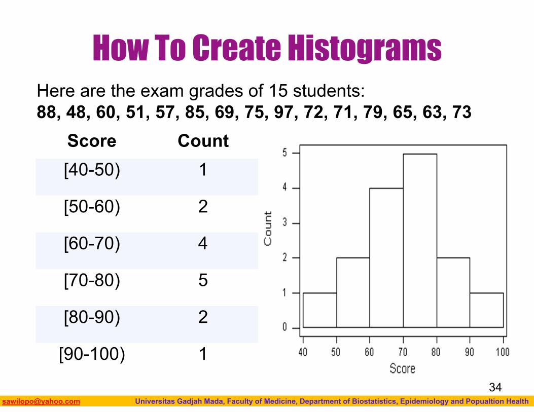
How To Create Histograms
Score Count[40-50) 1
[50-60) 2
[60-70) 4
[70-80) 5
[80-90) 2
[90-100) 1
Here are the exam grades of 15 students:88, 48, 60, 51, 57, 85, 69, 75, 97, 72, 71, 79, 65, 63, 73
34
Biostatistics I: 2013 [email protected] Universitas Gadjah Mada, Faculty of Medicine, Department of Biostatistics, Epidemiology and Popualtion Health
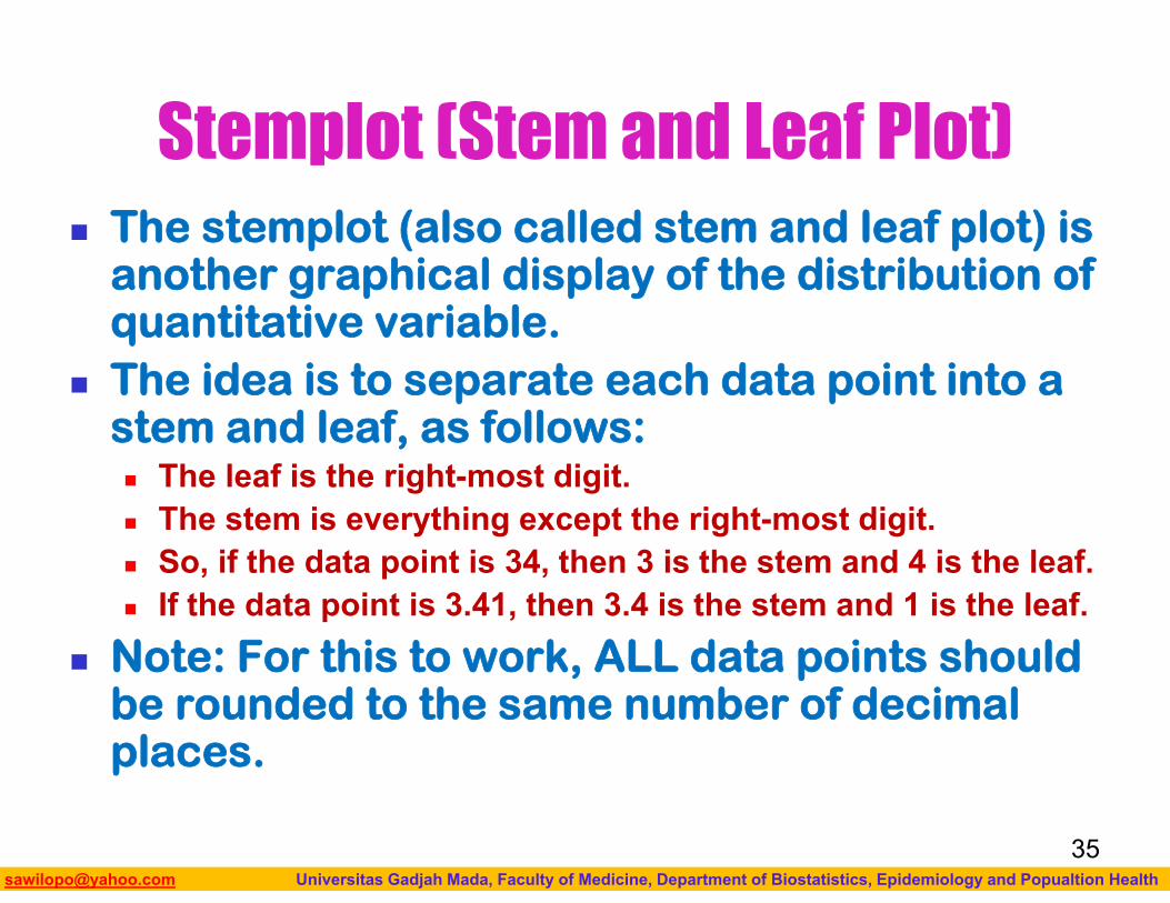
Stemplot (Stem and Leaf Plot) The stemplot (also called stem and leaf plot) is
another graphical display of the distribution of quantitative variable.
The idea is to separate each data point into a stem and leaf, as follows: The leaf is the right-most digit. The stem is everything except the right-most digit. So, if the data point is 34, then 3 is the stem and 4 is the leaf. If the data point is 3.41, then 3.4 is the stem and 1 is the leaf.
Note: For this to work, ALL data points should be rounded to the same number of decimal places.
35
Biostatistics I: 2013 [email protected] Universitas Gadjah Mada, Faculty of Medicine, Department of Biostatistics, Epidemiology and Popualtion Health
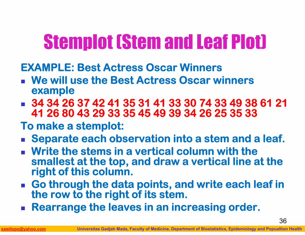
Stemplot (Stem and Leaf Plot)EXAMPLE: Best Actress Oscar Winners We will use the Best Actress Oscar winners
example 34 34 26 37 42 41 35 31 41 33 30 74 33 49 38 61 21
41 26 80 43 29 33 35 45 49 39 34 26 25 35 33To make a stemplot: Separate each observation into a stem and a leaf. Write the stems in a vertical column with the
smallest at the top, and draw a vertical line at the right of this column.
Go through the data points, and write each leaf in the row to the right of its stem.
Rearrange the leaves in an increasing order.36
Biostatistics I: 2013 [email protected] Universitas Gadjah Mada, Faculty of Medicine, Department of Biostatistics, Epidemiology and Popualtion Health
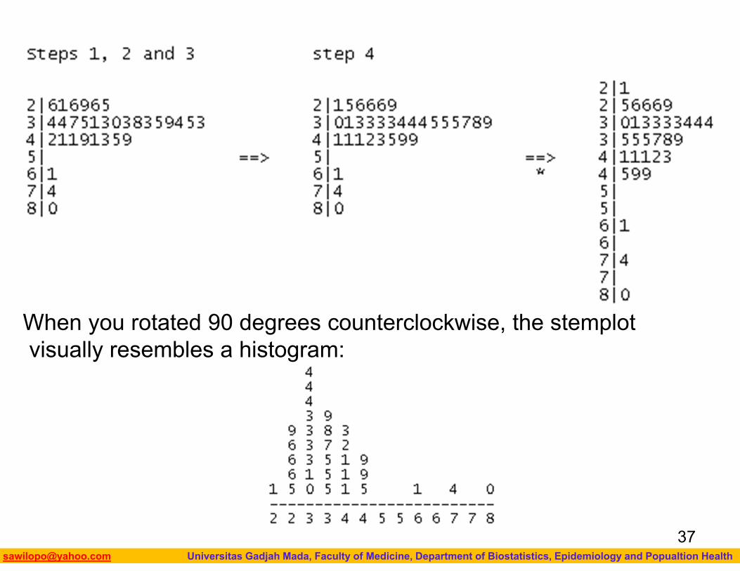
When you rotated 90 degrees counterclockwise, the stemplotvisually resembles a histogram:
37
Biostatistics I: 2013 [email protected] Universitas Gadjah Mada, Faculty of Medicine, Department of Biostatistics, Epidemiology and Popualtion Health
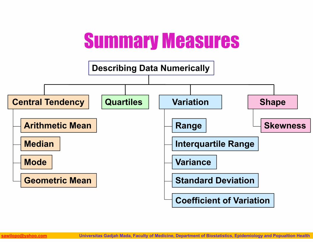
Summary Measures
Arithmetic Mean
Median
Mode
Describing Data Numerically
Variance
Standard Deviation
Coefficient of Variation
Range
Interquartile Range
Geometric Mean
Skewness
Central Tendency Variation ShapeQuartiles
Biostatistics I: 2013 [email protected] Universitas Gadjah Mada, Faculty of Medicine, Department of Biostatistics, Epidemiology and Popualtion Health
Central Tendency
Biostatistics I: 2013 [email protected] Universitas Gadjah Mada, Faculty of Medicine, Department of Biostatistics, Epidemiology and Popualtion Health
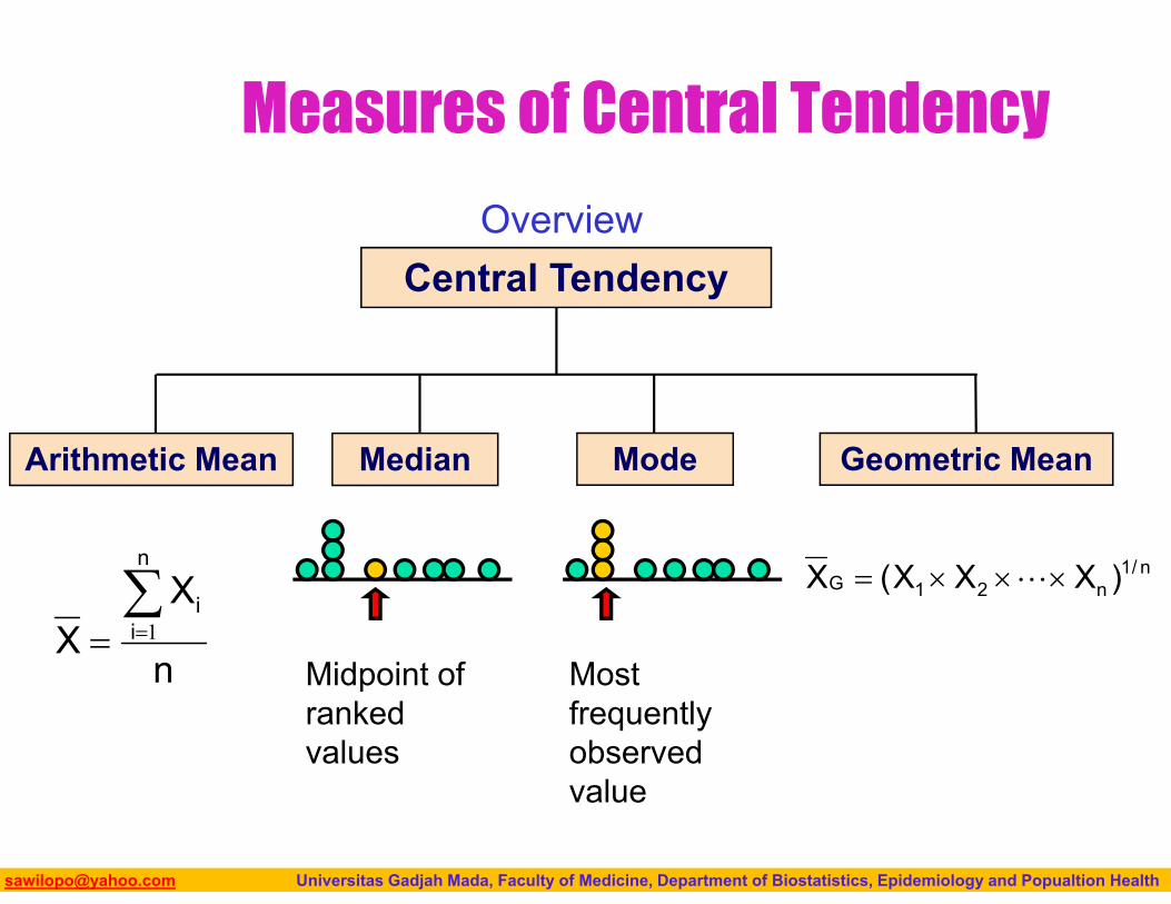
Measures of Central Tendency
Central Tendency
Arithmetic Mean Median Mode Geometric Mean
n
XX
n
ii
1
n/1n21G )XXX(X
Overview
Midpoint of ranked values
Most frequently observed value
Biostatistics I: 2013 [email protected] Universitas Gadjah Mada, Faculty of Medicine, Department of Biostatistics, Epidemiology and Popualtion Health
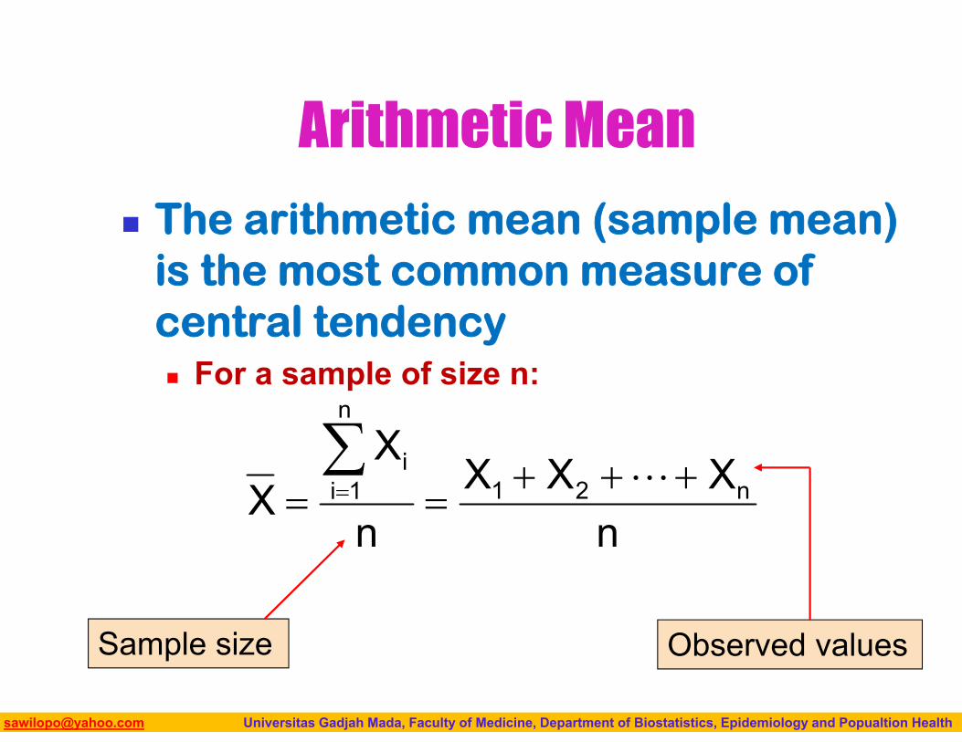
Arithmetic Mean
The arithmetic mean (sample mean) is the most common measure of central tendency For a sample of size n:
Sample size
nXXX
n
XX n21
n
1ii
Observed values
Biostatistics I: 2013 [email protected] Universitas Gadjah Mada, Faculty of Medicine, Department of Biostatistics, Epidemiology and Popualtion Health
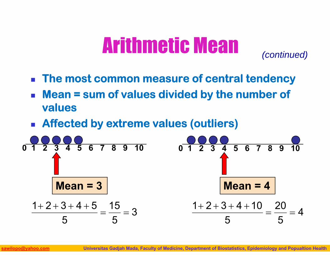
Arithmetic Mean
The most common measure of central tendency Mean = sum of values divided by the number of
values Affected by extreme values (outliers)
(continued)
0 1 2 3 4 5 6 7 8 9 10
Mean = 3
0 1 2 3 4 5 6 7 8 9 10
Mean = 4
35
155
54321
4520
5104321
Biostatistics I: 2013 [email protected] Universitas Gadjah Mada, Faculty of Medicine, Department of Biostatistics, Epidemiology and Popualtion Health
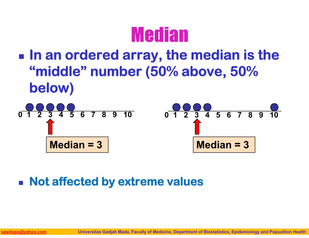
Median In an ordered array, the median is the
“middle” number (50% above, 50% below)
Not affected by extreme values
0 1 2 3 4 5 6 7 8 9 10
Median = 3
0 1 2 3 4 5 6 7 8 9 10
Median = 3
Biostatistics I: 2013 [email protected] Universitas Gadjah Mada, Faculty of Medicine, Department of Biostatistics, Epidemiology and Popualtion Health
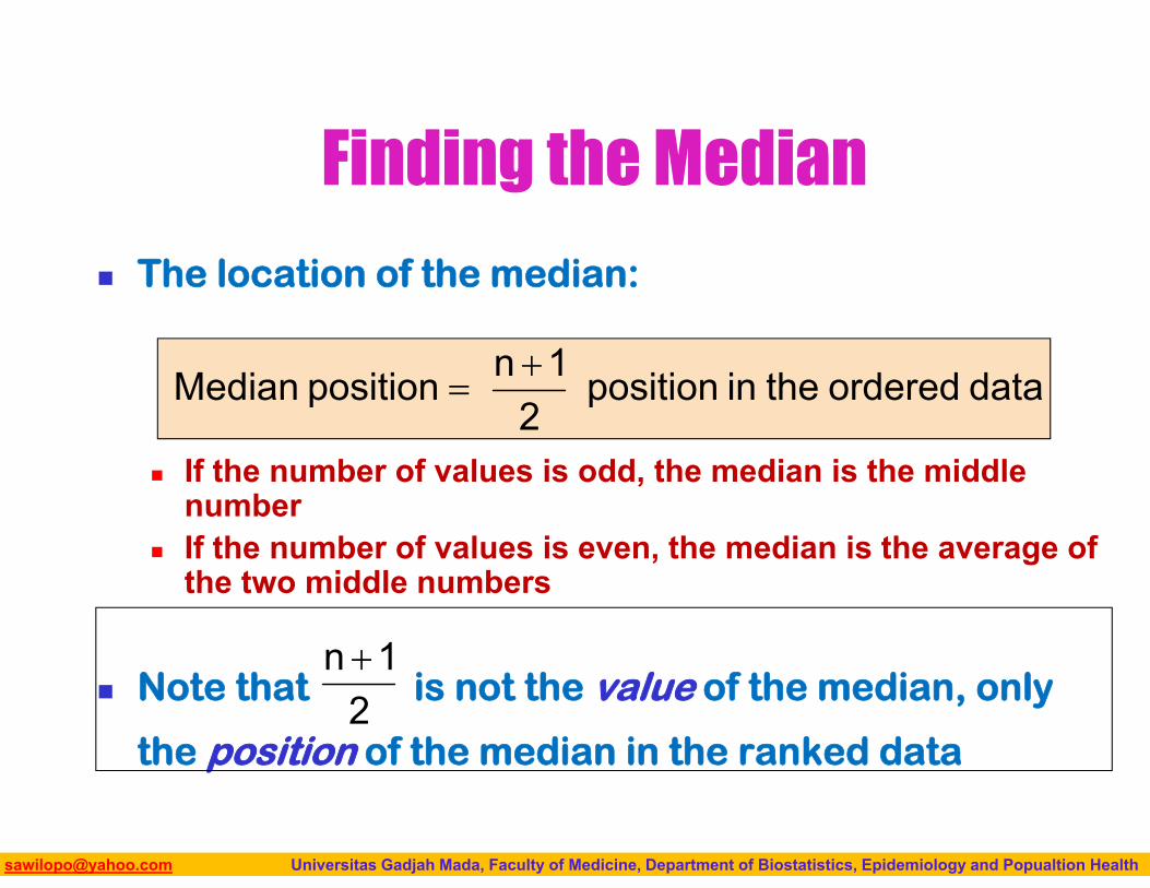
Finding the Median
The location of the median:
If the number of values is odd, the median is the middle number
If the number of values is even, the median is the average of the two middle numbers
Note that is not the value of the median, only
the position of the median in the ranked data
dataorderedtheinposition2
1npositionMedian
21n
Biostatistics I: 2013 [email protected] Universitas Gadjah Mada, Faculty of Medicine, Department of Biostatistics, Epidemiology and Popualtion Health
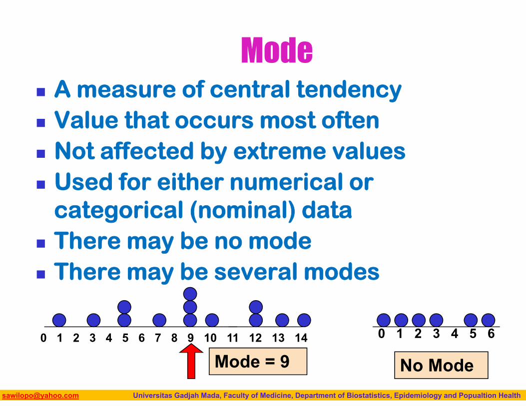
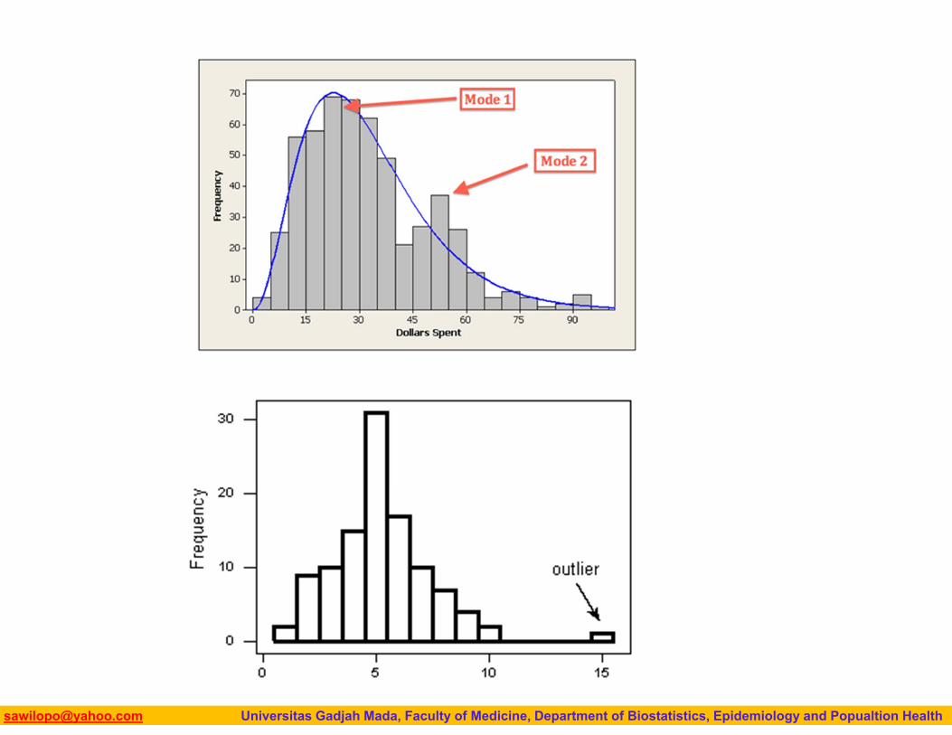
Mode A measure of central tendency Value that occurs most often Not affected by extreme values Used for either numerical or
categorical (nominal) data There may be no mode There may be several modes
0 1 2 3 4 5 6 7 8 9 10 11 12 13 14
Mode = 90 1 2 3 4 5 6
No Mode
Biostatistics I: 2013 [email protected] Universitas Gadjah Mada, Faculty of Medicine, Department of Biostatistics, Epidemiology and Popualtion Health
Mean is generally used, unless extreme values (outliers) exist
Then median is often used, since the median is not sensitive to extreme values.
ProblemWhich measure of location
is the “best”?
Biostatistics I: 2013 [email protected] Universitas Gadjah Mada, Faculty of Medicine, Department of Biostatistics, Epidemiology and Popualtion Health
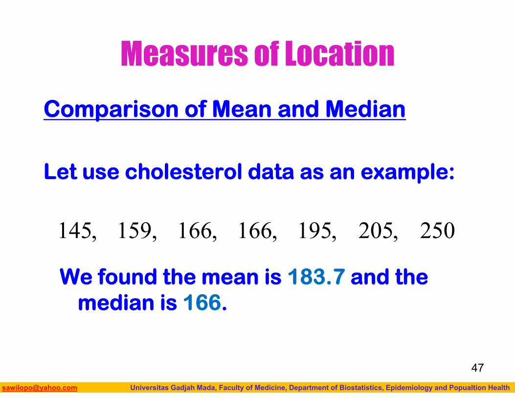
Measures of Location
Comparison of Mean and Median
Let use cholesterol data as an example:
We found the mean is 183.7 and the median is 166.
47
250,205,195,166,166,159,145
Biostatistics I: 2013 [email protected] Universitas Gadjah Mada, Faculty of Medicine, Department of Biostatistics, Epidemiology and Popualtion Health
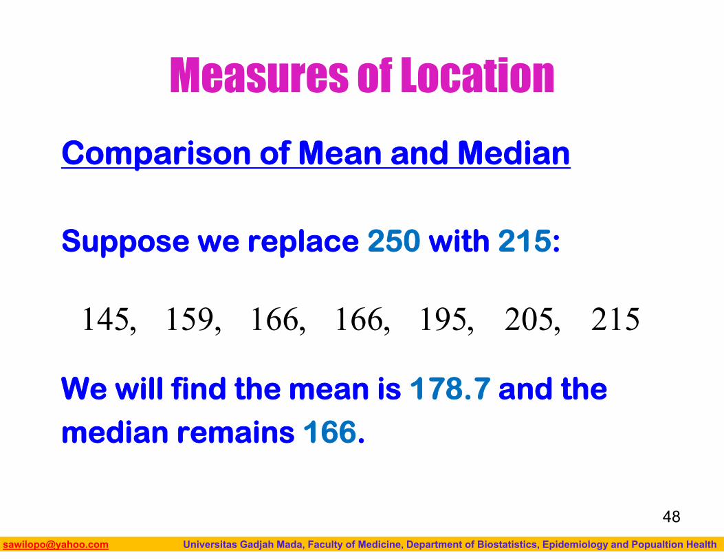
Measures of Location
Comparison of Mean and Median
Suppose we replace 250 with 215:
We will find the mean is 178.7 and themedian remains 166.
48
215,205,195,166,166,159,145
Biostatistics I: 2013 [email protected] Universitas Gadjah Mada, Faculty of Medicine, Department of Biostatistics, Epidemiology and Popualtion Health
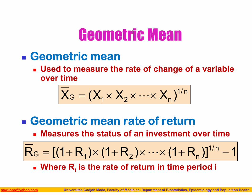
Geometric Mean Geometric mean
Used to measure the rate of change of a variable over time
Geometric mean rate of return Measures the status of an investment over time
Where Ri is the rate of return in time period i
n/1n21G )XXX(X
1)]R1()R1()R1[(R n/1n21G
Biostatistics I: 2013 [email protected] Universitas Gadjah Mada, Faculty of Medicine, Department of Biostatistics, Epidemiology and Popualtion Health
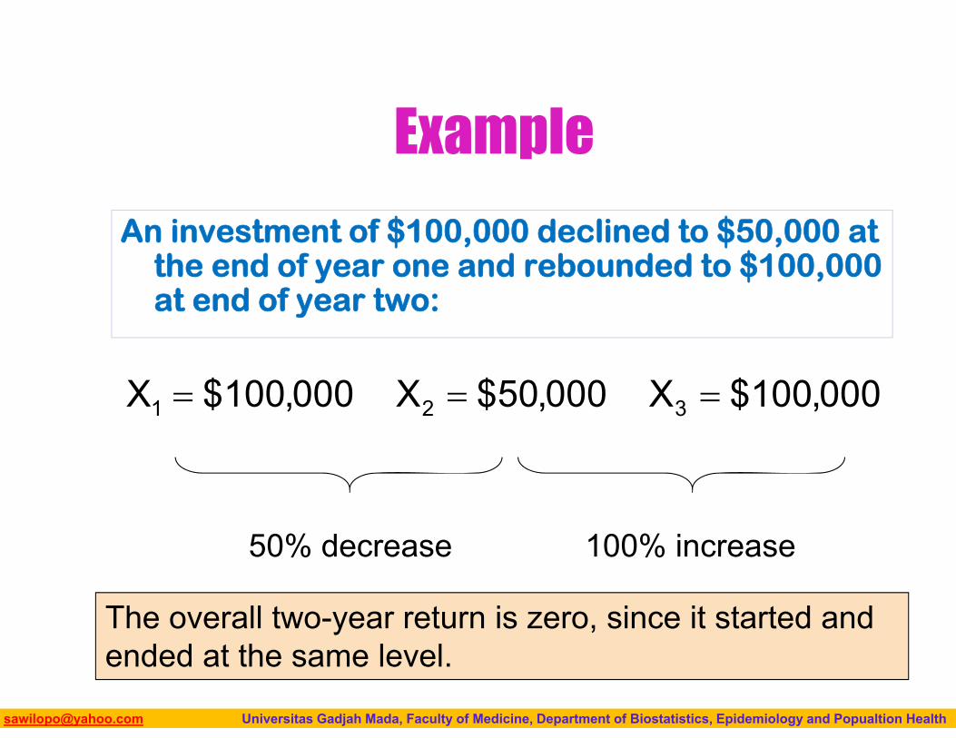
Example
An investment of $100,000 declined to $50,000 at the end of year one and rebounded to $100,000 at end of year two:
000,100$X000,50$X000,100$X 321
50% decrease 100% increase
The overall two-year return is zero, since it started and ended at the same level.
Biostatistics I: 2013 [email protected] Universitas Gadjah Mada, Faculty of Medicine, Department of Biostatistics, Epidemiology and Popualtion Health
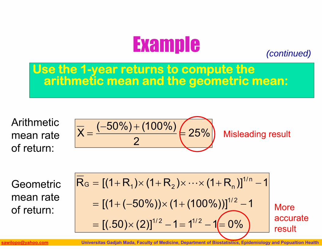
ExampleUse the 1-year returns to compute the
arithmetic mean and the geometric mean:
%0111)]2()50[(.
1%))]100(1(%))50(1[(
1)]R1()R1()R1[(R
2/12/1
2/1
n/1n21G
%252
%)100(%)50(X
Arithmetic mean rate of return:
Geometric mean rate of return:
Misleading result
More accurate result
(continued)
Biostatistics I: 2013 [email protected] Universitas Gadjah Mada, Faculty of Medicine, Department of Biostatistics, Epidemiology and Popualtion Health
MEASURE OF VARIATION
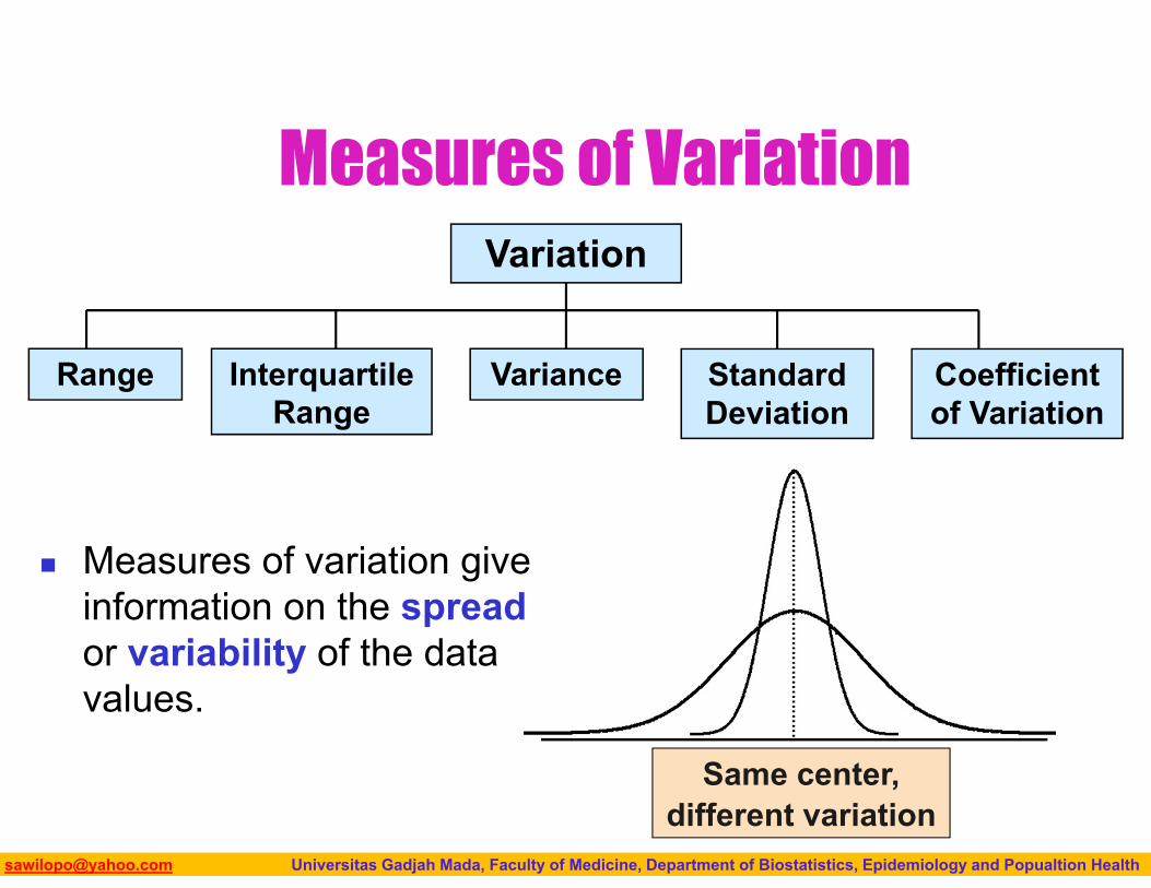
Biostatistics I: 2013 [email protected] Universitas Gadjah Mada, Faculty of Medicine, Department of Biostatistics, Epidemiology and Popualtion Health
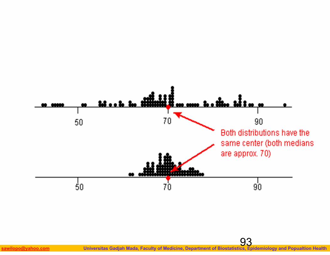
Same center, different variation
Measures of VariationVariation
Variance Standard Deviation
Coefficient of Variation
Range Interquartile Range
Measures of variation give information on the spread or variability of the data values.
Biostatistics I: 2013 [email protected] Universitas Gadjah Mada, Faculty of Medicine, Department of Biostatistics, Epidemiology and Popualtion Health
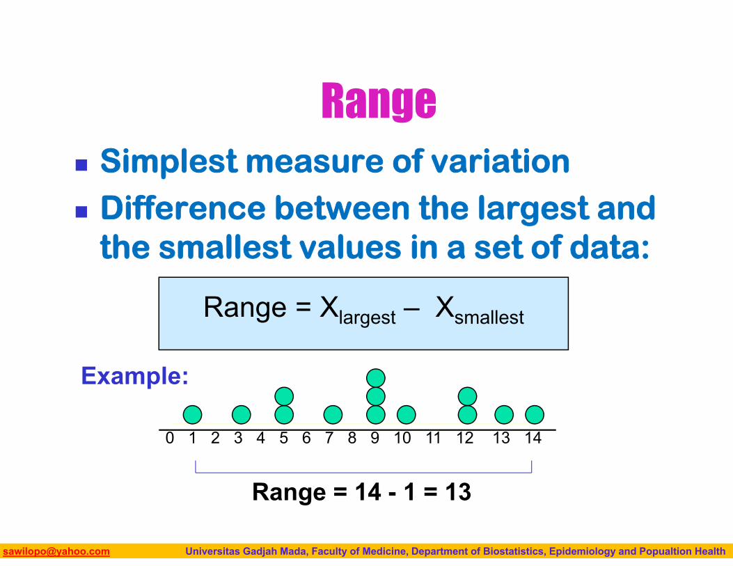
Range Simplest measure of variation Difference between the largest and
the smallest values in a set of data:
Range = Xlargest – Xsmallest
0 1 2 3 4 5 6 7 8 9 10 11 12 13 14
Range = 14 - 1 = 13
Example:
Biostatistics I: 2013 [email protected] Universitas Gadjah Mada, Faculty of Medicine, Department of Biostatistics, Epidemiology and Popualtion Health
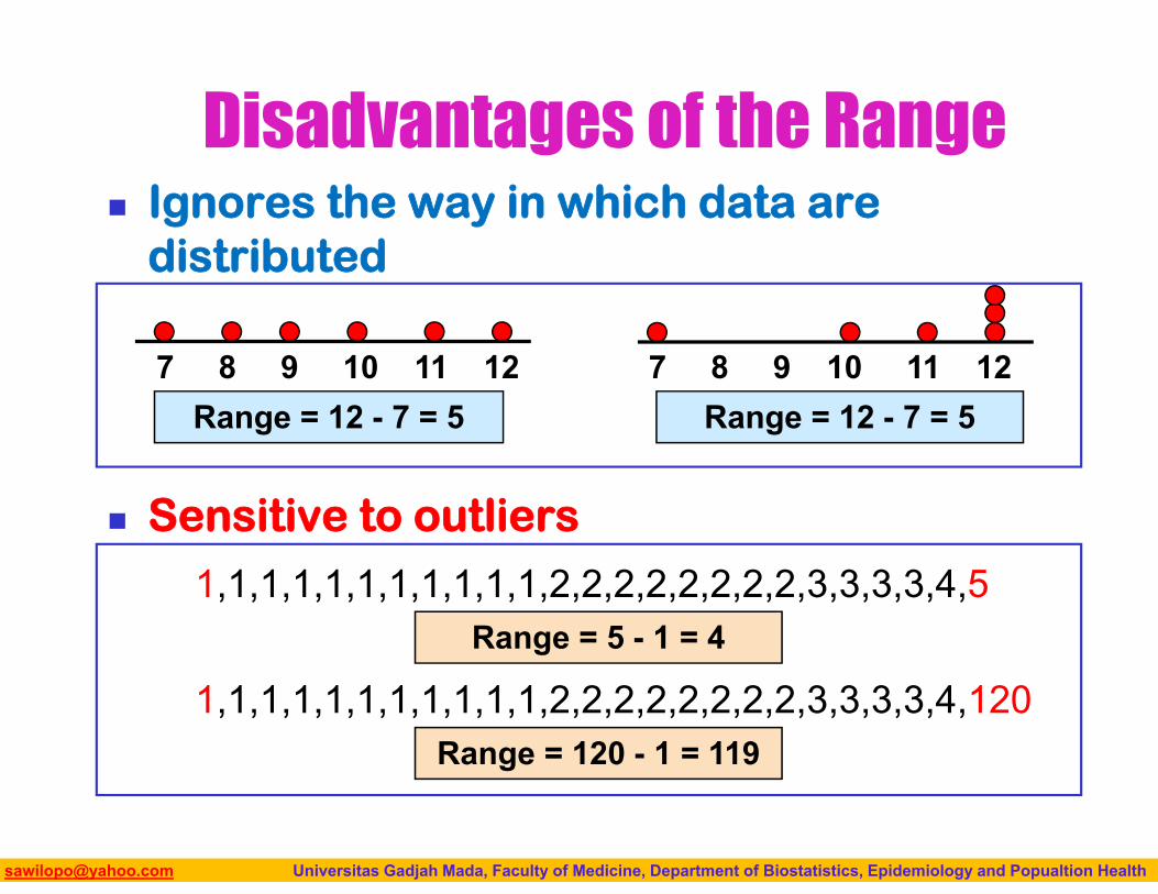
Ignores the way in which data are distributed
Sensitive to outliers
7 8 9 10 11 12Range = 12 - 7 = 5
7 8 9 10 11 12Range = 12 - 7 = 5
Disadvantages of the Range
1,1,1,1,1,1,1,1,1,1,1,2,2,2,2,2,2,2,2,3,3,3,3,4,5
1,1,1,1,1,1,1,1,1,1,1,2,2,2,2,2,2,2,2,3,3,3,3,4,120Range = 5 - 1 = 4
Range = 120 - 1 = 119
Biostatistics I: 2013 [email protected] Universitas Gadjah Mada, Faculty of Medicine, Department of Biostatistics, Epidemiology and Popualtion Health
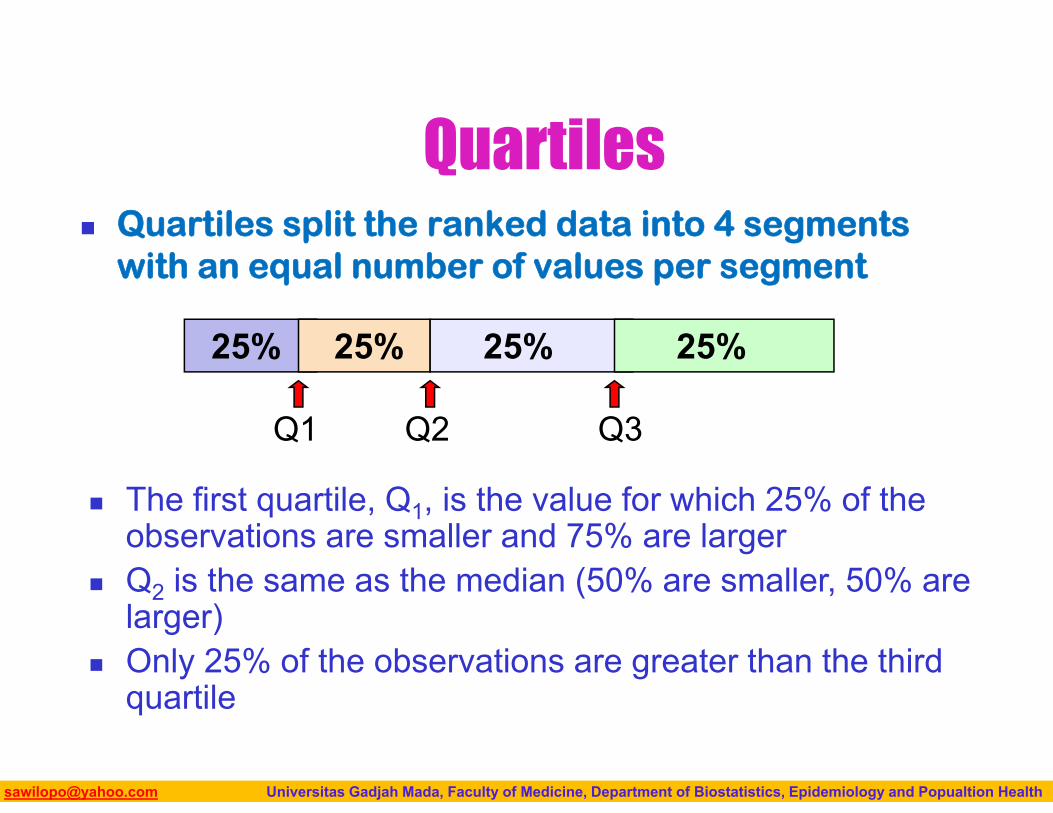
Quartiles Quartiles split the ranked data into 4 segments
with an equal number of values per segment
25% 25% 25% 25%
The first quartile, Q1, is the value for which 25% of the observations are smaller and 75% are larger
Q2 is the same as the median (50% are smaller, 50% are larger)
Only 25% of the observations are greater than the third quartile
Q1 Q2 Q3
Biostatistics I: 2013 [email protected] Universitas Gadjah Mada, Faculty of Medicine, Department of Biostatistics, Epidemiology and Popualtion Health
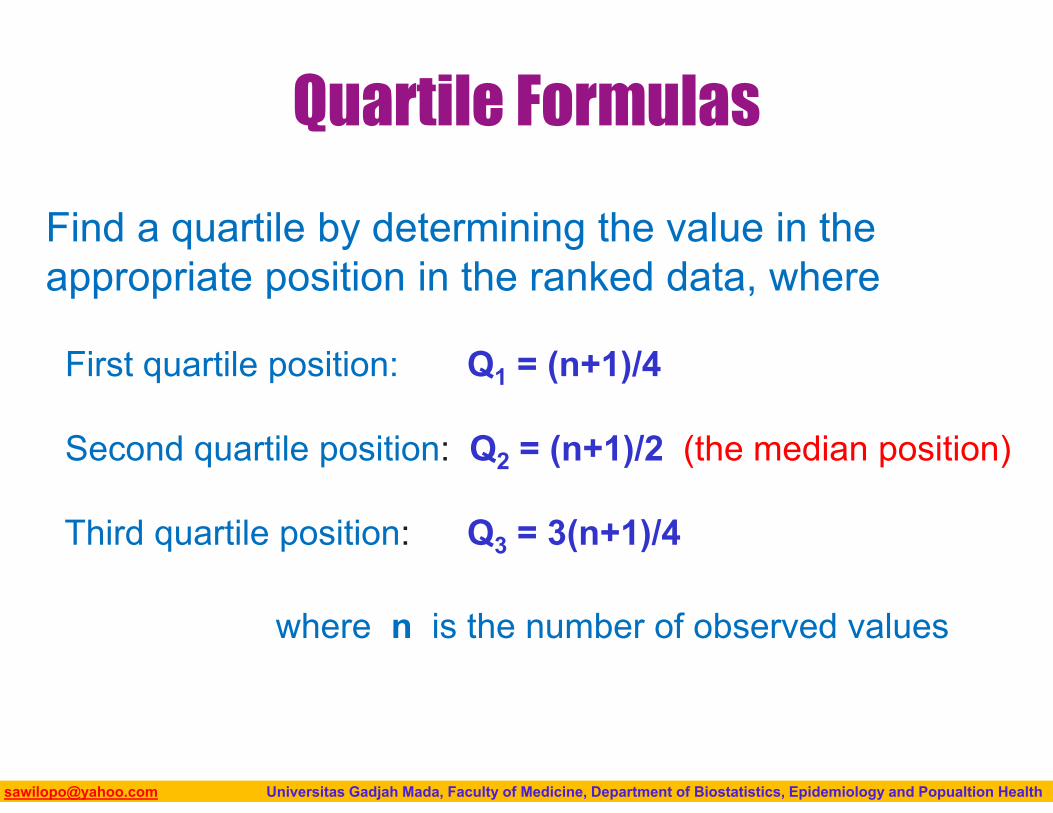
Quartile Formulas
Find a quartile by determining the value in the appropriate position in the ranked data, where
First quartile position: Q1 = (n+1)/4
Second quartile position: Q2 = (n+1)/2 (the median position)
Third quartile position: Q3 = 3(n+1)/4
where n is the number of observed values
Biostatistics I: 2013 [email protected] Universitas Gadjah Mada, Faculty of Medicine, Department of Biostatistics, Epidemiology and Popualtion Health
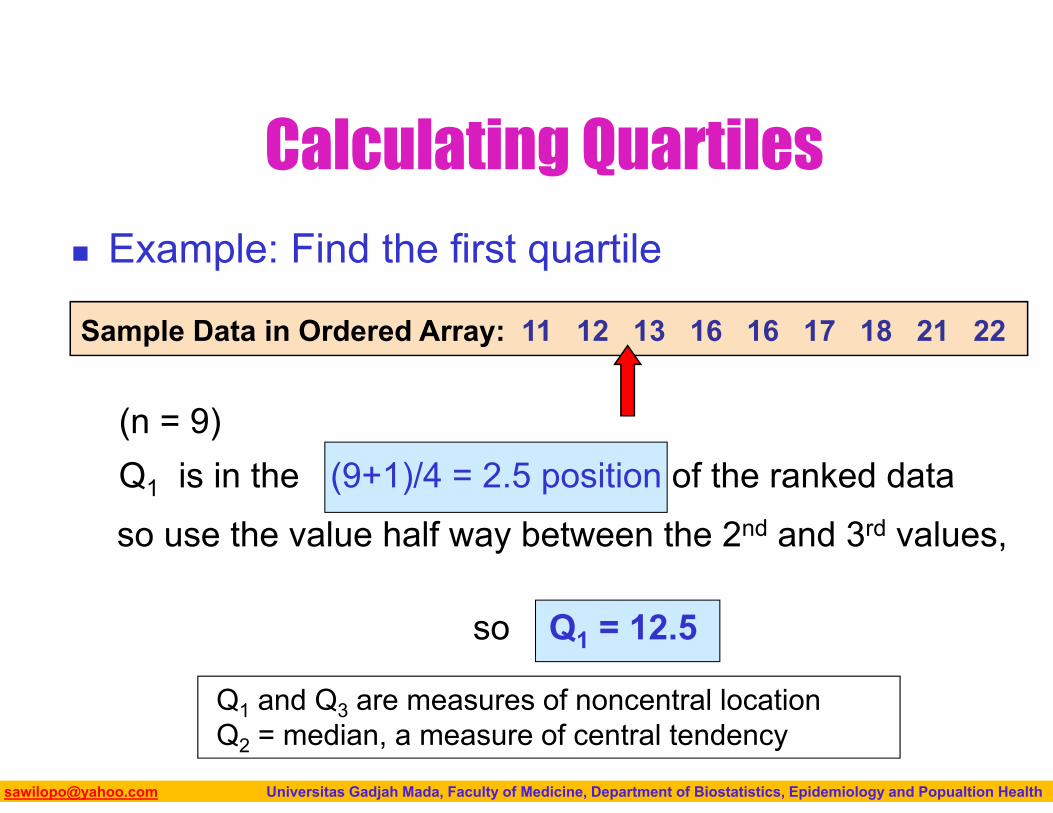
Calculating Quartiles
Sample Data in Ordered Array: 11 12 13 16 16 17 18 21 22
Example: Find the first quartile
Q1 and Q3 are measures of noncentral locationQ2 = median, a measure of central tendency
(n = 9)Q1 is in the (9+1)/4 = 2.5 position of the ranked dataso use the value half way between the 2nd and 3rd values,
so Q1 = 12.5
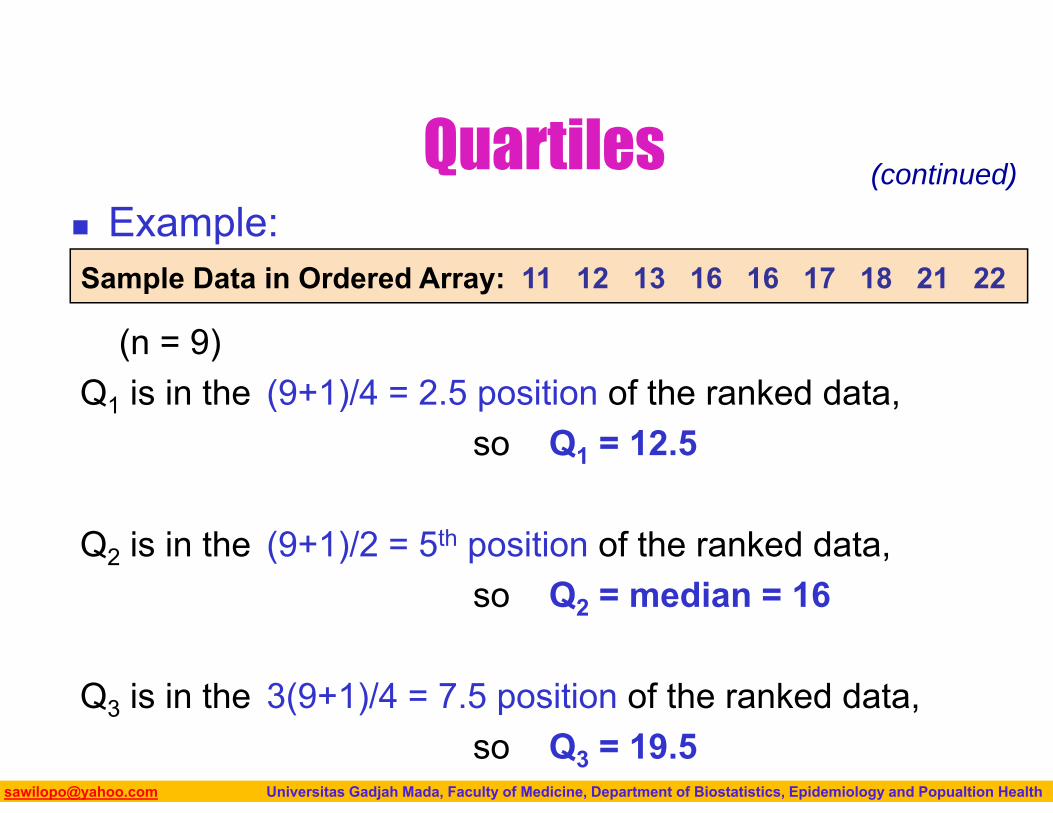
Biostatistics I: 2013 [email protected] Universitas Gadjah Mada, Faculty of Medicine, Department of Biostatistics, Epidemiology and Popualtion Health
(n = 9)Q1 is in the (9+1)/4 = 2.5 position of the ranked data,
so Q1 = 12.5
Q2 is in the (9+1)/2 = 5th position of the ranked data,so Q2 = median = 16
Q3 is in the 3(9+1)/4 = 7.5 position of the ranked data,so Q3 = 19.5
Quartiles
Sample Data in Ordered Array: 11 12 13 16 16 17 18 21 22 Example:
(continued)
Biostatistics I: 2013 [email protected] Universitas Gadjah Mada, Faculty of Medicine, Department of Biostatistics, Epidemiology and Popualtion Health
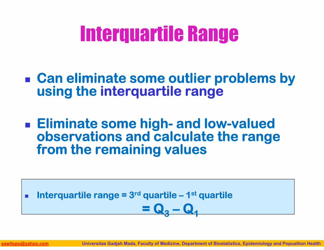
Interquartile Range
Can eliminate some outlier problems by using the interquartile range
Eliminate some high- and low-valued observations and calculate the range from the remaining values
Interquartile range = 3rd quartile – 1st quartile
= Q3 – Q1
Biostatistics I: 2013 [email protected] Universitas Gadjah Mada, Faculty of Medicine, Department of Biostatistics, Epidemiology and Popualtion Health
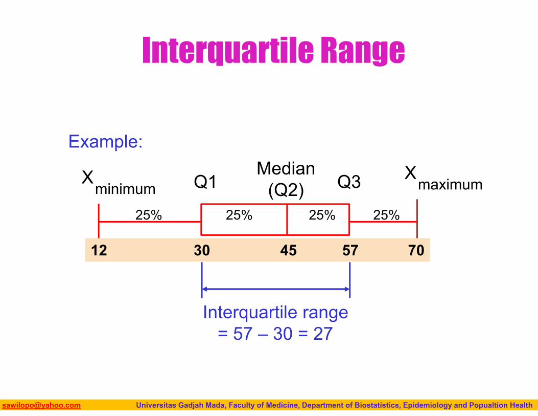
Interquartile Range
Median(Q2)
XmaximumX
minimum Q1 Q3
Example:
25% 25% 25% 25%
12 30 45 57 70
Interquartile range = 57 – 30 = 27
Biostatistics I: 2013 [email protected] Universitas Gadjah Mada, Faculty of Medicine, Department of Biostatistics, Epidemiology and Popualtion Health
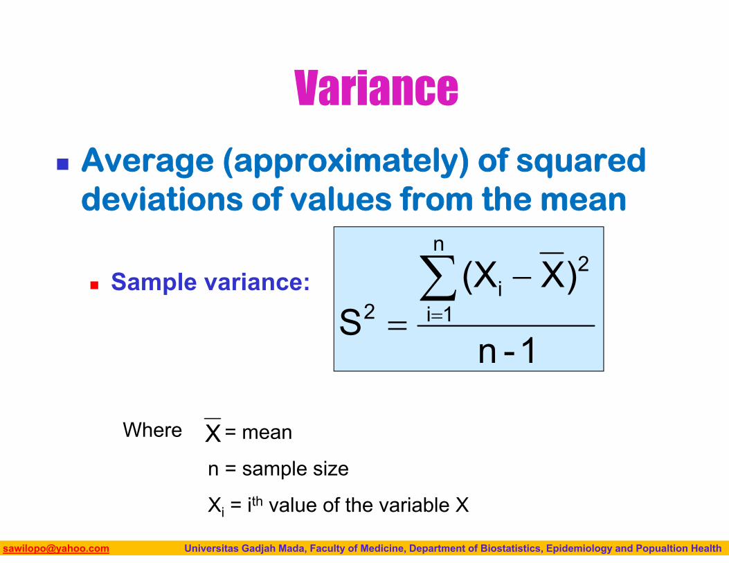
Average (approximately) of squared deviations of values from the mean
Sample variance:
Variance
1-n
)X(XS
n
1i
2i
2
Where = mean
n = sample size
Xi = ith value of the variable X
X
Biostatistics I: 2013 [email protected] Universitas Gadjah Mada, Faculty of Medicine, Department of Biostatistics, Epidemiology and Popualtion Health
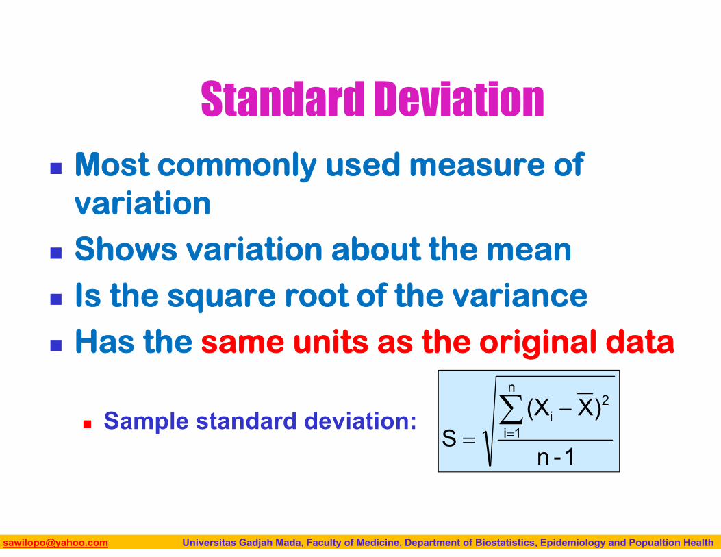
Standard Deviation Most commonly used measure of
variation Shows variation about the mean Is the square root of the variance Has the same units as the original data
Sample standard deviation:1-n
)X(XS
n
1i
2i
Biostatistics I: 2013 [email protected] Universitas Gadjah Mada, Faculty of Medicine, Department of Biostatistics, Epidemiology and Popualtion Health
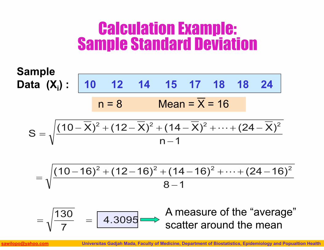
Calculation Example:Sample Standard Deviation
Sample Data (Xi) : 10 12 14 15 17 18 18 24
n = 8 Mean = X = 16
4.30957
130
1816)(2416)(1416)(1216)(10
1n)X(24)X(14)X(12)X(10S
2222
2222
A measure of the “average” scatter around the mean
Biostatistics I: 2013 [email protected] Universitas Gadjah Mada, Faculty of Medicine, Department of Biostatistics, Epidemiology and Popualtion Health
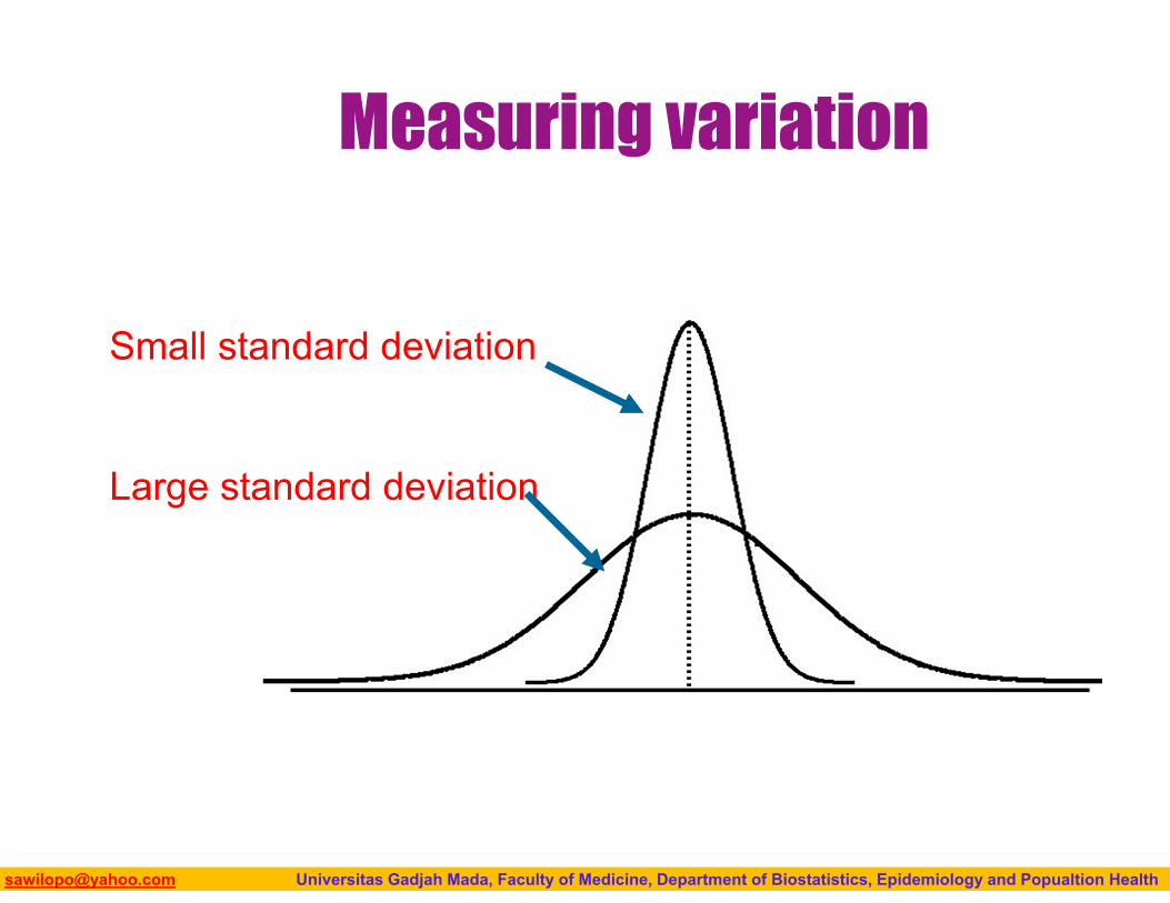
Measuring variation
Small standard deviation
Large standard deviation
Biostatistics I: 2013 [email protected] Universitas Gadjah Mada, Faculty of Medicine, Department of Biostatistics, Epidemiology and Popualtion Health
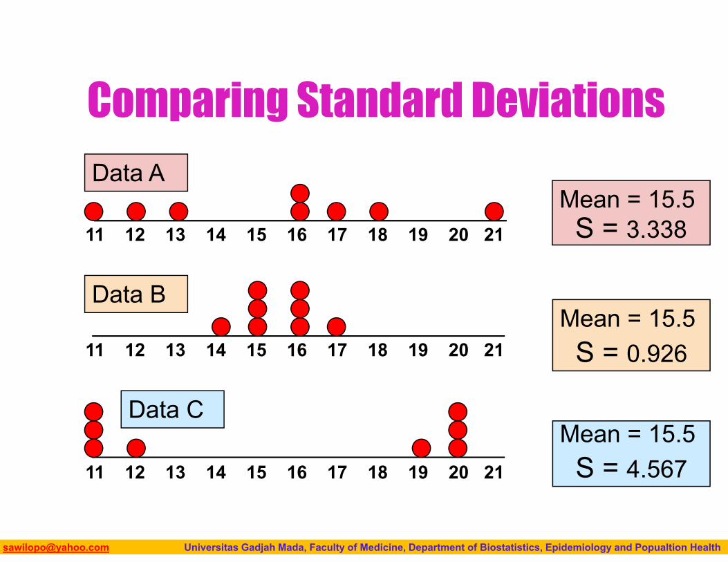
Comparing Standard Deviations
Mean = 15.5S = 3.33811 12 13 14 15 16 17 18 19 20 21
11 12 13 14 15 16 17 18 19 20 21
Data B
Data A
Mean = 15.5S = 0.926
11 12 13 14 15 16 17 18 19 20 21
Mean = 15.5S = 4.567
Data C

Biostatistics I: 2013 [email protected] Universitas Gadjah Mada, Faculty of Medicine, Department of Biostatistics, Epidemiology and Popualtion Health
Advantages of Variance and Standard Deviation
Each value in the data set is used in the calculation
Values far from the mean are given extra weight
(because deviations from the mean are squared)
Biostatistics I: 2013 [email protected] Universitas Gadjah Mada, Faculty of Medicine, Department of Biostatistics, Epidemiology and Popualtion Health
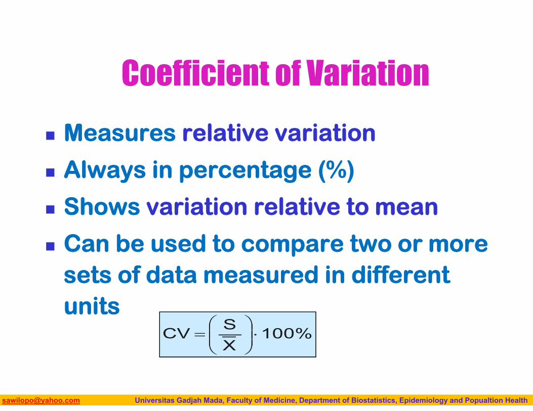
Coefficient of Variation
Measures relative variation
Always in percentage (%)
Shows variation relative to mean
Can be used to compare two or more sets of data measured in different units
100%XSCV
Biostatistics I: 2013 [email protected] Universitas Gadjah Mada, Faculty of Medicine, Department of Biostatistics, Epidemiology and Popualtion Health
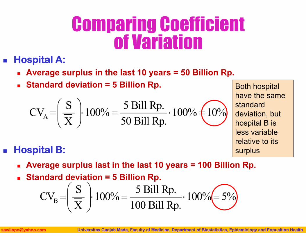
Comparing Coefficient of Variation
Hospital A: Average surplus in the last 10 years = 50 Billion Rp. Standard deviation = 5 Billion Rp.
Hospital B:
Average surplus last in the last 10 years = 100 Billion Rp. Standard deviation = 5 Billion Rp.
Both hospital have the same standard deviation, but hospital B is less variable relative to its surplus
AS 5 Bill Rp.CV 100% 100% 10%
50 Bill Rp.X
BS 5 Bill Rp.CV 100% 100% 5%
100 Bill Rp.X
Biostatistics I: 2013 [email protected] Universitas Gadjah Mada, Faculty of Medicine, Department of Biostatistics, Epidemiology and Popualtion Health
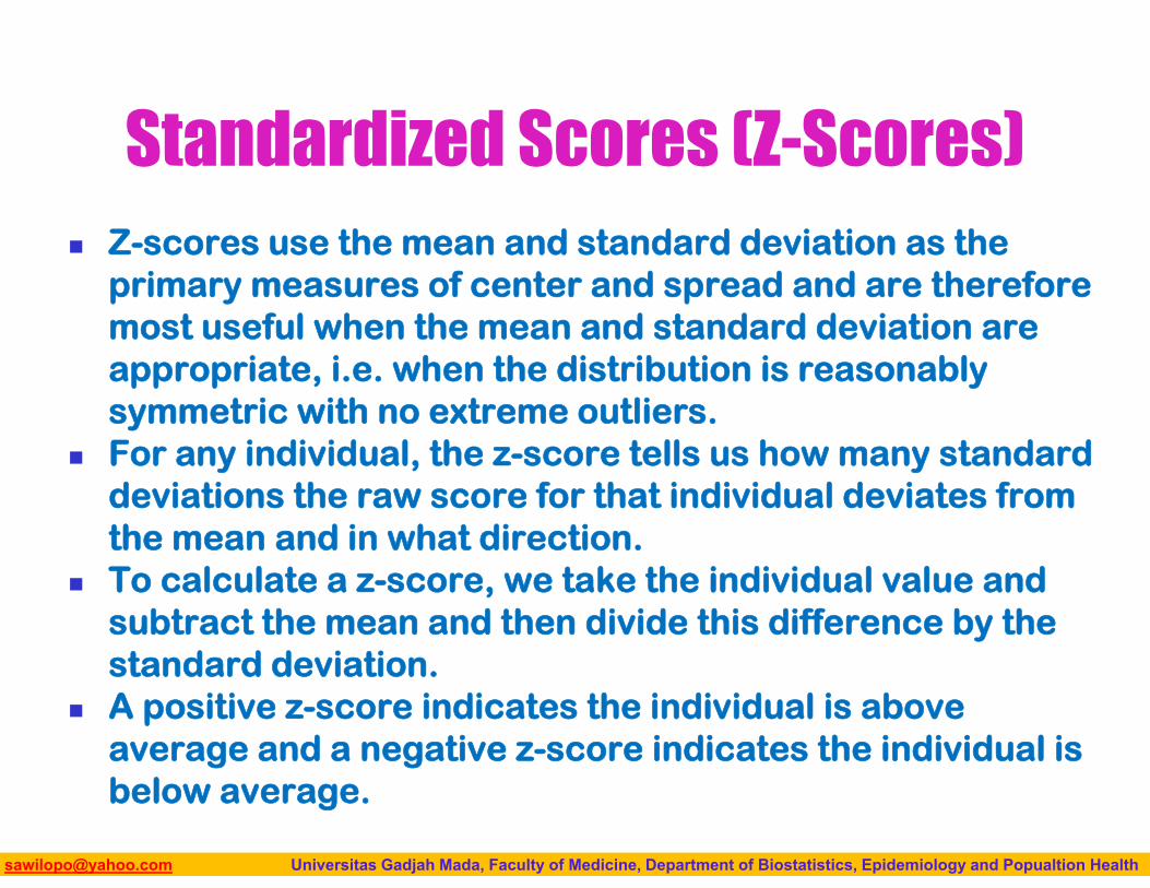
Standardized Scores (Z-Scores) Z-scores use the mean and standard deviation as the
primary measures of center and spread and are therefore most useful when the mean and standard deviation are appropriate, i.e. when the distribution is reasonably symmetric with no extreme outliers.
For any individual, the z-score tells us how many standard deviations the raw score for that individual deviates from the mean and in what direction.
To calculate a z-score, we take the individual value and subtract the mean and then divide this difference by the standard deviation.
A positive z-score indicates the individual is above average and a negative z-score indicates the individual is below average.
Biostatistics I: 2013 [email protected] Universitas Gadjah Mada, Faculty of Medicine, Department of Biostatistics, Epidemiology and Popualtion Health
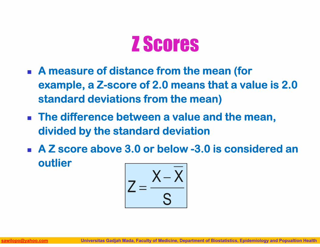
Z Scores A measure of distance from the mean (for
example, a Z-score of 2.0 means that a value is 2.0 standard deviations from the mean)
The difference between a value and the mean, divided by the standard deviation
A Z score above 3.0 or below -3.0 is considered an outlier
SXXZ
Biostatistics I: 2013 [email protected] Universitas Gadjah Mada, Faculty of Medicine, Department of Biostatistics, Epidemiology and Popualtion Health
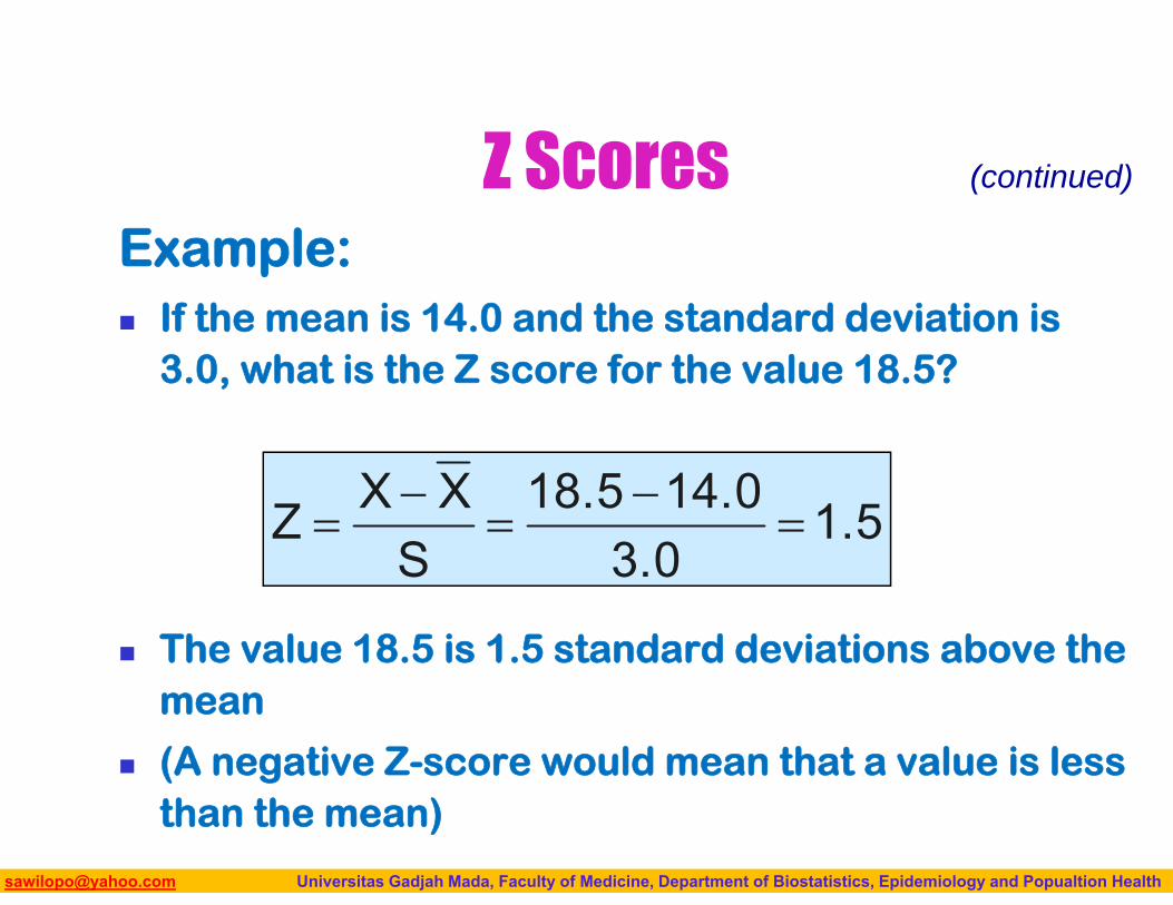
Z ScoresExample: If the mean is 14.0 and the standard deviation is
3.0, what is the Z score for the value 18.5?
The value 18.5 is 1.5 standard deviations above the mean
(A negative Z-score would mean that a value is less than the mean)
1.53.0
14.018.5S
XXZ
(continued)
Biostatistics I: 2013 [email protected] Universitas Gadjah Mada, Faculty of Medicine, Department of Biostatistics, Epidemiology and Popualtion Health
MEASURE SPREAD AND DISTRIBUTIONQuantitative and Graphical Approach:
73
Biostatistics I: 2013 [email protected] Universitas Gadjah Mada, Faculty of Medicine, Department of Biostatistics, Epidemiology and Popualtion Health
DESCRIBING DISTRIBUTIONS
74
Biostatistics I: 2013 [email protected] Universitas Gadjah Mada, Faculty of Medicine, Department of Biostatistics, Epidemiology and Popualtion Health
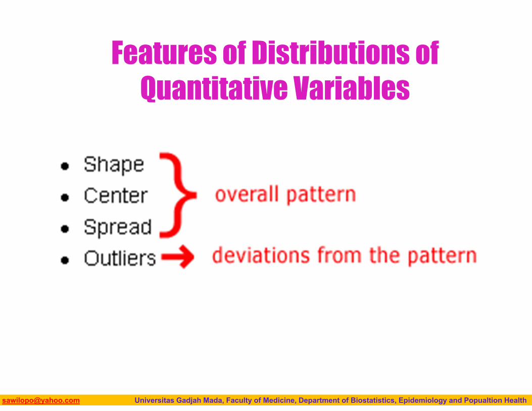
Features of Distributions of Quantitative Variables
Biostatistics I: 2013 [email protected] Universitas Gadjah Mada, Faculty of Medicine, Department of Biostatistics, Epidemiology and Popualtion Health
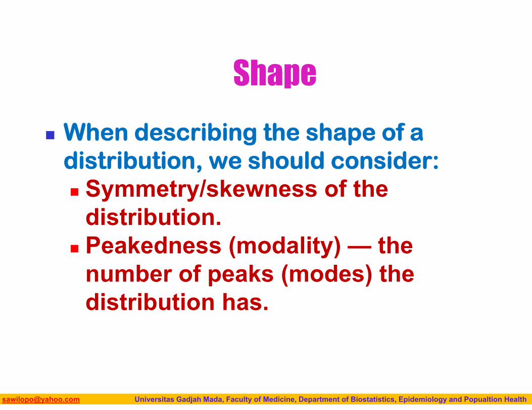
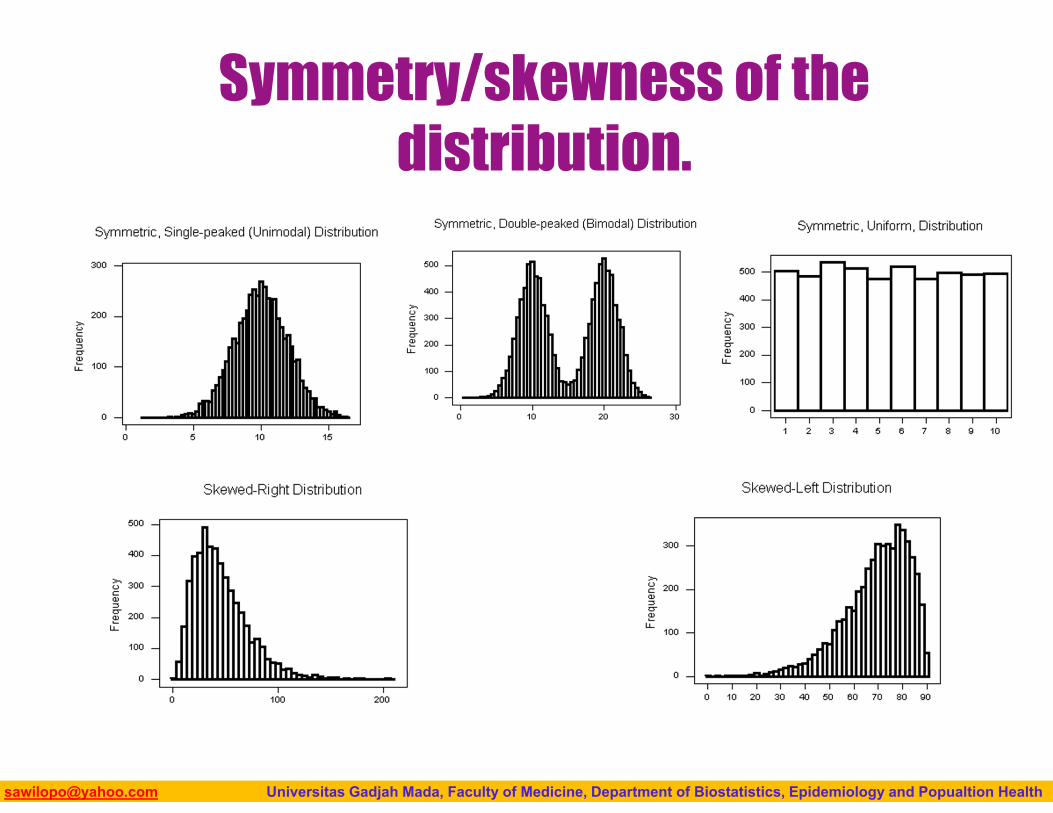
Shape
When describing the shape of a distribution, we should consider: Symmetry/skewness of the
distribution. Peakedness (modality) — the
number of peaks (modes) the distribution has.
Biostatistics I: 2013 [email protected] Universitas Gadjah Mada, Faculty of Medicine, Department of Biostatistics, Epidemiology and Popualtion Health
Symmetry/skewness of the distribution.
Biostatistics I: 2013 [email protected] Universitas Gadjah Mada, Faculty of Medicine, Department of Biostatistics, Epidemiology and Popualtion Health
Biostatistics I: 2013 [email protected] Universitas Gadjah Mada, Faculty of Medicine, Department of Biostatistics, Epidemiology and Popualtion Health
Biostatistics I: 2013 [email protected] Universitas Gadjah Mada, Faculty of Medicine, Department of Biostatistics, Epidemiology and Popualtion Health
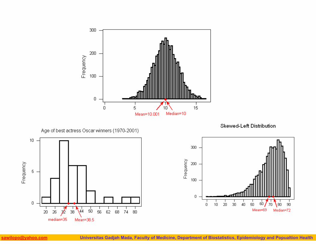
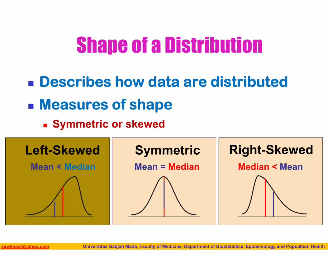
Shape of a Distribution
Describes how data are distributed
Measures of shape Symmetric or skewed
Mean = MedianMean < Median Median < MeanRight-SkewedLeft-Skewed Symmetric
Biostatistics I: 2013 [email protected] Universitas Gadjah Mada, Faculty of Medicine, Department of Biostatistics, Epidemiology and Popualtion Health
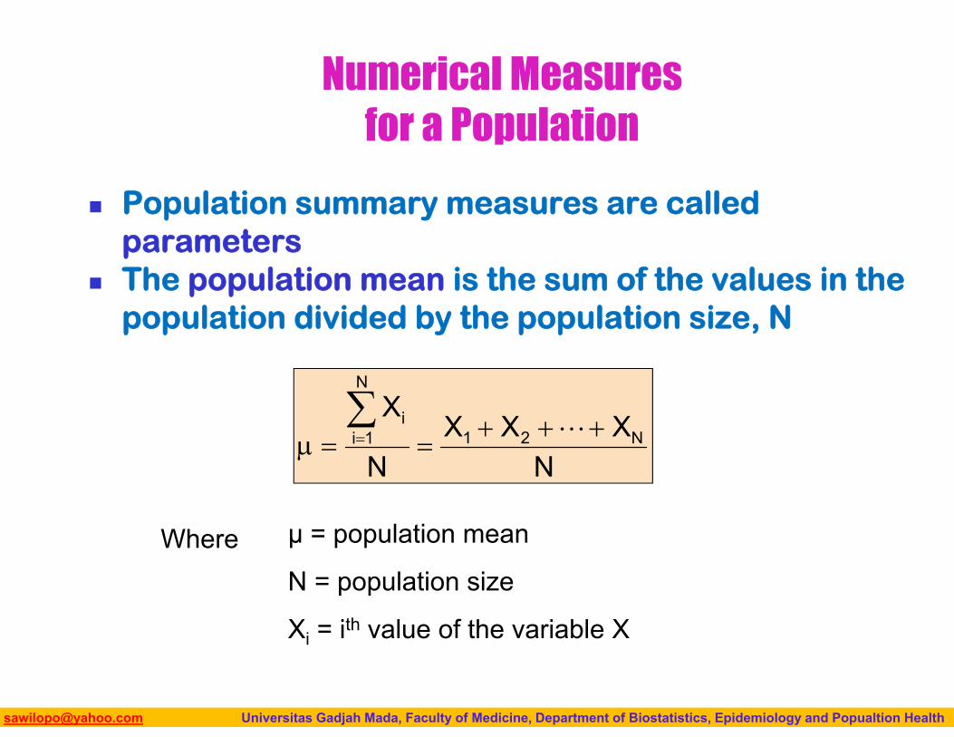
Numerical Measures for a Population
Population summary measures are called parameters
The population mean is the sum of the values in the population divided by the population size, N
NXXX
N
XN21
N
1ii
μ = population mean
N = population size
Xi = ith value of the variable X
Where
Biostatistics I: 2013 [email protected] Universitas Gadjah Mada, Faculty of Medicine, Department of Biostatistics, Epidemiology and Popualtion Health
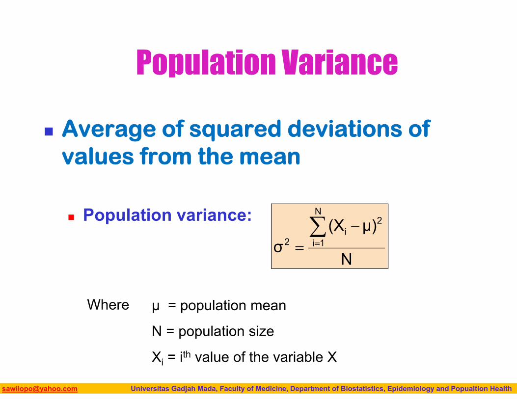
Average of squared deviations of values from the mean
Population variance:
Population Variance
N
μ)(Xσ
N
1i
2i
2
Where μ = population mean
N = population size
Xi = ith value of the variable X
Biostatistics I: 2013 [email protected] Universitas Gadjah Mada, Faculty of Medicine, Department of Biostatistics, Epidemiology and Popualtion Health
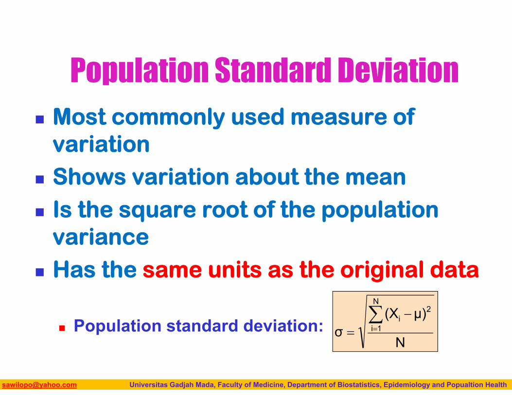
Population Standard Deviation Most commonly used measure of
variation Shows variation about the mean Is the square root of the population
variance Has the same units as the original data
Population standard deviation:N
μ)(Xσ
N
1i
2i
Biostatistics I: 2013 [email protected] Universitas Gadjah Mada, Faculty of Medicine, Department of Biostatistics, Epidemiology and Popualtion Health
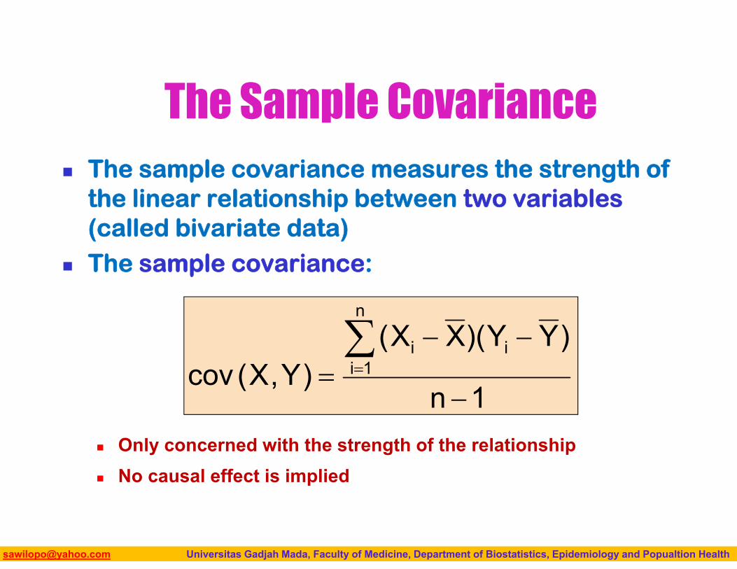
The Sample Covariance The sample covariance measures the strength of
the linear relationship between two variables (called bivariate data)
The sample covariance:
Only concerned with the strength of the relationship No causal effect is implied
1n
)YY)(XX()Y,X(cov
n
1iii
Biostatistics I: 2013 [email protected] Universitas Gadjah Mada, Faculty of Medicine, Department of Biostatistics, Epidemiology and Popualtion Health
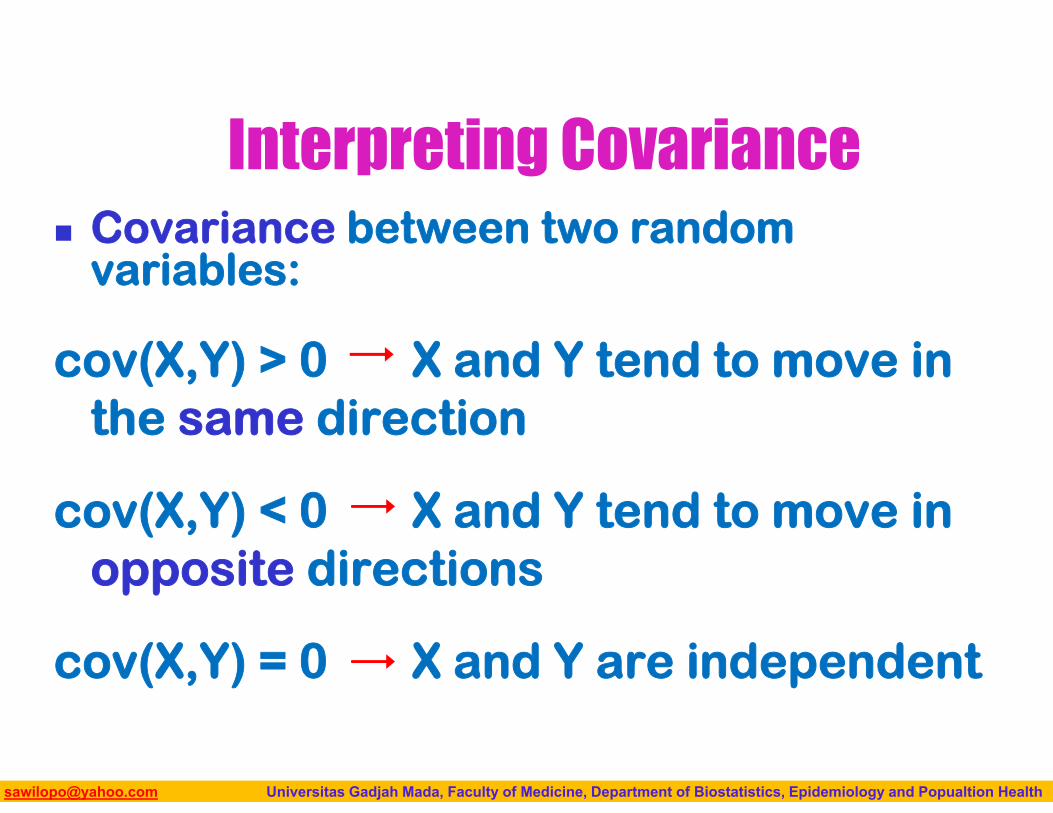
Covariance between two random variables:
cov(X,Y) > 0 X and Y tend to move in the same direction
cov(X,Y) < 0 X and Y tend to move in opposite directions
cov(X,Y) = 0 X and Y are independent
Interpreting Covariance
Biostatistics I: 2013 [email protected] Universitas Gadjah Mada, Faculty of Medicine, Department of Biostatistics, Epidemiology and Popualtion Health
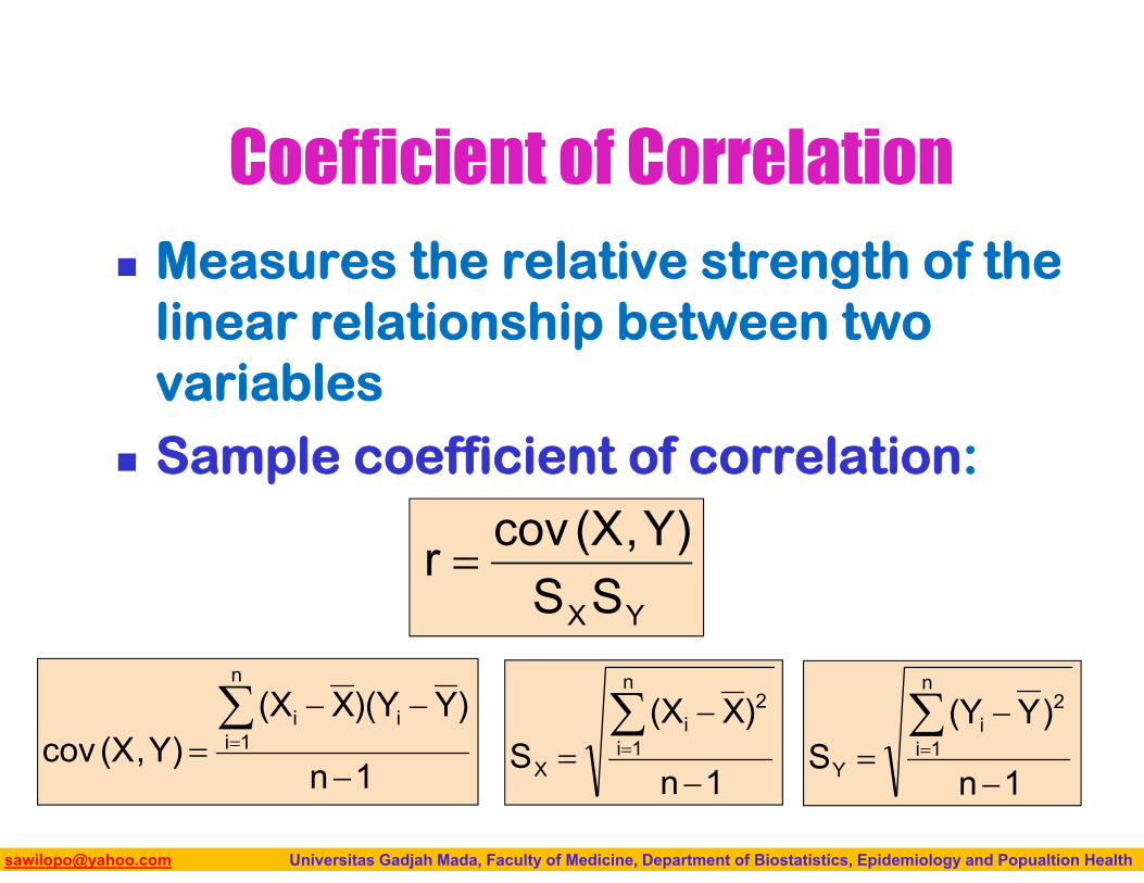
Coefficient of Correlation Measures the relative strength of the
linear relationship between two variables
Sample coefficient of correlation:
where
YXSSY),(Xcovr
1n
)X(XS
n
1i
2i
X
1n
)Y)(YX(XY),(Xcov
n
1iii
1n
)Y(YS
n
1i
2i
Y
Biostatistics I: 2013 [email protected] Universitas Gadjah Mada, Faculty of Medicine, Department of Biostatistics, Epidemiology and Popualtion Health
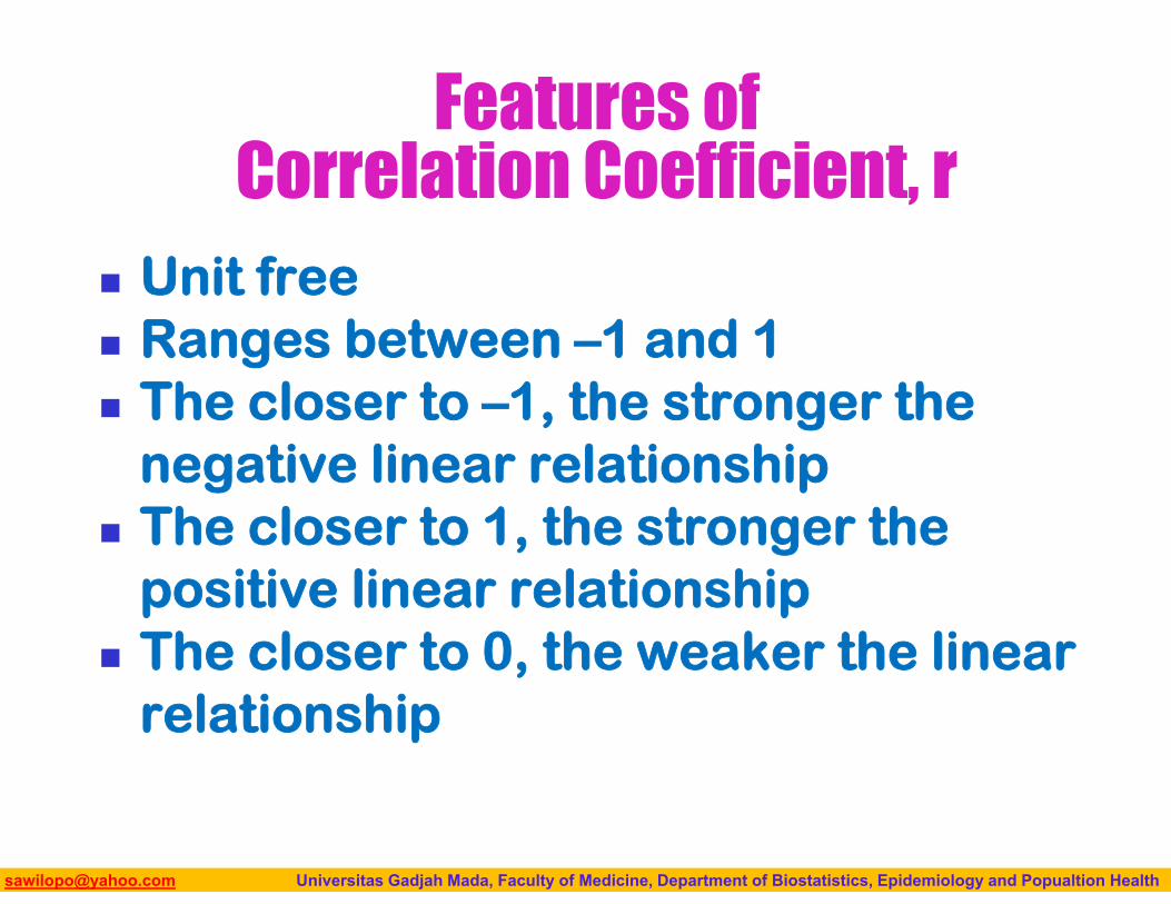
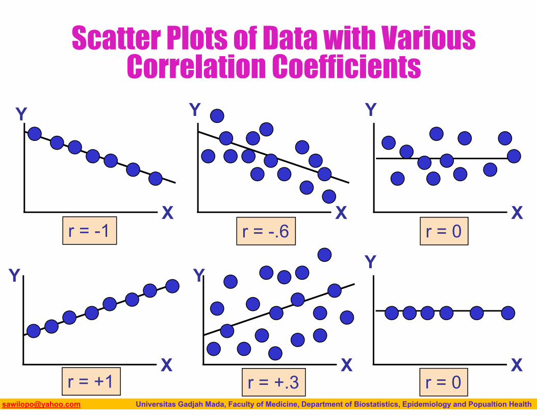
Features of Correlation Coefficient, r
Unit free Ranges between –1 and 1 The closer to –1, the stronger the
negative linear relationship The closer to 1, the stronger the
positive linear relationship The closer to 0, the weaker the linear
relationship
Biostatistics I: 2013 [email protected] Universitas Gadjah Mada, Faculty of Medicine, Department of Biostatistics, Epidemiology and Popualtion Health
Scatter Plots of Data with Various Correlation Coefficients
Y
X
Y
X
Y
X
Y
X
Y
X
r = -1 r = -.6 r = 0
r = +.3r = +1
Y
Xr = 0
Biostatistics I: 2013 [email protected] Universitas Gadjah Mada, Faculty of Medicine, Department of Biostatistics, Epidemiology and Popualtion Health
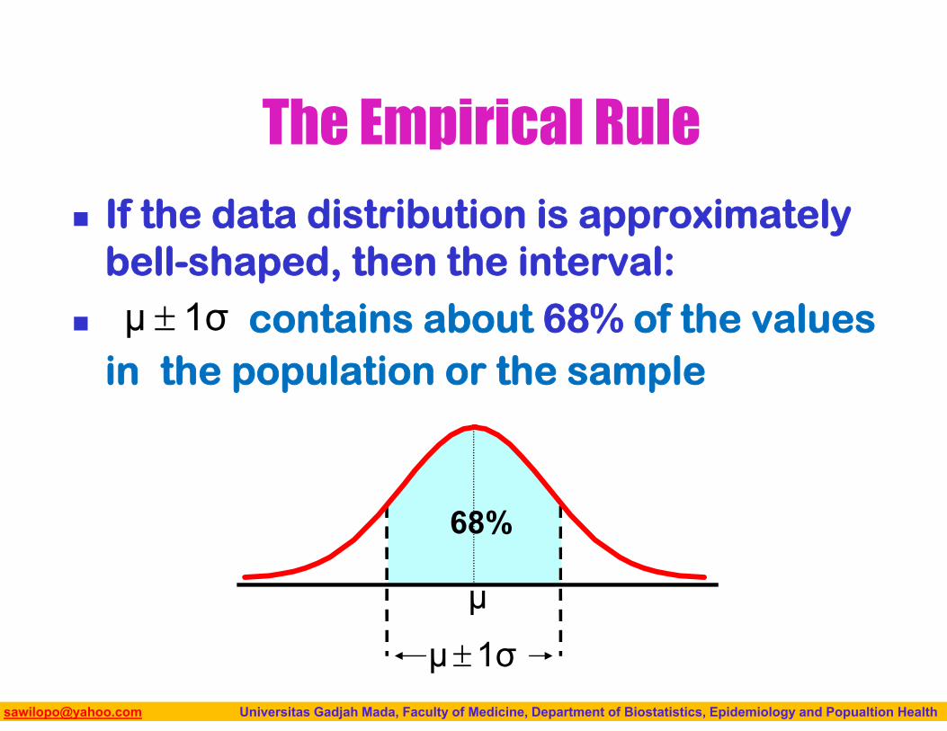
The Empirical Rule
If the data distribution is approximately bell-shaped, then the interval:
contains about 68% of the values in the population or the sample
1σμ
μ
68%
1σμ
Biostatistics I: 2013 [email protected] Universitas Gadjah Mada, Faculty of Medicine, Department of Biostatistics, Epidemiology and Popualtion Health
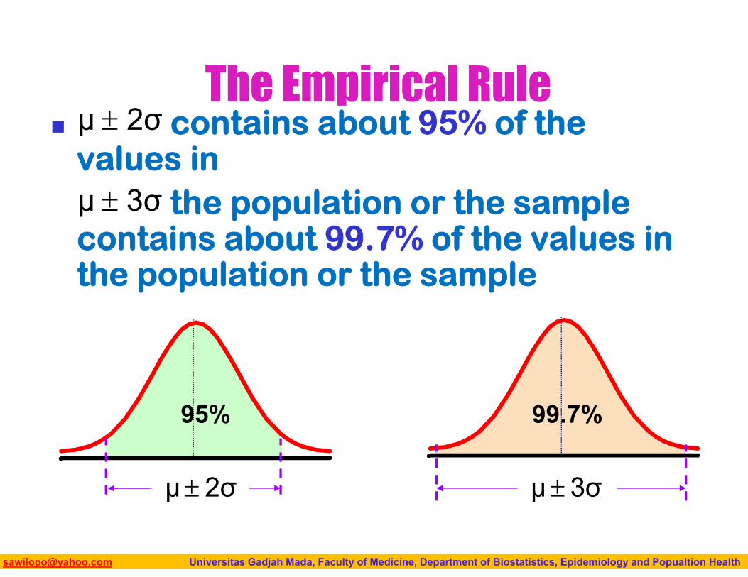
The Empirical Rule contains about 95% of the
values in the population or the sample
contains about 99.7% of the values in the population or the sample
2σμ
3σμ
3σμ
99.7%95%
2σμ
Biostatistics I: 2013 [email protected] Universitas Gadjah Mada, Faculty of Medicine, Department of Biostatistics, Epidemiology and Popualtion Health
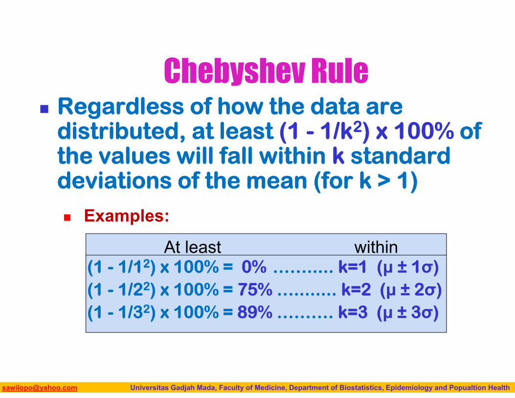
Chebyshev Rule Regardless of how the data are
distributed, at least (1 - 1/k2) x 100% of the values will fall within k standard deviations of the mean (for k > 1)
Examples:
(1 - 1/12) x 100% = 0% ……..... k=1 (μ ± 1σ)(1 - 1/22) x 100% = 75% …........ k=2 (μ ± 2σ)(1 - 1/32) x 100% = 89% ………. k=3 (μ ± 3σ)
withinAt least
Biostatistics I: 2013 [email protected] Universitas Gadjah Mada, Faculty of Medicine, Department of Biostatistics, Epidemiology and Popualtion Health
MEASURES OF SPREAD
92
Biostatistics I: 2013 [email protected] Universitas Gadjah Mada, Faculty of Medicine, Department of Biostatistics, Epidemiology and Popualtion Health93
Biostatistics I: 2013 [email protected] Universitas Gadjah Mada, Faculty of Medicine, Department of Biostatistics, Epidemiology and Popualtion Health
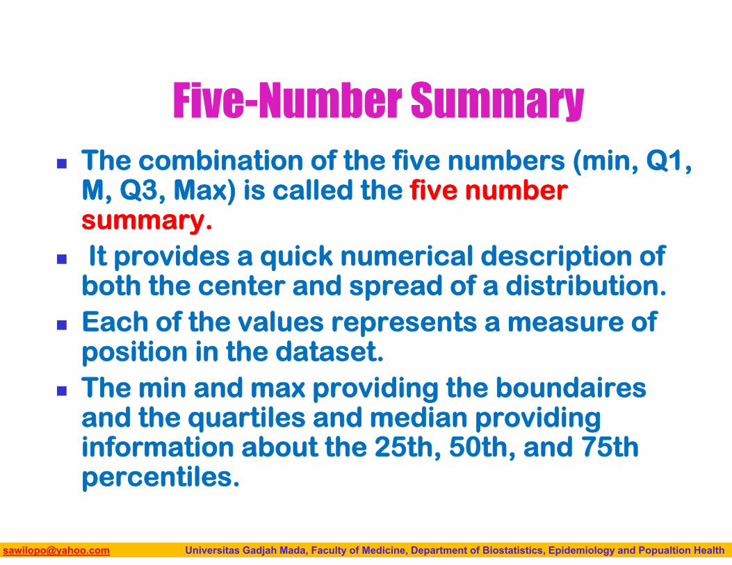
Five-Number Summary The combination of the five numbers (min, Q1,
M, Q3, Max) is called the five number summary.
It provides a quick numerical description of both the center and spread of a distribution.
Each of the values represents a measure of position in the dataset.
The min and max providing the boundairesand the quartiles and median providing information about the 25th, 50th, and 75th percentiles.
Biostatistics I: 2013 [email protected] Universitas Gadjah Mada, Faculty of Medicine, Department of Biostatistics, Epidemiology and Popualtion Health
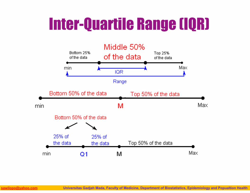
Inter-Quartile Range (IQR)

Biostatistics I: 2013 [email protected] Universitas Gadjah Mada, Faculty of Medicine, Department of Biostatistics, Epidemiology and Popualtion Health
Inter-Quartile Range (IQR)
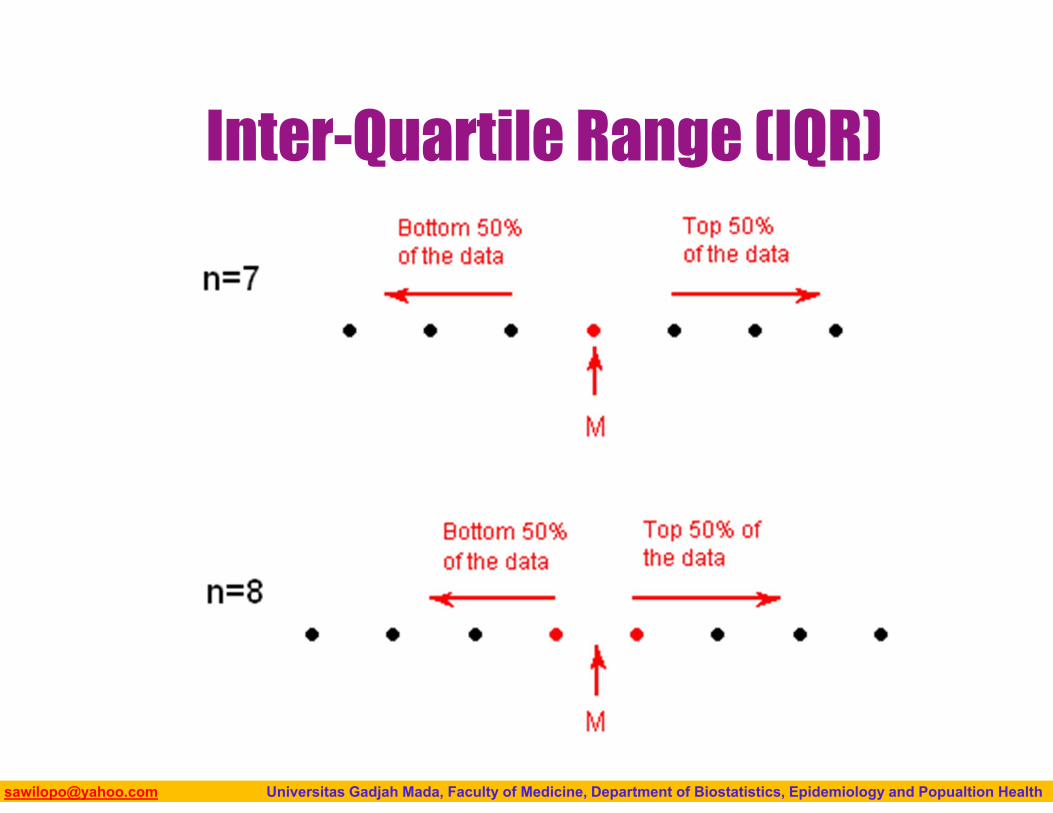
Biostatistics I: 2013 [email protected] Universitas Gadjah Mada, Faculty of Medicine, Department of Biostatistics, Epidemiology and Popualtion Health
Inter-Quartile Range (IQR)
Biostatistics I: 2013 [email protected] Universitas Gadjah Mada, Faculty of Medicine, Department of Biostatistics, Epidemiology and Popualtion Health
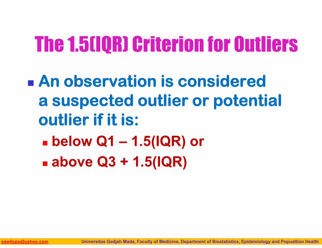
The 1.5(IQR) Criterion for Outliers
An observation is considered a suspected outlier or potential outlier if it is: below Q1 – 1.5(IQR) or above Q3 + 1.5(IQR)
Biostatistics I: 2013 [email protected] Universitas Gadjah Mada, Faculty of Medicine, Department of Biostatistics, Epidemiology and Popualtion Health
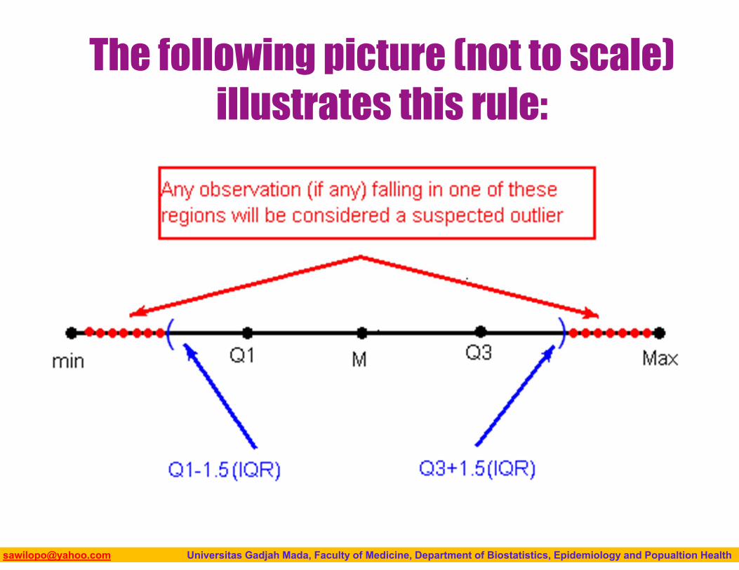
The following picture (not to scale) illustrates this rule:
Biostatistics I: 2013 [email protected] Universitas Gadjah Mada, Faculty of Medicine, Department of Biostatistics, Epidemiology and Popualtion Health
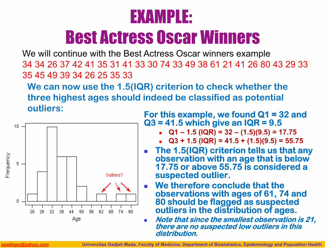
EXAMPLE:Best Actress Oscar Winners
We can now use the 1.5(IQR) criterion to check whether the three highest ages should indeed be classified as potential outliers:
For this example, we found Q1 = 32 and Q3 = 41.5 which give an IQR = 9.5
Q1 – 1.5 (IQR) = 32 – (1.5)(9.5) = 17.75 Q3 + 1.5 (IQR) = 41.5 + (1.5)(9.5) = 55.75
The 1.5(IQR) criterion tells us that any observation with an age that is below 17.75 or above 55.75 is considered a suspected outlier.
We therefore conclude that the observations with ages of 61, 74 and 80 should be flagged as suspected outliers in the distribution of ages.
Note that since the smallest observation is 21, there are no suspected low outliers in this distribution.
We will continue with the Best Actress Oscar winners example34 34 26 37 42 41 35 31 41 33 30 74 33 49 38 61 21 41 26 80 43 29 33 35 45 49 39 34 26 25 35 33
Biostatistics I: 2013 [email protected] Universitas Gadjah Mada, Faculty of Medicine, Department of Biostatistics, Epidemiology and Popualtion Health
Possible methods for handling outliers in practice
Why is it important to identify possible outliers, and how should they be dealt with? The answers to these questions depend on the reasons for the outlying values. Here are several possibilities: Even though it is an extreme value, if an outlier can be
understood to have been produced by essentially the same sort of physical or biological process as the rest of the data, and if such extreme values are expected to eventually occur again, then such an outlier indicates something important and interesting about the process you’re investigating, and it should be kept in the data.
Biostatistics I: 2013 [email protected] Universitas Gadjah Mada, Faculty of Medicine, Department of Biostatistics, Epidemiology and Popualtion Health
If an outlier can be explained to have been produced under fundamentally different conditions from the rest of the data (or by a fundamentally different process), such an outlier can be removed from the data if your goal is to investigate only the process that produced the rest of the data.
An outlier might indicate a mistake in the data (like a typo, or a measuring error), in which case it should be corrected if possible or else removed from the data before calculating summary statistics or making inferences from the data (and the reason for the mistake should be investigated).
Biostatistics I: 2013 [email protected] Universitas Gadjah Mada, Faculty of Medicine, Department of Biostatistics, Epidemiology and Popualtion Health
BOXPLOTSIdentification for suspected outliers
103
Biostatistics I: 2013 [email protected] Universitas Gadjah Mada, Faculty of Medicine, Department of Biostatistics, Epidemiology and Popualtion Health
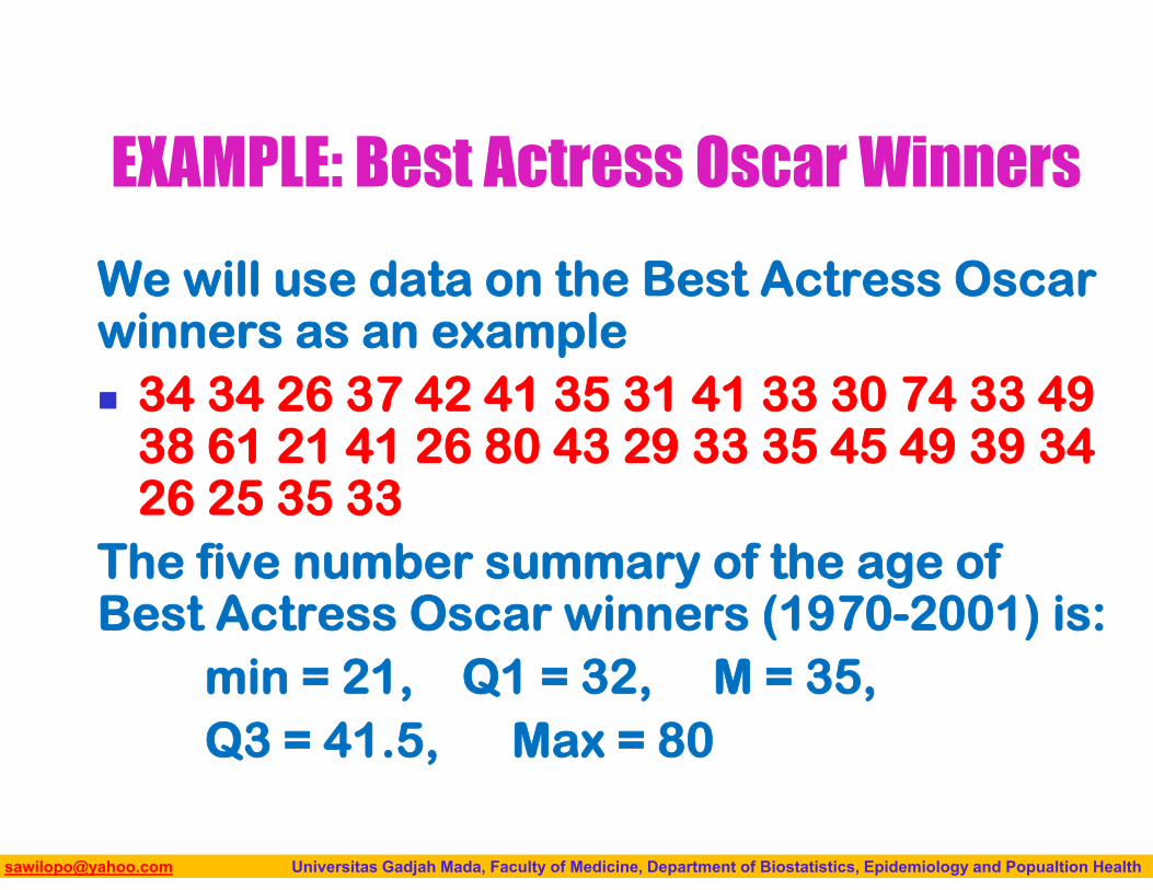
EXAMPLE: Best Actress Oscar Winners
We will use data on the Best Actress Oscar winners as an example 34 34 26 37 42 41 35 31 41 33 30 74 33 49
38 61 21 41 26 80 43 29 33 35 45 49 39 34 26 25 35 33
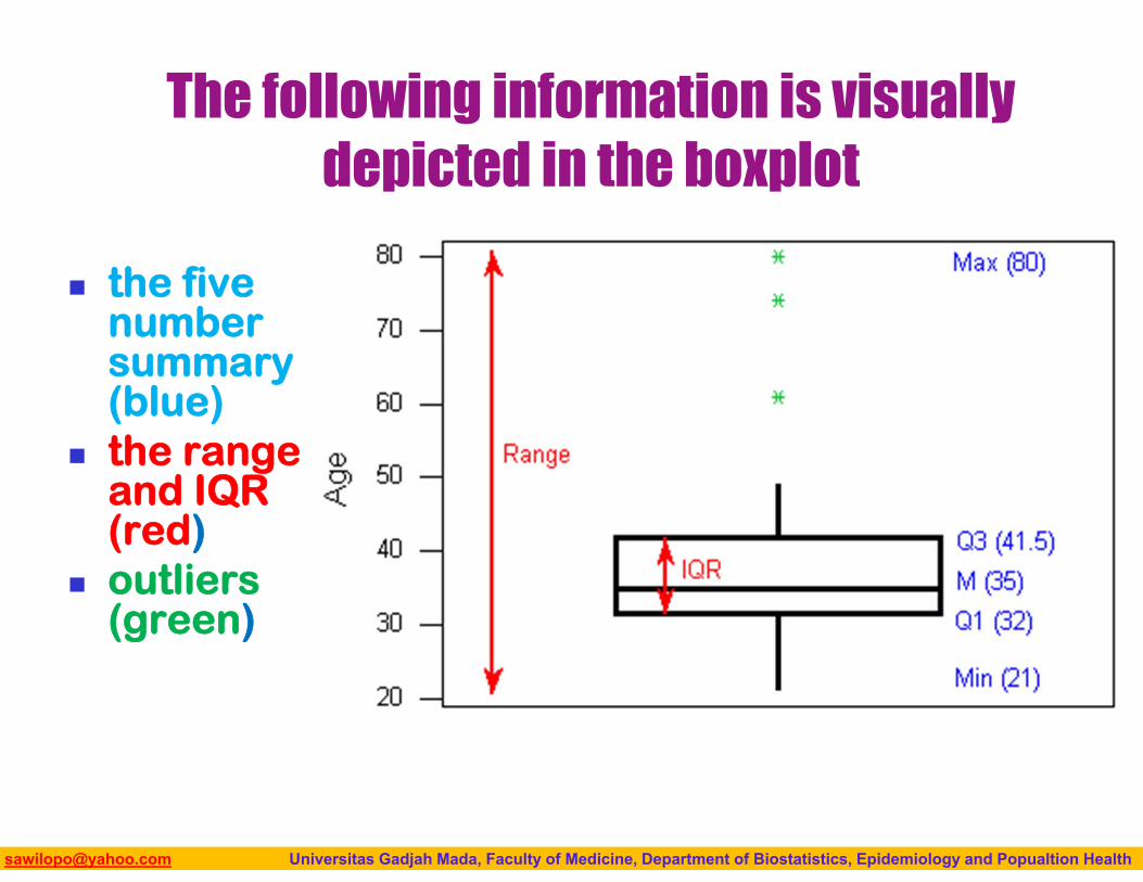
The five number summary of the age of Best Actress Oscar winners (1970-2001) is:
min = 21, Q1 = 32, M = 35, Q3 = 41.5, Max = 80
Biostatistics I: 2013 [email protected] Universitas Gadjah Mada, Faculty of Medicine, Department of Biostatistics, Epidemiology and Popualtion Health
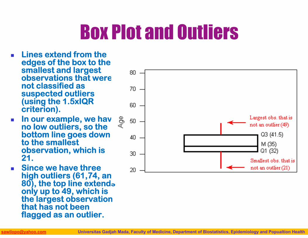
Box Plot and Outliers Lines extend from the
edges of the box to the smallest and largest observations that were not classified as suspected outliers (using the 1.5xIQR criterion).
In our example, we have no low outliers, so the bottom line goes down to the smallest observation, which is 21.
Since we have three high outliers (61,74, and 80), the top line extends only up to 49, which is the largest observation that has not been flagged as an outlier.
Biostatistics I: 2013 [email protected] Universitas Gadjah Mada, Faculty of Medicine, Department of Biostatistics, Epidemiology and Popualtion Health
The following information is visually depicted in the boxplot
the five number summary (blue)
the range and IQR (red)
outliers (green)
Biostatistics I: 2013 [email protected] Universitas Gadjah Mada, Faculty of Medicine, Department of Biostatistics, Epidemiology and Popualtion Health
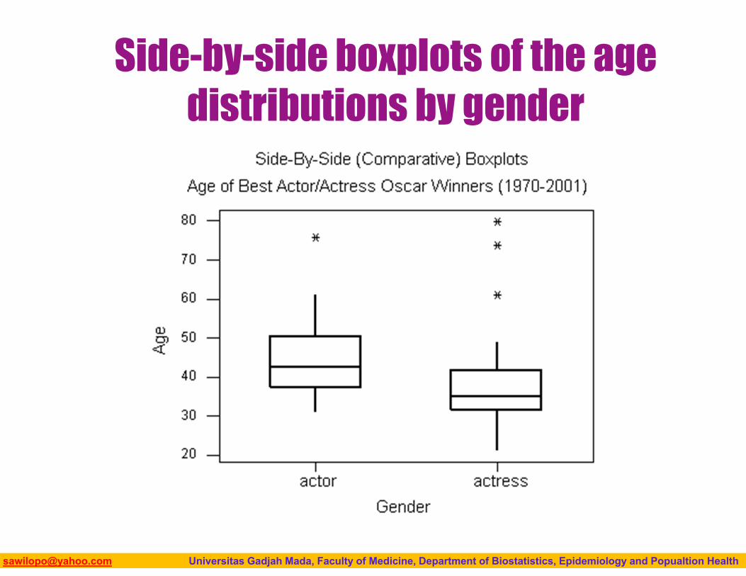
Side-by-side boxplots of the age distributions by gender
Biostatistics I: 2013 [email protected] Universitas Gadjah Mada, Faculty of Medicine, Department of Biostatistics, Epidemiology and Popualtion Health
Box Plot Summarized The five-number summary of a distribution
consists of M, Q1, Q3 and the extremes Min, Max. The median describes the center, and the
extremes (which give the range) and the quartiles (which give the IQR) describe the spread.
The boxplot is visually displaying the five number summary and any suspected outlier using the 1.5(IQR) criterion.
Boxplots presented in side-by-side to compare and contrast distributions from two or more groups.
Biostatistics I: 2013 [email protected] Universitas Gadjah Mada, Faculty of Medicine, Department of Biostatistics, Epidemiology and Popualtion Health
ROLE-TYPE CLASSIFICATION
109
Biostatistics I: 2013 [email protected] Universitas Gadjah Mada, Faculty of Medicine, Department of Biostatistics, Epidemiology and Popualtion Health
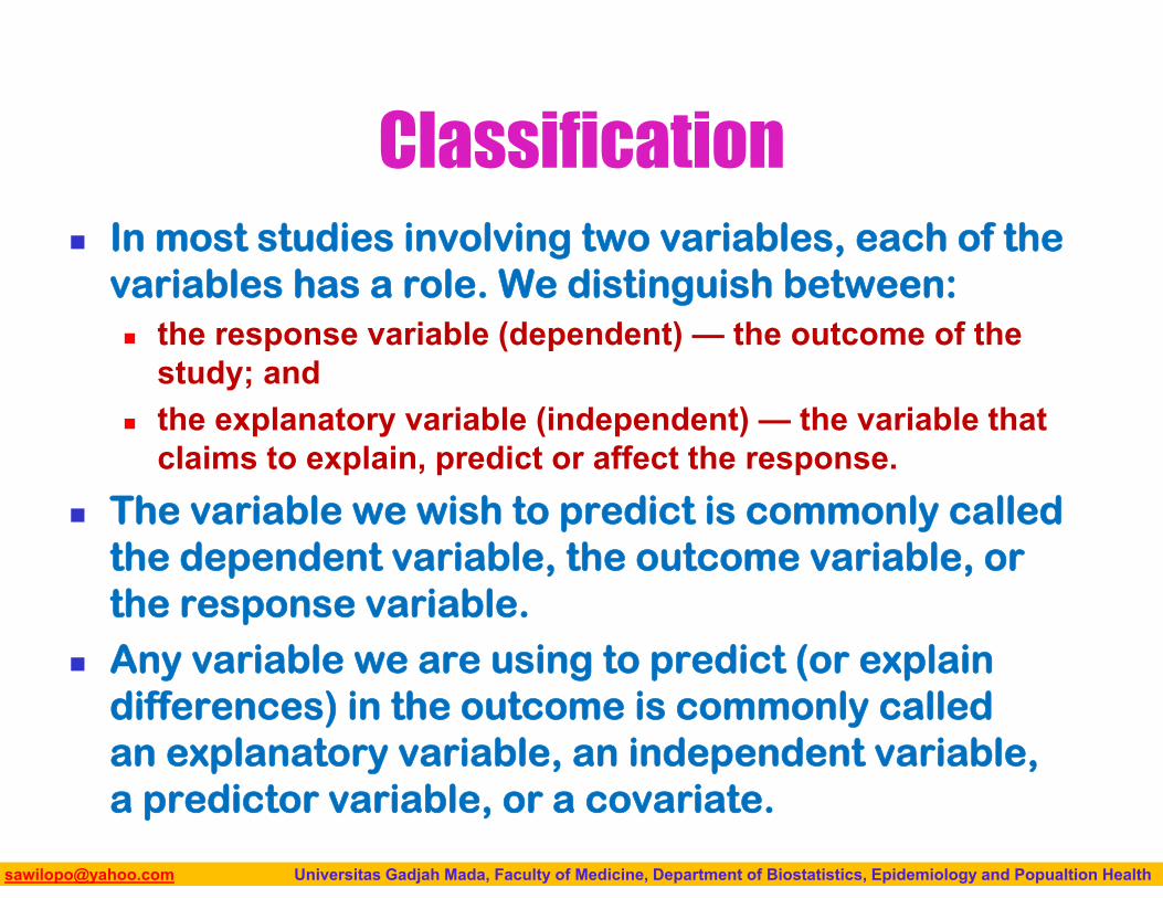
Classification In most studies involving two variables, each of the
variables has a role. We distinguish between: the response variable (dependent) — the outcome of the
study; and the explanatory variable (independent) — the variable that
claims to explain, predict or affect the response. The variable we wish to predict is commonly called
the dependent variable, the outcome variable, or the response variable.
Any variable we are using to predict (or explain differences) in the outcome is commonly called an explanatory variable, an independent variable, a predictor variable, or a covariate.
Biostatistics I: 2013 [email protected] Universitas Gadjah Mada, Faculty of Medicine, Department of Biostatistics, Epidemiology and Popualtion Health
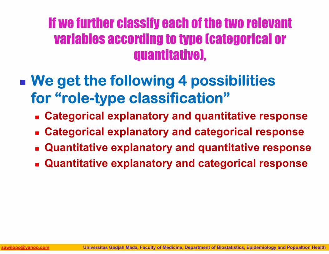
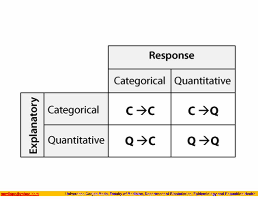
If we further classify each of the two relevant variables according to type (categorical or
quantitative),
We get the following 4 possibilities for “role-type classification” Categorical explanatory and quantitative response Categorical explanatory and categorical response Quantitative explanatory and quantitative response Quantitative explanatory and categorical response
Biostatistics I: 2013 [email protected] Universitas Gadjah Mada, Faculty of Medicine, Department of Biostatistics, Epidemiology and Popualtion Health
Biostatistics I: 2013 [email protected] Universitas Gadjah Mada, Faculty of Medicine, Department of Biostatistics, Epidemiology and Popualtion Health
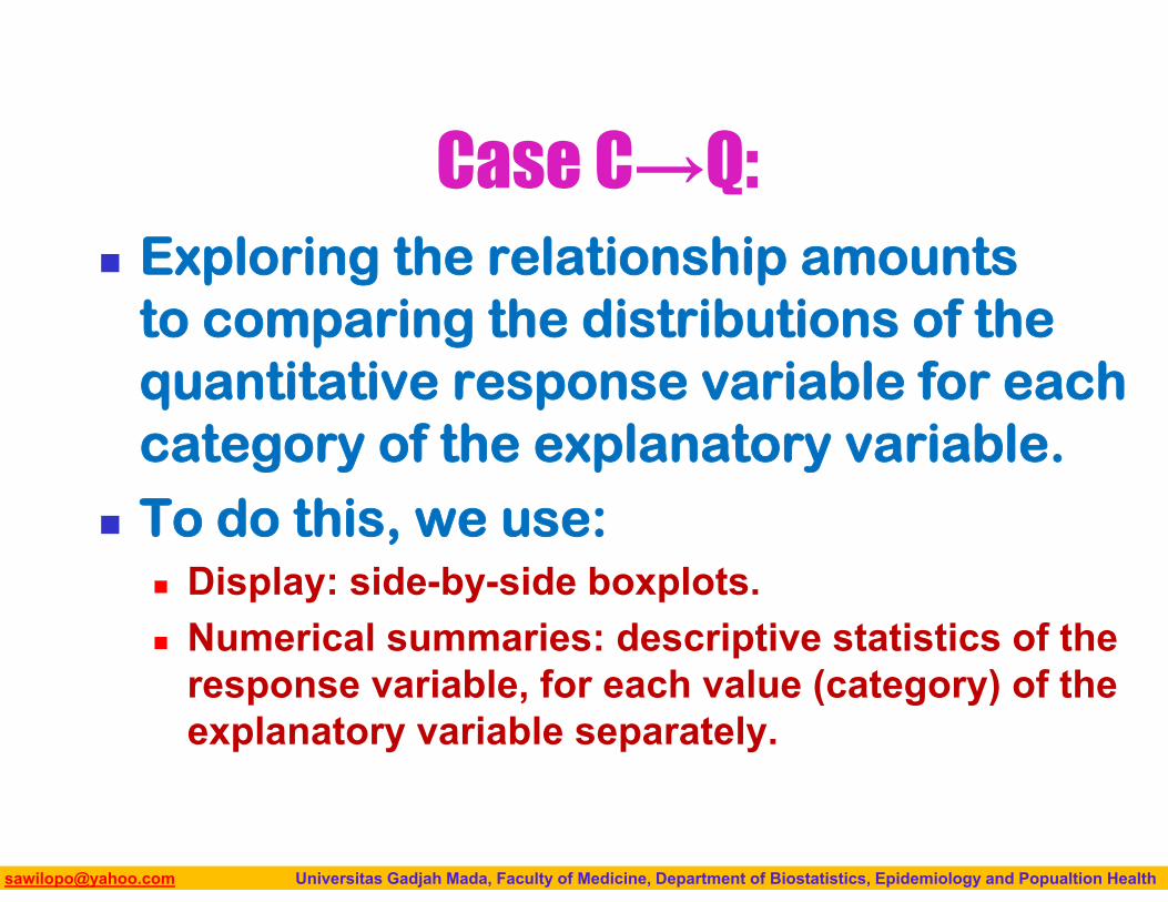
Case C→Q: Exploring the relationship amounts
to comparing the distributions of the quantitative response variable for each category of the explanatory variable.
To do this, we use: Display: side-by-side boxplots. Numerical summaries: descriptive statistics of the
response variable, for each value (category) of the explanatory variable separately.

Biostatistics I: 2013 [email protected] Universitas Gadjah Mada, Faculty of Medicine, Department of Biostatistics, Epidemiology and Popualtion Health
Case C→C: Exploring the relationship amounts
to comparing the distributions of the categorical response variable, for each category of the explanatory variable.
To do this, we use: Display: two-way table. Numerical summaries: conditional percentages (of
the response variable for each value (category) of the explanatory variable separately).
Biostatistics I: 2013 [email protected] Universitas Gadjah Mada, Faculty of Medicine, Department of Biostatistics, Epidemiology and Popualtion Health
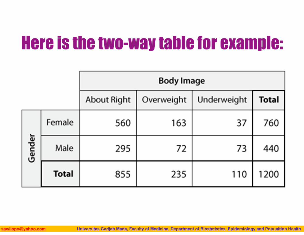
Here is the two-way table for example:
Biostatistics I: 2013 [email protected] Universitas Gadjah Mada, Faculty of Medicine, Department of Biostatistics, Epidemiology and Popualtion Health
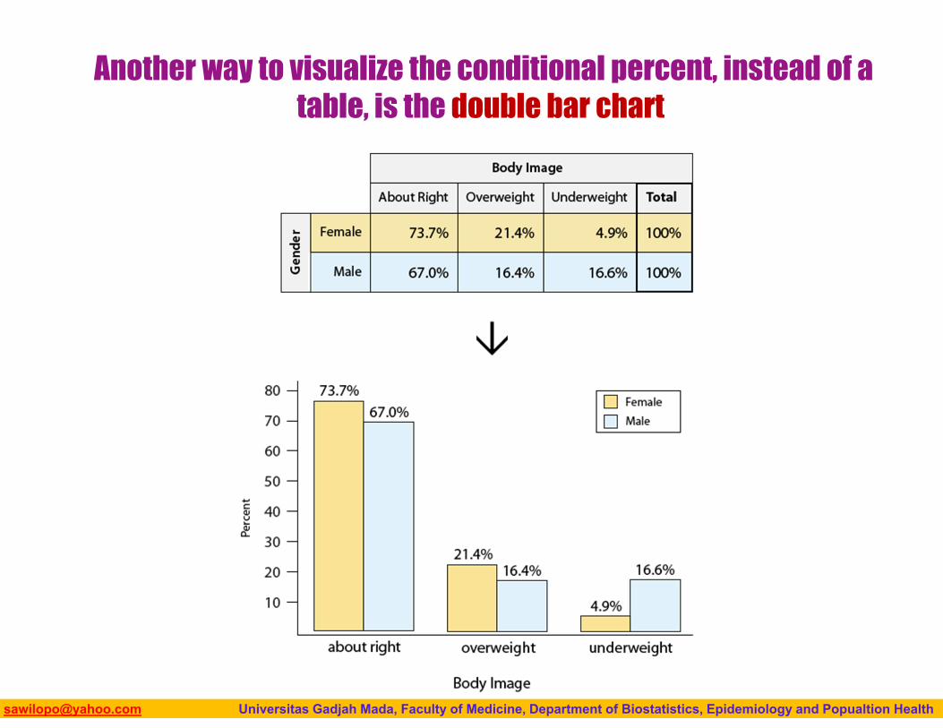
Another way to visualize the conditional percent, instead of a table, is the double bar chart
Biostatistics I: 2013 [email protected] Universitas Gadjah Mada, Faculty of Medicine, Department of Biostatistics, Epidemiology and Popualtion Health
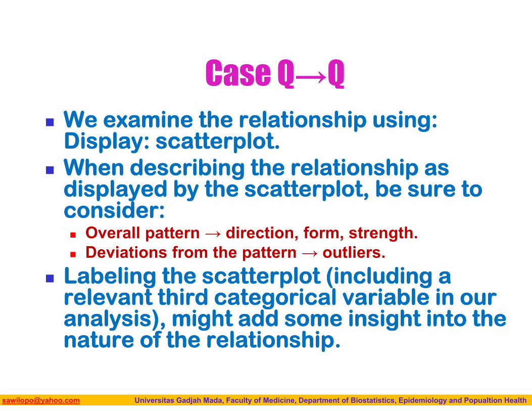
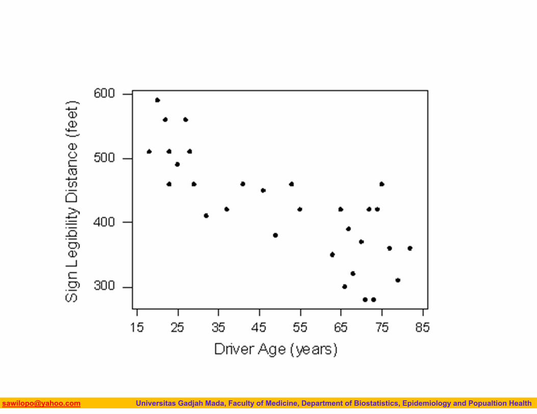
Case Q→Q We examine the relationship using:
Display: scatterplot. When describing the relationship as
displayed by the scatterplot, be sure to consider: Overall pattern → direction, form, strength. Deviations from the pattern → outliers.
Labeling the scatterplot (including a relevant third categorical variable in our analysis), might add some insight into the nature of the relationship.
Biostatistics I: 2013 [email protected] Universitas Gadjah Mada, Faculty of Medicine, Department of Biostatistics, Epidemiology and Popualtion Health
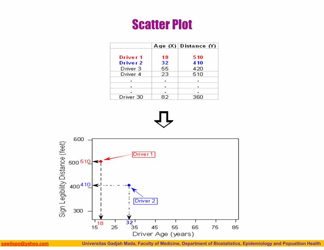
Scatter Plot
Biostatistics I: 2013 [email protected] Universitas Gadjah Mada, Faculty of Medicine, Department of Biostatistics, Epidemiology and Popualtion Health

Biostatistics I: 2013 [email protected] Universitas Gadjah Mada, Faculty of Medicine, Department of Biostatistics, Epidemiology and Popualtion Health
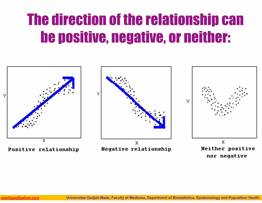
Interpreting Scatterplots• How do we explore the relationship between two
quantitative variables using the scatterplot? • What should we look at, or pay attention to?
Biostatistics I: 2013 [email protected] Universitas Gadjah Mada, Faculty of Medicine, Department of Biostatistics, Epidemiology and Popualtion Health
The direction of the relationship can be positive, negative, or neither:
Biostatistics I: 2013 [email protected] Universitas Gadjah Mada, Faculty of Medicine, Department of Biostatistics, Epidemiology and Popualtion Health
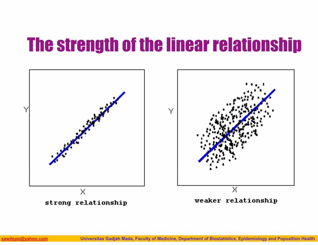
The strength of the linear relationship
Biostatistics I: 2013 [email protected] Universitas Gadjah Mada, Faculty of Medicine, Department of Biostatistics, Epidemiology and Popualtion Health
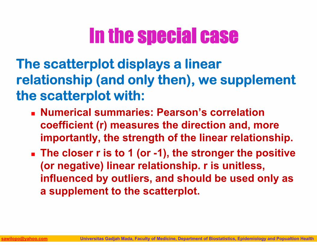
In the special caseThe scatterplot displays a linear relationship (and only then), we supplement the scatterplot with:
Numerical summaries: Pearson’s correlation coefficient (r) measures the direction and, more importantly, the strength of the linear relationship.
The closer r is to 1 (or -1), the stronger the positive (or negative) linear relationship. r is unitless, influenced by outliers, and should be used only as a supplement to the scatterplot.
Biostatistics I: 2013 [email protected] Universitas Gadjah Mada, Faculty of Medicine, Department of Biostatistics, Epidemiology and Popualtion Health
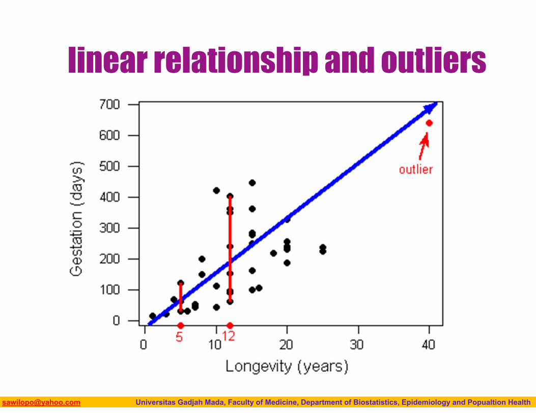
linear relationship and outliers
Biostatistics I: 2013 [email protected] Universitas Gadjah Mada, Faculty of Medicine, Department of Biostatistics, Epidemiology and Popualtion Health
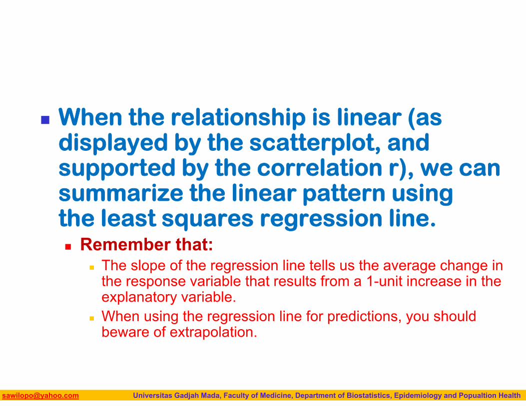
When the relationship is linear (as displayed by the scatterplot, and supported by the correlation r), we can summarize the linear pattern using the least squares regression line. Remember that:
The slope of the regression line tells us the average change in the response variable that results from a 1-unit increase in the explanatory variable.
When using the regression line for predictions, you should beware of extrapolation.
Biostatistics I: 2013 [email protected] Universitas Gadjah Mada, Faculty of Medicine, Department of Biostatistics, Epidemiology and Popualtion Health
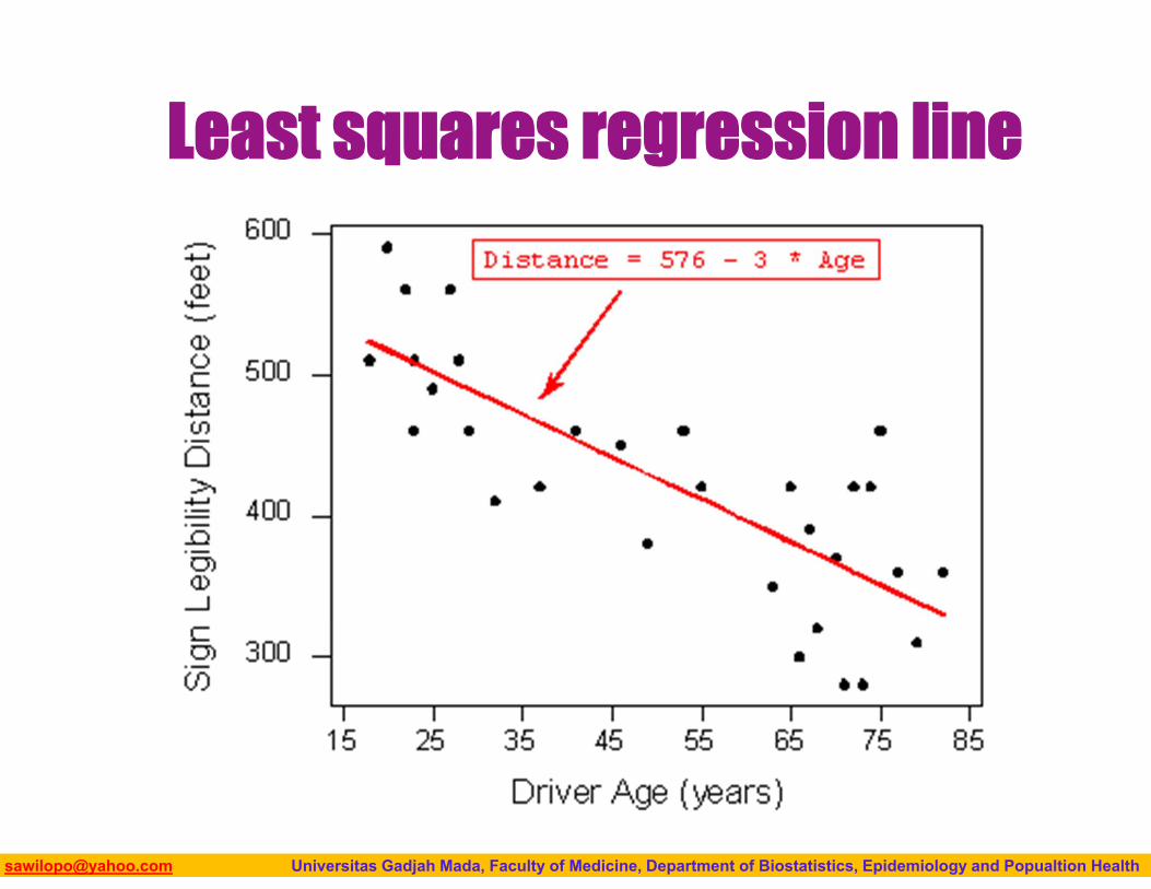
Least squares regression line
Biostatistics I: 2013 [email protected] Universitas Gadjah Mada, Faculty of Medicine, Department of Biostatistics, Epidemiology and Popualtion Health
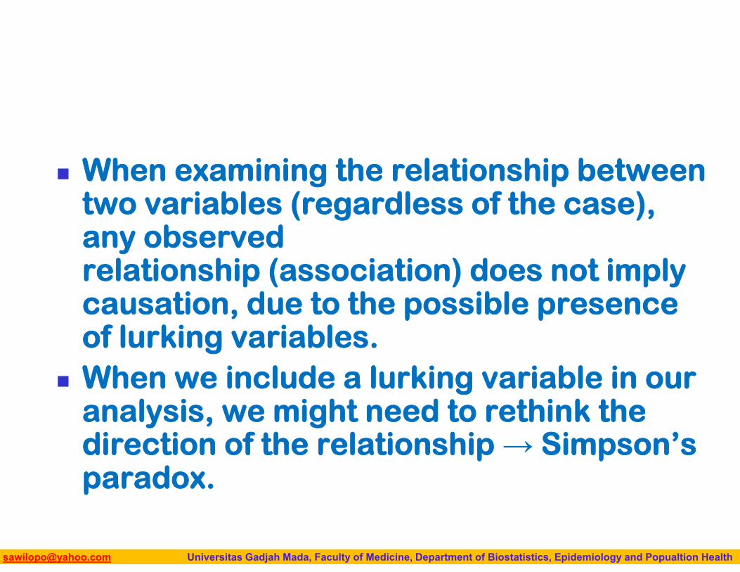
When examining the relationship between two variables (regardless of the case), any observed relationship (association) does not imply causation, due to the possible presence of lurking variables.
When we include a lurking variable in our analysis, we might need to rethink the direction of the relationship → Simpson’s paradox.
Biostatistics I: 2013 [email protected] Universitas Gadjah Mada, Faculty of Medicine, Department of Biostatistics, Epidemiology and Popualtion Health
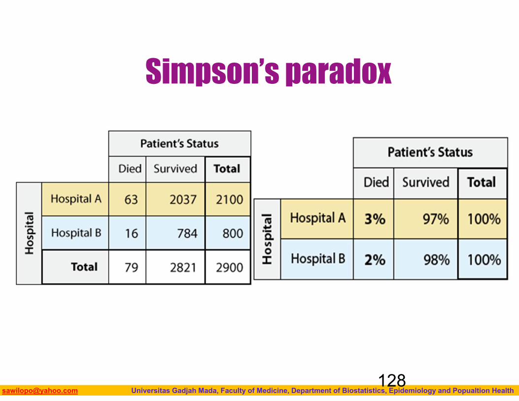
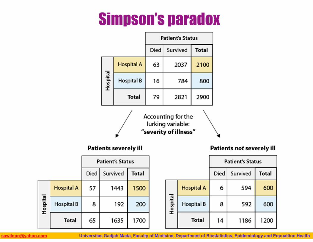
Simpson’s paradox
128
Biostatistics I: 2013 [email protected] Universitas Gadjah Mada, Faculty of Medicine, Department of Biostatistics, Epidemiology and Popualtion Health
Simpson’s paradox
Biostatistics I: 2013 [email protected] Universitas Gadjah Mada, Faculty of Medicine, Department of Biostatistics, Epidemiology and Popualtion Health
Simpson’s paradox
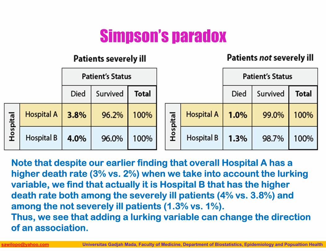
Note that despite our earlier finding that overall Hospital A has a higher death rate (3% vs. 2%) when we take into account the lurking variable, we find that actually it is Hospital B that has the higher death rate both among the severely ill patients (4% vs. 3.8%) and among the not severely ill patients (1.3% vs. 1%). Thus, we see that adding a lurking variable can change the direction of an association.

Biostatistics I: 2013 [email protected] Universitas Gadjah Mada, Faculty of Medicine, Department of Biostatistics, Epidemiology and Popualtion Health
END