Embed Size (px)
Citation preview

Process PortfolioBy: Gabriell Suarez del Real

Acrylic Painting Process : Pre-Painting Steps
When I decided I was creating a self portrait inspired by Chuck Close, I knew I would have to create a relatively large canvas in order to capture extreme details as he does in his work. There was also a lot of work to be done before I even began painting.
I started off by collecting the pieces of wood to build the frame which would be 121.92 cm by 91.44cm (4ft by 3ft). I connected the pieces and then stapled them together right before I moved onto cutting out the right amount of cloth. The cloth was then folded over the sides and corners neatly and tightly while being stapled to the wooden frame. I had to ensure the cloth was tight around the frame and that there was no loose spots because once the wet paint is applied, the canvas will start to bend and warp. Also, before the paint could be applied I had to apply a couple even coats of gesso to create a base for the paint.
- Creating the wooden frame.
- Cutting the right amount of cloth. - Neatly folding over and tightly stapling the cloth to the frame.
- Applying the gesso to create a base for the paint.

Acrylic Painting Process : Pre-Painting Steps (continued)
After the canvas was made but before the painting could begin, I had to do bit of digital work to help make the painting process much easier. I took several pictures, each with different emotions in my face to use as a reference image. I then proceeded to crop out my body and face and place it onto a grey background. I intentionally chose a specific shade of grey that is similar to the same shades as Chuck’s pieces. I
then digitally added a grid onto the image and drew out that grid onto the canvas, proceeding to draw out my face on the canvas. The reason I drew on my face by the grid method rather than projecting it onto the canvas was to achieve a much higher accuracy with the outline and shapes and size. I knew I would need as much accuracy as possible to achieve the photo-realistic look as my inspiration does.
- Taking the test pictures to figure out what angle and
emotion I will use on my face to capture the simple and
relaxed feeling of the subject.
- Placing the subject on a grey that is intentionally similar to the one of my
inspiration. This helps to achieve the same tone as
Chuck’s work.
- Digitally adding the grid onto the image to
help with the transferring of the
image.
- Drawing the grid.
- Drawing the image.
- Cropping out my body and face to
place on a background.

Acrylic Painting Process : Reflecting
Shortly after I began painting I started to experience some difficulties. I was having a really hard time blending the shades together. This problem most likely wouldn’t have occured if I had used oil paints rather than acrylics. The only reason I used acrylics is because it is the medium I had the most of previous experience with. I decided I should stick to my strengths to make this piece turn out as successful as possible considering there’s very small room for error if I want it to be as photo-realistic as Chuck’s work.
I thought to myself that it would be best to start from the pure blacks and works towards the pure whites. Once I realized the problem that was occurring I stopped painting and thought of a solution to what I could do to have the colors readily available to use of all the different shade I would need. The obvious answer was to just put the black and white on a pallet and mix them and use them as I need them. Although, I knew this wouldn’t be efficient in the long run because of the paints drying out over the course of the work.
- I was using this technique and creating a separation between the colors, what I needed was to be able to blend them and create a smoother gradient, like this.
- This is where I started to paint the darks first. Here it is with a dark grey that is really
close to black. This was the start of the blending problem.
- At this point I realized what the issue was and why it was happening. The paints were drying way too quickly and the fresh coats I would add would just completely cover up the previous one. This is when I stopped to think and plan my next steps in order to end this.

Acrylic Painting Process : Strong Experimentation
I decided to make a complete white to black gradient with paints that I mixed prior, and store them in small containers that I could wrap and save for later. This helped my blending and time efficiency greatly
- Here I worked on the teeth and gums as a whole and details on them individually (including the blending of the shadows).
- The lips were my first area of focus in isolation.
because it allowed me to use almost any shade I needed at any time. After I remembered a huge part of the problem was that the paints were drying to quickly, I knew I need to apply the next coat while the previous was still fresh and wet to achieve the perfect amount of blending. To do this I decided to focus on one area of the subject at a time. For example: the lips were my first area of focus. I took this new approach, I would look at my reference image and then paint as accurately as possible while being mindful of getting all the smallest and tiniest shadows and highlights just as Chuck does in his work.
- This is the gradient of different shades that I made in order to fix the problem that occured. This is also how I layed out and stored all the paints to have readily available. I kept them in smaller containers rather than larger ones because I knew I wouldn’t need a large amount of one specific shade.

Acrylic Painting Process : Inspiration from the Artist
Later on when it came time to adding some of the smaller details like the hairs and t-shirt fabric/stitching, I really tried to study Chuck’s work to get an idea of how I might even begin to create these extremely tiny details that are almost everywhere. After closely examining his images I finally accepted the fact that if I wanted my piece to be nearly as successful as his, then I would need to paint every hair individually. I then proceeded to go to one of my local art stores and buy two brushes with the smallest tips I could find. This allowed me to have much greater accuracy and thinner lines than I would with any of the other brushes I already owned.
- Here you can see two different examples on the same subject of how Chuck painted the hairs individually with extreme delicacy and accuracy.
- These are the two different brushes I bought strictly for the different types of hair, smaller highlights, face and shirt. I bought two rather than just one so I would have a backup and slightly different thickness options.

Acrylic Painting Process : Inspiration from the Artist
I knew that if I wanted to have my painting be similar to my inspirational artist’s work I would have to have a lot of commitment in this piece. I began painting every individual hair, which was not a difficult task but a very time consuming one and also extremely worth it. I tried to get it as accurate as possible to my reference photo that I took prior to painting, even including the reflection of my eyelashes in my eye. I used the paint on the end of the brush as delicately as possible since I was using black most of the time or a very dark shade of grey over a much lighter background. Additionally I used the same technique and steps with the highlights in the beard and a little of the eyebrows to show the light that illuminates them.
1 23
1 - You can see me adding the eyelashes onto the eyelids with one of the new brushes.2 - A close up of the beard and mustache with each hair and highlights.3 - The eyebrows used the same techniques as the beard and eyelashes but with fewer highlights.

Acrylic Painting Process : Presentation
The final step after the painting itself was completed, was to prepare it for my exhibition and make it more presentable. To do this I painted the edges of the canvas in one color. I decided to paint it a solid black to match the theme of the painting itself. Before I painted the edges I had to make sure to not get any of the black paint on the front of the piece. I used tape along the outside of the canvas, then I proceeded to paint the edges and remove the tape.
- Applying the paint along the outside of the
frame to prevent any crossing over of the black
paint.
- I used a brush that was close to having the same width as the thickness of
the frame. Also used pure black paint.
- Lastly, I removed the tape and let the paint
dry. The piece was now ready for exhibition.

2D Oil Painting Process : Planning from Inspiration
To be fully prepared for this piece, I made sure I practiced what position of hands I would - This idea of adding a
syringe, cuts and bruises to the hands in Creation of
Adam was an image that I found to be very powerful. I
knew for this piece, the closer it resembled
Michelangelo‘s
work the better.
have, the techniques for the cuts/bruises and I wrote down what everything meant so everything would have a purpose to help support the meaning; using drugs in an addictive and abuse way as a means of coping. In my planning sketches I made sure to get it as close to my inspiration as possible.

2D Oil Painting Process : Intention and Purpose
Capturing an image to use as reference was on of the most important steps because it allowed me to hit a lot of key points I would need to have my work reflect the inspiration of Michelangelo’s onto my own in an effective manor. It allowed my to
create a color scheme that offers a more dramatic feel, it allowed me to accurately choose the positioning of the the hands and their angles.
- I knew how important the hand position was and I kept that thought in the back of my head the entire time while taking the pictures. I held a pencil to use as a
reference point for how the syringe should lay within my fingers. I also adjusted the lighting and colors of the image so that it would be more dramatic and even
more similar to those of Michelangelo’s.
- I used an app on my phone to edit the two images I took and make them into one.

Digital/Screen Based Process : Planning
Considering this piece was meant to be all about inner feelings and expression of the emotions that are in me at the time, I used my planning phase as an opportunity to map out and draw a position or action that would express that theme well. This position was one where everything would be flowing out of my chest, my heart, as I’m in an accepting and relaxed state. All the emotions that would be flowing out would also be surrounding me in the air to show that they encompass me as a whole.
Later I began to start thinking what it would look like if there was to be two copies of myself that were tearing me apart from the chest and letting everything escape through force. I drew out this idea that I had and started to lean more towards this idea than the other.
I also started to imagine if instead of random colors that would be bright and vibrant, if it were to be faces that show those emotions instead. This is what I was set on up until I actually started to use Photoshop.
- I quickly became fond of the ideas that I had that I only made two different
planning sketches before I began. Each of these
sketches show just the general layouts of the ideas
I had in my head.

Digital/Screen Based Process : Experimentation
The majority of this piece was a bunch of experimentation and playing around with the tools that Photoshop provided. After playing around with the tools a lot, I got the hang of cutting out areas and moving them somewhere else along the canvas, I decided to go with the idea of having colors represent the emotions and feelings inside me and break apart rather than being ripped apart. I used random and vibrant backgrounds of color to fill in the white spaces that were left behind. I made sure to used the highly saturated and vibrant backgrounds over the ones that were not because this helped achieve a similar look to my inspirational artist.
- The first step was to just easily cut out the section that I felt and then move it slightly
to the side or anywhere else.
- After cutting and moving the body parts, I selected all
the white that was left behind from lack of an image.
- I would then move the
selection I previously made and place it onto
the color background to
cut.
- I then moved the cut of the background and placed it
onto the empty are area that was left behind. I do my best to make sure it lines up with
all the edges and to not overlap anything.

Digital/Screen Based Process : Experimentation (continued)
As I mentioned previously, the majority of this piece was experimenting and learning as much as I could about Photoshop. I started to play around with different effects and color changing tools until I was able to use something to add a pop of color like Max’s work in my own. For the longest time I could not find anything to help me do this, I spent hours of time looking for anything. After a while I decided to create my ownbackground thatconsisted of vibrant colors, I did this by mixing effectswith some image adjustments.
- When studying the work of Peter Max, I
made note of the theme of his work
which was having a bunch of flowing mix of colors around his subjects. This really
brought his pieces to life and it was exactly
what I wanted to capture in my own work at the time. I
used his as inspiration and got as
close to is as I possibly could at the time considering my
understanding of Photoshop.
- After I made some adjustments, I
decided to do one last step and apply an
effect. I looked through each effect
and chose the “posterize” effect
because I felt it best made the piece pop as
Peter Max’s does.
- One of the very first adjustments I
made was adjusting the saturation. This
would definitely help me achieve this saturated look that I
was going for.

Sequential Process : Planning from Inspiration
In my sequential piece, a big part of my planning stage was just finding out what positions I could have myself be in to show the maximum emotion and similarities to the positions and poses of Van Gogh. I wanted the piece to have as much expression of the pain and emotion as possible. I made many different planning sketches to capture this theme and idea.
- I had a few planning sketches like this one that are extremely simple
and similar to some of Gogh’s work. This was intentional to show a strong connection to my inspirational artist.
- I did several planning sketches based off of this specific work of Gogh, this was one of the most
important parts of the entire piece which held a lot of emotions and purpose and was the most
strongly related and recognized symbol (the bandage) to his work. This was one that I had to
make sure I had down and was able to accurately replicate and and express.

Sequential Process : Experimentation
A good portion of my work towards the middle of the entire process was experimenting with different techniques I could use to get to a certain look that I wanted. Part of the experimenting also included using
tools that I already roughly knew how to use and get better with them and use them efficiently. Once I got a hang of these tools, I used them in every area I could that would benefit the piece as a whole, or even just smaller areas that bring that section together.
- One tool that I used a large amount of the time was the smudge tool. I used it to create a motion blur effect on objects that I needed to
- After I drew the individual books and papers, I used the smudge tool and
lowered the opacity on the each one that you can see here with a blurry motion
effect.
have a fast and exaggerated movement. For example, here you can see I used the smudge tool on my slamming fists and the flying paper. I drew the object, copied and pasted it so I would have two, placed one on top of the other, smudged only one of the copies, and the lowered the opacity on the smudged copy. I did this for each object that I needed to have fast movement.

Sequential Process : Intention and Purpose
One aspect of this piece that really brought it together in the end was the gradient that I put behind each image to form one uniform gradient throughout the entire piece. This really helps the piece express the emotion that it needs to in each section and it does it in almost a subtle way.
Van Gogh did not use a gradient like the one I used in my work, he used the background to his favor. Gogh would have the colors of the background match the mood of the subject/emotion in his pieces. This was my intention with the gradient in the background.
- Each section has its own part of the overall gradient. That part is intended to help deliver the emotion of that specific section. The entire purpose of the gradient is emotion and expression. In the section with the books and my hands on my head; you can see all the stress of all the work getting to me and it's sort of a greyish, toned down image with the
gradient being a dirty and low value orange. Once it transitions down to my hands slamming on the table with extreme anger and power you can see that dirty brown turned into a very saturated and vibrant orangish-red, this expresses
and adds to the emotion behind the piece more than just a solid color would.

2D Ink Process : Planning
I felt that for my block print, I should connect it with my future dry point. A theme that I believed to be interesting
was a “man vs nature” theme. Now that I had the theme in my head it was time to start drawing out some ideas and
planning on what I would be making for the block print half and for the dry point half. After some time I decided that I
would have the block print half be nature and the dry point be man. I made this decision because I knew the dry point
would be a lot darker image.
- Here I drew out an outline of the
image that I will be carving, I did not
draw details on it, so instead I labeled
what each part should sort of look like and what kind
of textures they should have.
- It only took me about three
different tries before I came up with a texture/ pattern I would
like to use for the background. I drew out the
different ideas here.

2D Ink Process : Intention and Purpose
A huge focus for this piece was to have it really
speak out on the nature aspect for this side of
“man vs nature”. I figured I would do this by
having the piece feel calm, relaxed and detailed
to grab more attention. I achieved the
calmness with the smooth background that
almost resembles the tree bark or the flow of
wind. The relaxed aspect was from the position
of the hand. Lastly, I attempted to achieve the
details from the carving within the fingers very
lightly.
- The intention I had with the background of my image was to create a calm and
smooth state that reflected the flow of nature and the relaxed hand itself.
- This is a closeup of the fingers which have the much smaller ridges in an attempt to
show the details.

2D Ink Process : Trial and Error
When I had the image fully carved and ready to be inked, I had about three different attempts before I
had a print that wasn’t covered with too much ink or too little. I also had to make sure there wasn’t too much
ink in specific places that would result in covering up the details. This caused me to have to experiment with
the ink and try to find where it was best to apply it and how much.
- When applying the ink, I used a roller to cover up the image completely, instead of using a brush to
focus on an area more, I decided to change the amount of pressure I was applying on those certain
areas.
- There was a few areas where I did not apply the right amount of ink, either too little or too
much. Here you see and are that would have too much ink and result in lack of detail.
- To fix this problem, I would try me best to apply the right amount of ink and then print it and then
repeat if something was not right. I wanted the image to be able to show a good amount of detail,
just as my artist did with his work.

3D Mixed Media Process : Experimentation
A huge part of anything I ever experiment with is going off what my inspirational artist did and adding my own aspect to it to better reach the goal of whatever the meaning I had behind a piece. For example, in this piece I decided to paint the fists and only the fists a realistic flesh tone as my artist did, this shows the resemblance and connection between the different works already, but I decided to paint a smeared bloody pattern on the fists as well without any planning beforehand. This was mainly to better represent the message of damage and pain in the piece.
- After I painted my sculpture the way my inspirational artist painted his, I then decided to
do some experimenting to hopefully achieve the
dramatic look that I was looking for. I decided to paint a
blood smear kind of pattern along the knuckles of the lists and create a sense of realism.

2D Acrylic Paint Process : Planning from Inspiration
A huge part of my
focus for this piece was to have it resemble as much as my inspiration as possible. I studied his work and started to make planning sketches based off of what I saw. For
example, I made sure that my subject should have a simple smile instead of anything crazy or more relaxed, I also made sure that my subject was to blend into the background seamlessly.
- In my planning sketches, I tried
to set a pose that would allow me to
work with more than just a smile (like squeezing
my cheeks).
- Eventually I changed my
mind completely and figured it would actually be best to have a simple smile as most of my inspirational artist’s subjects
do.
- This is one of my inspirations
subjects who had a simple
and calm smile which caused
me to focus on replicating that
in my work. This image also shows how the subject begins
to blend in with the background
so fluidly, which also
became a huge part of my goal.

2D Acrylic Paint Process : Experimentation
It took a bit of experimenting to find a way that I could achieve the same look my artist does in his work. In his work he
used a mixture of blending and smooth line work, this was something that I was not yet very good at so I did one little section at a time and focused on where I'm adding the curves. I focused on having a mixture of lighter tones and darker tones as well, which you can see in the work of my artist.
This was by far the most difficult part of this piece because it is something I have never attempted. What made it so difficult was being able to stay consistent. At time I added the wrong colors in the wrong places because I was trying to hard to include the out colors in the subject just as my inspiration does.
- I focused on a small area at time to pay attention
to where I’m added curvers
and make sure it blends.
- I tried to have parts of the
subject to blend into the
background just as my
inspirational artist.
- My inspirational artist used a
combination of mixing colors, blending
colors, and precise areas to place a curve
or brushstroke. The hair and shirt of this subject seamlessly
flows into the background, this is
theme and skill I attempted to include within my own piece.
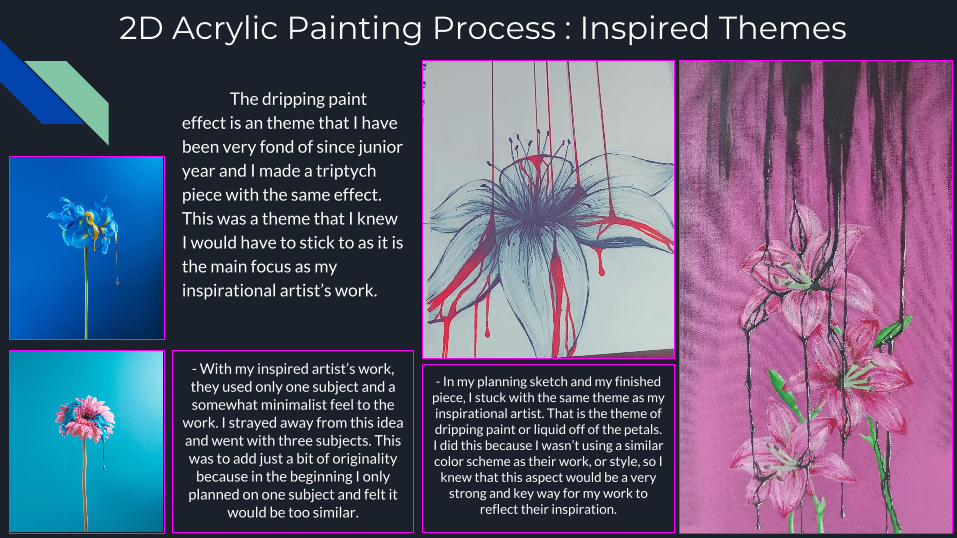
2D Acrylic Painting Process : Inspired Themes
The dripping paint
effect is an theme that I have
been very fond of since junior
year and I made a triptych
piece with the same effect.
This was a theme that I knew
I would have to stick to as it is
the main focus as my
inspirational artist’s work.
- In my planning sketch and my finished piece, I stuck with the same theme as my inspirational artist. That is the theme of dripping paint or liquid off of the petals. I did this because I wasn’t using a similar color scheme as their work, or style, so I
knew that this aspect would be a very strong and key way for my work to
reflect their inspiration.
- With my inspired artist’s work, they used only one subject and a somewhat minimalist feel to the
work. I strayed away from this idea and went with three subjects. This was to add just a bit of originality
because in the beginning I only planned on one subject and felt it
would be too similar.

Digital/Screen Based : Making it Similar to the Inspiration
Banksy is an extremely popular graffiti/street artist, he is known for his
powerful images and messages in his art that are focused around modern day issues that are overlooked, Banksy decides to shine a light on these events. This idea is exactly - In these images you can see two different close-ups which show how I
added a brick wall and street art in the background to give it a more localized feeling and sense of where it would be. This was to make my
work a better Banksy inspired piece and resemble his work more.- Banksy’s work has a large focus on being
local and located on building walls because he focuses with spray paint and self-made
stencils. This is the same aspect I wished to capture in my own work.
what I attempted to replicate in my work. To express his inspiration in my work, I digitally painted an image and shined a huge literal light on
the situation. I also added aspects like graffiti on the brick wall behind the subjects to make it more similar. Along with big and obvious texts as does Banksy in a majority of his work.

Digital/Screen Based Process : Experimentation
The biggest experimentation of
this whole piece was the use of
textures. I have never even
attempted textures. I used
images to create a texture on
the clothing and the cardboard
signs. I wanted the piece to stray
away from the cartoon side and
lean more towards the realistic
and gruesome side. Creating
textures was an important
role in doing specifically that.
- The graffiti itself was a bit of experimentation, I had no experience in graffiti since I was about thirteen. After a couple sloppy tries on a separate document, I finally had a result that I was content with. I would then transfer the image over to the main piece and then adjust its value and saturation, and top it off by adding a bit of a dripping and splatter effect from the spray paint. This was to add a bit of realism