Embed Size (px)
Citation preview
7/30/2019 Problem SolvingProcess Improvement Tools &Techniques Guide book.pdf
http://slidepdf.com/reader/full/problem-solvingprocess-improvement-tools-techniques-guide-bookpdf 1/175
Problem Solving and ProcessImprovement
Tools and Techniques Guide Book
© Max Zornada, Henley Management Group Pty Ltd, A.C.N. 054 337 101
61 Carrington Street, Adelaide 5000 South Australia,
Tel (08) 8237 0586, Fax (08) 8237 0555, Email:[email protected] Web: www.hmg.com.au

7/30/2019 Problem SolvingProcess Improvement Tools &Techniques Guide book.pdf
http://slidepdf.com/reader/full/problem-solvingprocess-improvement-tools-techniques-guide-bookpdf 2/175
Problem Solving and Process Improvement Tools and Techniques Page 2

7/30/2019 Problem SolvingProcess Improvement Tools &Techniques Guide book.pdf
http://slidepdf.com/reader/full/problem-solvingprocess-improvement-tools-techniques-guide-bookpdf 3/175
Problem Solving and Process Improvement Tools and Techniques Page 3
Contents
1. Introduction ......................................................................................................................................... 5
2. Problem Solving and Decision Making in Organisations ................................................................... 6
Conventional Approaches to Problem Solving .................................................................................................. 6
Problem Solving and Improvement in Six Sigma Organisations ................................................................. ...... 8
Root Cause Analysis ....................................................... .................................................................... ............. 10
The Problem Solving Tools and Techniques ................................................................ .................................... 13
3. Process Mapping ............................................................................................................................... 15
What is Process Mapping? .......................................................................................... .................................... 15
When to use Process Mapping ............................................................................................................ ............. 16
How to Build a Process Map ................................................................ ........................................................... 17
Issues to consider when developing Process Maps ................................................................. ......................... 18
Variations on Basic Process Mapping ............................................................... .............................................. 19
4. Problem Identification Tools and Techniques .................................................................................. 22
Brainstorming ................................................................. ................................................................. ................ 23
List Reduction ................................................................. ................................................................. ................ 27
Nominal Group Technique .......................................................... ................................................................... .. 28
Multivoting ........................................................... ................................................................... ......................... 31
5. The Seven Tools of Quality .............................................................................................................. 32
Cause and Effect Analysis (Fishbone Diagram) .......................................................... .................................... 33
Check Sheets ........................................................ ................................................................... ......................... 38
Pareto Analysis ............................................................... ................................................................. ................ 40
Histograms ........................................................... ................................................................... ......................... 46
The Scatter Diagram ................................................................ ................................................................... .... 51
Run Charts ........................................................... ................................................................... ......................... 57
Control Charts ................................................................ ................................................................. ................ 60
The X Chart .......................................................... ................................................................... ......................... 65
The X-bar and R Chart .................................................................................................................................... 68
The i and mr Chart........................................................................................................................................... 73
The np Chart. .......................................................................................................................... ......................... 79
The p Chart .......................................................... ................................................................... ......................... 84
The c Chart ...................................................................................................................................................... 88
7/30/2019 Problem SolvingProcess Improvement Tools &Techniques Guide book.pdf
http://slidepdf.com/reader/full/problem-solvingprocess-improvement-tools-techniques-guide-bookpdf 4/175
Problem Solving and Process Improvement Tools and Techniques Page 4
The u Chart .......................................................... ................................................................... ......................... 92
Interpreting Control Charts .................................................................. ........................................................... 97
Process Capability .......................................................... .................................................................... ........... 100
6. Extensions to the Seven Tools of Quality....................................................................................... 102
Interviews ............................................................. ................................................................... ....................... 103
Questionnaires ................................................................ ................................................................. .............. 106
Dot Plots .............................................................. ................................................................... ....................... 109
Box Plots .............................................................. ................................................................... ....................... 111
Force Field Analysis ....................................................... .................................................................... ........... 121
7. The Seven Quality Management and Planning Tools .................................................................... 124
The Affinity Diagram ....................................................................................... .............................................. 126
Relations Diagram .......................................................... .................................................................... ........... 132
The Systematic Diagram (Tree Diagram) ........................................................ .............................................. 138
The Matrix Diagram ....................................................... .................................................................... ........... 142
The Decision Matrix ...................................................................................................................................... 145
The Prioritisation Matrix ............................................................ ................................................................... 149
The Allocation Matrix ................................................................ .................................................................. .. 152
The Process Decision Program Chart ......................................................................................................... .. 155
The Network Diagram (Critical Path) ......................................................................... .................................. 158
Appendix: Understanding Data and Variation ................................................................................... 159
1. Introduction to Variation .................................................................................................... ....................... 160
2. Observing Variation .................................................................................................................................. 160
3. Characterising Data ................................................................................................ .................................. 160
4. Understanding Variation ................................................................................................................ ........... 170

7/30/2019 Problem SolvingProcess Improvement Tools &Techniques Guide book.pdf
http://slidepdf.com/reader/full/problem-solvingprocess-improvement-tools-techniques-guide-bookpdf 5/175
Problem Solving and Process Improvement Tools and Techniques Page 5
1. Introduction
This “Tools and Techniques” guidebook is intended to act as a reference source
for problem solving and process improvement practitioners, facilitators, team
leaders and team members. In this guidebook, you will find a comprehensivecoverage of all the major tools and techniques that have been found to be useful
in problem solving and process improvement applications. This includes the
original seven tools proposed by Dr. Kaoru Ishikawa as well as many others used
in support of these.
Before looking at each tool or technique in detail, the early part of this handbook
addresses the context in which the tools are used, by considering the issue of
problem solving and decision making in organisations, and contrasting
conventional approaches to structured quality based approaches.
In particular, we will look at the DMAIC problem solving process and processimprovement framework that is part of the Six Sigma philosophy.

7/30/2019 Problem SolvingProcess Improvement Tools &Techniques Guide book.pdf
http://slidepdf.com/reader/full/problem-solvingprocess-improvement-tools-techniques-guide-bookpdf 6/175
Problem Solving and Process Improvement Tools and Techniques Page 6
2. Problem Solving and Decision Making in
Organisations
Convent ional Approaches to Problem Solv ing
Being regularly confronted with problems to be solved, issues to be resolved and
decisions to be made is and has always been a major part of the day-to-day work
routine for all employees, regardless of the type and size of organisation, or the
level at which they work.
The only apparent difference as one moves through the organisational levels
from shopfloor to boardroom, is the type and scope of problems, issues,
decisions and the individual’s power to address them.
Individual experts and expertise, “troubleshooters” and “gut feel”, usually in themanagement and executive levels have dominated problem solving and decision
making approaches in most organisations.
The result of such approaches have been knee-jerk reactions to symptoms,
temporary “fixes” that fail to address the true causes of a problem and lack of
commitment by the those affected to implement the solution.
Hierarchical organisational structures and lengthy internal lines of
communication means that only a small proportion of all problems and issues
are ever known about by the management levels who have the authority to
address them.
Therefore, not only is problem solving and decision making overly dependent on
a few key individuals, but even where the individuals are effective problem
solvers, they rarely find out about more than a relatively small proportion of the
problems.
The consequences of such approaches are that most of the organisation’s
employees work in an environment where they have to put up with a whole host
of unresolved issues and problems, which they know about but are helpless to
act upon, as part of their day-to-day work life. This leads to frustration anddemotivation.
A more dangerous consequence is that when particular unresolved issues and
problems persist over a long period of time, they gradually become accepted as
part of the organisation’s “business as usual” paradigm. Both management and
workforce become blind to the problem or issues, accepting them as a natural
part of the way things are.

7/30/2019 Problem SolvingProcess Improvement Tools &Techniques Guide book.pdf
http://slidepdf.com/reader/full/problem-solvingprocess-improvement-tools-techniques-guide-bookpdf 7/175
Problem Solving and Process Improvement Tools and Techniques Page 7
A common response to any “outsider” or newcomer challenging or highlighting
such a problem or issue is often - “that’s the way we do thing’s around here!”.
In this manner, problems, inefficiencies and bad practices become
institutionalised. Attempts to address them are met with resistance, often coming
from those who would benefit most from the change.
Such organisations are easy prey for quality driven competitors. When faced
with the need to improve, they are usually blind to the opportunities within their
organisation and so focus their energies blaming external factors.
7/30/2019 Problem SolvingProcess Improvement Tools &Techniques Guide book.pdf
http://slidepdf.com/reader/full/problem-solvingprocess-improvement-tools-techniques-guide-bookpdf 8/175
Problem Solving and Process Improvement Tools and Techniques Page 8
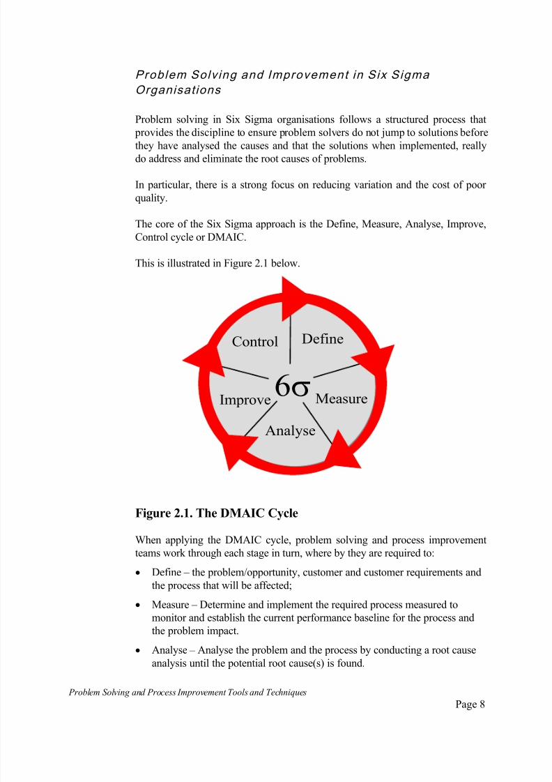
Problem Solv ing and Improvement in Six Sigma
Organisat ions
Problem solving in Six Sigma organisations follows a structured process that
provides the discipline to ensure problem solvers do not jump to solutions beforethey have analysed the causes and that the solutions when implemented, really
do address and eliminate the root causes of problems.
In particular, there is a strong focus on reducing variation and the cost of poor
quality.
The core of the Six Sigma approach is the Define, Measure, Analyse, Improve,
Control cycle or DMAIC.
This is illustrated in Figure 2.1 below.
Figure 2.1. The DMAIC Cycle
When applying the DMAIC cycle, problem solving and process improvement
teams work through each stage in turn, where by they are required to:
Define – the problem/opportunity, customer and customer requirements and
the process that will be affected;
Measure – Determine and implement the required process measured to
monitor and establish the current performance baseline for the process and
the problem impact.
Analyse – Analyse the problem and the process by conducting a root cause
analysis until the potential root cause(s) is found.
Define
Measure
Analyse
Improve
Control
6

7/30/2019 Problem SolvingProcess Improvement Tools &Techniques Guide book.pdf
http://slidepdf.com/reader/full/problem-solvingprocess-improvement-tools-techniques-guide-bookpdf 9/175
Problem Solving and Process Improvement Tools and Techniques Page 9
Improve – Generate potential solutions and assess them suitability, before
selecting the preferred solution and implementing it.
Control – institutionalise the change by embedding it into the process
through procedures, systems and standards. Implementing appropriate
performance measures for ongoing monitoring of the process.The basic DMAIC process can be further expanded to provide detailed
guidance for problem solving and process improvement teams by presenting
the key stages with their detailed steps in the form of a story board the team
work their way through, as shown in Figure 2.2.
Figure 2.2: DMAIC Problem Solving – Process Improvement Storyboard

7/30/2019 Problem SolvingProcess Improvement Tools &Techniques Guide book.pdf
http://slidepdf.com/reader/full/problem-solvingprocess-improvement-tools-techniques-guide-bookpdf 10/175
7/30/2019 Problem SolvingProcess Improvement Tools &Techniques Guide book.pdf
http://slidepdf.com/reader/full/problem-solvingprocess-improvement-tools-techniques-guide-bookpdf 11/175
Problem Solving and Process Improvement Tools and Techniques Page 11
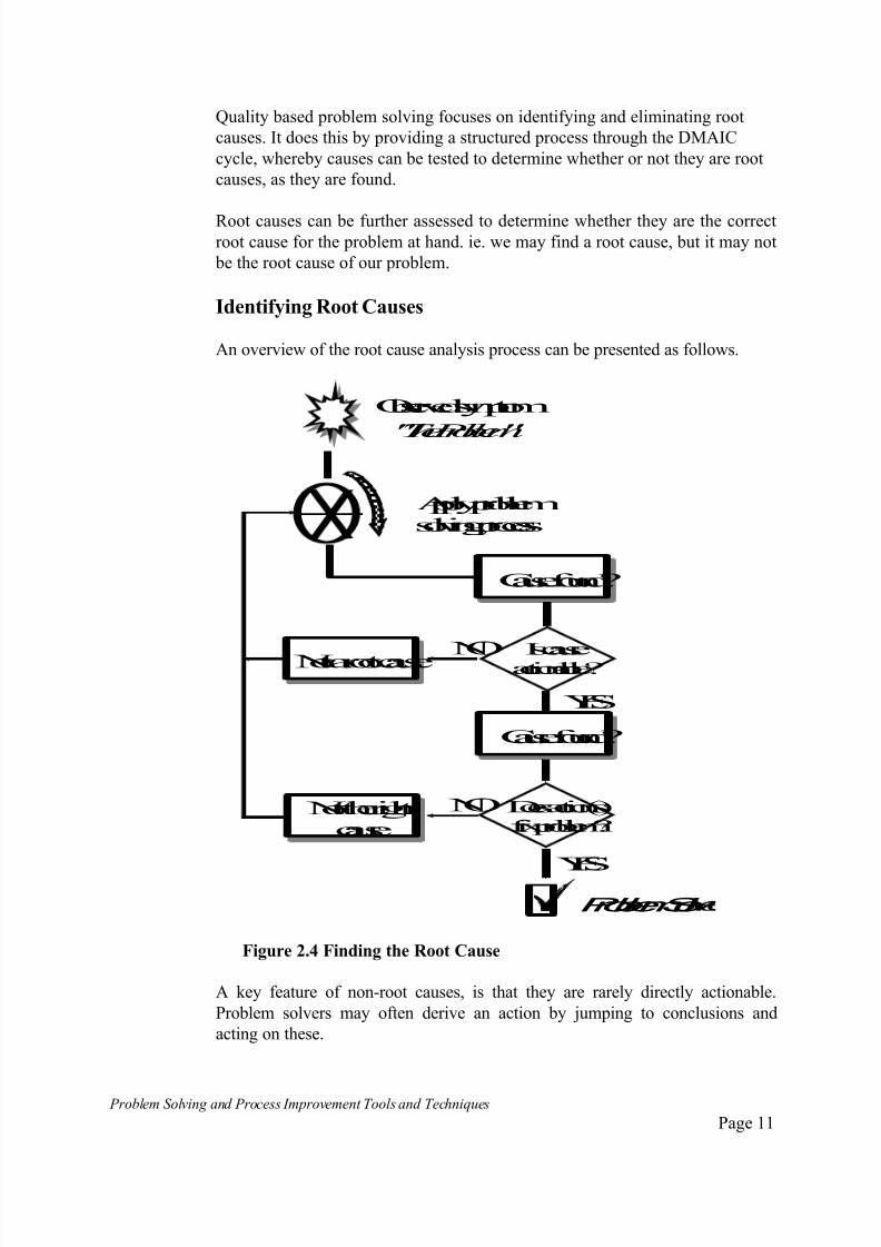
Quality based problem solving focuses on identifying and eliminating root
causes. It does this by providing a structured process through the DMAIC
cycle, whereby causes can be tested to determine whether or not they are root
causes, as they are found.
Root causes can be further assessed to determine whether they are the correctroot cause for the problem at hand. ie. we may find a root cause, but it may not
be the root cause of our problem.
Identifying Root Causes
An overview of the root cause analysis process can be presented as follows.
Observedsymptom
"TheProblem"
Applyproblemsolvingprocess
Causefound?
Iscauseactionable? Not aroot cause
Causefound?
Doesaction(s)fixproblem?
Not therightcause
Problem Sol
YES
YES
NO
NO
Figure 2.4 Finding the Root Cause
A key feature of non-root causes, is that they are rarely directly actionable.
Problem solvers may often derive an action by jumping to conclusions and
acting on these.

7/30/2019 Problem SolvingProcess Improvement Tools &Techniques Guide book.pdf
http://slidepdf.com/reader/full/problem-solvingprocess-improvement-tools-techniques-guide-bookpdf 12/175
Problem Solving and Process Improvement Tools and Techniques Page 12
If cycling through the root cause analysis process identifies a cause that is not
directly actionable, it is unlikely to be a root cause. This cause then becomes the
focus of the next cycle of analysis.
The process is repeated until an actionable cause is found.
An actionable cause will be a root cause, but it may be the wrong root cause.
Therefore, the process requires problem solving teams to check whether or not
actioning the root cause actually solves the problem. If it doesn’t, the process is
repeated until the right root cause is found.
Using the tools and techniques
Although there are many tools and techniques available, in practice, one finds
that a few tend to be used time and time again. The common cycle of events,
linked to the specific tools used most of the time is illustrated in Figure 2.5.
Cause & Effect Analysis
(Fishbone diagram) used to
brainstorm possible causes.
Vote on most likely and
develop data collection
approach and instrument.
This will usually be some sort
of checksheet.
Collect data using thechecksheet or other
appropriate data gathering
proforma.
Analyse Data using a Pareto
chart , determine most likely
cause.
If cause not actionable,
redefine problem to
determine causes of thiscause and repeat the process.
Figure 2.5 Using the Problem Solving Tools
No
Yes
Is cause
actionable?
Define the problem
7/30/2019 Problem SolvingProcess Improvement Tools &Techniques Guide book.pdf
http://slidepdf.com/reader/full/problem-solvingprocess-improvement-tools-techniques-guide-bookpdf 13/175
Problem Solving and Process Improvement Tools and Techniques Page 13
The Problem Solv ing Tools and Techniques
There are now a wide range of tools and techniques available to the quality
practitioner.
The problem solving and continuous improvement processes previously
described all call for the use of specific tools at the various stages of the process.
A key technique is the use of flow charting or process mapping as a tool for
understanding business and work processes.
By far the most common tools and techniques used to supplement process
mapping are the original seven tools of quality put forward by Dr. Kaoru
Ishikawa. These are:
Check sheets;
Cause-and-Effect diagrams;
Pareto Charts;
Histograms;
Scatter Diagrams;
Run Charts;
Control Charts.
Since then, many more tools and techniques have been added to the growing
arsenal that is now available to the quality practitioner. Most of the tools andtechniques have been developed for use at both the individual level or as part of
a group or team process.
In addition, their use has been extended well beyond their initial manufacturing
application as the quality philosophy has spread to the broader business
community.
This booklet introduces the reader to:
Process Mapping using the flowcharting technique;
Tools used to support initial problem identification. This includes:
Brain Storming
Nominal Group Technique
Multivoting
7/30/2019 Problem SolvingProcess Improvement Tools &Techniques Guide book.pdf
http://slidepdf.com/reader/full/problem-solvingprocess-improvement-tools-techniques-guide-bookpdf 14/175
Problem Solving and Process Improvement Tools and Techniques Page 14
The original seven tools of Quality. Namely:
Histograms;
Cause-and-Effect diagrams;
Check sheets; Pareto Charts;
Scatter Diagrams;
Run Charts;
Control Charts.
Tools that have been added and accepted as supplements to the seven tools.
Including:
Interviews;
Opinion Questionnaires;
Dot Plots;
Box Plots;
Force Field Analysis;
Process Capability Study;
The seven quality management and planning tools developed to support and
guide managerial problem solving and decision making. These include:
Affinity Diagram;
Interrelationship Diagram;
Systematic Diagram;
Matrix Diagram;
Matrix-Data Analysis;
Process Decision Program Chart;
Activity Network Diagram.

7/30/2019 Problem SolvingProcess Improvement Tools &Techniques Guide book.pdf
http://slidepdf.com/reader/full/problem-solvingprocess-improvement-tools-techniques-guide-bookpdf 15/175
Problem Solving and Process Improvement Tools and Techniques Page 15
3. Process Mapping
What is Process Mapping?
Process mapping is a technique used to analyse business and work processes.
Process mapping or flow charting as it is sometimes called, allows users to
build a picture or map of a process - a process map, using easy-to-understand
visual symbols. A process map reveals what a process actually looks like, its
shape and the flow of work through it.
The symbols most often used in process mapping/flow charting are given in
Figure 3.1.
Figure 3.1 Process Mapping Symbols
Figure 3.2 illustrates part of a typical process map.
The process mapping technique, when properly applied, is particularly good at
illustrating the structure and logic behind the process flow and highlighting key
decision points.
Symbol Name Brief Definition
Operation or
process step
Decision Point
Document
Generated
Continuation
Point
Input/Output
Block
Flow lines
Depending on the level of detail being developed, can be
used to denote anything from a simple task, major activity
or a whole sub-processes.
Used to indicate the process is continued elsewhere on
the flow diagram or on another sheet.
Point at which a form or report is generated by the
process.
Point where a decision must be made before any
further action can be taken.
Optionally used to describe an input or output from a
processing block.
Use to connect all blocks to display the sequence in
which operations are performed.
Termination
point
Used to indicate the start and end of a process.
7/30/2019 Problem SolvingProcess Improvement Tools &Techniques Guide book.pdf
http://slidepdf.com/reader/full/problem-solvingprocess-improvement-tools-techniques-guide-bookpdf 16/175
Problem Solving and Process Improvement Tools and Techniques Page 16
IsAccount Mgr in?
Raiseofficial order
IsOrderOK?
ProvideAdditional Info
2
Yes
No
No
Yes
SendtoDataProcessing
Call Account Manager
SendtoAccount Mgr.
ProvideAdditional Info
ReturntoDataProc
Start
Document
generated
Processstep
Decisionpoint
Continuation
point
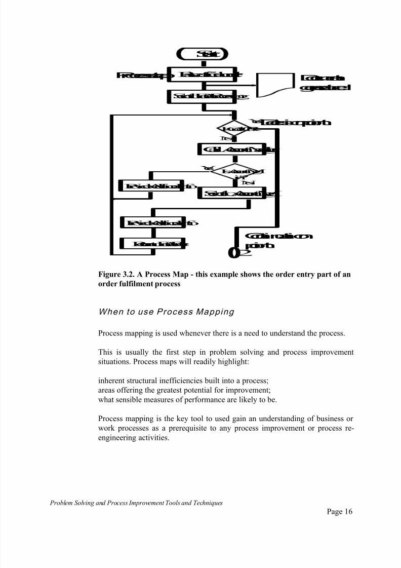
Figure 3.2. A Process Map - this example shows the order entry part of an
order fulfilment process
When to use Process Mapping
Process mapping is used whenever there is a need to understand the process.
This is usually the first step in problem solving and process improvement
situations. Process maps will readily highlight:
inherent structural inefficiencies built into a process;
areas offering the greatest potential for improvement;
what sensible measures of performance are likely to be.
Process mapping is the key tool to used gain an understanding of business or
work processes as a prerequisite to any process improvement or process re-
engineering activities.

7/30/2019 Problem SolvingProcess Improvement Tools &Techniques Guide book.pdf
http://slidepdf.com/reader/full/problem-solvingprocess-improvement-tools-techniques-guide-bookpdf 17/175
Problem Solving and Process Improvement Tools and Techniques Page 17
How to Bui ld a Process Map
1. Select the process . Determine which process you wish to study.
2. Defi ne the boundar ies . Define the boundaries to your process. Will you be
looking at a small work process that is part of a much larger business process
or will you be looking at a major process that connects with external suppliers
at one end and external customers at the other? Define where you process
begins and where it finishes.
3. Identi fy the start and end poin ts . Identify where the process starts and
where it ends, identify the inputs to and outputs from the process. In particular,
identify what it is that causes the process to operate or triggers the start of the
process and what is it that determines when the process has concluded. ie.
what event, occurrence or condition.
4. Start drawing the process map . To do this:
Identify all the process steps that must occur between the beginning and end
points of the process. ie. identify each activity, task, decision point, inspection,
check point etc. that occurs;
Lay them out in the sequence in which they occur in practice. Use the standard
symbols to depict the different types of activities that may occur;
Connect the various steps with flow lines to show how the process flows
through the steps.
5. Check accur acy and completeness.Ensure all the team members involved
in developing the process map agree on what the process looks like.
If not already represented on the team, ensure people involved with each
aspect of the process are given the opportunity to comment. In particular,
check that every step and decision point has been included and that the chart
depicts what actually happens and not what team members think should
happen.(a common trap).
6. Prepare the final process map
7. Repeat step 5 . If necessary, make final adjustments.
7/30/2019 Problem SolvingProcess Improvement Tools &Techniques Guide book.pdf
http://slidepdf.com/reader/full/problem-solvingprocess-improvement-tools-techniques-guide-bookpdf 18/175
Problem Solving and Process Improvement Tools and Techniques Page 18
Issues to c onsider when developing Process Maps
Level of Detail
The level of detail required for a process map will be dependent on the use theteam wish to make of the map. Is a simple overview all that is required or do
you need a detailed flowchart to identify areas of waste and inefficiency.
Typically, when looking for opportunities to change fundamental process
structures, an overview which illustrates the existing structure may be all that
is required.
Where a team is scrutinising a process to:
identify opportunities to reduce waste, complexity and inefficiency;
identify key control points;
develop meaningful performance measures;
a much more higher level of detail will need to be developed.
Who should be involved?
Ideally, the process map should be constructed by a team, whose membership
includes individuals from each part of the organisation involved with the
process.
When process mapping is left to management, staff experts or outside
consultants, the end result rarely provides a true reflection of what actually
happens. Rather, it is often the individual’s perceptions of the process or the
way it should operate.
It is essential to get the input of the people that have to work in the process day
in-day out to get the true picture of the way the process actually works.
7/30/2019 Problem SolvingProcess Improvement Tools &Techniques Guide book.pdf
http://slidepdf.com/reader/full/problem-solvingprocess-improvement-tools-techniques-guide-bookpdf 19/175
Problem Solving and Process Improvement Tools and Techniques Page 19
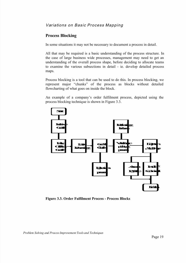
Var iations on Basic Process Mapping
Process Blocking
In some situations it may not be necessary to document a process in detail.
All that may be required is a basic understanding of the process structure. In
the case of large business wide processes, management may need to get an
understanding of the overall process shape, before deciding to allocate teams
to examine the various subsections in detail - ie. develop detailed process
maps.
Process blocking is a tool that can be used to do this. In process blocking, we
represent major “chunks” of the process as blocks without detailed
flowcharting of what goes on inside the block.
An example of a company’s order fulfilment process, depicted using the
process blocking technique is shown in Figure 3.3.
RaiseOfficialOrder
DataProcessing
ReceiveOrder
Rejection
process
PurchasingProcess
Dispatch
&Deliver
Start
Install
Commissi
Finish
Account
Payable
Credit Check
Warehouse picking process
Figure 3.3. Order Fulfilment Process - Process Blocks
7/30/2019 Problem SolvingProcess Improvement Tools &Techniques Guide book.pdf
http://slidepdf.com/reader/full/problem-solvingprocess-improvement-tools-techniques-guide-bookpdf 20/175
Problem Solving and Process Improvement Tools and Techniques Page 20
Organisational/Functional Process Maps
An example of this variation of a process map is illustrated in Figure 3.4.
The Organisational/Functional Process Map, which I refer to as a “Zig-Zag”
chart because of the way process flows often zig-zag across the chart, requiresthe team to identify all the functional positions in the organisation which are
involved in a process.
All the people involved in a process, commencing with the customer at the far
left, all internal positions and any external suppliers, usually placed at the far
right are placed horizontally across the top of the chart.
The process map is then drawn so as to depict which parts of the process are
performed by whom.
Customer Front Line
Assessm't Stamp Settlem't Manager Valuation Document'n Broker
Figure 3.4. A Zig-Zag Chart of a Bank Lending Process

7/30/2019 Problem SolvingProcess Improvement Tools &Techniques Guide book.pdf
http://slidepdf.com/reader/full/problem-solvingprocess-improvement-tools-techniques-guide-bookpdf 21/175
Problem Solving and Process Improvement Tools and Techniques Page 21
Depending on the size of the process and the level of detail required, this type
of chart may be developed for the detail process map, for process or for some
combination of the two which gives an appropriate level of detail.
The advantages of this technique are that it:
Highlights how the people in the organisation work together, or are
required to work together to make the process work;
Highlights where activities happen, are required to happen or may be
organised to be done in parallel;
Readily highlights inefficiency and opportunities for inefficiencies to arise
which manifests itself in the form of zig-zagging and handovers of between
positions.
The other major advantage of this approach, in the cases of service processes
which interface with external customers, is that it allows the team to understand
how the customer sees the process.
The interaction between the customer and the organisation occurs every time a
process flow line crosses the boundary between the customer column and the
organisation.
Regardless of what the process does inside the organisation, these will be the
parts of the process the customer sees and will form the basis of their view of
how the organisation delivers its service.

7/30/2019 Problem SolvingProcess Improvement Tools &Techniques Guide book.pdf
http://slidepdf.com/reader/full/problem-solvingprocess-improvement-tools-techniques-guide-bookpdf 22/175
Problem Solving and Process Improvement Tools and Techniques Page 22
4. Problem Identification Tools and Techniques
In many cases, the problem to be addressed is obvious. At other times, the
problem may not be all that apparent or well defined.
The problem identification tools and techniques are all aimed at improving the
process by which team members identify and define the specific problem, to
which they will apply the problem solving process.
The tools and techniques presented in this section include:
Brainstorming;
Nominal Group Technique;
Multivoting;
7/30/2019 Problem SolvingProcess Improvement Tools &Techniques Guide book.pdf
http://slidepdf.com/reader/full/problem-solvingprocess-improvement-tools-techniques-guide-bookpdf 23/175
Problem Solving and Process Improvement Tools and Techniques Page 23
Brainstorming
What is Brainstorming?
Brainstorming is a technique for generating a large number of ideas in a short period of time.
It is a group activity in which all members try to think of as many ideas as
possible on a given topic as possible. The focus is on the quantity of ideas
generated, not on the quality, as all ideas are evaluated later.
Brainstorming assumes that no matter how crazy or irrelevant an idea may
seem at first, it may spark an original and worthwhile idea that no one would
have thought of otherwise.
Brainstorming can serve to:
document what the team already collectively knows;
stimulate creative thinking;
get everyone involved;
bring the group closer together to work and think as a team.
When to use Brainstorming
Brainstorming is a particulary valuable tool to help teams identify problems towork on. It can also be used for identifying:
possible causes;
identify possible solutions;
identify ways to implement solutions.
7/30/2019 Problem SolvingProcess Improvement Tools &Techniques Guide book.pdf
http://slidepdf.com/reader/full/problem-solvingprocess-improvement-tools-techniques-guide-bookpdf 24/175
Problem Solving and Process Improvement Tools and Techniques Page 24
How do you use Brainstorming?
Although the term "brainstorming" is often use generically to describe any idea
generating activity involving a group of people, the formal brainstorming
technique follows some specific rules.
The brainstorming process is usually progressed in stages, these are:
Preparation;
Idea generation;
Review;
Evaluation;
Follow-up.
Preparation
1. Determine the purpose and establish some guidelines. Determine the
purpose of the brainstorming exercise. Make it clear to the group the type of
ideas that are being sought and establish guidelines with respect to any areas to
emphasise or ignore.
2. Set a time limit. Allow enough time for people to contribute their own
ideas and to build on the ideas of others. Do not make the time too short.
People often contribute their most valuable ideas towards the end of a session,
when they have run out of ideas and have to force themselves to come up withmore.
3. Distribute all data relevant to the purpose of the meeting before the
meeting, to avoid wasting meeting time briefing members on the purpose.
Idea Generatio n Stage
1. Encourage contributions from everyone. Encourage group members to
contribute any idea no matter how improbable. Keep the pace reasonably quick
so that group members do not have time to self-censor their contributions.
2. List all of the contributions as they are offered. This ensures that ideas do
not get lost, it avoids duplication and enables other group members to build on
other people's ideas. Often a completely impractical idea from one person will
spark another member to think of a creative and practical idea.
3. Don't evaluate. Criticism or comments about someone's idea may slow
down or even kill off further contribution. The purpose of brainstorming is to
generate as many ideas as possible, so encourage all contributions.

7/30/2019 Problem SolvingProcess Improvement Tools &Techniques Guide book.pdf
http://slidepdf.com/reader/full/problem-solvingprocess-improvement-tools-techniques-guide-bookpdf 25/175
Problem Solving and Process Improvement Tools and Techniques Page 25
Some typical idea spurring questions to assist group members with building on
each others ideas include:
What else is like this ?
What other ideas does this suggest ?
Greater frequency ?
Review
Review the list of idea, to ensure all team members understand what has been
written down. This review is done purely as an aid to understanding and
clarification. There is no discussion or criticism at this stage.
Evaluation
Evaluate all the contributions, to:
combine or consolidate duplicate and related items;
exclude items irrelevant to the topic;
exclude personnel related items - we are focussing on the problem with the
process;
Discuss and evaluate each item, if discussion generate new items, add these to
the list.
Conclude the session. Distribute copies of all the ideas generated to the teammembers after the session, for individual reflection.
Follow -up Stage
A follow-up team meeting is held to prioritise and reduce this list of ideas.
This is usually done using the list reduction, multi-voting or nominal group
techniques.

7/30/2019 Problem SolvingProcess Improvement Tools &Techniques Guide book.pdf
http://slidepdf.com/reader/full/problem-solvingprocess-improvement-tools-techniques-guide-bookpdf 26/175
Problem Solving and Process Improvement Tools and Techniques Page 26
Leading a Brainstorming Session
There are two general methods for leading a brainstorming session. The most
familiar is the fr ee wheel ing method, where:
Group members call out their ideas spontaneously A scribe records the ideas as they are offered
A variation on this is round-robin brainstorming, where:
The leader asks each member in turn, for an idea
Members may pass on any round
The session continues until all members have passed during the round
Ideas are recorded as in free wheeling

7/30/2019 Problem SolvingProcess Improvement Tools &Techniques Guide book.pdf
http://slidepdf.com/reader/full/problem-solvingprocess-improvement-tools-techniques-guide-bookpdf 27/175
Problem Solving and Process Improvement Tools and Techniques Page 27
List Reduct ion
What is List Reduction?
List reduction is a technique that can be used to evaluate and assess the resultsof a brainstorming or other session that has generated an extensive list of
ideas, so as to reduce it to a significant few that can be investigated in detail.
How to use List Reduction
The group identifies some criteria or "filters" that should be satisfied for an
item to remain on the list. Some typical criteria might be:
Is this item likely to improve the situation ?
Is this feasible ?
Is the cost excessive ?
Keeping the agreed upon criteria in mind, group members review or in
appropriate cases vote on each item. Any borderline items should be bracketed
or underlined rather than crossed, out so that group members may return to
them later if necessary.
In general, the group focuses on and continues to evaluate the items that
remain on the list.
The process may be repeated with different or more stringent criteria, until the
list is reduced to a manageable number of options for applying some of the
other analytical tools.

7/30/2019 Problem SolvingProcess Improvement Tools &Techniques Guide book.pdf
http://slidepdf.com/reader/full/problem-solvingprocess-improvement-tools-techniques-guide-bookpdf 28/175

7/30/2019 Problem SolvingProcess Improvement Tools &Techniques Guide book.pdf
http://slidepdf.com/reader/full/problem-solvingprocess-improvement-tools-techniques-guide-bookpdf 29/175
Problem Solving and Process Improvement Tools and Techniques Page 29
Idea Presentatio n
The idea presentation stage is progressed as follows:
The facilitator asks each team member in turn to volunteer one idea. The
ideas are written up on a flip-chart or white board, visible to the teammembers as they are offered.
Members are encouraged to “feed” off each other’s ideas ie. if some one
thinks of a new idea after hearing some one else’s idea, they add it to their
list and offer it when it is their turn next.
This process continues until everyone has offered all their ideas.
No discussion or criticism is allowed at this stage.
Idea Discus sion
Review the list of ideas, to ensure all team members understand what has been
written down. This review is done purely as an aid to understanding and
clarification. Again, no discussion or criticism at this stage.
Evaluation
Evaluate all the contributions, to:
combine or consolidate duplicate and related items;
exclude items irrelevant to the topic;
exclude personnel related items - we are focussing on the problem with the
process;
Discuss and evaluate each item, if discussion generate new items, add these to
the list.
Priorit ise
An approach to prioritisation used during NGT is as follows:
Each member writes out their own copy of all the ideas left over from the
previous stage;
They individually rate their idea ie. give each idea a score out of ten, or
allocate 100 points between the ideas etc.;
The team leader or facilitator asks each member to call out their score each
idea;
The scores are totalled to give the overall rankings ie. the highest score
being the highest ranked.

7/30/2019 Problem SolvingProcess Improvement Tools &Techniques Guide book.pdf
http://slidepdf.com/reader/full/problem-solvingprocess-improvement-tools-techniques-guide-bookpdf 30/175
Problem Solving and Process Improvement Tools and Techniques Page 30
Make a decision
Where a decision needs to be made, so as to arrive at a decision on a single
idea or option, the following extension to the above process can be applied.
Take the ranked ideas which resulted from the prioritisation step andeliminate the lowest ranked item from the list;
Reprioritise the items on the list using the prioritisation process previously
described;
Eliminate the lowest ranked idea;
Repeat the process until only one item remains.
Alternately:
Select the highest ranked item.
Variat ion
A variation to the basic ranking and decision making technique presented here
is to:
Define several relevant criteria against which to rate the ideas;
Apply a rating for each criteria to each idea;
Develop a consolidated score that encompasses all the criteria.
7/30/2019 Problem SolvingProcess Improvement Tools &Techniques Guide book.pdf
http://slidepdf.com/reader/full/problem-solvingprocess-improvement-tools-techniques-guide-bookpdf 31/175
7/30/2019 Problem SolvingProcess Improvement Tools &Techniques Guide book.pdf
http://slidepdf.com/reader/full/problem-solvingprocess-improvement-tools-techniques-guide-bookpdf 32/175
Problem Solving and Process Improvement Tools and Techniques Page 32
5. The Seven Tools of Quality
This section presents the seven basic tools of Quality. These are the original
seven tools put forward by Dr. Kaoru Ishikawa. They are:
Check sheets;
Histograms;
Cause-and-Effect diagrams;
Pareto Charts;
Scatter Diagrams;
Run Charts;
Control Charts.
The use of each of these tools shall now be discussed in detail.

7/30/2019 Problem SolvingProcess Improvement Tools &Techniques Guide book.pdf
http://slidepdf.com/reader/full/problem-solvingprocess-improvement-tools-techniques-guide-bookpdf 33/175
Problem Solving and Process Improvement Tools and Techniques Page 33
Cause and Effect Analys is (Fishb one Diagram)
What is a Cause and Effect Analysis?
Cause and Effect analysis is a technique for identifying the possible causes of aknow effect, usually the problem to be solved.
The Cause and Effect diagram is also known as a "Fishbone diagram" or an
Ishikawa diagram, after the Japanese Quality Management statistician Dr.
Kaoru Ishikawa who developed the technique in 1943.
The Cause-and-Effect diagram is a visually effective method of recording the
possible causes of a problem being analysed as they are suggested, organised
into the major categories that potentially contribute to a problem.
It is effectively a structured form of brainstorming. The use of the fishbonediagram to provide structure to brainstorming activity provides a degree of
focus on the problem at hand and more clearly allows team members to see or
establish the link between the observed effect and possible causes.
When do you use Cause and Effect Analysis?
The fishbone diagram is usually used after the problem identification/selection
stage of the problem solving process but before the data collection stage.
Once a problem has been identified using one the techniques identied earlier,the fishbone diagram is used to focuss the team thinking on possible causes.
The fishbone diagram will assist team members to determine what issues they
should be collecting data on, during the data collection stage of the problem
solving process.
Another advantage of cause-and-effect diagrams is that one can tell at a glance
how thoroughly a problem has been investigated. A diagram which contains a
lot of detail would suggest that a group has delved deeply into a problem.
At a more macro level, a fishbbone diagram can be used as an overall problem
identification tool, by deliberately using a broad or vague problem statement to
start the process eg. “improve business performance”, “improve quality”. The
outcomes of the fishbone exercise will be some more specific problems on
which improvement teams may focus.
7/30/2019 Problem SolvingProcess Improvement Tools &Techniques Guide book.pdf
http://slidepdf.com/reader/full/problem-solvingprocess-improvement-tools-techniques-guide-bookpdf 34/175
Problem Solving and Process Improvement Tools and Techniques Page 34
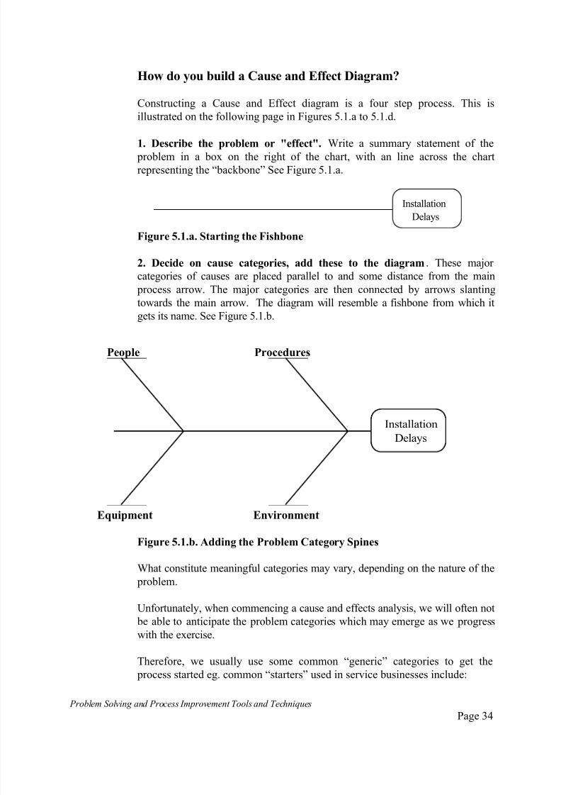
How do you build a Cause and Effect Diagram?
Constructing a Cause and Effect diagram is a four step process. This is
illustrated on the following page in Figures 5.1.a to 5.1.d.
1. Describe the problem or "effect". Write a summary statement of the problem in a box on the right of the chart, with an line across the chart
representing the “backbone” See Figure 5.1.a.
Installation
Delays
Figure 5.1.a. Starting the Fishbone
2. Decide on cause categories, add these to the diagram. These major
categories of causes are placed parallel to and some distance from the main process arrow. The major categories are then connected by arrows slanting
towards the main arrow. The diagram will resemble a fishbone from which it
gets its name. See Figure 5.1.b.
Figure 5.1.b. Adding the Problem Category Spines
What constitute meaningful categories may vary, depending on the nature of the
problem.
Unfortunately, when commencing a cause and effects analysis, we will often not
be able to anticipate the problem categories which may emerge as we progress
with the exercise.
Therefore, we usually use some common “generic” categories to get the
process started eg. common “starters” used in service businesses include:
People Procedures
Equipment Environment
Installation
Delays

7/30/2019 Problem SolvingProcess Improvement Tools &Techniques Guide book.pdf
http://slidepdf.com/reader/full/problem-solvingprocess-improvement-tools-techniques-guide-bookpdf 35/175
Problem Solving and Process Improvement Tools and Techniques Page 35
people;
procedures;
environment;
equipment.
In manufacturing businesses, common starters are:
people;
methods;
machines;
materials.
After conducting our initial cause and effect analysis, we may find that the
results obtained are good enough to proceed with data collection.
Alternately, our first attempt at cause and effect analysis may reveal that the
potential causes naturally fall into certain categories. At this point we may
wish to redraw the fishbone diagram using categories that we now know are
specific to the particular problem being analysed and continue the analysis in
greater depth using these categories.
3. Brainstorm for possible causes. Write these on the chart clustered around
the major category of causes they most influence. Causes should be divided
and subdivided to show, as accurately as possible the various elements of each
and how they interact. See Figure 5.1.c.
Figure 5.1.c. Building the Fishbone Diagram
People Procedures
Equipment Environment
InstallationDelays
Sales people
Truck availability
Computer problems
Poor inventory control
Poor sales notification
Bad weather
Heavy traffic
Technician
Heavy workloads

7/30/2019 Problem SolvingProcess Improvement Tools &Techniques Guide book.pdf
http://slidepdf.com/reader/full/problem-solvingprocess-improvement-tools-techniques-guide-bookpdf 36/175
Problem Solving and Process Improvement Tools and Techniques Page 36
Where team members identify causes related to causes that have already been
added to the fishbone diagram, these subsequent causes are shown as
extensions to the ones already identified, as illustrated in Figure 5.1.d.
Figure 5.1.d. Continuing to build the Fishbone
4. Evaluate the possible causes. Look at each item on the fishbone and ask how
it could contribute to the problem. Either list the responses next to the item or
draw them as extensions to the fishbones as shown is Figure 5.1.d.
This analysis should also reveal how the causes provoke the effects and assist in
developing appropriate solutions.
Variations and Ideas
There are several methods for available for developing Cause and Effect or
"fishbone" diagrams.
The random method requires group members to suggest causes which apply
to any of the major sub-divisions of the diagram. As in brainstorming, the
session has a leader and a scribe to record the contributions of the group.
People Procedures
Equipment Environment
InstallationDelays
Sales people
Truck availability
Computer problems
Poor inventory control
Poor sales notification
Bad weather
Heavy traffic
Technician
Heavy workloads
C o m p u t e r d
o w n
Back ups
C o m p
u t e r c
r a s h
Not availabletoo busy
Wrong skills
No stock on hand
Order not insystem
Notenough trucks
Truck breakdowns
7/30/2019 Problem SolvingProcess Improvement Tools &Techniques Guide book.pdf
http://slidepdf.com/reader/full/problem-solvingprocess-improvement-tools-techniques-guide-bookpdf 37/175
Problem Solving and Process Improvement Tools and Techniques Page 37
The systematic method requires the leader to choose one of the major sub-
divisions on which to focus the group's attention. The brainstorming process
looks at each sub-division in turn until the diagram has been completed.
When constructing the fishbone diagram, attention to a few facilitation
pointers will add value to the exercise:
Use large charts and use large printing - ensure everyone can see what is
going on;.
To encourage a free flow of ideas, follow the usual brainstorming rules;
Do not overload the diagram. If a group of causes begins to dominate,
develop a separate diagram to explore this group in more detail;
Construct a separate diagram for each problem. Where a problem
definition is not specific enough, some major categories of the diagram
may become overloaded and it will become necessary to redefine the
problem;
Look out for and examine closely the relationships between causes. This is
where unexpected solutions are likely to turn up;
Circle the most likely causes. This is usually done after all possible ideas
have been posted on the fishbone diagram and each has been critically
examined.
Preparing to Collect Data
In rare situations, an obvious implementable solution, which all team membersagree on will emerge as a result of the cause and effect analsysis.
However, the usual result of such a session is to go and collect further
information in order to evaluate the key causes that emerged from the fishbone
diagram.
The results of the cause and effect analysis can be used to guide the data
collection exercise and form the basis of the check sheet design.
Developing the Check sh eet
To derive the required check sheet format from the fishbone analysis, the
following steps can be followed:
Evaluate the identified causes to identify potential “root” causes;
Apply prioritisation, ranking and list reduction techniques to reduce the list
and identify the most likely or key causes;
Develop a checksheet which includes the reduced list of causes.

7/30/2019 Problem SolvingProcess Improvement Tools &Techniques Guide book.pdf
http://slidepdf.com/reader/full/problem-solvingprocess-improvement-tools-techniques-guide-bookpdf 38/175
Problem Solving and Process Improvement Tools and Techniques Page 38
Check Sheets
What is a Check Sheet ?
A check sheet or tallysheet is a form that allows you to systematically collectdata. You enter the data as check marks, ticks or measurements and analyse
them later. Checksheets are usually used for recording numerical data.
There is no standard form for checksheets. They should be set up to whatever
form is easiest to record and analyse the information.
When to use a Checksheet
One type of checksheet is needed when you are recording data that you are
counting, such as how often something happens over a given period of time, a
different type is used for recording measurements.
Checksheets are particularly useful when several people are collecting data.
They ensure that everyone will collect comparable data in the same format,
and they also provide a clear record of gathered data.
How to use a Checksheet
1. Determine the type of data that you need to collect. This should guide the
user to the type of check sheet required. You will be trying to answer the
questions:
Will the data gathered reveal facts ?
Can the data be analysed in such a way so as to reveal facts ?
Therefore, decide initially all the factors which might affect a situation and
how you might analyse the information when you collect it.
2. Determine the categories or types of data possible. It will not be
necessary to define all the categories at the start. The check sheet can be
expanded in light of actual experience.
3. Design the checksheet form for people to use as they record the data.
The sheet must reflect the type of data collected and reflect the categories of
data that are likely to be expected.
4. Test the checksheet Get someone who didn't help design it to use it. Make
any revisions that are necessary.
7/30/2019 Problem SolvingProcess Improvement Tools &Techniques Guide book.pdf
http://slidepdf.com/reader/full/problem-solvingprocess-improvement-tools-techniques-guide-bookpdf 39/175
Problem Solving and Process Improvement Tools and Techniques Page 39
Design a master checksheet if required to combine the results of numerous
individual forms where several people will be involved in collecting the data.
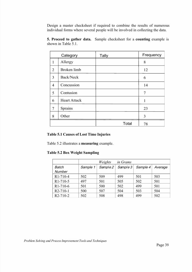
5. Proceed to gather data. Sample checksheet for a counting example is
shown in Table 5.1.
Table 5.1 Causes of Lost Time Injuries
Table 5.2 illustrates a measuring example.
Table 5.2 Box Weight Sampling
Weights in Grams
Batch
Number Sample 1 Sample 2 Sample 3 Sample 4 Average
R1-710-4 502 509 499 501 503
R1-710-5 497 501 505 502 501
R1-710-6 501 500 502 499 501
R2-710-1 500 507 504 503 504R2-710-2 502 508 498 499 502
Category Tally Frequency
Total
Allergy
Broken limb
Back/Neck
Concussion
Contusion
Heart Attack
Other
1
2
3
4
5
6
7
8
8
12
6
14
7
1
23
3
78
Sprains
7/30/2019 Problem SolvingProcess Improvement Tools &Techniques Guide book.pdf
http://slidepdf.com/reader/full/problem-solvingprocess-improvement-tools-techniques-guide-bookpdf 40/175
Problem Solving and Process Improvement Tools and Techniques Page 40
Pareto Analysis
What is Pareto Analysis?
Pareto analysis is a technique for recording and analysing information relatingto a problem or a cause, which readily enables the most significant
contributors to be identified.
The resulting display, referred to as a Pareto Chart is a special form of
histogram which allows the information to be visually displayed.
A pattern will usually emerge when we look at the relationship between the
numbers of items/occurrences of any situation and their relationship to the
cause under consideration. This pattern has been referred as the "80/20" rule.
The Pareto Principle
This form of analysis and the resulting chart is named after an Italian
economist Vilfredo Pareto, who studied the distribution of wealth in Europe in
the late 18th and early 19th centuries. He concluded that 80% of the wealth
was held be 20% of the population. Thus the Pareto Principle or 80/20 rule
was born.
During the 20th century Dr. J. Juran was able to show that this was a much
more general principle as a result of his studies into business activities. For
example: 80% of a company's waste are as a result of 20% of the causes;
The bulk of a company's business comes from relatively few customers;
80% of your phone calls come from 20% of your friends and colleagues.
Although the exact ratio is not critical, the principle that problems can be
classified as either being one of the vital f ew or the tri vial many is important,
as it provides considerably more focus to our problem solving efforts and
yields disproportionately beneficial results.
Pareto analysis shows at a glance which problems can be treated as the vital
few, which are the trivial many and assists which the allocation of priorities.
Although this technique will confirm many known notorious problems as
belonging to the vital few, one of its major benefits is in being able to flush out
problems not previously thought of as significant, identifying these as also
belonging to the vital few.

7/30/2019 Problem SolvingProcess Improvement Tools &Techniques Guide book.pdf
http://slidepdf.com/reader/full/problem-solvingprocess-improvement-tools-techniques-guide-bookpdf 41/175
Problem Solving and Process Improvement Tools and Techniques Page 41
When do you use Pareto Analysis?
Pareto analysis can be used for several purposes. Namely, to:
define where to concentrate problem solving efforts to get the most impact;
display the relative importance of the various components of a problem;
narrow a list of possible causes to identify the most likely cause;
to identify root causes.
How to Construct a Pareto Chart
1. Determine the categories to be plotted on the chart. Typically you will
want to categorise the data to be analysed. These categories will most likely be
those against which data was collected on the check sheet used during the data
collection stage.
2. Determine the measurement scale to use. The most common are cost,
frequency of occurrence and percentage.
3. Collect and tabulate the information required. See the previous section
on check sheets for more information. The following is an example of a record
of machine stoppages recorded for a wrapping machine.
Table 5.3. Machine Stoppages
Causes Number of
Occurences
Percentage
Machine breakdown 9 6%
Operators Error 14 9%
Wrapping Jam 62 41%
Mechanical Jam 18 12%
Product Jam 38 25%
Foreign Object 3 2%
Other 8 5%
Total 152 100%

7/30/2019 Problem SolvingProcess Improvement Tools &Techniques Guide book.pdf
http://slidepdf.com/reader/full/problem-solvingprocess-improvement-tools-techniques-guide-bookpdf 42/175
Problem Solving and Process Improvement Tools and Techniques Page 42
4. List the categories along the bottom of the chart, starting with the
largest one on the left. If there are many very small categories, group these
together into a single group called "other". See Figure 5.2.a.
Wrapping
Jam
Product
JamMech.
Jam
Operator
Error Machine
B/downOther Forei
bjt
Figure 5.2.a. Categories Layout for Pareto Chart
5. On the left side, mark off the vertical axis representing the measure
that was used. Mark off the units of measure up to or slightly more than the
maximum occurrences measured for any one category.
WrappingJam
Product Jam
Mech.Jam
Operator Error
MachineB/down
Other ForeiObjet
0
10
20
30
40
50
60
70
Figure 5.2.b Mark up the Vertical Axis
7/30/2019 Problem SolvingProcess Improvement Tools &Techniques Guide book.pdf
http://slidepdf.com/reader/full/problem-solvingprocess-improvement-tools-techniques-guide-bookpdf 43/175
Problem Solving and Process Improvement Tools and Techniques Page 43
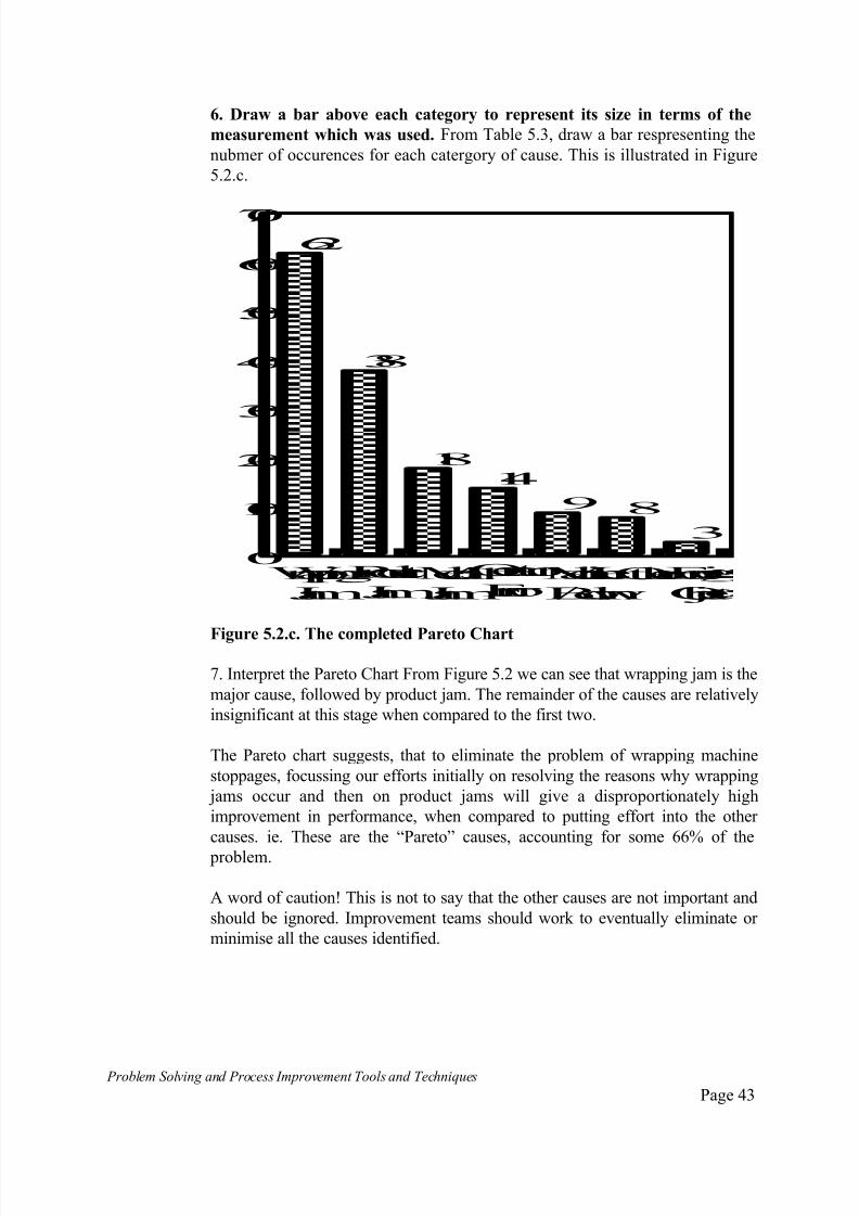
6. Draw a bar above each category to represent its size in terms of the
measurement which was used. From Table 5.3, draw a bar respresenting the
nubmer of occurences for each catergory of cause. This is illustrated in Figure
5.2.c.
Wrapping
Jam
Product
JamMech.
Jam
Operator
Error Machine
B/downOther Forei
Objet
0
10
20
30
40
50
60
70
62
38
1814
9 8
3
Figure 5.2.c. The completed Pareto Chart
7. Interpret the Pareto Chart From Figure 5.2 we can see that wrapping jam is the
major cause, followed by product jam. The remainder of the causes are relatively
insignificant at this stage when compared to the first two.
The Pareto chart suggests, that to eliminate the problem of wrapping machine
stoppages, focussing our efforts initially on resolving the reasons why wrapping
jams occur and then on product jams will give a disproportionately high
improvement in performance, when compared to putting effort into the other
causes. ie. These are the “Pareto” causes, accounting for some 66% of the
problem.
A word of caution! This is not to say that the other causes are not important and
should be ignored. Improvement teams should work to eventually eliminate or
minimise all the causes identified.

7/30/2019 Problem SolvingProcess Improvement Tools &Techniques Guide book.pdf
http://slidepdf.com/reader/full/problem-solvingprocess-improvement-tools-techniques-guide-bookpdf 44/175

7/30/2019 Problem SolvingProcess Improvement Tools &Techniques Guide book.pdf
http://slidepdf.com/reader/full/problem-solvingprocess-improvement-tools-techniques-guide-bookpdf 45/175
Problem Solving and Process Improvement Tools and Techniques Page 45
0
20
40
60
80
100
41
25
129
6 5 2
Wrapp'gJam
Mech.Jam
Mach.B/down
Other ForeiObje
Product Jam
Op.Error
Figure 5.2.e. A Percentage Pareto with Cumulative Line
7/30/2019 Problem SolvingProcess Improvement Tools &Techniques Guide book.pdf
http://slidepdf.com/reader/full/problem-solvingprocess-improvement-tools-techniques-guide-bookpdf 46/175
Problem Solving and Process Improvement Tools and Techniques Page 46
Histograms
What is a Histogram?
A histogram is a chart using bars of varying heights that illustrates the shape of a data distribution from which data has been collected.
When to Use a Histogram
Use a histogram when you need to obtain an understanding of the degree and
nature of variations that are occurring in a given process, where they are
occurring and to what extent.
How to Construct a Histogram
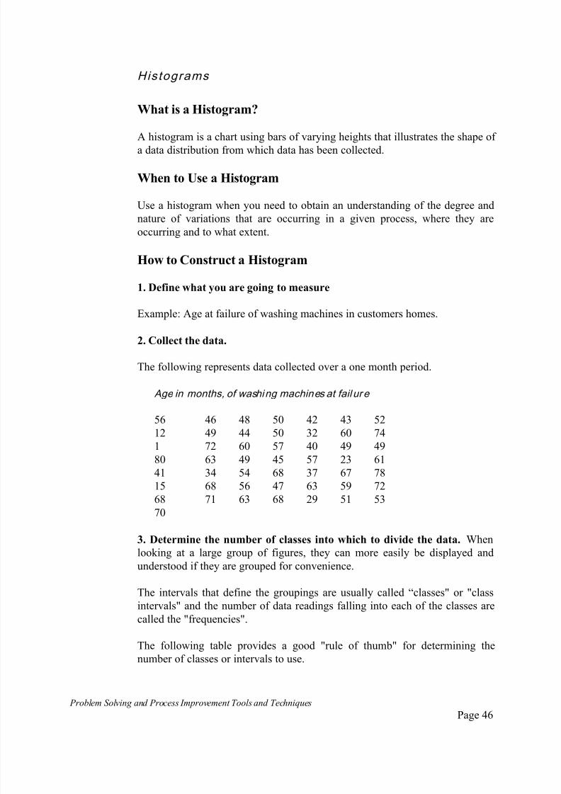
1. Define what you are going to measure
Example: Age at failure of washing machines in customers homes.
2. Collect the data.
The following represents data collected over a one month period.
Age in months, of washing machines at fail ure
56 46 48 50 42 43 5212 49 44 50 32 60 74
1 72 60 57 40 49 49
80 63 49 45 57 23 61
41 34 54 68 37 67 78
15 68 56 47 63 59 72
68 71 63 68 29 51 53
70
3. Determine the number of classes into which to divide the data. When
looking at a large group of figures, they can more easily be displayed andunderstood if they are grouped for convenience.
The intervals that define the groupings are usually called “classes" or "class
intervals" and the number of data readings falling into each of the classes are
called the "frequencies".
The following table provides a good "rule of thumb" for determining the
number of classes or intervals to use.
7/30/2019 Problem SolvingProcess Improvement Tools &Techniques Guide book.pdf
http://slidepdf.com/reader/full/problem-solvingprocess-improvement-tools-techniques-guide-bookpdf 47/175
Problem Solving and Process Improvement Tools and Techniques Page 47
Table 5.4 Determining the number of Class Intervals
Number of Data Values (N) Number of Classes (K)
Under 50 5 to 7
50 to 100 6 to 10
100 to 250 7 to 12
Over 250 10 to 20
In our example, the number of data values is 50 ie. N = 50. Therefore, from the
above table, we shall select the number of class intervals as 7. ie. K = 7.
4. Determine the class interval size.
By examining our original data, we can observe that the largest value (which
we shall arbitrarily call L) is 80. ie. L = 80. Similarly, the smallest value
present is 1 (which we shall arbitrarily call S) ie. S = 1.
The class sizes can now be calculated as:
L - S = 80 - 1 = 79 = 11.28
K 7 7
Which we shall round off to 12.
5. Construct a Tally Sheet with the appropriate class boundaries defined.
With reference to our previous calculations, we can construct a Tally Sheet
(also referred to as a frequency diagram) and analyse our data in preparation
for plotting a histogram. This is shown in Table 5.5.
Table 5.5 Tally Chart of washing machine failures
Class No Class
Boundaries
Frequency Tally Frequency
or Count
1 1 to 12II
22 13 to 24 II 2
3 25 to 36 III 3
4 37 to 48 10
5 49 to 60 II 17
6 61 to 72 III 13
7 73 to 84 III 3
Total = 50
7/30/2019 Problem SolvingProcess Improvement Tools &Techniques Guide book.pdf
http://slidepdf.com/reader/full/problem-solvingprocess-improvement-tools-techniques-guide-bookpdf 48/175
Problem Solving and Process Improvement Tools and Techniques Page 48
As a crosscheck that you have constructed the tally chart correctly, the
frequency column should total up the number of values in the original data. In
the example given here, N = 50.
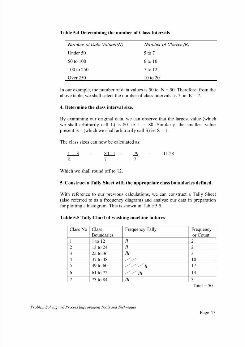
6. Construct the Histogram. Write the class interval values at the bottom of
the graph. Write the frequency measures along the vertical axis.
1-1213-2425-3637-4849-6061-7273-0
5
10
15
20
Figure 5.3.a. Laying out the axes for a Histogram
7. Draw in bars representing number of items counted in each of the class
intervals. The completed histogram is show in Figure 5.3.b.
1-1213-2425-3637-4849-6061-7273-80
5
10
15
20
2 23
10
17
13
3
Figure 5.3.b. Completed Histogram
7/30/2019 Problem SolvingProcess Improvement Tools &Techniques Guide book.pdf
http://slidepdf.com/reader/full/problem-solvingprocess-improvement-tools-techniques-guide-bookpdf 49/175
7/30/2019 Problem SolvingProcess Improvement Tools &Techniques Guide book.pdf
http://slidepdf.com/reader/full/problem-solvingprocess-improvement-tools-techniques-guide-bookpdf 50/175
Problem Solving and Process Improvement Tools and Techniques Page 50
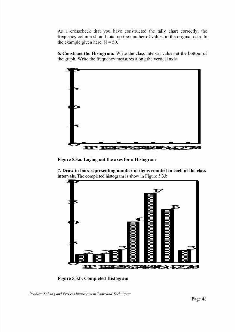
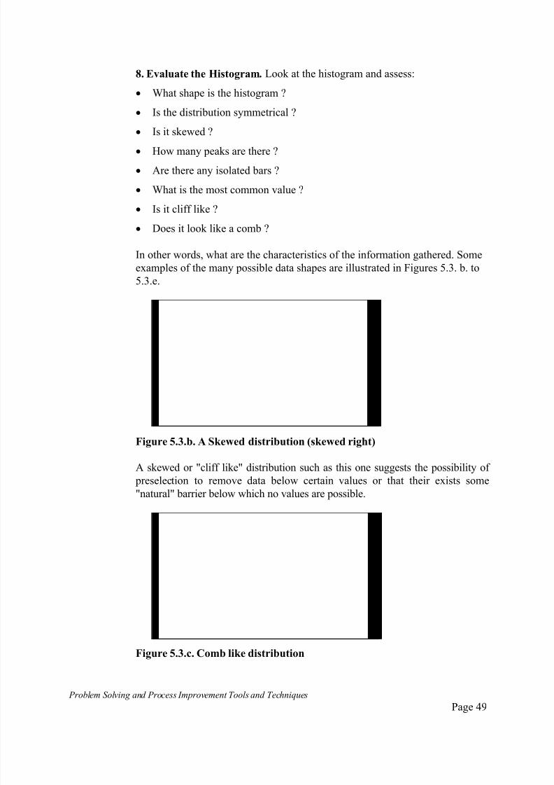
A "comb like" histogram suggests poor measurement method, faulty or
incorrectly set instrumentation or similar recording problem.
Figure 5.3.d Bi-modal distribution
This histogram is "bimodal" ie. it has two data peaks. Bi or multi-modal
histograms suggest that data from two or more populations has been mixed
together, as is the case when there are two or more different processes at work,
which the observer may have confused or assumed to be as one.
Figure 5.3.e. Outlying peak
An outlying peak such as on this histogram like this is suspicious. Investigate the
cause(s) of the peak on the far right as it appears to be an unusual occurrence
when compared to the remainder of the distribution.
7/30/2019 Problem SolvingProcess Improvement Tools &Techniques Guide book.pdf
http://slidepdf.com/reader/full/problem-solvingprocess-improvement-tools-techniques-guide-bookpdf 51/175
Problem Solving and Process Improvement Tools and Techniques Page 51
The Scatter Diagram
What is a Scatter Diagram?
Scatter diagrams, often called a scattergrams, show whether there is arelationship between two different characteristics of some process, operation
or other phenomenon.
Measurements are plotted as dots on a graph and the resulting pattern should
indicate whether or not there is a relationship. eg. an increase in one element
corresponds to an increase in the other etc.
When to Use Scatter Diagrams
Scatter diagrams are used to uncover relationships that could indicate possible
causes. In particular, scatter diagrams can help establish whether an effect isrelated to a particular cause.
Some examples could include, does working more overtime hours affect the
numbers of work related injuries? Does high customer satisfaction lead to
increased sales?
How to Construct a Scatter Diagram
1. Determine which two characteristics are to be studied
Example: the amount of business generated is related to the number of calls
made by sales representatives?
2. Collect the data. Collect paired samples of data. Typically at least 50 to
100 should be collected to ensure sufficient accuracy. For the purposes of this
example, as lesser number shall be used. The data is shown in Table 5.6.
7/30/2019 Problem SolvingProcess Improvement Tools &Techniques Guide book.pdf
http://slidepdf.com/reader/full/problem-solvingprocess-improvement-tools-techniques-guide-bookpdf 52/175
Problem Solving and Process Improvement Tools and Techniques Page 52
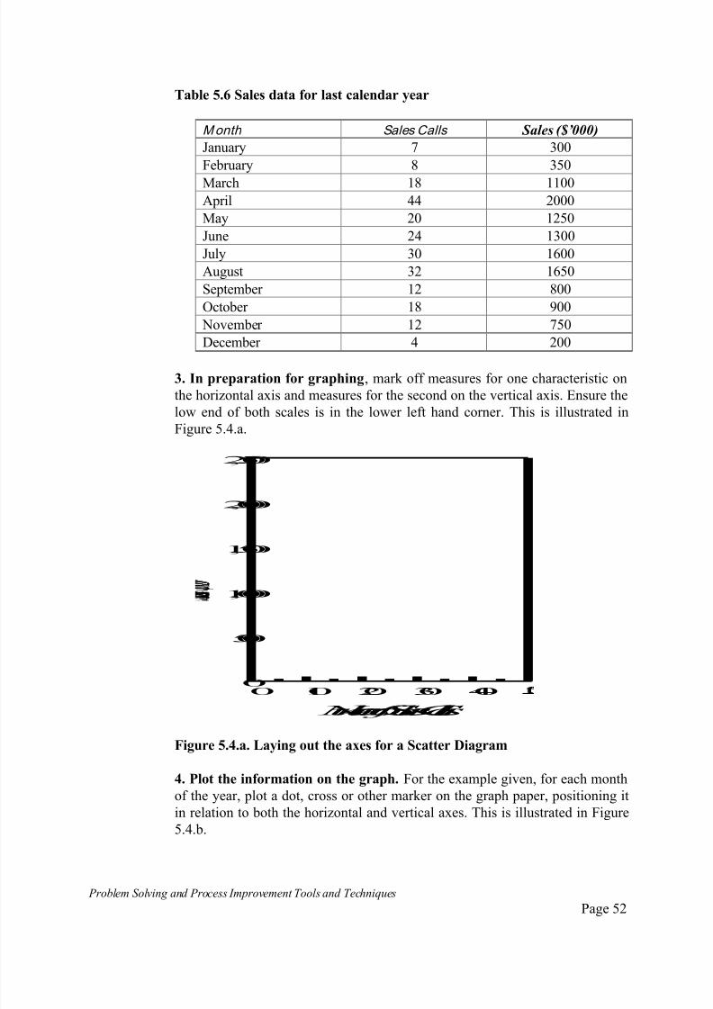
Table 5.6 Sales data for last calendar year
Month Sales Calls Sales ($’000)
January 7 300
February 8 350
March 18 1100
April 44 2000
May 20 1250
June 24 1300
July 30 1600
August 32 1650
September 12 800
October 18 900
November 12 750
December 4 200
3. In preparation for graphing, mark off measures for one characteristic on
the horizontal axis and measures for the second on the vertical axis. Ensure the
low end of both scales is in the lower left hand corner. This is illustrated in
Figure 5.4.a.
0 10 20 30 400
500
1,000
1,500
2,000
2,500
Numberof SalesCalls
Figure 5.4.a. Laying out the axes for a Scatter Diagram
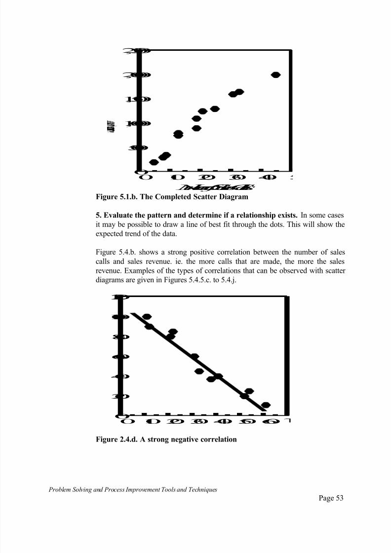
4. Plot the information on the graph. For the example given, for each month
of the year, plot a dot, cross or other marker on the graph paper, positioning it
in relation to both the horizontal and vertical axes. This is illustrated in Figure
5.4.b.
7/30/2019 Problem SolvingProcess Improvement Tools &Techniques Guide book.pdf
http://slidepdf.com/reader/full/problem-solvingprocess-improvement-tools-techniques-guide-bookpdf 53/175

7/30/2019 Problem SolvingProcess Improvement Tools &Techniques Guide book.pdf
http://slidepdf.com/reader/full/problem-solvingprocess-improvement-tools-techniques-guide-bookpdf 54/175
Problem Solving and Process Improvement Tools and Techniques Page 54
0 10 20 30 40 50 600
20
40
60
80
100
120
Figure 5.4.e. A weak negative correlation
0 10 20 30 40 50 600
20
40
60
80
100
Figure 5.4.f. Weak positive correlation
0 1020304050600
20
40
60
80
100
120
Figure 5.4.g. No correlation

7/30/2019 Problem SolvingProcess Improvement Tools &Techniques Guide book.pdf
http://slidepdf.com/reader/full/problem-solvingprocess-improvement-tools-techniques-guide-bookpdf 55/175
Problem Solving and Process Improvement Tools and Techniques Page 55
0 1020304050600
20
40
60
80
100
Figure 5.4.h. Non-linear (hyperbolic) correlation
0 10 20 30 400
500
1,000
1,500
2,000
2,500
Figure 5.4.i. Stratification
01020304050600
20
40
60
80
100
Figure 5.4.j. Non-linear (Inverse Hyperbolic) correlation
7/30/2019 Problem SolvingProcess Improvement Tools &Techniques Guide book.pdf
http://slidepdf.com/reader/full/problem-solvingprocess-improvement-tools-techniques-guide-bookpdf 56/175
Problem Solving and Process Improvement Tools and Techniques Page 56
Some Notes about using Scatter Diagrams
When using the scatter diagram, note the following important points:
Correlation does not mean that a cause and effect relationship exists
between the two characteristics being plotted. It only means the two arerelated is some way, maybe through a third characteristic we are yet to test,
it does not mean that one causes the other;
If you are putting data from different sources onto a scatter diagram. it is
possible that differences between the sources will interfere with the whole
picture. Overcome this by using separate diagrams or by using different
colours for data from different sources;
Correlation may only exist over part of the range over which the data has
been collected. Be aware so as not to misread a diagram and assume that
correlation exists over the entire range;
Negative relationships can be just as important as positive relationships.

7/30/2019 Problem SolvingProcess Improvement Tools &Techniques Guide book.pdf
http://slidepdf.com/reader/full/problem-solvingprocess-improvement-tools-techniques-guide-bookpdf 57/175
Problem Solving and Process Improvement Tools and Techniques Page 57
Run Charts
What is a Run Chart ?
A Run chart is a graph in which a line is used to sequentially connect the data
points. It gives a pictorial representation of what is happening to the process or system being measured, over time.
It can also be used to show the relationship between two variables in which
case it is referred to as a Line Graph.
A Run Chart is easy to look at and any patterns in the data become readily
apparent.
When to Use a Run Chart
Run charts are used when there is a need to monitor trends over time, or whenthe team suspects the cause of a problem is due to changes in a process or
system occurring over a period of time.
How to Construct a Run Chart
1. Determine the process/system characteristic or measure to monitor.
Example: A courier firm promising overnight parcel delivery has been
experiencing increasing customer complaints about late deliveries. A run
chart will be developed to monitor the number overnight delivery parcels
delivered late each month.
2. Collect the required data.
The number of late deliveries during the past year were extracted from the
computerised logistics management system. These are given in Table 5.7.
Table 5.7. Overnight parcel deliveries delivered late during past 12 months
Month Number Month Number
January 160 July 133February 157 August 125
March 169 September 151
April 131 October 169
May 145 November 163
June 120 December 165
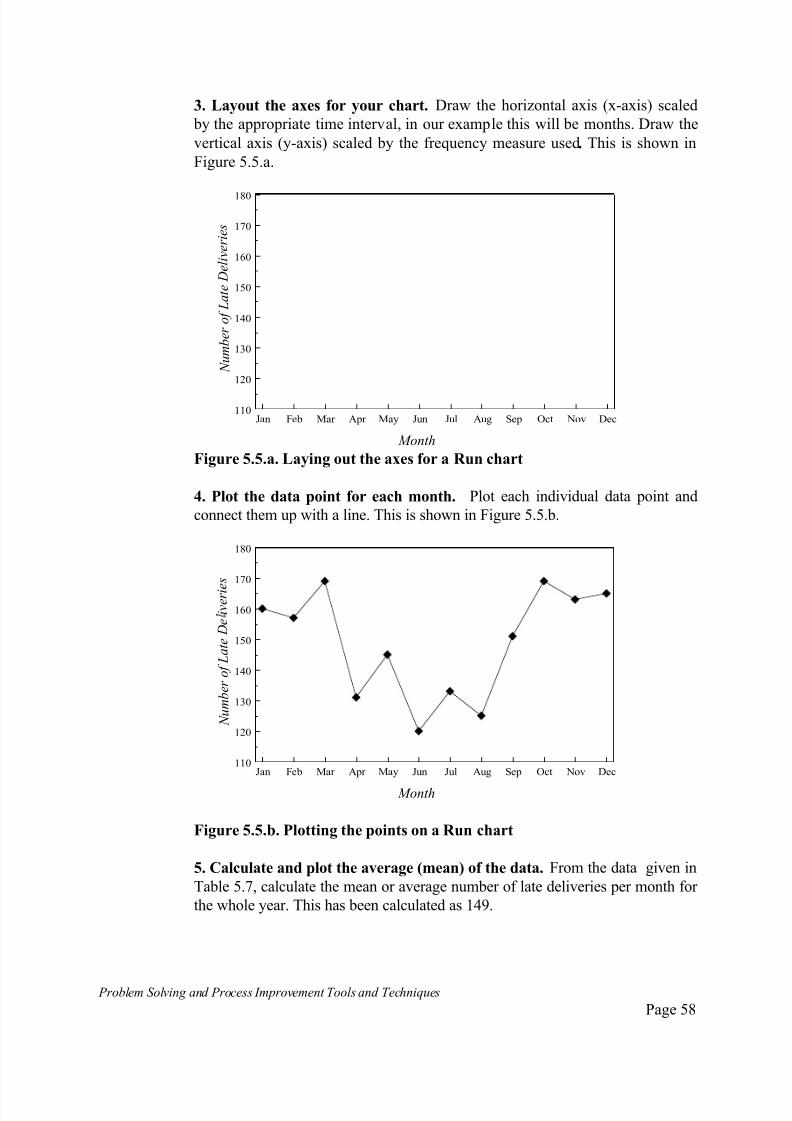
7/30/2019 Problem SolvingProcess Improvement Tools &Techniques Guide book.pdf
http://slidepdf.com/reader/full/problem-solvingprocess-improvement-tools-techniques-guide-bookpdf 58/175
Problem Solving and Process Improvement Tools and Techniques Page 58
3. Layout the axes for your chart. Draw the horizontal axis (x-axis) scaled
by the appropriate time interval, in our example this will be months. Draw the
vertical axis (y-axis) scaled by the frequency measure used. This is shown in
Figure 5.5.a.
Jan Feb Mar Apr May Jun Jul Aug Sep Oct Nov Dec110
120
130
140
150
160
170
180
Month
N u m b e r o f L a t e D e l i v e r i e s
Figure 5.5.a. Laying out the axes for a Run chart
4. Plot the data point for each month. Plot each individual data point and
connect them up with a line. This is shown in Figure 5.5.b.
Jan Feb Mar Apr May Jun Jul Aug Sep Oct Nov Dec110
120
130
140
150
160
170
180
N u m b e r o f L a t e D e i v e r i e
s
Month
Figure 5.5.b. Plotting the points on a Run chart
5. Calculate and plot the average (mean) of the data. From the data given in
Table 5.7, calculate the mean or average number of late deliveries per month for
the whole year. This has been calculated as 149.
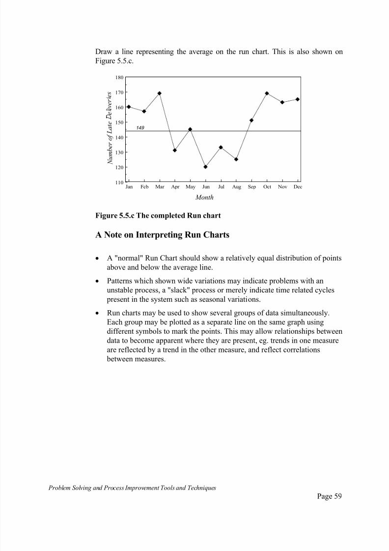
7/30/2019 Problem SolvingProcess Improvement Tools &Techniques Guide book.pdf
http://slidepdf.com/reader/full/problem-solvingprocess-improvement-tools-techniques-guide-bookpdf 59/175
Problem Solving and Process Improvement Tools and Techniques Page 59
Draw a line representing the average on the run chart. This is also shown on
Figure 5.5.c.
Jan Feb Mar Apr May Jun Jul Aug Sep Oct Nov Dec110
120
130
140
150
160
170
180
N u m b e r o f L a t e
e i v e r e s
Month
149
Figure 5.5.c The completed Run chart
A Note on Interpreting Run Charts
A "normal" Run Chart should show a relatively equal distribution of points
above and below the average line.
Patterns which shown wide variations may indicate problems with an
unstable process, a "slack" process or merely indicate time related cycles present in the system such as seasonal variations.
Run charts may be used to show several groups of data simultaneously.
Each group may be plotted as a separate line on the same graph using
different symbols to mark the points. This may allow relationships between
data to become apparent where they are present, eg. trends in one measure
are reflected by a trend in the other measure, and reflect correlations
between measures.
7/30/2019 Problem SolvingProcess Improvement Tools &Techniques Guide book.pdf
http://slidepdf.com/reader/full/problem-solvingprocess-improvement-tools-techniques-guide-bookpdf 60/175
Problem Solving and Process Improvement Tools and Techniques Page 60
Contro l Charts
What are Control Charts?
A Control Chart is a graphic comparison of how a process is performing withhow the process should perform.
It is basically a run chart with some additional information added, in the form
of lines representing control limits for the process being monitored. Control
limits are statistically determined upper and lower boundaries that define the
range of measurements that would be considered to be normal for a given
process.
A Control Chart enables you to distinguish between variation that is a natural
part of a process, and that caused by something outside the process that could
indicate a problem.
The Control Chart Principle
The principles on which control charts are based are discussed in more detail
in Appendix 1 - Understanding Variation and Data. To briefly summarise
some of the key points:
Control charts use the knowledge of the standard deviation of data around
its mean, which has been collected about a process, to determine what the
natural limits of performance for that process are;
The standard deviation and mean can be calculated for any set of data;
For data which follows the “Normal” distribution, the range defined
between the mean minus three times the standard deviation (called the
lower control limit) and the mean plus three times the standard deviation
(called the upper control limit), will enclose 99.73% of all possible data
points that can be obtained from such a process;
The upper and lower control limits will therefore indicate the natuaral
limits of variation of a process. ie. 99.73% of the time, the process will
yield a data point within these limits;
Although not all data follows the Normal distribition, most data collected
from “real” processes are close to normally distributed, and where they are
not, the sampling plan used to collect the data can yield normally
distributed points.
7/30/2019 Problem SolvingProcess Improvement Tools &Techniques Guide book.pdf
http://slidepdf.com/reader/full/problem-solvingprocess-improvement-tools-techniques-guide-bookpdf 61/175
Problem Solving and Process Improvement Tools and Techniques Page 61
When to use Control Charts
Control Charts can be used to address two broad categories of problems:
Process anal ysis involves understanding the nature of variation in
processes by looking at the effect of different process factors, so as toidentify potential problems;
Process control involves monitoring a process for which has been
standardised, for which control limits have been set, to determine if the
standardisation was correct and if it is being maintained.
Process control and process analysis charts are made in the same way, except
their purposes are different.
Types of Data and Types of Charts
The form of Control Chart used will depend on the type of data that is to be
plotted.
Data will be of two basic types:
things that you measure, or;
things that you count.
For things that you measure , such as measurements of some physical
dimension (eg. length in millimetres), time (eg. waiting time in minutes),
weight (eg. weight in kilograms) or other unit of measurement, data can take
any value depending on its measure.
Such data can take on what are known to as "indiscrete" values or variables. ie.
they can be anything and they can vary from item to item.
Measured or variable data is referred to as Continuous data.
For things that you count , for example, the number of defective items in a
sample, or the number of errors per form, the data can only take on certain or
"discrete" values. This type of data is called Attr ibutes data .
For attributes data, their can be two types - categorical data and occurrence
data.
The first type of attributes data is where we decide that we only want to know
whether an "attribute" is present or not.
For example, we may be monitoring the number of claim forms that have been
incorrectly filled out. Any error present on the form qualifies the form as
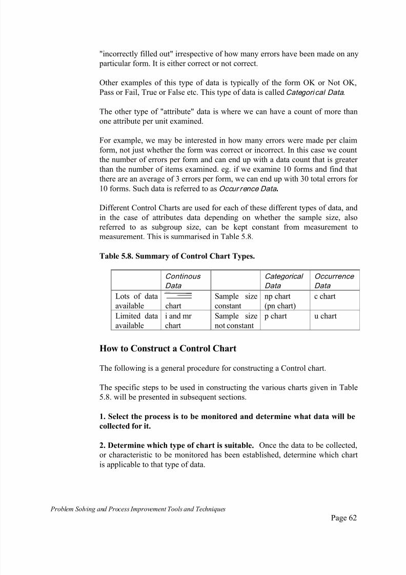
7/30/2019 Problem SolvingProcess Improvement Tools &Techniques Guide book.pdf
http://slidepdf.com/reader/full/problem-solvingprocess-improvement-tools-techniques-guide-bookpdf 62/175
Problem Solving and Process Improvement Tools and Techniques Page 62
"incorrectly filled out" irrespective of how many errors have been made on any
particular form. It is either correct or not correct.
Other examples of this type of data is typically of the form OK or Not OK,
Pass or Fail, True or False etc. This type of data is called Categori cal Data .
The other type of "attribute" data is where we can have a count of more than
one attribute per unit examined.
For example, we may be interested in how many errors were made per claim
form, not just whether the form was correct or incorrect. In this case we count
the number of errors per form and can end up with a data count that is greater
than the number of items examined. eg. if we examine 10 forms and find that
there are an average of 3 errors per form, we can end up with 30 total errors for
10 forms. Such data is referred to as Occur rence Data .
Different Control Charts are used for each of these different types of data, and
in the case of attributes data depending on whether the sample size, also
referred to as subgroup size, can be kept constant from measurement to
measurement. This is summarised in Table 5.8.
Table 5.8. Summary of Control Chart Types.
Continous
Data
Categorical
Data
Occurrence
Data
Lots of data
available chart
Sample size
constant
np chart
(pn chart)
c chart
Limited data
available
i and mr
chart
Sample size
not constant
p chart u chart
How to Construct a Control Chart
The following is a general procedure for constructing a Control chart.
The specific steps to be used in constructing the various charts given in Table
5.8. will be presented in subsequent sections.
1. Select the process is to be monitored and determine what data will be
collected for it.
2. Determine which type of chart is suitable. Once the data to be collected,
or characteristic to be monitored has been established, determine which chart
is applicable to that type of data.

7/30/2019 Problem SolvingProcess Improvement Tools &Techniques Guide book.pdf
http://slidepdf.com/reader/full/problem-solvingprocess-improvement-tools-techniques-guide-bookpdf 63/175
Problem Solving and Process Improvement Tools and Techniques Page 63
Refer to Table 5.8. or refer to the decision tree given in Figure 5.6 to decide
which chart is appropriate.
3. Decide how often data is to be collected. The more frequently the event
you wish to monitor occurs, the more frequently you will need to take
measurements.
For example: Measure queue outpatient waiting times at 10:00am and 2:00pm,
measure manufactured pin diameters every hour. etc.
The time interval between successive measurements or data collection is
referred to as the sampling in terval.
4. Decide how many data points to record each time. That is, how many
measurements will you take or how much data will you collect each time
measurements are take or data collected. This is the sample or subgroup size . eg. measure waiting times for first five customers, measure first 10 pins
manufactured each hour.
5. Collect the data. Implement you sampling/data collection plan. During
each sampling interval or at the predetermined time, collect one sample of data
values.
6. Calculate the statistics of interest. Use the prescribed statistical formulas
for the particular chart you have chosen to calculate the position of the:
Centre Line or Mean (CL) Upper Control Limit (UCL)
Lower Control Limit (LCL)

7/30/2019 Problem SolvingProcess Improvement Tools &Techniques Guide book.pdf
http://slidepdf.com/reader/full/problem-solvingprocess-improvement-tools-techniques-guide-bookpdf 64/175
Problem Solving and Process Improvement Tools and Techniques Page 64
Areyoucountingor measuring?
Counting
Measuring
ContinuousData
Canyouhavemorethanone
count per unit
Lotsof data
available
Not muchdataavailable
X-bar ( X)
andRCharts
i andmr Charts
No
CategoricalData
OccurenceData
ConstantSampleSize
Samplesizenotconstant
npChart
pChart
ConstantSampleSize
Samplesizenotconstant
cChart
uChart
Yes
Figure 5.6 Control chart selection logic tree
7. Draw the control chart
This involves laying out the chart format, and then plotting the data points.
To lay out the chart format:
Draw and scale the vertical and horizontal axes;
Draw the Centre Line, Upper and Lower Control Limits.
Then plot the data values collected on the Control Chart
8. Analyse the Control Chart.
In general, if all the points plotted fall within the control limits, the process can
be said to be in control and operating normally. The existence of points outside
the control limits or the existed or certain characteristic trends would suggest
that the process is not in control and that special causes are present.
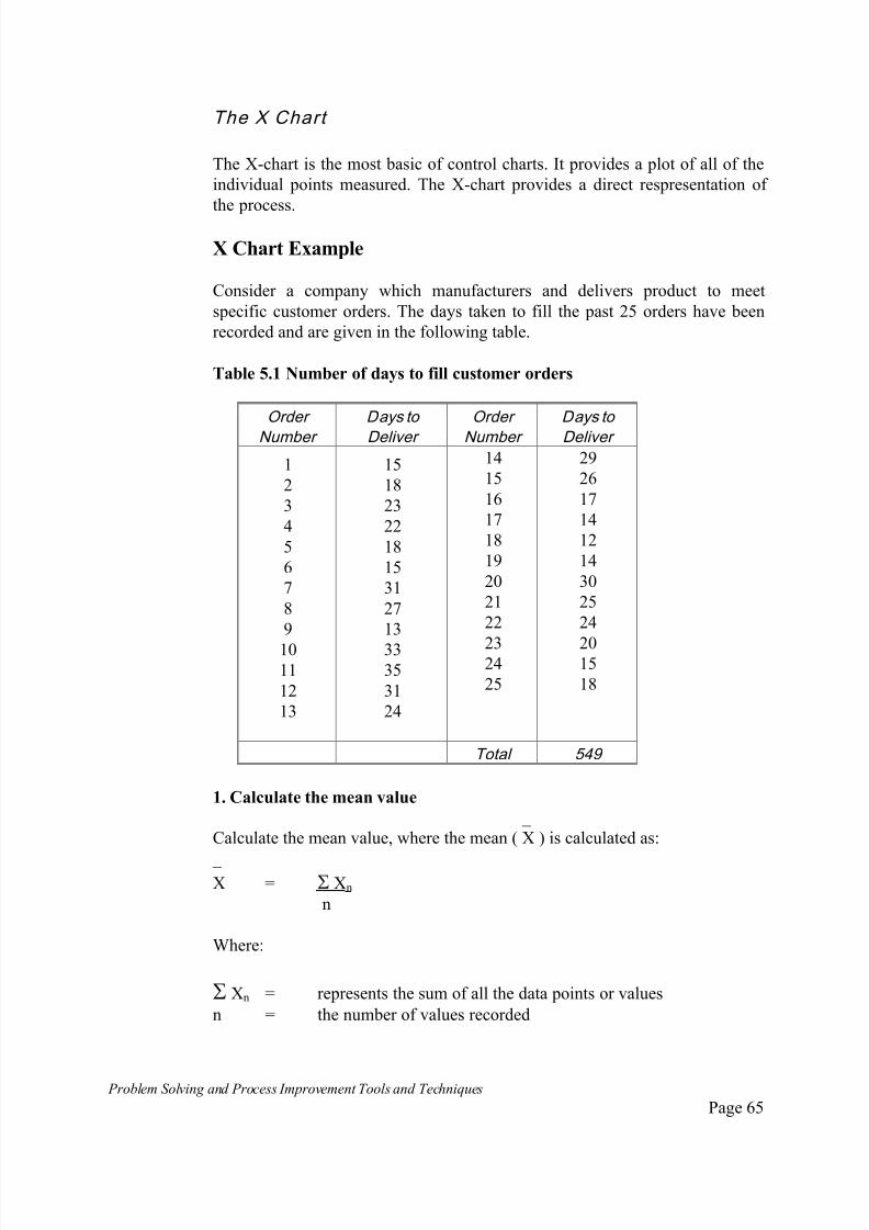
7/30/2019 Problem SolvingProcess Improvement Tools &Techniques Guide book.pdf
http://slidepdf.com/reader/full/problem-solvingprocess-improvement-tools-techniques-guide-bookpdf 65/175
Problem Solving and Process Improvement Tools and Techniques Page 65
The X Chart
The X-chart is the most basic of control charts. It provides a plot of all of the
individual points measured. The X-chart provides a direct respresentation of
the process.
X Chart Example
Consider a company which manufacturers and delivers product to meet
specific customer orders. The days taken to fill the past 25 orders have been
recorded and are given in the following table.
Table 5.1 Number of days to fill customer orders
Order
Number
Days to
Deliver
Order
Number
Days to
Deliver
1
2
3
4
5
6
7
8
9
1011
12
13
15
18
23
22
18
15
31
27
13
3335
31
24
14
15
16
17
18
19
20
21
22
2324
25
29
26
17
14
12
14
30
25
24
2015
18
Total 549
1. Calculate the mean value
_
Calculate the mean value, where the mean ( X ) is calculated as:
_ X = Xn
n
Where:
Xn = represents the sum of all the data points or values
n = the number of values recorded

7/30/2019 Problem SolvingProcess Improvement Tools &Techniques Guide book.pdf
http://slidepdf.com/reader/full/problem-solvingprocess-improvement-tools-techniques-guide-bookpdf 66/175
Problem Solving and Process Improvement Tools and Techniques Page 66
In our example:
X = 15 + 18 + 23 + ...... + 18
25
= 54925
= 21.96 = 22.
2. Calculate the standard deviation
The standard deviation, usually referred to by the symbol or the letters SD or
S, is calculated using the equation:
These symbols have been previously defined. In our example, this is calculated
as follows:
= (15-22)2 + (18-22)2 + (23-22)2 + ...... + (18-22)2
24
= 1156.96 = 48.21
24
= 6.94 = 6.9
3. Calculate the Upper and Lower Control Limits.
The general formulas for the calculation of Upper and Lower Control Limits
are:
_ Upper Control Limit (UCL) = X + 3
Lower Control Limit (LCL) = X - 3 For example, substituting our value of standard deviation, we get:
UCL = 22 + 3 X 6.9
= 22 + 20.7 = 42.7
LCL = 22 - 20.7 = 1.3
σ = Σ (Xn- X)2
n - 1
_
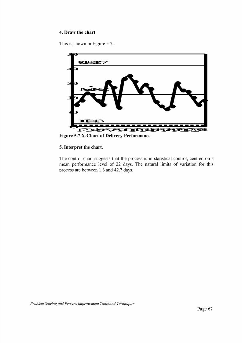
7/30/2019 Problem SolvingProcess Improvement Tools &Techniques Guide book.pdf
http://slidepdf.com/reader/full/problem-solvingprocess-improvement-tools-techniques-guide-bookpdf 67/175
Problem Solving and Process Improvement Tools and Techniques Page 67
4. Draw the chart
This is shown in Figure 5.7.
1234567891011121314151617181920212223240
10
20
30
40
50
LCL=1.3
MeanX=22
UCL=42.7
Figure 5.7 X-Chart of Delivery Performance
5. Interpret the chart.
The control chart suggests that the process is in statistical control, centred on a
mean performance level of 22 days. The natural limits of variation for this
process are between 1.3 and 42.7 days.
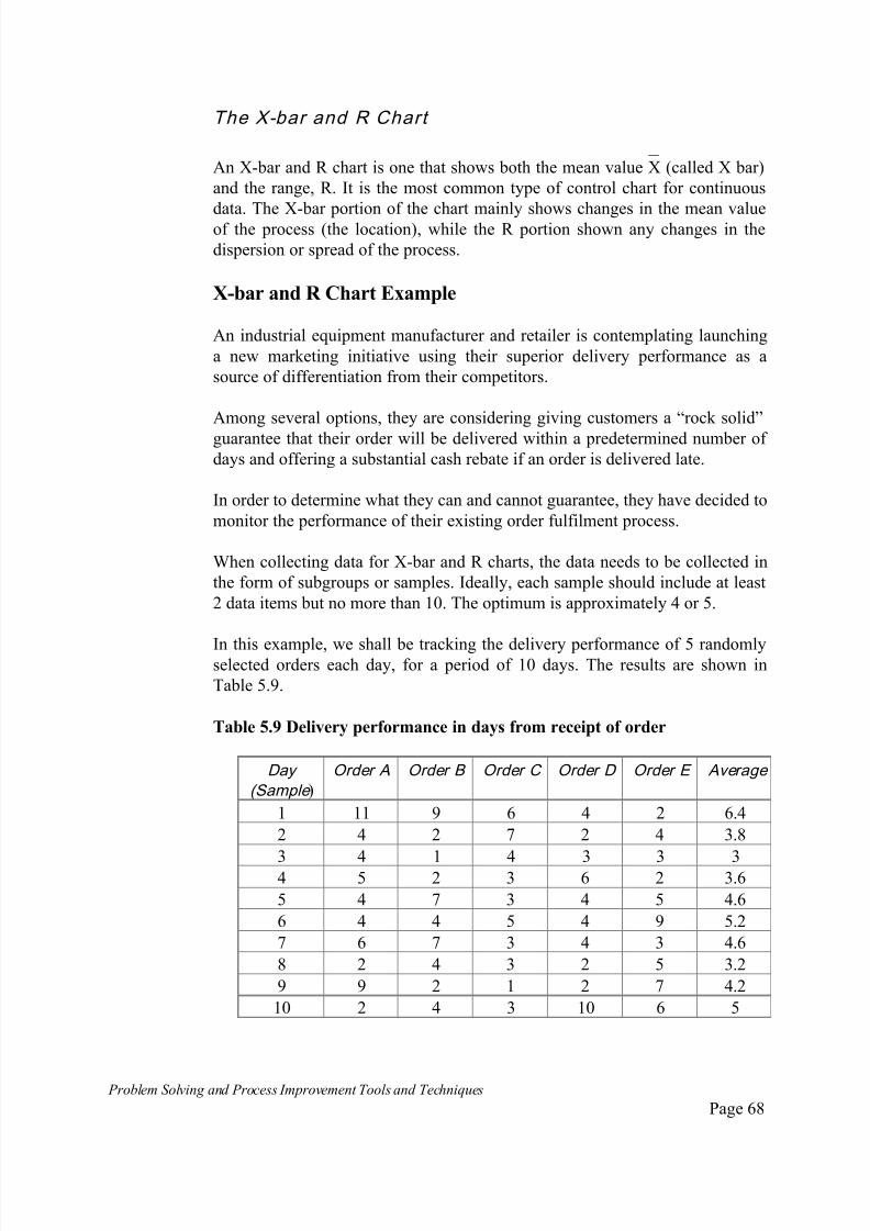
7/30/2019 Problem SolvingProcess Improvement Tools &Techniques Guide book.pdf
http://slidepdf.com/reader/full/problem-solvingprocess-improvement-tools-techniques-guide-bookpdf 68/175
Problem Solving and Process Improvement Tools and Techniques Page 68
The X-bar and R Chart
_ An X-bar and R chart is one that shows both the mean value X (called X bar)
and the range, R. It is the most common type of control chart for continuous
data. The X-bar portion of the chart mainly shows changes in the mean valueof the process (the location), while the R portion shown any changes in the
dispersion or spread of the process.
X-bar and R Chart Example
An industrial equipment manufacturer and retailer is contemplating launching
a new marketing initiative using their superior delivery performance as a
source of differentiation from their competitors.
Among several options, they are considering giving customers a “rock solid”
guarantee that their order will be delivered within a predetermined number of days and offering a substantial cash rebate if an order is delivered late.
In order to determine what they can and cannot guarantee, they have decided to
monitor the performance of their existing order fulfilment process.
When collecting data for X-bar and R charts, the data needs to be collected in
the form of subgroups or samples. Ideally, each sample should include at least
2 data items but no more than 10. The optimum is approximately 4 or 5.
In this example, we shall be tracking the delivery performance of 5 randomlyselected orders each day, for a period of 10 days. The results are shown in
Table 5.9.
Table 5.9 Delivery performance in days from receipt of order
Day
(Sample )Order A Order B Order C Order D Order E Average
1 11 9 6 4 2 6.4
2 4 2 7 2 4 3.8
3 4 1 4 3 3 34 5 2 3 6 2 3.6
5 4 7 3 4 5 4.6
6 4 4 5 4 9 5.2
7 6 7 3 4 3 4.6
8 2 4 3 2 5 3.2
9 9 2 1 2 7 4.2
10 2 4 3 10 6 5

7/30/2019 Problem SolvingProcess Improvement Tools &Techniques Guide book.pdf
http://slidepdf.com/reader/full/problem-solvingprocess-improvement-tools-techniques-guide-bookpdf 69/175
Problem Solving and Process Improvement Tools and Techniques Page 69
With reference to Table 5.9, we have sampled 5 orders each time we have
taken a sample ie. 5/day. The subgroup size, usually referred to as n, is
therefore 5. (ie. 5 orders).
Calculate the statistics of interest.
_ 1. Determine the location of the centre-line for the X Chart. Calculate the
average waiting time for the period being monitored.
For the above example this is the sum of all the daily averages divided by 10
(10 days).
=Average Mean X = 6.4 + 3.8 + 3 + 3.6 + 4.6 + 5.2 + 4.6 + 3.2 + 4.2 + 5
= 10
Average Mean X = 4.4 Days _
The daily averages are referred to as X. The average of the averages which
defines the centre-line is called X double bar.
2. Determine the centre-line for the Ranges chart. To determine the centre-
line of the ranges chart, we must first determine the range of each group of
data collected.
The range is the difference between the largest and smallest value in each
sample. eg. for the orders sampled during day one, the fastest was filled in 2
days, the slowest in 11 days.
The range is therefore 11 days - 2 days = 9 days. The ranges for each of the
samples are given in Table 5.10.
Table 5.10 Ranges of order fulfillment samples.
Day 1 2 3 4 5 6 7 8 9 10
Range 9 5 3 4 4 5 4 3 8 8

7/30/2019 Problem SolvingProcess Improvement Tools &Techniques Guide book.pdf
http://slidepdf.com/reader/full/problem-solvingprocess-improvement-tools-techniques-guide-bookpdf 70/175

7/30/2019 Problem SolvingProcess Improvement Tools &Techniques Guide book.pdf
http://slidepdf.com/reader/full/problem-solvingprocess-improvement-tools-techniques-guide-bookpdf 71/175
Problem Solving and Process Improvement Tools and Techniques Page 71
For the example used here, we sampled 5 orders each day, therefore the
subgroup size n = 5.
From Table 5.11. A2 = 0.577.
Substituting into the above equations:
UCL = 4.4 + 0.577 x 5.3 = 7.5
LCL = 4.4 - 0.577 x 5.3 = 1.3
4. Calculate the Upper and Lower Control Limits for the R Chart. The
equations for the upper and lower control limits for the range chart are:
_ _
UCL = D4R and LCL = D3R
From Table 5.11, D4 = 2.114 and D3 = 0.
The Upper and Lower Control Limits can therefore be calculated as:
UCL = 2.114 x 5.3 = 11.2
LCL = 0
5. Lay out the X-bar and R chart format. Draw the centre-lines, upper and
lower control limits for the X chart on one graph and the centre-line, upper and
lower control limits for the R chart on another.
6. Plot the values. Plot the daily averages (means) on the X chart and the
values of the daily ranges on the R chart. See Figure 5.8.a. (X-bar chart) and
5.8.b. (R-chart).
1 2 3 4 5 6 7 8 9 10
2
4
6
8
10
MeanX=4.4
UCL=7.5
LCL=1.3
XChart
SampleDays Figure 5.8.a The X-bar Chart
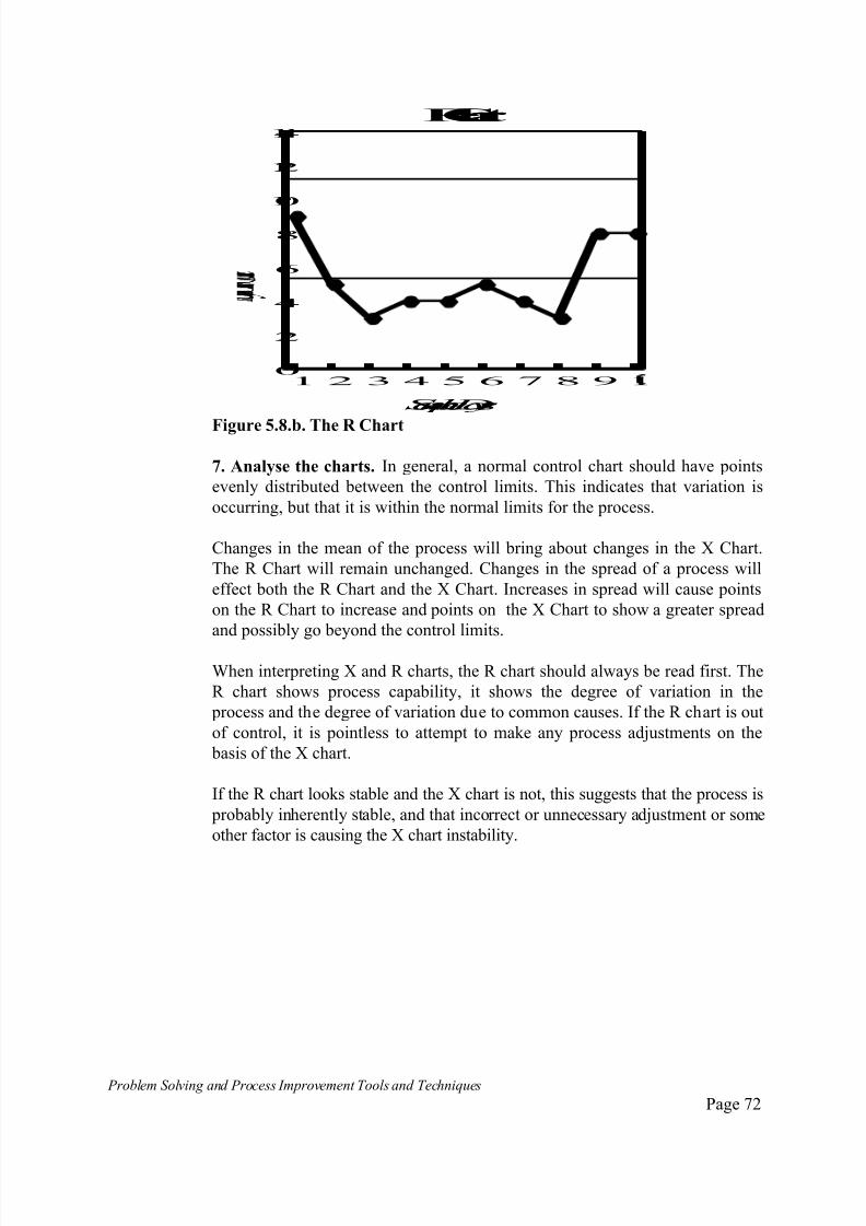
7/30/2019 Problem SolvingProcess Improvement Tools &Techniques Guide book.pdf
http://slidepdf.com/reader/full/problem-solvingprocess-improvement-tools-techniques-guide-bookpdf 72/175
Problem Solving and Process Improvement Tools and Techniques Page 72
1 2 3 4 5 6 7 8 9 10
2
4
6
8
10
12
14
SampleDays
RChart
Figure 5.8.b. The R Chart
7. Analyse the charts. In general, a normal control chart should have points
evenly distributed between the control limits. This indicates that variation is
occurring, but that it is within the normal limits for the process.
Changes in the mean of the process will bring about changes in the X Chart.
The R Chart will remain unchanged. Changes in the spread of a process will
effect both the R Chart and the X Chart. Increases in spread will cause points
on the R Chart to increase and points on the X Chart to show a greater spread
and possibly go beyond the control limits.
When interpreting X and R charts, the R chart should always be read first. The
R chart shows process capability, it shows the degree of variation in the
process and the degree of variation due to common causes. If the R chart is out
of control, it is pointless to attempt to make any process adjustments on the
basis of the X chart.
If the R chart looks stable and the X chart is not, this suggests that the process is
probably inherently stable, and that incorrect or unnecessary adjustment or some
other factor is causing the X chart instability.
7/30/2019 Problem SolvingProcess Improvement Tools &Techniques Guide book.pdf
http://slidepdf.com/reader/full/problem-solvingprocess-improvement-tools-techniques-guide-bookpdf 73/175
Problem Solving and Process Improvement Tools and Techniques Page 73
The i and m r Chart
When there are few data points and/or data is only available at irregular
intervals, we may not be able to collect enough points to construct X-bar and
R-charts.
For example:
a process that runs in single batches with a long cycle time;
situations where it is uneconomical to take multiple samples;
where destructive testing is used to take measurements;
etc., etc.;
In such situations the i - individuals, and mr - moving range charts are used.
These charts are similar to the X-bar and R-charts except that they useindividual points.
An i and mr Chart Example
A mining company operates a process for extracting small amounts of
previously unrecoverable precious metals for waste slurry. The slurry is stored
in tanks as it is generated, every few days when enough slurry has been
accumulated, the batch is processed.
The number of grams recovered from each batch is recorded every time therecovery process is run. The results of the past 25 runs is shown in Table 5.12.
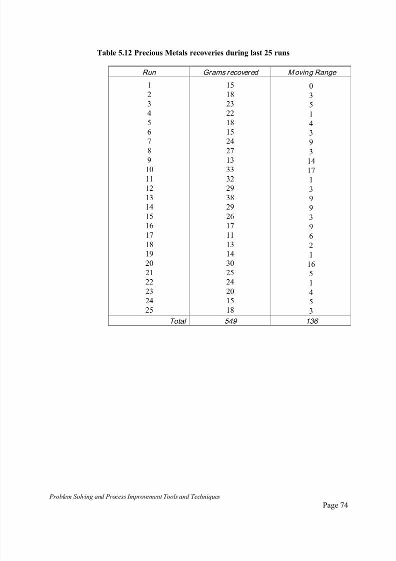
7/30/2019 Problem SolvingProcess Improvement Tools &Techniques Guide book.pdf
http://slidepdf.com/reader/full/problem-solvingprocess-improvement-tools-techniques-guide-bookpdf 74/175
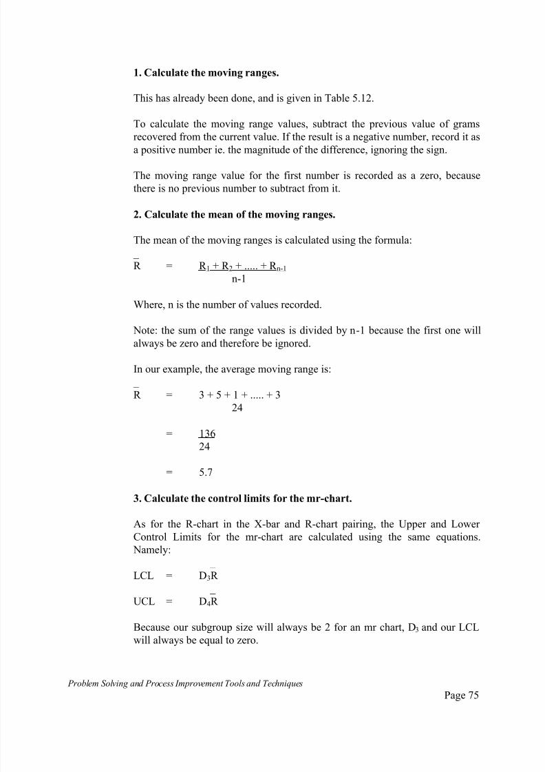
7/30/2019 Problem SolvingProcess Improvement Tools &Techniques Guide book.pdf
http://slidepdf.com/reader/full/problem-solvingprocess-improvement-tools-techniques-guide-bookpdf 75/175
Problem Solving and Process Improvement Tools and Techniques Page 75
1. Calculate the moving ranges.
This has already been done, and is given in Table 5.12.
To calculate the moving range values, subtract the previous value of grams
recovered from the current value. If the result is a negative number, record it asa positive number ie. the magnitude of the difference, ignoring the sign.
The moving range value for the first number is recorded as a zero, because
there is no previous number to subtract from it.
2. Calculate the mean of the moving ranges.
The mean of the moving ranges is calculated using the formula:
_
R = R 1 + R 2 + ..... + R n-1 n-1
Where, n is the number of values recorded.
Note: the sum of the range values is divided by n-1 because the first one will
always be zero and therefore be ignored.
In our example, the average moving range is:
_
R = 3 + 5 + 1 + ..... + 3
24
= 136
24
= 5.7
3. Calculate the control limits for the mr-chart.
As for the R-chart in the X-bar and R-chart pairing, the Upper and Lower
Control Limits for the mr-chart are calculated using the same equations. Namely:
_
LCL = D3R
_
UCL = D4R
Because our subgroup size will always be 2 for an mr chart, D3 and our LCL
will always be equal to zero.
7/30/2019 Problem SolvingProcess Improvement Tools &Techniques Guide book.pdf
http://slidepdf.com/reader/full/problem-solvingprocess-improvement-tools-techniques-guide-bookpdf 76/175

7/30/2019 Problem SolvingProcess Improvement Tools &Techniques Guide book.pdf
http://slidepdf.com/reader/full/problem-solvingprocess-improvement-tools-techniques-guide-bookpdf 77/175
Problem Solving and Process Improvement Tools and Techniques Page 77
Which in our example is:
_
X = 15 + 18 + 23 + 22 + .... + 18
25
= 54925
= 21.96 = 22
6. Calculate the Upper and Lower Control Limits
These are calculated using the equations used for the X-bar chart. That is:
_ _
UCL = X + A2R
_ _ LCL = X - A2R
The value of A2 is 2.66. Therefore:
_ _
UCL = X + 2.66 R, and
_ _
LCL = X - 2.66 R
In our example, X = 22 and R = 5.7. Substituting gives:
UCL = 22 + 2.66 x 5.7
= 22 + 15.16
= 37.16 = 37.2
LCL = 22 - 15.15
= 6.84 = 6.9

7/30/2019 Problem SolvingProcess Improvement Tools &Techniques Guide book.pdf
http://slidepdf.com/reader/full/problem-solvingprocess-improvement-tools-techniques-guide-bookpdf 78/175
Problem Solving and Process Improvement Tools and Techniques Page 78
7. Draw the i - chart
123456789101112131415161718192021222325
10
15
20
25
30
35
40
MeanX=22
UCL=37.2
LCL=6.9
Figure 5.9b. The completed individuals chart (i-chart)
8. Interpret the chart
One point appears to be due to a special cause. However, given that this is above
the control limit, indicating a higher than expected recovery rate, it warrants
investigation to see if the process can be improved so that the mean is shifted to
this higher level.

7/30/2019 Problem SolvingProcess Improvement Tools &Techniques Guide book.pdf
http://slidepdf.com/reader/full/problem-solvingprocess-improvement-tools-techniques-guide-bookpdf 79/175
Problem Solving and Process Improvement Tools and Techniques Page 79
The np Chart .
The np chart or Number Defective chart, also referred to as the pn chart is a
chart that shows the number of defective items produced by a process.
np charts are used with Categorical data, ie. attribute data where values are
measured in terms of OK or Not OK.
The np Chart is based on the assumption that count data, where we are
counting OK/Not OK tend to follow the Binomial distribution, which
approximates the Normal distribution. As subgroup size increases, the
accuracy of this approximation increases.
One restriction applying to the use of the np chart is that it requires sample or
subgroup size to be constant. ie. each sample has the same number of items in
it.
np Chart Example
An automatic packaging line which fills and seals bulk wine containers for
export, traditionally has damaged a certain percentage of containers during the
process. These are scrapped and the wine is recycled. The extent of the
problem is going to be investigated using an np Chart.
The first 200 containers filled each hour were examined and the results
recorded for 25 consecutive production hours. The collected data is given inTable 5.12.
7/30/2019 Problem SolvingProcess Improvement Tools &Techniques Guide book.pdf
http://slidepdf.com/reader/full/problem-solvingprocess-improvement-tools-techniques-guide-bookpdf 80/175
Problem Solving and Process Improvement Tools and Techniques Page 80
Table 5.12 Defective wine container data
Sample (Subgroup)
Number
Sample (Subgroup)
size
Number defective
12
3
4
5
6
7
8
9
10
11
1213
14
15
16
17
18
19
20
21
2223
24
25
200200
200
200
200
200
200
200
200
200
200
200200
200
200
200
200
200
200
200
200
200200
200
200
1518
23
22
18
15
44
47
13
33
42
4638
29
26
17
5
7
14
36
25
2420
15
18
Total 5,000 610
The Subgroup size indicates how many containers were sampled each time a
sample was taken. In our case, this was 200 and remained constant through out
the data collection period.
The number of defectives indicates how many of these were defective.
Note: Subgroup size n should be greater than 50, and the expected mean value
of defectives for each subgroup should ideally range from 3 to 4.
To calculate the required statistics for an np chart we proceed as follows.
7/30/2019 Problem SolvingProcess Improvement Tools &Techniques Guide book.pdf
http://slidepdf.com/reader/full/problem-solvingprocess-improvement-tools-techniques-guide-bookpdf 81/175
Problem Solving and Process Improvement Tools and Techniques Page 81
1. First, calculate the average number defective. This calculation is to work
out the average number defectives found per sample, overall.
In our case, we took 25 samples and found 610 defective items. The average
number of defectives is calculated as:
_ np = total number of defectives = 610
number of samples 25
_
np = 24.4
2. Calculate the average fraction or proportion defective for all the data
collected.
Average fraction or proportion defective is calculated as follows:
_ p = Total defective = np
Total inspected n
for the data in this example,
_
p = 610 = 0.122 = 12.2%
5,000
This defines the centre-line of the control chart.
Given that the sample size is constant, this could also have been calculated as: _ _
p = average number defective = np
sample size n
= 24.4
200
= 0.122 = 12.2%
3. Calculate the Upper and Lower Control Limits. The equations for calculating the Upper and Lower Control Limits for an np chart are:
_ _ _
UCL = np + 3 x np(1-p)
_ _ _
LCL = np - 3 x np(1-p)
UCL = 24.4 + 13.9 = 38.3
LCL = 24.4 - 13.9 = 10.5
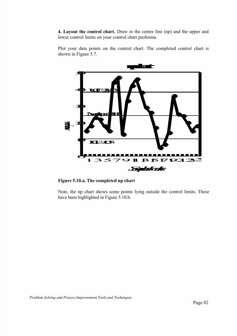
7/30/2019 Problem SolvingProcess Improvement Tools &Techniques Guide book.pdf
http://slidepdf.com/reader/full/problem-solvingprocess-improvement-tools-techniques-guide-bookpdf 82/175
Problem Solving and Process Improvement Tools and Techniques Page 82
4. Layout the control chart. Draw in the centre line (np) and the upper and
lower control limits on your control chart proforma.
Plot your data points on the control chart. The completed control chart is
shown in Figure 5.7.
13579111315171921230
10
20
30
40
50
Meann p=24.4
UCL=38.3
LCL=10.5
npchart
SampleHours
Figure 5.10.a. The completed np chart
Note, the np chart shows some points lying outside the control limits. These
have been highlighted in Figure 5.10.b.

7/30/2019 Problem SolvingProcess Improvement Tools &Techniques Guide book.pdf
http://slidepdf.com/reader/full/problem-solvingprocess-improvement-tools-techniques-guide-bookpdf 83/175
7/30/2019 Problem SolvingProcess Improvement Tools &Techniques Guide book.pdf
http://slidepdf.com/reader/full/problem-solvingprocess-improvement-tools-techniques-guide-bookpdf 84/175

7/30/2019 Problem SolvingProcess Improvement Tools &Techniques Guide book.pdf
http://slidepdf.com/reader/full/problem-solvingprocess-improvement-tools-techniques-guide-bookpdf 85/175
Problem Solving and Process Improvement Tools and Techniques Page 85
Table 5.12 Defective wine container data
Sample
(Subgroup)
Number
Sample
(Subgroup)
size
Number
defective %
Defect.
p (%)
UCL
(%)
LCL
(%)
1
2
3
4
5
6
7
8
9
1011
12
13
14
15
16
17
18
19
20
2122
23
24
25
115
220
210
220
220
255
440
365
255
300280
330
320
225
290
170
65
100
135
280
250220
220
220
220
15
18
23
22
18
15
44
47
13
3342
46
38
29
26
17
5
7
14
36
2524
20
15
18
13.0
8.2
10.9
10.0
8.2
5.8
10.0
12.9
5.1
11.014.6
13.9
11.9
12.9
8.9
10
7.7
7.0
10.4
12.8
10.010.9
9.1
6.8
8.2
18.8
16.5
16.6
16.5
16.5
16.0
14.6
15.1
16.0
15.615.8
15.3
16.5
16.4
15.7
17.3
21.6
19.4
18.2
15.8
16.116.5
16.5
16.5
16.5
1.8
4.1
4.0
4.1
4.1
4.6
6.0
5.5
4.6
5.04.8
5.3
4.1
4.2
4.9
3.3
0
1.2
2.4
4.8
4.54.1
4.1
4.1
4.1
Total 5,925 610
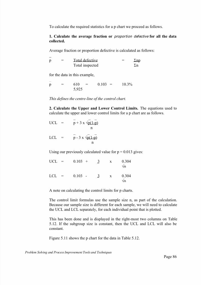
7/30/2019 Problem SolvingProcess Improvement Tools &Techniques Guide book.pdf
http://slidepdf.com/reader/full/problem-solvingprocess-improvement-tools-techniques-guide-bookpdf 86/175
Problem Solving and Process Improvement Tools and Techniques Page 86
To calculate the required statistics for a p chart we proceed as follows.
1. Calculate the average fraction or proportion defective for all the data
collected.
Average fraction or proportion defective is calculated as follows: _
p = Total defective = np
Total inspected n
for the data in this example,
_
p = 610 = 0.103 = 10.3%
5,925
This defines the centre-line of the control chart.
2. Calculate the Upper and Lower Control Limits. The equations used to
calculate the upper and lower control limits for a p chart are as follows.
_ _ _
UCL = p + 3 x p(1-p)
n _ _ _
LCL = p - 3 x p(1-p)
n
Using our previously calculated value for p = 0.013 gives:
UCL = 0.103 + 3 x 0.304
n
LCL = 0.103 - 3 x 0.304
n
A note on calculating the control limits for p charts.
The control limit formulas use the sample size n, as part of the calculation.Because our sample size is different for each sample, we will need to calculate
the UCL and LCL separately, for each individual point that is plotted.
This has been done and is displayed in the right-most two columns on Table
5.12. If the subgroup size is constant, then the UCL and LCL will also be
constant.
Figure 5.11 shows the p chart for the data in Table 5.12.

7/30/2019 Problem SolvingProcess Improvement Tools &Techniques Guide book.pdf
http://slidepdf.com/reader/full/problem-solvingprocess-improvement-tools-techniques-guide-bookpdf 87/175
7/30/2019 Problem SolvingProcess Improvement Tools &Techniques Guide book.pdf
http://slidepdf.com/reader/full/problem-solvingprocess-improvement-tools-techniques-guide-bookpdf 88/175
Problem Solving and Process Improvement Tools and Techniques Page 88
The c Chart
The c - chart or non-conformities chart, is a chart that shows the number of
occurrences of some event ie. a non-conformity per sampling period or
interval. The c-chart is used to monitor Occurrence Data.
For the p and np charts (Categorical data) we know both the number of
defectives as well as the number of remaining (nondefectives) units in the
sample.
This is not always possible. In many situations we may be able to measure the
number of non-conformities or occurrences of some event only. For example,
if a retailer were monitoring customer complaints (the non-conformities) it
may be impractical to try to measure the total number of customers which
come into the store, so as to determine the total sample size. ie. they can easily
measure the number of complaints per day, but the total number of customers per day is not known.
In such cases, a c-chart is used. A c-chart is used when the sampling period,
interval or unit is constant. The sampling unit may be a fixed length, area,
quantity, time etc.
Examples of fixed sampling units are:
Complaints per day;
Scratches per car;
Errors per form;
etc.
A key difference between Occurrence data and Categorical data, is that for
categorical data, we cannot obtain a count of the parameter we are monitoring
which is greater than the number of items in the sample. ie. if we sample 100
forms to monitor the number or percent defective (ie. incorrectly filled out)
the most we could conceivably measure is 100 assuming they were all
defective.
For Occurrence data, we may obtain a measure which is greater than the
number sampled. For example, if we a measuring the number of errors per
form (Occurrence data), and there is an average of 3 errors per form, we will
obtain a measurement of 300 which is significantly greater than the sample
size.

7/30/2019 Problem SolvingProcess Improvement Tools &Techniques Guide book.pdf
http://slidepdf.com/reader/full/problem-solvingprocess-improvement-tools-techniques-guide-bookpdf 89/175
Problem Solving and Process Improvement Tools and Techniques Page 89
c - Chart Example
The method for constructing a c-chart will now be illustrated by way of an
example.
Consider a textile firm manufacturing plain white fabric which is later dyed tomeet specific customer orders. Weaving errors and stains (usually oil) which
often find there way into the fabric during the process cannot be allowed in the
finished product which goes to dying. The dye highlights flaws and stains,
causing such fabric to be rejected.
To minimise the amount of finished product which is scrapped, the plain white
fabric is inspected. Any oil or other stains are manually cleaned during
inspection, any sections with weaving faults are highlighted to be cut out the
main roll before dying.
The rolls of plan white fabric are all prepared in 3,000 metre rolls.
Information is collected by the fabric inspectors on the number of weaving
faults found. This information is used by the weaving operators and mechanics
to try to improve the weaving process. Data collected from 25 rolls is shown in
Table 5.14.
Table 5.14 Number of weaving faults found per roll
Roll
Number
Number of
Weaving
Faults
Roll
Number
Number of
Weaving
Faults
1
2
3
4
5
6
7
8
910
11
12
13
15
18
23
22
18
15
44
47
1333
42
46
38
14
15
16
17
18
19
20
21
2223
24
25
29
26
17
5
7
14
36
25
2420
15
18
Total 610

7/30/2019 Problem SolvingProcess Improvement Tools &Techniques Guide book.pdf
http://slidepdf.com/reader/full/problem-solvingprocess-improvement-tools-techniques-guide-bookpdf 90/175

7/30/2019 Problem SolvingProcess Improvement Tools &Techniques Guide book.pdf
http://slidepdf.com/reader/full/problem-solvingprocess-improvement-tools-techniques-guide-bookpdf 91/175
Problem Solving and Process Improvement Tools and Techniques Page 91
3. Plot the chart
1234567891011121314151617181920212223240
10
20
30
0
50
Centreline
c=24.4
LCL=9.6
UCL=39.2
Figure 5.12. The completed c-chart
4. Interpret the chart
The above chart suggests that the upstream process which contributes to
weaving faults in the fabric is not stable or in statistical control. There is
evidence of several special causes - points outside the control limits.
Improvement efforts should focus on identifying and eliminating the causes of instability in the weaving process.

7/30/2019 Problem SolvingProcess Improvement Tools &Techniques Guide book.pdf
http://slidepdf.com/reader/full/problem-solvingprocess-improvement-tools-techniques-guide-bookpdf 92/175
Problem Solving and Process Improvement Tools and Techniques Page 92
The u Chart
If we are monitoring occurrence data but the sampling interval/unit varies we
can no longer use the c - chart, as this requires a constant sampling period/unit.
For example, if a department store is monitoring the number of customer
complaints per day and they have late night shopping on Friday and morning
shopping on Saturday, the length of the “day” will not be the same for every
day. A c-chart would not be used in such a situation.
Where the data is occurrence data and the sampling unit/period is not constant
a u-chart is used. The u-chart is to the c-chart what the p-chart is to the np-
chart.
u - Chart Example
The method for constructing a u-chart will now be illustrated with reference tothe textiles example used for the c-chart.
As part of the dying preparation process, the sections of fabric where
significant weaving faults were found are cut out, and the remaining
acceptable fabric sewn back into the roll. Rolls are also batched together or
split into smaller rolls depending on the size of the customer order for a
particular colour or pattern.
This means that the rolls processed in the dying section will be of varying
lengths depending on the customer order and the amount of flawed fabric thathad to be cut out.
Post-dying, the rolls are again inspected to identify any dying errors or faults.
Sections with flaws or shade inconsistencies are cut out of the main roll and
only fabric that meets the customer’s quality specifications are batched into the
finished order, ready to be fabricated into finished items. eg. garments, bed-
linen, curtains etc.
Because our sampling interval or unit (the roll) is no longer constant, we can
no longer use a c-chart to monitor the dying process. A u-chart is now the
appropriate chart to use.
Data collected for 25 consecutive customer orders is given in the following
table.
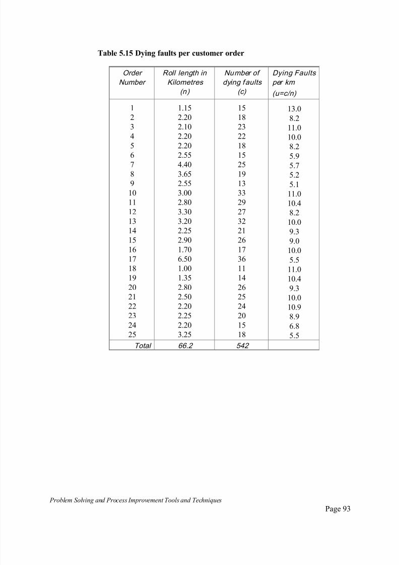
7/30/2019 Problem SolvingProcess Improvement Tools &Techniques Guide book.pdf
http://slidepdf.com/reader/full/problem-solvingprocess-improvement-tools-techniques-guide-bookpdf 93/175
Problem Solving and Process Improvement Tools and Techniques Page 93
Table 5.15 Dying faults per customer order
Order
Number
Roll length in
Kilometres
(n)
Number of
dying faults
(c)
Dying Faults
per km
(u=c/n)
1
2
3
4
5
6
7
8
9
10
11
12
13
14
15
16
17
18
19
20
2122
23
24
25
1.15
2.20
2.10
2.20
2.20
2.55
4.40
3.65
2.55
3.00
2.80
3.30
3.20
2.25
2.90
1.70
6.50
1.00
1.35
2.80
2.502.20
2.25
2.20
3.25
15
18
23
22
18
15
25
19
13
33
29
27
32
21
26
17
36
11
14
26
2524
20
15
18
13.0
8.2
11.0
10.0
8.2
5.9
5.7
5.2
5.1
11.0
10.4
8.2
10.0
9.3
9.0
10.0
5.5
11.0
10.4
9.3
10.010.9
8.9
6.8
5.5
Total 66.2 542

7/30/2019 Problem SolvingProcess Improvement Tools &Techniques Guide book.pdf
http://slidepdf.com/reader/full/problem-solvingprocess-improvement-tools-techniques-guide-bookpdf 94/175
Problem Solving and Process Improvement Tools and Techniques Page 94
1. Calculate u for each subgroup of data collected.
Calculate u for each unit or subgroup of data using the relationship:
u = c/n
where n = size of the sampling unit or subgroup. For example, the first roll is
1.15 kilometres long and the number of faults is 15. Therefore n = 1.15 and c =
15. u is calculated as:
u = c/n = 15/1.15 = 13 per kilometre.
2. Calculate the average nonconformities/unit (u).
This can be calculated as follows:
_ u = c = 542
n 66.2
= 8.2
3. Calculate the Upper and Lower Control Limits
Calculate the UCL and the LCL using the formula:
_ _
UCL = u + 3 uni
_ _
LCL = u - 3 u
ni
Note, the UCL and LCL will need to be calculated for each roll, to reflect the
changing sample size.
For example, for the first roll, the roll length is 1.15 kilometres. Therefore, UCL
and LCL will be:
UCL = 8.2 + 3 8.2
1.15
= 8.2 + 3 7.13
= 8.2 + 3 x 2.67
= 8.2 + 8.01 = 16.2
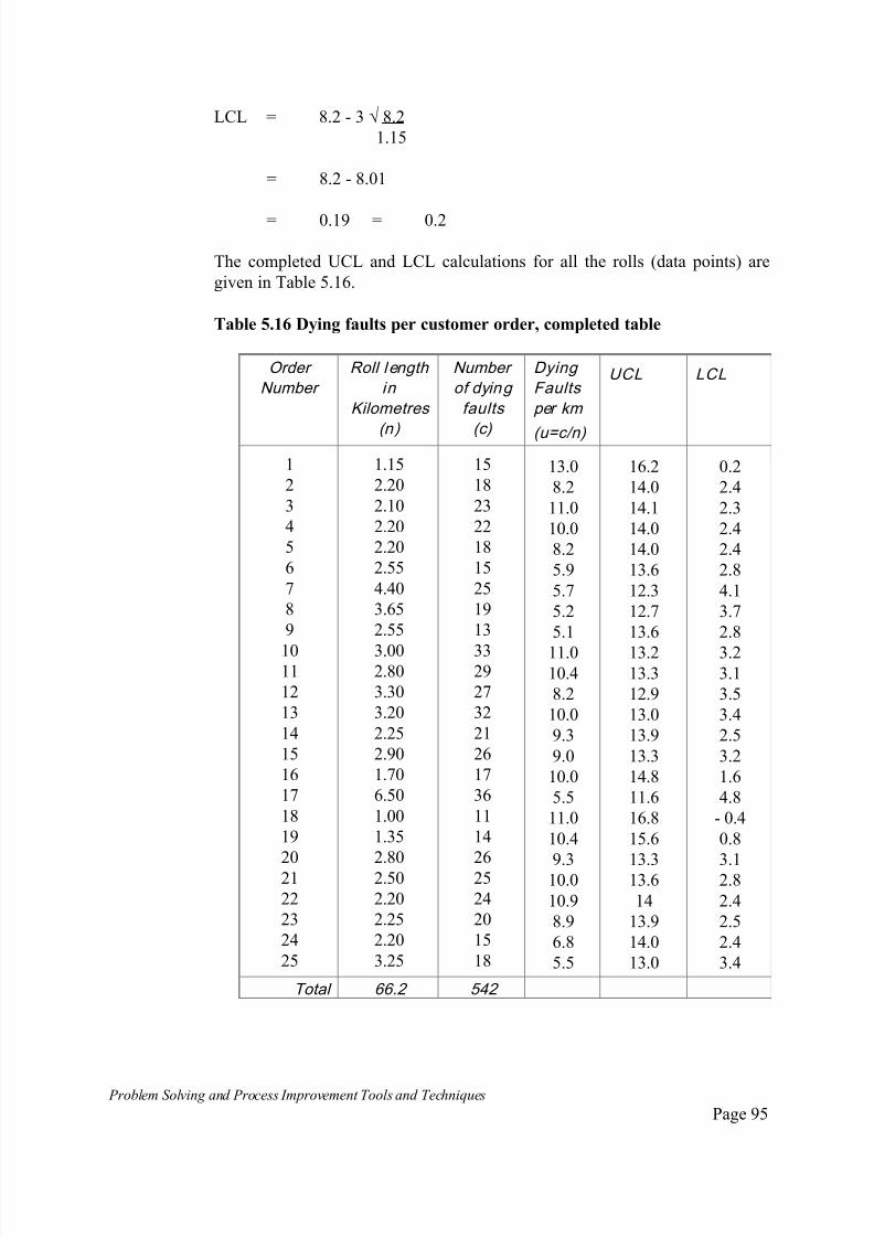
7/30/2019 Problem SolvingProcess Improvement Tools &Techniques Guide book.pdf
http://slidepdf.com/reader/full/problem-solvingprocess-improvement-tools-techniques-guide-bookpdf 95/175
Problem Solving and Process Improvement Tools and Techniques Page 95
LCL = 8.2 - 3 8.2
1.15
= 8.2 - 8.01
= 0.19 = 0.2
The completed UCL and LCL calculations for all the rolls (data points) are
given in Table 5.16.
Table 5.16 Dying faults per customer order, completed table
Order
Number
Roll length
in
Kilometres
(n)
Number
of dying
faults
(c)
Dying
Faults
per km
(u=c/n)
UCL LCL
1
2
3
4
5
6
7
8
9
1011
12
13
14
15
16
17
18
19
20
21
22
23
24
25
1.15
2.20
2.10
2.20
2.20
2.55
4.40
3.65
2.55
3.002.80
3.30
3.20
2.25
2.90
1.70
6.50
1.00
1.35
2.80
2.50
2.20
2.25
2.20
3.25
15
18
23
22
18
15
25
19
13
3329
27
32
21
26
17
36
11
14
26
25
24
20
15
18
13.0
8.2
11.0
10.0
8.2
5.9
5.7
5.2
5.1
11.010.4
8.2
10.0
9.3
9.0
10.0
5.5
11.0
10.4
9.310.0
10.9
8.9
6.8
5.5
16.2
14.0
14.1
14.0
14.0
13.6
12.3
12.7
13.6
13.213.3
12.9
13.0
13.9
13.3
14.8
11.6
16.8
15.6
13.313.6
14
13.9
14.0
13.0
0.2
2.4
2.3
2.4
2.4
2.8
4.1
3.7
2.8
3.23.1
3.5
3.4
2.5
3.2
1.6
4.8
- 0.4
0.8
3.12.8
2.4
2.5
2.4
3.4
Total 66.2 542
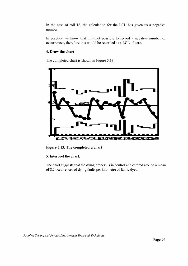
7/30/2019 Problem SolvingProcess Improvement Tools &Techniques Guide book.pdf
http://slidepdf.com/reader/full/problem-solvingprocess-improvement-tools-techniques-guide-bookpdf 96/175
Problem Solving and Process Improvement Tools and Techniques Page 96
In the case of roll 18, the calculation for the LCL has given us a negative
number.
In practice we know that it is not possible to record a negative number of
occurrences, therefore this would be recorded as a LCL of zero.
4. Draw the chart
The completed chart is shown in Figure 5.13.
12345678910111213141516171819202122232
0
5
10
15
20
u=8.2
Figure 5.13. The completed u chart
5. Interpret the chart.
The chart suggests that the dying process is in control and centred around a mean
of 8.2 occurrences of dying faults per kilometre of fabric dyed.
7/30/2019 Problem SolvingProcess Improvement Tools &Techniques Guide book.pdf
http://slidepdf.com/reader/full/problem-solvingprocess-improvement-tools-techniques-guide-bookpdf 97/175

7/30/2019 Problem SolvingProcess Improvement Tools &Techniques Guide book.pdf
http://slidepdf.com/reader/full/problem-solvingprocess-improvement-tools-techniques-guide-bookpdf 98/175
Problem Solving and Process Improvement Tools and Techniques Page 98
Trends. Any tendency of points to drift so as to give rise to a trend, is an
indication that the process may be unstable.
Periodicity. When points in a chart show a regular size and fall, the resulting
pattern is referred to as periodicity. Periodicity is an indication that something
in the process is changing in a regular pattern and therefore the process may beunstable.
Hugging the centreline. If the data tends to hug the centreline, defined as 15
or more consecutive points less than 1 standard deviation from the centreline,
an abnormality is indicated. This condition is usually as a result of data
corruption, poor or inadequate sampling.
Hugging the control limits. An abnormality is said to exist if 2 out of 3, 3 out
of 7 or 4 out of 10 consecutive points fall between 2 and 3 standard deviations.
Even if the points do not all fall on the same side of the centreline, thiscondition could be an indication that the process is unstable. The usual cause
of this type of condition is unnecessary or overadjustment of the process.
Shewharts original tests for control charts have been reproduced in Figure
5.14. In these diagrams, three zones have been defined above and below the
mean, these are:
Zone C - one standard deviation either side of the mean;
Zone B - between one and two standard deviations away from the mean,
one each side of the mean;
Zone A - between two and three standard deviations out from the mean.

7/30/2019 Problem SolvingProcess Improvement Tools &Techniques Guide book.pdf
http://slidepdf.com/reader/full/problem-solvingprocess-improvement-tools-techniques-guide-bookpdf 99/175
Problem Solving and Process Improvement Tools and Techniques Page 99
Figure 5.14 The Shewhart tests
A
B
CC
B
A
A
B
CC
B
A
A
B
CC
B
A
A
B
CC
B
A
A
B
C
C
B
A
A
B
C
C
B
A
A
B
CC
B
A
A
B
CC
B
A
Test 1. One point beyond zone A Test 2. Nine points in a row in
Zone C or beyond
Test 3. Six points in a row steadily
increasing or decreasing
Test 4. Fourteen points in a row
alternating up and down
Test 5. Two out of three point
in a row in zone A or beyond.
Test 6. Four out of five points
in a row in zone B or beyond.
Test 7. Fifteen point in a row in zone
C (above & below the centreline)
Test 8. Eight points in a row on
both sides of centreline with
none in zone C.
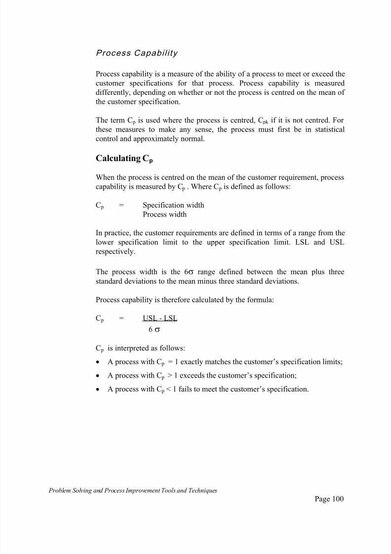
7/30/2019 Problem SolvingProcess Improvement Tools &Techniques Guide book.pdf
http://slidepdf.com/reader/full/problem-solvingprocess-improvement-tools-techniques-guide-bookpdf 100/175
Problem Solving and Process Improvement Tools and Techniques Page 100
Process Capabil i ty
Process capability is a measure of the ability of a process to meet or exceed the
customer specifications for that process. Process capability is measured
differently, depending on whether or not the process is centred on the mean of
the customer specification.
The term C p is used where the process is centred, C pk if it is not centred. For
these measures to make any sense, the process must first be in statistical
control and approximately normal.
Calculating Cp
When the process is centred on the mean of the customer requirement, process
capability is measured by C p . Where C p is defined as follows:
C p = Specification width
Process width
In practice, the customer requirements are defined in terms of a range from the
lower specification limit to the upper specification limit. LSL and USL
respectively.
The process width is the 6 range defined between the mean plus three
standard deviations to the mean minus three standard deviations.
Process capability is therefore calculated by the formula:
C p = USL - LSL
6
C p is interpreted as follows:
A process with C p = 1 exactly matches the customer’s specification limits;
A process with C p > 1 exceeds the customer’s specification;
A process with C p < 1 fails to meet the customer’s specification.

7/30/2019 Problem SolvingProcess Improvement Tools &Techniques Guide book.pdf
http://slidepdf.com/reader/full/problem-solvingprocess-improvement-tools-techniques-guide-bookpdf 101/175
Problem Solving and Process Improvement Tools and Techniques Page 101
Calculating Cpk
If a process is not centred on the mean of the customer requirement, process
capability is measured by C pk . Where C pk is defined as follows:
_ _
C pk = Minimum of (USL - X , X - LSL )
3 3
_
Where X is the mean of the process.
The C pk calculation overcomes the problem of the process not being centred by
calculating the capability for each half of the process and then taking the
minimum.
Note: the upper one sided capability index is often referred to as C pu and the
lower one sided capability index as C pl . ie. _
C pu = USL - X
3
_
C pl = X - LSL
3
7/30/2019 Problem SolvingProcess Improvement Tools &Techniques Guide book.pdf
http://slidepdf.com/reader/full/problem-solvingprocess-improvement-tools-techniques-guide-bookpdf 102/175
Problem Solving and Process Improvement Tools and Techniques Page 102
6. Extensions to the Seven Tools of Quality
This section presents a collection of tools and techniques that have all proved
useful in support of quality based problem solving and continuous
improvement activity, which are in addition to the seven basic tools of Quality.
The list of tools that have been added as extensions to the basic quality
management “toolkit” is ever growing as more of the many tools and
techniques that were previously known about or have recently been developed
are applied within a quality management framework, and in support of
continuous improvement and problem solving activities.
While by no means exhaustive, this section presents a collection of often used
tools and techniques, which we have found be useful and practical extensions
to the problem solving toolkit.
These are:
Interviews;
Questionnaires;
Dot Plots;
Box Plots;
Force Field Analysis.
7/30/2019 Problem SolvingProcess Improvement Tools &Techniques Guide book.pdf
http://slidepdf.com/reader/full/problem-solvingprocess-improvement-tools-techniques-guide-bookpdf 103/175
Problem Solving and Process Improvement Tools and Techniques Page 103
Interviews
What are interviews?
Interviews are structured conversations focused on a specific topic.
While usually more expensive than questionnaires, interviews allow longer
responses and provide the interviewer with opportunities to pursue or ignore
topics based on how the person being interviewed responds.
Interviews also provide the interviewer with the opportunity to discover about
issues that had not been previously thought of which are raised by the subject,
and which may be of importance.
Because interviews are conducted in person or over the telephone, they give
the interviewer a much better "feel" for the subject's position on the topic.
When to use Interviews
Interviews can help teams get started on the problem solving process.
Interviewing people in a department, work area or the whole organisation, will
often reveal consistent themes about what people see as being major issues or
problems. These can provide insights into areas that can be explored further
using the problem solving process and that may offer greatest opportunities for
improvement.
Interviews can also be used to probe people's attitudes and opinions in depth,
especially when there are relatively few people to survey, and/or when each
person's opinions are very important.
How to use Interviews
1. Decide on the kind of information needed . Opinions, personal
experiences, eye-witness accounts are good topics for interviews, as it may be
difficult to obtain this information by other means. Avoid using interviews to
obtain information available through other means.
2. Determine who you need to interview. Interviews are time consuming,
therefore limit the number of people interviewed to the minimum required to
find out what you want.
7/30/2019 Problem SolvingProcess Improvement Tools &Techniques Guide book.pdf
http://slidepdf.com/reader/full/problem-solvingprocess-improvement-tools-techniques-guide-bookpdf 104/175
Problem Solving and Process Improvement Tools and Techniques Page 104
3. Prepare questions in advance.
Keep questions to the minimum required to obtain the desired information
and try to keep interviews to under an hour;
Balance your interview by mixing shorter, factual, easier, closed questions
with open-ended, more thought provoking questions requiring longer answers;
Test your questions on some people before conducting the actual
interviews.
4. Prepare your interview subject ahead of time . Tell people in advance that
you will be interviewing them and give them some idea about the sorts of
things you will be asking, what the information will be used for, and how long
the session is likely to take. Most people will want you to make a formal
appointment with them.
5. Conduct the interview. When conducting the interview:
Put your subject at ease by trying to keep the session as informal and
conversational as possible;
Review the purpose of the interview and the points raised in the
preparation step above;
Ask one question at a time and don't interrupt. Don't be afraid of silences;
they can encourage people to volunteer more information. Remember, the
purpose of interviewing is to listen to what your subject has to say - it
should not be used as an excuse for you to tell people what you think;
Take notes. If you use a tape recorder, be sure to ask for permission.
A note on using tape recorders
It is usually more efficient to take notes, than to use a tape recorder. Especially
when interviews are being conducted on a one-on-one basis as opposed to
group interviews. Playing back to tapes to extract the key points which you
would normally note during an interview can often take longer than doing the
initial interviews. This significantly extends the time and effort required to
extract the same information from your subjects. This can become particularlytime consuming when there is a need to interview many people.
Even with groups, many people will often feel threatened that if they
something controversial, that the tape can be used to trace the comments back
to them as individuals. Participants will often offer less input to an interview if
it is being taped.
Finally, not using a tape recorder will assist team members develop their skills
as interviews and analysts. With time, team members will become very

7/30/2019 Problem SolvingProcess Improvement Tools &Techniques Guide book.pdf
http://slidepdf.com/reader/full/problem-solvingprocess-improvement-tools-techniques-guide-bookpdf 105/175
Problem Solving and Process Improvement Tools and Techniques Page 105
efficient at extracting information using the interview technique. Reliance on
tape recorders can often work against team members fully developing these
skills.
Ask easier questions, closed questions and factual questions earlier in the
interview; Ask more difficult open-ended questions later in the interview;
Take opportunities during the interview to summarise and recap what your
subject is saying;
Allow for opportunities for the subject to raise and explore issues you may
not have anticipated, this may give you additional insights;
At the end of the interview, thank your subject for participating;
After formally closing the interview, stay alert for any final remarks your
subject may make. After the pressure is off, people often volunteer some of
their most interesting observations and remarks.
6. As soon as possible after the interview, review your notes. Review your
interview note, summarise the key points and any impressions you may have
formed during the interview.
7. Assemble and analyse your responses. Depending on the purpose of the
interview, you could tabulate responses for each question, sum up general
reactions or identify recurring themes and issues.
7/30/2019 Problem SolvingProcess Improvement Tools &Techniques Guide book.pdf
http://slidepdf.com/reader/full/problem-solvingprocess-improvement-tools-techniques-guide-bookpdf 106/175
Problem Solving and Process Improvement Tools and Techniques Page 106
Quest ionnaires
What is a Questionnaire ?A questionnaire is a predetermined and structured proforma used to collect
information about people's attitudes and opinions on specific issues or onspecific dimensions of a problem or issue.
Questionnaires may be completed in writing, verbally in person, or over the
telephone.
When to use QuestionnairesQuestionnaires can be used in any situations where you wish to collect
attitudes and opinions about specific issues or problems, or where you wish to
gauge people’s opinions and attitudes about some specific characteristics or
dimensions of a problem or issues.
Such cases lend themselves to pre-analysis and structuring. The team members
can determine what issues? dimensions? characteristics? etc about which they
seek opinions and attitudes. These can then be worked into a structured
proforma questionnaire, on which subjects provided specific responses to
specific questions.
How to use a Questionnaire
1. Determine what it is you need peoples’ opinions on. Determine the
specific issues, problems, problem characteristics or dimensions you wish to
gauge peoples’ opinions on.
2. Determine the who you need to survey. Determine which group or groups
of people you need to survey. Do you need to survey customers, employees or
only specific groups of employees eg. certain departments, certain shifts,
certain sites. Do you need to compare the responses from different groups? or
will different groups receive different questionnaires.
3. Prepare your questions. Use the following as guidelines to developing
your questionnaire structure:
Use open-ended questions when you're not certain of the nature of the
response, when you need people's actual words or when you are looking
for anecdotes or examples.
Use close-ended questions when you want to focus responses on specific
areas or issues. True-False and multiple choice answers are examples of
this.

7/30/2019 Problem SolvingProcess Improvement Tools &Techniques Guide book.pdf
http://slidepdf.com/reader/full/problem-solvingprocess-improvement-tools-techniques-guide-bookpdf 107/175
Problem Solving and Process Improvement Tools and Techniques Page 107
Use a rating scale when you want to understand level of feeling. A
commonly used format is to presented each question as a statement and the
subject is asked to rate their level of agreement or disagreement with the
statement.
For example:
I think the existing computer system response is too slow
1:strongly agree 2:agree 3: neutral 4: disagree 5: strongly agree
Use neutral language. Do not pre-empt a “desired” response or any “bias”
through your wording.
4. Prepare your questionnaire. Some hints to assist your team in designing
their questionnaires.
Keep the number of questions to a minimum. When faced with lengthy
questionnaires, many people ignore it completely, answer without much
thought, or give more negative responses than they otherwise would because
they are annoyed at having to answer such a long questionnaire - which is not
indicative of how they really feel about the issues being probed by the
questionnaire.
If your questionnaire has a large number of questions, test it on a small group
first. Responses many indicate many of your questions to be non-issues. These
may be removed from your final questionnaire. Alternately, break up your questionnaire into several smaller questionnaires.
Test your questionnaire first and revise any questions that are confusing or
don't provide the required information.
5. Conduct the Survey When conducting the survey, using the questionnaire:
If surveying a sample, ensure that it is a random sample. When surveying
people from different groups, ensure the sample is representative of the
numbers of people in the different groups.
If possible, allow the responses to be anonymous for the individuals who
complete the questionnaire - people will tend to be more honest with their
answers;
If you are surveying different groups of people, ensure you have allowed
for some system of identifying which group a questionnaire came from
with out breaching confidentiality.

7/30/2019 Problem SolvingProcess Improvement Tools &Techniques Guide book.pdf
http://slidepdf.com/reader/full/problem-solvingprocess-improvement-tools-techniques-guide-bookpdf 108/175
Problem Solving and Process Improvement Tools and Techniques Page 108
6. Analyse the results.
Consolidate the responses to the categories established during the
questionnaire designed stage.
File the completed questionnaires is case this information is required for futurereference.

7/30/2019 Problem SolvingProcess Improvement Tools &Techniques Guide book.pdf
http://slidepdf.com/reader/full/problem-solvingprocess-improvement-tools-techniques-guide-bookpdf 109/175
Problem Solving and Process Improvement Tools and Techniques Page 109
Dot Plots
What are Dot Plots?
A dot plot is a pictorial way of displaying data. It is a plot of data points abovea measurement scale with each point representing a single data point.
When to use Dot Plots
Use dot plots to get a quick idea as to the shape of the data you have collected.
A glance at a dot plot will give you a good idea as to the shape, the range and
spread, highlight any skewness, unusual or extreme points. This will often
assist in deciding whether further analysis is worthwhile and what type of
further analysis represents the logical next step.
It allows easier interpretation than looking at a list of numbers.
How to Construct a Dot Plot
1. Determine what it is you need to investigate and collect your data.
Example: Bank staff have complained to management that existing account
withdrawal slips are too complicated. This results in frequent customer errors
when filling out the form, errors which must be corrected by teller staff before
the transaction can be processed. The time taken to make the correction is perceived as contributing to a decreasing level of customer service, forcing
customers to wait while the corrections are made.
Bank staff at one branch have decided to investigate this problem, by
recording how many incorrectly filled withdrawal slips requiring teller staff
correction are presented over a period of 30 working days. The results are as
follows.
9 9 10 14 14 13 7 12 9 10
8 13 8 9 8 11 11 8 8 13
15 16 10 7 6 10 10 15 5 12

7/30/2019 Problem SolvingProcess Improvement Tools &Techniques Guide book.pdf
http://slidepdf.com/reader/full/problem-solvingprocess-improvement-tools-techniques-guide-bookpdf 110/175
Problem Solving and Process Improvement Tools and Techniques Page 110
2. Lay out a horizontal scale. Make sure the scale spans a large enough range
to cover the range of the data.
From examination of the above data, we can see that the largest number in the
data is 16 and the smallest is 5. Therefore, a scale from 1 to 20 will more than
cover the required range. This is illustrated in Figure 6.1.a.
1234
Figure 6.1.a Layout of a Dot Plot Scale
3. Draw a dot over the number on your line corresponding to each value in
your data for occurrence of that value. A partially completed dot plot for the
above data is given in Figure 6.1.b.
123456
Figure 6.1.b. A partially completed Dot plot
Where a number is repeated several times in the data, the convention is to pile
dots vertically on top of one another.
For example, the number 10 occurs 5 times, the dot plot shows 5 dots over the
value 10. Figure 6.1.c. shows the completed dot plot.
123456789101112131
Figure 6.1.c. A completed Dot plot

7/30/2019 Problem SolvingProcess Improvement Tools &Techniques Guide book.pdf
http://slidepdf.com/reader/full/problem-solvingprocess-improvement-tools-techniques-guide-bookpdf 111/175
Problem Solving and Process Improvement Tools and Techniques Page 111
Box Plots
What are Box Plots ?
A boxplot is a graphical way of displaying information about the spread andlocation of data.
A boxplot focuses attention on certain features of the data without having to
plot all the values. In particular, box plots are good at highlighting extreme
points which are not typical of the rest of the sample and skewness in the data.
Box plots provide a quick way of assessing data for which the team may be
considering developing a control chart.
When to use Box Plots
Box plots can be used in the same types of situations where you would use a
histogram or dot plot, to establish the location and spread of data.
At the other end of the analytical scale, box plots may be used as an alternative
to a control chart for one-off analytical exercises.
One of the main advantages of box plots, are that we do not have to plot each
individual data point. If we can come to some conclusion will a box plot,
further and lengthier analysis will not be necessary.
The other main advantage of a box plot, is that is can be used to determine
whether or not there is a difference between two sets of data. This makes them
extremely useful in situations where we seek to compare two or more sets of
data. More so than histograms, dot plots and control charts - where apparent
trends may be due to sampling errors or not statistically significant to indicate
a real difference.
Examples of this would include situations where we wish to establish whether
data from to different sources are the same for the purpose of further analysis,
or situations where we have implemented some improvements and we wish to
establish whether the changes have made a difference or not by comparing before and after performance.

7/30/2019 Problem SolvingProcess Improvement Tools &Techniques Guide book.pdf
http://slidepdf.com/reader/full/problem-solvingprocess-improvement-tools-techniques-guide-bookpdf 112/175
Problem Solving and Process Improvement Tools and Techniques Page 112
How to construct a Box Plot
Unlike histograms and dot plots, box plots required us to have an
understanding of some common terms and concepts associated with analysing
and characterising data.
In particular, we will need to know how to calculate:
The median
The mean
The lower quartile
The upper quartile
These terms and others associated with analysing and characterising data are
presented and discussed in Appendix 1: "Understanding Variation and Data".Refer to this Appendix if you need a refresher on these concepts.
1. Define the problem to be investigated
Example: A bank decides to investigate customer queue waiting times.
2. Collect data. The average waiting times for a random sample of customers
joining a queue in front of a teller position are collected at five randomly
selected times during the day, for a week. The average waiting time is calculated
at each point.
The data is given in Table 6.1.
Table 6.1 Customer Queuing Times in Minutes (Averages of samples taken
5 times per day)
Mon Tues Wed Thur s Fri
Sample 1 6 1 2 12 4
Sample 2 4 10 6 8 9
Sample 3 5 2 9 7 4
Sample 4 12 7 5 4 8Sample 5 5 3 8 3 5
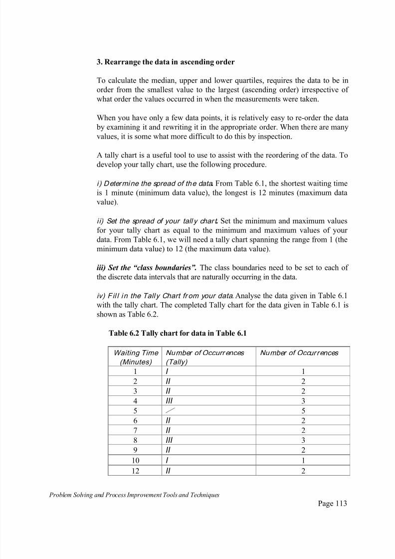
7/30/2019 Problem SolvingProcess Improvement Tools &Techniques Guide book.pdf
http://slidepdf.com/reader/full/problem-solvingprocess-improvement-tools-techniques-guide-bookpdf 113/175
Problem Solving and Process Improvement Tools and Techniques Page 113
3. Rearrange the data in ascending order
To calculate the median, upper and lower quartiles, requires the data to be in
order from the smallest value to the largest (ascending order) irrespective of
what order the values occurred in when the measurements were taken.
When you have only a few data points, it is relatively easy to re-order the data
by examining it and rewriting it in the appropriate order. When there are many
values, it is some what more difficult to do this by inspection.
A tally chart is a useful tool to use to assist with the reordering of the data. To
develop your tally chart, use the following procedure.
i ) Determine the spread of the data . From Table 6.1, the shortest waiting time
is 1 minute (minimum data value), the longest is 12 minutes (maximum datavalue).
i i) Set the spread of your tall y char t . Set the minimum and maximum values
for your tally chart as equal to the minimum and maximum values of your
data. From Table 6.1, we will need a tally chart spanning the range from 1 (the
minimum data value) to 12 (the maximum data value).
iii) Set the “class boundaries”. The class boundaries need to be set to each of
the discrete data intervals that are naturally occurring in the data.
iv) Fil l in the Tally Chart fr om your data.Analyse the data given in Table 6.1with the tally chart. The completed Tally chart for the data given in Table 6.1 is
shown as Table 6.2.
Table 6.2 Tally chart for data in Table 6.1
Waiting Time
(Minutes)
Number of Occurr ences
(Tally)
Number of Occur rences
1 I 1
2 II 2
3 II 24 III 3
5 5
6 II 2
7 II 2
8 III 3
9 II 2
10 I 1
12 II 2

7/30/2019 Problem SolvingProcess Improvement Tools &Techniques Guide book.pdf
http://slidepdf.com/reader/full/problem-solvingprocess-improvement-tools-techniques-guide-bookpdf 114/175
Problem Solving and Process Improvement Tools and Techniques Page 114
Total 25
The table tells us how many times each measured value occurred in the
collected data. Using this information we can rewrite the data collected in
ascending order, as is shown in Table 6.3.
This table shows that we have 25 data points, the lowest being 1 and thehighest being 12.
With reference to the tally chart (Table 6.2), we note that the value 5 minutes
was recorded on 5 occasions during the week. This is shown in Table 6.3 as a
block of 5 consecutive 5’s. Similarly, the tally chart shows that the value 8
minutes was observed on three occasions. This appears on Table 6.3 as a block
of three 8’s.
Table 6.3. Table 6.1 data, reordered in ascending order
Position Measured Value
1 1
2 2
3 2
4 3
5 3
6 4
7 4 Lower quartile (middle of the lower half)
8 4
9 5
10 5
11 5
12 5
13 5 Median (the middle value)
14 6
15 6
16 7
17 7
18 8
19 8 Upper quartile (middle of upper half)
20 821 9
22 9
23 10
24
25
12
12

7/30/2019 Problem SolvingProcess Improvement Tools &Techniques Guide book.pdf
http://slidepdf.com/reader/full/problem-solvingprocess-improvement-tools-techniques-guide-bookpdf 115/175
Problem Solving and Process Improvement Tools and Techniques Page 115
4. Calculate the value required to draw the Box Plot.
The key values we need to calculate in order to draw a box plot are the:
Median;
Upper Quartile;
Lower Quartile;
Interquartile Range;
Mean.
The mean, upper and lower quartiles can be determined from Table 6.3 by
observations.
i) Determine the Median
The median is the middle value in the data. We have 25 data values, the middle
value occupies the 13th position. ie. it has 12 values either side of it. The 13th
data point, the median value is 5 minutes.
ii ) Determine the Lower Quartile
The lower quarti le is the middle value of the lower half of the data .
The usual convention is to include the overall median as the upper limit of the
bottom half of the data.
The middle value of the lower half of the data is the 7th value. ie. It has 6 data
points below it, 1 to 6 and 6 data points above it, 8 to 13. The data value
corresponding to the 7th point is 4 minutes.
Therefore, the lower quarti le is 4 minutes.
ii i) Determine the Upper Quar tile
The upper quarti le is the middle value of the upper half of the data .
The usual convention is to include the overall median as the lower limit of the
upper half of the data. From Table 6.3. we can see that the middle value of the
top half of the data is the 19th data point which corresponds to the value of 8
minutes.
Therefore, the upper quarti le is 8 minutes.
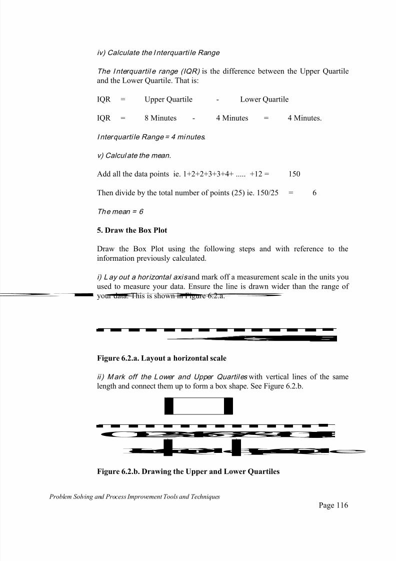
7/30/2019 Problem SolvingProcess Improvement Tools &Techniques Guide book.pdf
http://slidepdf.com/reader/full/problem-solvingprocess-improvement-tools-techniques-guide-bookpdf 116/175
Problem Solving and Process Improvement Tools and Techniques Page 116
iv) Calculate the I nterquarti le Range
The I nterquartil e range (IQR) is the difference between the Upper Quartile
and the Lower Quartile. That is:
IQR = Upper Quartile - Lower Quartile
IQR = 8 Minutes - 4 Minutes = 4 Minutes.
I nterquarti le Range = 4 minutes.
v) Calcul ate the mean.
Add all the data points ie. 1+2+2+3+3+4+ ..... +12 = 150
Then divide by the total number of points (25) ie. 150/25 = 6
The mean = 6
5. Draw the Box Plot
Draw the Box Plot using the following steps and with reference to the
information previously calculated.
i) L ay out a hor izontal axis and mark off a measurement scale in the units you
used to measure your data. Ensure the line is drawn wider than the range of
your data. This is shown in Figure 6.2.a.
01235
Figure 6.2.a. Layout a horizontal scale
ii ) Mark off the Lower and Upper Quartiles with vertical lines of the same
length and connect them up to form a box shape. See Figure 6.2.b.
LowerQuartileUpperQuartile01234567891011
Figure 6.2.b. Drawing the Upper and Lower Quartiles
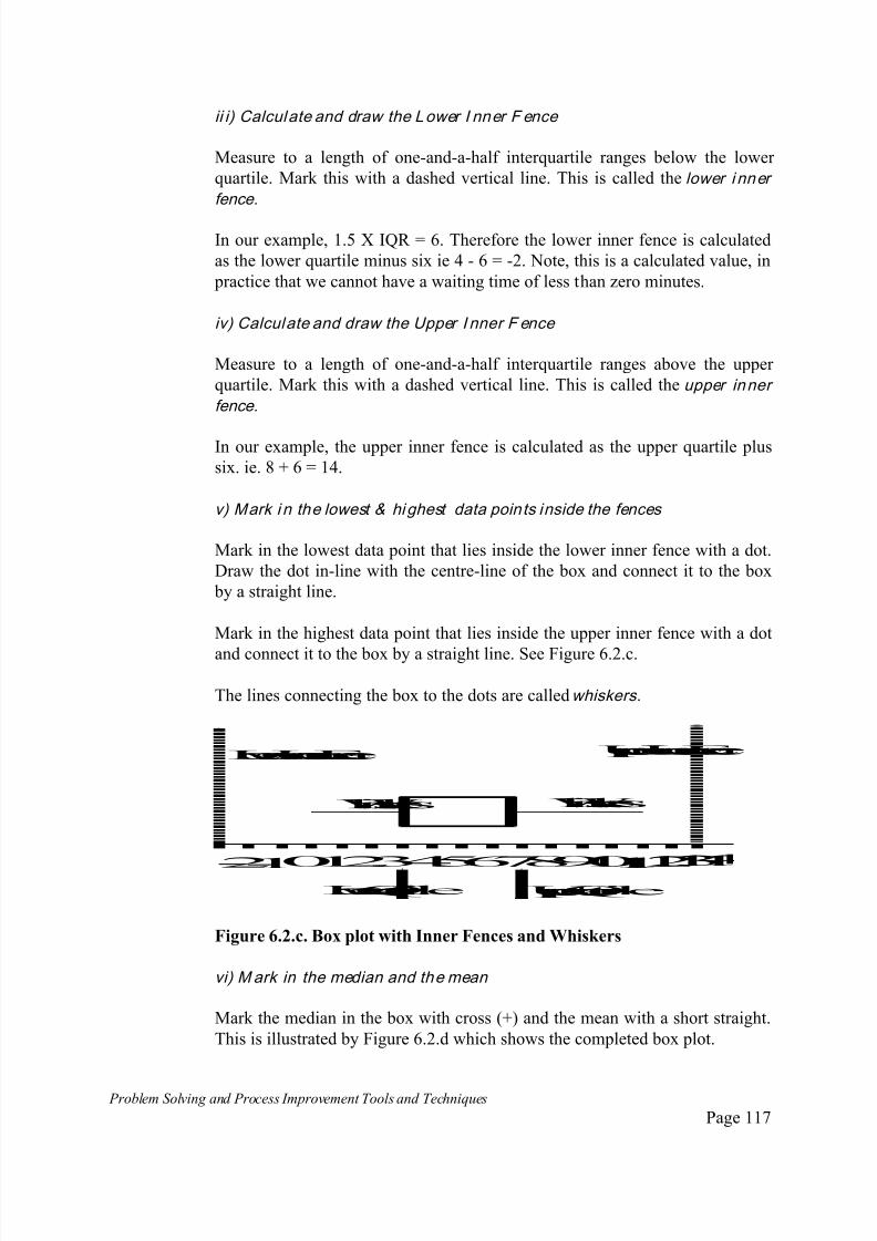
7/30/2019 Problem SolvingProcess Improvement Tools &Techniques Guide book.pdf
http://slidepdf.com/reader/full/problem-solvingprocess-improvement-tools-techniques-guide-bookpdf 117/175
Problem Solving and Process Improvement Tools and Techniques Page 117
ii i) Calculate and draw the Lower I nner F ence
Measure to a length of one-and-a-half interquartile ranges below the lower
quartile. Mark this with a dashed vertical line. This is called the lower i nner
fence.
In our example, 1.5 X IQR = 6. Therefore the lower inner fence is calculated
as the lower quartile minus six ie 4 - 6 = -2. Note, this is a calculated value, in
practice that we cannot have a waiting time of less than zero minutes.
iv) Calculate and draw the Upper I nner F ence
Measure to a length of one-and-a-half interquartile ranges above the upper
quartile. Mark this with a dashed vertical line. This is called the upper inner
fence.
In our example, the upper inner fence is calculated as the upper quartile plus
six. ie. 8 + 6 = 14.
v) Mark i n the lowest & highest data points inside the fences
Mark in the lowest data point that lies inside the lower inner fence with a dot.
Draw the dot in-line with the centre-line of the box and connect it to the box
by a straight line.
Mark in the highest data point that lies inside the upper inner fence with a dot
and connect it to the box by a straight line. See Figure 6.2.c.
The lines connecting the box to the dots are called whiskers.
LowerQuartile UpperQuartile
012345678910111213-2
-11
LowerInnerFence UpperInnerFence
Whiskers Whiskers
Figure 6.2.c. Box plot with Inner Fences and Whiskers
vi) Mark in the median and the mean
Mark the median in the box with cross (+) and the mean with a short straight.
This is illustrated by Figure 6.2.d which shows the completed box plot.

7/30/2019 Problem SolvingProcess Improvement Tools &Techniques Guide book.pdf
http://slidepdf.com/reader/full/problem-solvingprocess-improvement-tools-techniques-guide-bookpdf 118/175
Problem Solving and Process Improvement Tools and Techniques Page 118
LowerQuartile UpperQuartile
012345678910111213-2-1 14
LowerInnerFence UpperInner Fence
Whiskers Whiskers
Median
Mean
Figure 6.2.d. The completed Box Plot
vii) Mark in any outliers.
If data point occur which lie outside the inner fences, mark these with an asterisk
*. Suppose one of our measurements was 16 minutes. This would be plotted as
shown in Figure 6.2.e.
Data points lying outside the inner fences are called outliers.
LowerQuartile UpperQuartile
012345678910111213-2-1 14
LowerInnerFence UpperInner Fence
Whiskers Whiskers
Median
Mean
15
tl
Figure 6.2.e. Box Plot showing an Outlier
7/30/2019 Problem SolvingProcess Improvement Tools &Techniques Guide book.pdf
http://slidepdf.com/reader/full/problem-solvingprocess-improvement-tools-techniques-guide-bookpdf 119/175
Problem Solving and Process Improvement Tools and Techniques Page 119
Interpreting a Box Plot
The following points provide some guidance to interpreting a box plot.
The inner fences provide a measure of the likely spread of other samples taken
from the same population.
If the data is normally distributed, 99.3 % of the data will lie within the inner
fences. 99.9% of the data will lie within three interquartile ranges of the
quartiles. This measure is referred to as the outer fences .
If the data is normally distributed,
the median will be in the centre of the box;
the mean will be the same as the median;
the whiskers will be of even length;
The degree to which the median is off-centre gives a good indication as to the
degree to which the data is skewed on non-normal. Similarly, whiskers of
uneven length are also an indication that data is skewed.
Points outside the inner fences or "outliers" are unusual and should be
investigated to determine their cause. They indicate that some change,
aberration or unusual event has caused this particular point to be very different
from the usual performance of the process we are measuring. To fairly assess
the performance of the process, outliers should be excluded as they wouldotherwise excessively skew the data.
In summary, a box plot will show at a glance:
The range of the data
The medians and quartiles
The interquartile range
Whether or not data is skewed (a median that is off-centre or whiskers of
uneven length)
Outliers
Whether there is a difference between groups of data.
Using Box Plots to compare groups of data
Box plots can be used to test whether there is a real difference between two
groups of data, or whether apparent differences are due to random variations in
the process.

7/30/2019 Problem SolvingProcess Improvement Tools &Techniques Guide book.pdf
http://slidepdf.com/reader/full/problem-solvingprocess-improvement-tools-techniques-guide-bookpdf 120/175
Problem Solving and Process Improvement Tools and Techniques Page 120
For example, a company monitoring customer satisfaction can use a box plot
to determine whether a recent improvements in satisfaction levels is due to a
genuine improvement in customer satisfaction or simply due to the fact that
the group sampled was biased towards "happy" customers and as such did not
represent a "fair" sample. ie. this is usually referred to a sampling error .
In the bank queuing time example previously considered, suppose the bank
staff implemented some changes aimed at reducing waiting time. A second
group of data could be collected after the changes. By drawing a box plot for
the second group (after) data on the same graph as the first box plot we, can
assess whether or not the changes did actually reduce waiting time.
Figure 6.2.f. shows the second group of data collected after the changes,
plotted with the original box plot and illustrates graphically the value of box
plots for comparing groups of data.
012345678910111213-2-1 1415
Nooverlapindicatesa"real"differencebetween
twosetsofdata
Original Data
Afterthechanges
Figure 6.2.f. Using Box Plots to compare two groups of data
If the boxes do not overlap, as is the case in Figure 6.2.f, then we can say that
there is a real difference between the two groups.
If the boxes overlap to any degree, then any apparent change in the data is due to
sampling errors and not due to any fundamental changes or differences in the
processes which the data is measuring.

7/30/2019 Problem SolvingProcess Improvement Tools &Techniques Guide book.pdf
http://slidepdf.com/reader/full/problem-solvingprocess-improvement-tools-techniques-guide-bookpdf 121/175
Problem Solving and Process Improvement Tools and Techniques Page 121
Force Field Analysis
What is Force Field Analysis?
Force field analysis is a graphic technique that allows a team to display theforces acting for and against the successful implementation of any proposed
change or countermeasure. Also known as a “barriers and aids” analysis.
When to use a Force Field Analysis?
Force field analysis is most useful when formulating an implementation
strategy to ensure the team have comprehensively addressed all of the key
issues.
Force field analysis is particularly good at identifying and highlighting both
problem areas and likely areas of resistance as well as key points of leveragewhich can be exploited by the team to overcome resistance and other
implementation problems.
How to do a Force Field Analysis
1. Decide on and describe the goal or change to be analysed.
Decide on and describe the goal or change to be analysed. Write this on a sheet
of paper or white board and draw a box around it.
Draw a line across the page starting at the box to act as the dividing line
between positive and negative forces. This is illustrated in Figure 6.3.a.
Improve
delivery
performance
Figure 6.3.a. Starting layout for force field analysis.
2. Brainstorm and list all of the positive factors.
Brainstorm and list all of the factors which will support the achievement of the
goal or implementation of the change. Record these on the force field analysis
diagram with arrow pointing toward the horizontal line.
This is illustrated in Figure 6.3.b.
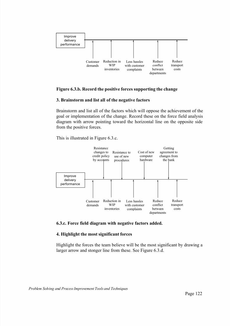
7/30/2019 Problem SolvingProcess Improvement Tools &Techniques Guide book.pdf
http://slidepdf.com/reader/full/problem-solvingprocess-improvement-tools-techniques-guide-bookpdf 122/175
Problem Solving and Process Improvement Tools and Techniques Page 122
Improve
delivery
performance
Customer demands
Reduction inWIP
inventories
Less hassleswith customer
complaints
Reduceconflict
betweendepartments
Reducetransport
costs
Figure 6.3.b. Record the positive forces supporting the change
3. Brainstorm and list all of the negative factors
Brainstorm and list all of the factors which will oppose the achievement of the
goal or implementation of the change. Record these on the force field analysis
diagram with arrow pointing toward the horizontal line on the opposite side
from the positive forces.
This is illustrated in Figure 6.3.c.
Improve
delivery
performance
Customer demands
Reduction inWIP
inventories
Less hassleswith customer
complaints
Reduceconflict
betweendepartments
Reducetransport
costs
Resistance touse of new
procedures
Cost of newcomputer hardware
Gettingagreement tochanges from
the bank
Resistancechanges to
credit policy by accounts
6.3.c. Force field diagram with negative factors added.
4. Highlight the most significant forces
Highlight the forces the team believe will be the most significant by drawing a
larger arrow and stonger line from these. See Figure 6.3.d.

7/30/2019 Problem SolvingProcess Improvement Tools &Techniques Guide book.pdf
http://slidepdf.com/reader/full/problem-solvingprocess-improvement-tools-techniques-guide-bookpdf 123/175
Problem Solving and Process Improvement Tools and Techniques Page 123
Improvedelivery
performance
Customer demands
Reduction inWIP
inventories
Less hassleswith customer
complaints
Reduceconflict
betweendepartments
Reducetransport
costs
Resistance touse of new
procedures
Cost of newcomputer hardware
Gettingagreement tochanges from
the bank
Resistancechanges to
credit policy by accounts
6.3.d. The completed force field analysis.
5. Assess the results
Assess the results of the force field analysis and modify your implementation
strategy to take into account the new information.

7/30/2019 Problem SolvingProcess Improvement Tools &Techniques Guide book.pdf
http://slidepdf.com/reader/full/problem-solvingprocess-improvement-tools-techniques-guide-bookpdf 124/175
Problem Solving and Process Improvement Tools and Techniques Page 124
7. The Seven Quality Management and Planning
Tools
The seven quality management and planning tools were identified during the
early 1970’s by the Japanese Society of Quality Control and TechniqueDevelopment, as part of a deliberate initiative aimed at identifying and
evaluating management control techniques which had been proven to be the
most effective.
They identified seven new management techniques. These are:
The affinity diagram;
Interrelationship diagram;
Systematic diagram;
Matrix Diagram/Decision Matrix;
Prioritisation Matrix;
Process decision program chart;
Activity network diagram;
In contrast to the seven basic quality tools, which are predominantly
quantitative in nature, based on the use of “hard” data and applied at the
shopfloor level, the seven quality management and planning tools are aimed at
problems that are predominantly qualitative.
They are mainly used by the middle and upper management levels to help
identify problems, recommend and establish plans for corrective action.
The relationship between the different tools when they are used as part of an
integrated approach to address some management issue or problem is illustrated
in Figure 7.1.
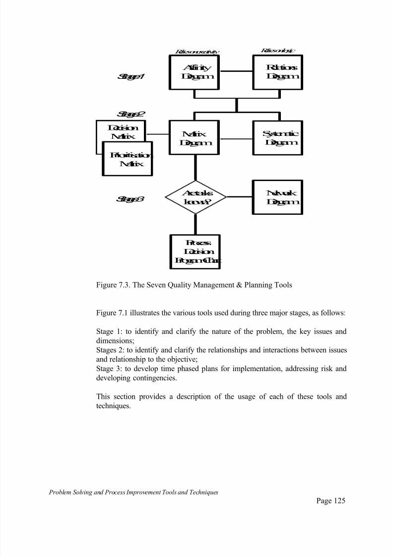
7/30/2019 Problem SolvingProcess Improvement Tools &Techniques Guide book.pdf
http://slidepdf.com/reader/full/problem-solvingprocess-improvement-tools-techniques-guide-bookpdf 125/175
Problem Solving and Process Improvement Tools and Techniques Page 125
Relations
Diagram
Affinity
Diagram
Systematic
DiagramMatrix
Diagram
Decision
Matrix
Prioritisation
Matrix
Aretasksknown?
Network Diagram
Process
Decision
ProgramChart
Reliesoncreativity Reliesonlogic
Stage 1
Stage 2
Stage 3
Figure 7.3. The Seven Quality Management & Planning Tools
Figure 7.1 illustrates the various tools used during three major stages, as follows:
Stage 1: to identify and clarify the nature of the problem, the key issues and
dimensions;
Stages 2: to identify and clarify the relationships and interactions between issues
and relationship to the objective;
Stage 3: to develop time phased plans for implementation, addressing risk and
developing contingencies.
This section provides a description of the usage of each of these tools and
techniques.
7/30/2019 Problem SolvingProcess Improvement Tools &Techniques Guide book.pdf
http://slidepdf.com/reader/full/problem-solvingprocess-improvement-tools-techniques-guide-bookpdf 126/175
Problem Solving and Process Improvement Tools and Techniques Page 126
The Aff ini ty Diagram
What is an Affinity Diagram?
The affinity diagram is a means of collecting a large amount of verbal data andorganising it into natural clusters.
The clusters will ideally represent the intrinsic structure of the problem being
investigated. The process of creating an affinity diagram promotes the
generation, organisation and consolidation of information about a problem or
other complex issue. The process of developing affinity diagrams is also
known as the KJ method (its Japanese name), after its developer Mr Jiro
Kawakita, a Japanese anthropologist.
When do you use an Affinity Diagram?
The strength of the affinity diagram is in the way it can help with unravelling
and understanding complex problems and issues. It is useful for collecting and
consolidating team member’s thoughts on unknown or unexplored areas.
In particular, the affinity diagram is best used when dealing with problems and
issues that:
are complex in nature and difficult to “get your mind around”;
are disorganised or chaotic;
have resisted attempts to resolve them using other approaches eg. the seven basic tools and problem solving process;
require a large number of ideas and inputs, all of which must be organised;
require a degree of creativity if they are going to be solved;
required team efforts.
How do you use an Affinity Diagram?
Identify the problem or issue to be addressed.
Consider an organisation which has had ongoing problems meeting delivery
targets on customer orders .
Significant internal conflict has arisen as managers and staff in the various
departments involved in the order fulfilment process try to assign blame for
the delays to each other’s department.

7/30/2019 Problem SolvingProcess Improvement Tools &Techniques Guide book.pdf
http://slidepdf.com/reader/full/problem-solvingprocess-improvement-tools-techniques-guide-bookpdf 127/175
Problem Solving and Process Improvement Tools and Techniques Page 127
The organisation has decided to examine the order fulfilment process to
identify and resolve the problems that affect the organisation’s delivery
performance.
Nominate a team leader or facilitator to lead the session. Developing an
affinity diagram requires strong facilitation. The team should nominate a teammember or if necessary, invite some one external to the team who has a good
command of the affinity diagram development process to lead the session(s).
Develop a problem or issues statement. Prepare a formal problem or issue
statement, to focus the attention of the team - this is often best done by stating
the problem or issue in the form of a question eg. “how do we accelerate our
product development cycle?” or “what are the issues associated with
implementing this new technology?”
In our case, “What are the problems that impact on customer delivery performance.”
Individual and Team Brainstorming.
The brainstorming phase can be progressed as a group brainstorming session,
as individual brainstorming or as a combination of both. The key part is that as
each idea is thought of or verbalised, it is written on a small piece of paper or
card. (Post-it notes are particularly good for this).
One approach is to have each person brainstorm individually and list their
ideas on a sheet of paper.
When this is done, the session leader has every one offer one idea . This idea is
written on a piece of paper or card (one idea per card) and the card is placed on
the table. This process continues until everyone has exhausted their ideas.
The same rules that apply to brainstorming are applied. Any ideas that are
thought of as this process progresses are written down on cards and added to
the pile.

7/30/2019 Problem SolvingProcess Improvement Tools &Techniques Guide book.pdf
http://slidepdf.com/reader/full/problem-solvingprocess-improvement-tools-techniques-guide-bookpdf 128/175
Problem Solving and Process Improvement Tools and Techniques Page 128
NoInstallationManual inBox
NoInstallationManual inBox
Credit checktakestoolong
Notransportorganised
Bickeringbetweendepartments
Order heldupininternal mail
Not clear whatcustomer wants
Deliveryaddresswrong
NoInstallationManual inBoxNoInstallation
Manual inBoxCredit checktakestoolong
Notransportorganised
Bickeringbetweendepartments
Order heldupiinternal mail
NoInstallationManual inBox
NoInstallationManual inBox
Credit checktakes
toolong
Notransport
organisedBickeringbetweendepartments
Order heldupiinternal mail
Not clear whatcustomer wants
Deliveryaddresswrong
NoInstallationManual inBox
NoInstallationManual inBox
Credit checktakestoolong
Notransportorganised
Order helduiinternalil
Not clear what
customer wants
Techniciansbusyonother work
Official order incorrect
Consolidate cards into like piles. Spread all the cards out on a table. Everyindividual in the group then participates in arranging the cards into similar or
related groups ie. cards that have an “affinity” to each other.
Some guidelines to conducting this exercise include:
While grouping the cards into like piles, there should be no talking
between members;
Cards can be moved between piles by different team members as many
times as required until every one is happy with the arrangement;
Cards that do not seem to fit in any one pile can be grouped into a“miscellaneous” pile.
The exercise is finished when team members are no longer moving cards
between piles.
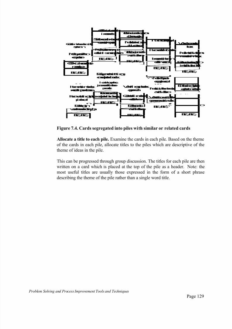
7/30/2019 Problem SolvingProcess Improvement Tools &Techniques Guide book.pdf
http://slidepdf.com/reader/full/problem-solvingprocess-improvement-tools-techniques-guide-bookpdf 129/175
Problem Solving and Process Improvement Tools and Techniques Page 129
Order ininternal mailsystem
Not typedinto
computer
Official order notmadeup
Etc., Etc.,
Official order incorrect
Stockcodeincirrect,cannot input
Newcustomer, nodetailsoncomputer
Etc., Etc.,
Techniciansbusyonother work
Notechnicianallocated
Techniciannotavailable
Etc., Etc.,
Itemdamaged
Itemdoesn't work
Incorrect itemdelivered
Etc., Etc.,
Itemnot instock,needtopurchase
Itemwaitingtobepicked
Backloginwarehousetoohigh
Etc., Etc.,
Equipment sittingondespatchdock
loadingdocks jammedwithother
product
Turnaroundindespatchtoolong
Etc., Etc.,
Waitingonbankapproval
Cannot findcreditdetails
Banker notavailable
Etc., Etc.,
Notransportorganised
Nosuitabletruckavailable
Wait for availablespaceonnext truck
Etc., Etc.,
Wrongmanual ibox
Noinstallation
manual inbox
Partsmissingfroinstallationkit
Etc., Etc.,
Bickeringbeteedepartments
Nobodyhelpsouththereisaproble
Nocommunicatioonpriorities
Etc., Etc.,
Figure 7.4. Cards segregated into piles with similar or related cards
Allocate a title to each pile. Examine the cards in each pile. Based on the theme
of the cards in each pile, allocate titles to the piles which are descriptive of the
theme of ideas in the pile.
This can be progressed through group discussion. The titles for each pile are then
written on a card which is placed at the top of the pile as a header. Note: the
most useful titles are usually those expressed in the form of a short phrasedescribing the theme of the pile rather than a single word title.
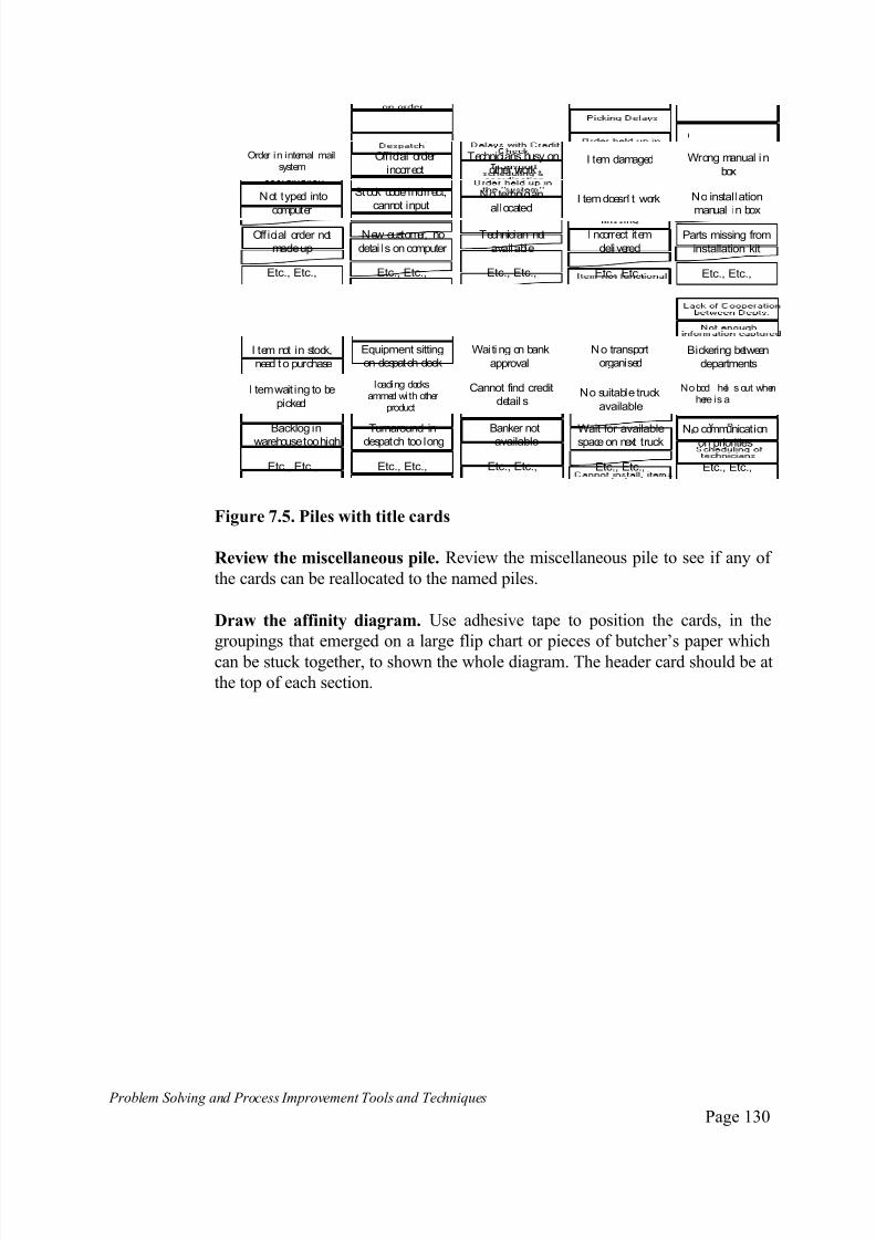
7/30/2019 Problem SolvingProcess Improvement Tools &Techniques Guide book.pdf
http://slidepdf.com/reader/full/problem-solvingprocess-improvement-tools-techniques-guide-bookpdf 130/175
Problem Solving and Process Improvement Tools and Techniques Page 130
Order in internal mailsystem
Not typed into
computer
Off icial order not
madeup
Etc., Etc.,
Official order
incorrect
Stock code incirrect,
cannot input
New customer, no
detai ls on computer
Etc., Etc.,
Technicians busy on
other work
No technician
allocated
Technician not
available
Etc., Etc.,
I tem damaged
I tem doesn' t work
I ncorrect item
delivered
Etc., Etc.,
I tem not in stock,
need to purchase
I tem wait ing to be
picked
Backlog in
warehousetoo high
Etc., Etc.,
Equipment sitting
on despatch dock
loading docksammed wi th other
product
Turnaround in
despatch too long
Etc., Etc.,
Waiti ng on bank
approval
Cannot find credit
detail s
Banker not
available
Etc., Etc.,
No transport
organised
No suitable truck
available
Wait for available
spaceon next truck
Etc., Etc.,
Wrong manual in
box
No installation
manual in box
Parts missing from
installation kit
Etc., Etc.,
Bickering between
departments
Nobod hel s out whenhere is a
No communicationon priorities
Etc., Etc.,
Figure 7.5. Piles with title cards
Review the miscellaneous pile. Review the miscellaneous pile to see if any of
the cards can be reallocated to the named piles.
Draw the affinity diagram. Use adhesive tape to position the cards, in the
groupings that emerged on a large flip chart or pieces of butcher’s paper which
can be stuck together, to shown the whole diagram. The header card should be at
the top of each section.
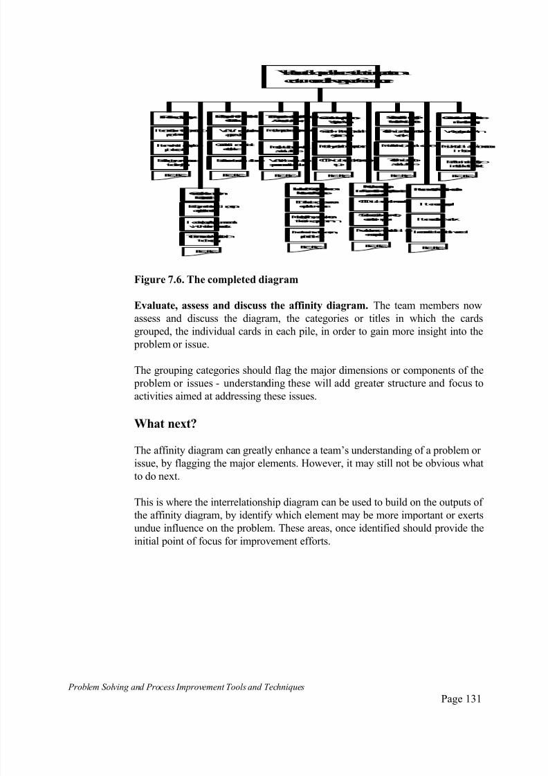
7/30/2019 Problem SolvingProcess Improvement Tools &Techniques Guide book.pdf
http://slidepdf.com/reader/full/problem-solvingprocess-improvement-tools-techniques-guide-bookpdf 131/175
Problem Solving and Process Improvement Tools and Techniques Page 131
PickingDelays
Itemnot instock, needto
purchase
Itemwaitingtobe
picked
Backloginwarehouse
toohigh
Etc., Etc.,
OrderheldupinDespatch
Equipment sittingon
despatchdock
loadingdocksjammed
withotherproduct
Turnaroundindespatchtoolong
Etc., Etc.,
DelayswithCreditCheck
Waitingonbank
approval
Cannot findcredit
details
Bankernot available
Etc., Etc.,
Transportscheduling
&coordination
Notransport organised
Nosuitabletruckavailable
Wait foravailable
spaceonnext truck
Etc., Etc.,
Orderheldupinthe"system"
Orderininternal mail
system
Not typedintocomputer
Etc., Etc.,
Notenough
informationcapturedonorder
Official orderincorrect
Stockcodeincirrect,
cannot input
Etc., Etc.,
Schedulingof technicians
Techniciansbusyonother
work
Notechnicianallocated
Etc., Etc.,
Itemnotfunctional
Itemdamaged
Itemdoesn't work
Etc., Etc.,
Cannotinstall, ite
missing
Wrongmanual in
Noinstallationmanul
inbox
Etc., Etc.,
LackofCooperationbetweenDepts.
Bickeringbetweendepartments
Nobodyhelpsout whenthereisaproblem
Nocommunicationonpriorities
Etc., Etc.,
Official ordernot made
up
Newcustomer, nodetailsoncomputer
Techniciannotavailable
Incorrect itemdelivered
Partsmissingfroinstallationkit
What aretheproblemsthat impact on
customerdeliveryperformance
Figure 7.6. The completed diagram
Evaluate, assess and discuss the affinity diagram. The team members now
assess and discuss the diagram, the categories or titles in which the cards
grouped, the individual cards in each pile, in order to gain more insight into the
problem or issue.
The grouping categories should flag the major dimensions or components of the
problem or issues - understanding these will add greater structure and focus to
activities aimed at addressing these issues.
What next?
The affinity diagram can greatly enhance a team’s understanding of a problem or
issue, by flagging the major elements. However, it may still not be obvious what
to do next.
This is where the interrelationship diagram can be used to build on the outputs of
the affinity diagram, by identify which element may be more important or exerts
undue influence on the problem. These areas, once identified should provide the
initial point of focus for improvement efforts.
7/30/2019 Problem SolvingProcess Improvement Tools &Techniques Guide book.pdf
http://slidepdf.com/reader/full/problem-solvingprocess-improvement-tools-techniques-guide-bookpdf 132/175
Problem Solving and Process Improvement Tools and Techniques Page 132
Relat ions Diagram
What is a Relations Diagram?
The relations diagram is a graphical method for clarifying and representingcomplex cause and effect relationships. It illustrates the logic that exists
between the many factors or elements of a problem or issue.
This technique may also be used for displaying complex objectives means-to-
ends relationships.
When do you use a Relations Diagram?
The relations diagram is used to determine the root causes and root effects of a
problem.
Root causes are those factors or elements of a problem that generate the
majority of the symptoms. Root effects are the major symptoms.
The relations diagram is particularly useful for determining the root causes of a
problem or issues in cases where quantified data is not available, or where
there is a large number of interrelated issues to be defined and understood.
Where there are a large number of factors to be understood, it is often useful
to use the affinity diagram as a method for identifying the key factors or issues,
which are then used as an input to the relations diagram.
How do you use a Relations Diagram?
Define the problem or issue to be addressed.
Agree a problem or issue statement. Prepare a short problem or issue statement
to focus the attention of the team - this is often best done by stating the
problem or issue in the form of a question eg. “how do we accelerate our
product development cycle?” or “what are the issues associated with
implementing this new technology?”
In our case, “What are the problems that impact on customer delivery
performance.”
Layout the major factors/elements.
Write the problem statement in the centre of a large sheet of paper or chart.
Draw a circle around the problem statement.
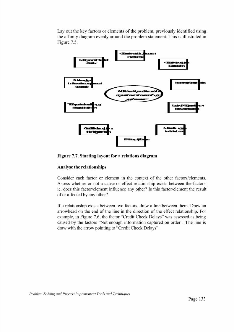
7/30/2019 Problem SolvingProcess Improvement Tools &Techniques Guide book.pdf
http://slidepdf.com/reader/full/problem-solvingprocess-improvement-tools-techniques-guide-bookpdf 133/175
Problem Solving and Process Improvement Tools and Techniques Page 133
Lay out the key factors or elements of the problem, previously identified using
the affinity diagram evenly around the problem statement. This is illustrated in
Figure 7.5.
Cannot install, items
missing
Itemnot functional
Order heldupin
Despatch
Not enough
informationcaptured
onorder
Orderheldupinthe"system"
PickingDelays
Transport scheduling
&coordination
Schedulingof
technicians
DelayswithCredit
Check
Lackof Cooperation
betweenDepts.
What aretheproblemsthat
impact oncustomerdelivery
performance
Figure 7.7. Starting layout for a relations diagram
Analyse the relationships
Consider each factor or element in the context of the other factors/elements.
Assess whether or not a cause or effect relationship exists between the factors.
ie. does this factor/element influence any other? Is this factor/element the result
of or affected by any other?
If a relationship exists between two factors, draw a line between them. Draw an
arrowhead on the end of the line in the direction of the effect relationship. For
example, in Figure 7.6, the factor “Credit Check Delays” was assessed as being
caused by the factors “Not enough information captured on order”. The line is
draw with the arrow pointing to “Credit Check Delays”.
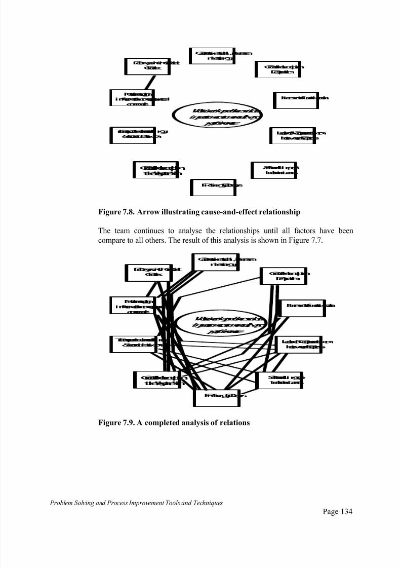
7/30/2019 Problem SolvingProcess Improvement Tools &Techniques Guide book.pdf
http://slidepdf.com/reader/full/problem-solvingprocess-improvement-tools-techniques-guide-bookpdf 134/175
Problem Solving and Process Improvement Tools and Techniques Page 134
Cannot install, items
missing
Itemnot functional
Order heldupin
Despatch
Not enough
informationcapturedonorder
Orderheldupinthe"system"
PickingDelays
Transport scheduling
&coordination
Schedulingof
technicians
DelayswithCredit
Check
Lackof Cooperation
betweenDepts.
What aretheproblemsthat
impact oncustomerdelivery
performance
Figure 7.8. Arrow illustrating cause-and-effect relationship
The team continues to analyse the relationships until all factors have been
compare to all others. The result of this analysis is shown in Figure 7.7.
Cannot install, items
missing
Itemnot functional
Order heldupin
Despatch
Not enough
informationcaptured
onorder
Orderheldupinthe"system"
PickingDelays
Transport scheduling
&coordination
Schedulingof
technicians
DelayswithCredit
Check
Lackof Cooperation
betweenDepts.
What aretheproblemsthat
impact oncustomerdelivery
performance
Figure 7.9. A completed analysis of relations

7/30/2019 Problem SolvingProcess Improvement Tools &Techniques Guide book.pdf
http://slidepdf.com/reader/full/problem-solvingprocess-improvement-tools-techniques-guide-bookpdf 135/175
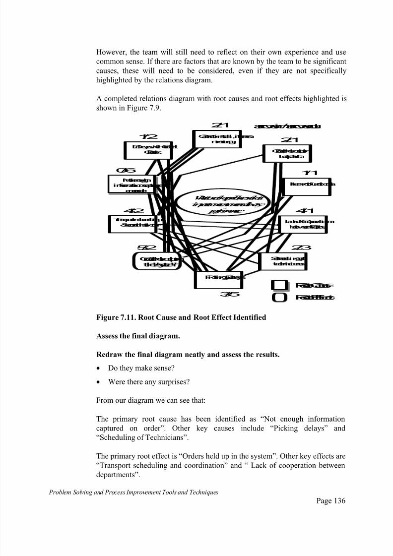
7/30/2019 Problem SolvingProcess Improvement Tools &Techniques Guide book.pdf
http://slidepdf.com/reader/full/problem-solvingprocess-improvement-tools-techniques-guide-bookpdf 136/175

7/30/2019 Problem SolvingProcess Improvement Tools &Techniques Guide book.pdf
http://slidepdf.com/reader/full/problem-solvingprocess-improvement-tools-techniques-guide-bookpdf 137/175
Problem Solving and Process Improvement Tools and Techniques Page 137
The favoured strategy is to focus on resolving the root causes, commencing
with the primary root cause first, as this will eliminate most of the effects.
However, depending on the nature of the required solution, we may need to
take shorter term measures aimed a coping with the root effects ie. dealing
with the symptoms.
The relations diagram highlights both.
When it comes to formulating strategies for dealing with root causes (or
effects) the systematic diagram is a useful tool for generating the actions
required to resolve them. This is discussed in the next section.
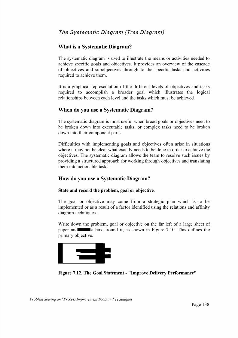
7/30/2019 Problem SolvingProcess Improvement Tools &Techniques Guide book.pdf
http://slidepdf.com/reader/full/problem-solvingprocess-improvement-tools-techniques-guide-bookpdf 138/175
Problem Solving and Process Improvement Tools and Techniques Page 138
The Systematic Diagram (Tree Diagram)
What is a Systematic Diagram?
The systematic diagram is used to illustrate the means or activities needed toachieve specific goals and objectives. It provides an overview of the cascade
of objectives and subobjectives through to the specific tasks and activities
required to achieve them.
It is a graphical representation of the different levels of objectives and tasks
required to accomplish a broader goal which illustrates the logical
relationships between each level and the tasks which must be achieved.
When do you use a Systematic Diagram?
The systematic diagram is most useful when broad goals or objectives need to
be broken down into executable tasks, or complex tasks need to be broken
down into their component parts.
Difficulties with implementing goals and objectives often arise in situations
where it may not be clear what exactly needs to be done in order to achieve the
objectives. The systematic diagram allows the team to resolve such issues by
providing a structured approach for working through objectives and translating
them into actionable tasks.
How do you use a Systematic Diagram?
State and record the problem, goal or objective.
The goal or objective may come from a strategic plan which is to be
implemented or as a result of a factor identified using the relations and affinity
diagram techniques.
Write down the problem, goal or objective on the far left of a large sheet of
paper and draw a box around it, as shown in Figure 7.10. This defines the
primary objective.
I
Figure 7.12. The Goal Statement - "Improve Delivery Performance"

7/30/2019 Problem SolvingProcess Improvement Tools &Techniques Guide book.pdf
http://slidepdf.com/reader/full/problem-solvingprocess-improvement-tools-techniques-guide-bookpdf 139/175
Problem Solving and Process Improvement Tools and Techniques Page 139
Generate the next level of the diagram.
To generate the next level of the diagram, ask the question “How will this
objective be achieved”.
The answers to the question “how” will either define tasks to be actioned or other objectives, the achievement of which will fulfil the primary objective.
In our example, using the results of the relations diagram as an input to the
process, the answer to the question “How” do we improve delivery performance
generates the secondary objectives shown in Figure 7.11.
Improvedeliveryperformance
Makecredit check
processfaster
Ensureall necessar
informationcaptured
order
Eliminatepicking
delays
Improvetechnician
scheduling
Primary
Objective
Secondar
Objective
How?
Figure 7.13. Ask the question "How?" to generate the next level
Complete the diagram
Continue building the systemic diagram until all branches have been completed.
To do this, continue asking the question “How?” for each objective. When all
the answers for a particular objective represent actionable tasks, then the branch
can be considered completed.
Continue until all the branches lead to actionable tasks. A completed systematic
diagram is shown in Figure 7.12.
Note: not all the branches will extend neatly together or generate tasks at the
same level. Some objectives will generate both tasks and sub-objectives. These
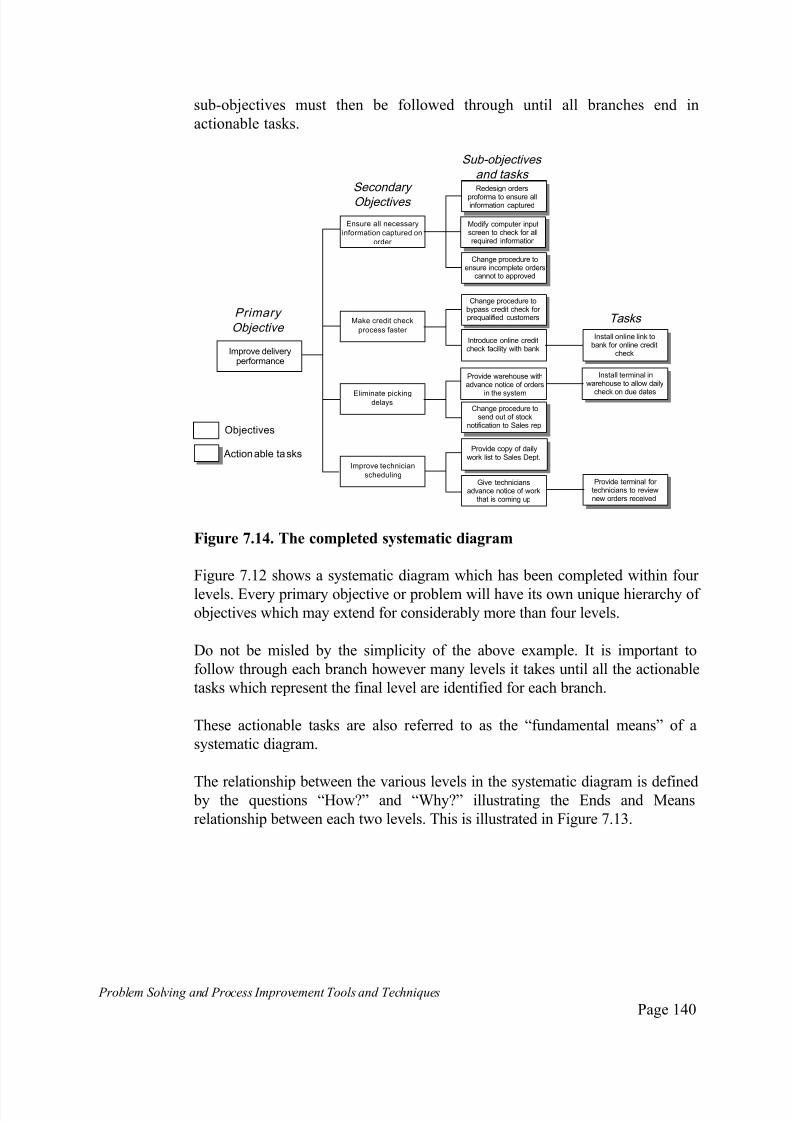
7/30/2019 Problem SolvingProcess Improvement Tools &Techniques Guide book.pdf
http://slidepdf.com/reader/full/problem-solvingprocess-improvement-tools-techniques-guide-bookpdf 140/175
Problem Solving and Process Improvement Tools and Techniques Page 140
sub-objectives must then be followed through until all branches end in
actionable tasks.
Improve deliveryperformance
Make credit check
process faster
Ensure all necessary
information captured on
order
Eliminate pickingdelays
Improve technician
scheduling
Change procedure tobypass credit check for prequalified customers
Modify computer inputscreen to check for allrequired information
Provide warehouse withadvance notice of orders
in the system
Provide copy of dailywork list to Sales Dept.
Redesign orders
proforma to ensure allinformation captured
Change procedure toensure incomplete orders
cannot to approved
Introduce online creditcheck facility with bank
Give techniciansadvance notice of work
that is coming up
Install online link tobank for online credit
check
Provide terminal for technicians to reviewnew orders received
Primary
Objective
Secondary
Objectives
Sub-objectives
and tasks
Tasks
Install terminal inwarehouse to allow daily
check on due dates
Change procedure tosend out of stock
notification to Sales rep.Objectives
Actionable tasks
Figure 7.14. The completed systematic diagram
Figure 7.12 shows a systematic diagram which has been completed within four
levels. Every primary objective or problem will have its own unique hierarchy of objectives which may extend for considerably more than four levels.
Do not be misled by the simplicity of the above example. It is important to
follow through each branch however many levels it takes until all the actionable
tasks which represent the final level are identified for each branch.
These actionable tasks are also referred to as the “fundamental means” of a
systematic diagram.
The relationship between the various levels in the systematic diagram is defined by the questions “How?” and “Why?” illustrating the Ends and Means
relationship between each two levels. This is illustrated in Figure 7.13.

7/30/2019 Problem SolvingProcess Improvement Tools &Techniques Guide book.pdf
http://slidepdf.com/reader/full/problem-solvingprocess-improvement-tools-techniques-guide-bookpdf 141/175
Problem Solving and Process Improvement Tools and Techniques Page 141
Improvedeliveryperformance
Makecredit check
processfaster
Ensureall necessary
informationcapturedon
order
Eliminatepicking
delays
Improvetechnician
scheduling
Changeproceduretobypasscredit checkfor prequalifiedcustomers
Modifycomputer inputscreentocheckfor allrequiredinformation
Providewarehousewithadvancenoticeof orders
inthesystem
Providecopyof dailyworklist toSalesDept.
Redesignordersproformatoensureallinformationcaptured
Changeproceduretoensureincompleteorderscannot toapproved
Introduceonlinecreditcheckfacilitywithbank
Givetechniciansadvancenoticeof workthat iscomingup
Install onlinelinktobankfor onlinecredit
check
Provideterminal for technicianstoreviewnewordersreceived
Install terminal inwarehousetoallowdailcheckonduedates
Changeproceduretosendout of stock
notificationtoSalesrep.
How? How?
How?
Why? Why?
Why?
Ends Means
Figure 7.15. The Ends-Means relationship between the levels
Assess the systematic diagram
To understand the Ends-Means relationships illustrated by the systematic
diagram: Start with any objective box in the diagram and ask the question “How?”
to move “down” the hierarchy, ie. move to the right or ask the question
“Why?” to move “up” the hierarchy, ie. move to the left.
Start with any task box in the diagram and ask the question “Why?” to
move “up” the hierarchy, ie. move to the left.
Asking “How?” identifies the “Means” asking “Why” identifies the “Ends”.
A completed systematic diagram will identify all the tasks which must be
actioned in order to achieve all of the objectives identified in the diagramand in turn achieve the primary objective.
Assess the results of the diagram to ensure that completion of the tasks
identified do indeed achieve the higher level objective from which they were
generated. If they do not, reassess the objective to see if you have missed
some tasks or sub-objectives.
Responsibility for completion of the action items is then assigned to team
members.

7/30/2019 Problem SolvingProcess Improvement Tools &Techniques Guide book.pdf
http://slidepdf.com/reader/full/problem-solvingprocess-improvement-tools-techniques-guide-bookpdf 142/175
Problem Solving and Process Improvement Tools and Techniques Page 142
The Matrix Diagram
What is a Matrix Diagram?
The matrix diagram is used to illustrate the relationship or interaction between two or more sets of factors. There are many variations on the
basic matrix diagram including the:
decision matrix;
allocation matrix;
prioritisation matrix.
This section shall consider the basic matrix diagram.
When do you use a Matrix Diagram?
The basic matrix diagram is most useful when you wish to assess the
interaction or impact changes to a series of factors may have on a groups of
other factors or areas. This is best illustrated by way of an example. which
follows.
How do you use a Matrix Diagram?
Example: An organisation wishes to implement changes to their order
fulfilment process. There are a number of planned changes including changesto written and computerised procedures, changes to responsibilities and job
descriptions across several departments.
In order to facilitate effective training and implementation in each group, the
implementation team has decided to assess the degree to which each major
group involved in the order fulfilment process is affected by each change, to
ensure they are made aware of what they specifically will need to know and do
differently.
List the first group of factors along one of the matrix axes.
In our case, the team have decided to list the changes to be made along the
vertical axis of the matrix.
This is illustrated in Figure 7.14..

7/30/2019 Problem SolvingProcess Improvement Tools &Techniques Guide book.pdf
http://slidepdf.com/reader/full/problem-solvingprocess-improvement-tools-techniques-guide-bookpdf 143/175
Problem Solving and Process Improvement Tools and Techniques Page 143
Changes
New order input screen
Authority tables change
Online credit check facility New credit update screen
Warehouse pick list update
screen
New orders list
Technician backlog report
Technician work allocations
screen
Figure 7.14 Matrix Diagram showing changes to be implemented
List the second group of factors along the other matrix axis.
In our example, the departments involved in the order fulfilment process have
been listed along the horizontal axis. ie. along the top of the axis. This shown
in Figure 7.15.
Groups affected >>
Changes Sales Credit W/Hs Desp. Techs
New order input screen
Authority tables changeOnline credit check facility
New credit update screen
Warehouse pick list update
screen
New orders list
Technician backlog report
Technician work allocations
screen
Figure 7.15 Matrix Diagram showing departments affected.
Rate the level of interaction between the two groups of factors.
Usually some form of rating system is used to indicate the level or type of
interaction between the two groups of factors where some interaction exists.

7/30/2019 Problem SolvingProcess Improvement Tools &Techniques Guide book.pdf
http://slidepdf.com/reader/full/problem-solvingprocess-improvement-tools-techniques-guide-bookpdf 144/175
Problem Solving and Process Improvement Tools and Techniques Page 144
In our case, the team decided to use a system based on the letters:
H = High, indicating the change has a high level of impact on this
department;
M = Moderate, indicating the change will have a moderate level of impact
on this department;
L = Low, indicating the change will have a low level of impact on this
department;
Blank, indicating the change will have no impact on this department,
The completed matrix diagram is shown in Figure 7.16.
Use the results of the Matrix Diagram to guide future actions.
In our example, the team would use the knowledge of which departments are
most affected by which changes to develop specific implementation strategies,training and awareness sessions, focussed on the specific changes the different
departments will need to master.
For example, the implementation and training for the Technicians Department
would focus on ensuring they were aware of the changes to authority tables
and had access to the warehouse pick list. It would then focus on ensuring they
had specific knowledge and skill in the use of procedures relating to, new
order lists, backlog reporting and the work allocation screen.
Alternately, the Despatch Department would only need to be aware of the
authority table changes and have a moderate working knowledge of the
warehouse picklist screen.
Figure 7.16 The completed Matrix Diagram
Groups affected >>
Changes Sales Credit W/Hs Desp. Techs
New order input screen H
Authority tables change M H L L L
Online credit check facility M H New credit update screen H
Warehouse pick list update
screen
L H M L
New orders list H H M
Technician backlog report H H
Technician work allocations
screen
H M

7/30/2019 Problem SolvingProcess Improvement Tools &Techniques Guide book.pdf
http://slidepdf.com/reader/full/problem-solvingprocess-improvement-tools-techniques-guide-bookpdf 145/175
Problem Solving and Process Improvement Tools and Techniques Page 145
The Decisio n Matr ix
What is a Decision Matrix?
The Decision Matrix is a worksheet made up of columns and rows which isused to rank the options or alternatives which must be decided between,
against a set of agreed criteria which the decision must meet, so as to facilitate
decision making.
It is best used by a team to arrive at a group decision in a manner that
overcomes potential influences from personal biases of group members.
When do you use a Decision Matrix?
The decision matrix is most useful when a choice must be made between more
than one clear alternative, and there are set of definable criteria which thedecision must satisfy.
How do you use a Decision Matrix?
Determine the alternatives
The first step before using a decision matrix is to determine the alternatives to
be decided between.
Consider an example of an organisation that wishes to progress a performanceimprovement initiative in their operations division. The alternatives have been
defined as:
Use an external consultant to progress the initiative;
Use and internal team, trained and facilitated by an external consultant;
Use an internal team only.
Determine the criteria to be satisfied by the ideal outcome.
The criteria the successful course of action must meet, against which thealternatives will be evaluated against have been defined as:
Implementation must be able to be fast tracked. A quick result is required;
There must be a high degree of ownership of any changes by the employees;
The results need to be sustainable in the long term;
Implementation of recommendations should be easy;

7/30/2019 Problem SolvingProcess Improvement Tools &Techniques Guide book.pdf
http://slidepdf.com/reader/full/problem-solvingprocess-improvement-tools-techniques-guide-bookpdf 146/175
Problem Solving and Process Improvement Tools and Techniques Page 146
The methodology/approach should reflect leading edge management
thinking;
The project should be able to be done for the lowest cost possible;
The conducting the project should not disrupt existing operations.
Lay out the decision matrix.
Lay out the decision matrix with the alternatives along the horizontal axis and
the criteria along the vertical axis.
This is illustrated in Figure 7.17.
Evaluation Criteria
Weighting ScoreWeighted Score
ScoreWeighted Score
Scoreei t Scor
Fast trackimplementation
Ownershipof anyrecommendedchanges
Sustainableresults
Easeof implementation
Leadingedgeapproach
Lowcost
Minimisedisruptionstoexistingoperations
Total
Useexternal consultants
Consultantsled internal team
Internal t only
Alternatives
Figure 7.17. Lay out the Decision Matrix
Apply a weighting to each of the criteria.
Assign a score to each of the criteria, which reflects the relative importance of
that element. This is usually done by assigning a score out of 10 to each criteria.
A Decision Matrix with the weightings applied to the criteria is shown in Figure
7.18.

7/30/2019 Problem SolvingProcess Improvement Tools &Techniques Guide book.pdf
http://slidepdf.com/reader/full/problem-solvingprocess-improvement-tools-techniques-guide-bookpdf 147/175
Problem Solving and Process Improvement Tools and Techniques Page 147
Evaluation Criteria
Weighting ScoreWeighted Score
ScoreWeighted Score
Scoreei t Scor
Fast trackimplementation8
Ownershipof any
recommendedchanges
4
Sustainableresults 9
Easeof implementation4
Leadingedgeapproach2
Lowcost 3
Minimisedisruptionstoexistingoperations
7
Total
Useexternal consultants
Consultantsled internal team
Internal teonly
Alternatives
Figure 7.18. Decision Matrix with each criteria weighted
Score each alternative along each criteria.
That is, assign a score out of ten for how each alternative performs along each
element of the criteria.
A scored decision matrix is shown in Figure 7.19.
Evaluation Criteria
Weighting ScoreWeighted Score
ScoreWeighted Score
Scoreei t Scor
Fast trackimplementation8 7 6 3
Ownershipof any
recommendedchanges
4 2 5 8
Sustainableresults 9 5 6 8
Easeof implementation4 8 7 5
Leadingedgeapproach2 8 8 4
Lowcost 3 4 6 7
Minimisedisruptionstoexistingoperations
7 8 7 6
Total
Useexternal consultants
Consultantsled internal team
Internal t only
Alternatives
Figure 7.19. A scored Decision Matrix
Determine a weighted score for each alternative
Multiply the score by the weighting for each criteria for each alternative to
obtain a weighted score. Add up the weighted scores to obtain a total for each
alternative.
This completes the decision matrix, shown in Figure 7.20.

7/30/2019 Problem SolvingProcess Improvement Tools &Techniques Guide book.pdf
http://slidepdf.com/reader/full/problem-solvingprocess-improvement-tools-techniques-guide-bookpdf 148/175

7/30/2019 Problem SolvingProcess Improvement Tools &Techniques Guide book.pdf
http://slidepdf.com/reader/full/problem-solvingprocess-improvement-tools-techniques-guide-bookpdf 149/175
Problem Solving and Process Improvement Tools and Techniques Page 149
The Prior i t isat ion Matr ix
What is a Prioritisation Matrix?
The Prioritisation Matrix is an application of the basic matrix diagram whichis used to assign priorities to a group of activities needing to be implemented.
Alternatively, this type of matrix may be used for evaluating and comparing a
list of possible solutions against a set of guidelines, in the same way as a
decision matrix is used.
As with the other types of matrix based techniques, the prioritisation matrix is
best used in the team environment, to arrive at a group decision in a manner
that overcomes potential influences from personal biases of group members.
When do you use a Prioritisation Matrix?
A prioritisation matrix is most useful when a there are several
countermeasures that may be implemented to solve a problem or several
actions which may potentially be taken to implement a strategy, and where
trade-offs need to be assessed between costs, benefits, ease of implementation,
timing or similar characteristics.
A typical example would be a situation where there may be a need to
implement a quick fix to address the symptoms of a problem while progressing
longer term actions aimed at resolving the root causes. A prioritisation matrixcould be used to establish implementation priorities between the range of
available actions.
How do you use a Prioritisation Matrix?
Determine the guidelines the countermeasures or actions should meet
Determine the guidelines or criteria the countermeasures or actions to be
implemented must meet. These will be the criteria against which the
countermeasures or actions shall be evaluated.
Consider the example of an organisation wishing to implement a range of
measures aimed at improving the responsiveness of their order fulfilment
process. To develop a detailed implementation strategy, the team need to
prioritise the actions to establish the best order to implement so as to maximise
the benefits and the speed with which they are achieved.

7/30/2019 Problem SolvingProcess Improvement Tools &Techniques Guide book.pdf
http://slidepdf.com/reader/full/problem-solvingprocess-improvement-tools-techniques-guide-bookpdf 150/175

7/30/2019 Problem SolvingProcess Improvement Tools &Techniques Guide book.pdf
http://slidepdf.com/reader/full/problem-solvingprocess-improvement-tools-techniques-guide-bookpdf 151/175
Problem Solving and Process Improvement Tools and Techniques Page 151
Add up the score in each criteria to give a total for each action or option. The
scored and completed matrix is shown in Figure 7.22.
Actions Cost Time Ease Authorisation Tot l
Redesignordersproformatoensureallinformationcaptured
1 3 2 2
Modifycomputerinput screentocheckfor all requiredinformation
3 5 2 5 1
Changeproceduretoensureincompleteorderscannot toapproved
2 2 3 7 1
Changeproceduretobypasscredit checkforprequalifiedcustomers
2 3 5 9 1
Install onlinelinktobankforonlinecreditcheck
8 7 3 9
Changeproceduretosendout of stocknotificationtoSalesrep.
2 2 1 2
Providecopyof dailyworklist toSalesDept.
2 1 1 2
Install terminal inwarehousetoallowdaily
checkonduedates
5 5 1 7 1
Provideterminal fortechnicianstoreviewnewordersreceived
5 5 1 7 1
Guidelines Actions or Options
Figure 7.22. Each action scored for each criteria/guideline
Use the resulting total scores to determine priorities.
The general rule is to prioritise the actions in order of ascending score. That is,
implement the lowest scoring option/action first. The completed and prioritised
matrix is shown in Figure 7.23.
Actions Cost Time Ease Authorisation Total
Redesignordersproformatoensureallinformationcaptured
1 3 2 2 8
Modifycomputerinput screentocheckfor all requiredinformation
3 5 2 5 15
Changeproceduretoensureincompleteorderscannot toapproved
2 2 3 7 14
Changeproceduretobypasscredit checkforprequalifiedcustomers
2 3 5 9 19
Install onlinelinktobankforonlinecreditcheck
8 7 3 9 27
Changeproceduretosendout of stocknotificationtoSalesrep.
2 2 1 2 7
Providecopyof dailyworklist toSalesDept.
2 1 1 2 6
Install terminal inwarehousetoallowdailycheckonduedates
5 5 1 7 18
Provideterminal fortechnicianstoreviewnewordersreceived
5 5 1 7 18
Guidelines
3
5
4
8
9
2
1
6
7
Implementati
prioritie Actions or Options
Figure 7.23. The completed and prioritised matrix
7/30/2019 Problem SolvingProcess Improvement Tools &Techniques Guide book.pdf
http://slidepdf.com/reader/full/problem-solvingprocess-improvement-tools-techniques-guide-bookpdf 152/175
Problem Solving and Process Improvement Tools and Techniques Page 152
The Allocat ion Matr ix
What is a Allocation Matrix?
The Allocation Matrix is usually used as an extension to the systematicdiagram to allocate responsibilities for actioning the various tasks that are
identified as a result of applying the systematic diagram tool to an objective.
When do you use an Allocation Matrix?
An allocation matrix is most useful when there are many tasks to be completed
in order to achieve some higher order goal/objective, and tasks must be
allocated to individual team members for completion in a coordinated fashion.
How do you use an Allocation Matrix?
Layout the matrix
Commence with the systematic diagram. At the far right of the systematic
diagram, once all the required tasks or actions have been identified, draw a
matrix consisting of three columns and a row for each task identified by the
systematic diagram.
This is illustrated in Figure 7.24.
Improve deliveryperformance
Make credit checkprocess faster
Ensure all necessaryinformation captured
on order
Eliminate pickingdelays
Improve technicianscheduling
Provide warehouse withadvance notice of orders
in the system
Modify computer inputscreen to check for allrequired information
Redesign ordersproforma to ensure allinformation captured
Change procedure toensure incomplete orders
cannot to approved
Introduce online creditcheck facility with bank
Give techniciansadvance notice of
work that is coming up
Install online link tobank for online credit
check
Provide terminal for technicians to reviewnew orders received
Install terminal inwarehouse to allow daily
check on due dates
W ho W he n S ta t u s
Change procedure tosend out of stock
notification to Salesrep.
Provide copy of dailywork list to Sales
Dept.
Change procedure tobypass credit check
for prequalifiedcustomers
Figure 7.24. Lay out the allocation matrix

7/30/2019 Problem SolvingProcess Improvement Tools &Techniques Guide book.pdf
http://slidepdf.com/reader/full/problem-solvingprocess-improvement-tools-techniques-guide-bookpdf 153/175
Problem Solving and Process Improvement Tools and Techniques Page 153
Label the three columns “Who”, “When” and “Status” as shown in Figure
7.24.
Assign tasks to team members.
Assign tasks to team members by writing in the team member name in the“Who” column and specify completion date requirements in the “When”
column.
This is illustrated in Figure 7.25.
Improve deliveryperformance
Make credit checkprocess faster
Ensure all necessaryinformation captured
on order
Eliminate pickingdelays
Improve technicianscheduling
Provide warehouse withadvance notice of orders
in the system
Modify computer inputscreen to check for allrequired information
Redesign ordersproforma to ensure allinformation captured
Change procedure toensure incomplete orders
cannot to approved
Introduce online creditcheck facility with bank
Give techniciansadvance notice of
work that is coming up
Install online link tobank for online credit
check
Provide terminal for technicians to reviewnew orders received
Install terminal inwarehouse to allow daily
check on due dates
W ho W he n S ta t u s
John End
June
Sue End
Sept
Peter End
June
Peter End
July
Rob Jan
next
year
Sue End
Oct
John End
July
Deb End
June
Sue End
Sept
Change procedure tosend out of stock
notification to Salesrep.
Provide copy of dailywork list to Sales
Dept.
Change procedure tobypass credit check
for prequalifiedcustomers
Figure 7.25. The completed allocation matrix
Use the allocation matrix to monitor progress.
Use the allocation matrix to monitor progress towards the achievement of the
overall goal/objective. Use the status column to check off completed tasks.
This is illustrated in Figure 7.26.

7/30/2019 Problem SolvingProcess Improvement Tools &Techniques Guide book.pdf
http://slidepdf.com/reader/full/problem-solvingprocess-improvement-tools-techniques-guide-bookpdf 154/175
Problem Solving and Process Improvement Tools and Techniques Page 154
Improve delivery
performance
Make credit checkprocess faster
Ensure all necessary
information captured
on order
Eliminate pickingdelays
Improve technician
scheduling
Provide warehouse with
advance notice of ordersin the system
Modify computer input
screen to check for allrequired information
Redesign ordersproforma to ensure all
information captured
Change procedure toensure incomplete orders
cannot to approved
Introduce online creditcheck facility with bank
Give technicians
advance notice of
work that is coming up
Install online link to
bank for online creditcheck
Provide terminal for technicians to review
new orders received
Install terminal in
warehouse to allow daily
check on due dates
W h o W h e n S ta t u s
John End
June
Sue End
Sept
Peter EndJune
Peter End
July
Rob Jan
next
year
Sue End
Oct
John End
July
Deb End
June
Sue EndSept
Change procedure to
send out of stocknotification to Sales
rep.
Provide copy of daily
work list to SalesDept.
Change procedure to
bypass credit check
for prequalified
customers
Figure 7.26. Using the allocation matrix to track progress

7/30/2019 Problem SolvingProcess Improvement Tools &Techniques Guide book.pdf
http://slidepdf.com/reader/full/problem-solvingprocess-improvement-tools-techniques-guide-bookpdf 155/175
Problem Solving and Process Improvement Tools and Techniques Page 155
The Process Decision Pro gram Chart
What is a Process Decision Program Chart?
The Process Decision Program Chart (PDPC) is a tool which helps a teamanticipate and plan for dealing with problems which may arise during
implementation. It identifies likely weaknesses and potential for failure.
The team can then use the PDPC to formulate and assess contingency plans
and countermeasures to minimise the risk of failure. The Failure Modes and
Effects Analysis Technique (FMEA) often used in conjunction with new
product development is based on the use of the PDPC tool.
When do you use a Process Decision Program Chart?
The PDPC is best used to help a team with the development of contingency plans. It is also useful as a tool for evaluating alternative courses of action.
How do you use a Process Decision Program Chart?
Identify the goal or objective to be achieved.
Consider an organisation whose objective is to ensure all customer orders are
delivered on time. The objective can be defined as “on-time order delivery”.
Brainstorm all the possible unexpected problems
Identify all the possible unexpected problems which could occur in each part
of the process associated with filling customer orders. Ask the question “What
if ... ?”.
Figure 7.27 illustrates a Process Decision Program Chart showing the things
which might go wrong and act against the achievement of the objective “on-
time order delivery”.
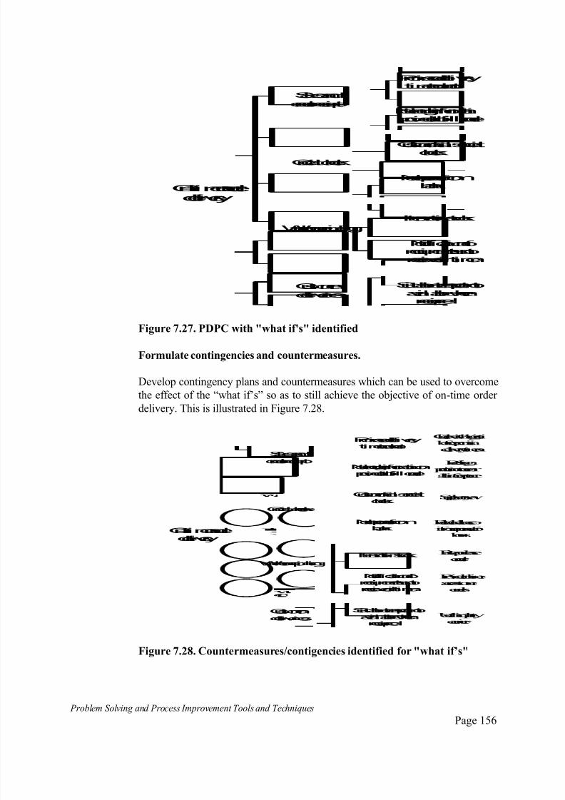
7/30/2019 Problem SolvingProcess Improvement Tools &Techniques Guide book.pdf
http://slidepdf.com/reader/full/problem-solvingprocess-improvement-tools-techniques-guide-bookpdf 156/175
Problem Solving and Process Improvement Tools and Techniques Page 156
On-timeorder delivery
Credit check
Salesand
order receipt
Warehousepicking
Customer
deliveries
Itemnot instock
Suitabletransport notavailablewhenrequired
Noresponsefrombank
Notificationof requirementsnotreceivedintime
Promiseddeliverytimetooshort
Not enoughinformatiprovidedtofill order
Customerfailscreditcheck
Figure 7.27. PDPC with "what if's" identified
Formulate contingencies and countermeasures.
Develop contingency plans and countermeasures which can be used to overcome
the effect of the “what if’s” so as to still achieve the objective of on-time order
delivery. This is illustrated in Figure 7.28.
On-timeorder delivery
Credit check
Salesand
order receipt
Warehousepicking
Customer
deliveries
Itemnot instock
Suitabletransport notavailablewhenrequired
Noresponsefrombank
Notificationof requirementsnotreceivedintime
Promiseddeliverytimetooshort
Not enoughinformationprovidedtofill order
Customerfailscreditcheck
Checkwithlogisti beforepromisideliverytimes
Redesign proformatoensr all infocapture
Supplyanywa
Recheckall accoifnoresponsefor
hours
Raisepurchase
order
Provideonlineaccesstoneorders
Usethirdpartycourier
Figure 7.28. Countermeasures/contigencies identified for "what if’s"

7/30/2019 Problem SolvingProcess Improvement Tools &Techniques Guide book.pdf
http://slidepdf.com/reader/full/problem-solvingprocess-improvement-tools-techniques-guide-bookpdf 157/175
Problem Solving and Process Improvement Tools and Techniques Page 157
The countermeasures or contigencies are indicated in the ovals to distinguish
them from the “what if’s” represented in boxes.
Assess the PDPC
Assess the viability of implementing the identified countermeasures andcontingencies. This is illustrated in Figure 7.29.
On-timeorder delivery
Credit check
Salesand
order receipt
Warehousepicking
Customer
deliveries
Itemnot instock
Suitabletransport notavailablewhenrequired
Noresponsefrombank
Notificationof requirementsnotreceivedintime
Promiseddeliverytimetooshort
Not enoughinformationprovidedtofill order
Customer failscreditcheck
Checkwithlogistics beforepromisingdeliverytimes
Redesign proformatoensureall infocaptured
Supplyanyway
Recheckall accountsifnoresponsefor2
hours
Raisepurchaseorder
Provideonlineaccesstoneworders
Usethirdpartycourier
Difficult orImpossible
Recommendedaction
Figure 7.29. The completed PDPC
7/30/2019 Problem SolvingProcess Improvement Tools &Techniques Guide book.pdf
http://slidepdf.com/reader/full/problem-solvingprocess-improvement-tools-techniques-guide-bookpdf 158/175
Problem Solving and Process Improvement Tools and Techniques Page 158
The Netwo rk Diagram (Crit ical Path)
What is a Network Diagram?
A Network Diagram is a technique used for the planning and tracking of pro jects. It is a technique which identifies the “critical path” of a project,
which represents the shortest possible time in which the project may be
completed.
It also forms the basis for the development of bar charts or gantt charts for
monitoring and controlling projects.
When do you use a Network Diagram?
The network diagram is best used whenever there is a requirement to
implement a project that uses significant resources and requires the time phased coordination of several types of skills to complete.
It is also particularly useful in situations where specific completion dates must
be met and to identify the available options and flexibility for reducing time to
completion and optimising the use of resources.
How do you use a Network Diagram?
The use of the network diagram technique, known as critical path planning is
outside the scope of this handbook.

7/30/2019 Problem SolvingProcess Improvement Tools &Techniques Guide book.pdf
http://slidepdf.com/reader/full/problem-solvingprocess-improvement-tools-techniques-guide-bookpdf 159/175

7/30/2019 Problem SolvingProcess Improvement Tools &Techniques Guide book.pdf
http://slidepdf.com/reader/full/problem-solvingprocess-improvement-tools-techniques-guide-bookpdf 160/175
Problem Solving and Process Improvement Tools and Techniques Page 160
1. Introd uct io n to Variat ion
One of the laws of nature is that no two things are exactly identical. No two
manufactured items are exactly the same, no two services are delivered in
exactly the same manner.
Variation, however small, is a fact of life and of business. It is therefore
important to understand variation so that we may manage it proactively to our
benefit, and not be continually reacting in order to compensate for the impact
it may be having on our processes and on our business.
2. Observin g Variat ion
If we collect data on any process and plot the data values on a histogram, we
can observe the variation in the process. The distribution of points plotted will
give rise to a pattern that characterises the observed variation. Some typical patterns that are often formed by different processes are illustrated in Figure
2.1.
3. Characteris ing Data
For a given group of data, we can determine several characteristics that allow
us to describe and characterise the data and its variation. The key measures
that allow us to do this are measures of:
Shape
Spread
Location
These are illustrated in Figure 2.2.

7/30/2019 Problem SolvingProcess Improvement Tools &Techniques Guide book.pdf
http://slidepdf.com/reader/full/problem-solvingprocess-improvement-tools-techniques-guide-bookpdf 161/175
Problem Solving and Process Improvement Tools and Techniques Page 161
Normal Distribution
Skewed or "cliff like" distribution
"Comb like" distribution
Bi-modal distributionie. two peaks
Normal with outlying data
Figure 2.1 Examples of Variation Patterns
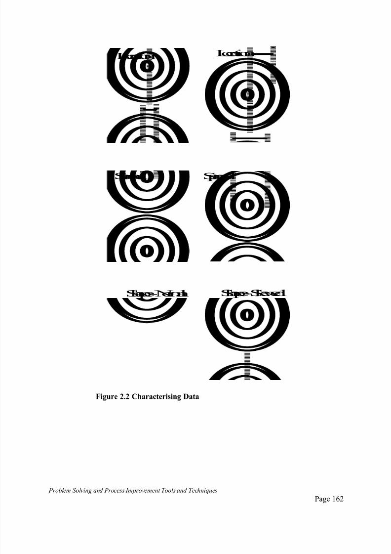
7/30/2019 Problem SolvingProcess Improvement Tools &Techniques Guide book.pdf
http://slidepdf.com/reader/full/problem-solvingprocess-improvement-tools-techniques-guide-bookpdf 162/175
Problem Solving and Process Improvement Tools and Techniques Page 162
Location Location
Spread Spread
Shape- Normal Shape- Skewed
Figure 2.2 Characterising Data

7/30/2019 Problem SolvingProcess Improvement Tools &Techniques Guide book.pdf
http://slidepdf.com/reader/full/problem-solvingprocess-improvement-tools-techniques-guide-bookpdf 163/175
Problem Solving and Process Improvement Tools and Techniques Page 163
3.1 Measures of Location
There are three measures of location used in statistics.
Mean
_ X or the mean is the ordinary arithmetic average of a group of numbers. It is
referred to as X-bar when spoken.
_
The mean X = Xn
n
Where Xn = represents the values in the sample of data
Xn = the sum of all the values in the sample
n = the number of values in the sample (sample size)
Example: Suppose an organisation collects some data on the performance of
its order fulfilment process. The number of days it had taken to fill eleven
consecutive orders was recorded as:
9, 6, 4, 2, 4, 2, 4, 7, 2, 4, 3.
The mean or average time to fill an order, based on this sample is calculated
as:
_
X = Xn = 9 + 6 + 4 + 3 + 4 + 2 +5 + 7 + 2 + 6 + 3n 11
= 51 = 4.6 days
11
The mean time to fill an order is 4.6 days.
7/30/2019 Problem SolvingProcess Improvement Tools &Techniques Guide book.pdf
http://slidepdf.com/reader/full/problem-solvingprocess-improvement-tools-techniques-guide-bookpdf 164/175
Problem Solving and Process Improvement Tools and Techniques Page 164
The Median
The median is the middle value of a group of data points. It is the value such
that half the data points are less than the median and half are greater.
If data is skewed or there are a few extreme values, these will distort thecalculation of the mean. The result being, the value obtained for the mean will
not be typical of most of the values in the data. ie. the value of the mean will
not be where most of the data points are located.
For example: the median is often used when reporting housing prices, because
the occasional sale of a very expensive house distorts the average calculation.
Prospective home buyers, are more likely to be interested in what the typical
house in a particular area is likely to sell for. In such cases, the mean will not
be a good indicator of this.
Consider the following data, showing the values of houses sold in a particular
suburb during a month.
Five houses were sold, for the following amounts:
$ 130,000, $ 132,000, $ 420,000, $ 137,000, $ 135,000
The mean housing price from this data is:
$130,000 + $132,000 + $420,000 + $137,000+$135,000
5
= $ 190,800
We can see from observation, that with the exception of the $420,000 house,
the others are all in the range between $130,000 and $140,000. The
prospective home buyer wanting to buy a typical home in this suburb would
therefore need to budget for somewhere in this range.
The mean value of $190,800 has been distorted by the single $420,000 home
which was not typical of the others. To prospective home buyers, this would be a misleading representation of housing values in this suburb.
To calculate the median of the above data, we re-list the values from the
lowest to the highest value ie. ascending order. eg.:
$130,000, $ 132,000, $135,000, $137,000, $420,000
The middle value is the third, or $ 135,000. Therefore, we can say that the
median house price in this suburb during the month the data was collected was

7/30/2019 Problem SolvingProcess Improvement Tools &Techniques Guide book.pdf
http://slidepdf.com/reader/full/problem-solvingprocess-improvement-tools-techniques-guide-bookpdf 165/175
Problem Solving and Process Improvement Tools and Techniques Page 165
$135,000. We can see that this is indeed typical of what most of the houses
sold for, and has overcome the distorting effect of the single $420,000 house.
Therefore, in situations where the data is skewed or there are extreme values
present, the median is a much better indicator of location than the mean.
Let use reconsider the performance of the order fulfilment process, for which we
have previously calculated the mean.
9, 6, 4, 2, 4, 2, 4, 7, 2, 4, 3.
To find the median of this data, we reorder it from the lowest to the highest
value. ie.
2, 2, 2, 3, 4, 4, 4, 4, 6, 7, 9
There are 11 values in our group of data points, the middle value will be the
6th. ie. their are 5 values below it, 5 values above it. The 6th value is 4 days.
Therefore we can say the median = 4 days.
In cases where there are an even number of data points, the median is
calculated as the sum of the middle two divided by 2. Suppose we had ten
data points as follows:
2, 2, 2, 3, 4, 5, 5, 6, 6, 7
There is no middle value. The two middle values, the 5th and 6th are 4 and 5respectively. The median is then calculated as follows:
Median = 4 + 5 = 9 = 4.5
2 2

7/30/2019 Problem SolvingProcess Improvement Tools &Techniques Guide book.pdf
http://slidepdf.com/reader/full/problem-solvingprocess-improvement-tools-techniques-guide-bookpdf 166/175
7/30/2019 Problem SolvingProcess Improvement Tools &Techniques Guide book.pdf
http://slidepdf.com/reader/full/problem-solvingprocess-improvement-tools-techniques-guide-bookpdf 167/175
Problem Solving and Process Improvement Tools and Techniques Page 167
3.2 Measures of Spread
Range
The range indicates the spread of extreme values.
It is calculated by subtracting the smallest value in the sample from the largest
and is represented by the symbol R. With reference to the data referred to in
our previous examples.
9, 6, 4, 2, 4, 2, 4, 7, 2, 4, 3.
The smallest value = 2, the largest value = 9. The Range can be calculated as:
R = 9 - 2 = 7 days.
The Standard Deviation
The range is an easy way to get an indication of the amount of variation, but it
does not take into account the overall spread of values. Figures 3.1a to 3.1c
show three different distributions of data.
Mean
Range
Figure 3.1.a Data points "tightly" clustered around the mean

7/30/2019 Problem SolvingProcess Improvement Tools &Techniques Guide book.pdf
http://slidepdf.com/reader/full/problem-solvingprocess-improvement-tools-techniques-guide-bookpdf 168/175
Problem Solving and Process Improvement Tools and Techniques Page 168
Mean
Range
Figure 3.1.b. Data points evenly spread across the range
Mean
Range
Figure 3.1.c. Data points clustered around the range extremes
Depending on the values of specific data points, all three distributions could
conceivably have the same values for the mean, median and range. Yet, they
are very different from each other and would indicate significantly different
process performance situations.
The standard deviation, often referred to as SD, S, or the Greek symbol sigma
is a measure which overcomes this problem, and allows us to develop a
more complete picture of what our data it telling us.
The standard deviation is a measure of how tightly clustered around the mean,
our data is. It is a measure which reflects the variability and dispersion of data.
It is effectively a measure of the average distance from the mean of all of the
data points. Therefore, data which is tightly clustered around the mean will

7/30/2019 Problem SolvingProcess Improvement Tools &Techniques Guide book.pdf
http://slidepdf.com/reader/full/problem-solvingprocess-improvement-tools-techniques-guide-bookpdf 169/175
Problem Solving and Process Improvement Tools and Techniques Page 169
have a relatively low value for standard deviation compared to data which is
dispersed away from the mean. With reference to Figure 3.1a to 3.1c. Figure
3.1.a would have the smallest standard deviation - most points clustered close
to the mean, Figure 3.3.c. would give the highest value - most number of
points relatively far from the mean.
The standard deviation is calculated as follows.
_
s = ( Xn - X )2
n-1
_
The term ( Xn - X )2 is referred to as the Variance (Var or S2 ).
n-1
The standard variation is the square root of the variance.
The term Xn refers to our data points;
n is the number of data points we have;
X is the mean of the data.
With reference to our sample data about a company’s order fulfilment process,
we can calculate the standard deviation as follows.
9, 6, 4, 2, 4, 2, 4, 7, 2, 4, 3
We know from our previous calculation, that the mean is 4.6 days.
Variance = (9-4.6)2 + (6-4.6)2 + (4-4.6)2 + ...... + (3-4.6)2
(11 - 1)
= 19.36 + 1.96 + 0.36 + ......... + 2.56
10
= 51.36
10
Variance = 5.14
Standard Deviation = Var
Standard Deviation = 5.14
Standard Deviation = 2.27

7/30/2019 Problem SolvingProcess Improvement Tools &Techniques Guide book.pdf
http://slidepdf.com/reader/full/problem-solvingprocess-improvement-tools-techniques-guide-bookpdf 170/175
Problem Solving and Process Improvement Tools and Techniques Page 170
4. Understandin g Variat ion
4.1 Common and Special Causes
Irrespective of what individual data points are produced by a process, if theshape, location and spread of the data remains consistent, then we are able to
predict how the process will perform.
This allows us to make decisions that take into account the variation which we
now is there, in this way minimising the negative impact it may potentially
have on the operation of our processes.
If the shape, location and spread is forever changing, then we are unable to
predict how a process with perform, giving rise to uncertainty in the decision
making process and in the way we manage our business.
An American statistician, Dr. W.A. Shewhart, studied variation and patterns of
variation during the 1920's. The results of his studies yielded a major
breakthrough in the understanding of variation and how it should be managed.
The results of his studies can be summarised by three simple statements:
All processes display variation;
Some display controlled variation;
Some display uncontrolled variation.
Another American statistician Dr. W. Edwards Deming, renamed these two
different types of variation by calling them variation due to special causes and
variation due to common causes.
Variation due to common causes was due to the many potential variables
interacting in different combinations as part of the normal operation of a
system or process. This type of variation was purely random and people
working in a system have no control over it. Measuring and plotting data from
a process which exhibited common causes only would produce distributions
with consistent shape, location and spread.
Such processes are said to be in a controlled state, stable or in statistical
control.
Variation due to special causes was due to causes which were not a natural
part of the process or system. This type of variation could always be traced to
an specific or "assignable" cause, such as an unusual event, a specific person,
machine or localised condition.

7/30/2019 Problem SolvingProcess Improvement Tools &Techniques Guide book.pdf
http://slidepdf.com/reader/full/problem-solvingprocess-improvement-tools-techniques-guide-bookpdf 171/175
Problem Solving and Process Improvement Tools and Techniques Page 171
Data collected at different times from processes or systems in which special
causes are present, will produce distributions which are not consistent as far as
shape, location and spread are concerned.
Such processes are said to be uncontrolled, unstable or not in statistical
control.
Shewhart's breakthrough pointed the way to quality and productivity
improvement through the reduction of variation by removing special causes
first, to make the process stable, and then working on the common causes to
reduce the variation inherent in the process.
Deming went further with his definition of quality as:
Good quality does not necessarily mean high quality. It mean a predictable
degree of uniformity and dependability at low cost, with a quality suited to themarket.
To Deming, quality meant reducing variation, so that customer requirements
could be consistently met. In addition, Deming highlighted the fact that
because common causes "belong" to a system or process, and are a
fundamental property of a process, people working in the process had no
control over them.
It was pointless blaming employees for poor performance. If the substandard
performance was within the limits of the common cause variation of the
process they were working in, employees were effectively "prisoners of the process". Equally pointless was rewarding managers for above standard
performance if this too was within the limits of natural variation of the
process. Both these results are due to the process and not as a result of the
actions of any individual on the process.
To remove common causes requires the implementation of fundamental
changes to the process or system which only management have the power to
change.
Special causes on the other hand, can be traced to an individual, machine,event or local condition. Employees and supervisors working in a process or
system can usually act to identify and remove special causes.
Therefore, for an organisation to work towards continuous improvement, it
needs to train and empower employees to identify and remove special causes
from their work processes until a state of statistical control was achieved.
When processes have been stabilised and only common cause variation exists,
management can either themselves, or through the use of empowered

7/30/2019 Problem SolvingProcess Improvement Tools &Techniques Guide book.pdf
http://slidepdf.com/reader/full/problem-solvingprocess-improvement-tools-techniques-guide-bookpdf 172/175

7/30/2019 Problem SolvingProcess Improvement Tools &Techniques Guide book.pdf
http://slidepdf.com/reader/full/problem-solvingprocess-improvement-tools-techniques-guide-bookpdf 173/175
Problem Solving and Process Improvement Tools and Techniques Page 173
95.44 % of all data values will fall within the band of plus or minus two
standard deviations around the mean;
99.73 % of all data values will fall within the band of plus or minus three
standard deviations around the mean.
If we have a process or system, whose performance generates data that is
“normally” distributed, we can use our data to calculate and draw an upper
control limit three standard deviations above the mean and a lower control
limit three standard deviations below the mean, as illustrated in Figure 4.2.
The range spanned by these limits will enclose 99.73% of all the data points
that are likely to be produced by the process or system.
Mean=X
UpperControl Limit =X+3xSD
LowerControl Limit =X-3xSD
99.73%ofall datapoints
Figure 4.2 A Control Chart Layout
These limits would effectively define the limits of common cause variation
attributable to a system (ie. covering 99.73% of all possible outcomes). Data
points which lying outside these limits, will usually be as a result of special
causes. Such a chart, showing the upper and lower control limits, the mean and
plotting the data points is known as a control chart.
Fortunately, most naturally occurring data in business and in the natural worldtends to follow the normal distribution, or follows distributions which for
practical purposes may be approximated to normal. Where this is not the case,
the Normal distribution can be approximated with appropriate sampling
procedures.
In addition, when data collection and analysis is based on samples of data and
sample averages are taken as data points rather than the individual points,
Shewhart proved that regardless what the original distribution was, the
averages will approximate the Normal distribution.
7/30/2019 Problem SolvingProcess Improvement Tools &Techniques Guide book.pdf
http://slidepdf.com/reader/full/problem-solvingprocess-improvement-tools-techniques-guide-bookpdf 174/175
Problem Solving and Process Improvement Tools and Techniques Page 174
This tendency of averages of data to be more normally distributed than the
original data is often referred to as the Central Limit Theorem.
This means that the control chart and Shewhart’s principles in general have
widespread application for understanding and managing variation.
4.2. Collecting Data
When you collect data you will usually be collecting a sample which you hope
is representative of all the outcomes for a particular process. eg. a process may
produce 1,000 manufactured items per day, or process 200 transactions per
day. In most cases it will be impractical to examine each item or transaction,
and so a sample is be taken.
In general, the total number of outcomes eg. transactions, items etc is referred
to as the population. The subgroup which is selected for examination is calleda sample.
The two basic approaches to sampling are:
Random sampling , where sampling is carried out in such a way to ensure
that every unit in a population has an equal chance of being included in a
sample, regardless of the unit's appearance or position.
Systematic sampling , where samples are taken at fixed intervals.
Because we are only looking at a small part of the total population with our
sample, there will inevitably be some difference between the results obtainedfrom our sample and the result we would have obtained had we looked at the
whole population.
The variation between the population and the sample results in sampling error
or sampling variation.
The topic of sampling is a complex subject in its own right and outside the
scope of this booklet. Suffice to say, one needs to be aware of the impact of
sampling error on calculations, so as not to jump to incorrect conclusions on
the basis of small or limited samples. eg. small apparent improvements in a process may be due to sampling error effects and not due to any genuine
improvement.
In all critical situations, one should seek skilled advice on sampling and
sample size selection.

7/30/2019 Problem SolvingProcess Improvement Tools &Techniques Guide book.pdf
http://slidepdf.com/reader/full/problem-solvingprocess-improvement-tools-techniques-guide-bookpdf 175/175