Embed Size (px)
Citation preview


PresentationPATTERNS

This page intentionally left blank

PresentationPATTERNSTe c h n i q u e s f o r C r a f t i n g B e t t e r P re s e n t a t i o n s
NEAL FORD | MATTHEW MCCULLOUGH | NATHANIEL SCHUTTA
Upper Saddle River, NJ • Boston • Indianapol is • San Francisco
New York • Toronto • Montreal • London • Munich • Par is • Madr id
Capetown • Sydney • Tokyo • Singapore • Mexico Ci ty

Many of the designations used by manufacturers and sellers to distinguish their products are claimed as trademarks. Where those designations appear in this book, and the publisher was aware of a trademark claim, the designations have been printed with initial capital letters or in all capitals.
The symbols that appear on the front cover and in the text are all from The Noun Project collection (www.thenounproject.com) and are either in the Public Domain or are covered by a Creative Common License. Please see pages 244 through 246, which constitute a continuation of this copyright page.
The authors and publisher have taken care in the preparation of this book, but make no expressed or implied warranty of any kind and assume no responsibility for errors or omissions. No liability is assumed for incidental or consequential damages in connection with or arising out of the use of the information or programs contained herein.
The publisher offers excellent discounts on this book when ordered in quantity for bulk purchases or special sales, which may include electronic versions and/or custom covers and content particular to your business, training goals, marketing focus, and branding interests. For more information, please contact:
U.S. Corporate and Government Sales (800) 382-3419 [email protected]
For sales outside the United States, please contact:
International Sales [email protected]
Visit us on the Web: informit.com/aw
Library of Congress Cataloging-in-Publication Data Ford, Neal.
Presentation patterns : techniques for crafting better presentations / Neal Ford, Matthew McCullough, Nathaniel Schutta.
p. cm. Includes bibliographical references and index. ISBN 978-0-321-82080-8 (pbk. : alk. paper) 1. Presentation graphics software—
Handbooks, manuals, etc. I. McCullough, Matthew (Matthew J.) II. Schutta, Nathaniel T. III. Title.
P93.52.F67 2012 005.5'8—dc23 2012018963
Copyright © 2013 Pearson Education, Inc.
All rights reserved. Printed in the United States of America. This publication is protected by copyright, and permission must be obtained from the publisher prior to any prohibited reproduction, storage in a retrieval system, or transmission in any form or by any means, electronic, mechanical, photocopying, recording, or likewise. To obtain permission to use material from this work, please submit a written request to Pearson Education, Inc., Permissions Department, One Lake Street, Upper Saddle River, New Jersey 07458, or you may fax your request to (201) 236-3290.
ISBN-13: 978-0-321-82080-8 ISBN-10: 0-321-82080-0
Text printed in the United States on recycled paper at RR Donnelley in Crawfordsville, Indiana.First printing, August 2012
Editor-in-ChiefMark Taub
Acquisitions EditorGreg Doench
Development EditorEileen Cohen
Managing EditorJohn Fuller
Full-ServiceProduction ManagerJulie B. Nahil
Project EditorScribe Inc.
Copy EditorScribe Inc.
IndexerScribe Inc.
ProofreaderScribe Inc.
Interior DesignerScribe Inc.
Cover DesignerChuti Prasertsith
CompositorScribe Inc.

v
CONTENTS
List of Figures ix
Introduction 1Origins 2Toward Patterns 3How This Book Is Organized 10How to Use This Book 11Summary 11
Part I Prepare 13Chapter 1 Presentation Prelude Patterns 15
Pattern: Know Your Audience 16Pattern: Social Media Advertising 18Pattern: Required 20Pattern: The Big Why 22Pattern: Proposed 24Antipattern: Abstract Attorney 26
Chapter 2 Creativity Patterns 29Pattern: Narrative Arc 30Pattern: Fourthought 34Pattern: Crucible 38Pattern: Concurrent Creation 41Pattern: Triad 43Pattern: Expansion Joints 45Pattern: Talklet 46Pattern: Unifying Visual Theme 48Pattern: Brain Breaks 51Antipattern: Alienating Artifact 53Antipattern: Celery 56Pattern: Leet Grammars 58Pattern: Lightning Talk 59

vi Contents
Pattern: Takahashi 60Pattern: Cave Painting 62
Part II Build 65Chapter 3 Slide Construction Patterns 67
Antipattern: Cookie Cutter 68Pattern: Coda 70Antipattern: Injured Outlines 71Pattern: Peer Review 72Pattern: Foreshadowing 75Antipattern: Bullet-Riddled Corpse 77Pattern: Greek Chorus 80Antipattern: Ant Fonts 81Antipattern: Fontaholic 83Antipattern: Floodmarks 86Antipattern: Photomaniac 89Pattern: Composite Animation 92Pattern: Á la Carte Content 95Pattern: Analog Noise 99Pattern: Vacation Photos 104Pattern: Defy Defaults 106Antipattern: Borrowed Shoes 108
Chapter 4 Temporal Patterns 111Antipattern: Slideuments 112Pattern: Infodeck 114Pattern: Gradual Consistency 116Pattern: Charred Trail 120Pattern: Exuberant Title Top 123Pattern: Invisibility 127Pattern: Context Keeper 131Pattern: Breadcrumbs 133Pattern: Bookends 135Pattern: Soft Transitions 137Pattern: Intermezzi 139Pattern: Backtracking 141Pattern: Preroll 142Pattern: Crawling Credits 143

viiContents
Chapter 5 Demonstrations versus Presentations 145Pattern: Live Demo 147Antipattern: Dead Demo 151Pattern: Lipsync 154Pattern: Traveling Highlights 157Pattern: Crawling Code 162Pattern: Emergence 164Pattern: Live on Tape 165
Part III Deliver 169Chapter 6 Stage Prep 171
Pattern: Preparation 172Pattern: Posse 174Pattern: Seeding Satisfaction 175Pattern: Display of High Value 177Antipattern: Shortchanged 181
Chapter 7 Performance Antipatterns 183Antipattern: Hiccup Words 184Antipattern: Disowning Your Topic 186Antipattern: Lipstick on a Pig 187Antipattern: Tower of Babble 188Antipattern: Bunker 190Antipattern: Hecklers 191Antipattern: Going Meta 193Antipattern: Backchannel 195Antipattern: Laser Weapons 197Antipattern: Negative Ignorance 199Antipattern: Dual-Headed Monster 200
Chapter 8 Performance Patterns 203Pattern: Carnegie Hall 204Pattern: Emotional State 207Pattern: Breathing Room 208Pattern: Shoeless 209Pattern: Mentor 210Pattern: Weatherman 211Pattern: Seeding the First Question 214Pattern: Make It Rain 215Pattern: Entertainment 216Pattern: The Stakeout 218

viii Contents
Pattern: Lightsaber 219Pattern: Echo Chamber 221Pattern: Red, Yellow, Green 222
Conclusion 225Patterns Redux 225Build Your Own . . . 226Summary 228
Glossary of Patterns 229
Resources 241
Credits 243Contributor Acknowledgments 243Symbol Credits 244Personal Acknowledgments 246About the Authors 247Contact 249
Notes 251
Index 255

ix
LIST OF FIGURES
Figure 2.1 Narrative arc 30
Figure 2.2 Flowchart of the structure of a presentation 31
Figure 2.3 Overall structure of the Test-Driven Design talk 32
Figure 2.4 Representation of a mind map for Neal’s On the Lam
from the Furniture Police keynote 36
Figure 2.5 The gloomy end of the second act 44
Figure 2.6 Stock-photo series used for Emergent Design presentation 50
Figure 2.7 Representation of a Cave Painting demonstration
showing a lengthy set of steps 63
Figure 2.8 Cave Painting implemented in Keynote 64
Figure 3.1 Two slides that contain one continued idea 69
Figure 3.2 Second slide, continuing the idea by retaining the title 69
Figure 3.3 Foreshadowing an upcoming case study 77
Figure 3.4 Greek Chorus character indicating that better
examples will appear shortly 80
Figure 3.5 Representation of an Oracle status-update slide featuring Ant Fonts 83
Figure 3.6 A slide designed by a Fontaholic 84
Figure 3.7 Slide designed by an adept font user 85
Figure 3.8 Floodmarks eat a lot of space in this
representation of a conference template. 86
Figure 3.9 Image compromised to fit within Floodmarks 87
Figure 3.10 Making the image big enough to see
overlaps the Floodmarks in an unattractive way 88
Figure 3.11 Conceptual clash between subject and (very pretty) stock photo 90
Figure 3.12 Slide suffering from Photomaniac stock photos 91
Figure 3.13 Composite Animation in Keynote 93
Figure 3.14 Composite Animation in PowerPoint 94
Figure 3.15 The “home” slide from Neal’s Á la Carte Content
Agile Engineering Practices presentation 97

x List of Figures
Figure 3.16 Setting a hyperlink in Keynote’s inspector 97
Figure 3.17 Setting a hyperlink in PowerPoint 98
Figure 3.18 Subramaniam’s Programming Language Puzzlers
game on the home screen 98
Figure 3.19 Subramaniam’s Programming Language Puzzlers
game with a question opened 99
Figure 3.20 A noisy font nicely contrasts the refined line drawing 100
Figure 3.21 The added fringe focuses the picture around
the important part, fuzzing out the rest 101
Figure 3.22 The stroke property for lines in Keynote 101
Figure 3.23 Noise helping nonverbally convey the messiness
of learning over time 102
Figure 3.24 Purposeful use of noisy fonts and lines 102
Figure 3.25 Allowing the user to “pick up” the chalk 103
Figure 4.1 Merlin Mann giving his Time and Attention talk at Google 114
Figure 4.2 Gradual Consistency: Introducing the “Pattern” concept 117
Figure 4.3 Gradual Consistency: Changing only the first letter 117
Figure 4.4 Gradual Consistency: Adding “idiomatic” to further the definition 118
Figure 4.5 Gradual Consistency: Using Exuberant Title Top
to migrate the title to the top 118
Figure 4.6 Gradual Consistency: Adding two subcategories 118
Figure 4.7 Gradual Consistency: Adding subcategory examples 118
Figure 4.8 Gradual Consistency: Adding examples for the other subcategory 119
Figure 4.9 Gradual Consistency: Adding the last definition nuance 119
Figure 4.10 Gradual Consistency: The slide inspector in Keynote
highlighting the complex life of the “pattern” text box 119
Figure 4.11 Charred Trail slide in the designer 120
Figure 4.12 The same slide during presentation 120
Figure 4.13 Effect options dialog in PowerPoint 121
Figure 4.14 Slide inspector showing by highlighted bullet
approach for Charred Trail 122
Figure 4.15 Exuberant Title Top (beginning position) 123
Figure 4.16 Exuberant Title Top with body 123
Figure 4.17 Exuberant Title Top + Charred Trail 123
Figure 4.18 Exuberant Title Top slide in designer 125
Figure 4.19 Exuberant Title Top slide in designer 125
Figure 4.20 Exuberant Title Top slide in designer 125

xiList of Figures
Figure 4.21 Exuberant Title Top in the PowerPoint designer 126
Figure 4.22 Invisibility slide as presented 129
Figure 4.23 Invisibility slide in the Keynote designer 129
Figure 4.24 Ghost image of the invisible element 129
Figure 4.25 Inspector with 0 opacity setting 130
Figure 4.26 Using a hashtag + magic move as a Context Keeper 132
Figure 4.27 Fading recurring element to keep it from
becoming a distraction 132
Figure 4.28 Representation of a mind map providing a
good breadcrumb overview 134
Figure 4.29 Highlighting the breadcrumb to make your
location unambiguous 134
Figure 4.30 An opening Bookend slide 137
Figure 4.31 A closing Bookend slide 137
Figure 4.32 Transition styles help define narrative flow 138
Figure 4.33 Using sprout pictures to separate major sections
and create a Unifying Visual Theme 140
Figure 5.1 The Nikon D4 live demonstration 149
Figure 5.2 Traveling Highlights in source code 158
Figure 5.3 Information-dense status-report slide 159
Figure 5.4 Using boxes and lines as Traveling Highlights 159
Figure 5.5 Using zoom and opacity for Traveling Highlights 160
Figure 5.6 Keynote Inspector for size, motion, and opacity settings 161
Figure 5.7 Traveling Highlights in PowerPoint 162
Figure 5.8 Apple’s page for Live on Tape videos 167
Figure 8.1 Representation of Neal’s heads-up display in Keynote 212
Figure 9.1 Relationship between presentation tool
features, patterns, and recipes 227

This page intentionally left blank

111
C H A P T E R 4
TEMPORAL PATTERNS
LEVERAGING TIME TO ADD A FOURTH DIMENSION TO
presentations is a recurring theme throughout the book. This chapter
shows patterns that take advantage of time to add life to presentations.
As a side effect, we also uncover a way to create attractive presenta-
tions as both slide shows and handouts.
We discuss one of the unfortunate realities of corporate life in this
chapter, the Slideuments antipattern, a presentation that also attempts
to be a document. Because many of the patterns in this chapter manipu-
late time during the presentation, they help solve the common problems
presented by Slideuments, with solutions such as Gradual Consistency
and Charred Trail.

112 Presentation Patterns
Antipattern: Slideuments Also Known As A Deck for the Boss to Flip Thru
Definition Garr Reynolds defines this antipattern in Presentation Zen (see Resources ) as a presentation also used as a readable document. We adamantly agree with him that either you can create a presentation to deliver live, or you can use a presentation tool to create a document. You can’t create one artifact that works well in both cases!
Motivation Slideuments are an attempt to combine two incompatible vehicles for delivering information—a presentation and an Infodeck —under the mis-apprehension that they are compatible.
Mary’s Dilemma With great opportunities come great problems. Mary the Marketer has both. She’s in charge of putting together and delivering the presentation for the rollout of the new product that everyone is sure will revolutionize the industry. Mary’s debut happens at the big trade show, where everyone concerned will be present . . . almost. For those not present, Mary’s presenta-tion must act as a stand-alone document that’s just as compelling as her live presentation. How can one thing (her presentation) serve two such radically different purposes (live on-stage presentation and brochure)? It turns out she’s being asked to create Slideuments .
It’s possible to create Slideuments , but the outcome is rarely good. The tool diminishes or corrupts the message you are trying to convey. Slideuments are worse than either of the alternatives (only a presentation or only a document).
Mechanics You can create a marginally better form of Slideuments by building a pre-sentable presentation and adding comprehensive speaker notes for the prose portion of the document. When you print the slides, print the speaker notes too. Distribute the document as a PDF rather than in its native slide format. That way the recipient doesn’t need to have the presentation tool that you used. (Everyone has a PDF reader.) And you force people to look at more than the slides because each page exists in only one format. Distributing a slide deck in native format with important information in the notes is risky because many viewers won’t even think to look at the notes.
The approach we’ve just described has two major drawbacks. First, it’s mechanically difficult to write prose in the speaker’s notes sections of pre-sentation tools. These tools weren’t designed as word processors, so their
Applicability/Consequences

113Chapter 4, Temporal Patterns
support for creating attractive content is poor. Second, people have a strong tendency to use the slides as the outline for the items they talk about in the notes, forcing the outcome toward the Bullet-Riddled Corpse antipattern.
Ideally, either create a presentation without worrying about how it will look when printed, or use another tool to create a real document. To repeat, presentation tools make crummy word processors.
Known Uses Slideuments are a pervasive antipattern in most large corporations: All deliverables that don’t have an inherent format become slide decks. When Neal was part of a group doing an architectural assessment at a large com-pany, the group was told that the deliverable must be a PowerPoint slide deck because “the CEO is really good at flipping through slide decks really fast!” That wasn’t a big selling point for Neal and his coworkers, and they refused. Instead, they delivered a written document because the nuanced messages they needed to include were impossible to force into slides (see the Cookie Cutter antipattern).
Related Patterns Slideuments are the evil twin of the Infodeck pattern. Frequently, people think they want Slideuments when what they really want is an Infodeck . Infodeck captures the best part of the Slideuments antipattern’s intent (por-table information that isn’t prose) without all the negatives of trying to make it a presentation too.
The Bullet-Riddled Corpse antipattern shows up in conjunction with Slideuments ; they are both common antipatterns encouraged by presenta-tion tools.
Now that we’ve ranted against this antipattern, the remainder of this chapter shows several patterns that make it more palatable, including Charred Trail , Gradual Consistency , and Soft Transitions . We live in the real world too, and we realize that sometimes this isn’t a battle that’s worth fighting (especially if you are concurrently fighting other battles).
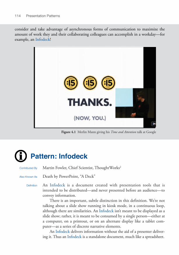
Merlin Mann’s Token Transactions Merlin Mann is a frequent speaker on productivity and Getting Things Done (GTD) tech-niques. An interesting presentation that he gave a few years ago, Time and Attention , 1 noted that one company handed out wooden tokens for employees to use to purchase meeting attendance. Yes, purchase . Employees had to use these scarce tokens in increasing quantities to get other employees to attend their meetings. This created a tangible measurement of the otherwise hidden cost of widely attended meetings, and it raised awareness of alternative, asynchronous forms of sharing and reviewing information. More knowledge workers should
114 Presentation Patterns
Pattern: Infodeck Contributed By Martin Fowler, Chief Scientist, ThoughtWorks 2
Also Known As Death by PowerPoint, “A Deck”
Definition An Infodeck is a document created with presentation tools that is intended to be distributed—and never presented before an audience—to convey information.
There is an important, subtle distinction in this definition. We’re not talking about a slide show running in kiosk mode, in a continuous loop, although there are similarities. An Infodeck isn’t meant to be displayed as a slide show; rather, it is meant to be consumed by a single person—either at a computer, on a printout, or on an alternate display like a tablet com-puter—as a series of discrete narrative elements.
An Infodeck delivers information without the aid of a presenter deliver-ing it. Thus an Infodeck is a standalone document, much like a spreadsheet.
Figure 4.1 Merlin Mann giving his Time and Attention talk at Google
consider and take advantage of asynchronous forms of communication to maximize the amount of work they and their collaborating colleagues can accomplish in a workday—for example, an Infodeck !

115Chapter 4, Temporal Patterns
Motivation There are certainly legitimate reasons for creating an Infodeck . Just make sure you are doing it on purpose—not accidentally by creating an ane-mic presentation.
Martin Fowler, who found this pattern in the wild rather than creating it, lists three advantages to creating Infodecks:
• You can use spatial layout to help with explanation. Frequently, presentation tools have better drawing support than word processors, and slides evoke “canvas” more readily than a blank word-processor screen.
• They discourage long prose that people don’t read. If the bullet points convey all you want, leave it at that rather than write a lot of purple prose around your bullet points.
• It’s easy to include diagrams as primary elements in the communication or let the diagrams, rather than prose, lead the narrative.
As long as you can avoid allowing an Infodeck to become Slideuments , pre-sentation tools are effective ways to craft succinct communication. However, the desktop-publishing features of most word processors do this job better without some of the limitations of a tool used counter to its original purpose.
In many ways, this pattern itself is a litmus test. If you set out to create a presentation and end up with an Infodeck , something went wrong. The subtle advantage that presentations have over other communication media is the control that you as the presenter have over the rate of knowledge exposition. Don’t surrender that control lightly.
Don’t try to present an Infodeck : Because you have put no effort into transitions or animations, you’ll present a series of textually dense slides, utilizing none of the features that make presentation tools effective.
Mechanics None of the rules we’ve laid out in the book change when you create an Infodeck . Those in the Creativity Patterns chapter are especially apt.
Don’t use transitions and animations for these types of slide decks. Rather, spend your time on concise and informative layout of information.
You can create compelling presentations using the Infodeck style. In particular, if you have compelling visuals that accompany your topic, show-ing them during your presentation aids it without the use of transitions or animations. However, if you’ve used no transitions or animation on any of the slides, you’ve purposefully ignored the time element of the presenta-tion. If you have a word-heavy slide deck with no time manipulation, you risk allowing your Infodeck to tend toward becoming an antipattern.
Known Uses Every corporation that hasn’t explicitly banned the Infodeck uses it.
Related Patterns Slideuments are usually a failed attempt to create an Infodeck . Decide early if you need a presentation or an Infodeck ; don’t try to create both.
Applicability/Consequences

116 Presentation Patterns
The Cookie Cutter antipattern applies acutely to the Infodeck : Don’t allow the slide to become the unit of thought.
Just because you are creating an Infodeck , you shouldn’t ignore Creativity Patterns like Narrative Arc . Being allowed to avoid transitions is one benefit of this pattern, but don’t throw everything out the window.
Developer Dan’s Density Dilemma Developer Dan wanted to become a better presenter, so he attended seminars that focus on speaking style, poise, diction, and the myriad other qualities that make a compelling speaker. But he received some contradictory advice. One seminar told him never to use slides or other presentation tools because slides draw audience attention away from the speaker. Another told him to use slides but never to convey more than one thought per slide. So he tried using the Takahashi pattern, but the boss, who printed the presentation to read on the flight, yelled about the high number of pages.
How can Dan reconcile this conflicting advice? He needs slides so that he can show technical artifacts such as code, but he doesn’t want to kill a forest. He needs a way to add information density without adding size . It turns out that he needs two patterns, Exuberant Title Top and Gradual Consistency , that add emphasis to elements via time rather than space.
Pattern: Gradual Consistency Definition When presenting information, you have an extra dimension that’s unavail-
able in a written document: time . Use time wisely in your presentation, building intelligently toward the final form—which could be Slideuments .
Motivation When you produce Slideuments , don’t feel compelled to show the “fin-ished” version of the slides right away. With Gradual Consistency , the slides will eventually look like the printed version, but it takes some time (and intermediate versions of the slides) to arrive at the final version.
Gradual consistency should be used in most Slideuments presentations. Because you are forced to print out your presentation, your slides hold little surprise when you present them. Gradual consistency helps emphasize the fact that time is sometimes very important in interpreting information, and it adds motion back into your presentation.
Gradual Consistency enables you to turn the disadvantage of Slideuments into an advantage. If forced to print out a copy beforehand, you can now leverage each audience member’s sense of narrative on each
Applicability/Consequences

117Chapter 4, Temporal Patterns
slide, illustrating via time how you reached the conclusion they now see cast in stone before them.
Mechanics The mechanics for this pattern have more to do with how you construct each slide’s narrative than with a particular set of tool techniques. Instead of showing tools, Neal will deconstruct a complex slide from one of his technical presentations.
In Neal’s Emergent Design presentation, he defines a concept called idiomatic patterns , which is an alternate way of looking at a well-known concept in the software-development community— design patterns . He starts by talking about patterns but as a grand concept: Patterns with a capital P, as shown in Figure 4.2 .
For the first animation, he wanted to deflate the concept of design pat-terns a bit, so the first animation changes the uppercase P to a lowercase one, as shown in Figure 4.3 .
In this case, Neal replaced the entire uppercase “Patterns” with another text box with the lowercase “patterns”—partially because the “patterns” text box has a complex further life on this slide. An interesting alternative would be to replace only the first letter, implemented by creating two text boxes: one for the first letter and another for the remainder of the word (“atterns”). That would allow a different animation for just the first letter, which would sup-port the presentation’s goal of making a subtle distinction between the two different types of patterns.
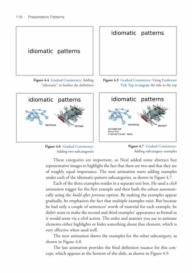
The next animation builds in the word “idiomatic,” further separating Neal’s conception of patterns from the traditional one, as shown in Figure 4.4 .
Neal then converted these two words into the slide’s title, thereby imple-menting the Exuberant Title Top pattern: Make a major point, then use the body of the slide to provide extra examples or nuance. This effect is shown in the next intermediate version of the slide, which appears in Figure 4.5 .
The next animation shows the two categories of idiomatic patterns—”technical” and “domain”—as shown in Figure 4.6 .
Figure 4.2 Gradual Consistency: Introducing the “Pattern” concept
Figure 4.3 Gradual Consistency: Changing only the first letter
118 Presentation Patterns
These categories are important, so Neal added some abstract but representative images to highlight the fact that there are two and that they are of roughly equal importance. The next animation starts adding examples under each of the idiomatic-pattern subcategories, as shown in Figure 4.7 .
Each of the three examples resides in a separate text box. He used a click animation trigger for the first example and then built the others automati-cally using the build after previous option. By making the examples appear gradually, he emphasizes the fact that multiple examples exist. But because he had only a couple of sentences’ worth of material for each example, he didn’t want to make the second and third examples’ appearance as formal as it would seem via a click action. The order and manner you use to animate elements either highlights or hides something about that element, which is very effective when used well.
The next animation shows the examples for the other subcategory, as shown in Figure 4.8 .
The last animation provides the final definition nuance for this con-cept, which appears at the bottom of the slide, as shown in Figure 4.9 .
Figure 4.4 Gradual Consistency: Adding “idiomatic” to further the definition
Figure 4.5 Gradual Consistency: Using Exuberant Title Top to migrate the title to the top
Figure 4.6 Gradual Consistency: Adding two subcategories
Figure 4.7 Gradual Consistency: Adding subcategory examples

119Chapter 4, Temporal Patterns
This last bit of text appears on an already crowded slide, but Neal wanted to make sure he added that last supporting statement. To make it stand out a bit, he used a bold font (later changed to an Analog Noise font for even more emphasis) and used a Composite Animation rather than his usual dissolve animation.
All the animations on this single slide illustrate patterns and techniques that appear throughout this book (and more than typi-cally come into play at one time). Getting the elements in the right place for Slideuments purposes required a bit of invisible, pre appear-ance moves. For example, Figure 4.10 shows the build inspector in Keynote, with the “pat-tern” text box highlighted. It does a pre appearance move underneath the other “Patterns” text box (the one with the capital P) so that it can replace it when Neal emphasizes their difference. It then moves back up to the top of the slide as an Exuberant Title Top .
This final built version of the slide corre-sponds to the print version in the Slideuments . If your audience members are following along as you do the presentation, this is what you’re building toward. Gradual Consistency pro-vides a way to add some dynamic interest to your talk. When you start with this slide, your audience can see the common elements, which creates a bit of tension: What’s missing, and what’s going to be added? That tension translates into interest, especially if you also remove some things along the way as Neal did in this example (changing “Patterns” to “patterns”).
Figure 4.8 Gradual Consistency: Adding examples for the other subcategory
Figure 4.9 Gradual Consistency: Adding the last definition nuance
Figure 4.10 Gradual Consistency: The slide inspector in Keynote
highlighting the complex life of the “pattern” text box

120 Presentation Patterns
Related Patterns This pattern works particularly well with the Slideuments pattern, as you frequently want to slowly build toward the printed version.
Exuberant Title Top is a specific implementation of this pattern.
Mary’s Handouts Mary understands the perils of the Cookie Cutter antipattern, so she wants to make sure each slide in her presentation conveys a single thought. However, she also has to consider what the size of the handout will be. Although it looks fine to flip quickly through 200 slides during a presentation, no one wants to do that with paper.
How can she meet the simultaneous goals of a quality presentation and a concise printed equivalent? Bulleted lists meet the goal of conciseness, but they lead directly to the Bullet-Riddled Corpse antipattern. Single slides with just a few words make presentations more engaging but hinder conveying significant amounts of information in a compact printed space. Mary needs the next few patterns, which allow the presenter to control the exposition rate precisely.
Pattern: Charred Trail Also Known As Highlighted Bullet, Single Line of Focus
Definition When printed, a Charred Trail slide is a complete slide. In presentation mode, items on the projected slide appear one at a time; as each one appears, the previous one grays out.
Figure 4.11 shows a slide in the designer (which is how it will print), and Figure 4.12 shows the same slide during the presentation.
Figure 4.11 Charred Trail slide in the designer Figure 4.12 The same slide during presentation

121Chapter 4, Temporal Patterns
Motivation This pattern works nicely for audiences accustomed to presentations fea-turing many Bullet-Riddled Corpse slides because when printed it appears to be in the same format. However, it also provides the highly desirable presentation quality of highlighting each point as you discuss it.
If you must create Slideuments , this pattern enables you to create a printed page that contains high-level talking points. As you present, only the item you’re focusing on shows on the screen with full contrast.
A charred trail provides a good sense of where you are within the slide, making it a version of a Context Keeper , but with the scope of a single slide instead of the entire deck.
This pattern enables you to produce a concise printout that still provides a reasonable presentation format at the expense of a nontrivial amount of additional effort.
This pattern is applicable any time you are forced to create a Slideument and need to control the exposition pace. It is also a useful organizational principle that enhances readability yet presents well.
This pattern works nicely with Exuberant Title Top .
Mechanics PowerPoint includes this pattern as one of its features, although it has one annoyingly hidden property required to make it work properly. Keynote implements this feature directly, making it easy in both tools to create a template slide featuring this technique.
PowerPoint PowerPoint allows you to implement this pattern by setting animation options for entrance animations such as fade . Once you’ve placed your elements in a text box in the animation pane, select the topmost element, click in the ani-mation pane, and select effect options . . . , as shown in Figure 4.13 .
One of the options is what color you would like to set the element after animation; to create the Charred Trail effect, set it to a transparent version of the original color.
You must take one more step to make this implementation palatable when you present the slides. By default, each of the elements in the text box will dim their color after the subsequence animation, which is the behavior you want . . . except for the last element. For our implementation of Charred
Applicability/Consequences
Figure 4.13 Effect options dialog in PowerPoint

122 Presentation Patterns
Trail , the last element isn’t “charred”—in other words, the next thing that should happen after the last element on the slide isn’t to make the last ele-ment transparent but to transition to the next slide. By default, PowerPoint will dim the last element, requiring you to click an extra time to get to the next slide.
To eliminate this annoyance, expand the animation pane to show each individual element, and select the last element you’ll show. For that ele-ment, set the effect options . . . to don’t dim , which will make the last element behave correctly.
Keynote Keynote implements this pattern directly, as shown in Figure 4.14 . Choose any build in animation you like, and then choose the delivery option of by highlighted bullet . Unlike the PowerPoint version, you don’t have to do any-thing special to avoid “charring” the last element; Keynote acts correctly, allowing the last animation (“charring” the last element, which you don’t need) to perform the slide transition instead.
Related Patterns This pattern is a form of Context Keeper for an individual slide: It helps the audience focus exactly where you want it to, keeping the current context within each slide.
This pattern works nicely with Exuberant Title Top .
Figure 4.14 Slide inspector showing by highlighted bullet approach for Charred Trail
123Chapter 4, Temporal Patterns
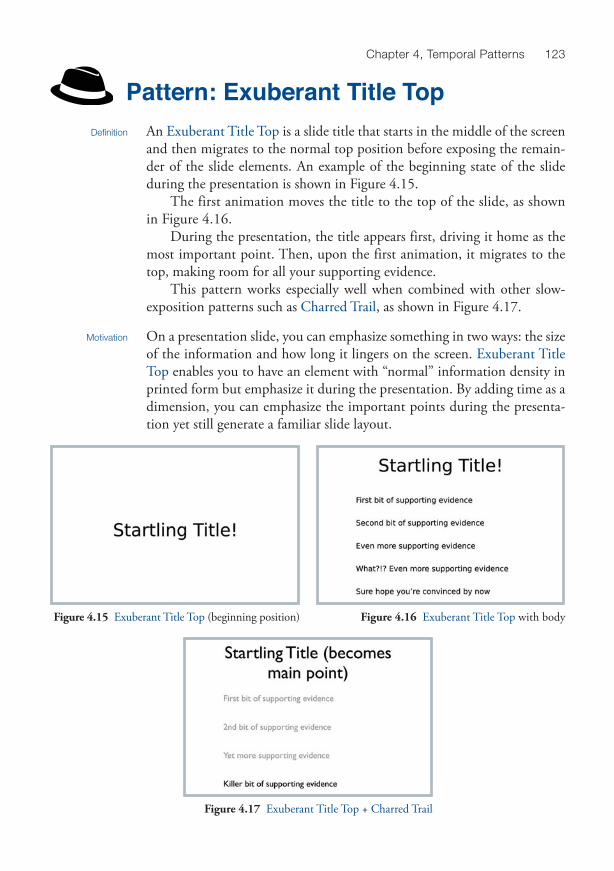
Pattern: Exuberant Title Top Definition An Exuberant Title Top is a slide title that starts in the middle of the screen
and then migrates to the normal top position before exposing the remain-der of the slide elements. An example of the beginning state of the slide during the presentation is shown in Figure 4.15 .
The first animation moves the title to the top of the slide, as shown in Figure 4.16 .
During the presentation, the title appears first, driving it home as the most important point. Then, upon the first animation, it migrates to the top, making room for all your supporting evidence.
This pattern works especially well when combined with other slow-exposition patterns such as Charred Trail , as shown in Figure 4.17 .
Motivation On a presentation slide, you can emphasize something in two ways: the size of the information and how long it lingers on the screen. Exuberant Title Top enables you to have an element with “normal” information density in printed form but emphasize it during the presentation. By adding time as a dimension, you can emphasize the important points during the presenta-tion yet still generate a familiar slide layout.
Figure 4.15 Exuberant Title Top (beginning position) Figure 4.16 Exuberant Title Top with body
Figure 4.17 Exuberant Title Top + Charred Trail

124 Presentation Patterns
This pattern applies strongly to Slideuments because it bridges the gap between attractive printouts and effective presentations but can be a useful technique in any presentation.
A slight negative reaction to this pattern can arise when people in the audience are following along (an antipattern that goes hand-in-hand with Slideuments ). Because Exuberant Title Top exposes your full slide content slowly (especially when used in conjunction with patterns like Charred Trail ), it sometimes takes a long time for the presented slides to match the printouts. This can create a bit of tension (especially for audience members accustomed to following along) that you might want to mitigate early on with an explanation.
Mechanics The basic mechanics of this pattern have you play with time in the designer as much as during the presentation. Slideuments should be readable when printed, meaning that the printed version should mirror the slide in the designer. You want the title in its “normal” place at design time, but you want it to start life in the middle of the slide when presented. The key real-ization is that build in doesn’t need to be the first animation activity by an element on a slide. Exuberant Title Top works by moving the title element to the center of the slide as its first animation. Only then does the build in animation fire, followed by another move of the title back to its home at the top of the slide.
General Recipe 1. Place the title on the slide where you want it to appear in the printed
version of the Slideuments . 2. Create a build in animation for the title. 3. Create the first of two move animations. The first moves the title from
its finishing spot to the location where you want it to appear initially. In the animation inspector, change this animation so that it occurs before the build in animation.
4. Create the second move animation, symmetrical to the first, moving the title from the initial location to the final location.
Applicability/Consequences
1. The slide shown in Figure 4.17 appears both in the designer and when printed out as Figure 4.18 .
But when you click on the title itself in the designer, you see the real trickery at work here, which is shown in Figure 4.19 .
Most people think of build in as the first possible animation for an item on a slide, but that’s not the case. For the design-time view (and consequently the document you’re going to print) to remain pretty, the title box must be in its final position, at the top. However, for the effect
Exuberant Title Top in Keynote

125Chapter 4, Temporal Patterns
to work, the title must appear in the middle of the slide and migrate to the top. The complete slide in the Keynote designer along with the inspector appears in Figure 4.20 .
2. When the slide transitions in, the title’s first animation moves it to the middle of the screen. Then the title’s build in animation fires. The first move to the middle is set to happen as the slide transition occurs, and the duration is set to the minimum time (0.01 seconds).
3. The build in build makes it appear. The next click performs a second move build to get it back to its original location while the rest of the slide content starts to appear. Generally, the first supporting-evidence item should be set to build after the second move, which gives the appearance that the title is being pushed upward by the supporting facts. If you use the with build, you’ll see some overlap between the migrating title and the first element.
Figure 4.18 Exuberant Title Top slide in designer Figure 4.19 Exuberant Title Top slide in designer
Figure 4.20 Exuberant Title Top slide in designer

126 Presentation Patterns
Keynote will fight you a little on setting up this pattern because it assumes that the first thing you’ll want to do to a slide element is make it appear. Consequently, if you add a move build and then add an build in animation, Keynote reorders the builds to make the build in occur first. It’s a simple matter to repair the misguided help by manually moving the move build above the build in build; Keynote won’t bother it again.
1. The slide in Figure 4.21 shows an Exuberant Title Top slide in the de-signer, along with the animation pane.
Most people think of entrance as the first possible animation for an item on a slide, but that’s not the case. Because the goal of Slideuments is to create a presentation that looks nice when printed, you must keep the design-time view clean. That means that the title box must be in its final position at the top. However, to get the effect to work, the title must appear in the middle of the slide and migrate to the top.
When the slide transitions in, the title’s first animation moves it to the middle of the screen. Then the title’s entrance build kicks in. The first move to the middle is set to happen as the slide transition occurs, and the duration is set to the minimum time (0 seconds). Once that happens, you can now allow the title to appear as it normally would.
2. The entrance animation makes the title appear. The next click performs a second move animation to reset the title back to the top of the slide. Generally, the first supporting evidence item’s animation should be set to start after previous , which gives the appearance that the title is being pushed upward by the supporting facts. (If you use the start with previous , you’ll see some overlap between the migrating title and the first element.)
Exuberant Title Top in PowerPoint
Figure 4.21 Exuberant Title Top in the PowerPoint designer

127Chapter 4, Temporal Patterns
PowerPoint will fight you a little on setting up this pattern because it assumes that the first thing you’ll want to do to a slide element is make it appear. Consequently, if you add a motion path animation and then add an entrance build, PowerPoint will reorder the builds to make the entrance first. It’s a simple matter to repair the misguided help by manually moving the motion path animation above the entrance build; PowerPoint won’t bother it again.
Related Patterns This pattern is frequently used with the Slideuments pattern as you build slowly toward the printed version of the slide.
Charred Trail and Exuberant Title Top make an attractive combination because they work well together to provide good information density and controlled exposition.
This pattern is a specialization of the Gradual Consistency pattern; the title eventually goes to the top to match the final version of the slide.
Pattern: Invisibility
Also Known As Hidden Treasure
Definition Use invisible elements and surprise animations to restore some mystery and surprise to your presentation. Those invisible elements may be blank slides that you place at strategic points in the presentation to force the audience’s focus back to you, the presenter.
Motivation Surprise is an excellent technique for creating and maintaining interest. Yet when you are presenting from Slideuments , the audience usually has a copy of your presentation. They know all your surprises, which ruins them. This pattern suggests that you use hidden images, phrases, or other invisible (to the handouts) elements to restore intrigue.
By the same token, you sometimes want some preparatory time to set up the subject of the next slide. Allowing the old slide to remain shows stale con-tent. You can create a slide that uses animations yet starts in a completely blank state. You effectively keep elements invisible until you want to show them.
Applicability/Consequences
This pattern works in any Slideuments setting. Some may think this is too showy for office presentations, but we disagree. Those presentations tend to be among the dullest, and anything that adds interest is welcomed by every-one in the room (presenter and audience alike). Business presentations must frequently implement the Slideuments antipattern; this pattern is a good complement.

128 Presentation Patterns
One negative consequence of this pattern is less consistency with the printed version of the Slideuments . You must weigh the benefit of using a few surprise elements to spice up the presentation against the erosion of consistency.
Another consequence of this pattern appears at design time for your slides. To make Slideuments attractive, you must pay attention to your slides’ appearance in the designer because that is the view that prints. If you have invisible elements on the slide, it’s easy to forget they are there and accidentally work on the slide. Keynote adds little diamonds to indicate hidden elements with builds, as shown in Figure 4.23 . PowerPoint shows the animation order number on top of each element. Neither mechanism is great; it’s easy to not see the invisible element when you have lots of other elements on the slide. Neal uses a little indicator on the speaker’s notes for the slide: If the characters “(-)” appear at the first of the notes (it’s supposed to look like an eye), he knows that there’s something invisible on the slide and to tread carefully when making changes.
A little of this pattern goes a long way. After you’ve sprung a surprise on your audience once, they’ll automatically pay more attention in case you do it again. As long as you plant one early, you can use very few yet benefit from this effect. Conversely, if you use it too much, it loses its surprise fac-tor and becomes annoying.
Mechanics The Invisibility pattern is simple to implement in both Keynote and PowerPoint, but each utilizes a different tool feature. The short version: In Keynote, you make the image invisible by setting its opacity to zero and then use an action to set the opacity to 100 percent. In PowerPoint, it’s more difficult to set the opacity initially, so you can use a slide-sized white image with no border as a curtain. To make the image appear, you “drop” the curtain. The curtain effect will work in Keynote as well, but our current implementation is easier.
Here is an example of this pattern from one of Neal’s presentations. He’s trying to show some options for a technical solution to a problem, and the first suggestion works but is considered suspect by other developers (for good reason). For completeness, Neal wanted to show the option but also convey that perhaps it isn’t the optimal solution. The slide sequence appears in Figure 4.22 .
The designer view is the view you get when you print your Slideuments . When you look at this slide in the designer, the background image doesn’t seem to appear. Figure 4.23 shows the designer view for this slide.

129Chapter 4, Temporal Patterns
Notice the red diamonds in the designer view, which is Keynote’s indicator for hidden animations. Clicking on the bottom-right diamond shows a ghost view of the image whose opacity you have set to zero, as shown in Figure 4.24 .
As you can see in Figure 4.24 , the image exists but won’t appear until its appearance animation happens. In this particular example, Neal also moved the text to fit into convenient spots on the resulting slide. He wanted the main point to show up centered on the slide and only make way for the surprise ele-ment. You may also notice that part of the image “hangs off” the slide in the designer, which is perfectly OK. Neal needed to get the image aligned with the text and ended up using just the part of the picture that fit nicely with the text.
Alignment with the surrounding text can be tricky. You want the text to look unassuming, which adds more impact to the surprise element. When you place the invisible image on the slide, set its opacity to 10 per-cent until you get everything the way you want it. Then set it to zero for the final effect (and find a way to remind yourself that invisible things now lurk on your slide the next time you make changes).
Figure 4.22 Invisibility slide as presented
Figure 4.23 Invisibility slide in the Keynote designer Figure 4.24 Ghost image of the invisible element

130 Presentation Patterns
1. Choose a suitable image or phrase that you want as your surprise and add it to the slide.
2. Set the image’s opacity to 0 using the inspector, as shown in Figure 4.25 .
3. After you have all the other elements in place on the slide, add an opacity action that restores the image to 100 percent.
4. You can use the reappearance of the image as the build in animation if you like. However, if you’re really going for surprise, set the duration of the opacity action to 0.10 seconds, and add a build in animation for the image. When you add the build in animation, Keynote will always place the build in animation above any existing action s you might have in the slide’s build order. You have to change the order manually only once; Keynote will stop fighting you on this subject.
Invisibility in Keynote
Figure 4.25 Inspector with 0 opacity setting
1. Choose a suitable image or phrase that you want as your surprise and add it to the slide.
2. Insert a borderless shape that covers your surprise element. It can be as small as a box that covers a phrase or big enough to cover the entire background of the slide. (See Figure 4.22 for an example.) You’ll have to play around with the layering order to get it so that it covers your surprise element but doesn’t cover other text that you want to see on your Slideuments .
3. At the point on the slide’s timeline when you’re ready for the surprise, create an exit animation for your shape with zero duration. Removing the curtain will make your image appear. If you want more bang for your surprise, add an entrance animation immediately after you exit the curtain; the zoom entrance works nicely.
Related Patterns This pattern works well in Slideuments to add a bit of presentation time pizzazz.
Invisibility in PowerPoint (Also
Known as the “Curtain Trick”)
131Chapter 4, Temporal Patterns
Pattern: Context Keeper Definition A Context Keeper reveals a presentation’s structure. An organizational tech-
nique, it uses a presentation device (such as an animation or transition) to reveal the talk’s structure temporally, by subject matter, or via some other context meaningful to the audience.
Motivation Context Keeper imposes a visible structure on a presentation that might not be obvious enough from the content.
This pattern applies when the following occur:
• The presentation subject matter naturally consists of discrete chunks • You have a complex subject and need to identify potentially confusing
parts explicitly • You want to help the audience understand the Narrative Arc of your
presentation with some visual guidance
Mechanics You can implement this pattern in many ways, including Breadcrumbs , but the pattern goes beyond a simple concrete technique. A Context Keeper ties a series of slides together within a larger subject area. Erik Doernenburg, a well-known technical presenter, suggests using a different slide color back-ground for each section—a nice, simple way to implement this pattern.
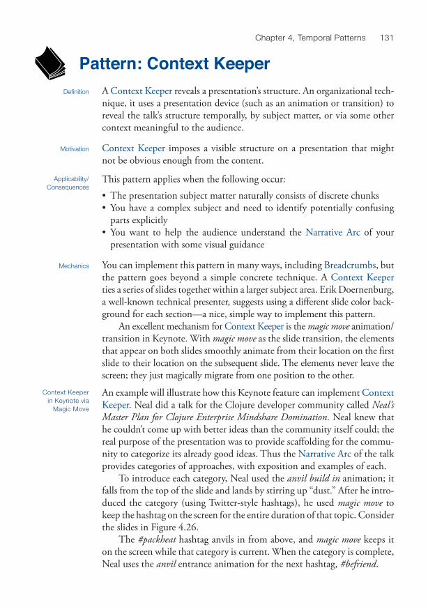
An excellent mechanism for Context Keeper is the magic move animation/transition in Keynote. With magic move as the slide transition, the elements that appear on both slides smoothly animate from their location on the first slide to their location on the subsequent slide. The elements never leave the screen; they just magically migrate from one position to the other.
Applicability/Consequences
An example will illustrate how this Keynote feature can implement Context Keeper . Neal did a talk for the Clojure developer community called Neal’s Master Plan for Clojure Enterprise Mindshare Domination . Neal knew that he couldn’t come up with better ideas than the community itself could; the real purpose of the presentation was to provide scaffolding for the commu-nity to categorize its already good ideas. Thus the Narrative Arc of the talk provides categories of approaches, with exposition and examples of each.
To introduce each category, Neal used the anvil build in animation; it falls from the top of the slide and lands by stirring up “dust.” After he intro-duced the category (using Twitter-style hashtags), he used magic move to keep the hashtag on the screen for the entire duration of that topic. Consider the slides in Figure 4.26 .
The #packheat hashtag anvils in from above, and magic move keeps it on the screen while that category is current. When the category is complete, Neal uses the anvil entrance animation for the next hashtag, #befriend .
Context Keeper in Keynote via
Magic Move

132 Presentation Patterns
Although using a recurring element like the hashtag in this example ties your context together nicely, it can be a distraction if it becomes a Floodmark . A technique Neal uses allows the magic move to be the context keeper and then gradually fades the recurring element away on subsequent slides. When the context shift is new, he enhances the noticeability of the Context Keeper by leaving it at full color and then gradually reducing its opacity on subsequent slides, as shown in Figure 4.27 .
Figure 4.26 Using a hashtag + magic move as a Context Keeper
Figure 4.27 Fading recurring element to keep it from becoming a distraction
As of this writing, PowerPoint doesn’t include this powerful feature. You can mimic the effect with some effort, but the end result isn’t as nice.
To partially emulate magic move as a Context Keeper in PowerPoint, do the following:
1. Entrance animate the first element in whatever way you like. 2. For the exit animation, choose one like fly out or wipe . 3. For the next slide, the first animation after the transition should be the
symmetrical entrance animation. For example, if you chose wipe as the exit on the previous slide, choose the effect options to wipe left to right.
4. On the entrance animation on the subsequent slide, choose wipe with the option for right to left.
Using transitions and animations as a Context Keeper creates a visual bridge to the previous slide by using symmetrical animations. This doesn’t look as nice as Keynote’s magic move because you still “lose” the element as the slide transitions. The magic of magic move is that it can display things at times not allowed using standard transitions, such as between slides.
Related Patterns The Breadcrumbs pattern is a specific implementation of this pattern. You need an identifiable Narrative Arc to provide the context this
pattern preserves.
Context Keeper in PowerPoint

133Chapter 4, Temporal Patterns
Pattern: Breadcrumbs Also Known As Agenda, Roadmap
Definition Place slides at critical junctures within your presentation to give the audi-ence checkpoints that indicate where you are in the overall presentation.
Motivation When you give a long talk, it’s easy for attendees to lose track of the narra-tive flow, especially if the topic is highly technical or the material is new for the audience. Showing checkpoint slides along the way makes it easier for the attendees to see the overall structure of your material.
This pattern works best in situations in which you are
• giving a lengthy presentation; • covering complex technical subjects; and • presenting a very abstract, “hand-waving” kind of talk.
On the downside, you must sacrifice some of your presentation time to a metapresentation concern—namely, elucidating the talk’s structure. If you find yourself always using this pattern and your subject area isn’t overly technical, perhaps you should rethink your presentation’s organization. If the attendees can’t figure out the organization, perhaps you should revise the organization to make it clearer. You don’t want the audience to miss your important points because they can’t readily figure out what context a point belongs in. Getting the organization right is sometimes tricky but always improves the clarity of your presentation.
We’ve seen some evil VBA (scripting code for Windows-based applica-tions) code on the Internet that enables you to embed a “live” progress bar in your presentation, showing precisely what percentage you’ve completed. We dislike real-time progress indicators because they distract from your message by introducing too much metapresentation information (see the Going Meta antipattern). You want the audience to proceed within a con-text of ideas , not just elapsed time. Your audience will start noticing the progress and, just like a user waiting for a document to save, start hoping for a merciful end.
Mechanics This pattern has many different implementations; a common one is to repli-cate the agenda slide throughout the presentation. You can use presentation-tool tricks like highlighting the upcoming section or dimming the completed ones à la the Charred Trail pattern.
You don’t have to use bulleted agendas to implement this pattern; it’s difficult to get many levels of indentation unless you resort to Ant Fonts .
Applicability/Consequences

134 Presentation Patterns
Neal sometimes uses a mind map to show the overall structure in a single image, as shown in Figure 4.28 .
Showing an entire mind map might not be the best way of automati-cally notifying your attendees where you are within the presentation. You can always improve the static view of the mind map with a little bit of highlighting, as shown in Figure 4.29 .
During the presentation, Neal has a dissolve entrance animation on the highlight box so that the audience sees the overall agenda for a moment; the next topic of conversation then slowly highlights. An alternative approach he has also used is to reduce the opacity on the elements that aren’t the cur-rent topic.
Related Patterns This pattern is a specific implementation of the Context Keeper pattern. You can combine Breadcrumbs with Bookends , placing your agenda
elements within the other content. Breadcrumbs serve to illuminate the structure of your talk, but be care-
ful to avoid Going Meta by telling your audience too much about the structure and other things you find fascinating but are decidedly peripheral to the subject of the presentation.
Figure 4.28 Representation of a mind map providing a good breadcrumb overview
Figure 4.29 Highlighting the breadcrumb to make your location unambiguous

135Chapter 4, Temporal Patterns
Pattern: Bookends
Also Known As Opening and Closing Curtain, Previews and Trailers
Definition Place similar or identical slides at the start and end of your presentation deck, often for the purpose of advertising yourself or your presentation.
Motivation The following are various motives for using Bookends :
At the Beginning The front bookend slide reassures audience members that they are in the correct room with the correct presenter. It is also a form of guilt-free adver-tising for the presenter that entertains the waiting audience and consumes none of the allocated presentation time.
Additional attendees, including some who may be highly interested in your topic but unaware of your talk, might be enticed into the room by the first advertising slide. Persons wandering by the open door of the room who see the slide might think, “That’s catchy. I think I’ll sit in on this.” Just as usefully, the front bookend slide might turn away attendees who are already in their chairs. Perhaps they now realize they’re in the wrong talk or that they’d misunderstood the single-sentence abstract that had led them to attend. The net result is that your audience is now a set of more interested attendees. The energy of the room, the volume of questions, the intensity of interac-tion, and the feedback scores will all be heightened by this process of natural but aided audience selection.
At the End The concluding bookend slide is often identical to the opening one. It offers one more opportunity for audience members to jot down your phone number, website, e-mail address, or other contact information. It can also serve as a reminder to the audience to tweet a positive (or occasionally criti-cal) comment about your talk while mentioning your Twitter handle.
A final bookend slide serves one more important purpose: It lets the audi-ence know that your presentation has concluded. This may seem like a trivial benefit, but think back to presentations you’ve attended in which you were uncomfortably unsure if it was polite to leave. Is she done? Is there more? This should be crisply clear—not be a matter for conjecture. A bookend slide politely says, “We’re done, and you are free to leave or ask questions.”
Every presentation that allots time for the audience to get settled and doesn’t immediately transition to another presenter at its end should apply this pattern. This includes corporate, boardroom, internal, informal, and special interest group presentations. No matter how
Applicability/Consequences

136 Presentation Patterns
familiar the group, almost certainly someone in the audience will know how to reach you only from the contact information on your talk’s bookend slides.
If stylistically permissible, this pattern should be applied even to unique formats such as Ignite and Pecha Kucha, which are popular styles that implement the Lightning Talk pattern.
Making your contact information clear increases the chance of contact for future interest, which might be good for business if you’re a professional speaker (but a curse if you get too much useless contact).
Feedback will be more transparent about your performance. If your social media links, such as a Twitter handle, are posted as part of the book-end slides, you can expect more candid feedback—some complimentary, some constructive, some passive, and some downright mean-spirited. Social media books such as The Backchannel 3 offer insights into how to harness and shape this new avenue of instant commentary.
If you’re speaking with an opportunity for feedback via evaluation forms, be sure to remind your audience on your final bookend slide to fill them out. Receiving useful, actionable comments on your presenta-tion is both rare and valuable, and it’s essential to applying the Crucible pattern correctly.
At the Beginning The bookend slide can contain as much or as little information about the presenter as desired. The following are frequently used items:
1. Speaker’s full name 2. Speaker’s business title or position 3. E-mail address 4. Twitter handle 5. Blog URL 6. Company name 7. Company website URL 8. Copyright information (or perhaps Creative Commons License)
At the End The concluding bookend slide might differ from the opening one by including “Questions?” in a large font. This signals not only that the pre-sentation has ended but also that questions are now welcome.
The final slide might also differ by including a link to where your slides can be downloaded. In the age of digital distribution, it is increasingly com-mon to deliver a supplement or the slides themselves digitally, eschewing the printed handouts model of yore.
The concluding bookend slide often contains the following:
Mechanics

137Chapter 4, Temporal Patterns
1. Slides download URL 2. Talk and presenter feedback URL, such as a link to SpeakerRate. 4 3. A repeat of many or all the items on the opening bookend slide
Related Patterns An advanced implementation of this pattern is embodied in Preroll —an animated, embedded movie that loops through several slides.
A similar mechanism to Bookends is the Intermezzi slides, which serve as transitional buffers between subject matter shifts. Generally, we are more likely to allow Floodmarks and other distractions on Bookends than Intermezzi .
Pattern: Soft Transitions Also Known As Slow Fade, Fade to Black, Crossfade
Definition Use subtle slide transitions (such as dissolve ) to avoid always being forced to show exactly one slide’s material at a time.
Motivation As we discuss in the Cookie Cutter antipattern, using the slide to define the unit of size for your thoughts is a bad idea. Some thoughts require more than one slide to explore them fully. Don’t fall into the trap of allowing the presentation tool to define the scope of information flow. Instead, use the tool to its advantage, controlling the information flow via slide transitions and animations.
Transitions, defined as moving from one slide to the next, implement your narrative flow. If you use no transitions (in other words, are presenting an Infodeck ), all information arrives in slide-sized chunks. Using consistent, subtle transitions is one way to unify your topic visually across multiple slides.
Figure 4.30 An opening Bookend slide Figure 4.31 A closing Bookend slide
138 Presentation Patterns
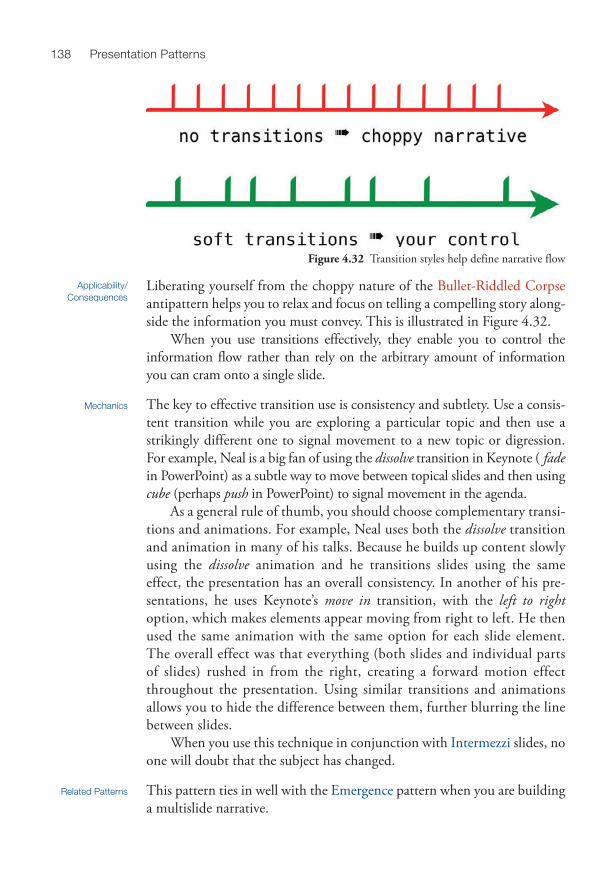
Liberating yourself from the choppy nature of the Bullet-Riddled Corpse antipattern helps you to relax and focus on telling a compelling story along-side the information you must convey. This is illustrated in Figure 4.32 .
When you use transitions effectively, they enable you to control the information flow rather than rely on the arbitrary amount of information you can cram onto a single slide.
Mechanics The key to effective transition use is consistency and subtlety. Use a consis-tent transition while you are exploring a particular topic and then use a strikingly different one to signal movement to a new topic or digression. For example, Neal is a big fan of using the dissolve transition in Keynote ( fade in PowerPoint) as a subtle way to move between topical slides and then using cube (perhaps push in PowerPoint) to signal movement in the agenda.
As a general rule of thumb, you should choose complementary transi-tions and animations. For example, Neal uses both the dissolve transition and animation in many of his talks. Because he builds up content slowly using the dissolve animation and he transitions slides using the same effect, the presentation has an overall consistency. In another of his pre-sentations, he uses Keynote’s move in transition, with the left to right option, which makes elements appear moving from right to left. He then used the same animation with the same option for each slide element. The overall effect was that everything (both slides and individual parts of slides) rushed in from the right, creating a forward motion effect throughout the presentation. Using similar transitions and animations allows you to hide the difference between them, further blurring the line between slides.
When you use this technique in conjunction with Intermezzi slides, no one will doubt that the subject has changed.
Related Patterns This pattern ties in well with the Emergence pattern when you are building a multislide narrative.
Applicability/Consequences
Figure 4.32 Transition styles help define narrative flow

139Chapter 4, Temporal Patterns
This pattern also facilitates multislide implementations of the Gradual Consistency pattern.
Use the Soft Transitions pattern to help avoid the Cookie Cutter antipattern.
Pattern: Intermezzi Also Known As Digital Entr’acte
Definition Use a color change, thematic shift, or outline introduction to clearly signal the beginning or end of each logical part of your presentation’s narrative structure.
Motivation Presentations should be composed of logical parts in the form of a Triad or Narrative Arc . Intermezzi , like Breadcrumbs , are a form of Context Keeper that helps you to set your presentation’s organizational context.
When audience members are sitting through a lengthy presentation, they need hooks to reset their understanding of where you are taking them in the overall story. Small, graphically creative cues—sometimes supple-mented by a list of points or words describing the next big idea —can help align audience minds with your presentation direction.
This pattern is useful for long expositions, deep topics with many tentacles, and tutorial-style talks. Any presentation over 15 minutes in length can benefit from it. It is especially recommended for talks in the 50- to 90-minute range because they can cover so much ground that the audience needs to be gently kept in mental lockstep with the presenter.
If done poorly, these demarcation slides can cause a slight visual inter-ruption of the narrative. But if you are careful to keep them within the Unifying Visual Theme , they can reinforce your overall message rather than detract from it.
Mechanics You can use many techniques to implement this pattern, such as the following:
• Color change from main presentation • List of items to be covered (opening) • List of items just covered, inviting questions (closing) • A visual element or picture that represents the next group of ideas • A loaded question that raises or renews interest in the next section
Another common way to delineate section changes is to use obvious graphical slides, generally tied to the Unifying Visual Theme. Neal uses this
Applicability/Consequences
140 Presentation Patterns
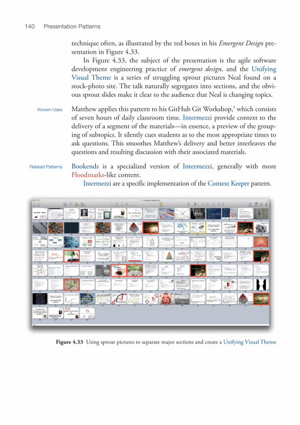
technique often, as illustrated by the red boxes in his Emergent Design pre-sentation in Figure 4.33 .
In Figure 4.33 , the subject of the presentation is the agile software development engineering practice of emergent design , and the Unifying Visual Theme is a series of struggling sprout pictures Neal found on a stock-photo site. The talk naturally segregates into sections, and the obvi-ous sprout slides make it clear to the audience that Neal is changing topics.
Known Uses Matthew applies this pattern to his GitHub Git Workshop, 5 which consists of seven hours of daily classroom time. Intermezzi provide context to the delivery of a segment of the materials—in essence, a preview of the group-ing of subtopics. It silently cues students as to the most appropriate times to ask questions. This smoothes Matthew’s delivery and better interleaves the questions and resulting discussion with their associated materials.
Related Patterns Bookends is a specialized version of Intermezzi , generally with more Floodmarks -like content.
Intermezzi are a specific implementation of the Context Keeper pattern.
Figure 4.33 Using sprout pictures to separate major sections and create a Unifying Visual Theme

141Chapter 4, Temporal Patterns
Pattern: Backtracking Contributed By Martin Fowler, Chief Scientist, ThoughtWorks 6
Definition Backtracking is a Context Keeper technique that enables you to reestablish a narrative context by purposefully repeating slides.
Motivation Many talks naturally feature a primary narrative stream with necessary digressions along the way. Backtracking helps you safely venture off on a tangent and then immediately reestablish the previous context. The dupli-cated slides remind the audience where you left off and also establish a new context for the next few slides.
This pattern provides benefits beyond structural convenience. Returning to a familiar spot is a familiar narrative pattern. Comedians call this a call-back : returning to a punch line delivered earlier in the show to elicit a new (sometimes even bigger) laugh. People are accustomed to navigation clues in stories and movies; you can leverage that innate knowledge for your presentation.
This pattern applies to presentations that feature digressions. Be careful when implementing this pattern because it forces you to violate
the DRY (Don’t Repeat Yourself) principle: If you change any of the slides you’re using as backtrackers, you must remember to change all copies of them.
Mechanics No special tool support is required to implement this pattern. When you identify a trail off your main narrative, copy the slide that you show just before you start your digression and paste it at the end of the digression.
Use a distinctive slide transition to indicate you are venturing into a digression. Neal loves the cube transition in Keynote, flipping to the right to start the digression and left to return.
This pattern is different from using the slide tool to revisit an earlier slide as a reminder. The Backtracking pattern purposefully duplicates slides to act as visual placeholders. As in the Invisibility pattern, Neal always places a special character in the speaker’s notes (in this case, it’s “#_#”) to remind him that this is a duplicated Backtracking slide and to be careful to only change the original.
Related Patterns This pattern is a specific implementation of the Context Keeper pattern. Intermezzi make a great backtracking destination; they exist in the pre-
sentation to provide an anchoring point, which is generally where you want to return after digressions.
Applicability/Consequences

142 Presentation Patterns
Pattern: Preroll Definition Preroll is an advanced animated implementation of Bookends that auto-
matically loops through two or three slides while the audience is still filtering into the room and getting situated.
Motivation If your opening bookend slide is crowded with too much information—an antipattern of the highest order—you can gain more canvas and decrease infor-mation density by splitting it into two or three slides and implementing Preroll .
When other presenters in your circle have adopted the static Bookends technique and you want to raise the bar again, this animated variation gains attention and comments.
This technique applies to any presentation that needs more advertising space for the presenter’s contact information or a list of points describ-ing who will enjoy this talk. . . .
Preroll requires you to maintain additional files and use additional tools. Implementing it is much more time-intensive than traditional static Bookends .
Mechanics You typically apply this pattern only to the opening bookend slide. Animation at closing is less effective than a static slide in communicating that your presentation is finished.
Preroll is not built into the Keynote or PowerPoint applications. You can implement it in one of two ways. One is more flexible but creates a second file. The other is embedded in the master presentation but requires a second tool.
The two-file approach: Simply create a second Keynote or PowerPoint file, store it in the same directory as your core presentation, and set several settings uniquely on this preroll file:
1. Include an interesting, attention-grabbing transition such as cube or fall . 2. Automatically advance the slides on a timed basis. 3. Loop the slides continuously when the last slide is reached.
The embedded-movie approach: This implementation requires both a slide-presentation tool and video-recording software. It requires all the pre-paratory work of the two-file approach but embeds the result into your core presentation. After creating the second Keynote or PowerPoint file using the two-file approach, you must do the following:
1. Play the preroll presentation you just created. 2. Record a screen-capture video of the full sequence of preroll slides. 3. Trim the recorded video to start with the first slide and end with the
last (because you might have captured a bit too much with the screen-recording tool).
Applicability/Consequences

143Chapter 4, Temporal Patterns
4. Set your movie export preferences to your presentation-delivery resolution. 7
5. Export to a native format that your presentation application can embed natively. Keynote understands MOV and M4V. PowerPoint under-stands AVI and WMV.
6. Embed the finished (exported) movie file in the first slide of your presentation.
7. Set the properties of the embedded movie to loop until the slide is advanced.
Related Patterns Preroll is a specific implementation of the Bookends pattern.
Pattern: Crawling Credits
Also Known As Star Wars Credits Crawl, Closing Credits
Contributed By Nancy Duarte, CEO, Duarte Design Inc. 8
Definition As in Crawling Code , text continuously and slowly scrolls upward, fading the oldest text into the distance. But this nuanced variation applies solely to the closing credits of a presentation.
Motivation As presentations become more elaborate, more contributors—be it to the stock photos, prose, research, quotes, illustrations, or sample code—tend to be involved. You can list contributors (and, optionally, your contact information) in a fun and animated style through a slow automatic crawl of text on the presentation’s closing slide.
Credits should be large enough for all to see and visible for long enough so that audience members can record any of interest. Crawling Credits enables you to meet both criteria when your credits won’t fit on a single slide. It’s often easier to have a single, static bookend slide to signal the end of your presentation, but if you must expand to more than one, mimicking the visual style of movie credits lets you pack in more information while still conveying a clear sense of ending.
An animated closing can be a strong visual differentiator from less pol-ished presentations. If construed as unnecessary eye candy, it can be a negative differentiator. The stodgiest of audience members might think an animated closing is pretentious. Perhaps it is. But if they remember it, and it’s done tastefully, it is yet one more way to make your presenta-tion memorable.
Applicability/Consequences

144 Presentation Patterns
If you use an embedded-movie approach to craft the Crawling Credits , editing the text is complicated for even the smallest of updates. Plain text in a slide takes just a click and edit to revise.
Audience members who write or type slowly or are not focused on the screen when the credits begin scrolling can miss all or part of an item of importance to them. You can mitigate this potential problem by creating a static bookend slide that includes the most-critical URLs and displaying it after the scrolling credits have concluded.
Mechanics The easiest way to implement this pattern uses a single static image that is much too tall for the slide. In other words, the content hangs significantly off the top if you place the bottom of the image aligned with the bottom of the slide. Then use an animation such as move in and set the direction option to bottom to top and the duration to a long interval. As the image animates on the slide, it will slowly move “up” the slide, like movie credits. Crawling Credits can also be implemented as a mashup with the techniques described in the Preroll pattern.
Related Patterns This pattern has similar implementation to but different uses from the Crawling Code pattern.
Crawling Credits generally appear on or just before a final bookend slide. In many ways, Crawling Credits is the symmetrically opposite effect of
the Preroll pattern.
Mary’s Presentation In Mary the Marketer’s case, the primary deliverable is the big product launch at the trade show. She double-checked with the organizers, and it turns out that only 60 percent of the target audience will be there, the rest receiving the news via a PDF of the Slideuments .
Having a “printed” version suggests a higher information density so that you don’t waste paper for someone who might print it out. Mary decided to start the presentation using the Cave Painting pattern to illustrate the trials and tribulations of getting the product to mar-ket. She then created a tight series of Slideuments , using Exuberant Title Top and Charred Trail to maintain audience interest in the live presentation but keep information density high.
Because of the large number of people who will consume her deliverable in nonpre-sented form, Mary considered creating an Infodeck , but they work poorly for live presentations, and she wanted to make sure that both experiences worked as well as possible.
This is a good example of using our patterns as nomenclature about presentations. Notice how much knowledge about Mary’s presentation we managed to cram into the preceding paragraphs because we can now communicate via a pattern shorthand.

255
INDEX
Note: Blue and red entries refer to patterns and antipatterns, respectively. Bold numbers
indicate a pattern’s (or an antipattern’s) main entry, while other numbers indicate where
the pattern or antipattern may have been mentioned or cross-referenced. The letter f
indicates that the entry refers to a figure.
A Abstract Attorney , 26–28 , 229 abstracts, 20, 24, 25, 26–28, 135, 176,
229, 237 after transitions, 160 Á la Carte Content , 47, 67, 95–99 , 97 f ,
227, 229 Alexander, Christopher, 3, 7 Alienating Artifacts , 10, 29, 52, 53–55 ,
179, 217, 227, 229 allotted time, 45, 94–95, 96, 151, 181 American Academy of Orthopaedic Surgeons
Annual Meeting, 26 American Academy of Physician Assistants
Annual Conference, 26 American Institute of Chemical Engineers
Annual Meeting, 26 Analog Noise, 58, 60, 67, 99–103 , 100 f ,
101 f , 102 f , 103 f , 119, 159–60, 229 Ancient Philosophers & Blowhard Jamborees
keynote (Ford), 43–44 “Angel of Death” keynote speeches, 44 animations, 6, 9, 38, 57, 63, 68, 70, 92–
94, 226 animation pane, 121–22, 126 appearance , 69, 93, 94, 129, 162
bottom to top , 144, 232 Breadcrumbs and, 134 build in , 69, 93, 122, 124–26, 130, 131 Cave Painting and, 63, 63 f Celery and, 57 Charred Trail and, 121 click triggers, 118, 125, 126, 213, 237 complementary, 93 Composite Animation and, 92–94 , 93 f ,
94 f , 119, 226, 231 confetti , 213 Context Keeper and, 131–32 Cookie Cutter and, 68 Crawling Code and, 163 Crawling Credits and, 143 Defy Defaults and, 106 dissolve entrance, 134, 159 effect options , 121–22, 121 f , 132 Emergence and, 164 emphasis , 162 entrance , 68, 93, 121, 126, 127, 130,
131, 132, 161, 164 exit , 130, 132 Exuberant Title Top and, 123–27,
123 f , 125 f , 126 f first slides with, 70, 131

256 Index
animations (continued ) Gradual Consistency and, 117–19, 117 f ,
118 f , 119 f hidden, 129 Infodeck patterns and, 6, 115 Invisibility patterns and, 127–30, 129 f Keynote, 93, 122 layering, 92, 130 Lipsync and, 155, 156 magic move , 63, 131–32, 132 f , 165 motion path , 127, 161 move , 124, 126 opacity and, 128–30, 130 f , 132, 134,
160, 160 f , 161 f , 164 PowerPoint, 93, 121–22, 128 Preroll and, 142, 237 reveal , 78 Soft Transitions and, 137, 138 surprise, 127 Traveling Highlights and, 157–62 Weatherman and, 213
Ant Fonts , 67, 79, 81–83 , 83 f , 133, 229 antipatterns, 1, 3–8, 10, 11, 65
origins of, 3, 7 patterns versus, 3 Performance Antipatterns, 10, 169,
183–201 software, 7, 94–95
“antirecipes,” 7 asides, 52 audiences, 1–2, 5, 8–10, 12–13, 39
artificial personas, 17 attention span of, 43, 47, 51 boredom and, 9, 95, 151, 208 composition of, 16 dispersed, 200 empathy with, 23, 32 event organizers and, 17 feedback from, 17–18, 21, 22–23,
26–27 interactions with, 17, 45, 205
knowledge/skill level of, 16, 199, 210 Know Your Audience , 16–17, 25 participation of, 45, 230 polling, 95 providing value to, 27, 32 questions from, 70, 79–80, 135–36,
139–40, 149, 163, 169, 176, 178, 180–82, 191–92, 194, 196, 199, 214–15, 218, 221, 227, 237
reactions from, 22 remote, 200, 233 requests from, 45, 149, 155 shocking, 53–55, 152, 217 skeptical, 80 technical bullies, 191, 192 warming up, 175
August Technology Group, 177 AVI file format, 143
B Backchannel , 18, 19, 195–97 , 230 Backchannel , The (Atkinson), 136 Backtracking , 36–37, 47, 141 , 230 bad taste, 53 Beck, Kent, 179 Berglund, Tim, 177 best-case scenarios, 109 bibliographies, 70 big ideas, 43, 139 big picture, 39, 164 Big Why, The , 22–24 , 25, 230 blogging, 17, 18–19, 34, 136, 207, 238,
241. See also Social Media Advertising “blue screen of death,” 150 Bock, David, 37, 199 Bookends , 8, 33, 88, 89, 90, 107, 134,
135–37 , 137 f , 140, 142–43, 230, 235 Borrowed Shoes , 108–9 , 230 Box, Don, 82 Brain Breaks , 40–41, 51–53 , 56–57, 61,
64, 91, 208, 217, 230

257Index
brainstorming, 35, 48, 105 Breadcrumbs , 8, 131, 132, 133–34 , 139,
230 Breathing Room , 184, 185, 194, 208 , 209,
230–31 build after previous option, 118 bullet points, 5, 8–9, 61, 72, 77–79, 82,
115, 151, 157, 216, 231, 235 Bullet-Riddled Corpse , 1, 61–62, 72, 77–
79 , 83, 92, 113, 120, 121, 138, 147, 151, 227, 231
Bunker , 190 , 193, 219, 231
C callbacks, 141 calls for papers (CFP), 19–20, 25 Carnegie Hall , 24, 27, 52, 59, 108, 148,
173, 177, 185, 190, 194, 204–6 , 209, 221, 231
case studies, 76, 77 f Cave Painting , 62–64 , 63 f , 64 f , 144, 231 Celery , 56–57 , 231 Chabris, Chris, 194 Charred Trail , 9, 78, 111, 113, 120–22 ,
120 f , 122 f , 123, 123 f , 124, 127, 133, 144, 226, 231
“clickers,” 194, 220 clip art, 48, 51, 61, 78, 83, 89 Clojure, 79, 131 Coda , 70–71 , 96, 231 collaboration, 10, 18, 42–43, 114 competitive edge, 25 complete sentences, 73–74, 78–79 complex subjects, 43, 131, 146, 186 Composite Animation , 92–94 , 93 f , 94 f ,
119, 226, 231 Concurrent Creation , 10, 21, 41–42 , 231 conference
agenda, 26–27, 196 brochure, 26, 229 deadlines, 24, 25, 41, 146
guidelines, 20, 25, 59, 72, 78 organizers, 17, 18, 19–20, 22–23, 24–25,
55–56, 86, 89, 106, 107, 144, 152, 173, 180, 181–82, 191, 207, 211, 218
proposals for, 20, 22, 24–26, 237 websites, 17
contact information, 17, 135–36, 142, 143, 180
Context Keeper , 8, 32, 62, 64, 121, 122, 131–32 , 132 f , 134, 139, 140, 141, 154, 160–61, 232, 235
continuous loops, 114 Conway, Damian, 59 Cookie Cutter , 6, 34, 35, 68–70 , 71, 72,
78, 79, 113, 116, 120, 137, 139, 159, 227, 232
copyediting, 68, 72–75 Corbis, 89 Crawling Code , 143, 144, 145, 162–63 ,
232 Crawling Credits , 143–44 , 163, 232 Creative Commons licenses, 49, 90, 105,
136 Creativity Patterns, 6, 10, 11, 13, 29–64 ,
115, 116 credibility, 28, 29, 52, 58, 73, 150, 155,
208, 236, 238 Crucible , 21, 24, 27, 38–41 , 52, 108, 109,
136, 186, 194, 206, 209, 218, 221, 222, 232
cruft, 87 cube transitions, 141 curse of knowledge, 210
D data visualization, 82 Davis, Scott, 17–18 dead air, 231, 234 Dead Demo , 95, 146, 148, 150, 151–52 ,
154, 156, 232. See also Live Demo

258 Index
deadlines, 24, 25, 41, 146 default slide templates, 1, 78, 79, 107, 227 Defy Defaults , 1, 48, 51, 59, 60, 88–89,
103, 106–7 , 225, 227, 232 demonstrations, 7, 107, 150. See also Dead
Demo ; Live Demo Á la Carte Content and, 95 Cave Painting and, 62–63, 63 f Lipsync and, 154–56, 165, 235–36 live coding during, 152–53, 157, 213 Live on Tape and, 165–66 Nikon D4 live, 149–50, 149 f presentations versus, 10, 65, 145–67
design patterns, 117 Design Patterns (Gang of Four), 3 Devoxx, 26 Diemand-Yauman, Connor, 100 digressions, 40, 46, 138, 141, 156 Disowning Your Topic , 57, 186 , 189, 199,
232 Display of High Value , 177–80 , 181, 193,
211, 215, 232 Display of Low Value , 178 dissolve transitions, 68–69, 119, 134, 137–
59, 160 diversions. See Brain Breaks Doernenburg, Erik, 96, 131 Dr. Fox effect, 57 Dropbox, 179 DRY (Don’t Repeat Yourself ) principle, 141 Dual-Headed Monster , 200–201 , 233 Duarte, Nancy, 99, 143, 162, 188, 210, 241
E Echo Chamber , 221 , 233 embedded-movie approach, 137, 142–44 Emergence , 94, 138, 145, 152, 164–65 ,
233 emergent design, 140 Emergent Design talk (Ford), 50, 50 f , 101,
117, 139–40
Emotional State , 17, 207 , 233 Encryption Boot Camp on the JVM talk
(McCullough), 163 Entertainment , 53, 190, 214, 216–18 , 233 event organizers, 17, 18, 19–20, 22–23,
24–25, 55–56, 86, 89, 106, 107, 144, 152, 173, 180, 181–82, 191, 207, 211, 218
Expansion Joints , 45–46 , 181, 182, 227, 233
Exuberant Title Top , 116, 117–20, 118 f , 119 f , 121, 122, 123–27 , 123 f , 125 f , 126 f , 144, 233
F Facebook, 17, 18–19, 238 fade transitions, 68–70, 121, 132, 137–38,
161, 238 feast-or-famine approach, 68 feedback, 2, 17, 20–21, 38–39, 45, 135,
175, 222 contact information and, 136 evaluation forms, 136 loops, 2–3 negative, 26
FHWA Series Fonts, 84 Fields, Syd, 30, 204 first drafts, 27, 39, 72 first impressions, 25 first slide, the, 27–28, 70, 89, 131, 142–43 Flickr, 49, 89, 90, 105 Floodmarks , 48, 86–89 , 86 f , 87 f , 88 f ,
106–7, 132, 137, 140, 226–27, 233 Fontaholic , 83–85 , 84 f , 89, 233 Font Book, 84 fonts
Ant Fonts , 67, 79, 81–83 , 83 f , 133, 229 Arial, 84 ChalkDuster, 101 Fonts control panel, 84 handwritten, 229

259Index
Helvetica, 84–85 Helvetica Neue, 85 Inconsolata, 82 Lucida Console, 82 size of, 68, 81–82, 163, 230 TrueType, 82 Verdana, 84
Ford, Neal, 3, 7–8, 27, 37–38, 40, 87, 107–8, 113, 146, 179, 184, 186, 209, 216, 218, 246–48 Á la Carte Content and, 95–99, 97 f Agile Engineering Practices presentation,
97 f Analog Noise and, 103 Ancient Philosophers & Blowhard Jamborees
keynote (Ford), 43–44 Backtracking and, 141 Brain Breaks and, 51–52 Breadcrumbs and, 134 Breathing Room and, 208 Carnegie Hall and, 204–5 Cave Painting and, 63, 63 f Composite Animation and, 92–93 Context Keeper and, 131–32 Crucible and, 38–40 Dead Demo and, 152 Emergent Design talk (Ford), 50, 50 f ,
101, 117, 139–40 Floodmarks and, 87 Functional Thinking talk (Ford), 92,
101–3 Gradual Consistency and, 116–19 Greek Chorus and, 79–81 Hiccup Words and, 184–85 Invisibility and, 128–29 JavaOne Rock Star award, 107–8 Lipsync and, 156–57 Neal’s Master Plan for Clojure Enterprise
Mindshare Domination talk (Ford), 131
On the Lam from the Furniture Police keynote, 35–36, 36 f
Rails in the Large talk (Ford), 76–77 Seeding the First Question and, 214 Slideuments and, 113 Soft Transitions and, 138–39 Test-Driven Design talk (Ford), 32–33,
32 f , 76, 213 Unifying Visual Theme and, 49–51, 50 f Weatherman and, 212–13, 212 f
Foreshadowing, 47, 51, 67, 75–77 , 77 f , 234 Fourthought, 27, 34–37 , 39, 43, 44, 59,
72, 78, 79, 227, 234 Fowler, Martin, 45, 46–47, 82, 89, 114–15,
141, 179, 186–87 friendly faces, 21, 175, 176, 235. See also
Posse Functional Thinking talk (Ford), 92, 101–3
G gaffes, 54, 185 “Gang of Four” (GoF), 3 Gates, Bill, 150 Geary, David, 165 Getting Things Done (GTD) techniques,
113 Git, 63 GitHub, 140, 175 GitHub Git Workshop, 140 Going Meta , 46, 95, 133, 134, 149, 178,
179, 181, 182, 193–94 , 195, 201, 211, 234
Google, 49, 90, 114 f Gradual Consistency , 111, 113, 116–20 , 117 f ,
118 f , 119 f , 127, 139, 234 grammar, 25, 72–75, 235. See also Injured
Outlines ; Leet Grammars ; Peer Review Greek Chorus , 67, 80–81 , 80 f , 175, 214,
215, 234 guidelines, 20, 25, 59, 72, 78

260 Index
H HalfSize Composition, 82 handouts, 61, 111, 120, 127, 136, 176, 235 hashtags, 17, 131–32, 132 f , 196 headings, 71 heads-up display, 182, 211–13, 212 f , 236 Hecklers , 28, 178–79, 191–93 , 234 Hiccup Words , 184–85 , 205, 208, 234 Hickey, Rich, 179 hidden elements (Keynote), 128 hidden properties (PowerPoint), 121 humor
Alienating Artifacts and, 53 anecdotes and, 21 audience interactions with, 55, 81,
174, 176, 216 backfiring, 178 Brain Breaks and, 40, 51–53 , 230 contextualized, 52 Emotional State and, 207 Entertainment and, 216–18 inside jokes and, 52, 218 Matthew’s joke catalog, 41 pictures and, 21, 51 word play, 52
hyperlinks, 96, 97 f , 98 f
I idiomatic patterns, 117–18, 118 f Ignite, 59, 136 Infodeck , 4–6, 8–9, 43, 61, 65, 71, 73,
78–79, 83, 112–13, 114–16 , 137, 144, 234
infographics, 105 information density, 52, 62, 79, 100–101,
116, 123, 127, 142, 144, 151, 157–58, 159 f , 189
Injured Outlines , 26, 67, 71–72 , 235 instant-messaging services, 19 interludes, 2–3, 10–11, 17–18, 22, 37–38,
41, 53, 55–56, 60, 61–62, 79–80,
94–95, 105–6, 107–8, 112, 113–14, 116, 120, 144, 146–47, 150, 152–54, 156–57, 166, 175, 179–80, 184, 186–87, 190–91, 195, 198, 209, 211, 214, 216
Intermezzi , 33, 50, 76, 90, 107, 137, 138, 139–40 , 141, 234–35
Invisibility , 4, 127–30 , 129 f , 141, 235 iPhone, 40, 52 iStockphoto, 89, 104
J jargon, 57, 58, 74, 75, 235, 239 JavaOne conference, 26, 107–8 JavaOne Rock Star award, 108 Jazoon, 25 jokes. See humor
K Keynote, 4, 6, 8, 9, 63–64, 64 f , 71–72, 82,
93, 93 f , 95, 96, 97 f , 100–101, 101 f , 105, 119, 119 f , 121, 122, 124–26, 128–30, 129 f , 131–32, 138, 141, 142–43, 160–61, 161 f , 164–65, 201–13, 212 f , 242
keynote speeches, 7, 10, 27, 36 f , 37, 43–44, 50, 52, 54–56, 58, 60, 104, 105, 152, 153, 186–87, 190, 195
kiosk mode, 114 Know Your Audience , 16–18 , 25, 55–56,
172–73, 176–77, 179, 186, 189–90, 193, 194, 195, 199, 208, 215, 218, 235
L Lanyrd.com, 19 laser pointers, 40, 197–98, 219–20, 235 Laser Weapons , 40, 197–98 , 220, 235. See
also Lightsaber Leet Grammars , 29, 52, 53, 58 , 60, 75,
235

261Index
Lessig, Lawrence, 58, 60, 61, 179, 238 Lightning Talk , 59–60 , 136, 180, 199, 235 Light on Two Sides of Every Room talk
(Alexander), 7 Lightsaber , 198, 219–20 , 235. See also
Laser Weapons Lipstick on a Pig , 187–88 , 235 Lipsync , 62, 146–53, 154–56 , 165–67,
213, 214, 227, 235–36 Lisp, 79 Little LISPer , The , 79–80 Live Demo , 95, 147–50 , 149 f , 150, 151–
52, 155, 167, 216, 227, 236. See also Dead Demo
Live on Tape , 165–67 , 167 f , 214, 236 “long-tail presenting,” 200
M M4V file format, 143 magic move transitions, 63, 131–32, 132 f ,
165 mailing lists, 18 Make It Rain , 198, 213, 215–16 , 236 Mann, Merlin, 113–14, 114 f master slide decks, 41 McCullough, Matthew, 7–8, 179–80, 246–48
blog, 241 bookmarks, 241 Crawling Code and, 163 Encryption Boot Camp on the JVM talk,
163 GitHub Git Workshop, 140 joke catalog, 41 Lipsync and, 156–57 Unifying Visual Theme and, 50
Meetup.com, 18–19 Mentor , 81, 210–11 , 236 metadata, 49, 236 metapresentation information. See Going
Meta Microsoft, 82, 96, 242
mind maps, 34–36, 36 f , 37, 105, 134, 134 f
Morguefile.com, 49 motion sickness, 62, 198 move in transitions, 138, 144 MOV file format, 143
N Narrative Arc , 6, 10, 27, 29, 30–33 , 30 f ,
31 f , 32 f , 34–35, 37, 41, 43–44, 46–47, 53, 56–57, 59, 70, 75, 76–77, 79–80, 81, 91, 108–9, 116, 131–32, 139, 172, 194, 205, 208, 211, 217, 225, 234, 236
Neal’s Master Plan for Clojure Enterprise Mindshare Domination talk (Ford), 131
Negative Ignorance , 198, 199 , 236 Neward, Ted, 193 Nikon D4 live demonstration, 149–50, 149 f No Fluff, Just Stuff conference, 2–3, 25,
94–96, 204
O O’Brien, Joe, 216 Oppenheimer, Daniel, 100 Oracle, 83 f Øredev conference, 223 O’Reilly Media, 59 orthogonal distractions, 49, 189 OSCON 2011, 59 OS X, 156, 201 outlines, 27, 34–37. See also Injured Outlines
broken, 71, 72 Bullet-Riddled Corpse and, 78–79 Fourthought and, 34 Infodecks and, 71, 78 Intermezzi and, 139, 234–35 orphaned, 71–72 Slideuments and, 113 Vacation Photos and, 105

262 Index
P paid events, 18 panic, 179, 181 Pattern Language, A (Alexander), 3 patterns, 3–9
antipatterns versus, 3 backfiring, 52 building your own, 226–27
glossary of, 229–39 origins of, 3, 7 recipes versus, 7 software, 7, 94–95 structures, 3–6
PDFs, 9, 83, 112, 144, 166, 236, 237 Pecha Kucha, 59, 136 Peer Review , 25, 26, 72–75 , 236 Performance Antipatterns, 10, 169, 183–201 Performance Patterns, 10, 169, 203–23 Perry, Rick, 185 personality, 17, 24, 26, 172 personas, 10–11, 17, 79–80 photo credits, 49 Photomaniac , 21, 51, 85, 89–92 , 90 f , 91 f ,
105, 188, 236 Plug and Play capabilities, 150 Pop! Tech, 194, 241 Posse , 21, 81, 174–75 , 197, 236–37 PowerPoint, 4–6, 8–9, 63, 68, 71–72, 79,
82, 89, 93–94, 94 f , 96, 98 f , 100, 103, 113, 121–22, 121 f , 126–28, 126 f , 130, 132, 138, 142–43, 161–62, 162 f , 164, 201, 211, 242
practicing, 59, 149, 175, 194, 204–6 pre appearance moves, 119 Prelude Patterns, 13–28 preparation, 5, 16, 22, 37, 157
all-nighters, 209 Ant Fonts and, 81 Borrowed Shoes and, 108 Bullet-Riddled Corpse and, 77, 79 Carnegie Hall and, 231
Coda and, 70 environmental, 171 Fourthought and, 34 hecklers and, 234 insufficient, 51, 178, 187 Lightning Talk and, 59 Lipstick on a Pig , 187 Lipsync and, 154 Make It Rain and, 215 relaxing, 16 Social Media Advertising and, 18 sufficient, 18, 81, 108
Preparation , 172–73 , 182, 237 Preroll , 28, 137, 142–43 , 144, 214–15,
237 presentations. See also slides: slide decks
advertising, 18 agendas, 26–27, 45, 76, 95, 133–34,
138, 146, 149, 192, 230 allotted time for, 45 architecture, 39 building tension in, 30, 47, 77, 94,
119, 124 collaborating on, 10, 41–42, 114 demonstrations versus, 10, 65, 145–67 ends of, 70. See also Bookends four stages of building, 34 giving. See Performance Antipatterns;
Performance Patterns information channels of, 48 lifecycle of, 10 mode, 120 printed versions of, 114, 119–21, 124,
201 promoting, 18 purposes of, 43 recipes and, 7, 124, 225–27, 227 f recording your own, 40, 165–67, 205 resources about, 241–42 tools. See Keynote; PowerPoint
Presentation Zen (Reynolds), 8, 112, 188, 241

263Index
Proposed , 19–20, 21, 22–24 , 237 props, 178, 215, 236
Q QCon, 223 questions, 70, 79–80, 135–36, 139–40,
149, 163, 169, 176, 178, 180–82, 191–92, 194, 196, 199, 214–15, 218, 221, 227, 237
R RailsConf, 37, 186 Rails in the Large talk (Ford), 76–77 recipes, 7, 124, 225–27, 227 f Red, Yellow, Green , 222–23 , 237 Remember the Team pattern, 226 Required , 19–20, 20–21 , 26, 34, 56, 237 Reynolds, Garr, 8, 112, 188, 241 Richards, Mark, 94–95 Rock, Paper, Scissors (RPS) method, 76–77 Ruby on Rails, 37, 186
S safety nets, 45 Schutta, Nathaniel, 7–8, 61–62, 156–57,
180, 196, 211, 214, 247–48 screen-capture tools, 142, 154, 156, 158 screen shots, 157–59 search engines, 17, 24 Seeding Satisfaction , 10, 17, 19, 175–77 ,
181, 190–97, 218, 219, 223, 225, 237 Seeding the First Question , 214–15 , 237 Shoeless , 146, 172, 209 , 238 Shortchanged , 181–82 , 238 ShutterStock, 89 silence, 53, 140, 184, 185, 186, 192, 194,
208 skipping slides, 46 slide advancer. See “clickers” Slide Construction Patterns, 10, 65, 67–109 Slide:ology (Duarte), 188, 241
slides agenda, 133–34 bullet points in. See Bullet-Riddled
Corpse default templates, 1, 78, 79, 107, 227 duplicate, 141 first slides, 27–28, 70, 89, 131, 142–43 headings in, 71 shows, 1, 111, 114 sidebars on, 70 slide decks, 41, 61–62, 70–72, 104–5,
107–9, 112–13, 147, 179, 231 Slide Wrangler, 41–42 subheadings in, 71 templates, 9, 48, 71, 86, 107, 157,
226–27 Title Top Slide, 125 f word-heavy, 115
SlideShare, 17, 242 Slideuments , 5–6, 82, 111, 112–13 , 115–
17, 119–20, 121, 124–28, 130, 144, 158, 164, 201, 233, 234, 235, 238
“smiling lady” pictures, 104 Social Media Advertising , 18–20 , 207, 238 Soft Transitions , 63, 68, 70, 113, 137–39 ,
213, 238 sound checks, 205 source code, 2, 32, 37, 82, 148, 155, 157–
58, 158 f , 165, 216, 233 Spam, 18 SpeakerRate, 137 spell-checking, 74 split sites, 200 sprout pictures, 140, 140 f stage lighting, 186, 190, 205 Stage Prep patterns, 171–82 Stakeout, The , 218–19 , 238 stock photos, 38, 49–50, 50 f , 76, 89–92,
90 f , 91 f , 104–5, 140, 143, 203, 205, 236
story arcs. See Narrative Arc

264 Index
storytelling, 30, 63, 75, 104, 236 Strange Loop conference, 58 stroke property, 101, 101 f styles, 2–3, 108, 209
“Build Your Own Adventure,” 96 Cave Painting style, 63
distinctive, 106–7 evangelical, 105 learning, 208 Lightning Talk style, 59
Socratic, 79–80 Takahashi style, 60–62 transition, 138 f tutorial, 139 Vacation Photos style, 104, 224 writing style, 72
submission packets, 24 Subramaniam, Venkat, 22, 55, 96–99, 146 supplementary materials, 24 syntax highlighting, 158
T Takahashi , 58, 60–62 , 64, 116, 197–98, 238 Takahashi, Masayoshi, 60 Talklet , 42, 43, 46–47 , 60, 91, 96, 99, 199,
225, 229, 239 Tate, Bruce, 215 technical bullies, 190–92 TelePresence, 200 tempo, 211 Temporal Patterns, 9, 10, 65, 111–44 Test-Driven Design talk (Ford), 32–33, 32 f ,
76, 213 test-driven development (TDD), 32–33 text boxes, 79, 93–94, 96, 117–19, 119 f ,
121–22, 158 ThoughtWorks, 46, 76–77, 114, 141 Time and Attention talk (Mann), 113–14,
114 f title boxes, 124–26 Title Top Slide, 125 f
Tower of Babble , 75, 188–89 , 239 transitions, 6, 9, 33, 38, 60, 92, 106, 213,
226, 233, 238, 239 after , 160 dissolve , 68–69, 119, 134, 137–59, 160 Cave Painting and, 62–64 Charred Trail and, 125–26 cube , 141 hiding, 68–70 Infodecks and, 115–16 lack of, 59 magic move , 63, 131–32, 132 f , 165 narrative flow and, 138 f Soft Transitions , 63, 68, 70, 113, 137–
39 , 213, 238 Traveling Highlights , 40, 145, 151–52, 157–
62 , 158 f , 159 f , 160 f , 162 f , 165, 198, 219–20, 235, 239
Triad , 27, 31–33, 43–44 , 139, 234, 239 Tufte, Edward, 82 Twitter, 17, 18–19, 26, 131, 135–36, 195–
96, 207, 238, 241. See also Social Media Advertising
two-file approach, 142
U Unifying Visual Theme , 16, 33–34, 36–37,
42, 46, 48–51 , 88–89, 90–92, 105, 139–40, 140 f , 225, 239
V Vacation Photos , 70–71, 92, 104–5 , 227, 239 Vaughan, Erikka, 100 version-control tools, 155 video
embedded-movie approach, 144, 156, 237
file formats, 143 files, 166–67 Lipsync and, 154–57 Live on Tape and, 165–67, 167 f

265Index
Preroll and, 142–43, 237 problems with, 154, 156
video-conferences, 200 visual elements, 91, 99, 219
common repeating, 48 embedded, 48 layering, 63 repetitive, 88
visual interest, 48, 62 visual layout, 62 visual metaphors, 62 visual themes, 48, 50–51, 53, 100 voice
active, 25 passive, 72–74 speaking, 8, 17–18, 196, 205
Voltaire, 39 Vonnegut, Kurt, 54
W Weatherman , 9, 182, 211–13 , 239 When Intuition Fails talk (Chabris), 194 whiteboards, 108 whitespace, 48, 68 Wi-Fi, 147, 155 wikis, 18–19 Windows, 82, 84, 133, 150, 156, 201 WMV file format, 143 worst-case scenarios, 94–95
Z zoom, 62, 130, 160 f , 182, 231