Embed Size (px)
Citation preview

Deconstruction Of School Magazine Front Covers

•The blue, white and orange contrasts well together because it is a bright and eye
catching color scheme.
•Each picture is taken from a medium shot so you as the reader can see what they are
doing and the purpose for the photo.
•The editor has put the buzz word ‘Free’ in bold letters to attract the target audience because they will want to read something they don't
have to pay for
•This magazine front cover's layout isn’t squashed together and everything fits well in its place so the target audience can read
everything more clearly
•The magazine has hyperlinks at the bottom of the page so that when the students or parents get home they can access the schools website online to find out more information such as the schools number to contact, oncoming events
and much more and this makes the reader feel important because they can ask there own
questions and get involved themselves
First Front Cover Deconstruction
• · The slogan 'September Issue' has been situated obscure on the front cover which is going against the
codes and conventions but for a good reason because many parents will know the logo from previous letters therefore the school could easily get
away with it
• Overall I like this magazine front cover because the colour scheme fits well and there is enough edits on the page to attract the target audience because if there is too
little it doesn't look professional but if there is too much you don't read
the information that could be important.

Second Front Cover Deconstruction
•The magazine does not display any content therefore the parent or student will not know
what they are reading
• · This front cover does not show a date when it was published which could
mean that the magazine now contains old news
• · The colours scheme for the front cover is too pale meaning you cannot see the name of the school. If they had used a darker background the wording would be
more eye-catching
• There are too many photographs and no explanation of what they are which does not
appeal to the target audience
• · However the colour scheme is appealing because blue
and white connote joy and calmness showing the students
would enjoy learning at this facility• · I do not like this magazine
front cover for many different reasons that I have stated above, the difference between this front
cover and the previous one I deconstructed is that the only
writing displayed on this magazine is blurry and hard to read whereas the other has clear writing which
stands out on the page to grab the target audiences attention to read
more. The similarities in both magazines is that they both show their locations in their pictures of
the students being productive and enjoying their school life which will want a parent to send their kids to
this school also.
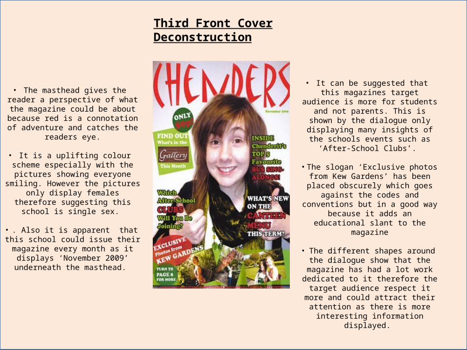
Third Front Cover Deconstruction
• The masthead gives the reader a perspective of what the magazine could be about because red is a
connotation of adventure and catches the readers eye.
• It is a uplifting colour scheme especially with the pictures showing
everyone smiling. However the pictures only display females therefore suggesting this school is single sex.
• . Also it is apparent that this school could issue their magazine every
month as it displays ‘November 2009’ underneath the masthead.
• It can be suggested that this magazines target audience is more for
students and not parents. This is shown by the dialogue only displaying many insights of the schools events such as
‘After-School Clubs’.
• The slogan ‘Exclusive photos from Kew Gardens’ has been placed
obscurely which goes against the codes and conventions but in a good way because it adds an educational
slant to the magazine
• The different shapes around the dialogue show that the magazine has had a lot work dedicated to it therefore the target audience respect it more and could attract their attention as there is
more interesting information displayed.

Deconstruction Of School Magazine Contents Pages

First Contents Page Deconstruction
• Using the numbers next to the dialogue and pictures goes with the
codes and conventions of magazines because the target
audience will know what page to turn to for the information they want
to read
• The colours green, red and white are uplifting colours and symbolise the general feeling throughout the
magazine
• The masthead 'Contents' is put in bigger writing and in a different
font to show it has a higher position than the rest of the dialogue because its what the target
audience look at before they read on
• The editor has situated the writing down the side of the page to make it more aesthetically pleasing for the target audience. This also links in with the codes and conventions
because you never see the dialogue in the middle of the page.
• Each photograph that is shown on this page has a different
purpose behind it which interests the reader because they don't
always want to look at the same type of photo of students
working, its better to show photos of places they could go
and what type of things students could do in the lesson
• However the only thing that isn't mentioned on this contents page
is an introduction of what is featured and usually this is
written by the editor and situated either at the top corner of the
contents page or at the bottom corner.

Second Contents Page Deconstruction
• This colour scheme can be a connotation of wealth and
luxury, this could suggest to the target audience that the students do very well in their
studies and it is a professional working environment. The picture situated in the left
hand corner can also back this point up as they are
dressed smartly which would attract parents attention to send their children to this
facility.
• I think that this magazines target audience is for older students because it doesn't
show an element of fun in the colour scheme and the whole
layout in general is for this target audience as they would
appreciate it more.
• The colour scheme is very professional as the black and
white combined together make the magazine look more formal and could be a connotation the
overall school environment
• The layout seems a bit basic and straight forward however
this makes it look more organised and more easier to read by the target audience
• The masthead isn't as eye-catching as most which goes
against the codes and conventions which could be an advantage because it makes
the magazine look more individual.
•A disadvantage of this contents page is it doesn't display an
introduction to the magazine, this is usual situated at the right
hand corner and is written by the editor.

Third Contents Page Deconstruction
• The school’s logo has been situated obscurely on this
contents page which does not fit with the codes and
conventions. By doing this the editor has made the page look crowded and off-putting to the
target audience.
• The editor could have enlarged the logo to show its importance to the school so
the target audience remember it
• The target audience of this magazine could be aimed at a variety of ages because some of the dialogue is directed at the students such as ‘Year 11 Prom’ but also aimed at the
parents/guardians with mentioning ‘Anti-Bullying at
Brakenhale.
• The underlining the second half of the masthead it
reminds the read that the information located inside is
directly about the school.
• The use of symmetry with the dialogue being in purple and red fits in with the codes and
conventions because the page looks well organised
• However this editor has got scattered dialogue which
doesn't look in place as some writing is larger then others
and looks clustered.
• The slogan at the bottom of the page ‘Learn- Achieve-
Succeed’ suggests how past students have achieved and could connotate the schools
overall performance.