Embed Size (px)
Citation preview

Proiect Erasmus+: 2017-1-RO01-KA102-036700
Beneficiar : COLEGIUL NATIONAL “ GHEORGHE VRANCEANU”, BACAU
PORTOFOLIU MOBILITATE
PAPHOS, CIPRU
Perioada mobilitate: 28.05.2018 – 15.06.2018
Tutore practica: MAVROS PETROS
Participant: BURCĂ SABINA
DISCLAIMER: "The European Commission support for the production of this publication does not
constitute an endorsement of the contents which reflects the views only of the authors, and the
Commission cannot be held responsible for any use which may be made of the information
contained therein."

Erasmus+ Project 2017-1-RO01-KA102-036700
Beneficiary : COLEGIUL NATIONAL “ GHEORGHE VRANCEANU”, BACAU
Mobility portfolio Flow
PAPHOS,CYPRUS
Mobility period: 28.05.2018 – 15.06.2018
Practice tutor: MAVROS PETROS
Participant: BURCĂ SABINA
DISCLAIMER: "The European Commission support for the production of this publication does not
constitute an endorsement of the contents which reflects the views only of the authors, and the
Commission cannot be held responsible for any use which may be made of the information
contained therein."

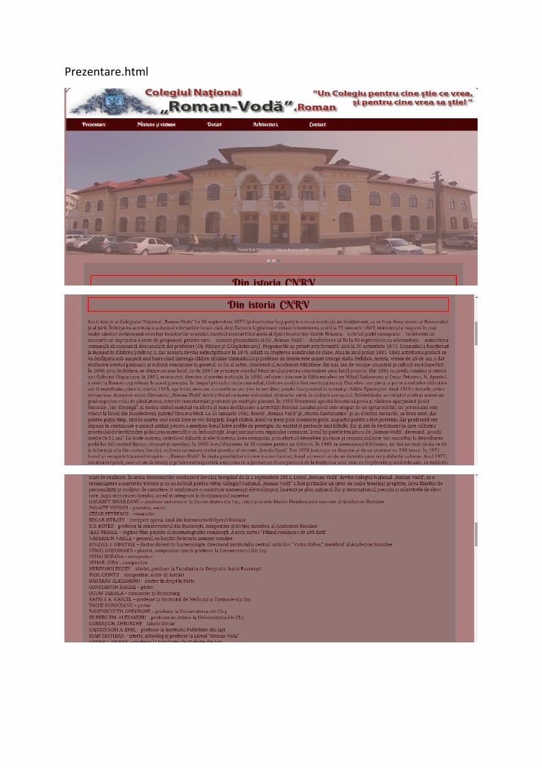
Review of “Roman-Vodă” National College
I will be reviewing the high school’s website, ”Roman-Voda” National College.
First of all,the site menu doesn’t allow you yo switch the languages.Also the chosen
color palette is representative for the colors of the college, but it does not create a pleasant
visual effect in my opinion. The arrangement of the divs is well proportioned, so the overall
picture is symmetrical and visually enjoyable. The content is concentrated in the middle of the
device, so it is easier to look at the website. The body color is dark grey and I consider it to be
bad chosen because it doesn’t fit the overall picture and it is not related to the other colors of
the site. The header contains the high school’s banner, so the persons who are reaching the
site will be immediately informed about the site that they have reached. I consider that the
width and the height are good proportionated, so the visitors work on site will be much easier.
After the banner there it is the menu bar that contains key words for what is available on the
site, so visitors can pick an option and then they will be led to the content that they are
interested in. If you pick up an option, the following page is uploading slowly, and the content
on the page is messy, unorganized. The following div contains images that are changing over
a certain interval of time, thing that is benefic to people so they can observe how our college
looks like on the outside. The site also has a button system in this div that allows visitors to
move over to the next image, thing that I consider to be useful.

The next container contains the latest news, but in my opinion the display of
information is really messy, because the news are not displayed proportionally. The only thing
that separates the news are some light grey borders which are barely observable, and the
background color is white, which is disadvantaging. The information is inconvenient, it should
be selected more carefully: images are disposed in a row for a news, while for other news
there is only one paragraph referring, or only one row written. Links about the articles are not
written in the same way, some in capital letters and some in small letters, which is not
symmetrical for the overall image of the site. On the right side of the container with the news,
there are some buttons which link the page to other platforms and I think that they are right
positioned, considering that they are not crossing over the width of the container. The search
button in the right corner of the container is very useful because it reaches the page you want
to see if you write down a key word.
The last idea about the site is linked to the responsive part of websites. This particular
website is not responsive, so people can’t reach the site on their phones or other devices but
computers and laptops. Besides, as a conclusion, i consider that this website requires an
update of information, layout, background colours and more other details , as people are
confused and disoriented when they spend their time on this site.

Actriţa favorită
Actrita favorita.html

Sportul favorit
Sportul favorit.html

Prezentare proiect IT
Prezentare proiect it.html

Exerciţii
FormularContact.html

FormularVot.html
Layout1.html

Layout2.html
Layout3.html
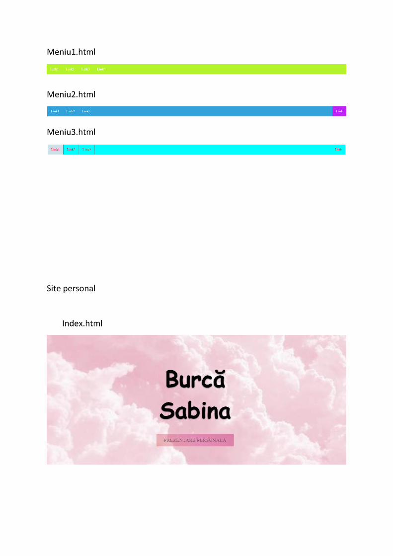
Meniu1.html
Meniu2.html
Meniu3.html
Site personal
Index.html

Acasa.html
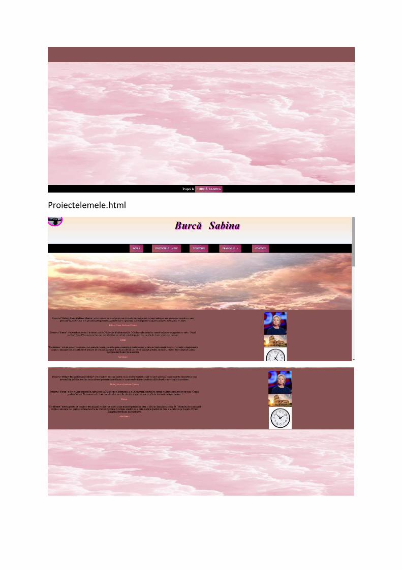
Proiectelemele.html

Hobby-uri.html
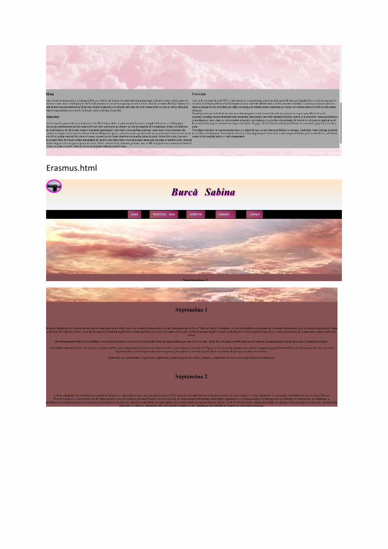
Erasmus.html

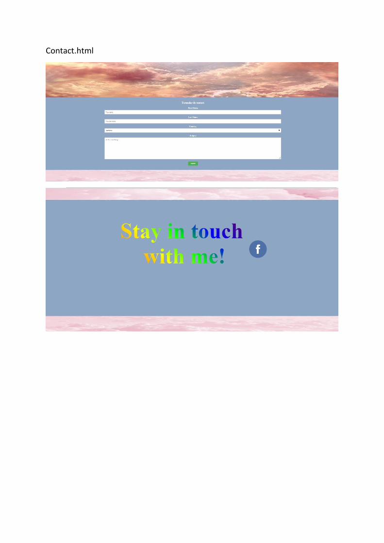
Contact.html

Site instituţie
Misiune şi viziune.html
Prezentare.html

Arhitectura.html

Contact.html

Promovare produs

Activităţi europene firma de primire
Index.html

Europeanactivities.html

Contact.html