Embed Size (px)
DESCRIPTION
portfolio 2011
Citation preview


BETHLEHEM
ACADEMY

BETHLEHEM
ACADEMY
LOGO DESIGN
LOCAL BUSINESS TO CORPORATE.ORGANIC FORMS, CLEAN AND BOLD.ILLUSTRATIVE AND ICONIC.
INJOY. Healthy gourmet organic restuarant promoting healthy living for their customers. Very clean and simple logo with minimal colors and bold icon of a leaf.
JOYRAW. Organic unprocess chocolate bar company. Ranging from 100% to 75% Cacao, the company offers the raw chocolate bar for the ultimate chocolate lovers. Simple logo with using both serif typeface and an organic type.
GREEN LEAF. Healthy take out food place offering heart healthy menu for their customers. Small iconic symbol on the left-side followed by the serif typeface.
NATURALES. Organic cosmetic company offering their customers with USDA approved cosmetic products. Two color process with text overlapping each other.
EARDRUM EVENTS. Nightlife entertainmentcompany offering their customers with varieties of nighttime entertainments. Using a neon magenta shaped like an ear. This logo can also be interactive and the ear-shaped is pulsating with the beats.
BETHLEHEM ACADEMY. Institution helping children with their homework offering afterschool guidance to the children. Also offering religious teachings. The logo has a feeling of premiere institution with higher education. The tree and the pathway represent the pathway of higher education and the beam of lights represents the religious teaching as well as the bright future. The logo is also used in the outfits.
THE SURF CHANNEL. Cable channel company targeting the surfers and people who enjoy watching surfing. The channel offers everything from surfing to other water-sports. The first logo is straight forward, large “S” shaped of a surf board, orange representing the sunset and the cyan representing the water. The second logo is illustration contained within therectangular figure. The surfer is riding in the barrel, and the text surf channel is simple san-serif typeface. The last logo is very illustrative, wave is forming a large “S” while the surfer is riding the wave.


STATIONERY SET
FULLY CUSTOMIZED.STAIONERY SET.BUSINESS CARD.
Very decorative stationery setrepresenting the company’s face as well as the message. Fully customized, very simple yet delivers the message to the recipients.


DIRECT MAILER
DIRECT MAILER.MULTIPAGE.FULL COLOR.
Very bright colored direct mailer for Hardrock Cafe. In order to catch the recipient’s attention, I’ve used bright color. The direct mailer containsfeaturing artist, show schedules,locations, and food and drink menu.

THE WORLD’S BEST-SELLING HOMES MAGAZINE
D E C O R AT I O N
$14.50
Breakfast with Sophie DahlEASY ENTERTAINING
Cool kid kit forstylish little people
SMART SHOPPING
GLOBAL DESIGN REPORTThe new trendsThe best of the big brandsThe future classics
The Overlapping ColoursTransform the Layout of the Apartment
New season style!

EDITORIAL DESIGN
EDITORIAL DESIGN.INNOVATIVE DESIGN.BRIGHT COLORS.
Matching cover page and the main article in the center-fold. Using CMYK color pallete, very bright and minialist approach of an editorial designing.


ECO-BAG DESIGN
SUSTAINABILITY.EARTH-FRIENDLY BAG.RECYCLED CANVAS BAG.
Fifty years ago, plastic bags -- starting first with the sandwich bag -- were seen in the United States as a more sanitary and environmentally friendly alternative to the deforesting paper bag. Now an estimated 180 million plastic bags are distributed to shoppers each year in San Francisco. Made of filmy plastic, they are hard to recycle and easily blow into trees and waterways, where they are blamed for killing marine life. They also occupy much-needed landfill space.
ECO-FRIENDLY BAG. Canvas bag itself is made from recycled materials. Now that many cities are banning the use of plastic bags from the market, a lot of people are using the reusuable bag when they shop. This particular work is for CSU Northridge. Using the school color for the bag, I’ve put a cartoon drawing of a face with recycle logo on the forehead of thecharacter. Keeping the graphic very minimal, so that the students can also use the bag for their book bags as well as the market bag.


WEBSITE DESIGN
USER FRIENDLY.EASILY MAINTAINABLE.UNIQUELY DESIGNED.
Website is a crucial part in this society. I’m able todesign a simple one-page informative website tomultipage website. There are ways to build awebsite so that it is easily maintainable by the owner. I do not code website, however have a team ready to code at anytime.
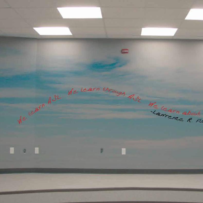

ENVIRONMENTAL GRAPHICS
PLAYFUL.SOOTHING.EVERLASTING.
This particular work was done for aclassroom focusing on “ASL”, American Sign Language. Since most of the participants had vision issues, the graphics could not be too distracting from viewing the sign-language. The background of sky promotes bright-future and the paper airplane signifies higher education, and moving forward.The quote was given by the client.


BRAND ID + AD CAMPAIGN
FUN.STRAIGHT FOWARD.EASY TO UNDERSTAND.
This was a brand id work for a gourmet peanut butter company. The company offers high-end peanut butter only at certainlocation. First one is a magazine ad, also can be used for a poster. Very fun and easy to understand, it is consumer friendly and also can be understand by young audience.Second one is a wall advertisement that usually goes on construction walls. Giving different perspective, looking out from the inside of the peanut butter jar. Last one is a billboard which can be viewed as far away, due to the bright color and simple message.Stationery set, business card, logo, jar,website, and advertisements weredeveloped for this job.


AD CAMPAIGN
REACHING OUT.WELL KNOWN PLACES.PUBLICITY.
This job is an advertisement campaign for the movie “Despicable Me.” It arranges from small scale to large scale. First one is a google homepage where it gets the most traffic by everyone all over the world. Also there are popcorn trays targeting the specific audience, which are the movie-watchers. On the next page, there is the building ad where people will look at everytime they pass by the building. Very playful with the paint dripping and the most cast of the movie is displayed. Last one is a bus-stop advertisement with the character covering the trash bin, which can be very interesting to the audience.

ADVERTISING CAMPAIGN ON THE SIDE OF THE BUILDING

ADVERTISING CAMPAIGN ON THE SIDE OF THE BUILDING BUS-STOP ADVERTISING WITH CHARACTER TRASH-BIN

MESSAGE
These are only some of my recent works. I’m always exploring for new ideas, keeping up with the trend as well as using the elements from the past. Some of my other work can-not be displayed in the portfolio due toNon-Disclosure Agreement that I had with the client. I do contract work with thecompany as well as freelance work on my own.


MACRO PHOTOGRAPHY

MACRO PHOTOGRAPHY

AMATEUR MODEL [SNAP SHOT STYLE]

AMATEUR MODEL [AVERAGE LIFE STYLE]


SPECIAL LOCATION [THEMED]

35MM SLIDE FILM DIGITALLY PROCESSED

MESSAGE
I Currently own CANON 5D Mark II with equipments to shoot photos as well asvideos. I am able to do photo retouches ranging from re-composing, clean-up, and etc. I also own polaroid camera, CANON SLR, able to shoot regular film to slide film. These are also some of my work and some of my best photo and video work cannot be displayed here due to Non-Disclosure Agreement that I made with the client.

FOR MORE INFORMATIONPlease contact ...Sungmin ParkGraphic Designer.Photographer.Los Angeles, [email protected]