Embed Size (px)
Citation preview

National GP ProfilesUser Guide v 4.0

National General Practice Profiles User Guide v 4.0
About Public Health England
Public Health England exists to protect and improve the nation's health and wellbeing, and reduce health inequalities. It does this through world-class science, knowledge and intelligence, advocacy, partnerships and the delivery of specialist public health services. PHE is an operationally autonomous executive agency of the Department of Health.
Public Health England Wellington House 133-155 Waterloo Road London SE1 8UG Tel: 020 7654 8000 www.gov.uk/phe Twitter: @PHE_uk Facebook: www.facebook.com/PublicHealthEngland
Prepared by: John Battersby and Doris HainFor queries relating to this document, please contact: [email protected]
© Crown copyright 2017 This publication is licensed under the terms of the Open Government Licence v3.0 except where otherwise stated. To view this licence, visit: nationalarchives.gov.uk/doc/open- government-licence/version/3 or write to the Information Policy Team, The National Archives, Kew, London TW9 4DU, or email: [email protected]. Where we have identified any third party copyright information you will need to obtain permission from the copyright holders concerned. Any enquiries regarding this publication should be sent to us at [email protected] First Published December 2014 PHE publications gateway number: 2014-626
2
National General Practice profiles User Guide v 4.0
Contents
Introduction 4
Using elements in reports and presentations 4
Feedback 4
Overview of National GP Profiles 5
Quick Guide to Fingertips Features in the National General Practice Profiles 5
Additional information 5
Practice 5
Benchmark 6
Statistical significance and colour coding 6
Views 6
Domains 7
Map 7
Population 8
Overview 9
Compare indicators 9
Trends 9
Compare areas - Bar Chart and Funnel plot 10
Area profiles 10
England 11
Box plots 12
Definitions 12
Download 12
3

National General Practice profiles User Guide v 4.0
Introduction
The National General Practice Profiles are an interactive web tool (with associated pdf reports) produced by Public Health England Data Science et al.
The tool uses the Fingertips software which was developed by Public Health England to provide easy access to in-depth analysis of a wide range of health related data in thematic profiles.
This user guide focuses on the common features of the Fingertips software and uses examples taken from the National General Practice Profiles. Other profiles developed in the software also share these features. Metadata information on the indicators themselves are available via the ‘Definitions’ section of the profiles.
Using elements in reports and presentations
You are welcome to use elements of Fingertips in your own documents and reports. You may re-use this information (excluding logos) free of charge in any format or medium, under the terms of the Open Government Licence v3.0. To view this licence, visit OGL or email [email protected]. Where we have identified any third party copyright information you will need to obtain permission from the copyright holders concerned. Otherwise please acknowledge the source with this statement:
© Crown copyright 2017
Most data used in producing these tools are available as CSV files by clicking the ‘Download’ tab for those who would like to create their own tables or charts. The data can also be accessed via an API which can be found in the same location.
The population pyramid and other visualisations can be exported as image. The best way to extract other graphics from Fingertips is to use the Snipping Tool (available under Accessories in the Windows Start Menu). If you do not have the Snipping Tool, use the ‘print screen’ button on your keyboard to produce a screen grab which can be pasted into a document and cropped to show the element of interest. Alternatively, the page can be printed from the web.
Feedback
We welcome any comments on the Fingertips tools, in particular, on the usefulness and user friendliness of the tool and on the indicators included. All data in the tools, and the tools themselves, have undergone internal quality assurance. However, we recognise that with the
4

National General Practice profiles User Guide v 4.0
range of data presented in electronic format over the web, errors are possible and request that users alert us to any potential problems if they occur. Please get in touch by clicking ‘Contact Us’ or emailing directly [email protected].
Overview of National GP Profiles
These profiles are designed to support GPs, clinical commissioning groups (CCGs) and local authorities to ensure that they are providing and commissioning effective and appropriate healthcare services for their local population.
In addition to viewing individual practice profiles, you can view summary profiles for CCGs. Each practice can be compared with the CCG and England.
The tool presents a range of practice-level indicators drawn from the latest available data, including:
Local demography Quality and Outcomes Framework domains Cancer services Child health Patient satisfaction Antibiotic prescribing
Quick Guide to Fingertips Features in the National General Practice Profiles
Additional information
Links to supporting information such as FAQs are found in the Introduction page of the tool.
Practice
Practices can be selected in two ways, either by searching for a practice from the Introduction page or the Map tab, selecting a practice from the map, or by navigating to the practice via the CCG, using the area selecton facilities as in any other Fingertips profile.
5

National General Practice profiles User Guide v 4.0
Benchmark
To decide on statistical significance a benchmark needs to be chosen. This is by default England but alternatively CCG can be selected.
Statistical significance and colour coding
A training video on significance is available at https://www.youtube.com/watch?v=zVDcYbf0Y4w
For each indicator, the colour coding shows whether the measure for that area is statistically above or below the comparator (in most cases 99.8% confidence, for details see ‘Definitions’). The benchmark is the national average. If it cannot be determined if there is a significant difference the area is left uncoloured.
Details of the statistical method used for comparison are available by clicking on the ‘Definitions’ tab. Wherever possible, statistical process control methods have been used for comparison. If the indicator is not coloured it means that no statistical comparison was possible. In most cases this is because the raw data used to calculate the indicator, and which is necessary to undertake statistical comparison, were not available, or the necessary benchmark value could not be obtained.
Within the National GP Profiles indicators have not been assigned a preferred polarity and so appear blue if they are statistically different or yellow if they are similar to the England average.
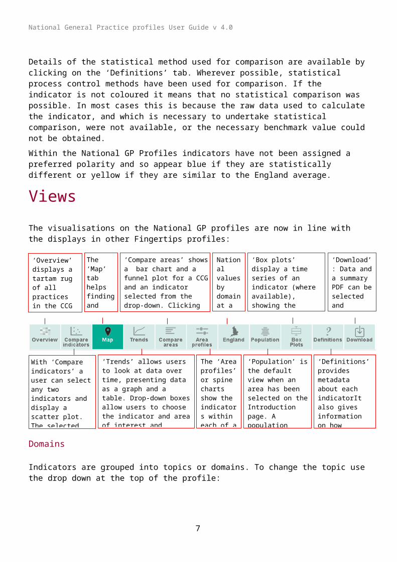
Views
The visualisations on the National GP profiles are now in line with the displays in other Fingertips profiles:
6
With ‘Compare indicators’ a user can select any two indicators and display a scatter plot. The selected practice and all other CCG practices are highlighted.
‘Compare areas’ shows a bar chart and a funnel plot for a CCG and an indicator selected from the drop-down. Clicking on an indicator on the Spine Chart also displays the Bar Chart.
‘Definitions’ provides metadata about each indicatorIt also gives information on how statistical comparisons are made for each indicator.
‘Download’: Data and a summary PDF can be selected and downloaded at this tab.
The ‘Area profiles’ or spine charts show the indicators within each of a number of thematic domains.
‘Trends’ allows users to look at data over time, presenting data as a graph and a table. Drop-down boxes allow users to choose the indicator and area of interest and colour-coding indicates whether the values are significantly different from the benchmark.
‘Box plots’ display a time series of an indicator (where available), showing the change of an indicator regarding range and median over time.
‘Population’ is the default view when an area has been selected on the Introduction page. A population pyramid and some summary information about a practice.are shown.
National values by domain at a glance.
The ‘Map’ tab helps finding and selecting practices.
‘Overview’ displays a tartam rug of all practices in the CCG and all indicators of the domain.
National General Practice profiles User Guide v 4.0
Domains
Indicators are grouped into topics or domains. To change the topic use the drop down at the top of the profile:
Map
The Map view in the GP profiles is used differently to other Fingertips profiles. It is there to find and identify practices on a map similar to the practice finder on the Iintroduction page of the tool.
Practices can be searched for by postcode or place name and selected from the list or the pins on the map.
7

National General Practice profiles User Guide v 4.0
Population
‘Population’ is the default view once a practice has been selected. On the left of the page there is a population pyramid for the selected practice. This shows the practice in 5 year (quinary) age bands with males to the left and females to the right. The relevant CCG and the England populations are shown as pink and black lines respectively.
To the right of the page there is summary information about the practice. This starts with the practice and CCG registered list size. It is then followed by overall QOF achievement, estimates of male and female life expectancy (where available) and the percentage of patients that would recommend their practice.
The final two boxes on the right of the page show:
The practice’s deprivation decile using a ‘heat’ scale where more deprived practices will show as red and less deprived practices show as green;
An estimate of the ethnic mix of the practice population where possible. This is population weighted average derived from the Census 2011.
8
Enter area name or postcode Display a pin for all practices in the CCG
Hover over a practice and click the link to select the practice
Select the practices found in the search from the list

National General Practice profiles User Guide v 4.0
Overview
This view presents all indicators in a domain for all practices in the CCG in a matrix format (also called ‘tartan rug’). While this big picture can be ideal for some purposes this wealth of data is often overwhelming for practice data and more specific visualisations concentrating on one practice (Area profile) or one indicator (Compare areas) are more helpful.
Compare indicators
This view allows the user to select two indicators and generate a scatter plot. The selected practice is shown as a black cross within the scatter plot and other practices in the CCG are shown as blue dots. All other practices appear as grey dots.
Any indicator within the profiles can be compared against any other indicator. The tool is unable to determine the appropriateness of the chosen comparison and so this judgement must be made by the user.
Trends
This view presents indicator time series data. By default a line chart and a table are shown for the selected practice and the selected indicator. However, the user has the option to select trends for either all practices in the CCG at the same time or, alternatively, all indicators of the same domain for the selected practice.
Time series data are not available for all indicators and all areas. A number of QOF indicators have changed their definition over time and so, unless the change is minimal, only a short time series can be provided for these indicators.
9

National General Practice profiles User Guide v 4.0
Compare areas - Bar Chart and Funnel plot
This view can be reached by clicking on the tab labelled ‘Compare areas’ or by clicking on an indicator from within the spine chart view. The view displays a bar chart for the selected indicator showing all the practices in the selected CCG.
Significance is calculated with statistical process control methods to 99.8% confidence which can be seen on the funnel plot. Comparators England and the CCG value are shown on top of the chart. Practices can be sorted by name or value, ascending or descending by clicking the triangles in the header bar.
Note: Lower CI and Upper CI are 95% confidence limits (shown as numbers and with the error bars). They are for information only and do not in all cases correspond with the significance colouring.
Area profiles
A training video on spine charts is available at https://www.youtube.com/watch?v=480Mswgcg8M
The indicator data are shown in the form of a spine chart with colour coded points indicating whether the area is significantly different from the England average. Hovering the mouse cursor over elements of the spine chart will give more information about the underlying data.
10
England average
The bar chart can be sorted in different ways
Chart export
CCG average

National General Practice profiles User Guide v 4.0
In the spine chart the red vertical line represents the benchmark, by default England. The light grey bar shows the range between the highest and lowest areas in England with the interquartile range shown in dark grey.
The interquartile range (dark grey bar) is the difference between the 25th and 75th percentile i.e. if all areas’ values for an indicator are ranked from lowest to highest the 25th percentile is 25% of the way through the ranking and the 75th is 75% of the way through.
The light grey bar represents the range and skew of the data. If the lowest and highest values are equidistant from the mean the light grey bar will extend evenly across the chart. If the data are skewed towards the lowest values the light grey bar will extend to the left hand side and if the data are skewed towards the highest values the light grey bar will extend to the right hand side.
Each dot represents the area indicator value. Dots to the left of the red line show that the value for this area is lower than the England average, dots to the right of the line show that the value is higher than the England average. The dots are blue if the value is significantly lower or higher and amber if the difference is not significant. Significance is calculated using 3 standard deviation statistical process control.
In addition to the England average users can select the CCG as benchmark.
England
The England view is displaying all indicator values and counts (where applicable) for England only.
11
England averageColour-coded indicator value
Range of the data – here, the data is skewed towards the lower values
Interquartile range

National General Practice profiles User Guide v 4.0
Box plots
The box plot shows one indicator over time. It displays the range of the values from the fifth to the 95th percentile, more prominently the interquartile range (25th to 75th percentile) and the median value. The underlying values are also shown in a table.
Definitions
For each indicator there is a set of metadata, providing a definition for the indicator, the data source, the methods applied etc. Depending on the purpose, more detailed information might be required than can be provided in the metadata. In this case please see also the FAQs or contact [email protected] .
Download
The underlying data can be downloaded into CSV files. Various options to chose from are available regarding the range of indicators and areas. Aternatively the data can be accessed via an API (details also on the Download).
The National GP profiles are accompanied by a summary PDF for each practice which can also be downloaded via the Download tab. The printable version of the practices’ profiles contain the population panel and the spine charts.
12