Embed Size (px)
Citation preview
Probabilistic Forecast DistributionVerification Primer
Kevin WernerDave BrandonSteve Shumate
Colorado Basin River Forecast CenterSalt Lake City, UT
Version 2.1 October 9, 2003

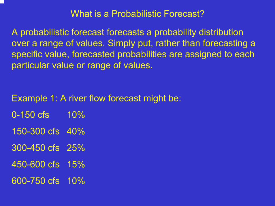
What is a Probabilistic Forecast?
A probabilistic forecast forecasts a probability distribution over a range of values. Simply put, rather than forecasting a specific value, forecasted probabilities are assigned to each particular value or range of values.
Example 1: A river flow forecast might be:
0-150 cfs 10%
150-300 cfs 40%
300-450 cfs 25%
450-600 cfs 15%
600-750 cfs 10%
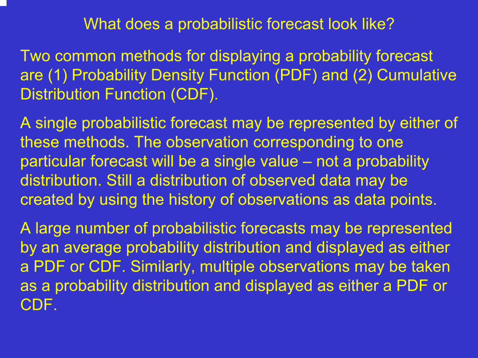
What does a probabilistic forecast look like?
Two common methods for displaying a probability forecast are (1) Probability Density Function (PDF) and (2) Cumulative Distribution Function (CDF).
A single probabilistic forecast may be represented by either of these methods. The observation corresponding to one particular forecast will be a single value – not a probability distribution. Still a distribution of observed data may be created by using the history of observations as data points.
A large number of probabilistic forecasts may be represented by an average probability distribution and displayed as either a PDF or CDF. Similarly, multiple observations may be taken as a probability distribution and displayed as either a PDF or CDF.

What is a Probability Density Function (PDF)?
A PDF is basically a histogram, possibly smoothed, normalized such that the area under the curve is unity. Forecast values are on the x-axis, probability on the y-axis.
Example: Using the sample probabilistic forecast from Example 1:
0
0.05
0.1
0.15
0.2
0.25
0.3
0.35
0.4
0-150 150-300 300-450 450-600 600-750
Flow (cfs)
Probability
Area= 1

What is a Cumulative Distribution Function (CDF)?
A CDF is related to the PDF. The CDF is the probability that the observation will be less than a value for every value on the x-axis. Probability is on the y-axis. The CDF is the inegral of the PDF.
Example 2: Using the sample probabilistic forecast from Example 1:
0
0.2
0.4
0.6
0.8
1
1.2
0-150 150-300
300-450
450-600
600-750
Flow (cfs)
Prob
abili
ty
Here there is a 75% chance the flow will be 450 cfs or less.

How are probabilistic forecasts constructed?
Probabilistic forecasts are usually constructed with ensembles. That is, two or more forecasts for the same quantity may be combined into a single probabilistic forecast. This is accomplished by fitting a continuous distribution (i.e. normal , log-normal or empirical or…) to the discreet data points.

How are probabilistic forecasts constructed? (con’t)
For example, the hypothetical forecast given in the previous slides may have been created from the following ensembles:Category Forecast(s) Number in cat % of tot
0-150 cfs 123, 144 cfs 2 10
150-300 166, 178, 202, 248,
249, 270, 279, 290 8 40
300-450 302, 350, 378, 400, 433 5 25
450-600 490, 505, 545 3 15
600-750 603, 625 2 10

How do I choose a continuous distribution function?
Choosing a particular distribution to fit a data set takes both art and science. There is a large body of knowledge on this subject which is outside the scope of this primer. Whatever distribution is chosen should fit the data well and represent whatever else may be known about the entire distribution. For the purposes of this primer, we will use only empirical distributions.
An EMPIRICAL DISRIBUTION simply gives equal weight to each ensemble member or data point and connects them to form the distribution.

OK, I made a probabilistic forecast… How can I tell if its any good?
“Probabilistic forecasting means never having to say I’m sorry.” – Craig Peterson - CBRFC

Probabilistic Forecast Verification 101
Caveats:
(1) A large (> ~20) number of independent observations are required.
(1) No “one size fits all” measure of success.
(1) Concepts are similar to deterministic forecast evaluation; However the application of the concepts is different.

Talagrand Diagram
A Talagrand Diagram is an excellent tool to detectsystematic flaws of an ensemble prediction system.It indicates how well the probability distribution has been sampled. It does not indicate that the ensemble will be of practical use.
It allows a check where the verifying analysis usually falls with respect to the ensemble data ( arranged in increasing order at each point ).

Sample Verification Data Set
YEAR E1 E2 E3 E4
1981 42 74 82 90
1982 65 143 223 227
1983 82 192 295 300
1984 211 397 514 544
1985 142 291 349 356
1986 114 277 351 356
1987 98 170 204 205
1988 69 169 229 236
1989 94 219 267 270
1990 59 175 244 250
1991 108 189 227 228
1992 94 135 156 158
OBS
112
206
301
516
348
98
156
245
233
248
227
167
Four forecasts of peak flow (cfs) were made on May 14 for a two week window ending May 29 for a number of years. The four Sample Ensemble Members (E1 – E4) were ranked lowest to highest and correlated with the corresponding observation.
For illustrative purposes, a small sample data set of ensemble forecasts was created. Each of the verification techniques will be applied to this dataset.


Talagrand Diagram Description
YEAR E1 E2 E3 E4
1981 42 74 82 90
1982 65 143 223 227
1983 82 192 295 300
1984 211 397 514 544
1985 142 291 349 356
1986 114 277 351 356
1987 98 170 204 205
1988 69 169 229 236
1989 94 219 267 270
1990 59 175 244 250
1991 108 189 227 228
1992 94 135 156 158
OBS
112
206
301
516
348
98
156
245
233
248
227
167
Four Sample Ensemble Members (E1 – E4) Ranked Lowest to Highest For Daily Flow
Produced From Reforecasts Using Carryover In Each Year
Bin #
5
3
5
4
3
1
2
5
3
4
4
5
Bin # Tally
1 1
2 1
3 3
4 3
5 4
Bin1 Bin2 Bin3 Bin4 Bin5
Talagrand Diagram
0
0.5
1
1.5
2
2.5
3
3.5
4
4.5
1 2 3 4 5
C a t e gor y D e f i ne d by Or de r e d E ns e mbl e M e mbe r s

Talagrand Diagram Examples
Talagrand Diagram ( Rank Histogram)Example: “U-Shaped”Indicates Ensemble Spread Too Small
Talagrand Diagram ( Rank Histogram)Example: “L-Shaped”Indicates Over or Under Forecasting Bias
Talagrand Diagram ( Rank Histogram)Example: “N-Shaped” (domed shaped)Indicates Ensemble Spread is Too Big
Talagrand Diagram ( Rank Histogram)Example: “Flat-Shaped”Indicates Ensemble Distribution Has Been Sampled Well
0
5
10
15
20
25
1 3 5 7 9 11 13 15 17 19 21 23 25
Category(defined by ordered ensemble members)
Rel
ativ
e Fr
eque
ncy
of A
naly
sis
02468
101214161820
1 3 5 7 9 11 13 15 17 19 21 23 25
Category(defined by ordered ensemble members)
Rel
ativ
e Fr
eque
ncy
of A
naly
sis
02468
1012141618
1 3 5 7 9 11 13 15 17 19 21 23 25
Category(defined by ordered ensemble members)
Rel
ativ
e Fr
eque
ncy
of A
naly
sis
0
2
4
6
8
10
12
14
16
1 2 3 4 5 6 7 8 9 10 11 12 13 14 15 16 17 18 19 20 21 22 23 24 25 26
Category(defined by ordered ensemble members)
Rela
tive
Freq
uenc
y of
Ana
lysi
s

Brier Score
“A number of scalar accuracy measures for verification of probabilistic forecasts of dichotomous events exist, but the most common is the Brier Score (BS). The BS is essentially the mean-squared error of the probability forecasts, considering that the observation is o=1 if the event occurs and o=0 if the event does not occur. The score averages the squared differences between pairs of forecast probabilities and the subsequent observations.” (Wilkes, 1995)
∑=
−=n
kkk oy
nBS
1
2)(1
BS is bounded by 0 and 1. A forecast with BS=0 is perfect.

Brier Score
A key feature of the Brier Score is its application to dichotomous events; either the event happened or it didn’t happen. Therefore it is necessary to define the event for verification. This could be a major weakness if the probabilistic forecast is being made for purposes beyond a simple percent “yes” and percent “no” for the particular event being verified.
As an example, we present probability above and below flood stage. We will assume the flood stage for the sample data set is 300 cfs.

Brier Score Example
YEAR E1 E2 E3 E4
1981 42 74 82 90
1982 65 143 223 227
1983 82 192 295 300
1984 211 397 514 544
1985 142 291 349 356
1986 114 277 351 356
1987 98 170 204 205
1988 69 169 229 236
1989 94 219 267 270
1990 59 175 244 250
1991 108 189 227 228
1992 94 135 156 158
OBS
112
206
301
516
348
98
156
245
233
248
227
167
Step 1: Compute probability of flood / no flood based on flood flow of 300 cfs.
P(flood)
0
0
0.25
0.75
0.5
0.5
0
0
0
0
0
0
P(no flood)
1
1
0.75
0.25
0.5
0.5
1
1
1
1
1
1
In 1984, 3 of 4 forecasts were for above flood flow. Therefore the probability of flooding is ¾ or 0.75 whereas the probability of no flooding is 1-0.75 = 0.25

Brier Score Example
YEAR
1981
1982
1983
1984
1985
1986
1987
1988
1989
1990
1991
1992
OBS
112
206
301
516
348
98
156
245
233
248
227
167
Step 2: Determine whether event (flooding) occurred (1) or not (0).
P(flood)
0
0
0.25
0.75
0.5
0.5
0
0
0
0
0
0
P(no flood)
1
1
0.75
0.25
0.5
0.5
1
1
1
1
1
1
Flooding?
0
0
1
1
1
0
0
0
0
0
0
0

Brier Score Example
YEAR
1981
1982
1983
1984
1985
1986
1987
1988
1989
1990
1991
1992
Step 3: Calculate (y – o)2
P(flood)
0
0
0.25
0.75
0.5
0.5
0
0
0
0
0
0
Flooding?
0
0
1
1
1
0
0
0
0
0
0
0
(y – o)2
0
0
0.56
0.06
0.25
0.25
0
0
0
0
0
0

Brier Score Example
YEAR
1981
1982
1983
1984
1985
1986
1987
1988
1989
1990
1991
1992
Step 4: Calculate BS = 1/n SUM[(y – o)2]
P(flood)
0
0
0.25
0.75
0.5
0.5
0
0
0
0
0
0
Flooding?
0
0
1
1
1
0
0
0
0
0
0
0
(y – o)2
0
0
0.56
0.06
0.25
0.25
0
0
0
0
0
0
BS = 1/12 * (0.56+0.06+0.25+0.25+…)
BS = 0.093


Ranked Probability Score (RPS)
The Ranked Probability Score (RPS) is used to assessthe overall forecast performance of the probabilisticforecasts.
Similar to Brier Score but includes more than two categories.
A perfect forecast would result in a RPS of zero.
Gives credit for forecasts close to observation…Penalizes forecasts further from the observation.
Looks at the entire distribution ( all traces ).

RPS Formulation
Goal: Compare forecast CDF to observed CDF
Notes:
1. Here an empirical distribution is assumed (not necessary).
2. Observation is one value, in this case 3.0.

RPS Formulation
Graphically, the RPS is this area:

RPS Formulation
Mathematically, RPS is given by:
2#
1#)]()([∑
=
<−<=nbin
biniiobservedPiforecastPRPS
Where the summation indices are over n bins whose number and spacing are determined by the user. In order to best approximate the area between the forecast and observed CDFs, a large number of bins should be chosen. The larger the number of bins the more computationally intense the calculation becomes.

RPS Formulation
RPS is hugely dependent on bin choice. Here three different bin spacing are shown along with the calculated RPS. A “normalized RPS” may be defined as
NRPS = RPS / (# of bins)NRPS allows comparison between RPSs calculated with different numbers of bins and is bounded by 0 and 1. Again a score of zero indicates a perfect forecast.

RPS Formulation
RPS is sensitive to distance. Here RPS is calculated with the same forecast CDF against 3 different observations. The smaller the blue area, the “better” the forecast is and the smaller the RPS is.

RPS with sample data set
YEAR E1 E2 E3 E4
1981 42 74 82 90
1982 65 143 223 227
1983 82 192 295 300
1984 211 397 514 544
1985 142 291 349 356
1986 114 277 351 356
1987 98 170 204 205
1988 69 169 229 236
1989 94 219 267 270
1990 59 175 244 250
1991 108 189 227 228
1992 94 135 156 158
OBS
112
206
301
516
348
98
156
245
233
248
227
167
1. Assume an empirical CDF; For example, 1981 and 1984 are shownbelow. Note the Y values are simply 0/4,1/4,2/4,3/4, and 4/4.

RPS with sample data set
YEAR E1 E2 E3 E4
1981 42 74 82 90
1982 65 143 223 227
1983 82 192 295 300
1984 211 397 514 544
1985 142 291 349 356
1986 114 277 351 356
1987 98 170 204 205
1988 69 169 229 236
1989 94 219 267 270
1990 59 175 244 250
1991 108 189 227 228
1992 94 135 156 158
OBS
1.12
2.06
3.01
5.16
3.48
0.98
1.56
2.45
2.33
2.48
2.27
1.67
2. Choose number of bins and bin spacing. For Simplicity, let’s choose four bins and set them to be: (100,200,300,400)

RPS with sample data set
YEAR E1 E2 E3 E4
1981 42 74 82 90
1982 65 143 223 227
1983 82 192 295 300
1984 211 397 514 544
1985 142 291 349 356
1986 114 277 351 356
1987 98 170 204 205
1988 69 169 229 236
1989 94 219 267 270
1990 59 175 244 250
1991 108 189 227 228
1992 94 135 156 158
OBS
112
206
301
516
348
98
156
245
233
248
227
167
3. Pick off the probability that the volume will be less than the break point at each bin (i.e. non-exceedence probability). For example, 1984 would be:
Peak Probability
100 0
200 0
300 0.25
400 0.5

RPS with sample data set
YEAR E1 E2 E3 E4
1981 42 74 82 90
1982 65 143 223 227
1983 82 192 295 300
1984 211 397 514 544
1985 142 291 349 356
1986 114 277 351 356
1987 98 170 204 205
1988 69 169 229 236
1989 94 219 267 270
1990 59 175 244 250
1991 108 189 227 228
1992 94 135 156 158
OBS
112
206
301
516
348
98
156
245
233
248
227
167
3 (con’t). Pick off probabilities at each bin. All years:
100 cfs 200 cfs 300 cfs 400 cfs
1.0 1.0 1.0 1.0
0.25 0.5 1.0 1.0
0.25 0.5 1.0 1.0
0.0 0.0 0.25 0.5
0.0 0.25 0.5 1.0
0.0 0.25 0.5 1.0
0.25 0.5 1.0 1.0
0.25 0.5 1.0 1.0
0.25 0.25 1.0 1.0
0.25 0.5 1.0 1.0
0.0 0.5 1.0 1.0
0.25 1.0 1.0 1.0
Probability(forecast peak < …)

RPS with sample data set
YEAR
1981
1982
1983
1984
1985
1986
1987
1988
1989
1990
1991
1992
OBS
112
206
301
516
348
98
156
245
233
248
227
167
4. Compute Probabilities for observations. Since there is only one observation the probability will be either 0 or 1.
100 cfs 200 300 400
1.0 1.0 1.0 1.0
0.25 0.5 1.0 1.0
0.25 0.5 1.0 1.0
0.0 0.0 0.25 0.5
0.0 0.25 0.5 1.0
0.0 0.25 0.5 1.0
0.25 0.5 1.0 1.0
0.25 0.5 1.0 1.0
0.25 0.25 1.0 1.0
0.25 0.5 1.0 1.0
0.0 0.5 1.0 1.0
0.25 1.0 1.0 1.0
P(forecast peak < … ) P(observed peak < …)100 cfs 200 300 400
0.0 1.0 1.0 1.0
0.0 0.0 1.0 1.0
0.0 0.0 0.0 1.0
0.0 0.0 0.0 0.0
0.0 0.0 0.0 1.0
1.0 1.0 1.0 1.0
0.0 1.0 1.0 1.0
0.0 0.0 1.0 1.0
0.0 0.0 1.0 1.0
0.0 0.0 1.0 1.0
0.0 0.0 1.0 1.0
0.0 1.0 1.0 1.0

RPS with sample data set
YEAR
1983
5. Compute the RPS. 1983 is done as an example…
100 200 300 400
0.25 0.5 1.0 1.0
P(forecast peak < … ) P(observed peak < …)
100 200 300 400
0.0 0.0 0.0 1.0
2
1)]()([∑
=
<−<=n
iiobservedPiforecastPRPS
RPS =[0.25 – 0.0]2 + [0.5 – 0.0]2 +
[1.0 – 0.0]2 + [1.0 - 1.0]2
= 1.31

RPS with sample data set
YEAR
1981
1982
1983
1984
1985
1986
1987
1988
1989
1990
1991
1992
RPS
1.0
0.31
1.31
0.31
0.31
1.81
0.31
0.31
0.13
0.31
0.25
0.06
5 (con’t). RPS computed for all years…
100 200 300 400
1.0 1.0 1.0 1.0
0.25 0.5 1.0 1.0
0.25 0.5 1.0 1.0
0.0 0.0 0.25 0.5
0.0 0.25 0.5 1.0
0.0 0.25 0.5 1.0
0.25 0.5 1.0 1.0
0.25 0.5 1.0 1.0
0.25 0.25 1.0 1.0
0.25 0.5 1.0 1.0
0.0 0.5 1.0 1.0
0.25 1.0 1.0 1.0
P(forecast peak < … ) P(observed peak < …)100 200 300 400
0.0 1.0 1.0 1.0
0.0 0.0 1.0 1.0
0.0 0.0 0.0 1.0
0.0 0.0 0.0 0.0
0.0 0.0 0.0 1.0
1.0 1.0 1.0 1.0
0.0 1.0 1.0 1.0
0.0 0.0 1.0 1.0
0.0 0.0 1.0 1.0
0.0 0.0 1.0 1.0
0.0 0.0 1.0 1.0
0.0 1.0 1.0 1.0

RPS with sample data set
YEAR
1981
1982
1983
1984
1985
1986
1987
1988
1989
1990
1991
1992
RPS
1.0
0.31
1.31
0.31
0.31
1.81
0.31
0.31
0.13
0.31
0.25
0.06
6. Now you can make statements such as…
1986 was worst forecast (RPS was highest)
1992 was best forecast (RPS lowest)
Etc.

Because the actual RPSvalue is difficult to evaluateindependently, the use ofthe RPS in the absenceof reference forecasts islimited to forecast comparisonamong different forecastlocations. (Franz: Nov 2002)
Can be used to analyze regional consistency, i.e.,possible need for recalibration.)
Credit: “Verification on NWS Probabilistic Hydrologic Forecasts” – Franz/Sorooshian – U. of AZ

RPS used to compare various basins. (Note RPS here was computed with 100 bins.)


Credit: Presentation-”Evaluation of NWS Ensemble Sreamflow Prediction” – Kristie Franz – U. of AZ
Ranked Probability Skill Score RPSS
Useful to compare the forecast of interest to areference forecast, e.g., climatology.
It is expressed as a percent improvement, e.g.,over climatology ( or reference forecast ).
Perfect score is 100%.
Negative score indicates forecasts performedworse than reference forecast.

Ranked Probability Skill Score RPSS
RPSS =RPS - RPS
0 - RPSx 100%f cl
cl
RPS
RPSf
cl
= Rank Probability Score (forecasts)
= Rank Probability Score (climatology)
RPSf and RPScl must be calculated with the same bins!

RPSS with sample data set
YEAR
1981
1982
1983
1984
1985
1986
1987
1988
1989
1990
1991
1992
RPSfor
1.0
0.31
1.31
0.31
0.31
1.81
0.31
0.31
0.13
0.31
0.25
0.06
1. Take the RPS vector calculated in the RPS sample section and call it Forecast RPS or RPSfor.

RPSS with sample data set
YEAR
1981
1982
1983
1984
1985
1986
1987
1988
1989
1990
1991
1992
RPSfor
1.0
0.31
1.31
0.31
0.31
1.81
0.31
0.31
0.13
0.31
0.25
0.06
2. Calculate a reference RPS vector. This may be a climatology RPS that used the climatological values as forecasts. Call it RPSclim.
RPSclim
1.83
1.33
1.50
3.00
1.33
2.00
1.25
1.00
1.08
0.83
1.67
1.67

RPSS with sample data set
YEAR
1981
1982
1983
1984
1985
1986
1987
1988
1989
1990
1991
1992
RPSfor
1.0
0.31
1.31
0.31
0.31
1.81
0.31
0.31
0.13
0.31
0.25
0.06
3. Apply the formula, RPSS = 1 – mean(RPSfor)/mean(RPSclim). Note this formula is equalivent to the one a few slides back.
RPSclim
1.83
1.33
1.50
3.00
1.33
2.00
1.25
1.00
1.08
0.83
1.67
1.67
RPSS = 1 – 0.54/1.46
= +0.63
In words, this means the forecasts are 63% better than climatology!

Ranked Probability Skill Score (RPSS) for each Ranked Probability Skill Score (RPSS) for each forecast day and month using measured runoff and forecast day and month using measured runoff and
simulated runoff produced using: (1) simulated runoff produced using: (1) SDSSDS output output and (2) and (2) ESPESP techniquetechnique
Fore
cast
Day
Month MonthJ F M A M J J A S O N D J F M A M J J A S O N D
8
6
4
2
0
8
6
4
2
0
0.1 0.3 0.5 0.7 0.9RPSSRPSS
ESPSDS
Perfect Forecast: RPSS=1


DISCRIMINATION
“Measures of discrimination summarize the conditional distributions of the forecasts given the observations p(yi | oj)… The discrimination attribute reflects the ability of the forecasting system to produce different forecasts for those occasions having different realized outcomes of the predictand. If a forecasting system forecasts f = snow with equal frequency when o = snow and o = sleet, the two conditional probabilities of a forecast of snow are equal, and the forecasts are not able to discriminate between snow and sleet events.” Wilkes (1995)
We will approach discrimination through examination of conditional probability densities both in PDFs and CDFs.

DISCRIMINATION Example
All observation CDF is plotted and color coded by tercile.
Forecast ensemble members are sorted into 3 groups according to which tercile its associated observation falls into.
The CDF for each group is plotted in the appropriate color. i.e. high is blue.

DISCRIMINATION Example
In this case, there is relatively good discrimination since the three conditional forecast CDFs separate themselves.

Discrimination with sample data set
YEAR E1 E2 E3 E4
1981 42 74 82 90
1982 65 143 223 227
1983 82 192 295 300
1984 211 397 514 544
1985 142 291 349 356
1986 114 277 351 356
1987 98 170 204 205
1988 69 169 229 236
1989 94 219 267 270
1990 59 175 244 250
1991 108 189 227 228
1992 94 135 156 158
OBS
112
206
301
516
348
98
156
245
233
248
227
167
1. Order observations and divide ordered list into categories. Here we will use terciles.
OBS Tercile
Low
Middle
High
High
High
Low
Low
Middle
Middle
High
Middle
Low

Discrimination with sample data set
YEAR E1 E2 E3 E4
1981 42 74 82 90
1982 65 143 223 227
1983 82 192 295 300
1984 211 397 514 544
1985 142 291 349 356
1986 114 277 351 356
1987 98 170 204 205
1988 69 169 229 236
1989 94 219 267 270
1990 59 175 244 250
1991 108 189 227 228
1992 94 135 156 158
OBS
112
206
301
516
348
98
156
245
233
248
227
167
2. Group forecast ensemble members according to OBS tercile.
OBS Tercile
Low
Middle
High
High
High
Low
Low
Middle
Middle
High
Middle
Low
Low OBS Forecasts:42, 74, 82, 90, 114, 277, 351, 356,98, 170, 204, 205, 94,135, 156, 158
Hi OBS Forecasts:82, 192, 295, 300, 211, 397, 514, 544, 142, 291, 349, 356, 59, 175, 244, 250
Mid OBS Forecasts:65, 143, 223, 227, 69, 169, 229, 236, 94, 219, 267, 270, 108, 189, 227, 228
Low OBS Forecasts:42, 74, 82, 90, 114, 277, 351, 356,98, 170, 204, 205, 94,135, 156, 158
Mid OBS Forecasts:65, 143, 223, 227, 69, 169, 229, 236, 94, 219, 267, 270, 108, 189, 227, 228
Hi OBS Forecasts:82, 192, 295, 300, 211, 397, 514, 544, 142, 291, 349, 356, 59, 175, 244, 250

Discrimination with sample data set
OBS
112
206
301
516
348
98
156
245
233
248
227
167
3. Plot all-observation CDF color coded by tercile

Discrimination with sample data set
4. Add forecasts conditioned on observed terciles CDFs to plot
Low OBS Forecasts:42, 74, 82, 90, 114, 277, 351, 356,98, 170, 204, 205, 94, 135, 156, 158
Mid OBS Forecasts:65, 143, 223, 227,69, 169, 229, 236,94, 219, 267, 270,108, 189, 227, 228
Hi OBS Forecasts:82, 192, 295, 300,211, 397, 514, 544,142, 291, 349, 356,59, 175, 244, 250

Discrimination with sample data set
5. Discrimination is shown by the degree to which the conditional forecast CDFs are separated from each other.
In this case, high forecasts discriminate better than mid and low forecasts.

DISCRIMINATION
How well do April –July volume forecasts discriminate when they are made in Jan, Mar, and May?
Poor discrimination in Jan between forecasting high and medium flows. Best discrimination in May.

Discrimination
Another way to look at discrimination using PDF’s in lieu of CDF’s.
The more separation between the PDF’s the better the discrimination.


Reliability
“Reliability pertains to the relationship of the forecast to the average observation for specific values of the forecast. Reliability measures sort the forecast/observation pairs into groups according to the value of the forecast variable, and characterize the conditional distributions of the observations given the forecasts.” Wilkes (1995)
Whereas discrimination examines the relationship between given observations and the subsequent forecasts, reliability examines the relationship between forecasts and the subsequent observations.

Reliability Diagram
Reliability measures sort the forecast/observations pairs into groups according to the value of the forecast variable relative to an arbitrary value, and characterize the conditional distributions of the observations given the forecasts.
Traditional reliability diagrams transform a probabilistic forecast into a forecast of probability that an arbitrary value, such as flood stage or normal or …, will be exceeded. On one hand this limits the robustness of reliability as a verification measure. On the other, if the threshold value is of paramount importance, traditional reliability diagrams may be the most important verification measure.

Reliability Diagram with sample data set
YEAR E1 E2 E3 E4
1981 42 74 82 90
1982 65 143 223 227
1983 82 192 295 300
1984 211 397 514 544
1985 142 291 349 356
1986 114 277 351 356
1987 98 170 204 205
1988 69 169 229 236
1989 94 219 267 270
1990 59 175 244 250
1991 108 189 227 228
1992 94 135 156 158
OBS
112
206
301
516
348
98
156
245
233
248
227
167
1. Choose threshold value to base probability forecasts on. For simplicity we’ll choose the mean forecast over all years and all ensembles.
Mean(E1,E2,E3,E4) = 208

Reliability Diagram with sample data set
2. Choose the number of categories to group forecasts into. This will depend on the total number of forecasts as well as the number ofensembles. Something like (total number of forecasts) / 10 will assure an average of ten forecasts in each category. With large a large number of forecasts it is usual to choose ten categories. Since the sample data set is small, we’ll use five categories. Since we have only four ensembles and we are assuming an empirical distribution there are only five possible probability forecasts: 0/4, ¼, 2/4, ¾, 4/4. In our small case study, these five numbers will make up the five categories.

Reliability Diagram with sample data set
YEAR E1 E2 E3 E4
1981 42 74 82 90
1982 65 143 223 227
1983 82 192 295 300
1984 211 397 514 544
1985 142 291 349 356
1986 114 277 351 356
1987 98 170 204 205
1988 69 169 229 236
1989 94 219 267 270
1990 59 175 244 250
1991 108 189 227 228
1992 94 135 156 158
OBS
112
206
301
516
348
98
156
245
233
248
227
167
3. For each forecast, calculate the forecast probability below the threshold value.
P(peakfor < 208)
1.0
0.5
0.5
0.0
0.25
0.25
1.0
0.5
0.25
0.5
0.5
1.0

Reliability Diagram with sample data set
OBS
112
206
301
516
348
98
156
245
233
248
227
167
4. Group the observations into groups of equal forecast probability (or, more generally, into forecast probability categories).
P(peakfor < 208)
1.0
0.5
0.5
0.0
0.25
0.25
1.0
0.5
0.25
0.5
0.5
1.0
P(peak < 208) = 0.0
516
P(peak < 208) = 0.25
348, 98, 233
P(peak < 208) = 0.5
206, 301, 245, 248, 227
P(peak < 208) = 0.75
N/A
P(peak < 208) = 1.0
112, 156, 167
P(peak < 208) = 0.0
516
P(peak < 208) = 0.25
348, 98, 233
P(peak < 208) = 0.5
206, 301, 245, 248, 227
P(peak < 208) = 1.0
112, 156, 167

Reliability Diagram with sample data set
5. For each group, calculate the frequency of observations above the threshold value, 208 cfs.
P(peak < 208) = 0.0
516
P(peak < 208) = 0.25
348, 98, 233
P(peak < 208) = 0.5
206, 301, 245, 248, 227
P(peak < 208) = 0.75
N/A
P(peak < 208) = 1.0
112, 156, 167
P(obs peak < 208 given [P(peakfor < 208) = 0.0]) = 0/1 = 0.0
P(obs peak < 208 given [P(peakfor < 208) = 0.25]) = 1/3 = 0.33
P(obs peak < 208 given [P(peakfor < 208) = 0.5]) = 1/5 = 0.2
P(obs peak < 208 given [P(peakfor < 208) = 1.0]) = 3/3 = 1.0
P(obs peak < 208 given [P(peakfor < 208) = 0.75]) = 0/0 = NA

Reliability Diagram with sample data set
6. Plot centroid of the forecast category (just points in our case) on the x-axis against the observed frequency within each forecast category on the y-axis. Include the 45 degree diagonal for reference.

Reliability Diagram with sample data set
7. Include bar plot showing the number of observation/forecast pairs in each category.

Reliability DiagramExample
Under Forecastingif area is above thediagonal
Perfect if on the diagonal
Over Forecastingif area is below thediagonal

Multi-Category Reliability Extension
A major constraint of reliability diagrams is the requirement todefine an event to construct the probabilities on.
Recent work from Hamill (1997) demonstrated a multi-category extension to reliability diagrams. Although the arbitrary selection of categories remains, the inclusion of multiple categories may make reliability diagrams a more robust verification measure.

Other Verification Tools
Verification measures beyond what was presented here exist. Their exclusion here is not meant to diminish their usefulness.
Statistical verification is not meant as a substitute for examination of the actual forecasts and observations. An inspection of the actual forecasts and their corresponding observations can be invaluable. The next slide illustrates this.

Ensemble Forecast Analysis:
Forecasts for April-July volume for a particular basin (Granby, CO) are depicted with box and whisker plots here. The observation is a blue line.

Credits:Franz, Kristie and Sorooshian, Soroosh, 2002: Verification of NWS Probabilistic Hydrologic Forecasts, M.S. Thesis, Univ of Ariz.
Hamill, T.M., 1997: Reliability Diagrams for Multicategory Probabilistic Forecasts. Wea. Forecasting, 12, 736-741.
Hersbach, Hans, 2000: Decomposition of the Continuous RPS for Ensemble Prediction Systems, Wea. Forecasting, 15, 559-570.
Wilks, D.S., 1995: Statistical Methods in the Atmospheric Sciences: An Introduction. Academic Press, 467 pp.