Embed Size (px)
DESCRIPTION
A PDF based on my Booklet.
Citation preview

1
Graphic design: New Media Semester 1, Year 1
Brief 03: Kinetic Typography
Mike Thomas

2
Contents Pages 3-‐5: Brief 1 – Colour Composition and Type Pages 6-‐11: Brief 2 – 1 Word, 1 Image Pages 9-‐11: Brief 3 – Kinetic Typography Pages 12-‐15: Brief 4 – Stop Motion Pages 16-‐17: Brief 5 – 20 Questions Pages 18-‐20: Brief 6 – Oil Painting Animation Pages 21-‐22: Brief 7 – Wallpapers Pages 23-‐25: Brief 8 – Placard Pages 26-‐30: Brief 9 -‐ To what extent does an artist’s colour choices dominate the viewer’s impression or feel of a piece of media or design and why? Pages 31-‐32: Brief 10 – Advert Pages 33-‐34: Brief 11 – Title Sequence

3
Brief 01: Composition, Colour and Type The first brief focused on developing our understanding of the basics of design, including composition, colour and type. See below for my finished work. 1.
For this piece of work, I have used the standard type font of Kremlin in an attempt to provide a revolutionary atmosphere to the piece. Using a dominant colour choice of black and using split complimentary colours to provide shades to add to its dark nature backs this up. I've used the symmetry strategy.

4
2.
The abstract type I collected was of a standard cutlery set. I used the word food as this has a direct relation with my choice of typography. I've used a triad colour palette derived from the colours of the cutlery. I've emphasized this by splitting the canvas into thirds and using a colour from the palette on each third. I've also used an odd number of subjects or letters in my piece, which fits with the rule of Odds.

5
3.
For this piece, I used the typography from an NYPD poster on www.vernaculartypography.com. I've used a monochromatic colour guide, which gave different similar hues and shades of the original blue colour of the font. I've also made use of the rule of thirds by placing my work in the upper third of the piece. I have drawn faint lines to demonstrate the rule of thirds on the canvas.

6
Brief 02: 1 Word, 1 Image 1. Simplicity
For this piece, I have used the word ‘Simplicity’. I chose this word because I think it relates directly to the background image in a number of ways. First, the colours used in the background are few but bold in colour. I think this reinforces how one might describe a lifestyle involving a beach and sun as a simple one. The blue sea and sand compliment this theory. I used a sandy texture to colour my text as it relates to the environment. I used the font of ‘Impact’ because the tightly spaced letters and the rigidity of the letters enforce the message effectively enough. When I read a phrase in this font I feel like I’m reading something with a purpose or meaning. I finally added an Omni light to add a realistic lighting effect, alongside a matte shadow effect.

7
2. Explore
For this piece, my background image is of a winding road, leading into the depths of a misty landscape. The word I used was ‘Explore’. Reasons for this are that I wanted to lead the viewer into the picture as if they are following the road. The road bends around the corner leaving it to the mind of the viewer to wonder what’s there. I used the texture of an autumn leaf to add to the mood of the picture. The colour of the text allowed the word to be seen clearly too. I found using a colour similar to the trees in the background was too difficult to read without a backdrop of the grey road. The fact that the text is placed diagonally on the road was another factor in making sure the text was readable as the grey road contrasts the green font. I used an Omni light for shadows and lighting. 3. Success

8
This piece shows a motorway of freeway leading to the city of Abu Dhabi in the United Arab Emirates. My chosen word was ‘Success’. Abu Dhabi is renown for attracting people due to it’s wealthy projects the city promises, including a thriving economy and generally speaking a good way of life. I thought that the word ‘Success’ encompassed all these traits. I decided to position my text so it sits directly underneath the signs leading to Abu Dhabi. I did this because there are arrows pointing downwards from the sign directly towards my word, which I thought looked quite effective. I decided to use an Omni light to my text but only gave the wording a slight shadow, as I could not pick up any obvious source of light in the photograph. My colour choice of the word although subdued I think fits in well with the colour combinations that the photograph offers. Using a bright and more inviting shade looked out of place against the dull looking sky.

9
Brief 03: Kinetic Typography This brief introduced me to the fundamentals of Adobe Affect Effects and it’s basic functions. Below are my finished projects for this brief. My chosen song was ‘Stan’ by Eminem. I chose this track because I thought it contained a simple story, yet a story with a dark and deep meaning. The story of the lyrics centres around how obsessed people can be about celebrities and the length they will go to be noticed. For this reason, I decided to restrict my colour palette for this exercise to black and white. The story of my lyrics involves a psychotic fan of Eminem, who keeps writing letters to him. However, all contact is ignored, until the fan kills himself. Only then does Eminem decided to write back, until he finds out it’s too late. The lyrics of this song are quick in sequence, so I’ve tried to emphasize the rush and speed of the ‘situation’ that the lyrics present. I have tried to flash meaningful words to the viewer through use of typography size and motion. Links: With Sound: http://www.youtube.com/watch?v=x-‐OZIdokbfo&feature=player_embedded Without Sound: http://www.youtube.com/watch?v=yE_NpVdQLXo&feature=player_embedded

10
Below are screenshots from my typography video:

11

12
Brief 04: Stop Motion
Storyboard for Stop Motion This was my first attempt at a stop motion exercise. I found the task highly labour intensive, yet the end results were surprisingly satisfying. Above is my storyboard for my stop motion idea. The story involves a stick man waving to his audience, he greets a seed, plants it, and a tree grows in rapid time. At the end, the branches of the tree spells out ‘Plant your own Seed’. I thought it would be an effective idea to end the animation sequence on an interpretive angle, allowing the viewing to think what the piece is about. The idea of the piece is to encourage people make their mark in their own way. Hopefully this was conveyed in my animation. The materials used for this animation were a white board, a white board pen and an eraser. I felt it was necessary to resort to simple materials, as anything more complicated would have made the task more intricate and labour intensive. The message I was trying to portray I felt was more important.

13
Below is a link to my stop motion animation: http://www.youtube.com/watch?v=o6OCVKi4fog&feature=player_embedded Screenshots of my stop motion animation: 1.
2.

14
3.
4.
5.

15
6.
7.
8.

16
Brief 05: 20 Questions Brief 05 introduced the first research task. We were asked to choose 20 questions that 5 different people could answer. Our job was to compare a piece designed by us (either a piece from Brief 02 or Brief 04), and compare it to a piece of our choice in our essential viewing list. Below are the two pieces of work I chose for comparison.
Brief 02 – Explore In Comparison to…
A Nike Heroes Ad Campaign.

17

18
Brief 06: Oil Painting animation A 30 second animation with a frame rate of 12 FPS. Link to video: http://www.youtube.com/watch?v=-‐hh3TGRgWus&feature=player_embedded Screenshots: 1.

19
2.
3.

20
Sources Used:
http://www.allartclassic.com/pictures_zoom.php?p_number=728&p=&number=LLD050– Vlad the Impaler Oil painting
http://www.hermitagemuseum.org/html_En/03/hm3_5_5f.html crown
http://images.npg.org.uk/800_800/0/1/mw05301.jpg Big Crown
http://www.culture24.org.uk/asset_arena/6/99/29/392996/v0_master.jpg sword http://2.bp.blogspot.com/_4kkT22kuvoA/TQJbtdBAWmI/AAAAAAAADG8/edwYH-‐0OuBA/s1600/sleep-‐paralysis-‐a.jpg Sleeping person For my oil painting, I chose a 16th Century portrait of Vlad the Impaler. After analysing this portrait I came to the conclusion that the factors shown here are the wealth and power of Vlad the Impaler due to his position as ruler of the Ottoman Empire and three time Voivode of Wallachia. I further emphasized this position of wealth and power by using cut outs of crowns to surround Vlad and by also placing a gold crown on his head. However, Vlad was known for the vile and sadistic way he treated people and in particular his enemies and prisoners. His favoured method for dealing with those who stepped out of line was impalement of his victims. To show this, I made the crowns disappear through reduced opacity and dropped 4 swords facing upwards and placing a body on top. Whilst this transition happens, I made the portrait of Vlad the Impaler darken to demonstrate his darker side.

21
Brief 07: Wallpapers Below are my finished designs for three different wallpapers. 1. Progressive, Polyrhythmic and my own colour palette
2. Flowing, Polyrhythmic, 2 colours.

22
3. Regular Rhythm, Monorhythmic, Black and White.

23
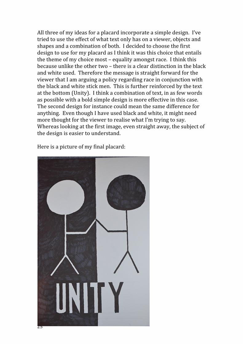
Brief 08: Placard For Brief 08 we had to choose an issue that we felt particularly strongly about and attempt to convey that message or issue as efficiently as possible through the medium of a Placard (A2 size). We had to first create our design on the computer and then copy it by eye onto our placard. After a brainstorm, the issue I decided to convey was the subject of equality in particular, equality across race. Below are three possible designs that I created on Photoshop and Illustrator. 1.

24
2.
3.
25
All three of my ideas for a placard incorporate a simple design. I’ve tried to use the effect of what text only has on a viewer, objects and shapes and a combination of both. I decided to choose the first design to use for my placard as I think it was this choice that entails the theme of my choice most – equality amongst race. I think this because unlike the other two – there is a clear distinction in the black and white used. Therefore the message is straight forward for the viewer that I am arguing a policy regarding race in conjunction with the black and white stick men. This is further reinforced by the text at the bottom (Unity). I think a combination of text, in as few words as possible with a bold simple design is more effective in this case. The second design for instance could mean the same difference for anything. Even though I have used black and white, it might need more thought for the viewer to realise what I’m trying to say. Whereas looking at the first image, even straight away, the subject of the design is easier to understand. Here is a picture of my final placard:

26
Brief 09: To what extent does an artist’s colour choices dominate the viewer’s impression or feel of a piece of media or design and why? Brief 09 was the second research task this semester. We had to chose an issue or question of our choice and ask five different people this question based on the following pieces of work all chosen by me. Alongside this we were to give a five minute presentation which detailed the responses of our question and an opportunity to present our findings. Piece 1:

27
Piece 2:
Piece 3.

28
Piece 4.
Brief 9 presentations. QUESTION To what extent does an artist’s colour choice dominate the viewer’s impression or feel of a piece of media or design? Why? RESEARCH METHODOLOGY: For my research, I decided to pick 5 people with varied interests and occupations to answer my question, providing them with the 4 pieces of work. I chose this method because I believe it would give me the most all rounded response to my question, as all media is seen in the public through various people.

29
1. Steph, 20 – Graphic Design student: “To a great extent I believe that the choice of colour not only should dominate the overall feel of a piece of work but should also be a primary factor in making the viewer feel the effect the designer desires. For instance, upon viewing all 4 pieces of work I was immediately set in particular moods due to the colours. The colour of the word ‘Explore’ in the first image suited the environment of the piece and felt at home in the scene. I felt more invited to explore as the colour choice directly related to the autumn like environment – so in this case, the colour does dominate my impression and desire to ‘explore”.
2. Adam, 64 – Retired Store Manager: “When I see a piece of media in public I am immediately drawn to vivid colours or “stand out” tones. This is what attracts my attention. After reviewing the 4 pieces of work you have given me, I only felt that 2 of the 4 pieces drew my interest due to the colour choices you provided. The first piece’s colour, which I felt gave a dominating impression to me, was Piece 3 – “Freddie Mercury”. The colour choice of Black and white is very appropriate to the vibe of the piece as we are looking at 3 identical statues of a deceased performer, symbolic of the black and white choices perhaps. So in this instance, the colour is directly related to the impression that the piece of work is trying to convey. On the other hand, your second piece of work ‘Success’, gives me a different feel. When I see success, I expect bright, vivid and eye-‐catching tones, yet the grey colour used in this piece, makes me feel slightly de-‐motivated. It makes me question what lies ahead for those who’d embark on the ‘road to success’. So in this respect, the colour choice does dominate my feel for the piece, yet whether the designer’s impression is to imply what I’m feeling is another matter”.
3. Nick – 22 – Business Studies student: “To me, I feel colour is important because it makes me feel a certain way about a piece of media or advertisement. For instance in the 4th piece ‘Simplicity’, the colour used is very neutral and could almost be seen as simple which to my mind is why the person who made the piece will have picked it. For me this piece, the colour reflects the feel of what the artist would have been trying to say. Yet again, when I looked at your second piece ‘Freddie Mercury’, I see a legend in the music business, but his image to

30
me is dampened by the dull tones of greys and whites. It is almost as if his identity is hidden or obscured. Therefore, my impression of the piece although influenced by the colours does not reflect what the artist is trying to say”.
4. Steve – 51, Business director: “It is difficult to say, as each piece is different but generally speaking my impression or mood is based on what colour I’m looking at. For instance looking at your first piece, I feel the colour of the text is suited to the background you’ve placed it on, yet simply because the colour is related in this way, doesn’t make me feel a certain way about the piece. At the most I feel slightly more willed to explore the forest, but the text’s imposing font and size matters more to me. In fact the word doesn’t stand out much in that colour”.
5. Amy – 17 – Student: “ Although I think colour is an important factor in making me feel a certain way about a piece of art or media I think there are more convincing factors such as arrangement of the text and composition of the piece. It has to ‘look right’. If I saw a piece of media advertising a holiday, it could have all the right colours but if the text isn’t arranged correctly it isn’t effective. Is it readable? Is the font appropriate to the feel of the piece? I say this because when I look at the 4th piece of work ‘ Simplicity’, the font used is very rigid and stands out. This makes me feel like living life on the sand is simple over the fact that the colour is sandy. The font is imposing and for me, this is the key factor that makes me feel that a beach life is a simple one”.

31
Brief 10: Advert The idea for this brief was to pick a current or previous advertisement and reverse engineer a written script through analysing what the advert is trying to portray and what hidden elements we could try and expose out of that advert. The advert I picked was a recent advert from Gillette, advertising their new Fusion Pro Razor. The thesis of this advert involves using several high profile sports stars as a marketing ploy to promote their new Razor. Appearances are made by stars such as Tiger Woods and Roger Federer, who intend to make a Mach 3 razor user feel uncomfortable by hitting balls at him, and secondly urging him to use their newer model. The advert proposes a new 5 blade design, where the blades are situated closer together, giving a more comfortable shaving experience in comparison to their earlier Mach 3 model. Emotions that the advert appeals to and involves are discomfort, comfort, satisfaction and perhaps masculinity. I get this from the slogan ‘A best a man can get’. Thesis: This Razor delivers a far superior performance in terms of comfort and efficiency. Using high profile sports stars will make the potential buyer feel they are viewing a product associated with people in high status, making them feel good about themselves. Stop using your Mach 3 razor, and buy this one. Antithesis: Ironically, the discomfort caused by the sports stars by hitting golf and tennis balls at the man indicates perhaps the discomforting levels of their previous model, the Mach 3, thus degrading their own product. The appearance of high profile sport stars has no direct effect on the actual performance of a product. We’ve added an unrealistic and pointless visual simulation of our new shaving experience to let you know just how comfortable the new razor is on a screen.

32
Original Script: Sometimes you need a little push To let go of your Mach 3 Razor Until you discover Gillette Fusion Power It has 5 blades spaced closer together to help reduce pressure With a feeling of even less irritation Switch to Gillette Fusion Power Gillette’s most comfortable shave. Reverse-‐engineered script: Here’s Tiger Woods To remind you of how uncomfortable our previous razor was. Until you discover Gillette Fusion power It has 5 blades, which will probably make no difference. With a feeling of eventual discomfort if our previous model is anything to go by. Switch to Gillette Fusion Power Gillette’s most uncomfortable shave. Original advert: http://www.youtube.com/watch?v=lrB7mJjonW0 Reverse-‐engineered advert: http://www.youtube.com/watch?v=NF3UV0SFYKc&feature=youtu.be

33
Brief 11c: 60 Second Title Sequence Brief 11 presented me with 3 options for a task. I chose to develop and create a 60 second title sequence animation for a film version of a book. Our book had to be chosen from www.gutenberg.org. I decided to choose ‘Dracula’, by Bram Stoker, published in 1897. I decided to base my title sequence on the 1992 adaptation of the book and hence used the cast list from that adaptation in my title sequence. Reasons for choosing this particular book included how I thought that Dracula portrayed such obvious and definite themes can could be easily translated through animated type, texture and photographs. These themes included gothic orientation, horror fiction and invasion/battle. Below is the title sequence I made. http://www.youtube.com/watch?v=TMbHMbOOYqs&feature=youtu.be Themes I tried to convey in the opening title sequence were that of darkness, obscurity and horror. I have also included the accompanied soundtrack to the film ‘Dracula, 1992’, by Wojciech Kilar. One of the features I have made most use out of in my opening title sequence was the opacity feature in Adobe After Effects. I feel this technique gives a revealing effect to the viewer and makes the viewer what to question the intentions or ideas of a character or plot. The typography I used was Old Edwardian Style. I feel this choice was particularly relevant to my piece because the Edwardian era centred around King Edward VII’s reign during 1901-‐1910. Dracula itself was written in 1897, therefore we can draw a direct historical link to the typography I’ve used and the novel. In terms of other features of the title sequence, I decided to settle on an old worn looking piece of scrunched up paper as a background template. I thought this was appropriate because the novel Dracula was based on the writings of several diary entries, ship log entries

34
and letters, and the writer’s of these items are the main novel’s protagonists. I thought this was a subtle way of incorporating the main format for the novel and involving that aspect within the film version.