Embed Size (px)
DESCRIPTION
Southwest Ontario Tourism Corporation and Surge Communications Award of Merit
Citation preview

Ontario’s Southwest Corporate Identity
Entrant’s Name: Tony SoaresOrganization’s Name: Surge Communications Inc.Division & Category: Communication Creative (3); Other Graphic Design (23)Title of Entry: Ontario’s Southwest Corporate IdentityTime Period of Project: September - December 2011
Project Summary: Southwest Ontario Tourism Corporation (SWOTC) is a newly formed organization mandated by the provincial government to attract visitors to the southwestern region of Ontario consisting of 9 Destination Marketing Organizations (DMOs). SWOTC had previously invested a substantial budget on an initial execution of the organization’s corporate identity. The proposed execution fell short with an identity that didn’t resonate with the SWOTC organization and its partnering DMOs. This early version of the identity was inspired by the styles and imagery of the southwestern United States using rustic colours and rugged font design creating an overall “Tex Mex” feel. The proposed tagline, “Undiscovered”, conjured up images of uninhabited land which was a complete disconnect for a region that attracts hobbyists and visitors who enjoy leisure activities. Surge Communications was brought on board to create a new corporate identity that would resonate with destinations in the region and appeal to potential visitors.
Intended Audience(s): Research conducted by Ontario’s Ministry of Tourism identified the core audience to be visitors within commuting distance from our region including the Greater Toronto Area, US residents living in Michigan and friends and relatives visiting southwestern Ontario. Our seasonal focus is concentrated to spring, summer and fall. Visitors during these seasons tend to be couples and families aged 35-60 that enjoy nature-based activities and relaxing getaways. They’re looking for a variety of experiences including culinary, recreation, birding, sports, motorcycling, historical, arts & culture and entertainment.
Objective: Develop a corporate identity that reflects a common theme to drive tourism to the region. Aim to receive over 70% of DMO support in favour of the new identity.
Key Messages/Theme: Our approach was to capture the true essence of the region and all that it offers its residents and guests. It’s beautiful, welcoming, and close, while it invites you to relax and discover unlimited new experiences: Distinctive festivals, farm-fresh foods, a storied history, unique flora & fauna, miles of freshwater coasts, and warm, friendly people who will make you feel like a guest in their own backyard. Nature, and its related activities and offerings, was the consistent theme that each DMO within the region shared and could support. This thread is what linked the region and provided us with the single focus needed to clearly communicate to visitors.
Creative Rationale: Ontario’s Southwest corporate identity captures both beauty and movement. The icon’s circular shape represents motion and captures the natural elements of this beautiful region into a work of art: representing folk/native art or stained glass. The icon swirls together the region’s land, water and sky with a salute to the bird migrations the area is well known for. Nine birds break out from the icon: one to represent each of the 9 DMOs in the region. The natural colour palette (soft greens/blues/yellow) mimics the water and land geography of the region and is inspired by the colours of the three key seasons that attract visitors to the region.
The font, Housecha, was chosen for its uniqueness, friendly rounded corners and clean, simple and modern look. The region name and tagline are kept in black to allow the focus to remain on the colourful icon.
The tagline, Shaped by nature, captures both the physical nature and the emotional nature of the region and its people. Sculpted by ice age glaciers, Ontario’s Southwest is a mosaic of rolling fields, forests and sandy shorelines tucked in by the blue water of Great Lakes and rivers. Located in the southern most part of Canada, our land, water and sky are home to our country’s most diverse ecosystem and world-renowned bird and butterfly migratory routes. Our human nature is warm, friendly and resourceful. Our people are a blend of city and country. All hold in common a deep appreciation for the beauty and richness our region provides.
Results: The original version of the identity (“Tex Mex”) developed by the previous agency received only partial approval (65% in favour) from both the SWOTC marketing committee and the Board of Directors. However, the new identity developed by Surge received 85% approval from the SWOTC marketing committee and unanimous approval from the Board of Directors.
The identity has been showcased at a few events and stakeholder meetings thus far and has received positive feedback from a variety of travel-related businesses from within the region as well as the Ministry of Tourism. The public launch takes place March of 2012.
Division 3, Category 23

Ontario’s Southwest Logo
Entrant’s Name: Tony SoaresOrganization’s Name: Surge Communications Inc.Category Number and Name: 23 - Other Graphic DesignEntry Title: Ontario’s Southwest Corporate Identity
Previous Corporate Identity
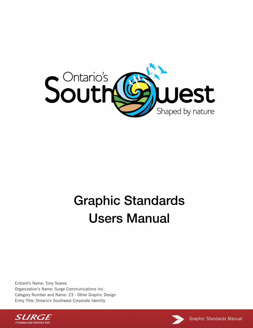
Graphic Standards Manual
Graphic StandardsUsers Manual
Entrant’s Name: Tony Soares Organization’s Name: Surge Communications Inc. Category Number and Name: 23 - Other Graphic Design Entry Title: Ontario’s Southwest Corporate Identity

1 | Ontario’s South West – Graphic Standards
Logo Versions
Horizontal Version(Preferred)
Vertical Version(Optional)

2 | Ontario’s South West – Graphic Standards
Logo Anatomy
Wordmark
TaglineIcon

3 | Ontario’s South West – Graphic Standards
The Exclusion Zone The OSW logotype must be reproduced with a clear area around it which is free from
other graphic elements.This area is known as the exclusion zone. This area is equal on all 4 sides and measured to the hight of the letter “S” from word Southwest in the OSW
workmark.
Logo Clearance

4 | Ontario’s South West – Graphic Standards
1.5"
1.0"
Minimum Sizing
Minimum Sizing (Horizontal Version)
The minimum width in any application should be no smaller than 1.5" wide as shown above.
Minimum Sizing (Vertical Version)
The minimum width in any application should be no smaller than 1” wide as shown above.

5 | Ontario’s South West – Graphic Standards
Brand Fonts
Brand Fonts
Lorem ipsum dolor sit amet Lorem ipsum dolor sit amet
consectetur adipiscing elit consectetur adipiscing elit
Maecenas lobortis, est ac condimentum eleifend, nisi risus interdum nisl, sit amet porttitor est turpis fermentum leo. Donec a quam eget diam ultrices eleifend. In eget molestie magna. Sed blandit ipsum eu lorem pulvinar nec posuere ligula pulvinar.
Maecenas lobortis, est ac condimentum eleifend, nisi risus interdum nisl, sit amet porttitor est turpis fermentum leo. Donec a quam eget diam ultrices eleifend. In eget molestie magna. Sed blandit ipsum eu lorem pulvinar nec posuere ligula pulvinar.
}
}}}
Level 1 Header Bell Gothic Black or Arial Bold
Level 2 Header Bell Gothic or Arial
Body Copy Bell Gothic
or
Arial

7 | Ontario’s South West – Graphic Standards
Logo Variations
Full Colour Version(with Black Wordmark)
Full Colour Version(with White Wordmark)
Grayscale or Monotone Version
Solid Version
White/Knocked-Out Version
Full Colour Version(with Black Wordmark)
Full Colour Version(with White Wordmark)
Grayscale or Monotone Version
Solid Version
White/Knocked-Out Version
Horizontal Version Vertical Version

11 | Ontario’s South West – Graphic Standards
Incorrect Logo Usage
Never cover or obscure logo in any way.
Never change the colouring, shading or opacity levels.
Never place logo over busy imagery/pattern.
Never distort, squash, stretch or tilt.
Never alter, re-size or substitute fonts/typefaces included in logo.
Never change, separate, add to or remove any elements from logo.