Embed Size (px)
Citation preview

Neighborhood Matters
Indicators/Winter 2002–3 15
Indicators, vol. 2, no. 1, Winter 2002–3, pp. 15–38.© 2003 M.E. Sharpe, Inc. All rights reserved.ISSN 1535–7449 / 2003 $9.50 + 0.00.
LELAND G. NEUBERG teaches statistics at the Department of Mathematics and Statistics atBoston University. VICTOR G. RODWIN is professor of health policy and management at theWagner School of Public Service at New York University, and he is director of the World CitiesProject (WCP) at the International Longevity Center-USA (ILC-USA).
POST-ELECTION ISSUES
Neighborhood MattersInfant Mortality Rates in Four Cities:London, Manhattan, Paris, and Tokyo
Leland G. Neuberg and Victor G. Rodwin
A comparison of citywide infant mortality rates forManhattan, Inner London, Paris, and Inner Tokyoduring 1988–97 shows the Manhattan rate nearlyalways higher than those of the other cities.Differences in the neighborhood rate distributions ofthe four cities explain the citywide pattern. In contrastto the other cities, Manhattan has neighborhoods withrates substantially above its median neighborhoodrate and these neighborhoods drag its citywide rateabove those of the other cities.
THE INFANT MORTALITY RATE IN NEW YORK CITY—like the infant mor-tality rate in the rest of the United States and most nations inthe world—has decreased over the past decades. But New York

Neuberg and Rodwin
16 Indicators/Winter 2002–3
City and, more generally, the United States still stand out on the highside in comparison to other world cities and industrialized nations. Acommon response to this health gap is to note that aggregate ratesmask large disparities by race, ethnicity, socioeconomic status, immi-grant status, and location. Indeed, an important policy objective an-nounced by the U.S. Department of Health and Human Services is tonarrow disparities in infant mortality rates and a range of other healthindicators.1
Two recent studies maintain that the decline in New York City’sinfant mortality rate between 1989 and 1992 was due largely to re-duced birth-weight-specific mortality rates rather than increased birthweights.2 This suggests that the source of the declines was a range ofperinatal and postnatal factors such as improved medical technolo-gies and practices, improved access to medical care, and widespreaduse of preventive practices. Although the studies noted these improve-ments across race, they did not examine the declines in infant mor-tality rates by neighborhood.
Rationale for Selection of World Cities andNeighborhoods Within Them
In the United States, New York City has the highest concentration ofbirths (over 120,000 in 1999). Along with New York City (population of8 million), Greater London (7 million), Paris and its first ring (6 mil-lion), and Central Tokyo (8 million) are the largest cities among thehigher-income nations belonging to the Organization for EconomicCooperation and Development. Like New York City, the other cities alsohave the highest concentration of births in their respective nations.
Beyond considerations of scale, New York, London, Paris, and To-kyo share world city status due to their high concentration of high-level functions in government, business, media, and the arts.3 Theyfunction as hubs in the global economy of transnational corpora-tions, financial services, and information exchange.4 One can definethese cities, spatially, as enormous metropolitan regions. In thispaper,however, we study their “urban cores”:5 Manhattan (1.5 million popu-
Neighborhood Matters
Indicators/Winter 2002–3 17
lation), the fifteen boroughs known as “Inner London” (2.7 million),the twenty arrondissements of Paris (2.1 million), and eleven inner ku(wards) of Tokyo (2 million) located within the area circumscribedby the Yamanote subway line (Figure 1).6 For simplicity, we will referto these four entities as Manhattan, London, Paris, and Tokyo in tablesand figures.
These urban cores share a number of convergent characteristics.Each has a higher population density than its surrounding region.Their economies, based on services and information, serve asemployment centers that attract large numbers of commuters fromtheir outer rings—between 32 percent and 38 percent of their workingpopulations.7 They are medical capitals with a disproportionate shareof hospitals and specialist physicians. In addition, they are destinationsfor large immigrant communities from around the world (with theexception of Tokyo).8 Finally, and perhaps most important to ourstudy, Manhattan, Paris, Inner London, and Inner Tokyo arecharacterized by increasing social and spatial polarization.9
With respect to polarization, there are important differences amongthe cities. Manhattan and Inner London are characterized by the largestsocioeconomic disparities across neighborhoods.10 Paris is known as a“soft” global city, in contrast to Inner London and Manhattan, becauseit provides more income support, family services, and health services tothe poor.11 Likewise, Tokyo is characterized by less social and spatial po-larization, not only because there is less ethnic diversity than in theother cities but also because income distribution is more equal.12
Neighborhood Identification and Infant Mortality
Designating neighborhoods is, to some extent, arbitrary. We rely ontwo criteria: existing designations of neighborhoods or administra-tive boundaries, and availability of live birth and infant death data forthese neighborhoods. Their fifteen boroughs and twenty arrondis-sements define Inner London and Paris, respectively. For Manhattan werelied on the twelve community districts established by the City Char-ter mandate in 1969, and for Inner Tokyo we relied on the eleven ku.

Neuberg and Rodwin
18 Indicators/Winter 2002–3
Fig
ure
1. F
our
Wo
rld
Cit
ies

Neighborhood Matters
Indicators/Winter 2002–3 19
For any given geographic entity, the definition of an annual infantmortality rate is the total number of infant deaths in a year dividedby the total number of births in that year.13 The annual number ofinfant deaths in the neighborhoods defined earlier ranges from zeroto sixty-six. The annual number of births ranges from 400 to 5,000.14
Given the small number of annual births and deaths in some neigh-borhoods, year-to-year changes in infant mortality rates may some-times result from chance alone. That is why we focus our analysis onperiods of five or ten years where chance plays a lesser role.15
Citywide Infant Mortality Rates
Over the 1988–97 decade, the Manhattan citywide infant mortalityrate was higher than the rate in London and Paris and more thantwice that of Tokyo (Table 1). There has been some discussion in theliterature about the extent to which differences in birth registrationpractices and reporting among France, Japan, the United Kingdom,and the United States affect international comparisons of infant mor-tality. Although it is recognized that such differences would affectrankings, there is general consensus on the fact that the United Statesdoes far less well than do many industrialized nations.16 Since thecitywide rates in Table 1 are calculated over a ten-year period, thenumbers of births and deaths are sufficiently large so that the differ-ence among rates of any two adjacent-ranked cities is statisticallysignificant.17 Had Manhattan’s rate been the same as Tokyo’s over the1988–97 period, there would have been 980 infant deaths averted.
Ten years is a long period over which to define a rate. One mightreasonably ask how citywide rates evolved on an annual basis (Table
Table 1
Citywide Infant Mortality Rates (1988–1997)
London Manhattan Paris Tokyo
8.0 9.3 6.5 4.5

Neuberg and Rodwin
20 Indicators/Winter 2002–3
2). Several patterns are evident. The Tokyo rates are lowest for everyyear except the eighth and do not change much over the decade. Therates in the other three cities decline over the decade. Manhattan andLondon begin the decade with infant mortality rates well above thoseof the other two cities, and those in Manhattan are above those in Lon-don. By the end of the decade, Manhattan and London have similarrates. With the exception of Manhattan in the tenth year, for the wholeperiod, the Manhattan and London rates remain above the Paris rate.
To analyze trends across the cities we compare two five-year periods(Table 3). The citywide infant mortality rates in London, Manhattan,and Paris decline, while in Tokyo there is no significant change. Rankedin order of their percentage increase rather than absolute changes be-tween the two periods, Manhattan has performed relatively well (Table4). In summary, Manhattan’s infant mortality rate was the highest over
Table 2
Annual Citywide Infant Mortality Rates (1988–1997)
London Manhattan Paris Tokyo
1988 9.9 13.4 7.3 4.41989 9.5 12.4 7.4 4.71990 8.7 10.5 7.4 4.51991 8.1 9.9 8.0 4.51992 7.8 8.6 7.6 4.01993 7.5 10.9 6.6 5.21994 7.5 7.2 6.1 4.21995 7.2 7.2 4.0 5.11996 6.9 7.0 4.5 4.21997 6.8 4.9 5.6 3.9
Table 3
Citywide Infant Mortality Rates by Five-Year Periods
London Manhattan Paris Tokyo
1988–92 8.8 10.9 7.5 4.41993–97 7.2 7.5 5.4 4.5

Neighborhood Matters
Indicators/Winter 2002–3 21
the 1988–97 period, but it improved the most. We propose to explainthis phenomenon at the neighborhood level.
Neighborhood Infant Mortality Rates
The distribution of neighborhood infant mortality rates across the citiesmay be analyzed with a traditional five-number summary (Table 5).18
The median is the best measure of the center of a distribution of ratesacross neighborhoods. In order of median neighborhood rate (lowestmedian first), the cities are: Tokyo, Paris, Manhattan, and London. Thatranking reverses the positions of Manhattan and London in comparisonto the citywide rate ranking (Table 1), a puzzle that we return to below.
Table 5 also reveals other features of the neighborhood rate distribu-tions. For example, the lower quartile Manhattan neighborhood rate islower than the lower quartile neighborhood rates of both London andParis (but not Tokyo). Also, the highest Manhattan neighborhood rateis nearly double the highest rate in London, which is the city with the
Table 4
Change in Citywide Infant Mortality Rates Between Five-Year Periods(1988–1992 and 1993–1997), in percent
London Manhattan Paris Tokyo
–18 –31 –28 +2
Table 5
Neighborhood Infant Mortality Rate Distribution: Five-NumberSummary (1988–1997)
London Manhattan Paris Tokyo
Largest 9.5 18.3 8.4 4.875th percentile 8.4 12.1 7.1 4.7Median 7.6 7.1 6.6 4.625th percentile 6.9 5.7 6.1 4.0Smallest 5.1 3.9 2.5 3.4

Neuberg and Rodwin
22 Indicators/Winter 2002–3
second highest neighborhood rate. The upper quartile Manhattan rateis more than twice that of the upper quartile Tokyo rate.
Finally, Table 5 provides measures of the spread and asymmetry ofthe distributions. For example, the highest minus the lowest rate givesthe range of a distribution, a good measure of spread. Or the seventy-fifth percentile minus the twenty-fifth percentile gives the inter-quartile range, another good measure of spread. Comparing the highestminus the median rate to the median minus the lowest rate gives asense of any asymmetry in the distribution.
Box plots graph five number summaries, and box plot comparisonsgive a graphic sense of differences in spread and asymmetry of dis-tributions.19 In Figure 2, the box plots show the distributions of in-fant mortality rates by neighborhood. Manhattan has the largest andTokyo has the smallest spread, with London and Paris falling in be-tween. In addition, the distributions of neighborhood infant mortal-ity rates in London, Paris, and Tokyo tilt slightly toward rates belowthe median. In contrast, the distribution of neighborhood infant mor-tality rates in Manhattan tilts sharply toward rates above the median.
So far we have merely compared the distributions of infant mortal-ity rates across neighborhoods in the four cities. What remains to ex-
Figure 2. Boxplots of 1988–1997 Neighborhood Infant Mortality RateDistributions
TokyoLondon Manhattan Paris

Neighborhood Matters
Indicators/Winter 2002–3 23
amine is how these rate distributions explain the differences amongcitywide rates in Table 1.
Neighborhood and Citywide Infant Mortality Rates
Another measure of the center of a neighborhood rate distribution isthe mean neighborhood rate.20 It is well understood that when aneighborhood rate distribution is asymmetric, the rates on the sideof the median to which the distribution is skewed get greater weightin calculating the mean than do those to the other side.21 Hence, theasymmetry drags the mean to the skewed side of the median.
Less well understood is how the mean neighborhood and citywiderates are related and what effect a skewed neighborhood rate distribu-tion has on the relation of the citywide and median neighborhood rates.Suppose that there are n neighborhoods. Let mi be the neighborhoodinfant mortality rate and bi be the number of live births, respectively, forneighborhood i. Let B be the number of live births citywide, m be themean of the neighborhood rates, M be the citywide rate, and V be thecovariance of the (bi / B)s and the mis. Then it is not hard to prove that:
M = m + (n – 1)V (1)
Two things follow from (1). First, as long as V is positive (as is thecase for the four cities that we study), the citywide rate will be greaterthan the mean neighborhood rate. Second, and more important, askewed neighborhood rate distribution will drag the citywide rate, asit drags the mean neighborhood rate, away from the median neigh-borhood rate, in the direction toward which the distribution is skewed.
Table 6 shows the citywide and mean and median neighborhoodrates for each of the four cities. As (1) suggests, the citywide rate isslightly above the mean neighborhood rates in each city.22 Further-more, since the London, Paris, and Tokyo distributions are skewedslightly toward rates below the median (Table 5 and Figure 2), themean neighborhood and citywide rates are slightly below the me-dian neighborhood rates in these three cities. In contrast, the Man-hattan distribution is heavily skewed toward rates above the median.

Neuberg and Rodwin
24 Indicators/Winter 2002–3
Therefore, the Manhattan mean neighborhood and citywide rates arewell above its median neighborhood rate.
How did the neighborhood rate distribution in each city changebetween the two five-year periods of 1988–97?
Changes in Neighborhood Infant Mortality Rates
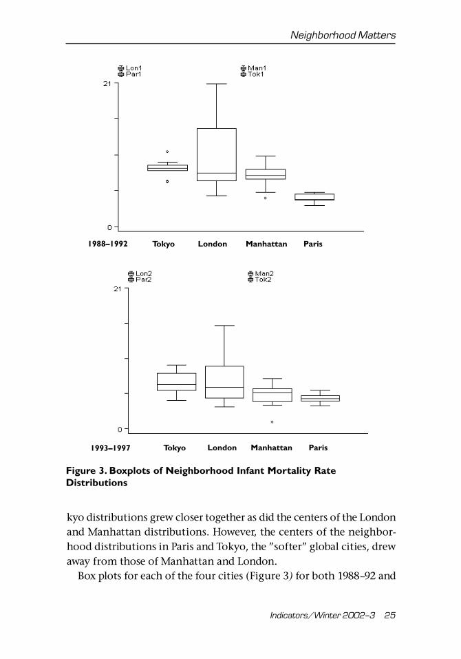
Table 7 gives a five-number summary for the neighborhood rate dis-tribution of each city for each of the two five-year periods (1988–92and 1993–97). The medians show that the centers of the Paris and To-
Table 6
Citywide Infant Mortality Rates and Measures of Center for theDistribution of Neighborhood Infant Mortality Rates (1988–1997)
London Manhattan Paris Tokyo
Median 7.6 7.1 6.6 4.6Mean 7.7 8.9 6.4 4.3Citywide 8.0 9.3 6.5 4.5
Table 7
Distribution of Infant Mortality Rates by Neighborhood:Five-Number Summary by Five-Year Periods
London Manhattan Paris Tokyo
1988–1992Highest 10.9 20.8 10.3 5.075th percentile 9 14.3 8.4 4.8Median 8.5 7.8 7.5 4.025th percentile 8.2 6.7 7.0 3.9Lowest 6.5 4.5 4.1 3.1
1993-1997Highest 9.5 15.4 7.5 5.775th percentile 8.3 9.3 6 4.9Median 6.6 6.2 5.4 4.525th percentile 5.7 4.6 4.1 4.1Lowest 4.2 3.3 1.0 3.4
Neighborhood Matters
Indicators/Winter 2002–3 25
kyo distributions grew closer together as did the centers of the Londonand Manhattan distributions. However, the centers of the neighbor-hood distributions in Paris and Tokyo, the ”softer” global cities, drewaway from those of Manhattan and London.
Box plots for each of the four cities (Figure 3) for both 1988–92 and
Tokyo London Manhattan Paris1988–1992
Figure 3. Boxplots of Neighborhood Infant Mortality RateDistributions
1993–1997 Tokyo London Manhattan Paris Tokyo

Neuberg and Rodwin
26 Indicators/Winter 2002–3
1993–97 indicate some increase in spread between the two periods inLondon, Paris, and Tokyo and some reduction in spread in Manhat-tan. In addition, between the two periods, the skewed nature of theLondon, Paris, and Tokyo distributions changed only slightly whilethe Manhattan distribution, starting sharply skewed toward rates abovethe median, grew considerably less skewed toward rates above themedian.
How do the changes in the distribution of infant mortality ratesacross neighborhoods explain changes in the citywide rates between1988–92 and 1993–97?
Changes in Neighborhood and Citywide InfantMortality Rates
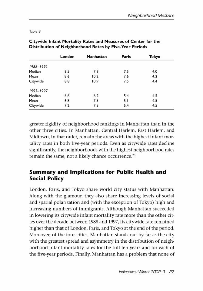
For both 1988–92 and 1993–97, Table 8 shows the citywide and me-dian and mean neighborhood infant mortality rates for each of thecities.
Little change in closeness of the citywide and mean and medianneighborhood rates between the two periods in London, Paris, andTokyo reflect the small changes in the skewed nature of these threeneighborhood rate distributions between the two periods (Table 7and Figure 3). In Manhattan, in contrast, the citywide rate in the firstperiod is 40 percent greater than the median neighborhood rate, whilein the second period it is only 21 percent greater. The growing closertogether of the citywide and mean and median neighborhood ratesbetween the two periods in Manhattan reflects the sharp reductionin skewed nature of the Manhattan neighborhood rate distributionbetween the two periods.
Geography of Neighborhood Disparities
Table 9 and Figure 4 compare the three neighborhoods with highestand lowest infant mortality rates in each city for the overall period.Changes in neighborhoods with highest and lowest infant mortalityrates between five-year periods appear in Table 10, which reveals
Neighborhood Matters
Indicators/Winter 2002–3 27
Table 8
Citywide Infant Mortality Rates and Measures of Center for theDistribution of Neighborhood Rates by Five-Year Periods
London Manhattan Paris Tokyo
1988–1992Median 8.5 7.8 7.5 4.0Mean 8.6 10.2 7.6 4.2Citywide 8.8 10.9 7.5 4.4
1993–1997Median 6.6 6.2 5.4 4.5Mean 6.8 7.5 5.1 4.5Citywide 7.2 7.5 5.4 4.5
greater rigidity of neighborhood rankings in Manhattan than in theother three cities. In Manhattan, Central Harlem, East Harlem, andMidtown, in that order, remain the areas with the highest infant mor-tality rates in both five-year periods. Even as citywide rates declinesignificantly, the neighborhoods with the highest neighborhood ratesremain the same, not a likely chance occurrence.23
Summary and Implications for Public Health andSocial Policy
London, Paris, and Tokyo share world city status with Manhattan.Along with the glamour, they also share increasing levels of socialand spatial polarization and (with the exception of Tokyo) high andincreasing numbers of immigrants. Although Manhattan succeededin lowering its citywide infant mortality rate more than the other cit-ies over the decade between 1988 and 1997, its citywide rate remainedhigher than that of London, Paris, and Tokyo at the end of the period.Moreover, of the four cities, Manhattan stands out by far as the citywith the greatest spread and asymmetry in the distribution of neigh-borhood infant mortality rates for the full ten years and for each ofthe five-year periods. Finally, Manhattan has a problem that none of

Neuberg and R
odwin
28
Ind
ica
tors
/W
inte
r 20
02
–3
Table 9
Neighborhoods with Highest and Lowest Infant Mortality Rates (1988–1997)
London Rate Manhattan Rate Paris Rate Tokyo Rate
Highest Southwark 9.5 Central Harlem 18.3 II 8.4 Shibuya 4.8Hackney 9.3 East Harlem 15.4 V 7.8 Kohtou 4.7Lambeth 8.8 Midtown 12.9 I 7.6 Sumida 4.7
Lowest Wandsworth 6.9 Financial District 5.5 VI 4.7 Toshima 4.0Kensington-Chelsea 6.6 Greenwich Village 4.8 III 4.4 Taito 3.7City of London 5.1 Upper West Side 3.9 IV 2.5 Chiyoda 3.4

Neighborhood M
atters
Ind
ica
tors
/W
inte
r 20
02
–3
29 Figure 4. Three Highest and Lowest Infant Mortality Rate Neighborhoods, 1988–1997
Manhattan
Inner London
Paris
Inner Tokyo
�����
����
���������
���������������������������������������
����������������������������������
����������������������������
������������������
Highest (dot):Midtown, Central Harlem, and East Harlem.
Lowest (hatch lines):Financial District, Greenwich Village,and Upper East Side.
4.4
����7.6
���
��� �������������
��������������������������
���������������������������
����������������������������������������������������������������
Highest (dot):Arrondissements:II, V, and VIII
Lowest (hatch lines):Arrondissements:III, IV, and VI
������������������������������������������������������������������������������������������������������������������������
��
��
��
��
����������������������������������������������������������������������������������������������������������������������������������������������������������������
���������������������������������������������������������������������������������������������
������������������������������������������
��������������
����������
��� ����
3.4
��
��
��
���
���
���������������������������������������������������������������������������������������������������������������������������������������
Highest (dot):Sumida, Kohtoh,and Shibuya
Lowest (hatch lines):Chiyoda, Taito,and Toshima
���
���
���
������������������������������������������������������������������������������������������������������������
��������������������������������������������������������������������������������������������������������������������������������
Highest (dot):Hackney, Lambeth,and Southwark
Lowest (hatch lines):City of London, Islington,and Kensington-Chelsea
��
��
����������������������������������������������������������������������������������������
���
���
���

Neuberg and R
odwin
30
Ind
ica
tors
/W
inte
r 20
02
–3
Table 10
Changes in Neighborhoods with Highest and Lowest Infant Mortality Rates Between Five-Year Periods
London Rate Manhattan Rate Paris Rate Tokyo Rate
1988–1992Highest Southwark 10.9 Central Harlem 20.8 V 10.3 Kohtou 4.9
Haringey 9.4 East Harlem 16.9 I 9.9 Sumida 4.8Brent 9.1 Midtown 14.8 VIII 9.9 Shinjuku 4.6
Lowest Wandsworth, Minato,City of Westminster 8.2 Financial District 5.9 VI 5.7 Arakawa 3.9
Kensington-Chelsea 6.6 Greenwich Village 5.5 III 5.0 Chuo 3.6City of London 6.5 Upper East Side 4.5 IV 4.1 Chiyoda 3.1
1993–1997Highest Hackney 9.5 Central Harlem 15.4 II 7.5 Chuo 5.7
Southwark 8.6 East Harlem 13.8 VII 6.6 Shibuya 5.3Lambeth 8.5 Midtown 10.2 XX 6.6 Arakawa 4.9
Lowest Islington 5.1 Upper West Side 4.0 VI 3.7 Toshima 4.1Camden 4.9 Greenwich Village 4.0 IX 3.5 Chiyoda 3.9City of London 4.2 Upper East Side 3.3 IV 1.0 Taito 3.4
Note: A comma between two neighborhoods indicates a tie for that rank between the neighborhoods.

Neighborhood Matters
Indicators/Winter 2002–3 31
the other cities share: the neighborhoods with the highest infant mor-tality rates remain the same for both five-year subperiods.
Infant mortality—deaths in the first year of life—certainly reflectsmultiple social determinants of health. At least the following are can-didates for social determinants of infant mortality rate: race, incomeclass, maternal age and health, and immigrant status. However, statis-tical modeling of infant mortality as a function of these and othervariables is plagued with difficulties. Our data, for example, are eco-logical or aggregated, and drawing causal conclusions from such datais very difficult. Even those who employ individual level observa-tional, nonexperimental data continue to debate causality because ofproblems of multicollinearity, excluded variables, model choice, andselection bias.
In this paper, we postponed the difficult question of what causesneighborhood infant mortality rates to vary. We concentrated insteadon the simpler question of how the citywide infant mortality ratedepends on the distribution of neighborhood infant mortality rates.We demonstrated that a skewed neighborhood rate distribution dragsthe citywide rate away from the median neighborhood rate. We showedthat in Manhattan, in contrast to the other three cities, a distributionof neighborhood rates heavily skewed toward high-rate neighborhoodsraises the citywide rate far above the median. Hence, neighborhoodsmatter for citywide rates and one sensible way to bring down thecitywide rate in Manhattan is to focus attention on the neighbor-hoods with extremely high rates.
The New York City Department of Health (NYCDOH) recognizesthis conclusion. Its “Turning Point” initiative launched a public healthplanning process that convened forums in each of the boroughs toshare data and set priorities.24 Its Infant Mortality Task Force empha-sized the importance of responding to “persistent disparities amongNew York City’s communities” by targeting interventions in com-munity districts with the highest infant mortality rates.25
NYCDOH’s Infant and Reproductive Health Program is also cur-rently trying to understand the causes of infant mortality in some ofNew York City’s community districts with the highest infant mortal-

Neuberg and Rodwin
32 Indicators/Winter 2002–3
ity rates. Its staff shares the concern of the Infant Mortality Task Forceabout many risk factors for high infant mortality rates: the persistenceof segregated African-American neighborhoods,26 high numbers of Car-ibbean immigrants, and high numbers of single mothers and teenbirths. We hope in future research to contribute to this effort to theextent that the methodological difficulties in identifying causes willallow us.
It is worth reiterating the conventional wisdom that infant mortal-ity reflects multiple social determinants of health. The infant mor-tality rate is an aggregate indicator that subsumes a number of otherindicators, each of which may point to different problems with differ-ent policy implications. For example, high numbers of fetal deathsusually reflect problems of maternal health whereas late infant deathstend to reflect problems of infant health. For this reason, in report-ing infant mortality, the World Health Organization (WHO) distin-guishes four categories according to age of death: fetal (less than 28weeks in utero), early neonatal (less than 7 days), late neonatal (7–27days), and post-neonatal (28–365 days).27
To the extent that neighborhood disparities more reflect the socialdeterminants of infant mortality, for example, a mother’s socioeco-nomic status, than do the perinatal and postnatal factors, it is par-ticularly important to focus interventions at the neighborhood level.The national systems of health insurance (in France and Japan) andthe National Health Service in the United Kingdom regularly moni-tor the health of all women. Beyond these national programs, in Lon-don (somewhat less than in the other two cities), Paris, and Tokyothere are aggressive efforts at the neighborhood level to follow allwomen in the course of their pregnancies and following delivery.28 Inaddition, in England, France, and Japan there are nationally fundedprograms to identify high-risk mothers and offer them special ser-vices. In France, there are even financial incentives for women toseek out these services.29 This is all in stark contrast to the organiza-tion and financing of maternal and child health in the United States,including New York City.30
Reducing the citywide infant mortality rate further in Manhattan
Neighborhood Matters
Indicators/Winter 2002–3 33
will require disproportionate declines in the neighborhoods with thehighest rates, for example, central and eastern Harlem. Achieving thisobjective will require, in turn, more searching, case-by-case examina-tion of the reasons for high infant mortality in these neighborhoodsfollowed by more aggressive targeted interventions to improve mater-nal health and decrease infant deaths.
Notes
1. U.S. Department of Health and Human Services, Healthy People 2010: Under-standing and Improving Health, 2d ed. (Washington, DC: Government Printing Of-fice, 2000).
2. H. Kalter, Y. Na, and P O’Campo, “Decrease in Infant Mortality in New YorkCity After 1989,” AJPH 88, no. 5 (May 1998): 816–20; and A. Racine, T. Joyce, W. Li,and M. Chiasson, “Recent Declines in New York City Infant Mortality Rates,” Pedi-atrics 101, no. 4 (April 1998): 682–88.
3. This was the sense in which the British city planner, Patrick Geddes, origi-nally used the term “world cities.” See his book, Cities in Evolution (London: Will-iams and Norgate, 1951).
4. P. Hall, The World Cities, 3d ed. (London: Weidenfeld and Nicholson, 1984);S. Sassen, The Global City: New York, London, Tokyo, 2d ed. (Princeton: PrincetonUniversity Press, 2001).
5. H.V. Savitch, Post-Industrial Cities: Politics and Planning in New York, Paris andLondon (Princeton: Princeton University Press, 1988).
6. We defined the eleven inner wards of Tokyo to correspond to Manhattan,Paris, and Inner London in terms of population, commuting patterns, and densityof hospital beds and physicians.
7. Data on commuting patterns are from the 1990 Census for each of the cities.For more precise references, see the WCP section of the ILC-USA Web site: ilcusa.org.
8. The foreign-born populations of Paris (1990), Inner London (1991), andManhattan (2000) are 25.1 percent, 27.8 percent, and 28.4 percent, respectively.
9. For recent data on New York, London, and Tokyo, see S. Sassen, “EconomicRestructuring as Class and Spatial Polarization,” ch. 9 in Sassen, The Global City; fordata on Paris see E. Preteceille, La ségregation sociale dans les grandes villes (Paris:Documentation Française, Problèmes Politiques et Sociaux, no. 684 (July 17, 1992).
10. C. Hamnett, “Social Polarization in Global Cities: Theory and Evidence,” Interna-tional Journal for Research in Urban and Regional Studies 31, no. 3 (April 1994): 401–24.
11. Sophie Body-Gendrot, “Paris: A ‘Soft’ Global City?” New Community 22, no. 4(October 1996): 595–605.
12. See the WCP section of the ILC-USA Web site: ilcusa.org. See also S. Kurasawaet al., Social Atlas of Tokyo (Tokyo: University of Tokyo Press, 1986).
13. In calculating infant mortality rates, a problem arises from the fact that tofollow a cohort of infants born in a given neighborhood from birth to one year is not

Neuberg and Rodwin
34 Indicators/Winter 2002–3
usually practical. Following convention, we define a practical infant mortality rate fora neighborhood as 1,000 times the number of infants below the age of one year who diein the neighborhood in a given period divided by the number of live births in theneighborhood during that period. (In the case of London for 1988 and 1989, data avail-ability forces us to employ the population below the age of one year instead of thenumber of live births.) What makes this definition differ from the ideal one is theimperfect nature of the cohort involved. During a given period, some infants not bornin a region may die there and some born there may move out of the region and dieelsewhere. Hence, a problem of infant in- and out-migration makes the practical defini-tion of infant mortality deviate from the ideal one. Researchers generally suppose that in-and out-migration balance to make the deviation of the practical from the ideal infantmortality rate negligible, and we follow suit. The full database for the article is found inthe appendixes of V.G. Rodwin and L.G. Neuberg, “Infant Mortality Rates in Four WorldCities: London, Manhattan, Paris, and Tokyo,” ILC-USA Working Paper, no date.
14. Two cities have one neighborhood with fewer than 400 births, and two citieshave two neighborhoods with fewer than 400 births. When these were merged withcontiguous neighborhoods, there was no appreciable effect on our results. Thus,we report only our analysis of nonmerged neighborhoods.
15. This allows for tests of significance at the citywide level. In the only table(Table 2) where we consider annual rates, we do not conduct significance tests. Atthe neighborhood level we do significance tests in only one table (Table 10).
16. S. Sepkowitz, “International Rankings of Infant Mortality and the UnitedStates’ Vital Statistics Natality Data Collecting System—Failure and Success,” Inter-national Journal of Epidemiology 24, no. 3 (1995): 583–88; E. Howell and B. Blondel,“International Infant Mortality Rates: Bias from Reporting Differences,” AJPH 84,no. 5 (May 1994): 850–52; K. Liu, M. Moon, M. Sulvetta, and J. Chawla, “Interna-tional Infant Mortality Rankings: A Look Behind the Numbers,” Health Care Financ-ing Review 13, no. 4 (summer 1992): 105–17.
17. Statistical significance is always at the .05 level in this article.18. A five-number summary includes the largest and smallest neighborhood rate,
the median or middle neighborhood rate when the rates are ranked in order (theaverage of the two middle rates when there are an even number of neighborhoods),and the seventy-fifth- and twenty-fifth-percentile neighborhood rates. The seventy-fifth-percentile rate of a distribution is the rate with 25 percent of the neighbor-hood rates above it, while the twenty-fifth-percentile rate is the one with 75 percentof the neighborhood rates above it.
19. The common vertical axis of all box plots is the infant mortality rate. Thethick middle horizontal line across the full rectangle of a box plot is at the medianneighborhood rate on the vertical axis. The upper and lower horizontal lines of thefull rectangle are at the seventy-fifth- and twenty-fifth-percentile rates, respectively.The remaining two horizontal lines of the box plot, the whiskers, are at the largestand smallest rate of the distribution on the vertical axis, unless there are rates asubstantial distance from the others. Such rates are outliers, and a box plot representsthem as dots.
20. For a city, the mean neighborhood rate is the sum of all the neighborhoodrates divided by the number of neighborhoods.
21. When the distribution is asymmetric, the mean is dragged from the median

Neighborhood Matters
Indicators/Winter 2002–3 35
in the direction in which the distribution is skewed. This dislocates the mean fromthe center of the rates and is why statisticians favor the median over the mean as ameasure of center for an asymmetric distribution.
22. The algebra of why this is so is discussed in the Appendix.23. Table 10 indicates that three of three high-rate, and two of three low-rate
neighborhoods persist from the first to the second period in Manhattan. The prob-ability that three of three high-rate neighborhoods would persist between the twoperiods, if all Manhattan neighborhoods were equally likely to form the high-threegroup, is .0045. The probability that two of three low-rate neighborhoods wouldpersist between the two periods, if all neighborhoods were equally likely to formthe low-three group, is .1227. Similar calculations for the other three cities alwaysyield probabilities higher than .1227. Hence, only the persistence of the three high-rate neighborhoods in Manhattan is statistically significant.
24. T. Hubinsky, E. Cagan, A. Goodman, D. Deitcher, and N. Cohen, “Partneringwith Communities to Improve Health: The New York City Turning Point Experi-ence,” Journal of Urban Health 78, no. 1 (March 2001): 176–80.
25. New York City Department of Health Proposal for Infant Mortality ReductionPhase III Report. Blueprint for Action (New York: NYC Department of Health, De-cember 2000).
26. I. Ellen, “Is Segregation Bad for Your Health? The Case of Low Birth Weight,”in Brookings-Wharton Papers on Urban Affairs (Washington, DC: Brookings Institu-tion Press, 2000), pp. 203–38.
27. This World Health Organization (WHO) “perinatal periods of risk approach”is used by the National Group on Urban Maternal and Child Health Assessment(GUMCHA)—an initiative sponsored by Citymatch and the Centers for Disease Con-trol in the United States. See GUMCHA Periods of Risk Work Group, WHO PerinatalPeriods of Risk Approach: The US Urban Experience, National Group on Urban Mater-nal and Child Health Assessment (GUMCHA), no date, p. 24.
28. G. Richardson, A Welcome for Every Child: How France Protects Maternal andChild Health—A New Frame of Reference for the United States (Arlington, VA: NationalCenter for Education in Maternal and Child Health, 1994).
29. B. Bergman, Saving Our Children from Poverty: What the United States CanLearn from France (New York: Russell Sage, 1996).
30. For a comparison of France, England and Wales, and the United States, seeChild Health in 1990: The United States Compared to Canada, England and Wales,France, the Netherlands and Norway. Supplement to Pediatrics 86, no. 6, part 2 (De-cember 1990).
31. For the standard computational formula for a sample covariance see, for example,B. Rosner, Fundamentals of Biostatistics, 3d ed. (Boston: PWS-KENT, 1990), p. 20.
Appendix: Relation of Citywide and MeanNeighborhood Infant Mortality Rates
Suppose that there are n neighborhoods in a city and that mi is theneighborhood infant mortality rate for neighborhood i. Then the

Neuberg and Rodwin
36 Indicators/Winter 2002–3
average of the neighborhood infant mortality rates is m ≡ ∑ (mi/n),
where the sum is from 1 to n, that is, over the neighborhoods. One canwrite m as
m = (1/n)m1 + (1/n)m
2 + . . . + (1/n)m
n(2)
because an average of a set of numbers is the weighted sum of the num-bers where each weight is 1 over the number of numbers averaged. Letbi be the number of live births in neighborhood i, B be the number oflive births citywide, and M be the citywide infant mortality rate. If eachneighborhood in the city had the same number of live births then Mwould equal m. However, each neighborhood in the city does not havethe same number of live births. When such is the case, to get M from theneighborhood rates, instead of weighting each neighborhood rate by(1/n) and adding them up, one weights each neighborhood infant mor-tality rate by the proportion of live births citywide that occur in theneighborhood and adds them up. That is
M ≡ (b1/B)m1 + (b2/B)m2 + . . . + (bn/B)mn (3)
So in contrast to the case of the average of the neighborhood rateswhere each neighborhood contributes equally, in the case of thecitywide rate, each neighborhood contributes proportionately to thenumber of live births that occur in it.
Let V be the covariance of the (bi/B)s and the m
is. Then
M ≡ m + (n – 1)V (4)
That is, the citywide rate is equal to the sum of the average of theneighborhood rates and the product of 1 less than the number ofneighborhoods and the covariance of the (bi/B)s and the mis. Recallalso that V is the product of the correlation of the (bi/B)s and the mis,the standard deviation of the (b
i/B)s, and the standard deviation of
the mis. That is, the difference between the citywide rate and theaverage of the neighborhood rates is proportional to the spread of theneighborhood rates, the spread of the neighborhood proportions oflive births, and the association of the neighborhood rates and pro-portions of live births.

Neighborhood Matters
Indicators/Winter 2002–3 37
To summarize, if for a given city the citywide and mean neighbor-hood rates differ much for a period—1988–97, 1988–92, or 1993–97,the primary reason is a large covariance between the neighborhoodinfant mortality rates and proportions of live births. That covariancecould, in turn, be large because of a large spread of either infantmortality rate (certainly true in Manhattan) or proportion of livebirths, or a high correlation between these variables.
To prove (3) and (4) above we introduce some simple notation. Letn = the number of neighborhoods in the city,b
i = the number of live births in neighborhood i, and
di = the number of infant deaths in neighborhood i.Let ∑ always be over the neighborhoods of the city.Thenthe number of live births in the city, B, ≡ ∑ bi,the number of infant deaths in the city, D, ≡∑ di,
the citywide infant mortality rate, M, ≡ D/B ≡ (∑di)/(∑ b
i),
the infant mortality rate for neighborhood i, mi,≡ di/bi, andthe average neighborhood infant mortality rate, m, ≡ ∑ mi/n.So d
i ≡ m
i x b
i and hence M ≡ D/B = (∑ d
i)/(∑ b
i) = (∑ d
i)/B = (∑m
i
x bi)/B = ∑ (bi/B) mi Q.E.D. (3).Also letb = ∑ (b
i/B)/n and
the covariance of the (bi/B)s and the mis, V, ≡ ∑[(bi/B) – b)(mi – m)]/(n – 1).
Then by the usual computational formula for V we have V =∑ [(bi/
B)mi]/(n – 1)] – [m/(n – 1)] = [M/(n – 1)] – [m/(n – 1)] so that M = m +(n – 1)V (Q.E.D. (4)).31
Acknowledgments and Data Sources
This paper grows out of the World Cities Project—a joint venture of the Interna-tional Longevity Center-USA (ILC-USA) and the Wagner School of Public Service,New York University (NYU). For financial support, we are grateful to the R.W. JohnsonFoundation for a health policy investigator award on “Health and Megacities” toVictor Rodwin; the International Longevity Center-USA; and the City of Paris (De-partment of Health and Social Affairs). We thank Robert Butler, Roland Moreau, and

Neuberg and Rodwin
38 Indicators/Winter 2002–3
To order reprints, call 1-800-352-2210; outside the United States, call 717-632-3535.
Robert Poinsard for their support of the whole project. Many colleagues across thefour cities were most helpful in obtaining data, by neighborhood, on infant births anddeaths:
London: Justine Fitzpatrick, London Regional Office of the National Health Ser-vice (1988–89) supplied the number of live births (1990–97), population below oneyear of age and number of infant deaths (1988–97) for each year for each borough ofLondon.
New York: Birgit Bogler, research assistant at ILC-USA and NYU, extracted data for usfrom the birth and death files provided to us by the NYCDOH, Office of Vital Statis-tics. Fabienne Laraque, Melanie Besculides, Kai-Lih Liu, and Tamara Dubanovsky,NYCDOH, Office of Family Health, provided support and assistance as needed.
Paris: The 1988–97 number of live births and 1988–92 number of infant deaths foreach arrondissement of Paris are from “La Santé de la Mère et de l’Enfant à Paris,”Département des Affaires Sanitaires et Sociales, Ville de Paris, July 2000. We thank Dr.Marie-Claude Bonnefoi for her help in reviewing these data. Diane Slama Lequet ofthe Research Office of the French Ministry of Health obtained data from InstitutNational Scientifique d‘Etudes et de Recherches Médicales (INSERM) on infant birthsand deaths, by arrondissement, for the period, 1993–97.
Tokyo: The 1988–92 Tokyo figures are from Tokyo Eiseikyoku (1993), Annual Re-port on Health in Tokyo. The 1993–97 Tokyo figures are from the Fiscal Year 2000Report of the Tokyo Metropolitan Government Bureau of Public Health. ProfessorYukiko Kudo of the International Longevity Center-Japan provided vital assistancein obtaining these data. We thank Keiko Honda, research associate at ILC-USA forher assistance with translation.


![Greater London Boroughs [Complete map book]](https://img.dokumen.tips/doc/110x75/58a2d5891a28ab724d8b6dc6/greater-london-boroughs-complete-map-book.jpg)


