Embed Size (px)
Citation preview

International Journal of Market Research Vol. 54 Issue 5
1© 2012 The Market Research Society
Received (in revised form): 1 March 2012
DOI: 10.2501/IJMR-54-5-000-000
Myths and realities of respondent engagement in online surveys
Theo Downes-Le Guin, Reg Baker, Joanne Mechling and Erica RuyleaMarket Strategies International
This paper describes an experiment in which a single questionnaire was fielded in four different styles of presentation: Text Only, Decoratively Visual, Functionally Visual and Gamified. Respondents were randomly assigned to only one presentation version. To understand the effect of presentation style on survey experience and data quality, we compared response distributions, respondent behaviour (such as time to complete), and self-reports regarding the survey experience and level of engagement across the four experimental presentations. While the functionally visual and gamified treatments produced higher satisfaction scores from respondents, we found no real differences in respondent engagement measures. We also found few differences in response patterns.
Background
As online surveys and panels have matured, researchers have raised concerns about the effect of long, onerous, poorly designed and simply dull surveys. Poor survey design demonstrably increases undesirable respondent behaviours that include speeding, random responding and premature termination. Over time an accumulation of flawed surveys affects participation rates across studies and degrades industry credibility. This effect is magnified in access panels, which provide an opportunity for repeated negative exposures to panellists who become savvy to, and potentially manipulative of, sub-standard survey designs.
None of this is new or peculiar to online surveys. Over 40 years ago Cannell and Kahn (1968) argued that, when the optimal length for a survey is exceeded, respondents become less motivated to respond, put forth less cognitive effort and may skip questions altogether, causing survey data quality to suffer. Empirical studies by Johnson et al. (1974)

Myths and realities of respondent engagement in online surveys
2
and Kraut et al. (1975) suggest that the problem may be especially acute in self-administered surveys where no interviewer is present to maintain engagement. Herzog and Bachman (1981) were the first to identify the tendency for respondents to ‘straight-line’ in large numbers of consecutive items that share the same scale. They also noted that this behaviour increases as respondents progress through a questionnaire. Krosnick (1991) coined the term ‘satisficing’ to describe the tendency for survey respondents to lose interest and become distracted or impatient as they progress through a survey, putting less and less effort into answering questions. The resulting behaviours typically include acquiescent responding, more frequent selection of non-substantive responses such as ‘don’t know’, non-differentiation in rating scales, choosing the first listed response (i.e. primacy) and random responding.
Given this history it should not surprise us when web surveys encounter these same problems. Indeed, these effects have been widely documented (see, for example, Downes-Le Guin et al. 2006; Fisher 2007; Heerwegh & Loosveldt 2008; Malhotra 2008; Miller 2008). In addition, experimental studies by Galesic and Bosnjak (2009) and Lugtigheid and Rathod (2005) have shown that, as questionnaires become longer, engagement declines, resulting in classic satisficing behaviours and even survey abandonment.
The general concept underlying all of this is generally referred to as ‘respondent burden’. Bradburn (1977) described respondent burden as the combination of four factors: the length of the interview; the amount of effort (cognitive and otherwise) required of the respondent; the amount of emotional stress a respondent might feel during the interview; and the frequency with which the particular respondent is asked to participate in a survey. His central argument is that ‘respondents seem to be willing to accept higher levels of burden if they are convinced that the data are important’ (p. 53). Writing at a time when most research was done in person and interviews were primarily a social interaction, Bradburn also noted that making the interview ‘an enjoyable social event in its own right’ (p. 49) might lower a respondent’s perception of the survey’s burden and encourage engagement throughout a long survey.
Unfortunately, most of the survey design elements that might be used to minimise respondent burden – shorter surveys with easily understood questions on interesting and important topics, and fewer survey requests – have proved elusive in commercial market research. And our increased reliance on online surveys and access panels has made it especially difficult to position a survey as ‘an enjoyable social event’.

International Journal of Market Research Vol. 54 Issue 5
3
In reaction to these challenges, market research agencies and clients have sought to create more enjoyable survey designs by capitalising on the visual and interactive features of the web through the use of additional visual elements added to questionnaires. Many market researchers argue that online surveys must be more lively and interactive – that is, more consistent with other online and entertainment experiences (see, for example, Reid et al. 2007; Strube & Zdanowicz 2008; GMIInteractive 2011; Sleep & Puleston 2011). The underlying goal is to increase ‘respondent engagement’, a concept typically measured by proxies such as self-reported satisfaction with the survey experience or item non-response. Specific techniques used to increase engagement include visuals used to enhance surveys (e.g. using colour and images to define answer categories) and visual response methods (e.g. drag-and-drop or slide bars as replacements for radio buttons).
Despite industry enthusiasm for exploring interactive visually oriented web survey designs, an emerging body of research suggests that the use of some of these elements may be counterproductive or generate unintended results. Miller (2009) demonstrated that, when given a choice, significant numbers of respondents prefer a traditional HTML-based survey over a more interactive, rich media design. When forced into a rich media design, a significant number of respondents abandoned the survey. Couper and his colleagues (2006) tested use of a Java-based slider bar in place of standard radio buttons, and found that the former increased survey length and caused more respondents to abandon the interview. Thomas et al. (2007) reported similar results for drag- and-drop ranking tasks. In a series of studies, Malinoff (2010) found that rich media interfaces can produce significantly different results than standard HTML interfaces across a broad set of attitudinal and behavioural measures.
Most recently, the notion of creating games or adding game-like elements to surveys has generated considerable interest (Blackbeard Blog 2010; Puleston 2011a; Tarran 2011). Although the term ‘gamification’ has no widely agreed upon definition within market research, a definition offered by Zichermann and Cunningham (2011) seems a useful starting point: ‘the use of game thinking and game mechanics to engage users and solve problems’. We might tweak that a bit and suggest that, in market research, gamification is the application of game mechanics (or game thinking) to an interaction with respondents, whether in a quantitative or qualitative setting. In the case at hand we have incorporated into a survey the five basic elements of game mechanics: a back story, a game-like

Myths and realities of respondent engagement in online surveys
4
aesthetic, rules for play and advancement, a challenge, and rewards (Schell 2008; McGonigal 2011).
A new survey design taxonomy
Despite the somewhat conflicted research record to date on the effectiveness of more interactive presentation styles in web surveys, a new survey design taxonomy (largely independent of study content) is arising. This taxonomy reflects four styles of presentation, as follows.
1. Text Only. This style of presentation, which has dominated online survey design since its inception, typically uses no images at all. Images are included only if intrinsic to the content requirements of the survey, such as images of a product packaging in a package test. Best practices of the past decade have led to a fairly consistent style of online surveys across the industry that rests on simplicity: black text on white background; extensive use of radio buttons, tick boxes and grids.
2. Decoratively Visual. This style of presentation uses visual elements (graphics, images, colour) primarily or only to provide visual stimulation that is intended to enhance the respondent experience. Graphics and images are not intrinsic to the study content, questions or responses. Examples include colour backgrounds, colour or patterned bars that separate the question wording from the response categories, and use of images that relate to the study or question content but are not in any way active as response items.
3. Functionally Visual. This style of presentation uses visual and motion elements, often implemented as Flash objects, integrated into the way those questions and responses are presented. For example, response categories are arrayed along a slider bar rather than next to tick boxes; grids are converted to drag-and-drop exercises; and images are used to exemplify, augment or replace text response categories.
4. Gamified. This style of presentation uses ‘game thinking’ to make all or portions of the questionnaire engaging. These designs employ various qualities common in most games such as rules, barriers, missions, progress indicators, and badges or rewards, to ‘gamify’ a survey. Depending on the nature of the task and research requirements, the entire survey may become game-like or only certain questions or sections may be recast as game-like. The game may directly relate to the survey content or may exist as a method of increasing respondent engagement somewhat independent of the survey content.

International Journal of Market Research Vol. 54 Issue 5
5
Experimental design
To systematically test the impact of each of these different presentation styles we designed and conducted an online survey of US adults using the ResearchNow online panel. Other than a minimum age of 18, no screening criteria were imposed on survey participation. The study content was drawn from the Edison Electric Institute’s Power Poll, an ongoing quarterly survey designed to help EEI members understand public opinion on major energy issues, and Market Strategies’ E2 study, a bi-annual programme that since 2007 has fielded eight waves of surveys designed to provide energy industry executives perspective on issues at the intersection of energy and the environment. These ongoing studies cover a range of issues including public attitudes on energy, the environment and the economy. In addition, we included two validation questions from a CNN/Opinion Research Company poll conducted in April/May 2011, and a number of debrief questions regarding the survey experience, to measure respondent satisfaction. Both the validation and engagement questions were added near or at the end of the questionnaire to minimise any order effects.
In all, the questionnaire comprised 66 questions exclusive of demographics and the debrief questions. We included a mix of yes/no, true/false, 4- and 5-point fully labelled scales and 0–10 scale questions. A number of questions were grouped into six grid-style presentations. Prior to field we estimated the survey would take around 15 minutes to complete.
Respondents were randomly assigned to one of four monadic designs representing the questionnaire presentation options described above. Figures 1 to 5 provide examples of the different visual presentations.
As one would expect, the gamified presentation was most strikingly different from other presentations. Beyond basic instructions that were shared across all design, respondents assigned to this presentation received a separate set of instructions which emphasised that the game was not a race and that it is important to take time to answer the questions honestly and thoroughly. We provided additional narrative in an effort to immerse the respondent in the fictional online world. The premise of the narrative was a very simple fantasy that nevertheless fulfils the basic requisites of a game. After choosing an avatar, player avatars advance through fantasy environments as survey questions are answered. The object of the game is for players to equip themselves for a quest with various weapon and non-weapon assets, such as a shield or sword. At certain stages in the questionnaire, the player is rewarded with a choice of assets, at which point he or she has the option of visiting a new world with different visuals. At the end of the game, the player’s avatar, now fully equipped,

Myths and realities of respondent engagement in online surveys
6
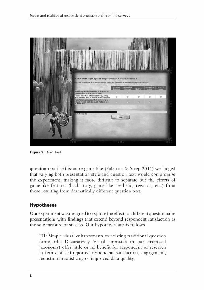
is shown with other players’ avatars as a visual ‘reward’. In order to separate the effects of the overall survey design and context from question and response presentation, we showed a text-only version of survey questions in a window superimposed over (but not completely obscuring) the game background (Figure 5). While some gamification researchers have argued that there are significant gains in response quality when the
Figure 1 Text only
Figure 2 Decoratively visual

International Journal of Market Research Vol. 54 Issue 5
7
Figure 3 Functionally visual
Figure 4 Gamified
Myths and realities of respondent engagement in online surveys
8
question text itself is more game-like (Puleston & Sleep 2011) we judged that varying both presentation style and question text would compromise the experiment, making it more difficult to separate out the effects of game-like features (back story, game-like aesthetic, rewards, etc.) from those resulting from dramatically different question text.
Hypotheses
Our experiment was designed to explore the effects of different questionnaire presentations with findings that extend beyond respondent satisfaction as the sole measure of success. Our hypotheses are as follows.
H1: Simple visual enhancements to existing traditional question forms (the Decoratively Visual approach in our proposed taxonomy) offer little or no benefit for respondent or research in terms of self-reported respondent satisfaction, engagement, reduction in satisficing or improved data quality.
Figure 5 Gamified

International Journal of Market Research Vol. 54 Issue 5
9
H2: Stimulating, functionally visual tasks offer satisfaction, engagement and data quality benefits. Elaborate images or games are not necessarily required.
H3: Game thinking as applied to surveys presentation is engaging and entertaining for some types of respondents but off-putting to others, creating a significant risk of self-selection that may bias survey results.
H4: Given the novelty of incorporating game features into surveys and the current limitations of survey software, the design and programming of gamified surveys adds significant cost in time and money.
Results
The survey was fielded from 28 June until 5 July. ResearchNow emailed 12,289 initiations to panel members, resulting in 1007 completed interviews for a participation rate of 8%. This response is consistent with what the authors see in other similar studies they do. Five years ago participation rates for online panels tended to be in the mid-teens (Miller 2007) but have fallen off markedly the last few years as the volume of survey invitations has increased. Table 1 shows the distribution of completed surveys across the four cells of the experiment, the completion rate (i.e. percentage of respondents starting the survey who completed) and the average length for each treatment cell.
The four presentations differ in few ways, other than the striking proportion of respondents in the Gamified cell who failed to complete the entire survey. A significant number of those respondents abandoned the survey either while the game was loading – a process that could take up to two minutes on low-bandwidth connections – or during the introduction to the game. If we eliminated these pre-survey terminations and recalculated the completion rate to include only those who made it through the game introduction and began answering the survey questions, the revised completion rate is 72%, still significantly different from the 93% and 94% achieved in the other cells.
Given this apparently high rate of self-selection in the Gamified cell we were concerned about potential demographic bias. Table 1 also shows the make-up of the four presentation cells by gender, age, education and income. While there are some significant differences among cells (for

Myths and realities of respondent engagement in online surveys
10
example, the low percentage of college graduates in the Decoratively Visual cell or the lower income respondents in the Functionally Visual cell), we found no evidence of a systematic demographic bias across cells. Table 1 also shows self-reports of the frequency of playing games of any kind, not just online or computer games. With the exception of a significantly lower representation of frequent game players again in the Decoratively Visual cell, the distributions of regular game-playing are similar. Finally, the table shows the average hours per week spent online. Of note here is the significantly higher report for the Functionally Visual cell. Respondents in this cell used a slider bar to answer, whereas the presentation in the other three cells required respondents to type a number into an input box. Thus, it may be that the difference in this item is a function of the answering device rather than a bias towards heavier internet users.
Other research in this area has relied heavily on debrief questions at the end of the survey that ask respondents about their satisfaction with the survey experience, often in comparison to other surveys they have taken. We asked five such questions, all on 7-point scales in which only the endpoints were labelled. The mean responses for those questions are shown in Table 2. After reviewing the results we concluded that, in general and despite one or two exceptions, respondents in the Functionally Visual and Gamified cells were more satisfied with their experience than those in the other two cells.
Table 1 Sample summary
Treatment cell
TotalText onlyN = 251
Decoratively visualN = 251
Functionally visualN = 252
GamifiedN = 253
SummaryCompletion rate 94 93 94 58* 80Average length (minutes) 14.1 15.2 15.5 15.3 15.0
DemographicsMale 44 48 50 49 48Younger than 35 22 23 29 24 24College graduate 59 51 56 61 57Income <$25K 19 22 15*** 18 18Play games daily/weekly 69 54** 61 64 62Play games seldom/never 21 27 22 24 24Average hours online per week 20.0 20.8 36.9** 20.9 24.3
*p < 0.001; **p < 0.01; ***p < 0.05

International Journal of Market Research Vol. 54 Issue 5
11
Table 2 also shows the average of respondent reports of how long they thought the survey took. While respondents in the Gamified cell thought the survey took significantly longer to complete than those in the other cells, the assessment does not appear to have had a negative impact on how they evaluated the survey-taking experience.
However, satisfaction with the survey experience does not necessarily translate to engagement. To measure engagement (or lack thereof) we implemented both direct and indirect widely used techniques to identify unengaged respondents. The direct measures were placed towards the end of the survey, and prior to the demographic and debrief questions. The first was placed in an eight-question grid containing two contradictory questions. Respondents were asked how likely they were to ‘Improve your home’s insulation’ and how likely they were to ‘Remove or downgrade your home’s insulation so that more heat escapes.’ Questions were randomised within the grid. Any respondent who gave contradictory answers to the questions was deemed to have failed the trap. The second trap question was in a five-question grid and instructed the respondent, ‘For quality assurance purposes please select Strongly Agree.’ Any respondent who did not select the correct response as per the instructions was deemed to have failed the trap.
Results from these two traps are shown at the bottom of Table 2. While there were minor differences among the four treatment cells, none of them
Table 2 Satisfaction and engagement measures
Treatment cell
TotalText onlyN = 251
Decoratively visualN = 251
Functionally visualN = 252
GamifiedN = 253
Debrief questionsHow interesting? 5.2 5.4 5.7*** 6.0*** 5.6How easy to read? 6.1 6.3 6.4*** 6.2*** 6.2How easy to answer? 5.9 6.0 6.3*** 6.3*** 6.1How fast? 5.3 5.3 5.4*** 5.0*** 5.3How much enjoyed? 5.0 5.3*** 5.4*** 5.7*** 5.4How many minutes? 12.7 13.0 13.8*** 15.1** 13.7
Engagement trap failuresInconsistent response 18 22 22 20 20Failed to select ‘strongly agree’ 13 12 10 13 12Straightlined in two or more grids 17 20 17 20 18
*p < 0.001; **p < 0.01; ***p < 0.05

Myths and realities of respondent engagement in online surveys
12
reached statistical significance for either of the two traps. The overall rates of failure on the inconsistent response trap (20%) and the ‘Select Strongly Agree’ items (12%) are in line with those reported by Miller (2007) in his study of data quality across 20 different US panels. He found an average failure of 18% for inconsistent responses and 15% for a trap similar to our ‘Select Strongly Agree’ instruction.
As an indirect measure of satisficing, we also examined the six grid questions for evidence of straightlining. We calculated standard deviations on a case-by-case basis across all items within each of the six grids in the questionnaire. A standard deviation of 0 for a grid was used as an indicator of straightlining. Results across all respondents and all six grids are shown at the bottom of Table 2. The only significant difference we found was in Q14, a set of 11 questions using a 0 to 10 scale for the respondent to rate the performance of the company providing his or her electric service. In this one instance the results for the Decoratively Visual cell were significantly higher than those for the Functionally Visual cell – that is, more straightlining in the former than in the latter. There were no significant differences in the other five grids.
In the last stage of our analysis we looked for significant differences in response distributions across the full range of questions in the main body of the questionnaires. Twenty-four of the 66 items in the questionnaire used 0 to 10 scales. Most were in grids but a few were presented as single questions on a page. We used an Anova procedure to look for significant differences in mean scores across the four experimental cells and found only one item significant at the .05 level, a finding consistent with chance. The remaining items were all categorical variables with response options varying from two (e.g. yes/no) to six in the case of some fully labelled scales. We cross-tabulated these 42 items by presentation cell and used chi-square to find significant differences. Ten of the 42 showed significant differences in distributions within presentation cells, seven of which were due to differences in the Functionally Visual cell.1
Because we anticipated widespread differences in response patterns we included two questions that we might use to validate responses in the experiment against an outside source, in this case a CNN poll. To our surprise, there were no meaningful differences across treatment cells for these questions and so little point to the validation exercise.
1 To conserve space we chose not to include the very large table that would be required show results across all 66 items. However, we will make these data available upon request.

International Journal of Market Research Vol. 54 Issue 5
13
Finally, we reviewed the level of effort to design and implement the four cells. As one would expect, all cells other than Text Only involved some incremental labour and may also lead to additional costs such as purchase of stock images. The Decoratively Visual presentation entailed about 10% to 15% more time as compared to the Text Only baseline, in order to identify and program subject-appropriate images. The Functionally Visual presentation entailed about 50% more time, in order to think through the different question format options, choose the best option and program. The Gamified presentation consumed more than twice as many hours (as well as significant subcontracted resources to create original artwork) to conceive and design the game structure, narrative and artwork, and to program and iteratively test.
Discussion
We designed this experiment to test four hypotheses. The first states that simple visual enhancements (such as those applied in the Decoratively Visual presentation) are insufficient to increase respondent satisfaction, reduce satisficing or lead to better-quality data. Our analysis shows this to be the case and so this hypothesis is accepted.
The second hypothesis states that the addition of more functionally visual elements such as slider bars and drag-and-drop answer mechanisms not only create a more positive experience for respondents but also lead to more engagement, less satisficing, and improvements in data quality. Our analysis found little evidence to support this hypothesis. While respondent satisfaction increased on a number of measures, we see no significant improvement in engagement as measured by reduced failures in trap questions or less satisficing. We found less straightlining in the Functionally Visual cell for just one of the six grids. In that grid three of the cells used standard radio buttons where the least amount of effort is to simply click down a single column. The Functionally Visual cell used a set of slider bars (Figure 6) where minimal effort does not necessarily result in straightline responding. In fact, creating a straightline pattern takes considerable effort.
We also found little evidence to support a claim of improved data quality in either the Functionally Visual or Gamified cells. Overall we found few significant differences in response patterns across the four presentations; where there were differences they were almost always in the Functionally Visual cell, whose basic response mechanisms differed consistently from the other presentations. For example, when asked about time spent on

Myths and realities of respondent engagement in online surveys
14
the internet each week, responses in the three other cells averaged around 20 hours, while those in the Functionally Visual Cell averaged 37 hours. Respondents in the other three cells were asked to record their answer by keying a number in a box. The Functionally Visual cell used a slider bar (Figure 7) with endpoints of 0 and 168, the total number of hours in a week. Feedback on their selection was shown to respondents on the far right as they moved the slider. One hypothesis here is that the length of
Figure 6 Q14 functionally visual

International Journal of Market Research Vol. 54 Issue 5
15
the bar had an anchoring effect, encouraging some respondents to answer with a higher number because a smaller number (like 15 or 20) seemed visually insignificant in such a long bar.
Most of the other questions where the Functionally Visual presentation resulted in statistically significant differences from other cells were concentrated in a single set of questions. We asked respondents to indicate how much effort they thought four industries or individuals were making to reduce greenhouse gases. Respondents in three of the four cells saw a standard grid with radio buttons (Figure 8). Those in the Functionally Visual cell were given a drag-and-drop exercise (Figure 9); this produced significantly different responses than the standard grid for three of the five items. One possible explanation for the difference is that the presentation of the drag-and-drop exercise may have influenced some respondents to interpret the question differently. Rather than evaluate each industry or set of individuals one at a time some may have focused on the answer boxes one at a time and decided which industry or group of individuals belonged in each, ultimately producing a somewhat different distribution.
These results are not surprising as the literature on use of these kinds of answering devices is conflicted. Couper and his colleagues (2006) found no differences in their experiments with sliders. Thomas and his colleagues (2007) found the same for both sliders and drag and drop ranking exercises. On the other hand, Reid et al. (2007) and Malinoff (2010) found numerous differences in response patterns when comparing slider bars with standard HTML radio buttons. We expect these different
Figure 7 Q39 functionally visual

Myths and realities of respondent engagement in online surveys
16
findings may be linked to the way in which these researchers implemented rich media in their respective studies and that additional research will lead to a set of best practices that minimise possible response effects.
The third hypothesis warns about the possible bias that might result from self-selection. This reflects our concern that some respondents might be turned off by the game and abandon the survey, while those more favourably disposed towards games would stick with it, resulting in a sample with a bias towards people to whom our particular game type appealed. The abandonment rate was indeed very high in the Gamification cell, though we hypothesise that was attributable in part to the length of time it took the game to load and to the need for respondents to read an introductory narrative, both factors that were specific to our experiment and that could be adjusted in other designs. As far as we can tell, however, there was little or no bias in the demographics of those who completed, their game-playing behaviour, or in their responses to the surveys questions. Thus, this hypothesis also is rejected.
Figure 8 Q26 decoratively visual

International Journal of Market Research Vol. 54 Issue 5
17
Our final hypothesis related to the level of effort required to design and launch a gamified survey. This hypothesis is accepted, though we note that different levels and forms of visual presentation and gamification will entail different levels of incremental effort. All three visually enhanced presentations will tend to create a variety of reusable images and programming assets, not to mention researcher experience, across surveys. While it is inconceivable that these presentations, thoughtfully executed, would ever be as simple to execute as a Text Only presentation, much of the additional labour consumed in this experiment by the Decoratively Visual, Functionally Visual and Gamified presentations was due to learning curve and the luxury of experimentation.
Conclusions
The two primary goals of this study were (1) to determine whether we could create a more enjoyable survey experience through the use of rich
Figure 9 Q26 functionally visual

Myths and realities of respondent engagement in online surveys
18
media and game-like features, and (2) whether that in turn would lead to increased engagement, less satisficing and better-quality data. Our analysis suggests that the first goal was achieved but the hoped-for benefits in engagement and data quality did not follow.
Based on the results of this study we conclude that the keys to greater survey engagement lie not in graphical enhancements or greater interactivity in the presentation of survey questions, but rather in dealing more effectively with the fundamental components of respondent burden that survey methodologists have long recognised: survey length, topic salience, cognitive burden (i.e. poorly written or hard to answer questions) and frequency of survey requests.
Nevertheless, creating a more enjoyable survey experience is still a worthwhile goal even if it does not lead to all the benefits sometimes claimed. Moreover, an accumulation of enjoyable (or at least tolerable) surveys could yield significant benefits to individual research or panel companies and to the market research industry as a whole. There seems to be little doubt that surveys will become more graphical, more ‘functionally visual’ as we have described it, if for no other reason than that researchers and web survey platforms will increasingly take their design cues from outside their own industry. The challenge is in learning to do visual surveys well, and in ways that are easily and unambiguously understood by respondents.
For example, a Functionally Visual web survey design philosophy that eschews mere decoration while avoiding complex game thinking would seem to offer a perfect blend of updated, respondent-friendly design with straightforward, budget-friendly research requirements. In various ways, however, this experiment demonstrates that even this approach can have profound effects on individual response distributions, and requires a wholesale replacement of best practices around question design that have evolved over decades for Text Only surveys.
Similarly, the Gamified approach opens up an even greater multiplicity of interpretations and undetectable sources of bias or error. In any domain – surveys included – ‘games’ represents an extremely broad category, with different types of games appealing to different types of people. While this experiment demonstrated no meaningful response bias as a result of our choice of a ‘fantasy role play’ format, it stands to reason that other approaches to gamification might not be so lucky. Some people like Monopoly, others like World of Warcraft, and some people would really just prefer to quietly read a book in the corner.
Along with other recent explorations of visual and gamified survey designs, our experiment underscores the need for a more concerted

International Journal of Market Research Vol. 54 Issue 5
19
research agenda focused on defining a pragmatic set of best practices for the visual enhancement of online survey questionnaires. These practices should be theory based and empirically verified, and will provide the industry with a much clearer understanding of what works, what doesn’t and under what circumstances. We need to move from evangelism to more rigorous and systematic evaluation.
Acknowledgements
The authors wish to thank Bayasoft for its subsidy of programming services, hosting and game design consulting, and ResearchNow for its contribution of an internet access panel sample. This experiment would not have been possible without these companies’ generosity and assistance.
ReferencesBlackbeard Blog (2010) Game on. Available online at: http://blackbeardblog.tumblr.com/
post/2142415261/game-on (accessed 25 May 2011).Bradburn, N. (1977) Respondent burden. Health Survey Research Methods: Research
Proceedings from the 2nd Biennial Conference. PHS Publication No 79-3207, pp. 49–53.Cannell, C.F. & Kahn, R.L. (1968) Interviewing, in G. Lindzey & E. Aronson (eds) Handbook
of Social Psychology, Vol. 2. Reading, MA: Addison Wesley.Couper, M.P., Singer, E., Tourangeau, R. & Conrad, F.G. (2006) Evaluating the effectiveness
of visual analog scales: a web experiment. Social Science Computer Review, 24, 2, pp. 227–245.
Downes-Le Guin, T., Mechling, J. & Baker, R. (2006) Great results from ambiguous sources: cleaning internet panel data. ESOMAR World Research Conference: Panel Research 2006. Amsterdam: ESOMAR.
Fisher, S. (2007) Practices that minimize online panelist satisficing behavior. Quirk’s Marketing Research Review. March, p. 44.
Galesic, M. & Bosnjak, M. (2009) Effects of questionnaire length on participation and indicators of response quality in a web survey. Public Opinion Quarterly, 73, 2, pp. 349–360.
GMIInteractive Whitepaper (2011) Redesigning Mintel’s Online Brand Research Survey to Re-Engage Respondents and Improve Data Quality. Bellvue, WA: Global Market Insight, Inc.
Heerwegh, D. & Loosveldt, G. (2008) Face-to-face versus web surveying in a high-internet-coverage population: differences in response quality. Public Opinion Quarterly, 72, 5, pp. 836–846.
Herzog, A.R. & Bachman, J.G. (1981) Effects of questionnaire length on response quality. Public Opinion Quarterly, 45, pp. 549–559.
Johnson, L.D., Sieveking, N.A. & Clanton III, E.S. (1974) Effects of alternative positioning of open-ended questions in multiple-choice questionnaires. Journal of Applied Psychology, 59, pp. 776–778.
Kraut, A.I., Wolfson, A.D. & Rothenburg, A. (1975) Some effects of position on opinion survey items. Journal of Applied Psychology, 60, pp. 774–776.
Krosnick, J. (1991) Response strategies for coping with the cognitive demands of attitude measures in surveys. Applied Cognitive Psychology, 5, pp. 213–236.

Myths and realities of respondent engagement in online surveys
20
Lugtigheid, A. & Rathod, S. (2005) Questionnaire Length and Response Quality: Myth or Reality? Stamford, CT: Survey Sampling International.
Malhotra, N. (2008) Completion time and response order effects in web surveys. Public Opinion Quarterly, 72, 5, pp. 914–934.
Malinoff, B. (2010) Sexy questions, dangerous answers. CASRO Technology Conference, New York.
McGonigal, J. (2011) Reality is Broken: Why Games Make Us Better and How They Can Change the World. New York, NY: Penguin Press HC.
Miller, C. (2009) Respondent technology preferences. CASRO Technology Conference, New York.
Miller, J. (2007) Burke Panel Quality R&D Summary: ARF Online Research Quality Council. Cincinnati: Burke, Inc.
Miller, J. (2008) Burke Panel Quality R and D. Cincinnati: Burke, Inc.Puleston, J. (2011a) Market Research Game Theory. Bellevue, WA: Global Market Insight,
Inc.Puleston, J. & Sleep, D. (2011) The game experiments: researching how gaming techniques
can be used to improve the quality of feedback from online research. ESOMAR Congress 2011, Amsterdam.
Reid, J., Morden, M. & Reid, A. (2007) Maximizing respondent engagement: the use of rich media. ESOMAR Congress 2007, Berlin.
Schell, J. (2008) The Art of Game Design: A Book of Lenses. Burlington, MA: Elsevier.Sleep, D. & Puleston, J. (2011) Measuring the Value of Respondent Engagement: Summary of
Research Findings. Bellevue, WA: Global Market Insight.Strube, S.N. & Zdanowicz, Y. (2008) Maximizing respondent engagement through survey
design. CASRO Panel Conference, Miami.Tarran, B. (2011) Entertainment by design. Available online at: http://www.research-live.com/
features/entertainment-by-design/4004918 (accessed 30 March 2011).Thomas, R., Bremer, J., Terhanian, G. & Couper, M.P. (2007) Truth in measurement:
comparing web-based interviewing techniques. ESOMAR Congress, Berlin.Zichermann, G. & Cunningham, C. (2011) Gamification by Design. Sebastopol, CA: O’Reilly
Media.
About the authors
Theo Downes-LeGuin is the former Chief Research Officer of Market Strategies International where he continues to serve the company as a senior consultant. Specialising in technology research, Theo has expertise in qualitative and quantitative market analysis, brand equity and new product research and has worked with a number of industry-leading computer manufacturing and software companies.
Reg Baker is the former President and Chief Operating Officer of Market Strategies International. He continues to serve the company as a senior consultant on research methods and technologies. Throughout his career, Reg has focused on the methodological and operational implications of new survey technologies including CATI, CAPI, Web and now mobile.

International Journal of Market Research Vol. 54 Issue 5
21
Joanne Mechling is Director, Research Design Quality at Market Strategies International. She has worked for over 20 years as a survey researcher. She has extensive client- and supplier-side experience across a wide range of industries and methodologies, but has spent the latter half of her career focused on technology markets.
Erica Ruyle is a Senior Methodologist at Market Strategies International. She is a trained anthropologist with extensive experience in designing and moderating traditional qualitative research. Her recent work has focused on research uses of social media.
Address correspondence to: Reg Baker, Senior Methodologist, Market Strategies International, 17430 College Parkway, Livonia, MI 48152, USA.
Email: [email protected]