Embed Size (px)
DESCRIPTION
Mood Board for Rap Magazine
Citation preview

From this magazine I’m going to use the black and white house style with the bright yellow as the accent colour.
From this magazine im going to take inspiration form the black and white colour of the image.
From these two fonts im going to take inspiration from the graffiti stencil effect used to create them.
Im going to use a snapback as part of my costume like the one used in the magazine below.
One of my ideas is for the front cover is for it to be shot behind some graffiti create an urban feel. However this could be used for by double page spread instead.
My front cover is going to be shot as a mid close up as most of the magazines I have analysed in this genre used mid close ups to portray the main artist.
From this magazine im going to take inspiration from the way its shot in order for the cover lines to be clear.
From this magazine im going to take inspiration from the positioning, colour and font of the splash.
FRO
NT
COVE
R
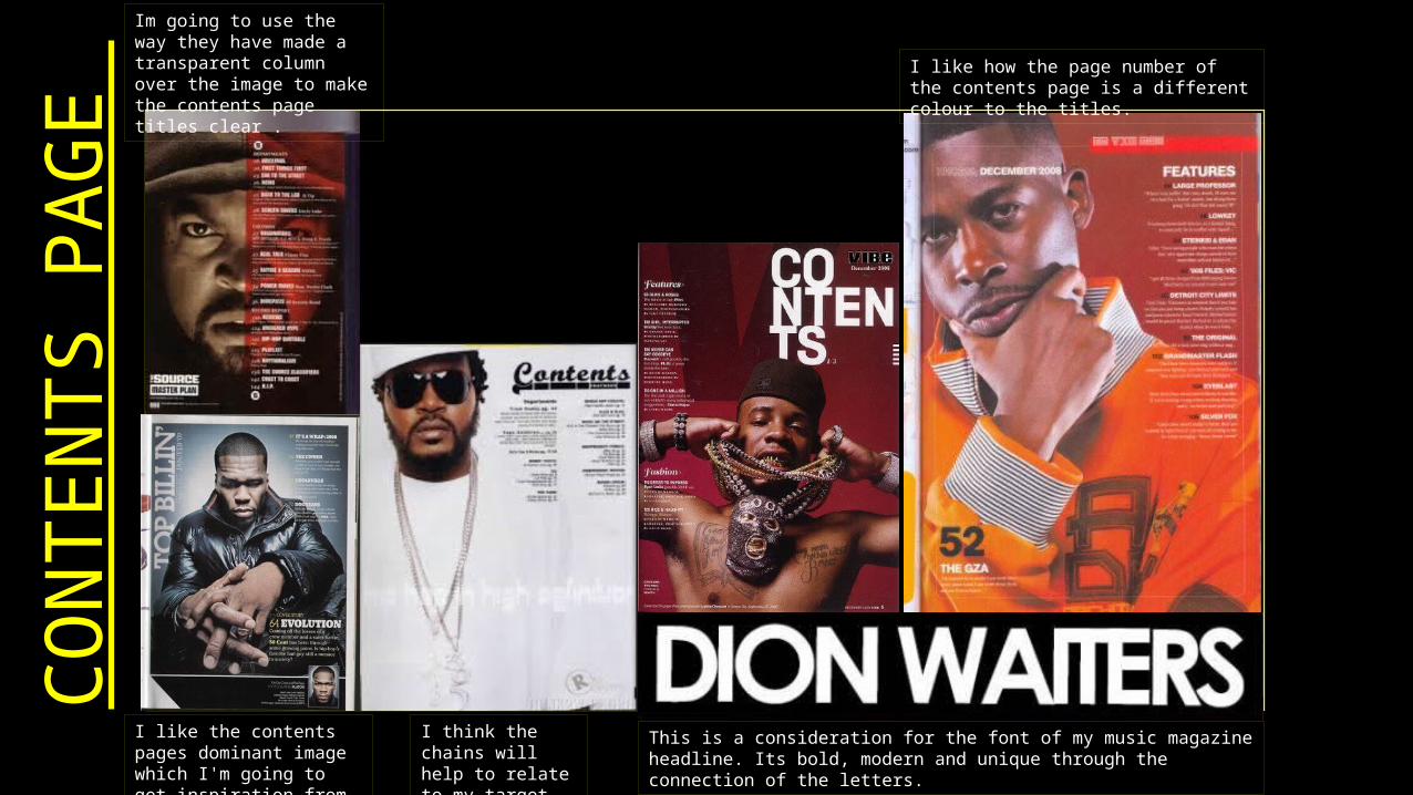
CON
TEN
TS P
AGE
Im going to use the way they have made a transparent column over the image to make the contents page titles clear .
I think the chains will help to relate to my target audience.
I like the contents pages dominant image which I'm going to get inspiration from.
This is a consideration for the font of my music magazine headline. Its bold, modern and unique through the connection of the letters.
I like how the page number of the contents page is a different colour to the titles.

DO
UBL
E PA
GE
SPRE
ADIm going to take inspiration from the way the contents page uses a dark house style.
Form this magazine I’m going to try to recreate the way they implemented a bright colour in the image which is also used for the colour the article is written in.
From this magazine im going to take inspiration from the positioning and style of the headline of the article.
I like the way this magazine has integrated the image with the text and not just but the image on the other [age to the text
I am intending to make an interview style article similar to the one shown above.
I like the lighting of this image as well as the way it has been shot.