Embed Size (px)
Citation preview

Mole Valley District Council
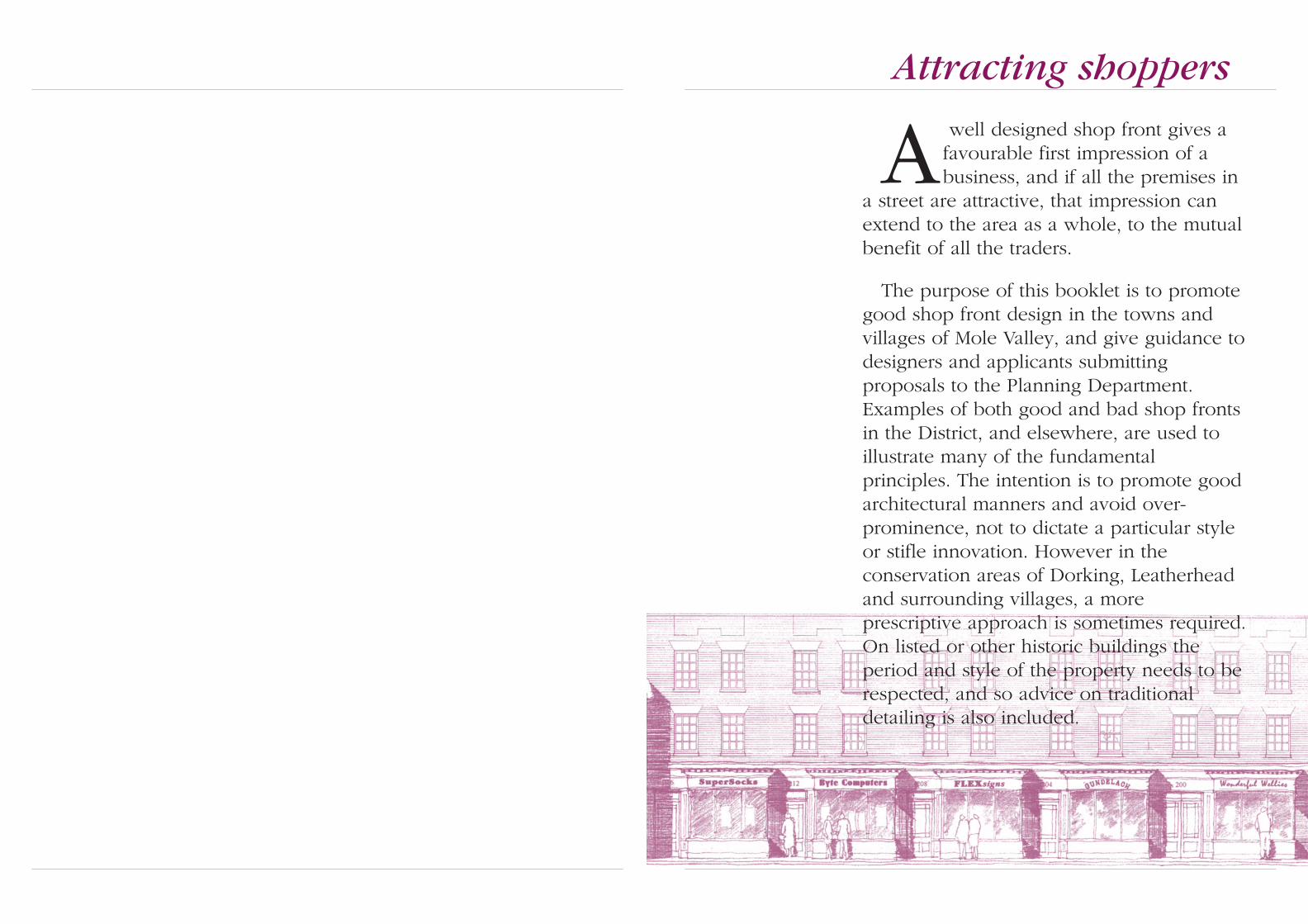
A well designed shop front gives afavourable first impression of abusiness, and if all the premises in
a street are attractive, that impression canextend to the area as a whole, to the mutualbenefit of all the traders.
The purpose of this booklet is to promotegood shop front design in the towns andvillages of Mole Valley, and give guidance todesigners and applicants submittingproposals to the Planning Department.Examples of both good and bad shop frontsin the District, and elsewhere, are used toillustrate many of the fundamentalprinciples. The intention is to promote goodarchitectural manners and avoid over-prominence, not to dictate a particular styleor stifle innovation. However in theconservation areas of Dorking, Leatherheadand surrounding villages, a moreprescriptive approach is sometimes required.On listed or other historic buildings theperiod and style of the property needs to berespected, and so advice on traditionaldetailing is also included.
Attracting shoppers

4 5
Planning controlsThere are many examples of good shop fronts
in Mole Valley but insensitive design can harmthe character of town centres and their buildings.Planning controls can help to ensure that gooddesign can flourish and that local character isprotected. The purpose of this document, whichhas been subject of public consultation and wasadopted by the Council in March 1999 as Supple-mentary Planning Guidance, is to interpretpolicies in the Mole Valley Local Plan, and it maybe taken in to account when determining plan-ning applications.
The relevant Local Plan policies, ENV 33 –Design of Shop fronts, and ENV 34 – Advertise-ment Control, appear at the back of this docu-ment.
What needs permission?A new shop front, or substantial alterations to
an existing one, including the provision of blindsand external security shutters, requires ‘PlanningPermission’. Separate ‘Listed Building Consent’ isalso required for any alterations or additions tolisted buildings which will affect the character ofthe property. All illuminated signs or fascias, andmany other non-illuminated signs and advertise-ments, require ‘Advertisement Consent’.
The Planning Department can give advice toapplicants on what needs permission.
What to do next?Applicants are strongly recommended to con-
sult the Planning Department for advice on thedesign approach to be taken and the drawingsthat will be required before commissioningdesign work or placing orders for installations. Itis also advisable to appoint a qualified architectto undertake design work. Where old or listedbuildings are concerned specialist knowledge isdesirable.
Even a good design can be marred by poorworkmanship, so it is also important that anexperienced contractor is employed to executethe work, and that regular supervision of thecontract is included within the scope of thedesigner’s appointment.
What information is required?The Planning Department needs to be assured
that proposals are correctly detailed. Applicants’drawings need to include the following informa-tion:
• An elevation of the shop front and the buildingin which it is located, together with the adjoin-ing parts of neighbouring properties on eitherside, - to a scale of 1:50;
• An elevation of the shop front itself - at 1:20;
• Cross-sections (which also show the positions offloors and ceilings) - at 1:20;
• Key details (such as joinery profiles, andsigns etc.) - at 1:5;
• Information on the materials, fittings andcolours.
• Details of access into the premises, taking intoaccount the needs of disabled people.
The last two items may be submitted as ‘re-served matters’ to be dealt with after planningpermission has been granted - subject to prioragreement with the Planning Department.
Shop front improvement grantsPlanning controls can prevent inappropriate
new shop fronts and signs from appearing, butthere remains a sizable legacy of poor designfrom the past - most notably from the 1960s and1970s. The Council may be able to offer financialassistance to encourage the replacement of shopfronts considered to be particularly detrimental,through a discretionary grant scheme. Details canbe obtained from the Planning Department.
Design guidanceDesign ability comes with knowledge, experi-
ence and aptitude. These guidelines do notpretend to be a substitute for such skills, but theyoutline some of the basic principles that aregenerally accepted as fundamentals of good shopfront design.
IntroductionContents
Introduction 3
Evolution of shopfronts 4
Basic architectural principles 6Replacement or repair? ............................................. 6Respecting the building ............................................ 6Scale ........................................................................... 7Visual support ........................................................... 7Symmetry ................................................................... 8Maintaining rhythm ................................................... 9Shopping parades ................................................... 10Materials................................................................... 12Colour ...................................................................... 12
Other design considerations 13Signs......................................................................... 13Fascias...................................................................... 13Hanging and projecting signs................................. 15Illumination - introduction .................................. 16Fascia illumination .................................................. 16Illumination of hanging and projecting signs ........ 19Building illumination .............................................. 20Corporate identities ................................................. 20Blinds ....................................................................... 21Accessibility ............................................................. 22Burglar alarms & telephone wiring ........................ 23Security measures.................................................... 23
Detailing 24Modelling ................................................................. 24Classical Embellishment.......................................... 25Stall risers................................................................. 25Entablatures ............................................................. 26Fascias...................................................................... 26Mullions, transoms, and glazing bars ..................... 27Consoles and pilasters ............................................ 28Painting .................................................................... 28Flashings .................................................................. 29Miscellaneous details .............................................. 29
Summary 30
Planning checklist 31
Planning policies 32

6 7
VictorianThroughout the Victorian period more promi-
nence was given to the name of the shop byemphasising the fascia and reducing the depth ofthe cornice. Consoles (also known as corbels)were placed at either end of the fascia to providea distinct separation between adjoining shops inthe increasing number of purpose-built parades.Blinds were sometimes introduced, and the fasciawas tilted forward to accommodate the blind boxat the top and give further prominence to thename. Decoration was applied to many of thedetails and it became progressively more exuber-ant in later decades. Later on, a variety of materi-als were employed as an alternative to paintedtimber - such as glazed terracotta, stone, brass,bronze and cast iron - and new sign writingtechniques appeared, such as glass faced fascias,and raised lettering. The invention of plate glassalso saw the appearance of even larger windowpanes, and these were usually set into finelydetailed mullions and transoms.
Early 20th CenturyExcept for some notable modernist exceptions
in the 1920s and 1930s, the established elementsof shop front design remained. Detailing wasgenerally simpler than the exuberance of Victo-rian design but there were a variety of styles,each of which was considered appropriate for aparticular type of shop. For example glazed tilingwas often used for dairies as it portrayed animage of good hygiene, whereas drapers shopsemployed elaborate window layouts to maximisethe display area.
Post World War IIImmediately after the war, shop front details
were simplified still further, to the point of dull-ness, but the 1960s and 70s saw a dramaticchange of direction towards brash and insensitivedesign. Over-dominant fascias and box signs,crude plastic lettering, large areas of glass, char-acterless aluminium window frames, inappropri-ate corporate signage, and a disregard for thearchitectural features of existing buildings, oblit-erated the scale and character of many shoppingstreets across the country.
Evolution of shopfronts
It is useful to know a littleabout the evolution ofshop fronts so that the
appropriateness of designs forspecific buildings can be morefully appreciated.
Medieval periodFor centuries, market stalls were the principal
places where goods were bought and sold, butin later medieval times shops began to appear.Initially they were little more than openings intraders’ houses, and goods were spread out ontothe street or displayed on a drop-down shutterthat served as a counter during the day.
The oldest commercial property in the Districtis ‘Cradlers’, a 14th century timber framed build-ing at No. 33 High Street, Leatherhead.
Mid - Late 18th CenturyDuring the Georgian era display windows were
introduced, often in the form of square bays orbow windows. The window panes were smalland the joinery detailing often Classical in style,in accordance with the architectural fashion ofthe time. The Classical ‘entablature’ was particu-larly well suited to shop fronts, as it provided anideal place to display the name of the shop.
A very fine example is the double bow-win-dowed shopfront at No.20 High Street, Dorking.
Late 18th - Mid 19th CenturyFrom C1810 onwards, Doric, Ionic or Corin-
thian style pilasters (columns attached to walls)were used to frame the shop front and providevisual support for the entablature - rather in themanner of a Greek temple.
Projecting bay windows were now outlawed inmost places to avoid obstructing the pavement,but the entrance door was sometimes set back tocompensate. Improved glass manufacture sawthe introduction of larger panes of glass, whichwere usually secured in elegant slender glazingbars.
West Street in Dorking has some fine early 19thCentury shopfronts.
Evolution of shopfronts
Early C19. A smallcantilevered bay window in aformer dwelling.
Early C19. A flat frontedshopfront with recessed doors.
Good modern shopfront.Well proportioned, with unfussydetailing and good 3-dimen-sional modelling from curvedwindows and a bold fascia.
Good modern shopfront. Amodern interpretation of a me-dieval shopfront (on a medievalbuilding) with exposed timbersand simple window openings.
Early C19. A double rectan-gular bay shopfront.
Late C18. A double bow-windowed shopfront at No.20Dorking High Street.
1930’s shopfront. Zig-zagdisplay windows typical of a1930’s drapers or clothes shop.The fascia has an Art Decosurround, but the current signis an over-large later addition.
Poor 1960s&70s shopfronts.Typical examples:- flat frontedshopfronts, oversized fasciasand crude plastic signs, theyimpose a cluttered and tawdryimage on the locality.
Medieval shop. A simpleopening with a drop downcounter.
Late Victorian shopfront -An elaborate design with finedetailing.
Mid-Victorian shopfront -with characteristic fascia, con-soles and pilasters.
Late C18th - Early C19thClassical shopfront details.
cornice
fascia
capital
glazingbars
stall riser
entablature
pilaster
mullion
plinth
dentils
Late C18thbow window
Early C19thflat window
Late Victorian.Typical shopfront details.
fascia
cornice
console orcorbel
plinth
transomlight
stall riser
mullion
pilaster
fanlight
entablature
transom

8 9
Basic architectural principles
ScaleIn small-scale buildings the shop front should
also be small. The depth and height of the fascia,the size of the display windows, and the propor-tions of the various details, should all be modest.In larger buildings the shop front can be corre-spondingly larger but it should still be in propor-tion to the building. If large windows are neces-sary but otherwise out of scale, their impact canbe reduced by subdivision. This can be achievedwith mullions and transoms which can also beused to help relate the shop front to architecturalfeatures on the upper floor.
Over-large fascias are the most common disfig-uring element of existing shop fronts, and theyoften obscure important architectural details.Fascias should always respect the scale andproportions of the buildings they belong to.
Visual supportMany 1960s and 70s shop fronts have large
expanses of glass which create an uncomfortableperception of lack of support for the upperfloors. When extended across two adjoiningbuildings the effect can be even more pro-nounced, particularly if there is an entrance dooracross the join. Pilasters or areas of wallingbridging the party walls can eliminate this effect,and on wide buildings intermediate columns cangive further visual support.
Basic architectural principles
The influence of Classical architectureduring the early development of shopsestablished the basic principles of shop
front design which are still relevant today.Classical detailing is not always imperative, but thescale, rhythm and architecture of the existingtownscape and buildings should be respected,even when designing a modernshop front.
Replacement or repair?If an existing shop front is architecturally or
historically worthy, restoration should be consid-ered instead of replacement. Any disfiguring lateradditions should be removed, damage reinstatedand repairs undertaken, with materials which arethe same as, or match, the original design.
Respecting the buildingA shop front should relate to the building it
belongs to so that it forms an integral part of theelevation rather than an isolated element on theground floor. This can be achieved by takingaccount of the scale and architectural style of thebuilding and by echoing the arrangement of thewindows, columns and areas of walling on theupper floors.
Respecting the building.After restoration. The fascia isremoved and replaced by metallettering. The lined render isreinstated, the left-hand displaywindow is narrowed to matchthe width of the windowsabove, and glazing bars areadded to both windows. Finallya glazed panelled door replacesthe former modern one.
Disprespecting the building.A 1960’s shopfront in a listedbuilding. The left-hand displaywindow does not align with thewindow above, the plasticfascia is unsympathetic andconceals architectural features,and the rustication (lined ren-dering) has been covered up.All these features unbalance thebuilding’s appearance.
Lack of visual support.Running across two properties,this shopfront does not relate tothe two buildings it occupies. Avisual weakness is also createdby the presence of the dooropening across the party wall.
Scale. Although small and at-tractive, this shopfront is too bigfor the building. The pilastersare a little too wide, and theblind box conceals the firstfloor window cill. The uppersign is also unnecessary.
Lack of visual support. Thewide opening of this shopfrontoffers weak visual support to theupper floor, compounded by thevertical lines of the fascia. Alsothe brick pier between the shopand the door on the right de-stroys the shop’s symmetry.
Visual support. In a similarbuilding to the one on the left,the intermediate columnsprovide well-proportionedvisual support for the upperfloor. This is reinforced by thestrong horizonal cornice andbottom moulding of the fascia.
Visual support. Anothersimilar building to the above,where a deeper fascia providesmore visual support,supplemented by windowmullions, instead of columns.
Scale. A tall building where atall shopfront and tall window,such as here, is appropriate.The slender pilasters and shal-low fascia look just right be-cause there are several pilastersto provide visual support.
Repair. A shopfront beforerestoration, obscured by 1960’s‘improvements’.
Repair. The same shopfrontafter removal of the ‘improve-ments’, and then refurbished.
Lack of visual support in an individual building
In a wide building a shopfront canstill look weak even if it has a
frame, but introducing columns ormullions, (right) will provide visual
support.
A shopfront with a lot of glass, thinwindow frames and no pilastersmakes the building look weak,
whereas a stong shop frame (right)provides support.
Lack of visual support across two or more buildings
Lack of apparent support underneath theparty wall makes these two buildings
look unstable.
Two separate shopfronts overcome theproblem and also reinstate the vertical
rhythm of the buildings.
Relating shopfronts to symmetrical buildings
Symmetricalbuilding
Columns align withsides of 1st floor
windows
Columns alignwith centresof brickwork
Columns alignwith sides of cen-
tre window
Relating shopfronts to asymmetrical buildings
Non-symmetricalbuilding
Columns align with centres ofwindows, and mullions subdivide
the display window
Columns align withcentres of brickwork
Disrespecting the building.A 1960’s shopfront which re-spects neither the style nor scaleof the medieval building it be-longs to. The fascia almost con-ceals the first floor window andthe large area of glass providesno visual support for the upperfloor. The excellent restorationof this building appears on thefront cover of this document.
10 11
Basic architectural principles
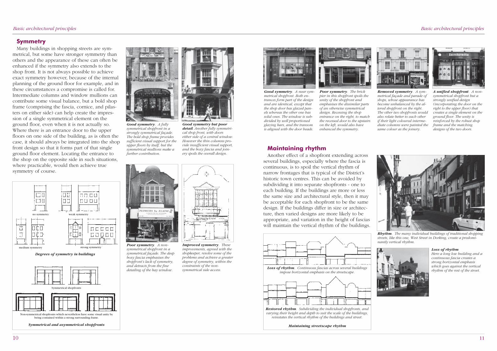
SymmetryMany buildings in shopping streets are sym-
metrical, but some have stronger symmetry thanothers and the appearance of these can often beenhanced if the symmetry also extends to theshop front. It is not always possible to achieveexact symmetry however, because of the internalplanning of the ground floor for example, and inthese circumstances a compromise is called for.Intermediate columns and window mullions cancontribute some visual balance, but a bold shopframe (comprising the fascia, cornice, and pilas-ters on either side) can help create the impres-sion of a single symmetrical element on theground floor, even when it is not actually so.Where there is an entrance door to the upperfloors on one side of the building, as is often thecase, it should always be integrated into the shopfront design so that it forms part of that singleground floor element. Locating the entrance tothe shop on the opposite side in such situations,where practicable, would then achieve truesymmetry of course.
Basic architectural principles
Symmetrical and asymmetrical shopfronts
Symmetrical shopfronts
Non-symmetrical shopfronts which nevertheless have some visual unity bybeing contained within a strong surrounding frame.
Degrees of symmetry in buildings
no symmetry weak symmetry
medium symmetry strong symmetry
Maintaining rhythmAnother effect of a shopfront extending across
several buildings, especially where the fascia iscontinuous, is to spoil the vertical rhythm ofnarrow frontages that is typical of the District’shistoric town centres. This can be avoided bysubdividing it into separate shopfronts - one toeach building. If the buildings are more or lessthe same size and architectural style, then it maybe acceptable for each shopfront to be the samedesign. If the buildings differ in size or architec-ture, then varied designs are more likely to beappropriate, and variation in the height of fasciaswill maintain the vertical rhythm of the buildings.
Rhythm. The many individual buildings of traditional shoppingstreets, like this one, West Street in Dorking, create a predomi-nantly vertical rhythm.
Loss of rhythmHere a long low building and acontinuous fascia creates astrong horizontal emphasiswhich goes against the verticalrhythm of the rest of the street.
Good symmetry. A near sym-metrical shopfront. Both en-trances form part of the designand are identical, except thatthe shop door has glazed pan-els whereas the other one hassolid ones. The window is sub-divided by well proportionedglazing bars, and the transomis aligned with the door heads.
Poor symmetry. The brickpier in this shopfront spoils theunity of the shopfront andemphasises the dissimilar partsof an otherwise symmetricaldesign. Recessing the shopentrance on the right, to matchthe recessed door to the upstairson the left, would also haveenhanced the symmetry.
Removed symmetry. A sym-metrical façade and parade ofshops, whose appearance hasbecome unbalanced by the al-tered shopfront on the right.The other two shopfronts wouldalso relate better to each otherif their light coloured interme-diate columns were painted thesame colour as the joinery.
A unified shopfront. A non-symmetrical shopfront but astrongly unified design(incorporating the door on theright to the upper floor) thatcreates a single element on theground floor. The unity isreinforced by the robust shopframe and the matchingdesigns of the two doors.
Poor symmetry. A non-symmetrical shopfront in asymmetrical façade. The deepboxy fascia emphasises theshopfront’s lack of symmetry,and detracts from the finedetailing of the bay window.
Improved symmetry. Theseimprovements, agreed with theshopkeeper, resolve some of theproblems and achieve a greaterdegree of symmetry, within theconstraints of the non-symmetrical side access.
Good symmetry but poordetail. Another fully symmetri-cal shop front, with doorseither side of a central window.However the thin columns pro-vide insufficient visual support,and the boxy fascia and join-ery spoils the overall design.
Good symmetry. A fullysymmetrical shopfront in astrongly symmetrical façade.The bold shop frame providessufficient visual support for theupper floors by itself, but thesymmetrical mullions make afurther contribution.
Loss of rhythm. Continuous fascias across several buildingsimpose horizontal emphasis on the streetscape.
Restored rhythm. Subdividing the individual shopfronts, andvarying their height and depth to suit the scale of the buildings,
reinstates the vertical rhythm of the buildings and street.
Maintaining streetscape rhythm

12 13
Basic architectural principles
Shopping paradesIn purpose-built parades there should be some
degree of continuity between the various shopfronts, but the manner will depend on the designof the parade.
Victorian & Edwardian paradesConsistent pilasters, consoles and fascias are a
common feature of Victorian and Edwardianparades and they should remain undisturbed, orbe restored where they have been altered. If theconsoles and pilasters are painted, they shouldall be the same colour scheme if possible, tomaintain the continuity of the parade. Muted orneutral colours will avoid a clash with colourschemes of the individual shops.
The shop fronts should be set back slightly intoopenings, to a consistent depth, so that the 3-dimensional character of the parade’s pilastersand fascias is visible. The individual design of theshop fronts can then be expressed in their fenes-tration, entrance doors, colour and signage.
Modern paradesThese usually have simple openings in a rela-
tively plain façade, into which the shop frontsare recessed – to a consistent depth. The recessdepth of existing shop fronts should generally beused to determine the depth of any new shopfronts. Fascias are usually required to be in-cluded as part of the inserted shop front, andthey should all be a consistent height to maintainthe continuity of the parade. The 1960’s paradein South Street, Dorking, is a typical example.Fascias should be fully contained within theopening and should not oversail the piers on
Basic architectural principles
Lack of modelling. A flatshopfront and dull frameprovides little visual interest.
Good modelling. An inset doorand profiled window joineryprovides good visual interest.
Shopfront modellingUnrelieved flat-fronted shopfronts can also
deaden streetscapes. In contrast, inset doors,bold architectural features and intricate detailingcan provide three-dimensional modelling andvisual interest both to the shop and the street.
either side. Likewise, any continuous corniceabove the openings should not be concealed orpainted, as it too will contribute to the continuityof the parade.
Sometimes a continuous entablature is pro-vided above the openings specifically for theshop names. In these situations fascia boards arenot required (either as part of the recessed shopfronts or fixed to the entablature) and shopnames should be limited to lettering or graphicsapplied directly to the entablature.
Parades with projecting shop frontsWhere shop fronts stand proud of the main
façade in a parade, or have projecting bays, theyusually read as a single architectural element andshould therefore be consistently detailed tomaintain the parade’s continuity. The separateidentity of each shop front is then largely limitedto the design of the fascia signs.
Parades with identical shop frontsIn parades with identical shop fronts that form
an integral part of the overall design of thewhole building, new shop fronts should gener-ally conform to original design.
Hanging signs in a paradeHanging signs in a parade should be located in
a common position in order to reinforce thecontinuity of a parade. (Further requirements ofhanging signs are noted in the following section,‘Other Design Considerations’)
An Edwardian parade - of four shops, designed with identicalshop frame consoles, pilasters and facias. However the fascia ofthe shop at the far end has been raised out of alignment, spoilingthe unity of the parade.
A typical Victorian orEdwardian parade. Thefascias, consoles and pilastersare consistent, leaving only thewindows and doors of eachshop to be installed–inset intothe provided opening.
Parade details. These shouldbe consistent. Here two halvesof a console and pilaster havebeen painted differently, spoil-ing the unity of the parade.
A modern parade. All theshopfronts in this parade,including the fascias, arecontained within the shop unitopenings.
A typical modern parade -with a brick or stone surroundinto which the windows, doorsand fascia of each shopfrontare recessed.
Inconsistent cornice. Thestone cornice on this parade haslost its continuity because it hasbeen painted on the left, andneeds cleaning on the right.
Incorrect detailing. The endof this fascia oversails the sideof the brickwork opening; itshould be fully recessed into theopening.
Shopfronts standing proud -of a building façade, like these,should be consistently detailedto maintain continuity.
Projecting shopfronts. Asuggested parade of consistentlydetailed bay window shop frontson a listed terrace - Dorking.
Identical shopfrontsA delightful parade of identical
shopfronts.
Hanging signs on a parade -should be consistently located,like these. In this instance theyare mounted on the pilasters.

14 15
After the basic architecturalprinciples, the individualelements of a shop front need to
be considered, along with practical is-sues such as security and accessibility.Modern features, like lighting and newforms of signage, need to be particularlycarefully designed, especially on oldbuildings and in conservation areas.
Other design considerations
SignsSome signs require ‘Advertisement Consent’
from the Council so traders are strongly advisedto check with the Planning Department beforeerecting any. Shops are normally limited to onefascia sign, and, if required, one hanging sign.
Consent is sometimes required for illuminatedsigns, but it is always required for:-
• any illuminated sign in a conservation area,
and for all signs:-
• located above a first floor window cill,• that have letters over 0.75 metres high,• that have the highest part more than 4.6 metres above ground level,• that advertise goods or premises elsewhere.
FasciasOversized and garish fascias can be one of the
most unattractive features of shopping streets.This can spoil the appearance of buildings byobscuring string courses and first floor windowcills, as well as cornices and consoles of originalshop fronts. Fascias should not impinge on thesedetails, and as a general rule fascias look wellproportioned if they are no deeper than about afifth of the shop front’s overall height.
Deep fascias have sometimes been employedto conceal the space above a false ceiling insidethe shop, but a better method is to incorporateceiling-level transoms in the display windowsand fit panelling or opaque glass in the transomlights above. Alternatively the edge of the falseceiling can be set back from the window.
Oversized fascias.Both these fascias are too deepand spoil the appearance of thetwo façades. The right-handfascia is so high the first floorwindows have been shortened,and the left one clips the cills,resulting in a distractingflashing with intermittent gaps.
max 1/5 H
Fascia proportions. Fasciasshould generally be no deeperthan 1/5th the overall height ofa shopfront.
H
Suspended ceilings. Twopossible ways they can be con-cealed, without resorting to anoverdeep fascia.
Opaque or solidtransom panel Sloping
ceiling
Basic architectural principles
MaterialsNatural aluminium, acrylics and other shiny
artificial materials are generally out of place onolder buildings and in conservation areas andgenerally will not be permitted in these situa-tions.
Preference should be given to materials thathave an affinity with existing buildings and thelocal area. Traditional materials of good quality,such as wood, stone, brick, tiles and metalworkcan offer a wide variety of profiles, textures andfinishes, which maintain their appearance betterthan many modern materials. Timber givesgreater scope for interesting moulding thanaluminium, for example, and a well preparedhand painted fascia can provide many optionsfor attractive decoration.
ColourHarsh and gaudy colours draw undue attention
to themselves and should also be avoided. Onolder buildings and in conservation areas dark orpale colours, or white, which were traditionallyused on shop fronts, are still usually appropriatetoday.
Garish materials. Shiny plas-tic materials, garish coloursand excessively bulky letteringlike this, stand out undulyprominently, especially on oldbuildings and in conservationareas.
Off-the-peg - A collection ofgarish and boxy signs, lackingany finesse or style.
Shiny plastic blinds - creatinga cheap image of the shop. Theplastic bins don’t help either.
16 17
Other design considerations
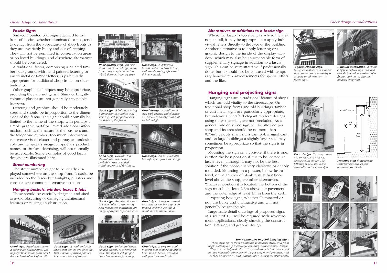
Alternatives or additions to a fascia signWhere the fascia is too small, or where there is
none at all, it may be appropriate to apply indi-vidual letters directly to the face of the building.Another alternative is to apply lettering or agraphic design to the inside of the display win-dow, which may also be an acceptable form ofsupplementary signage in addition to a fasciasign. This can be very attractive if professionallydone, but it should not be confused with tempo-rary handwritten advertisements for special offersand the like.
Hanging and projecting signsHanging signs are a traditional feature of shops
which can add vitality to the streetscape. Ontraditional shop fronts and old buildings, timberor cast metal signs are particularly appropriate,but individually crafted elegant modern designs,using other materials, are not precluded. As ageneral rule only one sign will be allowed pershop and its area should be no more than0.75m2. Unduly small signs can look insignificant,and on large buildings a slightly larger size maysometimes be appropriate so that the sign is inproportion.
Mounting the sign on a console, if there is one,is often the best position if it is to be located atfascia level, although it may not be the bestsolution if the console is very elaborate or deeplymoulded. Mounting on a pilaster, below fascialevel, or on an area of blank wall at first floorlevel above the shop, are other alternatives.Whatever position it is located, the bottom of thesign must be at least 2.6m above the pavement,and the outer edge at least 1m in from the kerb.
Projecting box signs, whether illuminated ornot, are bulky and unattractive and will notgenerally be acceptable.
Large scale detail drawings of proposed signsat a scale of 1:5, will be required with advertise-ment applications, clearly showing the construc-tion, lettering and graphic design.
Other design considerations
A good window sign.Designed with care, a windowsign can enhance a display orprovide an alternative to afascia sign.
Some examples of good hanging signs These signs range from traditional to modern styles, and from
simple rectangular panels to eye catching 3-dimensional designs.They are all designed with artistry and executed in a variety of
quality materials. None are off-the-peg shopfitters’ products, andso they bring variety and individuallity to the local street scene.
Unusual alternative. A smallcrisply moulded sign attachedto a shop window (instead of afascia sign) on an elegantmodern shopfront.
Max 0.75 sq m
Min1m
Min2.6m
Poor design. Two signs hereare uneccessary and justcreate visual clutter. Thelettering is also mundane,especially on the lower sign.
Hanging sign dimensionsStatutory clearances frompavement and kerb
Fascia SignsSurface mounted box signs attached to the
front of fascias, whether illuminated or not, tendto detract from the appearance of shop fronts asthey are invariably bulky and out of keeping.They will not be permitted in conservation areasor on listed buildings, and elsewhere alternativesshould be considered.
A traditional fascia, comprising a painted tim-ber background with hand painted lettering orraised metal or timber letters, is particularlyappropriate for traditional shop fronts on olderbuildings.
Other graphic techniques may be appropriate,providing they are not garish. Shiny or brightlycoloured plastics are not generally acceptablehowever.
Lettering and graphics should be moderatelysized and should be in proportion to the dimen-sions of the fascia. The sign should normally belimited to the name of the shop, with perhaps asimple graphic motif or limited additional infor-mation, such as the nature of the business andthe telephone number. Too much informationcan create visual clutter and portray an undesir-able and temporary image. Proprietary productnames, or similar advertising, will not normallybe acceptable. Some examples of good fasciadesigns are illustrated here.
Street numberingThe street number ought to be clearly dis-
played somewhere on the shop front. It could beincluded on the fascia but fanlights, pilasters andconsoles are common alternative positions.
Hanging baskets, window boxes & tubsThese should be carefully designed and sited
to avoid obscuring or damaging architecturalfeatures or causing an obstruction.
Poor quality sign. An over-sized and cluttered sign, madefrom shiny acrylic materials,which detracts from the street.
Good sign. A delightfultraditional hand painted signwith an elegant typeface anddelicate motifs.
Good sign. A bold sign using3-dimensional stainless steellettering, well proportioned tothe depth of the fascia.
Good design. A traditionalsign with incised gilded letterson a coloured background, allset behind glass.
Good sign. An unusual andbeautifully crafted mosaic sign.
Good sign. A very restrainedand elegant modern sign withincised lettering, set into asmall matt laminate sheet.
Good sign. A very unusualmodern sign comprising drilledholes in hardwood, executedwith precision and style.
Good sign. A small individu-alistic sign can be eye catching.This is made of raised paintedletters on a piece of timber.
Good sign. Metal lettering ona black glass background. Theimperfections in the glass avoidthe mechanical look of acrylic.
Good sign. Individual lettersapplied directly to a renderedwall. The sign is well propor-tioned to the size of the shop.
Good sign. An attractive signin glazed tiles - a type rarelyseen nowadays, portraying animage of hygene & permanence
Good sign. Delicate andelegant thin metal letters,probably brass or gilded,standing proud of the fascia.

18 19
Other design considerations
External fascia lightingThis can be suitable for many situations includ-
ing traditional shop fronts, and in some circum-stances listed buildings. The light sources shouldbe concealed as much as possible and should becarefully directed at the signs, to avoid glare ontothe pavement below or into the windows ofupper floor residences. Lamp types includetungsten halogen floods, tungsten spotlights, lowvoltage tungsten spotlights and fluorescent tubes.
Full details of the light fittings are required withplanning and advertisement applications.
Tungsten lampsTungsten and halogen lamps produce a warm
inviting white light and are good for highlightingarchitectural details.
Low voltage spotlights have the advantage ofbeing very small so that they can be discretelymounted onto architectural features, on top ofledges or on the end of slim projecting rods.They also offer a very controllable light source,as a wide range of lamps is available with differ-ent beam angles and light outputs.
Mains voltage tungsten halogen floods arelarger than low voltage lamps, but fewer arerequired because they have wider beams and aremore powerful. Two or three fittings are usuallyadequate for most fascia signs, preferably limitedjust to the area over the name of the shop.Where more focused light is needed, tungstenspotlights may be more suitable and these alsocome in a range of wattages and beam angles.
Fluorescent tubesConcealed fluorescent tube lighting is another
alternative but great care needs to be taken withits design. Indeed a preponderance of fluores-cent lighting could have a very unwelcomeimpact on shopping streets, and applications willbe determined on their individual merit andpotential impact at each location.
In contrast to tungsten lamps, fluorescent tubeshave a slightly colder colour, and being a linearlight source they produce a flatter, less interestingwash of light.
Tubes can be fitted in a projecting cowl di-rected towards the sign, but there are somebulky fittings on the market with rather crudefixings, and these should be avoided in prefer-ence to slimmer and neater designs. The cowl
Other design considerations
At night. The lighting high-lights the lettering. The oakbackground ensures that thefascia is not too bright.
A slim fluorescent cowl - Aneat design which is limited tothe length of the name.
Careful design. Low voltagetungsten spotlights recessedinto a cornice above the sign.
Small spotlights. Three small‘PAR 30’ spotlights with shades,limit illumination just to thename of the shop.
Tungsten halogen floods arebright, so two fittings here aresufficient to light the name.
Discrete light fittings. Thesetiny low voltage spotlightsmounted on thin metal armsare almost invisible in daytime.
Illumination - introductionModest and subtle lighting can add valuable
sparkle and vitality to the night-time street scene.In some locations though, for example wherethere is a concentration of old or listed proper-ties, such as West Street in Dorking, considerablerestraint is required.
Too often, illuminated signs are bulky orpoorly designed or sited, adding unwelcomeclutter to shop fronts. If a new shop front is to beilluminated therefore, the choice and location offittings should be considered from the outset sothat they form an integral part of the designrather than ending up as later ad-hoc additions.Over-illumination must also be avoided becauseit can upset the balance of light with otherpremises and with street lighting, and can putpressure on neighbouring traders to increasetheir illumination in order to compete.
Applications for illuminated signs will beassessed on their merits and on their suitabilityfor the intended locations. Early consultationwith the Planning Department is thereforestrongly advised, especially where conservationareas and listed buildings are involved.
Fascia illuminationFascia lighting is by no means essential for
many types of shop, but where it is required apreponderance of any one form of lighting in astreet would be very unwelcome. As with otheraspects of urban design, variety adds to the grainand interest of the streetscape.
Internally illuminated fasciasThese are box signs with a translucent plastic
face on which there is lettering or other graphicdesigns. They create excessive glare at night,drawing undue attention to themselves, and areusually bulky and crudely detailed. They aretherefore not generally acceptable.
Alternative forms of fascia illuminationMore subtle forms of lighting are available
which include, amongst other things, externallighting, backlit lettering, individual halo letters,and cold cathode tubes. However the type anddesign of lighting needs to be appropriate to theshop front, the building and the location.
Unacceptable box sign. Acrude box structure attached tothe fascia, with unimaginativelettering and a whitetranslucent background thatcreates glare at night.
Unacceptable glare. Anexample of the excessive andunacceptable glare from aninternally illuminated fascia,and a projecting sign, withlight translucent backgrounds.
Poor illumination.An over-illuminated shopfrontwith too many bright lights,some of which are inaccuratelyaligned, causing light to strayover the upper façade.
Inviting entrance.Restrained and carefullylocated tungsten lighting canprovide an inviting entrance atnight, withoutover-illumination, like this.
Poor detail - patchy lightingfrom too widely spaced fittings.
Poor detail - a sign obscuredby mounting the fittings too low
Poor detail - one fitting is notenough to illuminate this sign.
Good detail - even lightingfrom correctly spaced fittings.

20 21
Other design considerationsOther design considerations
Cold cathode signs (eg. neon)Despite their ostentatious reputation, designed
with sensitivity these signs can exude a variety ofacceptable images, from elegance and sophistica-tion to exuberance and vitality. They are notgenerally associated with small market towns likeLeatherhead and Dorking but there may be somesituations where they would be acceptable, andeach application will be considered on its merits.
The signs should be moderately sized and bein a single colour or a limited palette of colours,but flashing versions will not be acceptable inany location as they can be distracting and irritat-ing.
Other fascia lighting techniquesOther, possibly innovative, lighting techniques
may be acceptable providing they are modestand subtle and providing the fittings are notunduly obtrusive, particularly in sensitive loca-tions. The acceptability of the signs will bejudged on these criteria.
Illumination of hanging andprojecting signs
Internally illuminatedThese have tended to be bulky and poorly
detailed, and suffer from the same glare defectsassociated with internally illuminated fascia signs.They are therefore not generally acceptable.
With the development of very thin fluorescenttubes however, there is scope for slimmer andmore interestingly shaped signs. Within conserva-tion areas their application may be limited, butwhere they are acceptable to the planning au-thority they will need to be well crafted andgraphically elegant – crude lettering on a baretranslucent background will not be acceptable.The background panel should be predominantlyopaque or semi-opaque so that it is the letteringor graphic that is illuminated, rather than thebackground, and that glare is avoided.
Alternative methods of illuminationAs with fascias, external lighting with tungsten
lamps or fluorescent tubes, or backlit lettering, orcold cathode signs, can provide acceptablealternatives. They need to be designed with justas much care and moderation as fascia signs, andapplications will be considered on their merits.
Internally illuminated sign.A watch-like shape with round-ed edges. The translucent areais small, so glare is avoided.
A carefully detailed sign.An attractively shaped signwith integral external spotlighthousings, carefully positionedto avoid glare.
A good backlit sign. A simplebox, but slim and crisply de-tailed. With an opaque back-ground, there is no problem ofglare at night.
Glare. A similar sign, produc-ing undue glare at night.
Poor design. A boxy and dullprojecting sign, with a lighttranslucent background thatcreates glare at night.
needs to project sufficiently so that it can beangled towards the fascia without the tubesbeing seen from the pavement below, although itshould not project so far that the fitting detractsfrom the appearance of shop front in daytime.
Another design technique for fluorescent tubesis to install them in a recess behind a purpose-built cornice above the fascia, but glare onto thepavement can be even more of a problem withthis technique unless special grilles are fitted.
A potential problem with fluorescent lightingcan be over-illumination if the backgroundcolour of the fascia is a light colour, and thisform of lighting is therefore best avoided in suchcircumstances. Reflections from dark fascias canalso present problems if the tubes are not closelyspaced, or if tubes with different ‘colour tem-peratures’ are mixed together, or if the tubes anddiffusers are not adequately maintained.
Backlit letteringIn this technique translucent plastic letters or
graphics are inset into an opaque backgroundwhich is illuminated from behind. The light boxmust be fully recessed behind the fascia, – asurface mounted fitting or a light box behind aprojecting fascia will not be acceptable. Ideallythe lettering should be flush with the backgroundpanel (or only project very slightly) and it shouldhave a matt or sheen surface so that it looks aslittle like plastic as possible.
In conservation areas the background fasciacould be a painted timber panel so that it lookslike a traditional sign during the day, whilst atnight the lettering and graphics would be subtlyilluminated.
The technique is suitable for fascias and (sub-ject to conditions outlined later) hanging signs aswell. In conservation areas and on old or listedbuildings the designs need to be especiallyrestrained, and each application will be consid-ered on its merits.
Individual halo lettersThese comprise individual letters which stand
proud of a surface and are lit from behind toproduce a halo effect. They can be suitable forfascias or wall mounting situations but the lettersshould not be too bulky. Plastic lettering will notgenerally be acceptable on listed buildings or inconservation areas.
An over-bright white fascia -lit by fluorescent tubes recessedbehind the cornice. The fasciais also too deep and too long.
Glare. The same fascia as seenfrom the pavement. Despite aplastic diffuser, the tubes causeundesirable glare.
Halo lettering. Subtle buteffective 3-dimensional halolettering, the size of which iswell proportioned to both thefascia and the shopfront.
Backlit sign with halo.An attractively moulded logowith gently illuminated, buteffective, lettering and halowhich avoids glare.
Good backlit sign. The box ofthis backlit sign is fully recessedinto the fascia. The letters aretranslucent and the back-ground is opaque. (To give amore traditional appearancethe background could havebeen painted timber instead ofpressed metal, from which thissign is probably constructed ).
Good backlit sign. Like thesign on the left, the letters onthis backlit sign are flush withthe background surface. Theylook like well-painted letteringin the daytime. (Projecting let-ters would look much less ele-gant and would create somedegree of glare at night).
Good detailing. Well designedfluorescent lighting recessedbehind a cornice, and fittedwith a grille to eliminate glare.
Patchy reflections. Fluores-cent lighting in a slim cowl.The dark background preventsover-illumination but the effectis spoilt by the reflection of thediscontinuous tubes.
Neon. A restrained andelegant neon sign, portrayingan image of quality.
Neon. The same sign at night.
Different technique. Gentlysilhouetted lettering against anfluorescent uplit background.
Different technique. A con-cealed top light, silhouettingdelicate raised lettering.
Internally illuminated sign.A simple drum shape, and amuted graphic which glows atnight.
22 23
BlindsBlinds protect display goods from sunlight and
provide shelter for shoppers. They can also addinterest to the street, but they should be appro-priate to the period of the building and thecharacter of the locality. Planning Permission isrequired for some blinds so the Planning Depart-ment should be consulted before installation.
Fixed blinds, and blinds made from plastic orwhich have fluorescent or metallic finishes, candetract from the appearance of many shoppingstreets. They soon become dirty and dilapidated.Traditional roller blinds made of canvass orsimilar non-reflective materials, such as acrylicdralon, are much to be preferred, especially onlisted buildings and in conservation areas. Inthese locations Dutch blinds are also out ofplace too, whatever materials they are made of.Roller blinds should always be retractable andthe blind box should be an integral part of theshop front rather than an added-on extra. If theblind box is located beneath the fascia, ratherthan above it, the name of the shop will bevisible to more shoppers in the street, but thechoice of position is a matter for the applicant.
The name of the shop can also appear onblinds but any other advertising is discouraged.Highway regulations require the outer edge oflowered blinds to be set back at least 1m fromthe kerb and the outer and inner ends of thesupporting arms respectively not less than 2.14and 2.3m above the pavement (see diagramopposite). Side flaps should be avoided as theycan obstruct pedestrians.
Other design considerations Other design considerations
Building illuminationThis should not be confused with general
floodlighting; rather, it is the judicious use ofdiscrete spotlights to highlight the architecturalfeatures of a shop front or building, or spillinviting pools of light around entrances and thelike. Used in moderation it can have a construc-tive role to play, particularly for businesses thatare open in the evening, adding sparkle to thenight-time townscape. However, it is very impor-tant that undue uniformity, excessive brightnessand glare are avoided.
Illuminated display windowsThe impact that attractively lit window displays
can have on trade and on the vitality and senseof security of shopping streets at night, shouldnot be forgotten, and traders are encouraged tokeep their premises lit - well into the evenings.Carefully illuminated displays, using spotlightsrather than bare fluorescent tubes, generallyhave the most impact.
Although internal display lighting is not subjectto planning control, it should be noted thatilluminated signs within a metre of a shop win-dow do require ‘Advertisement Consent’ from thePlanning Authority.
Corporate identitiesChain stores need to respect existing buildings
and streetscapes so that local distinctiveness ismaintained. In sensitive locations the use ofstandardised corporate shop fronts may need tobe substantially moderated.
Compromises are often possible which enablea corporate image to be maintained withoutbeing at the expense of local character.
Good corporate signage. Thesmall corporate signage on thisnarrow fascia and hangingsign are instantly recognisablewithout despoiling the building.
Good corporate sign. Thiscorporate sign is tiny, and fitscomfortably within the depth ofthe frieze, yet it is instantlyrecognisable.
Good corporate sign. Thelogo on this shop is easilyrecognisable. Its small size andshinyness is gem-like, and it isin scale with the shop front.
Good corporate signage.This sign successfully relies onthe corporate typeface and col-our for customer recognition,rather than the full house-style.
Daytime view. The spotlightsare almost invisble.
Good shopfront illumination. A flamboyant restaurantshopfront illuminated by several small PAR 38 and low-voltagespotlights.The fittings are almost invisible during the daytime, andall are carefully angled to highlight key architectural features.
Low-voltage spotlight. Asmall fitting carefully posi-tioned on the pilaster, and withthe wiring concealed. The beamhighlights the capitol at night.
Traditional blinds. These are the preferred type of blind, espe-cially for conservation areas. The blind boxes here are an integralpart of the shopfront, neatly located underneath the fascias.
Recessed blind box. In this shop the blind box is recessedwithin the fascia.
Min1m
Min
2.1
4 m
Min
2.3
m
Blind dimensionsStatutory clearances frompavement and kerb
An unsatisfactory blind.Shiny plastic blinds are notencouraged, especially inconservation areas. They teareasily and look dreadful whenthey get dirty - like this one.
Dutch blinds. These are nottraditional in conservationareas, but elsewhere they canbe acceptable if they are madewith a non-shiny material, likecanvas or acrylic dralon.

24 25
AccessibilityShops should be welcoming and accessible for
all customers, including people with disabilities,parents with children in prams and buggies, andfor elderly, less agile people. The followingfeatures should therefore be considered:-
• Entrances should comply with Part M of theBuilding Regulations which sets out statutoryaccess requirements.
• Steps, water bars and raised thresholds shouldbe avoided. Ramps should have gentle gradi-ents – shallower than 1:20 if possible but nosteeper than 1:12. If possible there should alsobe a level area immediately in front of en-trance doors and a space of 300mm alongsidethe leading edge of the door to make it easierfor a person in a wheelchair to get close to thedoor handle. Surfaces should be free of irregu-larities and be non-slip. Recessed doors, whichcan create architectural interest, may also makeramped access easier to achieve.
• Entrance doors should have a minimum clearopening of 800mm and preferably more thanthis. In double doors at least one leaf shouldprovide this width. Where practical, doorsshould be automatic or power assisted. Han-dles should be no higher than waist height anda glazed panel should be provided to aid vis-ibility. Fully glazed doors should be clearlymarked to help partially sighted people.
• Mat wells should be close fitting and flush, andthe mats should be non-slip and non-compressible.
• Where automatic cash machines are beinginstalled consideration must be given to theheight of the equipment so that people inwheelchairs can have access to them.
In listed and other old buildings these stand-ards should be taken into account as far as prac-ticable, but they should be commensurate withpreserving the building’s character and setting.
Security measuresSome types of shop need special security
measures. External shutters require planningpermission, but they tend to create a hostileambiance when lowered at night so they will notgenerally be approved unless it can be demon-strated that there is no practical alternative.
Security glass or unobtrusive devices, such ascollapsable jewellers’ shelves, are preferred, asthe visual interest and light from illuminatedwindow displays is maintained at night. Reducingthe size of window panes can provide less of atemptation to vandals, and reduces the cost ofreplacing glass in the event of damage occurring.
Internally fitted see-through lattice grillesprovide the next most preferred solution, and avariety of attractive designs are available.
Burglar alarms & telephone wiringBurglar alarms and telecom junction boxes
should not conceal architectural features or belocated in over-conspicuous positions, and theassociated wiring should be neatly fixed, orbetter still, hidden. They may need consent whenthey are to be located on a listed building.
All fixings should be made of non-ferrousmaterials to avoid problems with rust.
Other design considerations Other design considerations
Nighttime appearance.See-through grilles and illumi-nated displays make this shopand street more interesting andwelcoming at night.
An unobstructed ramped or level access benefits:-
An impenetrable entrance -for some people.
A raised cill - is still difficultfor a wheelchair to negotiate.
A gentle ramp - like this,makes access easy for everyone.
Parents with buggys.Here the ramp is unavoidably steep, but it is better than a step.
The elderly Wheelchair users
A small step - like this, can alsobe difficult for a wheelchair.
Untidy wiringThis, can spoil an attractiveshopfront. Giving carefulthought to the installation ofburglar alarms, telecom boxesand wiring at the early stages ofdesign, can avoid this problem.
Solid shuttersThese, will be strongly resistedas they create an undesirablyhostile ambiance.
Internal grilles. If grilles areunavoidable, an internalsee-through lattice type, withan attractive pattern, like these,are the preferred solution.(photo: SimFlex Ltd.)

26 27
Detailing Detailing
Not infrequently, shop fronts that aregenerally well designed and meet most ofthe criteria outlined in previous sections
of this guide, are let down by poor detailing. Intraditionally styled shop fronts the classical detailsare sometimes incorrect or, more often, simplymissing. This can be due to a lack of architecturalknowledge or a misinterpretation of traditionalconstruction techniques when using modernmaterials, but the effect can be to ruin anotherwise attractive design.
The final section of this guide highlights impor-tant details which need to be considered, andillustrates common examples of poor detailing, aswell as examples of good practice. The latter areby no means exhaustive - they simply illustratethe principles of good detailing and should notbe regarded as ‘pattern book’ designs to becopied religiously. Most of the examples areclassical details, or classically based, but theydemonstrate fundamental principles which canapply equally to modern designs, albeit some-times in a simpler form.
ModellingJust as shop fronts look more inviting if they
are interestingly modelled with inset doors andprofiled display windows for example, so too at asmaller scale the component parts, like windowand door frames, fascias and pilasters, can beenlivened with embellishment. It can provide theessential finishing touch, giving depth and visualsolidity to a design.
PanellingIn the past, traditional joinery automatically
produced a degree of modelling because of theconstruction techniques that were used to jointogether the limited sizes of the timber that werethen available. This was particularly so for panel-ling (as used for shop front pilasters and stallrisers for example) which comprised planking setinto a timber frame. The edges of the inset panelswere either chamfered, sometimes in a decorative
manner called ‘raised and fielded’ panelling, orthe joins were covered by beading or decorativemouldings, or there was a combination of both.
Today, modern sheet materials like plywoodand medium density fibreboard (mdf) obviate theneed for such construction. Large flat areas ofunrelieved panelling is often the result, whichcan look dull and uninteresting. Sometimes, in anattempt to imitate traditional panelling, beadingis applied to the sheeting, but the result invari-ably looks crude and unconvincing. There can beseveral reasons for this. Firstly, the face of thecentre ‘panel’ is on the same plain as the sur-rounding ‘framework’, whereas traditionally partof it would be either recessed or projected for-ward. Secondly, the size or profile of the beadingis often inadequate. Thirdly, the width of thesurrounding ‘frame’ is sometimes out of propor-tion with the size of the panel; traditionally itwould have been between 50-100mm or so.
Modern timber materialsOn traditional shop fronts, especially where
listed buildings are concerned, traditional joinerytechniques are often still appropriate. Howeverthe use of modern timber materials like exteriorgrade plywood and ‘mdf’, can be an acceptablealternative. Some classical mouldings are nowalso available in exterior grade ‘mdf’ which canbe an acceptable alternative to the traditionalhardwood and softwood ones where a paintedfinish is required, as it is less liable to warp thantoday’s softwood.
Classical EmbellishmentClassical mouldings are based on a fairly small
range of basic profiles. They can be used indi-vidually, as cover beads for example, or in com-binations to create larger sections such as cor-nices on top of entablatures or fascias. This canbe done either by grouping separate sectionstogether, or by making a combination of profilesout of a single section of wood. Further mould-ings, and adaptations of the original ones, ap-peared in the Victorian and Edwardian periods,some of which were for specific purposes suchas skirtings and architraves.
Another embellishment technique is to ‘rout’(gouge out) patterns into the surface of a pieceof timber using special planes, or nowadaysmachine tools. In shop fronts this is most com-monly used to make vertical fluting or decorativepatterns in pilasters.
Stall risersStall risers should be an integral part of a shop
front - not an alien element that destroys theunity of the design, and a limited palette ofmaterials and colours will ensure continuity. Theprevious comments about panelling also apply totimber stall risers, so care needs to be taken inthe latter’s detailing if they are to look convinc-ing. Plain sheeting with applied beading shouldbe avoided for example, and the addition of askirting is an essential finishing touch. A durablegood quality timber should be used for the base,such as hardwood or exterior grade mdf, whichwill be resistant to dampness and rain splashes.Alternatively, non-absorbant materials could beused, such as stone or tiles for example.
No modelling. Plain plywoodarches and hardly any depth tothe mullion and arch reveals,creates a flat and bland shopwindow.
3-dimensional modelling. Asimilar window with muchmore modelling. The revealsare deeper, and the decorationadds further interest.
Better timber stall riser.A similar construction to thestall riser on the left, but themoulding is a little more elabo-rate. The added skirting alsomakes it look more substantial.
Poor timber stall riser. Aplain plywood sheet with anapplied half-round moulding,and no skirting, this stall riserlacks authenticity and lookscrude and cheap.
Granite skirting. Providesa durable base to stall riser.The colour of the stone andtimber are closely related sothey ‘read’ well together.
Good timber stall riser.Genuine ‘raised and fielded’panels and a moulded skirtingproduces attractive depth andmodelling to this stall riser.
Examples of classical mouldings.
Fillet Bead or Astragal
Ovolo Cavetto
Scotia Cyma recta Cyma reversaor Ogee
Cyma reversawith curves ofdifferent radii
BASIC SHAPES
COMPOSITE SHAPES
COMPLEX SHAPES & CONSTRUCTIONS
Architrave
Cornice
Glazingbead
Mullion
Skirting
Raised & field-ed panel

28 29
DetailingDetailing
The use of bare brickwork for stall risersshould be considered particularly carefully as itcan often look rather dull, and where there areonly two or three courses, it can look insignifi-cant as well. Bare brickwork can also weakenthe coherence of the shop front as a singlearchitectural element on the ground floor of abuilding, especially if the surounding façade isalso brick.
Mullions, transoms, andglazing barsMullions and transoms are respectively the
principal intermediate vertical and horizontalmembers of a window frame, and windows aresometimes further subdivided by glazing bars. Acommon mistake in modern interpretations ofthese elements is to make them too thick, whichcan make an otherwise well proportioned shopwindow look clumsy and heavy. They alsomakes it less easy to see the shop display inside.The sections should be narrow and deep ratherthan wide and shallow. Visual support andbalance can also be enhanced sometimes, if thetransoms have slightly smaller sections than themullions.
Glazing bars, when they are included in awindow design, should generally be slim how-ever. Late-Georgian ones, which look particularlyelegant, are rarely more than 15mm wide, whichis much less than many modern imitations.
New window sections also often lack anymodelling or moulding, which further detractsfrom the appearance, particularly on traditionalshop fronts where such decoration is essential forarchitectural authenticity.
Correct entablature end.Here the profile of the fasciaand cornice is correctlycontinued around the corner.
Dull boxy angled fascia.Reasonably proportioned butpoorly executed - devoid of acornice or any other mouldings
Good fascia. A wellproportioned fascia with acornice at the top and amoulding along the bottom.
Good fascia. A shallowfascia with a rich elaboratecornice, and an equallydecorative console.
EntablaturesEntablatures were the forerunners of modern
shop fascias. Typically they have a relativelyshallow vertical fascia topped by a generouslymoulded cornice which provides a positive capto the shop front. It is important that the profileof the entablature is maintained whenever itturns a corner, otherwise it will look crude andunbalanced. Where there is insufficient space todo so, because the entablature has to terminatetight against a party wall for example, and thereturn would encroach upon the neighbouringproperty, a technique needs to be used to over-come the problem.
Unattractive box fascia. Abulky and cumbersome rectan-gular box which spoils thebuilding and the streetscape.
Good detailing. Smaller sec-tions and simply profiled mul-lions and transoms create alight and elegant impression,which is further aided by thetransoms also being slighlysmaller than the mullions.
Good detailing. A fairly sim-ple moulding - a decorative bossand slender corner mullion.
FasciasA shop fascia (as opposed to the ‘fascia’ part of
a traditional entablature) can be either vertical orangled forward, but projecting rectangular boxsections should be avoided as they look bulkyand cumbersome. The fascia should be toppedby a cornice to provide the same visual ‘cap’ asan entablature as well as weather protection tothe fascia panel. The size of the cornice shouldnot be too mean otherwise it will just look insig-nificant. Equally, a generous cornice can be veryeye catching. A smaller moulding should alsousually be applied along the bottom of the fasciato provide a neat trim.
If the fascia and cornice is not enclosed be-tween consoles, nor recessed into an opening,then their profile should be maintained aroundthe returns at each end (as described for entabla-tures, above).
Alternative end detail.One possible way of avoidingthe return of a cornice overlap-ping a neighbouring property.
A poor brick stall riser -which forms an L-shape withthe adjoining pier of thebuilding in which it is located,destroys the unity of theshopfront as a separatearchitectural element.
A good brick stall riser. Thisis successful because the brick-work is contained within aframe which relates to the restof the shopfront. (The design isalso appropriate to the medievalbuilding in which it is located).
Incorrect entablature end.This entablature looks awk-ward because the cornice is notreturned around the corner.
Poor detailing. Bulky andcrudely shaped mullions andtransoms make this shop win-dow, in a traditional style shopfront, look heavy and dull.
Good detailing. Anelaborately moulded mullionand window cill.
Good detailing. An attractivecircular fluted mullion andrichly profiled window cill.
Good modern detailing. Amodern shopfront with simplyprofiled mullions and transoms,and decorative panelling,executed with restraint andrefinement.
Decorative detailAn unusualy fine and intricate
mullion, on an Art Nouveaxshopfront.
Unduly thick glazing bars.A common detail nowadays,which looks cumbersome, andobscures the goods on display.
Better detailing. Traditionallate-Georgian style glazingbars, like these, are slenderand elegant.
30 31
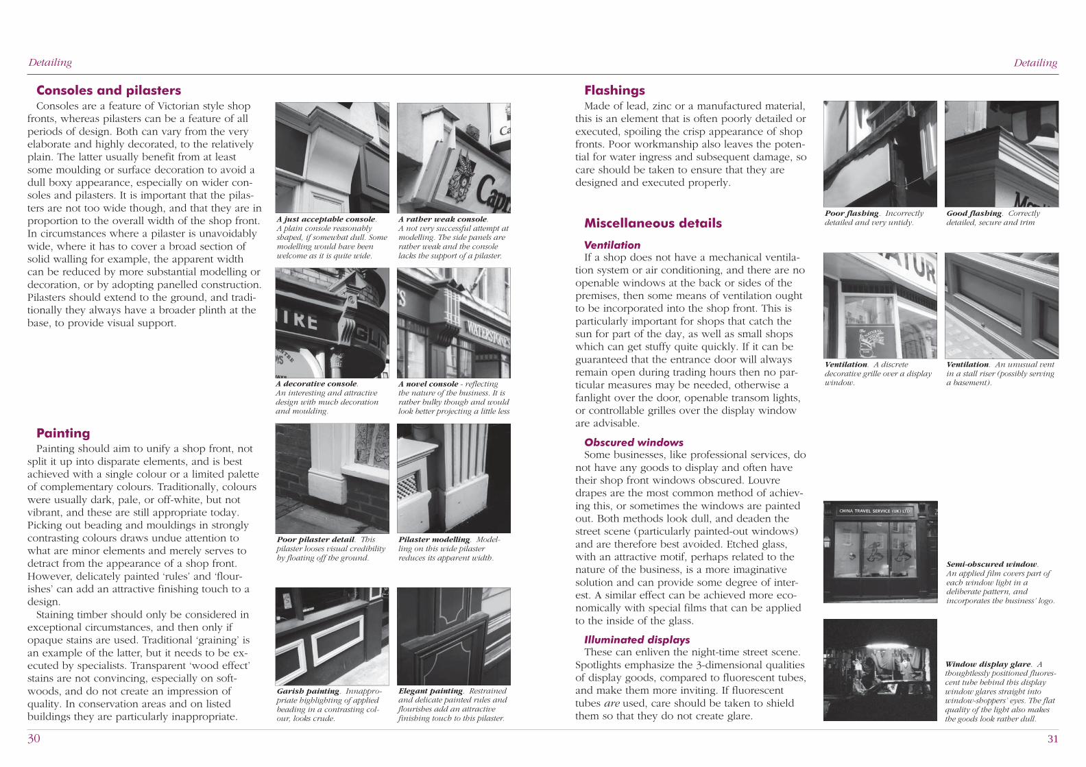
Consoles and pilastersConsoles are a feature of Victorian style shop
fronts, whereas pilasters can be a feature of allperiods of design. Both can vary from the veryelaborate and highly decorated, to the relativelyplain. The latter usually benefit from at leastsome moulding or surface decoration to avoid adull boxy appearance, especially on wider con-soles and pilasters. It is important that the pilas-ters are not too wide though, and that they are inproportion to the overall width of the shop front.In circumstances where a pilaster is unavoidablywide, where it has to cover a broad section ofsolid walling for example, the apparent widthcan be reduced by more substantial modelling ordecoration, or by adopting panelled construction.Pilasters should extend to the ground, and tradi-tionally they always have a broader plinth at thebase, to provide visual support.
FlashingsMade of lead, zinc or a manufactured material,
this is an element that is often poorly detailed orexecuted, spoiling the crisp appearance of shopfronts. Poor workmanship also leaves the poten-tial for water ingress and subsequent damage, socare should be taken to ensure that they aredesigned and executed properly.
Miscellaneous details
VentilationIf a shop does not have a mechanical ventila-
tion system or air conditioning, and there are noopenable windows at the back or sides of thepremises, then some means of ventilation oughtto be incorporated into the shop front. This isparticularly important for shops that catch thesun for part of the day, as well as small shopswhich can get stuffy quite quickly. If it can beguaranteed that the entrance door will alwaysremain open during trading hours then no par-ticular measures may be needed, otherwise afanlight over the door, openable transom lights,or controllable grilles over the display windoware advisable.
Obscured windowsSome businesses, like professional services, do
not have any goods to display and often havetheir shop front windows obscured. Louvredrapes are the most common method of achiev-ing this, or sometimes the windows are paintedout. Both methods look dull, and deaden thestreet scene (particularly painted-out windows)and are therefore best avoided. Etched glass,with an attractive motif, perhaps related to thenature of the business, is a more imaginativesolution and can provide some degree of inter-est. A similar effect can be achieved more eco-nomically with special films that can be appliedto the inside of the glass.
Illuminated displaysThese can enliven the night-time street scene.
Spotlights emphasize the 3-dimensional qualitiesof display goods, compared to fluorescent tubes,and make them more inviting. If fluorescenttubes are used, care should be taken to shieldthem so that they do not create glare.
Ventilation. A discretedecorative grille over a displaywindow.
PaintingPainting should aim to unify a shop front, not
split it up into disparate elements, and is bestachieved with a single colour or a limited paletteof complementary colours. Traditionally, colourswere usually dark, pale, or off-white, but notvibrant, and these are still appropriate today.Picking out beading and mouldings in stronglycontrasting colours draws undue attention towhat are minor elements and merely serves todetract from the appearance of a shop front.However, delicately painted ‘rules’ and ‘flour-ishes’ can add an attractive finishing touch to adesign.
Staining timber should only be considered inexceptional circumstances, and then only ifopaque stains are used. Traditional ‘graining’ isan example of the latter, but it needs to be ex-ecuted by specialists. Transparent ‘wood effect’stains are not convincing, especially on soft-woods, and do not create an impression ofquality. In conservation areas and on listedbuildings they are particularly inappropriate.
Poor pilaster detail. Thispilaster looses visual credibilityby floating off the ground.
Poor flashing. Incorrectlydetailed and very untidy.
Good flashing. Correctlydetailed, secure and trim
Ventilation. An unusual ventin a stall riser (possibly servinga basement).
A rather weak console.A not very successful attempt atmodelling. The side panels arerather weak and the consolelacks the support of a pilaster.
Garish painting. Innappro-priate highlighting of appliedbeading in a contrasting col-our, looks crude.
DetailingDetailing
Semi-obscured window.An applied film covers part ofeach window light in adeliberate pattern, andincorporates the business’ logo.
Window display glare. Athoughtlessly positioned fluores-cent tube behind this displaywindow glares straight intowindow-shoppers’ eyes. The flatquality of the light also makesthe goods look rather dull.
A just acceptable console.A plain console reasonablyshaped, if somewhat dull. Somemodelling would have beenwelcome as it is quite wide.
Elegant painting. Restrainedand delicate painted rules andflourishes add an attractivefinishing touch to this pilaster.
A novel console - reflectingthe nature of the business. It israther bulky though and wouldlook better projecting a little less
A decorative console.An interesting and attractivedesign with much decorationand moulding.
Pilaster modelling. Model-ling on this wide pilasterreduces its apparent width.

32 33
Summary
Mole Valley has many finetraditional and modern shopfronts that are an important
element in the local townscapes.However there are still opportunities toimprove shops so that they make apositive contribution to the appearance,vitality and viability of town centres andvillages.
Planning checklistPlanning permissionPlanning applications are required for all new
shopfronts, or alterations to existing shop fronts,that materially affect the external appearance of abuilding. The drawings and information that arerequired to be submitted with the application arelisted on Page 3 of this guide.
Conservation areasParts of Leatherhead and Dorking town centres,
and a number of village centres, are designatedas conservation areas, whose character andappearance it is desirable to preserve or en-hance. Within them, the Council has additionalplanning powers, to control advertising anddemolition for example, and the quality anddetailing of development proposals must meetthe preservation and enhancement objectives.
Listed BuildingsAny alterations to a listed building will require
‘Listed Building Consent’ if the works affect thecharacter of the building. This can include rela-tively small changes to features such as windowframes and decorative details, as well as interiordetails. Owners or traders are therefore stronglyadvised to consult the Planning Departmentbefore embarking on any alterations to a buildingthat is, or may be, listed. An application for listedbuilding consent will need to be accompanied bya justification of the proposals.
Signs and advertisementsPage 12 of this guide outlines the circum-
stances in which consent is needed for signs andadvertisements. However, even if a sign is notcovered by any of the circumstances listed, it isstill advisable to consult the Planning Departmentbefore proceeding. Signs which are considered tobe detrimental to the amenity of an area can bemade subject to ‘discontinuance action’ by thePlanning Authority, even when express consentis not required.
Professional designBy means of planning controls and guidance,
outlined in this booklet, the Council wish topromote new shop fronts that enhance the townand village centres within Mole Valley District.Although the guidelines give much detailedadvice that should help designers, the PlanningDepartment encourages the appointment ofqualified architects to undertake the design ofshop fronts, especially when old or listed build-ings are involved.
Whatever the style of shop front preferred bythe retailer, if attention is given to detail, and thedesign is one of quality, the image of the busi-ness will also be enhanced, which will more thanjustify the additional time and cost involved.
Manufacture and constructionIt is wise to be selective in the appointment of
contractors and suppliers, particularly in the caseof historic buildings, where specialist skills arenormally necessary.
Advice from the Planning Department
The guidelines are not intended to be undulyrestrictive, but applicants are strongly recom-mended to consult the Planning Department atan early stage in the design process for adviceabout any special considerations that may applyto the building or the locality.
ContactFor all enquiries relating to shop front planning
and design, listed buildings, signs and advertise-ments contact:
Mole Valley District CouncilPlanning DepartmentPippbrookDorkingSurreyRH4 1SJTel: 01306-885001
Additional information on access for disabledpeople is obtainable from:
Mole Valley Access GroupWesley HouseBull HillLeatherheadSurreyKT22 7BH

34 35
Planning policies
The following policies,which relate to shop frontsand advertisements, are
contained in the Mole Valley LocalPlan.
Policy ENV33Design of shop frontsNew shop fronts or alterations to existing
shopfronts should relate in their size, scale,detailing colour and use of materials, to thecharacter of the building and the street scene.The design of shop fronts should incorporateentrance an access arrangements suitable for theless mobile and disabled people.
Policy ENV 34Advertisement controlProposals for the display of advertisements will
be strictly controlled. Applications will be deter-mined taking into account the interests of publicsafety and amenity.
Externally illuminated signage may be permit-ted on hand painted shop fascias or shop fasciasemploying individually applied letters of timberor metal where light fittings are discreetly sited.Externally illuminated signs and fascias may beacceptable on other premises where the func-tional need has clearly been demonstrated. Thismay include public hotels, public houses andrestaurants, but not as of right.
Internally illuminated advertisements will notnormally be permitted.
Advertisements within Conservation Areas willbe required to preserve or enhance the characterof the locality.
Outside built-up areas, within the Area ofSpecial Control of Advertisements, advertise-ments will be required to respect the rural char-acter of the area.
Published by Mole Valley District Council Planning Department - July 1999Compiled, photographed and designed by Peter Phillips Design, and Town & Country Strategies
(Architects, Landscape Architects & Urban designers), Redhill, SurreyPrinted by Tracts Associates Ltd, Leigh, Surrey
Above: Co-operation between two shopkeepers:–
before & after photographs of fascia improvements.
Nos. 61-65 West Street, Dorking.
Front cover: No. 8-10 South Street, Dorking:–a restored C16th building, with a new shop front.
Inset: The same building before restoration.