Embed Size (px)
Citation preview

Module 4: Creating Content Lesson 4: Creating Charts Learn
Welcome to Module 4, Lesson 4. In this lesson, you will learn how to create, edit, and save new charts based on your uploaded data using InfoAssist+. _____________________________________________________________________________________ InfoAssist+ provides you with many types of charts that can be selected quickly, and allow you to display your data clearly and effectively. To create a chart, you can either right-click a folder, point to New and click Chart, or highlight a folder in the Resources tree and on the Home page, under Quick Links, click Chart.

You will be prompted to pick a Master File, which you will use to develop your chart. Once this is complete, InfoAssist+ opens in Chart mode.
The default format for a chart is the classic bar chart, but WebFOCUS offers many other options. These are available in the Format tab. You can select one of the many other chart types available. For example, a Pie chart, Area chart, Line chart, or Maps.

To add data to your chart, simply double-click a field in the Data pane to automatically add it to the corresponding field container in the Query pane. You can also drag fields onto the canvas or into field containers in the Query pane.
Different types of charts use data in different ways. For example, in a bar chart, extra measures will produce extra bars in each group by default. Many other types of charts can use fields in the Color, Size, or Detail field containers.

Adding a measure into the Color field container will add a color scale to the chart, while adding a dimension into this field container creates a color coded legend, displaying aspects (for example, bars or lines) for each component of the dimension on the canvas. The size of a chart component can be determined by a measure field.

The Detail field container, used for scatter plots and other X Y Plot charts, uses a dimension field to determine how many points to plot on the chart.
If there is no field specified in the Detail field container, the chart will show values for whichever dimension fields are in the other field containers.

The values from the Detail field also appear in the tooltip when you point to a marker on the chart at run time. The tooltip provides precise data and additional information related to each value shown on the chart. You can add even more valuable information to the tooltip by adding fields to the Tooltip field container.
To filter a chart, drag a field into the Filter pane or use the Filter option in the Data tab. Filters help to narrow down your data by selectively including or excluding certain data values.

Once you’ve added your data to the chart, you can customize it using the options available in the ribbon.
Different tabs in the Chart canvas contain different options for modifying your chart. The Home tab contains formatting and display options, such as the ability to choose a StyleSheet to style the entire chart, add a header or footer, or change the output type.

In addition to chart types, the Format tab contains label options and format options, as well as a few features that provide different options to allow users to interact with the chart at run time.
Auto-linking allows you to link your content to other charts and reports in your enterprise, auto-drill allows you to explore the data hierarchies used in your chart, and InfoMini allows you to provide your choice of ribbon functionalities to users at run time.
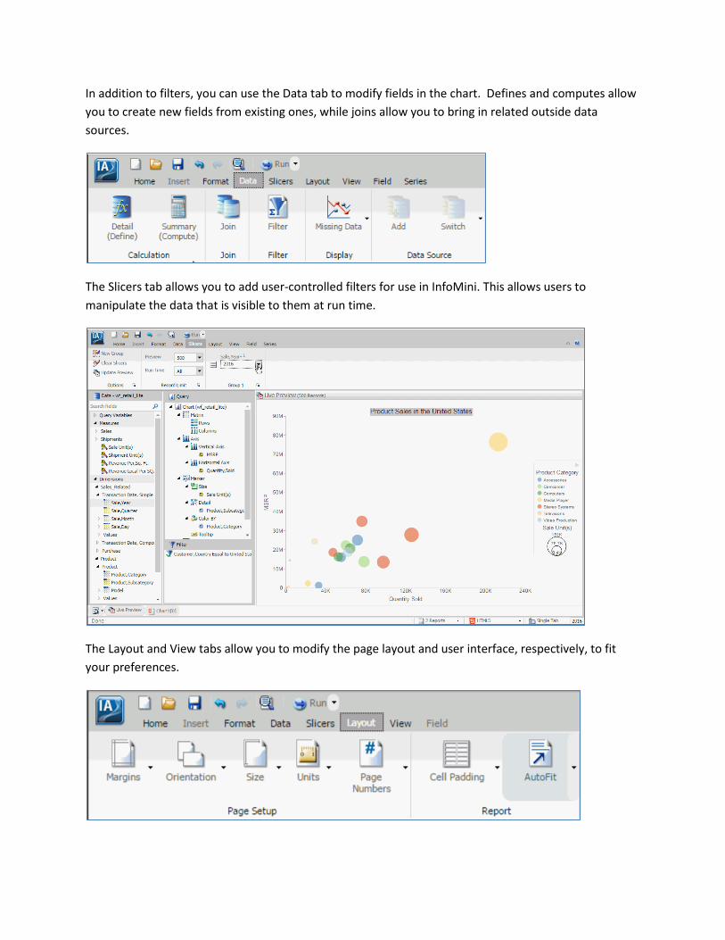
In addition to filters, you can use the Data tab to modify fields in the chart. Defines and computes allow you to create new fields from existing ones, while joins allow you to bring in related outside data sources.
The Slicers tab allows you to add user-controlled filters for use in InfoMini. This allows users to manipulate the data that is visible to them at run time.
The Layout and View tabs allow you to modify the page layout and user interface, respectively, to fit your preferences.

The Series tab can be used to modify or augment specific fields in the chart or all series depending on the menu selection. You can add data labels to your chart or set different measures to be displayed with different chart types.
For example, you could have a bar graph and a line chart together in a single chart.

If you select a field in your chart or in the Query pane, the Field tab is enabled. This tab contains options to format or modify that specific field.
Finally, if you click Save in the Application menu or Quick Access Toolbar, you are able to navigate to any available folder to save your content.

Depending on the type of chart that you create, InfoAssist+ contains a wide variety of options for formatting your chart so that it meets your business needs, allowing you to communicate your information with maximum effectiveness.

You are now ready to create a chart on your own as described by the Try Now! exercise that is provided for this lesson.
After you complete the exercise, you can move on to Module 4, Lesson 5, where you will learn how to create, edit, and save new visualizations using InfoAssist+.