Embed Size (px)
DESCRIPTION
Table of Contents Smashing eBook #4: Mobile Design for iPhone and iPad 2 This e-book is not protected by DRM. A copy costs only $9.90 and is available exclusively at http://shop.smashingmagazine.com. Please respect our work and the hard efforts of our writers. If you received this book from a source other than the Smashing Shop, please support us by purchasing your copy in our online store. Thank you. Thomas Burkert e-book editor Smashing eBook #4: Mobile Design for iPhone and iPad 3
Citation preview


Table of Contents
Preface 3
Imprint 4
Mobile Web Design Trends 5
Mobile Web Design: Tips and Best Practices 18
How to Build a Mobile Website 32
Web Development for the iPhone and iPad: Getting Started 46
How to Create Your First iPhone Application 55
iPhone Apps Design Trends 64
iPhone Apps Designs Reviewed 93
iPhone Apps Design Mistakes: Over-Blown Visuals 114
iPhone Apps Design Mistakes: Disregard of Context 134
Useful Design Tips for Your iPad App 153
Make it a Mobile Web App 166
How to Use CSS3 Media Queries to Create a Mobile Website 173
Forms on Mobile Devices 189
Setting up Photoshop for Web and iPhone Development 202
How to Market Your Mobile Application 209
A Study of Trends in Mobile Design 220
Study Results 1 225
Study Results 2 251
Study Results 3 270
Study Results 4 295
The Authors 318
Smashing eBook Series 321
Smashing eBook #4: Mobile Design for iPhone and iPad
2

Preface
Web designers know that their industry changes quickly. Continuous
adaption and development of skills is necessary in order to always stay up
to date. Over the past few years, mobile web usage has increased to a point
that web designers no can longer afford to ignore it. As a result, web
designers have a growing need to be educated in this area and to be ready
to design websites that accommodate this audience.
This e-book presents articles on professional mobile design for the iPhone
and iPad, including studies of trends in mobile design and guidelines for
the development of mobile web pages. These articles are a selection of the
best from Smashing Magazine in 2009 and 2010 dealing with mobile
design for the iPhone and iPad plus an exclusive 90-page study about
mobile web design trends. The articles have been carefully edited and
prepared as a PDF version and versions for ePub and Mobipocket
compatible e-book readers, such as the Apple iPad and Amazon Kindle.
Some screenshots and links were removed in order to make the book easier
to read and to print.
This e-book is not protected by DRM. A copy costs only $9.90 and is
available exclusively at http://shop.smashingmagazine.com. Please respect
our work and the hard efforts of our writers. If you received this book from
a source other than the Smashing Shop, please support us by purchasing
your copy in our online store. Thank you.
Thomas Burkert
e-book editor
Smashing eBook #4: Mobile Design for iPhone and iPad
3

Imprint
This edition was first published in November 2010
© 2010 Smashing Media GmbH, Freiburg, Germany
Book Cover Design: Andrea Austoni
Layout & Editing: Thomas Burkert
Concept: Sven Lennartz, Vitaly Friedman
Smashing eBook #4: Mobile Design for iPhone and iPad
4

Mobile Web Design Trends
By Steven Snell
Web designers know that the industry involves plenty of change, and
continuous adaption and development of skills is required in order to stay
up to date. In the past few years, one of the biggest areas of change has
been the amount of Internet users who are accessing websites via phones
and mobile devices. As a result, Web designers have a growing need to be
educated in this area and to be ready to design websites that
accommodate this audience.
Because designing websites for mobile devices brings some unique
situations and challenges into play, the subject requires a strategic
approach from the designer and developer. In this article, we’ll look at the
subject as a whole, including current trends, challenges, tips and a
showcase of mobile websites. Plenty of helpful resources and articles are
also linked to throughout this article, so, if you’re interested in learning
more about designing for mobiles, you should have plenty of information
at your fingertips.
1. Simple options
One of the most intriguing things about mobile websites is the scaled-
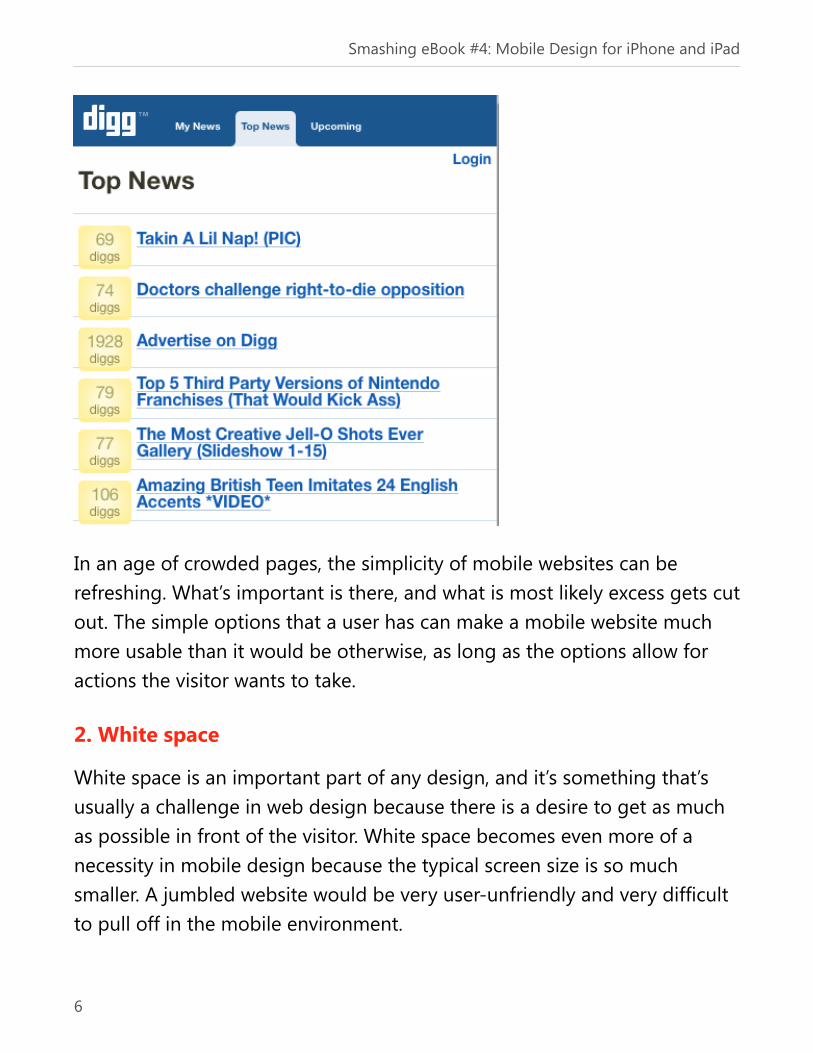
down options that are available to visitors. The mobile home page of Digg,
for example, contains only 17 simple headlines and links, a log-in link and a
few very basic navigation options. When it comes to mobile websites,
simplicity is key. Because of the lack of space on the screen and Internet
connections that are often slower, it’s important for visitors to have access
to what is most crucial, and as little else as possible.
Smashing eBook #4: Mobile Design for iPhone and iPad
5
In an age of crowded pages, the simplicity of mobile websites can be
refreshing. What’s important is there, and what is most likely excess gets cut
out. The simple options that a user has can make a mobile website much
more usable than it would be otherwise, as long as the options allow for
actions the visitor wants to take.
2. White space
White space is an important part of any design, and it’s something that’s
usually a challenge in web design because there is a desire to get as much
as possible in front of the visitor. White space becomes even more of a
necessity in mobile design because the typical screen size is so much
smaller. A jumbled website would be very user-unfriendly and very difficult
to pull off in the mobile environment.
Smashing eBook #4: Mobile Design for iPhone and iPad
6

As you browse through the websites shown in the gallery further down in
this article or in real-world scenarios on your own mobile device, you’ll find
that many websites include ample white space, especially the ones that are
helpful and easy to use.
3. Lack of images
As high-speed Internet connections have become more common in recent
years, designers have been able to take more liberties with things like
bandwidth-hogging video and images. The average visitor on a desktop or
laptop wants to see a visually engaging website, and, as a result, images are
heavily used. However, when it comes to mobile design, excessive use of
images often does more harm than good.
There is a great variety of speeds of mobile Internet connections and of
pricing plans for access. Visitors are more likely to be slowed down or
concerned with use of their resources when they’re on a mobile.
Additionally, the size of the screens can make many images difficult to see
and content harder to read. For these reasons, it’s very common to see
minimal use of images in mobile Web design.
As a growing number of mobile users move to smart phones with larger
screens and better connection speeds, more opportunity exists to use
images. However, because there is still a large percentage of users who are
not using these devices, many mobile websites still avoid images when
possible.
4. Sub-domains instead of .mobi or separate domains
When the .mobi top-level domain (TLD) first became available, a lot of buzz
surrounded the news. While some websites use .mobi for mobile versions
of their websites, it is currently more common to see companies use a sub-
Smashing eBook #4: Mobile Design for iPhone and iPad
7

domain or a separate folder on their primary domain. There are multiple
issues a company must consider when making this decision, but one of the
major benefits of using a sub-domain is that it keeps everything on one
domain, rather than spreading things out and potentially confusing visitors.
You’ll commonly see mobile versions of websites at such addresses as
mobile.example.com, m.example.com, example.com/mobile, example.com/
m and other ones along these lines. Of course, there are exceptions to this
trend, but, as you look at the mobile versions of major websites, you will
see more sub-domains than .mobi TLDs.
5. Prioritized content
Because of the simplicity of these pages and the general lack of many
options, the content displayed is highly prioritized. One thing you may find
surprising when viewing mobile websites is how much of the content is
prioritized for the visitor. Of course, all websites should be user-focused,
but, because most websites are run commercially for business purposes,
there are often elements that aren’t necessarily important to visitors, such
as banner ads. While advertisements have largely become an accepted part
of the Internet, most mobile websites are ad-free. The content available on
a mobile website is typically of the highest priority to the average mobile
visitor, not the company, although in the end the company benefits by
having a more usable website.
Common Challenges in Designing for Mobiles
Of course, Web design for mobile devices brings its own unique set of
challenges that designers must overcome to create a successful mobile
website. If you’ve attempted to design for mobiles, these were probably
some of your most significant challenges.
Smashing eBook #4: Mobile Design for iPhone and iPad
8

1. Variety of screen sizes
Although Web designers are used to dealing with varying screen sizes and
the resulting issues, mobile design presents this challenge in a bit of a
different way than dealing with different-sized desktop monitors. Most
designers are comfortable with the challenges that arise from various
screen resolutions on desktop monitors, but, if you haven’t worked with
mobile design before, it can be something yet more complicated that you
need to overcome.
Because mobile technology is always changing, screen sizes are changing
too. Fortunately for designers, modern mobile devices typically have bigger
screens and higher resolutions than those of a few years ago, but of course
those older phones are still in use.
While we’re on the topic of mobile screen sizes, there are two excellent
articles from April of 2008 at Sender 11: Mobile Screen Size Trends and
More on Mobile Screen Size Trends. The results of the study behind these
articles show that 240 x 320 (a.k.a. QVGA) should be the standard for
mobile development. Many newer mobiles and smart phones have larger
screens, but smaller ones are largely a thing of the past.
The graph below shows the findings of the report, which is close to a year
old at this point. With the rise in popularity of the iPhone and its
competitors, the most recent numbers most likely favor larger screens even
more.
Smashing eBook #4: Mobile Design for iPhone and iPad
9

For more interesting details on the study and other helpful charts and graphs,
please see both articles at Sender 11.
2. Lack of understanding
One of the biggest challenges that many designers face is just the
intimidation of dealing with a new aspect of design. If you haven’t
considered mobile browsers and visitors in your previous design work, it’s
most likely not something you feel comfortable doing without some
research. Because mobile browsers behave somewhat differently than
desktop browsers and, because the environment of its users is not the
same, the designer needs to gain some understanding and familiarity.
Through the information and resources presented in this article, you can
easily get started with a general understanding of the mobile Web, if you
don’t already have experience.
Smashing eBook #4: Mobile Design for iPhone and iPad
10

3. Rapid change
Like any other technology, rapid change is a constant. Of course, Web
designers need to stay on top of the industry in general, and the mobile
Web is no different. As technology and trends continue to change, the
mobile Web will evolve accordingly. The challenge of change isn’t really
anything new to designers; the mobile Web just presents another area in
which designers need to stay up to date.
4. Testing challenges
One of the most significant challenges in designing for mobiles is the wide
variety of phones in use. While designing for desktops brings its own
testing challenges with its various browsers and screen resolutions, there
are more dependable ways of testing these items at the moment. On the
mobile Web, however, many of your visitors will likely be accessing your
website in an environment that you were not specifically able to test.
There are, of course, some things you can do so that a mobile website is
tested as well as possible. To start with, the simplicity of mobile websites in
a way makes the testing process easier because there is less that can go
wrong. With a careful design and some well-planned testing, it’s possible to
be fairly certain that a website will be displayed properly and, more
importantly, usable on the vast majority of mobile devices.
There are a number of helpful resources for testing, we’d like to point out
here. First, the Web Developer Toolbar has some very useful features for
testing a website for mobile users. Because CSS and images may not be
enabled when a mobile visitor is on your website, you can use the toolbar
to disable both and see how the website will appear. While this does not
exactly replicate the experience of visiting the website in a mobile browser,
Smashing eBook #4: Mobile Design for iPhone and iPad
11

it can help identify potential problems in the way content and navigation is
displayed.
Another helpful testing resource is the Opera browser. In the Opera toolbar,
go to “View” and select “Small Screen.” This will display the website in a
very narrow window, similar to what would be used on a mobile device.
Additionally, you can use the Opera WebDev Toolbar to view an unstyled
page by clicking on “Display.” By viewing the page in the small screen with
CSS turned off, you can get an idea of how mobile visitors may experience
the website. The screenshot below shows the Smashing Magazine front
page unstyled in the small window.
Smashing eBook #4: Mobile Design for iPhone and iPad
12

5. Deciding on what is essential
If websites are to contain only what is most essential, the website owner or
designer will have to determine accurately what content is most important.
This may seem pretty simple, but taking a website that’s loaded with
content, images and maybe even video, and weeding it down to just the
essentials can be quite a challenge. Another aspect to this issue that must
be considered is the status of the average mobile visitor. What are they
doing? Why are they accessing the website at that time? What are they
likely and unlikely to have any interest in? Keep in mind that the goals of
mobile visitors are often vastly different than those of visitors sitting at a
desk.
Considerations for Mobile Design
Now that we’ve looked at some of the current trends and challenges in
designing for mobiles, let’s examine some specific issues that should be
considered by designers during the process.
1. Clean, semantic markup
The best thing you can do to lay a solid foundation for a usable mobile
website is to incorporate clean and semantic markup. What you may be
able to get away with on a traditional website may cause significant
problems on a mobile website. Clean markup will help ensure that the
browser is capable of properly displaying the website, and it will help give
visitors a pleasant experience, with no unnecessary difficulties.
Smashing eBook #4: Mobile Design for iPhone and iPad
13
2. Separation of content and presentation with CSS
Alongside clean, semantic markup is the need for the separation of content
and presentation. Mobile visitors are much more likely than desktop visitors
to see a website with images and CSS disabled. The most important thing
for these visitors is to be able to access the content and links – presentation
is secondary. A website that uses clean, valid markup, with CSS to separate
the presentation from the content, is off to a great start as a mobile
website.
3. Alt tags
Because it’s likely that some visitors will not be able to see images on the
website (or will choose to disable them), alt tags are extremely important
for usability purposes. Of course, alt tags should be used anyway, but it’s
even more critical for mobile visitors.
4. Labeling form fields
Like alt tags, form field labels help make a website much more usable for
mobile visitors. Imagine trying to use a form without knowing what is
supposed to go where. Simple details like alt tags and form field labels can
make a big difference this way.
5. Use of headings
With inconsistent and often limited styling of text on mobile browsers,
headings become more significant. Mobile browsers are less likely to style
text exactly how you would like it to be, but h1, h2, h3 and other such tags
generally help make certain text stand out and build the structure of the
page from a visitor’s perspective.
Smashing eBook #4: Mobile Design for iPhone and iPad
14

6. Avoid floats if possible
Even if a mobile browser correctly displays a website that uses floats for
layout, it’s unlikely the website will look good on a small screen. Usually the
website will be more usable and look less awkward without floats
altogether and with content simply stacked up.
7. Reduce margins and padding
Most likely, your mobile website should have smaller margins and padding
than your main website has for traditional visitors. Of course, this depends
partly on how much of a margin and padding your website currently has,
but very large amounts can make the layout awkward.
8. Pay attention to navigation
Most websites have a primary navigation menu very high on the page. This
is helpful on mobile websites as well, but generally, mobile navigation
options are scaled down. Provide only the most relevant links, and, if
possible, give visitors an easy way to access the other navigation items.
9. Consider Color Contrast
Because mobile screens may not have the same appearance as desktop or
laptop monitors, make sure the background and text colors provide
adequate contrast so that the content can be read easily.
Sitepoint’s Designing for the Mobile Web
Sitepoint published an article, Designing for the Mobile Web by Brian Suda,
that provides an excellent point of reference on the subject. In the article,
Brian breaks down the process of designing for mobiles in seven
understandable and digestible steps. The article is useful enough to restate
the main points here.
Smashing eBook #4: Mobile Design for iPhone and iPad
15

1. Don’t mix up your markup
For most websites, we can ignore WML and make use of the markup
language with which we’re probably much more familiar: XHTML.
2. Know your phones
We must cater not only to different screen sizes and resolutions, but to
different shapes. From short and long rectangles to tall and skinny ones to
perfect squares, the mobile world contains a rich tapestry of variation that
almost makes you want to pull your hair out!
3. Target the right customers
Traditional website customers are most likely sitting at a desk facing a large
monitor that has a decent resolution. Visitors who are browsing your
mobile website are unlikely to be in the same circumstances. They may be
waiting in line, riding on the train or bus, running to the departure gate or
lost in an unfamiliar town late at night and trying to get somewhere.
4. Publish the bare minimum
While the concept of having only one website, and simply styling it
differently depending on the medium the visitor is using, is popular with
many standardistas, a separate mobile website is required to deliver an
optimized experience for mobile users.
Smashing eBook #4: Mobile Design for iPhone and iPad
16

5. Choose a great domain name
When deciding on a domain name for a mobile website, the colleagues and
companies I’ve worked with have always used a sub-domain. Creating a
sub-domain is the easiest of the options to set up (you already own the
domain), it’s the cheapest option (there’s no need to register the .mobi),
and it means you avoid having to spend hours tweaking the server (and
potentially messing up normal traffic).
6. Validate your markup
Mobile browsers are much less forgiving than desktop browsers. A browser
running on a mobile device generally doesn’t have the luxury of a 2 GHz
processor and 200 GB of disk space. Therefore, you must check, validate
and recheck your markup, time and time again.
7. Test, Test, TEST!
Testing your website with a Web browser on a desktop computer can get
you only so far in terms of simulating the mobile experience. There are
many elements of mobile device usage that can’t be replicated accurately in
this way.
Brian’s article is an excellent starting point for those who are new to
designing for mobile devices, and it’s also a great resource to have handy
down the road when you want to check your work to make sure you’re
doing things the right way.
Smashing eBook #4: Mobile Design for iPhone and iPad
17

Mobile Web Design: Tips and Best Practices
By Cameron Chapman
In Year 2009, more than 63 million people in the United States accessed the
Internet from a mobile device. It’s forecasted that by 2013 there will be
more than 1.7 billion mobile Internet users worldwide. With those kinds of
numbers, it’s imperative that web designers and developers learn optimal
development and design practices for mobile devices.
For the most part, you won’t need to learn any new technologies for mobile
site design, but you will need to look at site design in a new way, one that is
decidedly more restrictive than design for standard browsers. To work
around the issues that mobile site design presents, and to get a result that
is as user-friendly and useful as your standard site, some creative problem-
solving skills are required.
Familiarize Yourself with the Hardware and Software
Available
Cell phone and mobile device platforms vary greatly when it comes to
operating system, screen size, resolution, and user interface. To be able to
decide which platform(s) you want to optimize your site for, it would be
helpful to familiarize yourself with the different available options.
The most common operating systems in use are Windows Mobile, the
iPhone platform, Palm OS, Mobile Linux, Symbian OS, the BlackBerry
platform, and Android (which is poised to get a lot bigger thanks to a
recent deal between Verizon and Google). There are other proprietary
systems specific to particular phones, such as those found on some Verizon
handsets and specific brands of phones. You can estimate, based on the
Smashing eBook #4: Mobile Design for iPhone and iPad
18

type of audience your site targets, which OSs your users are most likely to
be using. If your visitors are mostly business users, you’ll need to optimize
your site for Windows Mobile and BlackBerry devices. If your users are
younger, trendier, or more tech-savvy, you’ll want your site optimized for
iPhones and Android devices. In any case, ensure your site is at least usable
on the majority of mobile platforms.
StatCounter Global Stats – Top 8 Mobile OSs
http://gs.statcounter.com/#mobile_os-ww-monthly-200812-201010
Smashing eBook #4: Mobile Design for iPhone and iPad
19

Mobile browsers are another factor to consider. Some of the more common
browsers include Safari for the iPhone, Android browser, Opera Mobile,
WebOS browser (on Palm devices), BlackBerry browser and Internet
Explorer Mobile (on Windows Mobile devices). There are additional
browsers in use on Nokia and on other phone brands. Some of these
browsers are based on proprietary code, while others are built on WebKit
(Android, Safari), Gecko (Fennec, a Mozilla browser) or other common
platforms.
StatCounter Global Stats – Top 9 Mobile Browsers
http://gs.statcounter.com/#mobile_browser-ww-monthly-200901-200910
Smashing eBook #4: Mobile Design for iPhone and iPad
20

Finally, you need to consider your site visitors’ most common screen size
and resolution. Your site should work on the widest range of mobile devices
that your visitors might be using.
Simplify!
Your mobile site, in most cases, should be simpler than your standard site.
The only exception to this is if your standard site is already very minimalist.
Eliminating graphic elements from your site is usually an effective way to
optimize its display on a mobile device. Look for ways to simplify both the
design and functionality of your site. This might mean redoing your menus,
eliminating images, breaking up text over multiple pages, or otherwise re-
working your site’s layout and functionality.
Smashing eBook #4: Mobile Design for iPhone and iPad
21

Examples
Use Valid Markup
Considering the variety of potential operating systems and browsers from
which people might be accessing your site, web standards become even
more vital. Standard browsers are, for the most part, very forgiving of bad
code, but with a mobile browser you often won’t get that kind of leeway.
Make sure your code validates and is as clean and minimalist as possible.
Smashing eBook #4: Mobile Design for iPhone and iPad
22
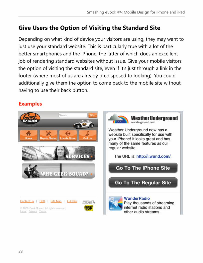
Give Users the Option of Visiting the Standard Site
Depending on what kind of device your visitors are using, they may want to
just use your standard website. This is particularly true with a lot of the
better smartphones and the iPhone, the latter of which does an excellent
job of rendering standard websites without issue. Give your mobile visitors
the option of visiting the standard site, even if it’s just through a link in the
footer (where most of us are already predisposed to looking). You could
additionally give them the option to come back to the mobile site without
having to use their back button.
Examples
Smashing eBook #4: Mobile Design for iPhone and iPad
23

Use a Separate Mobile Theme
While optimizing your main site for mobile use sometimes makes sense, it’s
often easier to use a separate mobile theme, which can be done on most
CMSs by changing the CSS for mobile devices. A dedicated mobile theme
means you can really take into account how your visitors will see your site
and optimize it specifically for them. Some sites have one design optimized
for regular mobile devices and another for iPhone users.
Examples
Smashing eBook #4: Mobile Design for iPhone and iPad
24
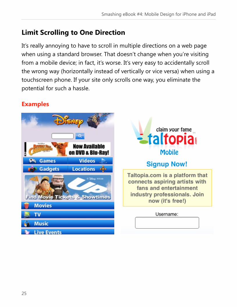
Limit Scrolling to One Direction
It’s really annoying to have to scroll in multiple directions on a web page
when using a standard browser. That doesn’t change when you’re visiting
from a mobile device; in fact, it’s worse. It’s very easy to accidentally scroll
the wrong way (horizontally instead of vertically or vice versa) when using a
touchscreen phone. If your site only scrolls one way, you eliminate the
potential for such a hassle.
Examples
Smashing eBook #4: Mobile Design for iPhone and iPad
25

Don’t Use Pop-Ups or Open New Windows
Depending on the particular platform, popups and new windows can
interfere with the browsing experience, so don’t use them. If you absolutely
need something to open in a new window, make sure you alert your mobile
visitors that it will do so.
Smashing eBook #4: Mobile Design for iPhone and iPad
26

Minimize the Use of Images
Use only the images you need to get your message across. A logo is fine, as
are most icons. Images that are integral to the content on your site are also
fine. But eliminate images that serve no purpose other than to look pretty.
They generally won’t look pretty on a mobile device anyway, so why
bother? And sometimes they just make your site look worse, or cause
strange scrolling or layout issues if the resolution is other than what you
were expecting.
Examples
Smashing eBook #4: Mobile Design for iPhone and iPad
27

Optimize Your Navigation
Many mobile devices have touchscreen interfaces, so try to design with that
in mind. That means making the clickable area around your links a little
greater, making buttons larger, and putting more space between links.
Trying to click on tiny, barely-visible links is a real pain, and having to zoom
in every time you want to click on something doesn’t make it much better.
To improve these navigation issues, many sites use a completely separate
mobile navigation design, optimized for touchscreens or non-mouse input
devices.
Examples
Smashing eBook #4: Mobile Design for iPhone and iPad
28
Don’t Rely on Flash or JavaScript
Not all phones and mobile devices support Flash or JavaScript. Even if they
do, there’s no guarantee it will be the most recent version. And forget
about Flash if your visitors are using an iPhone. Make sure all the important
information and functionality on your mobile site is in plain (X)HTML/CSS.
Otherwise, you risk a large portion of your visitors being unable to access
important content.
Smashing eBook #4: Mobile Design for iPhone and iPad
29

Include as Much Content from Your Standard Site as is
Practical
How many times have you gone to a favorite website from your phone and
then realized you can’t get to the part you wanted to visit? It happens all
the time. Include as much of the original site content as possible on your
mobile site. In addition to making it available, make sure the navigation
route to get to it also remains relatively unchanged.
Examples
Smashing eBook #4: Mobile Design for iPhone and iPad
30
Make Sure Redirects Work Properly
Don’t just send mobile users to your home page. There’s nothing more
annoying than clicking a link, either in search engine results or from
another website, and having it redirect to the homepage if you’re on a
mobile device. If your site automatically detects whether a visitor is coming
from a mobile browser, make sure it’s set up to send that visitor to the link
they were trying to visit, otherwise they’re likely to leave and never come
back.
Smashing eBook #4: Mobile Design for iPhone and iPad
31

The Authors
Alexander Dawson
Alexander is a freelance web designer, author and recreational software
developer specializing in web standards, accessibility and UX design. As
well as running a business (HiTechy) and writing, he spends time in Twitter,
SitePoint's forums and other places, helping those in need.
Alexander Komarov
Alexander Komarov is a Russian designer (currently residing in
Philadelphia), who has been working in the field of Web and Mobile
Interaction design and user experience for over 7 years. He runs a nimble
interaction design studio that specializes in mobile interaction design and
strategy. He helps his clients break through the wall that separates them
from their customers and stand out in the competitive world of modern
technology.
Cameron Chapman
Cameron Chapman is a professional Web and graphic designer with over 6
years of experience. She writes for a number of blogs, including her own.
She’s also the author of Internet Famous: A Practical Guide to Becoming an
Online Celebrity
Jen Gordon
Jen Gordon is the owner of Atlanta-based iPhone app design studio Clever
Twist. Her studio created the iPad application iBrite. She specializes in
usable interfaces, beautiful design and straight talk.
Smashing eBook #4: Mobile Design for iPhone and iPad
318

Jon Raasch
Jon Raasch is a front-end web developer/UI designer with endless love for
jQuery, CSS3 and performance tuning.
Kim Pimmel
UX Designer at Adobe, photographer, DJ, tinkerer.
Luke Wroblewski
Luke Wroblewski is an internationally recognized Web thought leader who
has designed or contributed to software used by more than 600 million
people. He is currently Senior Director of Product Ideation & Design at
Yahoo! Inc., author of two popular Web design books, and a top-rated
speaker at conferences and companies around the world.
Marc Edwards
Marc Edwards is the Director and Lead Designer at Bjango, an iPhone app
developer. Marc has been using Photoshop and Illustrator for over 12 years,
designing for print, Web, desktop applications and the iPhone.
Michael Flarup
Michael Flarup is a Copenhagen based interface designer & iconist. When
he’s not freelancing and blogging out of PixelResort.com he’s creating
iPhone apps with his young startup company Robocat.
Smashing eBook #4: Mobile Design for iPhone and iPad
319

Nick Francis
Nick Francis builds websites with an outstanding team at Project83 in
Nashville, Tennessee. He also co-founded Brightwurks that created web
apps Feed My Inbox and Linkpatch, along with mobile website gallery
Mobile Awesomeness.
Rachel Andrew
Rachel Andrew is a front and back-end web developer and Director of
edgeofmyseat.com, a UK web development consultancy and the creators of
the small content management system, Perch. She is the author of a
number of web design and development books including CSS Anthology:
101 Essential Tips, Tricks and Hacks (3rd edition), published by SitePoint and
also writes on her own blog. Rachel tries to encourage a common sense
application of best practice and standards adoption in her own work and
when writing about the web.
Steven Snell
Steven Snell has been designing websites for several years. He actively
maintains a few blogs of his own, including DesignM.ag, which regularly
provides articles and resources for web designers.
Smashing eBook #4: Mobile Design for iPhone and iPad
320

Smashing eBook Series
Smashing eBook #1: Professional Web Design
This book presents guidelines for professional web
development, including communicating with
clients, creating a road map to a successful
portfolio, rules for professional networking and
tips on designing user interfaces for business web
applications.
Buy this eBook now for just $9.90
Smashing eBook #2: Successful Freelancing for
Web Designers
Being a great web designer or developer is one
thing – running a successful freelance business
another. Whether you already have work
experience in companies or have just graduated
from design school, being self-employed entails a
number of tasks that you most likely haven’t had
to deal with so far.
Buy this eBook now for just $9.90
Smashing eBook #4: Mobile Design for iPhone and iPad
321

Smashing eBook #3: Mastering Photoshop for
Web Design
Mastering Photoshop is written for advanced and
intermediate designers who want to brush up on
their workflow and improve their Photoshop skills.
The eBook contains 178 pages, explaining
fundamental techniques that web designers need
to know to produce high-quality work in
Photoshop.
Buy this eBook now for just $ 19.90
Smashing eBook #4: Mobile Design for iPhone and iPad
322


