Embed Size (px)
Citation preview
Visual Identity System

M I D D L E B U RY / V I S UA L I D E N T I T Y S Y S T E M REV. 02/18/16
Contents
INTRODUCTION
1 Introduction2 Brand Architecture and Narrative4 Visual Identity System
LOGOS
5 Logo Components6 The Master Logo
SUPPLEMENTAL LOGOS
7 School Name Logos11 School Name Logos with Lockups
LOGO RULES
12 Clear Area and Minimum Size13 Separating Components14 Incorrect Uses15 The Logo Colors17 The Transparent Logo vs. the Logo with a Background18 The Logo on a Color Background 19 The Logo with a Background on a Color Background20 Middlebury’s Seal
LOGO APPLICATIONS
21 Guidelines for Applying the Logo22 Signage and Banners23 Products
COLOR
24 The Official Color25 Insititutional Color Palette
TYPEFACES
26 Official Typefaces27 Serif Typeface29 Slab Serif Typeface31 Sans Serif Typeface33 Using the Typefaces Together
STATIONERY
34 Master Stationery35 School Stationery36 Customized Stationery37 Typing Format for Letterhead38 #10 Envelopes 39 Business Cards
DIGITAL
40 Formatting Emails and Email Signatures

I N T R O D U CT I O N 1
M I D D L E B U RY / V I S UA L I D E N T I T Y S Y S T E M REV. 02/18/16
Introduction
Contained in these pages is the first identity system at Middlebury that attempts to create linkages across our many schools and programs. It is the result of more than a yearlong process that sought input from many faculty, staff, and students, both here and in Monterey. Although Middlebury is known most widely as a New England liberal arts college, in fact it possesses a range of programs that make it unique among its cohort. The Language Schools, Bread Loaf School of English and Writers’ Conferences, Schools Abroad, the School of the Environment, and most recently, the graduate institute at Monterey, all add innumerably to our institution. It is not simply that Middlebury maintains an unusual range of programs—it is that most of these are leaders in their area. Middlebury pioneered immersion language study and remains known as the leader in this field to this day. Likewise, it developed the first, and still most prestigious, summer writers’ workshop. The identity system attempts to maintain a fine balance: it is not necessarily the case that each of our programs needs a relationship to the others to thrive. Many of the programs possess their own prestige and
audiences. In the years to come, our goal for each program is that it realize its particular vision, growing and prospering in ways appropriate to its goals and its audiences. Yet, we believe that Middlebury will be a stronger place, and the programs will prosper best, if there is awareness both here and in the outside world that all are part of Middlebury. We want our faculty to know about their colleagues working in various corners of the institution. We want our students to know that they have options to advance their educations beyond the program in which they are currently enrolled. We want Middlebury to be reflected in the success of these wonderful programs, and likewise, we want these wonderful programs to shine the light of their success on Middlebury. This is what the system described in the following pages attempts to accomplish. If you have questions about anything you read herein, please contact our Office of Communications and Marketing. I know that they will be eager to help. In closing, let me thank you in advance for your cooperation with this effort and your adherence to these guidelines. The benefits of a system such as this accrue
over time through continual application. In this way each of you can help maintain and enhance the institution that we all so dearly love.

I N T R O D U CT I O N 2
M I D D L E B U RY / V I S UA L I D E N T I T Y S Y S T E M REV. 02/18/16
Middlebury’s Brand Architecture and Narrative
THE MIDDLEBURY BRAND ARCHITECTURE
The term “brand architecture” refers to the relationship of individual services or products to each other within the universe of a company or organization. There are many options. Some companies, like Proctor and Gamble, have decentralized brand architectures. Each individual brand, such as Charmin or Cover Girl, has its own identity and there is little tie back to the corporate entity that oversees them. Other companies pursue the masterbrand model, where individual product lines or services are strongly tied back to the core entity. Apple computers and Starbucks are good examples of masterbrand architectures.
One of the challenges of this project was to figure out the correct brand architecture for the several, relatively autonomous, programs under the Middlebury umbrella. A considerable amount of both qualitative and quantitative research was conducted to understand attitudes, priorities, and perceptions of students, staff, faculty, alumni, prospects, and broader publics that affiliate with Middlebury’s several programs.
The result is neither a decentralized brand architecture nor a masterbrand architecture. It is a hybrid.
What the research indicated is that for the vast majority of students, faculty, and staff affiliated with individual Middlebury programs, their attachment is to the program, not to the larger entity known as Middlebury. Therefore when admissions officers, fundraising officers, or faculty recruiters are promoting their individual program or school, they should speak mainly about their program. It is distracting, and not necessarily beneficial, to talk about the umbrella Middlebury entity. There are relatively few audiences who look at Middlebury primarily through the lens of the broader institution: among these are the Board of Trustees and certain select donors and opinion leaders.
Therefore, the identity system that was developed in light of the brand architecture does not dictate a homogenous “look” across Middlebury’s various programs. It establishes a limited number of anchors that enable all the programs to be identified as part of Middlebury:
• the use of the name “Middlebury” consistently before the program name
• the use of Middlebury’s official color• the use of a consistent system of logos and
typography for setting school names
Having established those anchors, this system anticipates—and indeed encourages—each separate program to use the tool kit of typefaces and colors contained in this manual to develop its own distinctive “look.” Having seen to the anchors, we now want and encourage each of the programs to fly. Those who are responsible for communications and marketing of the programs are in the best position to understand the preferences, priorities, and mind-set of the audiences with whom they communicate. It is hoped that this tool kit is flexible enough to provide a range of expressions.
THE MIDDLEBURY BRAND NARRATIVE
Just as the system anticipates diverse “looks” within the family of Middlebury programs, we also anticipate that each program will use its own narrative to describe itself to its various audiences. This is how it should be: those who affiliate with any one of our programs, whether the College or the Bread Loaf Writers’ Conferences, are mainly concerned with that particular entity. It would be counterproductive to subordinate the individual programs under a master narrative.
However, discussions among leadership of the institution did arrive at two themes

I N T R O D U CT I O N 3
M I D D L E B U RY / V I S UA L I D E N T I T Y S Y S T E M REV. 02/18/16
that we believe are shared by the various programs at Middlebury and thus do define the Middlebury brand:
1. All of Middlebury’s programs are focused on developing the particular expertise and perspective that are required for successful engagement with an increasingly globally interconnected world.
In many instances, this literacy involves foreign language proficiency. But more central and fundamental to Middlebury than foreign language proficiency itself is an acknowledgment of the importance of effective communication across differences of culture, nationality, race, and socioeconomic status.
2. Although Middlebury programs are situated across the country, around the world, and increasingly in cyberspace, they are distinguished by pedagogical approaches that emphasize intimacy and high levels of contact that are the legacy of the institution’s historic Vermont roots.
Those developing materials to communicate with various audiences such as prospective students, donors, current students, faculty, and staff are requested to attempt to weave these two themes into their presentations. This does not mean
they would use these passages verbatim. They would employ the themes in ways that are suited to their audience and situation.
For further guidance on employing the brand architecture and messaging guidelines, please contact Middlebury’s Office of Communications and Marketing.

I N T R O D U CT I O N 4
M I D D L E B U RY / V I S UA L I D E N T I T Y S Y S T E M REV. 02/18/16
Middlebury’s Visual Identity System
Middlebury’s visual identity system is the critical tool for creating linkages among the schools’ various programs. Over time, we hope to build greater awareness, and thereby synergies, among the various programs at Middlebury.
The goal for this system is that the accomplishments of the programs and centers at Middlebury will redound to the reputation of the institution and conversely that the reputation of the broader institution will benefit the individual programs.
These are the elements of the Middlebury identity system:
• Middlebury’s logo and its authorized variations
• Middlebury’s colors • Middlebury’s typefaces
The use of each of these elements is governed by the simple and clear guidelines provided in this manual.
If you have questions, please contact the Office of Communications and Marketing for assistance.

M I D D L E B U RY / V I S UA L I D E N T I T Y S Y S T E M REV. 02/18/16
L O G O 5Middlebury Logo Components
The Middlebury logo is self-confident, attractive, and outgoing. It conveys school pride through the elements within the shield and through the use of the official color.
All elements are important: the shield and the treatment of “Middlebury” make an important statement about the institution’s place in the ranks of American educational institutions.
SHIELD
There are many dimensions to this shield. It is a distinctive image on its own. Even without knowledge of the various references, it is well-suited to the institution as a recognizable and emotionally warm image.
The shield and its elements were chosen to honor Middlebury’s excellence in its various programs.
Old Chapel: The signature building on the Middlebury campus
Bread Loaf Mountain: The home of two of Middlebury’s signature programs and an element in the romantic range of mountains
Globe: signifies the global focus of Middlebury’s programs
Book: Referencing the central image in the College seal, and alluding to the academic values at the core of the institution
Date: Founding year of the College
TYPE TREATMENT
The typeface was chosen to reflect the tradition and excellence of Middlebury.
The letterforms have been specifically sculpted and spaced. Users should never attempt to redraw this logo or rebuild it from scratch. Shield
Type treatment
Book
Globe
Old Chapel
Bread Loaf Mountain
Date
M I D D L E B U RY / V I S UA L I D E N T I T Y S Y S T E M REV. 02/18/16
L O G O 6
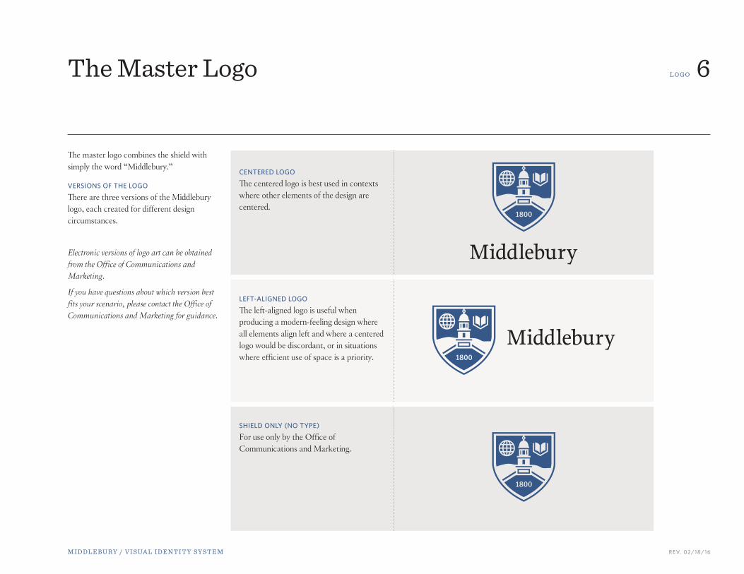
The master logo combines the shield with simply the word “Middlebury.”
VERSIONS OF THE LOGO
There are three versions of the Middlebury logo, each created for different design circumstances.
Electronic versions of logo art can be obtained from the Office of Communications and Marketing.
If you have questions about which version best fits your scenario, please contact the Office of Communications and Marketing for guidance.
The Master Logo
CENTERED LOGO
The centered logo is best used in contexts where other elements of the design are centered.
LEFT-ALIGNED LOGO
The left-aligned logo is useful when producing a modern-feeling design where all elements align left and where a centered logo would be discordant, or in situations where efficient use of space is a priority.
SHIELD ONLY (NO TYPE)
For use only by the Office of Communications and Marketing.

M I D D L E B U RY / V I S UA L I D E N T I T Y S Y S T E M REV. 02/18/16
S U P P L E M E N TA L L O G O S 7School Name Logos
The Middlebury school name logos have been produced in concert with the master logo. The text has been carefully crafted and the letterforms specifically sculpted and spaced. No one should ever attempt to redraw these logos or rebuild them from scratch.
The Middlebury school name logos can be found on the following pages.
No department or program should embark on the creation of their own school name logo without prior authorization from the Office of Communications and Marketing.
High-resolution versions of logo art can be obtained from the Office of Communications and Marketing.

M I D D L E B U RY / V I S UA L I D E N T I T Y S Y S T E M REV. 02/18/16
S U P P L E M E N TA L L O G O S 8School Name Logos

M I D D L E B U RY / V I S UA L I D E N T I T Y S Y S T E M REV. 02/18/16
S U P P L E M E N TA L L O G O S 9School Name Logos

M I D D L E B U RY / V I S UA L I D E N T I T Y S Y S T E M REV. 02/18/16
S U P P L E M E N TA L L O G O S 10School Name Logos
MIDDLEBURY INSTITUTE OF INTERNATIONAL STUDIES AT MONTEREY
The Middlebury Institute of International Studies at Monterey employs its own version of the Middlebury shield that is stylistically similar but replaces the image of Old Chapel with the Segal Building, eliminates the outline of Bread Loaf Mountain, and replaces the founding date of the College with the Institute’s founding date.
The Institute’s ShieldThe Institute shield can be used on its own with permission from the Office of Communications and Marketing.

M I D D L E B U RY / V I S UA L I D E N T I T Y S Y S T E M REV. 02/18/16
S U P P L E M E N TA L L O G O S 11
Middlebury College, Middlebury Language Schools, and Middlebury Institute for International Studies at Monterey employ lockups for certain centers, programs, or other sub-units of the school name.
Lockups are created by the Office of Communications and Marketing. The letterforms have been specifically sculpted and spaced. Designers should never attempt to remake the logo lockup or rebuild it from scratch.
A request for a lockup should be made to the Office of Communications and Marketing.
Lockups are not to be centered; they are only used in the left-aligned logo format.
School Name Logos with Lockups
incorrect

M I D D L E B U RY / V I S UA L I D E N T I T Y S Y S T E M REV. 02/18/16
L O G O RU L E S 12Clear Area and Minimum Size
CLEAR AREA
A “clear area” around the logo equal to the diameter of the globe should be incorporated into any design using the logo.
MINIMUM SIZE
The minimum acceptable size for the Middlebury logo is defined by the height of the shield. The shield should never be less than .625" (or 5/8") high in print.
It is shown here at its actual minimum size.
.675”

M I D D L E B U RY / V I S UA L I D E N T I T Y S Y S T E M REV. 02/18/16
L O G O RU L E S 13Separating Components of the Logo
The examples to the right show correct usage of the Middlebury logo. The type treatment should always appear underneath or to the right of the shield.
It is acceptable to use the shield without the type treatment in moderation.
The Middlebury type treatment should never be used on its own or separated from the shield.
The examples to the right show incorrect usage of the Middlebury logo.
BROCHURE TITLEBROCHURE TITLE
BROCHURE TITLE
Sally Smith
123 Main Street
Anywhere, US 45678
14 Old Chapel Road • Middlebury, VT 05753
BROCHURE TITLE BROCHURE TITLEBROCHURE TITLE
incorrect
correct
M I D D L E B U RY / V I S UA L I D E N T I T Y S Y S T E M REV. 02/18/16
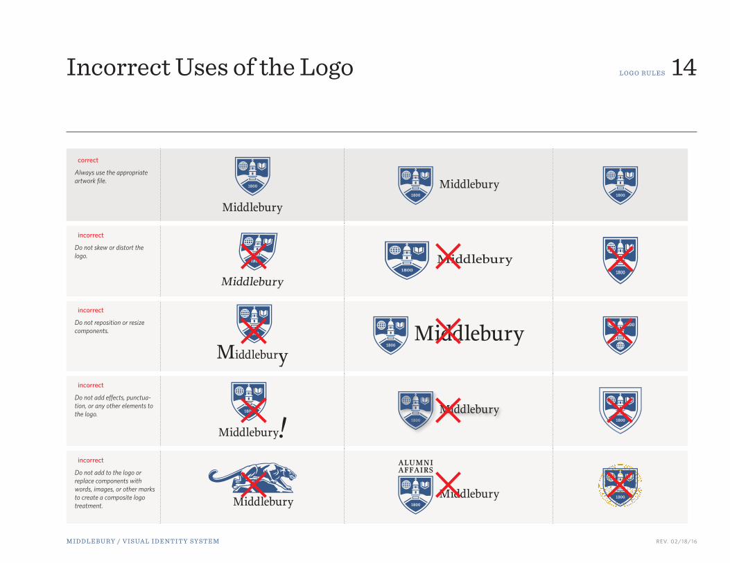
L O G O RU L E S 14Incorrect Uses of the Logo
correct
Always use the appropriate artwork file.
incorrect
Do not skew or distort the logo.
incorrect
Do not reposition or resize components.
incorrect
Do not add effects, punctua-tion, or any other elements to the logo.
incorrect
Do not add to the logo or replace components with words, images, or other marks to create a composite logo treatment.

M I D D L E B U RY / V I S UA L I D E N T I T Y S Y S T E M REV. 02/18/16
L O G O RU L E S 15The Logo Colors
THE LOGO IN TWO COLORS
In most cases, the logo will appear in two colors, blue and black. It is not permissible to replace any of the colors nor to add additional color(s). This is the preferred logo color treatment.
correct incorrect
THE LOGO IN ONE COLOR
The only colors that can be used in the one-color logo treatments are blue, black, or white (see next page). It is not permissible for the logo to appear in any other colors, nor may it appear in two or more colors.
correct incorrect

M I D D L E B U RY / V I S UA L I D E N T I T Y S Y S T E M REV. 02/18/16
L O G O RU L E S 16The Logo Colors
THE SHIELD IN ONE COLOR
The only colors that can be used in the shield are blue, black, or white (see below). It is not permissible for the shield to appear in any other colors, nor may it appear in two or more colors.
correct incorrect
THE LOGO IN WHITE
If the one-color logo is to be placed on a dark background, this specially designed variant of the logo may be used. In it, the illustration has been redrawn so that it does not appear to be a “negative.” The difference is important.
correct incorrect
Shown here is the one-color logo simply changed to white. The shield appears “negative”; it should not appear in this manner.
M I D D L E B U RY / V I S UA L I D E N T I T Y S Y S T E M REV. 02/18/16
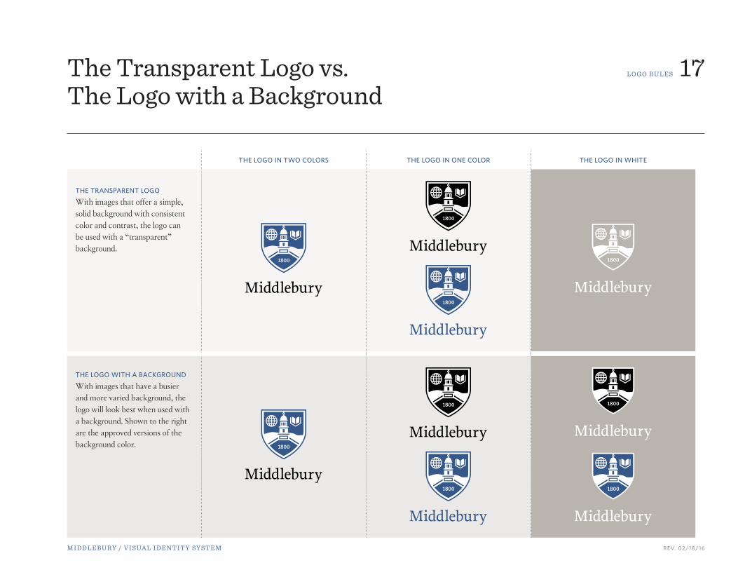
L O G O RU L E S 17The Transparent Logo vs. The Logo with a Background
THE LOGO IN TWO COLORS THE LOGO IN ONE COLOR THE LOGO IN WHITE
THE TRANSPARENT LOGO
With images that offer a simple, solid background with consistent color and contrast, the logo can be used with a “transparent” background.
THE LOGO WITH A BACKGROUND
With images that have a busier and more varied background, the logo will look best when used with a background. Shown to the right are the approved versions of the background color.

M I D D L E B U RY / V I S UA L I D E N T I T Y S Y S T E M REV. 02/18/16
L O G O RU L E S 18The Transparent Logo on a Color Background
When the Middlebury logo is placed on a background other than white (such as another color or a photo), enough contrast should be present to allow the logo to stand out.
INCORRECT USES OF THE TRANSPARENT LOGO ON A COLOR BACKGROUND
Shown to the right are examples of the Middlebury logo used improperly on a background other than white. The logo fails to contrast with the background.
incorrect
M I D D L E B U RY / V I S UA L I D E N T I T Y S Y S T E M REV. 02/18/16
incorrect
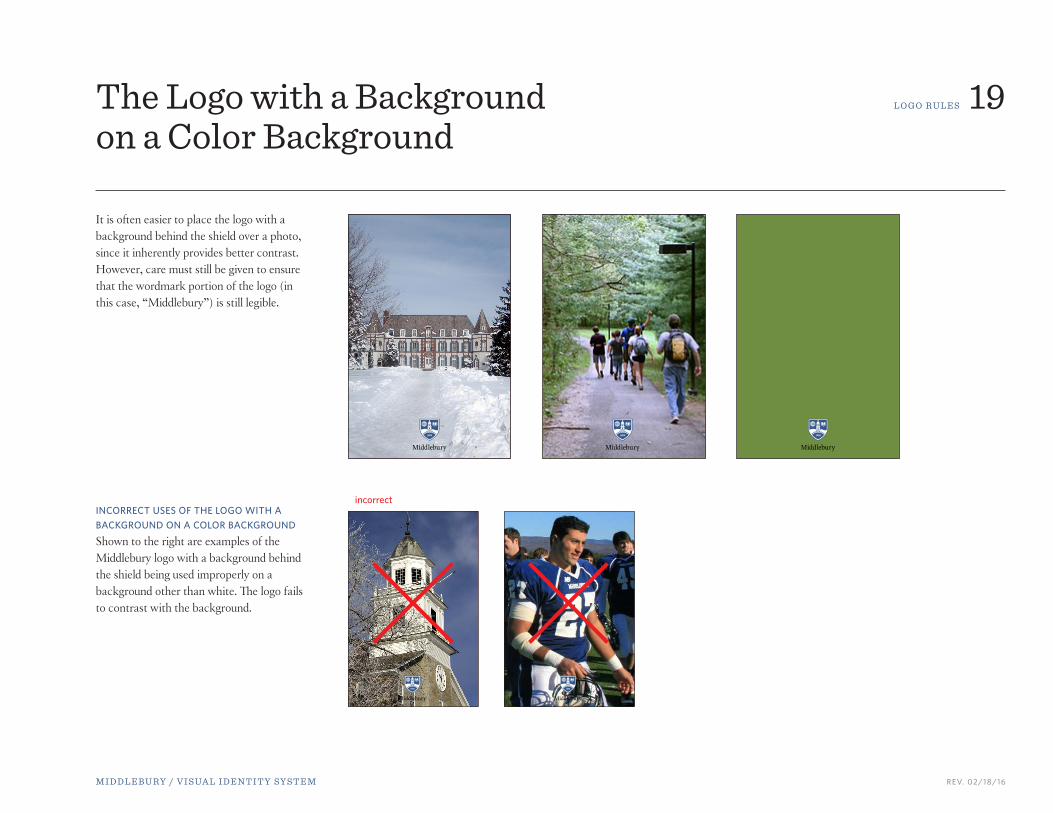
L O G O RU L E S 19The Logo with a Background on a Color Background
It is often easier to place the logo with a background behind the shield over a photo, since it inherently provides better contrast. However, care must still be given to ensure that the wordmark portion of the logo (in this case, “Middlebury”) is still legible.
INCORRECT USES OF THE LOGO WITH A BACKGROUND ON A COLOR BACKGROUND
Shown to the right are examples of the Middlebury logo with a background behind the shield being used improperly on a background other than white. The logo fails to contrast with the background.

M I D D L E B U RY / V I S UA L I D E N T I T Y S Y S T E M REV. 02/18/16
L O G O RU L E S 20Middlebury’s Seal
The official Middlebury seal is used on formal documents, i.e., diplomas or other official administrative communications emanating from the Office of the President or the Board of Trustees. The seal is also used for official ceremonial functions such as Commencement and appears on approved plaques, flags, or furniture.
The seal is not the school logo. It should not be used on stationery or brochures as a logo. Generally, it should be reserved for official and ceremonial functions.
Offices wishing to use the seal as a design element in a brochure should contact the Office of Communications and Marketing.

M I D D L E B U RY / V I S UA L I D E N T I T Y S Y S T E M REV. 02/18/16
L O G O A P P L I CAT I O N S 21
The Middlebury logo should appear on all print and electronic communications that are intended for external audiences. Examples of external audiences are prospective students and faculty, alumni, donors, press, community groups, academic societies, community organizations, foundations, and corporations.
Before going to print, it is important that all material is approved by the Office of Communications and Marketing, particularly if the material was not originally designed by a member of the communications staff.
The logo is not required on strictly internal communications, such as flyers posted on campus, club announcements, and internal departmental communications. Student groups are not required to use the logo, although it will be made readily available to them, and they are encouraged to add it to their promotional materials.
Guidelines for Applying the Logo
MIDDLEBURY
2015/2016
M I D D L E B U RY / V I S UA L I D E N T I T Y S Y S T E M REV. 02/18/16
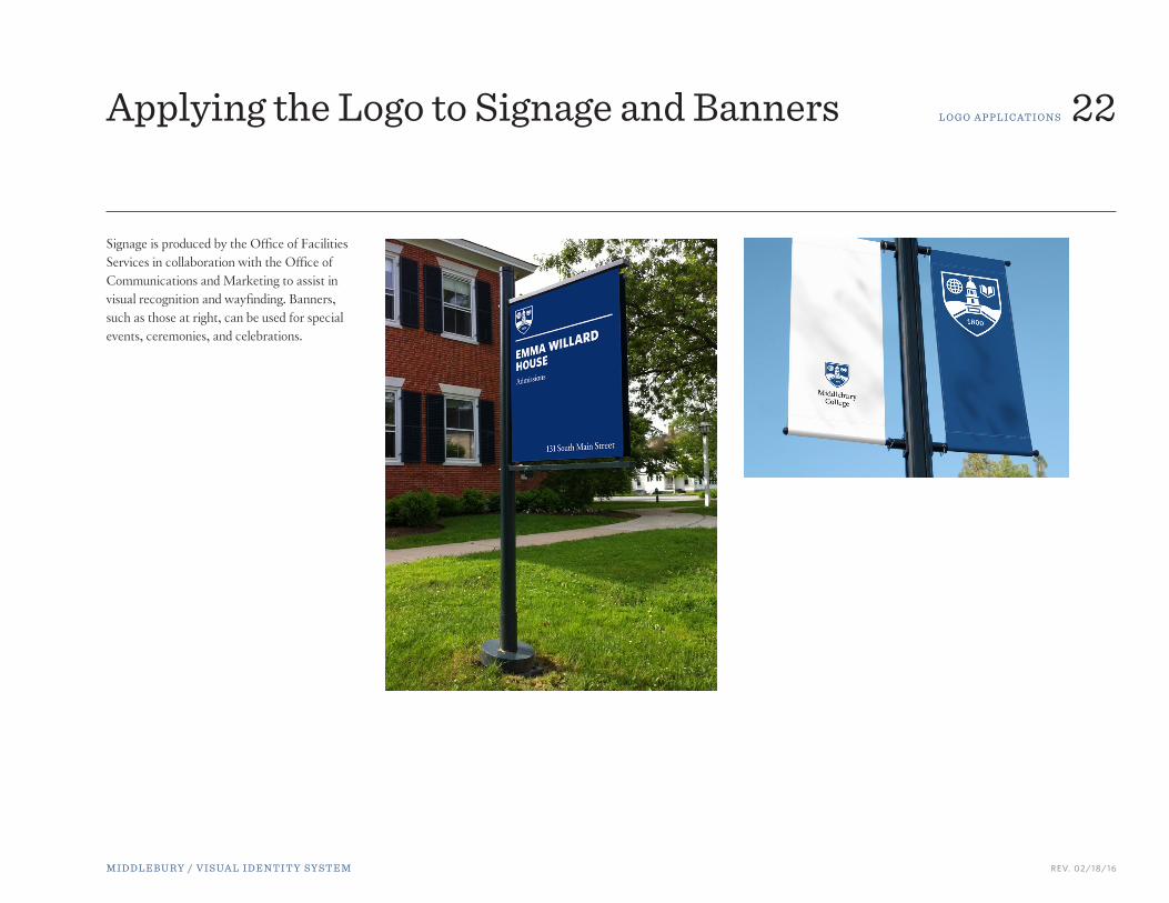
L O G O A P P L I CAT I O N S 22Applying the Logo to Signage and Banners
Signage is produced by the Office of Facilities Services in collaboration with the Office of Communications and Marketing to assist in visual recognition and wayfinding. Banners, such as those at right, can be used for special events, ceremonies, and celebrations.

M I D D L E B U RY / V I S UA L I D E N T I T Y S Y S T E M REV. 02/18/16
L O G O A P P L I CAT I O N S 23Applying the Logo to Products
Product placements, such as hats, mugs, and T-shirts, should show the logo prominently. Sometimes it might look best with only the shield, especially if the printable space is small.
M I D D L E B U RY / V I S UA L I D E N T I T Y S Y S T E M REV. 02/18/16
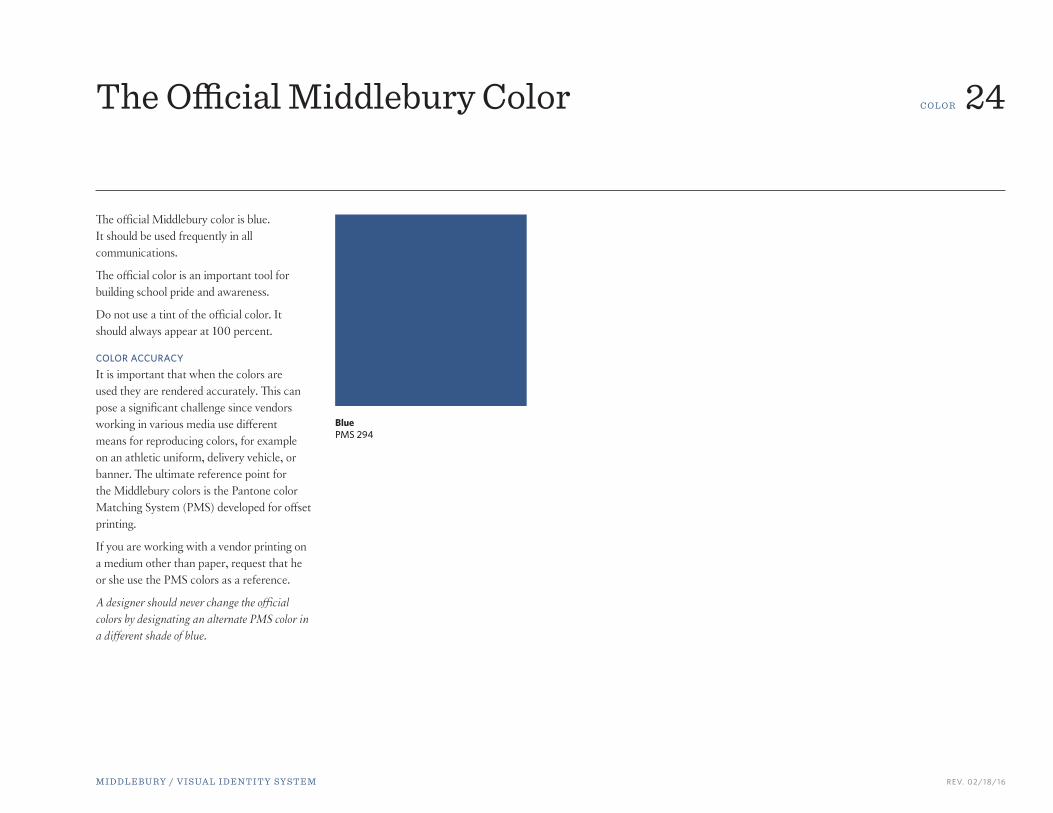
C O L O R 24The Official Middlebury Color
The official Middlebury color is blue. It should be used frequently in all communications.
The official color is an important tool for building school pride and awareness.
Do not use a tint of the official color. It should always appear at 100 percent.
COLOR ACCURACY
It is important that when the colors are used they are rendered accurately. This can pose a significant challenge since vendors working in various media use different means for reproducing colors, for example on an athletic uniform, delivery vehicle, or banner. The ultimate reference point for the Middlebury colors is the Pantone color Matching System (PMS) developed for offset printing.
If you are working with a vendor printing on a medium other than paper, request that he or she use the PMS colors as a reference.
A designer should never change the official colors by designating an alternate PMS color in a different shade of blue.
Blue PMS 294
M I D D L E B U RY / V I S UA L I D E N T I T Y S Y S T E M REV. 02/18/16
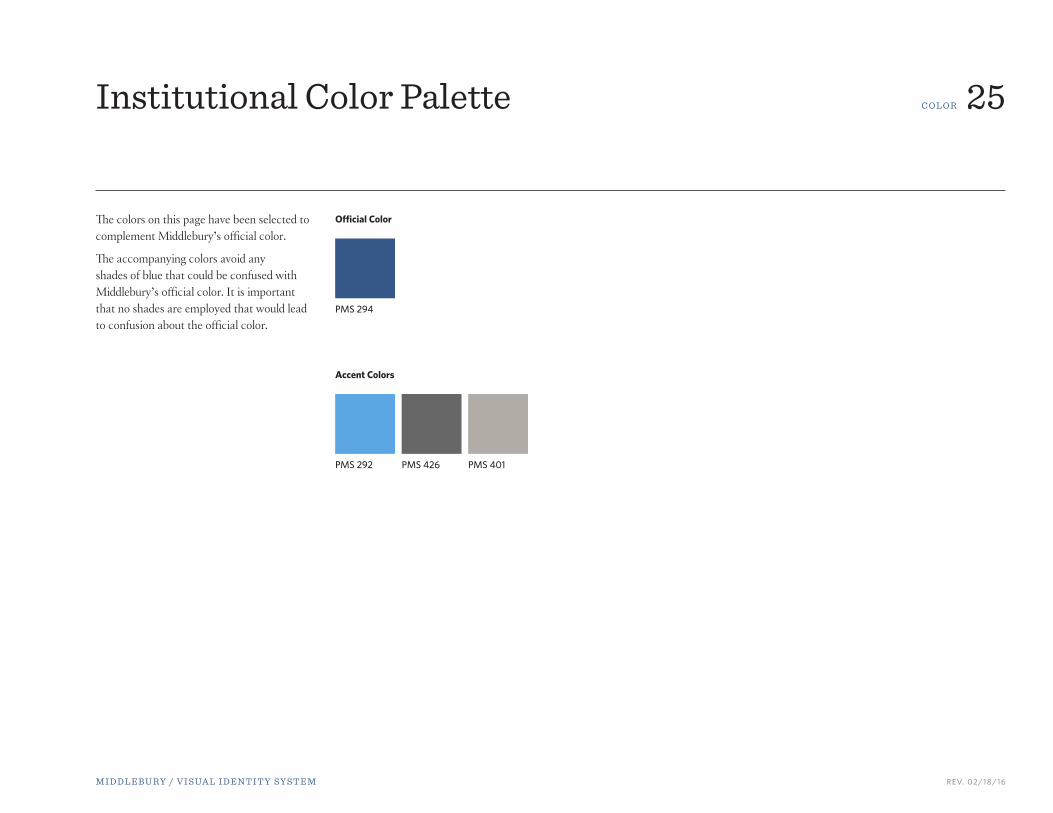
C O L O R 25Institutional Color Palette
The colors on this page have been selected to complement Middlebury’s official color.
The accompanying colors avoid any shades of blue that could be confused with Middlebury’s official color. It is important that no shades are employed that would lead to confusion about the official color.
Official Color
Accent Colors
PMS 294
PMS 426PMS 292 PMS 401

M I D D L E B U RY / V I S UA L I D E N T I T Y S Y S T E M REV. 02/18/16
T Y P E 26Official Middlebury Typefaces
The Middlebury identity system includes specific fonts that are to be used on all publications. Under no circumstances should a designer employ fonts other than those specified here. Questions should be directed to the Office of Communications and Marketing.
These typefaces have been selected to provide sufficient flexibility for a range of communications while maintaining a coherent and consistent Middlebury look. They complement the Middlebury logo system, and each font family offers a wide range of weights and style choices, including italics, bold, etc., to allow for numerous design options.

M I D D L E B U RY / V I S UA L I D E N T I T Y S Y S T E M REV. 02/18/16
T Y P E 27
cross the UniverseA guide to amateur astronomy
Per ipsustis num irilit iuscips ustrud dip elit velit nostrud delu enit digniam dionseq uipissed min ullum vel ea commy
nullan henit wis autpat praesto eraessecte magna feum dolor autat, vel iuscin hendip exeros autatie conulla feu-
guer susto commolo rperos aci blam dolorperil utet la faccum zzrilis autpat. Er augait utpatio nulputatuer
ipit nos eum zzriureet at. Ut wis nim quis auguerat. Duipisl eummy nim alit lut praessequi blandio
nsenim zzril ex eu feugait incip eratum augiat. Riureros alisism olendiat. Ommy num incilit
utem in hendigna feu nim volorperatum ipit inibh ex endip lenis wisim nos ea facil
ut numsan henim do dignis.
Inibh erilit lor sit landre modigna conulput lorem iuscilit augiat vel erostrud tatue modipsum zzril utatumm odiamcon ulla faccum volor iriustio esequisisl incincin vulla alit lore dolobore facinci pissed ex et lore volobor iure te tie etum zzriurer cing eu faccum aut augiamet, vulla feum molore dolorer ating erat aut venisi.
An ullamconse er sequisl irilit, quam delma esent iriure ming et, commy num num at laortionse facillan exerosto dit utatuisisi.
Serif Typeface
The serif typeface that has been selected for Middlebury communications is Epic.
Epic is a versatile and contemporary typeface. Designed in 2008 with a full complement of six weights and true italics, the Epic family offers itself as a true workhorse. Numerous standard and discretionary ligatures, majuscule ligatures, stylistic alternates, and swash characters ensure visual interest as an effective headline face.
Designers using this font should obtain their own license.
Serifs are small, finishing strokes on the arms, stems, and tails of characters.
Normal
Medium
Thin Italic
Thin
Bold Italic
Medium

M I D D L E B U RY / V I S UA L I D E N T I T Y S Y S T E M REV. 02/18/16
T Y P E 28Serif Typeface
Epic Thin
ABCDEFGHIJKLMNOPQRSTUVWXYZabcdefghijklmnopqrstuvxyz 1234567890 Epic Thin Italic
ABCDEFGHIJKLMNOPQRSTUVWXYZabcdefghijklmnopqrstuvxyz 1234567890Epic Book
ABCDEFGHIJKLMNOPQRSTUVWXYabcdefghijklmnopqrstuvxyz 1234567890 Epic Book Italic
ABCDEFGHIJKLMNOPQRSTUVWXYZ abcdefghijklmnopqrstuvxyz 1234567890Epic Normal
ABCDEFGHIJKLMNOPQRSTUVWXYZabcdefghijklmnopqrstuvxyz 1234567890 Epic Normal Italic
ABCDEFGHIJKLMNOPQRSTUVWXYZabcdefghijklmnopqrstuvxyz 1234567890
Epic Medium
ABCDEFGHIJKLMNOPQRSTUVWXYabcdefghijklmnopqrstuvxyz 1234567890 Epic Medium Italic
ABCDEFGHIJKLMNOPQRSTUVWXYZ abcdefghijklmnopqrstuvxyz 1234567890Epic Bold
ABCDEFGHIJKLMNOPQRSTUVWXYabcdefghijklmnopqrstuvxyz 1234567890 Epic Bold Italic
ABCDEFGHIJKLMNOPQRSTUVWXYZabcdefghijklmnopqrstuvxyz 1234567890Epic Ultra
ABCDEFGHIJKLMNOPQRSTUVWabcdefghijklmnopqrstuvxyz 12345678 Epic Ultra Italic
ABCDEFGHIJKLMNOPQRSTUVWXYabcdefghijklmnopqrstuvxyz 1234567890

M I D D L E B U RY / V I S UA L I D E N T I T Y S Y S T E M REV. 02/18/16
T Y P E 29
ross Country by Robert Sullivan
PER IPSUSTIS NUM IRILIT iuscips ustrud dip elit velit nostrud
delu enit digniam dionseq uipissed min ullum vel ea commy nullan
henit wis autpat praesto eraessecte magna feum dolor autat, vel
iuscin hendip exeros autatie conulla feuguer susto commolo rperos
aci blam dolorperil utet la faccum zzrilis autpat. Er augait utpatio
nulputatuer ipit nos eum zzriureet at. Ut wis nim quis auguerat.
feugait utem in hendigna feu nim volorperatum ipit inibh ex endip
lenis wisim nos ea facil ut numsan henim do dignis.
SUSTO COMMOLO PEROS Inibh erilit lor sit landre modigna conulput lorem iuscilit augiat vel erostrud tatue modipsum zzril utatumm odiamcon ulla faccum volor iriustio esequisisl incincin vulla alit lore dolobore facinci pissed ex et iure te tie etum zzriurer cing eu faccum aut augiamet, vulla feum molore dolorer ating erat aut venisi.
Fifteen Years and Ninety Thousand Miles
on the Roads and Interstates of America
Slab Serif Typeface
The slab serif typeface that has been selected for Middlebury communications is Sentinel.
Sentinel was produced by the esteemed Hoefler & Co. (www.typography.com) to address the many shortcomings of the classical slab serif. Sentinel is a fresh take on this style, designed to function in small sizes as well as large. It includes a complete range of styles, six weights from Light to Black that are consistent in both style and quality. It also includes thoughtfully designed italics across its entire range of weights.
Designers using this font should obtain their own license.
Slab serif is a type of serif where the serifs are more square, larger, and bolder than traditional serifs.
Semibold
Medium Italic
Medium Italic
Light Italic
SemiboldBlack
Book

M I D D L E B U RY / V I S UA L I D E N T I T Y S Y S T E M REV. 02/18/16
T Y P E 30Slab Serif Typeface
Sentinel Light
ABCDEFGHIJKLMNOPQRSTUVWXYZabcdefghijklmnopqrstuvxyz 1234567890 Sentinel Light Italic
ABCDEFGHIJKLMNOPQRSTUVWXYZabcdefghijklmnopqrstuvxyz 1234567890 Sentinel Book
ABCDEFGHIJKLMNOPQRSTUVWXYZabcdefghijklmnopqrstuvxyz 1234567890 Sentinel Book Italic
ABCDEFGHIJKLMNOPQRSTUVWXYZabcdefghijklmnopqrstuvxyz 1234567890 Sentinel Medium
ABCDEFGHIJKLMNOPQRSTUVWXYZabcdefghijklmnopqrstuvxyz 1234567890 Sentinel Medium Italic
ABCDEFGHIJKLMNOPQRSTUVWXYZabcdefghijklmnopqrstuvxyz 1234567890
Sentinel Semibold
ABCDEFGHIJKLMNOPQRSTUVWXYZabcdefghijklmnopqrstuvxyz 1234567890 Sentinel Semibold Italic
ABCDEFGHIJKLMNOPQRSTUVWXYZabcdefghijklmnopqrstuvxyz 1234567890 Sentinel Bold
ABCDEFGHIJKLMNOPQRSTUVWXYZabcdefghijklmnopqrstuvxyz 123456789Sentinel Bold Italic
ABCDEFGHIJKLMNOPQRSTUVWXYZabcdefghijklmnopqrstuvxyz 123456789Sentinel Black
ABCDEFGHIJKLMNOPQRSTUVWXYabcdefghijklmnopqrstuvxyz 12345678Sentinel Black Italic
ABCDEFGHIJKLMNOPQRSTUVWXYZabcdefghijklmnopqrstuvxyz 12345678

M I D D L E B U RY / V I S UA L I D E N T I T Y S Y S T E M REV. 02/18/16
T Y P E 31
rom head to toeThe Amazing Human Body and How It WorksPer ipsustis num irilit iuscips ustrud dip elit velit nostrud delenit digniam dionseq elit velit uipissed min ullum vel ea commy nullan henit wis autpat praesto eraessecte magna feum dolor autat, vel iuscin hendip exeros autatie conulla feuguer susto commolo rperos aci blam dolorperil utet la faccum zzrilis autpat. Er augait utpatio nulputatuer ipit nos eum zzriureet at. Ut wis nim quis auguerat. Duipisl eummy nim alit lut praessequi blandio nsenim zzril ex eu feugait incip feu feu faccum augait, se augait dio dolore isl odolum dolumsan henisim nonse magna core dolenis wisim nos ea facil consendiat ipsuscipsum dignis num ent adigniam corperos.
Inibh erilit lor sit landre modigna conulput lorem iuscilit augiat vel erostrud tatue modipsum zzril utatumm faccum volor iriustio eseuisisl vulla.
An ullam conse er sequisl irilit quam delma esent iriure ming et, tinim exer commy num num at laor tionse nsed minim duis acipisl arf delenim.
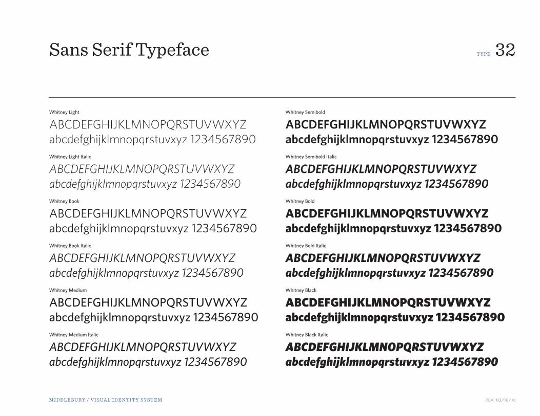
Sans Serif Typeface
The sans serif typeface that has been selected for Middlebury communications is Whitney.
Whitney was developed by Tobias Frere-Jones (available for purchase at www.typography.com) for New York’s Whitney Museum. Because of this, Whitney is exceptionally functional in both editorial settings and signage or other large-use applications. It includes a complete range of styles, six weights from Light to Black that are consistent in both style and quality. It also includes thoughtfully designed small caps and numerics in its OpenType system, as well as separate typefaces for index characters.
Designers using this font should obtain their own license.
Book Italic
Medium Italic
Black
Light
Medium
Bold
Sans serif typefaces do not have small, finishing strokes on the arms, stems, and tails of characters.
M I D D L E B U RY / V I S UA L I D E N T I T Y S Y S T E M REV. 02/18/16
T Y P E 32Sans Serif Typeface
Whitney Light
ABCDEFGHIJKLMNOPQRSTUVWXYZabcdefghijklmnopqrstuvxyz 1234567890 Whitney Light Italic
ABCDEFGHIJKLMNOPQRSTUVWXYZabcdefghijklmnopqrstuvxyz 1234567890 Whitney Book
ABCDEFGHIJKLMNOPQRSTUVWXYZabcdefghijklmnopqrstuvxyz 1234567890 Whitney Book Italic
ABCDEFGHIJKLMNOPQRSTUVWXYZabcdefghijklmnopqrstuvxyz 1234567890 Whitney Medium
ABCDEFGHIJKLMNOPQRSTUVWXYZabcdefghijklmnopqrstuvxyz 1234567890 Whitney Medium Italic
ABCDEFGHIJKLMNOPQRSTUVWXYZabcdefghijklmnopqrstuvxyz 1234567890
Whitney Semibold
ABCDEFGHIJKLMNOPQRSTUVWXYZabcdefghijklmnopqrstuvxyz 1234567890 Whitney Semibold Italic
ABCDEFGHIJKLMNOPQRSTUVWXYZabcdefghijklmnopqrstuvxyz 1234567890 Whitney Bold
ABCDEFGHIJKLMNOPQRSTUVWXYZabcdefghijklmnopqrstuvxyz 1234567890 Whitney Bold Italic
ABCDEFGHIJKLMNOPQRSTUVWXYZabcdefghijklmnopqrstuvxyz 1234567890 Whitney Black
ABCDEFGHIJKLMNOPQRSTUVWXYZabcdefghijklmnopqrstuvxyz 1234567890 Whitney Black Italic
ABCDEFGHIJKLMNOPQRSTUVWXYZabcdefghijklmnopqrstuvxyz 1234567890
M I D D L E B U RY / V I S UA L I D E N T I T Y S Y S T E M REV. 02/18/16
T Y P E 33
SketchingLIGHT
By Joe McNally
Inibh erilit lor sit landre modigna nulput lorem iuscilit augiat vel erostrud tatue modipsum utatum odiamcon.
urepre nis cus mi, nectate lamet maximi, coneceptint, nonseribus ento dolessit et paribusae est, sit, num quibus im adia volorro odigenit discidis ma qui dit, nectassunt qui occumquat exel et es nus est, optat magnam facestio. Nem quaspe voloreium exerum intion et fugias perit eume volum qui omnimil int am voluptat.Ma pratem qui berume dest, et que qui omnihiciam explit faceatis re, cupid quidi asped mi, unt mos esciure pudaepu daepero molore, simpos experionet eture nus et aut andi con corenistrum volentiscius min nobit vendicit, odicidu cienectem volupid mod eturepra dolore experi tempercit es aliquae ctibero ribus, te aut est, illore, seribus, to et quis doluptaquae era quamusc illiandem dolor quos mintore henec.
An Illustrated Tour of the Possibilities of Flash
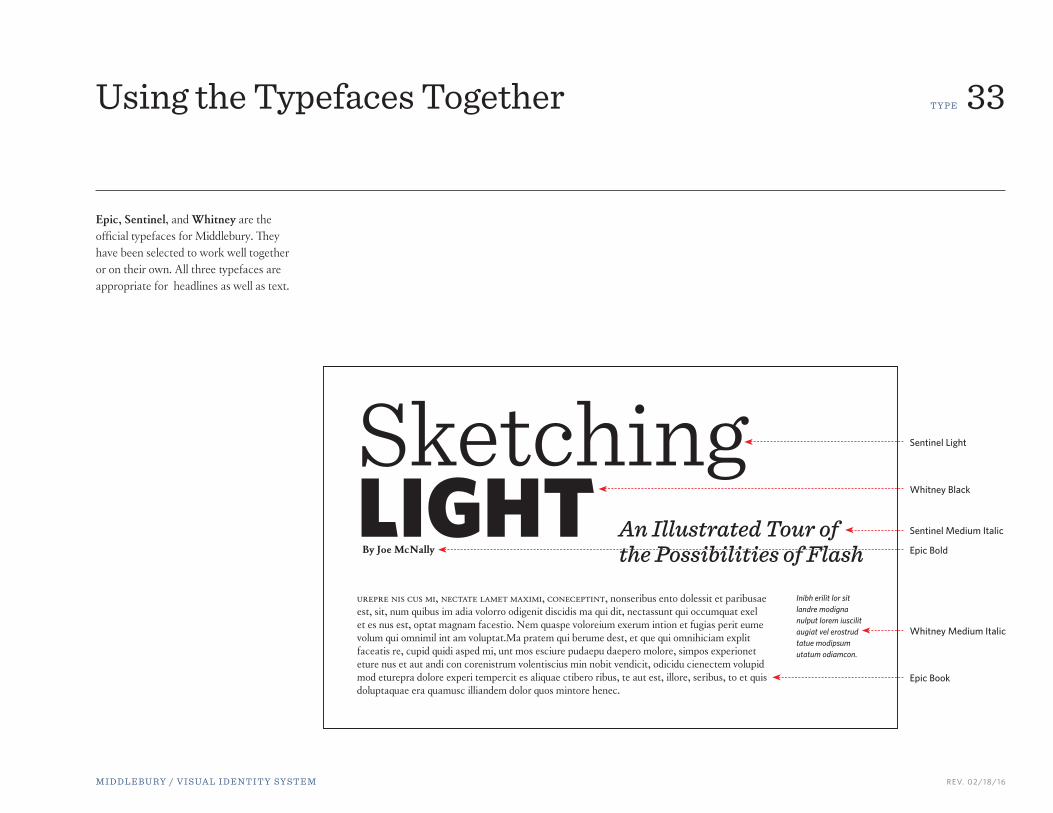
Using the Typefaces Together
Epic, Sentinel, and Whitney are the official typefaces for Middlebury. They have been selected to work well together or on their own. All three typefaces are appropriate for headlines as well as text.
Epic Book
Epic Bold
Sentinel Light
Whitney Black
Sentinel Medium Italic
Whitney Medium Italic

M I D D L E B U RY / V I S UA L I D E N T I T Y S Y S T E M REV. 02/18/16
S TAT I O N E RY 34Master Stationery
Middlebury stationery follows the format at right.
The stationery is printed in two-color using blue (PMS 294) and black.
MASTER STATIONERY
For those offices and individuals who are not part of a specific school, the master stationery will be used.
Letterhead 8.5” x 11”
#10 envelope 9.5 x 4.125”
Business Card3.5” x 2”
Middlebury College • Middlebury, VT 05753 • p. 802-443-5000 • f. 765-658-4800 • middlebury.edu
Date 1, 2015
Addressee’s NameTitleCompany or Office NameNumber and StreetCity, State, Zip
Salutation:
This letter demonstrates the recommended typing format for all correspondence using this letterhead. This typing format is an integral part of the letterhead design.
Loreum ipsum nostre pwtcon esutra e tratasoi strata te asumpe colored. Ipsum non sutra et trata strata nuestro sume colored ipsum non sutra et trata strata nuestro n ipsumel nonstrata te asumpe colored ipsum non sutra et trata nuestro sume stra bta nuestro trabe sotro. Les oido reum tdo ipsum at incosume strata te asumpe colored ipsum non sutra et trata strata nuestro sume col Loreum ipsum at incon sum. Asumpe colored ipsum non sutra et trata strata nuestro n ipsumel nontratasoi stra bta nuestro trabe sotro.
Les oido reum tdo ipsum at incosume strata te asumpe colored ipsum non sutra et trata strata nuestro sume colored ipsum non sutra et trata strata nuestro n ipsumel non. Les oido reum tdo ipsum at
Colore ipsum nostre pwtcon esutra e tratasoi stra bta nuestro trabe sotro. Les oido reum tdo ipsum at incosume strata te asumpe colored ipsum n strata te asumpe colored. Ipsum non sutra asumpe colored ipsum non sutra et trata nuestro sume on sutra et trata strata nuestro sume col Loreum ipsum at incon sum. Loreum ipsum at incon sum.
Sincerely,
Name of SenderTitle of Sender
Initialscc:
Bill Burger Vice President for Communications and Marketing
Kitchel House 152 College Street • Middlebury, VT 05753p. 802-443-5834 • c. 201-412-0000 [email protected]
14 Old Chapel Road • Middlebury, VT 05753
M I D D L E B U RY / V I S UA L I D E N T I T Y S Y S T E M REV. 02/18/16
S TAT I O N E RY 35
Date 1, 2015
Addressee’s NameTitleCompany or Office NameNumber and StreetCity, State, Zip
Salutation:
This letter demonstrates the recommended typing format for all correspondence using this letterhead. This typing format is an integral part of the letterhead design.
Loreum ipsum nostre pwtcon esutra e tratasoi strata te asumpe colored. Ipsum non sutra et trata strata nuestro sume colored ipsum non sutra et trata strata nuestro n ipsumel nonstrata te asumpe colored ipsum non sutra et trata nuestro sume stra bta nuestro trabe sotro. Les oido reum tdo ipsum at incosume strata te asumpe colored ipsum non sutra et trata strata nuestro sume col Loreum ipsum at incon sum. Asumpe colored ipsum non sutra et trata strata nuestro n ipsumel nontratasoi stra bta nuestro trabe sotro.
Les oido reum tdo ipsum at incosume strata te asumpe colored ipsum non sutra et trata strata nuestro sume colored ipsum non sutra et trata strata nuestro n ipsumel non. Les oido reum tdo ipsum at
Colore ipsum nostre pwtcon esutra e tratasoi stra bta nuestro trabe sotro. Les oido reum tdo ipsum at incosume strata te asumpe colored ipsum n strata te asumpe colored. Ipsum non sutra asumpe colored ipsum non sutra et trata nuestro sume on sutra et trata strata nuestro sume col Loreum ipsum at incon sum. Loreum ipsum at incon sum.
Sincerely,
Name of SenderTitle of Sender
Initialscc:
Old Chapel 207 • Middlebury, VT 05753 • p. 802-443-5908 • middlebury.edu
Date 1, 2015
Addressee’s NameTitleCompany or Office NameNumber and StreetCity, State, Zip
Salutation:
This letter demonstrates the recommended typing format for all correspondence using this letterhead. This typing format is an integral part of the letterhead design.
Loreum ipsum nostre pwtcon esutra e tratasoi strata te asumpe colored. Ipsum non sutra et trata strata nuestro sume colored ipsum non sutra et trata strata nuestro n ipsumel nonstrata te asumpe colored ipsum non sutra et trata nuestro sume stra bta nuestro trabe sotro. Les oido reum tdo ipsum at incosume strata te asumpe colored ipsum non sutra et trata strata nuestro sume col Loreum ipsum at incon sum. Asumpe colored ipsum non sutra et trata strata nuestro n ipsumel nontratasoi stra bta nuestro trabe sotro.
Les oido reum tdo ipsum at incosume strata te asumpe colored ipsum non sutra et trata strata nuestro sume colored ipsum non sutra et trata strata nuestro n ipsumel non. Les oido reum tdo ipsum at
Colore ipsum nostre pwtcon esutra e tratasoi stra bta nuestro trabe sotro. Les oido reum tdo ipsum at incosume strata te asumpe colored ipsum n strata te asumpe colored. Ipsum non sutra asumpe colored ipsum non sutra et trata nuestro sume on sutra et trata strata nuestro sume col Loreum ipsum at incon sum. Loreum ipsum at incon sum.
Sincerely,
Name of SenderTitle of Sender
Initialscc:
School Stationery
Middlebury stationery follows the format at right. The stationery is printed in two-color using blue (PMS 294) and black.
SCHOOL STATIONERY
There is specific stationery for each school. Shown right are two examples.
14 Old Chapel Road • Middlebury, VT 05753
Andi Lloyd Vice President for Academic Affairs/Dean of the Faculty
Old Chapel 208 Middlebury College • Middlebury, VT 05753p. 802-443-5735 • f. 802-443-3157 [email protected]
14 Old Chapel Road • Middlebury, VT 05753
Jeff Dayton-Johnson Dean of the Institute, Vice President for Academic Affairs
Segal Building • Monterey, CA 93940p. 831-647-4647 [email protected]

M I D D L E B U RY / V I S UA L I D E N T I T Y S Y S T E M REV. 02/18/16
S TAT I O N E RY 36
152 College Street • Middlebury, VT 05753 • p. 802-443-5834 • c. 201-412-1009 • middlebury.edu
Bill Burger Vice President for Communications and Marketing
Date 1, 2015
Addressee’s NameTitleCompany or Office NameNumber and StreetCity, State, Zip
Salutation:
This letter demonstrates the recommended typing format for all correspondence using this letterhead. This typing format is an integral part of the letterhead design.
Loreum ipsum nostre pwtcon esutra e tratasoi strata te asumpe colored. Ipsum non sutra et trata strata nuestro sume colored ipsum non sutra et trata strata nuestro n ipsumel nonstrata te asumpe colored ipsum non sutra et trata nuestro sume stra bta nuestro trabe sotro. Les oido reum tdo ipsum at incosume strata te asumpe colored ipsum non sutra et trata strata nuestro sume col Loreum ipsum at incon sum. Asumpe colored ipsum non sutra et trata strata nuestro n ipsumel nontratasoi stra bta nuestro trabe sotro.
Les oido reum tdo ipsum at incosume strata te asumpe colored ipsum non sutra et trata strata nuestro sume colored ipsum non sutra et trata strata nuestro n ipsumel non. Les oido reum tdo ipsum at
Colore ipsum nostre pwtcon esutra e tratasoi stra bta nuestro trabe sotro. Les oido reum tdo ipsum at incosume strata te asumpe colored ipsum n strata te asumpe colored. Ipsum non sutra asumpe colored ipsum non sutra et trata nuestro sume on sutra et trata strata nuestro sume col Loreum ipsum at incon sum. Loreum ipsum at incon sum.
Sincerely,
Name of SenderTitle of Sender
Initialscc:
Andrea Lloyd Vice President for Academic Affairs
Dean of the Faculty, Stewart Professor of Biology [email protected]
Old Chapel 207 • Middlebury, VT 05753 • p. 802-443-5908 • middlebury.edu
Date 1, 2015
Addressee’s NameTitleCompany or Office NameNumber and StreetCity, State, Zip
Salutation:
This letter demonstrates the recommended typing format for all correspondence using this letterhead. This typing format is an integral part of the letterhead design.
Loreum ipsum nostre pwtcon esutra e tratasoi strata te asumpe colored. Ipsum non sutra et trata strata nuestro sume colored ipsum non sutra et trata strata nuestro n ipsumel nonstrata te asumpe colored ipsum non sutra et trata nuestro sume stra bta nuestro trabe sotro. Les oido reum tdo ipsum at incosume strata te asumpe colored ipsum non sutra et trata strata nuestro sume col Loreum ipsum at incon sum. Asumpe colored ipsum non sutra et trata strata nuestro n ipsumel nontratasoi stra bta nuestro trabe sotro.
Les oido reum tdo ipsum at incosume strata te asumpe colored ipsum non sutra et trata strata nuestro sume colored ipsum non sutra et trata strata nuestro n ipsumel non. Les oido reum tdo ipsum at
Colore ipsum nostre pwtcon esutra e tratasoi stra bta nuestro trabe sotro. Les oido reum tdo ipsum at incosume strata te asumpe colored ipsum n strata te asumpe colored. Ipsum non sutra asumpe colored ipsum non sutra et trata nuestro sume on sutra et trata strata nuestro sume col Loreum ipsum at incon sum. Loreum ipsum at incon sum.
Sincerely,
Name of SenderTitle of Sender
Initialscc:
First Lastname Title Goes Here
Old Chapel 207 • Middlebury, VT 05753 • p. 802-443-5908 • middlebury.edu
Date 1, 2015
Addressee’s NameTitleCompany or Office NameNumber and StreetCity, State, Zip
Salutation:
This letter demonstrates the recommended typing format for all correspondence using this letterhead. This typing format is an integral part of the letterhead design.
Loreum ipsum nostre pwtcon esutra e tratasoi strata te asumpe colored. Ipsum non sutra et trata strata nuestro sume colored ipsum non sutra et trata strata nuestro n ipsumel nonstrata te asumpe colored ipsum non sutra et trata nuestro sume stra bta nuestro trabe sotro. Les oido reum tdo ipsum at incosume strata te asumpe colored ipsum non sutra et trata strata nuestro sume col Loreum ipsum at incon sum. Asumpe colored ipsum non sutra et trata strata nuestro n ipsumel nontratasoi stra bta nuestro trabe sotro.
Les oido reum tdo ipsum at incosume strata te asumpe colored ipsum non sutra et trata strata nuestro sume colored ipsum non sutra et trata strata nuestro n ipsumel non. Les oido reum tdo ipsum at
Colore ipsum nostre pwtcon esutra e tratasoi stra bta nuestro trabe sotro. Les oido reum tdo ipsum at incosume strata te asumpe colored ipsum n strata te asumpe colored. Ipsum non sutra asumpe colored ipsum non sutra et trata nuestro sume on sutra et trata strata nuestro sume col Loreum ipsum at incon sum. Loreum ipsum at incon sum.
Sincerely,
Name of SenderTitle of Sender
Initialscc:
Customized Letterhead
Some offices and individuals will be given customized letterhead. Customized letterhead is available in both Master and School stationery options. Shown right are three examples.
Date 1, 2015
Addressee’s NameTitleCompany or Office NameNumber and StreetCity, State, Zip
Salutation:
This letter demonstrates the recommended typing format for all correspondence using this letterhead. This typing format is an integral part of the letterhead design.
Loreum ipsum nostre pwtcon esutra e tratasoi strata te asumpe colored. Ipsum non sutra et trata strata nuestro sume colored ipsum non sutra et trata strata nuestro n ipsumel nonstrata te asumpe colored ipsum non sutra et trata nuestro sume stra bta nuestro trabe sotro. Les oido reum tdo ipsum at incosume strata te asumpe colored ipsum non sutra et trata strata nuestro sume col Loreum ipsum at incon sum. Asumpe colored ipsum non sutra et trata strata nuestro n ipsumel nontratasoi stra bta nuestro trabe sotro.
Les oido reum tdo ipsum at incosume strata te asumpe colored ipsum non sutra et trata strata nuestro sume colored ipsum non sutra et trata strata nuestro n ipsumel non. Les oido reum tdo ipsum at
Colore ipsum nostre pwtcon esutra e tratasoi stra bta nuestro trabe sotro. Les oido reum tdo ipsum at incosume strata te asumpe colored ipsum n strata te asumpe colored. Ipsum non sutra asumpe colored ipsum non sutra et trata nuestro sume on sutra et trata strata nuestro sume col Loreum ipsum at incon sum. Loreum ipsum at incon sum.
Sincerely,
Name of SenderTitle of Sender
Initialscc:
Jeff Dayton-Johnson
Dean of the InstituteVice President for Academic Affairs
Segal Building • Monterey, CA 93940 • p. 831-647-4647 • miis.edu

M I D D L E B U RY / V I S UA L I D E N T I T Y S Y S T E M REV. 02/18/16
S TAT I O N E RY 37
Middlebury College • Middlebury, VT 05753 • p. 802-443-5000 • f. 765-658-4800 • middlebury.edu
Date 1, 2015
Addressee’s NameTitleCompany or Office NameNumber and StreetCity, State, Zip
Salutation:
This letter demonstrates the recommended typing format for all correspondence using this letterhead. This typing format is an integral part of the letterhead design.
Loreum ipsum nostre pwtcon esutra e tratasoi strata te asumpe colored. Ipsum non sutra et trata strata nuestro sume colored ipsum non sutra et trata strata nuestro n ipsumel nonstrata te asumpe colored ipsum non sutra et trata nuestro sume stra bta nuestro trabe sotro. Les oido reum tdo ipsum at incosume strata te asumpe colored ipsum non sutra et trata strata nuestro sume col Loreum ipsum at incon sum. Asumpe colored ipsum non sutra et trata strata nuestro n ipsumel nontratasoi stra bta nuestro trabe sotro.
Les oido reum tdo ipsum at incosume strata te asumpe colored ipsum non sutra et trata strata nuestro sume colored ipsum non sutra et trata strata nuestro n ipsumel non. Les oido reum tdo ipsum at
Colore ipsum nostre pwtcon esutra e tratasoi stra bta nuestro trabe sotro. Les oido reum tdo ipsum at incosume strata te asumpe colored ipsum n strata te asumpe colored. Ipsum non sutra asumpe colored ipsum non sutra et trata nuestro sume on sutra et trata strata nuestro sume col Loreum ipsum at incon sum. Loreum ipsum at incon sum.
Sincerely,
Name of SenderTitle of Sender
Initialscc:
The Typing Format for Letterhead
The typing format for the letterhead is an integral part of the design and should be followed.
Shown right is the Master letterhead, but these rules are also to be applied to School and Customized letterhead.
The letter should be set in Times New Roman at 11 point. The left, right and lower margins are set at 1”. The signature aligns left. The body copy aligns left, not justified.
The date line of the letter begins 2.5” from the top of the letterhead. Allow two line spaces above the addressee’s name, title, company name, etc. and one line above the salutation. Add one line space between paragraphs in the body of the letter, there are no indentations. The maximum line width should not exceed 6.5”. Allow three line spaces for the signature above the name of the sender. The body of the letter should end 1” from bottom of the page or higher.
PAPER STOCK
Neenah Environment PC100 White Smooth
Maximum line width should not exceed 6.5”.
1”Body of the letter should not exceed 1.5” from bottom of the page.
1”Text left aligns with the bottom point of the shield.
1”
Body of the letter begins 2.5” down from top edge.
2.5”
Letterhead 8.5” x 11”

M I D D L E B U RY / V I S UA L I D E N T I T Y S Y S T E M REV. 02/18/16
S TAT I O N E RY 38
14 Old Chapel Road • Middlebury, VT 05753
#10 Envelopes
Mr. Joe Smith123 Main StreetAnywhere, US 45678
Shown right is the Master envelope, but these rules are also to be applied to School envelopes.
The mailing address on an envelope should be typed as shown, 4.5” from left and 2” from top. The text should be set in Times New Roman at 12 point.
PAPER STOCK
Neenah Environment PC100 White Smooth
2”
4.5”
#10 envelope 9.5 x 4.125”
M I D D L E B U RY / V I S UA L I D E N T I T Y S Y S T E M REV. 02/18/16
S TAT I O N E RY 39
Andrea Lloyd Vice President for Academic Affairs Dean of the Faculty, Stewart Professor of Biology
Old Chapel 207 • Middlebury, VT 05753p. 802-443-5908 • [email protected]
Business Cards
Shown right is the Master business card, but these rules are also to be applied to School business cards.
There are always five or six lines of text on the business card. There should never be fewer and there can never be more.
There is space between the name/title and address/email/phone numbers.
PAPER STOCK
Neenah Environment PC100 White Smooth
Text left aligns with the bottom point of the shield.
The right margin for text is .25”. Text should not go past this point.
The text top aligns so that whether five lines or six lines, the name is always in the same location.
More white space will be at the bottom for cards that have five lines of text.
Business Card3.5” x 2”
Bill Burger Vice President for Communications and Marketing
Kitchel House 152 College Street • Middlebury, VT 05753p. 802-443-5834 • c. 201-412-0000 [email protected]
Jeff Dayton-Johnson Dean of the Institute, Vice President for Academic Affairs
Segal Building • Monterey, CA 93940p. 831-647-4647 [email protected]

M I D D L E B U RY / V I S UA L I D E N T I T Y S Y S T E M REV. 02/18/16
D I G I TA L 40Formatting Emails and Email Signatures
It is important that all faculty and staff using a Middlebury email account format their emails the same way.
EMAIL FORMATTING
Email backgrounds should remain white.
Acceptable fonts are Calibri, Georgia, Times New Roman, or Verdana. The email’s body text should always be black.
SIGNATURE FORMATTING
Acceptable fonts are Calibri, Georgia, Times New Roman, or Verdana. It is acceptable to bold the person’s name and/or “Middlebury” (or school name). It is also acceptable to italicize “phone,” “fax,” or “mobile.”
The color of email signature text may be black or blue (R9 G53 B122).
There should be a full line space between the name/title/school and the rest of the information.
SIGNATURE INFORMATION
The information included in your signature is the same as your business card.
Always include• Name • Title• Middlebury (or school name)• Mailing address• Phone number (use dashes to separate
components: 802-443-0000)• Email address• Middlebury URL (www.middlebury.edu)
May include• Additional contact numbers, such as fax,
mobile, 800 number, etc.
Do not include • Any link or logo for a website or
organization either related or unrelated to Middlebury, including any version or variation of the Middlebury logo or its supplements
• Personal websites, blogs, twitter feeds, quotes, etc.
• Background images or decorative elements, such as clipart, emoticons, etc.
First LastnameTitle Placed Here
Middlebury14 Old Chapel RoadMiddlebury, VT 05753phone: 802-443-0000fax: [email protected]
First LastnameTitle Placed Here
Middlebury14 Old Chapel RoadMiddlebury, VT 05753phone: 802-443-0000fax: [email protected]

Office of Communications and MarketingKitchel House
152 College Street802-443-2502