Embed Size (px)
Citation preview

360 Albert Street, Suite 1740, Ottawa ON K1R 7X7 613.236.8196 613.233.4552
[email protected] / [email protected] www.cia-ica.ca
Memorandum
To: Pension Experience Subcommittee
From: Bob Howard
Date: February 13, 2014
Subject: CPM 2014 Mortality Tables Document 214014
1. BACKGROUND This memorandum sets out the method that I used for constructing mortality tables, the justification for the parameters, and the finished results. The underlying data is the registered pension plan (RPP) dataset, collected by MIB Solutions and modified by me as the subcommittee agreed. I used data for pensioners only; experience is always by amount of pension rather than by record count. Details regarding the collection and validation of data are provided in the study prepared by the subcommittee and the report prepared by MIB Solutions.
This memorandum replaces CIA publication 213060 published on July 31, 2013. There are several changes in method and results, but only one is of major significance, the introduction of weights by industry to make the data more representative of the Canadian defined benefit (DB) population. (Data in this document up to section 6 is always unweighted, and weighted by industry for sections 7 and later, unless stated explicitly otherwise.) The changes are not highlighted in this document.
2. DEFINITIONS yxq means the probability that a person, age x nearest birthday at the beginning of calendar year
y, will die before reaching the end of the calendar year. Note that both x and y are defined at the beginning of the one-year period.
yxI means the improvement rate in mortality for persons aged x nearest birthday at the start of
calendar year y-1 to those aged x at the start of calendar year y. In this case x is constant through the one-year period, and y is defined at the end of the period.

2
Thus )1(1 yx
yx
yx Iqq −= −
However, this definition yields a rather odd application if one desires improvement for a partial year, for example, at the middle of year y-1. It is odd because the improvement factor is indexed for year y, but the mortality rate is indexed for year y-1.
5.015.0 )1( yx
yx
yx Iqq −= −−
In what follows, I rarely use the actuarial symbols, but I do refer to a mortality rate or improvement rate for a year. The above definitions are to clarify what I intend.
3. IDENTIFYING THE NEED FOR A NEW CANADIAN TABLE Chart 1 shows the ratio of actual deaths, measured by annualized pension, to expected deaths on UP94 projected on scale AA to 2004 (UP94AA04). The bars represent males and females for the indicated five-year age groupings.
The mortality rates of the dataset are clearly well under those anticipated by UP94AA04 until higher ages. However, the more serious problem is that the slope is different. If the bars of the chart were all about the same height, then we could adjust UP94AA04 by a simple multiple. Because the slope of actual experience is materially steeper than expected, there is no good solution other than to construct a new table.
4. OVERVIEW OF METHOD The method for constructing the new tables can be divided into the following steps. Note that all calculations use the data by amount of pension; data by number of lives is not used in table construction.
60%
70%
80%
90%
100%
110%
60-64 65-69 70-74 75-79 80-84 85-89 90-94 95-99
Chart 1. Actual to Expected on UP94AA04, by pension
Male Female

3
1. Decide on what ages to include in the main graduation; 2. Adjust amount of deaths to reflect the impact of improvement to 2014; 3. Adjust the weightings by industry to reflect better the Canadian DB population; 4. Adjust the data to normalize the distribution by size band across all ages; 5. Graduate the data using Whittaker-Henderson; 6. Extend to younger and older ages using data from other sources; and 7. Develop adjustment factors by size of pension.
Each of these steps is described in detail below.
5. AGES TO USE The data are not uniformly distributed by age. There are plenty of data for constructing a table in the mid-range of pensioner ages, but much fewer at the younger and older ages. I prefer to have the standard deviation in mortality rate less than 10% of the rate itself to enhance the reliability of the resulting table. By this criterion, I would use an age range of 57–96 for males and 57–100 for females. However, I chose to use ages 55–100 knowing that the graduated rates for some of these ages at either end would later be replaced with interpolated rates. Table 1 provides details for some ages.
Note that the mortality rates in table 1 are by income rather than count. I always use data by income unless expressly stated to the contrary.

4
6. ADJUSTING FOR IMPROVEMENT We1 decided on 2014 as the base year for the table because the table is likely to take effect early 2014.
Most tables in the past have simply added data across all years and worked with the aggregate. Then, if desired, the table is projected forward to some future year. However, adding across all years can inject a distortion in the resulting table in two ways.
First, the actual weighted average year will not be exactly on January 1. To the extent it is not, the table will be inconsistent with improvement factors that are later applied to the base table. This concern is valid in our case because the weighted average year of experience is 2004.39, and improvement for 0.39 years is not negligible at all ages.
Second, the weighted average year of experience is likely to be different for each age. In our case this is not a large concern. By quinquennial groups, the average year varies from a low of 2004.14 for ages 55–59 to a high of 2004.59 for 80–84, but most are within 0.05 of 2004.50.
Both concerns are resolved by adjusting the reported deaths by the appropriate improvement factors so that they would be consistent with the calendar year 2014.
The adjustment factor is
∏ (1 − 𝐼𝑥𝑡)2014𝑡=𝑦+1 for deaths in calendar year, y
Thus, deaths for all years are decreased in anticipation of mortality improvement from that year to 2014. The mortality improvement scale used is the one proposed by the subcommittee.
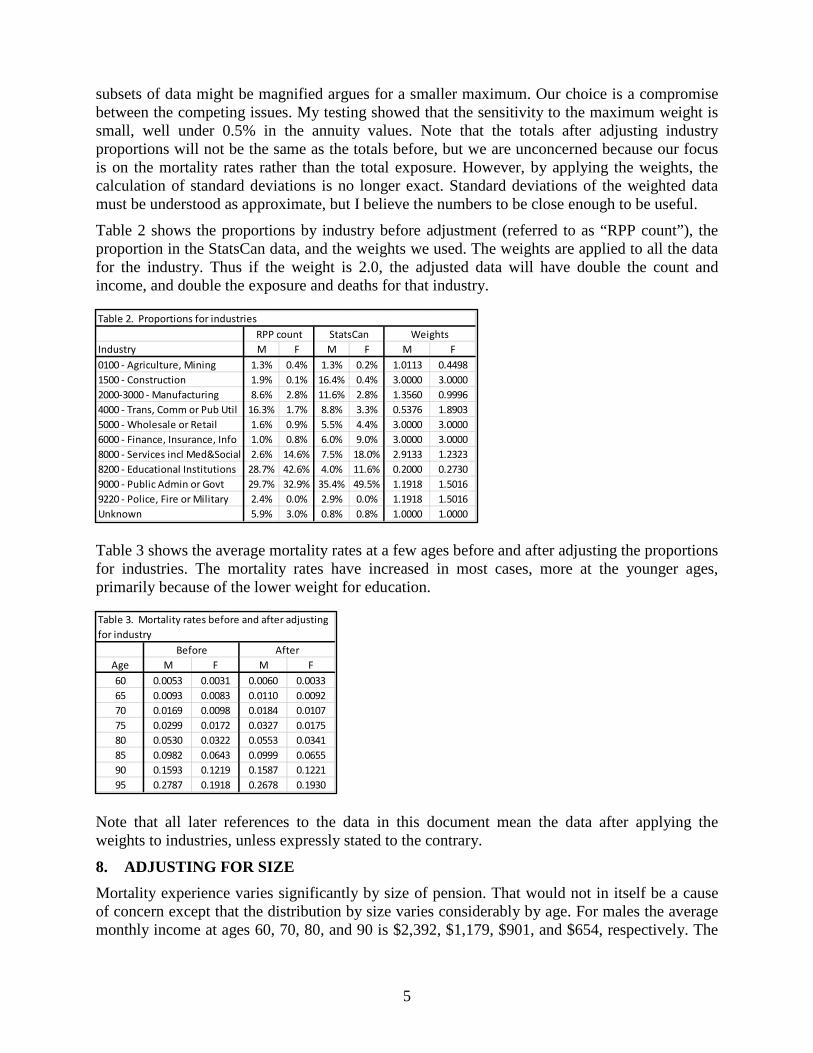
7. ADJUSTING FOR INDUSTRY Mortality experience varies significantly by industry. However, the data submitted to our study are not distributed by industry in the same manner as found in the full population of Canadian defined benefit registered pension plans. For example, education is over-represented and finance and construction are under-represented in our data. We decided to adjust the data by industry so that they would be more representative of Canadian DB plans. This step is a pragmatic one. The adjustments lack the precision that we would prefer, but we believe that the result improves the validity of our study.
We were able to obtain from Statistics Canada (CANSIM series 280-0011) a count of members in DB pension plans by industry. The industry groups are based on the North American Industry Classification System (NAICS), but our industry classification is based on the Standard Industrial Classification (SIC). We needed to split the NAICS grouping of “Educational services, health care and social assistance” into “Education” and “Other”. We did that split using counts of employees by industry from series 280-0063.
We were then able to determine the proportion by industry for membership in DB plans and the proportion by industry for the count in our data. Our data by industry can then be multiplied by the ratio of the StatsCan proportion to our proportion. However, we made three alterations in the weights to be applied to our data. We set a maximum weight of 3.0, a minimum weight of 0.2, and a weight of 1.0 for “unknown”. A desire for better proportions for the industries in our sample argues for a larger maximum weight. The concern that statistical fluctuations in small 1 Throughout this document I generally use “we” when referring to matters on which the subcommittee has earlier discussed options and arrived at a collective decision. I use “I” when referring to matters which I proposed even though the subcommittee in some cases has already given its express approval.
5
subsets of data might be magnified argues for a smaller maximum. Our choice is a compromise between the competing issues. My testing showed that the sensitivity to the maximum weight is small, well under 0.5% in the annuity values. Note that the totals after adjusting industry proportions will not be the same as the totals before, but we are unconcerned because our focus is on the mortality rates rather than the total exposure. However, by applying the weights, the calculation of standard deviations is no longer exact. Standard deviations of the weighted data must be understood as approximate, but I believe the numbers to be close enough to be useful.
Table 2 shows the proportions by industry before adjustment (referred to as “RPP count”), the proportion in the StatsCan data, and the weights we used. The weights are applied to all the data for the industry. Thus if the weight is 2.0, the adjusted data will have double the count and income, and double the exposure and deaths for that industry.
Table 3 shows the average mortality rates at a few ages before and after adjusting the proportions for industries. The mortality rates have increased in most cases, more at the younger ages, primarily because of the lower weight for education.
Note that all later references to the data in this document mean the data after applying the weights to industries, unless expressly stated to the contrary.
8. ADJUSTING FOR SIZE Mortality experience varies significantly by size of pension. That would not in itself be a cause of concern except that the distribution by size varies considerably by age. For males the average monthly income at ages 60, 70, 80, and 90 is $2,392, $1,179, $901, and $654, respectively. The
Industry M F M F M F0100 - Agriculture, Mining 1.3% 0.4% 1.3% 0.2% 1.0113 0.44981500 - Construction 1.9% 0.1% 16.4% 0.4% 3.0000 3.00002000-3000 - Manufacturing 8.6% 2.8% 11.6% 2.8% 1.3560 0.99964000 - Trans, Comm or Pub Util 16.3% 1.7% 8.8% 3.3% 0.5376 1.89035000 - Wholesale or Retail 1.6% 0.9% 5.5% 4.4% 3.0000 3.00006000 - Finance, Insurance, Info 1.0% 0.8% 6.0% 9.0% 3.0000 3.00008000 - Services incl Med&Social 2.6% 14.6% 7.5% 18.0% 2.9133 1.23238200 - Educational Institutions 28.7% 42.6% 4.0% 11.6% 0.2000 0.27309000 - Public Admin or Govt 29.7% 32.9% 35.4% 49.5% 1.1918 1.50169220 - Police, Fire or Military 2.4% 0.0% 2.9% 0.0% 1.1918 1.5016Unknown 5.9% 3.0% 0.8% 0.8% 1.0000 1.0000
Table 2. Proportions for industriesRPP count StatsCan Weights
Age M F M F60 0.0053 0.0031 0.0060 0.003365 0.0093 0.0083 0.0110 0.009270 0.0169 0.0098 0.0184 0.010775 0.0299 0.0172 0.0327 0.017580 0.0530 0.0322 0.0553 0.034185 0.0982 0.0643 0.0999 0.065590 0.1593 0.1219 0.1587 0.122195 0.2787 0.1918 0.2678 0.1930
Table 3. Mortality rates before and after adjusting for industry
Before After

6
implication is that the mortality rates will be steeper by age than would be experienced for any one range of amount because the average size at higher ages is lower than at younger ages.
Although we are able to calculate an appropriate raw mortality rate for each sex-size-age cell, the mortality rates that we get when we combine sizes or ages will not be appropriate. The only way to avoid the problem is to adjust the distribution of the data in a manner which is faithful to the observed experience in each sex-size-age cell.
The idea behind the adjustment is similar to age-adjusted mortality rates used by demographers to compare the mortality between countries with dissimilar distributions by age. The mortality rates at each age are applied to a standard population. The average mortality rates for the two countries on the same standard population then gives a meaningful comparison of the relative level of mortality between them.
In this case we need not age-adjustment, but size-adjustment. The following sets out how I make that adjustment. The adjustment is done separately for each sex.
1. Determine the distribution of exposure by size band for the whole set of data to be graduated. More detail on the size bands is given in section 0.
2. Determine the total exposure for each age. 3. Determine the desired exposure for each size-age by an outer product of the two previous
vectors. 4. For each size-age multiply both exposure and deaths by the ratio of the proportion for that
cell of the desired exposure to the actual exposure. Note that the mortality rate for each cell is not altered.
5. However, if some size bands have zero exposure at a particular age, then apply #4 for the non-zero cells at that age with a modified proportion for the total. The modification is to recalculate the proportions excluding the bands with zero exposure. Mathematically some accommodation is necessary to avoid a division by zero. Pragmatically we cannot use a cell with zero exposure because it has no mortality rate.
6. Add the modified data across size bands at each age. The resulting sums can be used for determining the base mortality table.
This approach preserves the mortality rates for each size-age, but it combines the data in such a way that the varying distributions by size band by age will have no effect on the final result.
Table 4 shows how the method is implemented for male age 65 and male age 75. Note that the mortality rates for each size band are unchanged, the distribution for both ages is the same, but the “total” mortality rate has changed. The age 65 rate is higher and the age 75 lower after adjusting the distribution. (The size bands are measured by monthly income.)

7
9. MAIN GRADUATION The modified data is added across all bands. The resulting sums give the deaths and exposure, measured by pension, for each age.
The method of graduation is Whittaker-Henderson (WH), a commonly-used method. WH is computationally complex, but conceptually quite straightforward. The “elevator version” of WH is this: WH optimizes the balance between closeness of fit of the graduated data to the raw data and smoothness of the graduated data. Fit is measured by the sum of the squared difference between the graduated and raw data, usually weighted by another set of numbers, such as exposure. Smoothness is measured by the sum of the squared finite differences, of a specified order, in the graduated data. The standard expression to be optimized is given below.
I used the variation of WH presented by Lowrie which equates perfect smoothness for order n not with a polynomial of degree n-1 as in the normal version of WH but with an exponential plus a polynomial of degree n-2.
The raw mortality rates are graduated by WH. The weights are the exposures, normalized so that the sum of the weights is 46, the number of rates being graduated. For males, the order of difference is 3, the smoothing factor is 500, and exponential has a base of 1.12. The same factors are used for females except that the smoothing factor is 1,000.
The sensitivity of the result to the graduation parameters is fairly low. I have prepared another document with details of the selection of the parameters. It is not included here, but I will send it to you on request.
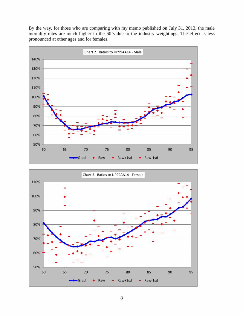
Charts 2 and 3 show the results of the graduation as ratios to UP94 projected to 2014 on scale AA (UP94AA14). The blue line represents the graduated rates, and the red diamonds represent the raw mortality rates. The red ticks above and below the diamonds represent one standard deviation in the ratios of the raw rates to UP94AA14. The fact that the tick marks are fairly close together over the central ages indicates that the graduated mortality rates are well supported by the data.
∑ ∑ ∆+− 22 )()( GradhRawGradWt n
Before After Before After Before After Before After10 2.5% 3.5% 0.00936 0.00936 5.5% 3.5% 0.02705 0.02705
500 6.4% 7.5% 0.00930 0.00930 12.1% 7.5% 0.03000 0.030001000 10.0% 9.3% 0.00957 0.00957 14.5% 9.3% 0.02678 0.026781500 11.0% 9.8% 0.00978 0.00978 13.7% 9.8% 0.02868 0.028682000 10.9% 9.6% 0.00742 0.00742 11.0% 9.6% 0.02675 0.026752500 11.0% 9.4% 0.00772 0.00772 8.9% 9.4% 0.02211 0.022113000 9.7% 8.7% 0.00630 0.00630 8.0% 8.7% 0.02315 0.023153500 8.7% 9.0% 0.00663 0.00663 6.4% 9.0% 0.01896 0.018964000 7.7% 8.0% 0.00646 0.00646 5.1% 8.0% 0.02332 0.023324500 6.3% 7.1% 0.00724 0.00724 3.6% 7.1% 0.02009 0.020095000 4.4% 5.4% 0.00748 0.00748 2.6% 5.4% 0.02333 0.023335500 3.0% 3.9% 0.01197 0.01197 2.3% 3.9% 0.00772 0.007726000 8.2% 9.0% 0.00987 0.00987 6.3% 9.0% 0.01226 0.01226Total 100.0% 100.0% 0.00818 0.00823 100.0% 100.0% 0.02438 0.02278
Lower Limit of
Band
Table 4. Effect of adjusting distribution by size band
Distribution Mortality Distribution MortalityMale 65 Male 75
8
By the way, for those who are comparing with my memo published on July 31, 2013, the male mortality rates are much higher in the 60’s due to the industry weightings. The effect is less pronounced at other ages and for females.
50%
60%
70%
80%
90%
100%
110%
120%
130%
140%
60 65 70 75 80 85 90 95
Chart 2. Ratios to UP99AA14 - Male
Grad Raw Raw+1sd Raw-1sd
50%
60%
70%
80%
90%
100%
110%
60 65 70 75 80 85 90 95
Chart 3. Ratios to UP99AA14 - Female
Grad Raw Raw+1sd Raw-1sd

9
10. EXTENSION TO YOUNGER AGES Our data were not adequate for use in table construction at younger ages. There are very few pensioners under age 55, and the quality of the active life data was poor. Because it is necessary to extend our table to much younger ages, I had to look for another source, preferably a Canadian one.
The mortality rates for younger ages are based on the insurance table CIA9704 (CIA publication 210028). This table is for individual life insurance, but it is a good candidate for this purpose for a number of reasons.
1. The underlying data is Canadian and fairly recent; 2. The “ultimate” duration of the table, like pension experience, should show little effect of
selection; 3. The slope is likely to be close to what is needed, although the level of mortality rates may
not be right; and 4. It is a table in general use in life insurance practice, if not in pension practice.
I found that by multiplying the male rates by 1.6 the two tables are fairly close together. For females, a multiple of 1.05 makes the tables very close. See charts 4 and 5.
For ages 54 to 60 the rates were obtained by fitting a 5th order polynomial to the rates already obtained for ages 51, 52, 53, 61, 62, and 63. See charts 4 and 5 below for details of the interpolation.
11. EXTENSION TO OLDER AGES The rates for older ages are taken from my paper delivered at the Living to 100 Symposium in 2011 on mortality at the oldest ages. This paper proposes mortality rates for ages over 95 for several countries based on raw death records, which were obtained from www.mortality.org. I used death records only, because they appear to be reliable because of the legal requirement for
0
0.002
0.004
0.006
0.008
51 52 53 54 55 56 57 58 59 60 61 62 63
Chart 4. Interpolation - Male
Interpolated Grad 1.60*CIA9704ns
0
0.002
0.004
0.006
51 52 53 54 55 56 57 58 59 60 61 62 63
Chart 5. Interpolation - Female
Interpolated Grad 1.05*CIA9704ns

10
reporting deaths. In contrast the exposures at oldest ages are generally considered unreliable for census data. The relevant death records are for the Canadian population, not just for pensioners. The use of population data is not a concern because many studies show that mortality rates from various subsets tend to converge with each other at the highest ages.
The rates from the paper are used without modification for ages 103 and higher. Rates at these very high ages seem to be very similar over a wide variety of datasets. The mortality rates also seem to fit well with those graduated.
The table ends with a rate of 1 at age 115. Some recent tables go to a higher age; however, there is virtually no difference in actuarial present values until the attained age is over 105. Only one Canadian has ever reached exact age 116; she died before 118. No Canadian male has yet reached age 112.
The rates for ages 95–102 for males are obtained by fitting a 4th degree polynomial to the rates previously obtained for ages 92, 93, 94, 103, and 104. For females the rates for ages 98–102 are from a cubic based on ages 95, 96, 97, 103, and 104. The interpolations are shown graphically in charts 6 and 7.
12. SIZE ADJUSTMENT FACTORS Because our data are seriatim with monthly pension amounts, we are able to observe the variation in mortality by size of pension. To facilitate the analysis, I have segmented the data into size bands, the first for $10–499 monthly, the second $500–999, the third $1,000–1,499, …, the thirteenth and highest for $6,000 and higher.
However, these bands are not static. Rather, they reflect the increase in the Average Weekly Earnings (AWE) as reported in CANSIM II Series V1558664, and 281-0026. This series gave me AWE at the end of each year for 1998–2012. I estimated the value at the end of 2013 from the October 2013 value (the most recent) of 919.35 by increasing it by the average of the increase from October to December in 2011 and 2012. The lower limit of band 3 is $1,000 of
0.1
0.2
0.3
0.4
0.5
92 93 94 95 96 97 98 99 100 101 102 103 104 105
Chart 6. Interpolation - Male
Interpolated Grad Oldest
0.2
0.3
0.4
0.5
95 96 97 98 99 100 101 102 103 104 105
Chart 7. Interpolation - Female
Interpolated Grad Oldest
11
monthly income in 2014. For data of 2000 for example, I used $6,702 as the lower limit (1000 x 647.02 / 922.29, these numbers being the lower limit of the band and the AWE for the start of 2000 and 2014). The actual limits of each band vary in each year of experience. The data are summarized by the appropriate bands, indexed to AWE.
By the way, AWE fits well. The average increase in AWE over the nine years 1999–2008 is 2.6%. The increase in average monthly pension in the data over the same period is 2.8%, 3.0%, 2.9%, and 1.6% for male public, female public, male private, and female private, respectively.
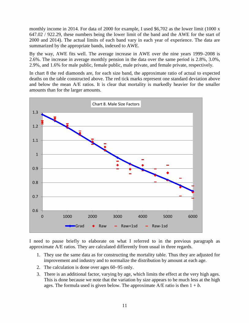
In chart 8 the red diamonds are, for each size band, the approximate ratio of actual to expected deaths on the table constructed above. The red tick marks represent one standard deviation above and below the mean A/E ratios. It is clear that mortality is markedly heavier for the smaller amounts than for the larger amounts.
I need to pause briefly to elaborate on what I referred to in the previous paragraph as approximate A/E ratios. They are calculated differently from usual in three regards.
1. They use the same data as for constructing the mortality table. Thus they are adjusted for improvement and industry and to normalize the distribution by amount at each age.
2. The calculation is done over ages 60–95 only. 3. There is an additional factor, varying by age, which limits the effect at the very high ages.
This is done because we note that the variation by size appears to be much less at the high ages. The formula used is given below. The approximate A/E ratio is then 1 + b.
0.6
0.7
0.8
0.9
1
1.1
1.2
1.3
0 1000 2000 3000 4000 5000 6000
Chart 8. Male Size Factors
Grad Raw Raw+1sd Raw-1sd

12
We want to find the factor b, for data in a specific size band, such that
�𝐸(𝑥)�𝑞(𝑥)�1 + 𝑏𝑏(𝑥)�� = �𝐷(𝑥)
𝑏 =∑𝐷(𝑥) − ∑𝐸(𝑥)𝑞(𝑥)∑𝐸(𝑥)𝑞(𝑥)𝑏(𝑥)
where
D(x) is the deaths at age x,
E(x) is the exposure at age x,
q(x) is the mortality on the base table at age x,
r(x) is the raw mortality rate = D(x)/ E(x)
g(x) is a factor which lessens the effect at the older ages. It is 1.0 to age 85, 0.0 for ages 100+, and interpolated linearly in between.
The blue line is the graduated size adjustment factors. The graduation used a smoothing factor of 10 and an order of 2. The weights for the graduation were the exposures.
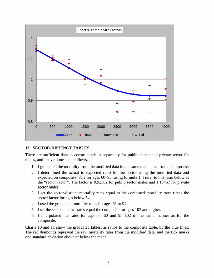
Comparable numbers for females are in chart 9. Note that I show fewer bands for females than for males. I have limited the bands to those for which there seems to be enough data to discern a pattern by size with reasonably good clarity. The highest band includes all pensions with amount equal to the lower limit for that band or higher. All lower bands have a uniform increment of $500.
…formula 1
13
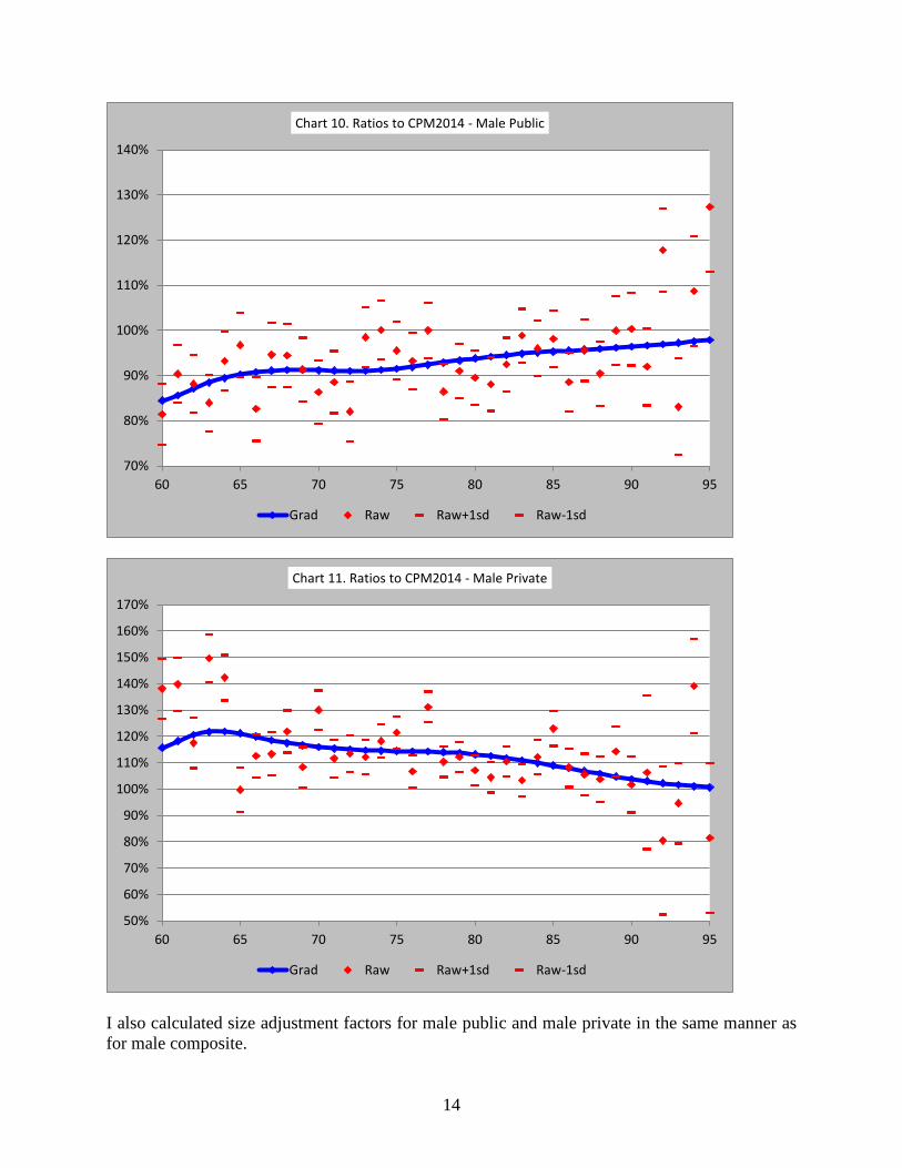
13. SECTOR-DISTINCT TABLES There are sufficient data to construct tables separately for public sector and private sector for males, and I have done so as follows.
1. I graduated the mortality from the modified data in the same manner as for the composite. 2. I determined the actual to expected ratio for the sector using the modified data and
expected on composite table for ages 60–95, using formula 1. I refer to this ratio below as the “sector factor”. The factor is 0.92562 for public sector males and 1.13457 for private sector males.
3. I set the sector-distinct mortality rates equal to the combined mortality rates times the sector factor for ages below 54.
4. I used the graduated mortality rates for ages 61 to 94. 5. I set the sector-distinct rates equal the composite for ages 103 and higher. 6. I interpolated the rates for ages 55–60 and 95–102 in the same manner as for the
composite.
Charts 10 and 11 show the graduated tables, as ratios to the composite table, by the blue lines. The red diamonds represent the raw mortality rates from the modified data, and the tick marks one standard deviation above or below the mean.
0.8
0.9
1
1.1
1.2
0 500 1000 1500 2000 2500 3000 3500 4000
Chart 9. Female Size Factors
Grad Raw Raw+1sd Raw-1sd
14
I also calculated size adjustment factors for male public and male private in the same manner as for male composite.
70%
80%
90%
100%
110%
120%
130%
140%
60 65 70 75 80 85 90 95
Chart 10. Ratios to CPM2014 - Male Public
Grad Raw Raw+1sd Raw-1sd
50%
60%
70%
80%
90%
100%
110%
120%
130%
140%
150%
160%
170%
60 65 70 75 80 85 90 95
Chart 11. Ratios to CPM2014 - Male Private
Grad Raw Raw+1sd Raw-1sd

15
There are not enough data for private sector females to support table construction. The best that I can do is to determine a multiple of the composite table. Because the public and private sector tables are complements of each other with respect to the composite, it makes sense to use the same method for both, although graduating a public sector female table could be justified.
I determined sector factors for females in the same manner as for males. The factors are 0.99321 for public and 1.09923 for private. I applied these factors for ages under 86, used a ratio of 1.0 for ages over 99, and interpolated the ratio linearly for intervening ages.
Chart 12 shows the female public and female private tables as ratios of the composite table.
Because the mortality rates are a multiple of the composite table, it makes sense for the size adjustment factors also to be a multiple of those for the composite table.
We want to find the factor m such that, when summing over all ages and bands,
�𝐸(𝑥, 𝑏)𝑞(𝑥)�1 + (𝑚𝑚(𝑏) − 1)𝑏(𝑥)� = �𝐷(𝑥, 𝑏)
𝑚 =∑𝐷(𝑥, 𝑏) −∑𝐸(𝑥, 𝑏)𝑞(𝑥)(1− 𝑏(𝑥))
∑𝐸(𝑥, 𝑏)𝑞(𝑥)𝑏(𝑥)𝑚(𝑏)
where
D(x,b) is the deaths at age x in band b,
E(x,b) is the exposure at age x in band b,
q(x) is the mortality on the sector-distinct table at age x,
…formula 2
0.8
0.9
1
1.1
1.2
50 60 70 80 90 100
Chart 12. Ratio of table to composite, Female
Public Private

16
g(x) is a factor which lessens the effect at the older ages. It is 1.0 to age 85, 0.0 for ages 100+, and interpolated linearly in between.
f(b) is the size adjustment factor for the composite table.
14. COLLAR-DISTINCT TABLES The subcommittee received considerable feedback on its earlier draft that members would prefer to have white collar and blue collar tables rather than public sector and private sector tables. We agree. However, only a very small proportion of the data had an indication of hourly or salaried. For the rest there is no sure way of making a split.
Note that the split between blue and white is rarely clean. The Retirement Plans Experience Committee (RPEC) of the Society of Actuaries has defined “blue” as plans with 70% or more hourly, “white” as 70% or more salaried, and “mixed” all others. However, RPEC has an advantage over us in that they have access to information by plan. We can only make inferences based on industry groupings.
We split records that marked hourly or salaried as indicated. For all other records, we split them into collar groupings based on industry. We allocated to “blue” Agriculture and Mining, Construction, Manufacturing, Transportation and Communications, Retail and Wholesale Trade, and Police and Fire. We allocated to “white” Educational Institutions and Finance and Insurance. That left Services, Public Administration and Unknown as “mixed”. We debated some of these allocations at length, and in the end we were not sure we got it right. Nor do we have access to any data that could help us get it right.
Because of the uncertainty of the split, we cannot recommend any use of collar-distinct tables, but we have noted that it will be important to get an indication of hourly or salaried on a much higher proportion of records when we do the next study.
15. TRANSITION—ONE-DIMENSIONAL SCALE The subcommittee has developed a two-dimensional improvement scale, called CPM-B. We believe that a two-dimensional scale is superior to a one-dimensional scale because it can reflect the high recent rates of improvement without being bound to continue them indefinitely. However, we recognize that not all actuaries will have access immediately to software than can handle a two-dimensional improvement scale. Therefore, the subcommittee asked me to develop a one-dimensional improvement scale which approximates the results of the two-dimensional scale closely enough so that it can be used as a transition until 2016.
Although this document is primarily about my development of mortality tables and size adjustment factors, I am documenting the transitional improvement scale here for convenience.
Developing a One-Dimensional Scale The transitional basis should give approximately the same annuity values that are produced by the proposed basis. This suggests a method: solve for the one-dimensional improvement rates which give the same annuity values as the two-dimensional scale.
Because the improvement rates at the highest age of the two-dimensional scale are zero, it is obvious that the one-dimensional scale will be zero at that age. The first non-zero improvement rate will be the two-dimensional rate for that age in 2015. The improvement rate for one year earlier can be solved for because there is only one unknown left, the improvement rate for that age. The method then is a recursive formula in which one solves for the improvement rate, Ix.

17
𝑎𝑥,2𝑑2015 = 𝑎𝑥,1𝑑
2015 = 𝑣𝑝𝑥,1𝑑2015�̈�𝑥+1,1𝑑
2016 = (1 − 𝑞𝑥,1𝑑𝑏𝑏𝑏𝑏(1 − 𝐼𝑥))𝑣�̈�𝑥+1,1𝑑
2016
The above works almost perfectly for life annuities. However, when adding a guarantee period, a deferred period, or a second life for some type of joint and survivor form or when calculating deferred annuities, the approximation is not as good, particularly for a long deferred period.
It is important to remember that this one-dimensional scale exists only to approximate a reasonable two-dimensional scale. It is not possible to construct an approximation which will work in all situations. One example for which the approximation is less than ideal is the valuing of active lives for which there is a death benefit equal to the commuted value of the pension until the retirement age. The value is largely independent of mortality rates before the retirement age. However, the mortality rates after the retirement age are projected considerably farther into the future than for a life annuity now at the retirement age. Because the one-dimensional improvement rates are tuned for an immediate annuity, and because the improvement rates decrease with time in the two-dimensional scale, present values of deferred annuities that are independent of mortality before retirement will be overstated on the approximate scale.
Note that this one-dimensional scale contains negative improvement rates for male ages 50–55. This fact illustrates that the one-dimensional scale is not reasonable in itself. It is a mathematical fiction developed to approximate the proposed two-dimensional scale. It will serve well for the next two years for pension valuations and pension commuted values. It may not work well for other purposes; in particular, it will not yield reasonable mortality rates at all ages.
16. RESULTS The tables 5, 6, and 7 compare present values of monthly annuities-due at 4% for the beginning of 2014, 2015, and 2016 for life annuities with and without a guarantee period and for joint and survivor annuities decreasing on member death.
We consider the approximation close enough to be acceptable in pension valuations before January 1, 2016.
Age Exact Approx ∆ Exact Approx ∆ Exact Approx ∆M45 19.79 19.79 0.00% 19.80 19.80 0.00% 19.82 19.82 0.00%M55 17.36 17.36 0.00% 17.39 17.39 0.00% 17.41 17.41 0.01%M65 14.17 14.17 0.00% 14.21 14.21 0.00% 14.25 14.25 0.02%M75 10.03 10.03 0.00% 10.08 10.08 0.00% 10.13 10.13 0.03%F45 20.52 20.52 0.00% 20.53 20.53 0.00% 20.54 20.54 0.00%F55 18.23 18.23 0.00% 18.24 18.24 0.00% 18.26 18.26 0.00%F65 15.13 15.13 0.00% 15.16 15.16 0.00% 15.18 15.18 0.01%F75 11.16 11.16 0.00% 11.19 11.19 0.00% 11.22 11.22 0.01%
Table 5. Monthly life annuity-due at 4%2014 01 01 2015 01 01 2016 01 01

18
Age Exact Approx ∆ Exact Approx ∆ Exact Approx ∆M45-F45 20.87 20.91 0.16% 20.88 20.92 0.17% 20.89 20.93 0.17%M55-F55 18.73 18.77 0.17% 18.75 18.79 0.18% 18.77 18.81 0.20%M65-F65 15.77 15.79 0.14% 15.80 15.82 0.16% 15.83 15.85 0.18%M75-F75 11.77 11.77 0.05% 11.80 11.81 0.06% 11.84 11.85 0.09%F45-M45 21.16 21.20 0.16% 21.17 21.21 0.17% 21.18 21.22 0.17%F55-M55 19.08 19.11 0.17% 19.09 19.13 0.18% 19.11 19.15 0.19%F65-M65 16.16 16.18 0.14% 16.18 16.20 0.15% 16.20 16.23 0.17%F75-M75 12.22 12.22 0.04% 12.25 12.26 0.06% 12.28 12.29 0.09%
Table 7. Monthly annuity-due reducing to 60% on member death at 4%2014 01 01 2015 01 01 2016 01 01
17. REFERENCES ______. “List of Canadian supercentenarians”. Wikipedia. Accessed December 17, 2013.
http://en.wikipedia.org/wiki/List_of_Canadian_supercentenarians
Committee on Life Insurance Financial Reporting. Mortality Improvement Research Paper. Canadian Institute of Actuaries. September 23, 2010. www.cia-ica.ca/docs/default-source/2010/210065e.pdf
Continuous Mortality Investigation. CMI Working paper 1. An interim basis for adjusting the 92 series mortality projections for cohort effects. 2002. http://www.actuaries.org.uk/ research-and-resources/documents/cmi-working-paper-1-interim-basis-adjusting-92-series-mortality-pro
Hanrahan, Mark S., et al. “The 1994 Uninsured Pensioner Mortality Table”. Transactions of the Society of Actuaries. The Society of Actuaries, Schaumburg, IL, 1995. Available at http://www.soa.org
Howard, R.C.W. “Mortality Rates at Oldest Ages”. Mortality at Oldest Ages. 2010. http://www.soa.org/library/monographs/life/living-to-100/2011/mono-li11-5b-howard.pdf
———. “Whittaker-Henderson-Lowrie Graduation.” 2007. http://www.howardfamily.ca/ graduation/WHGrad.doc
Human Mortality Database. University of California, Berkeley (USA), and Max Planck Institute for Demographic Research (Germany). Available at www.mortality.org or www.humanmortality.de (data downloaded on December 21, 2011).
Jordan, Chester Wallace, Jr. Life Contingencies. The Society of Actuaries, Schaumburg, IL, 1967.
London, D. Graduation: The Revision of Estimates. Actex Publications, Winsted and Abingdon, CT, 1985.
Age Exact Approx ∆ Exact Approx ∆ Exact Approx ∆M45 19.87 19.87 0.02% 19.89 19.89 0.02% 19.90 19.91 0.03%M55 17.55 17.55 0.05% 17.57 17.58 0.06% 17.59 17.61 0.08%M65 14.54 14.56 0.11% 14.57 14.60 0.15% 14.60 14.63 0.19%M75 11.06 11.07 0.11% 11.09 11.11 0.15% 11.12 11.14 0.20%F45 20.56 20.56 0.00% 20.57 20.57 0.01% 20.58 20.58 0.01%F55 18.33 18.33 0.02% 18.35 18.35 0.02% 18.36 18.37 0.03%F65 15.39 15.40 0.05% 15.42 15.42 0.06% 15.44 15.45 0.07%F75 11.89 11.90 0.07% 11.92 11.93 0.10% 11.94 11.95 0.13%
2015 01 01 2016 01 01Table 6. Monthly annuity-due with 10 year certain at 4%
2014 01 01

19
Lowrie, Walter B. “An Extension of the Whittaker-Henderson Method of Graduation”. TSA, XXXIV (1982), 329.
Ménard, Jean-Claude. Twenty-Sixth Actuarial Report on the Canada Pension Plan. 2010. Available at http://www.osfi-bsif.gc.ca/eng/docs/cpp26.pdf
Pelletier, David A. Final Communication of a Promulgation of Prescribed Mortality Improvement Rates Referenced in the Standards of Practice for the Valuation of Insurance Contract Liabilities: Life and Health (Accident and Sickness) Insurance (Subsection 2350). Actuarial Standards Board. 2011. www.cia-ica.ca/docs/default-source/2011/211072e.pdf