Embed Size (px)
Citation preview
Measurement and Data Display
QA Residency 2
Melanie Rathgeber, Merge Consulting
Learning Objectives
1. Identify and explain uses for five different tools to learn from data in QI
2. Create and analyze a run chart
3. Apply best practices for display of data using run charts

Reference:
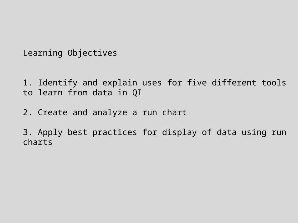
Tools to Learn from Variation in Data
Waiting Time for Clinic Visit
20
25
30
35
40
45
50
55
60
Ave
rage
Day
s
Waiting Time for Clinic Visit
20
25
30
35
40
45
50
55
60
Ave
rage
Day
s
Distribution of Wait Times
0
10
20
30
40
50
60
5 15 25 35 45 55 65 75 85 95 105Wait time (days) for Visit
num
ber of
vis
its
Clinic Wait Times > 30 days
0
24
68
10
12
14
16
C F G D A J H K B I L EClinic ID
# of
wai
ts >
30 d
ays
Relationship Between Long Waits and Capacity
0
5
10
15
20
75 95Capacity Used
# w
ait tim
es >
30
day
s
FREQUENCY PLOT PARETO CHART SCATTER PLOT
RUN CHART SHEWHART CHART
Health Care Data Guide, p. 65
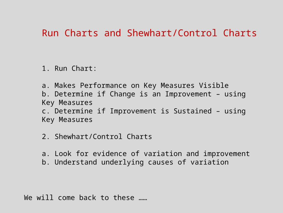
Run Charts and Shewhart/Control Charts
1. Run Chart:
a. Makes Performance on Key Measures Visibleb. Determine if Change is an Improvement – using Key Measuresc. Determine if Improvement is Sustained – using Key Measures
2. Shewhart/Control Charts
a. Look for evidence of variation and improvementb. Understand underlying causes of variation
We will come back to these ……

Tools to Learn from Variation in Data
Waiting Time for Clinic Visit
20
25
30
35
40
45
50
55
60
Ave
rage
Day
s
Waiting Time for Clinic Visit
20
25
30
35
40
45
50
55
60
Ave
rage
Day
s
Distribution of Wait Times
0
10
20
30
40
50
60
5 15 25 35 45 55 65 75 85 95 105Wait time (days) for Visit
num
ber of
vis
its
Clinic Wait Times > 30 days
0
24
68
10
12
14
16
C F G D A J H K B I L EClinic ID
# of
wai
ts >
30 d
ays
Relationship Between Long Waits and Capacity
0
5
10
15
20
75 95Capacity Used
# w
ait tim
es >
30
day
s
FREQUENCY PLOT PARETO CHART SCATTER PLOT
RUN CHART SHEWHART CHART
Health Care Data Guide, p. 65
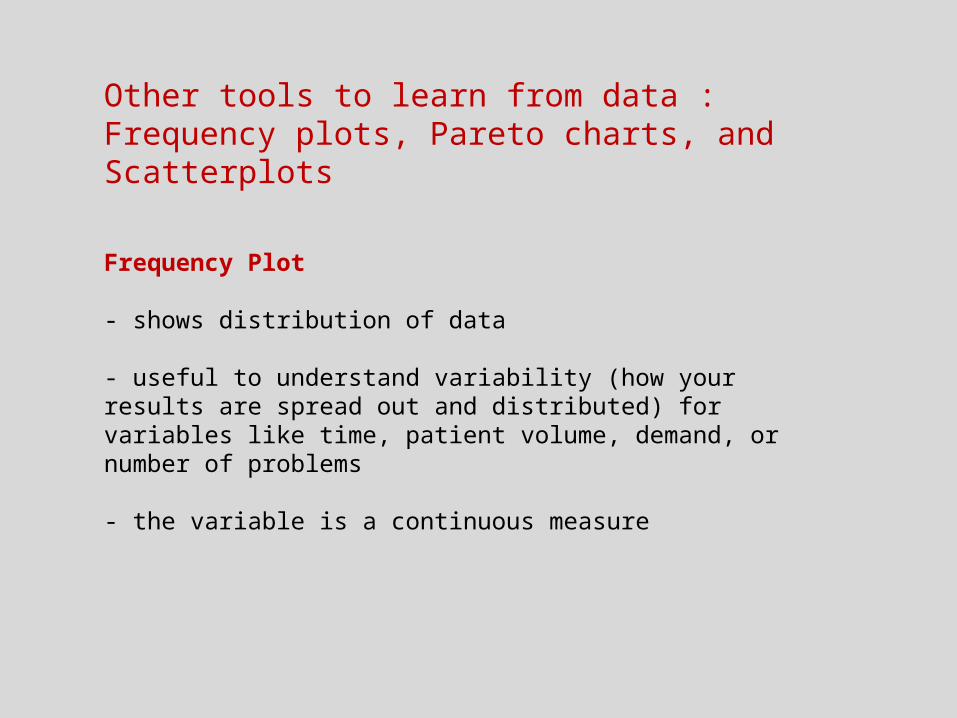
Other tools to learn from data : Frequency plots, Pareto charts, and Scatterplots
Frequency Plot
- shows distribution of data
- useful to understand variability (how your results are spread out and distributed) for variables like time, patient volume, demand, or number of problems
- the variable is a continuous measure

Example:
Each day for about 10 months (255 days), a team measures how long it takes to do medication administration on their unit on the night shift (they rounded the number of minutes to the nearest five minutes)
Variable = number of minutes taken to do medication administration
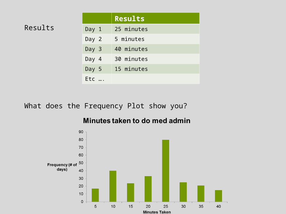
Results
What does the Frequency Plot show you?
ResultsDay 1 25 minutes
Day 2 5 minutes
Day 3 40 minutes
Day 4 30 minutes
Day 5 15 minutes
Etc ….
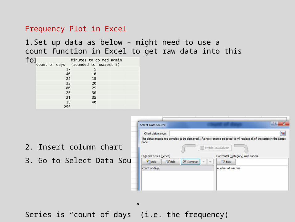
Frequency Plot in Excel
1.Set up data as below – might need to use a count function in Excel to get raw data into this format
2. Insert column chart
3. Go to Select Data Source
Series is “count of days” (i.e. the frequency)
Horizontal axis is your variable – “number of minutes”
Count of daysMinutes to do med admin (rounded to nearest 5)
17 540 1024 1533 2080 2525 3021 3515 40
255
5 minutes practice – create a frequency plot in Excel
What data do you work with that could be displayed as a frequency plot?
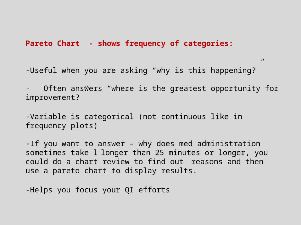
Pareto Chart - shows frequency of categories:
-Useful when you are asking “why is this happening?” - Often answers “where is the greatest opportunity for improvement?”
-Variable is categorical (not continuous like in frequency plots)
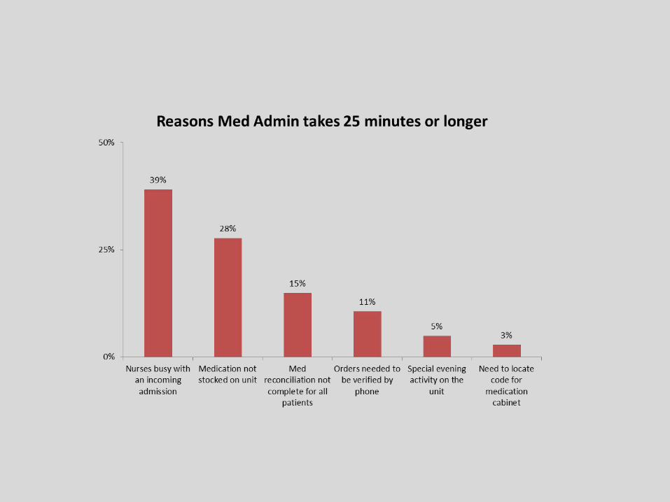
-If you want to answer – why does med administration sometimes take llonger than 25 minutes or longer, you could do a chart review to find out
reasons and then use a pareto chart to display results.
-Helps you focus your QI efforts
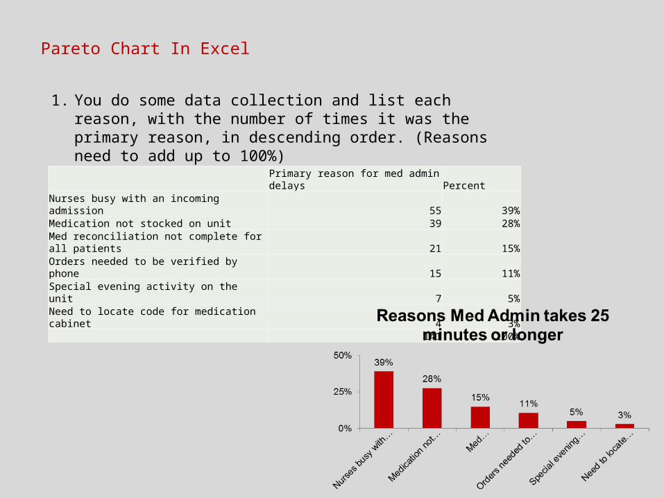
1. You do some data collection and list each reason, with the number of times it was the primary reason, in descending order. (Reasons need to add up to 100%)
2. Hide Column B and Insert Column Chart
Pareto Chart In Excel
Primary reason for med admin delays PercentNurses busy with an incoming admission 55 39%Medication not stocked on unit 39 28%Med reconciliation not complete for all patients 21 15%Orders needed to be verified by phone 15 11%Special evening activity on the unit 7 5%Need to locate code for medication cabinet 4 3%
141 100%
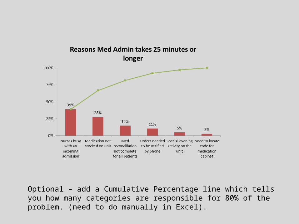
Optional – add a Cumulative Percentage line which tells you how many categories are responsible for 80% of the problem. (need to do manually in Excel).
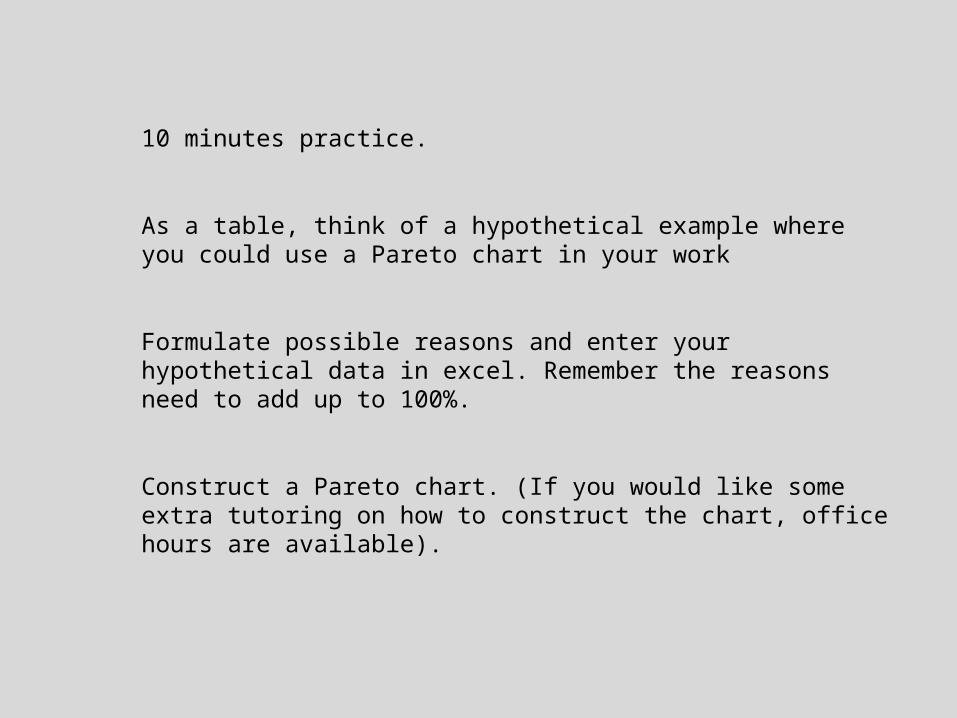
10 minutes practice.
As a table, think of a hypothetical example where you could use a Pareto chart in your work
Formulate possible reasons and enter your hypothetical data in excel. Remember the reasons need to add up to 100%.
Construct a Pareto chart. (If you would like some extra tutoring on how to construct the chart, office hours are available).

Scatterplot
Shows relationship between two continuous variables.
Will show a cause and effect relationship if one exists.
Useful for seeing potential areas for improvement.
“If we can decrease X, Y should also go down”
“If we can decrease time patients spend in the waiting room, the number of patients leaving without being seen should go down”
“If we can decrease time patients spend in the waiting room, the ratings on patient satisfaction should go up.”
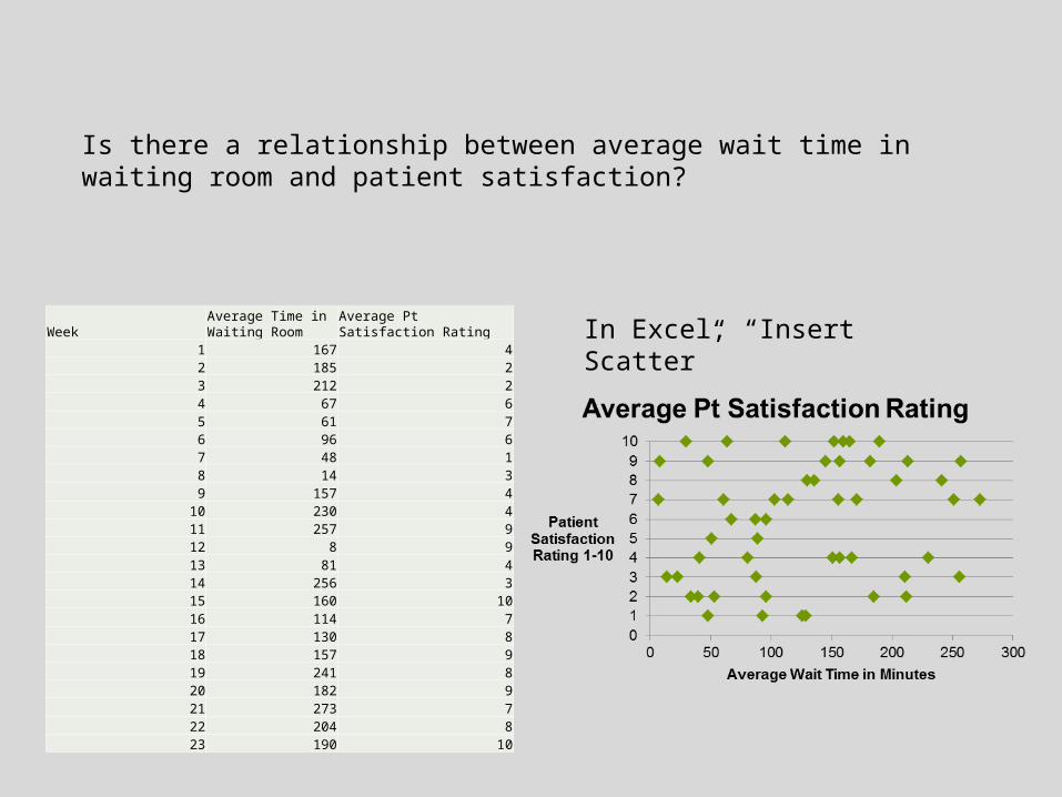
Week Average Time in Waiting Room
Average Pt Satisfaction Rating
1 167 42 185 23 212 24 67 65 61 76 96 67 48 18 14 39 157 4
10 230 411 257 912 8 913 81 414 256 315 160 1016 114 717 130 818 157 919 241 820 182 921 273 722 204 823 190 10
Is there a relationship between average wait time in waiting room and patient satisfaction?
In Excel, “Insert Scatter”

What about the relationship between number of weeks to get an appointment, and satisfaction?
Average Pt Satisfaction Rating
Number of weeks to get appointment
4 82 92 46 67 56 61 43 74 84 89 39 34 83 9
10 2
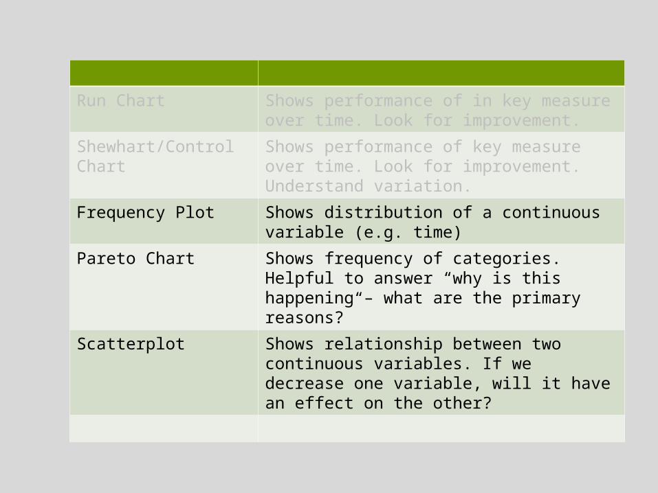
Run Chart Shows performance of in key measure over time. Look for improvement.
Shewhart/Control Chart Shows performance of key measure over time. Look for improvement. Understand variation.
Frequency Plot Shows distribution of a continuous variable (e.g. time)
Pareto Chart Shows frequency of categories. Helpful to answer “why is this happening – what are the primary reasons?”
Scatterplot Shows relationship between two continuous variables. If we decrease one variable, will it have an effect on the other?

Practice
Look for examples on your peers’ storyboards, where a frequency plot, pareto chart, or scatterplot may be used
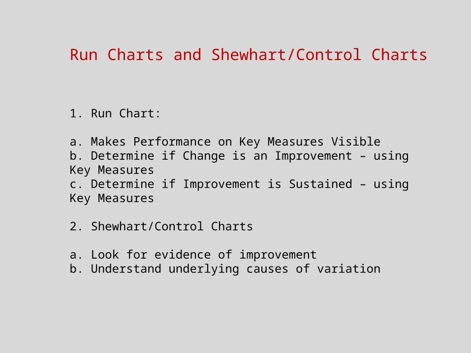
Run Charts and Shewhart/Control Charts
1. Run Chart:
a. Makes Performance on Key Measures Visibleb. Determine if Change is an Improvement – using Key Measuresc. Determine if Improvement is Sustained – using Key Measures
2. Shewhart/Control Charts
a. Look for evidence of improvementb. Understand underlying causes of variation

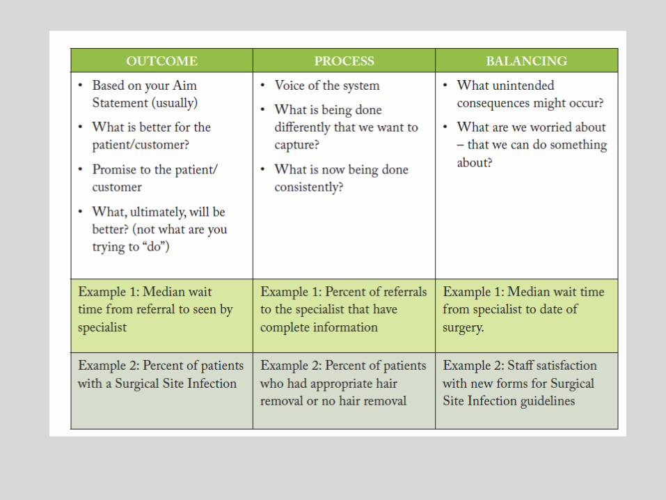
Review – Key Measures
– Collected over the life time of your project
– Provides feedback that changes are having the desired impact
– Outcome, process and balancing
– Displayed over time (e.g. Run Chart)
– Small samples collected frequently
– Guideline: between 3-5 measures in total
– Balancing measures may be collected more sporadically
Measures from Your Storyboards

Displaying Key Measures over Time - Run Chart
-Data displayed in time order
-Time is along X axis
-Result along Y axis
-Centre line = median
-One “dot” = one sample of data
-Sample size = each “dot” should have the same n 0
20
40
60
80
100
Perc
ent
Process: Cardiac Surgical Patients with Controlled Post-operative Serum Glucose

Showing improvement:
No improvement. Random fluctuation.
Improvement. Trend going up.

How Do We Analyze a Run Chart?
• Visual analysis first• If pattern is not clear, then apply probability based rules
% Timely Reperfusion
0
10
20
30
40
50
60
70
80
90
100
J-05
F M A M J J A S O N D J-06
F M A M J J A S O N D J-07
F M
Per
cent
Median 35.5
Figure 3.11: Run Chart with ED Team Uncertain About Improvement
Protocol V.3-Test Protocol V.1-Test
Protocol V.2-Test
The Data Guide, p 3-10
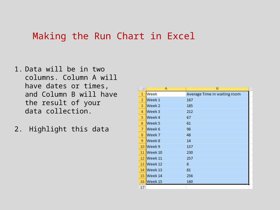
Making the Run Chart in Excel
1. Data will be in two columns. Column A will have dates or times, and Column B will have the result of your data collection.
2. Highlight this data
Making the Run Chart in Excel
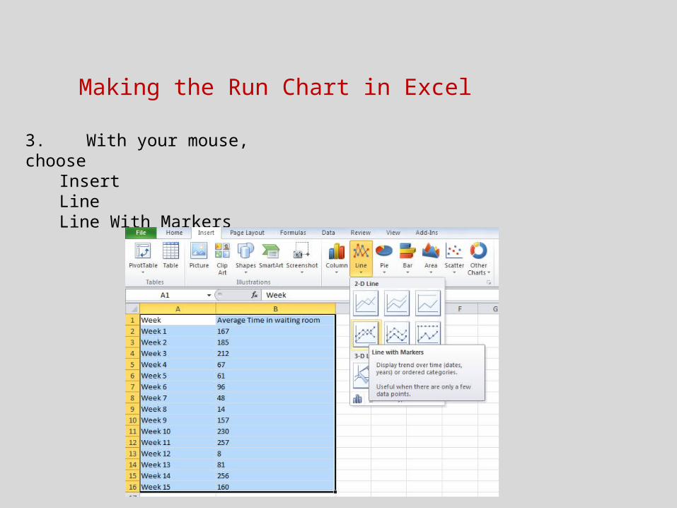
3. With your mouse, choose InsertLine Line With Markers

Making the Run Chart in Excel
Making the Run Chart in Excel
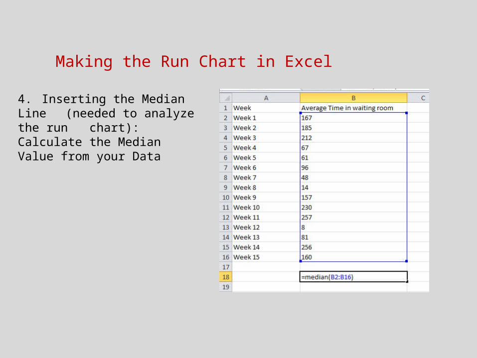
4. Inserting the Median Line (needed to analyze the run chart): Calculate the Median Value from your Data
Making the Run Chart in Excel
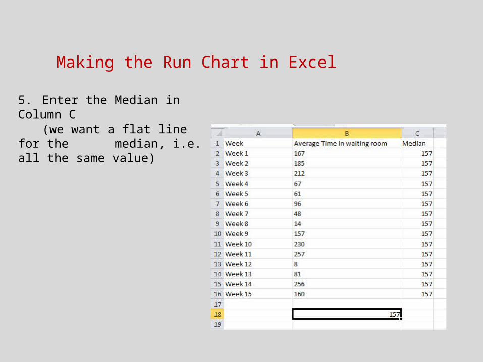
5. Enter the Median in Column C (we want a flat line for the median, i.e. all the same value)
Making the Run Chart in Excel
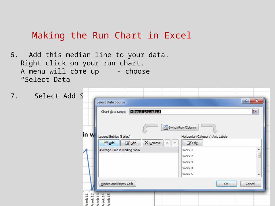
6. Add this median line to your data. Right click on your run chart. A menu will come up – choose “Select Data”
7. Select Add Series

Making the Run Chart in Excel7. When you click on Add Series, it will ask you about the data you
want to add. It will ask for a Series Name and Series Values. Ignore Series Name
Click the button beside Series Values and then highlight the median values in column C. Press Enter and then OK.
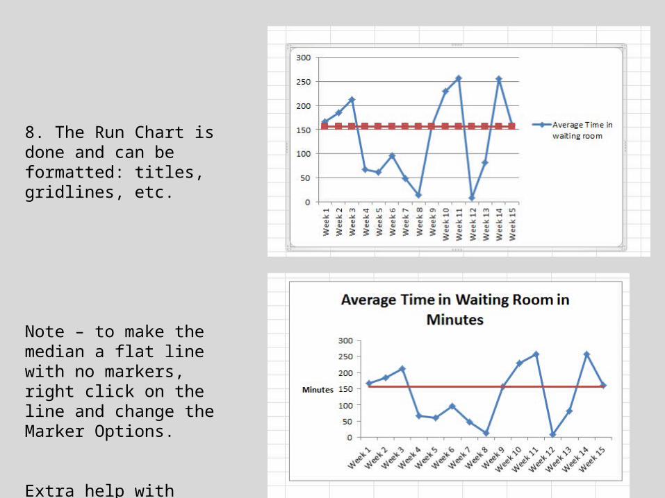
8. The Run Chart is done and can be formatted: titles, gridlines, etc.
Note – to make the median a flat line with no markers, right click on the line and change the Marker Options.
Extra help with formatting - available during office hours.
Making the Run Chart in Excel - Practice
-There are simple rules, based on probability, that are used to determine evidence of improvement in our projects
-Interpretation: the rules tell us if there is a non-random pattern in our data.
-If we have implemented a change, and we see a non-random pattern (going in the right direction), it is evidence of improvement
Analyzing Run Charts
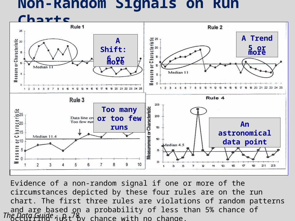
Non-Random Signals on Run Charts
A Shift: 6 or more
An astronomical data point
Too many or too few runs
A Trend5 or more
The Data Guide, p 78
Evidence of a non-random signal if one or more of the circumstances depicted by these four rules are on the run chart. The first three rules are violations of random patterns and are based on a probability of less than 5% chance of occurring just by chance with no change.
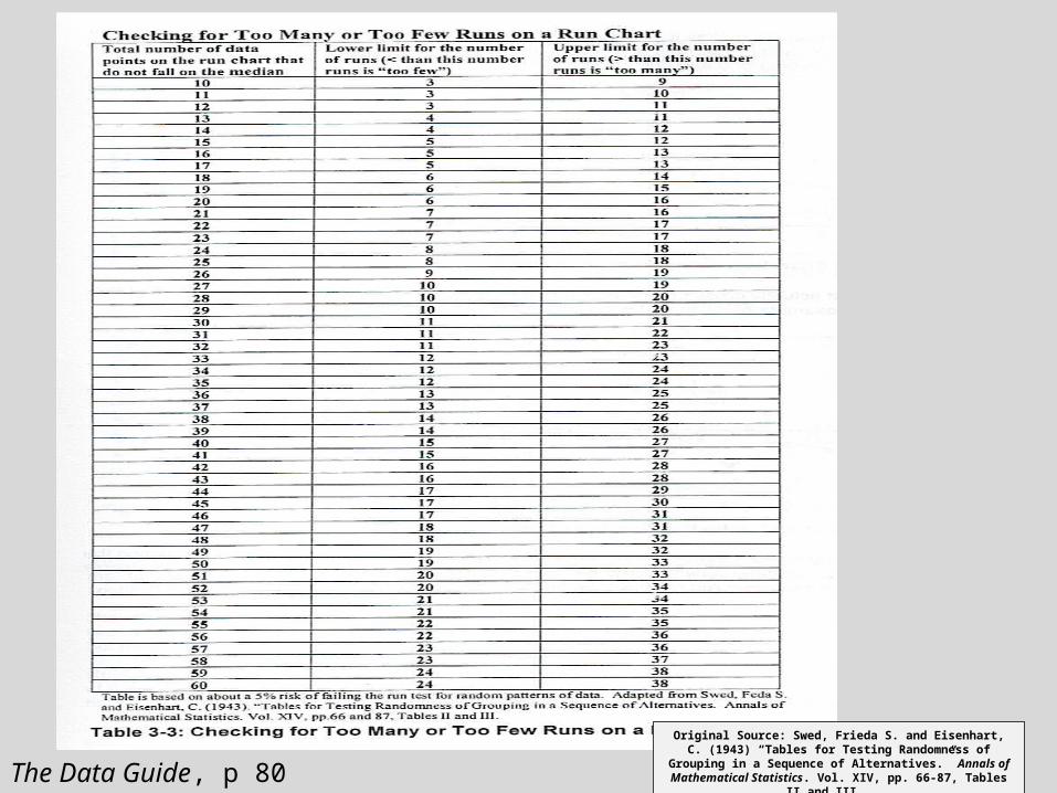
Original Source: Swed, Frieda S. and Eisenhart, C. (1943) “Tables for Testing Randomness of Grouping in a Sequence of Alternatives.” Annals of Mathematical Statistics. Vol. XIV,
pp. 66-87, Tables II and III. The Data Guide, p 80

Trend?
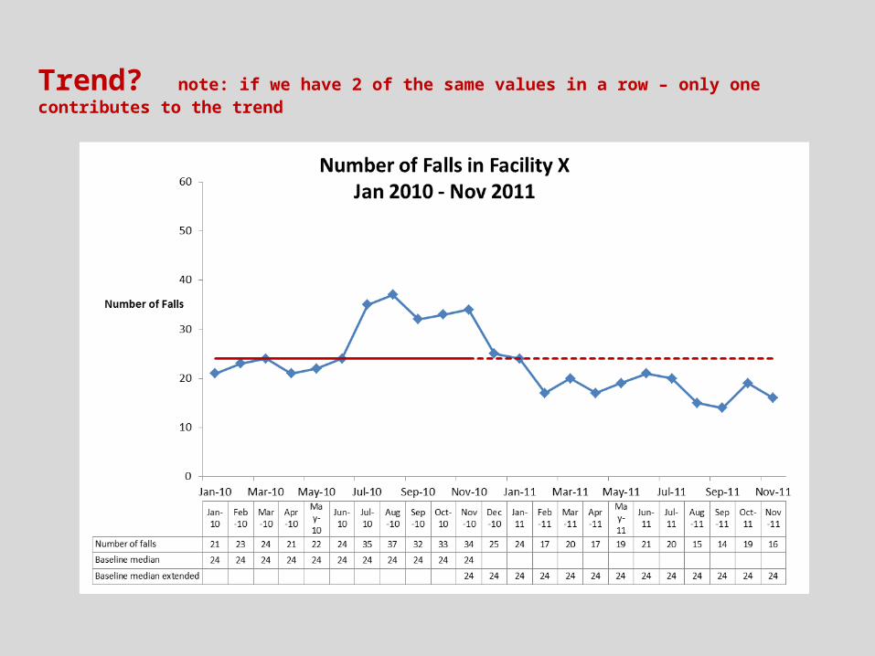
Trend? note: if we have 2 of the same values in a row – only one contributes to the trend
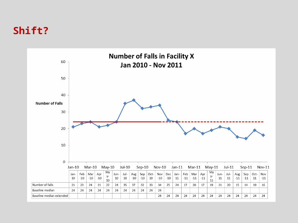
Shift?

Shift? note: values on median don’t make or break a shift
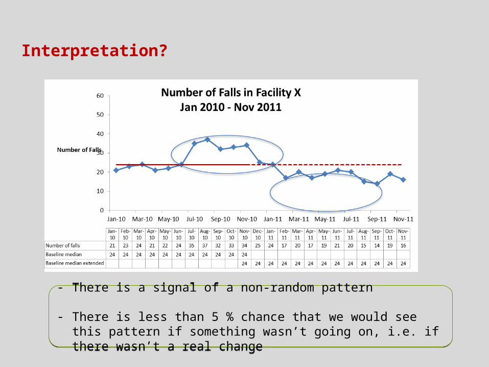
Interpretation?
- There is a signal of a non-random pattern
- There is less than 5 % chance that we would see this pattern if something wasn’t going on, i.e. if there wasn’t a real change
- There is a signal of a non-random pattern
- There is less than 5 % chance that we would see this pattern if something wasn’t going on, i.e. if there wasn’t a real change
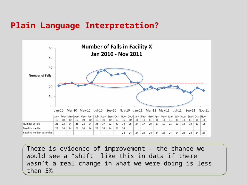
Plain Language Interpretation?
There is evidence of improvement – the chance we would see a “shift” like this in data if there wasn’t a real change in what we were doing is less than 5%
There is evidence of improvement – the chance we would see a “shift” like this in data if there wasn’t a real change in what we were doing is less than 5%
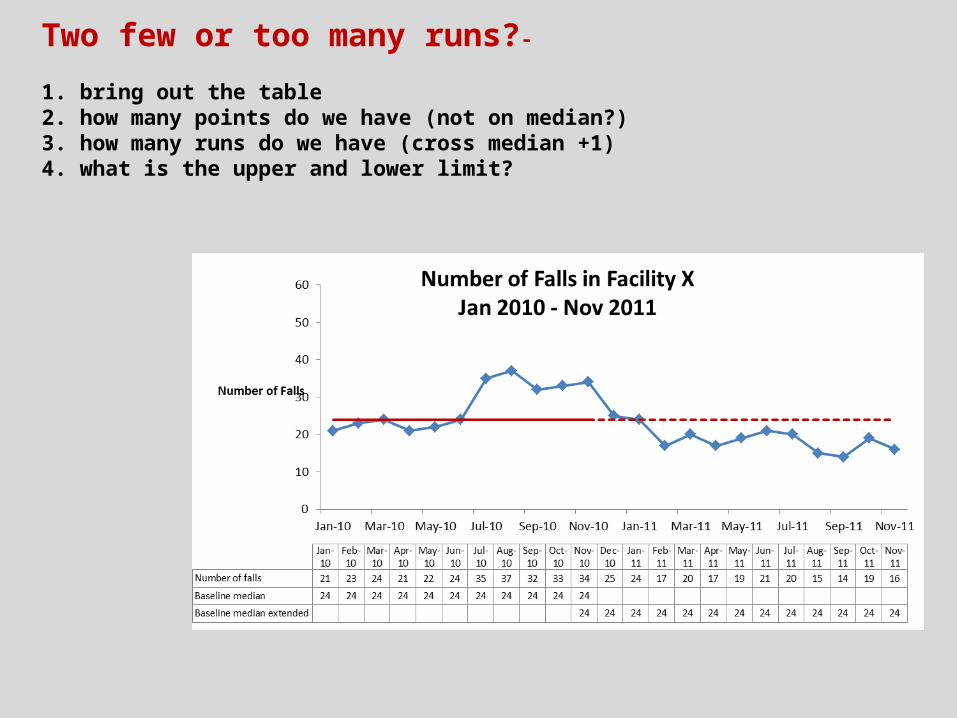
Two few or too many runs?-
1. bring out the table2. how many points do we have (not on median?)3. how many runs do we have (cross median +1)4. what is the upper and lower limit?
Two few or too many runs?-
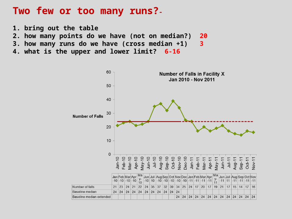
1. bring out the table2. how many points do we have (not on median?) 203. how many runs do we have (cross median +1) 34. what is the upper and lower limit? 6-16

Two few runs?Plain language interpretation
There is evidence of improvement – our data only crosses the median line twice – three runs. If it was just random variation, we would expect to see more up and down.
There is evidence of improvement – our data only crosses the median line twice – three runs. If it was just random variation, we would expect to see more up and down.

What if we had too many runs?Plain language interpretation
There is evidence of a non-random pattern. There is a pattern to the way the data rises and falls above and below the median. Something systematically different. Should investigate and maybe plot on separate run charts.
There is evidence of a non-random pattern. There is a pattern to the way the data rises and falls above and below the median. Something systematically different. Should investigate and maybe plot on separate run charts.
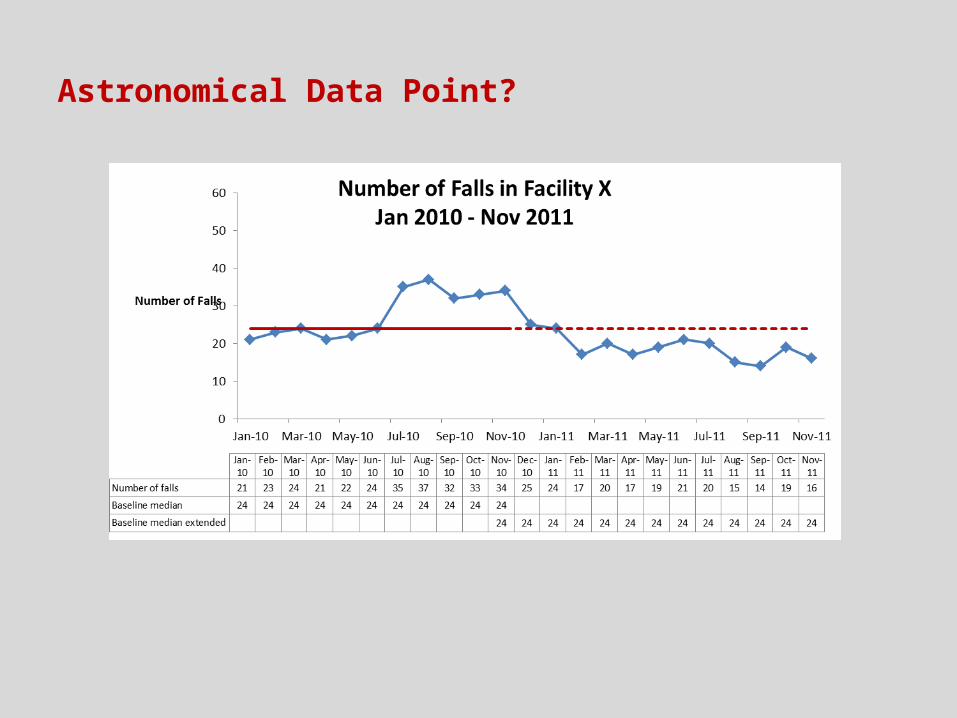
Astronomical Data Point?
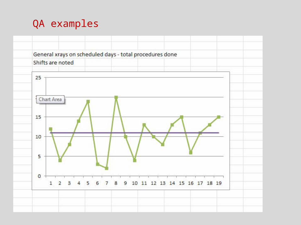
QA examples

Data Display Principles

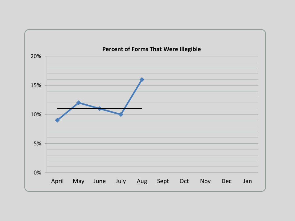
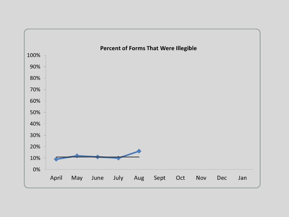

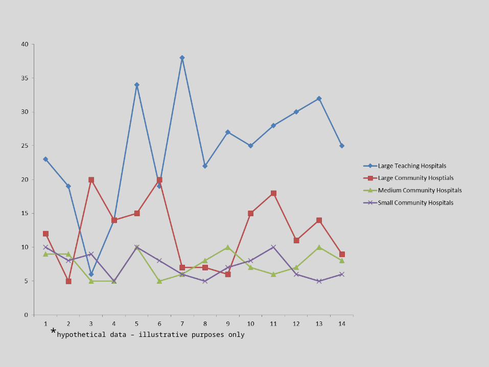
*hypothetical data – illustrative purposes only
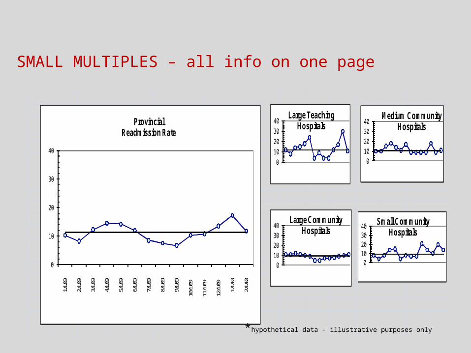
SMALL MULTIPLES – all info on one page
0
10
20
30
40
1/1/09
2/1/09
3/1/09
4/1/09
5/1/09
6/1/09
7/1/09
8/1/09
9/1/09
10/1/
09
11/1/
09
12/1/
09
1/1/10
2/1/10
ProvincialReadmission Rate
0
10
20
30
40Large Teaching
Hospitals
010203040
Large Community Hospitals
010203040
Medium Community Hospitals
010203040 Small Community
Hospitals
*hypothetical data – illustrative purposes only
Case Studies --- each table does 2 case studies.
• What is data telling you?
• How did you analyze it?
• What would your next steps be based on these results?
• Any data display issues?

Percent Hand Hygiene Compliance by Day (Observational Audit)
0
20
40
60
80
100
% compliance 45 32 43 55 67 44 54 65 89 90 94 92 76 54 56 67 98 88 90 88 90 91 94 94 92
1 2 3 4 5 6 7 8 9 10 11 12 13 14 15 16 17 18 19 20 21 22 23 24 25
Case Study 1
The Infection Control team collected data for 25 days in a row. The first week they did a poster campaign and made hand sanitizer available outside every room. The goal of the campaign is to have 95% compliance.
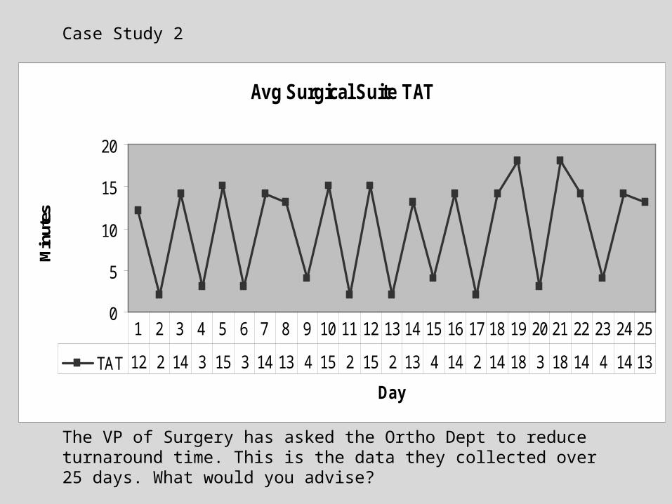
Avg Surgical Suite TAT
0
5
10
15
20
Day
Min
utes
TAT 12 2 14 3 15 3 14 13 4 15 2 15 2 13 4 14 2 14 18 3 18 14 4 14 13
1 2 3 4 5 6 7 8 9 10 11 12 13 14 15 16 17 18 19 20 21 22 23 24 25
Case Study 2
The VP of Surgery has asked the Ortho Dept to reduce turnaround time. This is the data they collected over 25 days. What would you advise?
1 2 3 4 5 6 7 8 9 10 11 12 13 14 15 16 17 18 19 20 21 22 23 24 25
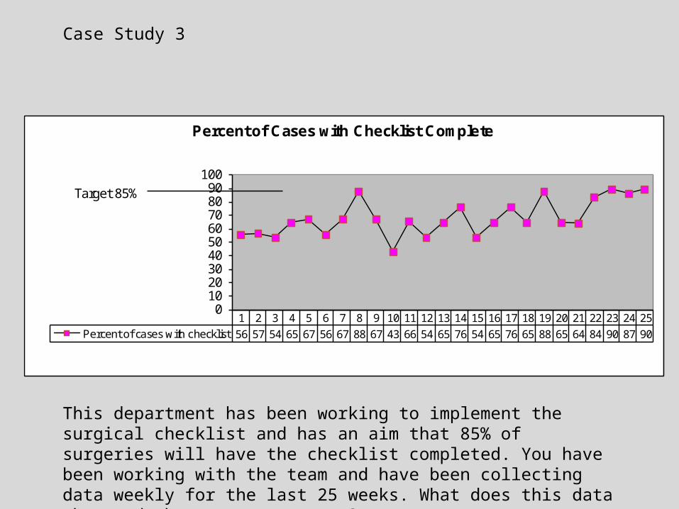
Percent of cases with checklist 56 57 54 65 67 56 67 88 67 43 66 54 65 76 54 65 76 65 88 65 64 84 90 87 90
0102030405060708090
100
Percent of Cases with Checklist Complete
Target 85%
Case Study 3
This department has been working to implement the surgical checklist and has an aim that 85% of surgeries will have the checklist completed. You have been working with the team and have been collecting data weekly for the last 25 weeks. What does this data show and what are next steps?

Percent of Cases with Checklist Complete
0
20
40
60
80
100
Percent of cases w ith checklist 33 54 34 54 34 44 45 47 55 44 56 57 60 64 65 68 69 70 74 75 76 75 76 77 79
1 2 3 4 5 6 7 8 9 10 11 12 13 14 15 16 17 18 19 20 21 22 23 24 25
Target 85%
Case Study 4
This department has been working to implement the surgical checklist and has an aim that 85% of surgeries will have the checklist completed. You have been working with the team and have been collecting data weekly for the last 25 weeks. What does this data show and what are next steps?

References
BCPSQC Measurement Report http://www.bcpsqc.ca/pdf/MeasurementStrategies.pdf
Langley GJ, Moen R, Nolan KM, Nolan TW, Norman CL, Provost LP (2009) The Improvement Guide (2nd ed).
Provost L, Murray S (2011) The Health Care Data Guide.