Embed Size (px)
Citation preview

Math 227 Elementary Statistics
Bluman 5th edition

2
CHAPTER 2
Frequency Distributions and Graphs
3
Objectives
• Organize data using frequency distributions.
• Represent data in frequency distributions graphically using histograms, frequency polygons, and ogives.
• Represent data using Pareto charts, time series graphs, and pie graphs.
• Draw and interpret a stem and leaf plot.
• Draw and Interpret a scatter plot for a set of paired data.
4
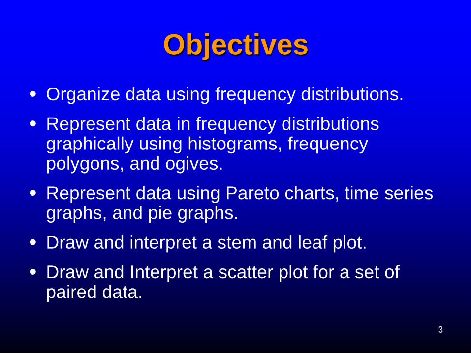
Introduction
This chapter will show how to organize data
and then construct appropriate graphs to
represent the data in a concise, easy-to-
understand form.

5
Section 2.1 Organizing Data
Basic Vocabulary
• When data are collected in original form, they are called raw data.
• A frequency distribution is the organization of raw data in table form, using classes and frequencies.
• The two most common distributions are categorical frequency distribution and the grouped frequency distribution.

6
Frequency Distributions
Categorical Frequency Distributions
count how many times each distinct
category has occurred and
summarize the results in a table
format
7
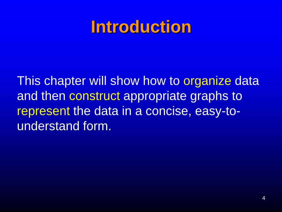
Example 1: Letter grades for Math 227 Spring 2005:
C A B C D F B B A C C F C
B D A C C C F C C A A C
a) Construct a frequency distribution for the categorical data.
Answer: Class Tally Frequency Percent
A //// 5 20
B //// 4 16
D // 2 8
F /// 3 12
Total 25 100
/ //// //// / C / 11 44
/
8
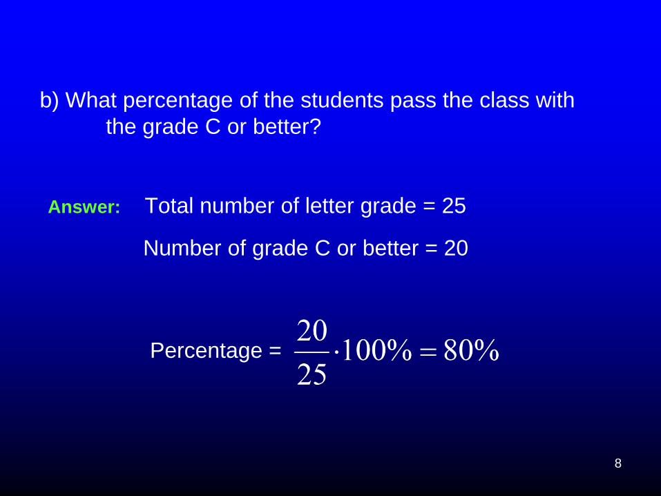
b) What percentage of the students pass the class with
the grade C or better?
Answer: Total number of letter grade = 25
Number of grade C or better = 20
Percentage =

9
Frequency Distributions
Group Frequency Distributions -
When the range of the data is large, the
data must be grouped into classes
that are more than one unit in width
10
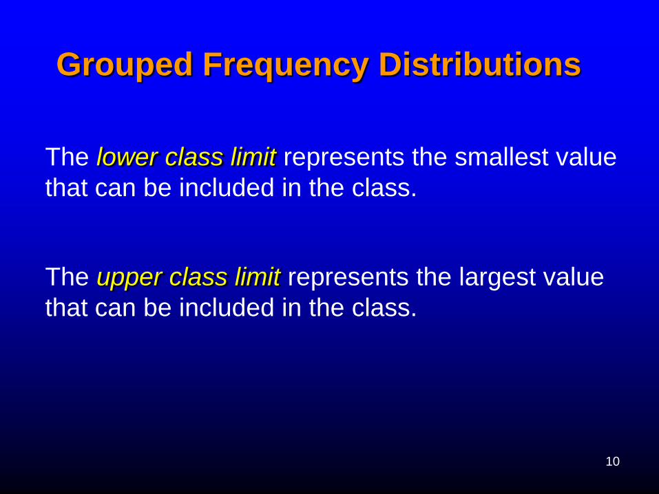
Grouped Frequency Distributions
The lower class limit represents the smallest value
that can be included in the class.
The upper class limit represents the largest value
that can be included in the class.
11
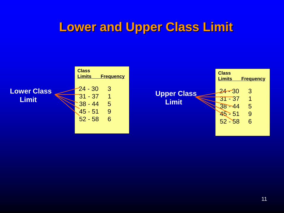
Lower and Upper Class Limit
Lower Class
Limit
Class
Limits Frequency
24 - 30 3
31 - 37 1
38 - 44 5
45 - 51 9
52 - 58 6
Class
Limits Frequency
24 - 30 3
31 - 37 1
38 - 44 5
45 - 51 9
52 - 58 6
Upper Class
Limit
12
Grouped Frequency
Distributions (cont.)
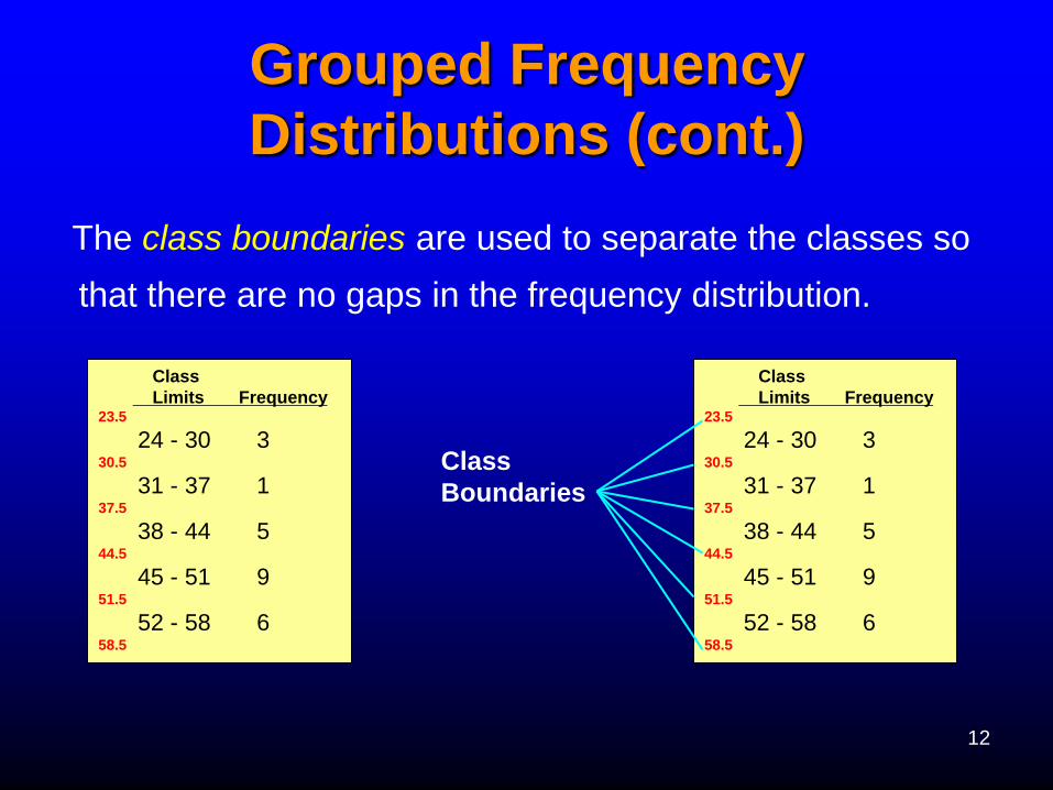
Class
Limits Frequency 23.5
24 - 30 3 30.5
31 - 37 1 37.5
38 - 44 5 44.5
45 - 51 9 51.5
52 - 58 6 58.5
Class
Limits Frequency 23.5
24 - 30 3 30.5
31 - 37 1 37.5
38 - 44 5 44.5
45 - 51 9 51.5
52 - 58 6 58.5
Class
Boundaries
The class boundaries are used to separate the classes so
that there are no gaps in the frequency distribution.
13
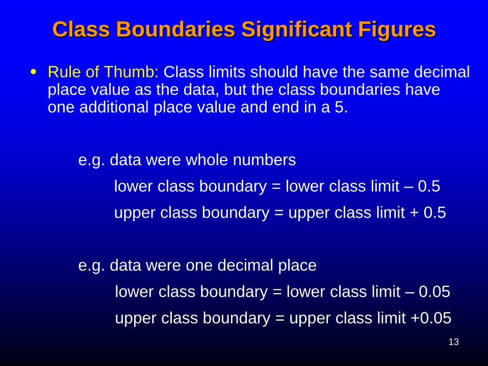
• Rule of Thumb: Class limits should have the same decimal place value as the data, but the class boundaries have one additional place value and end in a 5.
e.g. data were whole numbers
lower class boundary = lower class limit – 0.5
upper class boundary = upper class limit + 0.5
e.g. data were one decimal place
lower class boundary = lower class limit – 0.05
upper class boundary = upper class limit +0.05
Class Boundaries Significant Figures

14
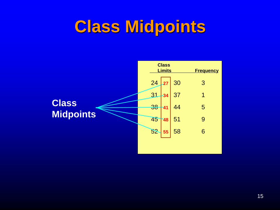
Class Midpoints
•The class midpoint (mark) is found by
adding the lower and upper boundaries (or
limits) and dividing by 2.
15
Class Midpoints
Class
Limits Frequency
24 27 30 3
31 34 37 1
38 41 44 5
45 48 51 9
52 55 58 6
Class
Midpoints
16
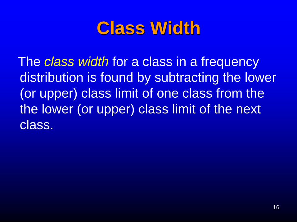
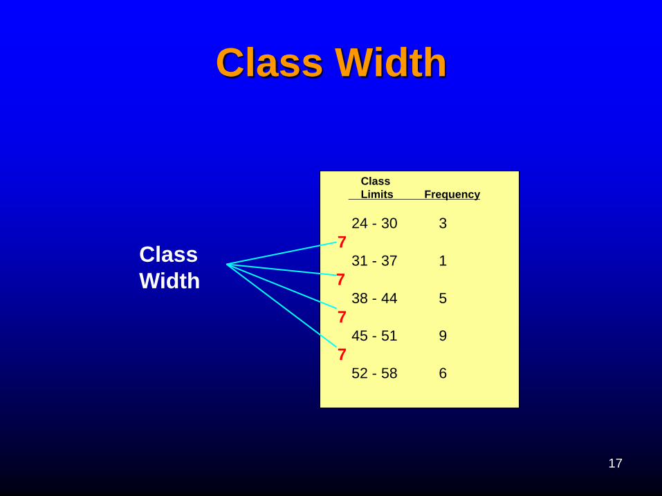
Class Width
The class width for a class in a frequency
distribution is found by subtracting the lower
(or upper) class limit of one class from the
the lower (or upper) class limit of the next
class.
17
Class Width
Class
Limits Frequency
24 - 30 3
7 31 - 37 1
7 38 - 44 5
7 45 - 51 9
7 52 - 58 6
Class
Width
18
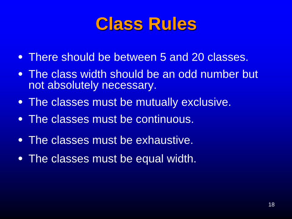
Class Rules
• There should be between 5 and 20 classes.
• The class width should be an odd number but not absolutely necessary.
• The classes must be mutually exclusive.
• The classes must be continuous.
• The classes must be exhaustive.
• The classes must be equal width.
19
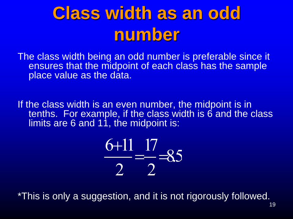
Class width as an odd
number The class width being an odd number is preferable since it
ensures that the midpoint of each class has the sample place value as the data.
If the class width is an even number, the midpoint is in tenths. For example, if the class width is 6 and the class limits are 6 and 11, the midpoint is:
*This is only a suggestion, and it is not rigorously followed.
20
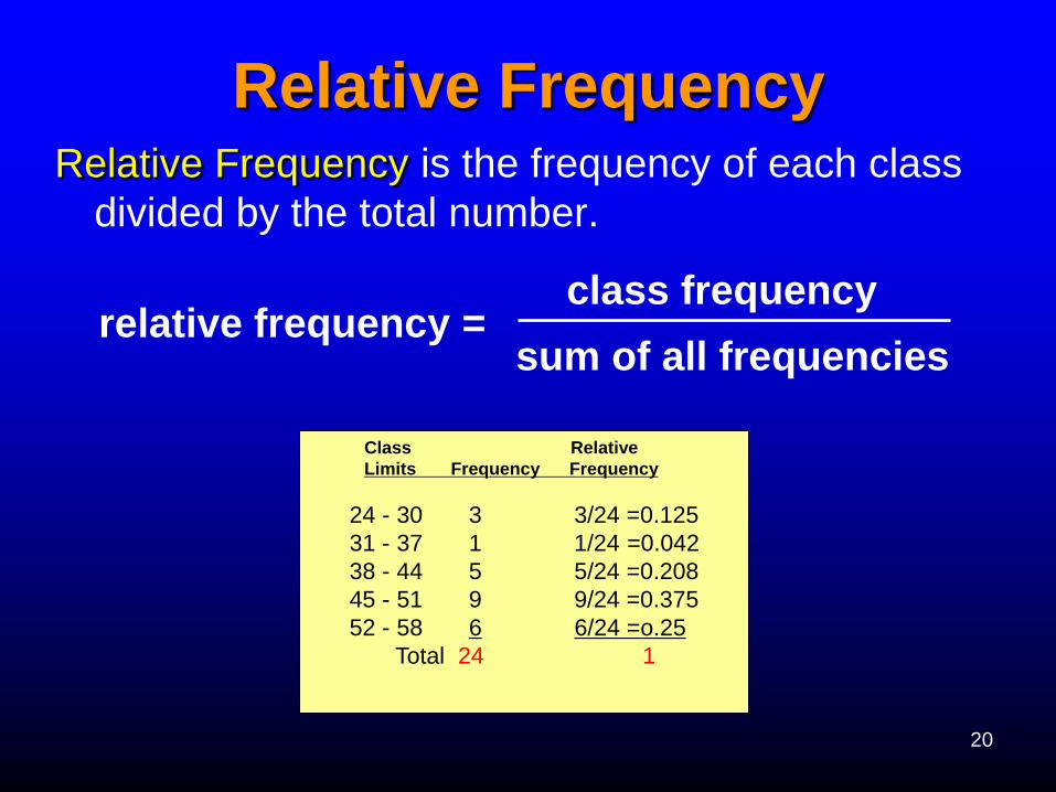
Relative Frequency Relative Frequency is the frequency of each class
divided by the total number.
relative frequency = class frequency
sum of all frequencies
Class Relative
Limits Frequency Frequency
24 - 30 3 3/24 =0.125
31 - 37 1 1/24 =0.042
38 - 44 5 5/24 =0.208
45 - 51 9 9/24 =0.375
52 - 58 6 6/24 =o.25
Total 24 1
21
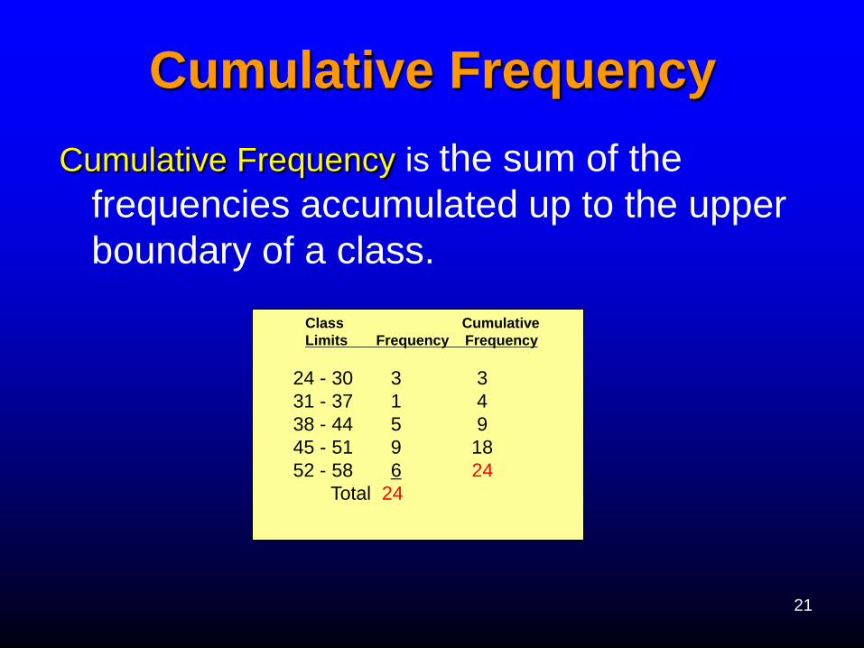
Cumulative Frequency
Cumulative Frequency is the sum of the
frequencies accumulated up to the upper
boundary of a class.
Class Cumulative
Limits Frequency Frequency
24 - 30 3 3
31 - 37 1 4
38 - 44 5 9
45 - 51 9 18
52 - 58 6 24
Total 24
22
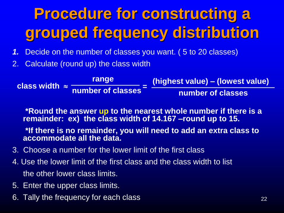
Procedure for constructing a
grouped frequency distribution 1. Decide on the number of classes you want. ( 5 to 20 classes)
2. Calculate (round up) the class width
*Round the answer up to the nearest whole number if there is a remainder: ex) the class width of 14.167 –round up to 15.
*If there is no remainder, you will need to add an extra class to accommodate all the data.
3. Choose a number for the lower limit of the first class
4. Use the lower limit of the first class and the class width to list
the other lower class limits.
5. Enter the upper class limits.
6. Tally the frequency for each class
class width (highest value) – (lowest value)
number of classes
range
number of classes =
23
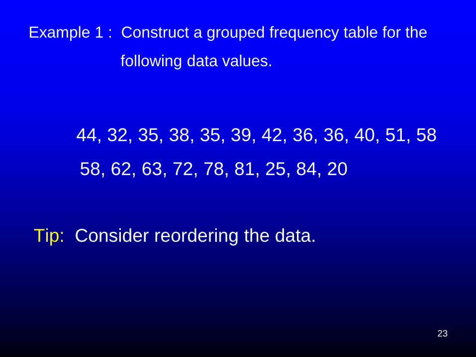
Example 1 : Construct a grouped frequency table for the
following data values.
44, 32, 35, 38, 35, 39, 42, 36, 36, 40, 51, 58
58, 62, 63, 72, 78, 81, 25, 84, 20
Tip: Consider reordering the data.
24
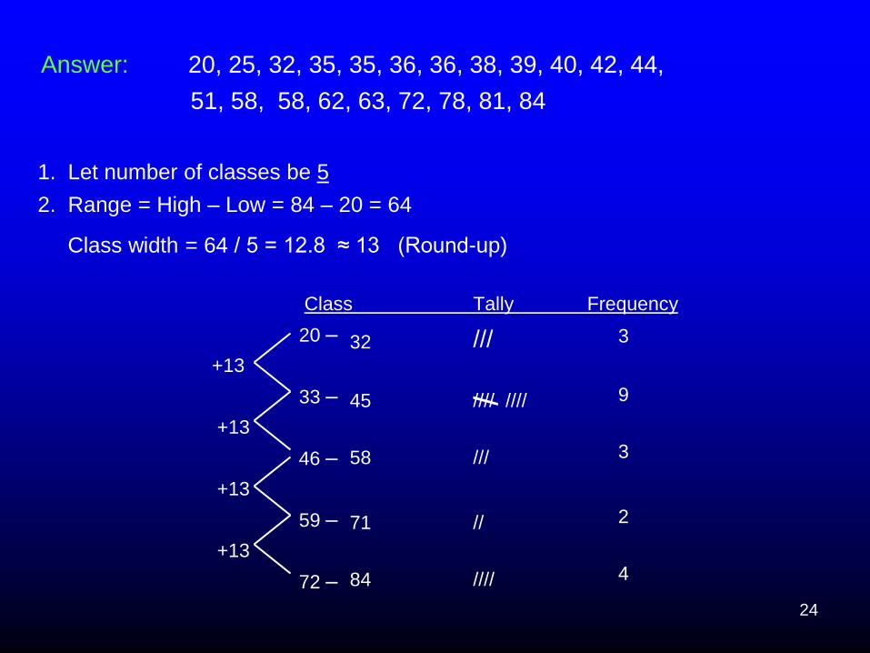
Answer: 20, 25, 32, 35, 35, 36, 36, 38, 39, 40, 42, 44,
51, 58, 58, 62, 63, 72, 78, 81, 84
1. Let number of classes be 5
2. Range = High – Low = 84 – 20 = 64
Class width = 64 / 5 = 12.8 ≈ 13 (Round-up)
Class Tally Frequency
20 –
+13
33 –
+13
46 –
+13
59 –
+13
72 –
///
//// ////
///
//
////
/
3
9
3
2
4
32
45
58
71
84
25
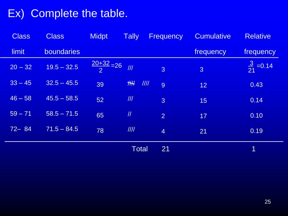
Ex) Complete the table.
Class Class Midpt Tally Frequency Cumulative Relative
limit boundaries frequency frequency
Total 21 1
20+32
2
=26
20 – 32
33 – 45
46 – 58
59 – 71
72– 84
19.5 – 32.5
32.5 – 45.5
45.5 – 58.5
58.5 – 71.5
71.5 – 84.5
39
52
65
78
///
//// ////
///
//
////
/
3
9
3
2
4
3
12
15
17
21
3
21
=0.14
0.43
0.14
0.10
0.19
26
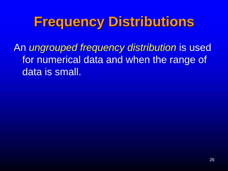
Frequency Distributions
An ungrouped frequency distribution is used
for numerical data and when the range of
data is small.
27
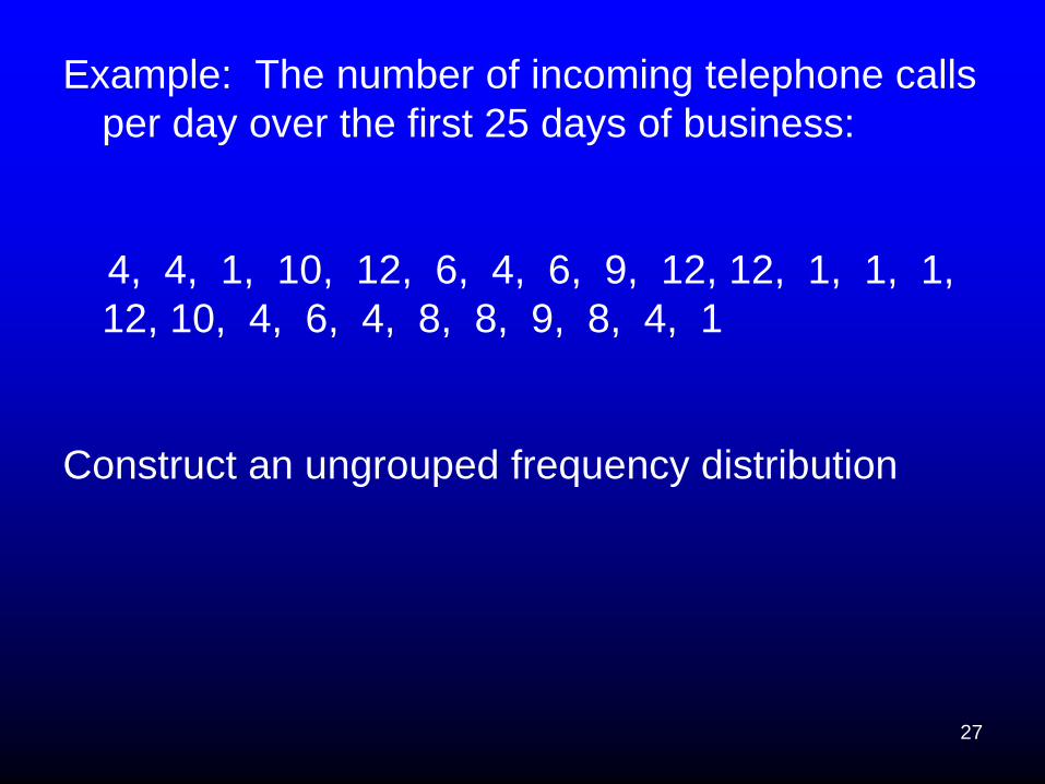
Example: The number of incoming telephone calls
per day over the first 25 days of business:
4, 4, 1, 10, 12, 6, 4, 6, 9, 12, 12, 1, 1, 1,
12, 10, 4, 6, 4, 8, 8, 9, 8, 4, 1
Construct an ungrouped frequency distribution
28
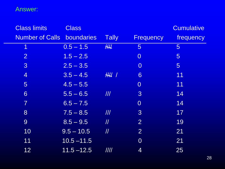
Answer:
Class limits Class Cumulative
Number of Calls boundaries Tally Frequency frequency
1 0.5 – 1.5 //// 5 5
2 1.5 – 2.5 0 5
3 2.5 – 3.5 0 5
4 3.5 – 4.5 //// / 6 11
5 4.5 – 5.5 0 11
6 5.5 – 6.5 /// 3 14
7 6.5 – 7.5 0 14
8 7.5 – 8.5 /// 3 17
9 8.5 – 9.5 // 2 19
10 9.5 – 10.5 // 2 21
11 10.5 –11.5 0 21
12 11.5 –12.5 //// 4 25
/ /
29
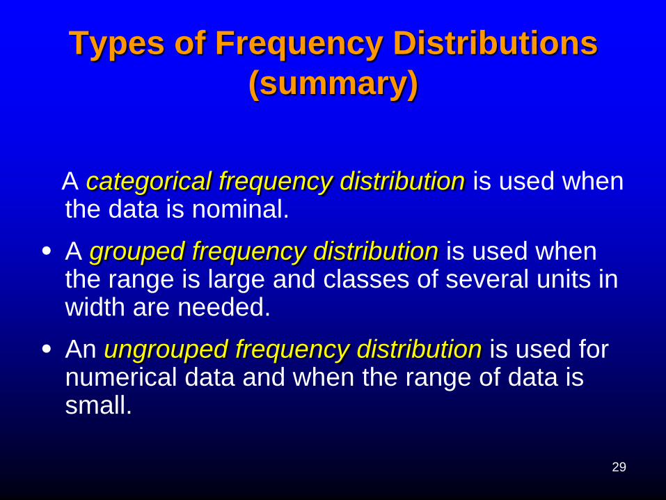
Types of Frequency Distributions
(summary)
A categorical frequency distribution is used when the data is nominal.
• A grouped frequency distribution is used when the range is large and classes of several units in width are needed.
• An ungrouped frequency distribution is used for numerical data and when the range of data is small.
30
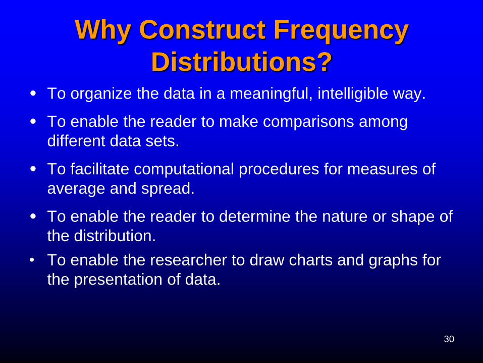
Why Construct Frequency
Distributions? • To organize the data in a meaningful, intelligible way.
• To enable the reader to make comparisons among
different data sets.
• To facilitate computational procedures for measures of
average and spread.
• To enable the reader to determine the nature or shape of
the distribution.
• To enable the researcher to draw charts and graphs for
the presentation of data.
31
Section 2.2 Histogram, Frequency
Polygons, Ogives
This chapter will show how to organize data
and then construct appropriate graphs to
represent the data in a concise, easy-to-
understand form.

32
The Role of Graphs
• The purpose of graphs in statistics is to convey
the data to the viewer in pictorial form.
• Graphs are useful in getting the audience’s
attention in a publication or a presentation.
33
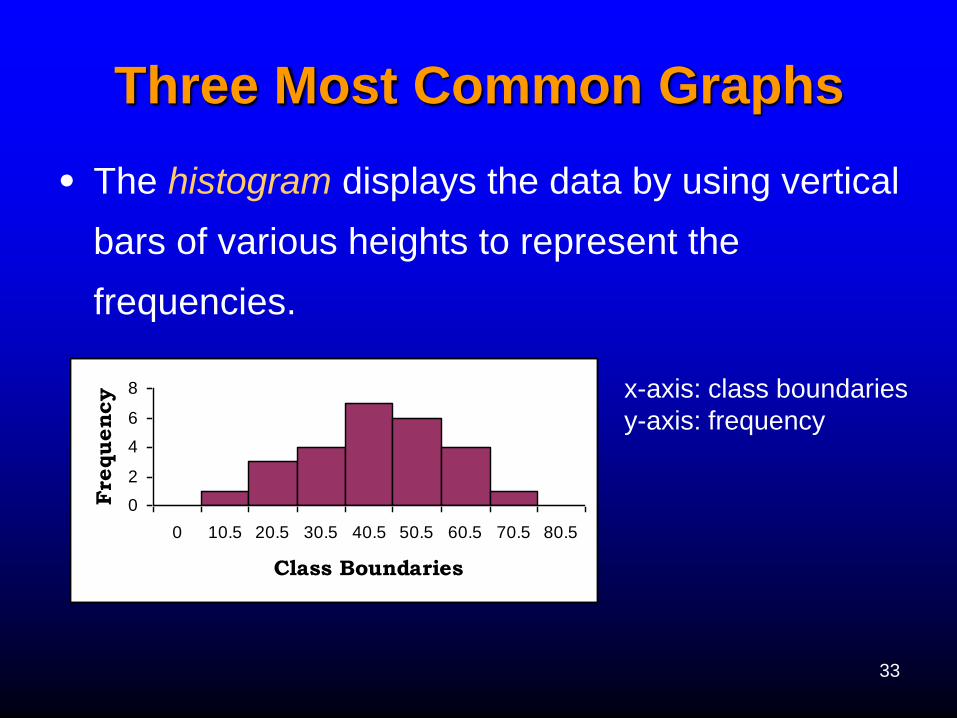
Three Most Common Graphs
• The histogram displays the data by using vertical
bars of various heights to represent the
frequencies.
0
2
4
6
8
0 10.5 20.5 30.5 40.5 50.5 60.5 70.5 80.5
Class Boundaries
Fre
quency x-axis: class boundaries
y-axis: frequency
34
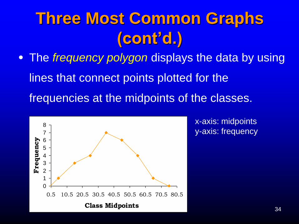
Three Most Common Graphs
(cont’d.) • The frequency polygon displays the data by using
lines that connect points plotted for the
frequencies at the midpoints of the classes.
x-axis: midpoints
y-axis: frequency
0
1
2
3
4
5
6
7
8
0.5 10.5 20.5 30.5 40.5 50.5 60.5 70.5 80.5
Class Midpoints
Frequency
35
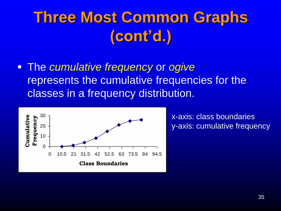
Three Most Common Graphs
(cont’d.)
• The cumulative frequency or ogive
represents the cumulative frequencies for the
classes in a frequency distribution.
x-axis: class boundaries
y-axis: cumulative frequency
0
10
20
30
0 10.5 21 31.5 42 52.5 63 73.5 84 94.5
Class Boundaries
Cum
ula
tive
Fre
quen
cy
36
Relative Frequency Graphs
• A relative frequency graph is a graph that
uses proportions instead of frequencies.
Relative frequencies are used when the
proportion of data values that fall into a given
class is more important than the frequency.
37
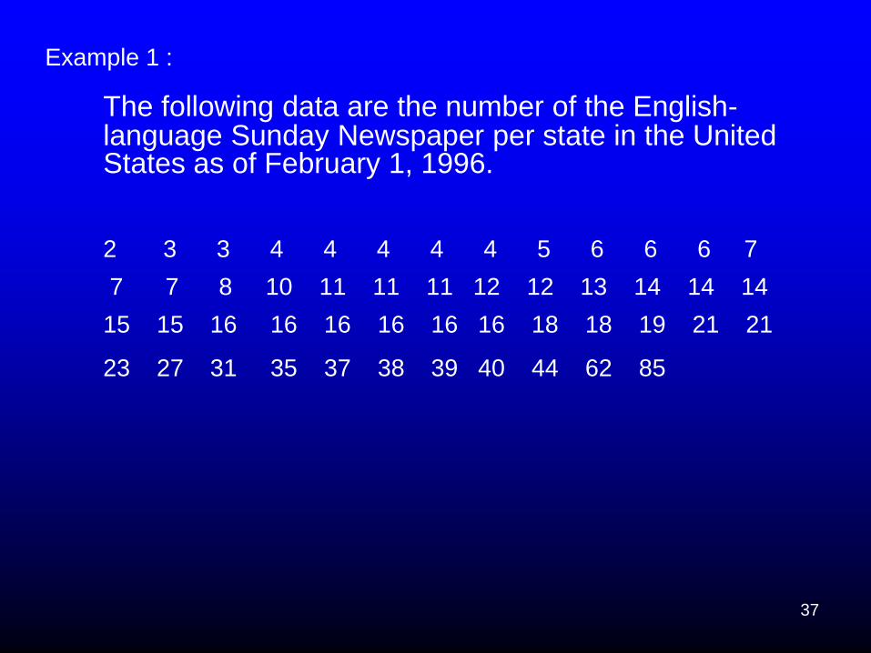
Example 1 :
The following data are the number of the English-language Sunday Newspaper per state in the United States as of February 1, 1996.
2 3 3 4 4 4 4 4 5 6 6 6 7
7 7 8 10 11 11 11 12 12 13 14 14 14
15 15 16 16 16 16 16 16 18 18 19 21 21
23 27 31 35 37 38 39 40 44 62 85
38
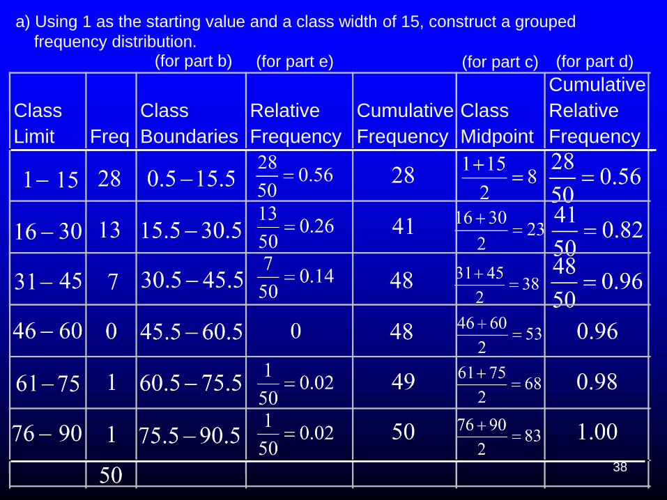
(for part b) (for part e) (for part c) (for part d)
a) Using 1 as the starting value and a class width of 15, construct a grouped
frequency distribution.
Class
Limit Freq
Class
Boundaries
Relative
Frequency
Cumulative
Frequency
Class
Midpoint
Cumulative
Relative
Frequency
39
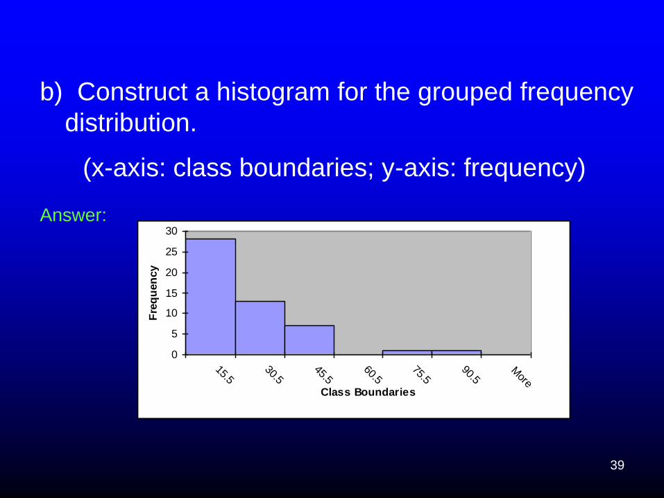
b) Construct a histogram for the grouped frequency
distribution.
(x-axis: class boundaries; y-axis: frequency)
Answer:
0
5
10
15
20
25
30
15.530.5
45.560.5
75.590.5
More
Class Boundaries
Fre
qu
en
cy

40
c) Construct a frequency polygon.
(x-axis: class midpoints(marks); y-axis: frequency)
Answer:
0
5
10
15
20
25
30
-7 8 23 38 53 68 83 98
Class Marks
Fre
qu
en
cy

41
d) Construct an ogive.
(x-axis: class boundaries; y-axis: cumulative frequency)
Answer:
0
10
20
30
40
50
60
0.5 15.5 30.5 45.5 60.5 75.5 90.5
Class Boundaries
Cu
mu
lati
ve F
req
uen
cy
42
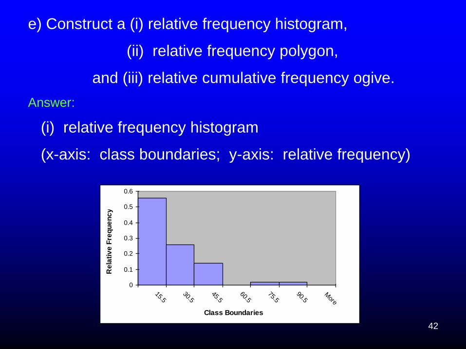
e) Construct a (i) relative frequency histogram,
(ii) relative frequency polygon,
and (iii) relative cumulative frequency ogive.
Answer:
(i) relative frequency histogram
(x-axis: class boundaries; y-axis: relative frequency)
0
0.1
0.2
0.3
0.4
0.5
0.6
15.530.5
45.560.5
75.590.5
More
Class Boundaries
Re
lati
ve
Fre
qu
en
cy

43
(ii) relative frequency polygon
(x-axis: class midpoints (marks); y-axis: relative
frequency)
0
0.1
0.2
0.3
0.4
0.5
0.6
-7 8 23 38 53 68 83 98
Class Marks
Rela
tive F
req
uen
cy
44
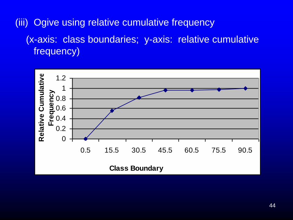
(iii) Ogive using relative cumulative frequency
(x-axis: class boundaries; y-axis: relative cumulative
frequency)
0
0.2
0.4
0.6
0.8
1
1.2
0.5 15.5 30.5 45.5 60.5 75.5 90.5
Class Boundary
Re
lati
ve
Cu
mu
lati
ve
Fre
qu
en
cy
45
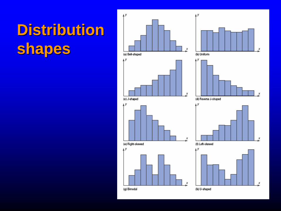
Distribution
shapes
46
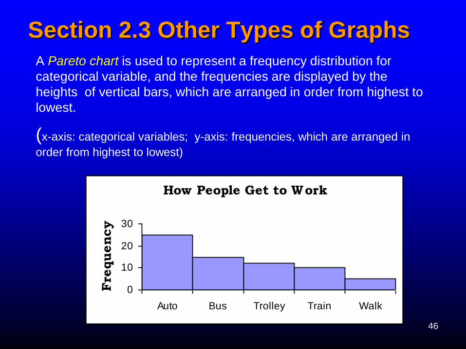
Section 2.3 Other Types of Graphs
A Pareto chart is used to represent a frequency distribution for
categorical variable, and the frequencies are displayed by the
heights of vertical bars, which are arranged in order from highest to
lowest.
(x-axis: categorical variables; y-axis: frequencies, which are arranged in
order from highest to lowest)
How People Get to Work
0
10
20
30
Auto Bus Trolley Train Walk
Fre
quency
47
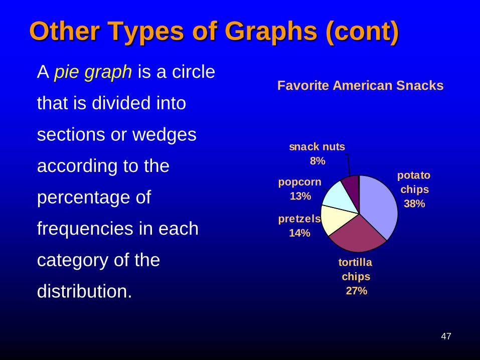
Other Types of Graphs (cont) A pie graph is a circle
that is divided into
sections or wedges
according to the
percentage of
frequencies in each
category of the
distribution.
Favorite American Snacks
potato
chips
38%
tortilla
chips
27%
pretzels
14%
popcorn
13%
snack nuts
8%
48
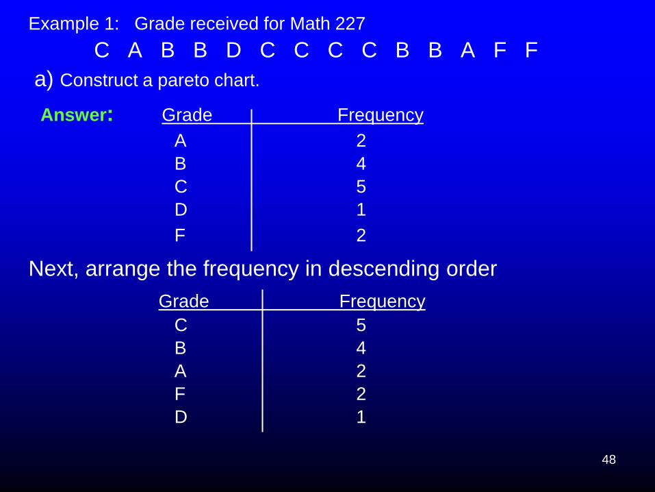
Example 1: Grade received for Math 227
C A B B D C C C C B B A F F
a) Construct a pareto chart.
Answer: Grade Frequency
A 2
B 4
C 5
D 1
F 2
Next, arrange the frequency in descending order
Grade Frequency
C 5
B 4
A 2
F 2
D 1
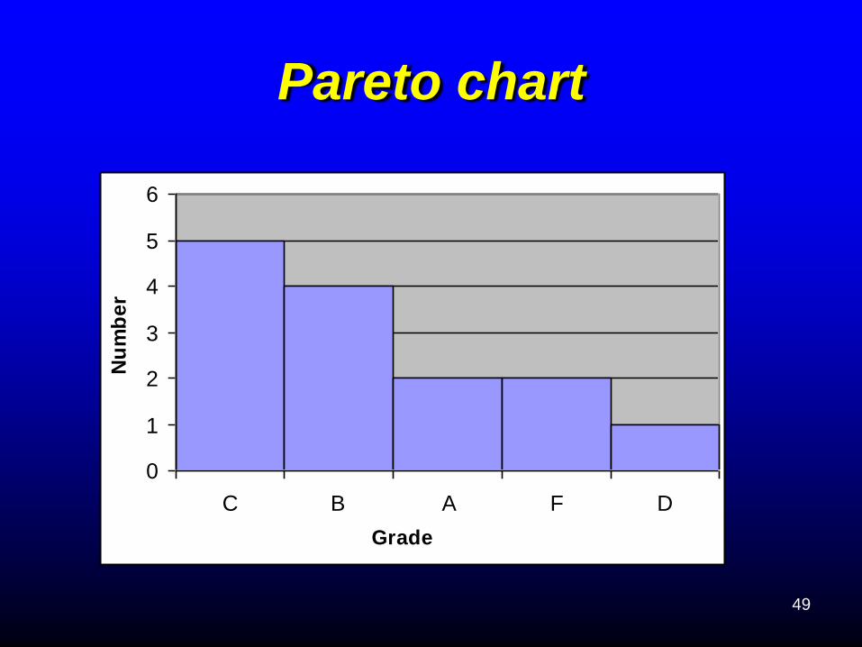
49
0
1
2
3
4
5
6
C B A F D
Grade
Nu
mb
er
Pareto chart
50
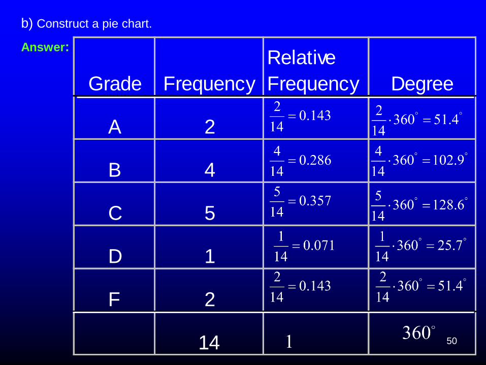
Grade Frequency
Relative
Frequency Degree
A 2
B 4
C 5
D 1
F 2
14
b) Construct a pie chart.
Answer:
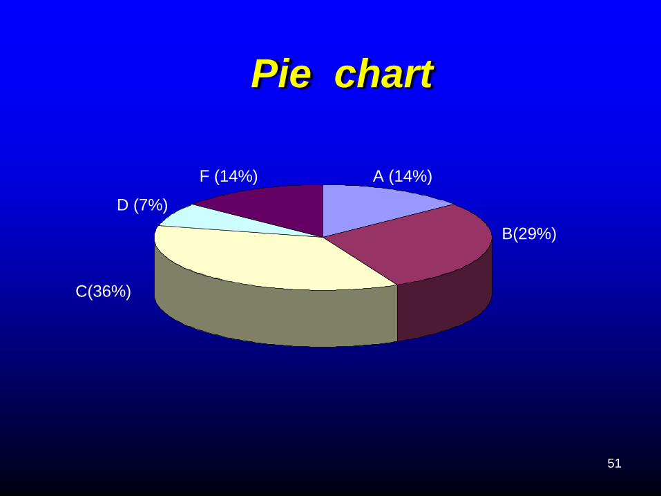
51
F (14%) A (14%)
D (7%)
B(29%)
C(36%)
Pie chart
52
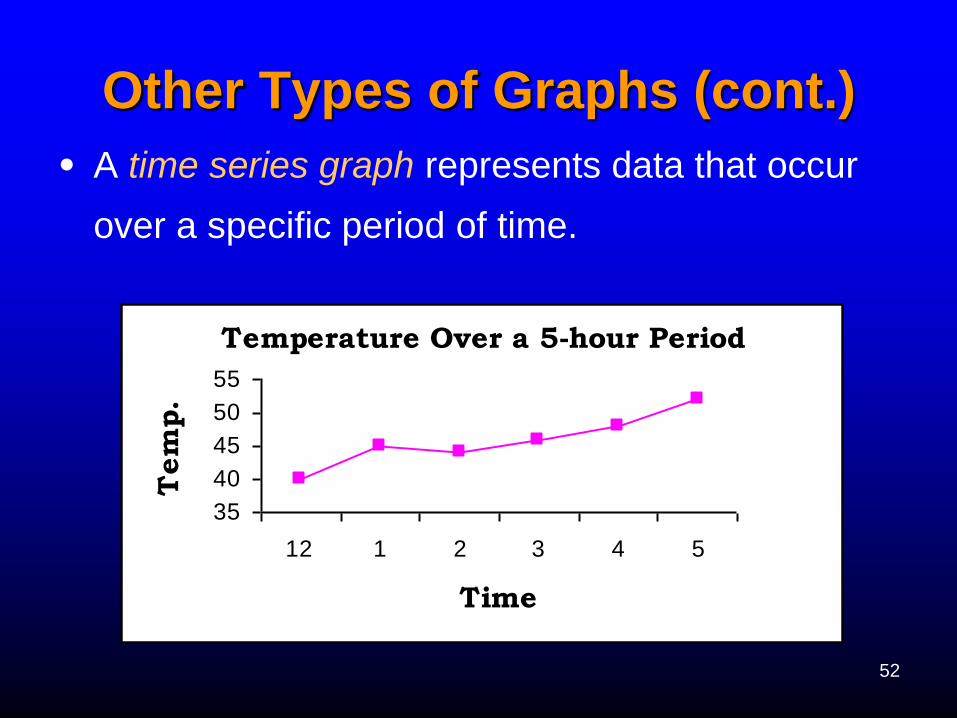
Other Types of Graphs (cont.)
• A time series graph represents data that occur
over a specific period of time.
Temperature Over a 5-hour Period
35
40
45
50
55
12 1 2 3 4 5
Time
Tem
p.
53
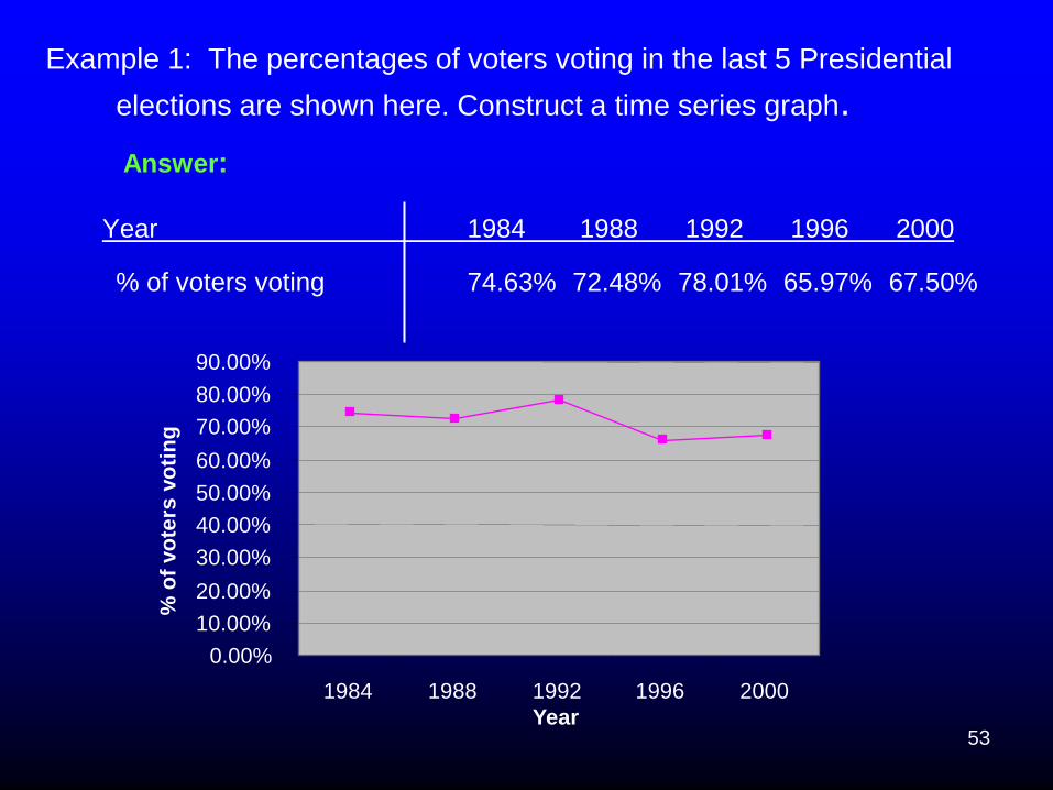
Example 1: The percentages of voters voting in the last 5 Presidential
elections are shown here. Construct a time series graph.
Answer:
Year 1984 1988 1992 1996 2000
% of voters voting 74.63% 72.48% 78.01% 65.97% 67.50%
0.00%
10.00%
20.00%
30.00%
40.00%
50.00%
60.00%
70.00%
80.00%
90.00%
1984 1988 1992 1996 2000
Year
% o
f vo
ters
vo
tin
g
54
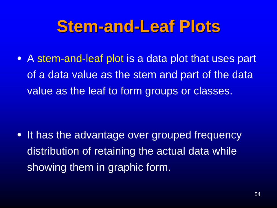
Stem-and-Leaf Plots
• A stem-and-leaf plot is a data plot that uses part
of a data value as the stem and part of the data
value as the leaf to form groups or classes.
• It has the advantage over grouped frequency
distribution of retaining the actual data while
showing them in graphic form.
55
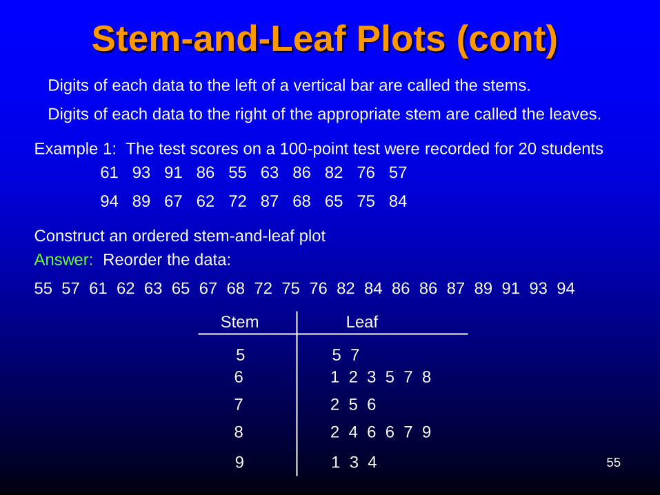
Stem-and-Leaf Plots (cont) Digits of each data to the left of a vertical bar are called the stems.
Digits of each data to the right of the appropriate stem are called the leaves.
Example 1: The test scores on a 100-point test were recorded for 20 students
61 93 91 86 55 63 86 82 76 57
94 89 67 62 72 87 68 65 75 84
Construct an ordered stem-and-leaf plot
Answer: Reorder the data:
55 57 61 62 63 65 67 68 72 75 76 82 84 86 86 87 89 91 93 94
Stem Leaf
5 5 7
6 1 2 3 5 7 8
7 2 5 6
8 2 4 6 6 7 9
9 1 3 4
56
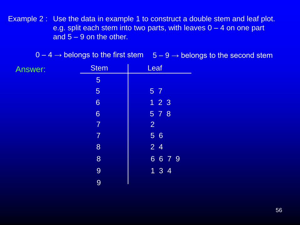
Example 2 :
0 – 4 → belongs to the first stem 5 – 9 → belongs to the second stem
5
5 5 7
6 1 2 3
6 5 7 8
7 2
7 5 6
8 2 4
8 6 6 7 9
9 1 3 4
9
Stem Leaf
Use the data in example 1 to construct a double stem and leaf plot.
e.g. split each stem into two parts, with leaves 0 – 4 on one part
and 5 – 9 on the other.
Answer:

57
Stem-and-Leaf Plots (cont)
A stem-and-leaf plot portrays the shape of a
distribution and restores the original data values.
It is also useful for spotting outliers.
Outliers are data values that are extremely large or
extremely small in comparison to the norm.
58
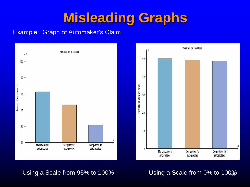
Misleading Graphs
Example: Graph of Automaker’s Claim
Using a Scale from 95% to 100% Using a Scale from 0% to 100%
59
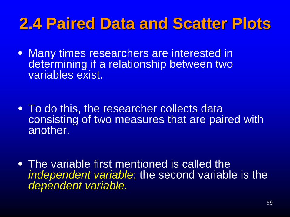
2.4 Paired Data and Scatter Plots
• Many times researchers are interested in determining if a relationship between two variables exist.
• To do this, the researcher collects data consisting of two measures that are paired with another.
• The variable first mentioned is called the independent variable; the second variable is the dependent variable.
60
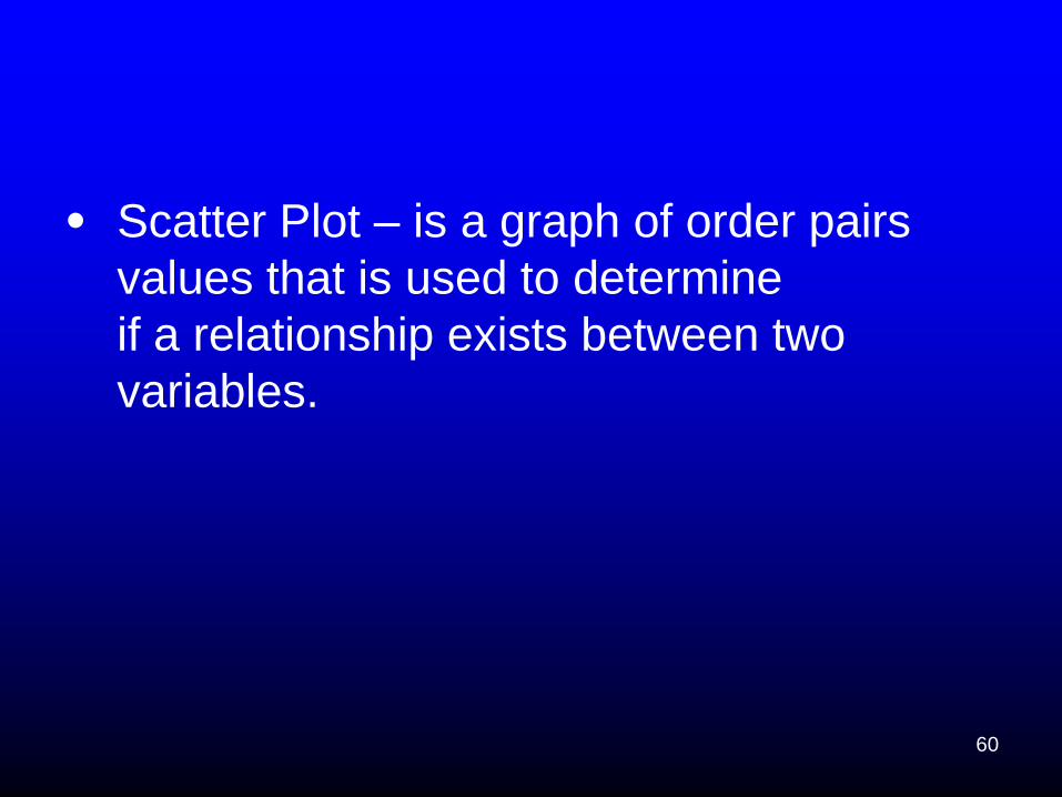
• Scatter Plot – is a graph of order pairs
values that is used to determine
if a relationship exists between two
variables.
61
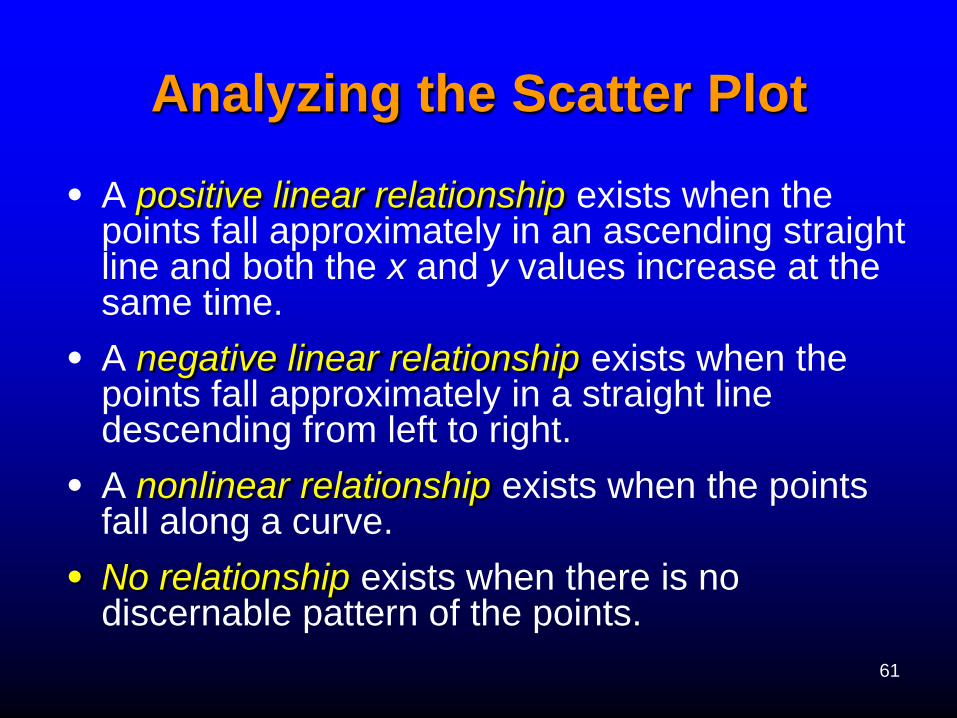
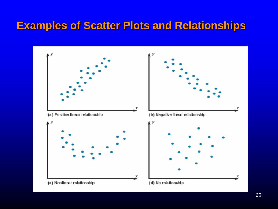
Analyzing the Scatter Plot
• A positive linear relationship exists when the points fall approximately in an ascending straight line and both the x and y values increase at the same time.
• A negative linear relationship exists when the points fall approximately in a straight line descending from left to right.
• A nonlinear relationship exists when the points fall along a curve.
• No relationship exists when there is no discernable pattern of the points.
62
Examples of Scatter Plots and Relationships
63
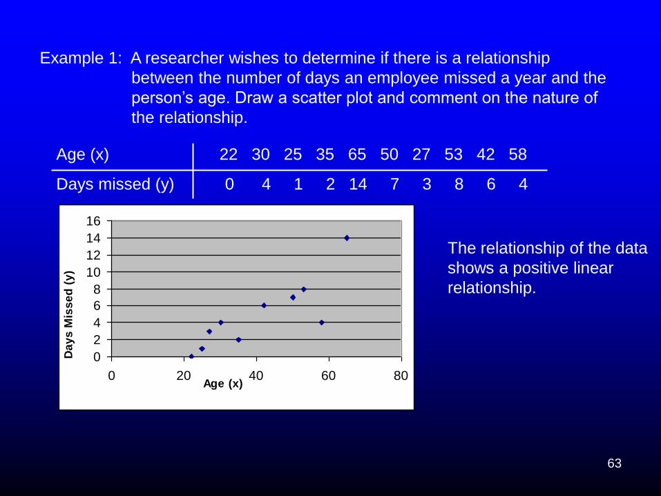
Example 1: A researcher wishes to determine if there is a relationship
between the number of days an employee missed a year and the
person’s age. Draw a scatter plot and comment on the nature of
the relationship.
Age (x) 22 30 25 35 65 50 27 53 42 58
Days missed (y) 0 4 1 2 14 7 3 8 6 4
0
2
4
6
8
10
12
14
16
0 20 40 60 80Age (x)
Da
ys
Mis
se
d (
y)
The relationship of the data
shows a positive linear
relationship.
64
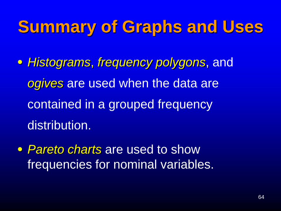
Summary of Graphs and Uses
• Histograms, frequency polygons, and
ogives are used when the data are
contained in a grouped frequency
distribution.
• Pareto charts are used to show
frequencies for nominal variables.
65
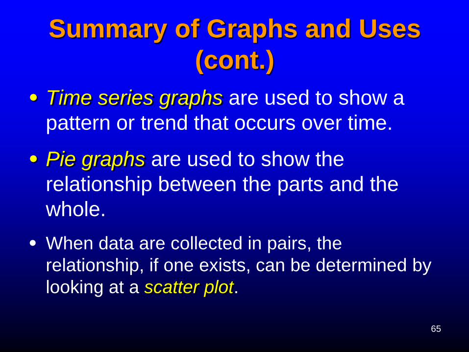
Summary of Graphs and Uses
(cont.)
• Time series graphs are used to show a
pattern or trend that occurs over time.
• Pie graphs are used to show the
relationship between the parts and the
whole.
• When data are collected in pairs, the
relationship, if one exists, can be determined by
looking at a scatter plot.

66
Conclusions
• Data can be organized in some
meaningful way using frequency
distributions. Once the frequency
distribution is constructed, the
representation of the data by graphs is a
simple task.


![Concise Pattern Learning for RDF Data Sets Interlinking · Concise Pattern Learning for RDF Data Sets Interlinking. Artificial Intelligence [cs.AI]. ... Concise Pattern Learning for](https://img.dokumen.tips/doc/110x75/5f0c2f617e708231d43428d9/concise-pattern-learning-for-rdf-data-sets-interlinking-concise-pattern-learning.jpg)