Embed Size (px)
Citation preview

PAD5700 lecture 8
Page 1 of 12
MASTERS OF PUBLIC AFFAIRS PROGRAM
PAD 5700 -- Public administration research methods Spring 2013
Regression IV -- Categorical data and time series
Statistic of the week
graphic source
Religion *
I. Categorical data
* This week is a bit of a catch-all week, in which we specifically address a couple of items that I
wasn't able to fit in earlier, as we continue this process of model building ‘learning-by-doing’.
The two items: categorical data and time series analysis.
Categorical data: that which is measured in categories, not as a continuous variable. By way of
explanation (and this draws from Berman & Wang, p. 44; O'Sullivan et al, p. 102-7; and Levin
and Fox p. 4-8), one generally breaks variables down as follows:
o Interval variables. I've also seen these referred to as continuous variables, as one of their
two key characteristics are that they are:
...continuous, in that they can take an infinite number of values. Age, for instance, can
be measured in years (as I write this, I am 54.68 years old). It can also be measured in
months (656.17), days (19,971?), hours (479,304), minutes (8,758,240) and
1,725,494,400 seconds (calculations based on rounding off the number of days).
Interval -- By this is meant the distance between the various measurements are equal:
one year is one year away from two years, which is also one year from three years,
etc.
o Categorical variables: what we are talking about today. Two mains types:
Ordinal -- Like interval variables, these are 'ordered', in that one is more or less than
another, but the intervals between these are not necessarily of equal value. So in a
Likert scale response to how satisfied you are with your course, your options may be

PAD5700 lecture 8
Page 2 of 12
very satisfied, satisfied, neutral, unsatisfied, or very unsatisfied. There is a definite
rank ordering here, but the distance between the various choices is not necessarily the
same.
Nominal -- variables that are no more than named designations. Religion, for
instance, is measured as Protestant (with the myriad denominations within this!),
Catholic, Buddhist, Muslim, Shinto, Jewish, Zoroastrian, Baha'i, Jain, Taoist, Sikh,
and myriad smaller groups. But (despite what advocates of too many of these belief
systems will tell you) one is not necessarily better than another, and a rank ordering
of all is something only the nuttiest zealot would attempt.
‘Dummy’ – a special kind of nominal variables are ‘dummy’, 0-1, either/or variables.
We’ve used this at least once in this class so far, with the Indiana v. Florida variable.
'Categorical' data is often what you end up with in qualitative research, especially survey
research. As an illustration, as suggested above a response to the question "How old are you,"
can be answered quantitatively with a number: 45. If this data is entered into a dataset with 1000
respondents, one can readily analyze the responses. What is the mean? 37.23 years!
Categorical data is harder to handle. Categorical data can be coded into spreadsheets
numerically: 1-5. But note that these numbers often don't function like numbers. This is
especially evident in what might be called attitudinal variables, or those that use a Likert scale, to
quantify what are otherwise non-numerical phenomena. How old one is can readily be counted,
but how one feels about (to use a Belle County dataset example) public services cannot be. Their
1 = excellent, 2 = good, 3 = fair, 4 = poor coding is ordinal, but not necessarily interval. For the
respondent the difference between 1 (excellent) and 2 (good), may not be the same as the
difference between 2 and 3 (fair). In other words, the slightest fault may cause the respondent to
classify a service as good (2) rather than excellent (1), but the service may have to be
considerably worse than 'good' (2), almost without special merit altogether, before it is classified
as fair (3). Worse, different people may apply this coding schema differently. If this is the case,
treating the variable numerically has its problems. Whereas the difference between 2 and 3 and
between 3 and 4 are exactly the same when analysing numbers, these differences aren't the same
when analysing categorical data.
In their limited discussion of categorical variables, too, O'Sullivan et al (p. 106) discuss nominal
variables (note that they don't use the term categorical, prefer instead 'nominal' and 'ordinal'). For
these, numbers assigned by SPSS, for instance, have no use beyond shorthand identifiers. The
Belle County dataset, for instance, opens with a question on race:
1 = Black or African-American
2 = Hispanic
3 = Native American/ Indian
4 = Asian
5 = White
Using descriptive statistics to generate a mean for this variable (it happens to be 4.16) means
nothing (by the way, this variable should have been created as a 'string' variable, so that you can't
calculate means for it). Instead, one would report this variable using frequencies (Analyze,
descriptive statistics, frequencies, throw 'respondent race' into variables, OK):

PAD5700 lecture 8
Page 3 of 12
Table 1 -- Respondent race
Frequency Percent Valid Percent
Cumulative Percent
Valid Black or African American 99 19.6 20.0 20.0
Hispanic 3 .6 .6 20.6
Native American/Indian 3 .6 .6 21.2
Asian 6 1.2 1.2 22.4
White 384 75.9 77.6 100.0
Total 495 97.8 100.0 Missing System 11 2.2 Total 506 100.0
As we will see, nominal variables can best be handled by creating ‘dummy’ variables. So you
could reconfigure the religion variable and make a new ‘Catholic’ variable, coding 0 = non-
Catholic, 1 = Catholic, and can now assess the impact of Catholicism on dependent variables.
Again, even income, which in this dataset is converted from a continuous to an ordinal variable,
can't readily be treated as a numerical variable. A mean income of 5.4 means little, it doesn't
even necessarily indicate that the mean income is 4/10s of the way along the interval in category
5 ($35,000 to 49,999). This data would, instead, be reported using frequencies, as follows
(Analyze, Descriptive Statistics, Frequencies, throw 'respondent income' into variables, OK):
Table 2 -- Respondent income
Frequency Percent Valid Percent
Cumulative Percent
Valid Less than $10,000 17 3.4 4.0 4.0
$10,000-$14,999 22 4.3 5.1 9.1
$15,000-$24,999 55 10.9 12.9 22.0
$25,999-$34,999 57 11.3 13.3 35.3
$35,000-$49,999 79 15.6 18.5 53.7
$50,000-$74,999 115 22.7 26.9 80.6
$75,000-$99,999 47 9.3 11.0 91.6
$100,000 or more 36 7.1 8.4 100.0
Total 428 84.6 100.0 Missing System 78 15.4 Total 506 100.0
Frequencies are especially useful for presenting classic Likert-scale type categorical data, so the
'Overall county service value' rating in the Belle County dataset would look like this (Analyze,
Descriptive Statistics, Frequencies, throw 'overall county service value rating' into variables,
OK):
PAD5700 lecture 8
Page 4 of 12
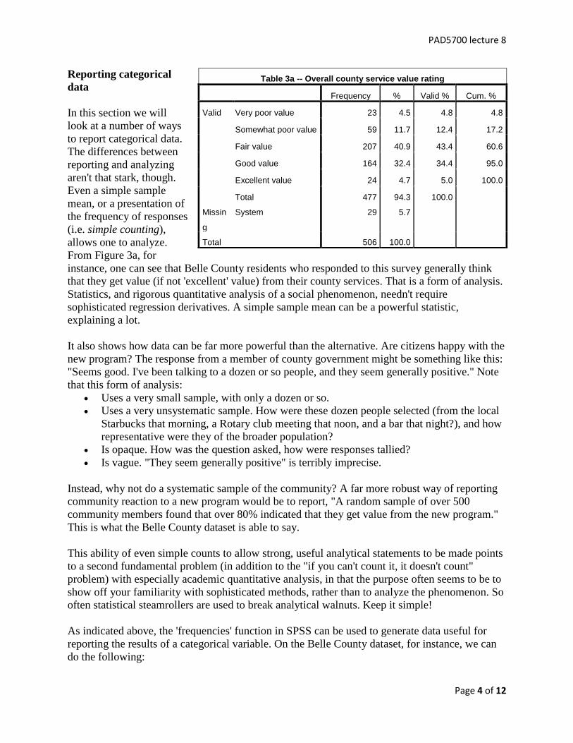
Reporting categorical
data
In this section we will
look at a number of ways
to report categorical data.
The differences between
reporting and analyzing
aren't that stark, though.
Even a simple sample
mean, or a presentation of
the frequency of responses
(i.e. simple counting),
allows one to analyze.
From Figure 3a, for
instance, one can see that Belle County residents who responded to this survey generally think
that they get value (if not 'excellent' value) from their county services. That is a form of analysis.
Statistics, and rigorous quantitative analysis of a social phenomenon, needn't require
sophisticated regression derivatives. A simple sample mean can be a powerful statistic,
explaining a lot.
It also shows how data can be far more powerful than the alternative. Are citizens happy with the
new program? The response from a member of county government might be something like this:
"Seems good. I've been talking to a dozen or so people, and they seem generally positive." Note
that this form of analysis:
Uses a very small sample, with only a dozen or so.
Uses a very unsystematic sample. How were these dozen people selected (from the local
Starbucks that morning, a Rotary club meeting that noon, and a bar that night?), and how
representative were they of the broader population?
Is opaque. How was the question asked, how were responses tallied?
Is vague. "They seem generally positive" is terribly imprecise.
Instead, why not do a systematic sample of the community? A far more robust way of reporting
community reaction to a new program would be to report, "A random sample of over 500
community members found that over 80% indicated that they get value from the new program."
This is what the Belle County dataset is able to say.
This ability of even simple counts to allow strong, useful analytical statements to be made points
to a second fundamental problem (in addition to the "if you can't count it, it doesn't count"
problem) with especially academic quantitative analysis, in that the purpose often seems to be to
show off your familiarity with sophisticated methods, rather than to analyze the phenomenon. So
often statistical steamrollers are used to break analytical walnuts. Keep it simple!
As indicated above, the 'frequencies' function in SPSS can be used to generate data useful for
reporting the results of a categorical variable. On the Belle County dataset, for instance, we can
do the following:
Table 3a -- Overall county service value rating
Frequency % Valid % Cum. %
Valid Very poor value 23 4.5 4.8 4.8
Somewhat poor value 59 11.7 12.4 17.2
Fair value 207 40.9 43.4 60.6
Good value 164 32.4 34.4 95.0
Excellent value 24 4.7 5.0 100.0
Total 477 94.3 100.0
Missin
g
System 29 5.7
Total 506 100.0

PAD5700 lecture 8
Page 5 of 12
Frequencies
Present frequencies, using Analyze, Descriptive Statistics, Frequencies (which got us the
respondent race data, above). Notice that you have the option to also produce some descriptive
statistics with this, by clicking 'Statistics' on the 'Frequencies' window. I don't find the SPSS
output to be terribly attractive or
professional looking, and
containing a lot of superfluous
information the reader might not
need. Percent, Valid Percent and
Cumulate Percent, for instance, all
are not needed. So you might want
to redo it by creating a new table in
MS Word, perhaps (to reconfigure
Figure 3a, above) using this format
that I've been using in my own
research lately:
Note, too, that in my non-stats classes, when I ask you to write papers, I also offer bonus points
for (as it is described in my standard assignments page format, the bullets below come from page
6 of the PAD5700 Assignments page):
If one was to 'incorporate' the reconfigured Table 3b 'into the narrative of the paper', one might
simply write, "As shown in Table 3b, a strong majority of over 80% of residents responded that
they felt they received at least fair value from the value of county services. Nearly 40% reported
that they received good or excellent value."
Descriptive statistics
One can present descriptive statistics, using Analyze, Descriptive Statistics, and Descriptives.
Try this using the variable 'Years resident in county', which is a purely continuous variable, with
values ranging from 1 to 83 years. The results:
Table 4 – Years resident in county
N Minimum Maximum Mean Std. Deviation
Statistic Statistic Statistic Statistic Std. Error Statistic
Years resident in county 506 1 83 19.06 .768 17.270 Valid N (listwise) 506
To report this, you would not even necessarily need a table. In the narrative, one could just write:
"The mean years resident in the county was 19.06."
Sample sorting
Table 3b
Overall county service value rating
Number Percent
Very poor value 23 4.8
Somewhat poor value 59 12.4
Fair value 207 43.4
Good value 164 34.4
Excellent value 24 5.0
Total 477 100.0 Notes:
29 cases were missing data.
The source is the Belle County dataset.
PAD5700 lecture 8
Page 6 of 12
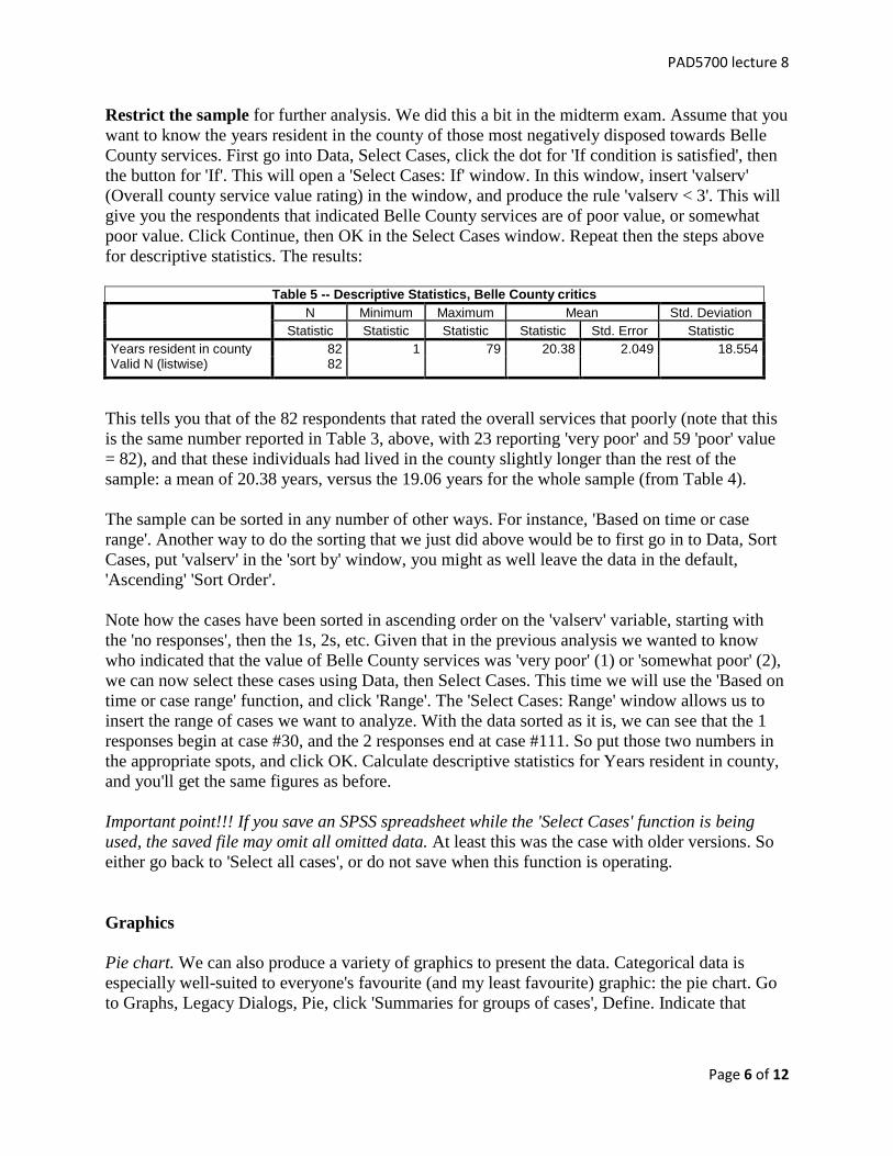
Restrict the sample for further analysis. We did this a bit in the midterm exam. Assume that you
want to know the years resident in the county of those most negatively disposed towards Belle
County services. First go into Data, Select Cases, click the dot for 'If condition is satisfied', then
the button for 'If'. This will open a 'Select Cases: If' window. In this window, insert 'valserv'
(Overall county service value rating) in the window, and produce the rule 'valserv < 3'. This will
give you the respondents that indicated Belle County services are of poor value, or somewhat
poor value. Click Continue, then OK in the Select Cases window. Repeat then the steps above
for descriptive statistics. The results:
Table 5 -- Descriptive Statistics, Belle County critics
N Minimum Maximum Mean Std. Deviation
Statistic Statistic Statistic Statistic Std. Error Statistic
Years resident in county 82 1 79 20.38 2.049 18.554 Valid N (listwise) 82
This tells you that of the 82 respondents that rated the overall services that poorly (note that this
is the same number reported in Table 3, above, with 23 reporting 'very poor' and 59 'poor' value
= 82), and that these individuals had lived in the county slightly longer than the rest of the
sample: a mean of 20.38 years, versus the 19.06 years for the whole sample (from Table 4).
The sample can be sorted in any number of other ways. For instance, 'Based on time or case
range'. Another way to do the sorting that we just did above would be to first go in to Data, Sort
Cases, put 'valserv' in the 'sort by' window, you might as well leave the data in the default,
'Ascending' 'Sort Order'.
Note how the cases have been sorted in ascending order on the 'valserv' variable, starting with
the 'no responses', then the 1s, 2s, etc. Given that in the previous analysis we wanted to know
who indicated that the value of Belle County services was 'very poor' (1) or 'somewhat poor' (2),
we can now select these cases using Data, then Select Cases. This time we will use the 'Based on
time or case range' function, and click 'Range'. The 'Select Cases: Range' window allows us to
insert the range of cases we want to analyze. With the data sorted as it is, we can see that the 1
responses begin at case #30, and the 2 responses end at case #111. So put those two numbers in
the appropriate spots, and click OK. Calculate descriptive statistics for Years resident in county,
and you'll get the same figures as before.
Important point!!! If you save an SPSS spreadsheet while the 'Select Cases' function is being
used, the saved file may omit all omitted data. At least this was the case with older versions. So
either go back to 'Select all cases', or do not save when this function is operating.
Graphics
Pie chart. We can also produce a variety of graphics to present the data. Categorical data is
especially well-suited to everyone's favourite (and my least favourite) graphic: the pie chart. Go
to Graphs, Legacy Dialogs, Pie, click 'Summaries for groups of cases', Define. Indicate that

PAD5700 lecture 8
Page 7 of 12
'Slices Represent % of cases', 'Define slices
by' the variable 'Respondent race', and click
OK. You should get Figure 6:
This is the same data presented in Figure 1,
save that this is a graphic, rather than a
numerical presentation of the data. With
regards to when to use this, note again my
standard, professional writing grading criteria
for tables/graphs: "Note the 'well used'... This
does not mean produce a large, gaudily
coloured pie chart" like the one above "when
it would be easier to simply write '55% of
Vermonters remain opposed to the civil
unions law.'" So the pie chart above really
provides little information that can't more
effectively (and economically) be
communicated by simply writing "The
population was majority white, with a large
Black minority and smaller groups of
Hispanics, Native Americans and Asians.
Notice that only categorical data (or data with
relatively few slices of pie) are readily
presented like this. Try the same for the
variable Years resident in county, you get
Figure 7:
Psychedelic, but not very useful, is it?
Bar chart. Click: Graphs, Legacy Dialogs,
Bar, Simple, Define, 'Bars Represent % of
cases', load 'Overall county service value
rating' in as 'category axis', click OK. You
get Figure 8:
This is the same data presented in the table in
Figure 3 (and 3b), above. The Histogram
function gets you essentially the same thing.
Tables
Note that my favourite graphic, the
Scatterplot, isn't well suited to categorical
data. You can see this by going to Graphs,
Legacy Dialogs, Scatter, Simple, Define, and

PAD5700 lecture 8
Page 8 of 12
loading 'Overall county service value rating' and Gender on the Y and X axis, respectively. I'll
save paper and not copy it in, as it ain't too useful.
You can, though, present this sort of relationship by producing a simple table. SPSS used to
have a separate function for this, but I haven’t been able to find it for years. You can trick it into
producing simple tables through the Crosstabs function:
Analyze, Crosstabs.
Put Overall county service value rating in the Row,
Gender in column. Click OK. You get this:
Table 9 -- Overall county service value rating * Gender Crosstabulation
Count
Gender
Total Male Female
Overall county service value rating
Very poor value 13 10 23
Somewhat poor value 34 25 59
Fair value 111 96 207
Good value 72 92 164
Excellent value 7 17 24 Total 237 240 477
At a glance, you can see that men (bunch o' whiners!) outnumber women in the two 'poor value'
rows, women (bunch o' sissies!) outnumber men in the two 'value' rows. Again, SPSS output isn't
terribly attractive or professional looking, so you might reconfigure it as follows:
Table 10
Gender and overall county service value rating,
Bell County
Male Female
Very poor value 13 10
Somewhat poor value 34 25
Fair value 111 96
Good value 72 92
Excellent value 7 17 Notes:
29 cases were missing data.
The source is the Belle County dataset. Higher level analytical stuff
The purpose of this section's material is to shift to somewhat higher order analytical techniques
that can be applied to categorical data.
Perhaps the most fundamental thing to keep in mind when analyzing any data is to pay attention
to the units in which the data is expressed. This is especially important because categorical
variables can present challenges in interpretation. In the Bell County dataset:
'Years Resident in the County is a purely interval variable'. The units refer to years.
Age is not a purely interval variable in this dataset, it is ordinal. The units refer to
categories: 1 = under 25 years; 2 = 25-29...; 11 = 70 and older.

PAD5700 lecture 8
Page 9 of 12
'Overall County Service Value' rating is an ordinal Likert scale. The units refer to
categories: 1 = very poor value, 2 = somewhat poor value, 3 = fair value, 4 = good value,
5 = excellent value.
'Residence in City Limits' is a dichotomous (either/or) variable. The units refer to one of
two, opposite things: 1 = inside; 2 = outside.
Race, again, is a nominal variable. As constructed in the Bell County dataset, it is un
interpretable in quantitative analysis.
The point here is that interpreting the results of these variables can be tricky.
Hypothesis tests
We'll start with hypothesis tests. Hypothesis testing for categorical variables doesn't differ that
much from that for interval variables. The categorical variable is simply treated like a number.
One sample t-test
As we have seen, in SPSS-ease, this is called a one sample t-test. Assume that the Belle County
survey was based on a standard survey form recommended by the International City/County
Management Association. Further assume that the mean overall county service value rating for
some dozens of counties that have applied the ICMA survey is 3.00. We want to see if the
overall county service value rating for Belle County is significantly different from this status
quo, null hypothesis figure.
In SPSS, go to Analyze, Compare Means, One-Sample T Test. Put 'Overall county service value
rating' in as the test variable, and use a Test Value of 3.0 (the ICMA, 'null hypothesis'). Click
OK. The results:
Table 11a – Overall value compared nationally
N Mean Std. Deviation Std. Error Mean
Overall county service value rating
477 3.22 .902 .041
Table 11b – Overall value compared nationally
Test Value = 3
t df Sig. (2-tailed) Mean
Difference
95% Confidence Interval of the Difference
Lower Upper
Overall county service value rating
5.433 476 .000 .224 .14 .31
The One-Sample Statistics tell us that there were 477 responses to this question, with a mean of
3.22, a standard deviation of 0.902, and a Standard Error of the Mean or, in PAD570-ease, a
standard deviation of the sampling distribution of 0.041. Note that the mean of 3.22 refers to that
1-5 (very poor to excellent) scale. It doesn't mean 3.22%, or 3.22 years, $3.22, or 3.22 gumnuts.
The One-Sample Test data gives us a test statistic of 5.433, indicating that the likelihood that a
sample of 477 would randomly yield a sample mean of 3.22, if the true population mean was

PAD5700 lecture 8
Page 10 of 12
really 3.00, is 5.433 standard deviations of the sampling distribution from the mean. We know
that this is very unlikely, and so can conclude that it is very unlikely, with close to a zero
probability (the significance -- Sig. (2-tailed) -- is 0.000), that a sample of 477 would randomly
yield a sample mean of 3.22, if the true population mean was really 3.00. If this sample mean of
3.22 can't be explained by randomness, you can be fairly confident that it is explained by a true
difference between Belle County and the other counties that have applied this ICMA survey. In
formal hypothesis testing terms, we can reject the null hypothesis that attitudes to overall county
services in Bell County is no different than that in other counties across America.
Note: this assumes, of course, that we have been careful to minimize the likelihood that
our implementation of the survey did not introduce biases.
Independent-Sample T Test
Using SPSS, conduct an hypothesis test to see if newer and older residents differ in their Overall
County Value Service Rating. The null hypothesis is that they do not differ. Here, we want to see
if the overall county service value rating for Belle County is significantly different between the
newer and longer-term residents.
Click on Analyze, Compare Means, Independent-Sample T Test. Your Grouping Variable will
be 'valserv', click Define Groups, the Cut Point dot, then 2.5 as the cutpoint. Insert 'Years
resident in county' as the Test Variable. This, again, should compare those who indicated 1 or 2,
to those who indicated 3-5. Click OK. The results (edited to fit):
Table 12 a – Overall value by years in county
Overall county service value rating N Mean Std. Deviation Std. Error Mean
Years resident in county >= 3 395 18.72 17.031 .857
< 3 82 20.38 18.554 2.049
Table 12b – Overall value by years in county
Levene's Test for Equality of Var. t-test for Equality of Means
F Sig. t df Sig.
(2-tailed) Mean Diff.
Std. Error Diff.
Years resident in county
Equal variances assumed .788 .375 -.788 475 .431 -1.654 2.099
Equal variances not ass. -.745 111.2 .458 -1.654 2.221
The Group Statistics tell us that there were 82 cases with a value of less than 3, with a mean of
20.38 years resident in the county; 395 cases with a value greater than or equal to 3, with a mean
of 18.72. On the Independent Sample Test, the Sig. (2 tailed) figure of .431 tells us that the
statistical significance of the difference between the two means of 1.65 years is small relative to
the variance in the sample, and that we can not reject the null hypothesis that there is no
difference in the number of years resident in the county between those with negative attitudes
toward county services, and the rest of the population.

PAD5700 lecture 8
Page 11 of 12
Paired-Samples T Test
Do the value service ratings differ for the environmental programs and the public schools? Here,
we want to see if one variable differs from another. Click on Analyze, Compare Means, Paired-
Samples t Test. Highlight both 'Public school value rating' and 'Environmental programs value
rating', and load these into the 'Paired Variable' box. Click OK. The results (I've redone the
formatting):
Table 13a – Public school value v. environmental value
Mean N Std. Deviation Std. Error Mean
Pair 1 Public school value rating 3.40 433 .943 .045
Environmental programs
value rating
3.57 433 1.014 .049
Table 13b -- Public school value v. environmental value
Paired Differences
t df
Sig. (2-
tailed) Mean
Std.
Dev.
Std. Error
Mean
Public school value rating -
Environmental prog. value rating
-.164 1.278 .061 -
2.67
432 .008
The 'Paired Samples' results indicate that the two did indeed have different mean figures. The
Paired Samples Test data again give a test statistic of 2.67, with a probability of .008. This tells
us that if the people of Belle County were indifferent in their opinions of these two programs,
there is a .008 chance that scores this far apart would be generated randomly. Given that this is
less than a one percent chance, we can be about 99% confident that the perceived value of these
two programs is indeed different, or in formal hypothesis testing terms: we can reject the null
hypothesis that there is no difference in Bell County residents' attitudes regarding the value of
public schools and environmental programs.
*
II. Time series
* We are going to do a sort of poor person's time series analysis here, mostly just to introduce you
to the concept. The idea is to introduce time as a variable. An important provision to keep in
mind is one of the assumptions of regression analysis, from lecture 5, #3 in the list of
considerations of regression: "residuals are independent," by which is meant "one value of x is
not related to (is independent of) the next." Over time, values of x often are related to the next.
Much popular global warming analysis, for instance, will point to a string of recent hot years as
evidence that something is going on. Yet we know that temperatures one year to the next are not
independent of each other: an el nino cycle, for instance, can last 3-4 years. In economic terms,
though, I'll consider years independent of each other, mostly because changes in economic

PAD5700 lecture 8
Page 12 of 12
conditions generally occur quicker than one year. You can see this in the linked "Gross Domestic
Product tables" from the Bureau of Economic Analysis.
So by way of a poor person's time series analysis: take my Macro Economic statistics file:
MacroStats. Assume that you wanted to analyse variation in US GDP growth rates after World
War II. This period is selected because prior to this era the economy was especially volatile, with
the massive contractions of the Great Depression, then equally large growth periods as a result of
the stimulus provided by New Deal programs
and war. You can see this in the following line
chart:
graphs
legacy dialog
line
choose 'simple', Data in Chart are
‘Values of Individual cases’, click
'Define'
Line represents: GDP change
Category labels: Variable
Variable: Year . Click OK
You get this:
Note the wild fluctuations prior to 1950 or so,
as well as the evident slowing in US economic
growth. So we want to be able to hold constant that long term, slowing growth trend in looking
for relationships between other variables and economic growth.
Now I’ll do a multivariate regression, with economic growth the dependent variable, and time
(Year), federal expenditures, and the cost of imported oil as independent variables. The results
(put in my standard table format):
Table 15
Regression of Economic growth on year, price of imported oil, and federal spending
β
(s.e.)
Standardized β t test Probability
Constant 6.74
(55.64)
.121 .904
Year -.002
(.027)
-.014 -.086 .932
Imported oil
($ real)
-.046
(.021)
-.377 -2.17 .037
Federal outlays
(% GDP)
.111
(.244)
.078 .453 .653
Adjusted r2 = .059 F (3, 37) = .156
Holding years constant, oil prices have an impact on economic growth, while growth of federal
spending does not.