Embed Size (px)
DESCRIPTION
This is the portfolio of Maryna Benson.
Citation preview

PortFolioDesign ed by Maryna benson
Corporate Identity / Websites / BROCHURES / Profiles / Adverts / Branding

GET IN TOUCH:Websitewww.marynadesigns.co.za
Mobile+27 76 099 3900
EmploymEnt
Current MST SPECIALISED VEHICLES Web & Graphic Designer
Designed & implemented new corporate identity, website, company profile,magazine adverts & vehicle branding.
2012 CAPE STONE (FREELANCE) Web Designer
Designed the logo & customised a CMS (WordPress) website that is responsive & cross-browser compatible.
2011 AT FUNCTION (FREELANCE) Web Designer
Implemented mock-ups using grid frameworks and designed the website using CSS, HTML and JQuery with cross-browser compatibility.
2011 EVENT HORIZON (FREELANCE) Graphic Designer
Designed and supplied print ready artwork for posters that was used to advertise music events.
EDucation
Current MULTIMEDIA & VIDEO MASTER e-Careers (online)
http://www.e-careers.co.uk
2013 pHotoGRapHy iPhotography (online)
http://www.iphotography.com
acHiEvEmEnts
computER stuDiEsSubject & Best AchievementWorcester Gymnasium 2009-2010
annual Rcl-BuRsuRyFor matric learner dedicated, involved & set a positive exampleWorcester Gymnasium 2010
#11 computER stuDiEs in W-capEat the end of Matric - average = 89%Worcester Gymnasium 2010
pERsonal skills
Social CommitmentCreativityAttention to detailCommunicationTeam Player
pRofEssional skills
Graphic Design Web DesignInterface DesignSEO
PhotoshopDreamweaverFlashFireworksIllustratorInDesign
HTML/CSSJavaScriptPHP/MySQLXMLActionScript
average good skilled
average good skilled
2012 SEO SEO in Practice (online)
http://www.seoinpractice.com
2011 aDoBE cERtifiED EXpERt: WEB spEcialist CTU Training Solutions
Stellenbosch
MarynaBensonGraphic & Web Designer

CorporateIdentityMST Specialised Vehicles
What is Corporate Identity?
Corporate Identity, CI in short, refers to the “external personality” of a corporation. This integrates the look and feel of designs and communications, along with the corporation’s behavior. Companies of all sizes invest a lot of time and energy in their identities, since this is the first thing potential clients see, thus the identity of the corporation has a great influence on how the people think about the company.
The first aspect of CI has to do with branding. The logo is often the start of the CI - it is (or should be) an easily recognizable symbol that sets the corporation aside from other companies. Branding typically also includes a color scheme and a general look and feel across a product family that makes all products recognizable.
Back in January 2012 when I started as a Graphic & Web Designer at MSTSV, I immediately saw the need of a Corporate Identity. MST already had a logo so it was easy to integrate the color scheme into a whole new CI.
During the next few months I created a whole new personality for MST - giving it an innovative yet corporate feel. My designs range from business cards to e-mail signatures, brochures to company profiles, even magazine adverts followed after that.

LogoDesignDesigned by Maryna Benson
RubiTronlogo
Rubitron is a new business that started up under the MSTSV trademark. They design and create prefabricated structures. At the time, I just moved into a new apartment in a suburb called Burgundy Estate. I was curious about the name, so I did a bit of research and fell in love with this amazing color the moment I saw it. I just had to use it in a design and Rubitron was the perfect fit. I created a sleek, professional logo using Adobe Illustrator and exported it for web as well as print use.
Cape Stonelogo
Cape Stone is part of the JM Group business chain. The JM Group businesses are undergoing a massive CI change and Cape Stone was the first of 7 to land on my empty canvas. All the companies in the group have the same look and feel, so I was trying to move away from that and focus more on the individual companies to give them all a unique look and feel. I designed the logo with a stone effect so it immediately tells you about the service they offer.
MarynadesignsLogo
300 CMYK epscolour filedpi
Logo’s go hand in hand with CI and therefore it must convey the correct feel of the brand. This logo was created for my personal website (www.marynadesigns.co.za). I’m trying to go for the personal and detail oriented feel - that is exactly how I approach projects. For each project that I take on, I put some of my personality into it and give it a lot of attention to detail. Because I love to add a sense of elegance to my designs, I added the curls to portray that.
300 CMYK epscolour filedpi
300 CMYK epscolour filedpi

The Maryna Designs brand is very clean and minimalistic. I stick to this image by using a simple grey & white gradient as the background and an enlarged part of the logo (curls) as the focus point of the card. I used a simple, yet readable font to finish the card with contact details to serve the purpose of a business card.
MSTSV have a bit more information on the card, thus I had to find space for it all, but still keep the design simple and effective. I went for the web 2.0 look to make the contact person and his position stand out in orange. The rest of the information was displayed in a contrasting manner - white font on a black background.
The FiBiGroup business card is solely being used for networking, thus the contact info has to be clear and readable. I used a simple font to compliment the minimalistic design of the logo. I didn’t use a background color, as it would ruin the look I was going for. The card is very cost effective as it uses only 2 colors.
MarynaDesignsBusiness Card
MSTSVBusiness Card
FibiGroupBusiness Card
BusinessCardsDesigned by Maryna Benson
300 CMYK epscolour filedpi
300 CMYK epscolour filedpi
300 CMYK epscolour filedpi

LetterheadMST Specialised Vehicles
LetterheadFibigroup
LetterheadRubitron
I used the same web 2.0 look for the MSTSV letterhead. The logo at the top left is balanced a-symmetrically to the wave at the bottom. The company name at the top (horizontal) is also in contrast with the contact information (vertical) on the side. All the necessary information is included at the bottom of the letterhead.
I was going for the same subtle look like the FiBiGroup business cards. I centered all the elements in this design to give it a clean yet professional layout. I also enlarged part of the logo and used it as a watermark in the background.
The burgundy color plays a big role in this brand. It’s very bold, thus I kept the design simple and elegant. I put the logo at the top of the letterhead along with all the important information about the company. The contact information can be found at the bottom of the page. The layout is centered to add to the elegancy of the design.
300 CMYK doccolour filedpi
300 CMYK doccolour filedpi
300 CMYK doccolour filedpi
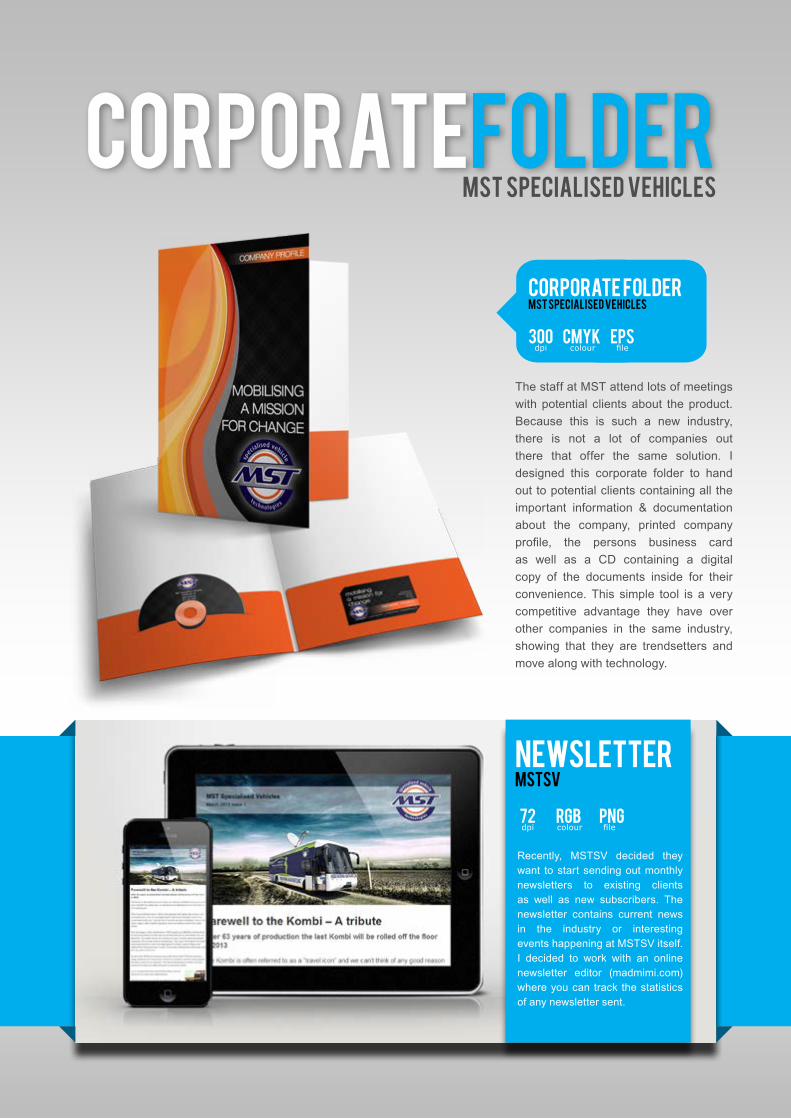
CorporateFolderMST Specialised Vehicles
The staff at MST attend lots of meetings with potential clients about the product. Because this is such a new industry, there is not a lot of companies out there that offer the same solution. I designed this corporate folder to hand out to potential clients containing all the important information & documentation about the company, printed company profile, the persons business card as well as a CD containing a digital copy of the documents inside for their convenience. This simple tool is a very competitive advantage they have over other companies in the same industry, showing that they are trendsetters and move along with technology.
Recently, MSTSV decided they want to start sending out monthly newsletters to existing clients as well as new subscribers. The newsletter contains current news in the industry or interesting events happening at MSTSV itself. I decided to work with an online newsletter editor (madmimi.com) where you can track the statistics of any newsletter sent.
NewsletterMSTSV
Corporate FolderMST Specialised Vehicles
300 CMYK epscolour filedpi
72 RGB pngcolour filedpi

Company ProfileMST Specialised Vehicles
300 36 PDFpages pagesdpi
Because the company profile is such a big source of information, it also came with a big price tag. MSTSV decided to scale the profile down to a bite size leaflet containing all the important information. This is a more cost effective way of providing information to potential clients while still keeping the design professional and consistent with the brand.
This simple booklet adds a lot of value to MSTSV. It started as an 8 page book about the company and soon turned into a 36 page source of information. The profile describes the company in a lot of detail covering subjects like how the company started, what mobile solutions they offer, past projects they had and clients they dealt with. The design fits in with the corporate identity keeping it consistent with the brand.
BrochureMSTSV
CompanyProfileMST Specialised Vehicles
300 CMYK epscolour filedpi

MSTSV decided to publish another advert. This advert was published in the Municipal Focus magazine in December 2012. I used the same picture of a vehicle in a rural area. On the right hand side I used several pictures of the different type of “insides” you get with the vehicles ranging from medical to educational equipment. The printing agency required a print ready PDF document with 5mm bleed, CMYK color & 300dpi.
MST Specialized Vehicles decided to broaden their horizons by publishing an advert in a magazine. This advert was published in the Leaders in Wellness Magazine in June 2012. I used a large picture of a vehicle in a rural area to showcase that these type of vehicles can operate in pretty rough areas. The purpose of the advert was to supply the public with information on this new mobile industry, thus I put in a lot of information about the company and services they offer, which in turn, brought in business for them. I had to supply the printing agency with a print ready PDF document which contained 5mm bleed, CMYK color & 300dpi.
AdvertMST Specialised Vehicles
AdvertMST Specialised Vehicles
300 CMYK pdfcolour filedpi
300 CMYK pdfcolour filedpi

The advert at the top formed part of a packaging design project I did in college. I designed the logo and also made the actual mock ups of the salad packaging in order to use the picture on the advert. I used a stock image and had to Photoshop a new salad into the girls hands that looked more like the salad I was advertising (the one she had in her hand just contained lettuce). The final poster was printed in A2 size without any pixilation.
While I was studying I decided to take on some personal projects to build on my experience so when I was done studying I could safely say I have some industry experience. One of the projects was a poster design for the Soundwaves Music Festival that took place in Robertson. The audience for this event was mainly psychedelic rock-fans, hence the use of the rainbow colours and the guitar with floral designs. Several other poster designs followed after the massive uproar this one made.
PrintedAdverts
300 A2 PDFsize filesdpi

Ekurhuleni MunicipalityVehicle Branding
Maternity HealthVehicle Branding
SME BankVehicle Branding
Mobile Science CentreVehicle Branding
Ekurhuleni Municipality required a fun and cheerful way of displaying what the mobile unit would do. This design incorporated the Art, Culture & Sport SETA’s perfectly.
Malawi was in need of a Maternity Healthcare Unit that would provide moms and moms-to-be free healthcare services. I designed the branding with a touch of femininity, but still kept the colors neutral.
SME Bank required a vehicle to bring banking services to the people. The design has a corporate feel to stay consistent with their banking image.
A Mobile Science Centre was required by an educational institution in South Africa. This unit will be used to teach science to children between the ages of 7-15, thus I approached this design from a creative point of view.
300 CMYK epscolour filedpi
300 CMYK epscolour filedpi
300 CMYK epscolour filedpi
300 CMYK epscolour filedpi

EskomVehicle Branding
Maternity Health Vehicle Branding
Department of labourVehicle Branding
Universal HealthcareVehicle Branding
Eskom enquired about a Mobile Schools Health Unit. MSTSV presented them with a medical unit that will service people in rural areas. I designed this branding with their technological background in mind.
This branding wasn’t designed with a particular client in mind. I designed this branding to improve on the existing Maternity Healthcare branding. I added more femininity to the overall design and cleaned it up a bit.
This was the first vehicle branding design I did. The Department of Labour required a branding that will tell the people exactly what services the unit offers. All the files used was supplied by the department.
I was inspired by medicine for the branding of Universal Healthcare. I used the flowing lines to display a sense of calmness and I used a grey & white gradient to still keep the “corporate” in the design.
300 CMYK epscolour filedpi
300 CMYK epscolour filedpi
300 CMYK epscolour filedpi
300 CMYK epscolour filedpi

WebsiteDesignDesigned by Maryna Benson
Cape StoneWordPress
Cape Stone was in need of a modern website to showcase their products and past projects to potential clients. The previous website of Cape Stone was very outdated and not very appealing to the eye, thus I needed to improve the visual design of the site. I also had to make it easy for users to navigate through the site and make core information available with reduced number of clicks. Overall I had to make the site look sleeker and give it an edge over competitors. They would also like to update the site themselves without having to hire a designer to do so.
The solution was to design a website using WordPress. This would allow them to update their website with ease, whenever they feel the need to do so, without having to spend extra money on a designer. I used a premium WordPress theme for this site to give it that extra sense of professionalism over their competitors. I also included their very own blog where they can update their projects/products without any trouble. The website is also able to adapt itself to whatever screensize its viewed on whether its on a screen, smartphone or tablet.
Cape Stone WordPress
72 rgb 14colour pagesdpi

The solution was to design the website using HTML and CSS as well as a bit of JavScript to make the site visually appealing. I optimised all the pictures in the website so it will load in the least amount of time.
I did this website in my spare time while I was still studying. It was challenging sometimes to fit everything in my busy schedule and satisfy everyone.
At FunctionHTML/CSS/JavaScript
At FunctionHTML/CSS/JavaScript
At Function needed an online presence where they could showcase the products that they offer. As this website target group was mainly women, the website needed to be neat and visually appealing. The site should be simple to use and easy to find the information they need, thus the navigation had to be clear and users should find the information they need with the least amount of clicks. The site must show all the products they offer, but still has to load fast enough.
72 rgb 18colour pagesdpi
Webdesign
FrontEndDev
html/css/javascript/php
html5/ccs3/javascript/php/mysql
mstsvcompany website
Data Captureinternal system
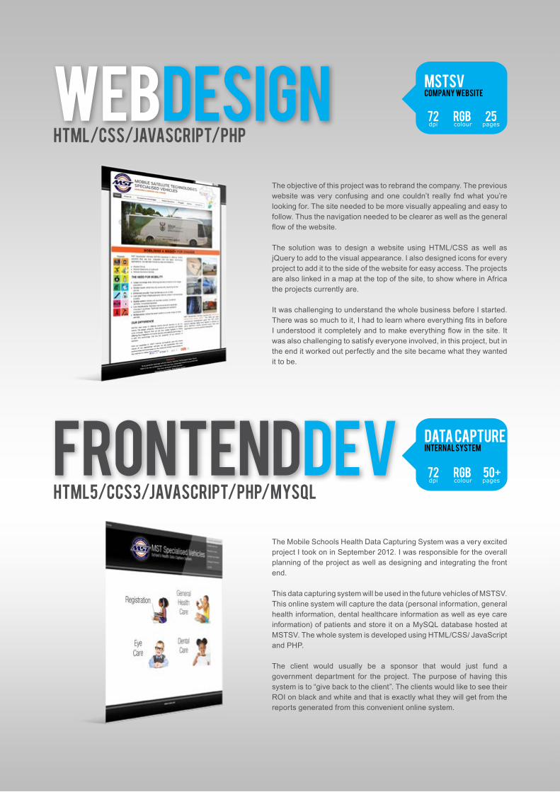
The objective of this project was to rebrand the company. The previous website was very confusing and one couldn’t really fnd what you’re looking for. The site needed to be more visually appealing and easy to follow. Thus the navigation needed to be clearer as well as the general flow of the website.
The solution was to design a website using HTML/CSS as well as jQuery to add to the visual appearance. I also designed icons for every project to add it to the side of the website for easy access. The projects are also linked in a map at the top of the site, to show where in Africa the projects currently are.
It was challenging to understand the whole business before I started. There was so much to it, I had to learn where everything fits in before I understood it completely and to make everything flow in the site. It was also challenging to satisfy everyone involved, in this project, but in the end it worked out perfectly and the site became what they wanted it to be.
The Mobile Schools Health Data Capturing System was a very excited project I took on in September 2012. I was responsible for the overall planning of the project as well as designing and integrating the front end.
This data capturing system will be used in the future vehicles of MSTSV. This online system will capture the data (personal information, general health information, dental healthcare information as well as eye care information) of patients and store it on a MySQL database hosted at MSTSV. The whole system is developed using HTML/CSS/ JavaScript and PHP.
The client would usually be a sponsor that would just fund a government department for the project. The purpose of having this system is to “give back to the client”. The clients would like to see their ROI on black and white and that is exactly what they will get from the reports generated from this convenient online system.
72 rgb 25colour pagesdpi
72 rgb 50+colour pagesdpi

Scuba ShackHTML/CSS
Dell Vostro Flash /actionscript
d'Ouwe Werfhtml5/css3
This website needed to “wow” the audience in terms of appearance. It should make them ‘feel’ the ocean and want to experience it by just looking at it. The solution was a HTMl/CSS website which contained lots of layers to create the desired visual appearance.
The objective of this task was to design a website using only Flash. The solution was to design all the graphics used in this site in Photoshop and then use the timeline in Flash to create the animations of the site. I also used ActionScript 3.0 to create actions for the different graphics e.g clickable buttons, 360 degree viewer, etc.
The object of this website was to design a simple, clean looking site where visitorscan easily find the information they need to make a booking. The site needed to bevisually appealing and have a calming effect on the viewer. The solution was a HTMl5/CSS3 website to add extra effects to make the webiste more appealing. The colours contributed to the calming effect of the site.
72 rgb 20+colour pagesdpi
72 rgb 7colour pagesdpi
72 rgb 7colour pagesdpi

Schools HealthConcept design
Student FutureConcept design
karmani.co.zaConcept design
maryna designsConcept design
The Schools Health website is still at the concept stages. It will be used as a sub website from MSTSV dedicated to Schools Health. I used green because it represents calmness and well-being.
The Student Future website is also still at the concept stages. It will be used as a sub website from MSTSV dedicated to inform students to apply at universities before registering. I used blue as the main color because it symbolizes freedom, strength and new beginnings.
Karmani.co.za went from concept stages to reality. I’m currently in the process of customizing this AWESOME theme to fit DJ Karmani’s needs. It has a lot of functionality including playlists, event management, new release updates in the form of a blog, layered sliders and more. I’m very excited to launch this website.
Leaving the best for last, Maryna Designs - The Official Website, finally saw the light. Through this busy lifestyle, I make time to complete my online portfolio where it will be easy to update and blog about current and past projects. I will soon reach this personal goal.
72 rgb ?colour pagesdpi
72 rgb ?colour pagesdpi
72 rgb 30+colour filedpi
72 rgb 20+colour filedpi
Maryna DesignsYOUR BEST OPTION
www.marynadesigns.co.zafacebook.com/marynadesignsn
@marynadesigns