Embed Size (px)
Citation preview

Management Quality Tools
Explanation of two Quality tools

Explanation of two Quality tools
Cause – and – effects diagrams
AND
Pareto Charts

Cause – and – effects diagrams
Also called “Fishbone” and “Ishikawa Diagram”
Is a method for analysing process dispersion. The diagram's purpose is to relate causes and effects.
It can become vey complex but helps organising and relating factors, providing a sequential view.

Cause – and – effects diagrams
Causes in a cause & effect diagram are frequently arranged into four major categories:
- manpower, methods, materials, and machinery (recommended for manufacturing)
- equipment, policies, procedures, and people (recommended for administration and service).

Cause – and – effects diagrams
Fishbone and tree structure

Cause – and – effects diagrams

Example: weighing machine company . 'lack of
responsiveness to customers'

Cause – and – effects diagrams
When to use it?
- To identify and select key problem causes to investigate
- When the primary symptom (or effect) of a problem is known, but possible causes are not all clear.
- Group brainstorming.- To find hierarchies and casual relationships

Cause – and – effects diagrams
Steps:
- Form a small team of people with complementary skills to work on the problem
- Write down the key effect or symptom at the center-right of the page and draw a horizontal spine.
- Draw the main cause area 'ribs' - Use Brainstorming to build the diagram, adding causes or cause
areas to the appropriate ribs or sub-ribs as they appear. - Discuss why the found causes are there
- Plan and implement actions to address key causes.

Cause – and – effects diagrams
To build a good diagram:
1) Be sure everyone agrees on the effect or problem statement before beginning.
2) Be succinct. 3) For each node, think what could be its causes. Add them
to the tree. 4) Pursue each line of causality back to its root cause. 5) Consider grafting relatively empty branches onto others. 6) Consider splitting up overcrowded branches. 7) Consider which root causes are most likely to merit further
investigation.

Pareto Chart
The Pareto Chart is used to show the relative importance of a set of measurements.
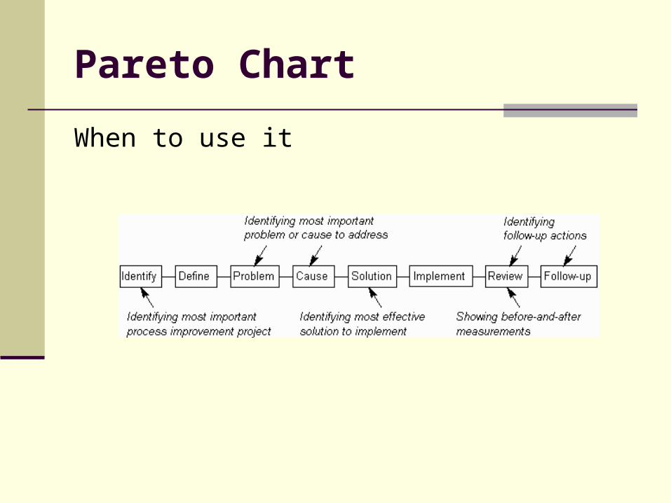
Pareto Chart
When to use it
Pareto Chart
As the Pareto Chart is often used for decision making, it is important to identify the right item to measure and show on the chart, as different measures may well result in the bars be ordered quite differently.
Stable process: the order of the bars may be expected to remain constant.
If the order of the bars changes with successive measurements, this may indicate an unstable process (or an insufficient number of measurements).
Improvements will often result in the order of the bars changing. If the improvements are maintained, the new bar order will remain stable.

Pareto Chart
How to Construct (I)
Determine the categories and the units for comparison of the data, such as frequency, cost, or time.
Total the raw data in each category, then determine the grand total by adding the totals of each category.
Re-order the categories from largest to smallest. Determine the cumulative percent of each category
(i.e., the sum of each category plus all categories that precede it in the rank order, divided by the grand total and multiplied by 100).
Draw and label the left-hand vertical axis with the unit of comparison, such as frequency, cost or time.

Pareto Chart
How to Construct (II)
Draw and label the right-hand vertical axis from 0 to 100 percent. The 100 percent should line up with the grand total on the left-hand vertical axis.
Beginning with the largest category, draw in bars for each category representing the total for that category.
Draw a line graph beginning at the right-hand corner of the first bar to represent the cumulative percent for each category as measured on the right-hand axis.
Analyze the chart. Usually the top 20% of the categories will comprise roughly 80% of the cumulative total.

Pareto Chart
Example: Pareto diagram from the data given in the table
below.