Embed Size (px)
Citation preview

CREATE Research Archive
Published Articles & Papers
1-1-2008
Leveling the Playing Field: Enabling Community-Based Organizations to Utilize GeographicInformation Systems for Effective AdvocacyHaydar KurbanHoward University, [email protected]
Makada Henry- Nickie
Rodney D. Green
Janet A. Phoenix
Follow this and additional works at: http://research.create.usc.edu/published_papers
This Article is brought to you for free and open access by CREATE Research Archive. It has been accepted for inclusion in Published Articles & Papersby an authorized administrator of CREATE Research Archive. For more information, please contact [email protected].
Recommended CitationKurban, Haydar; Henry- Nickie, Makada; Green, Rodney D.; and Phoenix, Janet A., "Leveling the Playing Field: EnablingCommunity- Based Organizations to Utilize Geographic Information Systems for Effective Advocacy" (2008). Published Articles &Papers. Paper 87.http://research.create.usc.edu/published_papers/87


URISA Leadership AcademyDecember 8–12, 2008 — Seattle, WA
13th Annual GIS/CAMA Technologies ConferenceFebruary 8–11, 2009 — Charleston, SC
URISA’s Second GIS in Public Health ConferenceJune 5–8, 2009 — Providence, RI
URISA/NENA Addressing ConferenceAugust 4-6, 2009 – Providence, RI
URISA’s 47th Annual Conference & ExpositionSeptember 29–October 2, 2009 — Anaheim, CA
GIS in Transit ConferenceNovember 11–13, 2009 — St Petersburg, FL
ww
w.
ur
is
a.
or
gUpcoming
conferences

Volume 20 • No. 2 • 2008
Journal of the Urban and Regional Information Systems Association
Contents
RefeReed
5 Using Global Position Systems (GPS) and Physical Activity Monitors to Assess the Built Environment Christopher J. Seeger, Gregory J. Welk, and Susan Erickson
13 Developing Geospatial Data Management, Recruitment, and Analysis Techniques for Physical Activity Research Barbara M. Parmenter, Tracy McMillan, Catherine Cubbin, and Rebecca E. Lee
21 Space-Time Patterns of Mortality and Related Factors, Central Appalachia 1969 to 2001 Timothy S. Hare
33 Leveling the Playing Field: Enabling Community-Based Organizations to Utilize Geographic Information Systems for Effective Advocacy Makada Henry-Nickie, Haydar Kurban, Rodney D. Green, and Janet A. Phoenix
43 Development of Neighborhoods to Measure Spatial Indicators of Health Marie-Pierre Parenteau, Michael Sawada, Elizabeth A. Kristjansson, Melissa Calhoun, Stephanie Leclair, Ronald Labonté, Vivien Runnels, Anne Musiol, and Sam Herold

2 URISA Journal • Vol. 20, No. 2 • 2008
Journal
EDITORIAL OFFICE: Urban and Regional Information Systems Association, 1460 Renaissance Drive, Suite 305, Park Ridge, Illinois 60068-1348; Voice (847) 824-6300; Fax (847) 824-6363; E-mail [email protected].
SUBMISSIONS: This publication accepts from authors an exclusive right of first publication to their article plus an accompanying grant of non-exclusive full rights. The publisher requires that full credit for first publication in the URISA Journal is provided in any subsequent electronic or print publications. For more information, the “Manuscript Submission Guidelines for Refereed Articles” is available on our website, www.urisa.org, or by calling (847) 824-6300.
SUBSCRIPTION AND ADVERTISING: All correspondence about advertising, subscriptions, and URISA memberships should be directed to: Urban and Regional Information Systems Association, 1460 Renaissance Dr., Suite 305, Park Ridge, Illinois, 60068-1348; Voice (847) 824-6300; Fax (847) 824-6363; E-mail [email protected].
URISA Journal is published two times a year by the Urban and Regional Information Systems Association.
© 2008 by the Urban and Regional Information Systems Association. Authorization to photocopy items for internal or personal use, or the internal or personal use of specific clients, is granted by permission of the Urban and Regional Information Systems Association.
Educational programs planned and presented by URISA provide attendees with relevant and rewarding continuing education experience. However, neither the content (whether written or oral) of any course, seminar, or other presentation, nor the use of a specific product in conjunction there-with, nor the exhibition of any materials by any party coincident with the educational event, should be construed as indicating endorsement or approval of the views presented, the products used, or the materials exhibited by URISA, or by its committees, Special Interest Groups, Chapters, or other commissions.
SUBSCRIPTION RATE: One year: $295 business, libraries, government agencies, and public institutions. Individuals interested in subscriptions should contact URISA for membership information.
US ISSN 1045-8077
Publisher: Urban and Regional Information Systems Association
Editor-in-Chief: Jochen Albrecht
Journal Coordinator: Scott A. Grams
Electronic Journal: http://www.urisa.org/journal.htm

URISA Journal • Vol. 20, No. 2 • 2008 3
URISA Journal EditorEditor-in-Chief
Jochen Albrecht, Department of Geography, Hunter College City University of New York
Thematic EditorsEditor-Urban and Regional Information Science
VacantEditor-Applications Research
Lyna Wiggins, Department of Planning, Rutgers University
Editor-Social, Organizational, Legal, and Economic Sciences
Ian Masser, Department of Urban Planning and Management, ITC (Netherlands)
Editor-Geographic Information ScienceMark Harrower, Department of Geography, University of Wisconsin Madison
Editor-Information and Media SciencesMichael Shiffer, Department of Planning, Massachusetts Institute of Technology
Editor-Spatial Data Acquisition and Integration
Gary Hunter, Department of Geomatics, University of Melbourne (Australia)
Editor-Geography, Cartography, and Cognitive Science
VacantEditor-Education
Karen Kemp, Director, International Masters Program in GIS, University of Redlands
Section Editors
Software Review Editor Jay Lee, Department of Geography, Kent State University
Book Review EditorDavid Tulloch, Department of Landscape Architecture, Rutgers University
Article Review Board
Peggy Agouris, Department of Spatial Information Science and Engineering, University of MaineGrenville Barnes, Geomatics Program, University of FloridaMichael Batty, Centre for Advanced Spatial Analysis, University College London (United Kingdom) Kate Beard, Department of Spatial Information Science and Engineering, University of Maine Yvan Bédard, Centre for Research in Geomatics, Laval University (Canada) Barbara P. Buttenfield, Department of Geography, University of ColoradoKeith C. Clarke, Department of Geography, University of California-Santa BarbaraDavid Coleman, Department of Geodesy and Geomatics Engineering, University of New Brunswick (Canada)David J. Cowen, Department of Geography, University of South CarolinaMassimo Craglia, Department of Town & Regional Planning, University of Sheffield (United Kingdom)William J. Craig, Center for Urban and Regional Affairs, University of MinnesotaRobert G. Cromley, Department of Geography, University of ConnecticutKenneth J. Dueker, Urban Studies and Planning, Portland State UniversityGeoffrey Dutton, Spatial Effects Max J. Egenhofer, Department of Spatial Information Science and Engineering, University of MaineManfred Ehlers, Research Center for Geoinformatics and Remote Sensing, University of Osnabrueck (Germany)Manfred M. Fischer, Economics, Geography & Geoinformatics, Vienna University of Economics and Business Administration (Austria)Myke Gluck, Department of Math and Computer Science, Virginia Military InstituteMichael Goodchild, Department of Geography, University of California-Santa BarbaraMichael Gould, Department of Information Systems Universitat Jaume I (Spain)Daniel A. Griffith, Department of Geography, Syracuse UniversityFrancis J. Harvey, Department of Geography, University of Minnesota
Kingsley E. Haynes, Public Policy and Geography, George Mason UniversityEric J. Heikkila, School of Policy, Planning, and Development, University of Southern CaliforniaStephen C. Hirtle, Department of Information Science and Telecommunications, University of PittsburghGary Jeffress, Department of Geographical Information Science, Texas A&M University-Corpus ChristiRichard E. Klosterman, Department of Geography and Planning, University of AkronRobert Laurini, Claude Bernard University of Lyon (France)Thomas M. Lillesand, Environmental Remote Sensing Center, University of Wisconsin-MadisonPaul Longley, Centre for Advanced Spatial Analysis, University College, London (United Kingdom)Xavier R. Lopez, Oracle CorporationDavid Maguire, Environmental Systems Research InstituteHarvey J. Miller, Department of Geography, University of UtahZorica Nedovic-Budic, Department of Urban and Regional Planning,University of Illinois-Champaign/Urbana Atsuyuki Okabe, Department of Urban Engineering, University of Tokyo (Japan)Harlan Onsrud, Spatial Information Science and Engineering, University of Maine Jeffrey K. Pinto, School of Business, Penn State ErieGerard Rushton, Department of Geography, University of IowaJie Shan, School of Civil Engineering, Purdue UniversityBruce D. Spear, Federal Highway AdministrationJonathan Sperling, Policy Development & Research, U.S. Department of Housing and Urban DevelopmentDavid J. Unwin, School of Geography, Birkbeck College, London (United Kingdom)Stephen J. Ventura, Department of Environmental Studies and Soil Science, University of Wisconsin-MadisonNancy von Meyer, Fairview IndustriesBarry Wellar, Department of Geography, University of Ottawa (Canada)Michael F. Worboys, Department of Computer Science, Keele University (United Kingdom)
F. Benjamin Zhan, Department of Geography, Texas State University-San Marcos
editoRs and Review BoaRd

URISA’s Second GIS in Public Health ConferencePutting Health in Place with GISJune 5-8, 2009www.urisa.org
From Chuck Croner, Geographer and Survey Statistician, Editor, Public Health GIS News and Information, Centers for Disease Control and Prevention:
“Congratulations to URISA and the Planning Committee for
their first-ever “GIS in Public Health” conference. I believe
you advanced the key issues of public health geospatial science
in this dynamic forum while engaging a very knowledgeable
and responsive audience, from many disciplines and the global
community. This was a successful ground breaking event for
URISA and it sets the stage for what will now be a much
anticipated 2009 “GIS in Public Health” conference.”

URISA Journal • Seeger,Welk, Erickson 5
IntroductIonAccording to the Centers for Disease Control (CDC), approxi-mately 66 percent of the U.S. adult population is either over-weight (body mass index of 25 to 29.9) or obese (BMI >= 30). These percentages are approximately twice the amount reported in health surveys taken in the mid-1970s. While there is debate regarding if this increase in prevalence constitutes an epidemic, it is widely accepted that insufficient individual physical activity and exercise is one of the contributing factors to weight gain. The CDC’s Behavioral Risk Factor Surveillance System (BRFSS) found that in 2005 the national average of individuals partici-pating in the recommended amount of weekly physical activity was only 48 percent, while 37.7 percent reported an insufficient amount of activity and 14.2 percent reported they were inactive. Another study reported that “sixty-two percent of adults never participated in any type of vigorous leisure-time physical activity” (Pleis and Lethbridge-Çejku 2006).
The fact that more than half of the U.S. population does not undertake a sufficient amount of physical activity calls to question why more people aren’t physically active when many communities have been investing significant funding to improve the outdoor infrastructure (parks, ball fields, trails) that facilitates and promotes opportunities for physical activity?
This and other similar questions have brought to the fore-front investigations into how the built environment affects an individual’s participation in leisure-time physical activity. The executive summary for the 2004 “Obesity and the Built Environ-ment: Improving Public Health Through Community Design” Conference in Washington, D.C., found that the “rapid increase in obesity over the past 30 years strongly suggests that environ-mental influences are responsible for this trend.”
Report #282, Does the Built Environment Influence Physical Activity: Examining the Evidence, published by the Transportation Research Board in January 2005, states that there is “available empirical evidence” linking a person’s physical activity with the
built environment. The report further states that additional stud-ies into the “causal relationship between the built environment and physical activity are needed” and that future research should include “residential location preferences, and characteristics of the built environment as determinants of physical activity.”
To identify, visualize, and understand this relationship between physical activity and the built environment, spatial analysis and data collection tools such as geographic information systems (GIS) and global positioning systems (GPS) can be used. These tools can provide an accurate map with which proximity, distribution, and connectedness can be measured. And, when combined with physical activity monitors and employed in participatory supported research, they can become even more useful measures.
The remainder of this paper focuses on one component of a study investigating the relationship between physical activity, trail use, and adjacent vegetation. In this component of the study, spatial, individual physical activity, and weather data were col-lected and processed and then visualized and analyzed in context with the built environment.
Project BackgroundTo better understand the role that vegetation or, more specifically, the urban forest has on an individual’s selection and use of com-munity recreation trails, the National Urban and Community Forestry Advisory Council funded a study by Iowa State Univer-sity Extension to investigate the relationship between vegetation patterns and physical activity. The research, conducted between July 2005 and July 2007 in Ames, Iowa, sought to answer the following questions:
Does vegetation adjacent to a trail impact the use of the •trail?Is vegetation variety an important aspect of route •selection?
using global Position Systems (gPS) and Physical activity
Monitors to assess the Built environment
Christopher J. Seeger, Gregory J. Welk, and Susan Erickson
Abstract: As public health continues to decline and obesity rates hit epidemic levels, there has been increased interest in under-standing what characteristics of the built environment may impact the amount of physical activity an individual receives. This paper discusses the utilization of global positioning system (GPS) receivers, physical activity monitors (PAM), meteorological data, and land-cover data to visualize and identify relationships between landscape characteristics of the built environment and an individual’s physical activity levels. This paper showcases a procedure for synchronizing the collected data, describes pitfalls to avoid when conducting a study, and illustrates how the results can be analyzed and visualized in a geographic information system (GIS).

6 URISA Journal • Vol. 20, No. 2 • 2008
What role do trees play in trail selection in various weather •conditions?What are the characteristics of the most commonly used •trail segments?Do physical activity rates (exertion) correspond directly to •the adjacent landscape, trail surfaces, or trail length?
Research FrameworkInformation for the study was collected from 48 Ames residents who identified themselves as physically active adults who walked or ran at least three times per week on community recreational trails. These participants were selected from a pool of 500 people who responded to a request for participants. Selections were based on gender, age, and location of residence. Study participants fell into one of three population age groups: 18–30, 30–55, and 55+.
The study lasted one year and included four one-week data-collection periods during the months of November, January, April, and August. For each of the one-week periods, each participant was asked to wear a GPS device on the wrist when he or she was walking or running. Participants also wore physical activity moni-tors attached to their waistbands for the entire week of the study during waking hours. In addition to wearing the two devices, participants kept paper logbooks documenting their daily physical activities. Each study week started at 12 A.M. on Wednesday and concluded at 11:59 P.M. on the following Tuesday.
To answer the research questions presented in the study, it was necessary to collect and identify:
Which trails were used.•When the trails were used.•What the weather conditions were at the time the trails were •being used.How much physical activity was exerted as individuals used •the trails.The characteristics of the trails and their adjacent •landscape.
Data collected from GPS devices worn by the participants were used to identify which trails were used and when the trails were used. Minute-by-minute weather data was collected at a local elementary school’s weather monitor and archived to a server on the Iowa State University campus. The physical activity monitors (or accelerometers) worn by the participants recorded the amount of physical activity they received during each minute of the day. The existing characteristics of the trails and the adjacent landscape were identified using field observations that were recorded with a GPS and inventory form. A community-wide vegetation map also was created from one-foot resolution aerial photography.
The study was approved by the university’s Institutional Review Board and all participants signed letters of consent before participating in the study. At the end of the study, participants were allowed to keep the GPS devices.
data-collectIon devIceS and ProceSSeSWhile basic infrastructure GIS data existed for the community, the majority of the data was at a scale that was not detailed enough to reveal characteristics of the built environment that may influence physical activity. Therefore, it was necessary to collect much of the information in the field or by digitizing high-resolution aerial imagery. For the purpose of identifying route preference or physical activity, a participatory approach using GPS and physical activity monitoring devices was utilized to collect the data.
Adjacent Landscape InventoryTwo data layers were created to inventory the environmental characteristics of the study area. The first data layer contained the trail characteristics and adjacent vegetation information and was created in the field using Trimble’s pocket pathfinder GPS and an HP iPaq PDA running ESRI’s ArcPad 6 software. The ArcPad/PDA solution allowed a base map containing the road and trail network to be displayed along with the location of sample points that were prelocated based on a linear sampling distribu-tion of 100 meters (see Figure 1). Two graduate students walked each of the trails and stopped at each of the sampling points to photograph and record the vegetation adjacent to the trail as well as characteristics of the trail.
Figure 1. ArcPad screen displaying road network and trail sample points.
Figure 2. ArcPad inventory forms.
URISA Journal • Seeger,Welk, Erickson 7
The field-data collection process was simplified by using form fields organized by content across six GPS inventory pages. The first page, adjacent land setting/land use, included pull-down menus for selecting the correct characteristics of the trail’s adjacent environment. Because the land use and landscape may differ for each side of the trail, each side was included as a unique attribute. Side 1 represented land that was north and east from the trail. Side 2 represented land that was south and west from the trail. The additional form pages included vegetation cover, tree characteristics, trail surfaces, amenities, and notes (shown in Figure 2).
The GPS used for the data collection had an accuracy of two to five meters when combined with a real-time differential correction source or differentially postprocessed; however, in this study, the data was collected without any differential correction at an accuracy of approximately ten meters. This level of accuracy was sufficient for the study, the sampling points were prelocated using aerial data with a resolution of less than one meter; thus the GPS-enabled PDA was primarily used to navigate to the general location to complete the form.
Participants in the study did not always walk or run for leisure exclusively on designated trails, making the data collected at the sample points insufficient for analysis of entire routes. A community-wide land-cover layer was therefore necessary. The existing land-cover data for the community was limited to a 15-meter resolution data set that was interpolated from color infrared aerials flown in 2002. This resolution was not adequate for the study so the city’s submeter photography from 2003 was digitized to create a more accurate vegetation map. The land-cover layer included four categories: deciduous, coniferous, agriculture fields, and water.
Participant Location—GPSThe GPS device selected for study participants to wear was the Garmin Foretrex 101 (see Figure 3). This GPS was selected be-cause it provides an affordable receiver that is lightweight with
a small form factor and good accuracy. Costing under $125 per unit, the Foretrex 101 was one of two models in the initial series of wrist GPS units by Garmin. The other model, the Foretrex 201, offered the same functionality as the 101 model but used rechargeable batteries instead of the two AAA batteries used by the Foretrex 101. The higher price tag of the Foretrex 201 and the requirement to recharge the batteries made it an unsuitable option for this study.
The small size and light weight of the device made it easy for participants to use it without being distracted. The Foretrex 101 measures 3.3 inches wide, 1.7 inches high, and 0.9 inch deep (8.4 x 4.3 x 2.3 cm.). The device weighs only 2.75 ounces (78 grams). The controls are located on the front edge of the device and are easy to operate. For the purpose of this study, participants only had to turn the device on and off.
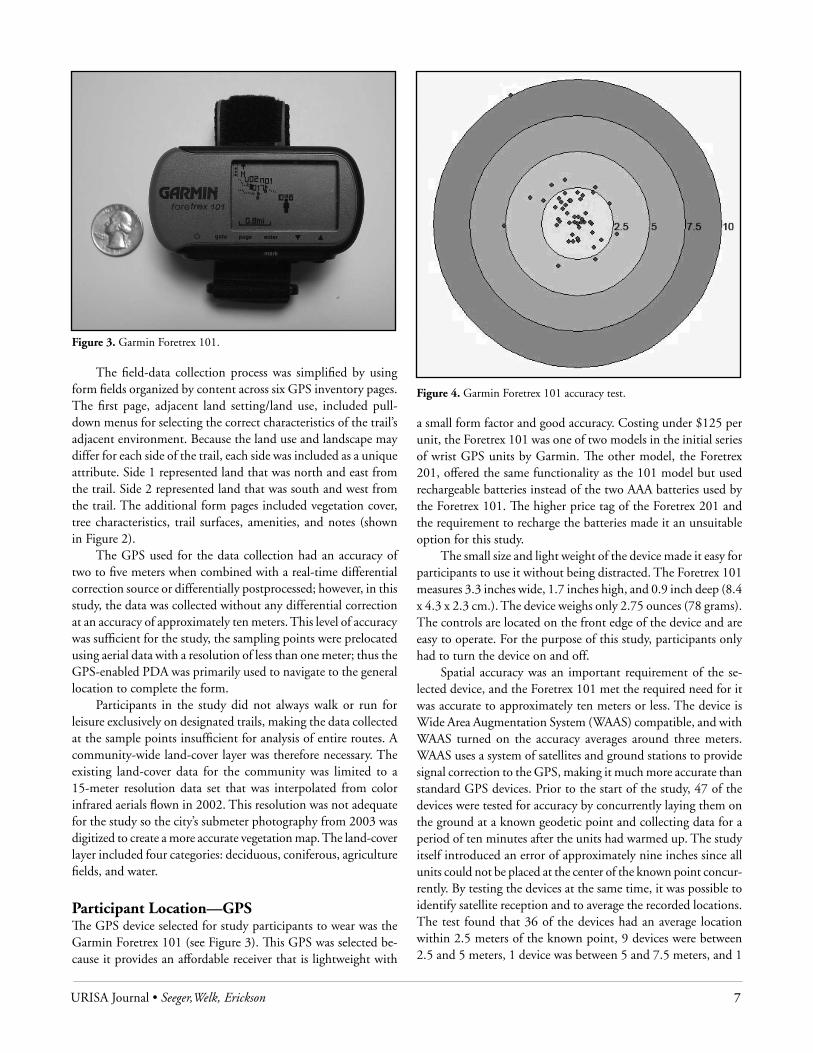
Spatial accuracy was an important requirement of the se-lected device, and the Foretrex 101 met the required need for it was accurate to approximately ten meters or less. The device is Wide Area Augmentation System (WAAS) compatible, and with WAAS turned on the accuracy averages around three meters. WAAS uses a system of satellites and ground stations to provide signal correction to the GPS, making it much more accurate than standard GPS devices. Prior to the start of the study, 47 of the devices were tested for accuracy by concurrently laying them on the ground at a known geodetic point and collecting data for a period of ten minutes after the units had warmed up. The study itself introduced an error of approximately nine inches since all units could not be placed at the center of the known point concur-rently. By testing the devices at the same time, it was possible to identify satellite reception and to average the recorded locations. The test found that 36 of the devices had an average location within 2.5 meters of the known point, 9 devices were between 2.5 and 5 meters, 1 device was between 5 and 7.5 meters, and 1
Figure 3. Garmin Foretrex 101.
Figure 4. Garmin Foretrex 101 accuracy test.

8 URISA Journal • Vol. 20, No. 2 • 2008
device was just over 10 meters (see Figure 4). In the case of the device that was more than 10 meters, it was determined that the WAAS feature was not enabled. The findings of the accuracy tests were in line with what Daniel Rodriguez reported for accuracy tests of the Foretrex 201 where he found the “average distance recorded from the units to the geodetic point was 3.02” meters with 81.1percent of the 726 GPS points collected (Rodriguez, Brown, and Troped 2005).
The other critical feature in the selection of the GPS was the capability to store a tracklog that could record where the participant walked or ran. The Foretrex 101 is capable of storing 10,000 points and can be set up to record at intervals as short as one second. The study utilized a ten-second interval, sufficient for recording points every 220 feet (67 meters) for a fast four-minute mile or every 44 feet (13.4 meters) for a person walking an average three miles per hour. At this setting, it would take more than 27 hours of use to fill the tracklog.
An optional Db9 interface cable provided a method to download tracklog records to a computer with a serial port. Each downloaded tracklog file contained the latitude, longitude, UTM coordinates, elevation, and time-stamp for each point recorded during a physical activity session. The tracklog also contained a field indicating when the device was turned on and when new data was being appended to the tracklog. The time-stamp recorded by the tracklog included the date and time as a single field value. The time stamp was stored in the year/month/day-hour:minute:second (2005/11/02-22:02:56) format.
The primary limitation of the Foretrex 101 was its battery life, which was specified to last 15 hours. Because of the increased power consumption of the WAAS, however, the average life was closer to 12 hours. In extremely cold temperatures, the battery life was dramatically reduced and the devices would often turn off after less than 30 minutes of use. Because of the limit imposed by the battery life, participants were asked to only wear the GPS
when they went outside for a walk or run.The GPS came with a wrist strap that allowed the participant
to wear it strapped to his or her body. As reported in the findings by Rodriguez et al., the location of the device on the body does impact the quality of the collected data and it was recommended that the devices be worn on the wrist (Rodriguez, Brown, and Troped 2005). Participants in this study were instructed to wear the devices on their wrists over clothing (extender straps were provided) with the LCDs facing up.
Physical Activity—AccelerometerAccelerometry-based activity monitors are used to measure physi-cal activity in free-living environments. Physical activity monitors
Figure 5. IM Systems Biotrainer-Pro.Figure 6. Sample downloaded physical activity counts with timestamp.
Figure 7. Sample physical activity data graphed in 30-minute intervals.

URISA Journal • Seeger,Welk, Erickson 9
(PAMs) are a preferred measuring device in health research be-cause they can digitally record physical activity as numeric values over a specified period of time. “Physical activity monitors can be worn without major inconvenience” and are compatible with most daily activities requiring little effort on the part of the user (Slootmaker et al. 2005).
The PAM selected for this study was the BioTrainer-Pro by IM Systems (shown in Figure 5). The primary reason for its selection was that 50 devices were already available at Iowa State University and they had been found to be reliable devices. The BioTrainer-Pro uses a biaxial acceleration sensor for measuring a full range of body movements. Collected data can be recorded to the device’s memory at intervals ranging between 15-second to 5-minute epochs. The data is stored using absolute “g” units. For this study, data was collected every 60 seconds; the device can hold 22 days of information at this setting.
The BioTrainer-Pro uses standard AAA batteries and the data can be downloaded to a Windows computer for analysis. The downloaded data includes a count value representing the amount of physical activity since the last interval point and a relative time stamp showing the amount of time passed since the device was initialized (see Figure 6). This data can be graphed to show the amount of physical activity an individual undergoes over a series of days (shown in Figure 7), where the values are summarized in 30-minute intervals. The data also can be viewed with several days overlapping, as illustrated in Figure 8, or over the entire four study periods, as shown in Figure 9.
Daily Weather ConditionsMinute-by-minute weather conditions as recorded at an Ames elementary school were archived and saved to the Iowa State University Department of Agronomy’s Iowa Environmental Mesonet server (http://mesonet.agron.iastate.edu/schoolnet/dl/).
Figure 8. Sample physical activity calories used graphed over 6-day period.
Figure 9. Sample weekly physical activity graphed over 4 trial periods.
Figure 10. Sample downloaded weather conditions.
Figure 11. GPS error identification shown as sharp corner points.

10 URISA Journal • Vol. 20, No. 2 • 2008
From this server, various data parameters could be downloaded as a delimited file (shown in Figure 10). The data parameters included air temperature, wind direction, dew point, wind speed, relative humidity, solar radiation, and altimeter (pressure). Each row of data also contained a time-stamp field in month/date/year 24 hour:minute format (11/2/2004 22:10).
ProceSSIng the dataAt the end of each study week, data from the GPS and physical activity monitors were downloaded, cleaned, reviewed for errors, and then processed so they could be displayed in a GIS.
Data CleaningAfter the tracklogs were downloaded from the GPS, the data were trimmed to only show recorded values within the seven-day study period. Points recorded outside the study area also were trimmed for in some cases the participants wore the GPS when using one of the countryside recreational trails. The physical activity monitor data also were trimmed to only show the data collected over the seven-day period. Trimming the data of both devices reduced the number of points to be synchronized and made the files easier to manage.
Error CheckingPotential error could be introduced into the study in one of three ways. The first error was created when the GPS itself collected an incorrect point. As illustrated in Figure 11, spike points would result on the map when an incorrect point was recorded. Obser-vational and mathematical techniques were used to identify these locations. The observational method simply required displaying the point in ArcMap and creating a line feature that connected the points. Line segments that resulted in a sharp point were considered suspicious and were marked as such. The mathematical method calculated the average distance between points to identify
the speed required to get from point A to point B in ten seconds. If this speed was significantly higher than the speed calculated for the previous two points, the points were identified as suspicious. All points identified as suspicious were either deleted or manually relocated to where they were geographically expected to be based on the location of previous and future points.
The second error was introduced by the participant. While participants were instructed to only wear the GPS units when walking or running, the devices on occasion were turned on when the participants were driving or riding bikes. Once again, speed and distance traveled calculations were utilized to identify these suspicious points. The process of error checking was aided by the paper log of physical activity that each participant kept. On the log sheet, a participant recorded the time of day that he or she walked or ran and whether or not he or she was wearing the physical activity monitor or GPS.
The last area for significant error to be introduced was in the process of preparing the physical activity monitors for each study period. Because the relative time saved in the monitor was critical for data synchronization, all monitors had to have the same base point for starting their internal clocks. To accomplish this, all monitors were initialized on a computer that had its time synchronized with a Network Time Server that was in alignment with the time recorded on the GPS.
Data Synchronization ProcessThe time stamp was the key to synchronizing the data collected from the GPS with the physical activity monitor. The time stamp also provided a means for synchronizing the downloaded weather data with the spatial data. The data downloaded from the physical activity monitor determined the format to be used for synchronization for the data were saved with each column representing a day and each row the number of minutes past midnight. For example, row 877 (minus one for the header) of
Figure 12. Recorded data for one participant over four study periods. Larger dots represent an increased level of physical activity.
Figure 13. Data display limited to only show physical activity counts of 1 – 26 where red/larger dots represent the highest level of physical activity recorded.

URISA Journal • Seeger,Welk, Erickson 11
column 2 represented 2:36 P.M., so a value of 876 could be ap-plied to that time. This same conversion format was applied to the GPS and weather data. The time stored on the GPS was in Universal time, requiring a value of 300 (or 360 depending on if daylight saving time was in effect) to be subtracted to correct the value to Central time (see Table 1). Once the time stamps were converted to a uniform format, the data were merged (joined) together and added to ArcMap.
Table 1. Time stamps calibration for time since midnight
Data Native Format Converted FormatPhysical Activity Monitor
(col2) 2.36 PM 0876
GPS 2006/02/14-19:36:22
1176 – 300 = 876
Weather 02/14/2006 14:36 876
Data Visualization and AnalysisOnce synchronized and merged into a single file for each study participant, the data were overlaid on the aerial photograph and vegetation data layers in ArcMap. With the data symbolized based on physical activity values, it was possible to identify not only which trails the participant used, but how much physical activity they exerted since the last recorded point. Figure 12 shows the trail-use patterns recorded over the length of the study for one participant. An increase in physical activity is illustrated using larger dots. Figure 13 shows a closer look at one of the areas the participant occupied when high physical activity counts were recorded. Figure 14 illustrates that the majority of the highest values included in any of the four trial periods for this participant occurred in or near parks on paved asphalt trails.
The samples provided in Figures 12 to 14 present data from just one participant. However, within the study, the data from
Figure 14. An individual’s data limited to physical activity values greater than 4 indicated the majority of their intense physical activity took place in a wooded park area.
all participants were analyzed to locate relationships between the built environment and physical activity. Various spatial analysis techniques including proximity overlap and zonal statistics were utilized to identify the most commonly used routes, existing trails that were underutilized, patterns of vegetation, and locations where physical activity values increased/decreased. The time-stamp value also allowed the data to be queried to only show the activity of the entire study group for a specific time of day. The weather conditions at the time of use were available as contextual information from the table or as a data query parameter.
concluSIonSThis paper presents a methodological framework for visualizing and analyzing the relationships between the built environment and physical activity using data derived from participants’ inter-actions with the built environment. When viewed individually, the data-collection devices discussed present only a piece of the information that is necessary to understand the relationship in question. However, when the data from each device are synchro-nized and merged with other environmental data, a more complete model of the environment can be visualized and analyzed. This technique can be applied to many research areas as multiple characteristics of the built environment are evaluated. Throughout the study, several lessons were learned that should be considered when conducting future studies:
The use of a paper log file is a necessity for it helps identify where participants did not follow the study protocol or the GPS device failed to acquire a good signal.
Erroneous data can and will be logged by the GPS when the signal is lost or the participant steps indoors or under dense tree canopy. It is therefore necessary to clean and check all recorded data.
The BioTrainer-Pro device includes a plastic clip for securing the device to the participant; however, the clip often failed so an elastic band with an alligator clip was used as a secondary method to ensure that the device was not lost. Participants should take care when using the restroom or changing clothes; the shuffling makes it easy for the devices to fall off.
The Foretrex GPS included a wrist-band extender that worked very well except during the January trial period when it was not long enough to be worn on the wrist over winter clothing. Participants were tempted to wear the unit under their clothes, which resulted in weaker signal reception.
The batteries selected for the study performed poorly during the coldest days of the January study period. While all the batteries were new at the beginning of the week, several battery exchanges were required. This problem did not exist in the following two trial periods. Research conducted during cold periods should utilize premium quality batteries capable of maintaining a charge when exposed to freezing temperatures.
The BioTrainer-Pro device used during the study included an LCD display that showed the count value. In some cases, an LCD would turn off during the study and the participant thought the device was not working so an exchange was made.

12 URISA Journal • Vol. 20, No. 2 • 2008
Upon examination it was determined that the device was still recording but the display had malfunctioned for an unknown reason. The end result was that two data sets had to be merged together. The recommendation is to turn the display off during initialization of the device.
Throughout the study, the same GPS units were assigned to the participants. This was not the case with the BioTrainer-Pro units, which resulted in an extra step of data management before the data could be synchronized.
Acknowledgments
Greg Welk, Ph.D., Co-PI—accelerometry-based activity monitor data and analysis; Susan Erickson, ASLA, Co-PI—participant or-ganization and data logs; Khalil Ahmad, graduate student—GPS data and device management; and Zoran Todorovic, graduate student—ArcPad form development and data collection.
About the Authors
Christopher J. Seeger, RLA, ASLA, is an assistant professor of landscape architecture and the Extension Landscape Architect at Iowa State University, Ames. His areas of interest include geospatial Web technologies, volunteered geographic information (VGI), and healthy community mapping with an emphasis on safe routes to school and trails.
Corresponding Address: Department of Landscape Architecture Iowa State University 146 College of Design Ames, IA 50011 Phone: (515) 294-3648 Fax: (515) 294-2348 [email protected]
Gregory J. Welk, Ph.D., is an associate professor in the Department of Kinesiology at Iowa State University, Ames. His research interests focus on the assessment and promotion of physical activity in both children and adults using accelerometry-based activity monitors, pedometers, and various self-report measures.
Corresponding Address: Department of Kinesiology Iowa State University 257 Forker Building Ames, IA 50011 Phone: (515) 294-3583 Fax: (515) 294-8740 [email protected]
Susan Erickson, ASLA, is a program coordinator for the College of Design at Iowa State University, Ames. She is a licensed landscape architect; her areas of interest include healthy community design, biophilia, trail design to promote physical activity, and therapeutic garden research.
Corresponding Address: PLaCE Program Coordinator 146 College of Design Iowa State University Ames, Iowa 50011 Phone: (515) 294-1790 Fax: (515) 294-5256 [email protected]
References
Behavioral Risk Factor Surveillance System (BRFSS). U.S. obesity trends 1985–2005. http://www.cdc.gov/nccdphp/dnpa/obesity/trend/maps/index.htm.
Center for Disease Control. 2007. U.S. physical activity statistics, http://apps.nccd.cdc. gov/PASurveillance/StateSumV.asp?Year=2005.
Obesity and the built environment: Improving public health through community design. Conference executive summary. Washington, D.C., May 24 to 26, 2004.
Pleis J.R., and M. Lethbridge-Çejku. 2006. Summary health statistics for U.S. adults: National health interview survey, 2005. National Center for Health Statistics Vital and Health Statistics 10 (232).
Rodríguez, D. A., A. Brown, and P. Troped. 2005. Portable global positioning units to complement accelerometry-based physical activity monitors. Medicine and Science in Sports and Exercise 37:11, S572-S581.
Slootmaker, Sander, et al. 2005. Promoting physical activity using an activity monitor and a tailored Web-based advice: Design of a randomized controlled trial. BMC Public Health 5:134, http://www.biomedcentral.com/1471-2458/5/134.
Transportation Research Board Committee on Physical Activity, Health, Transportation, and Land Use. 2005. Special report 282: Does the built environment influence physical activity? Examining the evidence. Washington, D.C., Transportation Research Board and the Institute of Medicine of the National Academies.

URISA Journal • Parmenter, McMillan, Cubbin, and Lee 13
IntroductIonResearchers are increasingly seeking to understand the potential impacts of local neighborhoods on public health (Sallis et al. 2006, Handy 2005). Indicators for which measurements are being developed include population and employment densities; local exposure to hazards (e.g., pollutants generated by road traffic); the availability, quantity, quality, and accessibility of physical resource activities within a neighborhood; the availability and accessibility of transportation; the integration of residential and commercial land uses; the availability and quality of food resources (e.g., groceries, convenience stores, fast food); and the availability and accessibility of health services. Examining spatial relation-ships at this scale requires a level of geographical detail that can be acquired either by field surveys, which are expensive, and/or by using locally available geospatial data for both inventorying neighborhoods (e.g., parks, schools, land use) and for geocoding businesses, services, health records, and research participants (Brennan Ramirez et al. 2006).
Most geospatial data that allows analysis at the urban/suburban neighborhood level tends to be locally produced data developed by cities and counties for purposes other than health research, including infrastructure management, land-use planning, or tax assessment. The structure and content of lo-cal geospatial data can vary widely by jurisdiction. It would be ideal to use nationally available geospatial data to support health research at the neighborhood level to easily enable comparative studies across cities, regions, and states. However, there are many instances in which national data does not exist for the indica-tors needed (e.g., land use), or the data that exists (e.g., roads from the Census TIGER/Line file) is not accurate enough to support the measurements of interest. Developing a geospatial database to support health research at the neighborhood scale, therefore, requires extensive knowledge of both national and local geographic information system (GIS) data sets, their accuracy, content, and quirks.
the health IS Power (hIP) ProjectThis paper discusses the development of a geospatial database to support the Health is Power (HIP) project, a study funded by a National Institute of Health R01 grant (1R01CA109403). HIP is a multisite intervention study examining the effect of a social cohesion intervention on physical activity and nutrition behavior of African-American and Hispanic women. A key re-search question in this study is whether the effectiveness of the intervention varies by characteristics of a participant’s neighbor-hood environment. The study is ongoing as of June 2007 and is being conducted in Houston (Harris County) and Austin (Travis County), Texas. The goal is to recruit 240 women between the ages of 25 and 60 years of age in each county (African-Americans in Harris County and Latinas in Travis County), using com-munity partners (primarily churches). Participants in each county are randomized into two groups—one group forming teams for the physical activity social cohesion intervention (the PA group) and a second control group focusing on nutritional practices. Participants take a set of surveys and undergo physi-cal assessments, and in the PA group, they wear accelerometers for short time periods to measure their walking. The PA group forms teams that set physical activity goals and meet periodically to monitor progress. Researchers will assess participants over a two-year period to gauge the effectiveness of the social cohesion intervention and the role of neighborhoods in supporting or obstructing physical activity. GIS is playing an important role in recruitment, participant mapping, field survey preparation and management, and environmental analysis.
Geocoding for Recruitment and Neighborhood Proximity AnalysisThe research team defined neighborhood for purposes of this study at two scales—a 400-meter and 800-meter buffer around each
developing geospatial data Management, recruitment, and analysis techniques for Physical activity research
Barbara M. Parmenter, Tracy McMillan, Catherine Cubbin, and Rebecca E. Lee
Abstract: This research project, funded by the National Institute of Health, brings together urban planning and public health researchers to study the relationship between the built environment and physical activity among adult Latina and African-American women in Austin and Houston, respectively. The project required the development of a number of innovative techniques. For recruiting women from diverse contexts in terms of both the built and socioeconomic environments to ensure geographic variability, we developed measures of street intersection density and socioeconomic status (SES) to create a recruitment matrix. For the analytical portion of the study, a number of field survey instruments are used to measure the built environment and available physical activity resources. The article describes issues in geocoding participants, recruitment matrix mapping, and the integration of surveys to GIS information. Although the project is ongoing, some lessons learned pertaining to the use of geospatial data are described. Work is funded by NIH 1R01CA109403, Rebecca E. Lee, Principal Investigator.

14 URISA Journal • Vol. 20, No. 2 • 2008
participant’s residence. While network buffers were experimented with, “as the crow flies” circular buffers around each geocoded residence point were used for monitoring recruitment and ini-tial field survey deployment. Network buffers can be used at a later point in analysis for the circular buffers are inclusive of the network buffers, but not vice versa. Because these distances were important for the research, it was critical to geocode participants’ residential locations as accurately as possible.
Figures 1 and 2 illustrate different geocoding reference files available to the research team, using a suburban area of Harris County as an example. In Figure 1, the street centerlines from the TIGER/Line files appear in yellow, while the streets from the GHC-911 network appear in black. The TIGER/Line streets in this area may be as much as 300 meters off, they frequently do not represent the true shape of streets and blocks, and they are missing in some cases compared to the aerial photograph and the GHC-911 street centerlines.
Figure 2 shows the same area with the GHC-911 roads and the address points. By geocoding participants to these points,
much more accurate positional locations were obtained.Table 1 lists the advantages and disadvantages of various
geocoding reference files.
Table 1. Advantages and disadvantages of deocoding reference filesParcel Address Points
Advantages DisadavantagesTypically allows more •accurate placement of residential location than street centerline geocoding (parcel positional data often is very good, e.g., +/-5 meters or less).If owner name is present, •may allow a validity check if participant is owner or owner’s family.
May not be available or •may cost a substantial amount of money.Address data may not be •formatted in a way that directly fits standard GIS geocoding capacities.
Street Centerlines from Local JurisdictionsAdvantages Disadvantages
Potential to be more •up-to-date (often yearly updates, sometimes quarterly).Usually adequate •accuracy to meet city infrastructure needs (typically +/-10 meters or less).
May need to contact •individuals within agencies to get most up-to-date data.Accuracy often not •documented.Streets often end at •jurisdictional lines that don’t match study boundaries.Street formatting may •not match standard GIS geocoding capabilities.May not support •topological network analysis.
TIGER/Line Street Centerlines (U.S. Census Bureau)Advantages Disadvantages
Uniform across •jurisdictional lines and nationally.Street address formatting •works well with standard GIS geocoding capacities.Available online for free •download.Robust database design, •tested, uniform, supports topological network analysis.
Not up-to-date.•Digitized from 1:100,000 •scale maps originally—positional accuracy varies widely, but +/-300 meters is not unusual.Placement of address •point is approximate.
Figure 1. Comparison of TIGER/Line and GHC-911 street centerlines
Figure 2. Parcel address points with GHC-911 street centerlines

URISA Journal • Parmenter, McMillan, Cubbin, and Lee 15
Although it would be ideal to use a national street centerline data set to ease and standardize the geocoding process across the two metro regions, the research team decided to go instead with data layers developed by local agencies in each metropolitan area. The TIGER/Line street files available from the U.S. Census are not accurate enough for the research geocoding needs and ap-pear to be out-of-date for these rapidly developing metropolitan regions. Other private street centerline files also were rejected for cost or accuracy reasons. Both metro regions provide free access to address-point GIS data layers as well as to recently updated street centerline GIS data sets. After several experiments and analyses of results for positional accuracy, the research team developed a process for using a hierarchy of data sources for geocoding. Participants were first geocoded against the address-point GIS data layer for each county provided by local jurisdictions. Any remaining unmatched records then were matched against street centerline files from the city of Austin (COA) and the Greater Harris County 911 Network (GHC-911). When there are re-maining participants still unmapped at this stage, the addresses were researched and manually mapped where possible. Also, participants have opportunities to inform the team of erroneous address points during an exercise in which they receive a map of their neighborhoods and are asked to draw in areas where they walk (PA group) or to highlight areas where they shop for food and other necessities (control group).
recruItMent—enSurIng dIverSIty acroSS SocIoeconoMIc StatuS and BuIlt envIronMentFor purposes of analyzing the recruitment process, the HIP re-search team needed to ensure that it had participants from across the socioeconomic status (SES) spectrum and from different types of built environments. For SES, a standardized socioeco-nomic status score was derived using 2000 census block group data (see Figure 3 for the mapped results in Harris County). The score was based on a principle components analysis using five census variables by block group: percent blue-collar occupation, percent less than high school degree, median family income, median housing value, and percent unemployed. For classifying the built environment, after some discussion the team decided to use street connectivity as measured by intersection density. To create the density measure, freeways, highways, and associated ramps were deleted from the roads data layer, nodes were cre-ated for each remaining line segment, and the node data layer was processed into a raster density layer (see Figure 4 for Harris County). Both SES and street node density then were classified into high, medium, and low. The eventual aim was to classify each urban county into a 3x3 matrix in which participants would be allocated into one of nine possible cells based on residential location as shown below:
Street Node Density Low Medium High
SES Low Low/Low Low/Medium Low/High
Medium Medium/Low
Medium/Medium
Medium/High
High High/LowHigh/Medium High/High
The three-class SES data and the three-class street node density data were reclassified to raster grids as shown below:
Figure 4. Harris County street node density map
Figure 3. Harris County socioeconomic status by census block group

16 URISA Journal • Vol. 20, No. 2 • 2008
Socioeconomic Status Reclass Values
Street Node Density Reclass Values
10 = Low (< -0.5 Standard Dev.)20 = Medium (-0.5–0.5 Standard Dev.)30 = High (> 0.5 Standard Dev.)
1 = Low Density (< 120 nodes per sq. km.)2 = Medium Density (121–200 nodes per sq. km.)3 = High Density (> 200 nodes per sq. km.)
The two raster grids then were overlaid with values added, resulting in each cell getting one of nine possible values—11, 12, 13, 21, 22, 23, 31, 32, 33—each value representing a cell in the 3x3 matrix and mapped as shown in Figure 5.
Using this system, the research team can monitor recruitment distribution and make efforts for more intensified recruitment in specific geographic areas. The first three waves of participants
from the Houston study were distributed in the 3x3 matrix as follows: Street Node Density Low Medium HighSES Low 4 13 10 Medium 13 16 20 High 5 7 6
Based on the SES/street node density raster grid, combina-tions with low participant counts can be geographically isolated for further recruitment efforts through community partners. The map in Figure 6 shows low SES/low node density zones and churches within those zones (churches are important community partners in the project).
geocodIng FacIlIty data In addition to the research participants, the HIP research project requires that a number of other facilities be accurately located in regard to each participant’s 400-meter and 800-meter neighbor-hood. These facilities include physical activity resources such as parks and gyms, as well as food and nutrition sources such as supermarkets, convenience stores, and fast-food restaurants. Some of this data is already available in digital GIS format at the required accuracy from local governments—parks, for example, may exist as a separate data layer or often can be extracted from a parcel or land-use data set. Private facility data typically is not available from local, state, or the federal government, but can be assembled and geocoded from phone books or online listings or can be purchased from private business-data vendors. The same issues that apply to participant geocoding apply to facil-ity geocoding in terms of having accurate reference layers and having accurate addresses; plus assembling the digital data lists into a format that can be easily geocoded takes time and care. In addition, one has to be concerned with the completeness of any facility listing, and geocoded data would need to be field-checked at least on a sample basis. Purchasing business data already geo-coded is another option and was something the HIP research team considered carefully.
However, data quality questions don’t go away with purchased data—indeed, they may escalate if the data and geoc-oding methods are not well documented. The research team ran a quick unscientific test of purchased geocoded business data by regeocoding it against Harris County parcel address points and comparing the two results. There were substantial differences (up to several hundred meters) between the two, with the parcel points providing a much more accurate reference layer. At this point, because of these issues and the fact that research teams are performing field audits of every participant’s neighborhood anyway, the research team decided not to geocode facility infor-mation but to add the recording of this data to the field audits. These audits are described in the following section.
Figure 5. Socioeconomic status/street node density matrix map for portion of Harris County, Texas
Figure 6. Low SES/low street node density zone with churches, Harris County, Texas

URISA Journal • Parmenter, McMillan, Cubbin, and Lee 17
FIeld audIt toolSTo understand each participant’s neighborhood and how it can support or obstruct physical activity, the HIP research team used three field audit tools. These are the Pedestrian Environment Data Scan, or PEDS (Clifton et al. 2006), the Physical Activity Resources Assessment, or PARA (Lee 2005), and a Goods and Services (GAS) survey.
The PEDS tool was developed to provide a consistent, reliable, and efficient method to collect information about “microscale” walking environments at the street block level. Information collected using PEDS relates to several key indica-tors identified in the literature on physical activity and health, including:
Land-use mix•Transportation environment (traffic, transit options, and •amenities)Pedestrian facilities•Aesthetics•Trees and shading•Relation of buildings to streets and sidewalks• The Physical Activity Resources Assessment (PARA) likewise
was developed to provide a consistent and efficient method for assessing physical activity resources (including parks, churches, schools, sports facilities, fitness centers, community centers, and trails). Information collected includes location, type, cost, features, amenities, quality, and incivilities. In the HIP project, the initial PARA identification and count is being conducted via a windshield survey. Field auditors record the name, address, and nearest cross-street intersection for each facility within the 800-meter buffer of a participant’s geocoded location.
The Goods and Services (GAS) survey was created by the research team to provide a way of counting and locating by street segment different types of food stores and restaurants to obtain an accurate picture of food resources in each participant’s neigh-borhood. In addition, the GAS instrument counts pharmacies, liquor stores, pawnshops, and some adult-sex businesses. Each facility is counted by street segment, with the street segment’s ID recorded on the survey.
Geodatabase Management—Linking Participant Buffers and Street InformationIn the HIP project, as stated earlier, participant “neighborhoods” are defined as 400-meter and 800-meter Euclidean buffers around their geocoded residences. Field auditors are using the PEDS, PARA, and GAS tools to collect information by street location, primarily by street segment. A street segment is considered to be a public road running from intersection to intersection with another public road. For the PEDS tool, field auditors walk a random sample of residential streets within each participant’s 400-meter buffer, and all arterial street segments within the 800-meter buffer to collect the required information. For the PARA tool, the address of a physical activity resource is recorded
as well as the nearest intersection, and for the GAS survey, facilities are counted by street segment. It is critical, therefore, for project database development and management that there are unique street segment IDs as well as unique participant buffer IDs. The use of GIS facilitates this data management. The concept of street segment as running from intersection to intersection corresponds with the way many cities, but not all, format their street centerline GIS data. In this project, the team found that the city of Austin street data was formatted in this way and contained unique IDs assigned by the city. For Harris County, street centerline seg-ments were divided by driveways and alleyways, and no unique IDs were assigned by the local jurisdiction, but the GIS software did provide unique IDs.
Each participant has an ID, and when the buffers are cre-ated, this ID is assigned to the participant’s neighborhood as the neighborhood ID. Then an Intersect command in ArcGIS can be used to combine the neighborhood buffers and street center-lines to create a buffer streets layer—the resulting layer has both the neighborhood ID and the street segment ID for each street segment. The research team then used a random sampling tool from Hawth’s Analysis Tools for ArcGIS (Beyer 2004) to create the random sample, which adds a 1 to the street segment’s database if it is selected for sampling. Using these three attributes (neigh-borhood ID, street segment ID, and random selection flag), the research team can identify and map each audited street segment in the database, and join this to the tables of collected informa-tion that records street segment ID or address (see Figure 7). This will prove important to research data management but also has facilitated field audit assignments and management, for maps highlighting audit areas and streets are made for each auditor, and duplication of street audits (where participant buffers overlap) can be managed (the research team is allowing some duplication as a way of testing data collection validity).
Figure 7. Neighborhood buffers, street segments, and randomly selected residential streets (demonstration data only)

18 URISA Journal • Vol. 20, No. 2 • 2008
Lessons LearnedAlthough the HIP project is ongoing, the team already has learned important lessons regarding the use of geospatial data for research into physical activity at the neighborhood scale. First, regarding data, the use of GIS data sets from local jurisdictions is probably a necessity unless a research project is able to expend thousands of dollars on private street centerline data or until such time that national data sets such as TIGER/Line achieve higher positional accuracy. The use of local data results in greater project complexity because it will require a certain amount of manipulation to make it amenable for research purposes. In projects such as HIP that involve more than one urban area, data likely will be in different formats and structures. Developing good relationships with local data providers will be important, for understanding the data—its attributes and coding schemes, as well as its limitations—and for acquiring data updates.
From a project design and management perspective, it is im-portant that public health and GIS specialists develop a common understanding of research needs, measures, and especially meth-ods. Much of the recent research has used a variety of methods and tools that are not in the end comparable across studies. GIS specialists on a public health research team can help communicate data needs and questions to local jurisdictions, and help health researchers to understand the full powers of geospatial informa-tion development, management, and analysis. GIS is much more than a mapping tool, and, even more than an analysis tool, it can be a powerful data management tool.
Finally, from a research team preparation perspective, all key research team members should undergo some basic GIS training so that they understand concepts and potential limitations. The training does not need to be extensive, but it should give some hands-on experience with GIS software and local data. This is especially true concerning the geocoding of addresses and use of street centerline data. Research team members who have expertise in public health records and who understand issues involved in geocoding will be better able to recognize potential errors and problems in geocoding than a GIS specialist alone or than health researchers with no background in geocoding. Likewise, hav-ing field auditors understand where the streets and points have come from will help them identify errors and fill in gaps more effectively than if they simply are sent out with maps and audit recording tools. Likewise, research teams using geospatial data and recording a wide variety of information elements should be provided grounding in relational database structure. Although most researchers have expertise in spreadsheets and in statisti-cal analysis software, combining GIS data with health data is substantially aided by robust relational database management structures and expertise that differs markedly from simpler data recording techniques.
About the Authors
Barbara Parmenter is a faculty member of the Department of Urban and Environmental Policy and Planning at Tufts University and a staff member of Tufts’ University Information Technology, where she provides guidance in GIS and spatial analysis for researchers across the Tufts system. She earned a Ph.D. in geography from the University of Texas at Austin. Her interests focus on the historical evolution of cities, towns, and metropolitan regions.
Corresponding Address: Department of Urban and Environmental Policy and Planning University Information Technology Tufts University 97 Talbot Ave Medford, MA 02155 [email protected]
Tracy E. McMillan is the President of PPH Partners, a consulting firm focused on community planning and public health research. She earned a Ph.D. from the University of California, Irvine, in 2003. Her interests are in children’s school transportation, physical activity, and traffic safety; and healthy neighborhood environments.
Corresponding Address: [email protected]
Catherine Cubbin is an associate professor in the School of Social Work and a faculty research associate at the Population Research Center at the University of Texas at Austin. She earned her Ph.D. in health and social policy from the Johns Hopkins University School of Hygiene and Public Health in 1998. Her research focuses on using epidemiological methods to understand socioeconomic and racial/ethnic inequalities in health for the purpose of informing policy.
Corresponding Address: [email protected]
Dr. Rebecca Lee is an associate professor in the Department of Health and Human Performance and serves as the Director of the Texas Obesity Research Center at the University of Houston. As a community psychologist, she investigates the role that the neighborhood environment promotes or hinders in the physical activity and healthy eating in populations of color. Dr. Lee has received more than $3 million in funding from the National Institutes of Health, the Robert Wood Johnson Foundation, Kaiser Permanente, and Wal-Mart to investigate these relationships in neighborhoods in Houston and Austin, Texas, and has published numerous scientific manuscripts in scholarly journals. She is a charter member of the Community Level Health Promotion Study Section at the Center for Scientific Review at the NIH, and she has been recognized as a National Disparities Scholar by the NIH since 2002. She has twice received the Award for Research

URISA Journal • Parmenter, McMillan, Cubbin, and Lee 19
Excellence in the College of Education at the University of Houston; she has served on the Houston Mayor’s Wellness Council since its inception and as chair of the Policy Committee since 2006.
Corresponding Address: Phone: (713) 743-9335 Fax: (713) 743-9860 [email protected] http://hhp.uh.edu/undo
References
Beyer, H. L. 2004. Hawth’s analysis tools for ArcGIS. Available at http://www.spatialecology.com/htools.
Brennan Ramirez, L.K., et al. 2006. Indicators of activity-friendly communities. American Journal of Preventive Medicine 12, 31: 6.
Clifton, Kelly J., et al. 2006. The development and testing of an audit for the pedestrian environment, Landscape and Urban Planning 80(1-2): 95-110.
Handy, Susan. 2005. Critical assessment of the literature on the relationships among transportation, land use, and physical activity. Resource paper for Does the built environment influence physical activity? Examining the evidence, Special report 282. Washington, D.C.: Transportation Research Board and Institute of Medicine Committee on Physical Activity, Health, Transportation, and Land Use, http://trb.org/downloads/sr282papers/sr282Handy.pdf.
Lee, Rebecca E., et al. 2005. The physical activity resource assessment (PARA) instrument: Evaluating features, amenities and incivilities of physical activity resources in urban neighborhoods. International Journal of Behavioral Nutrition and Physical Activity 2: 13.
Sallis J. et al. 2006. An ecological approach to creating active living communities. Annual Review of Public Health 27: 297-322.


URISA Journal • Hare 21
IntroductIonFor distressed regions, effective decision making relies on under-standing the changing spatial and temporal patterns in interactions among health, poverty, education, economics, and policy. In Ap-palachia, these interactions take place in a landscape differentiated by climate, terrain, resources, political cultures, and sociocultural expression. The result is a region and population differentiated by striking inequalities. Sophisticated spatiotemporal modeling can help explain these patterns, the processes generating them, and their relationships with the unique features of the region.
This project explores changing spatiotemporal patterns in the relationships between mortality and associated socioeconomic factors across central Appalachia between 1969 and 2001. The project’s foundation is an integrated database of multiple factors with geographical and temporal positions. These data are analyzed using a space-time information system to characterize and explore the shifting spatiotemporal patterns in relation to variations in local characteristics and accessibility. The results facilitate the as-sessment of causality and development initiatives, and enhance decision making.
BackgroundCounty-level geographical time-series data, a geographical infor-mation system (GIS), and a space-time information system (STIS) was used to explore the spatial and temporal transformations in the interactions between mortality and several socioeconomic factors in the context of the history of Appalachian development policy. The results provide new and fine-grained information about the interplay of factors in the persistence and transforma-tion of geographical patterns of health in central Appalachia. In this way, persistent patterns in the interactions among the project variables were characterized. Specifically, the following questions were evaluated:
What are the spatial patterns of mortality across central •Appalachia?
How have the spatial patterns of mortality changed from •1969 to 2001?What socioeconomic factors are associated with mortality •and changes in mortality across Appalachia from 1969 to 2001?
AppalachiaReviews of Appalachia paint a grim picture of the well-being of the residents (Couto 1994, Lichter and Campbell 2005, Wood 2005). Some of the highest poverty and unemployment rates in the United States are found in central Appalachia (Black and Sanders 2004, McLaughlin et al. 1999). The Appalachian Regional Commission identifies several challenges to develop-ment in Appalachia (ARC 2006), including competition from imports, declining real wages, an increasing income gap, and reliance on coal and tobacco. Additional reports reveal similar challenges in education (Haaga 2004), health care (Stensland, Mueller, and Sutton 2002; Halverson 2004), and infrastructure (Mather 2004). Previous research also observed high degrees of geographical variation across Appalachia (e.g., Lichter and Camp-bell 2005, Wood 2005). These factors motivated many policy initiatives targeting Appalachia over the past 40 years (Bradshaw 1992, Laing 1997).
General research highlights the complex set of relationships connecting poverty, accessibility, health, education, employment, public policy, and many other factors. For instance, Mercier and Boone (2002) examined infant mortality and identified correla-tions with poverty, spatial location, environmental conditions, and culturally related behavior. Land, McCall, and Cohen (1990) modeled homicide using population structure, resource depriva-tion/affluence, proportion divorced, particular age groups, and unemployment (see also Messner and Anselin 2002). Parkansky and Reeves (2003) investigated the predictors of educational at-tainment in Appalachia in relation to employment opportunities and occupational categories and revealed complex relationships
Space-time Patterns of Mortality and related Factors, central appalachia 1969 to 2001
Timothy S. Hare
Abstract: Striking inequalities in wealth, education, and health divide Appalachia’s population. A spatiotemporal information system was used to explore transformations in the spatial patterns of central Appalachia’s county-level mortality rates between 1969 and 2001 in relation to several socioeconomic variables. High rates of poverty in Appalachia have deep roots, but the implementation of development policies since the 1960s suggests that differences between Appalachian and non-Appalachian areas should have decreased. The results reveal that the complex interaction between mortality rates and associated socioeconomic factors remains relatively constant through time, and improvements in mortality, as well as health, education, and economic development, are occurring. Nonetheless, inequality persists in central Appalachia with the increasing clustering of relatively high mortality rates in Appalachian Kentucky and West Virginia. These clusters are not associated with the borders of Appalachia but with state borders, suggesting that state-level processes are strongly influencing health outcomes.

22 URISA Journal • Vol. 20, No. 2 • 2008
among the variables. In my own work, I found a close correspon-dence between poverty and educational attainment and weaker relationships with employment, policy, and health status (2004, 2005). Similar research on birth outcomes and child mortality show that nonmetropolitan residence is associated with reduced prenatal care and higher postneonatal and child mortality rates (Larson 1997).
Spatiotemporal Research in AppalachiaDespite the frequency of research in Appalachia, few projects have focused on geographical patterning, and fewer have addressed temporal change in geographical patterns. Most previous studies aggregate data into large zones or ignore spatial patterning entirely. Many recent reports use subjective analysis of thematic mapping at the county level rather than more rigorous spatial statistical techniques (e.g., Galbraith and Conceição 2001, Lichter and Campbell 2005, Wood 2005, Wood and Bischak 2000). The few spatial statistical analyses of Appalachia have revealed meaning-ful patterns. For instance, Barcus and Hare demonstrated the existence of at least two areas of inadequate service availability for heart-related conditions in Kentucky (2004). Their study highlights the importance of using more sophisticated spatial analysis techniques.
Appalachian Study Area The study area encompasses all states that contain portions of central Appalachia, as defined by the Appalachian Regional Com-mission (ARC). Appalachia is divided by the ARC into northern, central, and southern zones. The study area also includes areas surrounding central Appalachia to support comparisons between areas inside and outside the region (see Figure 1). The study area includes all counties from Kentucky, West Virginia, Virginia, North Carolina, and Tennessee, but only counties within 100 kilometers of central Appalachia for Ohio, Pennsylvania, and Maryland. The study area covers 241,352 square miles and is divided into three zones: the eastern coastal area, the Appalachian area that crosses northeast-southwest through the center of the region, and the plains and hills to the west. The study area’s population in 2000 was 45,217,775, of which 45 percent lived in
Appalachia. The region’s total population density was 187.4 per-sons per square mile and 109.0 within Appalachia (U.S. Census Bureau 2000). The study area population was 77.9 percent white and 16.5 percent black. Hispanic or Latino made up 3.2 percent. The median age was 36.2 years, 27.4 percent of the population was age 19 or below, and 12.6 percent was age 65 or older.
Approximately 4.3 million people live in central Appalachia (Pollard 2003). Central Appalachia is associated with several in-dicators of poverty such as low per capita income: of the region’s population, 18.8 percent live in poverty versus only 11.8 percent of the total study area. Differences between Appalachian and non-Appalachian areas also are evident in unemployment and educational attainment. States containing portions of Appala-chia face unique economic and social challenges (Couto 1994, Pollard 2003).
Expectations and Research QuestionsDespite the lack of specifically targeted spatiotemporal research in Appalachia, several guiding expectations can be defined based on previous work. First, central Appalachia has historically mani-fested higher levels of underdevelopment than has surrounding regions (Black and Sanders 2004). Second, Appalachia, in general, has been the target of numerous development initiatives since the mid-1960s (Bradshaw 1992). Third, Appalachian urban areas have historically attracted greater investment and been targeted by more development initiatives than have rural areas (Bradshaw 1992). These observations provide the basis for defining several research expectations:
The worst mortality and development indicators will cluster •within the borders of central Appalachia.The absolute and relative degrees of disparities between •central Appalachia and surrounding regions will have decreased through time.The best mortality and development indicators will be •associated with urban areas. Additionally, urban areas will have seen the greatest improvement.
reSearch MethodS Conclusions drawn from standard statistical analysis of spatial and time series data are often flawed, because the independence of observations and the homogeneity of variance cannot be reli-ably assumed. Until recently, however, few techniques existed to simultaneously assess complex spatial and temporal patterns. New geospatial technologies, such as geographical information systems (GIS), encompass a wide range of computer and map-ping hardware and software tools for collecting, managing, and analyzing spatial data (Longley et al. 2002). These technologies have revolutionized the way researchers explore numerous socio-economic issues (Hochberg, Earle, and Miller 2000), including poverty (Hall, Malcom, and Piwowar 2001), education (Clarke and Langley 1996), economics (Gamper-Rabindran 1996), health (Gatrell and Senior 1999, Ricketts 2003), the environment (de Savigny and Wijeyartne 1995, Lyon and McCarthy 1995), and policy (Birkin, Clarke, and Clarke 1999; Rushton 2001). GIS
Figure 1. Overview of study area and central Appalachia

URISA Journal • Hare 23
allows analysts to explore relationships that are difficult to study using traditional techniques.
GIS, however, do not provide two essential capabilities for the analysis of complex spatiotemporal systems. First, GIS do not provide tools for the simultaneous exploration of geographical and historical factors and processes. While GIS can create multiple maps representing data from different times, they do not provide tools to facilitate their comparison. Second, current GIS are limited to subjective visual examination and minimal statistical tools. These limitations constrain the development of effective policies that target those locations and realms with the greatest need and potential for improving conditions. Tools that are more specialized are necessary to facilitate rigorous and simultaneous space-time analyses. Fortunately, new geospatial techniques are being developed to overcome these limitations (Rey and Anselin 2006). Space-time information systems (STIS) provide appropri-ate tools to facilitate spatiotemporal data processing, exploratory data analysis, and statistical testing and modeling (AvRuskin et al. 2004; Jacquez, Goovaerts, and Rogerson 2005; Rey and Vanikas 2006). These new systems make possible the exploration, testing, and modeling of spatiotemporal data. For instance, shifts in the locations of poverty clusters can be mapped and tracked through time. Similarly, the pattern of interactions between educational initiatives and poverty can be statistically tested. Finally, models can be constructed that reveal how the nature of relationships between factors differs in time and space.
Analytical TechniquesSeveral different GIS and spatial data analysis techniques were used to assess the changing spatial patterns of the project variables, including several methods of GIS and STIS data visualization and a variety of exploratory spatial data analysis techniques. Specifi-cally, ESRI’s ArcGis 9.1 was used for processing and visualiza-tion of the data (e.g., Figure 1), GeoDa 0.9.5-i for exploratory spatial data analysis and regression (Anselin 2003 and 2004), and Space-Time Intelligence System (STIS) for space-time analysis (AvRuskin et al. 2004). The primary techniques used include thematic maps and charts, along with space-time animations. Additionally, global and local Moran’s I and the bivariate Local Indicators of Spatial Autocorrelation (LISA) were used to allevi-ate problems of spatial autocorrelation, which distort standard statistical analyses (Messner and Anselin 2002), and to increase confidence in interpreting spatial patterns in the data.
The spatial statistics used include univariate and bivariate Moran’s I, Moran Scatterplots, univariate Local Moran LISA cluster maps, and spatial regression. The spatial weights matrix derives from queen’s case contiguity. Unlike global measures of spatial autocorrelation that evaluate an entire study area, Local In-dicators of Spatial Association (LISA) focuses on specific subareas to test the assumption of spatial randomness. LISA techniques can identify areas of spatial autocorrelation that global measures overlook. LISA techniques can assess one or two variables at a time, in each case, highlighting statistically significant clusters of positive or negative spatial autocorrelation. Spatial regression
is used to assess the influence of the independent variables on mortality and to alleviate the problem of spatial autocorrelation in the data.
DataThe foundation of this project is a database that encompasses mortality rates and several socioeconomic variables for the states encompassing central Appalachia, and is aggregated by county for the period 1969 through 2001. In addition, the mortality variables are aggregated by three-year periods because of low frequencies in the populations and mortality incidence data for some rural counties. The data was compiled from a variety of sources, including the Census Bureau, Centers for Disease Control and Prevention (CDC), Bureau of Economic Analysis (BEA), and the Bureau of Labor Statistics (BLS). The Census Bureau provides demographic data as well as baseline poverty statistics (U.S. Census Bureau 2000). The Area Resource File (US DHHS 2003) furnishes county-level data on health facilities, providers, utilization, education, and employment for the United States. The CDC supplies data on health status and outcomes. The BEA and BLS provide a wide variety of economic data. The Appalachian Regional Commission furnishes supplemental data on wealth, poverty, and economic status for Appalachian counties (2006). In addition, travel and accessibility data was compiled from a variety of sources with digital data for streets, highways, railroads and stations, airports and air corridors, transit properties, and intermodal points in the study area.
Several different causes of death were evaluated, based on pre-vious research on frequency and expectations about associations with Appalachia. Total mortality due to all causes was included as a baseline. Specific causes were selected using the CDC cause of
Table 1. ICD codes used for mortality variables
Cause of Death
ICD8 ICD9 ICD10
All Causes All All AllDiseases of Heart
390-398, 404, 410-413, 424, 428, 420-423, 425-427, 429
390-398, 402, 404, 410-414, 424, 415-423, 425-429
I00-I09, I11, I13, I20-I51
All Cancers 140-149, 150-159, 160-163, 174, 180-187, 188, 189, 170-173, 190-199
140-208, 238.6
C00-C97
Chronic Obstructive Pulmonary Disease
490-493, 519.3
490-496J4-0-J47
J40-J47
Accidents 800-949 800-949 V01-X59, Y85-Y86
Diabetes Mellitus
250 250 E10-E14

24 URISA Journal • Vol. 20, No. 2 • 2008
death recodes, which themselves are based on International Clas-sification of Disease (ICD) disease incidence categories (NCHS 1999, U.S. Department of Health and Human Services 1980). Specific code revisions were used for appropriate time periods (shown in Table 1). The specific variables used are summarized in Tables 2 and 3.
Locating comparable data across the temporal coverage used in the project was the most difficult part of data compilation (see Table 4). The shaded cells in Table 4 show the years for which data are available. The numbers in each cell show the sequence of time periods used in the analysis. The cell numbers also show that although data for all mortality variables are available for all years, they were aggregated by three-year periods. Aggregation reduced the impact of low-frequency counties on the calcula-tion of rates.
These data were compiled within GIS and STIS to facilitate analysis. The integrated spatiotemporal data model within a STIS allows the evaluation of the changing spatial distributions of mor-tality in relation to related factors and the unique characteristics of local communities and populations. For instance, mortality rates were mapped and characterized in relation to travel through the region and proximity to health-care infrastructure. These patterns were compared to local social, health, educational, demographic, and economic profiles. Both areas of persistently high rates of mortality and areas moving into and out of distressed status were studied. In this way, this project has both theoretical and public-policy outcomes that will contribute to enhancing planning and services in Appalachia.
All data are aggregated by county, and rates were calculated using standard age-adjustment techniques. For instance, all mor-tality data in this study are from the Compressed Mortality File (NCHS 2002, 2003, 2004), which is available only at the county level. Age-adjusted mortality rates were calculated to reduce the effect of age-based mortality variability and enhance the com-parison of populations with different age structures (Goldman and Brender 2000, Kulldorf 1999, Rushton 2003). The direct method and the year 2000 U.S. standard population distribu-tion (Anderson and Rosenberg, 1998) were used.. Age-adjusted rates were calculated by multiplying the age-specific rates by the corresponding weight from the specified standard population, summing the results for all age groups, and multiplying the result by 100,000.
Using rates aggregated by area raises several methodological issues. For example, spatial patterns in the distributions of some variables might exist only at finer spatial scales (Messner and Anse-lin 2002). Aggregating data by area can obscure these patterns. Using smaller areal units can alleviate this problem, but creates another problem. Areal aggregated data often show heterogeneity of rates for varying populations at risk because of the different population sizes in each areal unit. Ratios for areal units with small counts are particularly sensitive to rate heterogeneity. This can generate spurious outliers, and weaken the reliability of some tests of spatial autocorrelation. Despite these problems, counties appear to be a useful compromise. Most county populations are large enough to alleviate the problem of rate heterogeneity, while still providing a fine enough scale to identify meaningful patterns. In addition, all rates were calculated using counts from multiple years to provide larger frequencies and smoothed using a local empirical Bayes estimator to reduce the impact of outliers (Haining 2003).
reSultS
Spatiotemporal Patterns of MortalityExploratory spatiotemporal data analysis reveals several distinct and common patterns manifested by the various variables. The total mortality rate for all causes provides the baseline for com-parison with mortality due to specific causes (see Figure 2). The age-adjusted mortality rate for all causes starts at a mean of 1,300 deaths per 100,000 people in 1969, decreases continually to approximately 1,000 in 1981, and then remains stable through 2001. In parallel, the standard deviation decreases gradually from 130 in 1969 and stabilizes between 90 and 100 after 1981.
The choropleth maps of rates and Local Indicators of Spatial Autocorrelation (LISA) cluster maps by period show a complex pattern (shown in Figure 2). LISA techniques compare values in specific locations with those of their neighbors and test the null hypothesis of spatial randomness in their associated distributions. Moderate positive spatial autocorrelation is present and increases throughout the period, indicating a growing tendency for similar rates to cluster geographically. This pattern is driven by two sig-nificant clusters. The largest cluster is in extreme western North
Table 2. Mortality variables summary for 2000–2004
Cause of Death Study Area U.S.All Causes 903.8 837.4Diseases of Heart 249.6 237.9All Cancers 205.9 192.7Chronic Obstructive Pulmonary Disease
46.3 43.1
Accidents 39.9 36.4Diabetes Mellitus 27.9 25.1
Note: Rates are per 100,000 and age-adjusted for the 2000 U.S. Standard Million.
Table 3. Summary of socioeconomic variables for Census 2000Socioeconomic Variables Central Ap-
palachiaStudy Area
U.S.
Population Density 71.9 187.4 79.6Unemployment Rate 7.1% 5.2% 5.8%Average Family Income $45,429 $62,340 $64,663% Persons in Poverty 18.8% 11.8% 12.4%% High School or Less Education
65.8% 51.7% 48.2%
Hospitals 143 882 5,939Hospital Beds 16,817 166,729 996,334% Employment in Agri-culture, Forestry, Fishing, and Hunting
1.9% 1.1% 1.5%

URISA Journal • Hare 25
Table 4. Temporal coverage and aggregation of variables
Year/ VariableEmployment by
Sector Per Capita IncomeMedian Family
IncomePopulation in
Poverty Unemployment Rate Population Hospitals per peopleHospital Beds per
people Mortality1969 1 1 1 1 11970 2 2 2 1 1 11971 3 3 3 11972 4 4 4 21973 5 5 5 21974 6 6 6 21975 7 7 7 2 2 31976 8 8 8 31977 9 9 9 31978 10 10 10 41979 11 11 2 11 41980 12 12 1 12 3 3 41981 13 13 13 51982 14 14 14 51983 15 15 15 51984 16 16 16 61985 17 17 2 17 4 4 61986 18 18 3 18 5 5 61987 19 19 4 19 6 6 71988 20 20 5 20 7 7 71989 21 21 3 3 6 21 8 8 71990 22 22 4 7 22 9 9 81991 23 23 8 23 10 10 81992 24 24 9 24 11 11 81993 25 25 5 10 25 12 12 91994 26 26 11 26 13 13 91995 27 27 6 12 27 14 14 91996 28 28 13 28 15 15 101997 29 29 7 14 29 16 16 101998 30 30 8 15 30 17 17 101999 31 31 4 9 16 31 18 18 112000 32 32 10 17 32 19 19 112001 33 33 11 18 33 20 20 11
Carolina, eastern Kentucky, and southwestern West Virginia, and manifests high levels of positive spatial autocorrelation. Eastern North Carolina and southeastern Virginia manifest similar but smaller clusters of positive spatial autocorrelation. By 1981, the central cluster shifts further into Kentucky and a long significant cluster of low rates extends from the southern Tennessee/North Carolina border, northeastward along the eastern Appalachian border. By the mid-1990s, the high-rate cluster in North Carolina shrinks and the northeastern tip of the low-rate cluster expands to encompass all of central and eastern Pennsylvania. The long-term cluster in eastern Kentucky and southwestern West Virginia persists and expands throughout the study period.
LISA cluster maps applied to a single variable highlight statistically significant clusters of positive or negative spatial au-tocorrelation. The LISA cluster maps of age-adjusted mortality rates for all causes at the beginning and end of the study period recapitulate the pattern observed in the choropleth maps, but reduce the complexity so that statistically significant clusters can be more easily distinguished. The darkest clusters, classified as “high–high,” correspond to areas of counties with high mortality rates surrounded by counties also with high mortality rates. The light gray clusters, classified as “low–low,” correspond to areas of counties with low mortality rates surrounded by counties also with low mortality rates. Areas that are filled with hatching or stip-pling indicated areas with statistically significant levels of negative spatial autocorrelation, indicating that counties with both high and low mortality are in close proximity. LISA cluster maps are not shown in the following results, except when useful to clarify complex patterns and relationships between patterns.
Heart-related mortality starts at a mean of 528 deaths per 100,000 people in 1969 and, unlike total mortality, decreases continually to 289 in 2001. The standard deviation decreases gradually from 87 in 1969 and stabilizes around 50 after 1990. The choropleth maps of rates and Local Indicators of Spatial Autocorrelation by period show a similar pattern to that of total mortality for all causes, except that mortality rates continue to diminish throughout the study time period (see Figure 3). Mod-erate positive spatial autocorrelation is present throughout the study time period, reflecting the persistent tendency for cluster-ing of similar rates. The two primary clusters include the large eastern Kentucky/southwestern West Virginia/western North Carolina area of high positive spatial autocorrelation and the long significant cluster of low rates extending from the southern Ten-nessee/North Carolina border, northeastward along the eastern
Figure 2. Age-adjusted mortality rates per 100,000 people for all causes

26 URISA Journal • Vol. 20, No. 2 • 2008
Appalachian border. As with the total mortality map, the central Appalachian high-rate cluster gradually shifts further out of North Carolina and into Kentucky and West Virginia. Furthermore, most of the large cluster of high rates in eastern North Carolina and southeastern Virginia ceases to be statistically significant by 2001. The pattern evident in the total mortality data is supported by heart-related mortality, but the patterns differentiate after 1980 because of decreasing heart-related mortality.
Total cancer mortality starts at a mean of 221 deaths per 100,000 people in 1969 and increases gradually to 300 in 1990. The rates stay between 290 and 300 throughout the 1990s (as shown in Figure 4). The standard deviation stays between 41 and 49 throughout the period. The choropleth maps of rates and Local Indicators of Spatial Autocorrelation by period show a similar pattern to that of total mortality for all causes, but differs in that only one region of a significant cluster persists throughout the period. Nonetheless, statistically significant moderate positive spatial autocorrelation is present throughout the period, reflect-ing the tendency for geographical clustering of similar rates. The only significant and large cluster is the long cluster of low rates extending from the southern Tennessee/North Carolina border, northeastward along the eastern Appalachian border. The second most persistent pattern is a patchy area of high rates along the Virginia and northeastern North Carolina coasts. In the mid-1990s, this cluster contracts to a small area along the Virginia/North Carolina border, and a second small cluster of high rates appears in eastern Kentucky.
Mortality due to diabetes mellitus starts at a mean of 24 deaths per 100,000 people in 1969, gradually decreases to a low of 17 in 1984, and increases gradually to peak at 29 in 2001
(see Figure 5). The standard deviation stays between 8 and 11 throughout the period. The choropleth maps of rates and Local Indicators of Spatial Autocorrelation by period show no long-term patterns. The period starts with low positive spatial autocorrela-tion and gradually increases through time. The only significant clusters that last for more than one three-year period are located in eastern Kentucky and West Virginia during the late 1990s. The results are surprising, given the high rates of obesity in Appalachia, but are probably generated by the association of diabetes with other causes of death, such as heart-related mortality. It also is important to point out that the category of deaths due to diabetes mellitus is the only one that shows a pattern of decreasing for the first half of the period and increasing during the second.
Mortality due to accidents starts at a mean of 81 deaths per 100,000 people in 1969 and gradually decreases to 49 in 2001. The standard deviation decreases from 26 in 1969 to 15 in the early 1980s and then remains stable between 14 and 16 to the end of the period. The choropleth maps of rates and Local Indicators of Spatial Autocorrelation by period show stable regions of low rates in western Ohio and eastern Pennsylvania and scattered and inconsistent clusters of high rates throughout the southern states (as seen in Figure 6). The period starts with moderate positive spatial autocorrelation, which gradually increases, indicating growth in geographical clustering of accidental deaths. Although clusters of high rates tend to be scattered and short-lasting, several overlapping clusters appear in eastern Kentucky and West Virginia during the 1990s, indicating an increasing concentration of high rates in central Appalachia.
Mortality related to chronic obstructive pulmonary disease (COPD) presents the most consistent pattern of the causes reviewed (see Figure 7). Rates start at a mean of 21 deaths per 100,000 people in 1969 and gradually increase to 52 in 2001. The standard deviation increases from nine in 1969 to 15 by the end of the period. Spatial autocorrelation is moderate throughout the period, indicating a stable long-term tendency for geographical clustering. The choropleth maps of rates and Local Indicators of Spatial Autocorrelation by period show a single large and stable region of high rates in eastern Kentucky and southwestern West Virginia and scattered and short-term clusters of low rates else-where, especially in North Carolina, Virginia, and Pennsylvania. The average rate for eastern Kentucky and West Virginia starts at 25 in 1969 and ends at 63 in 2001. In other words, COPD mor-tality has been a problem in eastern Kentucky and West Virginia since before 1969 and continues through the present.
Figure 3. Heart-related age-adjusted mortality rates per 100,000 people
Figure 4. Time plot of mortality due to all cancers for all counties, 1969–2001
Figure 5. Diabetes-related age-adjusted mortality rates per 100,000 people

URISA Journal • Hare 27
Spatiotemporal Patterns of Socioeconomic VariablesThe values of most of the socioeconomic variables show patterns that are weakly to moderately associated with one or more of the various mortality variables. For instance, the pattern for per capita personal income starts with a mean of $2,626 in 1969 and gradually increases to $22,664 in 2001 (shown in Figure 8). The standard deviation starts at $807 and ends at $6,730. The spatial distribution for all time periods shows a concentration of high income in Ohio, Pennsylvania, Maryland, northeastern Virginia, central North Carolina, the counties surrounding Nashville, Ten-nessee, and the I-64 corridor connecting Lexington and Louisville in Kentucky. Income also manifests moderate to high levels of significant positive spatial autocorrelation throughout the period. In other words, income increases in all areas, but not at an even pace. Income inequality increases continually throughout the study period. In particular, eastern Kentucky and West Virginia increasingly lag behind all other areas. This pattern is recapitulated in the statistically significant concentrations of poor poverty and employment indicators in eastern Kentucky and West Virginia.
For instance, the indicator of health-care service accessibility explored in this project, hospital beds per 1,000 people, is weakly but statistically significantly associated with eastern Kentucky and West Virginia and central Appalachia more generally. Hospital bed accessibility generally decreases through time from a mean of 531 in 1970 to 276 in 2001. The geographical patterns are distinc-tive. Eastern Kentucky and West Virginia have the largest and most consistent clusters of low rates of hospital beds. Of course, all areas see a gradual decrease in available hospital beds in most counties, as hospitals consolidate in urban areas. This tendency is especially evident in Virginia counties by data-collection agencies. The effect of this shift in Virginia is probably ameliorated, how-ever, for the change does not significantly increase the necessary travel time from rural areas to the hospitals. Nonetheless, hospital
beds throughout the study period are increasingly concentrated in urban areas, though one would expect this tendency to reach a limit in the near future.
Unemployment rates are more volatile than other variables, but have a general tendency to decrease through time. The aver-age starts at 8.5 percent in 1980, peaks at 9.5 percent in 1985, and decreases to its lowest point at 5.7 percent in 2001. The geographical patterns are distinctive. Eastern Kentucky and West Virginia have the largest and most consistent clusters of high rates, and Virginia and central North Carolina have the largest, most consistent clusters of low rates throughout the study period. The Louisville and Lexington area in Kentucky and eastern Pennsyl-vania also manifest low rates, but primarily during the late 1980s and early 1990s.
As with unemployment rates, the percentage of the civilian labor force employed in mining manifests a volatile temporal trend. Mining employment generally decreases and shows a consistent geographical pattern through time (see Figure 10). The mean percentage of employment in mining is always low for the study region as a whole, averaging 2.2 percent in 1969, peaking at 3.0 percent in 1984, and dropping to 1.0 percent in 2001. In contrast, the average rate in eastern Kentucky and West Virginia is 7.1 percent in 1969, peaking at 9.9 percent in 1982, and dropping to 3.5 percent in 2001. The choropleth maps of raw data and of the Local Indicators of Moran’s I show a consistent concentration along Kentucky’s borders with Virginia and West Virginia and through central West Virginia throughout the study period (as seen in Figure 10). The LISA cluster maps for both mine employment and COPD mortality highlighted the close relationship between the two variables. The LISA map shows a cluster of high COPD mortality extending over a broader area than that of mine employment, indicating that factors other
Figure 6. Accident-related age-adjusted mortality rates per 100,000 people
Figure 7. COPD-related age-adjusted mortality rates per 100,000 people
Figure 8. Per capita personal income
Figure 9. Time plot of hospital beds per 1,000 people for all counties, 1969–2001 (Highlighted = counties in eastern Kentucky and West Virginia)

28 URISA Journal • Vol. 20, No. 2 • 2008
than mine employment must be influencing COPD mortality, potentially including environmental characteristics and tobacco smoking.
The geographical patterning of population density also remains stable across the study area with a slight general trend toward increasing overall, but a gradual decrease in the most densely occupied counties, such as Philadelphia, Baltimore, Norfolk, and Portsmouth (see Figure 11). The mean population density was 194 people per square mile in 1969 and 225 people per square mile in 2001. The standard deviation of population density decreased from 838 to 681, as the most extreme low-density counties increased and the most extreme high-density counties decreased, which is consistent with suburban expansion throughout the study period.
dIScuSSIon
Observed Relationships among All VariablesSeveral distinctive patterns among the mortality and socioeco-nomic variables are evident. In general, high mortality rates are concentrated in eastern Kentucky and West Virginia. Conversely, the lowest rates are consistently along the eastern edge of Ap-palachia in western Virginia and North Carolina. Temporally, mortality rates decrease until they reach a plateau in the mid-1980s. Furthermore, through time the geographical clustering of high rates persists, despite general improvement everywhere. In other words, absolute mortality rates improve everywhere, but the relative inequity persists.
Mortality rates for specific causes of death reveal a wider range of variability and relationships. For instance, the decrease in mor-tality rates during the 1970s and early 1980s is closely associated with the decrease in heart-related mortality. Similarly, the plateau in total mortality rates starting in the mid-1980s is associated with the gradual increase in mortality due to cancer, diabetes mellitus, and COPD. In contrast, deaths due to diabetes mellitus decrease during the first half of the study period and increase during the second. Only heart-related mortality and deaths due to accidents see a continual decrease through the study period.
The tendency for high rates to cluster in eastern Kentucky and West Virginia is recapitulated in mortality due to heart-related conditions and COPD, but not in mortality due to cancer, dia-betes mellitus, and accidents. Mortality due to cancer, accidents, and diabetes mellitus is seen in the appearance of clusters of high rates in eastern Kentucky and West Virginia, but only during the 1990s.
The long and narrow cluster of low rates that extends north-east from the North Carolina/Tennessee border along the eastern Appalachian fringe is recapitulated only in mortality due to all cancers, but in none of the others. The most distinctive patterns are seen in accidental deaths and mortality due to COPD. Large long-term clusters of low rates of accidental death are concentrated along the northern edge of the study area. The pattern is strong and persists throughout the study period. High rates of mortal-ity due to COPD are always clustered in eastern Kentucky and West Virginia. Mortality due to COPD also presents the clearest geographical correlation with a probable causal factor: proportion of total employment in mining industries. Despite the variability, mortality due to diabetes mellitus is the only cause of death not in some way associated with eastern Kentucky and West Virginia for at least some of the study period.
Other than COPD, the patterns presented by the mortality variables are all more varied than those of the socioeconomic vari-ables. Eastern Kentucky and West Virginia are clearly associated with poor indicators in per capita personal income, unemploy-ment rates, and hospitals per 1,000 people. These patterns match well with factors addressed in other studies such as educational attainment (Hare 2005). Despite the long-known association between deprivation and health outcomes, the mortality variables analyzed in this project show much more complex and variable patterns. While the association between the socioeconomic vari-ables and mortality is strong, the variability indicates that mortal-ity is probably affected by many other factors not included here. Health-care service accessibility is the only additional category of factors addressed here and the number of hospitals and hospital beds per person also reflect a more uneven relationship. Again, health-care service accessibility influences health outcomes but does not account for all of the variability, suggesting that other factors must be explored. For instance, the close association between mortality due to COPD and employment in mining suggests that more specific factors need to be investigated for a wider range of causes of death.
Figure 10. Employment in mining and COPD mortality, 2001
Figure 11. Population density

URISA Journal • Hare 29
concluSIonS
For this paper, regional time-series data, a STIS, and techniques of spatiotemporal modeling were used to assess the expectations based on previous research and the history of Appalachia. The results provide new and fine-grained information about the interplay of factors in the persistence and transformation of geo-graphical patterns in central Appalachian mortality. This research evaluated the following questions:
What are the spatial patterns of mortality across central •Appalachia?How have the spatial patterns of mortality changed from •1969 to 2001?What socioeconomic factors are associated with mortality •and changes in mortality across Appalachia from 1969 to 2001?
In fact, most of the patterns for mortality, employment, in-come, poverty, and health-care accessibility remain stable through-out the study area and across the region. Despite local variations, eastern Kentucky and West Virginia are consistently at the core of the largest zones of poor mortality and socioeconomic indicators in the study area. The borders of Appalachia elsewhere appear to have little if any impact on any of the variables analyzed here.
The stability of these patterns through time suggests that policies and development strategies targeting Appalachia have not succeeded in reducing the levels of disparities. In fact, income and employment data suggest that the level of the disparities between central Appalachia and other areas is increasing.
The weak to moderate association between most causes of mortality and the socioeconomic variables used reflects how hu-man mortality is affected in complex ways by numerous forces. Similarly, the closer examination of specific causes of mortality reveals a high degree of spatial variability. Attention to the increas-ing clustering of high mortality rates in eastern Kentucky and southwest West Virginia might obscure the reality of considerable and complex geographical disparities across the study area. Future investigations should investigate the spatiotemporal patterns of more specific conditions and use epidemiological knowledge to explore a wider range of potential factors influencing mortality, especially education, health-care systems, and employment and industrial sector activity. Environmental and climatic conditions also deserve greater attention, given the strong and persistent geographical clustering of mortality in all categories except those related to diabetes mellitus.
The complex and shifting spatial and temporal nature of mortality rates and their relationships with employment, income, poverty, and health-care accessibility hinder the development of initiatives that account for and target the unique social, economic, and political contexts across Appalachia. A concrete understanding of the processes generating elevated mortality rates in particular ar-eas requires the use of new techniques, such as STIS, for studying dynamic spatiotemporal patterns. Planners need STIS capabilities for managing large social, demographic, and economic data sets,
analyzing spatiotemporal patterns, and modeling systems. This project’s spatiotemporal database and STIS analysis provide a foundation for building models that explain the persistence of disparities and impacts of policies, especially for the most margin-alized areas and populations. Furthermore, the resulting models will improve the forecasting of the effects of potential policies. In this way, this project contributes to enhancing the allocation of scarce development resources, including money, personnel, and facilities, and maximizing project impacts.
Acknowledgments
A special thank-you to the participants of the URISA GIS in Health Conference for their valuable questions and comments. This work was supported in part by the Institute for Regional Analysis and Public Policy and by a Morehead State University Research and Creative Productions grant.
About the Author
Dr. Timothy S. Hare is an assistant professor of anthropology at the Institute for Regional Analysis and Public Policy (IRAPP) and the Department of Geography, Government, and History at Morehead State University. He uses quantitative geographical analysis techniques to investigate political economy and public health. His current research focuses on social, political, economic, and cultural factors influencing regional health patterns in Appalachia.
Timothy S. Hare, Ph.D. Assistant Professor of Anthropology Institute for Regional Analysis and Public Policy Morehead State University 100D Lloyd Cassity Building Morehead, KY 40351-1689 Phone: (606) 783-9436 Fax: (606) 783-5016 [email protected]
References
Anderson, R. N., and H. M. Rosenberg. 1998. Age standardization of death rates: Implementation of the year 2000 standard. National vital statistics reports, Vol. 47, No. 3. Hyattsville, MD: National Center for Health Statistics.
Appalachian Regional Commission. 2006. Appalachian Regional Commission home page, http://www.arc.gov/, last accessed December 2, 2006.
Anselin, L. 2003. GeoDa 0.9 user’s guide. Champaign-Urbana, IL: Spatial Analysis Laboratory (SAL), Dept. of Agricultural and Consumer Economics, U. of Illinois.
Anselin L. 2004. GeoDa 0.9.5-i release notes. Champaign-Urbana, IL: Spatial Analysis Laboratory (SAL). Dept. of Agricultural and Consumer Economics, U. of Illinois.

30 URISA Journal • Vol. 20, No. 2 • 2008
AvRuskin, G. A., G. M. Jacquez, J. R. Meliker, M. J. Slotnick, A. M. Kaufmann, and J. O. Nriagu. 2004. Visualization and exploratory analysis of epidemiologic data using a novel space time information system. International Journal of Health Geographics 3(26).
Barcus, H. R., and T. S. Hare. 2004. Mapping supply and demand in Kentucky’s health care system. Presented at the Annual Meeting of the 2004 Southeastern Division of the Association of American Geographers, Biloxi.
Birkin, M., G. P. Clarke, and M. Clarke. 1999. GIS for business and service planning. In P. A. Longley, M. F. Goodchild, D. J. Maguire, and D. W. Rhind, Eds., Geographical information systems: Management issues and applications, Vol. 2. New York: John Wiley & Sons, 709-22.
Black, D. A., and S. G. Sanders. 2004. Labor market performance, poverty, and income inequality in Appalachia. Washington, D.C: Appalachian Regional Commission.
Bradshaw, M. J. 1992. The Appalachian Regional Commission: Twenty-five years of government policy. Lexington, KY: University Press of Kentucky.
Clarke, G. P., and R. Langley. 1996. A review of the potential of GIS and spatial modelling for planning in the new education market. Environment and Planning C: Government and Policy 14: 301.
Couto, R. A. 1994. An American challenge: A report on economic trends and social issues in Appalachia. Dubuque, IA: Kendall/Hunt.
de Savigny, D., and P. Wijeyaratne. 1995. GIS for health and the environment. Ottawa, Canada: International Development Research Center.
Galbraith, J. K., and P. Conceição. 2001. Manufacturing wage inequality in the Appalachian region: 1963–1992. Washington, D.C.: Appalachian Regional Commission.
Gamper-Rabindran, S. 1996. Did the EPA’s voluntary industrial toxics program reduce emissions? A GIS analysis of distributional impacts and by-media analysis of substitution. Journal of Environmental Economics and Management 52: 391-411.
Gatrell, A., and M. Senior. 1999. Health and health care applications. In P. A. Longley, M. F. Goodchild, D. J. Maguire, and D. W. Rhind, Eds., Geographical information systems: Management issues and applications, Vol. 2. New York: John Wiley & Sons, Inc., 925-38.
Goldman, D. A., and J. D. Brender. 2000. Are standardized mortality ratios valid for public health data analysis? Statistics in Medicine 19: 1081-88.
Haaga, J. 2004. Educational attainment in Appalachia. Washington, D.C.: Appalachian Regional Commission.
Haining, R. 2003. Spatial data analysis. Cambridge: Cambridge University Press.
Hall, G. B., N. W. Malcolm, and J. M. Piwowar. 2001. Integration of remote sensing and GIS to detect pockets of urban poverty: The case of Rosario, Argentina. Transactions in GIS 5: 235-254.
Halverson, J. 2004. An analysis of disparities in health status and access to health care in the Appalachian region. Washington D.C.: Appalachian Regional Commission.
Hare, T. S. 2004. Spatial patterns in Kentucky’s county-level mortality rates and related socioeconomic variables. In B. E. Montz and G. A. Tobin, Eds., Papers and proceedings of Applied Geography Conferences, Vol. 27, 379-89.
Hare, T. S. 2005. The effect of Appalachia and state borders on patterns of mortality in the five central Appalachian states. In G. A. Tobin and B. E. Montz, Eds, Papers and proceedings of Applied Geography Conferences, Vol. 28, 387-96.
Hochberg, L., C. Earle, and D. Miller. 2000. Geographic information systems: A handbook for the social sciences. London, UK: Blackwell Publishers.
Jacquez, G. M., P. Goovaerts, and P. Rogerson. 2005. Space-time intelligence systems: Technology, applications, and methods. Journal of Geographical Systems 7: 1-5.
Kulldorf, M. 1999. Geographic information systems (GIS) and community health: Some statistical issues. Journal of Public Health Management Practice 5: 100-6.
Laing, C. R. 1997. Mountain aid: Geographic assessment of the Appalachian Regional Commission’s social programs. Ph.D. dissertation. Knoxville, TN: The University of Tennessee.
Land, K. C., P. L. McCall, and L. E. Cohen. 1990. Structural covariates of homicide across time and social space. American Journal of Sociology 4: 922-63.
Larson, E. H. 1997. Is nonmetropolitan residence a risk factor for poor birth outcome in the U.S.? Social Science & Medicine 45(2): 171-88.
Lichter, D. T., and L. A. Campbell. 2005. Changing patterns of poverty and spatial inequality in Appalachia. Washington, D.C.: Appalachian Regional Commission.
Longley, P. A., M. F. Goodchild, D. J. Maguire, and D. W. Rhind. 2002. Geographic information systems and science. New York: John Wiley & Sons.
Lyon, J. G., and J. McCarthy, Eds. 1995. Wetland and environmental applications of GIS. Boca Raton, FL: Lewis Publishers, Inc.
Mather, M. 2004. Housing and commuting patterns in Appalachia. Washington, D.C.: Appalachian Regional Commission.
McLafferty, S. L. 2003. GIS and health care. Annual Review of Public Health 24: 25-42.
McLaughlin, D. K., D. T. Lichter, Stephen Mathews, Glynis Daniels, and James Cameron. 1999. Demographic diversity and economic change in Appalachia. Washington, D.C.: Appalachian Regional Commission.
Mercier, M. E., and C. G. Boone. 2002. Infant mortality in Ottawa, Canada, 1901: Assessing cultural, economic, and environmental factors. Journal of Historical Geography 4: 486-507.

URISA Journal • Hare 31
Messner, S. F., and L. Anselin. 2002. Spatial analysis of homicide with areal data. Unpublished manuscript. Http://agec221.agecon.uiuc.edu/users/anselin/papers.ht ml. Last accessed May 22, 2004.
National Center for Health Statistics, 1999. ICD-10 Cause of death lists for tabulating mortality statistics, effective 1999. NCHS instruction manual: Part 9. Hyattsville, MD: Public Health Service.
National Center for Health Statistics. 2002. Compressed mortality file, 1968–1988, Machine readable data file and documentation, CD-ROM series 20, no. 1A. Hyattsville, MD: National Center for Health Statistics.
National Center for Health Statistics. 2003. Compressed mortality file, 1989–1998, Machine readable data file and documentation, CD-ROM series 20, no. 2E. Hyattsville, MD: National Center for Health Statistics.
National Center for Health Statistics. 2004. Compressed mortality file, 1999–2002, Machine readable data file and documentation, CD-ROM series 20, no. 2H. Hyattsville, MD: National Center for Health Statistics.
Parkansky, S., and E. B. Reeves. 2003. A spatial-ecological model of educational attainment in Appalachia. In G. A. Tobin and B. E. Montz, Eds., Papers and proceedings of Applied Geography Conferences, Vol. 26. Colorado Springs, CO: University of Colorado at Colorado Springs, 212-21.
Pollard, K. M., and Population Reference Bureau. 2003. Appalachia at the millennium: An overview of results from Census 2000. Washington, DC: Population Reference Bureau.
Rey, S. J., and L. Anselin. 2006. Recent advances in software for spatial analysis in the social sciences. Geographical Analysis 38: 1-4.
Rey, S. J., and M. V. Janikas. 2006. STARS: Space-time analysis of regional systems. Geographical Analysis 38: 67-84.
Ricketts, T. C. 2003. Geographic information systems and public health. Annual Review of Public Health 24: 1-6.
Rushton, G. 2001. Spatial decision support systems. Encyclopedia of the social and behavioral science, Elsevier Science Ltd.
Rushton, G. 2003. Public health, GIS, and spatial analytical tools. Annual Review of Public Health 24: 43-56.
Stensland, J., C. Mueller, and J. Sutton. 2002. An analysis of the financial conditions of health care institutions in the Appalachian region and their economic impacts: Final report. Washington D.C.: Appalachian Regional Commission.
U.S. Department of Commerce, Bureau of the Census. 2000. Census of population and housing, 2000 [United States]: Summary file 1 DVD. Computer file. Washington, D.C.: U.S. Dept. of Commerce, Bureau of the Census.
U.S. Department of Health and Human Services, 2003. Area resource file. Rockville, MD: Health Resources and Services Administration, Bureau of Health Professions.
U.S. Department of Health and Human Services. 1980. The international classification of diseases, 9th Rev. Clinical modification. Washington, D.C.: U.S. Department of Health and Human Services, Public Health Service, Health Care Financing Administration. DHHS Publication no. (PHS) 80-1260.
Wood, L. E. 2005. Trends in national and regional economic distress: 1960–2000. Washington, D.C.: Appalachian Regional Commission.
Wood, L. E., and G. A. Bischak. 2000. Progress and challenges in reducing economic distress in Appalachia: An analysis of national and regional trends since 1960. Washington, D.C.: Appalachian Regional Commission.

TM

URISA Journal • Henry-Nickie, Kurban, Green, Phoenix 33
IntroductIonConflict over urban policies is ubiquitous, reflecting the clash-ing interests, visions, and aspirations of myriad existing and prospective community stakeholders. The conflicts between condominium developers and existing residents, landlords and tenants, small business and transformative developers, owners and renters, urban planners and grassroots activists all are played out in the public arena. Blue-ribbon panels, congressional hearings, city council hearings, hard-fought election campaigns, neighborhood association meetings, and faith-based organizational briefings are examples of the venues in which conflicting goals are exposed.
Entering this arena can be daunting for typically under-resourced community-based organizations (CBOs), which often face well-established, well-resourced agents in these venues with interests that differ from grassroots residents. Fortunately, as statistical and mapping technology becomes simpler to use, it may be possible even for novice CBOs to engage effectively in urban debates and thus build a stronger base among their constituents for grassroots action in their own interests.
Public Participatory GIS (PPGIS) efforts have attempted to engage communities by empowering stakeholders in various ways (see, for example, Carver 2005 and Geary, Trodd, and Hertzman 2005). The purpose of this project is to deepen the PPGIS ap-proach by providing information on relevant Web sites and wikis and by providing publicly available and accessible GIS training modules so that CBOs can independently develop their own GIS products to enhance their capacity for GIS-informed advocacy. Nowhere is such capacity needed more than in New Orleans, where the housing stock was devastated by Hurricanes Katrina and Rita (U.S. Department of Housing and Urban Development 2006) and where community-based rebuilding efforts remain problematic more than two years later.
The devastation of communities within New Orleans has been met with federal, state, and local dysfunction. Some argue that the political will needed to bring about restoration is missing, while others argue more ominously about a corporate initiative to transform New Orleans into a clean slate for corporate develop-ment and tourism by demoralizing former residents and dissuad-ing them from returning. (See, for example, Baugh 2006, Cooper 2005, Dawson 2006, Bullard 2006). Whatever the truth may be, local communities and neighborhoods have a strong desire and a responsibility to advocate vigorously for their communities in whatever venues may be available for them. Their interests are holistic, including housing, education, personal health, public health, disaster assistance, public works—in short, the key ne-cessities and amenities of life, most of which were destroyed or severely disrupted both by the hurricanes and by the neglect of the political establishment.
CBOs and ad hoc grassroots organizations have conducted many protests, given extensive personal testimonies, and generally advocated forcefully for the interests of their constituents. But to move the recovery process in a direction congruent with these interests, grassroots, community-based, and faith-based organiza-tions need to have information available to them to help define, refine, and articulate their interests in the recovery process. To that end, Howard University and Dillard University formed a partnership to provide GIS training modules to enable them to make the most of technology’s promise in the advocacy arena. The partnership builds on the long collaborations of Historically Black Colleges and Universities with each other and with their surrounding communities (Green et al. 2006).
Take, for example, the challenge of environmental damage. Among the most challenging issues facing the revitalization of New Orleans is the problem of environmental contamination (Bullard 2007). Lead poisoning remains a leading environmental hazard in New Orleans, especially for young children, and expo-sures to these hazards have been exacerbated by the flooding and destruction of housing (Classon 2005).
leveling the Playing Field: enabling community-Based organizations to utilize geographic Information Systems
for effective advocacy1
Makada Henry-Nickie, Haydar Kurban, Rodney D. Green, and Janet A. Phoenix
Abstract: Community-based participatory research can advance community advocacy efforts. Empowering community-based organizations (CBOs) with access to spatial analysis tools such as geographic information systems (GIS) can be an important step in this direction. The devastation of communities in New Orleans has been met with federal, state, and local dysfunction. Conflicting interests yield conflicting visions and plans, and grassroots CBOs face an uneven playing field in this complex process. By providing an approach to and access to modern databases, Web sites, wikis, and GIS training and implementation, profes-sionals can assist grassroots organizations in leveling this playing field and advocating more effectively for their interests.
1. An earlier version of this paper was presented at the URISA Conference, May 21 to 23, 2007, New Orleans, Louisiana.

34 URISA Journal • Vol. 20, No. 2 • 2008
National estimates suggest that half of the housing stock in the United States is contaminated with lead. That percentage is much higher in older cities and is estimated to be much higher in New Orleans (Bullard 2007). When working on older housing, one must take care when disturbing leaded or potentially leaded surfaces. Children are most vulnerable to the hazardous effects of lead (Shettler 2001). When they crawl around the house or play with their toys, they habitually insert their fingers into their mouths. They explore the world orally and this is the most common mechanism of exposure. They swallow small amounts of leaded dust that cling to their fingers (Campbell 2000). Over time, if they are living in a household with significant leaded dust, they will slowly become poisoned by the lead.
Health effects resulting from that exposure include hyper-activity; children suffering from this ailment cannot sit still in a classroom (Bannerjee et al. 2007). They are difficult to teach and often end up in special-education classes and/or on medication. Learning disabilities ranging from mild to severe can result from lead exposure (Stein et al. 2002). Lead-poisoned children grow into adults who have poor impulse control and who are more apt to engage in antisocial or even violent behavior (Bellinger 2004). Lead-poisoned children are more likely to drop out of school; many prison inmates can trace their origins back to leaded environments they occupied as children.
Because of the lead-laden character of New Orleans hous-ing, it is important that Lead Safe Work Practices be adopted to ensure that restoration work be performed safely by residents and contractors. Those practices include wetting surfaces ahead of time. Dry sanding, scraping, and using torches to burn off old paint should be avoided for these methods can release higher amounts of dust and make cleanup more difficult. Floors and other surfaces should be covered and sealed with plastic to protect them from accumulating higher amounts of dust. Cleanup should be thorough to remove any remaining dust particles created by the work (Livingston 1997).
Hurricane Katrina has presented New Orleans with many challenges, but it also has created some opportunities. The greatest opportunity is the ability to work on housing that is vacant instead of occupied. In a major renovation project, addressing lead and mold is more cost-effective than it is in a separate remediation project because there would be no remediation-specific tear-out and retrofitting costs beyond those of the broader project. Hous-ing in New Orleans can be made lead-safe and more resistant to future environmental insults. But to address these issues, substan-tial funding for systematic environmental health interventions is needed as rebuilding proceeds. Developing strong advocacy tools is therefore an important task facing community-based and faith-based organizations engaged in advocacy for an environmentally safe rebuilding of New Orleans.
Maps and Data SourcesCommunity-based participatory research can advance community interests. Empowering CBOs with access to spatial analysis tools such as geographic information systems (GIS) can be an important
step in this direction. Spatial analysis has been extensively used in various disciplines to explicitly incorporate space or distance into analyses. Spatial analysis transforms static data into spatial data and thus enables researchers and policy makers to translate flat data into three-dimensional visualizations. It is a powerful tool that serves as a means to translate a better picture of the issue at hand. When properly used, the end result is the amalgamation of different types of data into graphical thematic presentations. Spatial analysis provides a visual representation of reality that static data would not be able to properly convey.
Researchers who study the issue of access in health, econom-ics, and political decision-making processes have incorporated the spatial perspective in their analyses as distance and location have grown in importance. The same relevance extends to public policy makers who need to understand the spatial distribution of such phenomena as transportation networks, housing stocks, and retail centers to develop sound effective policies or to evaluate the impact of existing policies. Major economic and political interest groups have more resources to utilize the tools of spatial analysis to shape the public policy at national, state, and local levels. CBOs represent important populations that will be directly affected by the public policy choices. When policies are formed, debated, and implemented, the community-based groups generally lack resources to utilize the spatial analysis tools effectively.
The Howard/Dillard partnership follows a three-step process to build the capacity of CBOs in accessing data and mapping resources relevant to their advocacy needs. First, CBOs can learn to access existing map servers (such as those at the University of Binghamton and Brown University) that make it easy to display certain relevant data. Second, CBOs can learn to access data-rich sites, such as that maintained by the Greater New Orleans Com-munity Data Center. Third, CBOs can build capacity to create their own maps using data from multiple sources through train-ing modules developed specifically for their use by the Howard/Dillard partnership. These training modules include a voice-over of a recorded keystroke process showing how to use ArcGIS 9.1. Following these three steps will enable CBOs to become more effective advocates and organizers of their communities. While more effective advocacy may not solve the myriad problems facing New Orleans’s CBOs, it can certainly improve outcomes by better defining community goals and allowing community advocates to proceed with greater confidence.
Integrating GIS into Applied Community Research and AdvocacySpatial analysis allows local community groups to operationalize their own values with respect to important topics that touch their lives and to test them interactively against empirical evidence (Stocks and Freddolino 2000). There is growing scholarly inter-est in the proliferation of urban social movements and identity politics (Castells 1983), particularly in the context of culture war struggles at the local level. A growing body of research has shown that urban social movements and noneconomic cultural factors are integral to the formation of a potentially progressive urban

URISA Journal • Henry-Nickie, Kurban, Green, Phoenix 35
regime. These factors are important aspects of the new multicul-tural politics of immigration, race, and ethnicity in U.S. cities (Clark 1998). At the same time, they are a major constraint on development and land-use politics in some urban areas, and are increasingly recognized as preconditions supporting the emer-gence of new high-tech economies in urban settings.
Researchers at Binghamton University, Brown University, and other universities have developed useful GIS tools that can be used by CBOs. Even though most of these efforts have been supported by public funds through National Science Foundation or education grants, most CBOs are not aware of these resources. Similarly, an important recent GIS-based study (Bossard 2003) combines the literature on envisioning information, statistical concepts, and GIS and applies them to representing and under-standing urban data. This approach empowers local community groups by introducing them to quantitative and spatial analysis tools and techniques that they can use to study and understand urban areas. Bossard has developed principles to find, filter, transform, model, analyze, synthesize, and present urban spatial data in a form useful for understanding conditions, making decisions, and taking action. This approach teaches the user to develop schema that contain small replicate GIS maps, charts, digital images, and tables to facilitate comparison across space, scale, time, and conditions. Scales for analyzing urban places can include parcels, blocks, and areas within walking distance; city, county, and metropolitan regional aggregations; and state, national, and international levels.
To engage in effective advocacy efforts, CBOs should be able to create spatial maps that forcefully support their agenda. An important guide to follow is Edward Tufte’s principles (Tufte 1983, 1990, and 1997), which can be summarized as “simplicity of design and complexity of data.” Tufte has written extensively about principles underlying graphic designs that are used both to display and to explain complex processes and quantitative information. He argues that design should be used in the service of the content. In addition, the general and particular and macro and micro should be displayed together. A successful design uses graphics to learn more about the processes and narratives they represent; emphasizes the smallest effective difference; and uses similar templates to display variation and change. According to Tufte’s Five Grand Principles, a design should:
Enforce visual comparisons so that complex ideas are •communicated with clarity, precision, and efficiency.Show causality so that the greater numbers of ideas are •presented in the smallest space (when possible, displays of parallel data sets should be shrunk to display them side by side as “small multiples” for comparative interpretation). Be able to display multivariate data with multivariate •graphs.Integrate all visual elements (words, numbers, images) so that •substance, statistics, and design are in harmony.Be content-driven and tell the truth about data (eliminate •graphically distracting “chartjunk”) (Tufte 1983, 1990, and 1997).
Anatomy of a Geographic Information SystemUsing GIS involves various tasks, such as collecting data, creat-ing variables, and representing data on spatial maps that clearly communicate the message. The user has to know how to collect spatial, demographic, social, and economic data. The user has to know how to summarize, display, and analyze complex issues by a few well-defined variables or indicators. A successful stand-alone GIS application has to directly address each key element of GIS listed in Table 1. Without mastering the following key elements of GIS software, a user cannot effectively utilize spatial analysis.
Table 1. Anatomy of a geographic information system
GIS and Spatial Data: Projects, themes, views, and data layers are integral parts of GIS. A user should be able to demon-strate how data tables store information on spatial units in rows and attributes of the spatial information in columns. Exercises on opening projects, adding themes, switching views, and finding information and places can be very helpful (Clarke 2002, ESRI 2001).Cartographic Principles: Map projections, scale, and symbol-ogy are key components for a good map design (Robinson 1995, Dent 1996).Classifying Data: Understanding the logic of classifying data, classification schemes (natural breaks, equal intervals, quan-tiles, manual, and color ramps) are important. Querying Data in a GIS: This involves selecting map features in a view, finding records in a data table, and using location queries and attribute queries. Combining location and at-tribute queries, Boolean searches, and selection by theme also are important components of querying data. Envisioning Neighborhoods: GIS enables users to define and compare neighborhoods based on spatial indicators. Key to this part is finding, filtering, transforming, modeling, and synthesizing spatial data. Understanding attributes of places at different scales and in comparison to other places becomes a crucial part of neighborhood-based research (Bossard 2003). Analyzing Spatial Relationships: Finding features nearby, within, contiguous to, and intersecting other features are vital aspects of spatial analysis. Creating spatial joins and buffers enables GIS users to carry out spatial impact analysis (Bailey 1995, Mitchell 1999).The Visual Representation of Data: Creating simple data graphics—pie, bar, and line charts—and conventions regard-ing axes and labeling are important. To create robust maps for effectively communicating information, the user should apply Tufte’s principles (Tufte 1983, 1990, 1997).Creating and Populating Schema: This involves designing ap-propriate schema for small replicate GIS maps, charts, digital images, and tables to facilitate comparison across space, scale, time, and conditions. Populating the schema, exploratory data analysis, and schema revision need to be mastered (Bossard 2003).

36 URISA Journal • Vol. 20, No. 2 • 2008
GIS and Statistical Packages: GIS works with statistical pack-age software programs such as SPSS and SAS. The user needs to understand the logic common to data tables in the two kinds of software and how attribute data is joined to spatial representations of the data in a GIS. Operations to join data from a statistical package to data on locations in a GIS need to be explained in detail. GIS and spatial analysis can signifi-cantly enhance a spatial quantitative analysis (Goodchilde 1997, ESRI 2001, Clarke 2002).Getting Data for GIS Analysis: Sources of GIS data, accessing public domain spatial data from the Web, and creating new point, line, and polygon themes in GIS has to be integrated in the training manual. Data from digitizing maps, satellite im-ages, GPUs, and digital orthophotos are important resources. Creating themes from coordinate files and geocoding from actual addresses help the user to create new shapefiles (Good-childe 1997, ESRI 2001, Clarke 2002). Mapping the Output of Inferential Statistics in GIS: Linking the results of hypothesis testing in SPSS to GIS and mapping probabilities enable the user to test hypotheses.Multivariate Spatial Analysis: GIS can be used for the mea-sures of association for nominal, ordinal, interval, and ratio level data. This involves displaying the results of multivariate analysis from statistical packages on maps and analyzing two or more layers of spatial data together (Bailey and Gatrell 1995, Levine 1996, Haining et al. 1997, Mitchell 1999, No-lan and Speed 1999, Lee and Wong 2001).
Available Data and GIS ResourcesMany data and GIS resources are freely available to CBOs. With a little effort, CBOs can create maps by using the social and economic indicators used by researchers. Here are some of the resources recommended for New Orleans CBOs.
Binghamton University Census 2000 Map Server (http://censusmap.binghamton.edu)This Web site provides a comprehensive GIS-based tool with which the user can create visual maps by using the 2000 census variables for the United States. In this application, the user can zoom to the area of interest and choose the constructed variables from any of the census categories for any census geography. The Binghamton University (BU) Census 2000 Map Server groups the 2000 Census variables under five major categories: Citizen-ship, Migration, Employment, Population, and Socioeconomic and Housing. The user can choose any of the geographic areas defined by the Census Bureau, including state, county, metro-politan statistical area, county, census tract, and ZIP code. An important advantage of this Web site is that the user does not need a GIS program, does not have to know how to use GIS, and does not need to know how to create indicators or variables from the census tabulations. However, the user is limited to the census variables and the geography categories used by the BU Census 2000 Map Server and cannot add any new data. Nevertheless,
this Web site is an important resource for carrying out spatial analysis based on census 2000 data and can provide a baseline for impact analysis.
Hurricane Katrina Mapping Server from Brown University (http://maps.s4.brown.edu/mapusa)Similar to the Binghamton University Census 2000 Server, the Brown University Hurricane Katrina Mapping Server enables the user to produce maps by using the social and economic indicators generated from the census 2000 data. In addition to ZIP code, Metropolitan Statistical Area (MSA), and state shapefiles, this server also provides shapefiles for damage areas and Federal Emergency Management Agency (FEMA) relief areas, highly useful shapes for post-Hurricane Katrina analysis. As in the Binghamton case, users are limited to the variables and categories used by this server; no new data can be imported to generate specialized maps.
Greater New Orleans Community Data Center (GNOCDC) (http://www.gnocdc.org/)This is one of the most useful Web sites for local community groups. GNOCDC helps the community groups in various ways: It provides access to the most recent New Orleans data generated by various federal agencies, including the Census Bureau, Bureau of Labor and Statistics (BLS), and the Department of Housing and Urban Development (HUD). It provides links to new stud-ies, reports, and monthly progress reports on Hurricane Katrina such as those generated by the Brooking Institution (the “Katrina Index,” which can be found at http://www.brookings.edu/metro/katrina.htm). GIS maps for ZIP codes, elevation, neighborhood boundaries, and the extent of Hurricane Katrina flooding also are made available. These data are documented thoroughly and with great sensitivity as to context, and presented in a manner judged to be most useful to the community. There is no mapping facility for the user, however, but the user who receives training in GIS separately can use the data independently.
Atlas: The Louisiana Statewide GIS (http://atlas.lsu.edu)This Web site has a Web-based GIS portal that provides some mapping tools from the Web site. Its data search tool enables the user to create GIS maps from a variety of data resources. Users with different levels of GIS knowledge can benefit from this Web site. Those with limited GIS experience and data manipulation skills can access Census Bureau data through this Web site’s built-in interface. This Web site helps meet some objectives of the GIS Teaching Modules described here, such as guiding the user to create variables from census data.
LSU GIS—Hurricane Katrina and Rita Clearinghouse Cooperative (http://katrina.lsu.edu)This Web site provides access to pre- and post-Hurricane Katrina

URISA Journal • Henry-Nickie, Kurban, Green, Phoenix 37
data sources for community groups and researchers. This coop-erative effort was established to archive response and recovery GIS data for researchers and the larger GIS community. This site provides information on important data resources that would be useful for advocacy by the CBO community of New Orleans.
Think New Orleans (http://thinknola.com)This Web site provides an array of services to New Orleans residents. It provides up-to-date information on the progress in recovery from Katrina, and it facilitates workshops on Web publishing and the Internet to increase the participation of the citizens in forming social and economic policy. This Web site also provides a wiki (http://thinknola.com/wiki/New_Orleans_Wiki) platform that CBOs can use to cooperate and contribute to each other’s work. A wiki (the most popular example of which is the Wikipedia, which allows users to modify encyclopedia entries they deem incomplete or in error) enables the users to share information and to edit and add more information to texts that other users post. It is an excellent resource for the community groups to contribute and collaborate in terms of developing strate-gies and sharing data and research tools. A wiki is the simplest server-based online database that allows users to freely create and edit Web page content using any Web browser. The wiki supports hyperlinks and has simple text syntax for creating new pages and crosslinks between internal pages. Although the wiki’s “open editing” design allows the users to contribute to content through incremental individual effort, it also might have nega-tive effects on wiki usage when users have conflicts of interest. However, the users can restrict the access if they wish to limit this challenge.
Allowing everyday users to create and edit any page in a Web site is exciting. It encourages the democratic use of the Web and promotes content composition by nontechnical users. A wiki is an ideal tool for supporting the work of social networks through interaction and collaboration. Currently, however, these resources are underutilized because the need for an interactive Web-based research tool that allows the users to carry out spatial analysis has not yet been met.
Howard/Dillard GIS Training ModulesGIS can be an effective tool to successfully advocate for change in social and economic policies. However, it is not easy to use. There are three challenges: First, GIS software is not cheap. Second, it is not easy to use without training. Third, spatial analysis requires shapefiles, which are not easily available for those who are not familiar with GIS and spatial data. The effective user needs to know both where to find existing shapefiles and how to create them from scratch.
To make GIS more accessible for the community groups, the Howard/Dillard partnership developed a set of training modules for creating maps using ArcGIS that have been published and dis-seminated by the U.S. Bureau of the Census (Bureau of the Census 2007) to the Census Information Centers (CICs) throughout the country, including the CIC at Dillard University and the CIC at
Louisiana State University Shreveport Center for Business and Economic Research (for a listing of CICs, see http://www.census.gov/clo/www/cic/members /004701.html ). These modules may be placed at no charge on Web sites and are available to CBOs in the areas most affected by Hurricane Katrina.
Stand-alone instructional modules to accompany Web-based data sets and exercises are included in these modules and can be placed on Web sites along with supplementary material. Links to relevant Web sites containing appropriate databases and wikis also are part of this process. The goal is to teach local community groups technological skills to empower them to access, analyze, and communicate spatial information.
Teaching GIS by using a stand-alone training module presents many challenges. The user has to know how to use GIS for many different tasks described previously. The GIS training module has two components: a manual that describes the hands-on projects and video clips that help the users learn the basic steps involved in using GIS. The training modules contain 13 sequentially arranged objectives that guide the novice user through basic GIS tasks (see Table 2). For example, Objective 1 presents a step-by-step audiovisual guide to data collection from the U.S. Census Bureau. Opening projects, adding themes, and switching views are briefly covered in Objective 9. Depending on the type of the project and the availability of data sources, the user might need to use only a few or all 13 objectives. For instance, if the user already has shapefiles, there is no need to create shapefiles through geocoding.
Table 2. Main objectives of the GIS training module
OBJECTIVE 1: CREATING DATABASESOBJECTIVE 2: DOWNLOADING AND SAVING DATA OBJECTIVE 3: CLEANING THE DATA OBJECTIVE 4: CREATING A DATABASE OBJECTIVE 5: BUILDING A DATABASE WITH RAW DATAObJECTIVE 6: Obtaining ShapefilesOBJECTIVE 7: WORKING IN ARCGIS OBJECTIVE 8: EXPLORING SHAPEFILESOBJECTIVE 9: JOINING SHAPEFILES AND DATA-bASESOBJECTIVE 10: CREATING SHAPEFILESOBJECTIVE 11: CREATING A BUFFER OBJECTIVE 12: USING YOUR DATAOBJECTIVE 13: COMBINING DATA
The GIS training module has two components: video clips with voice-over that run with Microsoft Media Player and a training manual that explains step-by-step each of the 13 objectives. Figure 1 displays a portion of Objective 6 in the trainer manual. The user can read step-by-step instructions in the trainer manual and/or watch the video clips that implement the instructions. This application simultaneously accomplishes

38 URISA Journal • Vol. 20, No. 2 • 2008

URISA Journal • Henry-Nickie, Kurban, Green, Phoenix 39
two purposes: It teaches the user how to use GIS for exploratory data analysis or to compare the outcomes under different policy scenarios. On the other hand, it visually displays how CBOs can effectively utilize the vast public data resources to create social and economic variables by using Excel, GIS, and some statistical software programs such as SPSS and SAS. The user has access to the GIS Training Modules folder, which includes five subfolders, including databases, Excel files, shapefiles, video demos, and the GIS training manual. These subfolders contain the supporting files to complete the GIS exercises.
The GIS Training Modules developed by the Howard/Dillard partnership incorporated the key ArcGIS elements described in Table 1 in a sense that the user gains GIS skills through hands-on experience. It guides the user through an exercise of transforma-tion of static data to spatial data. A demonstration project in-cluded as an exercise in the training manual and modules presents an investigation through GIS of the proximity of McDonald’s fast-food restaurants to high schools in the District of Columbia. The project examined proximity within a certain zone that is uni-form to each selected school, median household income, and race distribution across the census tracts in the District of Columbia. The maps produced in this project provided a visualization of the close relationship between fast-food establishments and schools in low-income minority neighborhoods.
concluSIonThe purpose of the GIS Training Modules project is to guide the user through data modification and their spatial transformation using ArcGIS 9.1. The GIS training modules accompanied by the training manual provide step-by-step instruction and an audiovisual guide to facilitate trouble-free practice. After having completed the 13 objectives, the user should be able to collect data, create variables, transform data to GIS format, and carry out spatial analysis.
The reconstruction of New Orleans requires a difficult nego-tiation among social forces in the city and the nation. Conflicting interests yield conflicting visions and plans, and grassroots CBOs face an uneven playing field in this complex process. By provid-ing an approach to and access to modern databases, Web sites, wikis, and GIS training and implementation, professionals can assist grassroots organizations in leveling this playing field and advocating more effectively for their interests.
Acknowledgments
The authors gratefully acknowledge support from the U.S. De-partment of Housing and Urban Development (U.S. HUD) for this project, in particular U.S. HUD Fair Housing Initiatives Program (FHIP) Grant FH400605002 and U.S. HUD Universi-ties Rebuilding America Partnership Grant URAP-05-DC-015. The analysis and conclusions are those of the authors and do not necessarily represent those of U.S. HUD or its officials.
About the Authors
Makada Henry-Nickie is a doctoral candidate in the Department of Economics at Howard University in Washington, D.C. Her areas of interest include cost/ benefit analysis of demand-side housing policies and developing Web-based GIS teaching modules.
Corresponding Address: Department of Economics Howard University Washington, DC 20059 [email protected]
Haydar Kurban, Ph.D., is an associate professor in the Depart-ment of Economics at Howard University. His areas of interest include urban economics, fair housing analysis, spatial modeling using GIS, critical infrastructure, and urban vulnerabilities dur-ing disasters.
Corresponding Address: Department of Economics Howard University Washington, DC 20059 [email protected]
Rodney D. Green, Ph.D., has served since 1977 as Professor of Economics at Howard University and, since 1995, as Executive Director of the Howard University Center for Urban Progress. He oversees a network of community technology centers in schools, public-housing sites, and faith-based organizations. His interests include urban economics, community development, and the his-tory of economic thought.
Corresponding Address: Executive Director and Professor Howard University Center for Urban Progress Department of Economics 1840 7th Street, N.W. Washington, DC 20001 [email protected] http://www.coas.howard.edu/hucup/
Janet A. Phoenix, M.D., M.P.H., is the Executive Director of the Coalition for Environmentally Safe Communities, a national nonprofit organization providing technical assistance to commu-nities at risk for environmental disease. She is an assistant pro-fessor at George Washington University School of Public Health and Health Services in the Department of Environmental and Occupational Health. Her interests include continuing medical education, lead technical studies, and educational solutions to childhood lead poisoning and asthma.

40 URISA Journal • Vol. 20, No. 2 • 2008
Corresponding Address: Executive Director Coalition for Environmentally Safe Communities 6642 Fisher Avenue Falls Church, VA 22046 [email protected]
References
Bailey, T. C., and A. C. Gatrell. 1995. Interactive spatial data analysis. New York: Longman, Harlow.
Banerjee T. D., F. Middleton, S. V. Farsone. 2007. Environmental risk factors for attention-deficit hyperactivity disorder. Acta Paediatrica (Sept.) 96(9): 1269-74
Baugh, John. 2006. It ain’t about race: Some lingering (linguistic) consequences of the African slave trade and their relevance to your personal historical hardship index. Du Bois Review 3(1): 145-59.
Bellinger, D. C. 2004. Lead. Pediatrics (April) 113(4 Suppl): 1016-22.
Bossard, Earl G. 2003. Envisioning neighborhoods. Redland, CA: ESRI Press.
Bullard, Bob. 2007. Deadly waiting game: Addressing environmental health disparities in communities of color. In Marcheta Gillam, Steve Fischbach, Lynne Wolf, Nkiru Azikiwe, and Philip Tegeler, Eds., After Katrina: Rebuilding a healthy New Orleans. Washington, D.C.: The Health Policy Institute of the Joint Center for Political and Economic Studies, 7-18.
Bureau of the Census, U.S. Department of Commerce. 2007. Howard University CIC 2007 GIS training modules. CD-ROM. November.
Campbell, C., and K. C. Osterhoudt. 2000. Prevention of childhood lead poisoning. Current Opinion in Pediatrics (Oct.) 12(5): 428-37.
Carver, S. 2003. The future of participatory approaches using geographic information: Developing a research agenda for the 21st century. URISA Journal 15: 61-71.
Castells, Manuel. 1983. The city and the grassroots: A cross-cultural theory of urban social movements. Berkeley: University of California Press.
Clarke, Keith C. 2002. Getting started with geographic information systems, 4th Ed. New York: Pearson Prentice Hall.
Classon, Louise. 2005. Aftermath of Hurricanes Katrina and Rita poses severe environmental challenges. EH&S Solutions 6(4): 1-18.
Cooper, Kenneth. 2005. “They” destroyed New Orleans, AlterNet, http://www.alternet.org/katrina/30044/?page=1, April 4, 2007.
Dawson, Michael C. 2006. After the deluge: Publics and publicity in Katrina’s wake. Du Bois Review 3(1): 239-49.
Dent, Borden D. 1996. Cartography: Thematic map design, 4th Ed. Dubuque, IA: Wm. C. Brown.
ESRI. 2001. Getting to know ArcGIS. Redlands, CA: ESRI.Gearey, W., N. Trodd, and C. Hertzman. 2005. PPGIS in zone
design for community development. Proceedings of the 13th Annual Conference of GIS Research UK, Glasgow, 440-47.
Goldberg, David Theo. 2006. Deva-stating disasters: Race in the shadow(s) of New Orleans. Du Bois Review 3(1): 83-95.
Green, Rodney, Maybelle Taylor Bennett, Haydar Kurban, Charles Verharen, and Lorenzo Morris. 2006. Making community indicators accessible through the Census Information Center: Howard University, Portals to the Community, and the New American University. In M. J. Sirgy, Don Rahtz, and David Swain, Eds., Community quality of life indicators: Best cases II. The Netherlands: Springer, 255-73.
Haining, Robert, and Stephen Wise. 1997. Exploratory spatial data analysis. Santa Barbara, CA: NCGIA.
Lee, Jay, and David W. S. Wong. 2001. Statistical analysis with ArcView GIS. New York: John Wiley & Sons.
Levine, Ned. 1996. Spatial statistics and GIS: Software tools to quantify spatial patterns. Journal of American Planning Association 62(3): 381-91.
Livingston, D. 1997. Maintaining a lead safe home. Community resources 1997. Baltimore, MD..
Mitchell, Andy. 1999. The ESRI guide to GIS analysis, Vol. 1: Geographic patterns & relationships. Redlands, CA: ESRI Press.
Nolan, D., and T. P. Speed. 1999. Teaching statistics theory through applications. American Statistician 53(4): 370-5.
Robinson, Arthur H., et al. 1995. Elements of cartography, 6th Ed. New York: John Wiley.
Schettler T. 2001. Toxic threats to neurologic development of children. Environmental Health Perspectives (Dec.) 109(Suppl 6): 813-6.
Stein J., T. Schettler, D. Wallinga, and M. Valenti. 2002. In harm’s way: Toxic threats to child development. Journal of Developmental and Behavioral Pediatriacs (Feb.) 23(1 Suppl): S13-22.
Stocks, J. T., and P. Freddolino. 2000. Enhancing computer-mediated teaching through interactivity: The second iteration of a World Wide Web-based graduate social work course. Research on Social Work Practice 10(4): 505-19.
Tufte, Edward R. 1983. The visual display of quantitative information. Cheshire, CT: Graphics Press.
Tufte, Edward R. 1990. Envisioning information. Cheshire, CT: Graphics Press.
Tufte, Edward R. 1997. Visual explanations: Images and quantities, evidence and narrative. Cheshire, CT: Graphics Press.

URISA Journal • Henry-Nickie, Kurban, Green, Phoenix 41
U.S. Department of Housing and Urban Development, 2006. The impact of Hurricanes Katrina, Rita, and Wilma on the Gulf Coast housing stock. U.S. Housing Market Conditions, Fall, http://www.huduser.org/periodicals/ushmc/spri ng06/USHMC_06Q1_ch1.pdf.
USGS, NGA, and DHS collaborate to build “GIS for the Gulf.” 2006. ArcNews 28(1): 30. Also available at http://www.esri.com/news/arcnews/winter0506articles /usgs-nga-dhs.html, April 4, 2007.


URISA Journal • Parenteau, Sawada, Kristjansson, Calhoun, Leclair, Labonté, Runnels, Musiol, Herold 43
IntroductIonIn place-based research, geographic information systems (GIS) can be used to derive the context of place and further our un-derstanding of whether place influences health. The external context may include the quality of the physical environment, resources (material and social), and infrastructures that can affect individual health (Pearce et al. 2006). These contextual factors act directly in some instances and indirectly in others (Evans and Stoddart 1994). A strong relationship exists between individual social economic status (SES) and the quality of the neighborhood environment; this may amplify the disparities in health between the richer and the more deprived (Yen and Syme 1999, Fiscella and Williams 2004, Braveman 2006). Research-ers only recently have begun to study the impact of various neighborhood-level factors on individual health and health inequalities.
In this research, natural neighborhoods within Ottawa, Canada, were delineated, using data from DMTI Spatial Inc., Statistics Canada, the City of Ottawa, the National Capital Commission, the Ottawa Real Estate Board, DigitalGlobe satellite imagery, field-based observations, and expert and community knowledge. These neighborhood units were used within a GIS to derive contextual health indicators in the natural environment, social environment, goods, services and amenities, and the built environment. These indicators were organized into a set of health-relevant domains inspired by Maslow’s hierar-chy of needs (Maslow 1968, 1970), which was the basis of the conceptual framework for this research. The ultimate goal was to determine which, if any, contextual indicators act as predic-tors of health outcomes. In the subsequent sections, research
goals are described and the methodology used to delineate the neighborhoods and the conceptual framework and methods used to derive the indicators are provided. In conclusion, the initial results compare a measure of socioeconomic status within the neighborhoods and neighborhood health indicators.
deScrIPtIon oF reSearchThis study was initiated by a multidisciplinary team from the University of Ottawa who engage in collaborative community-based research aimed at reducing regional health inequalities. The practical objective was to work with city policy makers, planners, and program implementers to develop strategies and procedures to reduce health inequalities in Ottawa (Kristjansson et al. 2007). This project was focused on spatial inequalities in neighborhood resources for health, which can lead to inequities from a social justice perspective. More specifically, this project had four objectives:
To develop a methodology for defining “natural” •neighborhoods; To gather data on a number of neighborhood social and •physical resources/amenities; to essentially create a community inventory and subsequent measures of accessibility using GIS capabilities (c.f. Pearce et al. 2006); To map the relationships between neighborhood •socioeconomic status (SES), the distribution of resources necessary for health, and health outcomes; and To share the evidence with decision-makers and •relevant community organizations and to assess the usefulness of the GIS tools in a participatory process of neighborhood delineation.
development of neighborhoods to Measure Spatial Indicators of health
Marie-Pierre Parenteau, Michael Sawada, Elizabeth A. Kristjansson, Melissa Calhoun, Stephanie Leclair, Ronald Labonté, Vivien Runnels, Anne Musiol, and Sam Herold
Abstract: The literature on health inequalities demonstrates that where one lives impacts one’s health. This report details the development of tools to investigate the spatial relationship between inequalities in neighborhood quality and health disparities. A combination of spatial statistics, geographic information system (GIS) concepts and capabilities, and community consultation provided a novel methodology to define neighborhood units and the context to spatially analyze the relations between neighbor-hood health indicators and socioeconomic status. Data sets from DMTI Spatial Inc., Statistics Canada, the City of Ottawa, the National Capital Commission, the Ottawa Real Estate Board, as well as QuickBird Satellite imagery, Canada 411 phone calls, corporation web sites, field-based observations, and expert knowledge, were utilized as the base data sets for defining natural neighborhood boundaries and defining and collecting data on indicator variables. These spatial health indicators take into ac-count both the social component and the physical (environmental/contextual) component of the defined neighborhoods. The key to developing this quantitative set of indicators was the definition of neighborhoods in Ottawa. The methodologies established in this research are unique and transferable to similar research endeavors.

44 URISA Journal • Vol. 20, No. 2 • 2008
Because the project is still under way, an analysis of all com-munity resource indicators with socioeconomic status (SES) is not yet completed. However, the preliminary results suggest clear intra-urban variations in neighborhood SES and relations with health indicators. As such, others should benefit from this experience and methods thus far. The health-outcome–indicator analysis is for a future publication.
Study AreaOttawa, Ontario, is the national capital of Canada (see Figure 1), with a population of 846,802 and a population density per square kilometer of 258.7 in 2006 (Statistics Canada 2007). While the Ottawa-Gatineau census metropolitan area (CMA) crosses a provincial boundary and includes the city of Gatineau in the nation of Québec to the north, it was beyond the scope of this current research. Gatineau was excluded because of issues of data collection within the different national, regional, and local
administrative structures. However, work is ongoing to assimilate the Gatineau data and repeat the methods and study for the entire CMA. Ottawa is characterized by a generally well-educated popu-lation (36.8 percent of the residents age 35 to 44 had a university certificate, diploma, or degree in 2001) with a higher median family income than the provincial median (with a median family income of $73,192 in 2000, Ottawa residents are $12,000 over the provincial median income; Statistics Canada 2002).
deFInIng neIghBorhoodSIn neighborhood studies, the areas studied often consist of politi-cal or statistical units (e.g., census tracts, wards, etc). In a study on social processes in neighborhoods, Sampson et al. (2002) found that of 40 studies identified by a systematic search, less than five used a methodology that did not operationalize neighborhoods according to political or statistical areas. Frequent use of census tracts (CTs) has been criticized by many authors because CTs rep-resent imposed, irregular boundaries (cf. Bonham-Carter 1994) that have no effect on the social or health-related processes that take place within and between them (Ellen and Turner 1997, Germain and Gagnon 1999, Kawachi and Berkman 2003, Martin 2004, Clapp and Wang 2006), but few studies have attempted to define units that represent residents’ perceptions of their neighborhoods (Dietz 2002, Diez-Roux 2001, 2002). In this research, “natural” neighborhood units were delineated, allowing confirmation that the obtained results were not artifacts of the boundaries that were utilized (Ross et al. 2004). The methodology developed to define the natural neighborhoods was based on three considerations, specifically, the functional approach, the physical approach, and the use of Ottawa Multiple Listing Service (MLS) real estate board neighborhood maps.
A functional approach, based on work undertaken by the Chicago School of Sociology, was adopted in the first delineation of neighbourhoods. This approach considers the physical and Figure 1. Study region in context of North America.
Figure 2. Section of Ottawa study area: (A) Light gray line boundaries represent dissemination area polygons. Clusters of dissemination areas with the same shade of gray represent the results from spatially constrained clustering. (B) Illustrates the difference in boundaries from wombling that generally agree with socioeconomic changes at the cluster boundaries.

URISA Journal • Parenteau, Sawada, Kristjansson, Calhoun, Leclair, Labonté, Runnels, Musiol, Herold 45
demographic aspects of neighborhoods (Martin 2003) and as such guided the selection of relevant socioeconomic and demographic variables. Data from the 2001 Canadian Census (see Table 1) at the geographic level of the dissemination area (DA) were used as input for spatially constrained clustering and wombling (Leg-endre and Fortin 1989; Fortin 1994, 1997; Fortin and Drapeau 1995; Lu and Carlin 2005). The DA is the smallest geographic unit at which 20 percent sample data from the Canadian Census are disseminated. Dissemination areas have a population count between 400 to 700 people and are used by Statistics Canada to generate census tracts (Statistics Canada 2001), which are used most often as a neighborhood unit proxy (c.f. Pearce et al. 2006, 2008; Ross et al. 2004).
Table 1. Variables from the 2001 Canadian Census used as input for spatially constrained clustering and the wombling.
Factor Variable Economic Median household income
Unemployment rate Housing Affordability (more than 30% income spent on
housing) % structures built before 1961 % dwellings owned % single-detached Median value of dwelling
Social % visible minority % pop. with a bachelor’s degree
Spatially constrained clustering identifies units that are
similar and adjacent in space (shown in Figure 2). Clusters are computed using various clustering algorithms such as K-means, but the spatial constraint has to be respected. Only the units or the group of units that are contiguous according to a list of pre-determined connections will form a cluster (Fortin and Drapeau
1995). This technique results in areal boundaries that are closed and crisp (Jacquez et al. 2000). Wombling generates open bound-aries (difference boundaries) by computing the slope (first partial derivative) of qualitative or quantitative data. Results from these two methods were integrated to operationalize the functional approach and provide the first quantitative approximation of Ottawa neighborhoods.
Once the initial set of contiguous DA clusters was gener-ated, a physical approach was used to refine the neighborhood boundaries. Within the literature, physical features are considered important elements in the identification of neighborhood bound-aries. The underlying assumption is that these barriers mitigate the negative externalities for residents who prefer to not live near people who are different. Therefore, natural boundaries not only serve functional purposes such as transport or recreation, but they also have the capacity of working as a buffer zone between different groups (e.g., Aitken and Prosser 1990, Hoxby 2000, Noonan 2005).
In this work, elements of the environment that were con-sidered to potentially act as physical barriers between neighbor-hoods were overlaid on the results of the functional approach. The municipality identifies some boulevards, main streets, heri-tage conservation district streets, scenic parkways, transitways, railways, highways, bridge crossings, and waterways as barriers to movement and social and economic vitality (City of Ottawa 2006a). Road network data (Statistics Canada 2006, DMTI CanMap RouteLogistics 2007) were used; the juxtaposition of the functional boundaries with the results of the clustering and wombling allowed us to identify any anomalies, that is, areas where there was disagreement, and to rectify these accordingly. At this stage, two constraints were imposed to the neighborhood physical approach: (1) Boundaries must follow a dissemination area boundary and (2) boundaries must follow an ostensible
Figure 3. (A) Natural barriers—major roads—(heavy black lines) overlaid on neighborhoods shown by regions of like grayscale; (B) illustration of MLS map for comparison of neighborhood boundaries (MLS source http://orebweb1.oreb.ca/mlssearch/SearchMlsMap.aspx?x_map=53).
46 URISA Journal • Vol. 20, No. 2 • 2008
feature, natural or imposed (cf. Bonham-Carter 1994). From the combination of the functional and the physical approaches, the first preliminary set of natural boundaries was defined.
The preliminary set of natural boundaries then was compared to the Ottawa Multiple Listing Service (MLS) maps. These maps name and identify neighborhood units that have been used by members of the real estate profession in Ottawa for more than a decade. While MLS units are somewhat ad hoc creations and unofficial, they are based on expert knowledge of local real estate interests and tend to be accepted by buyers, sellers, and residents and used by the provincial Municipal Property Assessment Cor-poration. The results of the combined functional and physical approaches agreed remarkably well with the MLS maps at a similar level of aggregation (see Figure 3). As such, the results provide some evidence that time and familiarity with the units has made these MLS maps a standard from a socioeconomic and demo-graphic perspective. The names of the neighborhoods that were used in the MLS maps were retained for the current study where possible, to allow for better recognition of the neighborhoods by citizens and city planners.
Rural DAs were assigned to their closest satellite village (e.g., Vars, Munster, etc.; shown in Figure 4). The assignment of rural areas to a given satellite village was based on nearest network travel time using the 2006 Statistics Canada road network. The network was allowed to extend beyond the city boundary. The concept of nearest was based on the population-weighted centroid of each rural area and travel time to the satellite village coordinates provided by the City of Ottawa (2006). This method assumed that the majority of rural individuals will travel to the nearest population center for daily amenities such as food shopping and gasoline and thus more often than not tend to associate themselves with one of the rural centers.
Following the delineation of neighborhood boundaries, consultations with team members representing city planning, public health housing, community health centers, and grassroots organizations were undertaken and fieldwork was conducted. Finally, several neighborhood units were aggregated to meet the minimum sampling requirements for health analysis of about 4,000 persons per neighborhood (Ottawa Public Health 2007). In the end, 89 neighborhoods were delineated and approved by all of the investigators involved in this research.
Figure 4. Assignment of rural DAs to the nearest satellite village to create rural neighborhood affiliations.

URISA Journal • Parenteau, Sawada, Kristjansson, Calhoun, Leclair, Labonté, Runnels, Musiol, Herold 47
concePtual FraMework The organizational framework for the selection of health indicators was based on Maslow’s hierarchy of needs (Maslow 1968, 1970; see Figure 5). According to Maslow’s work, an individual must satisfy his or her basic needs before he or she can focus on the higher needs (Shao et al. 2006). At the base of the hierarchy are four basic needs: physiological needs, safety needs, belongingness and love needs, and the need for self-esteem. In the middle of the hierarchy are two more advanced needs: the need for knowledge and understanding and the need for creativity and aesthetics (Hagerty 1999). Finally, the two most abstract needs, the need for self-actualization and the need for transcendence, are represented at the top of the needs hierarchy.
Maslow’s theory was that people cannot grow and be physi-cally, mentally, and spiritually healthy until basic needs are satis-fied. For example, if one does not have adequate food for oneself and one’s family, it is hard to think about higher-level things such as helping others, socializing, or cultural advancement. Looking at the hierarchy in terms of neighborhoods, the question was asked: What should a neighborhood have to make it a good place to live, to be healthy, to grow, and to raise a family?
the IndIcatorSIn this research, a set of neighborhood contextual indicators were developed to measure neighborhood resources, to determine whether there were spatial inequalities in access to these resources, and to determine whether or not such inequalities correlated with variations in health. The indicators were conceptualized and operationalized based on the hierarchy of needs with most of the indicators representing basic levels with additional indicators inspired by the more advanced and abstract needs of the pyramid (shown in Figure 5). As such, the contextual indicators focused on both physical and social resources affecting health and their linkage to Maslow’s hierarchy are illustrated in Table 2. In the
process of indicator selection, two criteria were applied: first, the indicator had to be established as important to health within the learned literature, and second, the indicator’s context, composi-tion, configuration, quality, or quantity had to be amenable to change or intervention, which would suggest that the City of Ottawa and other levels of government have the potential to modify them. The indicators were grouped into five domains representing potential for intervention (see Table 2).
Table 2. Linkage of indicator domains organized around Maslow’s hierarchy of needs. Indented items represent categories within each domain for which specific indicators were derived.
Domains and Indicator Category Maslow’s Hierarchy
Goods, Services and Amenities Food Recreation Education (schools, libraries) Health services Financial services
Physiological Needs
The Natural Environment Greenspace Parks
Aesthetic needs
The Social Environment Voting rates Crime (personal and property) Mobility Sense of belonging
Safety, belonging, need to know
The Built Environment Housing in need of repairs Crowding Affordability
Esteem needs, physiological needs (shelter)
Neighborhood Sociodemographics Families below low-income cutoff Education levels Lone-parent families Unemployment
Mix of needs
In total, 44 indicators were derived within the five domains. Table 3 defines the first four domains with one example of an indicator within each.
The intent of this paper is to provide an example meth-odology for the selection of indicators and their operational implementation. Unfortunately, scope and space do not allow the provision of all 44 indicators.
Collecting the spatial and attribute data to derive an indicator involved the integration of existing data sets, manual verifica-tion, and various research methods. For example, grocery stores or supermarkets (as shown in Table 3) are one indicator within the domain of Goods, Services, and Amenities. Different data sets and sources had different definitions of, for example, a grocery
Figure 5. Maslow’s (1968, 1970) hierarchy of needs (gray pyramid) with location of further needs as suggested by Hagerty (1999).

48 URISA Journal • Vol. 20, No. 2 • 2008
Table 3. Justification of domains and one example indicator for each domain is defined and justified.
Goods, Services, and Amenities Justification (domain) Access to goods, services, and amenities promotes a healthy living by allowing residents to have good
nutrition (Morland et al. 2002, Wrigley et al. 2002), be physically active, and obtain an education that will provide them with critical thinking skills that are useful in maintaining health (Grossman and Kaestner 1994).
Indicators (example) Number of grocery stores per 1,000 households. Definition (indicator) Comprises establishments generally known as supermarkets and grocery stores (U.S. Census Bureau
2007). Justification (indicator) As the number of residents per available food store increases, the relative access to food decreases. A
gradient in this ratio has been observed according to community SES (Bell and Burlin 1993). Natural Environment
Justification (domain) A core amenity for the healthy functioning of a neighborhood. Greenspace provides beneficial envi-ronments for physical and mental health, on both the individual and community level (Diez-Roux 2001, Van Herzele and Wiedemann 2003).
Indicators (example) Accessibility (average distance to all parks or greenspace, measured from weighted centroid of popula-tion).
Definition (indicator) A city (or other political-level) designated area of open, publicly usable space provided for recreational use, usually infrastructure, measured by unit of population.
Justification (indicator) Access to parks provides recreational opportunities (Douglas 2005) and promotes a healthy lifestyle by encouraging walking, cycling, and other leisure activities (City of Ottawa, 2006b).
Social Environment
Justification (domain) The social environment provides an outlet and location for community members to care for others, work collectively on social problems, participate in social policy debate, express their values and beliefs, enforce social control, and provide opportunities (Berkman and Kawachi 2000, McNeill et al. 2006).
Indicators (example) Number of crimes against the person per 1,000 people. Definition (indicator) Crimes against the person are classified as abduction, assault, assault on child, breach of conditions,
fraud, homicide, homicide attempt, robbery commercial, robbery other, senior abuse. Based on the Canadian Criminal Code Offender Category Definitions.
Justification (indicator) Increasing evidence points to social cohesion as a vital ingredient for the maintenance of collective well-being, and crime is the mirror of the quality of social relationships among citizens (Kawachi et al. 1999).
Built Environment
Justification (domain) Housing is a significant engine of social inequality that has both material and psychosocial dimensions that may contribute to health differences. Housing factors may operate both directly and indirectly to modify the underlying factors shaping health status, such as social support and stress (Dunn 2002, Galea and Vlahov 2005).
Indicators (example) Affordability: Percent renters/owners paying more than 30 percent of household income on shelter. Definition (indicator) Affordability was defined by Canada Mortgage and Housing Corporation as costing less than 30 per-
cent of total cost before-tax household income. Depending on the source of the statistics, this also can include cost of utilities.
Justification (indicator) Community affordability has been listed as a measure of quality of life (Seasons 2003). When families are forced not only to meet, but often to far exceed, standard spending on housing, other important needs suffer, such as food, health care, and insurance, as well as family activities that provide exercise and emotional stability (Bashir 2002).

URISA Journal • Parenteau, Sawada, Kristjansson, Calhoun, Leclair, Labonté, Runnels, Musiol, Herold 49
store, convenience store, or specialty food store. However, for purposes of examining food quality, the number of grocery stores per 1,000 persons and the average distance to the four closest grocery stores in each neighborhood was mapped. Referring to the North American Industry Classification System (NAICS) to classify data that corresponded to an indicator of interest, a data set containing only grocery stores was created. Definitions were refined to help distinguish these from convenience and specialty stores based on a widely accepted standard. The Standard Indus-trial Classification (SIC) (U.S. Dept of Labor) codes were used to create a list of food services from enhanced points of interest (DMTI Enhanced Points of Interest (EPOI) 2006). The EPOI data set is a georeferenced Canada-wide inventory of industries that fall within the purview of the NAICS. The EPOI data set from February 2006 was used to extract point locations for food-services mapping. It quickly became apparent that there were inconsistencies, missing data, and misclassifications within the EPOI data set. If one were interested in mapping the intensity of various SIC variables at the scale of a census metropolitan area (CMA) using the EPOI, for example, for a market-competition analysis, the patterns generally are well represented in terms of spatial intensity. However, at the neighborhood level, the issues with the EPOI required a significant amount of research and field-work by the team was needed to achieve a full enumeration of each indicator for the final data set conducted through fieldwork:
1. Classifications
All classifications followed NAICS classification categories. •Classification criteria were verified during telephone •research. Grocery stores were required to provide a relatively full line •of fruits and vegetables and fresh meats. If a store carried a limited line of fruits and vegetables or meat products, it was classified as a convenience store. Convenience stores lacked the previous criteria. •Specialty stores were classified as ethnic, meat, fish/seafood, •fruit/vegetable, confectionary/nut, dairy, bakery, health food, other. Stores that could meet criteria for more than one category •were classified according to their primary purpose.
2. Verification
Checked Canada 411 Business (http://• www.canada411.ca) for listing. Checked Canada 411 Person for listing as a residential •line. Checked Ottawa Retail Survey (NAICS Codes 451 and •4452). Checked Web site search engines to verify name and address •of store. Stores that were not in the DMTI Spatial data set but were •personally known to team members were added.
3. Top Grocery and Convenience Stores Top grocers and convenience stores were doubled-checked •with store Web sites and Canada 411 and if not found were added; these included: Grocers: •
Loblaws •Sobey’s •Loeb •Food Basics •Your Independent Grocer•Real Canadian Superstore •
Convenience stores (also cross-checked with Ontario •Convenience Stores Association):
Mac’s •Quickie •Quick Food Market •7-Eleven •Hasty Market •Pronto •Ainee’s •
4. Transfers
A number of stores that did not belong in this data set were •transferred to other data sets used in the study. These included fast food, restaurants, and pharmacies. •
Additions Major department stores offering (limited) grocery counters •were added to the list. These included Wal-Mart, Zellers, and Giant Tiger. Address •verification was obtained from Canada 411 and retailer web sites.
6. Exclusions Listings from the data set that were confirmed as residential •numbers were removed from the list. In the case of duplicate entries (e.g., where the same store •was listed twice at the same address but with separate phone numbers), only one entry was counted and the other was deleted. Food distributors were excluded. •Any stores that were closed down/out of business at the time •of calling were excluded. Store closure was determined via: (1) calling the number and being informed the store had closed, (2) working group knowledge of a store on the list that was known to have closed down, (3) a site visit. Phone numbers that were not in service were moved to •another file for checking: if the existence of a store via Canada 411 or working group member knowledge could not be confirmed, the store was excluded. Grocery store exclusions: • Online grocers and food delivery services were excluded because they are not neighborhood-based resources.

50 URISA Journal • Vol. 20, No. 2 • 2008
Specialty stores:• Deli counters that were part of larger grocery stores and nutrition centers/supplement stores were excluded.
7. Final Verification
Fieldwork was conducted (street searches for verification) •where it was not possible to reach the business by telephone. With a complete set of entries for grocery stores, GIS concepts •and capabilities were used to derive the neighborhood indicator (see Table 3). GIS functions allowed for the localization of facilities within the neighborhoods (using point-in-polygon analyses), the calculation of summary counts and distances by neighborhoods, and measurements of accessibility. After address geocoding the list of grocery stores within the
GIS, the number in each neighborhood was counted using point-in-polygon analysis, added to the attribute table of the neighborhood layer, and standardized by population using the database function-ality of the GIS. Subsequently, graduated symbols were used to represent the indicator as described in Table 3. A second food ac-cessibility indicator required determining the average distance to the four closest grocery stores for each neighborhood. Network analysis capabilities was used to find the closest four grocers either inside or outside each neighborhood. Following Pearce et al. (2006), distan-ces to grocery stores were measured from the population-weighted centroid of each neighborhood. The network used was based on the most recent road network files (Statistics Canada 2006) that contain the attributes of street name, type, direction, and address ranges. Road segment travel times were based on municipally mandated speed limits according to road type.
These methods of data collection and subsequent GIS analy-sis were repeated to complete indicators for convenience stores, specialty stores, health services, community recreation, education, and financial services.
A composite socioeconomic indicator was developed and based on measures of socioeconomic status (SES), including educational attainment, occupational characteristics, income, living conditions, and immigration (Braveman et al. 2005, Braveman 2006, Gallo and Matthews 2003, Krieger et al. 1997, Krieger et al. 2003, Lynch and Kaplan 2000, Williams and Collins 1995). This SES index of neighborhood advantage was based on neighborhood census variables: percent of residents with less than a high school educa-tion, percent of lone-parent families, percent of recent immigrants, percent unemployed, percent below the low income cutoff (LICO), and average income. Variables within the index were adjusted for age and sex distributions within the neighborhood. The Principal Components Analysis (one strong component emerged) then was used to derive an overall index of socioeconomic advantage. The same methodology was used to derive other composite indicators such as healthy and unhealthy food indexes, healthy and unhealthy financial indexes, recreation indexes, etc.
The SES index of relative advantage was represented as a choropleth map by neighborhood overlaid with different con-
textual indicators. For ease of comparison, different indexes were developed to represent the composite behavior of the contextual domains. For example, the quantitative data derived using net-work distances and counts within the GIS for indicators that represent accessibility to unhealthy food were created and shown as proportional symbols on top of the choropleth map of SES (see Figure 6). The strength of GIS tools, therefore, is central to this project.
health outcoMeSThe health outcomes used to assess the relationship between inequalities in neighborhood quality and health disparities were obtained from Ottawa Public Health (OPH) for the fiscal years 2004–2005 and 2005–2006. Lists of six-digit postal codes (DMTI Platinum Postal Suite 2007) were provided to the OPH who then tabulated the health outcome data set for each neigh-borhood unit. Four health outcomes were used to determine the health profiles of people in each neighborhood.
Figure 6. (A) City of Ottawa socioeconomic status (SES) and GIS-derived recreation index; (B) same with unhealthy food index.

URISA Journal • Parenteau, Sawada, Kristjansson, Calhoun, Leclair, Labonté, Runnels, Musiol, Herold 51
Hospital Admission Rates for Ambulatory-Care-Sensitive ConditionsAmbulatory-care-sensitive conditions are those for which appro-priate and timely outpatient care could reduce hospital admission by preventing the occurrence of the illness or condition, control-ling the acute illness and condition, and/or managing the chronic disease or condition (Manitoba Centre for Health Policy 2003). Such ambulatory-care-sensitive conditions include, but are not limited to, asthma, diabetes, angina, pelvic inflammatory disease, gastroenteritis, congestive heart failure, severe ENT infections (ear-nose-throat), epilepsy, and cellulitis .
Rate of Emergency Room Use for Ambulatory-Care-Sensitive ConditionsEmergency departments have two core functions in an integrated primary care system: the provision of specialized clinical skills focused on the assessment and management of urgent or emergent medical needs, and the provision of continuous 24-hour access to primary-care services. These are important primary-care roles; recent Canadian estimates suggest that 15 percent to 25 percent of urban populations will use emergency department services at least once in a 12-month period. This health variable was mea-sured using the number of emergency room visits by people in a given neighborhood.
Rate of Smoking in Pregnancy Smoking during pregnancy harms both mother and fetus. Aside from increased morbidity and mortality from cancer and car-diovascular and pulmonary disease in the mother, smoking has been implicated in the etiology of placenta abruption, placenta previa, spontaneous abortion, premature delivery, and stillbirth (Moner 1994). The health indicator used was maternal cigarette smoking during pregnancy.
Rate of Low Birth WeightLow birth weight is an important population health outcome, for low-birth-weight babies are at a higher risk for physical and mental problems. A number of researchers have shown that neighbor-hood socioeconomic status is related to birth weight, with poorer neighborhoods having high rates of low birth weight (Joseph and Kramer 1997). Low birth weight was measured as the number of live newborn babies weighing between 500 and 2,499 grams at birth (Joseph and Kramer 1997).
reSultS and dIScuSSIonThe preliminary comparisons of food indicators indicate signifi-cantly more fast-food outlets in the lower two SES quintiles than in the highest quintile. Significantly more grocery and specialty stores were in the lowest and third SES quintiles when compared to the highest quintile. From a food quality and accessibility perspective, significantly more schools are closer to fast-food outlets in the lowest socioeconomic quintile (76 percent) than in the highest quintile (39 percent). While further analysis is forthcoming, it is clear that
spatial variations appear in the indicators and that these variations may have socioeconomic implications and health impacts.
The delineation of the neighborhoods was an important component of this project. The final units used in this study were defined and agreed on by the research team members. Eighty-nine neighborhood units were delineated in total, all with a popula-tion of more than 4,000 individuals. The population count was fundamental to ensure a sample size sufficient for the next steps of statistical analysis of health outcomes. Nine neighborhoods were classed as rural and were excluded from all analysis concerning amenities and socioeconomic status. (Note: Rural neighborhoods were included in the derivation of indicators and for neighbor-hood profiling.) Three additional neighborhoods were excluded because of insufficient population for statistical analysis. The neighborhood approach in this research is novel and transferable to other studies that may have similar goals.
While food services such as grocery/supermarket, specialty, and convenience stores are well defined under the NAICS and SIC, frequent misclassifications appear in the data sets that were used. This observation held true for all of the indicators, making field observation as well as Internet and phone calls necessary to avoid errors of omission and commission as much as possible.
Alternate modes of travel to grocery stores or other ameni-ties were not attempted. As such, it is uncertain that the optimal measure of accessibility was attained. A number of multimodal transportation scenarios could be tested using network analytical concepts and capabilities. Individuals in less affluent neighbour-hoods may have limited access to automobiles, making cycling or walking a more feasible mode of transportation to the nearest amenity. These observations further suggest the possibility of standardization of average distances according to census-reported modes of transportation in the neighborhoods. The extent to which the added complexity would provide additional explanatory power for health outcomes has yet to be explored.
concluSIonUltimately, the relationship between inequalities in neighborhood quality and health disparities in Ottawa will be assessed. This research project on the contextual influences of neighborhoods on health is one of the few projects of its type in Canada. “Natu-ral” neighborhoods were defined and neighborhood contextual indicators were conceptualized and operationalized, using the benefit of the experience of American and British counterparts. Another important aspect of this project is the high level at which community leaders and policy makers were involved. After two years into the research initiative, most of the core work has been completed. The assessment of the relationship between neighbor-hood quality and health disparities is currently under way. The results of these analyses then will be published and shared with decision makers and relevant community organizations to assess the usefulness of GIS tools as a means to understand the impact of neighborhoods on health. Readers can keep up-to-date by reference to the Ottawa Neighborhood Project Web site, http://neighbourhoodstudy.ca.

52 URISA Journal • Vol. 20, No. 2 • 2008
Acknowledgments
The authors thank all the members of the Ottawa Neighborhood Study and appreciate the strong participation of Ottawa Public Health (OPH). Funding for this project was provided by CIHR in addition to the Canadian Foundation for Innovation and Ontario Innovation Trust. Stephen Perkins, Ian Cross and Russel Mawby at the City of Ottawa were instrumental in refining the datasets used in the definitions as was the participation of Amira Ali, Andrea Morissette, Caroline Andrew, Cliff Gazee, David Gibson, David Hole, David Salisbury, Holly Johnson, Simone Thibault, Moe Garahan, Nazeem Muhajarine, Peter Tugwell, Robin McAndrew, Ted Schrecker, James McKinnon and Katherine Haimes.
About the Authors
Marie-Pierre Parenteau is a Ph.D. candidate at the University of Ottawa and a member of LAGGISS. She holds a bachelor’s degree in geography and a master of science degree from the University of Ottawa. Her current research involves the relationship between exposure to air pollution and health following a three-tier conceptual framework. She also works as a GIS analyst at Canada Mortgage and Housing Corporation.
Corresponding Address: Laboratory for Applied Geomatics and GIS Science Department of Geography University of Ottawa Ottawa, Ontario KIN 6N5, Canada Phone: (613) 562-5800, Ext. 1040 Fax: (613) 562-5725
Dr. Mike Sawada is an associate professor of geomatics at the University of Ottawa and a member of the Ottawa-Carleton Geoscience Center, Institute of Environment and Systems Science Program. He works primarily within applied geomatics and is the director of the Laboratory for Applied Geomatics and GIS Science (LAGGIS). His transdisciplinary research is within applied GIS, remote sensing, global positioning systems (GPS), spatial analysis, and 3-D visualization. He received the 2005 Julian M. Sciecz Award, which is presented annually by the Canadian Association of Geographers in recognition of a significant achievement by a Canadian geographer at an early career stage. Recently, he also was named Young Researcher of the Year for the Faculty of Arts at the University of Ottawa.
Dr. Elizabeth Kristjansson is an associate professor in the School of Psychology at the University of Ottawa and a principal scientist at the Institute of Population Health. She is a health measurement expert whose research focuses on the spatial dimensions of health and health inequalities, food insecurity, and health and social indicators. Another primary research interest is in interventions to reduce socioeconomic inequalities in health. She also is interested in researching
methods for detecting and understanding potentially biased items and, in general, psychometric work.
Melissa Calhoun is a Ph.D. candidate in clinical psychology at the University of Ottawa and holds an honors bachelor degree in psychology from the University of Ottawa. Her current research investigates food insecurity in rural and urban environments. She has been involved in several community-based research projects in Ottawa and is a researcher in the Community Health Research Lab under the direction of Dr. Elizabeth Kristjansson.
Sam Herold is a MSc. candidate in geography at the University of Ottawa and a member of LAGGISS. His research examines the current state of geomatics related free and open source software (FOSS) and its potential for improving natural disaster management capacity in developing countries. He has worked on numerous GIS-based research projects, ranging from historical climate modelling to mapping spatial health determinants at the neighbourhood level.
Stephanie Leclair is a doctoral candidate in the clinical psychology program at the University of Ottawa. Her interests are in the area of community health psychology, specifically child and adolescent obesity.
Dr. Ronald Labonté is the Canada Research Chair in Globalization and Health Equity and a professor on the faculty of Medicine. Prior to his work in globalization, he was involved with local-area health promotion research studies and development projects in many parts of Canada, Australia, and Aotearoa/New Zealand.
Vivien Runnels is a Ph.D. candidate in population health at the University of Ottawa and a research associate of the Globalization Knowledge Network of the WHO Commission on Social Determinants of Health and the Globalization and Health Equity Research Unit at the Institute of Population Health. Her current research investigates governance in community-based participatory research; health human resources and migration; food insecurity and homelessness; knowledge translation; qualitative methods and data analysis; and sex and gender-based analysis.
Anne Musiol was the Ottawa Neighborhood Project coordinator from 2005–2008.
References
A. H. Maslow, “A Theory of Human Motivation,” Psychological Review 50.(1943): 370-96. Aitken, S. C., and R. Prosser. 1990. Residents’ spatial knowledge of neighborhood continuity and form. Geographical Analysis 22(4): 301-26.
Bashir, S. A. 2002. Home is where the harm is: Inadequate housing as a public health crisis. American Journal of Public Health 92(5): 733-38.
Bell, J., and B. M. Burlin. 1993. In urban areas: Many of the poor still pay more for food. Journal of Public Policy and Marketing 12(2): 268-70.

URISA Journal • Parenteau, Sawada, Kristjansson, Calhoun, Leclair, Labonté, Runnels, Musiol, Herold 53
Berkman, L. F., and I. Kawachi. 2000. A historical framework for social epidemiology. In L. F. Berkman and I. Kawachi, Eds., Social epidemiology. New York: Oxford University Press, 1: 3-12.
Billings, J., L. Zeitel, J. Lukomnik, T. S. Carey, A. E. Blank, and L. Newman. 1993. Impact of socioeconomic status on hospital use in New York City. Health Affairs, Spring: 162-73.
Bonham-Carter, G. F. 1994. Geographic information systems for geoscientists: Modelling with GIS. Oxford; New York: Pergamon.
Braveman, P. 2006. Health disparities and health equity: Concepts and measurement. Annual Review of Public Health 27: 167-94.
Braveman, P. A., C. Cubbin, S. Egerter, S. Chideya, K. S. Marchi, M. Metzler, and S. Posner. 2005. Socioeconomic status in health research; one size does not fit all. Journal of the American Medical Association 294(22): 2879-88.
City of Ottawa. 2006a. Building blocks for a multi-layered city: Neighborhoods, precincts, corridors, waterways. Http://www.ottawa.ca/city_services/planning/resources/publications/neigh borhood_Design_Options_Study.pdf.
City of Ottawa. 2006b. City of Ottawa parks and recreation. Http://www.ottawa.ca/residents/ parks_recreation/parks/index_en.html.
City of Ottawa Vector GIS Data. 2006. Computer file. Ottawa: City of Ottawa GIS services.
Clapp, J. M., and Y. Wang. 2006. Defining neighborhood boundaries: Are census tracts obsolete? Journal of Urban Economics 59: 259-84.
Diez-Roux, A. 2002. Invited commentary: Places, people and health. American Journal of Epidemiology 155(6): 516-19.
Diez-Roux, A. 2001. Investigating neighborhood and area effects on health. American Journal of Public Health 91(11): 1783-89.
Dietz, R. D. 2002. The estimation of neighborhood effects in the social sciences: An interdisciplinary approach. Social Science Research 31: 539-75.
DMTI Enhanced Points of Interest (EPOI). 2007. V2007.3. Computer file. Markham, Ontario: DMTI Spatial Inc.
DMTI CanMap Parks & Recreation. 2007. V2007.3. Computer file. Markham, Ontario: DMTI Spatial Inc.
DMTI Platinum Postal Suite. 2007. V2007.3. Computer file. Markham, Ontario: DMTI Spatial Inc.
DMTI CanMap RouteLogistics. 2007. V2007.3. Computer file. Markham, Ontario: DMTI Spatial Inc.
Douglas, I. 2005. Urban greenspace and mental health. Prepared for the UK MAB Urban Forum, September 2005.
Dunn, J. R. 2002. Housing and inequalities in health: A study of socioeconomic dimensions of housing and self reported health from a survey of Vancouver residents. Journal of Epidemiology and Community Health 56: 671-81.
Ellen, I. G., and M. A. Turner. 1997. Does neighborhood matter? Assessing recent evidence. Housing Policy Debate 8(4): 833-66.
Evans, R. G., and G. L. Stoddart. 1994. Producing health, consuming health care. In R. G. Evans, M. L. Barer, and T. R. Marmor, Eds., Why are some people healthy and others not? The determinants of health of populations. New York: Aldine De Gruyter, 2: 27-64.
Fiscella, K., and D. R. Williams. 2004. Health disparities based on socioeconomic inequities: Implications for urban health care. Academic Medicine 79(12): 1139-47.
Fortin, M.-J. 1994. Edge detection algorithms for two-dimensional ecological data. Ecology 75: 956-65.
Fortin, M.-J. 1997. Effects of data types on vegetation boundary delineation. Canadian Journal of Forest Research 27: 1851-58.
Fortin, M.-J., and P. Drapeau. 1995. Delineation of ecological boundaries: Comparison of approaches and significance tests. OIKOS 72: 323-32.
Galea, S., and D. Vlahov. 2005. Urban health: Evidence, challenges, and directions. Annual Review of Public Health 26: 341-365.
Gallo, L. C., and K. A. Matthews. 2003. Understanding the association between socioeconomic status and physical health: Do negative emotions play a role? Psychological Bulletin 129(1): 10-51.
Germain, A., and J. E. Gagnon. 1999. Is neighborhood a black box? A reply to Galster, Metzger, and Waite. Canadian Journal of Urban Research 8(2): 172.
Grossman, M., and R. Kaestner. 1994. The effects of education on health. In J. Behrman, and N. Stacey, Eds., Social benefits of education. Ann Arbor: University of Michigan, 4: 69-124.
Hagerty, M. R. 1999. Testing Maslow’s hierarchy of needs: National quality-of-life across time. Social Indicators Research 46: 249-71.
Hoxby, C. M. 2000. Does competition among public schools benefit students and taxpayers? The American Economic Review 90(5): 1209-38.
Jackson, P., and S. J. Smith. 1984. Social and spatial interaction. In Exploring social geography. Boston: George Allen and Unwin Publishers Ltd., 65-97.
Jacquez, G. M., S. Maruca, and M. J. Fortin. 2000. From fields to objects: A review of geographic boundary analysis. Journal of Geographic Systems 2: 221-41.
Joseph, K. S., and M. S. Kramer. 1997. Recent trends in infant mortality rates and proportions of low birth weight live births in Canada. Canadian Medical Association Journal 157: 535-41.
Kawachi, I., and L. F. Berkman. 2004. Introduction in neighborhoods and health. In I. Kawachi and L. F. Berkman, Eds., Neighborhoods and health. New York: Oxford University Press, 1: 1-19.

54 URISA Journal • Vol. 20, No. 2 • 2008
Kawachi, I., S. V. Subramanian, and N. Almeida-Filho. 2002. A glossary for health inequalities. Epidemiology and Community Health 56: 647-52.
Kawachi, I., B. P. Kennedy, and R. G. Wilkinson. 1999. Crime: Social disorganization and relative deprivation. Social Science and Medicine 48(6): 719-31.
Krieger, N., S. Zierler, J. W. Hogan, P. Waterman, J. Chen, K. Lemieux, and A. Gjelsvik. 2003. Geocoding and measurement of neighborhood socioeconomic position: A U.S. perspective. In I. Kawachi and L. F. Berkman, Eds., Neighborhoods and health. New York: Oxford University Press, 7: 147-78.
Krieger, N., D. R. Williams, and N. E. Moss. 1997. Measuring social class in U.S. public health research: Concepts, methodologies, and guidelines. Annual Review of Public Health 18: 341-78.
Kristjansson, E. A., M. Sawada, R. Labonte, M.-P. Parenteau, M. Calhoun, S. Leclair, V. Runnels, A. Musiol. 2007. Neighborhood resources, socioeconomic status and health outcomes in Ottawa. ICUH 2007 6th International Conference on Urban Health, Baltimore, Maryland, October 31, 2007, to November 2, 2007.
Legendre, P., and M. J. Fortin. 1989. Spatial pattern and ecological analysis. Vegetation 80: 107-38.
Lynch, J., and G. Kaplan. 2000. Socioeconomic position. In L. F. Berkman and I. Kawachi, Eds., Social epidemiology. New York: Oxford University Press, 2: 13-35.
Lu, H., and B. P. Carlin. 2005. Bayesian areal wombling for geographical boundary analysis. Geographical Analysis 37(3): 265-85.
Macintyre, S., A. Ellaway, and S. Cummins. 2002. Place effects on health: How can we conceptualize, operationalize and measure them? Social Science and Medicine 55: 125-39.
Manitoba Centre for Health Policy. 2003. Ambulatory care sensitive (ACS) conditions. Retrieved April 20, 2007, from D. Martin. 2004. Neighborhoods and area statistics in the post 2001 census era. Area 36(2): 136-45.
Martin, D. G. 2003. Enacting neighborhood. Urban Geography 24(5): 361-85.
Maslow, A. 1968. Toward a psychology of being, 2nd Ed. New York: Van Nostrand.
Maslow, A. 1970. Motivation and personality. New York: Harper and Row.
McNeill, L. H., M. W. Kreuter, and S. V. Subramanian. 2006. Social environment and physical activity: A review of concepts and evidence. Social Science and Medicine 63: 1011-22.
Moner, S. E. 1994. Smoking and pregnancy. In: Canadian task force on the periodic health examination. Canadian guide to clinical preventive care. Ottawa: Health Canada, 26-36, http://www.phac-aspc.gc.ca/publicat/clinic-clinique/pdf/S1C3e.pdf. Morland, K., S. Wing, A. Diez-Roux, and C.
Poole. 2002. Neighborhood characteristics associated with the location of food stores and food service places. American Journal of Preventive Medicine 22(1): 23-28.
National Capital Region GIS Vector Data. 1998. Computer file. Ottawa: National Capital Commission.
Noonan, D. S. 2005. Neighbors, barriers and urban environments: Are things “different on the other side of the tracks”? Urban Studies 42(10): 1817-35.
Ottawa Public Health. 2007. Personal communication. Park, R. E. 1925. The city: Suggestions for the investigation of
human behavior in the urban environment. In The city. Chicago: University of Chicago Press, 1-46.
Pearce, J., R. Hiscock, T. Blakely, and K. Witten. 2008. The contextual effects of neighborhood access to supermarkets and convenience stores on individual fruit and vegetable consumption. Journal of Epidemiology and Community Health 62(3): 198-201.
Pearce, J., K. Witten, and P. Bartie. 2006. Neighborhoods and health: A GIS approach to measuring community resource accessibility. Journal of Epidemiology and Community Health 60(5): 389-95.
Ross, N. A., S. Tremblay, and K. Graham. 2004. Neighborhood influences on health in Montréal, Canada. Social Science and Medicine 59: 1485-94.
Sampson, R. J., J. D. Morenoff, and T. Gannon-Rowley. 2002. Assessing “neighborhood effects”: Social processes and new directions in research. Annual Review of Sociology 28: 443-78.
Schulz, A., and M. E. Northridge. 2004. Social determinants in health: Implications for environmental health promotion. Health Education and Behavior 31(4): 455-71.
Seasons, M. 2003. Indicators and core area planning: Application in Canada’s mid-sized cities. Planning Practice and Research 18(1): 63-80.
Shao, S. J., S. C. Su, and N. Kanarek. 2006. Country-level basics of living affects overall mortality rate in the United States—2000. Applied Research in Quality of Life 1(1): 97-106.
Statistics Canada. 2001. 2001 Census dictionary, http://www12.statcan.ca/english/census01/Products/Reference/dict/appendices/92-378-XIE02002.pdf.
Statistics Canada. 2002. 2001 Community profiles: Ottawa-Hull (Ontario Part), http://www12.statcan.ca/english/profil01/CP01/Details/Page.cfm?Lang=E&Geo1=CMA&Code1=50535&Geo2=PR&Code2=35&Data=Count&SearchText=Ottawa&SearchType=Begins&SearchPR=01&B1=All&Custom=.
Statistics Canada. 2007. 2006 Community profiles: Ottawa-Hull (Ontario Part), http://www12.statcan.ca/english/census06/data/profiles/community/Details/Page.cfm?Lang=E&Geo1=CMA&Code1=50535&Geo2=PR&Code2=35&Data=Count&SearchText=Ottawa&SearchType=Begins&SearchPR=01&B1=All&Custom=.

URISA Journal • Parenteau, Sawada, Kristjansson, Calhoun, Leclair, Labonté, Runnels, Musiol, Herold 55
Statistics Canada. 2006. Road network file (RNF) 92-500-GWE, Her Majesty the Queen in Right of Canada, Minister of Industry, ISSN 1911-5210.
U.S. Census Bureau. 2007. NAICS—North American Industry Classification System, http://www.census.gov/epcd/www/naics.html.
Van Herzele, A., and T. Wiedemann. 2003. A monitoring tool for the provision of accessible and attractive urban green spaces. Landscape and Urban Planning 62: 109-26.
Williams, D. R., and C. Collins. 1995. U.S. socioeconomic and racial differences in health: Patterns and explanations. Annual Review of Sociology 21: 349-86.
Wrigley, N., D. Warm, B. Margetts, and A. Whelan. 2002. Assessing the impact of improved retail access on diet in a “Food Desert”: A preliminary report. Urban Studies 39: 2061-82.
Yen, I. H., and S. L. Syme. 1999. The social environment and health: A discussion of the epidemiologic literature. Annual Review of Public Health 20: 287-308.


Learn more about
GIS Professional Certification at
www.gisci.org

Copyright © 2007 ESRI. All rights reserved. The ESRI globe logo, ESRI, and www.esri.com are trademarks, registered trademarks, or service marks of ESRI in the United States, the European Community, or certain other jurisdictions. Other companies and products mentioned herein may be trademarks or registered trademarks of their respective trademark owners.
Share the value of your work throughout your organization with Server GIS.
Extend your GIS Across the Enterprise.
As a geographic information system (GIS) professional, you receive countless requests for maps and spatial informa-tion. Answering special requests, while important, takes time and reduces your productivity.
Imagine being able to push your maps, models, and tools out to the rest of the organization via focused, easy-to-use applications. Staff in other departments and out in the field
could query accurate, up-to-date data without a lot of training. This increases their productivity as well as yours.
By making your maps, data, and analyses readily available, you can help others reap the benefits of the GIS work that you do. You already know that spatial analysis and visualization are important parts of daily decision making. Use Server GIS from ESRI to
help others benefit from your work.
To learn how organizations are using ESRI server GIS to improve productivity, visit www.esri.com/server.
In the United States: 1-866-447-3036 Outside the United States: +1-909-793-2853, extension 1-1235On the Web: www.esri.com/international
“The server-based options
provided by ESRI allow the City of
Mesa to deliver more enterprise
GIS applications throughout
our organization without high
installation and training costs.”
Jason Bell IT Services Leader,City of Mesa, Arizona
P_Server-Products_L0307.indd 1 3/19/07 10:30:55 AM