Embed Size (px)
Citation preview

Page 1 of 14
Lessons We Learnt After 10,000 WindowsMGL Curtain & Furnishing Singapore
Choosing Guide
Page
What problems do houseowner have?
That are pending to be solved
MGL Solution Plan
When Should We Start Planning?
What potential bad things will happen if plan
late or plan not correctly?
How MGL Solution Help You?
Style
How to Complement Interior Design Theme?
Window Covering Type + Good & Bad Soft
Hard
Film
Visual
Two Components Colour This Book
Texture
Material
How stuffs work? Quality & Reliability
Maintenance
You & Me
We see the world the same way. Live & Thrive in Singapore
We care about you. Relationship - More Than Service
Community & MGL Solution Insurance
Community & Help us Help Others
MGL Solution Lessons We Learnt After
10,000 Windows
MGL Solution - Lessons We Learnt After 10,000 Windows
Page 2 of 14
4 Visual
We had explored the form of the curtain & blinds, here come to the detail parts.
Colour and Texture go beyond themes, you can have any colour combination in any theme,
mutually exclusive.
Caveat aheads, this is the part that is usually most confusing and consume most time.
If you need help, MGL Solution is here. 63920373
4.1 Color Combination
Summary
I can talk one whole day on colours - for it is such a wide topics.
Before you move on, I would like to summarize three most conventional colour palette series for
you, so you can use them right away.
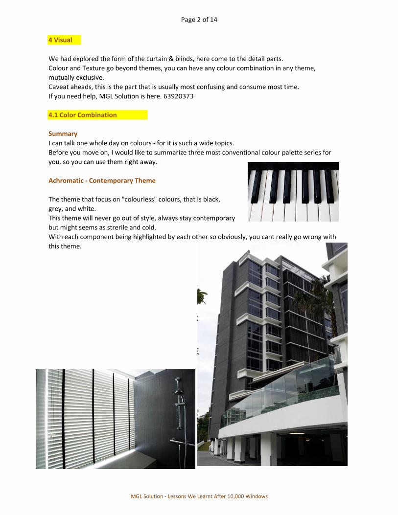
Achromatic - Contemporary Theme
The theme that focus on "colourless" colours, that is black,
grey, and white.
This theme will never go out of style, always stay contemporary
but might seems as strerile and cold.
With each component being highlighted by each other so obviously, you cant really go wrong with
this theme.
MGL Solution - Lessons We Learnt After 10,000 Windows
Page 3 of 14
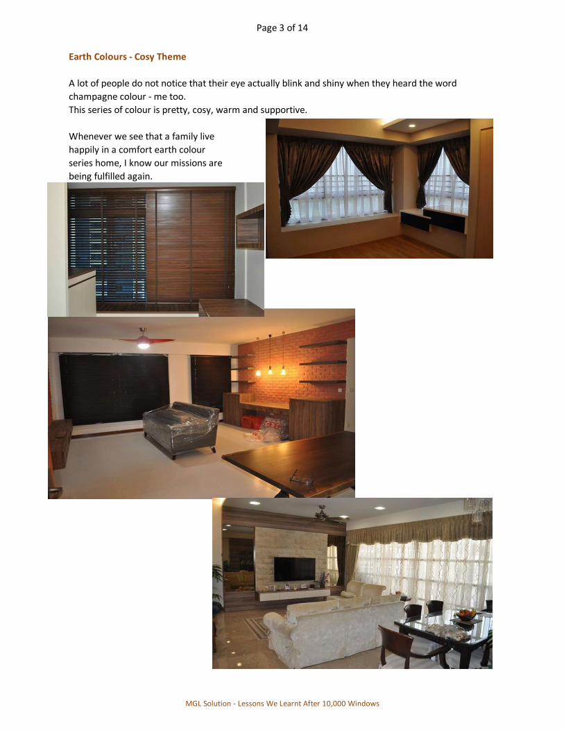
Earth Colours - Cosy Theme
A lot of people do not notice that their eye actually blink and shiny when they heard the word
champagne colour - me too.
This series of colour is pretty, cosy, warm and supportive.
Whenever we see that a family live
happily in a comfort earth colour
series home, I know our missions are
being fulfilled again.
MGL Solution - Lessons We Learnt After 10,000 Windows

Page 4 of 14
Electic - Be Bold and Vibrant
Electic, a vibrant splash of colour anywhere everywhere. Not easy to implement into interior, but
once done, the ambience is unique, out of world and impressive.
We used to colaborate with Miss Priya from Tailored Solutions Design, they are good at this.
MGL Solution - Lessons We Learnt After 10,000 Windows
Page 5 of 14
4.2 Colour Theory
This is a long discussion on colour & texture (later) with only black and white words, if you want to
skip this, no feeling :)
We did the ground work for you, you may contact [email protected]
What a joyful thing is color? How influenced we all are by it, even if we are unconcious of how
our sense of restfulness had been brought about. Certain colors are antagonistic to each of us,
and I think we should try to learn just what colors are most sympathetic to our own individual
emotions, and then make the best of them.
If you are inclined to a hasty temper, for instance, you should not live in a room in which the
prevailing note is red. On the other hand, a delicate nature could often gain courage and poise
by living in surroundings of rich red tones, the tones of the old Italian damasks in which the
primitive colors of the Middle Ages have been handed down to us.
Love of color is an emotional matter, just as much as love of music. Color! The very word would
suggest warm and agreeable arrangement of tones, a pleasing and encouraging atmosphere which
is full of life.
If we suspect we are "color-blind" as in we not sure what color to use in what proportion in
interior design, no worry. Let us furnish our house in neutral tones, depending on book bindings
and flowers and the necessary small furnishings for your color.
Rule of thumbs, paint the wall plain cream, have the woodwork be white, then splash your
favourite color in the small furnishing like curtain and like as you wish. The end result is that
this room is called cool and restful-looking by everyone who sees it, even if you splash with
intense color like red and blue. You can imagine how impossible it would be to be ill-tempered
in such a cheerful place.
Reference ii
MGL Solution - Lessons We Learnt After 10,000 Windows

Page 6 of 14
4.3 Language of Colour
and the psychology effect associated
Just like the romantic language of flower (i.e. floriography), I would like to share with you the
language of color.
Red
Positive : Power, Physicality, Passion, Sex, Energy, Strength
Negative : Danger, Death, Aggressive, Demanding, Anger
Black
Positive : Security, Emotional Safety, Glamorous, Sophisticated
Negative : Oppressive, Menacing, Cold, Mysterious
Orange
Positive : Warm, Expanding, Extrovert, Fun, Abundance
Negative : Disruptive, Frivolous, Immature, Frustration
Yellow
Positive : Optimistic, Bright, Happy, Friendliness, Creativity
Negative : Cowardly, Dingy, Bilious, Irrationality
Green
Positive : Balance, Tranquil, Peaceful, Refreshment, Harmony
Negative : Stagnation, Rotting, Inexperience, Jealousy
Blue
Positive : Calm, Soothing, Intellectual, Trust, Efficient, Serenity
Negative : Unfriendly, Aloof, Heavy, Withdrawn
Violet
Positive : Quality, Spiritual, Divinity, Truth
Negative : Introvertive, Depression, Death
White
Positive : Simplicity, Purity, Cleanliness, Sophistication
Negative : Strerile, Unfriendliness, Cold
Brown
Positive : Supporting, Warmth, Comforting, Sophistication
Negative : Barren, Dirty, Unsophisticated
Grey
Positive : Mature, Masculine, Self-sufficient, Independent
Negative : Dreary, Sombre, Depression, Insecurity, Lethargy
Reference vii : National Design Academy United Kingdom
MGL Solution - Lessons We Learnt After 10,000 Windows
Page 7 of 14
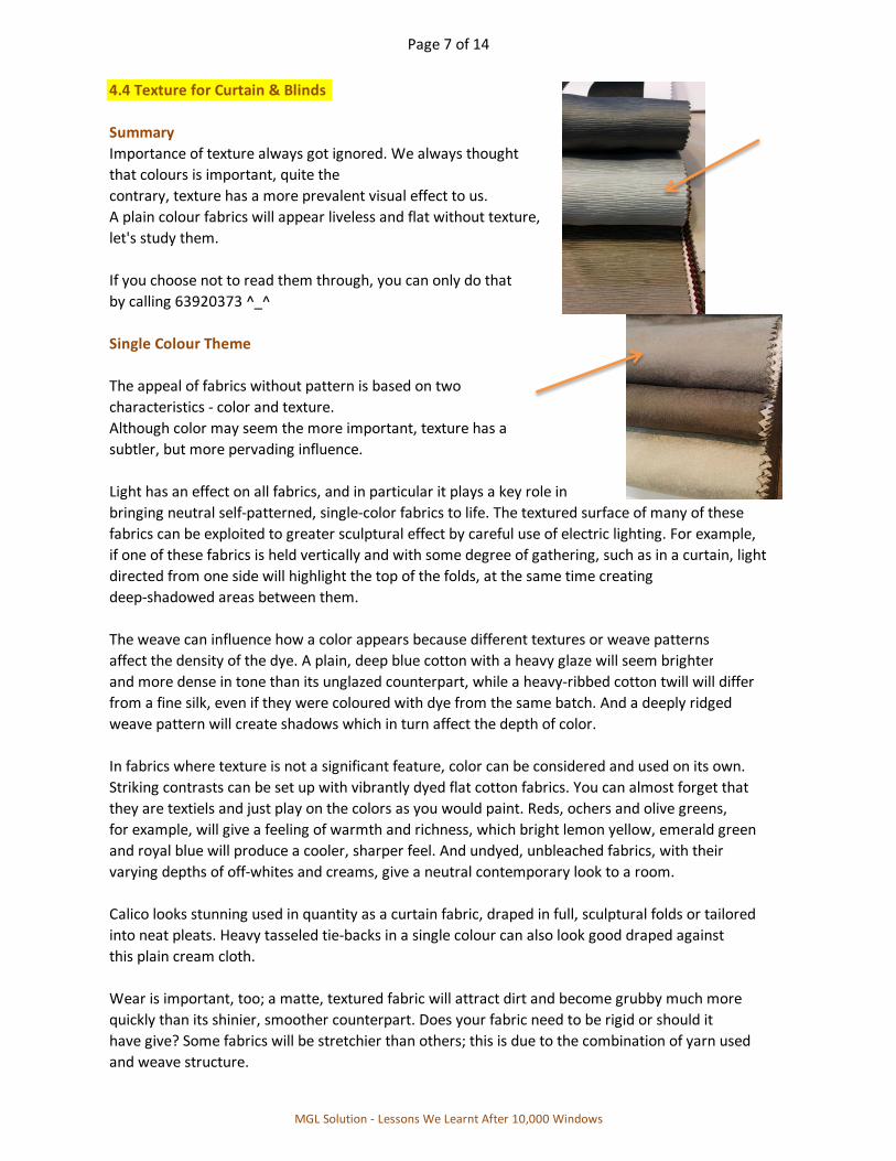
4.4 Texture for Curtain & Blinds
Summary
Importance of texture always got ignored. We always thought
that colours is important, quite the
contrary, texture has a more prevalent visual effect to us.
A plain colour fabrics will appear liveless and flat without texture,
let's study them.
If you choose not to read them through, you can only do that
by calling 63920373 ^_^
Single Colour Theme
The appeal of fabrics without pattern is based on two
characteristics - color and texture.
Although color may seem the more important, texture has a
subtler, but more pervading influence.
Light has an effect on all fabrics, and in particular it plays a key role in
bringing neutral self-patterned, single-color fabrics to life. The textured surface of many of these
fabrics can be exploited to greater sculptural effect by careful use of electric lighting. For example,
if one of these fabrics is held vertically and with some degree of gathering, such as in a curtain, light
directed from one side will highlight the top of the folds, at the same time creating
deep-shadowed areas between them.
The weave can influence how a color appears because different textures or weave patterns
affect the density of the dye. A plain, deep blue cotton with a heavy glaze will seem brighter
and more dense in tone than its unglazed counterpart, while a heavy-ribbed cotton twill will differ
from a fine silk, even if they were coloured with dye from the same batch. And a deeply ridged
weave pattern will create shadows which in turn affect the depth of color.
In fabrics where texture is not a significant feature, color can be considered and used on its own.
Striking contrasts can be set up with vibrantly dyed flat cotton fabrics. You can almost forget that
they are textiels and just play on the colors as you would paint. Reds, ochers and olive greens,
for example, will give a feeling of warmth and richness, which bright lemon yellow, emerald green
and royal blue will produce a cooler, sharper feel. And undyed, unbleached fabrics, with their
varying depths of off-whites and creams, give a neutral contemporary look to a room.
Calico looks stunning used in quantity as a curtain fabric, draped in full, sculptural folds or tailored
into neat pleats. Heavy tasseled tie-backs in a single colour can also look good draped against
this plain cream cloth.
Wear is important, too; a matte, textured fabric will attract dirt and become grubby much more
quickly than its shinier, smoother counterpart. Does your fabric need to be rigid or should it
have give? Some fabrics will be stretchier than others; this is due to the combination of yarn used
and weave structure.
MGL Solution - Lessons We Learnt After 10,000 Windows
Page 8 of 14
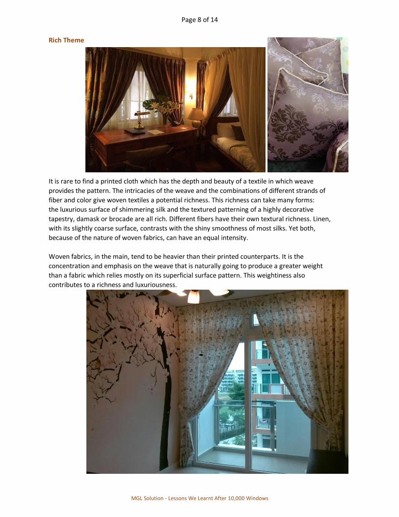
Rich Theme
It is rare to find a printed cloth which has the depth and beauty of a textile in which weave
provides the pattern. The intricacies of the weave and the combinations of different strands of
fiber and color give woven textiles a potential richness. This richness can take many forms:
the luxurious surface of shimmering silk and the textured patterning of a highly decorative
tapestry, damask or brocade are all rich. Different fibers have their own textural richness. Linen,
with its slightly coarse surface, contrasts with the shiny smoothness of most silks. Yet both,
because of the nature of woven fabrics, can have an equal intensity.
Woven fabrics, in the main, tend to be heavier than their printed counterparts. It is the
concentration and emphasis on the weave that is naturally going to produce a greater weight
than a fabric which relies mostly on its superficial surface pattern. This weightiness also
contributes to a richness and luxuriousness.
MGL Solution - Lessons We Learnt After 10,000 Windows
Page 9 of 14
Pattern is also a factor in producing a rich fabric. Often, this means grand, elegant or
traditional designs, for few woven patterns are new or contemporary. For exmaple, the
pomogranate has been used as a motif for hundreds of years and crops up on numerous silks and
damasks, adding to this group's exuberance. And tartan's particular history encourages a feeling
of tradition, which in turn contributes to a greater impression of richness.
Dense pattern, such as floral swirls in famask or detailed figurative scenes in tapestries, gives a
highly decorative feel to a textile. And the number of threads and color used to create such a
pattern adds to its beauty. It is immediately obvious whether a cloth has been composed of
a woven pattern or a surface-printed one. Pattern formed by printed color lacks the intrinsic
quality of a pattern fomed by the weave.
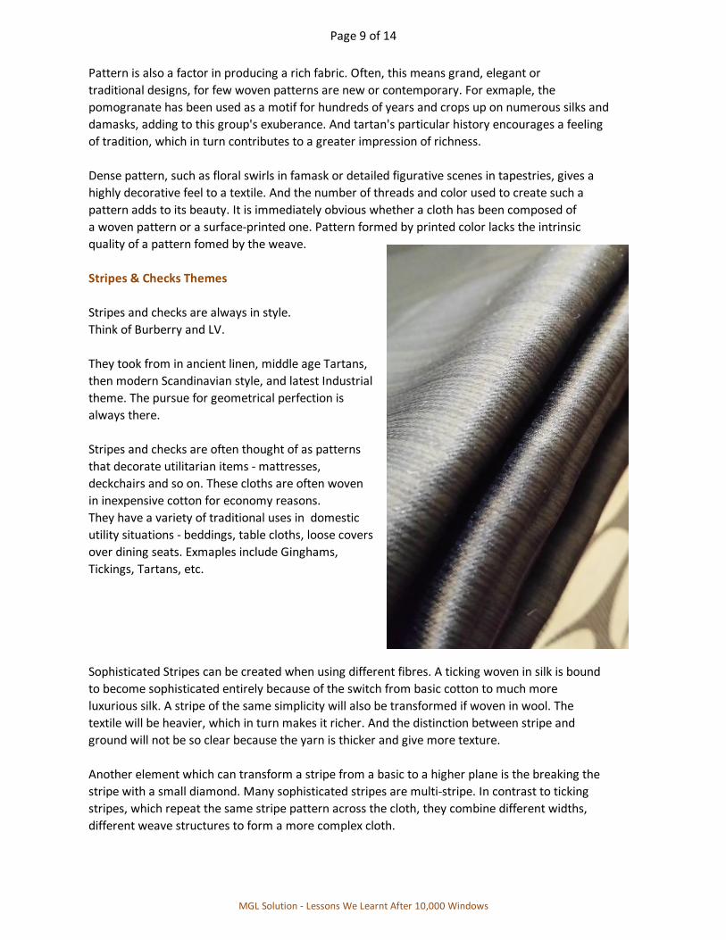
Stripes & Checks Themes
Stripes and checks are always in style.
Think of Burberry and LV.
They took from in ancient linen, middle age Tartans,
then modern Scandinavian style, and latest Industrial
theme. The pursue for geometrical perfection is
always there.
Stripes and checks are often thought of as patterns
that decorate utilitarian items - mattresses,
deckchairs and so on. These cloths are often woven
in inexpensive cotton for economy reasons.
They have a variety of traditional uses in domestic
utility situations - beddings, table cloths, loose covers
over dining seats. Exmaples include Ginghams,
Tickings, Tartans, etc.
Sophisticated Stripes can be created when using different fibres. A ticking woven in silk is bound
to become sophisticated entirely because of the switch from basic cotton to much more
luxurious silk. A stripe of the same simplicity will also be transformed if woven in wool. The
textile will be heavier, which in turn makes it richer. And the distinction between stripe and
ground will not be so clear because the yarn is thicker and give more texture.
Another element which can transform a stripe from a basic to a higher plane is the breaking the
stripe with a small diamond. Many sophisticated stripes are multi-stripe. In contrast to ticking
stripes, which repeat the same stripe pattern across the cloth, they combine different widths,
different weave structures to form a more complex cloth.
MGL Solution - Lessons We Learnt After 10,000 Windows

Page 10 of 14
Multi-colors, too, are used to add immediate sophistication, making the textile richer and more
detailed. A black and white pinstripe may be dramatic, but a multi-color stripe has greater
subtlety, especially if careful blending of shades and tones are used to produce complex
intersections of pattern.
Furniture too can benefit from the optical illusions a stripe can provide. Broad stripes,
especially if colors are in the same tonal range, will diminish the apparent size of an overlarge
sofa. And narrow, contrasting stripes will highlight a finely detailed chair.
Embroidery - Can be Either Rich Or Stripes Theme
All embroidery, from the Bayeux Tapestry through canvas work to samplers, uses stiches to apply
a pattern to a textile rather like drawing with thread. The success of the embroidered image
depends entirely on manual skill. Even machine embroideries need dexterity and a good eye to
transpose the desogn through the manipulation of the sewing machine onto the cloth.
Gold and metal threads were used extensively in all forms of English and European embroidery.
The metal threads were stiff and resistant, but by couching them down from the underside of the
canvas - an innovative but difficult process requiring much skill - they were made more flexible.
This process, which pulled tiny loops of another thread through to the back of the cloth, thus
securing them, produced a uniformly smooth front to the metallic surface.
Reference xxiii
MGL Solution - Lessons We Learnt After 10,000 Windows

Page 11 of 14
Translucent Theme
Translucent fabrics are those which are woven with an open weave that allows light to
penetrate the cloth. All fabrics which are eighter sheer or semi-sheer fall into this category.
Muslin, for example, is plain-woven in a finely spun cotton yarn, sometimes silk, which give a
soft, fine open cloth. This quality is exploited in all kinds of net curtaining, sheers an so-called
vision-nets. When hung at a window, they allow light through, at the same time diffusing the view
to the outside, beyond the glass. When looked through from the outside, these cloths conceals
the view from within.
These muslins, organza, lace and similar translucent cloths, are generally hung as a single shade
or curtain on their own or behind a main set of draperries. By their nature they do not require any
form of lining. However, some of the most open lace patterns can be lined, for example in a
shade, which a subtle color, so that the ligght diffuses through both layers and casts a gentle
colored glow into the room.
Two factors made fabrics sheer or semi-translucent: special weaving process or the fineness of
the thread used, or a combination of both.
Organza is a slightly stiffer version of muslin, originally used as a stiffener for clothing or as an
inner lining material which would give firmness to the main fabric covering it. It can be treated
in exactly the same way as mudlin, but because of its handle, it gives a more sculptural effect.
The idea of tenting one's bed with layers of muslin seems to be sheer romantic fancy, but in hot
countries like us it is in fact very practical. Whether it is shielding the sleeper from the sun or
from insects, or is purely decorative, the idea of coolness and light is certainly conveyed by
lengths of swathed or draped creamy white muslin.
MGL Solution - Lessons We Learnt After 10,000 Windows

Page 12 of 14
Pastel sheer in lemon, pink or pale blue tones are so insubstantial that they should, I think, be
ignored completely in favour of stronger or subtler colors. Use plaster-pinks, warm brass colors,
or soft bluey-grays for contrast.
Another use for sheer fabrics is to stretch them over screens that are used as room dividers.
These could be free-standing or constructed along the lines of the traditinoal Japanses shojis,
used to divide up their small living spaces without sacrificing light.
Make sure that light is allowed to travel through muslins and sheer cloths and is not directed onto
them. This is because direct light will make a sheer fabrics look opaque, which nullifies the fabric's
special quality.
Day curtain allow the window to do their original job of connecting us to the world.
Let the light come in, feel the beauty of your home.
MGL Solution - Lessons We Learnt After 10,000 Windows
Page 13 of 14
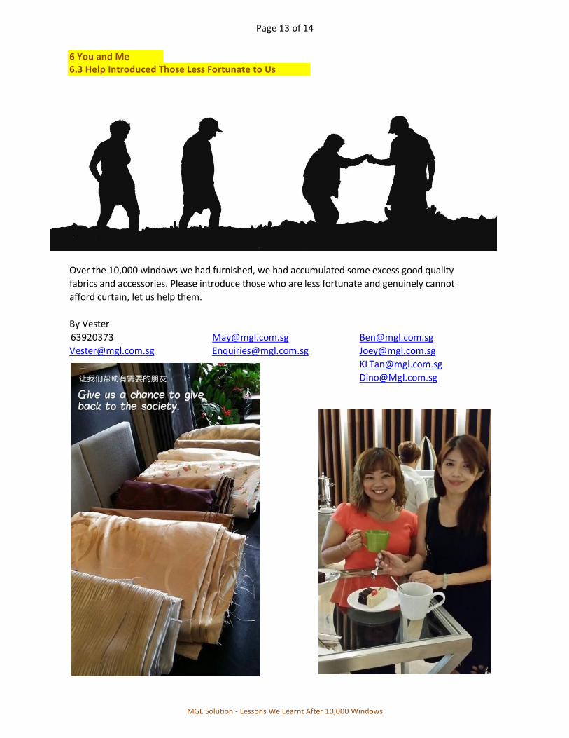
6 You and Me6.3 Help Introduced Those Less Fortunate to Us
Over the 10,000 windows we had furnished, we had accumulated some excess good quality
fabrics and accessories. Please introduce those who are less fortunate and genuinely cannot
afford curtain, let us help them.
By Vester
63920373 [email protected] [email protected]
[email protected] [email protected] [email protected]
MGL Solution - Lessons We Learnt After 10,000 Windows

Page 14 of 14
R Reference
i Kelly Hoppen @ East Meet West
ii Elsie De Wolfe @ The House of Good Taste
iii Nicholas Haslam @ Sheer Opulance, Haslam Style - Glamour in Contemporary Interiors
iv Cindy Lim @ Singapore Curtain, SIM
v Singapore Institute of Management, Interior Design
vi Vester Cheong @ MGL Curtain
vii National Design Academy of United Kingdom
viii Gina Moore @ The Window Style Bible
ix Dorothy Draper
x Kelly Wearstler @ Hue
xi Alison Books
xii Wendy Bakers @ Curtain Recipe
xiii Edith Wharton @ The Decoration of House
xiv Ogden Codman @ The Decoration of House
xv Chris Jefferys @ Basic Sewing
xvi Merrick & Day @ Encyclopedia of Curtains
xvii Alvin @ Singapore Curtain
xviii Michael S. Smith @ Element of Style
xix Wendy Shorter @ Hertfordshire Training Centre
xx Jenny Gibbs @ Curtains and Draperies - History, Design and Inspiration
xxi Hideaki Haraguchi @ Zero Kara Hajimeru Kenchiku No "Interia" Nyuumon 原口秀昭
xxii ShowyCulture @ Questions about Interior Design
xxiii Melanie Paine @ The Textile Art in Interior Design
xxiv Cho Hee Sun 조 석산 @ Home Design Story 홈 디자인 스토리
All images used are either self-generated or copyright-free.
MGL Solution - Lessons We Learnt After 10,000 Windows