Embed Size (px)
Citation preview

CREATE INTERACTIVE PORTFOLIOS WITH INDESIGN CS5
USE PSDS TO MAKE MOVIE POSTERS IN ILLUSTRATOR CS5
TIMESAVING FEATURES TO IMPROVE YOURPHOTOGRAPHIC WORKFLOW
Basic rules all Web designersand programmers should know
DesigningwithWebStandards
DISPLAY UNTIL JANUARY 18, 2011


storemags & fantamag - magazines for all

04
ww
w.l
ay
er
sm
ag
az
in
e.c
om
[ C O N T E N T S ]
[ F E A T U R E ]
30 ] Web StandardsWhether you’re a Web designer, coder, or programmer, this
issue we’ve decided to cater to you. Sue Jenkins expains where
Web standards came from, why you should use them (willingly),
and where you can go for more information about them. While
Web standards mostly deal with the behind-the-scenes issues,
they can also greatly affect a site’s design and how visitors view
a webpage. These standards are set in place for you to generate
the most traffic imaginable. So, let’s stick together and follow
the rules!—Sue Jenkins
[ T U T O R I A L S ]
36 ] Digital Photography: Improve Your Photographic Workfl ow
—Chris Orwig
42 ] Adobe Photoshop CS5:Creative Suite Advantages—Dave Cross
48 ] Adobe Illustrator CS5: Movie Poster—Corey Barker
56 ] Adobe InDesign CS5:Creating an Interactive Portfolio—Terry White
62 ] Adobe Dreamweaver CS5:Editing a WordPress Blog with Dreamweaver
CS5—Janine Warner
66 ] Adobe Flash CS5 Professional: Custom Video on Cue—Paul Trani
] N O V E M B E R / D E C E M B E R 2 0 1 0
] V O L . 6 , N O . 6
] W W W . L A Y E R S M A G A Z I N E . C O M
Page 30
18RA
DIM
MA
LIN
IC

05
LA
YE
RS
MA
GA
ZI
NE
][
NO
V /
DE
C 2
01
0
Whenever you see this symbol at the end of an article, it means there’s either additional material or a download
for that story at www.layersmagazine.com. So be sure to visit the website and check it out.
72
[ C O L U M N S ]
22 ] Design Makeover: Monster Ball—Jake Widman
28 ] Artistic Expressions: Illustrative Text—Bert Monroy
54 ] The Art of Type:Stroke, Stroke, Stroke—James Felici
[ D E P A R T M E N T S ]
8 ] Letter from the Editor
12 ] Layers News
18 ] Designer Spotlight
20 ] The Digital Canvas
78 ] Tips & Tricks
90 ] The Back Page
[ O N T H E C O V E R ]
Radim Malinic is a talented graphic
designer who creates intricate, innova-
tive designs and illustrations. He’s the
creative force behind his company,
Brand Nu, and a few of his clients
include Malibu, Dell, and PlayStation.
Don’t forget to look for his colorful art
throughout this issue of Layers.
[Radim Malinic]
Page 20
[ R E V I E W S ]
72 ] Boris Continuum Complete 7 AE—Rod Harlan
73 ] HP ZR30w Monitor—Bruce Bicknell
73 ] HP Z600 Workstation—Bruce Bicknell
74 ] Maya Entertainment Creation Suite 2010 —Bruce Bicknell
76 ] Adobe Captivate 5—David Creamer
storemags & fantamag - magazines for all

ww
w.l
ay
er
sm
ag
az
in
e.c
om
RA
DIM
MA
LIN
IC
] N O V E M B E R / D E C E M B E R 2 0 1 0
] V O L . 6 , N O . 6
] W W W . L A Y E R S M A G A Z I N E . C O M
[ T U T O R I A L S ]We’re always adding new tutorials to the Layers website,
so be sure to visit often. And don’t forget to sign up for
our graphics tip of the day. Here’s a small sampling of
some of the tutorials that you can find at the site now:
[ P H O T O S H O P ] www.layersmagazine.com/category/photoshop
Photoshop and Illustrator Interaction (Video): Watch how to
use Photoshop and Illustrator together to quickly defi ne
a graphic as a symbol. Corey even shows how to create a
design using various symbol tools and why it’s important
to paste your Illustrator graphic as a Vector Smart Object
in Photoshop.—Corey Barker
Senior Portrait Design in Photoshop, Parts 1 and 2 (Video):
In this two-part series, Jessica teaches how to create a
simple multilayered senior portrait design with several
layer style options, photos, and fonts. She even shows
how to easily place new photos into the already made
design.—Jessica Maldonado
[ I L L U S T R A T O R ]www.layersmagazine.com/category/illustrator
Everything You Wanted in Illustrator CS5 Artboards (Video):
Navigate through the new Artboards panel in Illustrator
CS5 with Jeff to learn more about its new features. You can
even renumber your artboards now!—Jeff Witchel
Adobe Illustrator CS5: Stroke of Genius (Video): Inter-
ested in learning about the newly overhauled Stroke
panel in Illustrator CS5? Here, Jeff talks about the new
dash and arrowhead options, the new Profi le settings
availabe with the Width tool, and how the Flip Along
option is a great timesaver.—Jeff Witchel
[ I N D E S I G N ]www.layersmagazine.com/category/indesign
Placing Images in InDesign CS5 (Video): Learn a few
quick tips from RC about placing images in InDesign
to maximize your skills. Watch as he shows different
importing options, two keyboard shortcuts, and a tip
about the Auto Fit checkbox in the Control panel.—
Rafael “RC” Concepcion
[ A F T E R E F F E C T S ]www.layersmagazine.com/category/aftereffects
Color Control in After Effects CS5 (Video): Getting the
right color can be tricky. Watch how to improve video
color in After Effects CS5 through Levels, Vibrance, and the
Color Finesse 3 plug-in.—Franklin McMahon
[ L A Y E R S T V ]Hosted by Corey Barker and Rafael “RC” Concepcionwww.layersmagazine.com/layerstvLayers TV is a weekly video podcast that offers killer tips and tricks to full-blown tutorials, and it covers all of your favorite print, Web, and video apps from Adobe.
[ S O C I A L N E T W O R K ]http://twitter.com/LayersMagazinewww.facebook.com/LayersMagazineWant to stay up to date on everything happening at Layers? Of course you do. Just follow @LayersMagazine on Twitter and be sure to join our Facebook fan page, as well.
06
18

storemags & fantamag - magazines for all

C H R I S { } M A I N
[ F R O M T H E E D I T O R ]
standard procedure
I want to start out this editor’s note by focusing on one word: standards. What are standards and why
should you care about them? You should care about standards because they make sure that most
things in your life just work. How would you feel if you brought home a brand-new Blu-ray player only
to find out it doesn’t work with your HDMI television because the manufacturer decided to use its own
specs for HDMI? Sure, their Blu-ray players work with their televisions, but they wouldn’t work with any
other brand. You wouldn’t be very happy, would you? Well, the same idea holds true for the Internet. When a person visits
a site, she just wants it to work, no matter what platform or browser she’s using. And as the designer or developer you want
to make sure that your users are never frustrated by things that don’t work because once a user encounters a problem,
chances are she’ll never return to your site again.
So we invited Sue Jenkins to tell us about Web standards. Sue is the Creative Director of Luckychair.com and is the
author of seven books, including Web Design All-in-One for Dummies by Wiley Publishing, Inc. In her article, you’ll learn
where Web standards come from, why you should use them, and where you can go to find out even more about them. If
you’re a budding Web designer or a photographer who’s just trying to create a presence on the Web, you’ll want to read
this article. Standards are important, and it’s critical to learn to use standards from the very beginning (and to keep up with
changing standards, as well).
Also in this issue, James Felici and Bert Monroy show two very different ways to take your
type well beyond simple keystrokes and kerning. In “The Art of Type” (p. 54), James teaches
how to use the Stroke panel in InDesign to really spice up your text. Bert uses Photoshop and
layer styles in “Artistic Expressions” (p. 28) to create pillow-shaped letters that would quickly
put any virtual baby to sleep.
The “Design Makeover” is one of our most popular columns in Layers magazine. This
issue, we asked three talented designers to take on a flyer for a Swing Goth event. What is
Swing Goth, you ask? You’ll have to read the article (p. 22) to find out, but the subject allowed
the designers to run free with their artistic visions, giving us some really inviting results.
If you’re a regular, then you know that every issue we feature an amazing artist and
designer. This issue, we’re proud to share the work of Radim Malinic. Under the name
Brand Nu, Radim has worked with many big-time clients, such as FUZE Beverage, Coca-Cola, Malibu, Dell, and PlayStation.
Radim pushes himself to new limits with every project he works on, and I think you’ll see the results of his determination
and drive as you view his artwork throughout the publication. Read our interview with Radim in the “Designer Spotlight”
on page 18.
We also have lots of great step-by-step tutorials in this issue; for example, you’ll learn how to streamline your photo-
graphic workflow in Photoshop and Bridge (p. 36), use Photoshop with the other Creative Suite applications (p. 42), create
eye-catching movie posters in Illustrator (p. 48), build interactive portfolios in InDesign (p. 56), edit WordPress themes in
Dreamweaver (p. 62), and create cue points in Flash to trigger events in video (p. 66). See, I told you there were a lot.
I hope you enjoy the magazine and that when you’ve finished reading it that you’re a little more productive and you
have a few more creative ideas than you did before you turned that first page. Until next time…
.
All my best,
Chris Main
Editor-at-Large
[You should care about
standards because they
make sure that most things
in your life just work.]
FOLLOWING THE RULES CAN MAKE EVERYONE’S LIFE EASIER
08
ww
w.l
ay
er
sm
ag
az
in
e.c
om

storemags & fantamag - magazines for all

EDITOR-IN-CHIEF
EDITOR-AT-LARGE
TRAFFIC DIRECTOR
DYNAMIC MEDIA EDITOR
CONTRIBUTING WRITERS
CREATIVE DIRECTOR
PRODUCTION MANAGER
SENIOR ASSOCIATE DESIGNER
PRODUCTION DESIGNER
VP, SALES
ADVERTISING COORDINATOR
ADVERTISING DESIGNER
DIRECTOR OF CIRCULATION
PUBLISHER
EXECUTIVE PUBLISHER
ASSOCIATE PUBLISHER
BUSINESS MANAGER
CHIEF FINANCIAL OFFICER
DIRECTOR OF WEB DEVELOPMENT
AND PROGRAMMING
WEB TEAM
PUBLISHED BIMONTHLY BY
SUBSCRIPTIONS
COVER DESIGN
COLOPHON
VOLUME 6 • NUMBER 6 • PRINTED IN USA
www.layersmagaz ine .com
All contents © COPYRIGHT 2010 Kelby Media Group, Inc. All rights reserved. Any
use of the contents of this publication without the express written permission of the
publisher is strictly prohibited. Layers magazine is an independent journal not affili-
ated with Adobe Systems, Inc. Adobe, the Adobe logo, Acrobat, Adobe Premiere, After
Effects, Dreamweaver, Flash, Illustrator, InDesign, Lightroom, and Photoshop are
either registered trademarks or trademarks of Adobe Systems Incorporated in
the United States and/or other countries. All other trademarks are the property of
their respective owners. Some of the views expressed by contributors may not be the
representative views of the Publisher. ISSN 1554-415X
Scott Kelby
Chris MainKim GabrielRod Harlan
Corey Barker • Peter Bauer • Bruce
Bicknell • Cyndy Cashman • Rafael
“RC” Concepcion • David Creamer
Dave Cross • James Felici • Sue Jenkins • Bert Monroy • Chris Orwig Paul Trani • Janine Warner • Terry
White • Jake Widman
Felix NelsonDave Damstra
Taffy Clifford
Dave Korman
Kevin Agren 813-433-2370
Jeanne Jilleba 877-622-8632 ext. 215
Margie Rosenstein
Ronni O’Neil
Scott KelbyDavid Moser
Mike MackenzieJean Kendra
Paul Parry
Tommy MaloneyJustin Finley • Jay Fortner • Karey
Johnson • Fred Maya • Leslie
Montenegro • Kris Olds • Aaron
Westgate
Kelby Media Group
333 Douglas Road East
Oldsmar, FL 34677-2922
Phone: 813-433-5010
www.kelbymediagroup.com
$29.95 (U.S.) Call (toll-free)
877-622-8632; subscribe online at
www.layersmagazine.com
Cover image courtesy
of Radim Malinic
Produced using Adobe InDesign CS5, Adobe Photoshop CS5, and
Adobe Illustrator CS5. Body copy is set in Avenir. Headlines are set in
Solex. Lorem ipsum dolor sit amet,
consectetur adipiscing elit. Suspendisse
blandit dapibus suscipit. Quisque vitae
sapien turpis. Vestibulum volutpat
congue neque, vitae scelerisque lacus
iaculis nec. Sed tempor interdum felis,
id porttitor dui laoreet nec. Maecenas
turpis massa, venenatis at lacinia eu,
pellentesque a tortor. Morbi aliquam
neque ac erat vestibulum et lobortis
ipsum porta...If you’re a designer or
layout person, you’re probably thinking
we inadvertently forgot to remove some
Greeked text. Well no, we didn’t. We just
wanted to see if: A) you’d even notice,
or B) you even knew what Greeked text
was (you would if you’re over 30 years
old). If you’re not a designer or layout
person, then who cares? We weren’t talking to you. Neener, neener, neener.
printEverything for the
Perfect Print.
Every day low prices+
FREE Shipping*
Call us Today!
Located in America's Heartland
(800) 771-9665Or Order Online 24/ 7
www.itsupplies.com*on orders over $99

storemags & fantamag - magazines for all

[ l a y e r s n e w s ]graphics design news • new products • digital video news • other stuff
ww
w.L
AY
ER
SM
AG
AZ
IN
E.C
OM
12
Adobe announces Acrobat XOn October 18, 2010, Adobe announced the latest version of their popular PDF solution software, Acrobat X (as in 10) Pro. This new version
has a simplifi ed panels interface (think Photoshop) and a new document view mode. PDF Portfolios (which were introduced in Acrobat 9) are
better than ever and make it easy to combine many different fi le types into one handy package that can be shared with anyone. And the new
guided actions feature streamlined document workfl ows and helps users create better, stronger PDFs faster. Acrobat X supports PDF/X-4:2010
and PDF/X-5:2010 (the new version of the PDF/X-4 and X-5 standards). You’ll also fi nd improvements in transparency fl attener and in printing
RGB-based documents to CMYK-based printers.
Adobe also announced Adobe Reader X, which benefi ts from the new simplifi ed panels interface, as well. In other good news, the com-
menting tools are now always on for Reader—you don’t have to activate them on a per-document basis in Acrobat Pro. Reader also includes
improved browser integration, protected mode security, and Android Mobile Reader.
Acrobat X Pro will be available for $499, or $199 for the upgrade. For more information, visit www.adobe.com.
Adobe Illustrator gets its own HTML5 pack
Photoshop Elements borrows a page from CS5
Following up on the Dreamweaver CS5 HTML5 Pack (which is now part of the Dreamweaver 11.0.3 updater), Adobe has announced the Illustrator
CS5 HTML5 Pack. Aimed at designers creating content for mobile devices and the Web (and honestly, who doesn’t design for mobile and Web
these days), the HTML5 Pack allows both designers and developers to take advantage of HTML5 and CSS3 and enhances the integration between
Illustrator CS5 and Dreamweaver CS5. SVG generated by Illustrator can be displayed directly in compatible browsers and Illustrator can be used
to generate CSS code for styling of HTML content. According to Lea Hickman, Senior Director, Creative and Interactive Solutions at Adobe, “The
HTML5 Pack for Illustrator CS5 gives designers and developers the power to deliver high-quality graphic content for the Web that can look great,
no matter what the screen.” The HTML5 Pack for Illustrator CS5 is available for free at Adobe Labs at http://labs.adobe.com.
Adobe recently announced the availability of Photoshop Elements 9. The latest version
of their popular consumer image-editing app has adapted one of the “wow” technolo-
gies that was originally introduced in Photoshop CS5—Content-Aware Fill. The content
intelligence now available in the Spot Healing Brush will have users removing telephone
poles, wires, and those bunny ears from behind your head that your best friend thinks
are so funny from your photos with ease. The same content intelligence also fi lls in
missing gaps when creating a panorama from multiple images.
Another cool new feature is the Photomerge Style Match. If you have a photo
in which you really like the contrast and color tone and you’d like to apply that to
another photo, Photomerge Style Match will automatically apply those qualities to
that other photo. And with the new Guided Edit options, you’ll quickly be creating
cool effects, such as making elements leap out of the photo in 3D, creating pop art,
or retouching. Photoshop Elements 9 is available now for $99.99. For more informa-
tion, visit www.adobe.com.

www.adobemuseum.comAdobe Museum of Digital Media: The world’s fi rst virtual museum dedi-cated to digital art and innovation
www.digitalfamily.comTraining and resources for Web design and Adobe Dreamweaver from Janine Warner
http://thephotoletariat.comDedicated to helping photographers with artistic advice, technical tips, and ways to build business in today’s economy
http://lightroomsecrets.comAdobe Photoshop Lightroom tips, tutorials, and news, along with the occasional article on photography and the creative process
Web Watch[more cool sites for creatives]
Nikon also introduced the COOLPIX P7000 at
Photokina. The 10.1-megapixel COOLPIX P7000
features a large 1/1.7" CCD sensor coupled with
a 7.1x Wide Angle Optical Zoom-NIKKOR ED
Glass Lens. It adopts Nikon’s new EXPEED C2
high-performance digital image processing engine
to ensure high-quality pictures.
ISO sensitivity ranges from 100–6400 (expand-
able to ISO 12,800 in low noise Night Mode)
to ensure sharp, crisp images when shooting in low
light or photographing fast-moving subjects. The
P7000 also features 5-Way VR Image Stabilization System to minimize the effect of camera shake.
Advanced users will also enjoy the benefi ts of shooting RAW/NRW fi les for creative freedom, and
macro abilities as close as 0.8".
The P7000 records HD video at 720p at 24 frames-per-second (fps) with optical zoom and
autofocus control. A COOLPIX fi rst, users can now record audio with an external stereo micro-
phone via the microphone input. An accessory microphone or Nikon Speedlight can be mounted
on the P7000’s hot shoe. The Nikon COOLPIX P7000 will be available for $499.95.
A ton of new gear from NikonAt Photokina 2010 in Cologne, Germany,
Nikon introduced the D7000 DSLR. Sitting
between the Nikon D90 and the D300S,
the DX-format (APS-C) D7000 camera
features a new 16.2-megapixel CMOS
sensor. According to Nikon, the new
EXPEED 2 image-processing engine fuels
the enhanced performance of the D7000,
along with a new 39-point AF system and
groundbreaking 2,016-pixel RGB 3D Matrix
Metering System to deliver amazing image
quality in a variety of shooting conditions.
Additionally, the D7000 DSLR provides full 1080p HD movie capability with full-time autofocus (AF).
Using Nikon’s exclusive Scene Recognition System, the D7000 analyzes subject information
from a database containing more than 30,000 images to optimize focus, exposure, and white
balance. The camera has a native ISO range of 100–6400, which can be expanded to a Hi-2
setting of 25,600, something previously found only in Nikon FX-format territory. The D7000
DSLR camera will be available throughout the United States beginning mid-October 2010 for
$1,199.95 for the body only and $1,499.95 for the body and lens outfi t that includes the AF-S DX
Zoom-NIKKOR 18–105mm f/3.5–5.6G ED VR lens.
Nikon also announced a new Speedlight and a couple of new lenses. The SB-700 Speedlight
builds on the success of the popular SB-600 Speedlight and the advanced functionality of
the SB-900 Speedlight and is scheduled to be available in mid-November for $329.95. The new
AF-S NIKKOR 35mm f/1.4G will appear around the same time for $1,799.95, and the new AF-S
NIKKOR 200mm f/2G ED VR II should be available by the time you read this for $5,999.95. Just
prior to the show, Nikon had also announced their new D3100 DSLR ($699.95) and four new
lenses: the AF-S NIKKOR DX 55–300mm f/4.5–5.6 VR ($399.95), the AF-S NIKKOR 24–120mm
f/4G ED VR ($1,049.95), the AF-S NIKKOR 28–300mm f/3.5–5.6G ED VR ($1,299.95), and the
AF-S NIKKOR 85mm f/1.4G ($1,699.95).
For more information regarding the new DSLRs, lenses, and Speedlight, please visit www
.nikonusa.com.
The new Nikon COOLPIX P7000
storemags & fantamag - magazines for all

[ n e w s ]
Upcoming Events
MAXIMUM PHOTOSHOP CS5 TOUR
Washington, DC (November 8, 2010)Boston, MA (November 10, 2010)South San Francisco, CA (November 15, 2010)New York, NY (November 22, 2010)www.kelbytraininglive.com
PHOTOSHOP CS5 FOR
PHOTOGRAPHERS TOUR
Chicago, IL (November 9, 2010)Denver, CO (December 13, 2010)www.kelbytraininglive.com
PHOTOSHOP CS5 DOWN & DIRTY
TRICKS TOUR
Livonia, MI (November 12, 2010)Sacramento, CA (December 6, 2010)www.kelbytraininglive.com
SCOTT KELBY’S PHOTOSHOP FOR
DIGITAL PHOTOGRAPHERS TOUR
November 18, 2010Washington State Convention & Trade CenterSeattle, WAwww.kelbytraininglive.com
LOCATION LIGHTING TECHNIQUES
FOR PHOTOGRAPHERS TOUR
Ft. Lauderdale, FL (December 3, 2010)Phoenix, AZ (December 7, 2010)San Diego, CA (December 9, 2010)www.kelbytraininglive.com
PHOTOSHOP CS5 CREATIVITY TOUR
Houston, TX (December 10, 2010)Portland, OR (December 15, 2010)www.kelbytraininglive.com
MACWORLD 2011
January 26–29, 2011Moscone CenterSan Francisco, CAwww.macworldexpo.com
PHOTOSHOP WORLD CONFERENCE
& EXPO
March 30–April 1, 2011Orange County Convention CenterOrlando, FLwww.photoshopworld.com
The Canon PowerShot G12
Canon makes headlines at Photokina
In more Photokina news, Canon U.S.A., Inc., announced the PowerShot G12 digital camera. The
PowerShot G12 includes the Canon HS SYSTEM. Canon’s DIGIC 4 Image Processor combined
with the PowerShot G12’s 10-megapixel High Sensitivity CCD sensor, make up Canon’s HS
SYSTEM to enhance image quality and help reduce noise at high ISO levels.
The PowerShot G12 is also the first PowerShot G-series model to record 720p HD video.
It offers a full range of shooting and recording modes with new features such as High Dynamic
Range (HDR) scene mode. With the use of a tripod, one push of the shutter button yields
three sequential images with various exposures, and then combines them into a single
optimized image.
The Canon PowerShot G12 has a 2.8" vari-angle LCD and a 5x optical zoom lens with
Optical Image Stabilization and wide-angle capabilities starting at 28mm. And as with
previous cameras from this series, the G12 supports RAW capture. The estimated selling
price of the PowerShot G12 is $499.99. For more information, visit www.usa.canon.com.
Just prior to Photokina, Canon announced
the EOS 60D DSLR. The EOS 60D has an
18-megapixel Canon CMOS sensor, Canon’s
proprietary DIGIC 4 Imaging Processor, and
can capture full HD video. The vari-angle
3" Clear View LCD screen allows users to
position the screen just about anywhere
they need to capture overhead or low-angle
shots. The 60D can process RAW files right in
the camera with features that include Picture
Style, White Balance, Color Space, High-ISO Noise
Reduction, and more. Photographers can now generate
optimized JPEG files from their RAW files for immediate sharing. The 60D will be available for
an estimated price of $1,099 (body only).
Canon also introduced four new L-series lenses: the Canon EF 8–15mm f/4L Fisheye USM
($1,400; available in January), the new EF 70–300mm f/4–5.6L IS USM ($1,500; available in
October), the EF 300mm f/2.8L IS II USM ($7,000; available in December), and the Canon EF
400mm f/2.8L IS II USM ($11,000; available in December). For more information on both the
EOS 60D and L-series lenses, visit www.usa.canon.com.
New Sigma camera, lenses, and flashesSigma announced the Sigma SD1 DSLR, two new lenses, and a couple of new flash units at
Photokina. The Sigma SD1 is a whopping 46 megapixels with a 24x16mm APCS-C X3 sensor.
Along with the Dual TRUE (Three-layer Responsive Ultimate Engine) II image processing
engines, Sigma claims the SD1 quickly processes high-resolution images with high definition
and a smooth and subtle graduation of color.
The two new lenses include the Sigma APO 120–300mm f/2.8 EX DG OS HSM and the
Sigma APO MACRO 150mm f/2.8 EX DG OS HSM. The two new flash units include the Elec-
tronic Flash EF-610 DG ST and the EF-610 DG Super. For pricing and availability, visit www
.sigmaphoto.com.

storemags & fantamag - magazines for all


storemags & fantamag - magazines for all

ww
w.L
AY
ER
SM
AG
AZ
IN
E.c
om
18
C H R I S { } M A I N
[ D E S I G N E R S P O T L I G H T ]
[r a d i m m a l i n i c ]
Layers: You seem to enjoy your freedom as a freelance designer
and illustrator. What are the advantages of working for yourself
compared to working for an agency or running your own agency?
Malinic: The biggest advantage is the opportunity to create interest-
ing and innovative work. If you work for an agency, you’re part of a
team and the work gets diluted. Politics and extra people are involved
in agencies, which can overtake the joy of each project. I opted for a
freelance career for many reasons—mainly so I can choose what I do
and when I do it. Obviously, it’s not a fairy tale scenario. Sometimes
you have to work 18-hour days, but I’m a lot happier to be at the
forefront of the creative tasks in a project. If I need to take time off,
I decide when to take it and when to work.
Radim Malinic is a self-taught, award-winning art director, illustrator, and graphic designer
based in London, England. Like many successful artists, Radim didn’t start out as a designer. He has a degree in business management,
and it wasn’t until he was 24 that he turned to full-time design and illustration. His cutting-edge, innovative designs, and bold use of color
has helped boost the visibility of many household brand names, such as FUZE Beverage, Coca-Cola, Malibu, Dell, and PlayStation.
Under the name Brand Nu, Radim has applied his vast skill set to advertising campaigns, product branding, magazine covers, editorial
illustrations, and Web solutions. He treats every project as a brand-new (i.e., brand nu) challenge, and never approaches a brief the same
way twice. His passion to make each project better than the last and his attention to intricate detail shines through in his work.
Layers: You use agents to help promote your work and fi nd new
clients. What are the advantages of using an agent, and at what
point in a designer’s career should he start thinking about using
an agent?
Malinic: A good agent can help you reach clients that can be hard to
get. Corporations often prefer to deal with an illustrator who has an
agent. It’s a simple rule because the ad agency has a back up of the
agent’s talent roster; therefore, being represented sometimes makes
you a better pick for the job. I started thinking about getting an agent
when I was ready to take the work up a notch. I learned a lot from my
previous day jobs and I knew I could successfully freelance. I didn’t
have a dream client list, but I had the right skill set.

19
lA
YE
RS
MA
GA
ZI
NE
][
no
v /
de
c 2
01
0
[CONTACT] Radim Malinic www.brandnu.co.ukAll imAges BY RADim mAliNiC
Layers: We’ve interviewed many designers in the past who have a
college degree in a subject totally unrelated to design, but they’ve
always found a way to use that degree to their advantage in the design
industry. Has your degree in business helped you succeed as an artist?
Malinic: My first encounter with the subjects of economics and market-
ing was simply enchanting. Although I dabbled with graphic design
before economics, I chose to study for a business degree. I always
say that a freelancer is a boss during the day and a creative at night.
Having a business management background is handy, but successful
design practice is a combination of common sense, good manners,
and hard work.
Layers: Your work is more about setting trends instead of following
them. Can you tell us a little about your style and how you strive to
create something new and unique each time?
Malinic: I admire illustrators who have one style that they do all
day, every day. It’s as if they’re on a diet eating just apples and never
try anything different. I understand they’re comfortable that way and
most are very successful. But I have the opportunity to do anything
I want, any time I want. It took me a while to get to the point where
I am right now, but I’m enjoying it. So I work to find new ways of apply-
ing the creative ideas, which always carry my signature style. This way
my clients are open to new ideas and let me explore the unexpected.
Layers: You’ve self-published three limited-edition showcase books
of your work. How have these books helped your career? Have they
helped in ways that you never even imagined?
Malinic: They have helped because I did something different
than my contemporaries. We’ll always have nice relationship with
physical objects like books and magazines. For me, each book has
opened a new set of doors and helped me grow. You can change
the content of your online portfolio as often as you like, but the
book stays the same forever.
storemags & fantamag - magazines for all

ww
w.l
ay
er
sm
ag
az
in
e.c
om
20
[ t h e d i g i t a l c a n v a s ]
s h o w c a s i n g t h e d e s i g n w o r k o f o u r r e a d e r s
[ g a l l e r y ]
Design: Craigslist Casual Encounters Book Cover ] [ Client: HaHa Publishing ] [ Designer: Tara Lynn Price ] [ Cover Illustration: Anthony Walton ] [ Software: Adobe InDesign CS3 and Adobe Photoshop CS3 ] [ www.tlpricefreelance.com
Design: Louis Armstrong ] [ Client: Personal Work ] [ Designer: Wayne Rose ] [ Software: Adobe Illustrator CS ] [ http://waynerose.webs.com
Design: ARTrageous Poster ] [ Client: Whistler Arts Council ] [ Designer: Ruth Johnson ] [ Software: Adobe Photoshop CS4 and Adobe Illustrator CS4 ] [ www.ruthjohnson.bc.ca
The staff at Layers magazine
appreciates the time and effort
involved in the creative process,
no matter how large or small the
project. With this in mind, we of-
fer you the opportunity to display
your work on The Digital Canvas.
Please submit your print, Web,
or packaging design (jpeg or eps
format) to: letters@layersmaga-
zine.com. Please include name of
piece, client name (if applicable),
applications used, and any web-
site where our readers can view
more of your work.

lA
YE
RS
MA
GA
ZI
NE
][
no
v /
de
c 2
01
0
21
Design: Jungle Birds ] [ Client: Personal Work ] [ Designer: Yuval Hoshen ] [ Software: Adobe Photoshop CS4 ] [ www.wix.com/yuvalhoshen/yuvalhoshen
Design: ialmostknewyou ] [ Client: Personal Work ] [ Designer: Andre Villanueva ] [ Model: Elissa Villanueva ] [ Photographers: Amanda Childress & April Garzarek ] [ Software: Adobe Photoshop ] [ www.000-000-0000.com
Design: Spring Float ] [ Client: Personal Work ] [ Designer: Doug Gilbert ] [ Software: Adobe Photoshop CS4 ] [ www.doug-gilbert.com
storemags & fantamag - magazines for all

ww
w.L
AY
ER
SM
AG
AZ
IN
E.c
om
22
J A K E { } W I D M A N
[ D E S I G N M A K E O V E R ]
wing Goth was born out of an attempt to marry partner danc-
ing with modern music. “We dream of a future where dancing
with each other is once again the norm, but we’re unlike other partner
dancing clubs in that we dance to modern music,” said Brian Gardner,
originator and promoter of Swing Goth. Gardner hosts biweekly dance
parties and occasional live-music events in San Francisco—Swing
Goth’s home—and the activity has spread to New York. “We teach
partner dancing based on upper body connection, and we focus on
developing a personal style and fl air rather than on perfecting cookie-
cutter footwork,” Gardner said.
Some of Swing Goth’s events, such as this October’s “Ball of
C’thulhu,” feature steampunk bands. Steampunk is a visual aesthetic
and literary genre that, like Swing Goth, combines old and new. “I think
of it as what would happen if the combustion engine and mass produc-
tion were never invented,” explains Gardner. Think of fl oating airships
or computers with keyboards made out of typewriters. “Aesthetically, it
is said that steampunk is what happens when goths discover brown.”
For the ball fl yer, one of the participating bands came up with the
tentacles-and-cemetery theme. Gardner took it from there, populating
the cemetery with ghouls drawn by a friend or images from the public
domain. The fl yer will be printed as a 4x6" postcard to be distributed in
clubs, record stores, and the like; and as 8.5x11" posters to be hung in
appropriate neighborhoods.
Gardner likes some aspects of the flyer, such as the tentacles
wrapping around the band, but he worries that it looks too wordy and
doesn’t like the way the text breaks down into horizontal bars that inter-
rupt the eye’s fl ow. He’d like a fl yer that covered the event details but still
gave a feeling of “gentle, dark seduction” between elegant ladies and
gentlemen. We asked three designers to create an appropriately seduc-
tive—but appropriately spooky—monster mash fl yer.
client:Swing Goth] [www.swinggoth.com
makeover submissionsWe’re looking for product packaging or labels, print advertisements, websites, and magazine covers that are currently in the marketplace for
future “Design Makeovers.” So if you or someone you know has a design that you’d like us to consider making over, or if you’re a designer
and you’d like to be considered for a future “Design Makeover,” drop us a line at [email protected].
beforemonster ball
S
Jake Widman is a writer and editor who lives in San Francisco. He’s been covering the intersection of computers and graphic design for about 20 years now—since back when it was all called “desktop publishing.”[ ]
He’d like a fl yer that covered the
event details but still gave a feeling
of “gentle, dark seduction” between
elegant ladies and gentlemen.

lA
YE
RS
MA
GA
ZI
NE
][
no
v /
de
c 2
01
0
23
y immediate impressions of the original design were that
it was busy, absent of any real focal point, and lacking
impact. I wanted to give it a more professional touch that would
complement the reputation of the promoter and musicians.
I began by stripping the poster down to its basics and identify-
ing what the client liked about the current design: colors, central
image, and dark mysterious vibe. I then looked at what elements
were necessary to the fl yer and reordered them in terms of size
and location to create a more structured hierarchy. I considered
the main focal point of this poster to be the event, theme, and
date, and therefore concentrated the design on these areas. I liked
the cemetery theme as it has a link with the headline act Abney
Park (also a cemetery here in London), as well as being a perfectly
fi tting theme for this monster mash.
The overall colors of the poster remain dark so that the white,
green, and yellow text can really pop in the ultraviolet lighting
common in clubs. All the band logos have been displayed using
white text in the style of their logos—this will ensure that they
stand out in nightclub lighting while complementing the central
image rather than detracting from it.
To reinforce the event theme of C’thulhu (a fi ctional cosmic
entity created by horror author H.P. Lovecraft), stylized ethereal
tentacles were added crawling out from under a headstone. The
tentacles provide a sense of horror and mystery, as well as con-
veniently creating the perfect frame with which to emphasize the
main details of the event. The event name and date appear on the
headstone, almost as though they were carved there.
Overall, the fi nal design is a classy, stylish, elegant take on a
subject matter (Halloween) that can often be cliché and cheesy.
Maria Stephens] [ www.tigerlillydesigns.co.ukOriginally from the beautiful valleys of South Wales, Maria Stephens has spent the last fi ve years honing
her expertise on the streets of London, working her way up through the ranks of design teams and enjoy-
ing both agency and client side projects. With a Masters Degree in Graphic Communication, Maria real-
ized that she could have more fun and greater creative freedom working for herself and founded Tigerlilly
Designs, a boutique design agency with big ambitions, in 2008.
Since its founding, Tigerlilly has worked with start-up entrepreneurs, blue-chip businesses, charities, and classy individu-
als on both sides of the pond. Recently, Tigerlilly nurtured a fl ourishing relationship with Razor Research, an award-winning
research agency based in London. This partnership has led to work for well-known brands such as Green Giant, Betty Crocker,
and Häagen-Dazs.
Maria lives in Central London with her boyfriend and her basil plant named Fred.
APPLICATIONs USED: Adobe Photoshop CS4, Adobe Illustrator CS4, and Adobe InDesign CS4
[ A B O U T T H E D E S I G N E R ]
The tentacles provide a sense of
horror and mystery, as well as
conveniently creating the perfect
frame with which to emphasize
the main details of the event.
afterDESIGNER: Maria Stephenswww.tigerlillydesigns.co.uk
M
storemags & fantamag - magazines for all

ww
w.L
AY
ER
SM
AG
AZ
IN
E.c
om
24
[ d e s i g n m a k e o v e r ]
his project was very interesting to me because it covered
a topic that I truly knew nothing about. Swing Goth was
a whole new world, and before I started any designs I spent time
learning about the culture. Once I had a good understanding of
the scene, I started by coming up with an element to focus the
piece around.
I created a drawing that depicted two people heading to the
party. The illustration was a composite of all the characters I saw in
my research—the female guest, for example, was an homage to one
of the band members. The fi gures and the background were colored
in Adobe Illustrator. The blue used was sampled from the original
piece, and the line drawing of a graveyard silhouette added a texture
to the background.
DESIGNER: Kwasi Amankwah
www.kwasi.net
Kwasi Amankwah] [ www.kwasi.netKwasi started as an illustrator and moved into graphic design after gaining a background in Adobe
Photoshop. After getting his Bachelor’s Degree in Art History at the University of Illinois, he moved to
Chicago to attend the Art Institute of Chicago. There he earned his BFA in graphic design, after which
he attended the University of Illinois-Chicago for his MFA.
His diverse background and his love and interest in all different styles of art gives him a unique
approach to his design projects. While he spends most of his time working on graphic design, he also draws, paints, and
belongs to a screen print studio.
After school, Kwasi spent several years on an in-house graphic design team and teaching graphic design at a local college.
Kwasi has now moved into the freelance world and started his own company, At Nine Design. Kwasi resides in Chicago with
his wife and dog.
APPLICATIONs USED: Adobe Illustrator CS3 and Adobe InDesign CS3
after
[ A B O U T T H E D E S I G N E R ]
continued on p. 26
The illustration was a composite of all the characters I saw in my research…
The toughest part about this project was incorporating all of
the different band logos, with each of them using a different font.
I decided that a dramatic angle would allow me to incorporate the
logos as party information more cohesively. The logos and informa-
tion were manipulated so that they appear to fi t into the same 3D
space as the illustration’s people. Changing logo one into a spatial
element allows the different fonts to act as a unit while being so dif-
ferent from each other. I set the ampersand in Angelic War, which
I thought looked like a nice blend between the fonts used in the
Swing Goth logo and the Clockwork logo. For the rest of the copy,
I used Helvetica Neue Bold, Light, and Light Italic. It’s a simple font,
but with the complexity of all of the other fonts used I wanted to
keep the other information as simple and clean as possible.
T

storemags & fantamag - magazines for all

ww
w.L
AY
ER
SM
AG
AZ
IN
E.c
om
26
[ d e s i g n m a k e o v e r ]
aving no knowledge of Swing Goth, steampunk, or H.P.
Lovecraft, I was jumping into a completely different world
blindfolded. The name C’thulhu had little meaning to me until doing
the research. This creature was created as a symbol of extreme horror
and evil. While the “Ball of C’thulhu” bears the creature’s name, it’s
an event fi lled with fun and fantasy.
Looking at the original poster, there are several elements that are
distracting. There’s so much text and so many line breaks that it’s vir-
tually impossible to notice the design. From the cartoon characters to
the poorly beveled tentacles, this poster doesn’t refl ect the vibrance
and quality of this event.
Browns and greens gave me the fall feel I wanted, while allowing
me to keep the poster bright, warm, and inviting. I drew my interpre-
tation of C’thulhu as if he were going to a costume party (on paper,
then redrawn in Adobe Illustrator). His plaid suit and paisley tie is what
he grabbed from Goodwill the night before the ball. He’s positioned
on the hardwood fl oor and is holding a mystical scepter as if he’s the
dancing disco ball of the party.
The header text is Oliver’s Barney, which was the perfect thick-
ness for me to apply the wood grain texture to. The leaves echo
the warmth and fall feel of the wood. Reprise Stamp was used as
the informational text because it’s eroded yet remains as legible as
Helvetica. The header and footer text are both set in a triangular shape
and give a nice sense of balance to the page. Logos were strategi-
cally placed so as not to take attention away from the overall design
of the poster. I’ve always loved the look of screen-printed posters,
and wanted to give this poster a similar vintage look and feel.
DESIGNER: Matt Holleywww.mattholleydesign.com
Matt Holley] [ www.mattholleydesign.comMatt Holley is a passionate freelance designer out of Columbus, Ohio. With a broad range of experience
ranging from corporate rebranding to creative marketing and interactive design, Matt brings a clean
approach to design and focuses on getting rid of unnecessary clutter. Clean lines, balance, and sym-
metry are at the forefront of Matt’s design profile.
After graduating from Marshall University with a Bachelor of Fine Arts in Visual Design, Matt moved
to Columbus to pursue his design career. While he enjoys corporate design, nonprofi ts have always had
a soft spot in Matt’s heart, as his dad and brother are both ministers. He loves using his talents to glorify God and help
local churches grow, and impact their neighborhoods. Matt also enjoys playing music and is part of the Jared Mahone
band, a groove-driven soulful pop band in Columbus. He is recently engaged and looking forward to being married to
his fi ancée, Krista.
APPLICATIONs USED: Adobe Illustrator CS3 and Adobe Photoshop CS3
after
[ A B O U T T H E D E S I G N E R ]
H
I drew my interpretation of C’thulhu as if he were going to a costume party…

storemags & fantamag - magazines for all

ww
w.L
AY
ER
SM
AG
AZ
IN
E.c
om
28
[ t h e d i g i t a l s t u d i o ]
B E R T { } M O N R O Y
[ A R T I S T I C E X P R E S S I O N S ]
The written word has always been considered to
possess great power. There are thousands of differ-
ent fonts available that can give what you’re saying
an additional emotional edge. When you illustrate
text, you can give it impact that tells the story without even reading
the words.
Take a baby announcement, for instance; would you use an Old
English typeface to illustrate it? No! You want something cute. You
want something that says “baby” and not “the Knights of the Round
Table.” A good suggestion would be little pillows that spell out the
word “baby,” or the baby’s name. That’s a great idea, but what if
you don’t have a font that looks like pillows? This is what Photoshop
is for—making your imagination come to life.
STEP ONE: To start, you need to choose a simple font such as Hel-
vetica Bold. In a new, 72-ppi Photoshop document, select the Type
tool (T), choose Helvetica in the Options Bar, and type a message.
Note: Make sure to add plenty of spacing or kerning between the
letters using the Character panel (Window>Character); the outcome
of the text will look best if the letters aren’t so close together. Click
on the Commit icon (checkmark) in the Options Bar when fi nished.
STEP TWO: Choose Edit>Transform>Scale to modify the shape of
the text. Click-and-drag the middle bottom handle of the bounding
box to scale the text vertically to make it taller, as shown here. Press
Return (PC: Enter) when fi nished.
STEP THREE: Command-click (PC: Ctrl-click) on the text layer thumb-
nail in the Layers panel to make it a selection. Choose Select>Save
Selection to save it as an alpha channel (just click OK in the Save
Selection dialog). At this point, the original text that was entered can
be discarded. Click-and-drag the text layer onto the Delete Layer icon
(trash can) at the bottom of the Layers panel and press Command-D
(PC: Ctrl-D) to deselect.
STEP FOUR: Navigate to the Channels panel (Window>Channels)
and click on the Alpha 1 channel. First, choose Filter>Blur>Gaussian
Blur and change the Radius to blur the channel until the text receives
rounded edges (6.4 pixels in this example). This becomes the basis
for the rounded, pillow-like text. Next, we need to make the text
sharp again with a Levels adjustment.
illustrative text
[ This is what Photoshop
is for—making your
imagination come to life. ]
IMA
GE
S:
©IS
TOC
KP
HO
TO
ILLU
STR
ATI
ON
:TA
FF
Y C
LIF
FO
RD

29
lA
YE
RS
MA
GA
ZI
NE
][
no
v /
de
c 2
01
0
STEP FIVE: Choose Image>Adjustments>Levels. In the Levels dialog,
the further you move the black Input Levels slider, the thinner the text
will become. The opposite is true by moving the white Input Levels
slider; the further the white is moved, the thicker the resulting text.
Move the black Input Levels slider to 70 and the white Input Levels
slider to 96. Click OK. The result is a rounded-edged typeface.
STEP SIX: Now we’re going to create the little pillows. Click on the
RGB channel in the Channels panel to activate it and then go back
into the Layers panel and click on the Create a New Layer icon to
create a new layer. Then, navigate back to the Channels panel and
make the Alpha 1 channel a selection by simply Command-clicking
(PC: Ctrl-clicking) on it (or you can go to Select>Load Selection and
select Alpha 1 from the Channel drop-down menu).
STEP SEVEN: With the Alpha 1 channel selected, choose Edit>Fill to
fi ll it with color. Select Color from the Use drop-down menu, select a
powder blue color (R:122, G:207, B:246) from the Color Picker, and
click OK. Click OK again. Don’t deselect just yet; in the next step, we’ll
give the little pillows some character by adding trim to the edges.
STEP EIGHT: Back in the Layers panel, create another new layer
and click on the Foreground color swatch in the Toolbox to select a
trim color. In our example, we chose a bright yellow (R:251, G:246,
B:33). Choose Edit>Stroke to open the Stroke dialog, enter 10 px
for Width, select Outside for Location, and click OK. Deselect.
Cute, but not the pillows we’re trying to achieve. We need to add
dimension to make the text seem like fl uffy pillows. Dimension comes
with the use of some lighting effects achieved through layer styles.
STEP NINE: Double-click on Layer 1 in the Layers panel to open the
Layer Style dialog. Click on the words “Drop Shadow” in the Styles
list on the left side of the dialog to make the text appear to be rest-
ing on a surface. Play with the Distance and Size sliders until you
achieve the exact drop shadow you want. Don’t click OK just yet.
STEP TEN: Click on the words “Bevel and Emboss” in the Styles
list to give the text the feeling of being rounded and soft. Increase
the Depth to 251% to add more contrast. Adjust the Size to 16 px
to give the text a full, rounded effect. Increase the Soften amount to
7 px to soften the edges of the tones. Set the Angle to 120°. Change
the Highlight Mode Opacity to 99%, and click on the Shadow Mode
color swatch to change the default color to make the pillows seem
more baby like; we chose a deep blue (R:46, G:63, B:175). Note: The
deep blue goes with the powder blue of the letters being shown in
this example; your color choices depend on what you’re illustrating.
Click OK to apply the two layer styles. This will make the text look like
it has the rounded edging usually found on these types of pillows.
STEP ELEVEN: Double-click on Layer 2 in the Layers panel to open the
Layer Style dialog again and click on the words “Bevel and Emboss”
to add a slight adjustment to the settings to make the stroke look
more natural. Change the Highlight Mode Opacity to 100%, and click
on the Shadow Mode color swatch to change the color to brown
(R:100, G:58, B:21). Click OK. The end result is big, fl uffy letters that
tell the story.
A few variations along the way can add some excitement. A sug-
gestion might be the use of a pattern showing various toys to fi ll
the letters rather than a single color. You’re only limited by your
imagination. Photoshop provides you with the tools to create what-
ever you can come up with. Have fun!
Bert Monroy is considered one of the pioneers of digital art. His work has been seen in many magazines and scores of books. He has served on the faculty of many well-known
institutions, written many books, and appeared on hundreds of TV shows around the world.[ ]
storemags & fantamag - magazines for all

Images: iStockphoto.com Layout Design: Taffy Clifford
With Web StandardsBy�Sue�Jenkins
Web�standards,�simply�put,�are�the�basic�rules�that�all�Web�designers,�coders,�and�programmers�
should�understand�and�follow�when�designing�and�building�webpages.�While�these�standards�
mostly�deal�with�coding�and�other�behind-the-scenes�issues,�they�can�also�greatly�affect�a�
site’s�design�and�influence�how�visitors�access�the�content�on�different�sites.�Above�all,�
standards�help�ensure�that�everyone�(including�nonhuman�Web�robots�and�spiders)�can�
access�every�webpage�on�the�Internet—regardless�of�their�browser,�device,�or�operating�
system.�In�this�article,�you’ll�learn�where�Web�standards�came�from,�why�you�should�use�
them,�and�where�you�can�go�to�find�out�more�about�them.

31
The birth of Web standardsIn the early days of the Internet (back in 1989), before there were
things like search engines, e-commerce, blogs, and social networking,
the World Wide Web was a bit of a free for all where each website
followed the coding whims of the person who made it. For example,
some HTML coders used all caps for their tags to help easily see
the difference between tags and content, while other coders used
“camelCase” for their tags, and still others used all lowercase let-
ters. In addition, some websites were composed entirely of graphic
images placed snugly inside cells of a table and others were made
using a combination of graphics, text, and tables.
On one hand, this do-it-yourself coding environment allowed for
unlimited freedom and creativity. On the other hand, having no rules
to follow frequently resulted in an “anything goes” policy, which
often made Internet users frustrated and confused about how they
should navigate through a site to fi nd the information they were
looking for. To be fair, the Internet did start as more of an informa-
tion sharing space rather than a place to sell and buy stuff, chat with
friends, and express yourself. However, as more people and com-
panies began using the Web to market and sell their products and
services, and more kinds of devices (such as handhelds and screen
readers for the visually impaired) were being used to access the
Web, it became clear that certain coding rules and standards would
need to be established to help control all the chaos.
So in 1994, that’s what Tim Berners-Lee did. Berners-Lee, if you
don’t know, is the University of Oxford-educated mastermind who
created the Internet as a global information sharing initiative while
working at CERN (the European Organization for Nuclear Research)
in 1989. Over the next several years, his specs for HTTP, URIs (Uni-
form Resource Identifi ers), and HTML were refi ned and improved
upon as this new technology spread quickly around the world.
By the early ’90s, when many middle-class families owned at least
one computer and many businesses had a Web presence, Berners-
Lee founded the World Wide Web Consortium (W3C) as an interna-
tional vendor-neutral group committed to creating Web standards
that allowed for device-independent Web access. The W3C’s mission
is “to lead the World Wide Web to its full potential by developing
protocols and guidelines that ensure long-term growth of the Web.”
The World Wide Web ConsortiumSince the W3C’s founding, more than 100 W3C recommendations
for Web design and applications, architecture, Semantic Web,
XML technology, Web services and browsers, and authoring tools
have been published on the W3C website. There have also been
standards proposed for accessibility, internationalization, mobile
Web, developing economies, and eGovernment. In fact, in 2009
Berners-Lee launched a new organization called the World Wide
Web Foundation to help support and coordinate further develop-
ment of the Web to benefi t humanity.
A few of the early, more monumental W3C Web standards
included things such as making uniform HTML/XHTML coding
rules, recommending the inclusion of a DOCTYPE in the head of
the code, and the promotion of using cascading style sheets (CSS)
to separate webpage form (presentation) from webpage content.
Here are some specifi c examples of each early Web standard:
• Uniform HTML and XHTML Coding: To improve the presen-
tation of webpages on Internet-capable devices, standards to
HTML and XHTML now follow stricter coding rules to improve
the accessibility of pages across browsers (Internet Explorer
[IE], Firefox, Opera, Safari, Chrome, etc.); operating systems
(Mac, PC, Linux, Unix); and other devices (screen readers, hand-
helds, printers, etc.) that access the Internet.
• Use of DOCTYPEs: By adding a DOCTYPE tag at the top
of the code of all HTML and XHTML pages, the browser can
interpret a webpage as an application in the XML programming
language and thereby present that data within the Internet-capable
device as it was coded. This standard is especially important
because XML lets programmers create their own proprietary
markup languages through which additional information can be
exchanged on the Web.
• Use of CSS: Separating content (HTML) from presentation (CSS)
and user interaction (JavaScript, jQuery, PHP, and other program-
ming languages) allows designers, coders, and programmers to
simplify their code and consolidate their presentation markup in
one place.
Other important standards focus on accessibility issues geared
toward making all Web content accessible to the widest possible
audience across the widest array of devices. According to the W3C,
people with disabilities make up roughly 10% of the Internet’s popu-
lation. Simple coding changes can often make the biggest impact,
such as requiring image tags to include alternate text attributes,
link tags to have descriptive title and target attributes, and form
elements to use tab order and hot keys to assist with navigation
through a site without a mouse or standard keyboard.
The W3C homepage
storemags & fantamag - magazines for all

32
www.LAYERSMAGAZINE.com
In addition to laying out Web standards, the W3C website is
chock full of detailed information about HTML, DHTML, XHTML,
XML, CSS, JavaScript, jQuery, Ajax, Ruby on the Rails, ARIA, and
more. You’ll even fi nd details on browser compatibility, document
formats, Web graphic formats, and CSS, as well as more obscure
documentation on developing technologies like HTML5 and CSS3
that have yet to be fully implemented across the Web. Defi nitely
spend some time exploring this site. The more you understand
about Web standards, the better you’ll be at designing and build-
ing standards-compliant websites.
Working with Web standardsWeb standards have really helped make the job of building web-
sites easier. This is especially true when you learn the right way to
do things from the start. For example, when building webpages,
it’s useful to follow a particular logical workfl ow. First, you get your
content on the page and then you mark it up with proper semantic
HTML (semantic means that you use the right tags to match the
meaning of your content, e.g., “<h1> for Heading 1s”). After that,
you add your CSS to style the content, and lastly, you add any
JavaScript and other programming languages as needed to create
page interactivity and present dynamic data.
One of the earliest and most important Web standards recom-
mended by the W3C is the use of CSS instead of the heavy HTML
formatting tags that designers, coders, and programmers used
before. With the old method, formatting markup had to be wrapped
around every block of text, every graphic, and each object or ele-
ment displayed on the page. (Imagine managing a 30-page website
and having to change all the fonts from Arial to Verdana!) Back then,
it would have meant opening and editing every single page, line by
line. By contrast, that same change today would only mean editing
a few lines in your external CSS fi le.
With CSS, you can quickly create site-wide styles for the tags
used to mark up your content, defi ne custom styles to selectively
style elements, and create styles that will automatically be applied
to an element’s ID. Not only does CSS separate your presentation
markup from your content, it also centralizes all the style information
into one discrete location (an external CSS fi le that is linked in the
“<head>” to all the pages in your site) and drastically reduces the
fi le size of your webpages, thereby making your pages load faster
in a browser.
Thankfully, nearly all the popular browsers and Web editing
software manufacturers are on board with Web standards, each work-
ing hard (and competitively) to help provide Web designers, coders,
programmers, and Internet users with the best experience they can.
In fact, for several years now, the top HTML and WYSIWYG code
editors—for example, Dreamweaver and Expression Web—have sup-
ported Web standards by automatically writing standards-compliant
code. What’s more, the newest and most popular browsers (with the
exception of IE) now render properly coded webpages near identically.
Unfortunately, this does not mean that if you use a good HTML
or WYSIWYG software program that you’ll be immune from coding
errors. The sad truth is that you’ll still have to deal with things like
display and compatibility problems with CSS and various scripts,
IE-only features, and browser-specifi c coding issues. The good
news is you’re not the only one out there doing it. In all likelihood,
someone on the Internet has already fi gured out the solution to
your very problem and is willing to share it. For CSS-related issues,
check out the Adobe CSS Advisor (http://bit.ly/6MsXLN).
Easily link your webpages to one or more external CSS files
Dreamweaver and Expression Web write standards-compliant code
Adobe CSS Advisor provides solutions to common CSS and browser-compatibility issues

33With Web Standards
Besides presentation consistency and device independence,
another really smart reason to build standards-compliant websites
is better search engine optimization (SEO), which can both help
improve search engine results page rankings and make the content
within the site easier to fi nd for Web visitors. Standards-compliant
sites provide a more consistent experience to the widest audience
of users across the widest variety of devices and platforms.
Web standards for Flash, HTML5, and CSS3As cool and interactive as they can be, Flash movies are single
objects that are embedded into a webpage, which means that
none of the content contained within them can be bookmarked,
selected, copied, or saved the way you can with content in a regular
webpage. They also can’t contain any meta tag information like key-
words or descriptions—which means that search engines can’t index
any of the content to help visitors fi nd that content.
As a workaround to building entire sites from Flash, some devel-
opers have begun shifting to including Flash modules inside of regular
sites and using JavaScript, jQuery, and HTML5 to create page interac-
tivity, both of which are easy enough to learn, standards-compliant, and
search engine friendly. For an interesting read on Flash Web standards,
visit www.webmonkey.com/2010/02/use_web_standards_with_fl ash.
HTML5—which is the new and smarter version of HTML—is now
starting to be supported by the newest and most popular browsers.
HTML5 introduces a bunch of new semantic elements like “<nav>”
and “<footer>,” and adds sweet JavaScript-like interactive func-
tionality through DOM scripting for things like geolocation, audio
and video playback, and drag-and-drop. You can read about all
the differences between HTML4 and HTML5 at http://dev.w3.org/
html5/html4-differences.
As for CSS3, according to the good folks over at www.sitepoint
.com, all the major non-IE browsers now support many useful CSS3
properties, as long as (for now) it’s used with proprietary code (e.g.,
“-moz” or “-webkit”). One amazing thing you can do right now
with CSS3 is set multiple backgrounds for a single div element.
What’s more, new CSS3 properties are being introduced
with each browser update so that eventually CSS3 can
be used without proprietary code. As for IE browsers (for
now), IE8 renders CSS2 predictably, and there are whispers
that IE9 might get in the game. For details and information
about working with CSS3, visit www.css3.com.
HTML5 semantic tags from www.html5rocks.com
HTML5 drag-and-drop demo at www.html5demos.com
Code example of CSS3 used to create multiple background images
Example of CSS3 showing four separate images within a single div tag
storemags & fantamag - magazines for all

With Web Standards
34
www.LAYERSMAGAZINE.com
Web standards and accessibility resourcesWorld Wide Web Consortium (W3C) www.w3.org
World Wide Web Foundation www.webfoundation.org
Web Standards Project www.webstandards.org
Web Standards Group http://webstandardsgroup.org
Web Accessibility Initiative www.w3.org/WAI
Equality & Human Rights Commission www.equalityhumanrights.com
Section 508 www.section508.gov
Web Accessibility in Mind http://webaim.org
Tutorials, references, statistics, and forumsW3Schools www.w3schools.com
JavaScript Kit www.javascriptkit.com
The jQuery Project www.jquery.com
HTML5 www.w3.org/TR/html5
HTML5 Demos www.html5demos.com
HTML5 Reset www.html5reset.org
CSS-Tricks
(HTML5 Innershiv) http://css-tricks.com/html5-innershiv
Introduction to CSS3 www.w3.org/TR/css3-roadmap
Web Safe Font Tester www.fonttester.com/web_safe_fonts.html
DebugBar www.my-debugbar.com/wiki
Web Style Guide www.webstyleguide.com/wsg3/index.html
960 Grid System http://960.gs
HTML/XHTML code validatorsW3C Markup Validator http://validator.w3.org
W3C Link Checker http://validator.w3.org/checklink
W3C Log Validator www.w3c.org/QA/Tools?LogValidator
WDG HTML Validator www.htmlhelp.com/tools/validator
CSE HTML Validator www.htmlvalidator.com
CSS code validatorsW3C CSS Validator http://jigsaw.w3.org/css-validator
WDG CSS Check www.htmlhelp.com/tools/csscheck
Accessibility validatorsWeb Accessibility Evaluation
(WAVE) Too www.wave.webaim.org/index.jsp
SortSite Testing Tool www.powermapper.com/products/sortsite
HiSoftware Cynthia
Says Portal www.contentquality.com
W3C Code &
Accessibility Validators www.w3.org/WAI/ER/tools/complete.html
Browser compatibility verificationAdobe BrowserLab https://browserlab.adobe.com
Spoon Browser Sandbox www.spoon.net/browsers
Browershots.org http://browsershots.org
Web conferences and Web design eventsAn Event Apart www.aneventapart.com
South By Southwest http://2007.sxsw.com/interactive
Mix10 http://live.visitmix.com ■
If you’d like to learn more about Web and accessibility
standards, check out the following sites:
Where can I learn more?There are dozens of sites on the Web to help designers, coders,
and developers learn the rules of the Internet road. Each is dedi-
cated in some form to helping create standards for structural
markup, presentation, scripting, and programming languages,
as well as object models and other markup languages, such
as SVG. There are also plenty of books and free online tutorials
such as Designing with Web Standards by Jeffrey Zeldman.
Another useful resource is the Max Design’s Web standards
checklist (www.maxdesign.com.au/articles/checklist), which can
guide you toward using a valid and accessible markup style with
CSS to create websites that are accessible, usable, and search
engine friendly.
The Max Design Web standards checklist
Sue Jenkins is a professional Web and graphic designer, photographer, and creative
director at Luckychair.com. She is also an award-winning Adobe software instructor
appearing in six training DVDs and author of seven instructional books including Web
Design All-in-One for Dummies.

storemags & fantamag - magazines for all

36
ww
w.l
ay
er
sm
ag
az
in
e.c
om
Here we’re going to discuss how to improve your photographic workflow with some new timesaving features in
Bridge and Photoshop CS5. Becoming a better photographer is an adventure and lifelong pursuit. Therefore, to
help you reach new horizons in your own photographic workflow, read on.
One of the pitfalls of digital photography is that we tend to cap-
ture too many photos. As a result, most of them will end up being
lost or buried on a hard drive. The remedy is to create contact
sheets for a quick visual reminder.
To create a contact sheet in Bridge, fi rst choose Window>Work-
space>Output. (Note: The contact sheet option is in a new loca-
tion in Photoshop CS5.) Customize the panel settings on the right
and after making changes click the Refresh Preview button to see
an updated layout. When satisfi ed, click Save.
[CREATE CONTACT SHEETS]
C H R I S { } O R W I G
In the current digital age, watermarks are more important than
ever. A watermark gives you the ability to protect your image or to
reinforce your brand. In Bridge CS5, you can add watermarks in the
Output module to either create single or multiple image layouts,
or Web galleries. This way, when you deliver or send your fi les digi-
tally, they can be protected from unfair use. For a basic text-based
copyright, select PDF, and then in the Watermark section, enable
Add Watermark, Place on Each Image, and Insert Text. Enter text in
the text fi eld and then choose a Font, Size, and Color.
[ADD WATERMARKS]
R A D I M M A L I N I C
improve your photographic workflow
[ D I G I T A L P H O T O G R A P H Y T U T O R I A L ]

LA
YE
RS
MA
GA
ZI
NE
][
no
v /
de
c 2
01
0
37
Another effective way to use a watermark is to use a graphic, logo,
or brand identity element on top of the image. First create a graphic
in Photoshop and save it as TIF or PNG. (Hint: Use PNG when you
want to have transparency.) Then, in the Watermark section, select
Add Watermark, Place on Each Image, and Insert Image. Click on
the icon to the right of the Path fi eld, select a graphic, and use the
sliders below to customize the size, opacity, and position of the
watermark. This way you have precise control over how and where
the watermark is displayed.
If you haven’t used Mini Bridge, you’ll defi nitely want to start using
it. Mini Bridge provides you with the ability to browse, fi lter, sort,
preview, and open images from directly inside of Photoshop.
To open Mini Bridge, click on the Launch Mini Bridge icon (circled)
in the Application Bar or choose File>Browse in Mini Bridge. Yet,
in order to be even more effective, you’ll want to set up a custom
keyboard shortcut. Choose Edit>Keyboard Shortcuts, twirl open
the File options, and assign Browse in Mini Bridge a shortcut. This
way, you can quickly (and effi ciently) access and use Mini Bridge
whenever you need it.
A common need for photographers is the ability to change the
name of their images. The good news is that you can now batch
rename fi les with more ease than ever while in Bridge CS5. Select
one or more images, Right-click on a selected image, and choose
Batch Rename. In the Batch Rename dialog, notice the two new
options: Presets and Preview. While these are simple improve-
ments, these are great timesavers. Use the Presets drop-down
menu to save, store, and reuse common renaming conventions,
and click on the Preview button for a quick visual of how the fi le
names will actually appear.
The Mini Bridge panel can be relocated or resized just like any of
the other panels, and the interface is relatively intuitive except for
a few new icons. Use the Filter icon to choose a range of fi ltering
options, the Sort icon to access options to change the order of
fi les, and the Tools icon for image placing options. The View icon
(located at the bottom of the panel) allows you to change the inter-
face layout and the Preview icon has various preview options. You
can press the Spacebar to enter Full Screen mode and double-
click on a fi le to open an image.
[BECOMING FAMILIAR WITH MINI BRIDGE][OPENING MINI BRIDGE]
[BATCH RENAMING][CUSTOM GRAPHIC WATERMARKS]
storemags & fantamag - magazines for all

38
ww
w.l
ay
er
sm
ag
az
in
e.c
om
[MAKING SMARTER SELECTIONS]
One of the most signifi cant features in Photoshop CS5 is the
ability to refi ne and improve selections and masks. First, make a
selection and then click the Refi ne Edge button in the Options
Bar, or create a mask, Right-click on the mask in the Layers panel,
and select the Refi ne Mask option. In both situations, this action
will open a Refi ne dialog. In the Edge Detection section, enable
the Smart Radius checkbox and increase the Radius to work on a
larger edge area. Then, use the Adjust Edge sliders to dial in the
exact selection parameters. Click OK when fi nished.
Being able to delete or remove unwanted items in a frame has
long been the desire of photographers. Now this process is easier
than ever. First, make a selection of an object with the selection
just outside the area of the object—if the selection is too close,
it won’t work well. To increase the selection, choose Select>
Modify>Expand and use the Expand dialog. Then press Shift-F5
to open the Fill dialog and choose Content-Aware from the Use
menu in the Contents section. Click OK.
[CONTENT-AWARE FILL]9
Photoshop is a strong program jammed-packed with features.
Yet, the downside is that many features aren’t relevant to your
own workfl ow. The good news is that you can quickly and easily
customize a workspace to suit your needs. To create a custom
workspace, choose Window>Workspace>Essentials (or whatever
workspace you want to use) or click on the Essentials button in the
Application Bar. Note: To access more workspaces in the Applica-
tion Bar, click-and-drag the handles (circled) to the left. Make
changes in the workspace in regards to panel sizes, positions, or
visibility and Photoshop will automatically save the changes.
[EFFECTIVE WORKSPACE CONTROL]
Working with layers and layer style effects in CS5 has been improved.
Now you can select one or more layers and then change the opac-
ity of all of those layers at one time. Simply Command-click (PC:
Ctrl-click) on multiple layers and change the Opacity in the Layers
panel. In addition, the layer style effects settings (drop shadow,
stroke, etc.) are capable of being saved with customized default
settings. To set a default, apply a layer style effect and click on the
Make Default button in the Layer Style dialog. To reset the settings,
click on the Reset to Default button.
[EXPANDED LAYER FUNCTIONALITY]8
10

LA
YE
RS
MA
GA
ZI
NE
][
no
v /
de
c 2
01
0
39
HDR and HDR type of effects have taken the photographic com-
munity by storm. More and more photographers are beginning to
experiment with how they can use these effects to improve their
images. HDR toning provides a set of powerful controls that can
be used to quickly make subtle or dramatic HDR-like effects. To
use HDR Toning, choose Image>Adjustments>HDR Toning. In
the HDR Toning dialog, experiment with the various presets from
the Preset drop-down menu, or simply create a custom effect by
modifying the Edge Glow, Tone and Detail, and Color controls.
Many argue that true HDR has fi nally come of age in Photoshop
CS5, and I completely agree. HDR is a valid and powerful tool for
both creative and corrective purposes. HDR Pro is now stronger
than ever giving you controls to deal with common HDR problems
(like ghosting) and more precise controls over tonal blending. To
use HDR Pro, capture multiple frames of the same subject at dif ferent
exposure settings. Next, select the images in Bridge and choose
Tools>Photoshop>Merge to HDR Pro. In the Merge to HDR Pro
dialog, use the Edge Glow, Tone and Detail, and Color/Curve sec-
tions to create the desired effect.
The Targeted Adjustment Tool (TAT) allows you to make precise
adjustments. You can use the TAT with Black & White, Curves,
and Hue/Saturation adjustment layers. Simply create one of the
aforementioned adjustment layers, select the TAT (circled) from
the Adjustments panel, position the cursor over the area of the
image you wish to adjust, and click-and-drag. This is one of
the most powerful tools in Photoshop, and is something you’ll
use frequently. I recommend you choose Auto-Select Targeted
Adjustment Tool from the fl yout menu. This way, each time you
open one of the supported adjustment layers, the TAT will be
selected by default.
In the previous version of Photoshop, the Spot Healing Brush was
primarily relegated to removing small blemishes in a frame. Now it
can be used to content-aware fi ll larger areas. It’s especially good
at removing items that are distractions, which are on top of com-
plex content—think telephone wires in front of a tree.
To use this tool, select the Spot Healing Brush tool (J), choose
Content-Aware in the Options Bar, and then click-and-drag over
the element that needs to be removed. For example, here the gar-
ment strap was removed with a single brush stroke. (Hint: Make
sure the brush size is slightly larger than the blemish.)
[HDR TONING][CONTENT-AWARE HEALING] 12
[HDR PRO] [TARGETED ADJUSTMENT TOOL]13 14
11
storemags & fantamag - magazines for all

40
ww
w.l
ay
er
sm
ag
az
in
e.c
om
In Photoshop CS5 there’s a new way to work with color. The Eye-
dropper tool (I) now features a color-sampling ring that acts as a
visual aid to help determine the correct color. Surrounding the
selected color is a 50% neutral gray ring, which visually isolates
and sets apart the color being sampled. In addition, you’ll fi nd a
heads-up display (HUD) color picker, which allows you to quickly
choose colors while painting. To open this display, press Control-
Option-Command-click (PC: Shift-Alt-Right-click). There are also
two options for the HUD: the Hue Strip or Hue Wheel. Choose
Preferences (PC: Edit)>General to select the HUD you like best.
Photoshop CS5 comes preinstalled with a few features that you have
to dig around in order to fi nd. One of those features is the incredibly
helpful LAB Black & White conversion action. To access this action,
open the Actions panel (Window>Actions), click on the fl yout menu,
and choose LAB - Black & White Technique. This will load the action
into the Actions panel. Next, open an image and click on the Photo
Toner Technique action. Click on the Play icon and the action will
run through the various steps, which will help you to create a poten-
tially more compelling black-and-white image.
[HUD COLOR PICKER][LAB BLACK-AND-WHITE ACTION] 1615
Chris Orwig, photographer, digital guru, and author, is on the professional photography faculty at the Brooks Institute in Santa Barbara, California. For more information and inspiration,
visit www.chrisorwig.com where you can fi nd out information about his latest books, training, and creative projects.[ ]
As a photographer seeking to create more powerful images,
learning how to work with masking is key. In Photoshop, masking
provides you with the ability to selectively paint various types of
adjustments. New to CS5 is a set of brushes called bristle tips
located in the Brush panel (Window>Brush), which helps create
more realistic, smooth and clean masks. The bristle tips provide
the ability to specify precise brush bristle characteristics, which
helps create natural-looking brush strokes. These brushes in addi-
tion with the other brushes improve how you create masks.
In the Lens Correction dialog (Filter>Lens Correction), you’ll see a
new tab titled Auto Correction. If your camera profi le is available,
the fi lter will select a profi le for your camera and lens combina-
tion. Select the various types of auto corrections you’d like to
have applied and click OK. In the example shown here, you can
see how even an image captured with a fi sheye lens (above) can
be relatively corrected (below). Note: While typically you won’t be
using this fi lter to remove such dramatic fi sheye distortion, it does
illustrate the power and potential of this new feature.
ALL IMAGES BY CHRIS ORWIG UNLESS OTHERWISE NOTED
[BRUSHES AND MASKING] [LENS CORRECTION]17 18

storemags & fantamag - magazines for all

42
ww
w.l
ay
er
sm
ag
az
in
e.c
om
Needless to say, Photoshop is an extremely powerful tool. Add in the other Creative Suite programs and there’s
even more amazing possibilities. Here we’ll look at how to combine Photoshop, Bridge, and InDesign to create
easily updated contact sheets, and then show you six ways to use Photoshop and Illustrator together.
In Photoshop, create a new 11x8.5" document at 300 ppi and
make a background design for the contact sheet using textures,
fi lters, and whatever else you’d like. We combined images; added
a shaded area to enter contact information in InDesign (we set
the blend mode to Multiply and Opacity to 50% in the Layers
panel); turned the design into a vector smart object (to allow for
easy edits after the document has been placed in InDesign); and
added a Vibrance adjustment layer. Choose File>Save As, set the
Format to Photoshop, and enable the Layers checkbox to save the
document as a layered PSD. Click Save.
[CREATE A BACKGROUND]
D A V E { } C R O S S
Open InDesign and choose File>New>Document. Deselect
the Facing Pages checkbox, select Landscape for the Orienta-
tion, click the chain-link icon in the Margins section to disable
the default settings, and set the Right Margins fi eld to 2 in (this
is where the contact information will go). Click OK. In the Pages
panel (Window>Pages), double-click the A-Master page and
choose File>Place to add the layered PSD to InDesign. To place
the fi le, hold down the Shift key and click-and-drag to draw a box
the size of the document. When you release the mouse button,
the fi le will be placed inside.
[SWITCH TO INDESIGN]
R A D I M M A L I N I C
Creative Suite advantages
[ P H O T O S H O P T U T O R I A L ]

LA
YE
RS
MA
GA
ZI
NE
][
no
v /
de
c 2
01
0
43
Still on the master page, choose the Type tool (T) and draw a text
box in the right margin to enter your contact information. Also,
place any logos or other design elements that you want behind
the placed images. Double-click on Page 1 in the Pages panel and
add any elements that you want to overlay on the placed images,
such as an embellishment, as shown here. Tip: Even the embel-
lishment can be a layered PSD fi le with a different choice on each
layer—choose Object>Object Layer Options to choose a different
layer to display in InDesign.
Choose Window>Workspace>Output. Select the PDF option in
the Output panel, and in the Document section, enter the same
settings as the InDesign document. In the Layout section, enter
the information shown here. Don’t worry about getting it right the
fi rst time; you can click the Refresh Preview button to experiment
with the settings. (Note: To remove the fi lename, uncheck the
Filename box in the Overlays section.) Click Save at the bottom
of the panel to save as a PDF, and click the Save Template icon
beside the Template drop-down menu to save as a template.
Open Bridge and navigate to a folder of images. Command-click
(PC: Ctrl-click) 12 images you wish to use for the contact sheet. To
make things easy, use labels; press Command-8 (PC: Ctrl-8) to apply
labels to the chosen fi les. Note: Choose portrait or landscape orien-
tations—rather than mixing them together—for contact sheets (for
our example, we chose landscape only). After the labels are applied,
click Approved in the Filter panel to show only the labeled images.
Back in InDesign, choose File>Place to bring in the PDF you just
created. To place the PDF, use the same method as Step Two
to place the layered PSD, but draw a box around the margins. If
necessary, nudge the PDF into position. If you added an embellish-
ment, choose Object>Arrange>Send to Back to position the PDF
behind it. Save your InDesign fi le. Note: The PDF is a “live” link
now, viewable in the Links panel (Window>Links).
[PLACE PDF IN INDESIGN][OUTPUT IN BRIDGE TO PDF]
[CHOOSE IMAGES IN BRIDGE][ADD CONTACT INFO]
storemags & fantamag - magazines for all
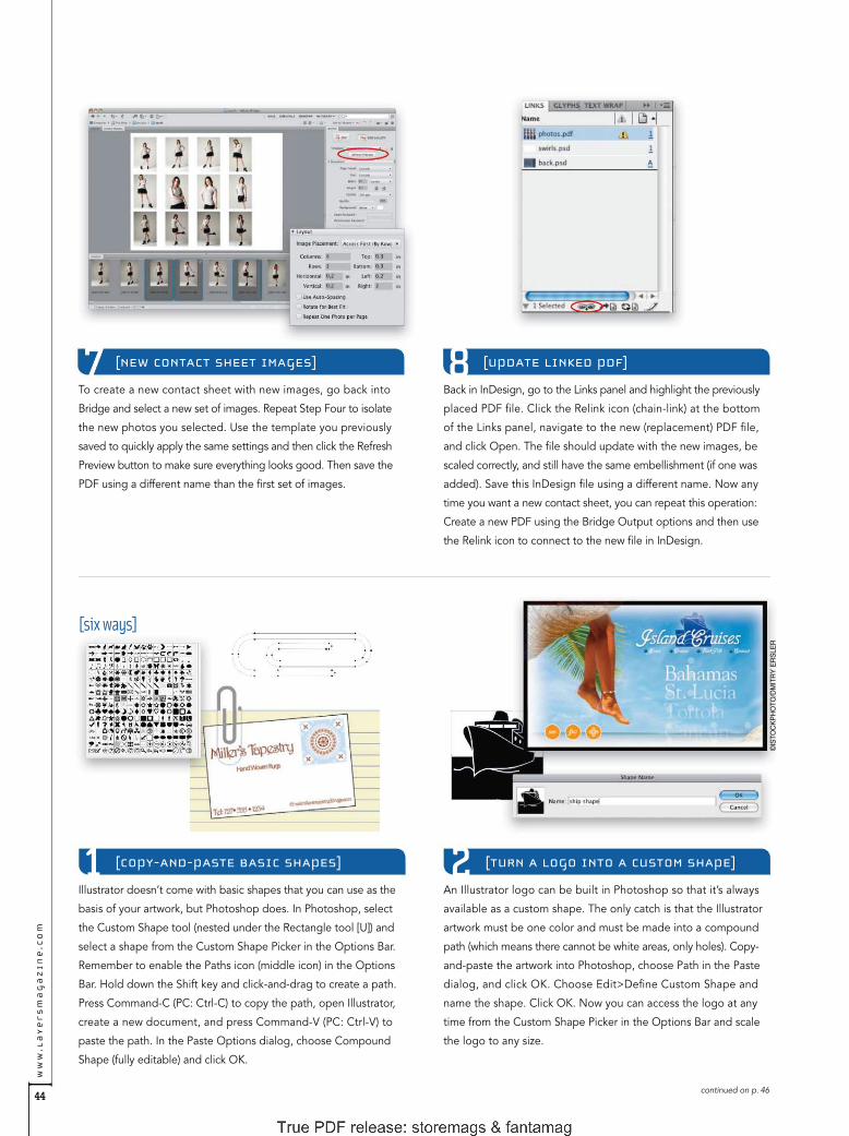
44
ww
w.l
ay
er
sm
ag
az
in
e.c
om
Back in InDesign, go to the Links panel and highlight the previously
placed PDF fi le. Click the Relink icon (chain-link) at the bottom
of the Links panel, navigate to the new (replacement) PDF fi le,
and click Open. The fi le should update with the new images, be
scaled correctly, and still have the same embellishment (if one was
added). Save this InDesign fi le using a different name. Now any
time you want a new contact sheet, you can repeat this operation:
Create a new PDF using the Bridge Output options and then use
the Relink icon to connect to the new fi le in InDesign.
An Illustrator logo can be built in Photoshop so that it’s always
available as a custom shape. The only catch is that the Illustrator
artwork must be one color and must be made into a compound
path (which means there cannot be white areas, only holes). Copy-
and-paste the artwork into Photoshop, choose Path in the Paste
dialog, and click OK. Choose Edit>Defi ne Custom Shape and
name the shape. Click OK. Now you can access the logo at any
time from the Custom Shape Picker in the Options Bar and scale
the logo to any size.
To create a new contact sheet with new images, go back into
Bridge and select a new set of images. Repeat Step Four to isolate
the new photos you selected. Use the template you previously
saved to quickly apply the same settings and then click the Refresh
Preview button to make sure everything looks good. Then save the
PDF using a different name than the fi rst set of images.
[UPDATE LINKED PDF][NEW CONTACT SHEET IMAGES] 8
[COPY-AND-PASTE BASIC SHAPES] [TURN A LOGO INTO A CUSTOM SHAPE]1 2Illustrator doesn’t come with basic shapes that you can use as the
basis of your artwork, but Photoshop does. In Photoshop, select
the Custom Shape tool (nested under the Rectangle tool [U]) and
select a shape from the Custom Shape Picker in the Options Bar.
Remember to enable the Paths icon (middle icon) in the Options
Bar. Hold down the Shift key and click-and-drag to create a path.
Press Command-C (PC: Ctrl-C) to copy the path, open Illustrator,
create a new document, and press Command-V (PC: Ctrl-V) to
paste the path. In the Paste Options dialog, choose Compound
Shape (fully editable) and click OK.
continued on p. 46
[six ways]
©IS
TO
CK
PH
OT
O/D
MIT
RY
ER
SLE
R

storemags & fantamag - magazines for all

46
ww
w.l
ay
er
sm
ag
az
in
e.c
om
Dave Cross is Senior Developer, Education and Curriculum, for the National Association of Photoshop Professionals. He is the author of Photoshop Finishing Touches and The Photoshop CS2
Help Desk Book, and is featured on a series of Photoshop training DVDs and on Photoshop User TV.[ ]
When you need to use a number of specifi c colors in various
applications, use this example. After creating artwork containing
swatches in Illustrator, deselect all swatches in the Swatches panel
(Window>Swatches) and choose Add Selected Colors from the
panel’s fl yout menu. Choose Select All Unused from the fl yout
menu to highlight the unused swatches, then choose Delete
Swatches, and click Yes. Finally, choose Save Swatch Library as
ASE (Adobe Swatch Exchange) and save the swatches. Then, in
Photoshop, choose Replace Swatches from the Swatches panel’s
fl yout menu to replace the default swatches with the new ones.
This example is a bit of a cheat because you can’t copy or export
the perspective grid from Illustrator CS5. In Illustrator, click on the
Perspective Grid tool or press Command-Shift-I (PC: Ctrl-Shift-I)
to display the grid. Then use the controls to set up the grid the
way you want and take a screen capture of it. For Macs, press
Command-Shift-4 and click-and-drag over the grid. For PCs, hold
down the Alt key and click on the Print Screen button. Locate the
screen capture, open it in Photoshop, and use it as a reference for
your work.
Photoshop CS5 Extended has Repoussé, but if you don’t have that
version or haven’t mastered it yet, try this alternative. In Illustrator,
create some type and choose Effect>3D>Extrude & Bevel. Enter
the desired settings and click OK. Copy-and-paste the results into a
Photoshop document and choose Smart Object in the Paste dialog.
If you need to tweak or change the type, double-click the Vector
Smart Object thumbnail in the Layers panel to return to Illustrator
and use the Appearance panel (Window>Appearance) to edit the
3D settings. Once the Illustrator fi le is saved, it will update automati-
cally in Photoshop.
ALL IMAGES BY DAVE CROSS UNLESS OTHERWISE NOTED
[SHARE SWATCHES]
[THE PERSPECTIVE GRID]
3 4
5Illustrator contains extra sets of brushes and symbols that contain
some pretty cool—and completely scaleable—graphics we can
use in Photoshop. For example, look under Window>Brush
Libraries>Vector Packs and you’ll fi nd Grunge Brushes Vector
Pack and Hand Drawn Brushes Vector Pack. These options were
designed for paths in Illustrator, but you can also drag them from their
panels onto the artboard where they become vector shapes that you
can copy-and-paste into a Photo shop document. Here, we used
several Illustrator brush shapes to create an interesting border.
[USE BRUSHES AS DESIGN ELEMENTS]6
[3D TYPE]

storemags & fantamag - magazines for all

48
ww
w.l
ay
er
sm
ag
az
in
e.c
om
©IS
TO
CK
PH
OT
O/K
KG
AS
©IS
TO
CK
PH
OT
O/IC
ON
OG
EN
IC
R A D I M M A L I N I C
C O R E Y { } B A R K E R
movie posterAs you may know, I’m a big fan of movie posters and I realized that I always create them in Photoshop. Recently,
I was asked if it’s possible to do them in Illustrator as well. The answer is a resounding yes, and there’s a real
advantage of doing something like this in Illustrator.
In this design, we’ll incorporate two photos processed in Photo-
shop into our Illustrator movie poster. Select two photos where
the subjects are facing opposite directions and open them in
Photoshop. Next, convert the images to black and white, boost
the contrast for a more dramatic effect, add black-to-transparent
gradients all around to hide the backgrounds in the photos for
easier placement, and save the photos as PSD fi les.
[PSD FILES FOR ILLUSTRATOR]
In Illustrator, choose File>New to create a new document, click OK
to use the default settings, and then choose View>Hide Artboards.
Select the Rectangle tool (M) and click once where the artboard
was to open the Rectangle dialog. Enter 8 in for Width and 12 in
for Height, then click OK. This is a proportional size to an actual
movie poster.
[CREATE A NEW DOCUMENT]
[ I L L U S T R A T O R T U T O R I A L ]

LA
YE
RS
MA
GA
ZI
NE
][
no
v /
de
c 2
01
0
49
Select the Rectangle tool and click on the artboard again. In the
Rectangle dialog, set the Width to 8 in, the Height to 3 in, and
click OK. This shape is going to be another clipping shape for the
second image. Before placing the second image, select the Shear
tool (nested under the Scale tool [S]). Double-click on the Shear
tool in the Toolbox to open the Shear dialog. Enter –20º for Shear
Angle; in the Axis section, set Angle to 90º; and click OK.
Let’s add some graphic accents to the images. Choose the Line
Segment tool (\) and click on the artboard to open the Line Seg-
ment Tool Options dialog. Set the Length to 8 in, the Angle to
0º, and click OK. Choose Window>Brushes to open the Brushes
panel. Click on the Chalk – Scribble brush to apply it to the selec-
ted path.
Choose File>Place, navigate to the second image, and click Place.
Choose the Selection tool and scale and rotate the image to best
fi t in the sheared rectangle. Select the rectangle path and repeat
the same process we used in Step Three to clip the image to the
rectangle shape. Remember to use the Direct Selection tool to re-
position the photo inside the sheared rectangle, if necessary. Once
the image is clipped inside the rectangle, place it in the poster
layout as shown here.
Choose File>Place, locate the fi rst image, and click Place. Choose
the Selection tool (V) and position the image in the upper-left
corner of the rectangle. Scale and rotate the image to better fi t
the composition. Click to select the rectangle alone and choose
Object>Arrange>Bring to Front. Shift-click to select the image and
press Command-7 (PC: Ctrl-7) to clip the image into the rectangle
shape. Now choose the Direct Selection tool (A), click on the path
of the rectangle, click the Fill color swatch in the Toolbox, and set the
color to black. This will make the image blend with the background.
[GRAPHIC ACCENTS]
[CREATE A CLIPPING SHAPE][PLACE FIRST IMAGE]
[PLACE SECOND IMAGE]
storemags & fantamag - magazines for all

50
ww
w.l
ay
er
sm
ag
az
in
e.c
om
Next, duplicate the movie title text using the same method as
duplicating the stroke in Step Seven. Because it’s still editable text
and has already been formatted to the proper angle, it’s easier to
duplicate and enter new text. We’ll use the tagline “DON’T GET
MAD. GET EVEN.” Using the Selection tool once more, scale and
position the text in the upper-right corner of the layout.
Select the Type tool (T) and click on the artboard to set a text
object. In the Control panel, set the Font to Impact and the Font
Size to 100 pt. Type the words “REVENGE-OPS,” highlight the
text, and set the Fill color to the same red color we used in Step
Seven. Also apply the same shear angle that we’ve been using on
the other elements.
Using the Selection tool, place the text in the poster layout just
below the bottom image in the approximate center. Make some
more duplicates of the stroked paths and add them to the top
and bottom of the text to continue the theme. Be sure to vary the
position and length to add more interest to the text.
Open the Stroke panel (Window>Stroke) and set the Weight to
0.5 pt. Shear this stroked path to the same angle that we used in
Step Four using the Shear tool. Note: We’re going to keep all the
elements the same angle for a uniform layout.
Choose Window>Color, click on the Stroke color swatch, and
choose a red color (R:200, G:0, B:0). Using the Selection tool, move
this path on top of the second image. Hold down the Option (PC:
Alt) key and click-and-drag a duplicate stroke to the lower edge of
the image. Scale the width to give these lines some variation.
[INSERT TEXT][ADD A STROKE] 8
[ADD ADDITIONAL STROKES] [ADD ADDITIONAL TEXT]109
continued on p. 52

storemags & fantamag - magazines for all

52
ww
w.l
ay
er
sm
ag
az
in
e.c
om
Corey Barker is an Education and Curriculum Developer for the National Association of Photoshop Professionals. His expertise in Adobe Photoshop and Adobe Illustrator has
earned him numerous awards in illustration, graphic design, and photography.[ ]
©F
OT
OLIA
/W14A
Remember to click on the art thumbnail to get out of mask mode,
indicated by the bold line around the thumbnail. Finally, add the
all-too-familiar credits at the bottom of the layout to fi nish the
movie poster look. Note: If you need to reposition any part of the
design, you’ll need to use the Direct Selection tool (the Selection
tool will select the entire group and texture as a whole).
Choose Window>Transparency, click on the panel’s fl yout menu,
and choose Make Opacity Mask. Note: You’ll see the text disap-
pear but only because the texture (or mask) fi le is off to the side.
This makes it easier to select the objects and the texture without
selecting the background shape.
In the Transparency panel, you’ll see two thumbnails: one for the
art and one for the mask. Click the chain link icon between the
thumbnails to unlink the mask and the art, and then click on the
mask thumbnail to work in mask mode. Select the texture on the
artboard and click-and-drag it over the layout. When you release
the mouse button, you’ll see the texture show through all the
red elements.
With all the graphic elements in place, we can now add texture
to give the text a grungy look. Choose File>Place, navigate to
a textured fi le of your choice, and click Place. Experiment with
different textures. Shift-click to select all the red elements (the
stroked paths and the text), then press Command-G (PC: Ctrl-G)
to group them. With the group selected, hold down the Shift key
and click on the texture.
[MAKE OPACITY MASK][INSERT A TEXTURED EFFECT]
[SLIDE TEXTURE TO SEE EFFECT] [FINISH MOVIE POSTER LOOK]1413
1211

storemags & fantamag - magazines for all

[ t y p o g r a p h y ]
ww
w.L
AY
ER
SM
AG
AZ
IN
E.c
om
54
IMA
GE
S:
©IS
TOC
KP
HO
TO
ILLU
STR
ATI
ON
:TA
FF
Y C
LIF
FO
RD
J A M E S { } F E L I C I
[ T H E A R T O F T Y P E ]
The InDesign Stroke panel can spice up your type
in surprising ways. Veteran readers of this column
know that I generally take a dim view of electroni-
cally manipulated type. When type is electronically
oblique or expanded, it doesn’t look as though it came from another
typeface, it simply looks fake—ill proportioned and just wrong.
But electronically manipulated, intentionally outrageous type, now
that’s another story. In this issue, we’ll take a look at how one simple
trick—altering a character’s stroke—can create some effects that are
very special indeed.
Stroke panelThe appearance of every character you typeset is a product of three
things: its outline shape (as described in its font); its fi ll color (usually
black); and the stroke weight of its outline (usually zero). We’ll just
focus on tampering with the last of these.
In Illustrator and InDesign, you can alter the stroke of a character
by simply selecting it and changing its weight in the Stroke panel
and its color in the Color or Swatches panel. Adding a black stroke
to a character creates a fake bold—it’s usually not very pretty. If you
add a white stroke to a character, you make it thinner, which is even
less pretty, especially when carried to extremes.
In InDesign though, you can also apply various types of strokes
to characters—dots, dashes, hash marks—and here’s where the
fun really starts. The key to making it work is to convert the type to
outlines, which turns the text into an independent graphic object—
a compound path—no longer associated with any font. Most of the
rest of the action takes place in the Stroke panel (Window>Stroke).
stroke, stroke, stroke
[The appearance of
every character you
typeset is a product
of three things…]
The three hard-to-decipher icons in the Stroke panel under
the Align Stroke section defi ne where a stroke will set relative
to the character outline path: Center, Inside, or Outside.

55
LA
YE
RS
MA
GA
ZI
NE
][
no
v /
de
c 2
01
0
James Felici is the author of The Complete Manual of Typography (Adobe Press), former managing editor of Publish magazine, and contributor to The Seybold Report, Macworld magazine,
PDFZone.com, and Publish.com.[ ]
Various examplesLet’s run through a couple of sequential manipulations for a sam-
pler of what’s possible. The first example shows a simple word in its
native condition set in 72-point Verdana. Select the text and choose
Type>Create Outlines to convert it to a graphic object. Notice that
the text still looks like its old self.
For the second example, open the Stroke panel, choose the
Selection tool (V), click on the text to select it, set the Weight to
2 pt, and the stroke Type to Right Slant Hash. This creates type
with razor stubble. Under the Align Stroke section, click on the
Align Stroke to Center icon so the whiskers overlap the filled por-
tions of the characters.
For the third example, make sure the text is selected and change
the stroke Type to Straight Hash. Now open the Swatches panel
(Window>Color>Swatches), click the Stroke icon at the top-left
to apply the color to the stroke, and choose yellow. Return to the
Stroke panel, set Gap Color to red, and Gap Tint to 67%. (Note: The
gaps are the spaces between the whiskers.) The net effect is type
surrounded by an orange and yellow zipper.
The final example shows a 3 pt stroke Weight, a White Diamond
stroke Type, and the Fill color set to None in the Swatches panel,
which makes the type itself disappear.
More variationsThis next set of examples follows another pattern. The first example
is good old 72-point Cooper Black. In the second example, set the
Weight to 2 pt, the Stroke color to white, and Type to Japanese
Dots to give the text a perforated edge. Once again, in the Align
Stroke section, click the Align Stroke to Center icon.
The third example has the same Stroke panel properties as the
second, but change the Stroke color to green and the Fill color to
None. Now follow the dots. In the fourth example, set the Weight
to 4 pt, the Gap Color to red, and the Fill color to yellow. This looks
like holiday type to me, but I have no idea which one.
Finally, in the fifth example, something completely different:
a classic inline effect. Set the stroke Weight to 4 pt, the Type to
Thin-Thin, the Stroke color to Paper, the Fill color to black, and
the Gap Color to None. Note: The Paper swatch in the Swatches
panel translates to “see-through,” so the inline rule will take on
whatever color paper the type is printed on.
These examples are just jumping-off points. Using the InDesign
tools for creating your own custom stroke types (just choose Stroke
Styles>New from the Stroke panel’s flyout menu), you can conjure
effects as yet undreamed of.
Kerning controlsOne last and important thing: When you convert type to outlines,
you lose the ability to use your normal manual kerning controls for
adjusting the spaces between characters. To manually kern these
outlines, first deselect everything. Then choose the Direct Selection
tool (A) and Option-click (PC: Alt-click) inside the character, which
selects its entire path. Now use your Left and Right Arrow keys to
nudge the selected character one way or the other.
If the nudge increments are too coarse, you can adjust them.
Choose InDesign (PC: Edit)>Preferences>Units & Increments.
Then, in the Keyboard Increments section, reduce the Cursor
Key value from its default value of 0p1 to whatever suits you.
You can specify decimal values down to one thousandth of a
point (0p0.001).
Note that characters with counters—open spaces, as in an
“o” or “p”—consist of two paths: one for the outer outline of the
character and another for the counter. A two-story lowercase “g”
(as in the Cooper Black font example) has two counters. Yet other
characters, such as the exclamation point, come in two pieces.
To select multiple paths, select the first using Option-click (PC:
Alt-click), and then the successive by using Shift-Option-click
(PC: Shift-Alt-click).
storemags & fantamag - magazines for all

56
ww
w.l
ay
er
sm
ag
az
in
e.c
om
We’re pretty used to creating InDesign documents for print in standard
sizes such as Letter and A4. In this case, however, we’re going to the
Web, so it’s best to start out with a document size that makes sense
for a computer display. Choose File>New>Document to create a new
document. For Intent select Web and for Page Size select 1024x768.
Click OK.
[CREATE A NEW WEB DOCUMENT]
R A D I M M A L I N I C
I almost never change the paper color in InDesign because it doesn’t
really affect the printed page. It’s more for visualizing how the
printed job will look on paper. Now that we can create documents
for the Web, the paper color does matter as it can be used as the
background color for your interactive document. Choose Window>
Color>Swatches to bring up the Swatches panel and double-click
the Paper swatch. Change the Color Mode to RGB and move the
Red, Green, and Blue sliders to 0 to change the swatch to Black.
Click OK.
[CHANGE PAPER COLOR TO BLACK]
creating an interactive portfolioWhenever I mention creating an interactive document with InDesign, the first thing most people think is, “He
must be talking about making a PDF.” While you can certainly still make interactive PDFs from InDesign, you
can do so much more using the InDesign CS5 interactive features.
T E R R Y { } W H I T E
[ I N D E S I G N T U T O R I A L ]

LA
YE
RS
MA
GA
ZI
NE
][
no
v /
de
c 2
01
0
57
[PLACE 20 IMAGES]
To speed up production, let’s create a new master page. Choose
Window>Pages to open the Pages panel and select New Master
from the fl yout menu. Enter “Landscape” in the Name fi eld and
click OK. Now we’re going to create a frame for the large images.
Click once with the Rectangle Frame tool (F), enter 1024x615
px in the Rectangle dialog, and click OK. Position the frame at
the top of the page. With the frame selected, choose Object>
Fitting>Frame Fitting Options. Enable Auto-Fit, make sure the Fit-
ting is set to Fill Frame Proportionally, and for Align From click the
center box in the grid. Click OK.
[CREATE THUMBNAIL FRAMES][CREATE NEW MASTER PAGE AND FRAME]
[COPY FRAMES AND CONVERT TO BUTTONS]
With all ten frames still selected, press Command-C (PC: Ctrl-C) to
copy the frames and then Command-V (PC: Ctrl-V) to paste them.
Position these new frames directly above the previously placed
frames (leave some space between the two sets of ten)—you should
now have 20 frames total.
Now its time to convert these 20 frames into buttons so our
viewers can click on them. Select all 20 frames and choose Object>
Interactive>Covert to Button.
Next we’ll create 20 frames to hold our image thumbnails, and
then turn them into buttons to allow the viewer to click on the
image they want to see in the big frame above. First, create one
84.23x58.5 px frame, set its Fitting options to the same as Step
Three, and press Shift-Option-Command-D (PC: Shift-Alt-Ctrl-D)
to duplicate the frame nine times. Use the Move tool (V) to position
the frames and then the Align panel (Window>Object & Layout>
Align) to align them—we selected all ten frames and clicked the
Distribute Left Edges icon and then the Align Bottom Edges icon.
It’s time to place your 20 best images for the interactive portfolio
into the 20 button frames. Hopefully, you have all 20 images in
one folder—as it will make placing them easier—but if not, gather
together the 20 best images for your portfolio. I usually use Adobe
Bridge CS5 for this task. Open Bridge, select the 20 images, and
choose File>Place>In InDesign. This will take you back to InDesign
with a loaded cursor. Click to place each image in the appropri-
ate frame.
storemags & fantamag - magazines for all

58
ww
w.l
ay
er
sm
ag
az
in
e.c
om
We’ve got our thumbnails and we’ve got 20 new pages to navigate
between; it’s now time to place those same 20 images that we used
for the thumbnails into their perspective pages in the large frames.
In Bridge, select the same 20 images as before and choose File>
Place>In InDesign. This will bring you back into InDesign with a
loaded cursor as before. Go to page 2 (the fi rst of your 20 new
pages) and click on the large frame to place your fi rst large image.
Continue placing each large image on the subsequent pages.
[PLACE LARGE IMAGES]
When we created this document, we started with one page. That
one page will be our intro page. However, we now need to create
20 additional portfolio pages. Click on the Pages panel fl yout menu
and choose Insert Pages. For Pages enter 20 and for Master select
B-Landscape. Click OK.
[INSERT 20 ADDITIONAL PAGES] 8
[CONNECT BUTTONS TO PAGES]
Now we need to wire the buttons to the right pages. In the Pages
panel, double-click on the B-Landscape page to go back to your
master page and click the fi rst button to select it. In the Buttons
panel (Window>Interactive>Buttons), click on the plus sign icon
(circled) and select Go to Page. For Zoom choose Fit in Window
and enter the corresponding Page number (2). With the Event
set to On Release by default, the document will navigate to the
correct page when a user clicks and releases. It’s probably a good
idea to name your buttons, too. Repeat this step for each button.
Optionally, you can set up rollovers for the buttons. It would have
been nice to do this ahead of time, but you couldn’t really do it
until the images were placed. In our example, we want the buttons
to be dim until someone rolls over them. With a button selected,
go to the Buttons panel and click on the Rollover thumbnail in the
Appearance section to activate it. Then, click on the Normal thumb-
nail to activate it. Open the Effects panel (Window>Effects) and
lower the Opacity to 30%. Repeat this step for each button.
[SET UP ROLLOVERS FOR BUTTONS]9 10
continued on p. 60

storemags & fantamag - magazines for all

60
ww
w.l
ay
er
sm
ag
az
in
e.c
om
SC
OT
T K
ELB
Y
We’ve done all the hard work now. At this point the navigation
of the portfolio is ready to go. All we need to do is go back to
page 1 and design the intro page the way we want. Keep in mind,
this is the fi rst page that viewers will see when they visit your port-
folio, so you probably want a description and possibly an opening
photo. You may also want to consider providing a link back to your
main site—just select the frame you want to use, go to Object>
Interactive>Convert to Button, select Go to URL for the action,
and type in the URL.
11 [INTRO PAGE]
[CREATE ANOTHER BUTTON]
At this point, we have no way to get from the intro page to the
fi rst page of the portfolio. We need another button—this can
either be text or an image. Create an object that can be turned
into a button (in our example, we’re using the word “Portfolio,”
which we’ve already typed on the page). Once it’s in place on the
page, go to Object>Interactive>Convert to Button. Use the But-
tons panel to set the action to go to page 2 (as we did with the
previous buttons). Tip: You can have this button fl y in using the
Animation panel, as well.
13
In his current role as Worldwide Creative Suite Design Evangelist for Adobe Systems, Inc., Terry White evangelizes the Creative Suite to customers around the world. He’s also the
author of Secrets of Adobe Bridge and co-author of InDesign CS/CS2 Killer Tips and The iPhone Book, 4th edition. Check out his tech blog at http://terrywhite.com/techblog.[ ]
[ANIMATE TEXT LOGO]
It’s InDesign CS5—we can animate! In our example, we want
our text to fl y onto the page (this will work with an image, too).
First place the text or your logo on the page where you want it
to be at the end of the animation. Then, bring up the Animation
panel (Window>Interactive>Animation) and choose a Preset for
how you want the logo to animate onto the page (we chose Fly
In From Top). Note: Click the Preview Spread icon (circled) at the
bottom of the Animation panel to test the animation.
12
[EXPORT TO SWF]
Use the Preview panel (Window>Interactive>Preview) to test every-
thing at this point. Fix anything that you want to tweak and then
choose File>Export. Name your fi le, change the Format to Flash
Player (SWF), and click Save. In the Export SWF dialog, change
the Page Transitions to Page Turn (this allows the user to manually
turn the pages in addition to using the navigation buttons) and
enable the Include Interactive Page Curl checkbox. Click OK. Once
exported you can update the SWF/HTML to your website and link
to it or embed the SWF on an existing page.
ALL IMAGES BY TERRY WHITE UNLESS OTHERWISE NOTED
14

storemags & fantamag - magazines for all

62
ww
w.l
ay
er
sm
ag
az
in
e.c
om
To run WordPress, you need a Web server, a MySQL database,
and PHP installed on your local computer. It’s also best to have the
Firefox Web browser, so be sure to install it if you haven’t already.
On a Mac, you can get everything you need in one nifty package
at www.mamp.info. If you’re on Windows, go to wampserver.com/en.
Because of the limited space in this column, these steps are spe-
cifi c to the Mac, but the process is similar for both platforms (and
you’ll fi nd special instructions for Windows users in the Dream weaver
Help Center on my site at www.DigitalFamily.com).
[WEB SERVER AND DATABASE SOFTWARE]
R A D I M M A L I N I C
After you download, install, and launch MAMP, a little window
opens with controls to turn the Apache server and MySQL data-
base on and off. Give them a second to get going and MAMP will
launch the Firefox Web browser. If the browser doesn’t open auto-
matically, click on the Open Start Page button. You’ll know that
the server is working on your Mac when you see the Welcome to
MAMP screen in your browser window and http://localhost/8888/
MAMP in the address bar.
[LAUNCH MAMP]
J A N I N E { } W A R N E R
[ D R E A M W E A V E R T U T O R I A L ]
editing a WordPress blog with Dreamweaver CS5One of the most dramatic improvements to Dreamweaver CS5 is the ability to edit WordPress themes,
but before you can get WordPress (or Joomla! or Drupal) to work, you’ll need to set up your computer as a
Web server. It’s a lot of technical steps, but once you get all this set up, you’ll be able to use all of the great
design tools in Dreamweaver.

LA
YE
RS
MA
GA
ZI
NE
][
no
v /
de
c 2
01
0
63
[SET SERVER PREFERENCES]
This is an optional step to remove the 8888 from the local URL: In
the small, fl oating MAMP window, click Preferences, then click the
Ports tab, and click the Set to Default Apache and MySQL Ports
button. This changes the port from 8888 to 80. Click OK. Anytime
you make a change to the server setup, or if things just don’t seem
to be working right, restarting the server often fi xes the problem.
Click the Stop Servers button, wait a minute, and then click the
Start Servers button to restart the server. Click the Open Start Page
button to refresh the browser with the simplifi ed URL.
Next, you need to create a database. Don’t worry, it’s not as hard
as you may imagine because WordPress builds all of the tables for
you. With MAMP open in Firefox, click on the phpMyAdmin tab
at the top. In the Create New Database Field, enter a name (don’t
use spaces or special characters). Make note of the name. Better
yet, copy it so you can just paste it into WordPress when you get
to Step Eight (you’ll need to enter it exactly). Click the Create but ton
and you’ve created a database (WordPress takes care of the rest).
[CREATE A MYSQL DATABASE]
Next, go to WordPress.org (not WordPress.com) and download
WordPress (it’s free and it’s a quick download.) Unzip the Word-
Press folder and you’ll fi nd all of the fi les and subfolders for a new
blog. There’s really nothing to install but you’ll need to copy these
fi les into the root folder of your local Apache Web server. On a
Mac, the htdocs folder inside the MAMP folder inside the Applica-
tions folder is the root folder of your local server. (More on copying
these fi les into the htdocs folder in the next step.)
[DOWNLOAD AND INSTALL WORDPRESS] [COPY FILES INTO THE HTDOCS FOLDER]
If you’re creating a single blog, simply copy all of the fi les in the
WordPress folder you unzipped into the htdocs folder (inside
the MAMP folder). If you’re working on multiple blogs, or if your
blog is part of an existing Dreamweaver site and you want to
work on all of the fi les together, you can create subfolders in the
htdocs folder. Then copy the entire WordPress folder into the
subfolder within htdocs as well as any Dreamweaver site files.
This way you can work on them together in the same root folder
in Dreamweaver.
storemags & fantamag - magazines for all

64
ww
w.l
ay
er
sm
ag
az
in
e.c
om
[CREATE A CONFIGURATION FILE]
[INSTALL AND SET UP WORDPRESS]
Click Run the Install button and fi ll in the WordPress Welcome
screen. I recommend you don’t use “admin” as the Username and
that you take note of your user name and password because you’ll
need them to access your blog even on your local computer.
Follow the rest of the WordPress instructions and you’ll soon fi nd
yourself at the WordPress Dashboard. From here you can do all
the things on your local computer that you can do on a remote
server with a WordPress install, including creating and editing
posts, downloading and changing themes, adding plug-ins, etc.
Click the Create a Confi guration File button and follow the Word-
Press instructions. On the screen where you have to enter the name
of the database, enter the exact name you entered when you creat-
ed the database in Step Four. In both the MySQL User Name fi eld
and the Password fi eld enter “root.” Note: All MySQL databases
come with the user name and password “root.” Unless you’re wor-
ried about someone hacking your blog on your local computer,
there’s no reason to change them. Leave the last two fi elds in the
WordPress setup page as they are and click Submit.
Now it’s time to open the blog in a Web browser on your computer.
Make sure that the Apache server and MySQL database are still
running in the background (you can always check the fl oating MAMP
dialog). In Firefox, enter the URL: http://localhost/ followed by
any subfolder names you added to the htdocs folder. Note: The
http:// isn’t optional, and you don’t use www. Also note: If you
didn’t change the preferences in Step Three, you’ll still need the
8888, so your URL would be something like this: http://locahost/
8888/foldername. Don’t panic when WordPress returns an error.
[OPEN WORDPRESS IN FIREFOX] 8
9Once you have the Apache server and MySQL database working
and you’ve installed WordPress, you can set up your blog so that
you can edit it in Dreamweaver. You set up a blog much as you
would set up any site in Dreamweaver. Choose Site>New Site.
Give the site a name (this name is just for your reference). Click
on the Browse for Folder icon at the far right of the Local Site
Folder fi eld and browse to fi nd the htdocs folder in your MAMP
folder in the Applications folder. If you created a subfolder for
your site, select that folder. Don’t click Save yet.
[SET UP YOUR BLOG IN DREAMWEAVER]10

LA
YE
RS
MA
GA
ZI
NE
][
no
v /
de
c 2
01
0
65
In the Web URL fi eld at the bottom of the Server Setup dialog,
type http://localhost/ (again, adjust this name to include any
subfolder names you may have added to the htdocs folder). Note:
You’ll need to add 8888 if you didn’t change the preferences in
MAMP in Step Three. Click Save. The dialog closes and the server
is added to the Servers list in the Site Setup dialog. Important: Next
to the server name are two checkboxes for Remote and Testing.
Uncheck Remote and check Testing. Then click Save to complete
the setup.
If you got through all those steps, congrats! Setting all that up is
complicated, but you only have to get it right once. Dreamweaver
saves your server settings and you can now take advantage of all
of the wonderful CSS and PHP features in Dreamweaver to edit
your blog theme. (Note: You still want to create and edit posts in
the WordPress Dashboard.) When you get the theme design the
way you want it, you can copy just the CSS fi le to your remote
Web server, or use the WordPress export/import features to move
the entire blog from your local server to a remote server.
[EDIT YOUR BLOG IN DREAMWEAVER]14
With the Site Setup dialog still open, click the Servers category
on the left. Click on the small plus sign (+) near the bottom of
the servers dialog to add a new server (just as if you were setting
up a remote server connection). Enter a name, such as “Testing
Server” (again this name is just for your reference). From the Con-
nect Using drop-down list, choose Local/Network (not FTP).
With Local/Network selected, the rest of the options will change.
Again, use the Browse icon (folder) to fi nd the site folder. If you
didn’t create a subfolder, it should be Applications/MAMP/htdocs.
[SET UP THE TESTING SERVER]11 [SAVE SERVER SETTINGS]12
Choose File>Open and select the index.php fi le in your Word-
Press blog folder (you can also open it by double-clicking on the
index.php page in the Files panel). Expect a blank screen—this
doesn’t mean you’ve made a mistake (necessarily). In tiny text at
the top of the workspace, look for the message: This page may
have dynamically-related fi les that can only be discovered by the
server. Click the Discover link, then click Yes. Finally, click the Live
View button at the top of the workspace to make Dreamweaver
act like a Web browser and display the dynamic WordPress page.
[OPEN THE INDEX.PHP PAGE]13
[ ]Janine Warner has authored more than a dozen books about the Internet, including Dreamweaver CS5 for Dummies. She’s also the host of a growing collection of
training videos on Dreamweaver and CSS at KelbyTraining.com. To learn more about Janine’s books, videos, and speaking engagements, visit www.DigitalFamily.com.
storemags & fantamag - magazines for all

66
ww
w.l
ay
er
sm
ag
az
in
e.c
om
R A D I M M A L I N I C
P A U L { } T R A N I
custom video on cueIn this tutorial you’ll see how easy it is to bring video and graphics together for a seamless, custom experience using
Flash Professional CS5. You’ll learn how to import video, apply a custom skin, and create your own video buttons
without writing any ActionScript code. Then you’ll learn how to add cue points, making synchronization between
video and graphics a snap. Let’s take a tour of these capabilities.
[If you’d like to download the fi le used in this tutorial to practice these techniques, visit www.layersmagazine.com and navigate to the Magazine section. All fi les are for personal use only.]
Download the exercise fi le for this tutorial at www.layersmagazine
.com and unzip it onto your desktop or another location of your
choosing. Inside of the ZIP fi le you’ll fi nd fi les named video.fl a and
intro.mov, as well as a fi nal folder that contains the completed
fi les for reference. Open the video.fl a in Flash CS5. Notice that in
the Library panel (Window>Library) there are already graphics
created that will be used in this tutorial.
[OPEN STARTER FILES]
The most common video fi le format used in Flash is the FLV format.
To convert a video fi le to FLV, launch Adobe Media Encoder CS5
(found in the Applications folder on a Mac, the Program Files folder
on a PC). Click the Add button on the right, locate the intro.mov
fi le that you downloaded, and then select Open. Select FLV | F4V
from the Format column, then select FLV – Match Source Attributes
(High Quality) from the Preset column.
[CONVERT VIDEO FOR USE IN FLASH]
[ F L A S H P R O F E S S I O N A L T U T O R I A L ]

LA
YE
RS
MA
GA
ZI
NE
][
no
v /
de
c 2
01
0
67
Now it’s time to import the intro.fl v into the video.fl a. Choose
File>Import>Import Video. When you’re asked where the video
fi le is, select On Your Computer, click Browse, locate the intro.fl v,
and click Open. Select Load External Video with Playback Com-
ponent; keeping the video external will keep the SWF that loads
it small in fi le size. Click Continue and you’ll then be able to select
a custom skin for the video. Choose the second skin, MinimaFlat-
CustomColorAll.swf, and then click the Color swatch to open the
Color Picker and select a red to tint the skin. Click Continue.
All of the video controls for the imported video are active on
the Stage. Click the play button (or press the Spacebar) to play
the video. With the video selected, open the Properties panel
(Window>Properties) and notice how you can modify various
video parameters. Confi rm that autoPlay is selected, and note
that both skinBackgroundAlpha and Volume are set to 1, which is
100% in Flash. Change the volume to 0.5 so it will be set to 50%.
The fi nal import screen notes that a Flash Video component will
be created on the Stage while an SWF fi le for the skin will be
placed in the same location as the FLA fi le once you publish the
SWF. If you’re going to upload this project to a Web server, than
both the intro.fl v and the skin SWF need to be uploaded once the
project is published. Click Finish and the video with the selected
skin will appear on the Stage. Test the movie (Control>Test Movie>
Test) to watch the video. Close the playback window after watching
the video.
To customize the export settings for a video, click FLV – Match
Source Attributes (High Quality), which you just selected in the
Preset column. Notice how you can trim the video, resize it, and
even adjust the bitrate settings for both audio and video. In this
case, you need to ensure that the alpha channel from the original
video gets encoded into the exported video. Under the Video tab
on the right, select Encode Alpha Channel, then select OK. Lastly,
in the Output File column, save the fi le as “intro.fl v” in the same
location as the original intro.mov (set by default), and then click
Start Queue.
[EDIT VIDEO PARAMETERS]
[IMPORT VIDEO INTO FLASH][CUSTOMIZE FLV EXPORT SETTINGS]
[FINISH IMPORTING VIDEO]
VID
EO
CO
MP
LIM
EN
TS
OF
AD
OB
E T
V
storemags & fantamag - magazines for all

68
ww
w.l
ay
er
sm
ag
az
in
e.c
om
continued on p. 70
Next, play the video and when the presenter says “agencies”
(about nine seconds in) add another cue point. Rename “Cue
Point 2” to “agencies.” Around 15 seconds in, when the presenter
says “nonprofi t,” add another cue point. Rename this one as
“nonprofi t.” Your cue points should look like the image above.
Double-click the Play/Pause button on the Stage to enter its symbol.
Double-click it again to enter the PlayButton symbol. Notice how a
Normal, Over, Down, and Disabled Play button appear. Each one
of these buttons can be customized to your liking. Change the green
outline to red in the Over and Down buttons. (To change the color,
double-click a button twice, click the green outline to select it, and
then change the Fill color to red.) Click on Scene 1 at the top-left
to go back to the Stage.
In order to sync up graphics with video, you’ll need to add cue
points in the video. With the video selected, go to the Properties
panel and near the bottom you’ll fi nd the Cue Points section.
Using the Add ActionScript Cue Point icon (+, plus sign) you’re
able to add cue points to the video at certain times. Play the video,
and when the presenter says “John,” add a cue point. Notice that
“Cue Point 1” was added at about one second. Click on the name
of the cue point and rename it “john.” Notice you can also edit
the cue point time if needed.
In the Properties panel, click the pencil icon next to the name of
the Skin to modify it. Select None for the skin and click OK. In
the Timeline panel (Window>Timeline) select the video controls
layer. Open the Components panel (Window>Components) and
expand the Video folder. Click-and-drag the PlayPauseButton and
the VolumeBar to the lower-left corner of the Stage.
[CUSTOMIZE VIDEO CONTROLS][ADD specific VIDEO CONTROLS] 8
[ADD A CUE POINT] [ADD MULTIPLE CUE POINTS] 9 10

storemags & fantamag - magazines for all

70
ww
w.l
ay
er
sm
ag
az
in
e.c
om
Paul Trani is a Flash Platform Evangelist at Adobe as well as an award-winning interactive designer, Adobe Certifi ed Instructor, courseware developer, and Lynda.com trainer.
He also runs a Flash-related blog at www.paultrani.com and can be followed on Twitter @paultrani. [ ]
[SET UP GRAPHICS]13
[ADD A CUE POINT EVENT]11
[DISPLAY GRAPHICS BASED ON CUE POINTS]14
[ADD GRAPHICS]12Now you need to have Flash “listen” for these cue points that
were added. But fi rst you need to give the video an instance
name. Select the video and at the top of the Properties panel,
name the video “intro.” Now, open the Code Snippets panel
(Window>Code Snippets) and expand the Audio and Video
folder. With the video still selected, double-click on the On Cue
Point Event. This will add the ActionScript shown above which will
basically show the names of the cue points in the Output panel.
Test the video to see it in action.
Since you don’t want all the movie clips to appear at the begin-
ning of the movie, you need to set their visibility to false using
ActionScript. In order to control the movie clips with ActionScript,
they fi rst need instance names. Select the john movie clip and
in the Properties panel give it an instance name of “john.” Give
the agencies movie clip an instance name of “agencies” and
the nonprofi t movie clip an instance name of “nonprofi t.” Select
the fi rst frame of the Actions layer and open the Actions panel
(Window>Actions). Using those instance names, set the visibility
of each movie clip to false as shown above.
Next, you need to add the graphics that will be displayed based
on the three cue points. Open the Library panel and notice the
john, agencies, and nonprofi t movie clips. Select the john layer in
the Timeline and then click-and-drag the john movie clip to the
Stage. Use the Properties panel to set both the x and y position
to 0. Next, drag the agencies and nonprofi t movie clips to their
appropriate layers and make sure their x and y position are set to
0. Test the movie and note that all the movie clips have animation
and play at the same time.
Now you can modify the cue point event listener. Change the
trace statement to a conditional statement that will listen for a cue
point. If a cue point is “heard,” the appropriate movie clip will
become visible and the animation will play. Type in the Action-
Script shown above and test your movie.

storemags & fantamag - magazines for all

ww
w.L
AY
ER
SM
AG
AZ
IN
E.c
om
72
[ l a y e r s r e v i e w s ]the straight scoop on all the latest graphics gear
Boris Continuum Complete 7 AE (BCC) for Adobe After Effects
and Premiere Pro brings more than 200 filters to Macintosh and
Windows versions of Adobe’s CS5, CS4, and CS3 suites. This latest
version features 11 new fi lters, including an audio-driven keyframe
generator, a new OpenGL particle engine, a 3-way color grade fi lter
(with built-in keying and masking tools), a new video noise reduction
tool, a spline-based warp fi lter, and still and video morph technology.
More importantly, each BCC fi lter has been reengineered for 64-bit
operating systems and OpenGL acceleration.
While many reviews of software plug-ins oftentimes focus on listing
a bunch of the effects found in the package (which are all found on
the manufacturer’s website anyway), I want to focus on the underlying
technology improvements found in version 7 of BCC. Graphic soft-
ware manufacturers are moving away from coding their applications
to run on the CPU (central processing unit) in favor of having them run
on the GPU (graphics processing unit) of your video card. OpenGL is
an industry standard for defi ning 2D and 3D images and it works well
on all graphics cards from both NVIDIA and ATI. In particular, OpenGL
excels in rendering a large number of polygons and supports 3D
cameras, lights, textures, and bump features. So it’s best suited for 3D
extrusions as well as composites and geometric image distortions like
those found in 3D text, lens fl ares, and particle systems.
These are the exact types of fi lters and effects found in BCC 7. In
fact, each BCC effect found in version 7 has been reengineered for
the new and faster 64-bit operating systems and includes optimiza-
tion for OpenGL acceleration. It is this new underlying technology
acceleration that I believe is the biggest selling point for BCC 7 for
both new and existing users. The results are noticeable and very
much appreciated by anyone using effects as part of their everyday
workfl ow. If you’re interested in learning more about OpenGL accel-
erated effects and graphics in Boris FX products, you can download
the white paper at www.borisfx.com/download_fi les/OpenGLAccel-
eratedEffects.pdf.
There are also a lot of nice little touches throughout the plug-in
set that any working motion graphics designer will really appreci-
ate. These include the ability to Generate 3D extruded shapes from
imported AE spline path mask shapes, full support for the camera
and lighting system in After Effects, spline-based still and video
morph technology, and fi lters such as Smooth Tone, DV Fixer, and
Pixel Fixer that help “repair” digital artifacts that are becoming all
too common. There are also complimentary 3D particle effects (to
those already found in AE), including Particle Array 3D and Pin Art
3D, and automated optical image stabilization that works without
the use of point trackers. When you add in video noise reduction
that uses video clip spatial and temporal information and more than
3,500 presets across all of the fi lters, you have quite a complete and
powerful package!
The complaint from some users of previous versions has been the
slow rendering of effects and the overall value of the package. With
rewritten code for 64-bit operating systems and optimized OpenGL
acceleration, Boris has certainly improved its overall speed of the
product. (You can see speed gains at www.borisfx.com/Adobe/
bccae/upgrade_reasons.php#gains.) At $995 retail for more than
200 fi lters you’re paying less than $5 per fi lter in the BCC 7 package
and upgrades are only $295 from any older version of BCC. While
you can certainly fi nd more specialized packages of plug-ins that add
even more advanced customization parameters (at a much higher
price), I believe Boris Continuum Complete 7 AE gives you the most
effects for the best value available in today’s market.—Rod Harlan
Boris ContinuumComplete 7 AEMORE THAN 200 FILTERS FOR AFTER EFFECTS
Company: Boris FX Price: $995 (Upgrade: $295)
Web: www.borisfx.com Rating: ●●●●
Hot: 64-bit; OpenGL optimization
Not: Complicated activation process

LA
YE
RS
MA
GA
ZI
NE
][
no
v /
de
c 2
01
0
73
There are only a few words to describe this new box from HP: The
Z600 is smoking hot! HP is taking the challenge of more power in a
smaller footprint to the next level with the Z600. I’ve tested many
larger boxes and have to say that with the Z600 loaded for review, it
gave those other boxes more than they could handle in performance
and function.
As with previous boxes I have reviewed, I expected something
more the size of a mini fridge, but I got a box that actually fit under
my desk without turning it sideways so it wouldn’t hang out. And,
surprisingly enough, the heat displacement was about half the
output of my workstation because it’s liquid cooled (which is very
impressive and annoying at the same time).
The specs for the HP Z600 came through as a midlevel box that
includes Windows 7 Professional 64-bit OS; Xeon 2.66 GHz Quad-
Core CPUs (12 MB cache/1333 MHz); the awesome NVIDIA Quadro
FX3800; 12 GB of DDR3 1333 ECC RAM; a 160-GB SATA 10K with
two 500-GB drives running RAID 0; a Creative X-Fi Titanium audio
card; and a slot-loading DVD+/-RW drive (something that all boxes
and laptops should have). Needless to say, this machine was up to
every task I threw at it. I exported a 5-minute, high-quality render
in record time while trying to tax the system by creating website
mockups in Flash and Photoshop. The Z600 breathed a little heavy
but came through with flying colors.
Simply put, I obviously was much more impressed with this box
than even I thought I could be. The features included didn’t fail to
impress and considering this is a midlevel box, the series can handle
whatever your professional needs may be.—Bruce Bicknell
What gets a creative person (designer, animator, photographer, etc.)
drooling when you’re talking about hardware? A monitor with enough
real estate to block the sun, and HP has just given us another reason
to spend more time inside with the new 30" HP ZR30w Monitor. Not
only has HP given us a sweet monitor, they’ve done it at a reasonable
price compared to other monitors in the market.
The ZR30w incorporates the S-IPS (Super In-Plane Switching) panel
that offers significantly better color reproduction and wider viewing
angles than cheaper monitors. It’s capable of delivering more than
4 million pixels and 1 billion displayable colors. What can it do? Right
out of the box this was pretty amazing and the difference was very
noticeable in my various tests using Lightroom, Photoshop, Maya, a bit
of Dead Red, and some HD trailers. The colors were vibrant and the
blacks looked great. There were no lags while playing the video games,
which is quite impressive in itself. I could go on and on about the great
features, but I need to give a quick rundown on some of the important
specs, as well. The ZR30w has 2560x1600 resolution, 16:10 aspect ratio,
and a 1000:1 contrast ratio with a 7 ms response time. It has connectors
for DisplayPort and DVI-D, as well as an onboard 4-port USB hub.
This is one impressive monitor that I would pick over one with the
fruit logo, even if they were the same price (they’re not). Its performance
on the applications that I use daily was unsurpassed by any monitor that
I’ve tested, worked on, or owned. Any professional who wants a great
monitor at a reasonable price should definitely take a long, hard look at
this one. You won’t be disappointed.—Bruce Bicknell
HP ZR30w Monitor30" DISPLAY FOR CREATIVE PROFESSIONALS
Company: Hewlett-Packard Price: $1,300
Web: www.hp.com Rating: ●●●●
Hot: Design; price; S-IPS panel; flexible stand
Not: No OSD; only two connectors (DVI and DisplayPort)Company: Hewlett-Packard Price: $5,521 as tested
Web: www.hp.com Rating: ●●●●●
Hot: Form factor; video card; configuration; speed
Not:
HP Z600 WorkstationSMALL, POWERFUL DESKTOP COMPUTER
storemags & fantamag - magazines for all

[ r e v i e w s ]
www.L
AYERSMAGAZINE.c
om
74
Maya Entertainment Creation Suite 20113D MODELING AND ANIMATION SOFTWARE
You have to love the way Autodesk assembled all of the essential
software in your creative pipeline into one package. Maya Entertain-
ment Creation Suite 2011 doesn’t disappoint and takes another step
forward in creating a more seamless workfl ow for artists. Packed with
everything you need to create amazing animation, character models,
rendering, and special effects, the Creation Suite includes Maya 2011,
Mudbox 2011, and MotionBuilder 2011. There’s also a version of the
suite that comes with Autodesk 3ds Max in place of Maya 2011, and
you can purchase 3ds Max individually to fulfi ll all of your animation
needs. With this release, Autodesk really stepped up the game with
some great new features.
Maya 2011
There are a ton of new features and enhancements in all of the pro-
grams. While we can’t hit them all, I’ll touch on a few of them. The
fi rst thing that users will notice in this release is the new interface
that includes new menus, as well as dockable windows that can be
customized and moved to fi t your workfl ow. The overall icon and
tool placement is consistent with previous versions, so users will be
familiar with them. This creates a more user-friendly workspace and
is a much-needed improvement.
One of my favorite additions is the HumanIK retargeting solver that’s
brand new to Maya 2011. This feature was previously only available in
MotionBuilder and you had to jump to it in order to map or retarget
animations between characters. Now you can do it in the program and
increase speed and productivity.
Other new features include an improved File Browser which makes
navigating much easier when trying to fi nd fi les on your computer.
There are some performance enhancements that are sure to get your
attention as well. For you Mac users, the introduction of 64-bit support
should get your attention. This will lead to a signifi cant bump in perfor-
mance for sure! A new interactive viewpoint makes frame rates several
times faster, and nParticle shows an improved speed as well.
MotionBuilder and Mudbox 2011
Mudbox has to be one of my all-time favorite programs because it’s
the ultimate sculpting tool. It allows artists to create amazing results
Company: Autodesk, Inc. Price: $4,995
Web: http://usa.autodesk.com Rating: ●●●●●
Hot: Integration between apps; interface; 64-bit for Mac;
new brushes/tools
Not:
with the only obstacle being their imagination. What really stands out
on the new version is the ability to integrate other Autodesk programs
effortlessly into Mudbox. You can now import models from Soft-
image, 3ds Max, and Maya with their weighted skeletons that remain
fully intact with complete control in Mudbox’s posing system. Other
features include increased speed with the posing toolset, plus a ton of
new paint brushes and tools to help expand your creativity.
MotionBuilder has received its fair share of enhancements as well.
It has always been a strong tool to have in your arsenal for providing
real-time animation, and with this release Autodesk has made it even
better! This will help with those large scenes and characters that have
slowed down the process in the past.
Once again, there’s not enough space on the page to really explore
the vast new features of the Maya Creation Suite 2011. The new fea-
tures are another great step forward for Autodesk and you defi nitely
owe it to yourself to check it out as it’s more than worth the upgrade.
—Bruce Bicknell

There’s one way to thaw out and get the
most comprehensive Photoshop®, Lightroom®
and photography training anywhere:
Photoshop World Orlando 2011!
We’re taking Central Florida by storm this spring!
Here’s your chance to experience three
days of intense training from the industry’s
best and brightest instructors, as well as attend
an electrifying industry expo and after-hours
events that will help you raise your game
and advance your career!
To register, Call 800-738-8513 or visit www.PhotoshopWorld.com
Photoshop World is the official conference of the National Association of Photoshop Professionals. For pricing and scheduling information, visit
www.photoshopworld.com. Adobe, the Adobe logo, Photoshop and Lightroom are registered trademarks of Adobe Systems Incorporated.
March 30 - April 1, 2011Orange County Convention CenterOrlando, FloridaEarly Registration Deadline: Friday, Feb. 25, 2011
Sign Up Early & Save$100
storemags & fantamag - magazines for all

[ r e v i e w s ]
www.L
AYERSMAGAZINE.c
om
76
Adobe Captivate 5E-LEARNING SOFTWARE NOW CROSS-PLATFORM
Company: Adobe Systems Incorporated Price: $799 (Upgrade: $299)
Web: www.adobe.com Rating: ●●●●
Hot: Powerful demonstration & interactive training program
Not: Round-tripping only available with eLearning Suite
Adobe Captivate is a program that allows the creation of online dem-
onstrations and interactive assessments, usually of other software
programs, but it can be used for presentations, too. Although Cap-
tivate has been around for a quite some time, this is the fi rst version
available for both Macintosh and Windows.
Whether you’re upgrading a Windows version or purchasing the
fi rst Macintosh version, Captivate is a powerful program that does
more than just record a video of your onscreen actions. When you
simply click the mouse, Captivate creates screen captures then adds
mouse animations and captions; of course, it can do full motion record-
ing (FMR) either automatically when required or be set to FMR all the
time. The slides can then be customized with text captions, buttons,
click boxes, rollover captions, and more.
Captivate 5 sports a new Adobe interface with new panel work-
spaces. Once you get used to the new interface, it’s much more
productive than in older versions. Other new features include Master
Slides and Object Styles—the former is similar to PowerPoint Master
Slides and the latter is similar to InDesign Object Styles. The Master
Slide feature allows the creating of masters that can be applied to
individual slides as required; when the masters are updated, the
individual slides update, too. The same principle applies for Object
Styles—these styles are for the individual objects on the slides and
update globally.
Speaking of PowerPoint, PowerPoint presentations can be imported
into Captivate with almost all of the PowerPoint animation intact,
plus you can link to the PowerPoint fi le so edits in PowerPoint can be
updated back in Captivate. Other programs that allow round-tripping
include Photoshop, Soundbooth, and Flash, but unfortunately, you
have to have the full eLearning Suite to round-trip with these programs
(all of these programs are included in the eLearning Suite). Photoshop
fi les can be imported with layer support, audio fi les can be edited with
Soundbooth (or directly in Captivate), and Flash-created SWF fi les can
be imported.
My biggest complaint with version 5 is that the round-tripping
doesn’t work if you already own Photoshop, Soundbooth, and Flash
(from the CS5 Master Collection, for example). That makes no sense
to me and I hope this is addressed in a future update. (Of course, one
could argue that Captivate should be part of the Master Collection.)
Flash video can be imported, and to make the importing of other
formats easier, Captivate now includes Adobe Media Encoder. If you
don’t like recording your own audio, you can turn your slide notes into
spoken text with the text-to-speech converter.
Creating scored quizzes has always been one of the useful features
of Captivate. These quizzes can create branches in the presentation
allowing the user to continue viewing the Captivate project or review
a section all over again based on the quiz score. In the past, the quiz
scores could be sent to a Learning Management System (LMS) or to
an email address. New to version 5 is the ability to also upload the
presentations to Acrobat.com and collect the data with the new Quiz
Results Analyzer. This feature is very useful for small groups that don’t
have the need for an expensive LMS.
Output is normally as a SWF fi le, although interactive PDF and
noninteractive Flash video fi le formats are available, too. The SWF fi le
can include custom skins and a table of contents (ToC), plus multiple
Captivate SWFs can be combined together into a single SWF presenta-
tion with Aggregator.—David Creamer

storemags & fantamag - magazines for all

ww
w.L
AY
ER
SM
AG
AZ
IN
E.C
OM
78
more hot tips for the coolest applications
POLYGoNAL QUICK SWITCHTo temporarily switch to the Polygonal Lasso tool while
working with the Lasso tool (L), press-and-hold the Option
key (PC: Alt key), release the mouse button, move the
cursor, and click to add anchor points. When you want to
switch back to the Lasso tool, press-and-hold down the
mouse button, release the Option key (PC: Alt key), and
drag. The Option (PC: Alt) key also toggles between the
Polygonal Lasso and the Lasso, and between the Magnetic
Lasso and the Lasso. (To switch from the Magnetic Lasso
to the Polygonal Lasso on the fl y, press-and-hold Option
[PC: Alt], release the mouse button, then click to add
anchor points.)
MINI-ME FOR BRIDGEMini Bridge is a great way to view a folder of images with-
out having to leave Photoshop. Keep in mind that Bridge
must be running in the background for Mini Bridge to func-
tion. If you close Mini Bridge and want to reopen it, remem-
ber that you won’t fi nd it listed with the other panels in
the Window menu; it’s found in Window>Extensions.
THE OTHER MINI BRIDGEYou have an alternative to Mini Bridge, too. Open Bridge,
press Command-Return (PC: Ctrl-Enter), and Bridge jumps
to Compact Mode. Bridge will fl oat on top, enabling you
to view a folder’s content while working in Photoshop (or
any other program). With Bridge active, press Command-
Return (PC: Ctrl-Enter) to exit Compact Mode.
[Adobe Photoshop CS5]B Y P E T E R B A U E R
[ T I P S & T R I C K S ]
R A D I M M A L I N I C
[Adobe Illustrator CS5]B Y D A V I D C R E A M E R
KEEPING IT IN PERSPECTIVEIf you spend any time customizing a perspective grid, be
sure to save it as a preset by using the View>Perspective
Grid>Save Grid as Preset menu. These presets will be
available for future use under their respective categories
(One, Two, or Three Point Perspective). If you need to edit
the settings, don’t use the View>Perspective Grid>Defi ne
Grid menu—that just makes a one-time change. Use the
Edit>Perspective Grid Presets menu; select the desired
preset and click Edit or Delete (as usual, you can’t edit or
delete the bracketed presets).
LAYER UPON LAYEREver wonder what that little circle to the right of each layer
in the Layers panel was for? It’s for applying effects to an
entire layer rather than a single object at a time. Just click
it to target the entire layer. When an object is created or
moved to the layer, it will have the effect automatically
applied; conversely, when an object is moved from the
layer, the effect is removed.
OFF THE GRIDWish Illustrator had a Create Grid feature like InDesign?
Use the Rectangle tool (M) and draw a box to the desired
margin size. Use the Object>Path>Split into Grid feature
to set the number of rows and columns along with the
desired gutter (it’s a good idea to turn on Preview); click
OK when satisfied. Finally, convert the grid to guides
using the View>Guides>Make Guides menu. (There’s an

LA
YE
RS
MA
GA
ZI
NE
][
no
v /
de
c 2
01
0
79
[Adobe InDesign CS5]B Y D A V I D C R E A M E R
SPLITSVILLEAlthough the Span Columns feature in CS5 requires the use
of a master text frame or at least a single text box set to
2 columns (Object>Text Frame Options), the Split Column
feature can work on any text box. This can be useful when
you need to run some text in multiple columns inside the
main column and don’t want to bother inserting a table (and
having to cut-and-paste all the text). (Note: The Span and
Split options can be found in a drop-down menu near the
center of the Paragraph Formatting Control panel. It’s set to
None by default.)
WHERE’S WALDOIf you need to find out where a style has been used in a
document, there are a few ways to hunt it down. First, you
can use the Find Format section in the Find/Change dialog
(Edit>Find/Change); second, you can change the style
color to a spot color, then use the Separations Preview
panel (Window>Output>Separations Preview) to locate the
styles (you may have to make a custom spot color and edit
the style if the color is used elsewhere); finally, you can use
Cross-References (Window>Types & Tables>Cross Refer-
ences) to show all paragraphs in a style (you should create
a temporary text frame to see the actual page number).
INDENT TO NOWHEREWhen creating a bulleted or numbered list, don’t use the
Indent to Here command (Type>Insert Special Character>
Other>Indent to Here) to indent multiline lists. Instead,
learn to use paragraph styles to control your indents—
mainly the Left and First Line Indent. Although the amounts
will vary depending on many factors, including font size, try
setting the Left Indent to 0.375 in and the First Line Indent
to –0.25 in (that’s a negative number). The tab setting will
automatically resolve itself.
[Adobe Flash CS5 Professional]B Y C Y N D Y C A S H M A N , P H . D .
DON’T CONFUSE FLASH WHEN LOADING EXTERNAL TEXT Avoid using Microsoft Word when creating and saving a text-
only file (.txt) for loading. It adds additional information to the
file that interferes with the file correctly loading. Instead, use
TextEdit (Macintosh) or Notepad (Windows) to create the file.
If you make changes in a text file’s content, be sure to save
the file before testing it in Flash. Otherwise, the changes will
not be displayed.
ROLL THE BONESUse the Properties panel to navigate the hierarchy of an arma-
ture. The first bone of an armature is the parent. Any bone
linked to it is called the child. Select a bone in an armature
then click the arrows in the Properties panel to move through
the hierarchy and select a child. In addition to making it easy
to select a bone, the Properties panel displays the properties
of each bone or node.
APPLY A FILTER IN THE MOTION EDITOROpen the Motion Editor by clicking the Motion Editor tab to
the right of the Timeline tab (or by choosing Window>Motion
Editor). Click the plus sign next to Filters and select a filter from
the menu (you may need to scroll down to find Filters). The
filter will be applied to the instance throughout the tween.
CREATE A JUMP MENU FOR NAVIGATIONThere will be times when you’ll need a compact navigation
for a specific site. The best way to accomplish this will be
with a jump menu. Go into your Forms section in the Insert
panel and click on the Select (List/Menu) button. Create
[Adobe Dreamweaver CS5]B Y R A F A E L “ R C ” C O N C E P C I O N
option to create guides in the Split into Grid dialog, but it
makes larger guides than necessary—I prefer the neater
Make Guides option.) You may want to lock the guides
(View>Guides>Lock Guides) or put the guides on their own
locked layer to prevent movement.
a list as you normally would but instead of selecting the
List option in the Properties panel, select Menu. In the List
Values dialog, set up your Item Labels to be the sections
of the website you want to navigate to, and the Value to an
HTTP address. Once your list is set, click on the plus sign in
the Behaviors panel (Window>Behaviors) and select Jump
Menu from the list. This will convert the drop-down list into
a menu that will take you to a new area.
USE ADD MEDIA QUERIESIf you’re working on a Web layout that will be seen on vari-
ous types of screens, check out the Multiscreen Preview
panel (Window>Multiscreen Preview) in Dreamweaver. Click
on the Add Media Queries button in the panel, and you’ll
be brought to a dialog that lets you assign individual CSS
files to the size of the screen they’ll be viewed on. This will
give you a way to tailor the experience for a user based
on what device they’re using.
SHARE MY SCREENIf you get stuck with anything in Dreamweaver CS5 and you
know someone that may be able to help you out, select
Window>Extensions>Share My Screen. This is a new free
feature in CS5 that allows you to send a connection request
to someone—offering you a virtual meeting. That user can
even take control of your application and help you sort out
whatever problem you may have.
storemags & fantamag - magazines for all


4 Over, Inc.. . . . . . . . . . . . . . . . . . . . . . . . . .85
www.4over.com
[ A ]
Adorama Camera, Inc. . . . . . . . . . . . . . . . .11 www.adorama.com
Artistic Photo Canvas . . . . . . . . . . . . . . . . .71 www.artisticphotocanvas.com
[ B ]
B&H Photo. . . . . . . . . . . . . . . . . . . . . . . . . .89 www.bhphotovideo.com
Berthold Direct . . . . . . . . . . . . . . . . . . . . . .51 www.bertholdtypes.com
Boss Logo . . . . . . . . . . . . . . . . . . . . . . . . . .87 www.bosslogo.com
[ C ]
CAR-FRESHNER Corporation . . . . . . . . . . .45 www.carfreshner.com
Corel. . . . . . . . . . . . . . . . . . . . . . . . . . . . . . .61 www.corel.com
[ D ]
Dahle North America . . . . . . . . . . . . . . . . .88 www.dahle.com
Digimarc. . . . . . . . . . . . . . . . . . . . . . . . . . . .59 www.digimarc.com/passion
[ E ]
Epson . . . . . . . . . . . . . . . . . . . . . . . . . . .16–17 www.epson.com
[ F ]
Fotolia . . . . . . . . . . . . . . . . . . . . . . . . . . . . BC www.fotolia.com
[ I ]
iStockphoto.com . . . . . . . . . . . . . . . . . . IFC–3 www.istockphoto.com
I.T. Supplies . . . . . . . . . . . . . . . . . . . . . . . . .10 www.itsupplies.com
[ K ]
Kelby Training . . . . . . . . . . . . . . . . 80, 82–84 www.kelbytraining.com
Kelby TV. . . . . . . . . . . . . . . . . . . . . . . . . . . .88 http://kelbytv.com
[ M ]
MacMall . . . . . . . . . . . . . . . . . . . . . . . . . . . .53 www.macmall.com
Media Graphix. . . . . . . . . . . . . . . . . . . . . . .69 www.mediagraphix.com
Media Lab, Inc . . . . . . . . . . . . . . . . . . . . . . 35 www.medialab.com
Mpix . . . . . . . . . . . . . . . . . . . . . . . . . . . . . . 15 www.mpix.com
[ N ]
National Association of Photoshop Professionals . . . . . . . . . . . . . . .77 www.photoshopuser.com
Nik Software, Inc.. . . . . . . . . . . . . . . . . . . . .47 www.niksoftware.com
[ O ]
onOne Software . . . . . . . . . . . . . . . . . . . . . 9 www.ononesoftware.com
Overnight Prints. . . . . . . . . . . . . . . . . . . . . .25 www.overnightprints.com
[ P ]
Peachpit Publishing Group . . . . . . . . . . . . .27 www.peachpit.com
Photoshop World Conference & Expo. . . 75 www.photoshopworld.com
PrintRunner . . . . . . . . . . . . . . . . . . . . . . . . .86 www.printrunner.com
[ R ]
Really Right Stuff . . . . . . . . . . . . . . . . . . . . .41 www.reallyrightstuff.com
[ S ]
Shutterstock. . . . . . . . . . . . . . . . . . . . . . . IBC www.shutterstock.com
[ W ]
Wacom. . . . . . . . . . . . . . . . . . . . . . . . . . . . . .7 www.wacom.com/americas
[ Z ]
Zoo Printing . . . . . . . . . . . . . . . . . . . . . . . . .88 www.zooprinting.com
I N D E X O F A D V E R T I S E R S
Every attempt has been made to make this listing as complete as possible. However, its accuracy cannot be guaranteed.
For advertising information, please contact Kevin Agren,
VP, Sales at 813-433-2370 Fax: 813-433-5013
Email: [email protected]
81
LA
YE
RS
MA
GA
ZI
NE
][
no
v /
de
c 2
01
0
storemags & fantamag - magazines for all

To Order, call 800.201.7323 or visit www.KelbyTraining.comNAPP Member Price
The Adobe® Photoshop® CS5 Book for Digital PhotographersScott KelbyAll new for CS5! Bonus: Order
from Kelby Training and get
Scott Kelby’s Adobe Photoshop
CS5 7-Point System for Camera
Raw DVD absolutely FREE!
KT Price $43.99
NAPP Price $33.99
Captured: Lessons from Behind the Lens of a Legendary Wildlife PhotographerMoose PetersonThe ultimate guide to wildlife photo-
graphy from the man who has
devoted his entire career to
capturing nature’s finest and
most rare moments.
KT Price $43.99
NAPP Price $32.99
The iPhone® Book 4th EditionScott Kelby and Terry White“The book that should be shipped
with the iPhone” is all new. The
fourth edition covers both the
iPhone 3GS and iPhone 4.
KT Price $17.99
NAPP Price $14.99

The Adobe® Photoshop® Lightroom® 3 Book for Digital PhotographersScott KelbyIncludes Scott’s “7-Point System”
for Lightroom 3. Bonus: Order from
Kelby Training and get Adobe Photoshop
Lightroom 3 Killer Presets CD with
Matt Kloskowski absolutely FREE!
KT Price $39.99
NAPP Price $29.99
The Digital Photography Book, Volume 2Scott KelbyThe second volume of Scott’s
best-selling series has been
completely updated to reflect
the latest camera gear. Revised
book, same low price!
KT Price $19.99
NAPP Price $14.99
Layers: The Complete Guide to Photoshop’s Most Powerful Feature Matt KloskowskiMatt’s first ground-breaking book
on Photoshop’s most powerful feature
is now revised with new graphics and
a brand new chapter.
KT Price $35.99
NAPP Price $26.99
All prices in U.S. dollars. NAPP Special Price applies only to members of the National Association of Photoshop Professionals. Copyright © 2010 Kelby Training, Inc. – all rights reserved. Content in Captured: Lessons from Behind
the Lens of a Legendary Wildlife Photographer, The iPhone® Book 4th Edition, The Adobe® Photoshop® Lightroom® 3 Book for Digital Photographers, Adobe® Photoshop® Lightroom® 3 Killer Presets, The Digital Photography Book,
Volume 2, The Adobe® Photoshop® CS5 Book for Digital Photographers, Adobe®Photoshop® CS5 7-Point System for Camera Raw®, and Layers: The Complete Guide to Photoshop’s Most Powerful Feature, is produced by Kelby
Training, Inc., 333 Douglas Road East, Oldsmar, FL 34677, www.kelbytraining.com. Adobe, Photoshop, Lightroom and Camera Raw are registered trademarks of Adobe Incorporated. iPhone is a registered trademark of Apple Inc.
storemags & fantamag - magazines for all


storemags & fantamag - magazines for all


storemags & fantamag - magazines for all


storemags & fantamag - magazines for all

90
ww
w.l
ay
er
sm
ag
az
in
e.c
om
Would you like the chance to get published in the pages
of Layers magazine? You would? Then all you have to do is
send us your artwork. That’s right—just attach your favorite
piece to an email and click Send. And if we think it’s cool
too, we’ll publish it in our “Digital Canvas” section. As we’ve
mentioned before here on the back page, we love showcas-
ing the work of our readers, and we know our readers love
seeing their work in print. So whether it was work for a client,
or something you did in your spare time, send it. We like
illustrations, Web designs, magazine and book covers, product
designs, brochures, posters, and the list goes on and on.
As you know, it would be impossible for us to publish everyone’s
work, but that shouldn’t stop you from taking the chance; it only
takes a few minutes to send us an email. And even though we can’t
publish everything, we still appreciate viewing the incredible illustra-
tions and designs that are being created by our readers.
Just send everything to [email protected] with a
subject of “Digital Canvas.” For each piece you submit, let us
know the title, client’s name (or personal work), all the appli-
cations you used (including version numbers), and a website
where readers can see more of your work. Turn to page 20
of this issue to see exactly what we need and to admire the
work of other readers.
[ T H E B A C K P A G E ]
HERE’S YOUR CHANCE TO BE PUBLISHED IN THE PAGES OF LAYERS MAGAZINE!
[ SUBMIT YOUR WORK TO [email protected] ]
THE DESIGN MAKEOVERBy the way, we’re also always on the lookout for talented designers
for the “Design Makeover.” Every issue, we ask three designers to
create a fresh new look for a design currently in the marketplace.
We’ve redesigned everything from logos to webpages to maga-
zine covers to product labels.
This is our most popular column, and it’s the fi rst page most
of our readers turn to when they receive their latest copy of the
magazine. So if you want a chance to show your skills to the world,
just drop us a line at [email protected] with a subject of
“Design Makeover.”

storemags & fantamag - magazines for all