Embed Size (px)
Citation preview
Labour’s Record on Cash Transfers, Poverty, Inequality and the Lifecycle 1997 - 2010
John Hills
Preface
This is one of a series of working papers which form the first stage of a programme of research, Social
Policy in a Cold Climate, designed to examine the effects of the major economic and political changes in
the UK since 2007, particularly their impact on the distribution of wealth, poverty, income inequality and
spatial difference. The full programme of analysis will include policies and spending decisions from the
last period of the Labour government (2007-2010), including the beginning of the financial crisis, as well
as those made by the Coalition government since May 2010. The programme is funded by the Joseph
Rowntree Foundation and the Nuffield Foundation, with London-specific analysis funded by the Trust for
London. The views expressed are those of the authors and not necessarily those of the funders.
The research is taking place from October 2011 to May 2015. More detail and other papers in the series
will be found at: http://sticerd.lse.ac.uk/case/_new/research/Social_Policy_in_a_Cold_Climate.asp
In our first set of papers, including this, we look back at the policies of the Labour government from 1997
to 2010, charting their approach and assessing their impact on the distribution of outcomes and on
poverty and inequality particularly. This provides a baseline for analysing and understanding the
changes that are now taking place under the Coalition government. All these papers approach this by
following a chain from ultimate policy aims, through specific policy objectives, to public spending and
other policies, to outcomes. This provides a device for the systematic analysis and comparison of
activity and impact in different social policy areas. A short supplementary paper defining the terms used
in the framework and exploring its uses and limitations is available at
http://sticerd.lse.ac.uk/dps/case/spcc/RN001.pdf
Working Paper 5 July 2013

2
WP05 Labour’s record on cash transfers, poverty, inequality and the lifecycle 1997-2010
Acknowledgements
The author is very grateful to Ben Richards for assistance with parts of the material reported here; to
Alex Barton and Mike Daly at the Department for Work and Pensions and Jack Cunliffe for analysis of
the 2010-11 Family Resources Survey used in Tables 9 and 11; to Ludovica Gambaro for analysis of
Labour Force Survey data used in Tables 10 and A3; and to Ruth Lupton, Abigail Bert Provan, Kitty
Stewart and David Utting for comments on earlier drafts of this paper and its summary.
John Hills is Professor of Social Policy and Director of the Centre for Analysis of Social Exclusion at the
London School of Economics.
3
WP05 Labour’s record on cash transfers, poverty, inequality and the lifecycle 1997-2010
Summary
Cash transfers (benefits and tax credits) are crucial to the way that inequalities develop over time. This paper looks at how Labour’s aims, policies and achievements on poverty and inequality related to its reforms of and spending on cash transfers.
• Labour’s aims for poverty and inequality were selective. ‘Equality of opportunity’ was the stated
aim, rather than equality of outcome – with a focus on lifting the lowest incomes, not reducing the
highest ones.
• Labour gave priority to reducing child and pensioner poverty, addressing them through a
series of reforms. It increased the share of national income provided through cash transfers to
children and pensioners, and increased the value of their cash transfers relative to the poverty
line.
• By contrast, spending on other transfers to working-age adults fell as a share of national income
from the level Labour inherited, while benefits for those without children fell further below the
poverty line.
• By the end of the period both child poverty and pensioner poverty had fallen considerably, in
circumstances where child poverty would have risen without the reforms (and pensioner poverty
would have fallen less far). However, poverty for working-age adults without children increased.
• The risks of poverty converged between children, their parents, pensioners, and other working
age adults. Being a child or a pensioner no longer carried a much greater risk of living in poverty
than for other age groups.
• Overall income inequality was broadly flat, comparing the start and end of Labour’s term in
office. But differences in net incomes between age groups were much lower. The smoothing of
incomes that occurred across the life cycle could be seen as a striking, if unremarked,
achievement.
A full summary of this paper is available at
http://sticerd.lse.ac.uk/case/_new/research/Social_Policy_in_a_Cold_Climate/Programme_Reports_an
d_event_information.asp

4
WP05 Labour’s record on cash transfers, poverty, inequality and the lifecycle 1997-2010
Contents
List of figures ............................................................................................................................... 5
1. Aims and goals ...................................................................................................................... 7
Summary .................................................................................................................................. 9
2. Policies ................................................................................................................................ 10
Children .................................................................................................................................. 10
Pensions ................................................................................................................................. 10
Direct taxation ........................................................................................................................ 11
Labour market ........................................................................................................................ 12
Summary ................................................................................................................................ 12
3. Spending on benefits and tax credits................................................................................... 13
International comparisons ...................................................................................................... 15
The balance between public and private sectors .................................................................... 16
Summary ................................................................................................................................ 17
4. Social security and tax credit levels and work incentives .................................................... 18
Summary ................................................................................................................................ 22
5. Redistribution ...................................................................................................................... 23
Summary ................................................................................................................................ 25
6. Outcomes: Poverty rates ..................................................................................................... 26
Overall income poverty rates .................................................................................................. 26
Poverty rates for particular groups ......................................................................................... 27
Poverty plus a pound? ............................................................................................................ 29
Policy impacts ........................................................................................................................ 30
Material deprivation ................................................................................................................ 31
International comparisons ...................................................................................................... 31
Summary ................................................................................................................................ 33
7. Outcomes: Income inequality .............................................................................................. 33
International comparisons ...................................................................................................... 36
Summary ................................................................................................................................ 37
8. Outcomes: Economic inequality by age and gender............................................................ 37
Summary ................................................................................................................................ 40
9. Summary and conclusions .................................................................................................. 41
Bibliography ............................................................................................................................... 44
Appendix ................................................................................................................................................................................ 46
5
WP05 Labour’s record on cash transfers, poverty, inequality and the lifecycle 1997-2010
List of figures Figure 1: Social security benefits and tax credits, 1996-97 to 2010-11 (£ billion, 2009-10 prices, Great
Britain .....................................................................................................................................................14
Figure 2: Social security benefits and tax credits as % public spending, 1996-97 to 2010-11 (GB)……..14
Figure 3: Social security benefits and tax credits as % GDP, 1996-97 to 2010-11 (GB)……………….....15
Figure 4: Net incomes after taxes and benefits as % of poverty line poverty line (60% median income
after housing costs) for families with half average earnings………………………………………………… 20
Figure 5: Net incomes after taxes and benefits as % of poverty line (60% median income after housing
costs) for couples with two children and different earnings .....................................................................21
Figure 6: Distributional effects of benefit and direct tax changes, 1996-97 to 2008-08 a) Relative to price-indexation of policies………………………………………………………………24
b) Relative to earnings-indexation of policies………………………………………………………….24
Figure 7: IFS estimates of distributional effects of tax and benefit reforms from 1997 to 2009 compared
to price- and GDP per capita uprating ....................................................................................................25
Figure 8: Proportion of population with income below 60% of 1996-97 median income in real terms and
below 60% of contemporary income (BHC)…………………………………………………………………… 26
Figure 9: Percentage below relative threshold, from proportion of population with income below 60% of
1996-97 median income in real terms and below 60% of contemporary income (BHC) by population
group
a) Percentage below fixed real threshold…………………………………………………………….. 28 b) Percentage below relative threshold………………………………………………………………. 28
Figure 10: Indicators of material deprivation for families with children, 2001-2008 (% stating that they
would like the item but could not afford it) ...............................................................................................31
Figure 11: Net income growth at annual rate by income group, 1979 to 1996-97 and 1996-97 to 2010-11
(%) .........................................................................................................................................................35
Figure 12: Income inequality, 1961 to 2010-11 (before housing costs, GB)………………………………..35
Figure 13: Income inequality, OECD countries in mid-1990s and late 2000s (Gini coefficient, %) ..........36
Figure 14:Equivalent net income by age (£/week, 2008 prices, before housing costs) ............................40
Figure 15: Difference in median net income for each age group from overall median, 1997-98 and 2010-
11 ...........................................................................................................................................................40
List of Tables
Table 1: Public spending on cash transfers as % of GDP, 1995 and 2009 .............................................16
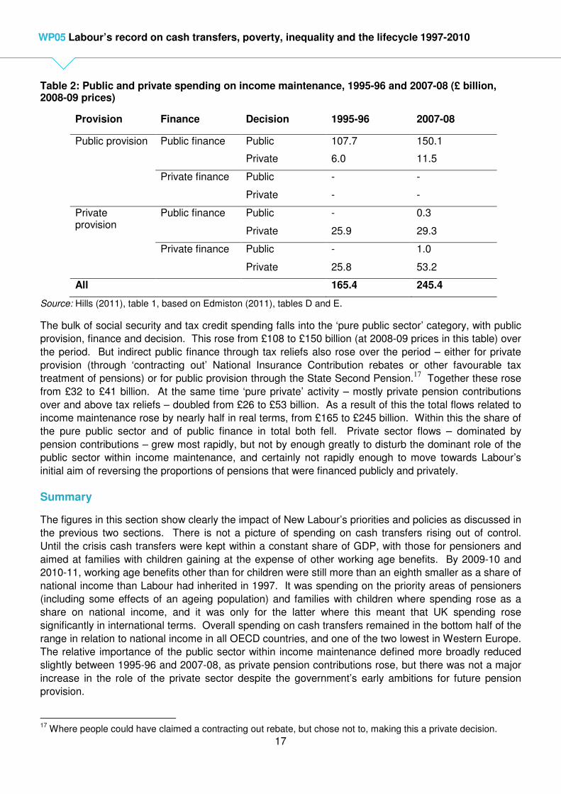
Table 2: Public and private spending on income maintenance, 1995-96 and 2007-08 (£ billion, 2008-09 prices) ....................................................................................................................................................17
Table 3: Income Support levels in relation to poverty thresholds and Minimum Income Standard by family type, 1997-98 to 2010-11 .............................................................................................................19
Table 4: Changes in relative poverty, 1996-97 to 2010-11 ......................................................................29
Table 5: Changes in distribution of incomes by income band, 1996-97 to 2010-11 .................................30
Table 6: Poverty rates in mid-1990s and late 2000s, OECD countries (% of population with equivalent net incomes below 60% of median) ........................................................................................................32
Table 7: At risk of poverty rate taken from fifteen European Union countire, 2001 and 2010 .................33
Table 8: Real changes in hourly wages of full-time employees in the UK ...............................................34
Table 9: Inequality in earnings and household incomes by gender, 1995-1997 and 2010 ......................37 Table 10: Inequality in wages and earnings by gender and selected ages, 1995-1997 and 2010 ...........38
Table 11: Inequality in equivalent net income by age, 1997-98 and 2010-11 ..........................................39

6
WP05 Labour’s record on cash transfers, poverty, inequality and the lifecycle 1997-2010
Appendices
Table A1: Benefit and tax credit spending, 1996-97 to 2010-11 (Great Britain ........................................46
Table A2: Public spending on cash transfers as % of GDP, 1995 and 2009, by client group ..................47
Table A3: Inequality in wages and earnings by gender and age, 1995-1997 and 2010...........................48
7
WP05 Labour’s record on cash transfers, poverty, inequality and the lifecycle 1997-2010
1. Aims and goals
Social security benefits – or cash transfers more generally (including other payments from government
such as tax credits) – have traditionally had a number of aims. These have included not just reducing
poverty, but also reducing inequality more generally, promoting ‘horizontal’ equity (in the sense of
helping compensate for particular needs, such as disability or having a larger family), and smoothing
income over the life cycle.
The 1997-2010 Labour government was much more explicit in its objectives for reducing poverty of
particular kinds than for the other aims such as reducing inequality. Its 1997 election manifesto only
mentioned inequality twice and only in general terms. Before the election, Tony Blair had written that:
“If the next Labour government has not raised the living standards of the poorest by the end of its term in office, it will have failed”.1
This only implied, however, reducing poverty against an absolute standard, something achieved in
nearly all periods – even on some definitions during the 1980s under Margaret Thatcher. Famously in a
Newsnight television interview he said:
“The issue isn’t in fact whether the very richest person ends up becoming richer. The issue is whether the poorest person is given the chance that they don’t otherwise have … the justice for me is concentrating on lifting incomes of those that don’t have a decent income. It’s not a burning ambition of mine to make sure that David Beckham earns less money.”2
This emphasis on improving opportunities at the bottom – sometimes developed into aims of ‘equality of
opportunity’ (rather than of outcomes) – was a recurring theme in what was argued to distinguish ‘New
Labour’ from its predecessors. As Gordon Brown put it in 1996:
“For too long we have used the tax and benefit system to compensate people for their poverty rather than doing something more fundamental – tackling the root causes of poverty and inequality … the road to equality of opportunity starts not with tax rates, but with jobs, education and the reform of the welfare state.”3
Reflecting this, the government’s key report and set of indicators reporting progress on poverty, social
exclusion, and inequality was entitled Opportunity for All. The indicators in that document were
concerned with much more than outcomes for income poverty, both in terms of other aspects of ‘social
exclusion’ and of life chances.
In government, ministers became more explicit about objectives for outcomes and for inequality in some
form. Soon after the 1997 election, Peter Mandelson suggested that “doubters” should, “judge us after
ten years in office. For one of the fruits of success will be that Britain has become a more equal society”.
More specifically, two years later in his Beveridge lecture at Toynbee Hall in 1999, Tony Blair declared
that: “Our historic aim [will be] that ours is the first generation to end child poverty forever. … It is a 20-year mission, but I believe it can be done” (Blair, 1999, p.7).
1 Independent on Sunday, 28 July, 1996.
2 Quoted in Bromley (2003), p,74.
3 Quoted in Powell (1999), p.17.

8
WP05 Labour’s record on cash transfers, poverty, inequality and the lifecycle 1997-2010
This commitment said nothing about how such an ambitious objective should be measured, but it was
quickly followed up by targets to reduce child poverty measured as the proportion of children living in
households with less than 60 per cent of contemporary median income – by a quarter by 2004, and by
half by 2010. Ultimately the objective was for Britain to become amongst “the best in Europe” in its
relative child poverty rate (recognising that even in egalitarian Scandinavia poverty on such a measure
had never been reduced to zero). Just before the end of its term in office, the government embodied its
objectives for ‘ending’ child poverty in the Child Poverty Act (with four different indicators set out to
measure this).
The other aspect of poverty emphasised as a policy aim was for pensioners. The 1997 Manifesto had
argued that, “all pensioners should share fairly in the increasing prosperity of that nation”. However, it
did not promise to restore the link between the value of the universal basic state pension and earnings
growth – unlike other Labour manifestos since the Conservative government broke the link at the start of
the 1980s. Indeed abandoning that pledge was one of the ways in which ‘New Labour’ marked a break
from its past. In the 1999 Opportunity for All report (DSS, 1999) the priorities set for older people were:
• Tackling the problems of low income and social exclusion amongst today’s pensioners;
• Improving opportunities for older people to live secure, fulfilling and active lives; and
• Ensuring that more of tomorrow’s pensioners can retire on a decent income.
Adding to this, at Labour’s 2002 party conference, Gordon Brown, then Chancellor of the Exchequer,
stated that, “Our aim is to end pensioner poverty in our country”.4 While the Opportunity for All indicators
included a similar set of indicators of relative, absolute, and persistent pensioner low income to those for
children, there were no explicit targets for their reduction.
The way in which objectives for pensioners were to be met were not seen, however, as only – or even
primarily – to do with the structure of the state pension system. Indeed the 1998 pensions green paper
set out the objective that as the population aged, the need for greater retirement incomes for a larger
retired population should be met through a switch in the balance of pension provision from what was
alleged to be 60 per cent from the state and 40 per cent from the private sector to the reverse. Improved
state provision was to be concentrated on the poorest pensioners rather than through increases in the
basic pension. It was only in its third term that these strategies were abandoned.5
More general aims for reducing inequality in general tended not to be stated until nearer the end of
Labour’s period in office, and the word ‘redistribution’ was studiously avoided until well into its second
term. But the language did begin to change, with the 2006 Equality Act putting a duty on the newly
established Equality and Human Rights Commission to monitor inequality outcomes in a triennial report,
while the first clause of the 2010 Equality Act allowed a power to put a ‘socio-economic’ duty on all
public authorities to consider in all the important decisions and actions they took how they could tackle
socio-economic inequality (although this was not subsequently implemented). In 2008 the government
also established an independent National Equality Panel6
to review the evidence on economic
inequalities between and within population groups defined in different ways.
4 Cited in Goodman et al. (2003), p.2.
5 See Evandrou and Falkingham (2009) for more detailed discussion.
6 Chaired by the author.

9
WP05 Labour’s record on cash transfers, poverty, inequality and the lifecycle 1997-2010
Summary
New Labour’s aims for poverty and inequality were selective. Child and pensioner income poverty –
including when measured in relative terms – were key priorities, but only alongside much wider
objectives for life chances and social inclusion. Equality was discussed in terms of equality of
opportunity, not of outcomes, and little emphasis put on inequalities at the top of the distribution. Cash
transfers (benefits and tax credits) from the state were not seen – rhetorically, at least – as being the
central instrument for achieving these objectives, by contrast with public services such as education,
health care, child care, and tackling other aspects of disadvantage, such as neighbourhood deprivation.
When cash transfers were discussed, the aim for families and the working age population was described
as ‘progressive universalism’ – something for all, alongside more for the poor – aimed at attempting to
ensure that ‘work pays’, at the same time as creating a less stigmatised system of transfers through the
use of ‘tax credits’, described as part of the income tax rather than benefit system. This contrasted,
however, with the initial strategy for incomes for current pensioners, which concentrated on means-
tested benefits. Labour’s strategy was not explicitly framed in terms of its effects on income smoothing
over the life cycle, although, as we shall see, that was an important side-effect of its emphasis on early
and later life.
The rest of this paper discusses what eventually had happened by the end of Labour’s time in
government in 2010 in terms of these aims and objectives, focussing on cash transfers and income
poverty and inequality.7 Its final decisions relating to the structure of the tax system and levels of
benefits set from April 2010, just before its election defeat, finalised most of the rules of the system that
applied for the whole of the 2010-11 financial year, having direct effects on income poverty and
inequality, as well as spending, in that year. There is therefore some ambiguity in which year should be
taken as the ‘end’ of the New Labour period in this area, so the paper presents information on trends in
spending and outcomes up to both 2009-10 and 2010-11, so that readers can see whether the choice of
‘end year’ makes a difference to the assessment.
The next section summarises the main policy developments affecting cash transfers between 1997 and
2010, and Section 3 charts developments in public spending over time and by comparison with other
countries. Section 4 examines what this meant in terms of the value of available public support for
different kinds of household, and Section 5 looks at the redistributive effects of the tax and benefit
reforms across the whole population. Section 6 examines outcomes for income poverty, and Section 7
those for income inequality, across the whole population. Section 8 examines in more detail how these
inequalities related to changes in those between and within groups defined by age and gender, and to
life cycle smoothing more generally. The final section concludes.
7 The analysis presented here is a summary only, as this area has been covered in detail elsewhere. See in
particular Sefton, Hills and Sutherland (2009) (some findings from which are updated here), Adam and Browne (2010), Cribb, Joyce and Phillips (2012), and Joyce and Sibieta (2013).
10
WP05 Labour’s record on cash transfers, poverty, inequality and the lifecycle 1997-2010
2. Policies
The main policies that affected cash incomes can be divided into four groups: changes affecting
transfers to families with children, including the introduction of tax credits; pension reforms; changes to
the direct tax system; and wider changes such as introduction of a National Minimum Wage. It is
important to note that all of these changes were against a background where the default assumption was
that benefits and tax allowances and brackets would be adjusted annually in line with price inflation (as
measured by the Retail Prices Index, RPI), not in line with overall living standards. This meant that
benefits such as Jobseeker’s Allowance were protected in real terms but in the period when overall living
standards were growing rapidly (from 1997 to 2003) they fell in value relative to average earnings or
incomes.
Children
For families with children,8 the first change was actually a cut. As part of the incoming government’s
commitment not to exceed its predecessor’s spending plans in its first two years, it implemented the
planned abolition of special benefits for lone parents, both the general One Parent Benefit and the lone
parent additions in Income Support. The most important change came in 1999 with a general increase
in Child Benefit for the first child in each family, the transformation of the existing means-tested Family
Credit into a more generous Working Families Tax Credit (WFTC) for low-earning families with children,
and more generous allowances for younger children in Income Support for workless families (including
many of the lone parents who had lost earlier).
The system for administering all of this was further reformed in 2003, combining Income Support child
allowances and the larger part of WFTC into a new Child Tax Credit. This was paid at the same rate
and through the same system to those out of work and those in low-paid work. By contrast with other
parts of the system, its value was uprated at least in line with earnings, not just prices. It also included a
‘family element’, which replaced what had once been the married man’s (and then married couples’)
income tax allowance. This went to all families except those with high incomes (on the philosophy that it
replaced tax allowances that had gone to all taxpayers). Additional amounts were paid to families with
younger children. The new Working Tax Credit (replacing the rest of WFTC) went to all those working
more than threshold numbers of hours, not just those with children but also other low-paid workers. This
was all aimed at ‘making work pay’, but also meant an extension of means-testing, albeit in a new form,
to a wider group with low to middle incomes. After 2003 tax credits were seen as part of the income tax
system, administered by HM Revenue and Customs rather than by what had become the Department of
Work and Pensions, and run on the basis of annual income assessments, with adjustments to payments
during and after the year in an attempt to make sure that the right amount was eventually paid out. This
attempted to match what the Pay As You Earn (PAYE) system does for income tax, and gave flexibility
as people’s circumstances changed within the year. But it resulted in extensive under- and over-
payments where the payments had not been adjusted within the year, requiring later additional
payments or (unpopular) reclaims.
Pensions
Following a Green Paper in 1998, a first wave of pension reform had three main components.9 Income
Support for pensioners was separated off to become the ‘Minimum Income Guarantee’, with its value
increased in real terms and then linked to earnings (unlike Income Support or Jobseeker’s Allowance for
8 For more details, see Stewart (2009, 2013).
9 See Evandrou and Falkingham (2009) for a more detailed discussion of pension reforms up to 2008.
11
WP05 Labour’s record on cash transfers, poverty, inequality and the lifecycle 1997-2010
those of working-age). This means-tested support was further reformed in 2003, with the minimum
becoming the ‘guarantee credit’ of Pension Credit. This included an additional means-tested element for
those with incomes just above the minimum, the ‘savings credit’. This was designed to reduce the
number of pensioners facing a 100 per cent withdrawal rate on small amounts of retirement income – but
at the cost of extending a lower means-testing rate to a larger group. Rather than general increases in
the basic pension a number of new concessions were introduced on a universal basis, including Winter
Fuel Payments, free TV licences for the oldest pensioners, and concessionary or free bus travel.
The second element of the first wave of reform was to change the way in which people still at work
accrued rights to state pensions, beginning the process of turning what had been the State Earnings
Related Pension Scheme (SERPS), paid on top of the flat rate basic pension, into the State Second
Pension (S2P). This gave better future pension rights to low-paid workers, as S2P was less related to
past earnings than the old SERPS system. In addition, the government tried to boost the accumulation
of private pensions through the introduction of ‘stakeholder pensions’, with limits on the charges that
providers could levy each year. This was an attempt to open up better value retirement savings to those
outside good value occupational schemes. In the end this had little impact, however, as the cap on
charges limited interest from providers, but the cap was still high enough to mean that those putting
aside small amounts could lose a considerable proportion of their potential savings through charges.
The government also faced the accusation that one of its earliest revenue-raising moves had been to
reduce tax relief for pension fund income and that this was one of the elements contributing to
withdrawal or scaling back of employer provision.
Near the start of Labour’s second term in office, in 2002, a further Green Paper announced an
independent Pensions Commission to review the way in which future pension rights were being
accumulated. Its first report in 2004 identified substantial structural problems with the way pensions
were evolving, including a rapid decline in private sector pension accrual, greater prospective reliance on
means-tested support in retirement in future (as the basic pension remained price-linked, but the means-
tested minimum was earnings-linked) acting as a barrier to encouraging extra saving, and little prospect
of private provision meeting the demand for greater pension flows as the population aged. Its second
report in 2005 put forward three key reforms designed to address these problems, the main elements of
which were introduced with all-party support in the 2007 and 2008 Pensions Acts. These were:
• A return to earnings-indexation of the basic pension and a widening of rights to it (particularly for
women) coupled with further moves to make the state second pension more flat rate. This was
designed to give a more valuable but less means-tested floor to retirement income on which
people could build non-state pension rights.
• Future increases in state pension age to reflect growing life expectancy and to allow the state
system to serve an ageing system without the flows being spread ever more thinly over a larger
retired population.
• Introduction of ‘automatic enrolment’ into people’s employer pension scheme (or a new low-cost
national funded scheme, eventually established as the National Employment Savings Trust), with
minimum contributions from employers and employees – but with the right of people to opt out of
this, rather than full compulsion to join.
The effects of all these reforms started only after Labour left office, and are now being carried further,
but they may in the long-term represent its greatest permanent mark on the cash transfer system.
Direct taxation
While New Labour avoided the language of redistribution, a series of reforms to direct taxation were also
designed to make it more progressive. This included reforms to National Insurance Contributions

12
WP05 Labour’s record on cash transfers, poverty, inequality and the lifecycle 1997-2010
(NICs), such as ending the remaining regressive element of flat rate minimum contributions, increasing
the level from which contributions were payable (with changes in employer contributions that partly
softened the impact on them of the National Minimum Wage). The main rates of NICs were increased in
2003 (including at a low rate on earnings above the normal upper limit) with the proceeds advertised as
being earmarked for increased spending on the NHS. What had been two major income tax allowances
– for mortgage interest and for married couples – were finally abolished (with parts of the latter absorbed
into the tax credit system and with pensioner couples protected). An initial move had been to reduce the
starting rate of income tax to 10 per cent, with much made of its positive effects on the low-paid, but this
‘10p band’ was removed in 2008 at the same time as the main rate was cut to 20 per cent. The
combination of the two left some low earners who were not entitled to (or did not receive) tax credits as
losers, even after an emergency increase in the general level of tax allowances the following Autumn.
Labour market10
The backdrop to all this – and often stressed far more by the government – were measures aimed at
boosting employment and wages when in work (as well as the general stress on and resources going to
education). At the centre of these were the ‘New Deal’ welfare-to-work programmes for the young
unemployed, lone parents, long-term unemployed, and partners of the unemployed as well as the
introduction of the first National Minimum Wage from April 1999. The latter was seen not just as justified
in its own right, but also as an underpinning to the supplementation of low wages through tax credits.
Gradually through the period of the government, the degree of conditionality for working age social
security payments increased, with for instance removal of an option of remaining on benefit for young
unemployed people and later reductions in the age of youngest child after which lone parents became
subject to conditions for actively seeking or moving towards employment (to age 7 from October 2010).
Some benefits were allowed to run on for short periods after people found work, to reduce financial
uncertainty in the transition from unemployment. The 1999 Welfare Reform and Pensions Act merged
the systems for claiming benefits and helping with job search, and more extensive support for job-
seekers was provided through the new ‘JobCentre plus’ offices.11 Introduction of joint claims meant that
members of a couple without children were treated equally in terms of both the services available and
the conditions for active job search. Benefits for people out of work because of disability were reformed
into a new Employment Support Allowance, with claimants’ treatment depending on the results of a new
Work Capability Assessment. An experimental Employment Retention and Advancement pilot explored
the effects of continuing support for people after they had found work and of bonuses for those who
stayed in work for particular periods.
Summary
Overall, this set of policies – perhaps unsurprisingly – reflected the core aims described in Section 1.
For the working age population the emphasis was on education, training, ‘making work pay’ and support
into work rather than real increases in social security benefits. By contrast, financial support for families
with children through tax credits in and out of work was made more generous in real terms in pursuit of
child poverty reduction targets, but alongside a series of other measures aimed at the early years and
wider aspects of social exclusion.12
The emphasis here was on ‘progressive universalism’ with
increased transfers to all families with children, but most for those with lower incomes. Pensioners also
10
See McKnight (2009) and Gregg and Wadsworth (2011), chapters 1,2 and 5, for more detail of labour market policies and their outcomes across the period. 11
Such as calculations showing people’s position in work, assistance with in-work benefit and tax credit applications, and work-focussed interviews delivered through personal advisers and much better use of new technology. 12
See Waldfogel (2010) and Stewart (2013).
13
WP05 Labour’s record on cash transfers, poverty, inequality and the lifecycle 1997-2010
benefited from increased support, but this was mainly on a means-tested basis (apart from items such
as the new Winter Fuel Payments), until a major reform introduced at the end of Labour’s period which
was designed to improve more universal pensions in the long term, but with the quid pro quo of future
increases in state pension age. Direct taxes were reduced to some extent for those on low incomes, but
increases for those with higher incomes were generally limited, until the response to the economic crisis
from 2008 included an increase in the top rate of income tax first to 50 per cent for incomes above
£150,000, but taking effect only from 2010-11, that is mainly after Labour had left office.
3. Spending on benefits and tax credits
The policy changes described above complicate a straightforward comparison of spending on cash
transfers over time for several reasons. First, responsibility for Child Benefit was moved from what is
now the Department of Work and Pensions (DWP) to HM Revenue and Customs (HMRC) in 2003 and is
no longer part of DWP benefit spending. Second, what had been a social security benefit – Family
Credit – was first transformed into the Working Families Tax Credit in October 1999. This was then
combined with what had been child additions within Income Support to form the Child Tax Credit and
Working Tax Credit in April 2003. During the period what had been a tax allowance – the Married
Couples Allowance (for couples aged under 65) – was also effectively turned into part of the tax credit
system, but had not previously been counted as part of public spending.
Recent analysis by DWP attempts to produce a consistent time series, and the results of this are shown
in Figure 1 (and Appendix Table 1).13
In 1996-97 total social security spending in Great Britain was £114
billion (at 2009-10 prices). By 2009-10 social security spending and Child Benefit had risen to £154
billion and tax credits cost £27.5 billion, so the total of cash transfers had reached £181.5 billion, nearly
60 per cent higher in real terms. It rose by a further £1.3 billion in 2010-11, taking the overall real
increase to 61 per cent to that year.
As the figure shows, more than half of the real increase – £37 billion by 2009-10 – was accounted for by
benefits for pensioners, and more than half of all transfers now go to pensioners. The figure divides the
rest of the spending between items aimed at children – mainly Child Benefit, Child Tax Credit and
Working Tax Credit for families with children (and their earlier equivalents, such as Family Credit and
WFTC) – and other transfers for the working age population (which includes items such as the adult
parts of Income Support or Jobseeker’s Allowance, including for parents, as well as Housing Benefit for
working age families). Those allocated here for children rose from £16 billion to nearly £40 billion,
accounting for nearly all of the rest of the real increase in spending.14
Other working age benefits and
tax credits rose much more slowly, from £41 to £48 billion.
13
Figures exclude Council Tax Benefit but include Housing Benefit. For consistency they exclude payments that had been made at the start of the period through Income Support for residential care, but are now in other budgets. They also do not allow at the start of the period for what would have been spending on non-pensioner Married Couples Allowance, but became part of tax credits from 2000-01. This would have been £2 billion in 2000-01 (at 2009-10 prices), or 0.17 per cent of GDP (HM Treasury, 1999, FSBR table 1.11 gives cost as £1.6 billion; adjusted to 2009-10 prices by GDP deflator). 14
See Stewart (2013), table 3, for a more detailed breakdown of transfers for children since 1997-98, calculated on a slightly different basis, but showing the same overall trends.

14
WP05 Labour’s record on cash transfers, poverty, inequality and the lifecycle 1997-2010
Figure 1: Social security benefits and tax credits, 1996-97 to 2010-11 (£ billion, 2009-10 prices, Great Britain
Source: Table A1.
Figure 2 shows the same flows as a share of total public spending (Total Managed Expenditure). Before
the economic crisis, in 2007-08, total transfers had fallen to a lower share of public spending (26.0 per
cent) than they had been in 1996-97 (27.4 per cent). Even in 2009-10 and 2010-11, with unemployment
rising, they were still no higher (27.0 and 27.2 per cent respectively) than at the start. Within this static
overall share, spending on pensioners rose, but that on other working age transfers fell (from 9.8 to 7.1
per cent in 2009-10 and 7.2 per cent in 2010-11).
Figure 2: Social security benefits and tax credits as % public spending, 1996-97 to 2010-11 (GB)
Source: Table A1.
0
20
40
60
80
100
120
140
160
180
200
96/97 97/98 98/99 99/00 00/01 01/02 02/03 03/04 04/05 05/06 06/07 07/08 08/09 09/10 10/11
Other working age Children (inc. tax credits if children) Pensioners
0%
5%
10%
15%
20%
25%
30%
96/97 97/98 98/99 99/00 00/01 01/02 02/03 03/04 04/05 05/06 06/07 07/08 08/09 09/10 10/11
Other working age Children (inc. tax credits if children) Pensioners

15
WP05 Labour’s record on cash transfers, poverty, inequality and the lifecycle 1997-2010
Finally, Figure 3 shows these flows in relation to national income. The total initially fell from its starting
level of 10.8 per cent of GDP 1996-97 but then fluctuated within a narrow range to remain slightly lower
(10.6 per cent) in 2007-08 than at the start. As the crisis hit, and unemployment rose and real GDP fell,
the total rose sharply to 12.8 per cent of GDP in 2009-10 (and 12.7 per cent in 2010-11). Looking over
the period as a whole from 1996-97 to 2009-10, spending on pensioner benefits rose and transfers for
children each rose by 1.3 percentage points of GDP, while other working-age benefits were a smaller
share of GDP, 3.4 per cent in 2009-10 and 3.3 per cent in 2010-11– even in the wake of the economic
crisis – than the 3.9 per cent they had been in 1996-97. This contrasts sharply with the increases in
spending as a share of GDP on health, education and early years provision which we describe in other
papers in this series.
Figure 3: Social security benefits and tax credits as % GDP, 1996-97 to 2010-11 (GB)
Source: Table A1.
International comparisons
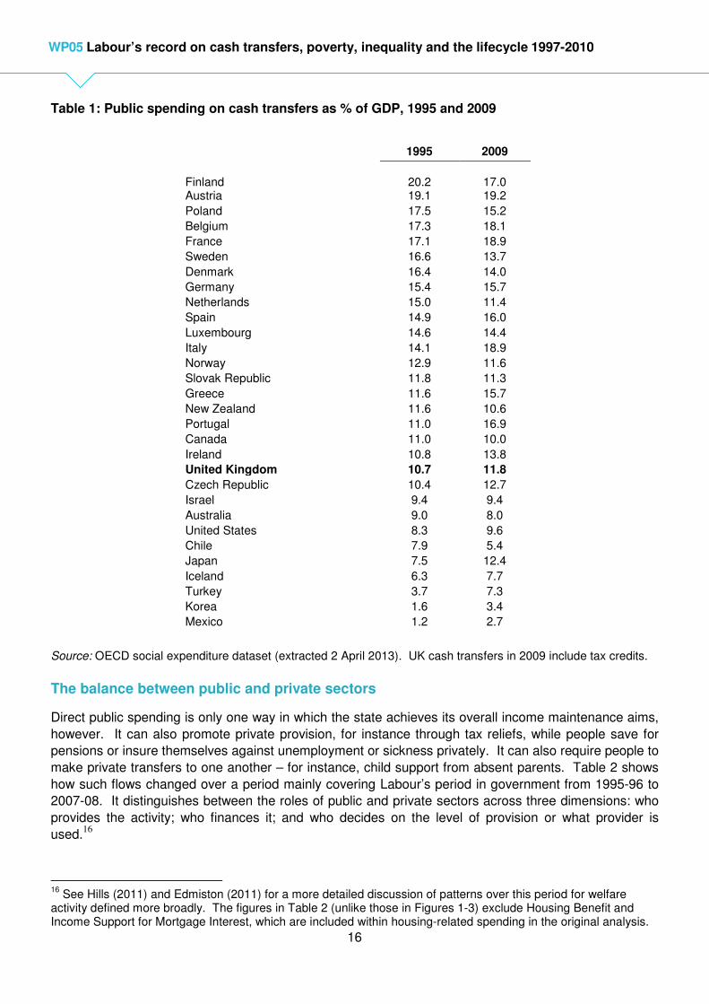
All this meant that in international terms UK spending on cash transfers remained low, as can be seen
from the OECD figures for 30 countries in Table 1. This series allows comparison of cash transfers
(including tax credits when introduced) as a share of GDP in 1995 and 2009. In 1995 UK cash transfers
had been twentieth out of 30 countries, rising to seventeenth in 2009. In 2009 UK spending, calculated
at 11.8 per cent of GDP on OECD’s definitions15
remained a smaller share of national income than in
any other Western European country apart from Norway. The more detailed breakdown in Appendix
Table A2 reflects the pattern shown in Figure 3 – UK spending on old age and survivors benefits and on
family benefits rose as a share of GDP, while that on other cash benefits fell. This left the UK as the
eighteenth highest spender on old age and survivors benefits in 2009 and nineteenth for other cash
benefits. However, on the OECD’s classification the UK’s spending on family benefits, 2.5 per cent of
GDP in 2009, had risen to being the third highest, behind only Luxembourg and Ireland (and equal to
New Zealand).
15
Compared to 12.8 per cent of GDP in 2009-10 on the definitions used by DWP and presented in Figure 3.
0%
2%
4%
6%
8%
10%
12%
14%
96/97 97/98 98/99 99/00 00/01 01/02 02/03 03/04 04/05 05/06 06/07 07/08 08/09 09/10 10/11
Other working age Children (inc. tax credits if children) Pensioners
16
WP05 Labour’s record on cash transfers, poverty, inequality and the lifecycle 1997-2010
Table 1: Public spending on cash transfers as % of GDP, 1995 and 2009
1995 2009
Finland
20.2
17.0
Austria 19.1 19.2
Poland 17.5 15.2
Belgium 17.3 18.1
France 17.1 18.9
Sweden 16.6 13.7
Denmark 16.4 14.0
Germany 15.4 15.7
Netherlands 15.0 11.4
Spain 14.9 16.0
Luxembourg 14.6 14.4
Italy 14.1 18.9
Norway 12.9 11.6
Slovak Republic 11.8 11.3
Greece 11.6 15.7
New Zealand 11.6 10.6
Portugal 11.0 16.9
Canada 11.0 10.0
Ireland 10.8 13.8
United Kingdom 10.7 11.8
Czech Republic 10.4 12.7
Israel 9.4 9.4
Australia 9.0 8.0
United States 8.3 9.6
Chile 7.9 5.4
Japan 7.5 12.4
Iceland 6.3 7.7
Turkey 3.7 7.3
Korea 1.6 3.4
Mexico 1.2 2.7
Source: OECD social expenditure dataset (extracted 2 April 2013). UK cash transfers in 2009 include tax credits.
The balance between public and private sectors
Direct public spending is only one way in which the state achieves its overall income maintenance aims,
however. It can also promote private provision, for instance through tax reliefs, while people save for
pensions or insure themselves against unemployment or sickness privately. It can also require people to
make private transfers to one another – for instance, child support from absent parents. Table 2 shows
how such flows changed over a period mainly covering Labour’s period in government from 1995-96 to
2007-08. It distinguishes between the roles of public and private sectors across three dimensions: who
provides the activity; who finances it; and who decides on the level of provision or what provider is
used.16
16
See Hills (2011) and Edmiston (2011) for a more detailed discussion of patterns over this period for welfare activity defined more broadly. The figures in Table 2 (unlike those in Figures 1-3) exclude Housing Benefit and Income Support for Mortgage Interest, which are included within housing-related spending in the original analysis.
17
WP05 Labour’s record on cash transfers, poverty, inequality and the lifecycle 1997-2010
Table 2: Public and private spending on income maintenance, 1995-96 and 2007-08 (£ billion, 2008-09 prices)
Provision Finance Decision 1995-96 2007-08
Public provision Public finance Public 107.7 150.1
Private 6.0 11.5
Private finance Public - -
Private - -
Private provision
Public finance Public - 0.3
Private 25.9 29.3
Private finance Public - 1.0
Private 25.8 53.2
All 165.4 245.4
Source: Hills (2011), table 1, based on Edmiston (2011), tables D and E.
The bulk of social security and tax credit spending falls into the ‘pure public sector’ category, with public
provision, finance and decision. This rose from £108 to £150 billion (at 2008-09 prices in this table) over
the period. But indirect public finance through tax reliefs also rose over the period – either for private
provision (through ‘contracting out’ National Insurance Contribution rebates or other favourable tax
treatment of pensions) or for public provision through the State Second Pension.17
Together these rose
from £32 to £41 billion. At the same time ‘pure private’ activity – mostly private pension contributions
over and above tax reliefs – doubled from £26 to £53 billion. As a result of this the total flows related to
income maintenance rose by nearly half in real terms, from £165 to £245 billion. Within this the share of
the pure public sector and of public finance in total both fell. Private sector flows – dominated by
pension contributions – grew most rapidly, but not by enough greatly to disturb the dominant role of the
public sector within income maintenance, and certainly not rapidly enough to move towards Labour’s
initial aim of reversing the proportions of pensions that were financed publicly and privately.
Summary
The figures in this section show clearly the impact of New Labour’s priorities and policies as discussed in
the previous two sections. There is not a picture of spending on cash transfers rising out of control.
Until the crisis cash transfers were kept within a constant share of GDP, with those for pensioners and
aimed at families with children gaining at the expense of other working age benefits. By 2009-10 and
2010-11, working age benefits other than for children were still more than an eighth smaller as a share of
national income than Labour had inherited in 1997. It was spending on the priority areas of pensioners
(including some effects of an ageing population) and families with children where spending rose as a
share on national income, and it was only for the latter where this meant that UK spending rose
significantly in international terms. Overall spending on cash transfers remained in the bottom half of the
range in relation to national income in all OECD countries, and one of the two lowest in Western Europe.
The relative importance of the public sector within income maintenance defined more broadly reduced
slightly between 1995-96 and 2007-08, as private pension contributions rose, but there was not a major
increase in the role of the private sector despite the government’s early ambitions for future pension
provision.
17
Where people could have claimed a contracting out rebate, but chose not to, making this a private decision.
18
WP05 Labour’s record on cash transfers, poverty, inequality and the lifecycle 1997-2010
4. Social security and tax credit levels and work incentives18
A key output from the social security and tax credit system is how well they succeed in keeping people
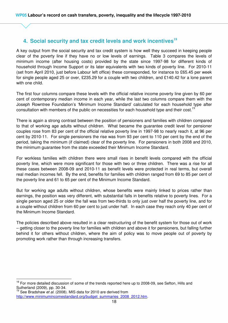
clear of the poverty line if they have no or low levels of earnings. Table 3 compares the levels of
minimum income (after housing costs) provided by the state since 1997-98 for different kinds of
household through Income Support or its later equivalents with two kinds of poverty line. For 2010-11
(set from April 2010, just before Labour left office) these corresponded, for instance to £65.45 per week
for single people aged 25 or over, £235.29 for a couple with two children, and £140.42 for a lone parent
with one child.
The first four columns compare these levels with the official relative income poverty line given by 60 per
cent of contemporary median income in each year, while the last two columns compare them with the
Joseph Rowntree Foundation’s ‘Minimum Income Standard’ calculated for each household type after
consultation with members of the public on necessities for each household type and their cost.19
There is again a strong contrast between the position of pensioners and families with children compared
to that of working age adults without children. What became the guarantee credit level for pensioner
couples rose from 83 per cent of the official relative poverty line in 1997-98 to nearly reach it, at 96 per
cent by 2010-11. For single pensioners the rise was from 93 per cent to 110 per cent by the end of the
period, taking the minimum (if claimed) clear of the poverty line. For pensioners in both 2008 and 2010,
the minimum guarantee from the state exceeded their Minimum Income Standard.
For workless families with children there were small rises in benefit levels compared with the official
poverty line, which were more significant for those with two or three children. There was a rise for all
these cases between 2008-09 and 2010-11 as benefit levels were protected in real terms, but overall
real median incomes fell. By the end, benefits for families with children ranged from 69 to 85 per cent of
the poverty line and 61 to 65 per cent of the Minimum Income Standard.
But for working age adults without children, whose benefits were mainly linked to prices rather than
earnings, the position was very different, with substantial falls in benefits relative to poverty lines. For a
single person aged 25 or older the fall was from two-thirds to only just over half the poverty line, and for
a couple without children from 60 per cent to just under half. In each case they reach only 40 per cent of
the Minimum Income Standard.
The policies described above resulted in a clear restructuring of the benefit system for those out of work
– getting closer to the poverty line for families with children and above it for pensioners, but falling further
behind it for others without children, where the aim of policy was to move people out of poverty by
promoting work rather than through increasing transfers.
18
For more detailed discussion of some of the trends reported here up to 2008-09, see Sefton, Hills and Sutherland (2009), pp. 30-34. 19
See Bradshaw et al. (2008). MIS data for 2010 are derived from http://www.minimumincomestandard.org/budget_summaries_2008_2012.htm.
19
WP05 Labour’s record on cash transfers, poverty, inequality and the lifecycle 1997-2010
Table 3: Income Support levels in relation to poverty thresholds and Minimum Income Standard by family type, 1997-98 to 2010-11
Source: Sefton, Hills and Sutherland (2009), table 2.4, extended and updated.
Notes:
1. The poverty threshold used is 60% of median incomes (After Housing Costs) in that year from DWP (2012) and earlier equivalents.
2. 2008 MIS figures are from Table 8 of Bradshaw et al (2008) and show Income Support/ Pension Credit levels in April 2008 as a percentage of the Minimum Income Standard (MIS) for each family type (excluding rent, council tax and childcare costs). See Bradshaw et al (2008) for further details. 2010 MIS figures from http://minimumincomestandard.org/budget_summaries_2008_2012.htm
The effects of the emphasis on ‘making work pay’ through the tax credit system can be seen in Figure 4.
This compares net incomes as modelled by DWP after direct taxes, benefits and tax credits for four
hypothetical household types with the poverty line for those with earnings of half the national average in
each case. The striking feature is the sharp rise when the Working Families Tax Credit was introduced
in October 1999 for a couple with two children – from 80 per cent of the poverty line to 100 per cent of it
– and for a lone parent from 120 to 140 per cent of the line. After 2000-01 the ratios remained roughly
constant for all four cases, apart from a slow fall for single people with no children, although they
remained well clear of poverty. The structural reforms in 2003 left these ratios generally unchanged.
% of poverty line1: % of MIS
2:
1997-98 2000-01 2004-05 2008-09 2010-11 2008
2010
Single, 18-24, no children 52 47 42 40 42 - -
Single 25+, no children 65 59 52 51 52 42 41
Couple working age, no children 60 54 48 46 48 42 40
Couple, 1 child aged 3 67 67 66 66 69 62 61
Couple, 2 children aged 4,6 67 70 73 75 78 62 62
Couple, 3 children aged 3,8, 11 71 72 79 82 85 61 62
Single parent, 1 child aged 3 81 78 80 81 84 67 65
Pensioner couple (aged 60-74) 83 83 90 93 96 106 102
Single pensioner (aged 60-74) 93 93 103 108 110 109 103

20
WP05 Labour’s record on cash transfers, poverty, inequality and the lifecycle 1997-2010
Figure 4: Net incomes after taxes and benefits as % of poverty line (60% median income after housing costs) for families with half average earnings
Source: Sefton, Hills, and Sutherland (2009), figure 2.4a, extended (using methodology as in DWP, 2008).
Figure 5 shows the position in more detail for couples with two children and different levels of earnings
and those with none. For those with half and two-thirds of average earnings there was a sharp jump in
relation to the poverty line when WFTC was introduced. The position of those with average earnings
remained constant. The value of Income Support for out of work families rose by less in 2000-01 than
did net income for those with low wages – so the difference between incomes out of work and in low-
paid work increased. But, as Table 3, showed there were continued rises in the relative value of Income
Support over the following decade, so the differential narrowed again, although that compared with half
average earnings remained wider in 2010-11 than at the start of the period. The figure also shows that
the differences in net income between those couple with children and gross earnings of half or two-thirds
of the average and those with average earnings narrowed significantly.
This raises the issue of work incentives. As far as public beliefs are concerned, there was a sharp rise in
the number questioned by the British Social Attitudes (BSA) survey who preferred the statement that
benefits for unemployed people are “too high and discourage work” to one that benefits are “too low and
cause hardship”. In 1996 only 32 per cent preferred the former statement, but 48 per cent the latter. By
2004 54 per cent preferred the “too high” response and only 23 per cent said they were too low,
proportions which were identical in 2010. Over the same period, the proportion agreeing that, “if benefits
were less generous, people would stand on their own two feet” rose from 33 to 55 per cent.20
20
Clery (2012), tables A.3 and A.5.
40
60
80
100
120
140
160
180
Single, no children Single, 1 child Couple, no children Couple, 2 children
21
WP05 Labour’s record on cash transfers, poverty, inequality and the lifecycle 1997-2010
Figure 5: Net incomes after taxes and benefits as % of poverty line (60% median income after housing costs) for couples with two children and different earnings
Source: Sefton, Hills, and Sutherland (2009), figure 2.4b, extended
Adam and Browne (2010) look in detail at the actual effects of all the changes in taxes (direct and
indirect), benefits and tax credits over the period on work incentives measured in three ways:
• Participation tax rates (for first and second earners) – the proportion of gross earnings taken
away through taxes or lower benefits, if someone moves out of work into work.
• Replacement rates – an individual’s net income out of work as a proportion of income in work.
• Effective marginal tax rates (EMTRs) – the share lost in taxes or reduced benefits if someone in
work increases their earnings. They look – over a thirty year period – at what happened to the
distributions of these three measures across the population at different dates, and at what the
effect of tax and benefit reforms was by themselves on a constant population, abstracting from
demographic and labour market changes.
Comparing the actual distributions in 1996-97 with those in 2009-10, mean and median participation tax
rates were virtually unchanged, but there was a slight fall in the very highest rates and a small rise in the
lowest ones. Across the distribution, replacement rates were slightly lower in 2009-10 than in 1996-97 –
that is, in general, incentives to work at all strengthened over the period.21
At the same time, for those in
work mean and median effective marginal tax rates (EMTRs) rose slightly, but there was a large
increase in the highest levels of EMTRs. In 1996-97 a tenth of those in work faced EMTRs over 55 per
cent or more, but by 2009-10 a tenth faced EMTRs above 75 per cent, with the large increase happening
as the new tax credit system was introduced in 2003.22
In other words for some cases, the incentive to
earn more if already in work declined. However, while Dickens and McKnight (2008) found that there
21
Adam and Browne (2010), figures 4.1 and 4.2. 22
Adam and Browne (2010), figure 4.3.
40
60
80
100
120
140
160
Average earnings Two-thirds of average earnings
Half of average earnings Income Support

22
WP05 Labour’s record on cash transfers, poverty, inequality and the lifecycle 1997-2010
was some evidence of improved employment retention after the changes, there was none of adverse
effects on wage progression within jobs.
Looking at the extent to which these changes resulted from tax and benefit reforms, average
participation tax rates and replacement rates were both lower under the 2009-10 tax and benefit system
than they would have been under the 1996-97 system, if it had been uprated in line with GDP growth.23
For those without children, as Table 3 shows, out of work income fell in relation to the poverty line and
median net incomes. For those with children, the rise in out of work was generally more than matched
for those in low-paid work, as illustrated in Figure 5. In those respects, the reforms improved average
incentives to work at all, especially for lone parents (but they were weakened for second earners in a
couple). However, average effective marginal tax rates for those at work (including the effects of indirect
taxes) would have been 49 per cent under the uprated 1996-97 system, but were 51 per cent under then
actual 2009-10 system.24
In that respect, the reforms reduced average incentives to increase earnings,
particularly for working parents, again as illustrated in Figure 5.
Summary
Looking at the structural changes to benefits, tax credits and taxes, the most striking effects came with
the first wave of tax credit reform in 1999, which improved net incomes in relation to the poverty line for
families with children in low paid work. Out of work incomes for families with children rose to some
extent at the same time and continued to rise slowly in relation to the poverty line. Pension reforms took
minimum incomes for pensions up to or even above the poverty line, but working age benefits for those
without children who were out of work fell further below it.
A corollary of such changes might have been expected to be deteriorating work incentives for those with
children. Public attitudes surveys certainly suggest much more widespread belief in disincentive effects
at the end of Labour’s period in office than at the start. However, the actual overall pattern of incentives
to work at all was little different in 2009 -10 than it had been in 1996-97. What did reduce somewhat
was the incentive for some of those in work to earn more, particularly as more working families were
affected by the tax credit means-tests: such families were better off than they would have been without
the tax credits, but at the margin gained less from extra earnings.
23
Adam and Browne (2010), figures 4.4 and 4.5. 24
Adam and Browne (2010), figure 4.6.

23
WP05 Labour’s record on cash transfers, poverty, inequality and the lifecycle 1997-2010
5. Redistribution
Measuring the redistributive effect of the reforms described in Sections 2 and 4 can be done in a number
of different ways. The key issue is what is assumed to constitute an unreformed system – that is, what
would have happened in the absence of structural changes. There are two main choices here. One is
that the system inherited in 1997 would have been uprated in line with price inflation – any real increases
in benefit levels then show as a gain to the income groups affected, for instance. But this kind of
benchmark is not neutral in many ways – the relative generosity of benefits and values of tax allowances
would be falling in relation to incomes, for instance, so other things being equal, relative poverty rates
would increase over time, and the public finances would improve substantially as benefits became easier
to finance and ‘fiscal drag’ increased direct tax revenues as a share of GDP.25
An alternative therefore
is to compare the reformed system with what the inherited one would have looked like if all its elements
had been uprated in line with a measure of income growth, such as earnings or GDP per capita. While
the former approach is more common in official presentations, the latter arguably gives a clearer guide to
the redistributive effect of policy.
Comparisons can vary in two other ways: first, as to what is included within the range of policies, such
as indirect taxes (such as VAT) as well as direct taxes (such as income tax); and second, what is used
as the way of defining which income group a household would be in (that is, whether it is the income
they would have had before or after the reform).
Figure 6, taken from Sefton, Hills and Sutherland (2009), compares the overall redistribution achieved by
Labour’s benefit and direct tax reforms up to 2008-09, against a price-indexed base in the upper panel
and against an earnings-uprated base in the lower panel. In each case the results are shown in terms of
the position households would have occupied under the unreformed 1996-97 system. The three bars in
each diagram show the cumulative effects of reforms up to 2000-01, 2004-05 and 2008-09 respectively.
The upper panel shows the large real gains compared to a price-indexed base for what would have been
the bottom three income groups – 25 per cent for the poorest tenth of households and more than 10 per
cent for the next two groups. On this basis the top two groups were slightly worse off than they would
have been under the price-uprated 1996-97 system. What is also clear from the panel is that the main
reform effects happened between 2000-01 and 2004-05, with only limited gains for each income group
beyond that when the whole period is included.
The lower panel makes the redistributive effect of Labour’s reforms clearer. Compared to a base where
the inherited system was uprated with average earnings the gains for the bottom income groups are
more modest – 8 per cent for the bottom tenth and less than 5 per cent for the next two groups – but still
positive, while the rest of the distribution emerge as losers, by up to 3 per cent for the top income group.
25
See Sutherland, et al. (2008) for further discussion.

24
WP05 Labour’s record on cash transfers, poverty, inequality and the lifecycle 1997-2010
Figure 6: Distributional effects of benefit and direct tax changes, 1996-97 to 2008-09,
(a) Relative to price-indexation of policies
b) Relative to earnings-indexation of policies
Source: Sefton, Hills and Sutherland (2009), figure 2.5, based on analysis using POLIMOD.
Figure 7 shows analysis by Adam and Browne which extends the time period up to 2009-10, Labour’s
last full year in office. The analysis also includes the impact of indirect tax changes, such as in VAT
rates, which offset some of the progressive effects of the direct tax reforms. It is also based on the
income groups households were in under the 2005 system, that is, after the bulk of the reforms, rather
% change in household income (BHC)
-5%
0%
5%
10%
15%
20%
25%
30%
1 2 3 4 5 6 7 8 9 10
household income decile group (1996/7)
% c
hange in d
isposable
incom
e
96/7-00/1
96/7-04/5
96/7-08/9
% change in household income (BHC)
-5%
0%
5%
10%
15%
20%
25%
30%
1 2 3 4 5 6 7 8 9 10
household income decile group (1996/7)
% c
hange in d
isposable
incom
e
96/7-00/1
96/7-04/5
96/7-08/9
25
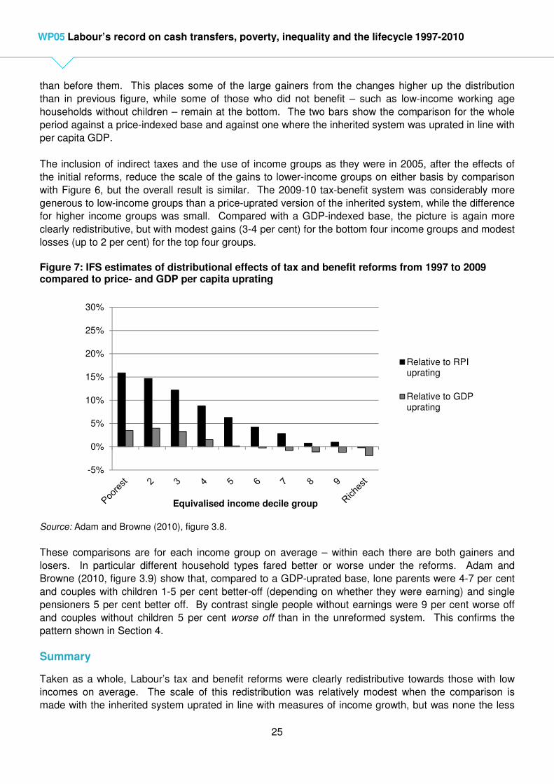
WP05 Labour’s record on cash transfers, poverty, inequality and the lifecycle 1997-2010
than before them. This places some of the large gainers from the changes higher up the distribution
than in previous figure, while some of those who did not benefit – such as low-income working age
households without children – remain at the bottom. The two bars show the comparison for the whole
period against a price-indexed base and against one where the inherited system was uprated in line with
per capita GDP.
The inclusion of indirect taxes and the use of income groups as they were in 2005, after the effects of
the initial reforms, reduce the scale of the gains to lower-income groups on either basis by comparison
with Figure 6, but the overall result is similar. The 2009-10 tax-benefit system was considerably more
generous to low-income groups than a price-uprated version of the inherited system, while the difference
for higher income groups was small. Compared with a GDP-indexed base, the picture is again more
clearly redistributive, but with modest gains (3-4 per cent) for the bottom four income groups and modest
losses (up to 2 per cent) for the top four groups.
Figure 7: IFS estimates of distributional effects of tax and benefit reforms from 1997 to 2009 compared to price- and GDP per capita uprating
Source: Adam and Browne (2010), figure 3.8.
These comparisons are for each income group on average – within each there are both gainers and
losers. In particular different household types fared better or worse under the reforms. Adam and
Browne (2010, figure 3.9) show that, compared to a GDP-uprated base, lone parents were 4-7 per cent
and couples with children 1-5 per cent better-off (depending on whether they were earning) and single
pensioners 5 per cent better off. By contrast single people without earnings were 9 per cent worse off
and couples without children 5 per cent worse off than in the unreformed system. This confirms the
pattern shown in Section 4.
Summary
Taken as a whole, Labour’s tax and benefit reforms were clearly redistributive towards those with low
incomes on average. The scale of this redistribution was relatively modest when the comparison is
made with the inherited system uprated in line with measures of income growth, but was none the less
-5%
0%
5%
10%
15%
20%
25%
30%
Equivalised income decile group
Relative to RPIuprating
Relative to GDPuprating
26
WP05 Labour’s record on cash transfers, poverty, inequality and the lifecycle 1997-2010
progressive, contrasting sharply with the regressive effects of reform in the period from 1978 to 1997.26
This redistribution was, however, selective, with families with children and pensioners gaining but
workless single people and couples without children losing.
6. Outcomes: Poverty rates
Official statistics on the proportions of the population with low incomes present information in a variety of
ways – measured against income thresholds that are fixed in real terms, ones that are relative to
contemporary median incomes, each against a variety of levels (eg. 50, 60 or 70 per cent of median
income), and before and after allowing for housing costs.27
The indicators used by the Labour
government to measure progress also included a combined measure of low income and deprivation (in
the sense of lacking particular items) and measures of persistent low income.
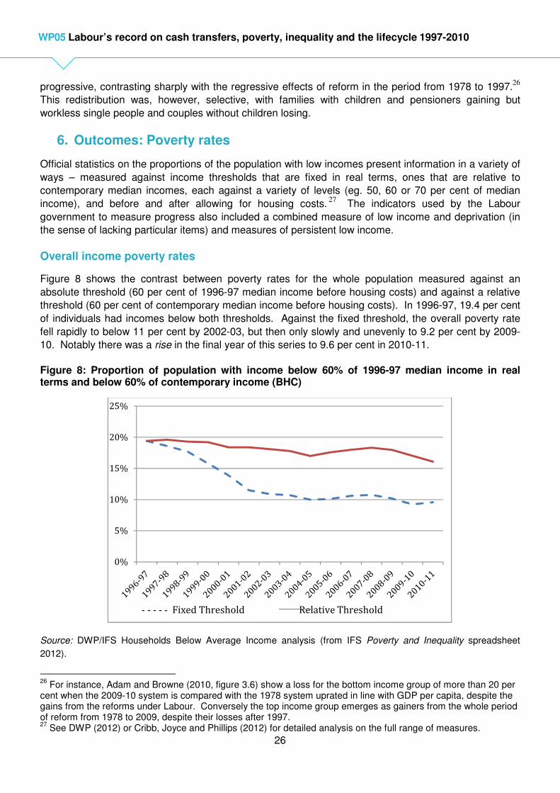
Overall income poverty rates
Figure 8 shows the contrast between poverty rates for the whole population measured against an
absolute threshold (60 per cent of 1996-97 median income before housing costs) and against a relative
threshold (60 per cent of contemporary median income before housing costs). In 1996-97, 19.4 per cent
of individuals had incomes below both thresholds. Against the fixed threshold, the overall poverty rate
fell rapidly to below 11 per cent by 2002-03, but then only slowly and unevenly to 9.2 per cent by 2009-
10. Notably there was a rise in the final year of this series to 9.6 per cent in 2010-11.
Figure 8: Proportion of population with income below 60% of 1996-97 median income in real terms and below 60% of contemporary income (BHC)
Source: DWP/IFS Households Below Average Income analysis (from IFS Poverty and Inequality spreadsheet
2012).
26
For instance, Adam and Browne (2010, figure 3.6) show a loss for the bottom income group of more than 20 per cent when the 2009-10 system is compared with the 1978 system uprated in line with GDP per capita, despite the gains from the reforms under Labour. Conversely the top income group emerges as gainers from the whole period of reform from 1978 to 2009, despite their losses after 1997. 27
See DWP (2012) or Cribb, Joyce and Phillips (2012) for detailed analysis on the full range of measures.
0%
5%
10%
15%
20%
25%
- - - - - Fixed Threshold Relative Threshold

27
WP05 Labour’s record on cash transfers, poverty, inequality and the lifecycle 1997-2010
The second line shows the relative measure on which attention is more commonly concentrated, given
that perceptions of minimum acceptable living standards tend to move over the medium- and long-term
with general living standards. Here progress was slower – as one would expect against a line that was
rising in real terms – and more uneven. From the same starting point of 19.4 per cent of individuals in
1996-97 it fell to a low point of 17.0 per cent in 2004-05, before rising again to 18.3 per cent in 2007-08,
but then falling through the first part of the recession to 17.0 per cent in 2009-10 and 16.1 per cent in
2010-11. The fall in the final year was because general living standards fell in real terms, while the value
of social security benefits was held constant. Such year-to-year movements in median incomes can be
more rapid (in either direction) than one would expect perceptions of what constitutes poverty to be
(which is why it is helpful to look at both relative and absolute standards), but looking over the long term
relative poverty clearly fell (continuing a trend which had started in the early 1990s, after the sharp rise in
poverty of the 1980s). Indeed, in the final year in these terms, overall poverty was lower than at any
point for 25 years.
Poverty rates for particular groups
The two panels of Figure 9 break these totals down between four population groups. The upper panel
shows that using the fixed threshold, the proportions below it more than halved for children (from 26.7 to
9.4 per cent by 2010-11), pensioners (from 24.6 to 9.5 per cent) and working-age parents (from 20.2 to
8.8 per cent). However, the proportion of working-age non-parents below even this fixed line only fell
from 12.0 per cent to 8.9 per cent in 2002-03 and had climbed back to 10.1 per cent in 2010-11, above
the overall average. Strikingly, there was a very clear convergence in poverty rates against this
threshold: being a child or a pensioner no longer meant that someone had a higher poverty risk than
others.
There was, however, a sharp contrast between different household types, as can be seen from the lower
panel of Figure 9 and from Table 4 (showing figures both before and after housing costs). For children,
relative poverty (before housing costs) fell over the period as whole by more than 9 percentage points to
17.5 per cent. This was by more than a third by 2010-11, which would generally be seen as a
considerable achievement, but fell short of Labour’s explicit target of halving it by 2010.
Correspondingly, poverty rates also fell for working age parents, from 20 to 16 per cent (more slowly as
the fall was most rapid for families with more children). Poverty also fell by a quarter for the
government’s other priority group, pensioners. However, relative poverty rose for working age adults
without children, from 12.0 to 14.6 per cent, still below the overall poverty rate on this measure, but
much closer to the overall average than at the start. Again, the result was very clear convergence in
poverty risks for the different groups. The table shows similar trends when incomes are measured after
housing costs, but in this case the most rapid fall is for pensioners, more than halving over the period.28
28
See Joyce and Sibeita (2013), figures 7 and 8 for trends since 1979.
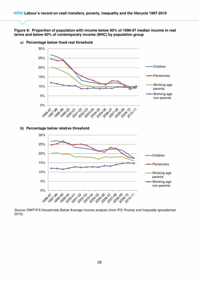
28
WP05 Labour’s record on cash transfers, poverty, inequality and the lifecycle 1997-2010
Figure 9: Proportion of population with income below 60% of 1996-97 median income in real terms and below 60% of contemporary income (BHC) by population group
a) Percentage below fixed real threshold
b) Percentage below relative threshold
Source: DWP/IFS Households Below Average Income analysis (from IFS Poverty and Inequality spreadsheet 2012).
0%
5%
10%
15%
20%
25%
30%
Children
Pensioners
Working-ageparents
Working-agenon-parents
0%
5%
10%
15%
20%
25%
30%
Children
Pensioners
Working-ageparents
Working-agenon-parents
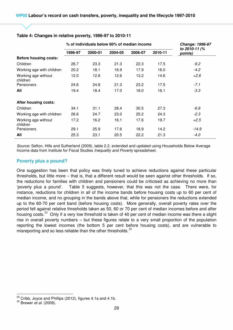
29
WP05 Labour’s record on cash transfers, poverty, inequality and the lifecycle 1997-2010
Table 4: Changes in relative poverty, 1996-97 to 2010-11
% of individuals below 60% of median income Change: 1996-97 to 2010-11 (% points) 1996-97 2000-01 2004-05 2006-07 2010-11
Before housing costs:
Children 26.7 23.3 21.3 22.3 17.5 -9.2
Working age with children 20.2 18.1 16.9 17.9 16.0 -4.2
Working age without children
12.0 12.8 12.6 13.2 14.6 +2.6
Pensioners 24.6 24.8 21.3 23.2 17.5 -7.1
All 19.4 18.4 17.0 18.0 16.1 -3.3
After housing costs:
Children 34.1 31.1 28.4 30.5 27.3 -6.8
Working age with children 26.6 24.7 23.0 25.2 24.3 -2.3
Working age without children
17.2 16.2 16.1 17.6 19.7 +2.5
Pensioners 29.1 25.9 17.6 18.9 14.2 -14.9
All 25.3 23.1 20.5 22.2 21.3 -4.0
Source: Sefton, Hills and Sutherland (2009), table 2.2, extended and updated using Households Below Average Income data from Institute for Fiscal Studies Inequality and Poverty spreadsheet.
Poverty plus a pound?
One suggestion has been that policy was finely tuned to achieve reductions against these particular
thresholds, but little more – that is, that a different result would be seen against other thresholds. If so,
the reductions for families with children and pensioners could be criticised as achieving no more than
‘poverty plus a pound’. Table 5 suggests, however, that this was not the case. There were, for
instance, reductions for children in all of the income bands before housing costs up to 60 per cent of
median income, and no grouping in the bands above that, while for pensioners the reductions extended
up to the 60-70 per cent band (before housing costs). More generally, overall poverty rates over the
period fell against relative thresholds taken as 50, 60 or 70 per cent of median incomes before and after
housing costs.29
Only if a very low threshold is taken of 40 per cent of median income was there a slight
rise in overall poverty numbers – but these figures relate to a very small proportion of the population
reporting the lowest incomes (the bottom 5 per cent before housing costs), and are vulnerable to
misreporting and so less reliable than the other thresholds.30
29
Cribb, Joyce and Phillips (2012), figures 4.1a and 4.1b. 30
Brewer et al. (2009).

30
WP05 Labour’s record on cash transfers, poverty, inequality and the lifecycle 1997-2010
Table 5: Changes in distribution of incomes by income band, 1996-97 to 2010-11
Equivalised income as % of median
<40% 40-50% 50-60% 60-70% 70-80% 80%+
Before housing costs: Children -0.3 -4.1 -4.6 2.4 2.2 4.4
Working age with children 0.2 -2.0 -2.3 1.5 1.3 1.3
Working age without children 1.9 0.6 0.2 -0.2 0.9 -3.4
Pensioners -0.2 -3.5 -3.2 -4.5 0.2 11.3
All individuals 0.6 -1.8 -2.1 0.0 1.2 2.1
After housing costs:
Children -0.7 -6.8 0.8 2.0 1.9 2.8
Working age with children 0.6 -3.6 0.7 1.1 1.3 -0.1
Working age without children 1.9 0.5 0.0 1.2 1.2 -4.9
Pensioners -0.1 -4.0 -11.0 0.1 1.5 13.4
All individuals 0.6 -2.9 -1.7 1.2 1.4 1.4
Source: Sefton et al. (2009), table 2.3, updated using own analysis of HBAI datasets 1994-95 to 2010-11. Figures show the change (in percentage points) in the proportion of the population in each band.
Policy impacts
The reductions that were seen against the conventional 60 per cent poverty line owed much to the
redistributive effects of the reforms to the tax and cash transfer systems. For instance the modelling in
Sefton, Hills and Sutherland (2009, figure 2.6(b)) suggests that the child poverty rate would have been 8
percentage points higher than it actually was in 2008-09, if the 1996-97 system had been continued,
uprated in line with earnings.31 The unreformed system would have left child poverty 3 percentage
points higher – rather than 5 percentage points lower – than the rate in 1996-97. This implies that other
changes in the distribution of market incomes meant that part of Labour’s redistributive effort was
needed simply for child poverty to stand still. By contrast, the pensioner poverty rate was 3 percentage
points lower than it would have been with an unreformed system, but the actual fall in pensioner poverty
up to that date shown in Figure 9 was somewhat larger. Other factors (such as improved pension rights
for new pensioners) were tending to reduce pensioner poverty as well, reinforcing the effects of the
policy reforms.
By contrast, the increase in the poverty rate for working-age adults without children would have been
slightly smaller without the reforms (compared to an earnings-linked base) than it actually was. To the
extent that Labour had a strategy for reducing working age poverty for those without children, it was
embodied in its early slogan, “work for those who can, security for those who cannot.” However, its
reliance on promoting work and making work pay was not enough to succeed in bringing poverty down
for this group.
31
If the comparison is made with a base system uprated in line only with prices since 1997, the fall in poverty due to the reforms is much larger; see Joyce and Sibieta (2013), figures 9 and 10.

31
WP05 Labour’s record on cash transfers, poverty, inequality and the lifecycle 1997-2010
Material deprivation
Labour’s child poverty targets also included a measure of whether children were living in a household
with a low income in relative terms (below 70 per cent of median income) and were ‘materially deprived’,
in the sense of lacking particular items, commonly seen as necessities. The official series for this
combined measure shows 17 per cent of children affected in 2004-05, when the series starts, falling to
16 per cent in 2009-10, and 14 per cent in 2010-11.32
Much of this fall is driven by that in relative
poverty over the period, rather than in material deprivation by itself. Recent initial analysis of the
‘poverty and social exclusion’ (PSE) survey suggests a rise in material deprivation on the definitions it
uses comparing surveys carried out in 1999 and 2012 (last three quarters).33
However the second of
these surveys is more than two years after Labour left office, and will reflect changes since then. Some
indication of what may have been happening through the main part of Labour’s period in office is shown
in Figure 10, using the now discontinued Families and Children Survey (FACS). Looking back to 1999 is
only possible on a consistent basis for lone parents, for whom deprivation fell sharply in several respects
between 1999 and 2002, and then more slowly up to 2006.34
Looking at all families with children, the
figure suggests that material deprivation may have reached a low point around 2005, but then rose. It
shows results from 2001 for the proportions who said they lacked an item because they could not afford
it. For nearly all of the items, there were falls between 2001 and 2005 (at the same time that income
poverty was falling on both a relative and absolute basis for children and their parents). However, for
several of the items, deprivation rose again between 2005 and 2008 (when income poverty was roughly
constant on both bases).
Figure 10: Indicators of material deprivation for families with children, 2001-2008 (% stating that they would like the item but could not afford it)
Source: Families and Children Survey (FACS).
International comparisons
Table 6 shows how the changes in the overall poverty rate in the UK measured by OECD in a similar
way to Figure 8 over the period from the ‘mid-1990s’ (1994-95 for the UK) to the ‘late 2000s’ (2008-09
for the UK) compared with 26 other countries. At the start of the period, the UK’s poverty rate, at 19.3
per cent, was the twelfth highest. It was then one of the 13 countries to record a fall in poverty, but this
only took it down to thirteenth in this particular league table.
32
DWP (2012), table 4.5tr. 33
Gordon et al. (2013). 34
Stewart (2009), table 3.2.
0
5
10
15
20
25
30
35
40
2001 2002 2003 2004 2005 2006 2007 2008
A one week holiday awayfrom homeA night out once a month
Two pairs of all-weathershoes for each adultFriends or relatives for ameal once a monthA car/van
A celebration with presentsat special occasionsToys and sports gear for thechildren

32
WP05 Labour’s record on cash transfers, poverty, inequality and the lifecycle 1997-2010
Table 6: Poverty rates in mid-1990s and late 2000s, OECD countries (% of population with equivalent net incomes below 60% of median)
mid-90s late-2000s Change
Sweden 7.9 16.4 8.5
Finland 9.1 15.6 6.5
Czech Republic 9.9 10.3 0.4
Denmark 11.5 13.4 1.9
Luxembourg 12.4 15.6 3.2
Germany 12.7 14.8 2.1
Norway 13.4 13.3 -0.1
Austria 13.7 12.8 -0.9
France 14.1 13.5 -0.6
Hungary 14.4 12.2 -2.2
Netherlands 15.2 13.1 -2.1
New Zealand 15.8 19.0 3.2
Canada 17.1 19.4 2.3
Belgium 17.6 16.3 -1.4
Spain 18.6 20.6 2.0
United Kingdom 19.3 18.4 -0.9
Japan 19.8 21.7 1.9
Ireland 20.7 16.8 -3.8
Israel 20.8 26.8 6.0
Australia 20.8 21.7 0.9
Greece 21.7 17.8 -3.9
Italy 21.8 19.9 -1.9
Portugal 22.1 18.5 -3.6
Turkey 23.5 24.0 0.6
United States 23.8 24.4 0.6
Chile 26.8 25.1 -1.7
Mexico 27.8 27.2 -0.6
Source: OECD poverty database (extracted 2 April 2013).
Eurostat also produces statistics on the ‘at risk of poverty rate’ measured in a similar way, with some
breakdowns between age groups. Its figures for the older fifteen EU members allow some comparisons
between 2001 and 2010, which are summarised in Table 7. Over this period the overall poverty rate in
the EU15 countries rose from 15 per cent to 16.2 per cent, while the figure for the UK fell from 18 to 17.1
per cent. But despite its improvement while the overall average was worsening, the UK’s ranking fell
from tenth to eleventh, slipping behind Ireland in this league table (where first has the lowest rate). A
consistent time series for children is not available, but the UK’s rate for children under 18 in 2010 was
only slightly higher than the EU15 average, leaving it in tenth place overall. This is in the context where
a similar league table showed the UK with the worst child poverty rate (for under-16s) in 1998, with a
rate 10 percentage points worse than the EU15 average.35
For those aged 65 or over, the fall in poverty
in the UK, from 27 to 21.4 per cent in this series was much faster than that for the EU15 as a whole, but
despite this the UK slipped down to being the 14th worst out of the fifteen countries. As with the OECD
series, this table suggests that the UK’s poverty rates were improving compared to international
averages, but not fast enough to improve in its overall rankings. The table also shows that the median
poverty gap – the extent to which the median person in poverty falls below the poverty line – deteriorated
35
Stewart (2009), figure 13.1.

33
WP05 Labour’s record on cash transfers, poverty, inequality and the lifecycle 1997-2010
in the UK but more quickly in the EU15 as a whole, but the UK also slipped to tenth worst on this
measure.
Table 7: At risk of poverty rates in fifteen European Union countries, 2001 and 2010
EU15 (%) UK (%) UK ranking (1st
is best)
2001 2010 2001 2010 2001 2010
At risk of poverty rate:
Total 15 16.2 18 17.1 10th 11
th
Under 18 na 19.8 Na 20.3 - 10th
65 or over 18 16.3 27 21.4 12th 14
th
Median poverty gap 15 18.0 19 21.4 9th 10
th
Source: EUROSTAT, statistical database on income and living conditions (downloaded 27 April 2013).
Summary
Using the most prominent of the available measures, relative income poverty fell between 1996-97 and
2010-11. This took its level to the lowest for 25 years. For children the fall was by a third (before
housing costs) – a considerable change, but falling short of the government’s target of halving it. For
pensioners, it fell by a quarter. Both of these reductions were in large part due to the redistributive
reforms of the tax and benefit systems. Indeed, without them, child poverty would have risen. But
relative poverty rose for working age adults without children – reforms such as the New Deals and the
National Minimum Wage were not enough to offset the effects of other labour market changes and the
way in which working age benefits in general remained linked to prices. Some take the view that poverty
should be measured against fixed real thresholds, as with the core US poverty line. In these terms,
poverty increased in the final year at the end of Labour’s period in office. However, taking the period
since 1996-97 to 2010-11 as a whole, poverty against an absolute standard halved and fell by nearly
two-thirds for children. Notably, whether measured against an absolute or a relative standard, poverty
rates for children, those of working age, and pensioners converged to similar levels, where there had
been wide differences at the start. There is not a consistent time series for levels of material deprivation
over the whole period, but partial surveys suggest that it fell for families with children between 2001 and
2005, but then rose again by 2008. In international terms, the decline in relative poverty was not enough
greatly to shift the UK’s generally poor rankings compared to other countries. However, while it had the
worst child poverty rate amongst fifteen older EU members in the late 1990s, by 2010 its poverty rate for
those under 18 was only just above the average for those countries, and its ranking had risen to tenth
out of the fifteen.
7. Outcomes: Income inequality
What happens to income inequality is a product of many more factors than what happens to cash
transfers and taxation, although as we have seen they can have considerable effects on the bottom of
the income distribution. One crucial pressure towards growing inequality in the 1980s and 1990s was
the widening dispersion of earnings, as shown in Table 8, with faster growth the nearer to the top of the
distribution one looks. What happened in the first and second halves of the New Labour period, shown
in the final two columns, was rather different. From 1997 to 2003, earnings growth was more balanced
while still relatively rapid. Indeed growth in hourly wages was slightly faster at the tenth percentile

34
WP05 Labour’s record on cash transfers, poverty, inequality and the lifecycle 1997-2010
(below which a tenth of workers fall) than at the median, although it continued to be fastest at the very
top. However, hourly wages were virtually unchanged in real terms in 2010 from what they had been in
2003 across the distribution. This stagnation in real wages predated the economic crisis from 2008, and
came despite continuing growth in GDP up to that point.
Table 8: Real changes in hourly wages of full-time employees in the UK
Annualised percentage increase in gross hourly pay
1980s 1990s 1997-2003 2003-2010
5th percentile 1.8 1 - -
10th percentile 1.6 1.1 2.0 0.0
25th percentile 1.8 1.2 1.7 0.1
50th percentile 2.3 1.5 1.7 0.2
75th percentile 3.0 1.9 1.9 0.2
90th percentile 3.5 2.1 2.3 0.0
95th percentile 3.8 2.2 3.0 0.0
Notes: Data from 1980s and 1990s from Sefton et al. (2009), table 2.1, based on Machin and van Reenen (2007). Time periods used for each decade are1979-89 and 1989-99. Data from 1997 from ONS Annual Survey of Hours and Earnings (ASHE).
As well as wages, other factors affect overall income distribution between households, particularly levels
of unemployment and the distribution of work between households. Gregg and Wadsworth (2011,
chaper 5) show that by 1997, the polarisation of work between households was more unequal than at
any time since records begain in the mid-1970s. Between 1997 and 2009, the proportion of households
with no one in work did fall (from 18.2 to 17.3 per cent), but not by enough to return to the position of the
1970s or even 1980s.
The end result of the combination of labour market changes, including these in wages, as well as the tax
and benefit reforms and other wider societal changes can be seen in Figure 11. This contrasts the
growth in incomes (before housing costs) at the mid-point of each tenth of the income distribution
between 1996-97 and 2010-11 with that between 1979 and 1996-97. In the earlier period, income
growth was faster the nearer the top of the distribution one looks – nearly 3 per cent annually for those in
the top tenth, five times as fast as for those in the bottom tenth. Wherever one looked, and however it
was measured, income inequality grew. The New Labour period is very different. Income growth was
fastest for the second and third tenths of the distribution, accounting for the falls in relative poverty
discussed in the previous section. But it was also higher right at the top than in the middle, and was
slowest for the poorest tenth (although still faster than in the Conservative period).
This pattern means that different measures of income distribution produce different results, as can be
seen in Figure 12 (for Great Britain, to give a consistent time series back to 1961). This shows two of
the most commonly used measures. The 90:10 ratio compares the incomes of those near the top (at the
90th percentile) with those near the bottom (at the 10th percentile). In the 1960s and 1970s this ratio was
at or just above three. There was then a step rise in the 1980s, and it was above four until the final year
in the series. Broadly speaking, over the Labour period it was constant, dipping by 2003-04 before rising
again and then falling in the last two years to what was (marginally) its lowest level for 25 years. The
second measure is the well-known Gini coefficient. This summarises inequality across the whole of the
distribution, including what is happening at the very bottom and very top. Again this was broadly flat
over the Labour period as a whole, with a rise to in the years from 2004-05 to 2007-08, leaving it above

35
WP05 Labour’s record on cash transfers, poverty, inequality and the lifecycle 1997-2010
the starting point in 2009-10, but with a dramatic fall in the final year which left its level close to where it
had started in 1996-97.
Figure 11: Net income growth at annual rate by income group, 1979 to 1996-97 and 1996-97 to 2010-11 (%)
Source: DWP/IFS Households Below Average Income analysis (from IFS Poverty and Inequality spreadsheet 2012).
Figure 12: Income inequality, 1961 to 2010-11 (before housing costs, GB)
Source: IFS Inequality and Poverty spreadsheet, 2012.
These patterns result from the interaction of several factors:
• Some improvement in the very lowest earnings, partly associated with the national Minimum
Wage, and more balanced growth (to 2003) across most of the earnings distribution.
• Gains for low-income families with children and pensioners.
0.0
0.5
1.0
1.5
2.0
2.5
3.0
Poorest 2nd 3rd 4th 5th 6th 7th 8th 9th Richest
1996-97 to 2010-11
1979 to 1996-97
0.0
0.1
0.2
0.3
0.4
1
2
3
4
5
90:10 ratio (left axis) Gini (right axis)

36
WP05 Labour’s record on cash transfers, poverty, inequality and the lifecycle 1997-2010
• Declines in the relative position of workless adults without children.
• Continued rapid growth in the very highest incomes.36
International comparisons
Figure 13 shows the OECD’s ranking of income inequality (using the Gini coefficient for net household
income) for 27 countries in the mid-1990s and late 2000s (as in Table 6). Over this period (to 2008-09
for the UK) OECD’s calculations suggest a small rise in the coefficient for the UK from 33.6 to 34.2 per
cent. With falling inequality in Spain and Italy, this meant that the UK rose from ninth to seventh highest,
behind only Portugal of the European countries included, and only Portugal and the USA of the richer
countries.
Figure 13: Figure 15: Income inequality, OECD countries in mid-1990s and late 2000s (Gini coefficient, %)
Source: OECD inequality and poverty database (extracted 2 April 2013). Figures are for net equivalent income.
36
Brewer, Sibieta and Wren-Lewis (2008); Joyce and Sibieta (2013).
0 10 20 30 40 50 60
Sweden
Denmark
Finland
Austria
Norway
Czech Republic
Luxembourg
Germany
France
Belgium
Canada
Hungary
Netherlands
Australia
Japan
Ireland
New Zealand
Greece
United Kingdom
Israel
Spain
Italy
Portugal
United States
Turkey
Mexico
Chile
Late 2000s
Mid-1990s
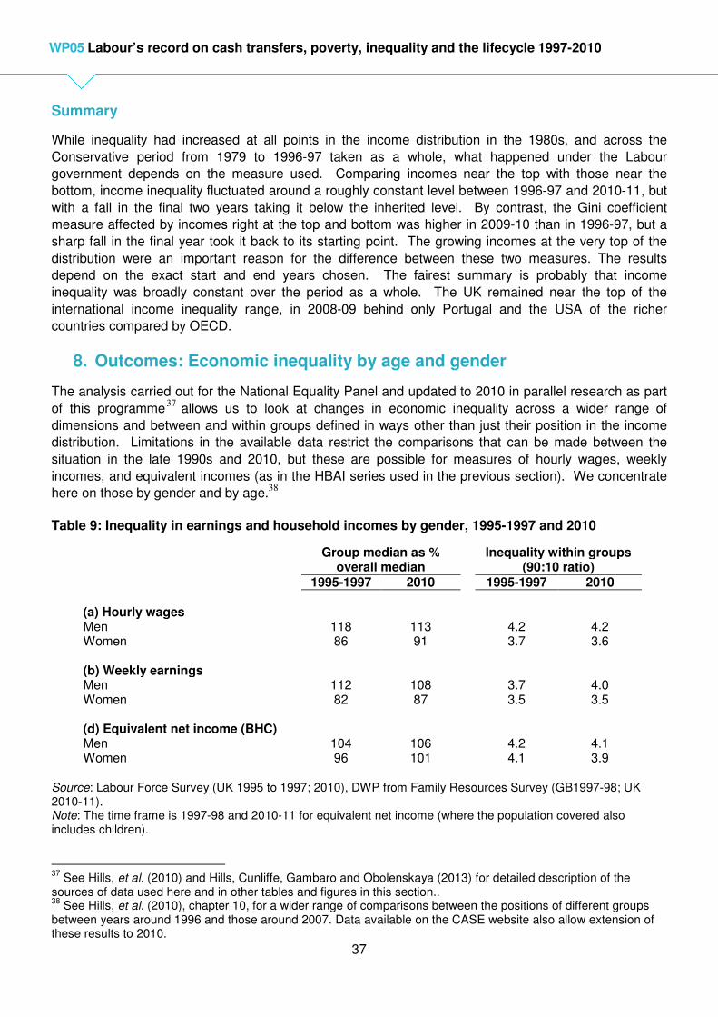
37
WP05 Labour’s record on cash transfers, poverty, inequality and the lifecycle 1997-2010
Summary
While inequality had increased at all points in the income distribution in the 1980s, and across the
Conservative period from 1979 to 1996-97 taken as a whole, what happened under the Labour
government depends on the measure used. Comparing incomes near the top with those near the
bottom, income inequality fluctuated around a roughly constant level between 1996-97 and 2010-11, but
with a fall in the final two years taking it below the inherited level. By contrast, the Gini coefficient
measure affected by incomes right at the top and bottom was higher in 2009-10 than in 1996-97, but a
sharp fall in the final year took it back to its starting point. The growing incomes at the very top of the
distribution were an important reason for the difference between these two measures. The results
depend on the exact start and end years chosen. The fairest summary is probably that income
inequality was broadly constant over the period as a whole. The UK remained near the top of the
international income inequality range, in 2008-09 behind only Portugal and the USA of the richer
countries compared by OECD.
8. Outcomes: Economic inequality by age and gender
The analysis carried out for the National Equality Panel and updated to 2010 in parallel research as part
of this programme37
allows us to look at changes in economic inequality across a wider range of
dimensions and between and within groups defined in ways other than just their position in the income
distribution. Limitations in the available data restrict the comparisons that can be made between the
situation in the late 1990s and 2010, but these are possible for measures of hourly wages, weekly
incomes, and equivalent incomes (as in the HBAI series used in the previous section). We concentrate
here on those by gender and by age.38
Table 9: Inequality in earnings and household incomes by gender, 1995-1997 and 2010
Group median as % overall median
Inequality within groups (90:10 ratio)
1995-1997 2010 1995-1997 2010 (a) Hourly wages Men Women
118 86
113 91
4.2 3.7
4.2 3.6
(b) Weekly earnings Men Women
112 82
108 87
3.7 3.5
4.0 3.5
(d) Equivalent net income (BHC) Men Women
104 96
106 101
4.2 4.1
4.1 3.9
Source: Labour Force Survey (UK 1995 to 1997; 2010), DWP from Family Resources Survey (GB1997-98; UK 2010-11). Note: The time frame is 1997-98 and 2010-11 for equivalent net income (where the population covered also includes children).
37
See Hills, et al. (2010) and Hills, Cunliffe, Gambaro and Obolenskaya (2013) for detailed description of the sources of data used here and in other tables and figures in this section.. 38
See Hills, et al. (2010), chapter 10, for a wider range of comparisons between the positions of different groups between years around 1996 and those around 2007. Data available on the CASE website also allow extension of these results to 2010.

38
WP05 Labour’s record on cash transfers, poverty, inequality and the lifecycle 1997-2010
Table 9 shows inequalities both between men and women and within the two genders on these three
measures. In all three respects overall gender inequality declined substantially, with the median level for
women rising relative to the overall median, and that for men falling. Median equivalent net income for
both men and women were both above the overall median in 2010; the median for children was lower.
Within the two groups, however, inequality as measured by the 90:10 ratio changed less, with the most
notable change being widening inequality in men’s weekly earnings (which occurred after 2006-08) and
a decline in the inequality of women’s equivalent net income.
These overall changes by gender were the product, however, of some very varied patterns when also
split by age. Table 10 concentrates on comparing those in their twenties and in their fifties at the two
dates (with more detail shown in Appendix Table A3). There was a sharp decline in the relative hourly
wages and weekly earnings of men in their twenties, but smaller declines for women. However, the
relative position of men in their late fifties improved, and that for women in both their early and late fifties
improved substantially. Notably, within nearly all of these groups there were generally small declines in
inequality, however, with the main exception of weekly earnings for both men and women in their early
fifties, where inequality increased.
Table 10: Inequality in wages and earnings by gender and selected ages, 1995-1997 and 2010
Group median as % overall median
Inequality within groups (90:10 ratio)
1995-1997 2010 1995-1997 2010 (a) Hourly wages (all employees)
Men 20-24 25-29 50-54 55-59
79 109
131 113
72 96
128 120
2.8 3.1
4.0 4.0
2.5 2.9
4.2 4.0
Women 20-24
25-29 50-54 55-59
73 96
86 79
69 90
95 90
2.6 3.1
3.6 3.4
2.5 2.9
3.6 3.4
(b) Weekly earnings (full-time) Men 20-24
25-29 50-54 55-59
72 101
122 105
66 92
121 112
2.7 2.9
3.5 3.6
2.5 2.8
4.0 3.8
Women 20-24
25-29 50-54 55-59
64 86
82 77
62 84
90 83
2.4 2.7
3.4 3.4
2.5 2.8
3.7 3.4
Source: Table A3.
Table 11 shows related results for equivalent incomes for all individuals by age in 1997-98 and 2010-11.
What is most notable here are the substantial improvements in the relative positions of children aged up

39
WP05 Labour’s record on cash transfers, poverty, inequality and the lifecycle 1997-2010
to 10 and those aged over 60, but the considerable deterioration in the positions of the groups aged from
17 to 30. This is also shown in Figure 14, which shows the median equivalent net incomes of each age
group in 1997-98 and 2010-11. Real incomes grew most for children (particularly younger ones), based
on their households’ incomes, and older adults. Growth in real incomes was very small for those in their
20s. Relative incomes fell back notably for those aged 17-30 (particularly in the period after the crisis in
2007). 39 Incomes for those in their 30s and early 40s grew, however, partly reflecting the extra support
for families with children. The result was a much flatter pattern of incomes by age at the end of the
period than at its start, as Figure 15 makes clear. In 1997-98, median incomes for age groups above 70
ranged from 72-74 per cent of the overall median; by 2010-11 they ranged from 83-86 per cent of it. At
the start the median for age groups under 17 ranged from 84-87 per cent of the overall median; by 2010-
11 they ranged from 89-92 per cent. The range across all age groups was from 72 per cent (76-80s) to
128 per cent (46-50s) in 1997-98. This narrowed to 83 per cent (over 80s) to 117 per cent (51-55s) in
2010-11. In terms of one of the main aims of social security systems – smoothing incomes across the life
cycle – this is a very striking success.
Table 11: Inequality in equivalent net income by age, 1997-98 and 2010-11
Group median as % overall median
Inequality within groups (90:10 ratio)
1997-98 2010-11 1997-98 2010-11 0-5 6-10 11-16 17-20 21-25 26-30 31-35 36-40 41-45 46-50 51-55 55-60 61-65 66-70 71-75 76-80 80+
85 84 87 101 117 119 112 108 116 128 124 106 95 82 74 72 73
90 92 89 91 101 112 116 110 110 115 117 107 102 94 86 84 83
3.8 3.7 3.6 3.9 3.9 4.2 4.4 4.3 4.1 4.2 4.3 4.4 3.9 3.2 3.0 3.2 3.2
3.6 3.4 3.5 3.7 3.7 3.8 4.4 4.3 4.1 4.1 4.4 4.7 4.2 3.2 3.0 3.0 3.0
Source: DWP based on Family Resources Survey (GB 1997-98; UK 2010-11).
At the same time, Table 11 shows that income inequality within most income groups fell or was constant,
with the exception of the (relatively affluent) groups aged between 50 and 65, where inequality
increased. The overall level of inequality shown by the 90:10 ratio in Figure 12 was a small fall – this
was the result of falls in inequality within most age groups, and between the previously poorest age
groups and the median, but partly offset by some increases in inequality within the most affluent age
groups.
39
See Hills et al. (2013), section 9 for more details and discussion.

40
WP05 Labour’s record on cash transfers, poverty, inequality and the lifecycle 1997-2010
Figure 14: Equivalent net income by age (£/week, 2010-11 prices, before housing costs)
Source: DWP based on Family Resources Survey (GB 1997-98; UK 2010-11).Author’s note: This revised figure corrects one included in earlier versions of this paper, where the price adjustment of the two series was inconsistent. Figure 15: Difference in median net income for each age group from overall median, 1997-98 and 2010-11
Source: DWP analysis of Family Resources Survey (GB 1997-98; UK 2010-11).
Summary
Looking over the period as a whole from 1995-1997 (or 1997-98 for net incomes) to 2010, inequalities
between men and women reduced for all three of hourly wages, weekly earnings, and equivalent net
incomes. Within gender groups, the inequality of men’s weekly earnings increased, but inequality in
women’s net incomes declined. A very pronounced feature of the period was that inequalities between
age groups declined, with the median incomes of those aged 16 or under and those aged over 60
increasing towards the overall median. Incomes by 2010-11 varied much less by age than at the start.
In terms of one of the main aims of social security systems – smoothing incomes across the life cycle –
this is a very striking success. This is clearly related to the ways in which policy focused on children and
pensioners. Relative incomes fell back notably for those aged 17-30 (particularly in the period after the
crisis in 2007). While inequalities fell within most age groups, they became wider for those aged 51-65.
-40
-30
-20
-10
0
10
20
30
40
0 6 11 17 21 26 31 36 41 46 51 55 61 66 71 76 80
Start of age range
1997-98
2010-11

41
WP05 Labour’s record on cash transfers, poverty, inequality and the lifecycle 1997-2010
9. Summary and conclusions
New Labour’s aims for poverty and inequality were selective. Child and pensioner income poverty –
including when measured in relative terms – were key priorities, but only alongside much wider
objectives for life chances and social inclusion. Equality was discussed in terms of equality of
opportunity, not of outcomes, and little emphasis put on inequalities at the top of the distribution.
Cash transfers from the state were not seen – rhetorically, at least – as being the central instrument for
achieving these objectives. The default assumption was that benefits and tax allowances and brackets
would be adjusted annually in line with price inflation, not in line with overall living standards. For the
working age population the emphasis was on education, training, ‘making work pay’ and support into
work rather than real increases in social security benefits. By contrast, financial support for families with
children through tax credits in and out of work was made more generous in real terms in pursuit of child
poverty reduction targets.
Overall spending on benefits and tax credits rose in real terms from £114 billion in 1996-97 to £181.5
billion in 2009-10 and £182.8 billion in 2010-11 (at 2009-10 prices), that is by 60-61 per cent. However,
there was not a picture of spending on cash transfers (including tax credits) rising out of control. Until
the crisis cash transfers were kept within a constant share of GDP, just under 11 per cent, with those for
pensioners and aimed at families with children gaining at the expense of other working age benefits. By
2009-10 and 2010-11, working age benefits other than for children were still more than an eighth smaller
as a share of national income than Labour had inherited in 1997. It was spending on the priority areas of
pensioners (including some effects of an ageing population) and families with children where spending
rose as a share on national income, and it was only for the latter where this meant that UK spending
rose significantly in international terms. Overall, spending on cash transfers remained in the bottom half
of the range in relation to national income in all OECD countries, and was one of the two lowest in
Western Europe in 2009.
Labour’s policies resulted in a clear restructuring of the benefit system for those out of work – with
benefits getting closer to the poverty line for families with children and above it for pensioners, but falling
further behind it for others without children. The most striking policy effects came with the first wave of
tax credit reform in 1999, which improved net incomes in relation to the poverty line for families with
children in low paid work. Out of work incomes for families with children rose to some extent at the same
time and continued to rise slowly in relation to the poverty line. Pension reforms took minimum incomes
for pensions up to or even above the poverty line, but working age benefits for those without children
who were out of work fell further below it.
A corollary of such changes might have been expected to be deteriorating work incentives for those with
children. However, the actual overall pattern of incentives to work at all was little different in 2009 -10
than it had been in 1996-97. What did reduce somewhat was the incentive for some of those in work to
earn more, particularly as more working families were affected by the tax credit means-tests: such
families were better off than they would have been without the tax credits, but at the margin gained less
from extra earnings.
Labour’s tax and benefit reforms were redistributive towards those with low incomes on average. The
scale of this was relatively modest when compared with the inherited system (if it had been uprated in
line with measures of income growth). Redistribution was, however, selective, with families with children
and pensioners gaining but workless single people and couples without children losing.

42
WP05 Labour’s record on cash transfers, poverty, inequality and the lifecycle 1997-2010
In terms of outcomes, relative income poverty fell between 1996-97 and 2010-11 to its lowest level for 25
years. For children the fall was by a third (before housing costs) – a considerable change, but falling
short of the government’s target of halving it. For pensioners, it fell by a quarter. Both of these
reductions were in large part due to the redistributive reforms; without them, child poverty would have
risen. But relative poverty rose for working age adults without children – labour market reforms were not
enough to offset the effects of other changes and the linking of working age benefits in general only to
prices. Against fixed real thresholds, poverty increased in the year in which Labour’s period in office
ended, but between 1996-97 to 2010-11 taken as a whole poverty against an absolute standard halved
and fell by nearly two-thirds for children. Notably, whether measured against an absolute or a relative
standard, poverty rates for children, those of working age, and pensioners converged to similar levels,
where there had been wide differences at the start.
In international terms, the decline in relative poverty was not enough greatly to shift the UK’s generally
poor rankings compared to other countries. However, while it had the worst child poverty rate amongst
fifteen older EU members in the late 1990s, by 2010 its poverty rate for those under 18 was only just
above the average for those countries.
Comparing incomes near the top with those near the bottom, income inequality fluctuated around a
roughly constant level between 1996-97 and 2010-11, but with a fall in the final two years taking it below
the inherited level. By contrast, the Gini coefficient measure, affected by incomes right at the top and
bottom, was higher in 2009-10 than in 1996-97, but a sharp fall in the final year took it back to its starting
point in 2010-11. The growing incomes at the very top of the distribution were an important reason for
the difference between these measures. The UK remained near the top of the international income
inequality range for OECD countries, in 2008-09 behind only Portugal and the USA amongst the richer
countries.
Gender inequalities reduced for hourly wages, weekly earnings, and equivalent net incomes. Within
gender groups, the inequality of men’s weekly earnings increased, but inequality in women’s net
incomes declined.
A very pronounced feature of the period was that inequalities between age groups declined, with the
median incomes of those aged 16 or under and those aged over 60 increasing towards the overall
median. Incomes by 2010-11 varied much less by age than at the start. This is clearly related to the
ways in which policy focused on children and pensioners. Relative incomes fell back notably for those
aged 17-30 (particularly in the period after the crisis in 2007).
In one way this paper describes a fairly simple story of policy priorities and outcomes. New Labour
prioritised reductions in child poverty and pensioner poverty, carried out a series of reforms designed to
address them, increased the share of national income going as cash transfers to children and
pensioners, and increased the value of cash transfers to them relative to the poverty line. By the end of
the period both child poverty and pensioner poverty had fallen considerably, whereas child poverty
would have risen without the policy reforms (and pensioner poverty fallen less). New Labour gave much
less prominence to reducing poverty for working age adults without children – and did not see cash
transfers as the way to achieve this – or to reducing overall income inequalities, particularly those at the
top of the distribution. Poverty for working-age adults without children increased, while income inequality
was broadly flat comparing the start and end of Labour’s term in office.
As corollaries of these policies and their outcomes there were also two striking and related outcomes.
First, the risks of poverty converged between children, their parents, pensioners, and other working age
43
WP05 Labour’s record on cash transfers, poverty, inequality and the lifecycle 1997-2010
adults. Being a child or a pensioner no longer meant a much greater poverty risk than others. Second,
while considerable inequalities remained within each age group, there was much less difference in net
incomes between age groups at the end of Labour’s period than at the start. In terms of one of the main
aims of social security systems – smoothing incomes across the life cycle – this could be seen as a very
striking success, albeit one that Labour itself did not emphasise much.
In looking forward to the Coalition’s period in office, Labour’s pension reforms are being carried forward
and in some ways extended, with continued protection of pensions and other old-age benefits, and
linking, for instance, of the basic pension to the higher of earnings and prices. But within an objective of
cuts in overall spending, transfers for working age families – including those for children – are being cut
in real terms and subject to a series of limits and reforms in part designed to reduce their levels.
Labour’s achievements in reducing pensioner poverty, and in smoothing incomes at the later stages of
the life cycle look more likely to endure than those of reducing child poverty and smoothing incomes at
the start of the life cycle.
44
WP05 Labour’s record on cash transfers, poverty, inequality and the lifecycle 1997-2010
Bibliography
Adam, S. and Browne, J. (2010), Redistribution, Work Incentives and Thirty Years of UK Tax and Benefit
Reform, IFS Working Paper 10/24, London: IFS.
Bradshaw, J., Middleton, S., Davies, O., Oldfield, N., Smith, N., Cusworth, L. and Williams, J. (2008), A
Minimum Income Standard for Britain: What people think, York: Joseph Rowntree Foundation.
Brewer, M., Sibieta, l. and Wren-Lewis, L. (2008), Racing Away? Inequality and the evolution of top
incomes, IFS Briefing Note No. 76, London: Institute for Fiscal Studies.
Brewer, M., O’Dea, C., Paull, G. and Sibieta, L. (2009), The living standards of families with children
reporting low incomes, DWP research report no. 577, London: Department for Work and
Pensions.
Bromley, C. (2003), ‘Has Britain become immune to inequality?’ in A. Park et al. (eds) British Social
Attitudes 20th report: Continuity and change over two decades, London: Sage Publications.
Clery, E. (2012), ‘Are tough times affecting attitudes to welfare?’, in British Social Attitudes 29, London:
National Centree for Social Research.
Cribb, J., Joyce, R. and Phillips, D. (2012) Living Standards, Poverty and Inequality in the UK: 2012,
London: Institute for Fiscal Studies.
Department for Social Security (1999), Opportunity for All: Tackling Poverty and Social Exclusion, First
Annual Report, Cm 4445, London: The Stationery Office.
Department for Work and Pensions (DWP) (2012), Households Below Average Income, An analysis of
the income distribution, 1994/95-2010/11, London: Department for Work and Pensions.
Dickens, R., and McKnight, A. (2008), The impact of policy change on job retention and advancement,
CASEpaper 134, London: London School of Economics.
DWP (2013), Benefit and Tax Credit Expenditure in Great Britain, London: Department for Work and
Pensions.
Edmiston (2011), The shifting balance of public and private welfare activity in the United Kingdom, 1979
-2007, CASEpaper 155, London: Centre for Analysis of Social Exclusion, London School of
Economics.
Evandrou, M. and Falkingham, J. (2009), ‘Pensions and income security in later life’ in J. Hills, T. Sefton
and K. Stewart (eds) Towards a More Equal Society? Poverty, inequality and policy since 1997,
Bristol: The Policy Press.
Goodman, A., Myck, M. and Shepard, A. (2003), Sharing in the nation’s prosperity? Pensioner poverty in
Britain, IFS Commentary 93, London: Institute for Fiscal Studies.
Gordon, D. et al (2013), The Impoverishment of the UK: PSE UK first results – living standards, Bristol:
University of Bristol.
Gregg, P.and Wadsworth, J. (2011), The Labour Market in Winter: The state of working Britain, Oxford:
Oxford University Press.
Hills, J., Brewer, M., Jenkins, S., Lister, R., Lupton, R., Machin, S., Mills, C., Modood, T., Rees, T. and
Riddell, S. (2010), An Anatomy of Economic Inequality, Report of the National Equality Panel,
CASE report 60, London: London School of Economics and Government Equalities Office.
Hills (2011),’The changing architecture of the UK welfare state’, Oxford Review of Economic Policy, 27
(4), 589-607.
Hills, J., Cunliffe, J., Gambaro, L. and Obolenskaya, P. (2013), Winners and Losers in the Crisis: The
changing anatomy of economic inequality in the UK, 2007-2010, Social Policy in a Cold Climate
Research Report RR02, London: Centre for Analysis of Social Exclusion, London School of
Economics.
Joyce, R. and Sibieta, L. (2013), ‘An assessment of Labour’s record on inequality and poverty’, Oxford
Review of Economic Policy, 29 (1): 203-226.

45
WP05 Labour’s record on cash transfers, poverty, inequality and the lifecycle 1997-2010
Machin, S. and Van Reenen, J. (2007), Changes in Wage Inequality, CEP Special Report no. 18,
London: Centre for Economic Performance, London School of Economics.
McKnight, A. (2009), ‘More equal working lives? An assessment of New Labour policies’ in J. Hills, T.
Sefton and K. Stewart (eds) Towards a More Equal Society? Poverty, inequality and policy since
1997, Bristol: The Policy Press.
Powell, M. (ed.) (1999), New Labour, new welfare state? The ‘third way’ in British social policy, Bristol:
The Policy Press.
Sefton, T., Hills, J. and Sutherland, H. (2009), ‘Poverty, inequality and redistribution’ in J. Hills, T. Sefton
and K. Stewart (eds) Towards a More Equal Society? Poverty, inequality and policy since 1997,
Bristol: The Policy Press.
Stewart, K. (2009), ‘ “A scar on the soul of Britain”: child poverty and disadvantage under New Labour’ in
J. Hills, T. Sefton and K. Stewart (eds) Towards a More Equal Society? Poverty, inequality and
policy since 1997, Bristol: The Policy Press.
Stewart (2013), Labour’s record on the under 5s, Social Policy in a Cold Climate Working paper 5,
London: Centre for Analysis of Social Exclusion, London School of Economics.
Sutherland , H., Evans, M., Hancock, R., Hills, J. and Zantomio, F. (2008), The impact of benefit and tax
uprating on incomes and poverty, York: Joseph Rowntree Foundation.
Waldfogel , J. (2010), Britain’s War on Poverty, New York: Russell Sage Foundation Press.

46
WP05 Labour’s record on cash transfers, poverty, inequality and the lifecycle 1997-2010
Appendix
Table A1: Benefit and tax credit spending, 1996-97 to 2010-11 (Great Britain)
Source: DWP (2013). Figures are on a consistent basis over time, excluding for instance Income Support ‘board and lodging’ payments for residential care that are now classed within other parts of public spending. They also exclude Council Tax Benefit (but include Housing Benefit).
Note: Spending on non-pensioner benefits is divided here between items aimed at children – mainly Child Benefit, Child Tax Credit and Working Tax Credit for families with children (and their earlier equivalents, such as Family Credit and WFTC) – and other transfers for the working age population (which includes items such as the adult parts of Income Support or Jobseeker’s Allowance, including for parents, as well as Housing Benefit for working age families, and Working Tax Credit for non-parents). Working Tax Credit divided between parents and non-parents using data from HMRC Child and Working Tax Credits 2012, table 1.1.
TotalOther
wk ageChild Pens Total
Other
wk ageChild Pens Total
Other
wk ageChild Pens
96-97 113.8 40.8 16 57 27.4 9.8 3.8 13.7 10.8 3.9 1.5 5.4
97-98 113.1 38.7 16 58.4 27.3 9.3 3.9 14.1 10.3 3.5 1.5 5.3
98-99 113.7 37.7 16.1 59.9 27.2 9 3.9 14.3 10.1 3.3 1.4 5.3
99-00 117.3 36.6 18 62.7 27.6 8.6 4.2 14.8 10 3.1 1.5 5.4
00-01 123.4 36.5 20.8 66.1 29.3 8.7 4.9 15.7 10.1 3 1.7 5.4
01-Feb 129 36.6 22.4 69.9 27.4 7.8 4.8 14.8 10.3 2.9 1.8 5.6
02-Mar 133.4 37.3 23.7 72.4 26.8 7.5 4.8 14.6 10.4 2.9 1.8 5.6
03-Apr 143.4 38.2 30.7 74.5 27.3 7.3 5.8 14.2 10.8 2.9 2.3 5.6
04-May 148.1 38.4 31.9 77.8 26.8 6.9 5.8 14.1 10.9 2.8 2.3 5.7
05-Jun 151.9 38.7 32.4 80.7 26.4 6.7 5.6 14 10.8 2.7 2.3 5.7
06-Jul 152.9 39.2 32.6 81.1 26 6.7 5.6 13.8 10.6 2.7 2.3 5.6
07-Aug 158.2 40.3 33.3 84.6 26 6.6 5.5 13.9 10.6 2.7 2.2 5.7
08-Sep 168.1 42 36.6 89.5 26.2 6.6 5.7 14 11.6 2.9 2.5 6.2
09-Oct 181.5 47.7 39.6 94.3 27 7.1 5.9 14 12.8 3.4 2.8 6.7
10-Nov 182.8 48.1 39.5 95.2 27.2 7.2 5.9 14.2 12.7 3.3 2.7 6.6
£billion at 2009-10 prices % TME %GDP

47
WP05 Labour’s record on cash transfers, poverty, inequality and the lifecycle 1997-2010
Table A2: Public spending on cash transfers as % of GDP, 1995 and 2009, by client group
Total Old age/survivors
Family benefits
Other cash benefits
1995 2009 1995 2009 1995 2009 1995 2009
Finland 20.2 17.0 8.8 9.9 2.7 1.7 8.7 5.4
Austria 19.1 19.2 12.3 13.5 2.6 2.3 4.2 3.4 Poland 17.5 15.2 9.5 11.8 1.1 0.8 6.9 2.6 Belgium 17.3 18.1 9.3 10.0 2.1 1.8 5.9 6.3 France 17.1 18.9 12.0 13.7 1.5 1.4 3.6 3.8 Sweden 16.6 13.7 8.1 8.2 1.9 1.6 6.6 3.9 Denmark 16.4 14.0 6.2 6.1 1.8 1.6 8.4 6.3 Germany 15.4 15.7 10.5 11.2 1.4 1.2 3.5 3.3 Netherlands 15.0 11.4 5.7 5.1 1.0 0.8 8.3 5.5 Spain 14.9 16.0 9.0 9.3 0.3 0.7 5.6 6.0 Luxembourg 14.6 14.4 8.8 7.6 2.2 3.5 3.6 3.3 Italy 14.1 18.9 11.3 15.5 0.4 0.8 2.4 2.6 Norway 12.9 11.6 5.5 5.4 2.2 1.4 5.2 4.8 Slovak Republic 11.8 11.3 6.3 7.0 2.4 1.6 3.1 2.7 Greece 11.6 15.7 9.6 13.1 0.8 1.0 1.2 1.6 New Zealand 11.6 10.6 5.7 4.7 2.0 2.5 3.9 3.4 Canada 11.0 10.0 4.7 4.5 0.8 0.9 5.5 4.6 Portugal 11.0 16.9 7.2 12.3 0.6 1.0 3.2 3.6 Ireland 10.8 13.8 4.4 5.1 2.0 3.3 4.4 5.4 United Kingdom 10.7 11.8 5.3 6.2 1.8 2.5 3.6 3.1 Czech Republic 10.4 12.7 6.1 8.3 1.8 1.2 2.5 3.2 Israel 9.4 9.4 4.8 5.0 1.7 1.1 2.9 3.3 Australia 9.0 8.0 3.7 3.5 2.1 1.9 3.2 2.6 United States 8.3 9.6 6.3 6.8 0.3 0.1 1.7 2.7 Chile 7.9 5.4 6.7 3.6 0.4 0.7 0.8 1.1 Japan 7.5 12.4 6.0 10.2 0.2 0.5 1.3 1.7 Iceland 6.3 7.7 2.4 1.7 1.5 1.6 2.4 4.4 Turkey 3.7 7.3 2.7 6.8 0.2 0.0 0.8 0.5 Korea 1.6 3.4 1.2 2.1 0.0 0.0 0.4 1.3 Mexico 1.2 2.7 0.7 1.7 0.0 0.4 0.5 0.6
Source: OECD social expenditure dataset (extracted 2 April 2013). For UK, 2009 figures are for financial year 2009-10 and family benefits include tax credits.
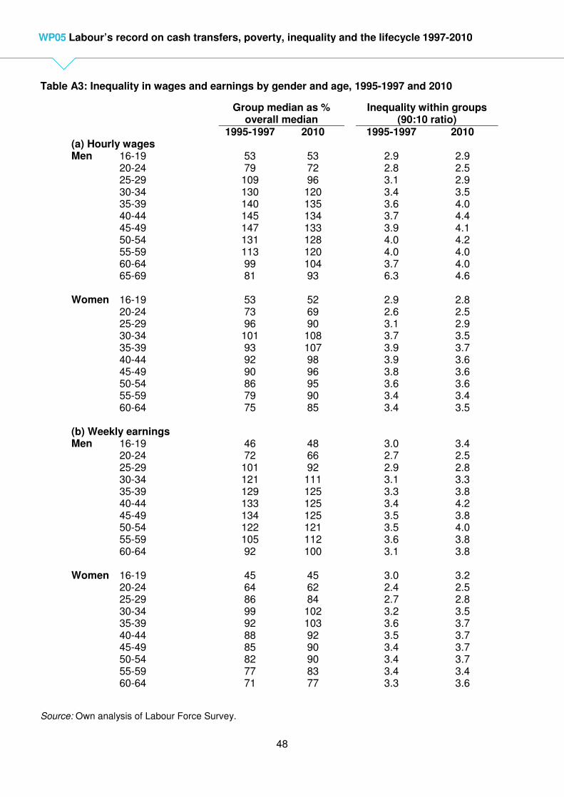
48
WP05 Labour’s record on cash transfers, poverty, inequality and the lifecycle 1997-2010
Table A3: Inequality in wages and earnings by gender and age, 1995-1997 and 2010
Group median as % overall median
Inequality within groups (90:10 ratio)
1995-1997 2010 1995-1997 2010 (a) Hourly wages Men 16-19
20-24 25-29 30-34 35-39 40-44 45-49 50-54 55-59 60-64 65-69
53 79 109 130 140 145 147 131 113 99 81
53 72 96 120 135 134 133 128 120 104 93
2.9 2.8 3.1 3.4 3.6 3.7 3.9 4.0 4.0 3.7 6.3
2.9 2.5 2.9 3.5 4.0 4.4 4.1 4.2 4.0 4.0 4.6
Women 16-19
20-24 25-29 30-34 35-39 40-44 45-49 50-54 55-59 60-64
53 73 96 101 93 92 90 86 79 75
52 69 90 108 107 98 96 95 90 85
2.9 2.6 3.1 3.7 3.9 3.9 3.8 3.6 3.4 3.4
2.8 2.5 2.9 3.5 3.7 3.6 3.6 3.6 3.4 3.5
(b) Weekly earnings Men 16-19
20-24 25-29 30-34 35-39 40-44 45-49 50-54 55-59 60-64
46 72 101 121 129 133 134 122 105 92
48 66 92 111 125 125 125 121 112 100
3.0 2.7 2.9 3.1 3.3 3.4 3.5 3.5 3.6 3.1
3.4 2.5 2.8 3.3 3.8 4.2 3.8 4.0 3.8 3.8
Women 16-19
20-24 25-29 30-34 35-39 40-44 45-49 50-54 55-59 60-64
45 64 86 99 92 88 85 82 77 71
45 62 84 102 103 92 90 90 83 77
3.0 2.4 2.7 3.2 3.6 3.5 3.4 3.4 3.4 3.3
3.2 2.5 2.8 3.5 3.7 3.7 3.7 3.7 3.4 3.6
Source: Own analysis of Labour Force Survey.