Embed Size (px)
Citation preview

© 2000-2010 Z-Space Technologies, Inc.All Rights Reserved
ITScriptNet Full Users Guide
Create Powerful Data CollectionSolutions - Simply and Easily
Version 3.2

ITScriptNet Full Users Guide
© 2000-2010 Z-Space Technologies, Inc.All Rights Reservedwww.z-space.com
No part of this User Guide, including illustrations and specifications, may be reproduced orused in any form or by any means without written permission from Z-Space Technologies, Inc.
The material contained in this User Guide is subject to change without notice.
Batch, Batch Plus, and OMNI are trademarks of Z-Space Technologies, Inc. All RightsReserved.
ITScript Net and Ready-To-Go are registered trademarks of Z-Space Technologies, Inc.
All other products mentioned herein are the copyrights of their respective companies.
Printed in USA.

3Contents
3
© 2000-2010 Z-Space Technologies, Inc.
Table of Contents
Part I Software License 8
Part II ITScriptNet Concepts 12
................................................................................................................................... 131 Introduction
................................................................................................................................... 142 Online Help
................................................................................................................................... 153 Technical Support
................................................................................................................................... 164 ITScriptNet Licenses
................................................................................................................................... 175 Installation
................................................................................................................................... 226 System Console
.......................................................................................................................................................... 28Client Installation
.......................................................................................................................................................... 30ActiveSync Guest Only Mode
.......................................................................................................................................................... 31Install SQL CE
................................................................................................................................... 327 PC License Registration
................................................................................................................................... 418 Device License Registration
................................................................................................................................... 449 Installed Components
................................................................................................................................... 4610 Getting Started
................................................................................................................................... 4711 Windows Vista Notes
Part III Program Design 49
................................................................................................................................... 501 Program Design Concepts
................................................................................................................................... 522 Prompt Design
.......................................................................................................................................................... 60Prompt Settings
.......................................................................................................................................................... 63Button Element
.......................................................................................................................................................... 70Calendar Input Element
.......................................................................................................................................................... 78Checkbox Element
.......................................................................................................................................................... 87Combobox Element
.......................................................................................................................................................... 102Date/Time Picker Element
.......................................................................................................................................................... 111Digital Ink Element
.......................................................................................................................................................... 120GPSLocation
.......................................................................................................................................................... 123Grid Element
......................................................................................................................................................... 138Grid Column Settings
.......................................................................................................................................................... 140Image Capture Element
.......................................................................................................................................................... 149Image Element
.......................................................................................................................................................... 153Input Text Element
.......................................................................................................................................................... 166KeypadElement
......................................................................................................................................................... 175KeypadCustomButton
.......................................................................................................................................................... 176Listbox Element
.......................................................................................................................................................... 189Multilist Element
.......................................................................................................................................................... 198Radio Button Element
.......................................................................................................................................................... 206Shape Element
.......................................................................................................................................................... 211Status Indicator Element
.......................................................................................................................................................... 220Text Display Element

ITScriptNet Full Users Guide4
© 2000-2010 Z-Space Technologies, Inc.
.......................................................................................................................................................... 226Text List Element
.......................................................................................................................................................... 232Timer Element
.......................................................................................................................................................... 233Advanced Barcode Settings
.......................................................................................................................................................... 236Media Element
................................................................................................................................... 2413 In-Prompt Scripts
.......................................................................................................................................................... 243Script Editor Screen
.......................................................................................................................................................... 245Debugging In-Prompt Scripts
................................................................................................................................... 2484 Configuring Validation Files
.......................................................................................................................................................... 250Validation File Properties
.......................................................................................................................................................... 252Validation File Indexes
.......................................................................................................................................................... 254Auto-Generate Validation Files
.......................................................................................................................................................... 259Remote Validation Files
................................................................................................................................... 2635 Configure Receive
.......................................................................................................................................................... 272Customize Field Layout
.......................................................................................................................................................... 273Data Processing Scripts
................................................................................................................................... 2766 OMNI Communications Settings
................................................................................................................................... 2787 Language Support
................................................................................................................................... 2798 Using SQL Compact Edition
................................................................................................................................... 2809 Designing for High Resolution Devices
................................................................................................................................... 28110 Override INI Files
Part IV Menus 285
................................................................................................................................... 2861 File Menu
................................................................................................................................... 2882 Edit Menu
................................................................................................................................... 2893 Program Menu
................................................................................................................................... 2914 Device Menu
................................................................................................................................... 2925 Prompts Menu
................................................................................................................................... 2936 View Menu
Part V Screens 297
................................................................................................................................... 2981 Auto-Generate ODBC Validation Files
................................................................................................................................... 3032 Color Selection Screen
................................................................................................................................... 3043 Compare Programs
................................................................................................................................... 3064 Configure Receive
................................................................................................................................... 3155 Configuring Validation Files
................................................................................................................................... 3176 Customize Field Layout
................................................................................................................................... 3187 Data Procesing Scripts
................................................................................................................................... 3218 GPS Tracking
................................................................................................................................... 3249 Script Debugger
................................................................................................................................... 32710 Snap To Grid
................................................................................................................................... 32811 Hot Key Editor
................................................................................................................................... 33012 Find
................................................................................................................................... 33113 Global Scripts

5Contents
5
© 2000-2010 Z-Space Technologies, Inc.
................................................................................................................................... 33214 Package Program
................................................................................................................................... 33315 Print Files
................................................................................................................................... 33516 Program Events
................................................................................................................................... 33617 Program Settings
................................................................................................................................... 33918 Protect Password
................................................................................................................................... 34019 Query Editor
................................................................................................................................... 34120 Receive File
................................................................................................................................... 34221 Remote Scripts
................................................................................................................................... 34322 Script Editor
................................................................................................................................... 34523 Select Device
................................................................................................................................... 34624 Send Program to Device
................................................................................................................................... 34725 Simulator
................................................................................................................................... 34926 Style Editor
................................................................................................................................... 35127 Support Files
................................................................................................................................... 35228 Text Delimiters
................................................................................................................................... 35329 Validation Indexes
................................................................................................................................... 35530 Validation Files
Part VI Writing Scripts 358
Part VII Function Reference 363
................................................................................................................................... 3641 String Functions
................................................................................................................................... 3712 Conversion Functions
................................................................................................................................... 3723 Logical Functions
................................................................................................................................... 3744 Math Functions
................................................................................................................................... 3775 Date/Time Functions
................................................................................................................................... 3826 Lookup Functions
................................................................................................................................... 3907 Response Functions
................................................................................................................................... 3918 Notification Functions
................................................................................................................................... 3969 Print Functions
................................................................................................................................... 39910 Other Functions
................................................................................................................................... 40411 Serial Functions
................................................................................................................................... 40712 GPS Functions
................................................................................................................................... 41013 File Functions
................................................................................................................................... 41214 Element Functions
................................................................................................................................... 41915 Omni Functions
................................................................................................................................... 42816 Keywords
Part VIII Script Sequencing Reference 432
Part IX Utilities 446

ITScriptNet Full Users Guide6
© 2000-2010 Z-Space Technologies, Inc.
................................................................................................................................... 4471 Download Utility
................................................................................................................................... 4482 Device Configuration Utility
................................................................................................................................... 4513 Upload Utility
................................................................................................................................... 4534 PC Client
................................................................................................................................... 4555 PC Client ActiveX Control
................................................................................................................................... 4576 Using Auto-Download
................................................................................................................................... 4607 Deployment Override Utility
................................................................................................................................... 4618 Using the ActiveX Controls
Part X Omni Concepts 464
................................................................................................................................... 4651 Understanding Omni Communications
................................................................................................................................... 4672 Designing OMNI Programs
................................................................................................................................... 4703 Using RAS to Communicate
................................................................................................................................... 4724 OMNI Communications Server
................................................................................................................................... 4735 Omni Configuration Utility
................................................................................................................................... 4846 Intermittent and Continuous Connections
Index 486

ITScriptNet Full Users Guide
Part
I

ITScriptNet Full Users Guide8
© 2000-2010 Z-Space Technologies, Inc.ITScriptNet Full Users Guide
1 Software License
READ THIS BEFORE USING THE NOTED PROGRAMSThank you for selecting ITScriptNet® from Z-Space Technologies, Inc. (“Z-Space”). Please read the followingLicense Agreement below before registering the serial number. If you do not accept these terms, return theproduct unregistered with proof of purchase to the point of purchase for a complete refund. Only if you acceptthese terms should you register the software.
The enclosed copy of ITScriptNet® is never sold. It is licensed by Z-Space to the original customer and to anysubsequent licensee of his or her for use in accordance with the terms set forth below. BY REGISTERINGTHIS SOFTWARE YOU ARE INDICATING ACCEPTANCE OF THESE TERMS. Otherwise, you may return thesoftware and User Guide within ten (10) days to the place where you obtained it for a full refund. Under theterms of this license agreement:
YOU MAY:For PC-Based Licenses:1. Load and use the software on any computer as long as it is used on only one computer by one user at atime. The software serial number can only be registered once on a single computer. The software cannot beshared over a network. If more than one computer requires the use of the software, then additional licensefees will be required for each computer.2. Communicate with the Remote Host Server (ITScriptNet® OMNI™ Server) residing on the host computer withonly the number of terminals as there are terminal licenses registered on the host computer. Additionalterminal licenses can be purchased and added to the host computer to increase the number of terminals thatcan be configured to communicate with the host computer. Communication by a terminal with the hostcomputer can be carried by a network and does not violate item 1) above. [This Provision applies to theITScriptNet® OMNI™ edition only.]3. Move a registered license from one computer to another by unregistering the license from the licensedcomputer via the method provided in the software, then re-registering the license on a different computer.Compliance with paragraph 1 (Load and Use) above must be maintained. There are no restrictions as to thenumber of times a license can be registered and unregistered.
For Device-Based Licenses:4. Load and Use the software on any number of computers without a serial number.5. License each device that will be communicating with a computer. Each device license can be registered ona single terminal. Once registered on a terminal, a Device License can not be removed or assigned to adifferent terminal. A terminal with a Device License can communicate with any computer running the softwarewhether that computer has a serial number or not.
For All Licenses:6. Copy the software for back-up purposes only. You may make up to three (3) copies of the software for back-up purposes. All copies must contain the copyright notice printed on the label of the CD containing the originalcopy of the software.7. Transfer the software and license permanently to another person if that person agrees to accept all of theterms and conditions of this Agreement. If you transfer the software, you must at the same time either transferall copies of the software to the same person or destroy any copies not transferred.8. Terminate this license by destroying the original and all copies of the software in whatever form.
YOU MAY NOT:1. Loan, rent, lease, give, sublicense or otherwise transfer the software (or any copy), in whole or in part, to anyother person, except as noted in paragraph 5 (Transfer) above.2. Copy or translate the User Guide included with the software.3. Copy, alter, translate, decompile, or reverse engineer the software, including but not limited to, modify thesoftware to make it operate on non-compatible hardware.4. Remove, alter or cause not to be displayed, any copyright notices or startup messages contained in theprograms or documentation.

Software License 9
© 2000-2010 Z-Space Technologies, Inc. ITScriptNet Full Users Guide
THIS LICENSE WILL TERMINATE AUTOMATICALLY if you fail to comply with the terms and conditions set forthabove.
TermThe license is effective until terminated. You may terminate it at any time by destroying the programs togetherwith all copies, modifications and merged portions in any form. It will also terminate upon conditions set forthelsewhere in this Agreement or if you fail to comply with any term or condition of this Agreement. You agreeupon such termination to destroy the programs together with all copies, modifications and merged portions inany form.
Limited Warranty
What is covered?Z-Space warrants to the original customer that (i) the CD on which the enclosed software is recorded is freefrom defects in materials and workmanship under normal use, and (ii) the software will perform substantiallyin accordance with the enclosed User Guide. EXCEPT AS SPECIFIED IN THIS PARAGRAPH, THERE ARE NOWARRANTIES OF ANY KIND, EITHER EXPRESS OR IMPLIED, INCLUDING, BUT NOT LIMITED TO, THEIMPLIED WARRANTIES OF MERCHANTABILITY AND FITNESS FOR A PARTICULAR PURPOSE, AND THEPROGRAMS, DOCUMENTATION AND OTHER FILES ON THE CD ARE PROVIDED “AS IS.”(Some states do not allow the exclusion of implied warranties, so the above exclusion may not apply to you.)
How long does this warranty last?This Limited Warranty continues for sixty (60) days from the date of delivery of the software to the originalcustomer (“Warranty Period”).
What will Z-Space do?1. Z-Space will replace any CD which proves defective in materials or workmanship, if you return the CDpostpaid to Z-Space during the Warranty Period with a dated proof of purchase.2. Z-Space will, at its option, either replace the CD or correct any software that does not performsubstantially in accordance with the enclosed User Guide if, during the Warranty Period, (i) you notify ZSpace inwriting of any claimed defects in the software, (ii) you return the CD containing the software to ZSpace, and (iii)Z-Space is able to duplicate the defects on its computer system.3. If Z-Space is unable to replace a defective CD or if Z-Space is unable to provide corrected software within areasonable time, Z-Space will, at its option, either replace the software with functionally equivalent software orrefund the license fees paid by you. THESE ARE YOUR SOLE AND EXCLUSIVE REMEDIES for any and allclaims that you may have against Z-Space arising out of or in connection with this product, whether made orsuffered by you or another person and whether based in contract or tort. 4. IN NO EVENT WILL Z-SPACE BE LIABLE TO YOU OR ANY OTHER PARTY FOR DIRECT, INDIRECT,GENERAL, SPECIAL, INCIDENTAL, CONSEQUENTIAL, EXEMPLARY OR OTHER DAMAGES ARISING FROMTHE USE OF OR INABILITY TO USE THE SOFTWARE OR FROM ANY BREACH OFTHIS WARRANTY, EVEN IFZ-SPACE HAS BEEN ADVISED OF THE POSSIBILITY OF SUCH DAMAGES. (Some states do not allow theexclusion or limitation of incidental or consequential damages, so the above exclusion or limitation may notapply to you.) In no event shall Z-Space’s total liability exceed the amount you paid in license fees for the rightto use a single copy of this software. Z-Space’s software pricing reflects the allocation of risk and limitations onliability contained in this Limited Warranty.
What additional provisions should I be aware of?1. Because it is impossible for Z-Space to know the purposes for which you acquired this software or the usesto which you will put this software, you assume full responsibility for the selection of the software, and for itsinstallation and use and the results of that use.2. While every reasonable effort has been made to insure that you will receive software that you can use andenjoy, Z-Space does not warrant that the functions of the software will meet your requirements or that theoperation of the software will be uninterrupted or error free. Due to the complex nature of computer programs,the programs in this package (like all large programs) will probably never be completely error free.3. This Limited Warranty does not cover any CD which has been the subject of abuse or damages, nor does it

ITScriptNet Full Users Guide10
© 2000-2010 Z-Space Technologies, Inc.ITScriptNet Full Users Guide
cover any software which has been altered or changed by anyone other than Z-Space.4. Z-Space is not responsible for problems caused by changes in the operating characteristics of the hardwareor operating system software you are using which are made after the release date of this version of ITScriptNet® with any other software.5. You agree to comply with all applicable international and national laws that apply to the products as well asend-user, end-use and destination restrictions issued by governments.6. If the SOFTWARE is labeled as an upgrade, you must be properly licensed to use a product identified by Z-Space as being eligible for the upgrade in order to use the software. Software labeled as an upgrade replacesand will disable the original software which was initially loaded on the computer. After upgrading, you may nolonger use the software that formed the basis for your upgrade eligibility. You may use the resulting upgradedproduct only in accordance with the terms of this license agreement and only with a computer that has alsoregistered the original software.7. This agreement constitutes the entire agreement between you and Z-Space and supersedes any priorunderstandings and agreements, either oral or written. It shall be interpreted under the laws of the State ofOhio.8. This warranty gives you specific rights and you may also have other rights which vary from state to state.9. No action for breach of warranty may be commenced more than one (1) year following the expiration date ofthe above Limited Warranty.
Should you have any questions concerning this Agreement, you may contact Z-Space by writing to Z-SpaceTechnologies, Inc. 26933 Westwood Road, Suite 100, Westlake, Ohio 44145.

ITScriptNet Full Users Guide
Part
II

ITScriptNet Full Users Guide12
© 2000-2010 Z-Space Technologies, Inc.ITScriptNet Full Users Guide
2 ITScriptNet Concepts
Introduction
Online Help
Technical Support
Licensing
Installation
System Console
PC License Registration
Device License Registration
Installed Components
Getting Started

ITScriptNet Concepts 13
© 2000-2010 Z-Space Technologies, Inc. ITScriptNet Full Users Guide
2.1 Introduction
Welcome to ITScriptNet®, the easy-to-use software that allows you to quickly and easily create datacollection solutions for portable terminals. ITScriptNet is designed to be easy-to-use, yet powerfulenough to support the most sophisticated applications. With ITScriptNet you will be designing datacollection programs in no time! Designing your program is simple - you can see the flow of the datacollection program graphically and can dictate exactly how each of your responses and fields are to beanswered. ITScriptNet includes sample applications that demonstrate common data collection tasks. ITScriptNet even includes a Simulator so you can try out your program at the PC before deploying yoursolution to the actual data collection terminals. ITScriptNet supports a variety of portable data terminals. For a complete listing of supported terminals,please refer to our web site http://www.z-space.com. There are two editions in the ITScriptNet product family - Batch Plus and Omni (Realtime). TheITScriptNet Batch Plus product is used for applications that collect a number of data records and thenprocess them in a Batch. ITScriptNet® OMNI is the RF-enabled evolution of the ITScriptNet productfamily that includes wireless communication functionality for radio frequency (RF) applications, andallows you to create real-time RF data collection solutions. Every feature in ITScriptNet® Batch Plus isincluded in ITScriptNet® OMNI, making it the all-inclusive tool for data collection. Regardless of the features you need for your data collection solution and the ITScriptNet product you areusing, you will find that ITScriptNet is easy to use, extremely powerful and flexible.

ITScriptNet Full Users Guide14
© 2000-2010 Z-Space Technologies, Inc.ITScriptNet Full Users Guide
2.2 Online Help
ITScriptNet provides two types of Online Help, and all of the topics discussed in the User Guide can beaccessed through the Online Help. The Online Help is built-in to the program and can be accessed fromthe Main Menu, or by clicking on any Help… button throughout the program. The second type of helpis the context-sensitive help designed to quickly provide basic information on any screen control byclicking on the ? button, and then clicking on a screen control.
Help Button

ITScriptNet Concepts 15
© 2000-2010 Z-Space Technologies, Inc. ITScriptNet Full Users Guide
2.3 Technical Support
If you need technical support on this product, please contact your reseller or hardware manufacturer. You can also access technical support at http://www.z-space.com, or by emailing [email protected], or by calling (440) 899-7370 between the hours of 9:00 a.m. to 5:00 p.m. EST.
ITScriptNet Web Sitehttp://www.z-space.com
ITScriptNet Knowledge Basehttp://www.z-space.com/kb
ITScriptNet Forumshttp://www.z-space.com/forums

ITScriptNet Full Users Guide16
© 2000-2010 Z-Space Technologies, Inc.ITScriptNet Full Users Guide
2.4 ITScriptNet Licenses
ITScriptNet requires a license for each PC it is installed on in order to run the program without limitation.By purchasing and registering the proper product licenses, the user will have full access to all of thefunctions and features of the licensed software. Each license can only be registered on one computer,although a license may be moved from one computer to another by un-registering the license and re-registering on the new computer.
Demo Mode LimitationsFor batch data collection programs, only 5 records may be collected. For RF data collection programs,the OMNI communications server can be configured for only one data collection program, and willrespond to remote calls from one terminal for 30 minutes per server session. This is typically enoughaccess to properly demonstrate the capabilities of the OMNI software.
PC Based LicensesITScriptNet OMNI consists of three (3) separate licensed software components:
ITScriptNet Program DesignerThe Program Designer is used to develop data collection programs for the terminals. The software islicensed on a per PC basis. A user may develop unlimited programs with a single Program Designerlicense that can be deployed in conjunction with Runtime and Client licenses.
ITScriptNet Batch Plus or OMNI RuntimeAn ITScriptNet Runtime license can be obtained for a PC that does not need program design features. Uploading data collection programs and downloading data is accomplished using separate utilities in theRuntime package. The ITScriptNet OMNI Host Server requires an OMNI Runtime license to operate. AProgram Designer license cannot be used to run the OMNI Host Server.
ITScriptNet ClientThe Client is the application that runs on the portable data collection terminal. No additional license isrequired on the Client to communicate with the Upload and Download utilities (Batch Plus), as long as aRuntime license has been registered on the PC. For Clients connecting to the OMNI Host Server, theHost Server manages the number of clients that can connect to the server.
Device LicensesDevice Licenses are a separate way for devices to be licensed for connection to the Upload andDownload utilities, or the OMNI Host Server. Device Licenses are registered on the client device insteadof the PC. A Device Licensed client can communicate with the PC utilities without requiring a Runtimelicense on the PC.
Please note that you still must design your data collection program with a Program Designer that has aPC license. Otherwise your program will still have the demo mode limitation.
License PackagesThe licenses are packaged under different products:
ITScriptNet OMNI Complete - Includes one Generator license, one Runtime license and one 5-packClient license.ITScriptNet OMNI Generator - Includes one Generator license.ITScriptNet OMNI Runtime - Includes one Runtime license and one 5-pack Client license.ITScriptNet OMNI Client - Includes one license for a quantity of clients in packs of: 5, 10, 25, 50, 75,100, 250 or 500.ITScriptNet Device Licenses - license one client device for communications with the PCcommunications utilities.

ITScriptNet Concepts 17
© 2000-2010 Z-Space Technologies, Inc. ITScriptNet Full Users Guide
2.5 Installation
Installation RequirementsITScriptNet has the following installation requirements:
Windows 2000, Windows XP, Windows Vista, or higherMinimum RAM: 16 MB (32 MB for Windows NT, Windows 2000, Windows XP)Minimum hard drive space required: 60 MB for full installation.Screen resolution of 800x600 or higher recommended.One or more supported portable data collection terminals configured for batch data collection or RFdata collectionAvailable serial or USB Port for communication with the portable data collection unit for batch datacollectionWireless LAN/Access Point configured for communication with portable terminals for RF datacollection.The Online Help system requires Internet Explorer 4.0 or higher for HTML. If you do not have InternetExplorer 4.0 or higher, the Online Help system may not function, although the rest of the program will.
If your system does not meet these requirements, the program may not run properly.
Installing ITScriptNetITScriptNet uses an installation setup program to step you through the installation process. To install the program, put the CD-ROM in your drive. The setup program will run automatically. If itdoes not, then selectStart and point to Run..., and enter x:\setup\setup.exe (where x: is the letter of your CD-ROM drive) andclick on OK.
Run the installation program

ITScriptNet Full Users Guide18
© 2000-2010 Z-Space Technologies, Inc.ITScriptNet Full Users Guide
After the setup program is done with its initialization, you will see the Welcome screen. Click Next tocontinue the installation.
Installation Introduction
The next screen is the Software License Agreement screen. Please read the license agreement, if youagree, select "I accept the terms..." and click Next. If you select "I do not accept" and click Next, theinstallation program will exit.
License Agreement

ITScriptNet Concepts 19
© 2000-2010 Z-Space Technologies, Inc. ITScriptNet Full Users Guide
The next screen shows the location where the program will be installed. You can click on Change... toput the program into a different location. Click Next to accept the destination folder.
Select installation folder
Now select the installation type. If you want to install all features and clients, select the Completeoption. If you want to control which options and clients are installed, select the Custom option. Thenclick Next to continue.
Select Complete or Custom Installation

ITScriptNet Full Users Guide20
© 2000-2010 Z-Space Technologies, Inc.ITScriptNet Full Users Guide
If you select the Custom option, you will see a list of the components to install. You can enable ordisable the installation of each component individually.
Select features to install
Once you have selected the options to be installed, the Confirmation dialog will be displayed. Click the Install button to install the software.
Confirm the installation

ITScriptNet Concepts 21
© 2000-2010 Z-Space Technologies, Inc. ITScriptNet Full Users Guide
As the installation proceeds, the progress will be displayed.
Installation Status
When the installation completes, the Completion dialog will be displayed. If you would like to launchthe ITScriptNet System Console, you can check the Launch ITScriptNet checkbox before clickingFinish.
Installation Complete
Congratulations! Setup is complete! Depending on the edition of ITScriptNet you are using, you will have various programs installed. Thereare communications utilities for sending programs and data to the terminals and receiving collected datain batch mode. The upload utility will send a data collection program and associated files to a terminalwithout running the full generator design program. Other installed items on the program start menuinclude installation programs for the client software that runs on the mobile terminal. You can find moreinformation about working with a specific model of data collection terminals in dedicated sections of thisUser Guide.

ITScriptNet Full Users Guide22
© 2000-2010 Z-Space Technologies, Inc.ITScriptNet Full Users Guide
2.6 System Console
The ITScriptNet installation process will place a shortcut to the ITScriptNet System Console on yourdesktop.
You can also navigate from the Start button as follows:
Start -> Programs -> ITScriptNet -> ITScriptNet System Console
System Console
Shortcut
System Console OverviewThe System Console allows you to easily view and navigate the setup, program design, andcommunication links in ITScriptNet. The initial view displays a list of the Program components whichmake up the software.
System Console Main View
Selecting an item in the pane on the left will display its functions and a link to launch that component inthe pane on the right. Each of the buttons at the top of the left pane will drop down more componentlinks for Help and Support, extensive Documentation, OMNI Communications, and Licensing.
For detailed information on each component in this view, please refer to the corresponding sections inthis User Guide. If you have downloaded a demo version of the software and prefer to run the ProgramDesigner before registration of the product, a registration window will appear. You will be able to run thesoftware prior to registration by clicking on the Continue button to skip the registration process andbegin the program.

ITScriptNet Concepts 23
© 2000-2010 Z-Space Technologies, Inc. ITScriptNet Full Users Guide
What To Do FirstAfter ITScriptNet has been installed to your computer, you must register the software in order to removethe demo mode limitations.
LicensingIn the Console view, click on the Licensing button on the left, and the Registration window will appearon the right. For more information on registration, see the PC License Registration section in thismanual.
System Console Licensing Tab

ITScriptNet Full Users Guide24
© 2000-2010 Z-Space Technologies, Inc.ITScriptNet Full Users Guide
Device Configuration After you have registered your products, you will need to configure your devices. The System Consoleprovides a link to make this process quick and easy! In the left pane of the Console under Programs,select Configure Devices.
Configure Devices
In the right pane, a drop-down box is available which displays a list of device clients installed with yourOMNI software. Select your device type from the list. Adjacent to the device drop-down box is a link to Install Client to Device. Clicking this link will launch the client installation. Follow the on-screeninstructions to install the client to your device.
You can also configure your device with the Device Configuration Utility, Configure ActiveSync, or InstallSQL CE to your device (if needed).

ITScriptNet Concepts 25
© 2000-2010 Z-Space Technologies, Inc. ITScriptNet Full Users Guide
DocumentationThe System Console Documentation link displays a list of the PDF documents installed with thesoftware. Selecting a document link in the left pane displays the document in the right pane. This is afast and easy way to access the many Omni guides available.
Documentation Tab Selected

ITScriptNet Full Users Guide26
© 2000-2010 Z-Space Technologies, Inc.ITScriptNet Full Users Guide
CommunicationsThe System Console OMNI Communications link displays a drop-down list of OMNI communicationscomponents. Clicking on each link displayed in the right pane will launch the respective process. Formore detailed instructions regarding Omni Communications, please refer to the respective sections inthis User Guide.
System Console OMNI Communications Tab

ITScriptNet Concepts 27
© 2000-2010 Z-Space Technologies, Inc. ITScriptNet Full Users Guide
DeploymentThis tab has options related to the deployment of ITScriptNet applications. For more information on theOverride Deployment utility, see the Utilities section of the User Guide.
Deployment Tab

ITScriptNet Full Users Guide28
© 2000-2010 Z-Space Technologies, Inc.ITScriptNet Full Users Guide
2.6.1 Client Installation
When you select the type of client to install, the client installation program will be launched. Theprogram connects to the device over ActiveSync to install the client program. If an ActiveSyncconnection is not established, the program will wait until it is.
Waiting for an ActiveSync connection
Once the installation program has connected to the device, you will be prompted to select theinstallation location on the device.
Select an installation location
The available installation locations will depend on the device type, and whether there are Storage Cardsinstalled. The default installation path will always be the device's persistent storage area, if it has one. You can drop down the combobox to see the available locations.
Available locations

ITScriptNet Concepts 29
© 2000-2010 Z-Space Technologies, Inc. ITScriptNet Full Users Guide
Once the installation location has been selected, press the Install button to start the process. The fileswill be copied to the device and progress displayed.
Installation Progress
When the installation is complete, the program will display a confirmation message and then close.

ITScriptNet Full Users Guide30
© 2000-2010 Z-Space Technologies, Inc.ITScriptNet Full Users Guide
2.6.2 ActiveSync Guest Only Mode
ActiveSync is used by ITScriptNet to communicate between the PC and a portable device for installationand configuration. Ordinarily, when a device is connected to the PC, ActiveSync will attempt toestablish a Partnership which allows synchronizing email, contacts, and calendar items from MicrosoftOutlook. For data collection devices, this partnership is usually not required. To prevent ActiveSyncfrom asking to establish a partnership every time a device is connected, you can use the SystemConsole to set Guest-Only mode. Once this mode is set, ActiveSync will simply connect all devices asGuests and not prompt for a Partnership.
This mode applies to ActiveSync running on Windows XP and lower. Windows Vista and higher use theMobile Device Center, which does not have a Guest Mode.

ITScriptNet Concepts 31
© 2000-2010 Z-Space Technologies, Inc. ITScriptNet Full Users Guide
2.6.3 Install SQL CE
ITScriptNet supports using Microsoft SQL Server Compact Editions (called SQL CE) for storing datafiles. SQL CE is not required, but some special features of ITScriptNet use it. However you can use flatfiles to store both validation files and collected data.
If you want to use SQL CE on your device, it must be installed. To do this, select Install SQLCompact Edition to Device from the System Console. The installation program will ask you to confirmthat you want to install SQL CE on your device.
Confirm Installation
You you have confirmed the installation, the three CAB files will be copied to the device. Depending onthe type of device, these CAB files may be copied to the persistent storage area so they can bereinstalled after a cold boot. For other devices, the CAB files will be copied to a temporary location.
Copying files
Once the files have been copied, they will be installed. The PC will wait for the process to becompleted.
Installation status
If the device has a storage card, you will be prompted on the device for the installation location. Alwaysselect 'Device'.
Select Install Location

ITScriptNet Full Users Guide32
© 2000-2010 Z-Space Technologies, Inc.ITScriptNet Full Users Guide
2.7 PC License Registration
If you are using PC Licenses to register ITScriptNet, you can also access registration from the SystemConsole. You will need to register the software in order to remove the communication limitations fromdemo mode.
Registration need only be done once and takes only a few minutes. It’s as easy as 1-2-3! Click the Licensing tab of the System Console.
System Console Licensing Tab
Press the Add Designer License or Add Runtime License button for the kind of serial number you wantto register.
To begin, enter the serial number that you received via email or with your boxed product. Enter the serialnumber exactly as it appears including the dashes.
Enter your serial number
Press OK to go to the License Agreement screen and read the license agreement. By registering thesoftware you are licensed to full use of the software. If you accept the terms of the license agreement,

ITScriptNet Concepts 33
© 2000-2010 Z-Space Technologies, Inc. ITScriptNet Full Users Guide
click the Accept button to continue with the registration. If you click the Decline button, you cancontinue to use the software under the terms of the trial license agreement that you accepted wheninstalling the software.
License Agreement

ITScriptNet Full Users Guide34
© 2000-2010 Z-Space Technologies, Inc.ITScriptNet Full Users Guide
Automated RegistrationTo register your copy of ITScriptNet, click on the Automated Registration button. This registrationprocess requires an active Internet connection.
Automated Registration
If the software is installed on a computer that does not have an Internet connection, please skip to Manual Registration later in this section.
Step 1: Verify the serial number you entered. When you have entered the serial number correctly, the Next button will activate and can be clicked.
Registration Step 1

ITScriptNet Concepts 35
© 2000-2010 Z-Space Technologies, Inc. ITScriptNet Full Users Guide
Step 2: The software will determine whether you have registered a serial number for this product on thisPC. If it is not currently registered, you may proceed by clicking on Next.
Registration Step 2
Step 3: Fill in the required information and click Next.
Registration Step 3
The next window to appear will display a message indicating that your software registration is complete. If you have created any data collection programs in an unregistered demo mode, you should open andre-save them with your registered Program Designer. If you ever need to know your serial number, you can find it in the About dialog box accessible from theHelp menu.
About Menu

ITScriptNet Full Users Guide36
© 2000-2010 Z-Space Technologies, Inc.ITScriptNet Full Users Guide
Manual RegistrationIf the software is installed on a computer that does not have an Internet connection, you can registermanually from a different computer which does have Internet access, or call Z-Space Technologies, Inc.at (440) 899-7370. Manual Registration need only be done once and takes only a few minutes. It’s as easy as 1-2-3! Tobegin Manual Registration, click the Licensing button in the System Console, to go to the LicenseAgreement screen and read the license agreement. By registering the software, you are licensed to fulluse of the software. If you accept the terms of the license agreement, click the Accept button tocontinue with the registration. If you click the Decline button, you can continue to use the softwareunder the terms of the trial license agreement that you accepted when installing the software.
Click on the Manual Registration button to begin the manual registration process.
Manual Registration Button
The Register Software screen shows the 3 steps needed to register manually.
Step 1: Enter your serial number. The serial number is normally found on the sleeve of the CD-ROM, orwas emailed to you. Serial Numbers can contain the digits 0-9, and the letters A-Z.
Manual Registration Step 1
Enter the serial number exactly as it appears, including the dashes. When you have entered the serialnumber correctly, the Get Registration Code Online… button will activate.
Manual Registration Step 2

ITScriptNet Concepts 37
© 2000-2010 Z-Space Technologies, Inc. ITScriptNet Full Users Guide
Step 2: Click on the Get Registration Code Online… button to access the Z-Space registration website automatically if your PC has Internet access, or, if you need to use a different PC for web access,go to: http://www.z-space.com/registration to manually enter the serial number and registration numberinto the web site registration form.
Fill out the online registration form and click the Submit button. In the next view, not shown here, theweb site will display the information you have entered and ask you to confirm that everything is correct. After you click the Confirm button on the web site, the registration web site will generate and displaythe Registration Code to unlock your software.
Registration Website
Step 3: On the computer on which the software is installed, type (or paste) the registration codegenerated by the registration web site into the input box in Step 3 of the Register Software box on yourPC (see example below). Make sure you have entered the Registration Code number exactly asdisplayed on the registration web site. Press the OK button to complete the registration process.
Manual Registration Step 3
You can also call Z-Space Technologies and our friendly and helpful staff will assist you.

ITScriptNet Full Users Guide38
© 2000-2010 Z-Space Technologies, Inc.ITScriptNet Full Users Guide
UnregistrationBecause the registration for ITScriptNet is specific to each PC, you will need to unregister the softwarein the event that you need to move the software’s registration to a different PC. The unregister processis accessible from the System Console and is essentially the reverse of registration.
Unregistration from the System Console
Click on the Remove button.
Automated UnregistrationTo unregister your copy of ITScriptNet, click on the Automated Unregistration button. Theunregistration process requires an active Internet connection.
Unregistration Step 1
The software will ask you to confirm that you want to unregister your software. Click OK in the nextmessage box, and if the registration servers can be reached, your serial number will be released and canbe used to register the software on another PC. If the automatic registration can not be completed, youcan unregister manually.

ITScriptNet Concepts 39
© 2000-2010 Z-Space Technologies, Inc. ITScriptNet Full Users Guide
Manual UnregistrationIf the software is installed on a computer that does not have an Internet connection, you can unregistermanually from a different computer which does have Internet access. Step 1: Click on the Get Unregistration Number Online… button.
Manual Unregistration Step 1
This brings up the Unregistration website, as shown.
Unregistration Website

ITScriptNet Full Users Guide40
© 2000-2010 Z-Space Technologies, Inc.ITScriptNet Full Users Guide
Step 2: Copy or enter the Unregistration Number from the web site into the Step 2 UnregistrationNumber field in ITScriptNet Unregister Software box. When the Unregistration Number has beenentered, click on the Unregister button. This will unregister your copy of ITScriptNet on your PC, butStep 3 is also necessary to complete the process.
Manual Unregistration Step 2
Step 3: Copy the Unregistration Code from the software back to the website, as shown.
Manual Unregistration Step 3
Unregistration Website
Press the Submit button to unregister your serial number.
The web site will confirm that your software has been unregistered. Your serial number is now releasedand can be used to register the software on another PC.
As with registration, you can call Z-Space Technologies for assistance.

ITScriptNet Concepts 41
© 2000-2010 Z-Space Technologies, Inc. ITScriptNet Full Users Guide
2.8 Device License Registration
If you are using Device Licenses instead of PC Licenses, you must apply the licenses to each terminalusing the System Console. All Device License serial numbers begin with a T.
To begin, launch the ITScriptNet System Console and click the Licensing Tab, followed by the DeviceLicense Management button.
Device Licensing from the System Console
Click Add Device License next to the yellow key icon to start the licensing process.
Device License Instructions

ITScriptNet Full Users Guide42
© 2000-2010 Z-Space Technologies, Inc.ITScriptNet Full Users Guide
Enter your Device License Serial Number and Contact information, and click Next.
Enter Device License Serial Number
Select the type of device you are using. Please read the instructions below the device type. ForPocketPC and Windows CE-based devices, you will need to create an ActiveSync connection to yourdevice and install the client first. You do not need to create a partnership, but simply a Guest connectionis OK. Click Next to proceed.
Select Device Type

ITScriptNet Concepts 43
© 2000-2010 Z-Space Technologies, Inc. ITScriptNet Full Users Guide
The registration process will attempt to connect to the device and retrieve its Unique ID and MACAddress for registration.
Registering the device
If the registration is successful, you will see the completion message. If there is a problem, you will havethe option of retrying your registration.
Device Licensing Completed.

ITScriptNet Full Users Guide44
© 2000-2010 Z-Space Technologies, Inc.ITScriptNet Full Users Guide
2.9 Installed Components
After the program has been successfully installed, you can run ITScriptNet from the Start button. If youpoint to ITScriptNet Omni Runtime, you will notice several folders and programs in the ITScriptNetprogram group.
System ConsoleThe ITScriptNet System Console is the central program that provides access to all of the functions of thesoftware. From here you can launch the Program Designer, Upload and Download utilities, and all of theother utilities.
Program DesignerThe ITScriptNet Program Designer program is the application used to design the data collectionprograms.
Download ServerThe Download Server is the application that supports ITScriptNet’s Autodownload feature. Thisapplication, when running, can receive and process data from a terminal simply by placing the terminalin its Home Base, cradle, or connecting it to its communication/charge cable.
Download UtilityThe Download Utility allows data to be received from the terminal and processed.
Terminal Configuration UtilityThis utility application allows the configuration for a terminal to be controlled from the PC. Most of theconfiguration settings for a terminal can also be controlled from the Client application’s Configurationscreen.
Upload UtilityThe Upload Utility sends a program to the terminal along with any validation files or support files that gowith the data collection program.
OMNI Configuration UtilityThis utility application configures the settings for the OMNI Communications Server.
OMNI Communications ServerThe OMNI Communications Server application (also available to run as a service) is the host componentthat handles the server side of any real-time RF communications during the data collection process.
PC ClientThe PC Client utility allows an operator to collect data on a PC using the same data collection programsas the portable terminals.
ClientsThe Client is the ITScriptNet component that runs on the terminal and receives data collection programsdesigned with ITScriptNet, runs the data collection programs to collect data, and then sends the databack to the PC for processing. All Windows CE and PocketPC devices require a Microsoft ActiveSyncconnection to be established prior to installing the client application on the terminal. Once established,simply run the Client Install program for your terminal type. Documentation for each specific device islocated in the Documentation -> Client Guides program group.

ITScriptNet Concepts 45
© 2000-2010 Z-Space Technologies, Inc. ITScriptNet Full Users Guide
DocumentsThe documentation for ITScriptNet is always supplied electronically and installed as part of installation. You can access ITScriptNet’s documentation from the Documentation folder in the program group.

ITScriptNet Full Users Guide46
© 2000-2010 Z-Space Technologies, Inc.ITScriptNet Full Users Guide
2.10 Getting Started
This chapter provides a brief overview of ITScriptNet and emphasizes the use of the samples to getstarted creating data collection solutions immediately!
Data Collection Solution OverviewHere is a list of the basic steps to create and deploy a data collection solution with ITScriptNet. Each ofthe basic steps includes references to the areas in this User Guide with more information.
Step
1 Install ITScriptNet Installing ITScriptNet
2 Register Installing ITScriptNet - Registration
3 Design Data Collection Program – you can use asample program to get started
Getting Started (this topic)
4 Test Data Collection Program in Simulator Terminal Menu - Simulate
5 Install the ITScriptNet Client on your Terminal See the Section specific to your Terminal
6 Upload Program (Send to Terminal) and Collect datausing your data collection program
Terminal Menu – Send Program to TerminalOR Upload Utility
7 Download Data (Receive data from Terminal) Terminal Menu – Receive a File from theTerminal OR Download Utility
SamplesSample applications are available that demonstrate various ITScriptNet data collection concepts.
SimulatorAfter creating a data collection program, it is a good idea to use the simulator. This will allow you toreview the prompts so that you can easily identify any changes you wish to make. It is easier and fasterto test your program from the simulator screen than it is to test with the portable terminal. You can startthe simulator by clicking on the Simulate menu item found under the Terminal main menu item, or byclicking on the Simulate icon on the toolbar.

ITScriptNet Concepts 47
© 2000-2010 Z-Space Technologies, Inc. ITScriptNet Full Users Guide
2.11 Windows Vista Notes
Vista implements security known as the UAC (User Account Control) which controls the
user’s access privileges. Access privileges are ‘elevated’ differently for administrators and
users. When logged in as an administrator user, installing or uninstalling software or running
software that accesses secure parts of the operating system requires accepting the Consent
Prompt. When logged in as a user, installing or uninstalling software or running software that
access secure parts of the operating system requires accepting the Credential Prompt after
entering the administrator’s username and password. Software that will require accepting
the Consent Prompt or Credential Prompt will be decorated with a shield glyph over its
icon. Consider the following when using ITScriptNet on a PC running Vista:
1) To Install ITScriptNet on a PC running Vista you will need administrator access; Right
click the ITScriptNet installation file and select “Run as administrator”. Otherwise, the
installation process will prompt with a Consent Prompt or Credential Prompt.
2) Running the ITScriptNet OMNI Configuration Utility will require accepting the Consent
Prompt or Credential Prompt.
3) If you enable logging using the ITScriptNet OMNI Configuration Utility, the log file will be
written to the
c:\ProgramData\ITScriptNet folder
4) Samples included with the ITScriptNet installation cannot be run in the Simulator from
their default install location. Please copy the Sample itb file to the User’s Documents
folder.
5) When uninstalling ITScriptNet, you may need to logoff or reboot before Vista visually
removes shortcuts from the desktop and start menu.
6) Vista uses the Windows Mobile Device Center instead of ActiveSync to connect to
mobile devices. Therefore ActiveSync Guest mode is not available.

ITScriptNet Full Users Guide
Part
III

Program Design 49
© 2000-2010 Z-Space Technologies, Inc. ITScriptNet Full Users Guide
3 Program Design
Program Design Concepts
Prompt DesignPrompt SettingsButton ElementCalendar ElementCheckBox ElementCombobox ElementDateTime Picket ElementDigital Ink ElementGPS Location ElementGrid ElementImage Capture ElementInput Text ElementKeypad ElementListbox ElementRadio Button ElementShape ElementStatus Indicator ElementText Display ElementText List ElementTimer Element
In-Prompt Scripts
Configuring Validation Files
Configure Receive
Omni Communications Settings
Language Support
Using SQL Compact Edition
Designing for High Resolution Devices

ITScriptNet Full Users Guide50
© 2000-2010 Z-Space Technologies, Inc.ITScriptNet Full Users Guide
3.1 Program Design Concepts
This section describes the basic concepts of designing data collection programs with ITScriptNet.
PromptsThe data collection programs that ITScriptNet creates are based on Prompts. Each program contains aseries of one or more Prompts. The program flows from one Prompt to the other as the user entersdata. Every Prompt will contain one or more Elements that collect data or are used for display.
Program Flowchart
LoopingGenerally, Prompts for data collection are presented to the user one after another in a logical order. Theorder of the Prompts within the program determines the order of the Prompts presented to the user atdata collection time. When the user gets to the end of the Prompts, the data collected is saved and theuser will need to start again at the first Prompt to collect another set of data. Each pass through thePrompts generates a record in the stored data. When downloaded to a text file, each record will berepresented by one row of text. When downloaded to a spreadsheet or database, each record ofcollected data corresponds to a row in Excel or a record in a database. In the example shown, there are four Prompts: EmpNum, PartNum, Location, and Qty. The short greenarrows show the flow of the program. In this case, the user will be prompted for PartNum aftersuccessfully entering the EmpNum. After PartNum comes Location, then Qty. However, when the user successfully enters the quantity on the Qty Prompt, the program loops back upto PartNum and not EmpNum. The green arrow from the Qty Prompt up to the PartNum Promptindicates that the looping structure for this example program skips the EmpNum after the first loopthrough the Prompts. ITScriptNet allows you to design programs to collect data efficiently. If anemployee enters his employee number, EmpNum, once, it is unlikely that it will be necessary for him toenter it for every record. The data collection process can be made more efficient by minimizing entry ofrepetitive data. In this example, the designer of the program has decided that after the first time throughthe loop, the program should not Prompt for EmpNum. Since the user is not prompted for EmpNum, theprogram holds the response and saves it as if it were entered for all subsequent prompting loops. The green arrows show the Prompt looping structure as the program flows from one Prompt to anotheron a successful Prompt response. The red arrows indicate the program flow when the user presses the Escape key to exit the Prompt. The Escape will abort the current Prompt and jump to the Prompt shown by the red arrow. In ourexample, if the user escapes during the Location Prompt or during the Qty Prompt, the program willmove back to PartNum. The user can then respond to the PartNum Prompt (the EmpNum will still beretained). If the user escapes while on the PartNum Prompt, however, the program will move back to the

Program Design 51
© 2000-2010 Z-Space Technologies, Inc. ITScriptNet Full Users Guide
EmpNum, or the beginning of the program. If the user escapes from the first Prompt, the program willexit the data collection program entirely and return the user to the main device menu. The program flow, or looping, can be more complex than described here. Using In-Prompt Scripts(described later in this User Guide), the data collection program can be made to have conditionalbranching. With conditional branching, the state of the program, the data collected, and/or the value ofprogram variables determine the next Prompt (or escape Prompt) while the program is running. Thegreen and red arrows that indicate program flow do not reflect possible conditional branching defined inthe Prompt’s scripts.
Saving Collected DataA record is saved to Collected Data when the last prompt in the program is Accepted. This is indicatedon the flowchart by the small red 'Save' on the last prompt.

ITScriptNet Full Users Guide52
© 2000-2010 Z-Space Technologies, Inc.ITScriptNet Full Users Guide
3.2 Prompt Design
Design EnvironmentA Prompt in ITScriptNet is a screen that will be displayed on the data collection device, that containsone or more Elements.
ITScriptNet has a rich set of Elements that can be used to display information to a user and/or obtaininput from the user.
Main Program Application Screen
The ITScriptNet Program Designer application screen contains several sections, each geared towardshelping you design data collection programs. These are:
Prompt FlowScript TreeMain Design AreaElement AreaPrompt Notes
Each section is described below.

Program Design 53
© 2000-2010 Z-Space Technologies, Inc. ITScriptNet Full Users Guide
Prompt FlowThe left side of the main window is the Prompt list. The Promptlist is like a flow chart showing the order of the Prompts. EachPrompt is listed. There is a green arrow connecting thePrompts showing the path from a Prompt to the Promptspecified as the Next Prompt. The Next Prompt is the Promptthat the program advances to after the user has correctlyentered data for all applicable Elements on a Prompt. Redarrows show the path the Prompt specified as the EscapePrompt. The Prompt area allows you to control several prompt-level actions.
Prompt Flowchart
Creating a PromptTo create a new Prompt, right-click on a Prompt and click on Insert Prompt After... or Insert PromptBefore... from the popup menu. You can also select one of these Insert menu items from thePrompts main menu.
Copy a PromptYou can also create a new Prompt by right-clicking on a Prompt, clicking on Copy, right-clicking on thesame or another Prompt and clicking Paste After. You will be asked to enter a name for the newPrompt. Copying Prompts can save time since all of the Elements, settings and scripts for the Promptwill be copied to the new Prompt.
Remove a PromptPrompts can be deleted by right-clicking on a Prompt and clicking Remove menu item. You will beasked to confirm deleting the Prompt since removing a Prompt cannot be undone. The Remove menuitem is also available from the Prompts main menu.
Move Up/Move DownYou can move Prompts relative to each other with the Move Up and Move Down menu items, whichcan be accessed by either right-clicking on a Prompt, or from the Prompts main menu item.
PropertiesThe Properties menu item in the Prompt menu will bring up the Prompt Settings screen. This screendefines the properties, or settings, for the Prompt. Each of these settings is described in a later section.

ITScriptNet Full Users Guide54
© 2000-2010 Z-Space Technologies, Inc.ITScriptNet Full Users Guide
Script TreeThe Script Tree is located between the Prompt Flow area and the MainDesign area. The Script Tree area in the design environment is optional. Itcan be turned on or off from the View Menu. If you do not see the ScriptTree area, make sure that the Script Tree menu option has a check marknext to it in the View Menu. The Script Tree area can also be resized.The main purpose of the Script Tree is to provide a view of your datacollection program that shows all the Prompts and Elements and In-Promptscripts in a collapsible tree format for easy access. Please refer to thesection in this User Guide on In-Prompt Scripts for more information onscripts. The Script Tree also provides an alternate means of accessingyour Prompts and Elements. Double-click on either a Prompt or anElement in the Script Tree to bring up either the Prompt’s or Element’sSettings screen.
Script Tree
Main Design AreaThe main design area provides a visual representation ofthe Prompt. The representation of the Prompt will beslightly different depending on the device type. This areaalso is an interactive area for modifying the Prompt. Youcan accomplish many types of tasks in the design area. Typically, a Prompt will have several Elements. Youcan see each of the Elements for the Prompt on thedesign area. If you select one Element or multipleElements and right-click, you can access severalelement-level actions. These element-level actionsinclude:
Cut/Copy/Paste/RemoveBring to Top/Bring Forward/Send Backwards/Send toBackCenter Horizontal/Center VerticalFlow Position
and are described below.
Main Prompt Design Area
Options for a Single Selected itemThe following options will appear on the menu when you right-click on a single selected item.
Cut, Copy, Paste, RemoveIf you right-click on an Element, you can click to Cut that Element and remove it from the Prompt, butthe Element will be available to right-click again and use the Paste menu item. You can also Copy anElement to create multiple Elements that are the same (except for the names of the Elements). Copyand Paste can be an efficient design strategy to minimize setting edits if you need to create Elementsthat are similar. You can also Copy and Paste an Element from one Prompt to another as well aswithin a Prompt. The Remove menu item deletes the Element from the Prompt and does not make theElement available for pasting. The Remove action on an Element can be undone with the Undo menuitem.

Program Design 55
© 2000-2010 Z-Space Technologies, Inc. ITScriptNet Full Users Guide
Bring To Top, Bring Forward, Send Backwards, Send to BackThese menu items control how the selected Element is displayed relative to other Elements whichoverlap the selected Element. Note: These options apply to Static elements (Static text, Shapes,Images. etc) only. You can not change the order of Input elements here.Bring to Top will layer theselected Element over top of all other Elements so it will be ‘on top’. The Send to Back menu item willsend the selected Element all the way to the back so that any other Elements will be on top of theselected Element. Move Forward and Move Backward move the selected item one step at a time inthe order respectively.
Center HorizontalThe Center Horizontal menu item will position the selected Element within the Prompt such that it iscentered from side to side. There will be an equal amount of space on either side of the Element.
Center VerticalThe Center Vertical menu item will position the selected Element within the Prompt such that it iscentered up and down. The Element will be centered on the Prompt such that there will be an equalamount of space on the top and bottom of the Element.
Flow PositionThe Flow Position feature assists in obtaining consistent positioning and sizing for Elements that havethe same name but are on different Prompts. If you use Elements on several Prompts you canreposition the Element on one Prompt and then use the Flow Position menu item to make the newposition and size flow to all the other Elements that have the same Element name but are on the otherPrompts. It is typical to use some design Elements such as logos, titles, buttons, etc. on severalPrompts in a data collection program.
PropertiesThe Properties menu item will bring up the properties, or settings, screen for the selected Element.The Element types and each of the settings for each Element type is described in the Element-specificsections later in this User Guide.

ITScriptNet Full Users Guide56
© 2000-2010 Z-Space Technologies, Inc.ITScriptNet Full Users Guide
Options for Multiple Selected ElementsThe following options are available when multiple elements are selected at the same time and right-clicked. To select more than one Element at a time, you can either hold the Ctrl key while clicking anElement, or by clicking and dragging on the Prompt to enclose the Elements in the rectangular region.
Element AlignmentThere are several alignment menu itemsavailable when more than one Element isselected. Click on the first Element to selectit, and then hold down the Ctrl key on thekeyboard while clicking the other Elementsyou wish to select. Another way to multi-select Elements is to use the ‘rubber band’: drag the mouse with no item selected acrossthe design area to select Elements touchingthe region enclosed by the mouse rectangle. Once you have the Elements selected, right-click the mouse within one fo the selectedElements, and you will see many availableMulti-Element actions on the pop-up menu. The alignment options include: Align Left,Align Right, Align Top, Align Bottom,Align Horiz Center, Align Vert Center,and Align Center. Each of these alignmentoptions will use the Element outlined with thesolid black resize rectangles as the anchorElement, and all other Elements selected willbe repositioned to align to the anchor. In theexample shown, the three button Elementshave been selected. The button on the right(labeled "Next") has the black resizerectangles to indicate that it is the anchorElement. After right-clicking on that Element,then clicking on Align Top, the other twoElements ("Exit" and "Review") are re-positioned so that the tops of all selectedElements are even with the anchor Elements.
Aligning elements on a prompt
Same Height, Same Width, Same BothThese three menu options are available when more than one Element is selected. Like the alignmentoptions, these features will use the anchor Element as the basis for the action. The Same Heightmenu option will make all selected Elements equal in height to the anchor Element. The Same Widthwill make all the selected Elements the same width and the Same Both option will make all theselected Elements the same size in both directions.

Program Design 57
© 2000-2010 Z-Space Technologies, Inc. ITScriptNet Full Users Guide
Space Evenly Down, Space Evenly AcrossThese options will position the selected Elements so thatthere is even spacing between them. For the Space EvenlyAcross option, the left-most and right-most Elements willremain in their original position. All other selected Elementswill align themselves so that the spacing left-to-right is equalbetween the selected Elements. Space Evenly Downworks in a similar manner except the top-most and bottom-most Elements will remain fixed, and the other Elements willalign themselves so that there is even spacing verticallybetween the Elements.
Spacing elements evenly on a
prompt
Resizing and Moving Elements with the Mouse
Resize ElementYou can resize an Element by clicking on it, and thenpositioning the cursor over the resize blocks. Your arrow cursorwill change to a resize cursor, and you can then drag the edgeof the Element to resize it.
Resizing an Element

ITScriptNet Full Users Guide58
© 2000-2010 Z-Space Technologies, Inc.ITScriptNet Full Users Guide
Move ElementYou can also move an Element after clicking on it bydragging the Element to the new position. You will see themove cursor when your mouse cursor is over a selectedElement to move. You can also move a group of objects allat once if you multi-select Elements. Another method formoving Elements is to select one or more Elements andthen use the keyboard arrow keys to nudge the positionone pixel at a time in the direction of the arrow key
Moving an element on a
prompt
Elements AreaThe Element Toolbar is located on the right side of the design environment. It is a list ofElements available for Prompts. This toolbar can be turned on or off from the View Menu.If you do not see the Elements toolbar, make sure that the Elements menu option has acheck mark next to it in the View Menu. The Elements at the top are Input Elements,and when used on a Prompt can collect data from the user: Input Textbox, Radio Button,Checkbox, Combobox, Listbox, Multilist, Grid, Digital Ink, Image Capture, Calendar, Date/Time, and GPS Location. The Button Element is unique in that it accepts input from theuser (the user clicks the button), but it does not have collected data associated with it.
The Elements at the bottom of the toolbar are Static Elements which do not collect data,but enhance the Prompt by displaying information to the user, or by creating an appealinguser interface. The Display Elements are: Text, Image, Textlist, Shape, Timer, Statusand Keypad.
Each Element is described in detail in its own section to follow.
Element
Toolbar

Program Design 59
© 2000-2010 Z-Space Technologies, Inc. ITScriptNet Full Users Guide
Prompt NotesThe Prompt Notes area allows you to enter notes that you want to save along with the program. Thesenotes can be anything that you need to remember. You can control the font color and attributes, suchas Bold and Italic.
Prompt Notes

ITScriptNet Full Users Guide60
© 2000-2010 Z-Space Technologies, Inc.ITScriptNet Full Users Guide
3.2.1 Prompt Settings
Each Prompt has a set of properties, or settings. When a Prompt is created, ITScriptNet sets theseproperties to default settings, but each property for each Prompt can be set during program design. Each Prompt setting can also be determined during runtime with the use of In-Prompt scripts. Pleaserefer to the In-Prompt Scripts section in this User Guide for more information. The Prompt Settings allowITScriptNet to have the flexibility to create almost any data collection solution. You can access the Prompt Settings screen using any of these methods:1. The clicking on the Properties option under the Prompts main menu.2. By right-clicking on a Prompt and selecting Properties… from the menu. 3. By double-clicking a Prompt in either the Prompt Flow or Script Tree areas in the design environment.
Prompt Settings
Prompt NameThe most basic property for a Prompt is the Prompt’s name. The nameyou give to your Prompt will be used throughout the program to refer tothat Prompt. The Prompt name is displayed in the flowchart along the leftside of the main application screen. The other Prompts in the programmay need to refer to the Prompt in order to display information from thatPrompt or to set up the Prompt’s looping structure. It is a good idea togive the Prompt a name that will reflect the Prompt’s data. The Promptname can be up to 20 characters and may contain letters or numbers. The following characters may not be used on Prompt names: # $ @ + -* . / = < > ( ) & or <space> as these characters are reserved for Promptsubstitution and variables. The words ‘Alias’, ‘Timestamp’ and 'This' arealso not permitted since using these as Prompt names would conflict withinformation that is always captured for each data record.
Prompt Name

Program Design 61
© 2000-2010 Z-Space Technologies, Inc. ITScriptNet Full Users Guide
Next Prompt and Escape PromptThe Next Prompt and Escape Prompt settings specify where a Promptfits into the overall Prompting structure and program loop. Whenresponses to the Elements on Multi-Prompt are successfully entered, theprogram will proceed to the next Prompt when the user performs an actionthat causes the program to advance, such as tapping a Next button. Ifthe user performs an action to cause the Prompt to escape instead, suchas tapping an Escape button, the program jumps to the Escape Prompt.The Next Prompt is shown graphically with the green arrow and theEscape Prompt is represented graphically by the red arrow. For everyPrompt except the last one, the Next Prompt setting cannot be changedand always shows the next Prompt in the sequence. For the last Promptof the program this setting can be changed to control where the programloops after the last Prompt is accepted. The Escape Prompt can beselected from the list of Prompts. If no Escape Prompt is selected, theprogram will behave as if the first Prompt has been specified as theEscape Prompt. Please refer to the section on Prompt Looping for moreinformation. The Next and Escape Prompt settings can also be used withIn-Prompt scripts to achieve conditional branching. Please see thesection in this User Guide about In-Prompt Scripts for more informationabout conditional branching.
Next and Escape Prompt
Do Not Prompt User (Skip)There is a checkbox for the 'Do Not Prompt User (Skip)' option. Normally, this box is unchecked andthe Prompt is displayed to the user. If checked, the Prompt will be hidden (skipped). This option can bean effective means of controlling program flow, especially if the value of this setting is determined by anIn-Prompt Script. Please see the section in this User Guide about In-Prompt Scripts and how they areused to achieve conditional branching.
Do not save data for this PromptThis checkbox controls whether the Prompt will save data into the collected data file. Normally, the datafor all Elements on the Prompt will be stored into the collected data file when the Prompt is saved. Ifthis box is checked, no data for this Prompt will be saved. This option would be used for Prompts whichare use for review, information display only, calculation, or any other case where you do not need tocollect any data.
Output OrderThe Output Order list is a list of all the input Elements and action button Elements onthe Multi-Prompt. The order of the list determines the tab order. When the user firstsees a Prompt, the focus will be on the first Element in this list. The Element with thefocus is the Element that is ready to receive input. If the user presses the Tab key, thefocus will move to the next Element in the list. When the last Element in the list getsthe focus, the next Tab key press will move the focus back up to the first Element. TheElement with the focus can also be changed with In-Prompt script functions or otherElement settings, so the tab order does not necessarily follow the order shown in thelist. The output order is also used when processing the collected data as text files or Excelfiles. The order of the fields in the output file will be as listed in the Output Order unlessmodified with the Customize Field Layout screen. Please refer to the Customize FieldLayout section of the User Guide.
Output Order

ITScriptNet Full Users Guide62
© 2000-2010 Z-Space Technologies, Inc.ITScriptNet Full Users Guide
Background ColorThe background color setting can enhance the user interface and is only effectiveon devices with a color display. To use a background color, check the Enableoption. Once enabled, the background color can then be changed by clicking onthe Change… button and selecting a color from the color screen.
Prompt
Background
Color
ScriptsThe scripts area defines In-Prompt Scripts for the Prompt. In-Prompt scripts allow additional functionality to be included inyour programs. The Before Prompting... script will executebefore the Prompt is displayed. This script is especiallyuseful for performing lookups or calculations for Elementsthat will be displayed to the user. The After Display... scriptruns immediately after the Prompt is displayed to the user. Itis a good place to add functions that control the Element thathas the focus. The third In-Prompt script is the AfterPrompting... script, and it runs after the user takes theaction that would cause the program to go to the NextPrompt but before the built-in validations for each of theElements on the Prompt run, such as whether or not to allowa blank response for an Element. After the built-in validationsrun for all the Elements on the Prompt, the last thing thathappens before the program flow transfers to the Next Promptis the After Validation... In-Prompt script. This script allowsa final opportunity to check for any undesirable data, performany lookups, or do any calculations prior to leaving thePrompt and moving to the next Prompt. Please refer to thesection on In-Prompt scripts for more information.
Prompt Scripts
Hot KeysClick on the Edit Hot Keys... button to configure Prompt-specific Hot Keys. Formore information on editing Hot Keys, see the Hot Key Editor section of thisUser Guide. Any Hot Keys you define here will be effective only for this Prompt. If you create a Hot Key for a Prompt that is the same as a global Hot Key, thePrompt Hot Key will override the global one on that Prompt.
Prompt
Hotkeys

Program Design 63
© 2000-2010 Z-Space Technologies, Inc. ITScriptNet Full Users Guide
3.2.2 Button Element
Buttons are a key Element type for Multi-Prompts, and are a unique type of Element for program design. They are considered to be Input Elements because users will tap on the buttons to make actions occur,but there is no data collected for buttons like the other true Input Elements. You will almost always haveat least one button on your Prompts. When a button is tapped on a device, the button will either acceptthe Prompt’s input and move to the next Prompt, escape to the escape Prompt, or perform some otheraction that is defined in the button’s OnClicked Script.
To add a button to a Prompt, click on the Button Element from the Element list on theright side of the main Program Designer Application Screen. If you cannot see the Element list you canturn it on by clicking the Elements menu under the View main menu item. After you click the ButtonElement, the Button Settings Screen will be displayed. You will then need to specify the settings foryour button. The key settings are the Element Name, the Button Text, and the Button Press Action. These and all Button Settings are discussed below.
Basic TabThe Basic Tab on the Button Settings Screen is shown here.
Button Basic Tab
Button TextThe 'Button Text' is the text that will be displayed on the button.
Element NameButton Elements, like all Elements, must have a name. When you first create the Button Element thename will be displayed as “Button1”, but you may change it to any valid Element name. If the name thesystem tries to use for an Element is already in use, the number will be incremented (Button2, Button3,etc) to find the next name that is not in use. Element names can be up to 20 characters long and mustbe a unique name within the Prompt. The following characters may not be used on Button names: # $@ _ - * . / = < > ( ) & or <space> as they are reserved.

ITScriptNet Full Users Guide64
© 2000-2010 Z-Space Technologies, Inc.ITScriptNet Full Users Guide
Button TypeA button can be one of several types, using colorsset by the Colors Tab, and are accessed by clickingon the down-down menu choice you desire:
Standard Button: Displays text on a solidcolored button. The text is colored using the'Foreground Color', and the background uses the'Background Color'.Image Button: Displays an image on the button. Any area not covered by the image is coloredusing the 'Background Color' .Chiseled Button: Displays text on a 2-sectiongradient. The text is colored using the'Foreground Color'. The background gradients arecolored using the 'Background Color' fading fromwhite at the top, and from black in the center.Gradient Button: Displays text on a smoothgradient. The text is colored using the'Foreground Color'. The background fades fromthe 'Background Color' at the top, to black at thebottom.Edge Gradient Button: Displays text on a solidbackground with a gradient to white at the top,and to black at the bottom.
Button Type
Samples
Button Type
Image FileThe 'Image File' setting is only applicable when the Image Buttons are selected from the drop-downmenu for 'Button Type'. The 'Image File' is the filename of the graphic to be displayed on the button. The Browse button (…), located at the top next to the 'Image File' box, is available to locate graphicsfiles (.bmp, .jpg, .png) to use for the Image Buttons. Using Image Buttons can enhance the look of thedata collection program and make it more appealing and intuitive for the data collection user.
Hidden, DisabledThe 'Hidden' Setting will cause the button to be hidden when checked. The 'Disabled' Setting will causethe button to be disabled. A button that is hidden and/or disabled cannot be clicked or tapped.

Program Design 65
© 2000-2010 Z-Space Technologies, Inc. ITScriptNet Full Users Guide
Position TabThe Position Tab on the Button Settings Screen controls the size and position of the Button Elementon the Prompt. You can also control the size and position of the Button Element from the main designarea. You can move the Button Element by selecting it and holding the mouse while you move thebutton to the desired location. You can also resize the Button Element by selecting it and dragging theresize rectangles.
Button Size and Position Tab
Left PositionThe 'Left' Position Setting specifies the horizontal location in pixels of the upper-left corner of the ButtonElement. The top left-hand corner of the main design screen is located at coordinates 0,0. Thus, if the'Left' Position Setting is set to 0, the Button Element will be all the way to the left of the Prompt. Thelimits of the Prompt Screen depend on the type of portable device. There is also no restriction thatrequires the Element to be located on the Prompt Screen. If you set the left position to a value largerthan the Screen, the Element will be located off the Prompt Screen.
Top PositionThe 'Top' Position Setting specifies the vertical location in pixels of the upper-left corner of the ButtonElement. The top left-hand corner of the main design screen is located at coordinates 0,0. Thus, if the'Top' Position Setting is set to 0, the button Element will be all the way to the top of the Prompt. Thelimits of the Prompt Screen depend on the type of portable device. There is also no restriction thatrequires the Element to be located on the Prompt Screen. If you set the top position to a value largerthan the Screen, the Element will be located off the Prompt Screen.
HeightThe 'Height' Setting specifies the height in pixels of the Button.
WidthThe 'Width' Setting specifies the width in pixels of the Button.

ITScriptNet Full Users Guide66
© 2000-2010 Z-Space Technologies, Inc.ITScriptNet Full Users Guide
Font TabThe Font Tab on the Button Settings Screen allows you to customize standard buttons. The fontsettings will have no effect on Image Buttons.
Button Font Tab
FontThe Font Settings allows you to choose a font for the button’s text. Fonts can be selected by clickingon the desired font in the drop-down menu. Note that if you select a font that is not installed on yourportable device, the operating system of the device will convert the font to a font that is installed. Theeffect of this conversion will most likely be that the positioning of the font on the button on the device willnot be consistent with the design view. The Font Preview area under the Font Settings displays apreview of the font you have chosen.
AttributesThe 'Attributes' section allows you to include Bold, Italic, Underline, or Strikeout attributes to your fontchoices. A check next to the attribute turns that attribute on.
Height and WidthThe 'Height' and 'Width' Font Settings specify the height and width of the font size in pixels. The FontPreview section will reflect the height and width specified. If you use a font width of zero, Windows willselect an appropriate default width.
StyleThe 'Style' setting allows you to apply a pre-defined Font and Color set to this Element. The Style musthave been created from the Style... menu under the Program menu of the Program Designer screen.Any changes made to the Style on the Edit Style Screen will automatically be applied to this Element.If you change any Font or Color setting on the Element, the Style will be removed.

Program Design 67
© 2000-2010 Z-Space Technologies, Inc. ITScriptNet Full Users Guide
Colors TabThe Colors Tab adds another dimension of flexibility and customization to the design of ButtonElements. The colors will only be effective for portable devices that have a color display. The first steptowards customizing the colors of a standard button is to check the ‘Use Custom Colors’ option on the Colors Tab. Once checked, the colors specified on the Tab will be used.
Button Colors Tab
Here is an example of a Standard Button that a user would tap on a device to move to a "Next" Prompt,using the colors chosen in the Screen example above. This button uses a larger bold and italic font, andthe custom colors to really add some flair as compared to the typical gray button:
Enabled ColorsThe 'Enabled Colors' colors are used when the Button Element is enabled. The 'Background' color andthe 'Foreground' (Text) color on the Buttons can be specified independently. Click on the Change…button to bring up the Color Screen to specify the color for the background and the foreground. You canselect from the basic colors on the left, select a color from the color matrix on the right, specify Hue/Saturation/Luminosity, or specify Red, Blue, and Green values to create a custom color.
For Standard buttons, the 'Foreground' color is used for the text, and the 'Background' color is used forthe button background.For Image buttons, the 'Background color' is used for any areas of the button that are not covered bythe image.For Chiseled buttons, the 'Foreground' Color is used for the text, and the 'Background' color is used forthe gradient sections. The top half fades from white to the 'Background' Color, and the bottom half fadesfrom black to the 'Background' color at the bottom.For Gradient buttons, the 'Foreground' Color is used for the text, and the 'Background' color is used forthe gradient. The color fades from the 'Background' color at the top to black at the bottom.
Disabled ColorsThe 'Disabled Colors' are used when the Button Element is disabled. The 'Background' color and the'Foreground' (Text) color on the buttons can be specified independently. Click on the Change… buttonto bring up the Color Screen to specify the color for the background and the foreground. You can selectfrom the basic colors on the left, select a color from the color matrix on the right, specify Hue/Saturation/Luminosity, or specify Red, Blue, and Green values to create a custom color. Note that some WindowCE and PocketPC devices override the disabled foreground color.

ITScriptNet Full Users Guide68
© 2000-2010 Z-Space Technologies, Inc.ITScriptNet Full Users Guide
Popup TabThe Popup Tab contains the settings used for popup help for the element. This popup appears whenthe user Taps and Holds on the element (Windows CE or Windows Mobile), or right-clicks the element(Simulator or PC Client).
Button Popup Tab
You can control the appearance of the popup with the settings on this tab. As with all settings, you canalso click the In-Prompt Script button next to each one to enter a script to override the value at runtime.
TextThis property sets the text that will be displayed on the popup.
FontSelect the font to be used for the text on the popup.
Font SizeThis setting controls the font size. It represents the font height in pixels.
BoldIndicates whether the text in the popup should be bold.
ItalicIndicates whether the text in the popup should be italic.
ColorsThe Foreground color will be used to display text on the popup. The Background color will be used asthe background of the popup.
StyleYou can select a style to apply a font and color scheme to the popup. When you select a style, theother properties will be changed to those of the style. If you change one of the text properties, the stylewill be removed.

Program Design 69
© 2000-2010 Z-Space Technologies, Inc. ITScriptNet Full Users Guide
Action TabThe Action Tab contains the Press Button Action setting, which is critical to defining the role of thebutton on the Prompt. This Tab also has access to the In-Prompt Scripts that can be used tocustomize behavior when the certain events occur, as described below..
Button Action Tab
Button Press ActionThe Action Tab for Button Elements contains the Button Press Action setting that determines thebehavior of the program once a user taps the button. Click from the pull-down menu to select one ofthree choices to determine the button’s behavior.
Button Press Action
"On Clicked Script Only", which will run the On Clicked script (see Events below)."Accept Prompt (OK)" action means that when the user taps the button, the entire Prompt will beaccepted and the program will proceed to the Next Prompt as defined in the Prompt’s settings. TheOn Clicked In-Prompt script will still run. There would typically be a button on each Multi-Prompt thatwould be set to be the Accept button (or Next, OK, etc.) so that the user can proceed to the nextPrompt for data collection."Exit Prompt (Escape)" action will cause the program to abort, or escape, from the Prompt and go tothe Prompt designed as the Escape Prompt in the Prompt’s settings. There would typically be abutton on each Multi-Prompt that would be set to be the Escape button (or Exit, Previous, etc.) sothat the user can escape to abort the Prompt and often go back to the previous Prompt.
EventsThe Button Elements have three special event-driven scripts that allow for customized behavior, and areaccessed by clicking on the appropriate box:
The On Get Focus Script runs when the Element receives focus. This can happen if the user taps onthe Element, tabs to the Element, if the focus is set to the Element in a Script, or can occur when aPrompt is displayed if the Element is the first element of the Prompt. The On Lose Focus Script runs when the Element loses the focus, or in other words, when the focusis moved to another Element. The On Clicked Script runs whenever the Element is tapped or clicked. The On Clicked Script isused to specify the behavior of the button when it is clicked. This Script must be used if the button isto have any other or additional functionality than just "Accept" or "Escape".

ITScriptNet Full Users Guide70
© 2000-2010 Z-Space Technologies, Inc.ITScriptNet Full Users Guide
3.2.3 Calendar Input Element
The Calendar Element allows the data collection user to select a datequickly and easily. This could be used for collection expiration dates,lot dates, next contact dates, or any date required for your application. The Calendar is an easy to use control that supports month and yearselection, and is fully configurable. The sample to the right shows howthe calendar might appear.
Note: The actual appearance of the control can vary slightly dependingon the Operating System your PC or Device is running. For example,some devices show a red square around the current date instead of thestylized red circle.
To add a Calendar to a Prompt, click on the Calendar Element
from the Element list on the right side of the mainProgram Designer Application Screen. If you cannot see the Elementlist you can turn it on by checking the Elements menu under the Viewmain menu item. When you click the Calendar Element, the CalendarSettings Screen will be displayed. You will need to specify the settingsfor your calendar as discussed below.
Calendar Sample
Basic TabThe Basic Tab has the general settings for the Calendar, including the name, display options, and wheredata should be saved.
Calendar Basic Tab
Element NameThe Calendar Element, like all Elements, must have a name. When you first create the CalendarElement, the name will be displayed as “Calendar1”, but you may change it to any valid Element name. If the name the system tries to use for an Element is already in use, the number will be incremented(Calendar2, Calendar3, etc) to find the next name that is not in use. Element names can be up to 20characters long and must be a unique name within the Prompt. The following characters may not beused on Calendar Element names: # $ @ _ - * . / = < > ( ) & or <space> as they are reserved.

Program Design 71
© 2000-2010 Z-Space Technologies, Inc. ITScriptNet Full Users Guide
Show Today CircleThis option controls whether the current day will be circled in red on the calendar or not. When the userclicks on a day in the calendar, that day is highlighted as the current selection. The Today Circle is avisual shortcut to help the user quickly find the current day if a different day has been selected.
Show Today LineThis option controls whether the Today line is shown below the calendar, displaying the current date innumeric (xx/xx/xxxx) form.
Show Week NumbersThis option turns on Week Numbers to the left of each week. You will need to increase the width of thecalendar to accommodate this extra column.
BorderIf you check this option, the calendar will be displayed with a rectangular border around it. Otherwisethere will be no border.
First day of the weekThis option allows you to change the day that will be considered the first day of the week. By default,Sunday is the first day but you can select any day you want by clicking the day on the pull-down menu.
Hidden, DisabledThe 'Hidden' setting, when selected, will cause the Calendar Element to be hidden. The 'Disabled'setting will cause the Calendar Element to be disabled. A response cannot be entered, meaning theCalendar cannot be tapped if the Calendar Element is hidden and/or disabled.
Do Not Store DataThis option prevents the data for this Element from being written into the collected data file. You canuse this option when you want to use the data for this Element for display only, or if you are using it forsome other calculation but do not want to save it.
Database Field/Column Header/Field HeaderThis setting specifies where the data collected for this Element is stored after it is sent to the PC andprocessed. Depending on the settings specified in the Configure Receive Screen, accessed from thePrograms menu, this field may have different meanings.
Access or ODBC Field
If the program is configured to send its data to a Microsoft Access file or an ODBC data source, thetarget database field must be set up properly so the data collected can be sent to the desired field. Afield from the target database must be selected from the list of fields. The fields in the list are the fieldsdefined for the database and table that are established on the Configure Receive Screen. The<Ignore> selection can be chosen and the collected data for the Calendar Element will be ignored whenthe collected data is sent to the database. Fields are output to Access and ODBC if the field specifiedhere exists and the maximum length of the response is not zero.
Excel Column Header

ITScriptNet Full Users Guide72
© 2000-2010 Z-Space Technologies, Inc.ITScriptNet Full Users Guide
If the program is configured to send its data to a Microsoft Excel file, this setting will become the columnheader for the data. For Excel files, if this field is left blank, the Element name will be used as thecolumn header. To skip this field and not output it (as with the <Ignore> selection for Access andODBC), you will need to use the Customize Field Layout Screen accessible from the ConfigureReceive Screen.
Text File Field Header
If the program is configured to send its data to a text file with a header, this setting will become the fieldheader for the data in the output file. For text files with headers, if this field is left blank, the Elementname will be used as the column header. To skip this field and not output it, you will need to use the Customize Field Layout Screen accessible from the Configure Receive Screen. If the program isconfigured to send its data to a text file with no header information, then there will be no 'Field Header'setting on the Calendar Settings Screen.
Position TabThe Position Tab on the Input Calendar Settings Screen controls the position of the Calendar Elementon the Prompt. You can also control the size and position of the Calendar Element from the maindesign area. You can move the Calendar by selecting it and holding the mouse while you move theCalendar to the desired location. You can also resize the Calendar by selecting it and hovering over itsresize boundaries and dragging the Element to resize it.
Calendar Position Tab
Left PositionThe 'Left' Position Setting specifies the horizontal location in pixels of the upper-left corner of theCalendar. The top left-hand corner of the main design screen is located at coordinates 0,0. Thus, if the'Left' Position Setting is set to 0, the Calendar will be all the way to the left of the Prompt. The limits ofthe Prompt Screen depend on the type of portable device. There is also no restriction that requires theElement to be located on the Prompt Screen. If you set the left position to a value larger than thescreen, the Element will be located off the Prompt Screen.
Top PositionThe 'Top' Position Setting specifies the vertical location in pixels of the upper-left corner of the Calendar

Program Design 73
© 2000-2010 Z-Space Technologies, Inc. ITScriptNet Full Users Guide
Element. The top left-hand corner of the main design screen is located at coordinates 0,0. Thus, if the'Top' Position Setting is set to 0, the Calendar will be all the way to the top of the Prompt. The limits ofthe Prompt Screen depend on the type of portable device. There is also no restriction that requires theElement to be located on the Prompt Screen. If you set the top position to a value larger than thescreen, the Element will be located off the Prompt Screen.
HeightThe 'Height' Setting specifies the height in pixels of the Calendar.
WidthThe 'Width' Setting specifies the width in pixels of the Calendar.
Input TabThe Input Tab contains options for how the Calendar should collect data.
Calendar Input Tab
Default ModeThis option selects what the default date for the Calendarshould be when the Prompt is loaded. The allowed optionsfrom the pull-down menu are:
Use Default Response: The Calendar will default to the'Default Value', or the current date if the 'Default Value' fieldis blank.Default to Last: The Calendar will default to the last valuecollected for this calendar.Default to Pending: The Calendar will default to the lastvalue specified for the calendar. If you move off this Promptand back to it before saving a collected data record, thatpending value will be used. Once a collected data record issaved, the calendar reverts to the Default Value.Pending or Last: The Calendar will default to the lastpending value, but if a collected data record has been savedit will default to that last value.
Default Response

ITScriptNet Full Users Guide74
© 2000-2010 Z-Space Technologies, Inc.ITScriptNet Full Users Guide
Default ValueIf you select the "Use Default Response" option for the 'Default Mode', you can enter the date in the'Default Value' field that you want to be initially selected in the calendar when the Prompt is loaded. Ifthis field is blank, the current date will be used.
Validate when Losing FocusIf this option is checked, the calendar will Validate when it loses the keyboard focus. For the Calendar,this means it will run the Validate action script, entered on the Action Tab.
Maximum / Minimum Allowed DatesBy default, the calendar will allow any date (subject to the limitations of the device operating system). Ifyou want to limit the date range that can be selected, use these options. For example, if you want tolimit the allowed dates to be between the current date and three months from now, you could use the In-Prompt Scripts to do that. The Calendar control will not allow the user to select a month outside therange, and will not allow selecting a date beyond the limits.
Font TabThe Font Tab on the Input Calendar Settings Screen allows you to customize standard CalendarElements.
Calendar Font Tab
FontThe 'Font' selection allows you to choose a font for the Calendar text. Note that if you select a font thatis not installed on your portable device, the operating system of the device will convert the font to a fontthat is installed. The effect of this conversion will most likely be that the positioning of the font for theCalendar on the device will not be consistent with the design view. The Font Preview area under theFont Settings displays a preview of the font you have chosen.
AttributesThe 'Attributes' section allows you to include Bold, Italic, Underline, or Strikeout attributes to your fontchoices. A check next to the attribute turns that attribute on.

Program Design 75
© 2000-2010 Z-Space Technologies, Inc. ITScriptNet Full Users Guide
Height and WidthThe 'Height' and 'Width' Font Settings specify the height and width of the font size in pixels. The FontPreview section will reflect the height and width specified. If you use a font width of zero, Windows willselect an appropriate default width.
StyleThe 'Style' setting allows you to apply a pre-defined Font and Color set to this Element. The Style musthave been created from the Style... menu under the Program menu of the Program Designer screen.Any changes made to the Style on the Edit Style Screen will automatically be applied to this Element.If you change any Font or Color setting on the Element, the Style will be removed.
Colors TabThe Colors Tab adds another dimension of flexibility and customization to the design of CalendarElements. The colors will only be effective for portable devices that have a color display. The first steptowards customizing the colors of a standard button is to check the ‘Use Custom Colors’ option on the Colors Tab. Once checked, the colors specified on the Tab will be used.
Calendar Color Tab
Enabled ColorsThe 'Enabled Colors' colors are used when the Calendar Element is enabled. The 'Background' color andthe 'Foreground' (Text) color on the Buttons can be specified independently. Click on the Change…button to bring up the Color Screen to specify the color for the background and the foreground. You canselect from the basic colors on the left, select a color from the color matrix on the right, specify Hue/Saturation/Luminosity, or specify Red, Blue, and Green values to create a custom color.
Disabled ColorsThe 'Disabled Colors' are used when the Calendar Element is disabled. The 'Background' color and the'Foreground' (Text) color on the buttons can be specified independently. Click on the Change… buttonto bring up the Color Screen to specify the color for the background and the foreground. You can selectfrom the basic colors on the left, select a color from the color matrix on the right, specify Hue/Saturation/Luminosity, or specify Red, Blue, and Green values to create a custom color. Note that some WindowCE and PocketPC devices override the disabled foreground color.

ITScriptNet Full Users Guide76
© 2000-2010 Z-Space Technologies, Inc.ITScriptNet Full Users Guide
Popup TabThe Popup Tab contains the settings used for popup help for the element. This popup appears whenthe user Taps and Holds on the element (Windows CE or Windows Mobile), or right-clicks the element(Simulator or PC Client).
Popup Tab
You can control the appearance of the popup with the settings on this tab. As with all settings, you canalso click the In-Prompt Script button next to each one to enter a script to override the value at runtime.
TextThis property sets the text that will be displayed on the popup.
FontSelect the font to be used for the text on the popup.
Font SizeThis setting controls the font size. It represents the font height in pixels.
BoldIndicates whether the text in the popup should be bold.
ItalicIndicates whether the text in the popup should be italic.
ColorsThe Foreground color will be used to display text on the popup. The Background color will be used asthe background of the popup.
StyleYou can select a style to apply a font and color scheme to the popup. When you select a style, theother properties will be changed to those of the style. If you change one of the text properties, the stylewill be removed.

Program Design 77
© 2000-2010 Z-Space Technologies, Inc. ITScriptNet Full Users Guide
Action TabThe Action Tab contains the settings to control the behavior of the Calendar Element after a responsehas been registered and if the user taps the Enter button. This tab also provides access to the In-Prompt scripts that can be used to customize behavior when the Element gets or loses the focus, orwhen the Calendar Element is tapped.
Calendar Action Tab
After Enter PressedWhen a user enters a response for the Calendar Element, it is often desirable to have the data collectionprogram automatically advance to the next Element so that the user does not have to tap on the nextElement to keep entering data. To help minimize the number of taps required for the user, it is often agood idea to take advantage of the 'After Enter Pressed' setting. There are three choices for how theElement will behave after the Enter button is tapped. The default behavior is for the Element to advancethe focus to the "Next Element" on the Prompt list. The order of the Elements is determined on the Prompt Settings Screen. You can also choose to have the Element "Do Nothing". In this case,tapping Enter will toggle the checked state of the Calendar. For the last choice, "Accept Prompt", theEnter key act as the acceptance for the entire Prompt and thus the program advances to the nextPrompt as defined on the Prompt Settings Screen.
EventsThe Calendar Element has several special event-driven Scripts that allow for customized behavior, andcan be accessed by clicking on the appropriate box.
The On Get Focus Script runs when the Element receives the focus. This can happen if the user tapson the Element, tabs to the Element, if the focus is set to the Element in a script, or can occur whena Prompt is displayed, if the Element is the first Element on the Prompt. The On Lose Focus Script runs when the Element loses the focus, or in other words, when the focusis moved to another Element.The On Click Script runs whenever the Element is tapped or clicked.The Value Changed Script runs whenever the data in the control is changed, whether by data entryor assigning from a script.The Validation Script runs when the Prompt is accepted, as part of the Prompt validation process. Ifyou call the ValidationFail function from within this script, the Prompt validation will fail, the errormessage specified will be displayed, and the focus will be set back to this Element.

ITScriptNet Full Users Guide78
© 2000-2010 Z-Space Technologies, Inc.ITScriptNet Full Users Guide
3.2.4 Checkbox Element
The Checkbox Element is a Data Collection Element designed to allow a user to select from one of twochoices: checked or not checked. The value stored for a Checkbox depends on whether the Checkboxwas selected (checked) or not selected (unselected, not checked).
To add a Checkbox Element to a Prompt, click on the Checkbox Element from theElement list on the right side of the main Program Designer Application Screen. If you cannot see theElement list, you can turn it on by clicking the Elements menu under the View main menu item. Whenyou click the Checkbox Element, the Checkbox Settings Screen will be displayed. You will need tospecify the settings for your Checkbox. The key settings are the Element Name, the Collected DataSize, and the Value for the Selected and Unselected states of the Checkbox. These and all CheckboxSettings are discussed below.
Basic TabThe Basic Tab on the Checkbox Settings Screen is shown here.
Checkbox Basic Tab
TextThe text for a Checkbox is the descriptive text next to the Checkbox square. The example here shows aCheckbox Element with the Text set to “Check if option is desired”. The Checkbox is a Left ButtonStyle Checkbox, and also uses custom fonts and colors described in the sections for the Font andColors Tabs.
Element NameCheckbox Elements, like all Elements, must have a name. When you first create the CheckboxElement the name will be “Checkbox1”, but you may change it to any valid Element name. If the namethe system tries to use for an Element is already in use, the number will be incremented (Checkbox2,Checkbox3, etc) to find the next name that is not in use. Element names can be up to 20 characters inlength and must be a unique name within the Prompt. The following characters may not be used onCheckbox Element names: # $ @ _ - * . / = < > ( ) & or <space> as they are reserved.

Program Design 79
© 2000-2010 Z-Space Technologies, Inc. ITScriptNet Full Users Guide
Collected Data SizeThe 'Collected Data Size' setting is the size of the underlying values that are associated with theselected and unselected state of the Checkbox. The data value to store is independent from the text onthe Prompt displayed to the user. The 'Collected Data Size' should correspond to maximum width of the'Selected Value Setting' and the 'Unselected Value Setting'. In the example shown, the Collected DataSize is 1 character, which corresponds to the number of characters in both the Selected and UnselectedValue Settings.
StyleThe 'Style' setting for a Checkbox Element determines the relative layout of the Checkbox square andthe Checkbox’s text, and can be selected using the pull-down menu. The "Push Button" style makes arectangular push-on/push-off button. The "Right Button" style puts the square for the option to the rightof the text. The default choice is the "Left Button" style. The 'Chiseled', 'Gradient' and 'Edge Gradient'styles are pushbuttons with the gradient style.
Selected ValueThe 'Selected Value' is the data value that will be stored for the Checkbox Element if the Checkbox isselected (checked).
Unselected ValueThe 'Unselected Value' is the data value that will be stored for the Checkbox Element if the Checkbox isnot selected (not checked).
Hidden, DisabledThe 'Hidden' setting, when selected, will cause the Checkbox Element to be hidden. The 'Disabled'setting will cause the Checkbox Element to be disabled. A response cannot be entered, meaning theCheckbox cannot be tapped, if the Checkbox Element is hidden and/or disabled.
Default to CheckedThe normal default state for the Checkbox is not selected (not checked). If the default for the CheckboxElement instead should be checked (selected) then the 'Default to Checked' setting should be turned on.
Do Not Store DataThis option prevents the data for this Element from being written into the collected data file. You canuse this option when you want to use the data for this Element for display only, or if you are using it forsome other calculation but do not want to save it.
Database Field/Column Header/Field HeaderThis setting specifies where the data collected for this Element is stored after it is sent to the PC andprocessed. Depending on the settings specified in the Configure Receive Screen, which is accessedthrough the Program menu, this field may have different meanings.
Access or ODBC Field
If the program is configured to send its data to a Microsoft Access file or an ODBC data source, thetarget database field must be set up properly so the data collected can be sent to the desired field. Afield from the target database must be selected from the list of fields. The fields in the list are the fieldsdefined for the database and table that are established on the Configure Receive Screen. The<Ignore> selection can be chosen and the collected data for the Checkbox Element will be ignored whenthe collected data is sent to the database. Fields are output to Access and ODBC if the field specifiedhere exists and the maximum length of the response is not zero.

ITScriptNet Full Users Guide80
© 2000-2010 Z-Space Technologies, Inc.ITScriptNet Full Users Guide
Excel Column Header
If the program is configured to send its data to a Microsoft Excel file, this setting will become the columnheader for the data. For Excel files, if this field is left blank, the Element name will be used as thecolumn header. To skip this field and not output it (as with the Ignore selection for Access and ODBC),you will need to use the Customize Field Layout Screen accessible from the Configure ReceiveScreen.
Text File Field Header
If the program is configured to send its data to a text file with a header, this setting will become the fieldheader for the data in the output file. For text files with headers, if this field is left blank, the Elementname will be used as the column header. To skip this field and not output it, you will need to use the Customize Field Layout Screen accessible from the Configure Receive Screen. If the program isconfigured to send its data to a text file with no header information, then there will be no Field Headersetting on the Checkbox Settings Screen.
Input TabThe Input Tab contains options for how Checkbox data will be collected.
Checkbox Input Tab
Default ModeThis option selects what the default date for the Checkboxshould be when the Prompt is loaded. The allowed optionsare:
Use Default Response: The Checkbox will default to thevalue of the 'Default Value' field.Default to Last: The Checkbox will default to the last valuecollected for this Checkbox.Default to Pending: The Checkbox will default to the lastvalue specified for the Checkbox. If you move off this Prompt
Default Response

Program Design 81
© 2000-2010 Z-Space Technologies, Inc. ITScriptNet Full Users Guide
and back to it before saving a collected data record, thatpending value will be used. Once a collected data record issaved, the Checkbox reverts to the default value.Pending or Last: The Checkbox will default to the lastpending value, but if a collected data record has been savedit will default to that last value.
Default ResponseIf you select the "Use Default Response" option for the 'Default Mode', you can select whether theCheckbox should be initially checked when the prompt is loaded.
Validate when Losing FocusIf this option is checked, the Checkbox will Validate when it loses the keyboard focus. This means itwill run the Validate Action Script, entered on the Action Tab.
Position TabThe Position Tab on the Checkbox Settings Screen controls the position of the Checkbox Element onthe Prompt. You can also control the size and position of the Checkbox Element from the main designarea. You can move the Checkbox by selecting it and holding the mouse while you move the Checkboxto the desired location. You can also resize the Checkbox by selecting it and hovering over its resizeboundaries and dragging the Element to resize it.
Checkbox Position Tab
Left PositionThe 'Left' Position Setting specifies the horizontal location in pixels of the upper-left corner of theCheckbox. The top left-hand corner of the main design screen is located at coordinates 0,0. Thus, if theLeft Position Setting is set to 0, the Checkbox will be all the way to the left of the Prompt. The limits ofthe Prompt Screen depend on the type of portable device. There is also no restriction that requires theElement to be located on the Prompt Screen. If you set the left position to a value larger than the screenthe Element will be located off the Prompt Screen.

ITScriptNet Full Users Guide82
© 2000-2010 Z-Space Technologies, Inc.ITScriptNet Full Users Guide
Top PositionThe 'Top' Position Setting specifies the vertical location in pixels of the upper-left corner of the CheckboxElement. The top left-hand corner of the main design screen is located at coordinates 0,0. Thus, if theTop Position Setting is set to 0, the Checkbox will be all the way to the top of the Prompt. The limits ofthe Prompt Screen depend on the type of portable device. There is also no restriction that requires theElement to be located on the Prompt Screen. If you set the top position to a value larger than the screenthe Element will be located off the Prompt Screen
HeightThe 'Height' setting specifies the overall height of the Checkbox Element.
WidthThe 'Width' setting specifies the overall width of the Checkbox Element.
Font TabThe Font Tab on the Checkbox Settings Screen allows you to customize standard CheckboxElements.
Checkbox Font Tab
FontThe 'Font' selection allows you to choose a font for the Checkbox text. Note that if you select a font thatis not installed on your portable device, the operating system of the device will convert the font to a fontthat is installed. The effect of this conversion will most likely be that the positioning of the font for theCheckbox on the device will not be consistent with the design view. The Font Preview area under theFont Settings displays a preview of the font you have chosen.
AttributesThe 'Attributes' section allows you to include Bold, Italic, Underline, or Strikeout attributes to your fontchoices. A check next to the attribute turns that attribute on.

Program Design 83
© 2000-2010 Z-Space Technologies, Inc. ITScriptNet Full Users Guide
Height and WidthThe 'Height' and 'Width' Font Settings specify the height and width of the Font size in pixels. The FontPreview section will reflect the height and width specified. If you use a font width of zero, Windows willselect an appropriate default width.
StyleThe 'Style' setting allows you to apply a pre-defined Font and Color set to this Element. The Style musthave been created from the Style... menu under the Program menu of the Program Designer screen.Any changes made to the Style on the Edit Style Screen will automatically be applied to this Element.If you change any font or color setting on the Element, the Style will be removed.
Colors TabThe Colors Tab adds another dimension of flexibility and customization to the design of CheckboxElements. The colors will only be effective for portable devices that have a color display.
Checkbox Color Tab
Transparent BackgroundIf this option is checked, the Checkbox will be displayed without using the Background color. Whateveris behind the button will be visible. This option only applies if the Button Type is a Left Button or RightButton.
Use Custom ColorsThe first step towards customizing the colors of a standard button is to check the ‘Use Custom Colors’option on the Colors Tab. Once checked, the colors specified on the Tab will be used.
Enabled ColorsThe 'Enabled Colors' colors are used when the Checkbox Element is enabled. The 'Background' colorand the 'Foreground' (Text) color on the Buttons can be specified independently. Click on the Change…button to bring up the Color Screen to specify the color for the background and the foreground. You canselect from the basic colors on the left, select a color from the color matrix on the right, specify Hue/Saturation/Luminosity, or specify Red, Blue, and Green values to create a custom color.

ITScriptNet Full Users Guide84
© 2000-2010 Z-Space Technologies, Inc.ITScriptNet Full Users Guide
Disabled ColorsThe 'Disabled Colors' are used when the Checkbox Element is disabled. The 'Background' color and the'Foreground' (Text) color on the buttons can be specified independently. Click on the Change… buttonto bring up the Color Screen to specify the color for the background and the foreground. You can selectfrom the basic colors on the left, select a color from the color matrix on the right, specify Hue/Saturation/Luminosity, or specify Red, Blue, and Green values to create a custom color. Note that some WindowCE and PocketPC devices override the disabled foreground color..
Popup TabThe Popup Tab contains the settings used for popup help for the element. This popup appears whenthe user Taps and Holds on the element (Windows CE or Windows Mobile), or right-clicks the element(Simulator or PC Client).
Popup Tab
You can control the appearance of the popup with the settings on this tab. As with all settings, you canalso click the In-Prompt Script button next to each one to enter a script to override the value at runtime.
TextThis property sets the text that will be displayed on the popup.
FontSelect the font to be used for the text on the popup.
Font SizeThis setting controls the font size. It represents the font height in pixels.
BoldIndicates whether the text in the popup should be bold.
ItalicIndicates whether the text in the popup should be italic.

Program Design 85
© 2000-2010 Z-Space Technologies, Inc. ITScriptNet Full Users Guide
ColorsThe Foreground color will be used to display text on the popup. The Background color will be used asthe background of the popup.
StyleYou can select a style to apply a font and color scheme to the popup. When you select a style, theother properties will be changed to those of the style. If you change one of the text properties, the stylewill be removed.
Action TabThe Action Tab contains the settings to control the behavior of the Checkbox Element after a responsehas been registered and if the user presses the Enter button. This Tab also provides access to the In-Prompt Scripts that can be used to customize behavior when the Element gets or loses the focus orwhen the Checkbox Element is clicked.
Checkbox Action Tab
After Enter PressedWhen a user enters a response for the Checkbox Element, it is often desirable to have the datacollection program automatically advance to the next Element so that the user does not have to click onthe next Element to keep entering data. To help minimize the number of clicks required for the user, itis often a good idea to take advantage of the 'After Enter Pressed' setting. There are three choices forhow the Element will behave after the Enter button is tapped. The default behavior is for the Element toadvance the focus to the "Next Element" on the Prompt list. The order of the Elements is determined onthe Prompt Settings Screen. You can also choose to have the Element "Do Nothing". In this case,tapping Enter will toggle the checked state of the Checkbox. For the last choice, "Accept Prompt",the Enter key act as the acceptance for the entire Prompt and thus the program advances to the nextPrompt as defined on the Prompt Settings Screen.

ITScriptNet Full Users Guide86
© 2000-2010 Z-Space Technologies, Inc.ITScriptNet Full Users Guide
EventsThe Checkbox Element has several special event-driven scripts that allow for customized behavior.
The On Get Focus script runs when the Element receives the focus. This can happen if the user tapson the Element, tabs to the Element, if the focus is set to the Element in a script, or can occur whena Prompt is displayed if the Element is the first Element on the Prompt. The On Lose Focus Script runs when the Element loses the focus, or in other words, when the focusis moved to another Element.The On Click Script runs whenever the Element is tapped or clicked.The Value Changed Script runs whenever the data in the control is changed, whether by data entryor assigning from a script.The Validation Script runs when the Prompt is accepted, as part of the Prompt validation process. Ifyou call the ValidationFail function from within this script, the Prompt validation will fail, the errormessage specified will be displayed, and the focus will be set back to this Element.

Program Design 87
© 2000-2010 Z-Space Technologies, Inc. ITScriptNet Full Users Guide
3.2.5 Combobox Element
The Combobox Element is the drop-down selection list for data collection that is useful in situationswhere you want your user to select one item from a list of choices. That list of choices can be a pre-defined list from design time (see Data Tab section) or can come from a validation file.
To add a Combobox Element to a Prompt, click on the Combobox Element from theElement list on the right side of the main Program Designer Application Screen. If you cannot see theElement list, you can turn it on by checking the Elements menu under the View main menu item.When you click the Combobox Element, the Combobox Settings Screen will be displayed. You willneed to specify the settings for your Combobox. The key settings are the Element Name, the collecteddata size, and whether the data for the Combobox will be pre-defined (static) or come from a validationfile. These and all Combobox Settings are discussed below.
Basic TabThe Basic Tab on the Combobox Settings Screen is shown here.
Combobox Basic Tab
Element NameCombobox Elements, like all Elements, must have a name. When you first create the ComboboxElement the name will be “ComboBox1”. You may change the name to another valid Element name. Ifthe name the system tries to use for an Element is already in use, the number will be incremented(ComboBox2, ComboBox3, etc) to find the next name that is not in use. Element names can be up to20 characters in length and must be unique within the Prompt. The following characters may not beused on Combobox Element names: # $ @ _ - * . / = < > ( ) & or <space> as they are reserved.
Collected Data SizeThe Collected Data size setting is the size of the underlying values that are associated with each choicein the list of items in the Combobox. Each Combobox item has a defined display text and a definedvalue that is stored if that item is selected. The text to display and underlying data values are defined onthe Data Tab.

ITScriptNet Full Users Guide88
© 2000-2010 Z-Space Technologies, Inc.ITScriptNet Full Users Guide
Allow a Blank ResponseThis setting will determine whether or not to allow a blank response for the Combobox Element. Bydefault this setting is turned on, meaning that a response is not required. If the box is checked, thusallowing a blank response, the user collecting the data will be able to go to the next Prompt even if hehas not chosen one of the Combobox items and therefore the Combobox Element has no response andis blank. Allowing a blank response is useful for optional data in a Data Collection program.
Hidden, DisabledThe 'Hidden' setting will cause the Combobox Element and all its items to be hidden when checked. The 'Disabled' setting will cause the Combobox Element to be disabled. A response cannot be entered,meaning the Combobox options cannot be clicked or scrolled, if the Combobox Element is hidden and/ordisabled.
Do Not Fill until RefreshedNormally the list is filled immediately when the prompt is loaded and displayed. This option prevents thelist from being filled automatically. The list will not be filled until the Refresh function is called on the list. For example, if you are using filters to limit the amount of data you are displaying and you do not wantthe whole list to be filled until the user has selected some filter options, this option will be useful.
Do Not Store DataThis option prevents the data for this Element from being written into the collected data file. You canuse this option when you want to use the data for this Element for display only, or if you are using it forsome other calculation but do not want to save it.
Database Field/Column Header/Field HeaderThis setting specifies where the data collected for this Element is stored after it is sent to the PC andprocessed. Depending on the settings specified in the Configure Receive Screen, this field may havedifferent meanings.
Access or ODBC Field
If the program is configured to send its data to a Microsoft Access file or an ODBC data source, thetarget database field must be set up properly so the data collected can be sent to the desired field. Afield from the target database must be selected from the list of fields. The fields in the list are the fieldsdefined for the database and table that are established on the Configure Receive Screen. The<Ignore> selection can be chosen and the collected data for the Combobox Element will be ignoredwhen the collected data is sent to the database. Fields are output to Access and ODBC if the fieldspecified here exists and the maximum length of the response is not zero.
Excel Column Header
If the program is configured to send its data to a Microsoft Excel file, this setting will become the columnheader for the data. For Excel files, if this field is left blank, the Element name will be used as thecolumn header. To skip this field and not output it, you will need to use the Customize Field LayoutScreen accessible from the Configure Receive Screen.

Program Design 89
© 2000-2010 Z-Space Technologies, Inc. ITScriptNet Full Users Guide
Text File Field Header
If the program is configured to send its data to a text file with a header, this setting will become the fieldheader for the data in the output file. For text files with headers, if this field is left blank, the Elementname will be used as the column header. To skip this field and not output it, you will need to use the Customize Field Layout Screen accessible from the Configure Receive Screen. If the program isconfigured to send its data to a text file with no header information, then there will be no Field Headersetting on the Combobox Settings Screen.
Position TabThe Position Tab on the Combobox Settings Screen controls the size and position of the ComboboxElement on the Prompt. You can also control the size and position of the Combobox Element from themain design area. You can move the Combobox by selecting it and holding the mouse while you movethe Combobox to the desired location. You can also resize the Combobox by selecting it and hoveringover the resize boundaries of the Combobox Element and dragging the Combobox to resize it.
Combobox Position Tab
Left PositionThe 'Left' Position Setting specifies the horizontal location in pixels of the upper-left corner of theCombobox. The top left-hand corner of the main design screen is located at coordinates 0,0. Thus, ifthe Left Position Setting is set to 0, the Combobox will be all the way to the left of the Prompt. Thelimits of the Prompt Screen depend on the type of portable device. There is also no restriction thatrequires the Element to be located on the Prompt Screen. If you set the left position to a value largerthan the screen the Element will be located off the Prompt Screen.
Top PositionThe 'Top' Position Setting specifies the vertical location in pixels of the upper-left corner of theCombobox. The top left-hand corner of the main design screen is located at coordinates 0,0. Thus, ifthe Top Position Setting is set to 0, the Combobox will be all the way to the top of the Prompt. Thelimits of the Prompt Screen depend on the type of portable device. There is also no restriction thatrequires the Element to be located on the Prompt Screen. If you set the top position to a value largerthan the screen the Element will be located off the Prompt Screen.

ITScriptNet Full Users Guide90
© 2000-2010 Z-Space Technologies, Inc.ITScriptNet Full Users Guide
WidthThe 'Width' Setting specifies the width in pixels of the Combobox.
Input TabThe Input Tab contains options for how the Combobox will collect data.
Combobox Input Tab
Input SourceThe setting for 'Source' specifies whether the response to the Combobox can be entered only on thedevice’s keypad, or by either keypad or scan. By default, Comboboxes are set to allow "Either Key orScan" for data entry. Most likely users will select an item from the Combobox using the arrow keys orby tapping on the screen. Depending on the application, requiring barcode scans will reduce datacollection time (scanning is faster than punching in the data on a keypad) and maximize accuracy.
SymbologyThe setting for 'Symbology' is used to limit the acceptable barcode symbologies when scanning aresponse for a Combobox Element. There are many different barcode symbologies. A barcodesymbology is an algorithm for encoding data into a barcode. Some of the more common symbologiesare: Code 39, I2of5, Code 128, and UPCA. The Combobox Element can be set to accept any barcodesymbology (the device has to be able to decode the symbology, please refer to documentation on thespecific portable device you are using for a list of symbologies compatible with your hardware). The"Any/Multiple" selection will allow a user to scan any symbology that is configured as a default for thescanner/imager for your hardware. The "Any/Multiple" setting is the default for any new ComboboxElement that you create. The Symbology property can also be set to accept only one type of barcode symbology. To select asingle symbology, select it from the list. The default settings for the symbology on your device will beused. For example, your warehouse uses Code 39 barcodes for your part numbers, but the boxes alsocontain UPC codes for those products; when collecting data, you want to insure that the Code 39barcode is scanned and not the UPC code. By setting the Combobox Element to only accept Code 39,the program will reject the UPC codes and any other symbology. Specifying a specific symbology is ameans of validating your data and maximizing data accuracy.

Program Design 91
© 2000-2010 Z-Space Technologies, Inc. ITScriptNet Full Users Guide
Depending on your data collection needs, you may need to customize the Symbology setting. In ourexample above, the warehouse had Code 39 and UPC part numbers. Let’s say that now you need to beable to scan either a Code 39 or a UPC, but still do not want to allow any other symbologies. You can
do this by clicking on the button with the barcode icon to bring up the Advanced SymbologySettings Screen. Please refer to the section in this User Guide describing the Advanced SymbologySettings Screen. The Advanced Symbology Settings Screen will also allow you to control eachparameter available for one or more symbologies. If you do not customize the barcode symbologysettings, the default settings for the single symbology specified or all symbologies will be used. Thedefaults are appropriate for most data collection applications, but if you need to control the settings moreprecisely, ITScriptNet allows you access and full control of the symbologies. If the AdvancedSymbology Settings Screen is used to customize the symbology behavior for a Combobox, thebarcode icon will change colors to provide an easy visual indicator that customized symbology settingsare in use.
Default ModeThis option selects what the default selection for theCombobox should be when the Prompt is loaded. Theallowed options are:
Use Default Response: The Combobox will default to the'Default Value' field.Default to Last: The Combobox will default to the lastvalue collected for this Element.Default to Pending: The Combobox will default to the lastvalue specified for the Element. If you move off this Promptand back to it before saving a collected data record, thatpending value will be used. Once a collected data record issaved, the element reverts to the default value.Pending or Last: The Combobox will default to the lastpending value, but if a collected data record has been savedit will default to that last value.
Default Response

ITScriptNet Full Users Guide92
© 2000-2010 Z-Space Technologies, Inc.ITScriptNet Full Users Guide
Default ResponseIf you select the "Use Default Response" option for the 'Default Mode', you can specify a value in the'Default Value' field for the Combobox to take when the Prompt is initially loaded.
Validate when losing FocusIf this option is checked, the Combobox will Validate when it loses the keyboard focus. This means itwill run the Validate Action Script.
Data TabThe text that is displayed to the user for each Combobox item (choice) is defined here as well as theunderlying value of the Combobox item that is stored as collected data corresponding for the ComboboxElement.
Combobox Data Tab - For Validation File Source

Program Design 93
© 2000-2010 Z-Space Technologies, Inc. ITScriptNet Full Users Guide
Data SourceData for the Combobox can come from any one of three sources: Static, Validation File, or a SQL CEQuery. Static content requires that the data is entered at design time into the list on the Data Tab. ForValidation File content, the Combobox display text and values come from a validation file. For SQL CE,the display and text values come from a SQL CE Query.
Static Content
Static Data
For Static content, each item in the list of items for the Combobox must be entered into the Data Tab.Click the Add… button to bring up the Edit Element Screen. For each Combobox choice, you mustdefine the data to display for that Combobox item and also the value to store if that choice is selected. As you add Combobox items, they will be added to the list that is displayed on the Data Tab. Double-clicking an item in the list will bring up the Edit Element Screen for editing. The 'Value to Store' foreach item should correspond to the Collected Data Size setting on the Basic Tab. The 'Data to Display'can be any length, but you should make sure it fits in the combobox so it can be seen. In the exampleshown above, there is a list of colors defined as choices for this Combobox Element. Each color thatwill be in the list for the user to see has an underlying data value that actually is stored. Blue has avalue of 1, Green has the value of 2, etc. The Del button removes the selected Combobox item from the list. The Up and Down buttons allowyou to manipulate the order of the list of Combobox choices by moving the item up or down in the list.
Validation FileValidation files can be used to fill a Combobox Element dynamically at run-time instead of at designtime. This gives your data collection program more flexibility.
Combobox Validation File

ITScriptNet Full Users Guide94
© 2000-2010 Z-Space Technologies, Inc.ITScriptNet Full Users Guide
The 'File to use' drop-down menu allows you to select a validation file to use to fill the Combobox. Thevalidation text file must be defined in the Validation Files Screen before a Combobox can be configuredto use the validation text file. Please refer to the Validation Files section of this User Guide for moreinformation on setting up the validation file for your data collection program.
Once the validation file has been selected, the 'Field for Data' drop-down menu will be filled with the fieldsin the validation file. Select a field to use as the underlying data in the Combobox that will be stored forthe item if the item is chosen by the user when collecting data. The field selected for the 'Field toDisplay' setting will determine what field from the validation file is used as the displayed text in theCombobox.

Program Design 95
© 2000-2010 Z-Space Technologies, Inc. ITScriptNet Full Users Guide
The 'Filter Fields' are used to apply a filter to the validation file so that only matching records are addedto the Combobox. For example, if you were filling a Combobox from an Order Items file, you mightspecify an Order Number field as the 'Filter Field', and a specific order number as the 'Filter Value' sothat only items on that order are listed in the Combobox. The 'Filter Value' is the value that should beused to filter the validation file. You can enter a value, or use the In-Prompt Script to override the FilterValue so you can filter by the value of another Prompt or variable. The 'Filter Type' option allows you tocontrol how the filter data is applied. Valid choices are "Exact Match", "Begins With", "Ends With","Contains", "Greater Than", "Greater Than or Equal", "Less Than", "Less Than or Equal", or "Not Equal". You can specify up to 5 filters.
If the 'Unique Data Only' option is checked, only unique values will be added to the Combobox. Duplicate values will be ignored.
The 'Display Format' allows you to control how data is displayed in the Combobox. The standard formatis to display both the Data (the Validation Field) and the Display (the Lookup Field), in the format "Data :Display". You can also specify to display just the "Data Field", or just the "Display Field" by selectingthem from the drop-down menu. The 'Override Display Field' allows you to control the way data is presented in the Combobox even furtherthan the Filter and Display options already described. This Script is executed once for each record inthe validation file. The result of the Script is used as the text to display in the Comobox, overriding thedefault display. If the Script returns an empty string, the record will not be added to the Combobox. Youcan reference the fields in the validation file record using the PickListField function. This allows you tocompletely control the way data is presented in a Combobox. The example shown above uses a validation file called "colors.txt". There is a field called ColorID, whichcontains a numeric code for each color listed. The names of the colors are in the field named ColorDescand will be displayed to the user in the Combobox. This example provides exactly the same results asthe example shown in the Static Content section.

ITScriptNet Full Users Guide96
© 2000-2010 Z-Space Technologies, Inc.ITScriptNet Full Users Guide
SQL CE Query
Combobox SQL CE Query
If the SQL CE Query has been selected as the 'Data Source', the 'Field for Data' drop-down list will befilled with the fields in the query. Use the Query Editor to build your query. Select a field to use as theunderlying data in the Combobox that will be stored for the item if the item is chosen by the user whencollecting data. The field selected for the 'Field to Display' setting will determine what field from thevalidation file is used as the displayed text in the Combobox. The 'Display Format' allows you to control how data is displayed in the Combobox. The standard formatis to display both the Data (the Validation Field) and the Display (the Lookup Field), in the format "Data :Display". You can also specify to display just the "Data Field", or just the "Display Field" by selectingthem from the drop-down menu. The 'Override Display Field' allows you to control the way data is presented in the Combobox even furtherthan the Filter and Display options already described. This Script is executed once for each record inthe validation file. The result of the Script is used as the text to display in the Combobox, overriding thedefault display. If the Script returns an empty string, the record will not be added to the Combobox. Youcan reference the fields in the validation file record using the PickListField function. This allows you tocompletely control the way data is presented in a Combobox.

Program Design 97
© 2000-2010 Z-Space Technologies, Inc. ITScriptNet Full Users Guide
Font TabThe Font Tab on the Combobox Settings Screen allows you to customize standard ComboboxElements.
Combobox Font Tab
FontThe 'Font' selection allows you to choose a font for the Combobox text. Note that if you select a fontthat is not installed on your portable device, the operating system of the device will convert the font to afont that is installed. The effect of this conversion will most likely be that the positioning of the font forthe Combobox on the device will not be consistent with the design view. The Font Preview area underthe Font Settings displays a preview of the font you have chosen.
AttributesThe 'Attributes' section allows you to include Bold, Italic, Underline, or Strikeout attributes to your fontchoices. A check next to the attribute turns that attribute on.
Height and WidthThe 'Height' and 'Width' font settings specify the height and width of the font size in pixels. The FontPreview section will reflect the height and width specified. If you use a font width of zero, Windows willselect an appropriate default width.
StyleThe 'Style' setting allows you to apply a pre-defined Font and Color set to this Element. The Style musthave been created from the Style... menu under the Program menu of the Program Designer screen.Any changes made to the Style on the Edit Style Screen will automatically be applied to this Element.If you change any Font or Color setting on the Element, the Style will be removed.

ITScriptNet Full Users Guide98
© 2000-2010 Z-Space Technologies, Inc.ITScriptNet Full Users Guide
Colors TabThe Colors Tab adds another dimension of flexibility and customization to the design of ComboboxElements. The colors will only be effective for portable devices that have a color display. The first steptowards customizing the colors is to check the ‘Use Custom Colors’ option on the Colors Tab. Oncechecked, the colors specified on the Tab will be used.
Combobox Colors Tab
Enabled ColorsThe 'Enabled Colors' colors are used when the Combobox Element is enabled. The 'Background' colorand the 'Foreground' (Text) color on the Buttons can be specified independently. Click on the Change…button to bring up the Color Screen to specify the color for the background and the foreground. You canselect from the basic colors on the left, select a color from the color matrix on the right, specify Hue/Saturation/Luminosity, or specify Red, Blue, and Green values to create a custom color.
Disabled ColorsThe 'Disabled Colors' are used when the Combobox Element is disabled. The 'Background' color and the'Foreground' (Text) color on the buttons can be specified independently. Click on the Change… buttonto bring up the Color Screen to specify the color for the background and the foreground. You can selectfrom the basic colors on the left, select a color from the color matrix on the right, specify Hue/Saturation/Luminosity, or specify Red, Blue, and Green values to create a custom color. Note that some WindowCE and PocketPC devices override the disabled foreground color.

Program Design 99
© 2000-2010 Z-Space Technologies, Inc. ITScriptNet Full Users Guide
Popup TabThe Popup Tab contains the settings used for popup help for the element. This popup appears whenthe user Taps and Holds on the element (Windows CE or Windows Mobile), or right-clicks the element(Simulator or PC Client).
Popup Tab
You can control the appearance of the popup with the settings on this tab. As with all settings, you canalso click the In-Prompt Script button next to each one to enter a script to override the value at runtime.
TextThis property sets the text that will be displayed on the popup.
FontSelect the font to be used for the text on the popup.
Font SizeThis setting controls the font size. It represents the font height in pixels.
BoldIndicates whether the text in the popup should be bold.
ItalicIndicates whether the text in the popup should be italic.
ColorsThe Foreground color will be used to display text on the popup. The Background color will be used asthe background of the popup.
StyleYou can select a style to apply a font and color scheme to the popup. When you select a style, theother properties will be changed to those of the style. If you change one of the text properties, the stylewill be removed.

ITScriptNet Full Users Guide100
© 2000-2010 Z-Space Technologies, Inc.ITScriptNet Full Users Guide
Action TabThe Action Tab contains the settings to control the behavior of the Combobox Element after a responsehas been scanned and/or if the user taps the Enter button. This tab also has access to the In-PromptScripts that can be used to customize behavior when the Element gets or loses the focus.
Combobox Action Tab
After ScanningWhen a user scans a response for the Combobox Element (as long as scanning is configured as a validinput source on the Input Tab), the 'After Scanning' setting determines how the Element will behave.There are three choices from the pull-down menu. The default behavior is for the Element to "DoNothing" after the scan. You can also choose to have the Element advance the focus to the "NextElement" on the Prompt. The order of the Elements is determined on the Prompt Settings Screen.The last choice is "Accept Prompt", which has the scan act as the acceptance for the entire Prompt andthus the program advances to the next Prompt as defined on the Prompt Settings Screen.
After Enter PressedWhen a user enters a response for the Combobox Element, it is often desirable to have the datacollection program automatically advance to the next Element so that the user does not have to tap onthe next Element to keep entering data. To help minimize the number of taps required for the user, it isoften a good idea to take advantage of the 'After Enter Pressed' setting. There are three choices for howthe Element will behave after the Enter button is tapped. The default behavior is for the Element toadvance the focus to the "Next Element" on the Prompt list. The order of the Elements is determined onthe Prompt Settings Screen. You can also choose to have the Element "Do Nothing". In this case,tapping Enter will toggle the checked state of the Combobox. For the last choice, "Accept Prompt",the Enter key act as the acceptance for the entire Prompt and thus the program advances to the nextPrompt as defined on the Prompt Settings Screen.

Program Design 101
© 2000-2010 Z-Space Technologies, Inc. ITScriptNet Full Users Guide
EventsThe Combobox Element has several special event-driven Scripts that allow for customized behavior.
The On Get Focus Script runs when the Element receives the focus. This can happen if the user tapson the Element, tabs to the Element, if the focus is set to the Element in a Script, or can occur whena Prompt is displayed if the Element is the first Element on the Prompt. The On Lose Focus Script runs when the Element loses the focus, or in other words, when the focusis moved to another Element.The On Click Script runs whenever the Element is tapped or clicked.The Value Changed Script runs whenever the data in the control is changed, whether by scanning,data entry, or assigning from a Script.The Validation Script runs when the Prompt is accepted, as part of the Prompt validation process. Ifyou call the ValidationFail function from within this Script, the Prompt validation will fail, the errormessage specified will be displayed, and the focus will be set back to this Element.

ITScriptNet Full Users Guide102
© 2000-2010 Z-Space Technologies, Inc.ITScriptNet Full Users Guide
3.2.6 Date/Time Picker Element
The Date/Time Picker Element allows the data collection user to selecta date or time quickly and easily, using a small amount of screen real-estate. This could be used for collection expiration dates, lot dates,next contact dates, or any date required for your application. The Date/Time Picker is an easy to use control that supports month and yearselection, and is fully configurable. Normally the Date/Time Pickerappears as a Combobox, but if the Down Arrow is tapped, the Calendarpops up. When a date is selected, the Calendar is hidden again.
To add a Date/Time Picker to a Prompt, click on the Date/Time
Element from the Element list on the right side of themain Program Designer Application Screen. If you cannot see theElement list you can turn it on by checking the Elements menu underthe View main menu item. When you click on this Element the Date/Time Picker Settings Screen will be displayed. You will need tospecify the settings for your Element. These are discussed below.
Date/Time Sample
Basic TabThe Basic Tab has the general settings for the Element, including the name, display options, and wheredata should be saved.
Date/Time Picker Basic Tab
Element NameWhen you first create the Date/Time Picker the name will be displayed as "DateTimePicker1", but youmay change it to any valid Element name. If the name the system tries to use for an Element is alreadyin use, the number will be incremented (DateTimePicker2, DateTimePicker3, etc) to find the next namethat is not in use. Element names can be up to 20 characters long and must be unique within thePrompt. The following characters may not be used on Date/Time Picker names: # $ @ _ - * . / = < > ( )& or <space> as they are reserved.

Program Design 103
© 2000-2010 Z-Space Technologies, Inc. ITScriptNet Full Users Guide
Date/Time FormatSelect the format of data to display and collect. You can select:
Short Date: This displays in the format '10/20/2008', and collects a date.Long Date: This displays in the format 'Monday, Oct 20, 2008' and collects a date.Time: This displays the time and collects the time. There is no pop-up for the Time format, but usesthe Up/Down buttons.
Use SpinnerThis option controls whether the popup calendar is displayed, or whether Up/Down spin buttons will beused to adjust the date. If this option is checked, the popup calendar will not be displayed.
BorderIf you check this option, the Date/Time Picker will be displayed with a rectangular border around it. Otherwise there will be no border.
Note: PocketPC 2003 devices do not support turning the border on or off at runtime. The In-PromptScripts and Border Properties will not be effective. The Border setting specified at design-time willalways be used. This applies to PocketPC 2003 only - all other device Operating Systems allowdynamically changing this setting.
First day of the weekThis option allows you to change the day that will be considered the first day of the week. By default,Sunday is the first day but you can select any day you want.
HiddenIf this option is checked, the Date/Time Picker will not be visible. You can then use the Scripts orproperties to show the Date/Time Picker when needed.
DisabledIf this option is checked, the user will not be able to change the selected date on the Date/Time Picker. You can use this option when the date is for display only, or if you do not want the user to be able tochange the date.
Do Not Store DataThis option prevents the data for this Element from being written into the collected data file. You canuse this option when you want to use the data for this Element for display only, or if you are using it forsome other calculation but do not want to save it.

ITScriptNet Full Users Guide104
© 2000-2010 Z-Space Technologies, Inc.ITScriptNet Full Users Guide
Database Field/Column Header/Field HeaderThis setting specifies where the data collected for this Element is stored after it is sent to the PC andprocessed. Depending on the settings specified in the Configure Receive Screen, this field may havedifferent meanings.
Access or ODBC Field
If the program is configured to send its data to a Microsoft Access file or an ODBC data source, thetarget database field must be set up properly so the data collected can be sent to the desired field. Afield from the target database must be selected from the list of fields. The fields in the list are the fieldsdefined for the database and table that are established on the Configure Receive Screen. The<Ignore> selection can be chosen and the collected data for the Date/Time Picker Element will beignored when the collected data is sent to the database. Fields are output to Access and ODBC if thefield specified here exists and the maximum length of the response is not zero.
Excel Column Header
If the program is configured to send its data to a Microsoft Excel file, this setting will become the columnheader for the data. For Excel files, if this field is left blank, the Element name will be used as thecolumn header. To skip this field and not output it (as with the Ignore selection for Access and ODBC),you will need to use the Customize Field Layout Screen accessible from the Configure ReceiveScreen.
Text File Field Header
If the program is configured to send its data to a text file with a header, this setting will become the fieldheader for the data in the output file. For text files with headers, if this field is left blank, the Elementname will be used as the column header. To skip this field and not output it, you will need to use the Customize Field Layout Screen accessible from the Configure Receive Screen. If the program isconfigured to send its data to a text file with no header information, then there will be no Field Headersetting on the Date/Time Picker Settings Screen.

Program Design 105
© 2000-2010 Z-Space Technologies, Inc. ITScriptNet Full Users Guide
Position TabThe Position Tab on the Date/Time Picker Element Screen controls the position of the Element on thePrompt. You can also control the size and position of the Element from the main design area. You canmove the Date/Time Picker by selecting it and holding the mouse while you move it to the desiredlocation. You can also resize the Date/Time Picker by selecting it and hovering over its resizeboundaries and dragging the Element to resize it.
Date/Time Picker Position Tab
Left PositionThe 'Left' Position Setting specifies the horizontal location in pixels of the upper-left corner of the Date/Time Picker. The top left-hand corner of the main design screen is located at coordinates 0,0. Thus, ifthe Left Position Setting is set to 0, the Date/Time Picker will be all the way to the left of the Prompt. The limits of the Prompt Screen depend on the type of portable device. There is also no restriction thatrequires the Element to be located on the Prompt Screen. If you set the left position to a value largerthan the screen the Elementwill be located off the Prompt Screen.
Top PositionThe 'Top' Position Setting specifies the vertical location in pixels of the upper-left corner of the Date/TimePicker Element. The top left-hand corner of the main design screen is located at coordinates 0,0. Thus,if the Top Position Setting is set to 0, the Date/Time Picker will be all the way to the top of the Prompt. The limits of the Prompt Screen depend on the type of portable device. There is also no restriction thatrequires the Element to be located on the Prompt Screen. If you set the top position to a value largerthan the screen the Element will be located off the Prompt Screen.
HeightThe 'Height' setting specifies the overall height of the Combobox portion of the Date/Time Picker. Theheight of the pop-up calendar is automatic and can not be configured.
WidthThe 'Width' setting specifies the overall width of the Combobox portion of the Date/Time Picker. Thewidth of the pop-up calendar is automatic and can not be configured.

ITScriptNet Full Users Guide106
© 2000-2010 Z-Space Technologies, Inc.ITScriptNet Full Users Guide
Input TabThe Input Tab contains options for how the Date/Time Picker should collect data.
Date/Time Picker Input Tab
Default ModeThis option selects what the default date for the Date/TimePicker should be when the Prompt is loaded. The allowedoptions are:
Use Default Response: The Date/Time Picker will defaultto the 'Default Value'.Default to Last: The Date/Time Picker will default to thelast value collected for this Date/Time Picker.Default to Pending: The Date/Time Picker will default to thelast value specified for the Date/Time Picker: If you moveoff this Prompt and back to it before saving a collected datarecord, that pending value will be used. Once a collecteddata record is saved, the Date/Time Picker reverts to theDefault Response.Pending or Last: The Date/Time Picker will default to thelast pending value, but if a collected data record has beensaved it will default to that last value.
Default Response
Default ResponseIf you select the "Use Default Response" option for the 'Default Mode', you can enter the date or time inthe "Default Value' box that you want to be initially selected in the element when the prompt is loaded. Ifthis field is blank, the current date or time will be used.
Validate when losing FocusIf this option is checked, the Date/Time Picker will Validate when it loses the keyboard focus. For theDate/Time Picker, this means it will run the Validate Action Script.

Program Design 107
© 2000-2010 Z-Space Technologies, Inc. ITScriptNet Full Users Guide
Maximum / Minimum Allowed DatesBy default, the Date/Time Picker will allow any date (subject to the limitations of the device operatingsystem). If you want to limit the date range that can be selected, use these options. For example, ifyou want to limit the allowed dates to be between the current date and three months from now, youcould use the In-Prompt Scripts to do that. The Date/Time Picker control will not allow the user toselect a month outside the range, and will not allow selecting a date beyond the limits.
Font TabThe Font Tab on the Date/Time Picker Settings Screen allows you to customize standard Date/TimePicker Elements.
Date/Time Picker Font Tab
FontThe 'Font' selection allows you to choose a font for the Date/Time Picker text. Note that if you select afont that is not installed on your portable device, the operating system of the device will convert the fontto a font that is installed. The effect of this conversion will most likely be that the positioning of the fontfor the Date/Time Picker on the device will not be consistent with the design view. The Font Previewarea under the Font Settings displays a preview of the font you have chosen.
AttributesThe 'Attributes' section allows you to include Bold, Italic, Underline, or Strikeout attributes to your fontchoices. A check next to the attribute turns that attribute on.
Height and WidthThe 'Height' and 'Width' Font Settings specify the height and width of the Font size in pixels. The FontPreview section will reflect the height and width specified. If you use a font width of zero, Windows willselect an appropriate default width.
StyleThe 'Style' setting allows you to apply a pre-defined Font and Color set to this Element. The Style musthave been created from the Style... menu under the Program menu of the Program Designer screen.Any changes made to the Style on the Edit Style Screen will automatically be applied to this Element.If you change any Font or Color setting on the Element, the Style will be removed.

ITScriptNet Full Users Guide108
© 2000-2010 Z-Space Technologies, Inc.ITScriptNet Full Users Guide
Colors TabThe Colors Tab adds another dimension of flexibility and customization to the design of Date/TimePicker Elements. The colors will only be effective for portable devices that have a color display. The firststep towards customizing the colors of a standard button is to check the ‘Use Custom Colors’ option onthe Colors Tab. Once checked, the colors specified on the Tab will be used.
Date/Time Picker Colors Tab
Enabled ColorsThe 'Enabled Colors' colors are used when the Date/Time Picker Element is enabled. The 'Background'color and the 'Foreground' (Text) color on the Buttons can be specified independently. Click on the Change… button to bring up the Color Screen to specify the color for the background and theforeground. You can select from the basic colors on the left, select a color from the color matrix on theright, specify Hue/Saturation/Luminosity, or specify Red, Blue, and Green values to create a customcolor.
Disabled ColorsThe 'Disabled Colors' are used when the Date/Time Picker Element is disabled. The 'Background' colorand the 'Foreground' (Text) color on the buttons can be specified independently. Click on the Change…button to bring up the Color Screen to specify the color for the background and the foreground. You canselect from the basic colors on the left, select a color from the color matrix on the right, specify Hue/Saturation/Luminosity, or specify Red, Blue, and Green values to create a custom color. Note thatsome Window CE and PocketPC devices override the disabled foreground color.

Program Design 109
© 2000-2010 Z-Space Technologies, Inc. ITScriptNet Full Users Guide
Popup TabThe Popup Tab contains the settings used for popup help for the element. This popup appears whenthe user Taps and Holds on the element (Windows CE or Windows Mobile), or right-clicks the element(Simulator or PC Client).
Popup Tab
You can control the appearance of the popup with the settings on this tab. As with all settings, you canalso click the In-Prompt Script button next to each one to enter a script to override the value at runtime.
TextThis property sets the text that will be displayed on the popup.
FontSelect the font to be used for the text on the popup.
Font SizeThis setting controls the font size. It represents the font height in pixels.
BoldIndicates whether the text in the popup should be bold.
ItalicIndicates whether the text in the popup should be italic.
ColorsThe Foreground color will be used to display text on the popup. The Background color will be used asthe background of the popup.
StyleYou can select a style to apply a font and color scheme to the popup. When you select a style, theother properties will be changed to those of the style. If you change one of the text properties, the stylewill be removed.

ITScriptNet Full Users Guide110
© 2000-2010 Z-Space Technologies, Inc.ITScriptNet Full Users Guide
Action TabThe Action Tab contains the settings to control the behavior of the Date/Time Picker Element after aresponse has been registered and if the user presses the Enter button. This tab also provides accessto the in-Prompt Scripts that can be used to customize behavior when the Element gets or loses thefocus or when the Date/Time Picker Element is clicked.
Date/Time Picker Action Tab
After Enter PressedWhen a user enters a response for the Date/Time Picker Element, it is often desirable to have the datacollection program automatically advance to the next Element so that the user does not have to click onthe next Element to keep entering data. To help minimize the number of clicks required for the user, itis often a good idea to take advantage of the 'After Enter Pressed' setting. There are three choices forhow the Element will behave after the Enter button is tapped. The default behavior is for the Element toadvance the focus to the "Next Element" on the Prompt list. The order of the Elements is determined onthe Prompt Settings Screen. You can also choose to have the Element "Do Nothing". In this case,tapping Enter will toggle the checked state of the Date/Time Picker. For the last choice, "AcceptPrompt", the Enter key act as the acceptance for the entire Prompt and thus the program advances tothe next Prompt as defined on the Prompt Settings Screen.
EventsThe Element has several special event-driven Scripts that allow for customized behavior.
The On Get Focus Script runs when the Element receives the focus. This can happen if the userclicks on the Element, tabs to the Element, if the focus is set to the Element in a Script, or can occurwhen a Prompt is displayed if the Element is the first Element on the Prompt. The On Lose Focus Script runs when the Element loses the focus, or in other words, when the focusis moved to another Element.The On Click Script runs whenever the Element is tapped or clicked.The Value Changed Script runs whenever the data in the control is changed, whether by data entryor assigning from a Script.The Validation Script runs when the Prompt is accepted, as part of the Prompt validation process. Ifyou call the ValidationFail function from within this Script, the Prompt validation will fail, the errormessage specified will be displayed, and the focus will be set back to this Element.

Program Design 111
© 2000-2010 Z-Space Technologies, Inc. ITScriptNet Full Users Guide
3.2.7 Digital Ink Element
The Digital Ink Element allows you to collect signatures or other drawn information from the device’sscreen. The Digital Ink Element has many characteristics in common with the Image Capture Elementin that both types of Elements produce images for the data collected.
To add a Digital Ink Element to a Prompt, Click on the Digital Ink Element from theElement list on the right side of the main Program Designer Application Screen. You can turn on theElements list by checking the Elements menu under the View main menu item. When you click theDigital Ink Element, the Digital Ink Settings Screen will be displayed. You will need to specify thesettings for the Digital Ink Element. The key settings are the Element Name and the image file type. These key settings and all the Digital Ink Element settings are discussed below.
Basic TabThe Basic Tab on the Digital Ink Settings Screen is shown here.
Digital Ink Basic Tab
Element NameDigital Ink Elements, like all Elements, must have a name. When you first create the Element the namewill be displayed as “DigitalInk1”. You may change the name to a valid Element name. If the name thesystem tries to use for an Element is already in use, the number will be incremented (DigitalInk2,DigitalInk3, etc) to find the next name that is not in use. Element names can be up to 20 characters inlength and must be unique within the Prompt. The following characters may not be used in Digital InkElement names: # $ @ _ - * . / = < > ( ) & or <space> as they are reserved.
Hidden, DisabledThe 'Hidden' setting will cause the Digital Ink Element to be hidden when checked. The 'Disabled'setting will cause the Element to be disabled. A Digital Ink Element that is hidden and/or disabledcannot be clicked and will not be able to capture an image.
Allow a Blank ResponseThe response for a Digital Ink Element is the image that was captured. The 'Allow a Blank Response'setting determines in the Digital Ink Element is allowed to have a blank image (Element skipped) as itsresponse.

ITScriptNet Full Users Guide112
© 2000-2010 Z-Space Technologies, Inc.ITScriptNet Full Users Guide
Save ImmediatelyClick the box for 'Save Immediately' to control whether the actual Image File collected for this Digital InkElement is created when the Prompt is accepted, or when the Collected Data Record is written to thefile. By default, Digital Ink is not saved immediately.
Image TypeThe Image Type setting controls the format of the image that is captured. The two choices are JPG orPNG.
Show Signature LineChecking this option will show a signature line on the Digital Ink Element.
Digital Ink w ith no Signature Line Digital Ink w ith Signature Line
Signature Line TextIf a signature line is used, this option specifies the text that will be displayed under the signature line. The text defaults to "Sign Here", but can be changed by clicking this box and typing the desired text.
RotationThis option specifies the rotation of the Digital Ink Element. If the Element is rotated away fromHorizontal, the image collected will be rotated back to horizontal when it is saved.
Database Field/Column Header/Field HeaderThis setting specifies where the data collected for this Element is stored after it is sent to the PC andprocessed. Depending on the settings specified in the Configure Receive Screen, this field may havedifferent meanings.
Element Database Field
If the program is configured to send its data to a Microsoft Access file or an ODBC data source, thetarget database field must be set up properly so the data collected can be sent to the desired field. Afield from the target database must be selected from the list of fields. The fields in the list are the fieldsdefined for the database and table that are established on the Configure Receive Screen. The<Ignore> selection can be chosen and the collected data for the Digital Ink Element will be ignored whenthe collected data is sent to the database. Fields are output to Access and ODBC if the field specifiedhere exists. The name of the image will be stored if the field selected is defined as a text field in thedatabase table. If the field selected is an OLE object, then the actual image collected will be embeddedin the database table.
Excel Column Header
If the program is configured to send its data to a Microsoft Excel file, this setting will become the columnheader for the data. For Excel files, if this field is left blank, the Element name will be used as thecolumn header. To skip this field and not output it, you will need to use the Customize Field Layout

Program Design 113
© 2000-2010 Z-Space Technologies, Inc. ITScriptNet Full Users Guide
Screen accessible from the Configure Receive Screen. The file name of the image will be stored inthe Excel file.
Text File Header
If the program is configured to send its data to a text file with a header, this setting will become the fieldheader for the data in the output file. For text files with headers, if this field is left blank, the Elementname will be used as the column header. To skip this field and not output it, you will need to use the Customize Field Layout Screen accessible from the Configure Receive Screen. If the program isconfigured to send its data to a text file with no header information, then there will be no Field Headersetting on the Digital Ink Settings Screen. The Digital Ink Element will store the file name of thecaptured image as its data if the Configure Receive Screen is set up for a text file.
Position TabThe Position Tab on the Digital Ink Settings Screen controls the size and position of the Digital InkElement on the Prompt. You can also control the size and position of the Element from the main designarea. You can move the Digital Ink Element by selecting it and holding the mouse while you move theElement to the desired location. You can also resize the Element by selecting it and dragging theresize rectangles.
Digital Ink Position Tab
Left PositionThe 'Left' Position setting specifies the horizontal location in pixels of the upper-left corner of the DigitalInk Element. The top left-hand corner of the main design screen is located at coordinates 0,0. Thus, ifthe Left Position setting is set to 0, the Digital Ink Element will be all the way to the left of the Prompt. The limits of the Prompt Screen depend on the type of portable device. There is also no restriction thatrequires the Element to be located on the Prompt Screen. If you set the left position to a value largerthan the screen, the Element will be located off the Prompt Screen.
Top PositionThe 'Top' Position setting specifies the vertical location in pixels of the upper-left corner of the Digital InkElement. The top left-hand corner of the main design screen is located at coordinates 0,0. Thus, if theTop Position setting is set to 0, the Digital Ink Element will be all the way to the top of the Prompt. The

ITScriptNet Full Users Guide114
© 2000-2010 Z-Space Technologies, Inc.ITScriptNet Full Users Guide
limits of the Prompt Screen depend on the type of portable device. There is also no restriction thatrequires the Element to be located on the Prompt Screen. If you set the top position to a value largerthan the screen the Element will be located off the Prompt Screen.
Height and WidthThe 'Height' setting specifies the height in pixels of the Digital Ink Element. The 'Width' setting specifiesthe width in pixels of the Digital Ink Element.
Caption TabThe Caption Tab allows you to customize captions that can optionally be superimposed on the DigitalInk image. There are two possible pieces of information to include. One piece of information is ageneral caption that you can specify. The other is a date/time stamp. You can choose to use neither,one, or both pieces of information to add detail to your digital ink images.
Digital Ink Caption Tab
Caption PositionThe 'Caption Position' allows you to choose where in the image to display the caption text. If youchoose “None”, the caption will not be displayed on the image. The other choices are "Upper Left","Upper Center", "Upper Right", "Lower Left", "Lower Center", and "Lower Right".
Caption TextThe 'Caption Text' is the text that you want to be superimposed on the digital signature image youcapture. You can also use a Script to create the text dynamically at run-time.
Caption FontThere are three settings related to the caption’s font. The 'Caption Font Height' is the number of pixelshigh the caption text will be. The width, then, is calculated automatically. The 'Caption Font Black'setting will make the caption text black if checked or white if not checked. The 'Caption FontTransparent' setting will make the rectangle enclosing the caption text transparent if checked. If the'Caption Font Transparent' setting is not checked, the caption text will appear on a solid white or blackrectangle, the opposite of the font color.

Program Design 115
© 2000-2010 Z-Space Technologies, Inc. ITScriptNet Full Users Guide
Datestamp PositionThe 'Datestamp Position' works the same as the 'Caption Position'. You can choose not to include aDatestamp ("None") or you can choose the location on the image for the Datestamp to be written.
Datestamp FormatThis setting allows you to choose the format for your date/time stamp. You can choose to include boththe date and time, just the date, or just the time. The image shown is an example of an image that wascaptured from a Digital Ink Element with a Date/Time Stamp in the Upper Left corner. The font is blackon a white background with no transparent font area.
Example digital ink
Datestamp FontThere are three settings related to the datestamp’s font. The 'Datestamp Font Height' is the number ofpixels high the datestamp text will be. The width is calculated automatically. The 'Datestamp FontBlack' setting will make the datestamp text black if checked or white if not checked. The 'DatestampFont Transparent' setting will make the rectangle enclosing the datestamp text transparent if checked. Ifthe 'Datestamp Font Transparent' setting is not checked, the datestamp text will appear on a solid whiteor black rectangle, the opposite of the font color.
Colors TabThe Colors Tab on the Digital Ink Settings Screen provides an opportunity for further customization ofthe Digital Ink Element. The colors will only be effective for portable devices that have a color display. Ifthe ‘Use Custom Colors’ option on the Colors Tab is checked, the colors specified on the Tab will beused.
Digital Ink Colors Tab

ITScriptNet Full Users Guide116
© 2000-2010 Z-Space Technologies, Inc.ITScriptNet Full Users Guide
Enabled ColorsThe 'Enabled Colors' colors are used when the Digital Ink Element is enabled. The 'Background' colorand the 'Foreground' (Text) color on the Buttons can be specified independently. Click on the Change…button to bring up the Color Screen to specify the color for the background and the foreground. You canselect from the basic colors on the left, select a color from the color matrix on the right, specify Hue/Saturation/Luminosity, or specify Red, Blue, and Green values to create a custom color.
Disabled ColorsThe 'Disabled Colors' are used when the Digital Ink Element is disabled. The 'Background' color and the'Foreground' (Text) color on the buttons can be specified independently. Click on the Change… buttonto bring up the Color Screen to specify the color for the background and the foreground. You can selectfrom the basic colors on the left, select a color from the color matrix on the right, specify Hue/Saturation/Luminosity, or specify Red, Blue, and Green values to create a custom color. Note that some WindowCE and PocketPC devices override the disabled foreground color.
Font TabThe Font Tab on the Digital Ink Settings Screen allows you to customize standard ComboboxElements.
Digital Ink Font Tab
FontThe 'Font' selection allows you to choose a font for the Digital Ink text. Note that if you select a font thatis not installed on your portable device, the operating system of the device will convert the font to a fontthat is installed. The effect of this conversion will most likely be that the positioning of the font for theDigital Ink text on the device will not be consistent with the design view. The Font Preview area underthe Font Settings displays a preview of the font you have chosen.
AttributesThe 'Attributes' section allows you to include Bold, Italic, Underline, or Strikeout attributes to your fontchoices. A check next to the attribute turns that attribute on.

Program Design 117
© 2000-2010 Z-Space Technologies, Inc. ITScriptNet Full Users Guide
Height and WidthThe 'Height' and 'Width' font settings specify the height and width of the font size in pixels. The FontPreview section will reflect the height and width specified. If you use a font width of zero, Windows willselect an appropriate default width.
StyleThe 'Style' setting allows you to apply a pre-defined Font and Color set to this Element. The Style musthave been created from the Style... menu under the Program menu of the Program Designer screen.Any changes made to the Style on the Edit Style Screen will automatically be applied to this Element.If you change any Font or Color setting on the Element, the Style will be removed.
Popup TabThe Popup Tab contains the settings used for popup help for the element. This popup appears whenthe user Taps and Holds on the element (Windows CE or Windows Mobile), or right-clicks the element(Simulator or PC Client).
Popup Tab
You can control the appearance of the popup with the settings on this tab. As with all settings, you canalso click the In-Prompt Script button next to each one to enter a script to override the value at runtime.
TextThis property sets the text that will be displayed on the popup.
FontSelect the font to be used for the text on the popup.
Font SizeThis setting controls the font size. It represents the font height in pixels.
BoldIndicates whether the text in the popup should be bold.

ITScriptNet Full Users Guide118
© 2000-2010 Z-Space Technologies, Inc.ITScriptNet Full Users Guide
ItalicIndicates whether the text in the popup should be italic.
ColorsThe Foreground color will be used to display text on the popup. The Background color will be used asthe background of the popup.
StyleYou can select a style to apply a font and color scheme to the popup. When you select a style, theother properties will be changed to those of the style. If you change one of the text properties, the stylewill be removed.
Action TabThe Action Tab contains the setting to control the behavior of the Digital Ink Element after a responsehas been registered and if the user presses the Enter button. This tab also contains the access to theIn-Prompt Scripts that can be used to customize behavior when the Digital Ink Element Gets the Focus,Loses the Focus, or is clicked.
Digital Ink Action Tab
After Enter PressedWhen a user enters a response for the Digital Ink Element, it is often desirable to have the datacollection program automatically advance to the next Element so that the user does not have to click onthe next Element to keep entering data. To help minimize the number of clicks required for the user, itis often a good idea to take advantage of the 'After Enter Pressed' setting. There are three choices forhow the Element will behave after the Enter button is tapped. The default behavior is for the Element toadvance the focus to the "Next Element" on the Prompt list. The order of the Elements is determined onthe Prompt Settings Screen. You can also choose to have the Element "Do Nothing". In this case,tapping Enter will do nothing. For the last choice, "Accept Prompt", the Enter key act as theacceptance for the entire Prompt and thus the program advances to the next Prompt as defined on the Prompt Settings Screen.

Program Design 119
© 2000-2010 Z-Space Technologies, Inc. ITScriptNet Full Users Guide
EventsThe Digital Ink Element has several special event-driven Scripts that allow for customized behavior.
The On Get Focus Script runs when the Element receives the focus. This can happen if the userclicks on the Element, tabs to the Element, if the focus is set to the Element in a Script, or can occurwhen a Prompt is displayed if the Element is the first Element on the Prompt. The On Lose Focus Script runs when the Element loses the focus, or in other words, when the focusis moved to another Element.The On Click Script runs whenever the Element is tapped or clicked.The Validation Script runs when the Prompt is accepted, as part of the Prompt validation process. Ifyou call the ValidationFail function from within this Script, the Prompt validation will fail, the errormessage specified will be displayed, and the focus will be set back to this Element.

ITScriptNet Full Users Guide120
© 2000-2010 Z-Space Technologies, Inc.ITScriptNet Full Users Guide
3.2.8 GPSLocation
The GPS Location Element is used to collect location data into your collected data record. Forexample, if you are writing a Package Delivery application, you could collect the GPS co-ordinates of thelocation where you delivered the package. This Element simplifies the collection of GPS data beeliminating the need to write any Scripts to gather this data.
To add a GPS Location Element to a Prompt, Click on the GPS Location Element fromthe Element list on the right side of the main Program Designer Application Screen. You can turn on theElements list by checking the Elements menu under the View main menu item. When you click theGPS Location Element, the GPS Location Settings Screen will be displayed. You will need to specifythe settings for the Element. The key settings are the Element Name and the fields to collect. Thesekey settings and all the Element settings are discussed below.
GPS Radio power managementIf the GPS radio is not enabled, when the collected data record is saved the radio will be enabled and thelocation saved. However, please note that GPS radios typically need from a few seconds to a fewminutes to initially lock onto the satellites. To eliminate this issue, you have a few options.
You can enable the radio on the GPS Tracking Options Screen. It is not necessary to collect GPSTracking Data, just enable the radio. This is the preferred method but does use more battery power.You can use the GPS Script functions to enable the radio. For example, if you want to leave the GPSradio off while moving from stop to stop, but enabled while making a delivery, you could use GPSOpento turn the radio on for a particular Prompt, then turn it back off when the delivery is complete. This istricky, as the GPS radio may have difficulty achieving a lock indoors.
GPS Location Settings Screen
GPS Location Settings
The GPS Element has a few options that can be set.
Element NameGPS Location Elements, like all Elements, must have a name. When you first create the Element thename will be displayed as “GPS1”. You may change the name to a valid Element name. If the namethe system tries to use for an Element is already in use, the number will be incremented (GPS2, GPS3,etc) to find the next name that is not in use. Element names can be up to 20 characters in length andmust be unique within the Prompt. The following characters may not be used in Element names: # $ @_ - * . / = < > ( ) & or <space> as they are reserved.

Program Design 121
© 2000-2010 Z-Space Technologies, Inc. ITScriptNet Full Users Guide
Do Not Store DataThis option prevents the data for this Element from being written into the collected data file. You canuse this option when you want to use the data for this Element for display only, or if you are using it forsome other calculation but do not want to save it.
GPS Location FieldsYou can select which GPS location fields you want to collect into your data. If you are only interested inthe Latitude and Longitude, but do not need the Speed or Heading, you can set that here.
When the GPS Location data is collected, each of these fields will be treated as a separate collecteddata field. The name of the field can be changed on this screen. Click on the Element Name and thefield will change to an edit box allowing you to override the name. Click elsewhere on the screen to savethe change and revert to the list.
GPS Location Fields
Database Field/Column Header/Field HeaderThis column specifies where the data collected for this Element is stored after it is sent to the PC andprocessed. Depending on the settings specified in the Configure Receive Screen, this field may havedifferent meanings.
Access or ODBCIf the program is configured to send its data to a Microsoft Access file or an ODBC data source, thetarget database field must be set up properly so the data collected can be sent to the desired field. Afield from the target database must be selected from the list of fields. The fields in the list are the fieldsdefined for the database and table that are established on the Configure Receive Screen. The<Ignore> selection can be chosen and the collected data for the field will be ignored when the collecteddata is sent to the database.
ExcelIf the program is configured to send its data to a Microsoft Excel file, this setting will become the columnheader for the data. For Excel files, if this field is left blank, the Element name will be used as thecolumn header. To skip this field and not output it, you will need to use the Customize Field LayoutScreen accessible from the Configure Receive Screen. Text File HeaderIf the program is configured to send its data to a text file with a header, this setting will become the fieldheader for the data in the output file. For text files with headers, if this field is left blank, the Elementname will be used as the column header. To skip this field and not output it, you will need to use the Customize Field Layout Screen accessible from the Configure Receive Screen. If the program isconfigured to send its data to a text file with no header information, then there will be no Field Headersetting on this screen.

ITScriptNet Full Users Guide122
© 2000-2010 Z-Space Technologies, Inc.ITScriptNet Full Users Guide
Collected Data FieldsWhen referencing collected data (on a grid, for example), the field will be named using the formatPROMPT.ELEMENT.FIELDNAME where the field name is what you entered above. Here is an exampleof a grid field being linked to the GPS Element:
GPS Field Mapping

Program Design 123
© 2000-2010 Z-Space Technologies, Inc. ITScriptNet Full Users Guide
3.2.9 Grid Element
The Grid Element presents a list of items to the user similar to the Listbox. However, the Grid Elementcontains multiple pieces of information that can be displayed. Each type of information is in a column inthe grid, and each item consists of one row in the grid. One of the aspects of the Grid Element thatmakes it so powerful is that it supports displaying information from Static Content, from a Validation file,or from Collected Data.
To add a Grid Element to a Prompt, click on the Grid Element from the Element list onthe right side of the main Program Designer Application Screen. If you cannot see the Element list, youcan turn it on by checking the Elements menu under the View main menu item. When you click theGrid Element, the Grid Settings Screen will be displayed. You will need to specify the settings for yourgrid. The key settings are the Element Name, the collected data size, and whether the data for the gridwill be pre-defined (static), come from a validation file, or come from collected data. These and all GridSettings are discussed below.
Basic TabThe Basic Tab on the Grid Settings Screen is shown here.
Grid Basic Tab
Element NameGrid Elements, like all Elements, must have a name. When you first create the Grid Element the namewill be “Grid1”. You may change the name to another valid Element name. If the name the system triesto use for an Element is already in use, the number will be incremented (Grid2, Grid3, etc) to find thenext name that is not in use. The name of the Grid Element can be up to 20 characters in length andmust be a unique name within the Prompt. The following characters may not be used on Grid Elementnames: # $ @ _ - * . / = < > ( ) & or <space> as they are reserved.
Collected Data SizeThe 'Collected Data Size' setting is the size of the underlying values that are associated with the ItemData of the grid. The Item Data is the piece of data that is stored when a row in the grid is selected fordata collection. The item data may or may not be included in the grid as a column.

ITScriptNet Full Users Guide124
© 2000-2010 Z-Space Technologies, Inc.ITScriptNet Full Users Guide
Allow a Blank ResponseThis setting will determine whether or not to allow a blank response for the Grid Element. By default thissetting is turned on, meaning that a response is not required. If the box is checked, thus allowing ablank response, the user collecting the data will be able to go to the next Prompt even if he has notchosen one of the Grid items and therefore the Grid Element has no response and is blank. Allowing ablank response is useful for optional data in a data collection program. There may be times when thegrid is used as a means to display information to a user and therefore would not need to have datacollected for the Grid Element itself.
Hidden, DisabledThe 'Hidden' setting will cause the Grid Element and all its items to be hidden when checked. The'Disabled' setting will cause the Grid Element to be disabled. A response can not be entered, meaningthe Grid options can not be clicked or scrolled, if the Grid Element is hidden and/or disabled.
Do Not Fill until RefreshedNormally the list is filled immediately when the prompt is loaded and displayed. This option prevents thelist from being filled automatically. The list will not be filled until the Refresh function is called on the list. For example, if you are using filters to limit the amount of data you are displaying and you do not wantthe whole list to be filled until the user has selected some filter options, this option will be useful.
Do Not Store DataThis option prevents the data for this Element from being written into the collected data file. You canuse this option when you want to use the data for this Element for display only, or if you are using it forsome other calculation but do not want to save it.
Database Field/Column Header/Field HeaderThis setting specifies where the data collected for this Element is stored after it is sent to the PC andprocessed. The data collected for a Grid Element will be the Item Data associated with the selectedrow. Depending on the settings specified in the Configure Receive Screen, this field may havedifferent meanings.
Access or ODBC Field
If the program is configured to send its data to a Microsoft Access file or an ODBC data source, thetarget database field must be set up properly so the data collected can be sent to the desired field. Afield from the target database must be selected from the list of fields. The fields in the list are the fieldsdefined for the database and table that are established on the Configure Receive Screen. The<Ignore> selection can be chosen and the collected data for the Grid Element will be ignored when thecollected data is sent to the database. Fields are output to Access and ODBC if the field specified hereexists and the maximum length of the response is not zero.
Excel Column Header
If the program is configured to send its data to a Microsoft Excel file, this setting will become the columnheader for the data. For Excel files, if this field is left blank, the Element name will be used as thecolumn header. To skip this field and not output it, you will need to use the Customize Field LayoutScreen accessible from the Configure Receive Screen.

Program Design 125
© 2000-2010 Z-Space Technologies, Inc. ITScriptNet Full Users Guide
Text File Field Header
If the program is configured to send its data to a text file with a header, this setting will become the fieldheader for the data in the output file. For text files with headers, if this field is left blank, the Elementname will be used as the column header. To skip this field and not output it, you will need to use the Customize Field Layout Screen accessible from the Configure Receive Screen. If the program isconfigured to send its data to a text file with no header information, then there will be no Field Headersetting on the Grid Settings Screen.
Position TabThe Position Tab on the Grid Settings Screen controls the size and position of the Grid Element onthe Prompt. You can also control the size and position of the Grid Element from the main design area. You can move the Grid by selecting it and holding the mouse while you move the Grid to the desiredlocation. You can also resize the Grid by selecting it and hovering over the resize boundaries of the GridElement and dragging the Grid to resize it.
Grid Position Tab
Left PositionThe 'Left' Position setting specifies the horizontal location in pixels of the upper-left corner of the Grid. The top left-hand corner of the main design screen is located at coordinates 0,0. Thus, if the LeftPosition setting is set to 0, the Grid will be all the way to the left of the Prompt. The limits of the PromptScreen depend on the type of portable device. There is also no restriction that requires the Element tobe located on the Prompt Screen. If you set the left position to a value larger than the screen theElement will be located off the Prompt Screen.
Top PositionThe 'Top' Position setting specifies the vertical location in pixels of the upper-left corner of the Grid. Thetop left-hand corner of the main design screen is located at coordinates 0,0. Thus, if the Top PositionSetting is set to 0, the Grid will be all the way to the top of the Prompt. The limits of the Prompt Screendepend on the type of portable device. There is also no restriction that requires the Element to belocated on the Prompt Screen. If you set the top position to a value larger than the screen the Elementwill be located off the Prompt Screen.

ITScriptNet Full Users Guide126
© 2000-2010 Z-Space Technologies, Inc.ITScriptNet Full Users Guide
Height and WidthThe 'Height' setting specifies the height, in pixels, of the Grid Element. The 'Width' setting specifies thewidth in pixels of the Grid Element.
Input TabThe Input Tab contains options for how Grid data will be collected.
Grid Input Tab
Input SourceThe setting for 'Source' specifies whether the response to the Grid can be entered only on the device’skeypad, only by scanning a barcode, or by either keypad or scan. By default, Grids are set to allow"Either Key or Scan" for data entry. Most likely users will select an item from the Grid using the arrowkeys or by tapping on the screen.
SymbologyThe setting for 'Symbology' is used to limit the acceptable barcode symbologies when scanning aresponse for a Grid Element. There are many different barcode symbologies. A barcode symbology isan algorithm for encoding data into a barcode. Some of the more common symbologies are: Code 39,I2of5, Code 128, and UPCA. The Grid Element can be set to accept any barcode symbology (the devicehas to be able to decode the symbology, please refer to documentation on the specific portable deviceyou are using for a list of symbologies compatible with your hardware). The Any/Multiple selection willallow a user to scan any symbology that is configured as a default for the scanner/imager for yourhardware. The Any/Multiple setting is the default for any new Grid Elements that you create.

Program Design 127
© 2000-2010 Z-Space Technologies, Inc. ITScriptNet Full Users Guide
The Symbology property can be set to accept only one type of barcode symbology. To select a singlesymbology, select it from the list. The default settings for the symbology on your device will be used. By way of example, let’s say that your warehouse uses Code 39 barcodes for your part numbers. However, the boxes also contain UPC codes for those products. When collecting data, you want toinsure that the Code 39 barcode is scanned and not the UPC code. By setting the Grid Element to onlyaccept Code 39, the program will reject the UPC codes and any other symbology. Specifying a specificsymbology is a means of validating your data and maximizing data accuracy. Depending on your data collection needs, you may need to customize the Symbology setting. In ourexample above, the warehouse had Code 39 and UPC part numbers. Let’s say that now you need to beable to scan either a Code 39 or a UPC, but still do not want to allow any other symbologies. You can
do this by clicking on the button with the barcode icon to bring up the Advanced SymbologySettings Screen. The Advanced Symbology Settings Screen will also allow you to control eachparameter available for one or more symbologies. If you do not customize the barcode symbologysettings, the default settings for the single symbology specified or all symbologies will be used. Thedefaults are appropriate for most data collection applications, but if you need to control the settings moreprecisely, ITScriptNet allows you access and full control of the symbologies. If the AdvancedSymbology Settings Screen is used to customize the symbology behavior for a Grid, the barcode iconwill change colors to provide an easy visual indicator that customized symbology settings are in use.
Default ModeThis option selects what the default selection for the Gridshould be when the Prompt is loaded. The allowed optionsare:
Use Default Response: The Grid will default to the value ofthe 'Default Value' field.Default to Last: The Grid will default to the last valuecollected for this element.Default to Pending: The Grid will default to the last valuespecified for the element. If you move off this Prompt andback to it before saving a collected data record, thatpending value will be used. Once a collected data record issaved, the Element reverts to the Default Value.Pending or Last: The Grid will default to the last pendingvalue, but if a collected data record has been saved it willdefault to that last value.
Default Response
Default ValueThis field allows you to specify a default value for this element that will be used when the prompt isinitially loaded.
Validate when losing FocusIf this option is checked, the Grid will Validate when it loses the keyboard focus. This means it will runany internal validations and the Validate Action Script.

ITScriptNet Full Users Guide128
© 2000-2010 Z-Space Technologies, Inc.ITScriptNet Full Users Guide
Columns TabThe Columns Tab defines the data to display in the grid. The settings on the Columns Tab work inconjunction with the settings on the Data Tab. The Data Tab allows you to choose whether the Grid willbe filled from Static Data, a Validation File, or from Collected Data. No matter what option is used forthe Grid data, the columns to display the data must be defined on the Columns Tab.
Grid Columns Tab
Pressing the Add or Edit buttons brings up the Grid Column Settings screen, where you configure thesettings for the column.
Show Header and Grid LinesThe 'Show Header' and 'Grid Lines' settings control the look of the Grid. If the 'Show Header' option ischecked, then the Header Text for each column will be displayed in the Grid Header. If the 'ShowHeader' option is not checked, the Grid will not have a header and will only display its data. The 'GridLines' setting determines whether or not the Grid will contain grid lines. The grid lines separate each cellin the Grid with lines. These options can customize the look of your Grid Element, but it is notrecommended that both options be used because they will conflict with each other when displayed.
Add/Edit/Delete Grid ColumnYou can add a Grid Column by clicking the Add… button. This will bring up the Grid Column Screen.The Grid Column Screen defines a column. The 'Header Text' is the text that will appear as theheading for the column if the 'Show Header' setting is enabled for the Grid Element. The 'Column Width'is the width of the column in pixels. The 'Justification' allows you to select whether the information in thecolumns should be displayed left, right, or center justified. The 'Data Field' column links one of the fieldsin the data source to the column. The fields to choose from for the data field will depend on the datasource specified in the Data Tab. To edit an existing column, double-click a column in the list, or selectthe column to edit and click the Edit… button. Use the Del button to remove a column from the Grid.
Up/DownYou can change the relative positions of the columns you defined using the Up and Down buttons.

Program Design 129
© 2000-2010 Z-Space Technologies, Inc. ITScriptNet Full Users Guide
Data TabThe Data Tab is where you specify the source for the data that is to be displayed in the Grid. There arethree types of data content sources for grids: Static, Validation File, and Collected Data. Each of thesedata source options is defined in this section.
Fill Grid In ReverseOne common setting amongst all the data source options is the Fill Grid in Reverse option. When thisbox is checked the data will fill the grid in reverse order. This may be desired for situations where it isuseful to have the most recent item displayed in the grid first instead of last.
Static Content Grid Data SourceFor Static Content, each piece of data in the Grid must be entered into the Data Tab. For StaticContent, you will want to define your columns on the Columns Tab first. Once your columns aredefined, you can then enter the data for the Grid.
Static Grid Data
Click the Add… button to add a row to the Grid. The Grid Row Screen will allow you to specify data foreach column for a given row of data to be displayed.
Editing Static Grid Data

ITScriptNet Full Users Guide130
© 2000-2010 Z-Space Technologies, Inc.ITScriptNet Full Users Guide
The Row Item Data will contain the data that will be stored for the Grid if the current row is selected bythe user in data collection. To enter data for each column, select the column from the list, enter thedata for that column for the current row in the 'Column Data' field, and then click on the Save button toupdate the column data. You can edit any row in the grid by double-clicking the row on the Data Tab list, or by clicking theEdit… button to bring up the Grid Row Screen for that row. You can delete a row of data for the grid byselecting the row and then clicking the Del… button. Use the Up and Down buttons to change thepositions of the grid rows.
Validation File Grid Data SourceValidation files can be used to fill a Grid Element dynamically at run-time instead of at design time. Thisgives your data collection program more flexibility. When using a validation file as the data source forthe grid, you will want to set-up the validation file on the Data Tab first, and then go to the Columns Tabto define the columns and link them with the validation file fields.
Validation File

Program Design 131
© 2000-2010 Z-Space Technologies, Inc. ITScriptNet Full Users Guide
The ‘File to use’ drop-down box allows you to select a validation file to use to fill the Grid. The validationtext file must be defined from the Validation Files Screen before a Grid can be configured to use thevalidation text file. Please refer to the Validation Files Screen section of this User Guide for moreinformation on setting up the validation file for your data collection program. Once the validation file has been selected, the 'Field for Item Data' drop-down list will be filled with thefields in the validation file. Select a field to use as the Item Data. The Item Data is the underlying datain the Grid that will be stored for the item if the item is chosen by the user when collecting data. TheItem Data is independent from the data displayed in the columns. The validation file field that youchoose for the Item Data may also be used in a column, but it is not required to be displayed. The 'Filter Field' is used to apply a filter to the validation file so that only matching records are added tothe Grid. For example, if you were filling a Grid from an Order Items file, you might specify an OrderNumber field as the filter field, and a specific order number as the 'Filter Value' so that only items on thatorder are listed in the Grid. The 'Filter Value' is the value that should be used to filter the validation file. You can enter a value, or use the In-Prompt Script to override the Filter Value so you can filter by thevalue of another Prompt or variable. The 'Filter Type' option allows you to control how the filter data isapplied. Valid choices are "Exact Match", "Begins With", "Ends With", "Contains", "Greater Than","Greater Than or Equal", "Less Than", "Less Than or Equal", or "Not Equal". You can specify up to 5filters. The 'Override Display Field' allows you to control the way data is presented in the Grid even further thanthe Filter and Display options already described. This Script is executed once for each record in thevalidation file. If the Script returns 0, the record will be added to the Grid. If the Script returns non-zero,the record will not be added to the Grid. You can reference the fields in the validation file record using thePickListField function. You can override the data to be added to a column by assigning using the format"$Prompt.grid.column$ = value".
The 'Unique Data Only' field causes the grid to add only items with unique Item Data fields. If an itemthat is to be added to the grid has the same Item Data field as an existing row, the new item will not beadded.
'Fill Grid in Reverse' causes the items to be added to the grid from the bottom up, instead of top down. This puts the list in reverse order.
The example shown uses a validation file called colors.txt. There is a field called ID, which contains anumeric code for each color listed. The names of the colors are in the field named ColorDesc and will bedisplayed to the user in the Grid.

ITScriptNet Full Users Guide132
© 2000-2010 Z-Space Technologies, Inc.ITScriptNet Full Users Guide
Collected Data Grid Data SourceIn addition to having Static Content or having data from a Validation File, Grids can also be filled fromCollected Data. This is another way to fill a Grid Element dynamically at run-time instead of at designtime. Using Collected Data as the data source for a grid is very similar to using a Validation File to fillthe grid. When using collected data as the data source for the grid, you will want to set-up the Data Tabfirst and then go to the Columns Tab to define the columns and link the columns with the data collectionfields.
Collected Data Grid
The ‘File to use’ drop-down box will be disabled for collected data, since there is no file choice- there isonly one set of collected data for each data collection program! The 'Field for Item Data' drop-down listwill be filled with the fields in the collected data. Each field in the list corresponds to a data collectionPrompt or Element in your program. Select a field to use as the underlying data in the Grid that will bestored for the item if the item is chosen by the user when collecting data. In this case, the field "P2.CustName" was selected. Although the Timestamp does not correspond to an Element or Prompt in theprogram, the Timestamp is always collected with each record. Choosing the Timestamp was aconvenient choice because it will be unique with the collected data.
The 'Filter Field' is used to apply a filter to the validation file so that only matching records are added tothe Grid. For example, if you were filling a Grid from an Order Items file, you might specify an OrderNumber field as the filter field, and a specific order number as the 'Filter Value' so that only items on thatorder are listed in the Grid. The 'Filter Value' is the value that should be used to filter the validation file. You can enter a value, or use the In-Prompt Script to override the Filter Value so you can filter by thevalue of another Prompt or variable. The 'Filter Type' option allows you to control how the filter data isapplied. Valid choices are "Exact Match", "Begins With", "Ends With", "Contains", "Greater Than","Greater Than or Equal", "Less Than", "Less Than or Equal", or "Not Equal". You can specify up to 5filters.
The 'Override Display Field' allows you to control the way data is presented in the Grid even further thanthe Filter and Display options already described. This Script is executed once for each record in thevalidation file. If the Script returns 0, the record will be added to the Grid. If the Script returns non-zero,the record will not be added to the Grid. You can reference the fields in the validation file record using thePickListField function. You can override the data to be added to a column by assigning using the format"$Prompt.grid.column$ = value".

Program Design 133
© 2000-2010 Z-Space Technologies, Inc. ITScriptNet Full Users Guide
The 'Unique Data Only' field causes the grid to add only items with unique Item Data fields. If an itemthat is to be added to the grid has the same Item Data field as an existing row, the new item will not beadded.
'Fill Grid in Reverse' causes the items to be added to the grid from the bottom up, instead of top down. This puts the list in reverse order.
The Columns Tab and the Data Tab need to be defined to work together. The header text and width isthe same as for the static and validation grids. Note, however, that the Field for each column is thename of a data input Element. To refer to a data input Element, use the "Prompt.Element" convention.
When using a grid to display collected data, make sure that you save the data by creating a loopingstructure that allows the user to get to the last Prompt to save the data before you display the grid. Otherwise, the data for the current loop will not be displayed since it will not have been saved yet!
Font TabThe Font Tab on the Grid Settings Screen allows you to customize standard Grid Elements.
Grid Font Tab
FontThe 'Font' selection allows you to choose a font for the Grid. Note that if you select a font that is notinstalled on your portable device, the operating system of the device will convert the font to a font that isinstalled. The effect of this conversion will most likely be that the positioning of the font for the Grid onthe device will not be consistent with the design view. The Font Preview area under the Font Settingsdisplays a preview of the font you have chosen.
AttributesThe 'Attributes' section allows you to include Bold, Italic, Underline, or Strikeout attributes to your fontchoices. A check next to the attribute turns that attribute on.

ITScriptNet Full Users Guide134
© 2000-2010 Z-Space Technologies, Inc.ITScriptNet Full Users Guide
Height and WidthThe 'Height' and 'Width' font settings specify the height and width of the font size in pixels. The FontPreview section will reflect the height and width specified. If you use a font width of zero, Windows willselect an appropriate default width.
StyleThe 'Style' setting allows you to apply a pre-defined Font and Color set to this Element. The Style musthave been created from the Style... menu under the Program menu of the Program Designer screen.Any changes made to the Style on the Edit Style Screen will automatically be applied to this Element.If you change any Font or Color setting on the Element, the Style will be removed.
Colors TabThe Colors Tab adds another dimension of flexibility and customization to the design of Grid Elements.The colors will only be effective for portable devices that have a color display. Check the ‘Use CustomColors’ option on the Colors Tab to enable the colors. Once checked, the colors specified on the Tabwill be used.
Grid Colors Tab
Enabled ColorsThe 'Enabled Colors' colors are used when the Grid Element is enabled. The 'Background' color and the'Foreground' (Text) color on the Buttons can be specified independently. Click on the Change… buttonto bring up the Color Screen to specify the color for the background and the foreground. You can selectfrom the basic colors on the left, select a color from the color matrix on the right, specify Hue/Saturation/Luminosity, or specify Red, Blue, and Green values to create a custom color.
Disabled ColorsThe 'Disabled Colors' are used when the Grid Element is disabled. The 'Background' color and the'Foreground' (Text) color on the buttons can be specified independently. Click on the Change… buttonto bring up the Color Screen to specify the color for the background and the foreground. You can selectfrom the basic colors on the left, select a color from the color matrix on the right, specify Hue/Saturation/Luminosity, or specify Red, Blue, and Green values to create a custom color. Note that some WindowCE and PocketPC devices override the disabled foreground color.

Program Design 135
© 2000-2010 Z-Space Technologies, Inc. ITScriptNet Full Users Guide
Popup TabThe Popup Tab contains the settings used for popup help for the element. This popup appears whenthe user Taps and Holds on the element (Windows CE or Windows Mobile), or right-clicks the element(Simulator or PC Client).
Popup Tab
You can control the appearance of the popup with the settings on this tab. As with all settings, you canalso click the In-Prompt Script button next to each one to enter a script to override the value at runtime.
TextThis property sets the text that will be displayed on the popup.
FontSelect the font to be used for the text on the popup.
Font SizeThis setting controls the font size. It represents the font height in pixels.
BoldIndicates whether the text in the popup should be bold.
ItalicIndicates whether the text in the popup should be italic.
ColorsThe Foreground color will be used to display text on the popup. The Background color will be used asthe background of the popup.
StyleYou can select a style to apply a font and color scheme to the popup. When you select a style, theother properties will be changed to those of the style. If you change one of the text properties, the stylewill be removed.

ITScriptNet Full Users Guide136
© 2000-2010 Z-Space Technologies, Inc.ITScriptNet Full Users Guide
Action TabThe Action Tab contains the settings to control the behavior of the Grid Element after a response hasbeen scanned and/or if the user presses the Enter button. This tab also has access to the In-PromptScripts that can be used to customize behavior when the Element gets or loses the focus or when theuser clicks, or selects, a row of the grid.
Grid Action Tab
After ScanningWhen a user scans a response for the Grid Element (as long as scanning is configured as a valid inputsource on the Input Tab), the 'After Scanning' setting determines how the Element will behave. Thereare three choices from the pull-down menu. The default behavior is for the Element to "Do Nothing" afterthe scan. You can also choose to have the Element advance the focus to the "Next Element" on thePrompt. The order of the Elements is determined on the Prompt Settings Screen. The last choice is"Accept Prompt", which has the scan act as the acceptance for the entire Prompt and thus the programadvances to the next Prompt as defined on the Prompt Settings Screen.
After Enter PressedWhen a user enters a response for the Grid Element, it is often desirable to have the data collectionprogram automatically advance to the next Element so that the user does not have to click on the nextElement to keep entering data. To help minimize the number of clicks required for the user, it is often agood idea to take advantage of the 'After Enter Pressed' setting. There are three choices for how theElement will behave after the Enter button is tapped. The default behavior is for the Element to advancethe focus to the "Next Element" on the Prompt list. The order of the Elements is determined on the Prompt Settings Screen. You can also choose to have the Element "Do Nothing". In this case,tapping Enter will toggle the checked state of the Grid. For the last choice, "Accept Prompt", theEnter key act as the acceptance for the entire Prompt and thus the program advances to the nextPrompt as defined on the Prompt Settings Screen.

Program Design 137
© 2000-2010 Z-Space Technologies, Inc. ITScriptNet Full Users Guide
EventsThe Grid Element has several special event-driven Scripts that allow for customized behavior.
The On Get Focus Script runs when the Element receives the focus. This can happen if the userclicks on the Element, tabs to the Element, if the focus is set to the Element in a Script, or can occurwhen a Prompt is displayed if the Element is the first Element on the Prompt. The On Lose Focus Script runs when the Element loses the focus, or in other words, when the focusis moved to another Element.The On Click Script runs whenever the Element is tapped or clicked.The On Double Click Script runs whenever the Element is double-tapped or double-clicked.The Value Changed Script runs whenever the data in the control is changed, whether by scanning,data entry, or assigning from a Script.The Validation Script runs when the Prompt is accepted, as part of the Prompt validation process. Ifyou call the ValidationFail function from within this Script, the Prompt validation will fail, the errormessage specified will be displayed, and the focus will be set back to this Element.

ITScriptNet Full Users Guide138
© 2000-2010 Z-Space Technologies, Inc.ITScriptNet Full Users Guide
3.2.9.1 Grid Column Settings
This screen is used to configure the settings for a Grid Column.
Grid Column Settings
Column DetailsThese settings control the column name and size.
Header TextThis is the text that will be displayed in the column header on the grid. This is also used as the columnname for In-Prompt Script functions that take the column name.
Column WidthThe initial width (in pixels) of the column in the grid. The operator can resize the column manually atrun-time.
JustificationSpecifies whether the text in the column should be Left aligned, Right aligned, or Centered.
Data FieldIf the data for the grid is coming from a Validation File or Collected Data, this setting specifies the field inthe data source to use for this column.
Automatic FormattingThese settings are used to control automatic formatting of the data in a grid cell.
Format AsThis setting specifies the formatting to use. The valid formats are No Formatting, -X,XXX.XX, (X,XXX.XX), -XXXX.XX or (X,XXX.XX). These control how the data is displayed if the value is negative, and whether ornot to separate the thousands place with a comma. The formats only apply to Numeric data.
Decimal PlacesIf a format is selected, this field controls how many decimal places will be used. The data is paddedwith zeros to match the number of decimals specified.

Program Design 139
© 2000-2010 Z-Space Technologies, Inc. ITScriptNet Full Users Guide
Floating PointIf this option is checked, the Decimal Places field is ignored and the data is displayed with as manydecimal digits as are required.
Currency PrefixThis field allows you to specify a prefix to be displayed in front of the data. Normally this is used for acurency prefix, such as '$'. however, any character can be specified.
Automatic ColoringThese settings control automatic coloring of individual cells in the column.
First / Second CriteriaYou can specify two colorizing criteria in addition to the default color. For example, you could use onecolor for Negative numbers, another for Positive numbers, and the default for zero.
Color WhenThis setting determines when the color will be applied.
Color When
Comparison ValueThis setting is the value to compare the current cell data against. If using a Column comparison, thisfield will be a list of valid columns. If using a value comparison, the field will be an edit box where youcan enter the value to compare.
Foreground / Background ColorThese settings are the colors to use if the coloring criteria is met.

ITScriptNet Full Users Guide140
© 2000-2010 Z-Space Technologies, Inc.ITScriptNet Full Users Guide
3.2.10 Image Capture Element
Image Capture Element allows you to add a whole other dimension to your data collection programs byincluding pictures in your collected data. This Element type is enabled for devices with an ITScriptNetsupported imager only. The Image Capture Element is very similar to the Action Button Element. Infact, you can almost think of the Image Capture Element as a specialized action button where the actionis to take an image.
To add an Image Capture Element to a Prompt, click on the Image Cap Element fromthe Element list on the right side of the main Program Designer Application Screen. If you cannot seethe Element list, you can turn it on by checking the Elements menu under the View main menu item.When you click the Image Capture Element, the Image Capture Settings Screen will be displayed.You will need to specify the settings for the Image Capture Element. The key settings are the ElementName and the Image Capture file type. These key settings and all the Image Capture Settings arediscussed below.
Basic TabThe Basic Tab on the Image Capture Settings Screen is shown here.
Image Capture Basic Tab
Element NameImage Capture Elements, like all Elements, must have a name. When you first create the Element the namewill be displayed as “ImageCapture1”. You may change the Element name to a valid Element name. If thename the system tries to use for an Element is already in use, the number will be incremented(ImageCapture2, ImageCapture3, etc) to find the next name that is not in use. Element names can be up to 20characters in length and must be unique within the Prompt. The following characters may not be used onImage Capture Element names: # $ @ _ - * . / = < > ( ) & or <space> as they are reserved.
Button TypeThe Image Capture Element is a specialized Action Button. The Button Type setting is identical to the buttontype setting for Action Buttons. The 'Button Type' can be either a "Standard Button" or an "Image Button". Theonly difference between a standard button and an image button is that a standard button will display text andan image button will display the button with an image. Select the type of button that you want from the drop-down list.

Program Design 141
© 2000-2010 Z-Space Technologies, Inc. ITScriptNet Full Users Guide
Button TextThe 'Button Text' setting is only applicable to "Standard Buttons". The Button Text is the text that isdisplayed on the button when the prompt is shown. In the example shown, the Button Text setting isfilled in with “Take Picture” in order to help provide useful instructions to the user of the data collectionprogram.
Image FileThe 'Image File' setting is only applicable to "Image Buttons" and not "Standard Buttons". The ImageFile is the filename of the graphic to be displayed on the button. Use the Browse button to locate thegraphic file for the Image Capture button image. ITScriptNet supports bitmap (.bmp), jpeg (.jpg), and .png image file formats. The full path to the graphics file must be specified. If there is no path, as shownin the example, the graphic file must be located in the same directory as the data collection program file(.itb file). The image file used for the Image Capture button will be automatically added to the SupportFiles list. Support files are used by the data collection program and would typically be sent to thedevice with the data collection program. Please refer to the section in the User Guide on Support Filesfor more information.
Hidden, DisabledThe 'Hidden' setting will cause the Image Capture Element to be hidden when checked. The 'Disabled'setting will cause the Element to be disabled. An Image Capture button that is hidden and/or disabledcannot be clicked and will not be able to capture an image.
Allow a Blank ResponseThe response for an Image Capture Element is the image that was captured. The 'Allow a BlankResponse' setting determines if the Image Capture Element is allowed to have a blank image as itsresponse.
Save ImmediatelyThis field controls whether the actual Image File collected for this Image Capture Element is createdimmediately when the image is captured, or when the Collected Data Record is written to the file. Bydefault, Images are saved Immediately.
Validate on Lose FocusThis option controls whether the Image Capture Element will be validated when the Element loses focus. Normally, Elements are only validated when the Prompt is Accepted. If the Element is validated when itloses focus, all internal validations will be performed (allow blank, etc) and the Validation Script will berun. If any of these validations fails, the focus will remain on the Element.
Database Field/Column Header/Field HeaderThis setting specifies where the data collected for this Element is stored after it is sent to the PC andprocessed. Depending on the settings specified in the Configure Receive Screen, this field may havedifferent meanings.
Access or ODBC Field
If the program is configured to send its data to a Microsoft Access file or an ODBC data source, thetarget database field must be set up properly so the data collected can be sent to the desired field. Afield from the target database must be selected from the list of fields. The fields in the list are the fieldsdefined for the database and table that are established on the Configure Receive Screen. The<Ignore> selection can be chosen and the collected data for the Image Capture Element will be ignoredwhen the collected data is sent to the database. Fields are output to Access and ODBC if the field

ITScriptNet Full Users Guide142
© 2000-2010 Z-Space Technologies, Inc.ITScriptNet Full Users Guide
specified here exists. The name of the image will be stored if the field selected is a text field. If the fieldselected is an OLE object, then the actual image collected will be embedded in the database field.
Excel Column Header
If the program is configured to send its data to a Microsoft Excel file, this setting will become the columnheader for the data. For Excel files, if this field is left blank, the Element name will be used as thecolumn header. To skip this field and not output it, you will need to use the Customize Field LayoutScreen accessible from the Configure Receive Screen. The file name of the image will be stored forExcel files.
Text File Field Header
If the program is configured to send its data to a text file with a header, this setting will become the fieldheader for the data in the output file. For text files with headers, if this field is left blank, the Elementname will be used as the column header. To skip this field and not output it, you will need to use theCustomize Field Layout Screen accessible from the Configure Receive Screen. If the program isconfigured to send its data to a text file with no header information, then there will be no Field Headersetting on the Image Capture Settings Screen. The Image Capture Element will store the file name ofthe captured image as its data if the Configure Receive Screen is set up for a text file.
Position TabThe Position Tab on the Image Capture Settings Screen controls the size and position of the ImageCapture Element on the Prompt. You can also control the size and position of the Image CaptureElement from the main design area. You can move the Image Capture Element by selecting it andholding the mouse while you move the button to the desired location. You can also resize the Elementby selecting it and dragging the resize rectangles.
Image Capture Position Tab
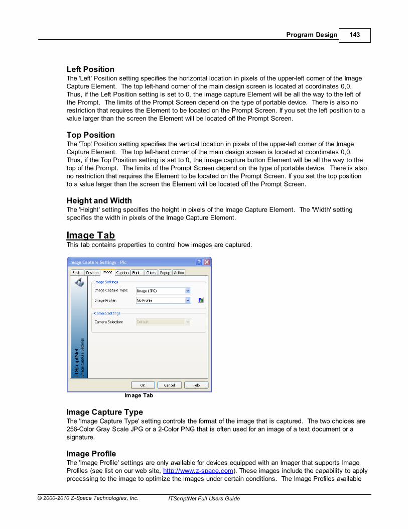
Program Design 143
© 2000-2010 Z-Space Technologies, Inc. ITScriptNet Full Users Guide
Left PositionThe 'Left' Position setting specifies the horizontal location in pixels of the upper-left corner of the ImageCapture Element. The top left-hand corner of the main design screen is located at coordinates 0,0. Thus, if the Left Position setting is set to 0, the image capture Element will be all the way to the left ofthe Prompt. The limits of the Prompt Screen depend on the type of portable device. There is also norestriction that requires the Element to be located on the Prompt Screen. If you set the left position to avalue larger than the screen the Element will be located off the Prompt Screen.
Top PositionThe 'Top' Position setting specifies the vertical location in pixels of the upper-left corner of the ImageCapture Element. The top left-hand corner of the main design screen is located at coordinates 0,0. Thus, if the Top Position setting is set to 0, the image capture button Element will be all the way to thetop of the Prompt. The limits of the Prompt Screen depend on the type of portable device. There is alsono restriction that requires the Element to be located on the Prompt Screen. If you set the top positionto a value larger than the screen the Element will be located off the Prompt Screen.
Height and WidthThe 'Height' setting specifies the height in pixels of the Image Capture Element. The 'Width' settingspecifies the width in pixels of the Image Capture Element.
Image TabThis tab contains properties to control how images are captured.
Image Tab
Image Capture TypeThe 'Image Capture Type' setting controls the format of the image that is captured. The two choices are256-Color Gray Scale JPG or a 2-Color PNG that is often used for an image of a text document or asignature.
Image ProfileThe 'Image Profile' settings are only available for devices equipped with an Imager that supports ImageProfiles (see list on our web site, http://www.z-space.com). These images include the capability to applyprocessing to the image to optimize the images under certain conditions. The Image Profiles available

ITScriptNet Full Users Guide144
© 2000-2010 Z-Space Technologies, Inc.ITScriptNet Full Users Guide
are: "No Profile", "Normal", "Distant", "Document", "Low Light", "Signature (Black & White)", "Signature(Grayscale)", and "Custom". The Custom profile is typically configured in the imaging demo area on thedevices and is made available through ITScriptNet. Refer to your device’s documentation for moredetailed information on Image Profiles.
Camera SelectionSome devices have a camera in addition to an Area Imager. On these supported devices, you canselect whether to take the picture with the Imager or the Camera. Generally the Imager is the defaultoption. Not all devices support selecting the camera.
Caption TabImage Capture Elements will collect image data. The Caption Tab allows you to customize captionsthat can optionally be superimposed on the image. There are two possible pieces of information toinclude in the image. One piece of information is a general caption that you can specify. The other is adate/time stamp. You can choose to use neither, one, or both pieces of information to add detail to yourcaptured images.
Image Capture Caption Tab
Caption PositionThe 'Caption Position' allows you to choose where in the image to include the caption text. If youchoose “None”, the caption will not be added to the image. The other choices are "Upper Left", "UpperCenter", "Upper Right", "Lower Left", "Lower Center", and "Lower Right".
Caption TextThe 'Caption Text' is the text that you want to be superimposed on the image you capture.
Caption FontThere are three settings related to the caption’s font. The 'Caption Font Height' is the number of pixelshigh the caption text will be. The 'Caption Font Black' setting will make the caption text be black ifchecked, or white if not checked. The 'Caption Font Transparent' setting will make the rectangleenclosing the caption text transparent if checked. If the 'Caption Font Transparent' setting is notchecked, the caption text will appear on a solid white or black rectangle, opposite the text color.

Program Design 145
© 2000-2010 Z-Space Technologies, Inc. ITScriptNet Full Users Guide
Datestamp PositionThe 'Datestamp Position' works the same as the 'Caption Position'. You can choose to not include aDatestamp or you can choose the location on the image for the Datestamp to be written.
Datestamp FormatThis setting allows you to choose the format for your date/time stamp. You can choose to include boththe date and time, just the date, or just the time.
Datestamp FontThere are three settings related to the datestamp’s font. The 'Datestamp Font Height' is the number ofpixels high the datestamp text will be. The 'Datestamp Font Black' setting will make the datestamp textbe black if checked or white if not checked. The 'Datestamp Font Transparent' setting will make therectangle enclosing the datestamp text transparent if checked. If the 'Datestamp Font Transparent'setting is not checked, the datestamp text will appear on a solid white or black rectangle, opposite thetext color.
Font TabThe Font Tab on the Image Capture Settings Screen allows you to customize standard Image CaptureElements. The font settings will have no effect on image-style image capture buttons.
Image Capture Font Tab
FontThe 'Font' selection allows you to choose a font for the Image Capture. Note that if you select a font thatis not installed on your portable device, the operating system of the device will convert the font to a fontthat is installed. The effect of this conversion will most likely be that the positioning of the font for theImage Capture on the device will not be consistent with the design view. The Font Preview area underthe Font Settings displays a preview of the font you have chosen.

ITScriptNet Full Users Guide146
© 2000-2010 Z-Space Technologies, Inc.ITScriptNet Full Users Guide
AttributesThe 'Attributes' section allows you to include Bold, Italic, Underline, or Strikeout attributes to your fontchoices. A check next to the attribute turns that attribute on.
Height and WidthThe 'Height' and 'Width' font settings specify the height and width of the font size in pixels. The FontPreview section will reflect the height and width specified. If you use a font width of zero, Windows willselect an appropriate default width.
StyleThe 'Style' setting allows you to apply a pre-defined Font and Color set to this Element. The Style musthave been created from the Style... menu under the Program menu of the Program Designer screen.Any changes made to the Style on the Edit Style Screen will automatically be applied to this Element.If you change any Font or Color setting on the Element, the Style will be removed.
Colors TabThe Colors Tab on the Image Capture Settings Screen provides an opportunity for furthercustomization of the image capture button. The colors will only be effective for portable devices thathave a color display. If the ‘Use Custom Colors’ option on the Colors Tab is checked, the colorsspecified on the Tab will be used.
Image Capture Colors Tab
Enabled ColorsThe 'Enabled Colors' colors are used when the Image Capture Element is enabled. The 'Background'color and the 'Foreground' (Text) color on the Buttons can be specified independently. Click on the Change… button to bring up the Color Screen to specify the color for the background and theforeground. You can select from the basic colors on the left, select a color from the color matrix on theright, specify Hue/Saturation/Luminosity, or specify Red, Blue, and Green values to create a customcolor.
Disabled ColorsThe 'Disabled Colors' are used when the Image Capture Element is disabled. The 'Background' color and

Program Design 147
© 2000-2010 Z-Space Technologies, Inc. ITScriptNet Full Users Guide
the 'Foreground' (Text) color on the buttons can be specified independently. Click on the Change…button to bring up the Color Screen to specify the color for the background and the foreground. You canselect from the basic colors on the left, select a color from the color matrix on the right, specify Hue/Saturation/Luminosity, or specify Red, Blue, and Green values to create a custom color. Note thatsome Window CE and PocketPC devices override the disabled foreground color.
Popup TabThe Popup Tab contains the settings used for popup help for the element. This popup appears whenthe user Taps and Holds on the element (Windows CE or Windows Mobile), or right-clicks the element(Simulator or PC Client).
Popup Tab
You can control the appearance of the popup with the settings on this tab. As with all settings, you canalso click the In-Prompt Script button next to each one to enter a script to override the value at runtime.
TextThis property sets the text that will be displayed on the popup.
FontSelect the font to be used for the text on the popup.
Font SizeThis setting controls the font size. It represents the font height in pixels.
BoldIndicates whether the text in the popup should be bold.
ItalicIndicates whether the text in the popup should be italic.
ColorsThe Foreground color will be used to display text on the popup. The Background color will be used asthe background of the popup.

ITScriptNet Full Users Guide148
© 2000-2010 Z-Space Technologies, Inc.ITScriptNet Full Users Guide
StyleYou can select a style to apply a font and color scheme to the popup. When you select a style, theother properties will be changed to those of the style. If you change one of the text properties, the stylewill be removed.
Action TabThe Action Tab is used to control the Elements response to Events.
Image Capture Action Tab
EventsThe Image Capture Element has several special event-driven Scripts that allow for customized behavior.
The On Get Focus Script runs when the Element receives the focus. This can happen if the userclicks on the Element, tabs to the Element, if the focus is set to the Element in a Script, or can occurwhen a Prompt is displayed if the Element is the first Element on the Prompt. The On Lose Focus Script runs when the Element loses the focus, or in other words, when the focusis moved to another Element.The Validation Script runs when the Element is validated. This is usually when the Prompt isaccepted, but can be when the Element loses the keyboard focus if 'Validate On Lose Focus' is set. If ValidationFail is called from within this event, the validation will fail and the focus will be set back tothis Element.The On Clicked Script runs whenever the Element is tapped or clicked, before the image is captured.The After Capture Script runs after the image has been captured.

Program Design 149
© 2000-2010 Z-Space Technologies, Inc. ITScriptNet Full Users Guide
3.2.11 Image Element
The Image Element is an Element for displaying graphics to a user. Use of images can enhance theuser interface and improve the look-and-feel of data collection programs.
To add an Input Image Element to a Prompt, click on the Image Element from the Elementlist on the right side of the main Program Designer Application Screen. If you cannot see the Elementlist, you can turn it on by checking the Elements menu under the View main menu item. When youclick the Image Element, the Image Settings Screen will be displayed. You will need to specify thesettings for your Image Element. The key settings are the Element Name and the filename of thegraphic you wish to display. These and all Image Settings are discussed below.
Basic TabThe Basic Tab on the Image Settings Screen is shown here.
Image Basic Tab
Element NameImage Elements, like all Elements, must have a name. When you first create the Image Element thename will be displayed as “Image1”. You may change the Element name to another valid Element nameif you wish. If the name the system tries to use for an Element is already in use, the number will beincremented (Image2, Image3, etc) to find the next name that is not in use. The name of the Elementcan be up to 20 characters in length and must be a unique name within the Prompt. The followingcharacters may not be used in Image Element names: # $ @ _ - * . / = < > ( ) & or <space> as theyare reserved.
File NameThe 'File Name' is the name of the graphic file for the image to display. Use the Browse button to locatethe graphic file for the Image Element. ITScriptNet supports bitmap (.bmp), jpeg (.jpg), and .png imagefile formats. The full path to the graphic file must be specified. If there is no path, as shown in theexample, the graphic file must be located in the same directory as the data collection program file (.itbfile). The image file used for the Image Element will be automatically added to the Support Files list.

ITScriptNet Full Users Guide150
© 2000-2010 Z-Space Technologies, Inc.ITScriptNet Full Users Guide
The support files are used by the data collection program and would typically be sent to the device withthe data collection program. Please refer to the section in the User Guide on Support Files for moreinformation.
Load ButtonThe Load button will read the graphic file and refresh the preview of the image that is displayed. Youwould use the Load button if you type in a file name instead of browsing for the file, or if you modify thegraphic file and want ITScriptNet to reload it to have the current image.
HiddenThe 'Hidden' setting will cause the Image Element to be hidden when checked.
RotationYou can select a rotation to display the image. You can rotate the image vertically or upside down.
PreviewThe preview area shows a representation of the image so you can make sure you have selected the rightone.
Position TabThe Position Tab on the Image Setting Screen controls the size and position of the Image Element onthe Prompt. You can also control the size and position of the Image Element from the main designarea. You can move the Image Element by selecting it and holding the mouse while you move the InputImage Element to the desired location. You can also resize the Image Element by selecting it anddragging one of the resize rectangles.
Image Position Tab
Left PositionThe 'Left' Position setting specifies the horizontal location in pixels of the upper-left corner of the Image

Program Design 151
© 2000-2010 Z-Space Technologies, Inc. ITScriptNet Full Users Guide
Element. The top left-hand corner of the main design screen is located at coordinates 0,0. Thus, if theLeft Position setting is set to 0, the Image Element will be all the way to the left of the Prompt.
Top PositionThe 'Top' Position setting specifies the vertical location in pixels of the upper-left corner of the ImageElement. The top left-hand corner of the main design screen is located at coordinates 0,0. Thus, if theTop Position setting is set to 0, the Image Element will be all the way to the top of the Prompt.
Height and WidthThe 'Height' setting specifies the height in pixels of the Image Element, and the 'Width' setting specifiesthe width in pixels of the Image Element. Note that if you change the height and the width using thesesettings you may distort the image from its original state.
Reset ScaleThe Reset Scale button will reset the height and width of the image according to the original height andwidth of the image as stored in the graphics file.
Popup TabThe Popup Tab contains the settings used for popup help for the element. This popup appears whenthe user Taps and Holds on the element (Windows CE or Windows Mobile), or right-clicks the element(Simulator or PC Client).
Popup Tab
You can control the appearance of the popup with the settings on this tab. As with all settings, you canalso click the In-Prompt Script button next to each one to enter a script to override the value at runtime.
TextThis property sets the text that will be displayed on the popup.
FontSelect the font to be used for the text on the popup.
Font SizeThis setting controls the font size. It represents the font height in pixels.

ITScriptNet Full Users Guide152
© 2000-2010 Z-Space Technologies, Inc.ITScriptNet Full Users Guide
BoldIndicates whether the text in the popup should be bold.
ItalicIndicates whether the text in the popup should be italic.
ColorsThe Foreground color will be used to display text on the popup. The Background color will be used asthe background of the popup.
StyleYou can select a style to apply a font and color scheme to the popup. When you select a style, theother properties will be changed to those of the style. If you change one of the text properties, the stylewill be removed.
Action TabThe Action Tab is used to control the Elements response to Events.
Image Action Tab
EventsThe Image Element has two special event-driven Scripts that allow for customized behavior.
The On Click Script runs whenever the Element is tapped or clicked.The On Double Click Script runs whenever the Element is double-tapped or double-clicked.

Program Design 153
© 2000-2010 Z-Space Technologies, Inc. ITScriptNet Full Users Guide
3.2.12 Input Text Element
The Input Text Element is a Textbox for entering data into the data collection programs. The data can beentered from the keypad of the device or scanned.
To add an Input Text Element to a Prompt, click on the Textbox Element from the Element liston the right side of the main Program Designer Application Screen. If you cannot see the Element list, you canturn it on by checking the Elements menu under the View main menu item. When you click the TextboxElement button, the Input Text Settings Screen will be displayed. You will need to specify the settings for yournew Element. The key settings are the Element Name, the minimum and maximum response lengths forInput Text, and whether the input should be entered with the keypad or scanned. These and all Input TextSettings are discussed below.
Basic TabThe Basic Tab on the Input Text Settings Screen is shown here.
Input Text Basic Tab
Element NameInput Text Elements, like all Elements, must have a name. When you first create the Input Text the name willbe displayed as “TextBox1”. You can rename the Element to a valid Element name. If the name the systemtries to use for an Element is already in use, the number will be incremented (TextBox2, TextBox3, etc) to findthe next name that is not in use. An Element name can be up to 20 characters in length and must be a uniquename within the Prompt. The following characters may not be used on Input Text Element names: # $ @ _ -* . / = < > ( ) & or <space> as they are reserved.
Maximum and Minimum Response LengthThe maximum and minimum response lengths are properties that set limits on the length of the responseentered for the Input Text Element. The limits of the number of characters for a response are the most basicform of validating data. For example, if each employee has a time clock number that is 3 or 4 digits, then thesettings for the Employee clock number can be set to require at least 3 characters/digits and no more than 4. When collecting data a user will not be able to enter a response longer than the maximum response length. Ifthe user enters a response that is less than the minimum response length, the program will issue a warningto that effect, and the user will not be permitted to move to the next Prompt until the response for the Input TextElement is within the minimum and maximum response lengths. If the response is scanned, the program willstill check the length of the scanned response and will reject any response that does not meet the responselength criteria.
Allow a Blank ResponseThis setting will determine whether or not to allow a blank response for the Input Text Element. By default thissetting is turned on, meaning that a response is not required. If the box is checked, thus allowing a blank

ITScriptNet Full Users Guide154
© 2000-2010 Z-Space Technologies, Inc.ITScriptNet Full Users Guide
response, the user collecting the data will be able to go to the next Prompt even if the Input Text Element hasno response and is blank. Allowing a blank response is useful for optional data in a data collection program. As an example, a note field that allows a user to enter special notes would often be blank unless the user hada special circumstance that required him to key in a note.
Hidden, DisabledThe 'Hidden' setting will cause the Input Text Element to be hidden when checked. The 'Disabled' setting willcause the Input Text Element to be disabled. A response cannot be entered into an Input Text Element that ishidden and/or disabled.
Do Not Store DataThis option prevents the data for this Element from being written into the collected data file. You can use thisoption when you want to use the data for this Element for display only, or if you are using it for some othercalculation but do not want to save it.
MultilineThe 'Multiline' Setting will allow an Input Text Element to be created so that its height is taller than one line ofinput text and will allow the text the user enters (or scans) to wrap to any number of lines (as long as thenumber of characters does not exceed the maximum response length). Scrolling up and down inside amultiline Input Text Element is accomplished with the arrow keys.
PasswordThe 'Password' Setting controls how text is displayed in the Input Text Element. If this checkbox is set, text willbe displayed as ‘*’ in a password mode. Otherwise, the text will be displayed normally.
Database Field/Column Header/Field HeaderThis setting specifies where the data collected for this Element is stored after it is sent to the PC andprocessed. Depending on the settings specified in the Configure Receive Screen, this field may have differentmeanings.
Access or ODBC Field
If the program is configured to send its data to a Microsoft Access file or an ODBC data source, the targetdatabase field must be set up properly so the data collected can be sent to the desired field. A field from thetarget database must be selected from the list of fields. The fields in the list are the fields defined for thedatabase and table that are established on the Configure Receive Screen. The <Ignore> selection can bechosen and the collected data for the Input Text Element will be ignored when the collected data is sent to thedatabase. Fields are output to Access and ODBC if the field specified here exists and the maximum length ofthe response is not zero.
Excel Column Header
If the program is configured to send its data to a Microsoft Excel file, this setting will become the columnheader for the data. For Excel files, if this field is left blank, the Element name will be used as the columnheader. To skip this field and not output it, you will need to use the Customize Field Layout Screen accessiblefrom the Configure Receive Screen.
Text File Field Header
If the program is configured to send its data to a text file with a header, this setting will become the field headerfor the data in the output file. For text files with headers, if this field is left blank, the Element name will be usedas the column header. To skip this field and not output it, you will need to use the Customize Field LayoutScreen accessible from the Configure Receive Screen. If the program is configured to send its data to a textfile with no header information, then there will be no Field Header setting on the Input Text Settings Screen.

Program Design 155
© 2000-2010 Z-Space Technologies, Inc. ITScriptNet Full Users Guide
Position Tab The Position Tab on the Input Text Setting Screen controls the size and position of the Input TextElement on the Prompt. You can also control the size and position of the Input Text Element from themain design area. You can move the Input Text Element by selecting it and holding the mouse whileyou move the Input Text Element to the desired location. You can also resize the Input Text Element byselecting it and hovering over the resize boundaries of the Input Text Element and dragging it to resizeit.
Input Text Position Tab
Left PositionThe 'Left' Position setting specifies the horizontal location in pixels of the upper-left corner of the InputText Element. The top left-hand corner of the main design screen is located at coordinates 0,0. Thus, ifthe Left Position setting is set to 0, the Input Text Element will be all the way to the left of the Prompt. The limits of the Prompt Screen depend on the type of portable device. There is also no restriction thatrequires the Element to be located on the Prompt Screen. If you set the left position to a value largerthan the screen the Element will be located off the Prompt Screen.
Top PositionThe 'Top' Position setting specifies the vertical location in pixels of the upper-left corner of the Input TextElement. The top left-hand corner of the main design screen is located at coordinates 0,0. Thus, if theTop Position setting is set to 0, the Input Text Element will be all the way to the top of the Prompt. Thelimits of the Prompt Screen depend on the type of portable device. There is also no restriction thatrequires the Element to be located on the Prompt Screen. If you set the top position to a value largerthan the screen the Element will be located off the Prompt Screen.
Height and WidthThe 'Height' setting specifies the height in pixels of the Input Text Element, and the 'Width' settingspecifies the width in pixels of the Input Text Element.

ITScriptNet Full Users Guide156
© 2000-2010 Z-Space Technologies, Inc.ITScriptNet Full Users Guide
Input Tab The Input Tab contains the settings that control the response input behavior of the Input Text Element.This tab controls whether the data for the user’s response must be entered on the keypad, scanned, or ifeither is allowed. This is also the Tab that contains specific information about bar code symbologiesand if the Input Text Element is designed to require a certain symbology. Default settings for theresponse are also on this Tab.
Input Text Input Tab
SourceThe setting for 'Source' specifies whether the response to the Input Text Element can be entered only onthe device’s keypad, only by scanning a barcode, or by either keypad or scan. By default, Input TextElements are set to allow either keypad or scan for data entry. Depending on the application, requiringbarcode scans will reduce data collection time (scanning is faster than punching in the data on akeypad) and maximize accuracy.
SymbologyThe setting for 'Symbology' is used to limit the allowed barcode symbology when scanning a responsefor an Input Text Element. There are many different barcode symbologies. A barcode symbology is analgorithm for encoding data into a barcode. Some of the more common symbologies are: Code 39,I2of5, Code 128, and UPCA. The Input Text Element can be set to accept any barcode symbology (thedevice has to be able to decode the symbology, please refer to documentation on the specific portabledevice you are using for a list of symbologies compatible with your hardware). The "Any/Multiple"selection will allow a user to scan any symbology that is configured as a default for the scanner/imagerfor your hardware. The "Any/Multiple" setting is the default for any new Input Text Elements that youcreate. The Symbology property can be set to accept only one type of barcode symbology. To select a singlesymbology, select it from the list. The default settings for the symbology on your device will be used. By way of example, let’s say that your warehouse uses Code 39 barcodes for your part numbers. However, the boxes also contain UPC codes for those products. When collecting data, you want toinsure that the Code 39 barcode is scanned and not the UPC code. By setting the Input Text Elementto only accept Code 39, the program will reject the UPC codes and any other symbology. Specifying aspecific symbology is a means of validating your data and maximizing data accuracy.

Program Design 157
© 2000-2010 Z-Space Technologies, Inc. ITScriptNet Full Users Guide
Depending on your data collection needs, you may need to customize the 'Symbology' setting. In ourexample above, the warehouse had Code 39 and UPC part numbers. Let’s say that now you need to beable to scan either a Code 39 or a UPC, but still do not want to allow any other symbologies. You can
do this by clicking on the button with the barcode icon to bring up the Advanced SymbologySettings Screen. Please refer to the section in this User Guide describing the Advanced SymbologySettings Screen. If you do not customize the barcode symbology settings, the default settings for theone symbology specified or all symbologies will be used. The defaults are appropriate for most datacollection applications, but if you need to control the settings more precisely, ITScriptNet allows youaccess and full control of the symbologies. If the Advanced Symbology Settings Screen is used tocustomize the symbology behavior for an Input Text Element, the barcode icon will change colors toprovide an easy visual indicator that customized symbology settings are in use.
Default ModeThis option selects what the default selection for the Textboxshould be when the Prompt is loaded. The allowed optionsare:
Use Default Response: The Textbox will default to thevalue of the 'Default Value' field.Default to Last: The Textbox will default to the last valuecollected for this element.Default to Pending: The Textbox will default to the lastvalue specified for the element. If you move off this Promptand back to it before saving a collected data record, thatpending value will be used. Once a collected data record issaved, the element reverts to the Default Value.Pending or Last: The Textbox will default to the lastpending value, but if a collected data record has been savedit will default to that last value.
Default Response
Default ValueThe field allows you to specify a default value for this element that will be used when the prompt isinitially loaded.
Keyboard ModeThe 'Keyboard Mode' property determines whether or not the keypad mode for the device will be setexplicitly. If this property is "Set to Numeric", ITScriptNet will force the portable device into numeric dataentry mode. Using this setting is especially useful when designing data collection programs for portabledevices that have keys that are combination alpha/numeric. If the Input Text Element requires the userto enter a quantity, for example, automatically switching the device into numeric key mode will save theuser time since the user will not have to switch the keypad into numeric mode. An Input Text Elementcan also be configured to "Set to Uppercase Alpha" or "Set to Lowercase Alpha", which are useful whenthe Prompt’s data is expected to be alphabetic. The default for this property is "Do Not Change", whichmeans that ITScriptNet does not change the keypad mode for the Prompt. The options available in thislist will depend on the device type selected for the program. There is also a second option for the keyboard mode. The ‘Follow Input Mask’ option works inconjunction with the 'Input Mask' setting on the Data Tab. When the ‘Follow Input Mask’ option ischecked, the keyboard mode will switch to the appropriate mode to follow the Input Mask. If the InputMask for the Input Text Element is " @## " for example, the Keyboard Mode will first be set to alphamode since the first character in the mask requires an alpha character. Then the Keyboard Mode willswitch to numeric for the second and third character since the mask requires numeric input for the last

ITScriptNet Full Users Guide158
© 2000-2010 Z-Space Technologies, Inc.ITScriptNet Full Users Guide
two characters for the input. The last option, ‘Limit Keys’, allow you to specify that only "Uppercase Letters", "Lowercase Letters", or"Numbers" can be entered into the field. If one of these selection is used, any other characters typedinto the field will be ignored.
Validation TabValidation files are text files that can be loaded into the device and used to ensure that the operatorenters accurate data. When the operator enters a response, the entered data can be compared to thedata in the validation file to make sure it is allowed. Additionally, a second field can be retrieved from thevalidation file and displayed to the operator. Typical uses might include:
Part Number/Description lookups and validationsLocation ValidationEmployee Number ValidationOrder PickingRoute/Delivery ListsMany More….
Input Text Validation Tab
The validation text file must be defined from the Validation Files Screen before a Prompt can beconfigured to use the validation text file. Please refer to the Validation Files Screen section of thisUser Guide for more information on setting up the validation file for your data collection program. For the purposes of this section, we will assume that a text file named "ItemLkUp.txt" has been setupfor use by our data collection program. The text file contains a part number and a description. The drop-down selection box for the validation file will contain a list of all the validation files that have beenidentified for use by this program from the Validation Files Screen. You can select which file you wantto use to validate the response for this Element. In the example, the "ItemLkUp.txt" file has beenselected. The second validation drop-down box contains the type of validation. There are three validation modes that can be chosen from the 'Validation Type' drop-down menu:
Lookup Only: This is used to perform a lookup, but does not require the response to exist.Must Be Found: This mode means that the entered data must exist in the lookup file. If the responseentered is not found in the validation file, the response is rejected.

Program Design 159
© 2000-2010 Z-Space Technologies, Inc. ITScriptNet Full Users Guide
Must Not Be Found: This mode means that the entered data must NOT exist in the lookup file. If theresponse is already in the lookup file the response is rejected. In our example, we have selected the‘Must Be Found’ validation since we want to validate the part number entered or scanned is a valid partnumber.
The third drop-down selection is the 'Validation Field' name to be used to validate this Input TextElement. When the "ItemLkUp.txt" file was added to the list of validation files for this program, thedefinition for that file was also configured. One of the fields in the file was named "Part", and thedescription included in the validation was named "Desc". In our example, the Element that we arevalidating is the part number so the Part field is selected as the Validation Field.
The 'Lookup Field' is the description, and is selected in the fourth drop-down menu, as the information tolookup as the result of the validation. The description can be displayed to the operator later by using the# marker in the display text for a later Prompt. The Lookup data is not stored in the collected data file. Only the entered responses are stored in the collected data file.
Data TabThe Data Tab contains three types of built-in rules that can be applied to collected data to insureaccuracy of the data you collect.
Input Text Data Tab
Input MaskIf the 'Input Mask' is used for an Input Text Element, the user will be required to enter data conforming tothe input mask in order for the data to be accepted as a valid response. The mask is entered as a stringof characters. Any required character can be entered as well as any of the three wildcard placeholdersin the mask. The # sign requires a number between 0-9 in that location in the input string. A @ symbolrequires an uppercase alphabetic character (A-Z) and the $ is a placeholder for any character. Forexample, the mask could ###-##-####. This input requires 3 numeric characters, then a dash (‘-‘), then2 more numeric characters, another dash (‘-‘), and then 4 numeric characters to complete the input. This Input Mask would correspond to a social security number. The Input Mask by default will store thewhole input string, but by unchecking the ‘Store Mask Characters with Response’ box, the response canbe stored without the specific mask characters. In our social security number format example, thenumber would be stored without the dashes if this option were turned off. ITScriptNet has many data

ITScriptNet Full Users Guide160
© 2000-2010 Z-Space Technologies, Inc.ITScriptNet Full Users Guide
validation options in addition to the Input Mask. It is therefore important that all the validations beconsidered when designing the validation scheme for each Element so that the validations can worktogether. If you specify an Input Mask, the Maximum and Minimum Length properties will automaticallybe set to match the length of the Input Mask and cannot be changed.
First CharacterThe First Character data validation feature allows the program designer to require the response to theInput Text Element to start with the character specified. For example, the letter "P" could be specifiedas the required first character. If the user scans a barcode or enters data that starts with somethingother than "P", the response will be rejected. This feature is perfect for automotive industry labels thatrequire part number barcodes to start with the letter "P" followed by the part number. The benefit ofencoding a "P" for part number or an "L" for location (or any other key letter) within a barcode is that theuser is protected from scanning the wrong barcode. This type of protection is especially useful if thelabel contains several different barcodes.
The designer of the program has the option of specifying whether or not to store the first letter with theresponse. In the case of the part number following the letter "P", it would often be advisable to removethe "P" prior to storing the part number response so that the collected data can be processed without anextra step to remove the first character "P". The default is to not store the first letter, but if it is desiredthen check the box next to 'Store First Char with Response'.
Range CheckingThe 'Response Range Checking' is another data validation feature of ITScriptNet. When range checkingis enabled, the response must be a numeric value. The value of the response will be compared to thehigh and low response values. If the response entered is within the bounds of the range, the responsewill be accepted. If the response is higher than the highest response value or lower than the lowestresponse value set for the range, the response will be rejected and the user will get a message statingthat the response was out of range. Enabling the range checking for responses is another way toincrease accuracy of the data you collect. 'Response Range Checking' works well on Elements wherenumeric data is required, such as quantities.
Validate on Lose FocusThis option controls whether the Textbox Element will be validated when the Element loses focus. Normally, Elements are only validated when the Prompt is Accepted. If the Element is validated when itloses focus, all internal validations will be performed (allow blank, etc) and the Validation Script will berun. If any of these validations fails, the focus will remain on the Element. Click on the box next to'Validate on Lose Focus' to allow the validations to occur when the Element loses focus.

Program Design 161
© 2000-2010 Z-Space Technologies, Inc. ITScriptNet Full Users Guide
Font TabThe Font Tab on the Input Text Settings Screen allows you to customize standard Input TextElements.
Input Text Font Tab
FontThe 'Font' selection allows you to choose a font for the Input Text. Note that if you select a font that isnot installed on your portable device, the operating system of the device will convert the font to a fontthat is installed. The effect of this conversion will most likely be that the positioning of the font on thebutton on the device will not be consistent with the design view. The Font Preview area under the FontSettings displays a preview of the font you have chosen.
AttributesThe 'Attributes' section allows you to include Bold, Italic, Underline, or Strikeout attributes to your fontchoices. A check next to the attribute turns that attribute on.
Height and WidthThe 'Height' and 'Width' font settings specify the height and width of the font size in pixels. The FontPreview section will reflect the height and width specified. If you use a font width of zero, Windows willselect an appropriate default width.
StyleThe 'Style' setting allows you to apply a pre-defined Font and Color set to this Element. The Style musthave been created from the Style... menu under the Program menu of the Program Designer screen.Any changes made to the Style on the Edit Style Screen will automatically be applied to this Element.If you change any Font or Color setting on the Element, the Style will be removed.

ITScriptNet Full Users Guide162
© 2000-2010 Z-Space Technologies, Inc.ITScriptNet Full Users Guide
Colors TabThe Colors Tab adds another dimension of flexibility and customization to the design of Text InputElements. The colors will only be effective for portable devices that have a color display. The first steptowards customizing the colors of a standard button is to check the ‘Use Custom Colors’ option on the Colors Tab. Once checked, the colors specified on the Tab will be used.
Input Text Colors Tab
Enabled ColorsThe 'Enabled Colors' colors are used when the Input Text Element is enabled. The 'Background' colorand the 'Foreground' (Text) color on the Buttons can be specified independently. Click on the Change…button to bring up the Color Screen to specify the color for the background and the foreground. You canselect from the basic colors on the left, select a color from the color matrix on the right, specify Hue/Saturation/Luminosity, or specify Red, Blue, and Green values to create a custom color.
Disabled ColorsThe 'Disabled Colors' are used when the Input Text Element is disabled. The 'Background' color and the'Foreground' (Text) color on the buttons can be specified independently. Click on the Change… buttonto bring up the Color Screen to specify the color for the background and the foreground. You can selectfrom the basic colors on the left, select a color from the color matrix on the right, specify Hue/Saturation/Luminosity, or specify Red, Blue, and Green values to create a custom color. Note that some WindowCE and PocketPC devices override the disabled foreground color.

Program Design 163
© 2000-2010 Z-Space Technologies, Inc. ITScriptNet Full Users Guide
Popup TabThe Popup Tab contains the settings used for popup help for the element. This popup appears whenthe user Taps and Holds on the element (Windows CE or Windows Mobile), or right-clicks the element(Simulator or PC Client).
Popup Tab
You can control the appearance of the popup with the settings on this tab. As with all settings, you canalso click the In-Prompt Script button next to each one to enter a script to override the value at runtime.
TextThis property sets the text that will be displayed on the popup.
FontSelect the font to be used for the text on the popup.
Font SizeThis setting controls the font size. It represents the font height in pixels.
BoldIndicates whether the text in the popup should be bold.
ItalicIndicates whether the text in the popup should be italic.
ColorsThe Foreground color will be used to display text on the popup. The Background color will be used asthe background of the popup.
StyleYou can select a style to apply a font and color scheme to the popup. When you select a style, theother properties will be changed to those of the style. If you change one of the text properties, the stylewill be removed.

ITScriptNet Full Users Guide164
© 2000-2010 Z-Space Technologies, Inc.ITScriptNet Full Users Guide
Action TabThe Action Tab contains the settings to control the behavior of the Input Text Element after a responsehas been scanned and/or if the user presses the Enter button. This Tab also has access to the In-Prompt Scripts that can be used to customize behavior when the Element gets or loses the focus.
Input Text Action Tab
After ScanningWhen a user scans a response for the Input Text Element (as long as scanning is configured as a validinput source on the Input Tab), the 'After Scanning' setting determines how the Element will behave.There are three choices from the pull-down menu. The default behavior is for the Element to "DoNothing" after the scan. You can also choose to have the Element advance the focus to the "NextElement" on the Prompt. The order of the Elements is determined on the Prompt Settings Screen.The last choice is "Accept Prompt", which has the scan act as the acceptance for the entire Prompt andthus the program advances to the next Prompt as defined on the Prompt Settings Screen.
After Enter PressedWhen a user enters a response for the Input Text Element, it is often desirable to have the datacollection program automatically advance to the next Element so that the user does not have to click onthe next Element to keep entering data. To help minimize the number of clicks required for the user, itis often a good idea to take advantage of the 'After Enter Pressed' setting. There are three choices forhow the Element will behave after the Enter button is tapped. The default behavior is for the Element toadvance the focus to the "Next Element" on the Prompt list. The order of the Elements is determined onthe Prompt Settings Screen. You can also choose to have the Element "Do Nothing". In this case,tapping Enter will toggle the checked state of the Input Text. For the last choice, "Accept Prompt",the Enter key act as the acceptance for the entire Prompt and thus the program advances to the nextPrompt as defined on the Prompt Settings Screen.

Program Design 165
© 2000-2010 Z-Space Technologies, Inc. ITScriptNet Full Users Guide
EventsThe Input Text Element has several special event-driven Scripts that allow for customized behavior.
The On Get Focus Script runs when the Element receives the focus. This can happen if the userclicks on the Element, tabs to the Element, if the focus is set to the Element in a Script, or can occurwhen a Prompt is displayed if the Element is the first Element on the Prompt. The On Lose Focus Script runs when the Element loses the focus, or in other words, when the focusis moved to another Element.The On Click Script runs whenever the Element is tapped or clicked.The On Double Click Script runs whenever the Element is double-tapped or double-clicked.The On Keypress Script runs whenever a key on the keypad is pressed.The Value Changed Script runs whenever the data in the control is changed, whether by scanning,data entry, or assigning from a Script.The Validation Script runs when the Prompt is accepted, as part of the Prompt validation process. Ifyou call the ValidationFail function from within this Script, the Prompt validation will fail, the errormessage specified will be displayed, and the focus will be set back to this Element.

ITScriptNet Full Users Guide166
© 2000-2010 Z-Space Technologies, Inc.ITScriptNet Full Users Guide
3.2.13 KeypadElement
The Keypad Element is a method for entering data into a Textbox. This Element presents an on-screenkeypad with buttons that the user can tap. This allows a program design where the user can only presscertain keys, as opposed to using the Soft Input Panel.
To add a Keypad Element to a Prompt, click on the Keypad Element from the Element liston the right side of the main Program Designer Application Screen. If you cannot see the Element list,you can turn it on by checking the Elements menu under the View main menu item. When you clickthe Element button, the Keypad Settings Screen will be displayed. You will need to specify thesettings for your new Element. The key settings are the Element Name, the keypad type, and whetherthe keypad should be linked to a specific Element. These and all Keypad Settings are discussed below.
Basic TabThe Basic Tab of the Keypad Settings Screen is shown here. This Tab contains general options for thekeypad.
Keypad Basic Tab
Element NameKeypad Elements, like all Elements, must have a name. When you first create the Keypad the namewill be displayed as “Keypad1”. You can rename the Element to a valid Element name. If the name thesystem tries to use for an Element is already in use, the number will be incremented (Keypad2,Keypad3, etc) to find the next name that is not in use. An Element name can be up to 20 characters inlength and must be a unique name within the Prompt. The following characters may not be used onKeypad Element names: # $ @ _ - * . / = < > ( ) & or <space> as they are reserved.

Program Design 167
© 2000-2010 Z-Space Technologies, Inc. ITScriptNet Full Users Guide
Keypad TypeThis option allows you to control the appearance and the buttons on the Keypad. Valid options for theKeypad are:
10 Key Numeric: This is a keypad consisting of 10 keys from 0 to 9.
10 Key Keypad
16 Key Hexadecimal: This keypad has 16 keys, 0 to 9 and A through F.
16 key keypad
Custom Keypad: This keypad is configurable and can contain any set ofkeys that you define. The Buttons Tab is used to defined the buttons. Youcan specify any number of buttons on a custom keypad.
Custom Keypad
Sample
Link to ElementThis option allows you to control which Element receives the characters entered from this keypad. If thisoption is blank, the Element which has the focus receives the characters. If you select a specificElement from the drop-down menu, then any taps on the keypad go to that Element regardless of whichcontrol had the focus.
Hidden, DisabledThe 'Hidden' setting will cause the Keypad Element to be hidden when checked. The 'Disabled' settingwill cause the Keypad Element to be disabled. A response cannot be entered into an Keypad Elementthat is hidden and/or disabled.

ITScriptNet Full Users Guide168
© 2000-2010 Z-Space Technologies, Inc.ITScriptNet Full Users Guide
Position Tab The Position Tab on the Keypad Element Screen controls the size and position of the KeypadElement on the Prompt. You can also control the size and position of the Keypad Element from themain design area. You can move the Keypad Element by selecting it and holding the mouse while youmove the Keypad Element to the desired location. You can also resize the Keypad Element byselecting it and hovering over the resize boundaries of the Keypad Element and dragging the KeypadElement to resize it.
Keypad Position Tab
Left PositionThe 'Left' Position setting specifies the horizontal location in pixels of the upper-left corner of the KeypadElement. The top left-hand corner of the main design screen is located at coordinates 0,0. Thus, if theLeft Position setting is set to 0, the Keypad Element will be all the way to the left of the Prompt. Thelimits of the Prompt Screen depend on the type of portable device. There is also no restriction thatrequires the Element to be located on the Prompt Screen. If you set the left position to a value largerthan the screen the Element will be located off the Prompt Screen.
Top PositionThe 'Top' Position setting specifies the vertical location in pixels of the upper-left corner of the KeypadElement. The top left-hand corner of the main design screen is located at coordinates 0,0. Thus, if theTop Position setting is set to 0, the Keypad Element will be all the way to the top of the Prompt. Thelimits of the Prompt Screen depend on the type of portable device. There is also no restriction thatrequires the Element to be located on the Prompt Screen. If you set the top position to a value largerthan the screen the Element will be located off the Prompt Screen.
Height and WidthThe 'Height' setting specifies the height in pixels of the Keypad Element, and the 'Width' settingspecifies the width in pixels of the Keypad Element.

Program Design 169
© 2000-2010 Z-Space Technologies, Inc. ITScriptNet Full Users Guide
Background TabThe Background Tab contains options for controlling the borders and background color of the keypad.
Keypad Background Tab
Border ColorThis option sets the color of the border around the keypad. Click on the Change… button to bring upthe Color Screen to designate your color choices. You can select from the basic colors on the left,select a color from the color matrix on the right, specify Hue/Saturation/Luminosity, or specify Red,Blue, and Green values to create a custom color.
Border WidthThe 'Width' option controls the thickness of the border around the keypad. If you set the width to 0, noborder will be used.
Enabled ColorThis is the color that will be used to fill the background of the keypad (between the buttons) when thekeypad is enabled. Click on the Change… button to bring up the Color Screen to designate your colorchoices. You can select from the basic colors on the left, select a color from the color matrix on theright, specify Hue/Saturation/Luminosity, or specify Red, Blue, and Green values to create a customcolor.
Disabled ColorThis is the color that will be used to fill the background of the keypad (between the buttons) when thekeypad is disabled. Click on the Change… button to bring up the Color Screen to designate your colorchoices. You can select from the basic colors on the left, select a color from the color matrix on theright, specify Hue/Saturation/Luminosity, or specify Red, Blue, and Green values to create a customcolor.

ITScriptNet Full Users Guide170
© 2000-2010 Z-Space Technologies, Inc.ITScriptNet Full Users Guide
Buttons TabThe Button Tab is used to control the button type and spacing, and configure custom buttons.
Keypad Buttons Tab
Button TypeThis option specifies the type of button to be displayed. This is similar to the button type for ButtonElements. You can select a "Standard Button", "Image Button", "Chiseled Button", "Gradient Button",or "Edge Gradient" from the drop-down menu. If you select "Image Button", you will set the image touse for each button in the Custom Buttons list.
Button SpacingThis option controls the spacing between buttons both vertically and horizontally.
Custom ButtonsIf you are using a "Custom" type keypad, this section will be enabled. If you are using the "10 KeyNumeric" or "16 Key Hexadecimal" type keypad, it will be disabled. You can add, edit and remove keysfrom the custom keypad by pressing the Add..., Edit... and Delete buttons. When you add a button,the Keypad Custom Button Screen will be displayed.
To change the layout of the buttons, use the Move Up and Move Down buttons to move the selectedbutton in the list.
Rows This option controls how many rows of buttons will be used for the "Custom" keypad.
ColumnsThis option controls how many columns of buttons there will be on the "Custom" keypad.
How custom keypads are displayedThe keypad uses the overall size in conjunction with the button spacing and the number of rows andcolumns to layout the keypad. The buttons will be displayed at a size to fill the overall width and heightof the keypad, with the spacing between them. If there are more rows and columns defined thanbuttons, the buttons will fill from the upper left, across the row. Then the next row will be filled from leftto right. If a row is incomplete, the buttons will appear from the left and the extra space will be on the

Program Design 171
© 2000-2010 Z-Space Technologies, Inc. ITScriptNet Full Users Guide
right hand side.
Custom Keypad with
a partial row
Buttons can also occupy more than one cell, and spaces can be skipped. This allows you to customizethe layouts, as shown.
Multicell button sample
Button Colors TabThis Button Colors Tab on the Keypad Settings Screen is used to set the colors that will be used forthe buttons on the keypad.
Button Colors Tab
Enabled ColorsThe 'Enabled Colors' colors are used when the Keypad Element is enabled. The 'Background' color and

ITScriptNet Full Users Guide172
© 2000-2010 Z-Space Technologies, Inc.ITScriptNet Full Users Guide
the 'Foreground' (Text) color on the Buttons can be specified independently. Click on the Change…button to bring up the Color Screen to specify the color for the background and the foreground. You canselect from the basic colors on the left, select a color from the color matrix on the right, specify Hue/Saturation/Luminosity, or specify Red, Blue, and Green values to create a custom color.
Disabled ColorsThe 'Disabled Colors' are used when the Keypad Element is disabled. The 'Background' color and the'Foreground' (Text) color on the buttons can be specified independently. Click on the Change… buttonto bring up the Color Screen to specify the color for the background and the foreground. You can selectfrom the basic colors on the left, select a color from the color matrix on the right, specify Hue/Saturation/Luminosity, or specify Red, Blue, and Green values to create a custom color. Note that some WindowCE and PocketPC devices override the disabled foreground color.

Program Design 173
© 2000-2010 Z-Space Technologies, Inc. ITScriptNet Full Users Guide
Font TabThe Font Tab on the Keypad Settings Screen allows you to customize the fonts used on the buttons.
Font Tab
FontThe Font Settings allows you to choose a font for the keypad’s text. Fonts can be selected by clickingon the desired font in the drop-down menu. Note that if you select a font that is not installed on yourportable device, the operating system of the device will convert the font to a font that is installed. Theeffect of this conversion will most likely be that the positioning of the font on the button on the device willnot be consistent with the design view. The Font Preview area under the Font Settings displays apreview of the font you have chosen.
AttributesThe 'Attributes' section allows you to include Bold, Italic, Underline, or Strikeout attributes to your fontchoices. A check next to the attribute turns that attribute on.
Height and WidthThe 'Height' and 'Width' font settings specify the height and width of the font size in pixels. The FontPreview section will reflect the height and width specified. If you use a font width of zero, Windows willselect an appropriate default width.
StyleThe 'Style' setting allows you to apply a pre-defined Font and Color set to this Element. The Style musthave been created from the Style... menu under the Program menu of the Program Designer screen.Any changes made to the Style on the Edit Style Screen will automatically be applied to this Element.If you change any Font or Color setting on the Element, the Style will be removed.

ITScriptNet Full Users Guide174
© 2000-2010 Z-Space Technologies, Inc.ITScriptNet Full Users Guide
Popup TabThe Popup Tab contains the settings used for popup help for the element. This popup appears whenthe user Taps and Holds on the element (Windows CE or Windows Mobile), or right-clicks the element(Simulator or PC Client).
Popup Tab
You can control the appearance of the popup with the settings on this tab. As with all settings, you canalso click the In-Prompt Script button next to each one to enter a script to override the value at runtime.
TextThis property sets the text that will be displayed on the popup.
FontSelect the font to be used for the text on the popup.
Font SizeThis setting controls the font size. It represents the font height in pixels.
BoldIndicates whether the text in the popup should be bold.
ItalicIndicates whether the text in the popup should be italic.
ColorsThe Foreground color will be used to display text on the popup. The Background color will be used asthe background of the popup.
StyleYou can select a style to apply a font and color scheme to the popup. When you select a style, theother properties will be changed to those of the style. If you change one of the text properties, the stylewill be removed.

Program Design 175
© 2000-2010 Z-Space Technologies, Inc. ITScriptNet Full Users Guide
3.2.13.1 KeypadCustomButton
This screen is used to define a custom button for the Keypad Element.
Keypad Custom Buttons
This screen allows you to enter the text to be displayed on the button, and select the Keycode to sendto the textbox when the key is pressed. The Text can be more than a single character, but it will beclipped if it does not fit on the button.
You can select 'Skip' as the Button Keycode to leave a blank space in the keypad.
If you are using the Image Button type, you can select the Image to use as the button background. Youcan also specify how many spaces wide the button should occupy.
A preview of what the button will look like is also displayed.

ITScriptNet Full Users Guide176
© 2000-2010 Z-Space Technologies, Inc.ITScriptNet Full Users Guide
3.2.14 Listbox Element
The Listbox Element is the selection list for data collection that is useful in situations where you wantyour user to select one item from a list of choices. That list of choices can be a pre-defined list fromdesign time or can come from a validation file.
To add a Listbox Element to a Prompt, click on the Listbox Element from the Element liston the right side of the main Program Designer Application Screen. If you cannot see the Element list,you can turn it on by checking the Elements menu under the View main menu item. After you click theListbox Element, the Listbox Settings Screen will be displayed. You will need to specify the settingsfor your Listbox. The key settings are the Element Name, the collected data size, and whether the datafor the Listbox will be pre-defined (static) or come from a validation file. These and all Listbox Settingsare discussed below.
Basic TabThe Basic Tab on the Listbox Settings Screen is shown here.
Listbox Basic Tab
Element NameListbox Elements, like all Elements, must have a name. When you first create the Listbox Element thename will be displayed as “Listbox1”. You can change the Element name to a valid Element name. Ifthe name the system tries to use for an Element is already in use, the number will be incremented(Listbox2, Listbox3, etc) to find the next name that is not in use. The name of the Listbox Element canbe up to 20 characters in length and must be a unique name within the Prompt. The followingcharacters may not be used on Listbox Element names: # $ @ _ - * . / = < > ( ) & or <space> as theyare reserved.
Collected Data SizeThe 'Collected Data Size' setting is the size of the underlying values that are associated with eachchoice in the list of items in the Listbox. Each Listbox item has a defined display text and a definedvalue that is stored if that item is selected. The text to display and underlying data values are defined onthe Data Tab. Please also refer to the section in this User Guide that describes the Data Tab of theListbox Settings Screen.

Program Design 177
© 2000-2010 Z-Space Technologies, Inc. ITScriptNet Full Users Guide
Allow a Blank ResponseThis setting will determine whether or not to allow a blank response for the Listbox Element. By defaultthis setting is turned on, meaning that a response is not required. If the box is checked, thus allowing ablank response, the user collecting the data will be able to go to the next Prompt even if he has notchosen one of the Listbox items and therefore the Listbox Element has no response and is blank. Allowing a blank response is useful for optional data in a data collection program.
Hidden, DisabledThe 'Hidden' setting will cause the Listbox Element and all its items to be hidden when checked. The'Disabled' setting will cause the Listbox Element to be disabled. A response cannot be entered,meaning the Listbox options cannot be clicked or scrolled, if the Listbox Element is hidden and/ordisabled.
Do Not Fill until RefreshedNormally the list is filled immediately when the prompt is loaded and displayed. This option prevents thelist from being filled automatically. The list will not be filled until the Refresh function is called on the list. For example, if you are using filters to limit the amount of data you are displaying and you do not wantthe whole list to be filled until the user has selected some filter options, this option will be useful.
Do Not Store DataThis option prevents the data for this Element from being written into the collected data file. You canuse this option when you want to use the data for this Element for display only, or if you are using it forsome other calculation but do not want to save it.
Do Not Store DataThis option prevents the data for this Element from being written into the collected data file. You canuse this option when you want to use the data for this Element for display only, or if you are using it forsome other calculation but do not want to save it.
Database Field/Column Header/Field HeaderThis setting specifies where the data collected for this Element is stored after it is sent to the PC andprocessed. Depending on the settings specified in the Configure Receive Screen, this field may havedifferent meanings.
Access or ODBC Field
If the program is configured to send its data to a Microsoft Access file or an ODBC data source, thetarget database field must be set up properly so the data collected can be sent to the desired field. Afield from the target database must be selected from the list of fields. The fields in the list are the fieldsdefined for the database and table that are established on the Configure Receive Screen. The<Ignore> selection can be chosen and the collected data for the Element will be ignored when thecollected data is sent to the database. Fields are output to Access and ODBC if the field specified hereexists and the maximum length of the response is not zero.
Excel Column Header
If the program is configured to send its data to a Microsoft Excel file, this setting will become the columnheader for the data. For Excel files, if this field is left blank, the Element name will be used as thecolumn header. To skip this field and not output it, you will need to use the Customize Field LayoutScreen accessible from the Configure Receive Screen.

ITScriptNet Full Users Guide178
© 2000-2010 Z-Space Technologies, Inc.ITScriptNet Full Users Guide
Text File Field Header
If the program is configured to send its data to a text file with a header, this setting will become the fieldheader for the data in the output file. For text files with headers, if this field is left blank, the Elementname will be used as the column header. To skip this field and not output it, you will need to use the Customize Field Layout Screen accessible from the Configure Receive Screen. If the program isconfigured to send its data to a text file with no header information, then there will be no Field Headersetting on the Listbox Settings Screen.
Position TabThe Position Tab on the Listbox Settings Screen controls the size and position of the Listbox Elementon the Prompt. You can also control the size and position of the Listbox Element from the main designarea. You can move the Listbox by selecting it and holding the mouse while you move the Listbox tothe desired location. You can also resize the Listbox by selecting it and hovering over the resizeboundaries of the Listbox Element and dragging the Listbox to resize it.
Listbox Position Tab
Left PositionThe 'Left' Position setting specifies the horizontal location in pixels of the upper-left corner of the Listbox. The top left-hand corner of the main design screen is located at coordinates 0,0. Thus, if the LeftPosition setting is set to 0, the Listbox will be all the way to the left of the Prompt. The limits of thePrompt Screen depend on the type of portable device. There is also no restriction that requires theElement to be located on the Prompt Screen. If you set the left position to a value larger than the screenthe Element will be located off the Prompt Screen.
Top PositionThe 'Top' Position setting specifies the vertical location in pixels of the upper-left corner of the Listbox. The top left-hand corner of the main design screen is located at coordinates 0,0. Thus, if the TopPosition setting is set to 0, the Listbox will be all the way to the top of the Prompt. The limits of thePrompt Screen depend on the type of portable device. There is also no restriction that requires theElement to be located on the Prompt Screen. If you set the top position to a value larger than the screenthe Element will be located off the Prompt Screen.

Program Design 179
© 2000-2010 Z-Space Technologies, Inc. ITScriptNet Full Users Guide
Height & WidthThe 'Height' setting specifies the height, in pixels, of the Listbox Element, and the 'Width' settingspecifies the width in pixels of the Listbox.
Input TabThe Input Tab contains options for how Listbox data will be collected.
Listbox Input Tab
Input SourceThe setting for 'Source' specifies whether the response to the Listbox can be entered only on thedevice’s keypad or by either scan or keypad. By default, Listboxes are set to allow "Either Key or Scan" for data entry, but the drop-downmenu also has choices to allow just key or just scan. Typically, users will select an item from theListbox using the arrow keys or by tapping on the screen. Depending on the application, allowingbarcode scans can reduce data collection time (scanning is faster than punching in the data on akeypad) and maximize accuracy.
SymbologyThe setting for 'Symbology' is used to limit the acceptable barcode symbologies when scanning aresponse for a Listbox Element. There are many different barcode symbologies. A barcode symbologyis an algorithm for encoding data into a barcode. Some of the more common symbologies are: Code 39,I2of5, Code 128, and UPCA. The Listbox Element can be set to accept any barcode symbology (thedevice has to be able to decode the symbology, please refer to documentation on the specific portabledevice you are using for a list of symbologies compatible with your hardware). The "Any/Multiple"selection will allow a user to scan any symbology that is configured as a default for the scanner/imagerfor your hardware. The "Any/Multiple" setting is the default for any new Listbox Elements that youcreate. The Symbology property can be set to accept only one type of barcode symbology. To select a singlesymbology, select it from the list. The default settings for the symbology on your device will be used. By way of example, let’s say that your warehouse uses Code 39 barcodes for your part numbers. However, the boxes also contain UPC codes for those products. When collecting data, you want toinsure that the Code 39 barcode is scanned and not the UPC code. By setting the Listbox Element to

ITScriptNet Full Users Guide180
© 2000-2010 Z-Space Technologies, Inc.ITScriptNet Full Users Guide
only accept Code 39, the program will reject the UPC codes and any other symbology. Specifying aspecific symbology is a means of validating your data and maximizing data accuracy. Depending on your data collection needs, you may need to customize the Symbology setting. In ourexample above, the warehouse had Code 39 and UPC part numbers. Let’s say that now you need to beable to scan either a Code 39 or a UPC, but still do not want to allow any other symbologies. You can
do this by clicking on the button with the barcode icon to bring up the Advanced SymbologySettings Screen. Please refer to the section in this User Guide describing the Advanced SymbologySettings Screen. The Advanced Symbology Settings Screen will also allow you to control eachparameter available for one or more symbologies. If you do not customize the barcode symbologysettings, the default settings for the single symbology specified or all symbologies will be used. Thedefaults are appropriate for most data collection applications, but if you need to control the settings moreprecisely, ITScriptNet allows you access and full control of the symbologies. If the AdvancedSymbology Settings Screen is used to customize the symbology behavior for a Listbox, the barcodeicon will change colors to provide an easy visual indicator that customized symbology settings are inuse.
Default ModeThis option selects what the default selection for the Listboxshould be when the Prompt is loaded. The allowed optionsare:
Use Default Response: The Listbox will default to the valueof the 'Default Value' field.Default to Last: The Listbox will default to the last valuecollected for this element.Default to Pending: The Listbox will default to the last valuespecified for the element. If you move off this Prompt andback to it before saving a collected data record, thatpending value will be used. Once a collected data record issaved, the element reverts to the Default Value.Pending or Last: The Listbox will default to the lastpending value, but if a collected data record has been savedit will default to that last value.
Default Response
Default ValueThe field allows you to specify a default value for this element that will be used when the prompt isinitially loaded.
Validate on losing FocusThis option controls whether the Listbox Element will be validated when the Element loses focus. Normally, Elements are only validated when the Prompt is Accepted. If the Element is validated when itloses focus, all internal validations will be performed (allow blank, etc) and the Validation Script will berun. If any of these validations fails, the focus will remain on the Element.
Do Not Allow First ItemIf this option is selected, the first item in the Listbox will not be allowed to be selected. A message willbe displayed when the Listbox is validated that the item is not valid.

Program Design 181
© 2000-2010 Z-Space Technologies, Inc. ITScriptNet Full Users Guide
Data TabThe Data Tab is where you specify the Listbox items. The text that is displayed to the user for eachListbox item (choice) is defined here as well as the underlying value of the Listbox item that is stored ascollected data corresponding to the Listbox Element.
Data SourceData for the Listbox can come from any one of three sources: Static, Validation File, or a SQL CEQuery. Static content requires that the data is entered at design time into the list on the Data Tab. ForValidation File content, the Listbox display text and values come from a validation file. For SQL CE, thedisplay and text values come from a SQL CE Query.
Static Content
Listbox Static Data
For Static Content, each item in the list of items for the Listbox must be entered into the Data Tab.Click the Add… button to bring up the Edit Element Screen. For each Listbox choice, you must definethe data to display for that Listbox item and also the value to store if that choice is selected. As youadd Listbox items, they will be added to the list that is displayed on the Data Tab. Double-clicking anitem in the list will also bring up the Edit Element Screen for editing.
Edit Static List Item
The 'Value to Store' for each item should correspond to the 'Collected Data Size' setting on the BasicTab. In the example shown, there is a list of colors defined as choices for this Listbox Element. Eachcolor that will be in the list for the user to see has an underlying data value that actually is stored. Bluehas a value of 1, Green has 2, etc.

ITScriptNet Full Users Guide182
© 2000-2010 Z-Space Technologies, Inc.ITScriptNet Full Users Guide
The Del button removes the selected Listbox item from the list. The Up and Down buttons allow you tomanipulate the order of the list of Listbox choices listed. The Up and Down buttons move the selectedListbox item either up or down.
Dynamic ContentValidation files can be used to fill a Listbox Element dynamically at run-time instead of at design time. This gives your data collection program more flexibility.
Listbox Validation Data
The ‘File to use’ drop-down box allows you to select a validation file to use to fill the Listbox. The validation textfile must be defined from the Validation Files Screen before a Listbox can be configured to use the validationtext file. Please refer to the Validation Files Screen section of this User Guide for more information on settingup the validation file for your data collection program. Once the validation file has been selected, the 'Field for Data' drop-down list will be filled with the fields in thevalidation file. Select a field to use as the underlying data in the Listbox that will be stored for the item if theitem is chosen by the user when collecting data. The field selected for the 'Field to Display' setting willdetermine what field from the validation file is used as the displayed text in the Listbox.
The 'Filter Field' is used to apply filters to the validation file so that only matching records are added to theListbox. For example, if you were filling a Listbox from an Order Items file, you might specify an Order Numberfield as the filter field, and a specific order number as the 'Filter Value' so that only items on that order are listedin the Listbox. The Filter Value is the value that should be used to filter the validation file. You can enter avalue, or use the In-Prompt Script to override the Filter Value so you can filter by the value of another Prompt orvariable. The 'Filter Type' option allows you to control how the filter data is applied. Valid choices are "ExactMatch", "Begins With", "Ends With", "Contains", "Greater Than", "Greater Than or Equal", "Less Than", "LessThan or Equal", or "Not Equal". You can specify up to 5 filters.
If the 'Unique Data Only' option is checked, only unique values will be added to the Listbox. Duplicate valueswill be ignored.
The 'Display Format' allows you to control how data is displayed in the Listbox. The standard format is todisplay both the Data (the Validation Field) and the Display (the Lookup Field), in the format "Data : Display". You can also specify to display just the "Data Field", or just the "Display Field" by selecting it from the drop-down menu.

Program Design 183
© 2000-2010 Z-Space Technologies, Inc. ITScriptNet Full Users Guide
The 'Override Display Field' allows you to control the way data is presented in the Listbox even furtherthan the Filter and Display options already described. This Script is executed once for each record inthe validation file. The result of the Script is used as the text to display in the Listbox, overriding thedefault display. If the Script returns an empty string, the record will not be added to the Listbox. Youcan reference the fields in the validation file record using the PickListField function. This allows you tocompletely control the way data is presented in a Listbox. The example shown uses a validation file called "Colors.txt". There is a field called ID, which contains anumeric code for each color listed. The names of the colors are in the field named Color and will bedisplayed to the user in the Listbox.
SQL CE Query
Listbox SQL CE
If "SQL CE Query" is selected, the 'Field for Data' drop-down list will be filled with the fields in the query.Select a field to use as the underlying data in the Listbox that will be stored for the item if the item ischosen by the user when collecting data. The field selected for the 'Field to Display' setting willdetermine what field from the validation file is used as the displayed text in the Listbox. The 'Display Format' allows you to control how data is displayed in the Picklist. The standard format isto display both the Data (the Validation Field) and the Display (the Lookup Field), in the format "Data :Display". You can also specify to display just the "Data Field", or just the "Display Field" from the drop-down menu. The 'Override Display Field' allows you to control the way data is presented in the Picklist even furtherthan the Filter and Display options already described. This Script is executed once for each record inthe validation file. The result of the Script is used as the text to display in the Picklist, overriding thedefault display. If the Script returns an empty string, the record will not be added to the Picklist. Youcan reference the fields in the validation file record using the PickListField function. This allows you tocompletely control the way data is presented in a Picklist.

ITScriptNet Full Users Guide184
© 2000-2010 Z-Space Technologies, Inc.ITScriptNet Full Users Guide
Font TabThe Font Tab on the Listbox Settings Screen allows you to customize standard Listbox Elements.
Listbox Font Tab
FontThe 'Font' selection allows you to choose a font for the Listbox. Note that if you select a font that is notinstalled on your portable device, the operating system of the device will convert the font to a font that isinstalled. The effect of this conversion will most likely be that the positioning of the font for the Listboxon the device will not be consistent with the design view. The Font Preview area under the FontSettings displays a preview of the font you have chosen.
AttributesThe 'Attributes' section allows you to include Bold, Italic, Underline, or Strikeout attributes to you fontchoices. A check next to the attribute turns that attribute on.
Height and WidthThe 'Height' and 'Width' font settings specify the height and width of the font size in pixels. The FontPreview section will reflect the height and width specified. If you use a font width of zero, Windows willselect an appropriate default width.
StyleThe 'Style' setting allows you to apply a pre-defined Font and Color set to this Element. The Style musthave been created from the Style... menu under the Program menu of the Program Designer screen.Any changes made to the Style on the Edit Style Screen will automatically be applied to this Element.If you change any Font or Color setting on the Element, the Style will be removed.

Program Design 185
© 2000-2010 Z-Space Technologies, Inc. ITScriptNet Full Users Guide
Colors TabThe Colors Tab adds another dimension of flexibility and customization to the design of ListboxElements. The colors will only be effective for portable devices that have a color display. The first steptowards customizing the colors of a standard button is to check the ‘Use Custom Colors’ option on the Colors Tab. Once checked, the colors specified on the Tab will be used.
Listbox Colors Tab
Enabled ColorsThe 'Enabled Colors' colors are used when the Listbox Element is enabled. The 'Background' color andthe 'Foreground' (Text) color on the Buttons can be specified independently. Click on the Change…button to bring up the Color Screen to specify the color for the background and the foreground. You canselect from the basic colors on the left, select a color from the color matrix on the right, specify Hue/Saturation/Luminosity, or specify Red, Blue, and Green values to create a custom color.
Disabled ColorsThe 'Disabled Colors' are used when the Listbox Element is disabled. The 'Background' color and the'Foreground' (Text) color on the buttons can be specified independently. Click on the Change… buttonto bring up the Color Screen to specify the color for the background and the foreground. You can selectfrom the basic colors on the left, select a color from the color matrix on the right, specify Hue/Saturation/Luminosity, or specify Red, Blue, and Green values to create a custom color. Note that some WindowCE and PocketPC devices override the disabled foreground color.

ITScriptNet Full Users Guide186
© 2000-2010 Z-Space Technologies, Inc.ITScriptNet Full Users Guide
Popup TabThe Popup Tab contains the settings used for popup help for the element. This popup appears whenthe user Taps and Holds on the element (Windows CE or Windows Mobile), or right-clicks the element(Simulator or PC Client).
Popup Tab
You can control the appearance of the popup with the settings on this tab. As with all settings, you canalso click the In-Prompt Script button next to each one to enter a script to override the value at runtime.
TextThis property sets the text that will be displayed on the popup.
FontSelect the font to be used for the text on the popup.
Font SizeThis setting controls the font size. It represents the font height in pixels.
BoldIndicates whether the text in the popup should be bold.
ItalicIndicates whether the text in the popup should be italic.
ColorsThe Foreground color will be used to display text on the popup. The Background color will be used asthe background of the popup.
StyleYou can select a style to apply a font and color scheme to the popup. When you select a style, theother properties will be changed to those of the style. If you change one of the text properties, the stylewill be removed.

Program Design 187
© 2000-2010 Z-Space Technologies, Inc. ITScriptNet Full Users Guide
Action TabThe Action Tab contains the settings to control the behavior of the Listbox Element after a response hasbeen scanned and/or if the user presses the Enter button. This Tab also has access to the In-PromptScripts that can be used to customize behavior when the Element gets or loses the focus, or when theListbox is clicked.
Listbox Action Tab
After ScanningWhen a user scans a response for the Listbox Element (as long as scanning is configured as a validinput source on the Input Tab), the 'After Scanning' setting determines how the Element will behave.There are three choices from the pull-down menu. The default behavior is for the Element to "DoNothing" after the scan. You can also choose to have the Element advance the focus to the "NextElement" on the Prompt. The order of the Elements is determined on the Prompt Settings Screen.The last choice is "Accept Prompt", which has the scan act as the acceptance for the entire Prompt andthus the program advances to the next Prompt as defined on the Prompt Settings Screen.
After Enter PressedWhen a user enters a response for the Listbox Element, it is often desirable to have the data collectionprogram automatically advance to the next Element so that the user does not have to click on the nextElement to keep entering data. To help minimize the number of clicks required for the user, it is often agood idea to take advantage of the 'After Enter Pressed' setting. There are three choices for how theElement will behave after the Enter button is tapped. The default behavior is for the Element to advancethe focus to the "Next Element" on the Prompt list. The order of the Elements is determined on the Prompt Settings Screen. You can also choose to have the Element "Do Nothing". In this case,tapping Enter will toggle the checked state of the Listbox. For the last choice, "Accept Prompt", theEnter key act as the acceptance for the entire Prompt and thus the program advances to the nextPrompt as defined on the Prompt Settings Screen.

ITScriptNet Full Users Guide188
© 2000-2010 Z-Space Technologies, Inc.ITScriptNet Full Users Guide
EventsThe Listbox Element has several special event-driven Scripts that allow for customized behavior.
The On Get Focus Script runs when the Element receives the focus. This can happen if the userclicks on the Element, tabs to the Element, if the focus is set to the Element in a Script, or can occurwhen a Prompt is displayed if the Element is the first Element on the Prompt. The On Lose Focus Script runs when the Element loses the focus, or in other words, when the focusis moved to another Element.The On Click Script runs whenever the Element is tapped or clicked.The On Double Click Script runs whenever the Element is double-tapped or double-clicked.The Value Changed Script runs whenever the data in the control is changed, whether by scanning,data entry, or assigning from a Script.The Validation Script runs when the Prompt is accepted, as part of the Prompt validation process. Ifyou call the ValidationFail function from within this Script, the Prompt validation will fail, the errormessage specified will be displayed, and the focus will be set back to this Element.

Program Design 189
© 2000-2010 Z-Space Technologies, Inc. ITScriptNet Full Users Guide
3.2.15 Multilist Element
The Multilist Element allows multiple items to be selected at the same time. It is similar to the Listbox,but the Listbox allows only one item to be selected. Each item in the Multilist corresponds to a piece ofcollected data whereas the entire Listbox corresponds to a piece of collected data.
To add a Multilist Element to a Prompt, click on the Multilist Element from the Elementlist on the right side of the main Program Designer Application Screen. If you cannot see the Elementlist, you can turn it on by checking the Elements menu under the View main menu item. When youclick the Multilist Element, the Multilist Settings Screen will be displayed. You will need to specify thesettings for your Multilist. The key settings are the Element Name and the data in the Multilist. Theseand all Multilist Settings are discussed below.
Basic TabThe Basic Tab on the Multilist Settings Screen is shown here.
Multilist Basic Tab
Element NameMultilist Elements, like all Elements, must have a name. When you first create the Multilist Element thename will be displayed as “Multilist1”. You change the name to any valid name. If the name the systemtries to use for an Element is already in use, the number will be incremented (Multilist2, Multilist3, etc)to find the next name that is not in use. The name of the Multilist Element can be up to 20 characters inlength and must be a unique name within the Prompt. The following characters may not be used onMultilist Element names: # $ @ _ - * . / = < > ( ) & or <space> as they are reserved.
Allow a Blank ResponseThis setting will determine whether or not to allow a blank response for the Multilist Element. By defaultthis setting is turned on, meaning that a response is not required.
Hidden, DisabledThe 'Hidden' setting will cause the Multilist Element and all its items to be hidden when checked. The'Disabled' setting will cause the Multilist Element to be disabled. A response cannot be entered,meaning the Multilist options cannot be clicked or scrolled, if the Multilist Element is hidden and/ordisabled.

ITScriptNet Full Users Guide190
© 2000-2010 Z-Space Technologies, Inc.ITScriptNet Full Users Guide
Validate on losing FocusThis option controls whether the Multilist Element will be validated when the Element loses focus. Normally, Elements are only validated when the Prompt is Accepted. If the Element is validated when itloses focus, all internal validations will be performed (allow blank, etc) and the Validation Script will berun. If any of these validations fails, the focus will remain on the Element.
Do Not Store DataThis option prevents the data for this Element from being written into the collected data file. You canuse this option when you want to use the data for this Element for display only, or if you are using it forsome other calculation but do not want to save it.
Position TabThe Position Tab on the Multilist Settings Screen controls the size and position of the MultilistElement on the Prompt. You can also control the size and position of the Multilist Element from themain design area. You can move the Multilist by selecting it and holding the mouse while you move theMultilist to the desired location. You can also resize the Multilist by selecting it and hovering over theresize boundaries of the Multilist Element and dragging the Multilist to resize it.
Multilist Position Tab
Left PositionThe 'Left' Position setting specifies the horizontal location in pixels of the upper-left corner of theMultilist. The top left-hand corner of the main design screen is located at coordinates 0,0. Thus, if theLeft Position setting is set to 0, the Multilist will be all the way to the left of the Prompt. The limits of thePrompt Screen depend on the type of portable device. There is also no restriction that requires theElement to be located on the Prompt Screen. If you set the left position to a value larger than the screenthe Element will be located off the Prompt Screen.
Top PositionThe 'Top' Position setting specifies the vertical location in pixels of the upper-left corner of the Multilist. The top left-hand corner of the main design screen is located at coordinates 0,0. Thus, if the TopPosition setting is set to 0, the Multilist will be all the way to the top of the Prompt. The limits of thePrompt Screen depend on the type of portable device. There is also no restriction that requires theElement to be located on the Prompt Screen. If you set the top position to a value larger than the screenthe Element will be located off the Prompt Screen.

Program Design 191
© 2000-2010 Z-Space Technologies, Inc. ITScriptNet Full Users Guide
Height and WidthThe 'Height' setting specifies the height, in pixels, of the Multilist Element, and the 'Width' settingspecifies the width in pixels of the Multilist Element.
Data TabThe Data Tab is where you specify the Multilist items. Multilist items must be defined as staticElements; however, you can use the settings In-Prompt Scripts to modify the settings during run-time inorder to make these static data items somewhat dynamic. Each item in the list of items for the Multilistmust be entered into the Data Tab.
Multilist Data Tab
AddClick the Add… button to bring up the Edit Element box. For each Multilist item, you must defineseveral settings.
DeleteThe Del button removes the selected Multilist item from the list.
Up/DownThe Up and Down buttons allow you to manipulate the order of the list of Multilist choices listed. TheUp and Down buttons move the selected Multilist item either up or down. Double-clicking the item inthe Static Data and Values list will bring up the Edit Element Screen so that each setting for the itemcan be edited.
Header TextThe 'Header Text' setting will set the title, or header, of the Multilist Element.
Checked ListWhen the 'Checked List' setting is checked, the Multilist will include checkboxes for each item in thelist. The checkboxes may provide a more user-friendly multi-select list, and users will find this style ofMultilist very intuitive. A Multilist without the Checked List setting has its items selected by clicking toselect the item or items. Shift-Tap will allow multiple items to be selected.

ITScriptNet Full Users Guide192
© 2000-2010 Z-Space Technologies, Inc.ITScriptNet Full Users Guide
Add/Edit ElementsThe Edit Elements Screen contains the settings for each item in a Multilist.
Edit Multilist Element
Element NameThis is the name of the Multilist’s item from the Static Data and Values list on the Data Tab. In orderto reference an item of a Multilist, you will need to use the Element name that you provide on this screenfor the item. The same naming restrictions apply to the Multilist items as to the names of all Elements,# $ @ _ - * . / = < > ( ) & or <space> as they are reserved.
Output LengthThe 'Output Length' is the collected data size for the Multilist item. Each item in a Multilist will collectdata, so each item needs to have a defined size for the collected data.
Data to DisplayThe 'Data to Display' is the display text that you want your user to see in the list for the item.
Selected ValueIf the item is one of the items selected by the user, the data stored for the item will be the value definedin the 'Selected Value' setting.
Unselected ValueIf the item is not one of the items selected by the user, the data stored for the item will be the valuedefined in the 'Unselected Value' setting.
Default to SelectedIf the 'Default to Selected' setting is checked, the item in the Multilist will default to be one of theselected items for the Multilist.
Database Field/Column Header/Field HeaderThis setting specifies where the data collected for this Element is stored after it is sent to the PC andprocessed. Depending on the settings specified in the Configure Receive Screen, this field may havedifferent meanings.
Access or ODBC Field
If the program is configured to send its data to a Microsoft Access file or an ODBC data source, the

Program Design 193
© 2000-2010 Z-Space Technologies, Inc. ITScriptNet Full Users Guide
target database field must be set up properly so the data collected can be sent to the desired field. Afield from the target database must be selected from the list of fields. The fields in the list are the fieldsdefined for the database and table that are established on the Configure Receive Screen. The<Ignore> selection can be chosen and the collected data for the Element will be ignored when thecollected data is sent to the database. Fields are output to Access and ODBC if the field specified hereexists and the maximum length of the response is not zero.
Excel Column Header
If the program is configured to send its data to a Microsoft Excel file, this setting will become the columnheader for the data. For Excel files, if this field is left blank, the Element name will be used as thecolumn header. To skip this field and not output it, you will need to use the Customize Field LayoutScreen accessible from the Configure Receive Screen.
Text File Field Header
If the program is configured to send its data to a text file with a header, this setting will become the fieldheader for the data in the output file. For text files with headers, if this field is left blank, the Elementname will be used as the column header. To skip this field and not output it, you will need to use the Customize Field Layout Screen accessible from the Configure Receive Screen. If the program isconfigured to send its data to a text file with no header information, then there will be no Field Headersetting on the Multilist Settings Screen.
Font TabThe Font Tab on the Multilist Settings Screen allows you to customize standard Multilist Elements.
Multilist Font Tab
FontThe 'Font' selection allows you to choose a font for the Multilist. Note that if you select a font that is notinstalled on your portable device, the operating system of the device will convert the font to a font that isinstalled. The effect of this conversion will most likely be that the positioning of the font for the Multiliston the device will not be consistent with the design view. The Font Preview area under the FontSettings displays a preview of the font you have chosen.

ITScriptNet Full Users Guide194
© 2000-2010 Z-Space Technologies, Inc.ITScriptNet Full Users Guide
AttributesThe 'Attributes' section allows you to include Bold, Italic, Underline, or Strikeout attributes to your fontchoices. A check next to the attribute turns that attribute on.
Height and WidthThe 'Height' and 'Width' font settings specify the height and width of the font size in pixels. The FontPreview section will reflect the height and width specified. If you use a font width of zero, Windows willselect an appropriate default width.
StyleThe 'Style' setting allows you to apply a pre-defined Font and Color set to this Element. The Style musthave been created from the Style... menu under the Program menu of the Program Designer screen.Any changes made to the Style on the Edit Style Screen will automatically be applied to this Element.If you change any Font or Color setting on the Element, the Style will be removed.

Program Design 195
© 2000-2010 Z-Space Technologies, Inc. ITScriptNet Full Users Guide
Colors TabThe Colors Tab adds another dimension of flexibility and customization to the design of MultilistElements. The colors will only be effective for portable devices that have a color display. The first steptowards customizing the colors of a standard button is to check the ‘Use Custom Colors’ option on the Colors Tab. Once checked, the colors specified on the Tab will be used.
Multilist Colors Tab
Enabled ColorsThe 'Enabled Colors' colors are used when the Multilist Element is enabled. The 'Background' color andthe 'Foreground' (Text) color on the Buttons can be specified independently. Click on the Change…button to bring up the Color Screen to specify the color for the background and the foreground. You canselect from the basic colors on the left, select a color from the color matrix on the right, specify Hue/Saturation/Luminosity, or specify Red, Blue, and Green values to create a custom color.
Disabled ColorsThe 'Disabled Colors' are used when the Multilist Element is disabled. The 'Background' color and the'Foreground' (Text) color on the buttons can be specified independently. Click on the Change… buttonto bring up the Color Screen to specify the color for the background and the foreground. You can selectfrom the basic colors on the left, select a color from the color matrix on the right, specify Hue/Saturation/Luminosity, or specify Red, Blue, and Green values to create a custom color. Note that some WindowCE and PocketPC devices override the disabled foreground color.

ITScriptNet Full Users Guide196
© 2000-2010 Z-Space Technologies, Inc.ITScriptNet Full Users Guide
Popup TabThe Popup Tab contains the settings used for popup help for the element. This popup appears whenthe user Taps and Holds on the element (Windows CE or Windows Mobile), or right-clicks the element(Simulator or PC Client).
Popup Tab
You can control the appearance of the popup with the settings on this tab. As with all settings, you canalso click the In-Prompt Script button next to each one to enter a script to override the value at runtime.
TextThis property sets the text that will be displayed on the popup.
FontSelect the font to be used for the text on the popup.
Font SizeThis setting controls the font size. It represents the font height in pixels.
BoldIndicates whether the text in the popup should be bold.
ItalicIndicates whether the text in the popup should be italic.
ColorsThe Foreground color will be used to display text on the popup. The Background color will be used asthe background of the popup.
StyleYou can select a style to apply a font and color scheme to the popup. When you select a style, theother properties will be changed to those of the style. If you change one of the text properties, the stylewill be removed.

Program Design 197
© 2000-2010 Z-Space Technologies, Inc. ITScriptNet Full Users Guide
Action TabThe Action Tab contains the settings to control the behavior of the Multilist Element after a responsehas been scanned and/or if the user presses the Enter button. This Tab also has access to the In-Prompt Scripts that can be used to customize behavior when the Element gets or loses the focus.
Multilist Action Tab
After Enter PressedWhen a user enters a response for the Multilist Element, you may want the data collection program toautomatically advance to the next Element. To help minimize the number of taps required for the user, itis often a good idea to take advantage of the 'After Enter Pressed' setting. There are three choices forhow the Element will behave after the Enter button is clicked or tapped. The default behavior is for theElement to advance the focus to the "Next Element" on the Prompt list. The order of the Elements isdetermined on the Prompt Settings Screen. You can also choose to have the Element "Do Nothing".In this case, clicking or tapping Enter will toggle the checked state of the Multilist. For the last choice,"Accept Prompt", the Enter key act as the acceptance for the entire Prompt and thus the programadvances to the next Prompt as defined on the Prompt Settings Screen.
EventThe Multilist Element has several special event-driven Scripts that allow for customized behavior.
The On Get Focus Script runs when the Element receives the focus. This can happen if the userclicks on the Element, tabs to the Element, if the focus is set to the Element in a Script, or can occurwhen a Prompt is displayed if the Element is the first Element on the Prompt. The On Lose Focus Script runs when the Element loses the focus, or in other words, when the focusis moved to another Element.The On Click Script runs whenever the Element is tapped or clicked.The On Double Click Script runs whenever the Element is double-tapped or double-clicked.The Value Changed Script runs whenever the data in the control is changed, whether by scanning,data entry, or assigning from a Script.The Validation Script runs when the Prompt is accepted, as part of the Prompt validation process. Ifyou call the ValidationFail function from within this Script, the Prompt validation will fail, the errormessage will be displayed, and the focus will be set back to this Element.

ITScriptNet Full Users Guide198
© 2000-2010 Z-Space Technologies, Inc.ITScriptNet Full Users Guide
3.2.16 Radio Button Element
The Radio Button Element is an Element for data collection which is useful for when you want your userto choose from a set of limited choices. The Radio Button Element is the group of items offering theuser his choice. There can be many radio button options within the same Radio Button Element.
To add a Radio Button Element to a Prompt, click on the Radio Element from the Elementlist on the right side of the main Program Designer Application Screen. If you cannot see the Elementlist, you can turn it on by checking the Elements menu under the View main menu item. When youclick the Radio Button Element, the Radio Button Settings Screen will be displayed. You will need tospecify the settings for your Radio Button. The key settings are the Element Name, the collected datasize, and the data to display and store for the radio button options. These and all Radio Button Settingsare discussed below.
Basic TabThe Basic Tab on the Radio Button Settings Screen is shown here.
Radio Button Basic Tab
Element NameRadio Button Elements, like all Elements, must have a name. When you first create the Radio ButtonElement the name will be displayed as “Radio1”. You may change the name to a valid Element name. Ifthe name the system tries to use for an Element is already in use, the number will be incremented(Radio2, Radio3, etc) to find the next name that is not in use. The Radio Element name can be up to20 characters in length and must be a unique name within the Prompt. The following characters maynot be used on Radio Element names: # $ @ _ - * . / = < > ( ) & or <space> as they are reserved.
Collected Data SizeThe 'Collected Data Size' setting is the size of the underlying values that are associated with eachchoice in the set of radio button items. Each radio button item has a defined display text and a definedvalue that is stored if that Element is selected. The text to display and underlying data values aredefined on the Data Tab.
StyleThe 'Style' setting for a Radio Button Element determines the relative layout of the radio button circle andthe radio button option’s text.

Program Design 199
© 2000-2010 Z-Space Technologies, Inc. ITScriptNet Full Users Guide
The "Left Button" is the default style.
The "Right Button" style puts the circle for the option to the right of the text.
The "Push-Like" style makes a radio button that looks like a push button. The buttonwhich is selected will appear pressed, while the others will appear unpressed.
The 'Chiseled', 'Gradient' and 'Edge Gradient' styles are pushbuttons with the gradientstyle.
Allow a Blank ResponseThis setting will determine whether or not to allow a blank response for the Radio Button Element. Bydefault this setting is turned on, meaning that a response is not required. If the box is checked, thusallowing a blank response, the user collecting the data will be able to go to the next Prompt even if hehas not chosen one of the radio button choices and therefore the Radio Button Element has no responseand is blank. Allowing a blank response is useful for optional data in a data collection program.
Hidden, DisabledThe 'Hidden' setting will cause the Radio Button Element and all its items to be hidden when checked. The 'Disabled' setting will cause the Radio Button Element and all its items to be disabled. A responsecannot be entered, meaning the radio button options cannot be clicked, if the Radio Button Element ishidden and/or disabled.
Do Not Store DataThis option prevents the data for this Element from being written into the collected data file. You canuse this option when you want to use the data for this Element for display only, or if you are using it forsome other calculation but do not want to save it.
Database Field/Column Header/Field HeaderThis setting specifies where the data collected for this Element is stored after it is sent to the PC andprocessed. Depending on the settings specified in the Configure Receive Screen, this field may havedifferent meanings.
Access or ODBC Field
If the program is configured to send its data to a Microsoft Access file or an ODBC data source, thetarget database field must be set up properly so the data collected can be sent to the desired field. Afield from the target database must be selected from the list of fields. The fields in the list are the fieldsdefined for the database and table that are established on the Configure Receive Screen. The<Ignore> selection can be chosen and the collected data for the Text Input Element will be ignored whenthe collected data is sent to the database. Fields are output to Access and ODBC if the field specifiedhere exists and the maximum length of the response is not zero.
Excel Column Header
If the program is configured to send its data to a Microsoft Excel file, this setting will become the columnheader for the data. For Excel files, if this field is left blank, the Element name will be used as thecolumn header. To skip this field and not output it, you will need to use the Customize Field LayoutScreen accessible from the Configure Receive Screen.

ITScriptNet Full Users Guide200
© 2000-2010 Z-Space Technologies, Inc.ITScriptNet Full Users Guide
Text File Field Header
If the program is configured to send its data to a text file with a header, this setting will become the fieldheader for the data in the output file. For text files with headers, if this field is left blank, the Elementname will be used as the column header. To skip this field and not output it, you will need to use the Customize Field Layout Screen accessible from the Configure Receive Screen. If the program isconfigured to send its data to a text file with no header information, then there will be no Field Headersetting on the Radio Button Settings Screen.
Input TabThe Input Tab is used to set input options for the Radio Buttons.
Radio Button Input Tab
Default ModeThis option selects what the default selection for the RadioButton should be when the Prompt is loaded. The allowedoptions are:
Use Default Response: The Element will default to thevalue of the Default Value field.Default to Last: The Element will default to the last valuecollected for this element.Default to Pending: The Element will default to the lastvalue specified for the element. If you move off this Promptand back to it before saving a collected data record, thatpending value will be used. Once a collected data record issaved, the element reverts to the Default Value.Pending or Last: The Element will default to the lastpending value, but if a collected data record has been savedit will default to that last value.
Default Response
Default ValueThe field allows you to specify a default value for this element that will be used when the prompt isinitially loaded.

Program Design 201
© 2000-2010 Z-Space Technologies, Inc. ITScriptNet Full Users Guide
Validate when losing FocusThis option controls whether the Radio Button will be validated when the Element loses focus. Normally,Elements are only validated when the Prompt is Accepted. If the Element is validated when it losesfocus, all internal validations will be performed (allow blank, etc) and the Validation Script will be run. Ifany of these validations fails, the focus will remain on the Element.
Data TabThe Data Tab is where you specify the Radio Button items. The text that is displayed to the user foreach radio button item (choice) is defined here as well as the underlying value of the radio button itemsthat is stored as collected data corresponding to the Radio Button Element.
Radio Button Data Tab
AddClick the Add… button to bring up the Edit Element box. For each radio button choice, you mustdefine the data to display for that radio button item, and also the value to store if that choice is selected.As you add radio button items, they will be added to the list that is displayed on the Data Tab. Double-clicking an item in the list will bring up the Edit Element Screen for editing.
Edit Radio Button Data
The 'Value to Store' for each item should correspond to the 'Collected Data Size' setting on the BasicTab. In the example shown, there are two radio button choices for this Radio Button Element. There isa "Yes" radio button item, and a "No" radio button item. If the user selects the "Yes" option, the value"Y" will be stored for this Radio Button Element. If the user selects the "No" option, the value "N" will bestored.
DeleteThe Del button removes the selected radio button item from the list.

ITScriptNet Full Users Guide202
© 2000-2010 Z-Space Technologies, Inc.ITScriptNet Full Users Guide
Up, DownThe Up and Down buttons allow you to manipulate the order of the list of radio button choices listed.The Up and Down buttons move the selected radio button item either up or down.
Font TabThe Font Tab on the Radio Button Settings Screen allows you to customize standard Radio ButtonElement.
Radio Button Font Tab
Font The 'Font' selection allows you to choose a font for the Radio Buttons. Note that if you select a font thatis not installed on your portable device, the operating system of the device will convert the font to a fontthat is installed. The effect of this conversion will most likely be that the positioning of the font for theradio buttons on the device will not be consistent with the design view. The Font Preview area underthe Font Settings displays a preview of the font you have chosen.
AttributesThe 'Attributes' section allows you to include Bold, Italic, Underline, or Strikeout attributes to you fontchoices. A check next to the attribute turns that attribute on.
Height and WidthThe 'Height' and 'Width' font settings specify the height and width of the font size in pixels. The FontPreview section will reflect the height and width specified. If you use a font width of zero, Windows willselect an appropriate default width.
StyleThe 'Style' setting allows you to apply a pre-defined Font and Color set to this Element. The Style musthave been created from the Style... menu under the Program menu of the Program Designer screen.Any changes made to the Style on the Edit Style Screen will automatically be applied to this Element.If you change any Font or Color setting on the Element, the Style will be removed.

Program Design 203
© 2000-2010 Z-Space Technologies, Inc. ITScriptNet Full Users Guide
Colors TabThe Colors Tab adds another dimension of flexibility and customization to the design of Radio ButtonElements. The colors will only be effective for portable devices that have a color display.
Radio Button Colors Tab
Transparent BackgroundIf this option is checked, the background color will not be used, and the button will be transparent. Thisoption only applies if the Button Type is a Left Button or Right Button.
Use Custom ColorsThe first step towards customizing the colors of a standard button is to check the ‘Use Custom Colors’option on the Colors Tab. Once checked, the colors specified on the Tab will be used.
Enabled ColorsThe 'Enabled Colors' are used when the Radio Button Element is enabled. The 'Background' color andthe 'Foreground' (Text) color on the Buttons can be specified independently. Click on the Change…button to bring up the Color Screen to specify the color for the background and the foreground. You canselect from the basic colors on the left, select a color from the color matrix on the right, specify Hue/Saturation/Luminosity, or specify Red, Blue, and Green values to create a custom color.
Disabled ColorsThe 'Disabled Colors' are used when the Radio Button Element is disabled. The 'Background' color andthe 'Foreground' (Text) color on the buttons can be specified independently. Click on the Change…button to bring up the Color Screen to specify the color for the background and the foreground. You canselect from the basic colors on the left, select a color from the color matrix on the right, specify Hue/Saturation/Luminosity, or specify Red, Blue, and Green values to create a custom color. Note thatsome Window CE and PocketPC devices override the disabled foreground color.

ITScriptNet Full Users Guide204
© 2000-2010 Z-Space Technologies, Inc.ITScriptNet Full Users Guide
Popup TabThe Popup Tab contains the settings used for popup help for the element. This popup appears whenthe user Taps and Holds on the element (Windows CE or Windows Mobile), or right-clicks the element(Simulator or PC Client).
Popup Tab
You can control the appearance of the popup with the settings on this tab. As with all settings, you canalso click the In-Prompt Script button next to each one to enter a script to override the value at runtime.
TextThis property sets the text that will be displayed on the popup.
FontSelect the font to be used for the text on the popup.
Font SizeThis setting controls the font size. It represents the font height in pixels.
BoldIndicates whether the text in the popup should be bold.
ItalicIndicates whether the text in the popup should be italic.
ColorsThe Foreground color will be used to display text on the popup. The Background color will be used asthe background of the popup.
StyleYou can select a style to apply a font and color scheme to the popup. When you select a style, theother properties will be changed to those of the style. If you change one of the text properties, the stylewill be removed.

Program Design 205
© 2000-2010 Z-Space Technologies, Inc. ITScriptNet Full Users Guide
Action TabThe Action Tab contains the settings to control the behavior of the Radio Button Element after aresponse has been registered and the user presses the Enter button. This Tab also has access to theIn-Prompt Scripts that can be used to customize behavior when the Elements gets or loses the focus, orwhen any of the Radio Button options gets tapped or clicked.
Radio Button Action Tab
After Enter PressedWhen a user enters a response for the Radio Button Element, it is often desirable to have the datacollection program automatically advance to the next Element so that the user does not have to click onthe next Element to keep entering data. To help minimize the number of clicks required for the user, itis often a good idea to take advantage of the 'After Enter Pressed' setting. There are three choices forhow the Element will behave after the Enter button is tapped. The default behavior is for the Element toadvance the focus to the "Next Element" on the Prompt list. The order of the Elements is determined onthe Prompt Settings Screen. You can also choose to have the Element "Do Nothing". In this case,tapping Enter will toggle the checked state of the Radio Button. For the last choice, "Accept Prompt",the Enter key act as the acceptance for the entire Prompt and thus the program advances to the nextPrompt as defined on the Prompt Settings Screen.
EventsThe Radio Button Element has several special event-driven Scripts that allow for customized behavior.
The On Get Focus Script runs when the Element receives the focus. This can happen if the userclicks on the Element, tabs to the Element, if the focus is set to the Element in a Script, or can occurwhen a Prompt is displayed if the Element is the first Element on the Prompt. The On Lose Focus Script runs when the Element loses the focus, or in other words, when the focusis moved to another Element.The On Click Script runs whenever the Element is tapped or clicked.The Value Changed Script runs whenever the data in the control is changed, whether by data entryor assigning from a Script.The Validation Script runs when the Prompt is accepted, as part of the Prompt validation process. Ifyou call the ValidationFail function from within this Script, the Prompt validation will fail, the errormessage specified will be displayed, and the focus will be set back to this Element.

ITScriptNet Full Users Guide206
© 2000-2010 Z-Space Technologies, Inc.ITScriptNet Full Users Guide
3.2.17 Shape Element
The Shape Element is an Element for displaying an enhanced user interface in the data collectionprograms.
To add a Shape Element to a Prompt, click on the Shape Element from the Element list onthe right side of the main Program Designer Application Screen. If you cannot see the Element list, youcan turn it on by checking the Elements menu under the View main menu item. When you click theShape Element, the Shape Settings Screen will be displayed. You will need to specify the settings foryour Shape Element. The key settings are the Element Name and the type of shape.
Basic TabThe Basic Tab on the Shape Settings Screen is shown here.
Shape Basic Tab
Element NameShape Elements, like all Elements, must have a name. When you first create the Shape Element thename will be displayed as “Shape1”. You may change the Element name to another valid Elementname. If the name the system tries to use for an Element is already in use, the number will beincremented (Shape2, Shape3, etc) to find the next name that is not in use. The name of the Elementcan be up to 20 characters in length and must be a unique name within the Prompt. The followingcharacters may not be used in Shape Element names: # $ @ _ - * . / = < > ( ) & or <space> as theyare reserved.
Shape TypeThis is the type of shape to include on the Prompt. The choices for shape type are "Square/Rectangle","Circle/Oval", "Line \" or "Line /".
HiddenThe 'Hidden' setting will cause the Shape Element to be hidden when checked.
Position TabThe Position Tab on the Shape Settings Screen controls the size and position of the Shape Elementon the Prompt. You can also control the size and position of the Shape Element from the main design

Program Design 207
© 2000-2010 Z-Space Technologies, Inc. ITScriptNet Full Users Guide
area. You can move the Shape Element by selecting it and holding the mouse while you move theShape Element to the desired location. You can also resize the Shape Element by selecting it andhovering over the resize boundaries of the Shape Element and dragging to resize it.
Shape Position Tab
Left PositionThe 'Left' Position setting specifies the horizontal location in pixels of the upper-left corner of the ShapeElement. The top left-hand corner of the main design screen is located at coordinates 0,0. Thus, if theLeft Position setting is set to 0, the Shape Element will be all the way to the left of the Prompt. Thelimits of the Prompt Screen depend on the type of portable device. There is also no restriction thatrequires the Element to be located on the Prompt Screen. If you set the left position to a value largerthan the screen the Element will be located off the Prompt Screen.
Top PositionThe 'Top' Position setting specifies the vertical location in pixels of the upper-left corner of the ShapeElement. The top left-hand corner of the main design screen is located at coordinates 0,0. Thus, if theTop Position setting is set to 0, the Shape Element will be all the way to the top of the Prompt. Thelimits of the Prompt Screen depend on the type of portable device. There is also no restriction thatrequires the Element to be located on the Prompt Screen. If you set the top position to a value largerthan the screen the Element will be located off the Prompt Screen.
Height and WidthThe 'Height' setting specifies the height in pixels of the Shape Element, and the 'Width' setting specifiesthe width in pixels of the Shape Element.
Colors TabThe Colors Tab adds another dimension of flexibility and customization to the design of ShapeElements. The colors will only be effective for portable devices that have a color display.

ITScriptNet Full Users Guide208
© 2000-2010 Z-Space Technologies, Inc.ITScriptNet Full Users Guide
Shape Colors Tab
Border ColorThe 'Border Color' can be set by clicking the Change… button to bring up the Color Screen. You canselect from the basic colors on the left, select a color from the color matrix on the right, specify Hue/Saturation/Luminosity, or specify Red, Blue, and Green values to create a custom color.
Border WidthThis setting controls how many pixels wide the border will be around the shape.
Fill ColorThe 'Fill Color' for the shape is separate from the border color. Click the Change… button to control thefill color of the shape. You can select from the basic colors on the left, select a color from the colormatrix on the right, specify Hue/Saturation/Luminosity, or specify Red, Blue, and Green values to createa custom color.
Color ModeThis setting applies only to Rectangles, and controls how the Element is filled. Options are:
Opaque: The rectangle is filled with the Color 1.Transparent: Only the Border is drawn, and the shape is not filled.Gradient Left to Right: The Rectangle is filled with a gradient from Color1 to Color2 moving from left toright.Gradient Top to Bottom. The Rectangle is filled with a gradient from Color1 to Color2 moving from topto bottom.

Program Design 209
© 2000-2010 Z-Space Technologies, Inc. ITScriptNet Full Users Guide
Popup TabThe Popup Tab contains the settings used for popup help for the element. This popup appears whenthe user Taps and Holds on the element (Windows CE or Windows Mobile), or right-clicks the element(Simulator or PC Client).
Popup Tab
You can control the appearance of the popup with the settings on this tab. As with all settings, you canalso click the In-Prompt Script button next to each one to enter a script to override the value at runtime.
TextThis property sets the text that will be displayed on the popup.
FontSelect the font to be used for the text on the popup.
Font SizeThis setting controls the font size. It represents the font height in pixels.
BoldIndicates whether the text in the popup should be bold.
ItalicIndicates whether the text in the popup should be italic.
ColorsThe Foreground color will be used to display text on the popup. The Background color will be used asthe background of the popup.
StyleYou can select a style to apply a font and color scheme to the popup. When you select a style, theother properties will be changed to those of the style. If you change one of the text properties, the stylewill be removed.

ITScriptNet Full Users Guide210
© 2000-2010 Z-Space Technologies, Inc.ITScriptNet Full Users Guide
Action TabThe Action Tab is used to control the Elements response to events.
Shape Action Tab
EventsThe Shape Element has two special event-driven Scripts that allow for customized behavior.
The On Click Script runs whenever the Element is tapped or clicked.The On Double Click Script runs whenever the Element is double-tapped or double-clicked.

Program Design 211
© 2000-2010 Z-Space Technologies, Inc. ITScriptNet Full Users Guide
3.2.18 Status Indicator Element
ITScriptNet supports a Status Element that you can use to view the status of various system states onyour Prompts. Most can be displayed as text or an icon. Some allow you can set a Warning andCritical threshold for each to control the colors used to display each indicator.
To add a Status Element to a Prompt, click on the Status Element from the Element liston the right side of the main Program Designer Application Screen. If you cannot see the Element list,you can turn it on by checking the Elements menu under the View main menu item. After you click theStatus Element, the Status Settings Screen will be displayed. You will need to specify the settings foryour Status Element. The key settings are the Element Name and the type of status Element.
The status choices from the 'Indicator Type' pull-down menu are:
Status Choices
Battery LifeThis indicator monitors the battery charge level and displays the percentage in either icon or text mode. You can specify a Warning and Critical level that control the colors used. The Foreground color is usedif the battery life is higher than the Warning level. The Warning color is used if the battery life is betweenthe Critical and Warning levels, and the Critical color is used when the battery life falls below the Criticalthreshold. You can also select to show a Power indicator if the device is on AC Power (cradled). Thebattery indicator is updated every 10 seconds.
Shown is an example of both the Icon and Percentage indicators at 60% battery power.
Date/Time DisplayThis indicator displays either the Time or Date (or both). The date/time is always displayed as text,using the Foreground color. The date/time is updated every minute.
Examples of the Date, Time, and Date/Time indicators.
Free Space (storage memory)This indicator displays the percentage of free space remaining in the storage memory. For a portabledevice, this is the Flash Memory size, while for the PC client it is the free disk space. This representsthe amount of memory available to store collected data, validation files, and images. You can specify aWarning and Critical level that control the colors used. The Foreground color is used if the free space ishigher than the Warning level. The Warning color is used if the free space is between the Critical andWarning levels, and the Critical color is used when the free space falls below the Critical threshold.

ITScriptNet Full Users Guide212
© 2000-2010 Z-Space Technologies, Inc.ITScriptNet Full Users Guide
Example of free space in Icon and Percentage modes.
GPS StatusThis indicator shows whether the GPS radio has a location fix. The indicator can report No Fix, a 2-DFix, or a 3-D Fix. The Icon version shows a globe indicator, while the Text version shows 0, 2,or 3 toindicate the fix type.
Example of the GPS Status indicator in Icon and Text modes.
GSM Registration StatusThis indicator shows whether the GSM radio is registered on the network. A data connection cannot beestablished unless the radio is registered on the network. This indicator can be either an icon or a Y/Ntext field. This indicator always uses the Foreground color.
Note: Not all portable devices report the GSM Registration Status. This indicator will only work correctlywhen the correctly manufacturer-specific client is used on a device which supports this mode.
Example of the Icon and Y/N modes.
GSM Signal StrengthThis indicator shows the signal strength of the GSM radio connection, as a percentage. This is anestimate of the signal strength. The indicator can be either an Icon or a Text percentage. You canspecify a Warning and Critical level that control the colors used. The Foreground color is used if thesignal strength is higher than the Warning level. The Warning color is used if the signal strength isbetween the Critical and Warning levels, and the Critical color is used when the signal strength fallsbelow the Critical threshold.
Note: Not all portable devices report the GSM Signal Strength. This indicator will only work correctlywhen the correctly manufacturer-specific client is used on a device which supports this mode.
Example of the GSM Signal Strength at 80% in both icon and text modes.
Numlock StateThe numlock indicator shows the state of the Number Lock on the device keypad. This is an aid to letthe user know what kind of character will be typed into an edit box. This is especially helpful on deviceswith a limited keypad where letters and number share keys. In text mode, the indicator is displayedusing the Foreground color.
Example of the Numlock indicator in icon and text mode

Program Design 213
© 2000-2010 Z-Space Technologies, Inc. ITScriptNet Full Users Guide
Progress BarThe Progress Bar indicator can be used when you want to give a visual representation of how far along aprocess is. For example, if you are collecting items on an order, you could display a progress barshowing how far through the order you are. The Progress Bar has a Maximum and Minimum value(instead of Warning and Critical thresholds).
Example of horizontal and vertical progress bars at 50%.
Shift StateThe shift state indicator shows the state of the Caps Lock on the device keypad. This is an aid to let theuser know what kind of character will be typed into an edit box. In text mode, the indicator is displayedusing the Foreground color.
Example of the Shift State indicator in icon and text mode.
WiFi Association StateThis indicator show whether the WiFi radio is associated with an access point. A data connectioncannot be established unless the radio is associated. This indicator can be either an icon or a Y/N textfield. This indicator always uses the Foreground color.
Note: Not all portable devices report the WiFi Association State. This indicator will only work correctlywhen the correctly manufacturer-specific client is used on a device which supports this mode.
Example of the WiFi Association State indicator in icon and text mode.
WiFi Signal StrengthThis indicator shows the signal strength of the WiFi radio connection, as a percentage. This is anestimate of the signal strength. The indicator can be either an Icon or a Text percentage. You canspecify a Warning and Critical level that control the colors used. The Foreground color is used if thesignal strength is higher than the Warning level. The Warning color is used if the signal strength isbetween the Critical and Warning levels, and the Critical color is used when the signal strength fallsbelow the Critical threshold.
Note: Not all portable devices report the WiFi Signal Strength. This indicator will only work correctlywhen the correctly manufacturer-specific client is used on a device which supports this mode.
Example of the WiFi Signal Strength at 80% in both icon and text modes.

ITScriptNet Full Users Guide214
© 2000-2010 Z-Space Technologies, Inc.ITScriptNet Full Users Guide
Basic TabThe Basic Tab contains general settings for the Element. Note that the options can change dependingon the status Element type selected. For example, the Battery Life and Free Space Indicators have aWarning and Critical Level used for determining what color to display them with, but the Date and TimeIndicators do not.
Basic Tab
Element NameStatus Elements, like all Elements, must have a name. When you first create the Status Element thename will be displayed as “Status1”. You may change the Element name to another valid Elementname. If the name the system tries to use for an Element is already in use, the number will beincremented (Status2, Status3, etc) to find the next name that is not in use. The name of the Elementcan be up to 20 characters in length and must be a unique name within the Prompt. The followingcharacters may not be used in Element names: # $ @ _ - * . / = < > ( ) & or <space> as they arereserved.
Indicator TypeThis option selects the type of indicator to display. The indicator types are described at the beginning ofthis section.
Display FormatThis option allows you to select the way the Status Indicator Element will appear. The options from thedrop-down menu are "Text" or "Icon" format.
HiddenIf this option is set, the Status Indicator Element will not be displayed.
BorderSelect this option to draw a rectangular border around the Status Indicator Element.
Warning LevelFor Elements which support this option, this specifies the level that indicates a Warning. Values abovethis Warning level will be displayed with the Foreground color. Values below this level (but above the

Program Design 215
© 2000-2010 Z-Space Technologies, Inc. ITScriptNet Full Users Guide
Critical level) will be displayed in the Warning color.
Critical LevelFor Elements which support this option, this specifies the level that indicates Critical. Values above thisCritical level (but below the Warning level) will be displayed with the Warning color. Values below thislevel will be displayed in the Critical color.
Show PowerFor the "Battery Life" Indicator, this option indicates that the Element should show when the device is onAC power as opposed to Battery power.
Progress BarThese items are specific to the Progress Bar Indicator.
Basic Tab
Maximum ValueThis is the maximum value where the progress bar will be shown at 100%.
Minimum ValueThis is the minimum value where the progress bar will be shown at 0%.
VerticalIf this option is checked, the Progress Bar will be displayed vertically. The bar will grow from bottom totop as the values move from 0% to 100%. Otherwise the bar is shown horizontally, with the bar movingfrom left to right as the value increases.

ITScriptNet Full Users Guide216
© 2000-2010 Z-Space Technologies, Inc.ITScriptNet Full Users Guide
SmoothCheck this option for a smooth progress bar, as opposed to a progress bar made up of rectangularblocks.
Example of standard and smooth progress bars.
Position TabThe Position Tab on the Status Element Screen controls the size and position of the Status Element onthe Prompt. You can also control the size and position of the Status Element from the main designarea. You can move the Status Element by selecting it and holding the mouse while you move theElement to the desired location. You can also resize the Status Element by selecting it and hoveringover the resize boundaries of the Element and dragging to resize it.
Position Tab
Left PositionThe 'Left' Position setting specifies the horizontal location in pixels of the upper-left corner of the StatusElement. The top left-hand corner of the main design screen is located at coordinates 0,0. Thus, if theLeft Position setting is set to 0, the Status Element will be all the way to the left of the Prompt. Thelimits of the Prompt Screen depend on the type of portable device. There is also no restriction thatrequires the Element to be located on the Prompt Screen. If you set the left position to a value largerthan the screen the Element will be located off the Prompt Screen.
Top PositionThe 'Top' Position setting specifies the vertical location in pixels of the upper-left corner of the StatusElement. The top left-hand corner of the main design screen is located at coordinates 0,0. Thus, if theTop Position setting is set to 0, the Status Element will be all the way to the top of the Prompt. Thelimits of the Prompt Screen depend on the type of portable device. There is also no restriction thatrequires the Element to be located on the Prompt Screen. If you set the top position to a value largerthan the screen the Element will be located off the Prompt Screen.

Program Design 217
© 2000-2010 Z-Space Technologies, Inc. ITScriptNet Full Users Guide
Height and WidthThe 'Height' setting specifies the height in pixels of the Status Element, and the 'Width' setting specifiesthe width in pixels of the Status Element.
Font TabThe Font Tab on the Status Settings Screen allows you to customize standard Status Elements.
Font Tab
FontThe 'Font' selection allows you to choose a font for the text. Note that if you select a font that is notinstalled on your portable device, the operating system of the device will convert the font to one that isinstalled and the size may not exactly match the design. The Font Preview area under the FontSettings displays a preview of the font you have chosen.
AttributesThe 'Attributes' section allows you to include Bold, Italic, Underline, or Strikeout attributes to you fontchoices. A check next to the attribute turns that attribute on.
Height and WidthThe 'Height' and 'Width' font settings specify the height and width of the font size in pixels. The FontPreview section will reflect the height and width specified. If you use a font width of zero, Windows willselect an appropriate default width.
StyleThe 'Style' setting allows you to apply a pre-defined Font and Color set to this Element. The Style musthave been created from the Style... menu under the Program menu of the Program Designer screen.Any changes made to the Style on the Edit Style Screen will automatically be applied to this Element.If you change any Font or Color setting on the Element, the Style will be removed.

ITScriptNet Full Users Guide218
© 2000-2010 Z-Space Technologies, Inc.ITScriptNet Full Users Guide
Colors TabThe Colors Tab adds another dimension of flexibility and customization to the design of StatusElements.
Colors Tab
Use Custom ColorsThe first step towards customizing the colors of a standard button is to check the ‘Use Custom Colors’option on the Colors Tab. Once checked, the colors specified on the tab will be used.
Background ColorThis option sets the background color for the Element in all modes. The 'Background Color' can be setby clicking the Change… button to bring up the Color Screen. You can select from the basic colors onthe left, select a color from the color matrix on the right, specify Hue/Saturation/Luminosity, or specifyRed, Blue, and Green values to create a custom color.
Foreground Color.This settings controls that normal color of the Element. This is the color used when the value of theElement is larger than the Warning level for Elements which support levels. The 'Foreground Color' canbe set by clicking the Change… button to bring up the Color Screen. You can select from the basiccolors on the left, select a color from the color matrix on the right, specify Hue/Saturation/Luminosity, orspecify Red, Blue, and Green values to create a custom color.
Warning ColorThis setting controls the color that will be used when the Element value is between the Critical andWarning levels. The 'Warning Color' can be set by clicking the Change… button to bring up the ColorScreen. You can select from the basic colors on the left, select a color from the color matrix on theright, specify Hue/Saturation/Luminosity, or specify Red, Blue, and Green values to create a customcolor.
Critical ColorThis setting controls the color that will be used when the Element value is below the Critical level. The'Critical Color' can be set by clicking the Change… button to bring up the Color Screen. You canselect from the basic colors on the left, select a color from the color matrix on the right, specify Hue/Saturation/Luminosity, or specify Red, Blue, and Green values to create a custom color.

Program Design 219
© 2000-2010 Z-Space Technologies, Inc. ITScriptNet Full Users Guide
Popup TabThe Popup Tab contains the settings used for popup help for the element. This popup appears whenthe user Taps and Holds on the element (Windows CE or Windows Mobile), or right-clicks the element(Simulator or PC Client).
Popup Tab
You can control the appearance of the popup with the settings on this tab. As with all settings, you canalso click the In-Prompt Script button next to each one to enter a script to override the value at runtime.
TextThis property sets the text that will be displayed on the popup.
FontSelect the font to be used for the text on the popup.
Font SizeThis setting controls the font size. It represents the font height in pixels.
BoldIndicates whether the text in the popup should be bold.
ItalicIndicates whether the text in the popup should be italic.
ColorsThe Foreground color will be used to display text on the popup. The Background color will be used asthe background of the popup.
StyleYou can select a style to apply a font and color scheme to the popup. When you select a style, theother properties will be changed to those of the style. If you change one of the text properties, the stylewill be removed.

ITScriptNet Full Users Guide220
© 2000-2010 Z-Space Technologies, Inc.ITScriptNet Full Users Guide
3.2.19 Text Display Element
The Text Element is an Element for displaying informational text to a user. The Text Element can becustomized to enhance the look-and-feel of data collection programs.
To add a Text Element to a Prompt, click on the Text Element from the Element list on theright side of the main Program Designer Application Screen. If you cannot see the Element list, you canturn it on by checking the Elements menu under the View main menu item. After you click the TextElement, the Text Settings Screen will be displayed. You will need to specify the settings for your TextElement. The key settings are the Element Name and the text to display. These and all Text Settingsare discussed below.
Basic TabThe Basic Tab on the Text Settings Screen is shown here.
Basic Tab
TextThis is the text to be displayed to the user.
Element NameText Elements, like all Elements, must have a name. When you first create the Text Element the namewill be displayed as “Text1”. You may change the Element name to another valid Element name if youwish. If the name the system tries to use for an Element is already in use, the number will beincremented (Text2, Text3, etc) to find the next name that is not in use. The name of the Element canbe up to 20 characters in length and must be a unique name within the Prompt. The followingcharacters may not be used in Text Element names: # $ @ _ - * . / = < > ( ) & or <space> as they arereserved.
JustificationThis setting will determine whether the text is left, right, or center justified within the text Element. Choose from the drop-down menu the justification you desire.
HiddenThe 'Hidden' setting will cause the Text Element to be hidden when checked.

Program Design 221
© 2000-2010 Z-Space Technologies, Inc. ITScriptNet Full Users Guide
Position TabThe Position Tab on the Text Setting Screen controls the size and position of the Text Element on thePrompt. You can also control the size and position of the Text Element from the main design area. Youcan move the Text Element by selecting it and holding the mouse while you move the Text Element tothe desired location. You can also resize the Text Element by selecting it and hovering over the resizeboundaries of the Text Element and dragging to resize it.
Position Tab
Left PositionThe 'Left' Position setting specifies the horizontal location in pixels of the upper-left corner of the TextElement. The top left-hand corner of the main design screen is located at coordinates 0,0. Thus, if theLeft Position setting is set to 0, the Text Element will be all the way to the left of the Prompt. The limitsof the Prompt Screen depend on the type of portable device. There is also no restriction that requiresthe Element to be located on the Prompt Screen. If you set the left position to a value larger than thescreen the Element will be located off the Prompt Screen.
Top PositionThe 'Top' Position setting specifies the vertical location in pixels of the upper-left corner of the TextElement. The top left-hand corner of the main design screen is located at coordinates 0,0. Thus, if theTop Position setting is set to 0, the Text Element will be all the way to the top of the Prompt. The limitsof the Prompt Screen depend on the type of portable device. There is also no restriction that requiresthe Element to be located on the Prompt Screen. If you set the top position to a value larger than thescreen the Element will be located off the Prompt Screen.
Height and WidthThe 'Height' setting specifies the height in pixels of the Text Element, and the 'Width' setting specifiesthe width in pixels of the Text Element.

ITScriptNet Full Users Guide222
© 2000-2010 Z-Space Technologies, Inc.ITScriptNet Full Users Guide
Font TabThe Font Tab on the Text Settings Screen allows you to customize standard Text Elements.
Font Tab
FontThe 'Font' selection allows you to choose a font for the text. Note that if you select a font that is notinstalled on your portable device, the operating system of the device will convert the font to one that isinstalled and the size may not exactly match the design. The Font Preview area under the FontSettings displays a preview of the font you have chosen.
AttributesThe 'Attributes' section allows you to include Bold, Italic, Underline, or Strikeout attributes to you fontchoices. A check next to the attribute turns that attribute on.
Height and WidthThe 'Height' and 'Width' font settings specify the height and width of the font size in pixels. The FontPreview section will reflect the height and width specified. If you use a font width of zero, Windows willselect an appropriate default width.
StyleThe 'Style' setting allows you to apply a pre-defined Font and Color set to this Element. The Style musthave been created from the Style... menu under the Program menu of the Program Designer screen.Any changes made to the Style on the Edit Style Screen will automatically be applied to this Element.If you change any Font or Color setting on the Element, the Style will be removed.

Program Design 223
© 2000-2010 Z-Space Technologies, Inc. ITScriptNet Full Users Guide
Colors TabThe Colors Tab adds another dimension of flexibility and customization to the design of Text Elements.The colors will only be effective for portable devices that have a color display.
Colors Tab
Foreground and Background ColorThe 'Background' color and the 'Foreground' (Text) color on the Text Element can be specifiedindependently. Click on the Change... button to bring up the Color Screen. You can select from thebasic colors on the left, select a color from the color matrix on the right, specify Hue/Saturation/Luminosity, or specify Red, Blue, and Green values to specify a custom color.
ShadowThe Shadow settings allow you to determine if the text should use a shadow and if so, how large theshadow should be. The shadow distance determines the number of pixels the shadow is positionedaway from the main text. The color to use for the shadow can also be changed by clicking the changebutton and then selecting a shadow color. Click on the Change... button to bring up the Color Screen.You can select from the basic colors on the left, select a color from the color matrix on the right, specifyHue/Saturation/Luminosity, or specify Red, Blue, and Green values to specify a custom color.

ITScriptNet Full Users Guide224
© 2000-2010 Z-Space Technologies, Inc.ITScriptNet Full Users Guide
Popup TabThe Popup Tab contains the settings used for popup help for the element. This popup appears whenthe user Taps and Holds on the element (Windows CE or Windows Mobile), or right-clicks the element(Simulator or PC Client).
Popup Tab
You can control the appearance of the popup with the settings on this tab. As with all settings, you canalso click the In-Prompt Script button next to each one to enter a script to override the value at runtime.
TextThis property sets the text that will be displayed on the popup.
FontSelect the font to be used for the text on the popup.
Font SizeThis setting controls the font size. It represents the font height in pixels.
BoldIndicates whether the text in the popup should be bold.
ItalicIndicates whether the text in the popup should be italic.
ColorsThe Foreground color will be used to display text on the popup. The Background color will be used asthe background of the popup.
StyleYou can select a style to apply a font and color scheme to the popup. When you select a style, theother properties will be changed to those of the style. If you change one of the text properties, the stylewill be removed.

Program Design 225
© 2000-2010 Z-Space Technologies, Inc. ITScriptNet Full Users Guide
Action TabThe Action Tab is used to control the Element's response to Events.
Action Tab
EventsThe Text Element has two special event-driven Scripts that allow for customized behavior.
The On Click Script runs whenever the Element is tapped or clicked.The On Double Click Script runs whenever the Element is double-tapped or double-clicked.

ITScriptNet Full Users Guide226
© 2000-2010 Z-Space Technologies, Inc.ITScriptNet Full Users Guide
3.2.20 Text List Element
The Textlist Element is an Element for displaying informational text to a user. The Textlist Element isvery similar to the Text Element. The main difference is that the Textlist Element can be scrolled todisplay longer text than the Text Element.
To add a Textlist Element to a Prompt, click on the Textlist Element from the Element liston the right side of the main Program Designer Application Screen. If you cannot see the Element list,you can turn it on by checking the Elements menu under the View main menu item. After you click theElement button, the Textlist Settings Screen will be displayed. You will need to specify the settings foryour new Element. The key settings are the Element Name and the Textlist to display. These and allsettings are discussed below.
Basic TabThe Basic Tab on the Textlist Settings Screen is shown here.
Textlist Basic Tab
TextThis is the Text to be displayed to the user.
Element NameTextlist Elements, like all Elements, must have a name. When you first create the Textlist Element thename will be displayed as “Textlist1”. You may change the Element name to another valid Elementname if you wish. If the name the system tries to use for an Element is already in use, the number willbe incremented (Textlist2, Textlist3, etc) to find the next name that is not in use. The name of theElement can be up to 20 characters in length and must be a unique name within the Prompt. Thefollowing characters may not be used in Textlist Element names: # $ @ _ - * . / = < > ( ) & or <space>as they are reserved.
HiddenThe 'Hidden' setting will cause the Textlist Element to be hidden when checked.

Program Design 227
© 2000-2010 Z-Space Technologies, Inc. ITScriptNet Full Users Guide
Position TabThe Position Tab on the Textlist Setting Screen controls the size and position of the Textlist Elementon the Prompt. You can also control the size and position of the Element from the main design area. You can move the Textlist Element by selecting it and holding the mouse while you move the Element tothe desired location. You can also resize the Textlist by selecting it and dragging the resizerectangles.
Textlist Position Tab
Left PositionThe 'Left' Position setting specifies the horizontal location in pixels of the upper-left corner of the Textlist. The top left-hand corner of the main design Screen is located at coordinates 0,0. Thus, if the LeftPosition setting is set to 0, the Textlist Element will be all the way to the left of the Prompt.
Top PositionThe 'Top' Position setting specifies the vertical location in pixels of the upper-left corner of the TextlistElement. The top left-hand corner of the main design Screen is located at coordinates 0,0. Thus, if theTop Position setting is set to 0, the Textlist Element will be all the way to the top of the Prompt
Height & WidthThe 'Height' setting specifies the height in pixels of the Textlist, and the 'Width' setting specifies thewidth in pixels of the Textlist.
Font TabThe Font Tab on the Textlist Settings Screen allows you to customize standard Textlist Elements.

ITScriptNet Full Users Guide228
© 2000-2010 Z-Space Technologies, Inc.ITScriptNet Full Users Guide
Textist Font Tab
FontThe 'Font' selection allows you to choose a font for the Textlist. Note that if you select a font that is notinstalled on your device, the operating system of the device will convert the font and the positioning maynot be consistent with your design. The Font Preview area under the Font Settings displays a previewof the font you have chosen.
AttributesThe 'Attributes' section allows you to include Bold, Italic, Underline, or Strikeout attributes to your fontchoices. A check next to the attribute turns that attribute on.
Height and WidthThe 'Height' and 'Width' font settings specify the height and width of the font size in pixels. The FontPreview section will reflect the height and width specified. If you use a font width of zero, Windows willselect an appropriate default width.
StyleThe 'Style' setting allows you to apply a pre-defined Font and Color set to this Element. The Style musthave been created from the Style... menu under the Program menu of the Program Designer screen.Any changes made to the Style on the Edit Style Screen will automatically be applied to this Element.If you change any Font or Color setting on the Element, the Style will be removed.

Program Design 229
© 2000-2010 Z-Space Technologies, Inc. ITScriptNet Full Users Guide
Colors TabThe Colors Tab adds another dimension of flexibility and customization to the design of TextlistElement. The colors will only be effective for portable devices that have a color display. The first steptowards customizing the colors of a standard button is to check the ‘Use Custom Colors’ option on the Colors Tab. Once checked, the colors specified on the Tab will be used.
Textlist Colors Tab
Enabled ColorsThe 'Enabled Colors' are used when the Textlist Element is enabled. The 'Background' color and the'Foreground' (Text) color on the Buttons can be specified independently. Click on the Change… buttonto bring up the Color Screen to specify the color for the background and the foreground. You can selectfrom the basic colors on the left, select a color from the color matrix on the right, specify Hue/Saturation/Luminosity, or specify Red, Blue, and Green values to create a custom color.
Disabled ColorsThe 'Disabled Colors' are used when the Textlist Element is disabled. The 'Background' color and the'Foreground' (Text) color on the buttons can be specified independently. Click on the Change… buttonto bring up the Color Screen to specify the color for the background and the foreground. You can selectfrom the basic colors on the left, select a color from the color matrix on the right, specify Hue/Saturation/Luminosity, or specify Red, Blue, and Green values to create a custom color. Note that some WindowCE and PocketPC devices override the disabled foreground color.

ITScriptNet Full Users Guide230
© 2000-2010 Z-Space Technologies, Inc.ITScriptNet Full Users Guide
Popup TabThe Popup Tab contains the settings used for popup help for the element. This popup appears whenthe user Taps and Holds on the element (Windows CE or Windows Mobile), or right-clicks the element(Simulator or PC Client).
Popup Tab
You can control the appearance of the popup with the settings on this tab. As with all settings, you canalso click the In-Prompt Script button next to each one to enter a script to override the value at runtime.
TextThis property sets the text that will be displayed on the popup.
FontSelect the font to be used for the text on the popup.
Font SizeThis setting controls the font size. It represents the font height in pixels.
BoldIndicates whether the text in the popup should be bold.
ItalicIndicates whether the text in the popup should be italic.
ColorsThe Foreground color will be used to display text on the popup. The Background color will be used asthe background of the popup.
StyleYou can select a style to apply a font and color scheme to the popup. When you select a style, theother properties will be changed to those of the style. If you change one of the text properties, the stylewill be removed.

Program Design 231
© 2000-2010 Z-Space Technologies, Inc. ITScriptNet Full Users Guide
Action TabThe Action Tab is used to control the Element's response to events.
Textlist Action Tab
EventsThe Textlist Element has two special event-driven Scripts that allow for customized behavior.
The On Click Script runs whenever the Element is tapped or clicked.The On Double Click Script runs whenever the Element is double-tapped or double-clicked.

ITScriptNet Full Users Guide232
© 2000-2010 Z-Space Technologies, Inc.ITScriptNet Full Users Guide
3.2.21 Timer Element
This Element is used to execute a Script on a time interval. You can enable and disable the timer, orallow it to run and execute the Script every time the interval expires.
To add a Timer Element to a Prompt, click on the Timer Element from the Element list onthe right side of the main Program Designer Application Screen. If you cannot see the Element list, youcan turn it on by checking the Elements menu under the View main menu item. After you click theTimer Element, the Timer Settings Screen will be displayed. You will need to specify the settings foryour Timer Element. The key settings are the Element Name and the Interval. These and all TimerSettings are discussed below.
Timer Settings
Timer NameTimer Elements, like all Elements, must have a name. When you first create the Timer Element thename will be displayed as “Timer1”. You may change the Element name to another valid Element nameif you wish. If the name the system tries to use for an Element is already in use, the number will beincremented (Timer2, Timer3, etc) to find the next name that is not in use. The name of the Elementcan be up to 20 characters in length and must be a unique name within the Prompt. The followingcharacters may not be used in Timer Element names: # $ @ _ - * . / = < > ( ) & <space> as they arereserved.
IntervalThe 'Interval' is the time interval to run the Script. This value is in milliseconds.
EnabledThis property determines whether the timer is running or not. If the timer is 'Enabled', the Script will berun each time the interval expires.
ScriptThe Script button brings up the Timer Event Script editor, used to enter the Script for the timer. Thisscript will execute once every time the timer triggers.
Enabling and Disabling the TimerYou can use the Enable and Disable In-Prompt Script functions to control the timer from your scriptcode. If the timer is enabled, it will execute the Script once every time the time interval is reached. Ifyou want the timer to only run once, you would call Disable in the Script for the timer.
Using the TimerReferencing the Element with the "$Prompt.Element$" syntax returns the interval. Setting the interval byassigning a value to "$Prompt.Element$" stops and restarts the timer with the new value.

Program Design 233
© 2000-2010 Z-Space Technologies, Inc. ITScriptNet Full Users Guide
3.2.22 Advanced Barcode Settings
This section applies to specific device clients that are supported by ITScriptNet that also support thefollowing features. If your device is not supported these features will be disabled. The AdvancedBarcode Settings Screen allows you to fully customize bar code scanning as a response to the datainput Element.
Advanced Symbologies Button
The Advanced Symbology Settings Screen is accessed by clicking the button with the barcode icon
to the left of the 'Symbology' drop-down box on the Prompt Settings Screen. Please note that thisscreen is only available when the "Any/Multiple symbology" selection is chosen. If a specific symbologyis selected, this button is disabled.
Symbologies TabThe portable data collection devices can be configured for scan engines with different capabilities. Eachengine supports a different set of symbologies, and various options within those symbologies. Using thebasic Symbology selection on the Prompt Settings Screen allows you to specify a symbology thatmust be scanned, but all scans will use the scan engine defaults. The Advanced SymbologySettings Screen provides access to the underlying scan engine settings, and gives greater control ofexactly how barcodes are to be scanned, validated, and how data will be returned.
Symbologies Tab
Customize SymbologiesThis check box controls whether the customized symbology settings will be effective. If this box is notchecked, no customization will be performed, and all barcodes will be enabled and scanned according totheir defaults. If checked, the scan engine will be configured according to the settings specified on therest of the Advanced Symbology Settings Screen. Caution:Some Portable devices take a significant amount of time to configure their scan engines. If 'Customized

ITScriptNet Full Users Guide234
© 2000-2010 Z-Space Technologies, Inc.ITScriptNet Full Users Guide
Symbologies' are enabled, you may see a performance impact on the device. Specifically, devices withslower processors can sometimes take several seconds to configure the scan engine for customizedoptions.
SymbologyThe symbologies supported by the device’s scan engine are listed on the left side of the AdvancedSymbology Setting Screen. Each symbology can be enabled or disabled by checking or clearing thecheckbox to the left of the symbology on the list. This allows you to specify a single symbology ormultiple symbologies as valid symbologies for the Prompt. When you click on a symbology name, the options available for that symbology appear to the right of thelist, in the Options area.
OptionsThe Options area displays the scan engine options for the selected symbology on the selected devicetype. Each device has a different set of options. For more information on specific symbologies andoptions, please consult your data collection device documentation. Options can be either Checkboxes or Input fields. If an option is a checkbox, you can check it to enablethe option, or uncheck it to disable the option. Examples of checkboxes may include enabling checkdigits, whether to return start and stop characters in the data, etc. If an option is an input field, you can type a numeric value for the field. Examples of numeric values mayinclude maximum or minimum lengths for a symbol.
DefaultClick the Default button to reset the values of the Options to the scan engine defaults for the selectedsymbology.
Default AllClick the Default All button to reset the values of the Options to the scan engine defaults for allsymbologies. This action does not change the status of the checkboxes for which symbologies areenabled. All symbologies will reset to the default parameter values regardless of whether the symbologyis checked or not.

Program Design 235
© 2000-2010 Z-Space Technologies, Inc. ITScriptNet Full Users Guide
Other TabThis Tab includes both 'Centering' and 'Advanced Linear Decoding' options for the mobile computersequipped with Honeywell (HandHeld Products) Imagers.
Other Tab
CenteringThe 'Centering' setting will turn on the centering feature of Honeywell (HandHeld Products) Imagers. Thecentering feature defines a region relative to the center of the image. The region is defined in pixels andis X pixels wide and X pixels high around the center of the image, where X is the centering value. If asymbology to decode is found to be within or touching that region, the symbol will be decoded. If thesymbol is not found in or touching this region, the symbol will be ignored. A centering setting of"0" (zero) will disable this feature and any symbol within the imaged area will be decoded. The centeringfeature is useful when you have an application where multiple barcodes may be in view of the imager atthe same time and you want to limit the barcode that is decoded to be the one in the center of theimage. A value of 20 for the centering option works well for these applications.
ALD (Advanced Linear Decode)The 'ALD' setting turns on the Honeywell (HandHeld Products) Imager’s Advanced Linear Decodefeature. The 'ALD' provides faster decode performance on linear (1-D) barcodes. A value of "0" (zero)turns ALD off. The Values from "1" to "6" will determine the vertical range around the center of theimager that ALD uses to locate the symbol to decode. A value of "1" is the smallest region, and a valueof "6" specifies the full vertical height.
Laser AimerThis setting controls how long the aiming dot will be projected on devices that have a laser scanner,before the laser starts to sweep and read the barcode. Not all devices support the laser aimer.

ITScriptNet Full Users Guide236
© 2000-2010 Z-Space Technologies, Inc.ITScriptNet Full Users Guide
3.2.23 Media Element
The Media Element allows you to display Windows Media format video files on a prompt.
Media Element Example
To add a Media Element to a Prompt, click on the Media Element from the Element list on theright side of the main Program Designer Application Screen. If you cannot see the Element list, you canturn it on by checking the Elements menu under the View main menu item. After you click theElement button, the Media Settings Screen will be displayed. You will need to specify the settings foryour new Element. The key settings are the Element Name and the Media File to display. These andall settings are discussed below.
Basic TabThe Basic Tab on the Media Settings Screen is shown here.
Media Element Basic Settings
Element NameMedia Elements, like all Elements, must have a name. When you first create the Media Element thename will be displayed as “Media1”. You may change the Element name to another valid Element nameif you wish. If the name the system tries to use for an Element is already in use, the number will be

Program Design 237
© 2000-2010 Z-Space Technologies, Inc. ITScriptNet Full Users Guide
incremented (Media2, Media3, etc) to find the next name that is not in use. The name of the Elementcan be up to 20 characters in length and must be a unique name within the Prompt. The followingcharacters may not be used in Element names: # $ @ _ - * . / = < > ( ) & or <space> as they arereserved.
File NameThis is the file name of the Media file to play.
HiddenThis property indicates whether the Media window is initially hidden.
VolumeSpecifies the initial volume to use when playing the media file.

ITScriptNet Full Users Guide238
© 2000-2010 Z-Space Technologies, Inc.ITScriptNet Full Users Guide
Position TabThe Position Tab on the Media Setting Screen controls the size and position of the Media Element onthe Prompt. You can also control the size and position of the Media Element from the main designarea. You can move the Media Element by selecting it and holding the mouse while you move theMedia Element to the desired location. You can also resize the Media Element by selecting it andhovering over the resize boundaries of the Media Element and dragging to resize it.
Positon Tab
Left PositionThe 'Left' Position setting specifies the horizontal location in pixels of the upper-left corner of the MediaElement. The top left-hand corner of the main design screen is located at coordinates 0,0. Thus, if theLeft Position setting is set to 0, the Media Element will be all the way to the left of the Prompt. Thelimits of the Prompt Screen depend on the type of portable device. There is also no restriction thatrequires the Element to be located on the Prompt Screen. If you set the left position to a value largerthan the screen the Element will be located off the Prompt Screen.
Top PositionThe 'Top' Position setting specifies the vertical location in pixels of the upper-left corner of the MediaElement. The top left-hand corner of the main design screen is located at coordinates 0,0. Thus, if theTop Position setting is set to 0, the Media Element will be all the way to the top of the Prompt. Thelimits of the Prompt Screen depend on the type of portable device. There is also no restriction thatrequires the Element to be located on the Prompt Screen. If you set the top position to a value largerthan the screen the Element will be located off the Prompt Screen.
Height and WidthThe 'Height' setting specifies the height in pixels of the Media Element, and the 'Width' setting specifiesthe width in pixels of the Media Element.

Program Design 239
© 2000-2010 Z-Space Technologies, Inc. ITScriptNet Full Users Guide
Popup TabThe Popup Tab contains the settings used for popup help for the element. This popup appears whenthe user Taps and Holds on the element (Windows CE or Windows Mobile), or right-clicks the element(Simulator or PC Client).
Popup Tab
You can control the appearance of the popup with the settings on this tab. As with all settings, you canalso click the In-Prompt Script button next to each one to enter a script to override the value at runtime.
TextThis property sets the text that will be displayed on the popup.
FontSelect the font to be used for the text on the popup.
Font SizeThis setting controls the font size. It represents the font height in pixels.
BoldIndicates whether the text in the popup should be bold.
ItalicIndicates whether the text in the popup should be italic.
ColorsThe Foreground color will be used to display text on the popup. The Background color will be used asthe background of the popup.
StyleYou can select a style to apply a font and color scheme to the popup. When you select a style, theother properties will be changed to those of the style. If you change one of the text properties, the stylewill be removed.

ITScriptNet Full Users Guide240
© 2000-2010 Z-Space Technologies, Inc.ITScriptNet Full Users Guide
Action TabThe Action Tab is used to control the Element's response to events.
Media Action
EventsThe Media Element has several special event-driven Scripts that allow for customized behavior.
The On Click Script runs whenever the Element is tapped or clicked.The On Double Click Script runs whenever the Element is double-tapped or double-clicked.The Media Progress event is called occasionally while the media is being played. You can use thePosition property of the Media element to determine the percentage that the media has been played.The Media Complete event is called once when the media clip has completed.
Note: The On Click and On Double Click events are supported on Windows CE and the PC only. Theyare not supported on Windows Mobile.

Program Design 241
© 2000-2010 Z-Space Technologies, Inc. ITScriptNet Full Users Guide
3.3 In-Prompt Scripts
ITScriptNet’s Prompt Settings give the designer of a data collection program a great deal of flexibility tocustomize a data collection solution with no programming. The variety of Element types and the broadrange of Element settings available add another dimension of flexibility in program design, again with noprogramming. With ITScriptNet’s In-Prompt Scripts, the possibilities are virtually endless. In-Prompt Scripting adds an amazing level of power to ITScriptNet programs. Using these simple-to-write scripts, you can control any setting in the program at run-time. This allows the data collectionprogram to adapt to the inputs made on the device and to change its behavior accordingly.
Property ScriptsAlmost every Prompt or Element setting in ITScriptNet has an In-Prompt Script that allows the value forthe setting to be determined programmatically. This means that the setting value can be based on datathat has been collected or the value of program variables as opposed to being a value set at design-time.
In-Prompt Script Button
The In-Prompt Script for a setting script can contain any number of lines of code. However, the last lineof code in the script must evaluate to a value that is appropriate for the setting. The last line of the scriptevaluates during run-time to a value used to set the Property value. For example, if the In-Prompt Scriptis a script to change the Max Length of the prompt, then the script must evaluate to a numberappropriate for a Max Length. If the script is for the barcode symbology, then the In-Prompt Script mustevaluate to one of the symbology constants. The bottom of the Script Editor screen providesinformation as to the type of expression that is required for the setting. In the example shown, the In-Prompt Script is for the Next Prompt setting. Thus, the result of the script expression must evaluate toa name of a Prompt (string).
In-Prompt Script Editor
In this example, the Script returns the name of the next Prompt to move to. The name of the promptdepends on the value of a variable.

ITScriptNet Full Users Guide242
© 2000-2010 Z-Space Technologies, Inc.ITScriptNet Full Users Guide
Prompt-Level ScriptsThe prompt-level Scripts allow you to add additional functionality to your programs by allowing scripts tobe run at specified points in the sequence of prompt evaluation. They can be accessed on the PromptSetting Screen.
Prompt Scripts
Before PromptingThe Before Prompting... Script is executed before the Prompt is displayed to the device operator. Youcan use this Script to generate the text to be displayed for the Prompt, or to determine values to use forElements for Multi-Prompts.
After DisplayThe After Display... Script runs immediately after the Prompt is displayed to the user. For Multi-Prompts, it is a good place to add functions that control the element that has the focus.
After PromptingThe After Prompting... Script is executed after the operator collects the data for the Prompt, but beforethe built-in validations are checked (i.e. Mask, Range Checking, etc). You can use this Script to modifythe collected data or to perform additional custom validations.
After ValidationThe After Validation... Script is executed after the built-in validations are checked. You can use thisScript to modify the collected data or to perform additional custom validations.
Event ScriptsEvent Scripts are another type of In-Prompt Scripts available for Multi-Prompt Elements. These Scriptsare attached to events for Elements. Most of the Element types have event Scripts available when theElement receives the input focus, loses the focus, or is tapped by the user. These events are describedin the Action Tab section for each element.

Program Design 243
© 2000-2010 Z-Space Technologies, Inc. ITScriptNet Full Users Guide
3.3.1 Script Editor Screen
Clicking on an In-Prompt Script button will bring a script editing screen where the In-Prompt Script fora specific Prompt Property or advanced Property can be edited. This screen is resizable, and saves itssize and position if they are changed.
Script Editor Screen
Script Element TreeThe top-left area contains a dynamic list of the functions, lookups, responses, etc. available to theScript. Double-clicking an Element in the list will insert the item into the Script. This always-availablereference makes writing the In-Prompt Script easy since you do not have to memorize functions andprogramming syntax.
Function Definition AreaThe top-right area displays the name, arguments, and description for the function selected on the left. An example using the function "ValidationFail" is provided.
Script AreaThe bottom portion of the Script Editor screen is the area to write the In-Prompt Script. The Script canbe any number of lines long and can include functions, variables, keywords, etc. Note: If the Script is used to determine the value of a Prompt or Element setting, then the last line of thescript must evaluate to a value that is valid for that setting. If the Script is a Prompt-level Script or anEvent Script, there is no restriction on the last line of the script.
Syntax-ColoringThe In-Prompt Script is syntax-colored to assist in writing the Scripts. Key words and Function namesare in Blue, Variable names (including responses to Prompts and user-defined variables) are in Red,Properties are Orange, Strings are Gray and Constants are Green. The syntax-coloring helps to identifythe Elements of an In-Prompt Script more readily, and makes the Script easier to read and use.

ITScriptNet Full Users Guide244
© 2000-2010 Z-Space Technologies, Inc.ITScriptNet Full Users Guide
Script CommentsYou can insert comments in your Scripts by starting the comment line with a semi-colon. The entireline in the Script will be disregarded when the script runs. You cannot start a comment in the middle ofa line in the script.
Check SyntaxThe Check Syntax button will cause ITScriptNet to run a trial evaluation of the In-Prompt Script and willeither inform the user that the expression evaluated is "OK", or will inform the user of a syntax problem. The Check Syntax button only checks syntax and is not able to truly and fully test the expressionsince there are no real values for the Script Elements at design time.

Program Design 245
© 2000-2010 Z-Space Technologies, Inc. ITScriptNet Full Users Guide
3.3.2 Debugging In-Prompt Scripts
ITScriptNet has a script debugger that can be used to assist in the development of your In-PromptScripts. The Debugger works in conjunction with the Simulator. The Script Debugger Screen allowsyou to stop scripts while they are executing so that you can step through them and investigate in detailwhat variables or actions are occurring, that way you can find any problems you might have with yourScript. To start the debugger, select Debug... from the Device menu. The Script Debugger Screen is shown below:
Script Debugger
Prompt, Element and Script TreeOn the left side of the Script Debugger Screen there is a list of all Prompts and Elements in theprogram, and the In-Prompt Scripts that have been created. You can click the [+] sign next to a promptname to expand the list to see the In-Prompt Scripts that have been defined within the Prompt, and theElements for that Prompt. You can further click on an Element to see its In-Prompt Scripts. In theexample here, the prompt named “Login” has Prompt-level Scripts and several Elements. If a breakpointhas been set for a Script, the icon for the Script will change to a small red circle. When a breakpoint isreached, the icon for the Script will be a blue arrow. The "AfterValidation" Script in the example abovehas a blue arrow to show that a breakpoint has been reached for this In-Prompt Script.
Code AreaWhen you click on a script name in the list, you will see the actual script code in the window in thecenter right of the Script Debugger Screen. This code listing uses the same syntax coloring as theScript Editor. The script can only be viewed and cannot be edited in the Debugger.

ITScriptNet Full Users Guide246
© 2000-2010 Z-Space Technologies, Inc.ITScriptNet Full Users Guide
BreakpointsThe Breakpoints area allows you to set a breakpoint on any Script. When the program is running in thesimulator, execution will stop when a Script with a breakpoint is reached. This gives you a chance toexamine variables, step into statements, etc. The Breakpoints section of the Script Debugger Screenalways displays the current list of breakpoints. Note that you cannot set a breakpoint on a specificstatement within a Script, only at the start of the Script itself.
Add BreakpointTo add a Breakpoint, select an In-Prompt Script from the tree of Prompts, Elements, and Scripts in theupper left portion of the Script Debugger screen. Click on the Add... button in the Breakpointssection to add the selected Script to the list of Breakpoints. The script icon in the tree will change to ared circle to indicate that a breakpoint has been set.
Remove BreakpointThe Remove button removes the currently selected breakpoint from the breakpoint list. The icon for thescript will change back to normal.
Remove All BreakpointsThe Remove All button removes all Breakpoints.
Simulator button
Click the Simulator button to bring the simulator window to the front. This button is only valid oncethe program execution has started.
Script Code areaThe Script Code area on the upper right displays the current line of Script code when stepping througha script. The Script line is displayed on the top line, and the result that will be returned is displayed onthe bottom line. You can control the execution of the script using the Run, Step Into, Step Over, and Step Outbuttons. These buttons are active when the Script execution has stopped at a Breakpoint.
RunClick the Run button to start the program in the debugger or to continue execution. The program will rununtil the next breakpoint.
Step IntoClick the Step Into button to execute a portion of the current Script. This button causes the debuggerto step into nested functions.
Step OverClick the Step Over button to execute the current statement in its entirety and stop on the next line inthe Script. Note: If you step over the last line of a script, the program will continue to run until the nextscript is encountered.
Step OutClick the Step Out button to execute the current Script in its entirety and stop on the next Script.

Program Design 247
© 2000-2010 Z-Space Technologies, Inc. ITScriptNet Full Users Guide
VariablesThe Variables area on the bottom left portion of the Script Debugger Screen displays the list of allvariables currently defined and their values.
Change ValueYou can change a value of a variable by selecting the variable from the variable list and then clicking onthe Change Value button. This will bring up the Change Variable Screen.
Change Variable Value
Enter the new value for the Prompt and click the OK button to save the new value for the variable andreturn to the Script Debugger Screen. Click the Cancel button to keep the value as it is and return tothe Script Debugger screen.
Script LogClicking the Script Log Tab on the bottom left portion of the Script Debugger Screen reveals theScript Log underneath the Variables area.
Script Log
This list shows each In-Prompt Script that has been run, the result of the script (if any), and the time itwas run. This can be helpful in determining the order that Scripts are executed and in reviewing theresults of each Script.

ITScriptNet Full Users Guide248
© 2000-2010 Z-Space Technologies, Inc.ITScriptNet Full Users Guide
3.4 Configuring Validation Files
An ITScriptNet data collection program can use multiple validation files. Validation files are used so thatresponses to Prompts can be validated against a set of data to determine if the response is acceptable.Use of validation files helps assure that the data collected is accurate. Each validation file to be used tovalidate data for a prompt within a program must be defined for the program on the Validation FilesScreen. You specify the file name and create fields within the file.
Validation File ListTo add a validation file to the program, click on Program on the menu bar of the main Program DesignerApplication Screen and select Validation Files from the drop-down menu.
Program Menu
In the Validation Files window, click the Add… button.
Validation Files List Screen
ITScriptNet will ask what type of validation file to add: Text File or Generate from ODBC Data Source?

Program Design 249
© 2000-2010 Z-Space Technologies, Inc. ITScriptNet Full Users Guide
Add Validation File
Text File validation files are existing fixed length or delimited text files. These text files can be createdby exporting data from Excel, Access, other data sources, or created in an application such asNotepad. If a validation file is no longer needed by the program, select the file from the list and click onthe Delete button to delete the file from the list of validation files for the current data collection program. The Find… button will allow you to browse for the selected validation file. This is useful if you receive adata collection program from another ITScriptNet user who has a different directory structure and thevalidation file must be located in a different folder.
Save To FileThe Save To File button allows to you save the selected Validation File definition to an external file. Youcan then import this definition into another program. This is useful when you have multiple programs thatshare the same validation file structures.
Load From FilePress this button to load a validation file definition that was saved previously.

ITScriptNet Full Users Guide250
© 2000-2010 Z-Space Technologies, Inc.ITScriptNet Full Users Guide
3.4.1 Validation File Properties
After adding a validation file to the list on the Validation Files Screen, the validation file must be definedby clicking on the Properties… button. The Validation File Properties Screen will be displayed. ThisScreen will allow you to define the validation file by specifying names and lengths for each field in thefile. Save the Validation file settings by clicking on the Save All Changes button after making changesto the validation file properties.
Validation File Properties
FilenameThis is the filename on the PC for the validation file. Press the Browse button [...] to search for the file.
Remove PathChecking the Remove Path checkbox at the top of the Screen under the Filename will cause thevalidation file to be stored without a path. The validation file will be assumed to be in the same directoryas the ITB file. Use this option when you will be moving your ITB file and validation files to another PCwith a different directory structure.
AutogenerateThis option allows you to specify whether the file is to be automatically generated. You can select toNever Autogenerate, generate Manually, or generate on every Upload.
File FormatThis option selects the file format, Fixed width or Delimited.

Program Design 251
© 2000-2010 Z-Space Technologies, Inc. ITScriptNet Full Users Guide
DelimitersIf Delimited is selected, this option controls what delimiters are used.
Use SQL CESelects whether this validation file will be embedded in SQL CE on the device.
Sample File DataThe middle section of the screen shows a sample of your text file. The top lines displayed are a ruler tohelp identify the format of the text file.
Field NameIt is necessary to define fields contained within the text file. Each validation file field that you will need inyour data collection program must be defined on the Validation File Properties Screen so that theprogram can make the fields available for use to your program.
Start Position, End Position, LengthAlong with the name of the field, the starting character position and the length of each field must bespecified. The ruler at the top of the sample data will help easily identify the starting and endingpositions for each field.
Add New, Delete FieldClick the Add New button to add a new field definition to the validation file. The area for specifying thename of the field and its start and end characters will default to be ready for your new field. Afterentering the information for the field name and the start and the end position or length, click the SaveChanges button. The Delete Field button will delete the selected validation field from the list.
Move Up, Move DownThe Move Up and Move Down buttons adjust the order of the list of fields by moving the selectedvalidation field in the list up or down.

ITScriptNet Full Users Guide252
© 2000-2010 Z-Space Technologies, Inc.ITScriptNet Full Users Guide
3.4.2 Validation File Indexes
The Validation File Properties Screen has an Indexes button. This button is disabled until you saveyour field changes. Click on the Indexes button to bring up the Validation File Indexes Screen.
Index button on the Validation File Properties screen
This Screen allows you to define one or more index files for the validation file. Index files will improve theperformance of lookups against large validation files. Indexed validation files that are large will realize asignificant decrease in the time required for a lookup. Index files do take up file space on the device, sothere may be some situations where index files cannot be used. Very small validation files will benefitless from index files than larger validation files because the lookup speed is already short for smallvalidation files.
Validation Files Index Screen
New IndexTo add an index to the validation file, click on the New Index button. This will activate the drop-downboxes in the Index Fields section of the screen. Select the field or fields for the index and click on theSave Changes button. Your new index file will be added to the list at the top of the screen.
Delete IndexAn index can be deleted from the validation file by selecting the index from the list at the top of thescreen and clicking the Delete Index button.

Program Design 253
© 2000-2010 Z-Space Technologies, Inc. ITScriptNet Full Users Guide
Generate IndexesEach index defined for a validation file will be generated to a separate file with an ".ix?" extension. Youcan generate an index manually by selecting the index from the list of indexes at the top of the screenand clicking on the Generate Now button. You can also have the index created automatically byselecting the appropriate Index AutoGeneration option from the drop-down menu. You can specify togenerate the index file manually, on every upload, or only if the existing index file is older than thecorresponding validation file. Index files are sent to the device with the validation file when a datacollection program is sent to the device. It is recommended to allow the index files to be createdautomatically if out of date, so that the index file is always current and in-sync with the validation file.

ITScriptNet Full Users Guide254
© 2000-2010 Z-Space Technologies, Inc.ITScriptNet Full Users Guide
3.4.3 Auto-Generate Validation Files
In ITScriptNet, validation files can be generated automatically from an ODBC data source. Automaticallygenerating validation files can eliminate the need to create validation files for use by the data collectionprogram you design in ITScriptNet. From the Validation Files Screen, clicking the Add... button willbring up the Validation File Type Screen which asks whether you wish to add a Text File orGenerate from ODBC Data Source which is generated by ITScriptNet from an ODBC data source.The Text File option will allow an existing text validation file to be added in the manner that wasdescribed in the preceding sections. The Generate from ODBC Data Source is described below.
ODBC Validation Source ScreenSelect the Generate from ODBC Data Source option on the Validation File Type Screen and clickOK to bring up the ODBC Validation Source Screen as shown here.
ODBC Source Validation File screen
Export FilenameThe Export Filename area on the Screen is used to specify the name of the validation file that will be
created (exported) from the ODBC source. The (Browse) button can be used to browse for the file.
ODBC Data Source-DSN
Select the ODBC Data Source for the validation file by clicking on the (Browse) button and clickingon the data source in the list that is displayed. The ODBC Data Source must exist to be in the list.An ODBC Data Source is established using the ODBC Data Source Administrator utility that isinstalled with ADO (ADO is typically installed with ITScriptNet, see the installation chapter for moreinformation). The ODBC Data Source Administrator is accessible from the Administrative Tools inWindows 2000 and XP.

Program Design 255
© 2000-2010 Z-Space Technologies, Inc. ITScriptNet Full Users Guide
ODBC Data Source-Data Link
You can establish an ODBC connection without a DSN with the Data Link button . Click the DataLink button and select the "Provider" and "Connection" settings. This will establish a direct connectionstring that ITScriptNet can use to generate the validation file without a pre-defined DSN.
TablesThe Tables section of the ODBC Validation Source Screen is a list of tables contained within theODBC data source. This explorer-style list will be filled with the table and field information from theODBC data source once the data source is selected. Click on the + sign or double-click a table nameto expand the list to see the fields in the table. Depending on the type of database for the ODBCconnection, there may be system tables or other information included in this list.
Selected ColumnsThe Selected Columns list displays the columns, or fields, from the data source that will be included inthe generated validation file. Double-clicking a field name in the Tables list will add the field to the
Selected Columns list. You can also select a field and click the button to add a field to theSelected Column. You can add all fields for a table to the Selected Columns list by double-clickingthe table in the Tables list. Once the Selected Columns list has been filled, the order of the fields inthe validation file can be set by using the Up and Down buttons to the right of the Selected Columns.
If you need to remove a field from the Selected Columns list, click the button to remove the item.
You can remove all the items by clicking the button.
Sort OrderThe Sort Order list on the right side of the screen displays the fields that will be used to sort the data.It is not required that there be fields in the sort order list, but a logical sort order will often be appropriate. In the example shown, the resulting validation file will be sorted by the "Part" field. To add a field as a
sort order, double-click the field in the Selected Columns list or click the or buttons to add theselected field or all fields to the sort list. You can change the sort order by using the Up and Down
buttons to the left of the Sort Order list. You can remove items from the sort list by clicking the
button to remove the selected item or remove all items by clicking the button. By default the fields selected as sort fields will be set to sort in ascending order. However, you canchange the field to sort in descending order by double-clicking the item in the Sort Order list. TheSelect Sort Order Screen will allow an ascending sort order or a descending sort order to be chosen.Pick the order appropriate for the field and click OK to set a new sort order.
CriteriaThe Criteria area allows statements to be added to the criteria list that will limit the validation files to anappropriate subset of the data.
Add CriteriaTo add an item to the criteria list, select the field for the criteria from the Tables list and click the Addbutton in the Criteria area. The Criteria area screen will show the field selected for the criteria and willallow the statement for the criteria to be built. A comparison operator must be selected from the drop-down list in the middle of the screen and a value must be entered in the Value field. The Value field isalso a drop-down list that can be used to select a field value to complete the criteria statement. Click OK to close the screen and save the criteria to the list.

ITScriptNet Full Users Guide256
© 2000-2010 Z-Space Technologies, Inc.ITScriptNet Full Users Guide
Edit CriteriaA statement in the criteria list can be edited by selecting the item and clicking on the Edit button. TheCriteria Screen will be displayed and the statement can be edited. Click OK to save the modificationsand return to the ODBC Validation Source Screen, or click Cancel to abort the changes.
Delete CriteriaSelect the criteria item in the list and click the Delete button to remove the selected item as a criterion.
Multiple CriteriaWhen adding the second (or higher) criteria to the criteria list, the Add button will display the CriteriaScreen. The difference is that the logical ‘AND’ or ‘OR’ must also be selected. If ‘AND’ is selected andthere are two criteria, then both criteria must be true for the record to be included in the generatedvalidation file. If ‘OR’ is chosen and there are two criteria then only one of the two criteria must be truefor the record to be included in the generated validation file. Be sure to add single-quotes around your data value if they are necessary. This is usually the case ifyou are matching a string or date type field.
Generate Val FileClick the Generate Val File button to cause ITScriptNet to generate the validation file based on theSelected Columns, the Sort Order, and the criteria that have been selected or specified. Or, if the SQLStatement has been edited directly, the validation file will be generated based on the edited SQLstatement. The validation file generated will be a text file named and located as specified in the ExportFilename area in the upper left corner of the screen. The validation file can be used as a normalvalidation file and is ready for you to define its fields and indexes so you can use it in your Prompts’ Advanced Properties and In-Prompt Scripts.
Fill Field ListThe generation of the validation file is separate from the definition of the validation file that occurs on the Validation File Properties Screen. The fields and field lengths must still be defined for the validationfile even though the validation file is configured to auto-generate. The Fill Field List button pulls thegeneration of the validation file and the definition of the validation file together by automatically filling inthe validation file field definitions according to the ODBC fields used to generate the file. This feature is aconvenience to save the few minutes it would take to enter the validation field names and sizes on the Validation File Properties Screen. If the fields for the validation file are already defined, the Auto-Generation process will use the field definitions already in place. If there are fields already defined for avalidation file, the Fill Field List button will overwrite the previously defined fields.
Table and Field Names in [ ]If this box is checked, all table and field names will be enclosed in [ ] brackets when the SQL Statementis generated. This is typically used for SQL Server syntax, and allows table and field names to bereserved words or nonstandard characters. If your data source does not use the [ ] syntax, uncheck thisbox.

Program Design 257
© 2000-2010 Z-Space Technologies, Inc. ITScriptNet Full Users Guide
Edit SQL Statement DirectlyThe ODBC Validation Source Screen, with its several list areas, is a visual means of deriving aStructured Query Language [SQL] statement to use to obtain a set of records to include in thegenerated validation file. Check the checkbox in the upper right corner of the screen to switch thescreen into direct SQL edit mode.
Edit SQL Statement Directly
The example shows the SQL statement that results from the examples previously shown in this section. The main view of the ODBC Validation Source Screen allows the SQL statement to be built visually,which is easier and faster than writing the SQL directly. Editing the SQL statement directly, however,allows highly complex SQL statements to be used to generate validation files. The SQL statements thatare generated use Microsoft SQL syntax – the [tablename].[fieldname] syntax. Other databases, Oraclefor example, use a different SQL syntax variant. The ability to edit the SQL directly allows adjustmentsto be made to the SQL statement to support any underlying database’s SQL variations.
Regenerate SQLThe Regenerate SQL button will use the settings from the visual mode lists to reset the SQLstatement. Click this button to undo any modifications that have been made to the SQL statementmanually. If changes to the SQL Statement have been made, it is necessary to regenerate the SQLstatement in order to be able to switch the screen back to the mode to visually build the SQL for thevalidation file.
Auto Generation and the Validation Properties ScreenOnce a validation file has been set up on the ODBC Validation Source Screen, the validation file canbe accessed from the Validation File Properties Screen like any other validation file. The validationproperties screen has an extra feature in ITScriptNet. The Auto-Generate drop-down box controls thetype of auto-generation that is used for the validation file. The choices are described below.

ITScriptNet Full Users Guide258
© 2000-2010 Z-Space Technologies, Inc.ITScriptNet Full Users Guide
No Auto GenerationThis option will disable the auto-generation settings. A validation file that was set-up originally as a textfile will have the No Auto-Generation option selected. The "Manual" or "On Every Upload" option can beselected at any time. Doing so will enable the Edit button and allow access to the ODBC ValidationSource Screen so that the auto-generation can be configured.
Auto Generate-ManualIf a validation file was created using the ODBC Validation Source Screen, the "Manual" option will bealready selected. The "Manual" option means that the validation file contains the additional informationnecessary so it can be auto-generated from an ODBC Data Source. However, the actual step ofcreating the validation file must be done manually by clicking on the Generate Val File button on theODBC Validation Source Screen. Clicking on the Edit button next to the Auto Generate options canaccess the ODBC Validation Source Screen.
Auto Generate-On Every UploadThe "On Every Upload" option will cause the validation file to be generated every time the program isuploaded to a device. This option assures that the validation file is always up-to-date and is therefore thegenerally recommended option for auto-generating validation files. The Validation file will also getgenerated when the program is uploaded via the OMNI Server.
Auto Generate-RemoteThe Remote option is a fourth choice that is only available in ITScriptNet OMNI. The remote option willcause the validation file not to be generated until it is needed during remote data collection. A Prompt orElement that uses a remote validation file will cause the remote validation file to be generated on-demand when the Prompt or Element needs the validation file.

Program Design 259
© 2000-2010 Z-Space Technologies, Inc. ITScriptNet Full Users Guide
3.4.4 Remote Validation Files
Remote Validation Files are accessed by the OMNI Server on demand. This allows you to takeadvantage of the real-time aspects of ITScriptNet OMNI. Remote Validation files must be ODBC-basedand not text files. To make a validation file a Remote validation file, select Remote from the AutoGenerate drop-down box on the Validation File Properties screen. Remote validation files will not be generated and sent to the device when uploading a program. TheOMNI Server is responsible for accessing the ODBC Data source on demand, so the OMNI Server mustbe running on the host PC for the remote validation files to be effective. Depending on how the Remote Validation File is used, it may be generated and sent to the device whena lookup is performed, or the OMNI Server may access the ODBC Data source directly and returnlookup results to the device. This will be described in detail in the following sections.
Built-In Remote ValidationsIf a Remote Validation file is used as part of a built-in validation, the validation file will be created andsent to the device when it is needed. Examples of built-in validation file use would include:
On the Validation Tab on an Input Text ElementOn the Data Tab of a Combobox, Listbox, or Grid Element
Remote Validation for Lookup OnlyUse of a validation file with the "Lookup Only" type can occur on the Validation Tab of an Input Elementsuch as a Textbox. For a remote "Lookup Only" type, the connection will be made after the user entersthe response to the Prompt. The OMNI Server will generate the validation file such that the values for thefield selected as the Validation Field match the user’s response to the Prompt. In other words, only thematching records are generated into the validation file and sent to the device to minimize the timeneeded for the RF connection. If no matching records are found, the validation file that is sent to thedevice will be empty. After the real-time validation file is sent to the device, the client handles thevalidation file the same way as if the validation was not remote. For a "Lookup Only", the lookup field isretrieved if the response to the Prompt is found in the validation file. If the response is not found in thevalidation file the lookup value will be empty, the user will not get an error and data collection willcontinue.
Remote Validation for Must Be FoundUse of a validation file with the "Must Be Found" type can occur on the Validation Tab of an InputElement such as a Textbox. Similar to "Lookup Only", the connection will be made after the user entersthe response to the Prompt. The OMNI Server will generate the validation file such that the values for thefield selected as the Validation Field match the user’s response to the Prompt. In other words, only thematching records are generated into the validation file and sent to the device to minimize the file sizeand the time needed for the RF connection. If no matching records are found, the validation file that issent to the device will be empty. After the real-time validation file is sent to the device, the clienthandles the validation file the same way as if the validation was not remote. For a "Must Be Found", theuser will get a “Data Not Found” error if the response to the Prompt is not found in the validation file.
Remote Validation for Must Not Be FoundThe "Must Not Be Found" remote validation type behaves similarly to the "Must Be Found" type. Theconnection will be made after the user enters the response to the Prompt. The OMNI Server willgenerate the validation file such that the values for the field selected as the Validation Field match theuser’s response to the Prompt. In other words, only the matching records are generated into thevalidation file and sent to the device to minimize the file size and the time needed for the RF connection.If no matching records are found, the validation file that is sent to the device will be empty. After the

ITScriptNet Full Users Guide260
© 2000-2010 Z-Space Technologies, Inc.ITScriptNet Full Users Guide
real-time validation file is sent to the device, the client handles the validation file the same way as if thevalidation was not remote. For a "Must Not Be Found", the user will get a “Data Not Allowed” error if theresponse to the Prompt is found in the validation file.
Remote Validation for Pick From ListThe remote behavior for a validation file that is used as a data source for a Combobox or Listbox is thesame. This remote validation type behaves a bit differently than the other remote validation types. Before the prompt is displayed, the RF connection is established and the validation file is generated bythe OMNI Server and sent to the device. The remote connection happens before the Prompt is displayedso that the resulting file can be pulled up to the device and then used to form the list that the user seesin the Prompt or Combobox/Listbox. In the other cases (Must Be Found, Lookup Only, and Must NotBe Found), only the data matching the response to the Prompt is included in the validation file. For thePick From List/Listbox/Combobox case, all the records must be included in the file in order to presentthe records as a list to the user. If you have created an Override Display Field Script, it will run for eachrecord in the resulting validation file. When the user makes a selection from the list, the remotevalidation file is retrieved from the OMNI Server again- this time using the response to only includematching records- so that the response can be checked against the validation file. This is necessarybecause it is possible the user could scan a response that is not in the list. The remote connectionafter the user selects or scans the response to the list behaves like the "Must Be Found" remotevalidation in that only matches are retrieved in the real-time validation file and the response must befound in the file.
Remote Validations with Lookup FunctionsOnce a validation file is created in the Validation Properties Screen and the validation file is markedas Remote, that validation file can be used just like any non-remote validation file. The previous sectiondescribed how the remote validation files behave when invoked from the element properties screen. Thissection will describe the behavior of remote validation files as they relate to ITScriptNet’s LookupValidation Functions.
LookupValidation FunctionThe LookupValidation Function performs a lookup from a validation file. The function syntax is: LookupValidation( <file>, <lookup>, <Field1>, <Value1>, ... )The validation filename without path should be in <file>. The field to lookup should be given in <lookup>. The fields to match are given in <Field1>, <Field2>, etc. The value of each field is given in <Value1>,<Value2>, etc. Up to 5 match fields can be specified in this way. The validation file must have beendefined in the Validation Files Screen. When the validation file is remote, the call to the functioncauses the connection to the OMNI Server to be established. The lookup is performed against theODBC data source and the lookup field is then returned to the device as the result of the function. Nofile is actually sent to the device.
LookupValidationRecord FunctionThe LookupValidationRecord Function performs a lookup from a validation file. The function syntax is: LookupValidationRecord( <file>, <Field1>, <Value1>, ... )The validation filename without path should be in <file>. The fields to match are given in <Field1>,<Field2>, etc. The value of each field is given in <Value1>, <Value2>, etc. Up to 5 match fields can bespecified in this way. The validation file must have been defined in the Validation Files Screen. Whenthe validation file is remote, the call to the function causes the connection to the OMNI Server to beestablished. The lookup is performed against the ODBC data source and the entire record is returned tothe device as the result of the function. No file is actually sent to the device. The functionLookupParseValidationField is then used to pull fields out of the record locally on the device.

Program Design 261
© 2000-2010 Z-Space Technologies, Inc. ITScriptNet Full Users Guide
CreateValidationRemote FunctionThe CreateValidationRemote Function remotely causes a validation file to be generated and sent to thedevice. The validation file must be defined in the Validation Files Screen like any other validation file,but it would not be defined as a remote file. The function syntax is: CreateValidationRemote( <file>,<Field1>, <Value1>, ... )The validation filename without path should be in <file>. The fields to match are given in <Field1>,<Field2>, etc. The value of each field is given in <Value1>, <Value2>, etc. Up to 5 match fields can bespecified in this way. The result of the function call is that the newly generated validation file will be onthe device and available for use by Prompts using validation files on the Advanced Prompt SettingsScreen or by the other Lookup functions. Typically, you would not use CreateValidationRemote on avalidation file set as Remote, as the other lookup functions will connect to the OMNI Server instead ofusing the local copy of the file.
Data Query PlaceholdersWhen defining a validation file, you can specify criteria to limit the number of records of interest. Thisconcept is described in the Auto-Generate Validation Files section of this User Guide. However, withdata query placeholders, this concept can be expanded and combined with ITScriptNet’s remotecapabilities to derive very powerful real-time solutions.
The screen shown here is the screen to define an ODBC data source.
ODBC Source Validation File screen
The fields to include in the validation file are listed in the center of the screen in the Selected Columnslist and the sort order for the resulting validation file is specified to the right-most list. The bottom portionof the screen is where the criteria for the validation file are defined. Setting fixed criteria for the ODBCValidation file has already been discussed, but here we will discuss extending the criteria with datasubstitution placeholders.

ITScriptNet Full Users Guide262
© 2000-2010 Z-Space Technologies, Inc.ITScriptNet Full Users Guide
To use a data substitution placeholder, add a criteria item as described in the ODBC Validation SourceScreen section of this User Guide. However, instead of using a fixed piece of data, use a{datasubname} placeholder. The name in the braces will be accessible when specifying match criteriaas though it were a field in the validation file, although it may or may not actually match the name of afield in the file. The criteria in the ODBC Validation File definition is used internally in ITScriptNet’s underlying SQL (Structured Query Language) as an expression in the SQL ‘WHERE’ clause. The actual data issubstituted for the {} placeholder before using the SQL to generate the validation file. Because thecriterion is used in the SQL statement, there is a significant performance advantage to using the datasubstitution placeholders as opposed to merely using the match criteria when referencing the validationfile. With the data substitution placeholder the data is filtered when retrieving the data. When using thematch criteria, the data is filtered after the validation file is created by searching through the validation filerecord by record. Be sure to add single-quotes around your { } placeholders if they are necessary. This is usually thecase if you are matching a string or date type field. Data substitution placeholders can be used in anyODBC validation file.
When uploading a program to a device, if the validation file is set as "AutoGenerate On Upload" andthere are { } placeholders in the criteria expressions, the operator will be prompted to supply values forthe placeholders on the Set Query Data Screen. This allows you to filter the validation file even forprograms that do not use the OMNI Server.

Program Design 263
© 2000-2010 Z-Space Technologies, Inc. ITScriptNet Full Users Guide
3.5 Configure Receive
The Configure Receive menu item from the Programs menu on the main Designer Application Screenwill display the screen that allows you to configure what ITScriptNet will do with the collected data after itretrieves the data from the device.
Configure Receive Screen
Receive TypeITScriptNet supports five download formats: Text File, Microsoft Excel, Microsoft Access, ODBC andSQL CE.. The detailed Receive Settings on the right side of the screen will change depending on thedownload format you select on the left side of the screen.
Text FileUse this option to receive your collected data into a text file. Click on the Text File option as theReceive Type on the left side of the screen to configure your data collection program to receive its datain text file format.
Configure Receive for Text File
File NameThis field allows you to specify the name of the file in which you want your collected data to be stored.
You may use the (Browse) button to browse for an existing file, or simply type the name of a newfile that you want to create. If you specify a fully qualified path name, that path will be used whendownloading your collected data file. If a file name only is specified, the file will be placed in the samedirectory as the ITB file when downloading.

ITScriptNet Full Users Guide264
© 2000-2010 Z-Space Technologies, Inc.ITScriptNet Full Users Guide
FormatYou can select between fixed-width text files or comma-delimited text files. You can further dictatewhether the comma-delimited text file includes field headers in the first row of the file. If you choose touse a comma-delimited file and name the file with a .CSV extension, you will be able to open the filedirectly in Microsoft Excel. The data collected for all Prompts in the data collection program will beincluded in the output file format in the order that they appear in the program. You can use the Customize Field Layout option to configure which fields to include in the data output and the order ofthe fields. See the Customize Field Layout section later in this chapter for more information.
Append To FileThis option controls whether the collected data will be appended to the end of the data file if it alreadyexists, or if the existing file will be deleted and replaced with a new file containing only the new data. Check the box to have your new data appended to the existing file. Leave the box unchecked to have anew file created each time. If the file does not exist, it will be created.
Timestamp Field HeaderIf you select "Fixed Width" or "Comma-Delimited Without Headers", this field is disabled. If you select"Comma-Delimited With Headers", this field specifies the name that will be given to the 'TimestampField' in the file. Each record collected in the device has a date and time stamp attached to it. Whenthe PC receives the data, the timestamp is kept with the record. If you leave this field blank, thetimestamp will not be saved in the output file.
Format As DateThis option is only available when using "Comma-Delimited" format. If checked, the date will be storedin a localized date format. If unchecked, the date will be in YYYYMMDDHHNNSS format where YYYYis the 4-digit year, MM is the month, DD is the day, HH is the hour, NN is the minute, and SS is thesecond.
Device Alias Field HeaderIf you select "Fixed Width" or "Comma-Delimited Without Headers", this field is disabled. If you select"Comma-Delimited With Headers", this field specifies the name that will be given to the 'Device AliasField' in the file. Each record collected in the device has the device’s alias attached to it. When the PCreceives the data, the alias is kept with the record. If you leave this field blank, the alias will not besaved in the output file. The device alias is set on the device’s configuration screen.
Autodownload should prompt before deleteThis option on the Configure Receive Screen will control whether or not the data for the data collectionprogram will be automatically deleted after being downloaded with the Autodownload Server application. There are several means of getting collected data from the devices to the PC for receipt and processing.One of these methods is via the Autodownload Server. The Autodownload Server will allow collecteddata to be sent to the PC automatically when the user places the device in the cradle. The defaultbehavior is to have the collected data be deleted after this automatic transfer to minimize userinvolvement in the process. When checked, this option will cause the device to prompt the user beforedeleting the collected data after transfer. In some cases this may be desirable so that there is a userinvolved to confirm that the data was transferred and processed as expected before the data is deletedfrom the device. The Autodownload Sever application has a dedicated section in the User Guide forfurther information.
Customize Field LayoutThis button is used to change the order in which fields will be placed in the output file, and is describedin detail in the Customize Field Layout section.

Program Design 265
© 2000-2010 Z-Space Technologies, Inc. ITScriptNet Full Users Guide
Excel SpreadsheetUse this option to receive your collected data into a Microsoft Excel spreadsheet. Click on the ExcelSpreadsheet option as the Receive Type on the left side of the screen to configure your datacollection program to receive its data into Microsoft Excel. You must have Excel installed on your PC tobe able to receive your collected data into an Excel file.
Configure Receive Screen for Excel File
File NameThis field allows you to specify the name of the spreadsheet file in which you want your collected data to
be stored. You may use the button to browse for an existing spreadsheet, or simply type the nameof a new spreadsheet that you want to create. If you specify a fully qualified path name, that path will beused when downloading your collected data file. If a file name only is specified, the file will be placed inthe same directory as the ITB file when downloading.
The data collected for all Prompts in the data collection program will be included in the output file formatin the order that they appear in the program. You can use the Customize Field Layout option toconfigure which fields to include in the data output and the order of the fields. See the Customize FieldLayout section later in this chapter for more information.
Sheet NameThis field allows you to specify the name of the sheet within the spreadsheet file in which you want yourcollected data to be stored. You may type the name of an existing sheet or a new sheet that you want
to be created. You may also use the button to select an existing sheet from the spreadsheet usingthe Worksheet List.
Worksheet ListThis screen displays a list of the sheets in the spreadsheet. You may select an existing sheet, or entera new sheet name in the New Sheet line.
Special Sheet NamesThere are three special codes you may use as sheet names. These codes cause the sheets to benamed dynamically. The valid codes are:
Append To FileThis option controls whether the collected data will be appended to the end of the sheet if it alreadyexists, or if the existing data will be overwritten and replaced with the new data. Check the box to have

ITScriptNet Full Users Guide266
© 2000-2010 Z-Space Technologies, Inc.ITScriptNet Full Users Guide
your new data appended to the existing file. Leave the box unchecked to have the new data overwritethe old data.
Timestamp Column HeaderThis field specifies the name that will be given to the Timestamp column in the spreadsheet. Eachrecord collected in the device has a date and time stamp attached to it. When the PC receives the data,the timestamp is kept with the record. If you leave this field blank, the timestamp will not be saved inthe output file.
Format As DateIf checked, the date will be stored in a localized date format. If unchecked, the date will be inYYYYMMDDHHNNSS format where YYYY is the 4-digit year, MM is the month, DD is the day, HH isthe hour, NN is the minute, and SS is the second.
Device Alias Column HeaderThis field specifies the name that will be given to the Alias column in the sheet. Each record collected inthe device has the device’s alias attached to it. When the PC receives the data, the alias is kept withthe record. If you leave this field blank, the alias will not be saved in the output file. The device alias isset on the device’s configuration screen.
Autodownload should prompt before deleteThis option on the Configure Receive Screen will control whether or not the data for the data collectionprogram will be automatically deleted after being downloaded with the Autodownload Server application. There are several means of getting collected data from the devices to the PC for receipt and processing.One of these methods is via the Autodownload Server. The Autodownload Server will allow collecteddata to be sent to the PC automatically when the user places the device in the cradle. The defaultbehavior is to have the collected data be deleted after this automatic transfer to minimize userinvolvement in the process. However, this option, when checked will cause the device to prompt theuser before deleting the collected data after transfer. In some cases this may be desirable so that thereis a user involved to confirm that the data was transferred and processed as expected before the data isdeleted from the device. The Autodownload Sever application has a dedicated section in the User Guidefor further information.
Customize Field LayoutThis button is used to change the order in which fields will be placed in the output file, and is describedin detail in the Customize Field Layout section..
Access DatabaseUse this option to receive your collected data into a Microsoft Access database. Click on the AccessDatabase option as the Receive Type on the left side of the screen to configure your data collectionprogram to receive its data into Microsoft Access. You must have ADO2.5 or higher installed on yourPC to receive your data into an Access database. The setup program should have automaticallyinstalled ADO 2.5, but you can also download ADO from Microsoft’s web site at http://www.microsoft.com/downloads (download MDAC 2.5).

Program Design 267
© 2000-2010 Z-Space Technologies, Inc. ITScriptNet Full Users Guide
Configure Receive for Access
Access DB (Database)This field allows you to specify the name of the database file in which you want your collected data to be
stored. You may use the button to browse for an existing database or type the name of thedatabase in the field. The database must exist. The receive process will not create the database if itdoes not exist.
TableThis field allows you to specify the name of the table within the database file in which you want your
collected data to be stored. You may type the name of an existing table or use the button to selectan existing table from the database using the Table List. You must specify an existing table. The tablewill not be created if it does not exist.
Isolate ConnectionsThis checkbox allows you to specify that you want updates to the Access Database to be isolated, sothat only one download process can update the database at a time. This option is available in theITScriptNet OMNI edition only.
Timestamp FieldThis field specifies the name that will be given to the Timestamp field in the Table. Each recordcollected in the device has a date and time stamp attached to it. When the PC receives the data thetimestamp is kept with the record. You may specify the name of an existing field or select <Ignore> ifyou do not want the timestamp data to be saved. The download process will automatically detect the field type in the database, and adjust the dataaccordingly. If your field is a Text type, the field must be a 14-character text field. The timestamp datawill be in YYYYMMDDHHNNSS format where YYYY is the 4-digit year, MM is the month, DD is the day,HH is the hour, NN is the minute, and SS is the second. If your field is a Date/Time type, the data willbe converted into a Date type and assigned to the field.
Alias FieldThis field specifies the name that will be given to the Alias field in the table. Each record collected in thedevice has the device’s alias attached to it. When the PC receives the data, the alias is kept with therecord. You may specify the name of an existing field or select <Ignore> if you do not want the aliasdata to be saved. The device alias is set on the device’s configuration screen.

ITScriptNet Full Users Guide268
© 2000-2010 Z-Space Technologies, Inc.ITScriptNet Full Users Guide
Autodownload should prompt before deleteThis option on the Configure Receive Screen will control whether or not the data for the data collectionprogram will be automatically deleted after being downloaded with the Autodownload Server application. There are several means of getting collected data from the devices to the PC for receipt and processing.One of these methods is via the Autodownload Server. The Autodownload Server will allow collecteddata to be sent to the PC automatically when the user places the device in the cradle. The defaultbehavior is to have the collected data be deleted after this automatic transfer to minimize userinvolvement in the process. However, this option, when checked will cause the device to prompt theuser before deleting the collected data after transfer. In some cases this may be desirable so that thereis a user involved to confirm that the data was transferred and processed as expected before the data isdeleted from the device. The Autodownload Sever application has a dedicated section in the User Guidefor further information.
ODBC DatabaseUse this option to receive your collected data into a database with an ODBC data source. Click on the ODBC Connection option as the Receive Type on the left side of the screen to configure your datacollection program to receive its data into ODBC. This is an advanced topic. If you are unsure how towork with ODBC data sources, contact your system administrator. You must have ADO2.5 or higherinstalled on your PC to receive your data into a database with ODBC. The setup program should haveautomatically installed ADO 2.5, but you can also download ADO from Microsoft’s web site at http://www.microsoft.com/downloads (download MDAC 2.5).
Configure Receive ODBC Database
DSN NameThis field allows you to specify the name of the ODBC data source in which you want your collected
data to be stored. You may use the button to browse for an existing data source, or type the nameof the data source in the field. If you specify a data source name (DSN), the data source must exist. The receive process will notcreate the data source if it does not exist.
Connection String Data LinkYou can build a connection string for ITScriptNet to use without first creating a DSN. Use the Data Link
button to bring up the Data Link Properties Screen and follow the steps of choosing a Provider andsetting Connection properties to build a connection string. The connection string contains all theinformation necessary for ITScriptNet to access the ODBC Connection without a predefined DSN.

Program Design 269
© 2000-2010 Z-Space Technologies, Inc. ITScriptNet Full Users Guide
TableThis field allows you to specify the name of the table within the database file in which you want your
collected data to be stored. You may type the name of an existing table or use the button to selectan existing table from the data source using the Table List. You must specify an existing table. Thetable will not be created if it does not exist.
Isolate ConnectionsThis checkbox allows you to specify that you want updates to the Database to be isolated, so that onlyone download process can update the database at a time. This option is available in the ITScriptNetOMNI edition only.
Timestamp FieldThis field specifies the name that will be given to the Timestamp field in the table. Each record collectedin the device has a date and time stamp attached to it. When the PC receives the data, the timestampis kept with the record. You may specify the name of an existing field or select <Ignore> if you do notwant the timestamp data to be saved. The download process will automatically detect the field type in the database, and adjust the dataaccordingly. If your field is a Text type, the field must be a 14-character text field. The timestamp datawill be in YYYYMMDDHHNNSS format where YYYY is the 4-digit year, MM is the month, DD is the day,HH is the hour, NN is the minute, and SS is the second. If your field is a Date/Time type, the data willbe converted into a Date type and assigned to the field.
Alias FieldThis field specifies the name that will be given to the Alias field in the table. Each record collected in thedevice has the device’s alias attached to it. When the PC receives the data, the alias is kept with therecord. You may specify the name of an existing field or select <Ignore> if you do not want the aliasdata to be saved. The device alias is set on the device’s configuration screen.
Autodownload Prompt Before DeleteThis option on the Configure Receive Screen will control whether or not the data for the data collectionprogram will be automatically deleted after being downloaded with the Autodownload Server application. The Autodownload Server will allow collected data to be sent to the PC automatically when the userplaces the device in the cradle. The default behavior is to have the collected data be deleted after thisautomatic transfer to minimize user involvement in the process. When checked, this option will causethe device to prompt the user before deleting the collected data after transfer. In some cases this maybe desirable so that there is a user involved to confirm that the data was transferred and processed asexpected before the data is deleted from the device. The Autodownload Server application has adedicated section in the User Guide for further information.
SQL CEUse this option to receive your collected data into a Microsoft SQL Server Compact Edition database. Click on the SQL CE Connection option as the Receive Type on the left side of the screen toconfigure your data collection program to receive its data into SQL CE. You must have SQL ServerCompact Edition 3.5 or higher installed on your PC to receive your data into a SQL CE database. Youcan download SQL CE from Microsoft’s web site at http://www.microsoft.com/downloads (download SQLCompact Edition for hte PC, version 3.5).

ITScriptNet Full Users Guide270
© 2000-2010 Z-Space Technologies, Inc.ITScriptNet Full Users Guide
Configure Receive for SQLCE Database
File NameThis field allows you to specify the name of the database file in which you want your collected data to be
stored. You may use the button to browse for an existing database or type the name of thedatabase in the field. The database must exist. The receive process will not create the database if itdoes not exist.
TableThis field allows you to specify the name of the table within the database file in which you want your
collected data to be stored. You may type the name of an existing table or use the button to selectan existing table from the database using the Table List. You must specify an existing table. The tablewill not be created if it does not exist.
Isolate ConnectionsThis checkbox allows you to specify that you want updates to the Access Database to be isolated, sothat only one download process can update the database at a time. This option is available in theITScriptNet OMNI edition only.
Timestamp FieldThis field specifies the name that will be given to the Timestamp field in the Table. Each recordcollected in the device has a date and time stamp attached to it. When the PC receives the data thetimestamp is kept with the record. You may specify the name of an existing field or select <Ignore> ifyou do not want the timestamp data to be saved. The download process will automatically detect the field type in the database, and adjust the dataaccordingly. If your field is a Text type, the field must be a 14-character text field. The timestamp datawill be in YYYYMMDDHHNNSS format where YYYY is the 4-digit year, MM is the month, DD is the day,HH is the hour, NN is the minute, and SS is the second. If your field is a Date/Time type, the data willbe converted into a Date type and assigned to the field.
Alias FieldThis field specifies the name that will be given to the Alias field in the table. Each record collected in thedevice has the device’s alias attached to it. When the PC receives the data, the alias is kept with therecord. You may specify the name of an existing field or select <Ignore> if you do not want the aliasdata to be saved. The device alias is set on the device’s configuration screen.

Program Design 271
© 2000-2010 Z-Space Technologies, Inc. ITScriptNet Full Users Guide
Autodownload should prompt before deleteThis option on the Configure Receive Screen will control whether or not the data for the data collectionprogram will be automatically deleted after being downloaded with the Autodownload Server application. There are several means of getting collected data from the devices to the PC for receipt and processing.One of these methods is via the Autodownload Server. The Autodownload Server will allow collecteddata to be sent to the PC automatically when the user places the device in the cradle. The defaultbehavior is to have the collected data be deleted after this automatic transfer to minimize userinvolvement in the process. However, this option, when checked will cause the device to prompt theuser before deleting the collected data after transfer. In some cases this may be desirable so that thereis a user involved to confirm that the data was transferred and processed as expected before the data isdeleted from the device. The Autodownload Sever application has a dedicated section in the User Guidefor further information.

ITScriptNet Full Users Guide272
© 2000-2010 Z-Space Technologies, Inc.ITScriptNet Full Users Guide
3.5.1 Customize Field Layout
The Configure Receive Screen includes the Customize Field Layout… button for the Text File andthe Excel Spreadsheet Receive Types. Clicking this button displays the Customize Data FieldLayout Screen. This screen is where a Text or Excel output file can be customized. Normally, theorder of the fields in a Text or Excel output file are in the same order as the Prompts in the program andthe responses for all prompts appear in the data output file. This screen allows the order of these fieldsto be customized so that the fields can match up to a specific desired format. The output data file canalso be customized to omit the fields for selected Prompts.
Customize Field Layout
The top of the screen contains a checkbox that determines whether or not customization is active. The left side of the screen contains a list of the Prompts and Elements in the data collection program. The device Alias and Timestamp are also in the list because the Alias and Timestamp are captured foreach record. The right side of the screen is the list of data fields to appear in the output file (either a Text file or Excelfile depending on the settings chosen on the Configure Receive Screen). You can use the arrow keysin the middle of the screen to add or remove data fields from the right-hand list. You can use the Up andDown buttons to manipulate the order of the fields in the list. Only the fields in the right-hand list will beincluded in the output file if the customized data checkbox is checked. The order of the fields in theoutput data file will match the order of the fields in the right-hand list.
In the example shown, there are many fields that were not specified to be included in the output file. Also, the order of the fields has been changed. At any time, if the Use Customized Data Field Layoutcheckbox is unchecked, the data output file will revert to the normal default output file.

Program Design 273
© 2000-2010 Z-Space Technologies, Inc. ITScriptNet Full Users Guide
3.5.2 Data Processing Scripts
The Configure Receive Screen includes the Edit Scripts button. Clicking this button displays the EditData Processing Scripts Screen. This is an area where VBScripts can be defined for the datacollection program’s data processing. These VBScripts run to process the collected data as the PCreceives the data. These scripts are optional.
Data Processing Scripts
Types of Data Processing ScriptsThere are several scripts that can be used. Each runs at a different time during the download process. To select the script to edit, use the Edit Script drop-down box. The script code can then be edited inthe editing window below.
Before UploadingThis script runs once before any files are uploaded to the device from the PC. This script could be useto copy support or validation files, start a validation file generation process in Host software, or any othertask that needs to be accomplished before uploading to the device. Note that this script runs before anyautomatic Validation File or Index File generation.
After UploadingThis script runs once after all of the files have been uploaded to the device from the PC. This scriptcould be used to clean up any files that were sent to the device, or any other task that should happenafter the upload process.
Before DownloadingThis script runs once before the data is downloaded from the device to the PC. This script could beused to prepare a download directory, or perform any other task that should be done before the data isdownloaded from the device.
Before ProcessingThis script runs once after the collected data is received, but before processing. This would typically bea script that would open connections to existing databases or perform other set-up tasks.

ITScriptNet Full Users Guide274
© 2000-2010 Z-Space Technologies, Inc.ITScriptNet Full Users Guide
On Every RecordThis script runs for each record before the native ITScriptNet processing occurs. This script usuallycontains the bulk of the processing logic. The logic of the script could be complex enough to updateseveral tables based on the data content or could tap into existing business logic.
After ProcessingThis script runs once after all records have been processed and often is used to send messages to theuser, close database connections, or perform any other final tasks before processing is consideredcomplete.
Accessing the Collected Data from the ScriptsThe collected data is available to the "On Every Record" script in a pre-defined collection namedResponseList, keyed by the Prompt Name for single Prompts and by “Prompt.Element” for Multi-Prompts. For example, if you have a single prompt named "Prompt1", you can access the datacollected for that Prompt by using ResponseList("Prompt1"). If you have a Multi-Prompt named“Prompt2” that has an Element named “ElementA”, you can access the data collected for that elementby using ResponseList("Prompt2.ElementA"). You may make changes to the collected data and savethose changes back to the ResponseList. Changes made in this way will be saved in the collected datafile. Any collected data fields that are not modified will be saved as they were collected. See the ScriptSample below for an example. Note that the ResponseList is only available in the "On Every Record" script.
Passing Objects Between ScriptsYou can pass objects (such as Database Connections, Recordsets, or COM Objects) between thescripts using the predefined collection named ObjList. This collection is keyed by a name you specify. For example, you could store a database connection as ObjList("Connection"). The ObjList retains theobjects placed into it from one script to the next. See the Script Sample below for an example. Note that the ObjList is only available in the "Before Processing" Data, "On Every Record", and "AfterProcessing" Data Scripts.
Skipping RecordsYou can force a record to be skipped and not placed in the collected data file. To do this, set the pre-defined variable named ProcessRecord = 0. This will cause the data record to be skipped as though ithad not been collected.
Sample ScriptThe following is a sample script using the Download scripts: Before Processing Script:
Set adoConn = CreateObject("ADODB.Connection")
adoConn.Open "DSN=Function"
Set adoRS = CreateObject("ADODB.Recordset")
adoRS.Open "select * from function where ID = -1", adoConn, 3, 3
Set ObjList("Conn") = adoConn
Set ObjList("RS") = adoRS
The Script creates and opens a database connection and an empty recordset, then stores them in theObjList so they will be available to the other scripts.

Program Design 275
© 2000-2010 Z-Space Technologies, Inc. ITScriptNet Full Users Guide
On Every Record Script:Set adoRS = ObjList("RS")
adoRS.AddNew
adoRS.Fields("PrePrompt") = ResponseList("preprompt")
strDate = trim(ResponseList("timestamp"))
adoRS.Fields("RealDate") = mid(strDate,5,2) & "/" & mid(strDate,7,2) & "/" & left(strDate,4) & " " & mid(strDate, 9, 2) & ":" & mid(strDate, 11,2) & ":" & mid(strDate,13,2)
ResponseList("Alias") = "NewTerm"
adoRS.Update
This Script is run once for each record. The recordset is retrieved from the ObjList, then the data for thefields is read from the ResponseList. In this sample, the timestamp field is reformatted and the alias ischanged. Note that you can change the data and assign it back to the ResponseList. The changeddata will be processed as though the device operator had collected it. The other fields in ResponseListare saved unchanged. After Processing Script:
Set adoConn = ObjList("Conn")
Set adoRS = ObjList("RS")
adoRS.Close
adoConn.Close
Set adoRS = Nothing
Set adoConn = Nothing
This script cleans up the objects by closing the recordset and database connection.

ITScriptNet Full Users Guide276
© 2000-2010 Z-Space Technologies, Inc.ITScriptNet Full Users Guide
3.6 OMNI Communications Settings
The Configure Receive Screen includes the Omni… button in the lower right-hand corner. Clickingthis button displays the Omni Communication Settings Screen. This Screen determines the mode ofdata collection. ITScriptNet OMNI has 4 modes of data collection. This screen allows you to choosethe appropriate data collection mode for your application. Each mode is described in this section.
Omni Communications Modes
Collected Data Download
Manual Mode for Data CollectionIn "Manual" data collection mode, data is collected and stored on the device. The data is then sent tothe PC in one of two ways. The user can manually initiate the sending of the data with the Send Dataoption on the main menu on the device, or the OmniSendCollectedData function can be used in an In-Prompt Script to send the data with a remote connection at desired points in the data collectionprogram.
Hybrid (Quiet) Mode for Data CollectionIn the "Hybrid (Quiet)" data collection mode, each record of data that is collected is sent to the OMNIServer for processing. If a wireless connection can be established, the data is sent. However, if theconnection cannot be established the data is stored locally on the device and data collection continues.The user is not notified that the data could not be sent. The device will continue to try and establish theconnection as more data is collected. When the connection is established, whatever data is stored willbe sent to the OMNI Server for processing. The Hybrid mode is especially useful in situations where thewireless LAN coverage may not extend to the full area where data collection occurs. Data collection cancontinue without a remote wireless connection. When the device comes back within range to establishthe connection, the data stored on the device is sent in the background without interfering with the datacollection process.
Hybrid (Retry) Mode for Data CollectionThe "Hybrid (Retry)" data collection mode is very similar to the Hybrid (Quiet) Mode. Each record ofdata that is collected is sent to the OMNI server for processing. If a wireless connection can beestablished, the data is sent. However, if the connection cannot be established the device will display

Program Design 277
© 2000-2010 Z-Space Technologies, Inc. ITScriptNet Full Users Guide
the Retry/Cancel message to the user when the connection could not be established. The user will beable to retry as many times as desired. If the user chooses to cancel, regular data collection willresume. The device will continue to try and establish the connection as more data is collected. Whenthe connection is established, whatever data is stored will be sent to the OMNI Server for processing. The Hybrid mode is especially useful in situations where the wireless LAN coverage may not extend tothe full area where data collection occurs. Data collection can continue without a remote wirelessconnection. When the device comes back within range to establish the connection, the data stored onthe device is sent in the background without interfering with the data collection process.
RF Mode for Data CollectionIn "RF" data collection mode, each record of data that is collected is sent to the OMNI Server forprocessing. The RF Mode is a true real-time data collection mode to be used for applications wherereal-time data collection is required. If the RF connection is not successful and the data cannot be sent,the user will be informed of the connection error and further data collection cannot continue until aconnection is made and the data is able to be sent.
Wait For Server to process collected dataThis option will cause the OmniSendCollectedData function to wait for the OMNI Server to completelyprocess the collected data before continuing to run the Script. Otherwise, the Script will continue assoon as the data has been sent to the OMNI Server.
Remote Functions Default Failure ModeThis setting determines how the program will behave if remote functions that connect to the OMNI Serverfail to make the connection. The two choices are to fail quietly (no message to user) or fail with the Retry/Cancel message box to the user. This default behavior applies to the entire data collection, butthe behavior for a Prompt can be overridden for that Prompt by calling the SetRemoteFailMode function. The function reference section of this User Guide describes the SetRemoteFailMode function, and alsodetails which functions are affected by this setting.

ITScriptNet Full Users Guide278
© 2000-2010 Z-Space Technologies, Inc.ITScriptNet Full Users Guide
3.7 Language Support
ITScriptNet supports multiple languages on the handheld devices. This allows you to change thelanguage of the menus and error messages that your device operators will see. At this time, all PCprograms are in English.
Changing the Device LanguageEach PC program has a menu selection to change the device language. The language selection issaved so each time you open the program the language setting is retained.
Program DesignerThe ITScriptNet Program Designer has a language selection option on the View menu on the mainProgram Designer Application Screen.
Upload UtilityThe ITScriptNet Upload Utility has a language selection option on the System Menu.
Autodownload UtilityThe Autodownload utility has a language selection option on the System Menu.
Device Support for LanguagesWhen you upload a program to the device from the PC, the language file for the selected language willbe sent to the device. You may need to reboot the device or exit and restart the ITScriptNet client forthe language changes to take affect. All menus, error messages, and configuration screens will be displayed in the selected language. ThePrompts in your ITScriptNet programs will not be changed, so you will need to design your programs inthe language you want the device operator to see. The Language files are installed into the device-specific subdirectories under the main ITScriptNetprogram directory. The device language files have a file extension that corresponds to the ISO 3 lettercode for the language. When an ITB is sent to the device, the correct language file is renamed to a BINfile and sent to the device. The language for the device is determined only by the device language selection described in thissection. The design of the data collection program (ITB file) does not determine the device language.

Program Design 279
© 2000-2010 Z-Space Technologies, Inc. ITScriptNet Full Users Guide
3.8 Using SQL Compact Edition
ITScriptNet supports storing Collected Data and Validation Files in SQL Server Compact Edition (SQLCE). The use of SQL CE is not required, as ITScriptNet can use text files to store its data as well.
Most programs do not need to use SQL CE. Programs that can take advantage of the features of SQLCE are programs that require complex queries against collected data or validation file, or programs thatwill be making extensive updates to collected data or validation files.
There are advantages and disadvantages to using SQL CE. Some of these are described here.
AdvantagesPerformance. The performance of filling Grids and Lists can be better with SQL CE, under the rightconditions. If many records need to be excluded by an Override Script, then SQL CE performance willbe better.Complex Queries. Since SQL CE supports the SQL query language, you can write complex queriesto populate Grids or Lists.Updates. Making updates to Collected Data using a Query is faster than updating the flat file with theUpdateCollect functions. This is especially true as the collected data file gets larger. Also, you canupdate Validation File data in SQL CE, which you can not do with a flat file.
DisadvantagesImport speed. This is the main disadvantage to SQL CE. The performance of importing a largeamount of Validation File data into SQL CE is not very good. This is a limitation of the slowerprocessors and Flash Memory used in portable devices.Limited SQL language. SQL CE has a limited subset of the full SQL Server TSQL language. Forexample, SQL CE does not support multiple statements or compound queries.Complexity. There is more to install on the device, and more storage memory consumed when usingSQL CE.Lookup Performance. The performance of a straight validation file lookup is not necessarily faster withSQL CE than with an indexed Validation File. The performance gains come when filtering data ormaking complex lookups.Device Licenses Required. We only support SQL CE on devices that have a Device License. If youwant to use Server-based Terminal Pack licensing, then you will not be able to use SQL CE.
Recommendations for when to use SQL CE.While you can use SQL CE for all collected data and validation file data in your program, we do notrecommend that. Our experience shows that storing Collected Data in SQL CE but leaving theValidation Files as flat text files (indexed where necessary) yields the best performance while giving youthe flexibility to fill Grids and Lists from collected data with SQL Queries. We recommend using SQLCE only for applications with large amounts of collected data, or for applications which need to makequeries against collected data that are too slow with filters or override scripts.
Data TypesSQL CE supports the full range of data types that SQL Server supports, but ITScriptNet only supports asubset of these. You can use the NVARCHAR, NVHAR, INT, and DOUBLE/FLOAT fields. All otherfields types would need to be converted to a string type using the CONVERT function. All fields createdby ITScriptNet are NVARCHAR type.

ITScriptNet Full Users Guide280
© 2000-2010 Z-Space Technologies, Inc.ITScriptNet Full Users Guide
3.9 Designing for High Resolution Devices
High Resolution DisplaysThere are more and more devices being released with high resolution displays. The default WindowsMobile and Windows CE screen size has always been 240 pixels wide, by 320 pixels high. Somedevices now have a VGA landscape display, which is 480 pixels wide, by 320 pixels high. ITScriptNetprograms can be designed to operate on a high resolution display, or an existing program can rununmodified.
Please note that resolution relates to the number of pixels on the screen, and not necessarily the screensize or screen dimensions. Devices come in a wide variety of physical sizes, but can have the sameresolution.
Auto ScalingThe ITScriptNet client will attempt to auto scale a program designed for a smaller screen resolution tothe large resolution. If the screen's physical resolution is a multiple of the size that the program wasoriginally designed for, the client will scale the program up to fit the new resolution. For example, if aprogram was designed for the default Windows Mobile resolution of 240x320, and is run on a device with480x640 resolution, the client will expand the size of all elements X2 to fill the screen. Without thisautoscaling, the program would only fill the top left 1/4 of the device display.
Most low resolution programs will run unmodified on a high resolution device by auto scaling.
Program DesignIf you want to design the program specifically for the high resolution display, you may. On the DeviceSelection screen in the ITScriptNet Program Designer, change the default screen resolution files tomatch the actual physical resolution of your device. Once you do this, you can design the program tothe new size. Note that the designer will show the program design at 1:1, so it will appear large in thedesigner.
High Resolution Notes. There are a few notes to keep in mind regarding High Resolution devices.
Check Boxes and Radio Buttons have a minimum defined size. Trying to create buttons smaller thanthe system minimum will cause the button portion to be displayed incorrectly. This is a WindowsCE / Windows Mobile limitation.There is a minimum Combobox height. Using a font smaller than this minimum will not cause thecombobox to be drawn any smaller. This is a Windows CE / Window Mobile limitation. In our testing,a font size smaller than about 28 pixels is the minimum on a High Resolution device, but this issystem dependant.Radio Buttons, Checkboxes, and Static Text elements can get clipped on the right edge when autoscaled. This happens because the font character widths do not precisely double when scaling up aTrueType font. If this happens, you can simply resize the element bounding box in the designer.

Program Design 281
© 2000-2010 Z-Space Technologies, Inc. ITScriptNet Full Users Guide
3.10 Override INI Files
ITScriptNet has many settings for Validation Files, Collected Data, and more that can be overridden atruntime. This allows the developer to use a test database or directory structure, and then deploy theprogram to the production database and directories. These overrides are accomplished by the use of anOverride INI File.
Override INI FileThe Override INI File is a text file with the same name as the ITB program, but with a .INI extension. Forexample, if your program is 'Sample.itb', our override INI file would be 'Sample.ini'. When deployed, theINI file must be in the same directory as the ITB program. The INI file is used by the Upload utility,Download utilities, and OMNI Server to override the design-time values of the settings that can bechanged. Any setting which is not specified simply uses the original value.
StructureThe INI file is divided into sections. Each section begins with the section name in square brackets. Forexample:[Program]
There are sections for the program and GPS Tracking, and you may also specify one section for eachvalidation file referenced by the program.
Program SectionThe program section has the following override keys available:
DownloadModeThe type of data source to store the collected data. Corresponds to the options on the ConfigureReceive screen.0 = Text File1 = Excel2 = Access3 = ODBC4 = SQL CE (Desktop)
DownloadThis option overrides the Database Connection String or data file name to be used. The meaning of theparameter depends on the Download Mode.Text File, Excel, Access, SQL CE: Specifies the filename that will receive the downloaded data.ODBC: Specifies the connection string to the database.
DownloadPathThis option specifies the path that temporary files should be placed in when downloading. Normally,downloaded files are placed in the ITB program directory. If you want to change the download pathbecause of permissions issues or for any other reason, this parameter allows you to do that.
DownloadTableThis parameter allows you to override the table that the collected data will be placed in. The meaning ofthe parameter depends on the download mode.Text File: This parameter does not apply.Excel: Specifies the Sheet Name that will be used.Access, SQL CE, ODBC: Specifies the Table name to use.

ITScriptNet Full Users Guide282
© 2000-2010 Z-Space Technologies, Inc.ITScriptNet Full Users Guide
Prompt.Field Database FieldThese parameters allow you to override the database field or field header that will be used for eachprompt. The parameter is specified as Prompt.Field for each field that you want to override. Forexample,Prompt1.Textbox1=TextField1
For Text Files (CSV), this parameter overrides the Header Text that will be placed in the file. ForAccess, ODBC, or SQL CE, this parameter overrides the Database Table field name that will be used tostore the downloaded data for the field.
You can override the Alias or Timestamp fields by specifying their name as 'Alias' or 'Timestamp'.
GPS TrackingThis section is used to override the database connection string, table and field names used to storecollected GPS Tracking data. The section name is:[GPSTracking]
ConnectionStringSpecifies the connection string to the database.
DatabaseTableSpecifies the name of the table in the database to use.
MapLatitudeThe field name to receive the Latitude data.
MapLongitudeThe field name to receive the Longitude data.
MapSpeedThe field name to receive the Speed data.
MapHeadingThe field name to receive the Heading data.
MapAltitudeThe field name to receive the Altitude data.
MapNumSatellitesThe field name to receive the Number of Satellites data.
MapAliasThe field name to receive the Alias data.
MapTimestampThe field name to receive the Timestamp data.
Validation FilesEach validation file can have its own section, named by the validation file name in square brackets. Forexample:

Program Design 283
© 2000-2010 Z-Space Technologies, Inc. ITScriptNet Full Users Guide
[ValidationFile.txt]Each section can have the following parameters.
DataSourceThis option only applies if the file is being auto-generated. This specifies the ODBC connection stringused to connect to the data source.
AutoGenerateOverride the Auto-Generation mode for the validation file. Valid modes are:0 = No Autogeneration1 = Manual2 = On Every Upload3 = Remote
FilePathSpecify a full-qualified file name. This parameter overrides the path to the validation file. Do not changethe file name of the file, or your lookups will not work. This parameter is intended just to override thepath.
Sample FileHere is a sample of what an Override INI file might look like. Please note that although lines may bewrapped on this printable sample, they should not be in your actual file.
[Program]
Download=Provider=SQLNCLI.1;Persist Security Info=True;User ID=user;Password=password;Initial Catalog=DatabaseName;Data Source=ServerName
DownloadMode=3
DownloadPath=C:\Temp
DownloadTable=TestTable
Prompt1.Textbox1=Field1
Prompt2.Checkbox=OptionField1
[ValidationFile.txt]
DataSource=Provider=SQLNCLI.1;Persist Security Info=True;User ID=user;Password=password;Initial Catalog=DatabaseName;Data Source=ServerName
[FixedValFile.csv]
FilePath=c:\temp\FixedValFile.csv

ITScriptNet Full Users Guide
Part
IV

Menus 285
© 2000-2010 Z-Space Technologies, Inc. ITScriptNet Full Users Guide
4 Menus
This section describes the menus in the Program Designer.
File MenuEdit MenuProgram MenuDevice MenuPrompts MenuView Menu

ITScriptNet Full Users Guide286
© 2000-2010 Z-Space Technologies, Inc.ITScriptNet Full Users Guide
4.1 File Menu
This section describes the Program Designer's File menu.
File Menu
NewThe first menu item under the File main menu item will create new data collection program. The Newmenu item will create a blank program with one Prompt.
OpenThe Open... menu item will allow you to open an ITScriptNet program. A standard Windows file openscreen will assist you in browsing for the file you wish to open. ITScriptNet programs use an .itb fileextension.
Save / Save AsThe Save menu item will save the ITScriptNet program that you are working on to a file. The file will besaved to the drive, folder, and file name that you opened. The Save As… will open the standardWindows save screen, which will allow you to save the program to any drive or file name that you wish.
Package ProgramThis option is used to create a ZIP file containing the data collection program and all of the support andvalidation files. This is useful when you need to send a complete set of files to another location. Youcan package the program and email it, or burn it to a CD-ROM. When you load the Package Program screen, the list shows the Data collection program and all supportor validation files. Each file has a checkmark indicating that it will be included in the package. You canuncheck any files that you do not want included. Click the Package button to specify the filename andcreate the package.
Compare ProgramsThis option is used to compare two ITScriptNet programs and show the differences between them.When you select this option, you will be prompted to select the ITB file to compare to the currentlyopened program. The results will be displayed in a list and can be printed.
Print ProgramThe Print menu item will print your program’s Prompts in flowchart form exactly as they are displayed inthe left-hand side of the main application screen. The printout will also include the detailed propertyinformation for the selected Prompt. The print feature creates an HTML report and displays it in yourdefault Internet Browser.

Menus 287
© 2000-2010 Z-Space Technologies, Inc. ITScriptNet Full Users Guide
Recently Used FilesITScriptNet will track your most recently used ITScriptNet programs (.itb files) and will list them underthe File menu. You can select one of your recent files from the menu, and the program files will beopened just as if you had used the Open... menu item and browsed for the file. The recently used filelist is a convenient shortcut for opening your files quickly.
ExitSelecting the Exit menu item will close ITScriptNet. Make sure any changes have been saved beforeexiting; there will be a message to remind you if you have not saved your changes.

ITScriptNet Full Users Guide288
© 2000-2010 Z-Space Technologies, Inc.ITScriptNet Full Users Guide
4.2 Edit Menu
This section describes the Program Designer's Edit menu.
Edit Menu
Cut / Copy / PasteThese menu items will allow you to cut or copy and then paste Prompts as described in the PromptDesign section of this User Guide.
UndoITScriptNet supports limited Undo functionality when editing Multi-Prompts. This will allow you to undosettings changes, movement on screen, delete, etc. Note that not all operations can be undone, andmoving from one Prompt to another, or using a program-level screen resets the last Undo point.
FindThe Find... menu item allows you to search your In-Prompt scripts for a specific word or phrase. Youcan choose to search in the current Prompt only, or search in all Prompts. If the word or phrase isfound, the matching scripts will be displayed in the Matches list at the bottom of the dialog box. Youcan double-click one of these entries to edit the script. See the Find Screen section of the User Guidefor more information.
PropertiesThe Properties... menu item will display the Prompt Settings Screen for the selected Prompt. Refer tothe Prompt Settings section of this User Guide for a complete description of each prompt settingavailable in ITScriptNet.

Menus 289
© 2000-2010 Z-Space Technologies, Inc. ITScriptNet Full Users Guide
4.3 Program Menu
The Program menu has options to allow you to control options globally to the entire program.
Program Menu
Program SettingsThe Program Setting... menu selection allows you to set your data collection program’s name,additional information, and associated passwords. See the Program Settings Screen section of thisUser Guide for more detailed information.
Configure ReceiveThe Configure Receive... menu selection will display the screen that allows you to configure whatITScriptNet will do with the collected data after it retrieves the data from the device. A completedescription of this menu item’s screen can be found in the Configure Receive section of this User Guide.
Validation FilesAn ITScriptNet data collection program can use multiple validation files. Selecting Validation Files...from the Program menu brings up the Validation File Screen. Validation files are used so thatresponses to Prompts can be validated against a set of data to determine if the response is acceptable.Use of validation files helps assure that the data collected is accurate. Each validation file to be used tovalidate data for a Prompt within a program must be defined for the program on the Validation FilesScreen. A complete description of this menu item’s screen can be found in this User Guide in the Configuring Validation Files section.
Print FilesITScriptNet allows printing to IrDA, RF, Serial or Bluetooth printers from portable devices that cansupport printing (the devices have the proper ports or radios). Selecting the Print Files... menu itemdisplays the Print Files Screen used to manage print files. Refer to the Print Files Screen informationin this User Guide for more detailed information.
Support FilesThe Support Files... menu selection brings up the lists of additional files that will be sent to the portabledevice along with the program and validation files. This allows Image files, Shell programs, or otherrequired files to be sent with the ITScriptNet program to the device. See the Support Files Screensection of this User Guide for more detailed information.
Global ScriptsThe Global Scripts... menu item is used to write scripts that can be called from anywhere in a programusing the GlobalScript function. See the Global Scripts Screen section of this User Guide for moreinformation.

ITScriptNet Full Users Guide290
© 2000-2010 Z-Space Technologies, Inc.ITScriptNet Full Users Guide
Remote ScriptsThe Remote Scripts... menu item allows solution designers to create VBScripts that can be called fromthe devices during data collection with the RemoteScript function. See the Remote Scripts Screensection of this User Guide for more detailed information.
Hot KeysThe Hot Keys... menu item is used to create Hot keys and Scripts that work on every Prompt in theprogram. Please refer to the Hot Keys Screen of this User Guide for more information.
Program EventsThe Program Events... menu selection is used to write scripts that run on global program events suchan Power On, Cradled, etc. See the Program Events Screen for more information.
GPS TrackingThe GPS Tracking... menu item is used to configure the collect and transmission of GPS Trackingdata. See the GPS Tracking Screen for more detailed information.
StylesThe Styles... menu item is where you can design text styles to be applied to Elements in the program.This assists you in keeping a common look throughout the program. Please see the Edit Style Screensection of this User Guide for more information.

Menus 291
© 2000-2010 Z-Space Technologies, Inc. ITScriptNet Full Users Guide
4.4 Device Menu
The Device menu contains the features that control how the program interfaces to the actual datacollection devices.
Device Menu
Select DeviceThe Select Device... menu item will bring up the Device Type screen. This screen sets the datacollection device for which you are designing the program.
Send Program to DeviceThis menu item is used to send your data collection program to the portable device.
Receive a File from the DeviceAfter data has been collected, you will need to retrieve the data from the device. Select the Receive aFile from the Device... menu item from the Device main menu item.
DebugITScriptNet has a script debugger that can be used to assist in the development of your In-PromptScripts. The Debugger works in conjunction with the Simulator. The Script Debugger Screen allows youto stop scripts while they are executing so that you can step through them and investigate in detail whatvariables or actions are occurring so that you may find any problems you might have with your script. Tostart the debugger, select Debug... from the Device menu.
SimulatorAfter creating a data collection program, it is a good idea to use the Program Simulator. This will allowyou to review the Prompts so that you can easily identify any changes you wish to make. It is easierand faster to test your program from the simulator screen than it is to test with the portable device. Youcan start the simulator by clicking on the Simulate... menu item found under the Device main menuitem, or by clicking on the simulate icon on the toolbar.

ITScriptNet Full Users Guide292
© 2000-2010 Z-Space Technologies, Inc.ITScriptNet Full Users Guide
4.5 Prompts Menu
The Prompts menu on the main Program Designer screen has options to allow you to control how yourPrompts will be displayed, and has access to the Properties for each of your Prompts in your datacollection program.
Prompts Menu
Insert Before... / Insert After...These options insert a new Prompt before (or after) the currently selected Prompt.
RemoveThis option removes the currently selected Prompt.
Move Up / Move DownThis option changes the sequence of the Prompts by swapping the selected Prompt with the one aboveit for Move Up, or with the one below it for Move Down.
Lock ElementsThis menu option is used to lock the elements so they can not be moved by dragging them with themouse. If the elements are locked, a visual indicator will be displayed to the left of the design area.
PropertiesThe Properties... menu item under the Prompts main menu item is another means of accessing thePrompt Settings Screen.

Menus 293
© 2000-2010 Z-Space Technologies, Inc. ITScriptNet Full Users Guide
4.6 View Menu
The items in the View menu control aspects of the ITScriptNet design environment.
View Menu
Side BannersThis option toggles the descriptive side banners along the left edge of each screen. These bannersdisplay the screen name as well as the software edition. You can turn the banners on or off with thisoption, the default is to have it on.
ToolbarThis menu option will toggle the toolbar on and off. The default is to show the toolbar.
Toolbar
ElementsThis option toggles the Element toolbar along the right edge of the screen. Elements are objects suchas Text Input fields, Comboboxes, Images, etc. that can be added to Prompts. The default is to showthe Element toolbar on the right.
Element
Toolbar
Status BarThis menu option will toggle the status bar on and off. The default is to show the status bar.

ITScriptNet Full Users Guide294
© 2000-2010 Z-Space Technologies, Inc.ITScriptNet Full Users Guide
Script TreeThis option toggles the Script Tree view on the main screen. The script tree shows the Prompts,Elements, and In-Prompt Scripts used in the data collection program. It is a compact and very usefulview of the data collection program. More information about the Script Tree can be found in both the Prompt section of this User Guide.
Script Tree
Prompt NotesThis options toggles the Prompt Notes panel at the bottom of the design area. The default is to showthe prompt notes.
Prompt Notes
Snap To GridThis option toggles whether Multi-Prompt Elements are positioned according to a grid, or freeform. With Snap To Grid on, the elements are placed on the grid. If Snap To Grid is off, elements can be placedfreeform in the main design area.
Snap to Grid Turned On

Menus 295
© 2000-2010 Z-Space Technologies, Inc. ITScriptNet Full Users Guide
Grid SettingsThe Grid Settings Screen and can be accessed from the Grid Settings... menu item in the menu. Itcontrols the spacing between the Snap To Grid points.
Grid Settings
PC LanguageThis option is not available at this time.
Device LanguageThis option is used to change the language used on the device for the Main Menu and ConfigurationScreens. When a program is loaded to a device, the selected language file will be sent as well. Thedefault is English.
This option does not effect the language used by the PC programs.

ITScriptNet Full Users Guide
Part
V

Screens 297
© 2000-2010 Z-Space Technologies, Inc. ITScriptNet Full Users Guide
5 Screens
This section describes all of the various Screens in the Program Designer.

ITScriptNet Full Users Guide298
© 2000-2010 Z-Space Technologies, Inc.ITScriptNet Full Users Guide
5.1 Auto-Generate ODBC Validation Files
In ITScriptNet, validation files can be generated automatically from an ODBC data source. Automaticallygenerating validation files can eliminate the need to create validation files for use by the data collectionprogram you design in ITScriptNet. From the Validation Files Screen, clicking the Add... button willbring up the Validation File Type Screen which asks whether you wish to add a Text File orGenerate from ODBC Data Source which is generated by ITScriptNet from an ODBC data source.The Text File option will allow an existing text validation file to be added in the manner that wasdescribed in the preceding sections. The Generate from ODBC Data Source is described below.
ODBC Validation Source ScreenSelect the Generate from ODBC Data Source option on the Validation File Type Screen and clickOK to bring up the ODBC Validation Source Screen as shown here.
ODBC Source Validation File screen
Export FilenameThe Export Filename area on the Screen is used to specify the name of the validation file that will be
created (exported) from the ODBC source. The (Browse) button can be used to browse for the file.
ODBC Data Source-DSN
Select the ODBC Data Source for the validation file by clicking on the (Browse) button and clickingon the data source in the list that is displayed. The ODBC Data Source must exist to be in the list.An ODBC Data Source is established using the ODBC Data Source Administrator utility that isinstalled with ADO (ADO is typically installed with ITScriptNet, see the installation chapter for moreinformation). The ODBC Data Source Administrator is accessible from the Administrative Tools inWindows 2000 and XP.

Screens 299
© 2000-2010 Z-Space Technologies, Inc. ITScriptNet Full Users Guide
ODBC Data Source-Data Link
You can establish an ODBC connection without a DSN with the Data Link button . Click the DataLink button and select the "Provider" and "Connection" settings. This will establish a direct connectionstring that ITScriptNet can use to generate the validation file without a pre-defined DSN.
TablesThe Tables section of the ODBC Validation Source Screen is a list of tables contained within theODBC data source. This explorer-style list will be filled with the table and field information from theODBC data source once the data source is selected. Click on the + sign or double-click a table nameto expand the list to see the fields in the table. Depending on the type of database for the ODBCconnection, there may be system tables or other information included in this list.
Selected ColumnsThe Selected Columns list displays the columns, or fields, from the data source that will be included inthe generated validation file. Double-clicking a field name in the Tables list will add the field to the
Selected Columns list. You can also select a field and click the button to add a field to theSelected Column. You can add all fields for a table to the Selected Columns list by double-clickingthe table in the Tables list. Once the Selected Columns list has been filled, the order of the fields inthe validation file can be set by using the Up and Down buttons to the right of the Selected Columns.
If you need to remove a field from the Selected Columns list, click the button to remove the item.
You can remove all the items by clicking the button.
Sort OrderThe Sort Order list on the right side of the screen displays the fields that will be used to sort the data.It is not required that there be fields in the sort order list, but a logical sort order will often be appropriate. In the example shown, the resulting validation file will be sorted by the "Part" field. To add a field as a
sort order, double-click the field in the Selected Columns list or click the or buttons to add theselected field or all fields to the sort list. You can change the sort order by using the Up and Down
buttons to the left of the Sort Order list. You can remove items from the sort list by clicking the
button to remove the selected item or remove all items by clicking the button. By default the fields selected as sort fields will be set to sort in ascending order. However, you canchange the field to sort in descending order by double-clicking the item in the Sort Order list. TheSelect Sort Order Screen will allow an ascending sort order or a descending sort order to be chosen.Pick the order appropriate for the field and click OK to set a new sort order.
CriteriaThe Criteria area allows statements to be added to the criteria list that will limit the validation files to anappropriate subset of the data.
Add CriteriaTo add an item to the criteria list, select the field for the criteria from the Tables list and click the Addbutton in the Criteria area. The Criteria area screen will show the field selected for the criteria and willallow the statement for the criteria to be built. A comparison operator must be selected from the drop-down list in the middle of the screen and a value must be entered in the Value field. The Value field isalso a drop-down list that can be used to select a field value to complete the criteria statement. Click OK to close the screen and save the criteria to the list.

ITScriptNet Full Users Guide300
© 2000-2010 Z-Space Technologies, Inc.ITScriptNet Full Users Guide
Edit CriteriaA statement in the criteria list can be edited by selecting the item and clicking on the Edit button. TheCriteria Screen will be displayed and the statement can be edited. Click OK to save the modificationsand return to the ODBC Validation Source Screen, or click Cancel to abort the changes.
Delete CriteriaSelect the criteria item in the list and click the Delete button to remove the selected item as a criterion.
Multiple CriteriaWhen adding the second (or higher) criteria to the criteria list, the Add button will display the CriteriaScreen. The difference is that the logical ‘AND’ or ‘OR’ must also be selected. If ‘AND’ is selected andthere are two criteria, then both criteria must be true for the record to be included in the generatedvalidation file. If ‘OR’ is chosen and there are two criteria then only one of the two criteria must be truefor the record to be included in the generated validation file. Be sure to add single-quotes around your data value if they are necessary. This is usually the case ifyou are matching a string or date type field.
Generate Val FileClick the Generate Val File button to cause ITScriptNet to generate the validation file based on theSelected Columns, the Sort Order, and the criteria that have been selected or specified. Or, if the SQLStatement has been edited directly, the validation file will be generated based on the edited SQLstatement. The validation file generated will be a text file named and located as specified in the ExportFilename area in the upper left corner of the screen. The validation file can be used as a normalvalidation file and is ready for you to define its fields and indexes so you can use it in your Prompts’ Advanced Properties and In-Prompt Scripts.
Fill Field ListThe generation of the validation file is separate from the definition of the validation file that occurs on the Validation File Properties Screen. The fields and field lengths must still be defined for the validationfile even though the validation file is configured to auto-generate. The Fill Field List button pulls thegeneration of the validation file and the definition of the validation file together by automatically filling inthe validation file field definitions according to the ODBC fields used to generate the file. This feature is aconvenience to save the few minutes it would take to enter the validation field names and sizes on the Validation File Properties Screen. If the fields for the validation file are already defined, the Auto-Generation process will use the field definitions already in place. If there are fields already defined for avalidation file, the Fill Field List button will overwrite the previously defined fields.
Table and Field Names in [ ]If this box is checked, all table and field names will be enclosed in [ ] brackets when the SQL Statementis generated. This is typically used for SQL Server syntax, and allows table and field names to bereserved words or nonstandard characters. If your data source does not use the [ ] syntax, uncheck thisbox.

Screens 301
© 2000-2010 Z-Space Technologies, Inc. ITScriptNet Full Users Guide
Edit SQL Statement DirectlyThe ODBC Validation Source Screen, with its several list areas, is a visual means of deriving aStructured Query Language [SQL] statement to use to obtain a set of records to include in thegenerated validation file. Check the checkbox in the upper right corner of the screen to switch thescreen into direct SQL edit mode.
Edit SQL Statement Directly
The example shows the SQL statement that results from the examples previously shown in this section. The main view of the ODBC Validation Source Screen allows the SQL statement to be built visually,which is easier and faster than writing the SQL directly. Editing the SQL statement directly, however,allows highly complex SQL statements to be used to generate validation files. The SQL statements thatare generated use Microsoft SQL syntax – the [tablename].[fieldname] syntax. Other databases, Oraclefor example, use a different SQL syntax variant. The ability to edit the SQL directly allows adjustmentsto be made to the SQL statement to support any underlying database’s SQL variations.
Regenerate SQLThe Regenerate SQL button will use the settings from the visual mode lists to reset the SQLstatement. Click this button to undo any modifications that have been made to the SQL statementmanually. If changes to the SQL Statement have been made, it is necessary to regenerate the SQLstatement in order to be able to switch the screen back to the mode to visually build the SQL for thevalidation file.
Auto Generation and the Validation Properties ScreenOnce a validation file has been set up on the ODBC Validation Source Screen, the validation file canbe accessed from the Validation File Properties Screen like any other validation file. The validationproperties screen has an extra feature in ITScriptNet. The Auto-Generate drop-down box controls thetype of auto-generation that is used for the validation file. The choices are described below.

ITScriptNet Full Users Guide302
© 2000-2010 Z-Space Technologies, Inc.ITScriptNet Full Users Guide
No Auto GenerationThis option will disable the auto-generation settings. A validation file that was set-up originally as a textfile will have the No Auto-Generation option selected. The "Manual" or "On Every Upload" option can beselected at any time. Doing so will enable the Edit button and allow access to the ODBC ValidationSource Screen so that the auto-generation can be configured.
Auto Generate-ManualIf a validation file was created using the ODBC Validation Source Screen, the "Manual" option will bealready selected. The "Manual" option means that the validation file contains the additional informationnecessary so it can be auto-generated from an ODBC Data Source. However, the actual step ofcreating the validation file must be done manually by clicking on the Generate Val File button on theODBC Validation Source Screen. Clicking on the Edit button next to the Auto Generate options canaccess the ODBC Validation Source Screen.
Auto Generate-On Every UploadThe "On Every Upload" option will cause the validation file to be generated every time the program isuploaded to a device. This option assures that the validation file is always up-to-date and is therefore thegenerally recommended option for auto-generating validation files. The Validation file will also getgenerated when the program is uploaded via the OMNI Server.
Auto Generate-RemoteThe Remote option is a fourth choice that is only available in ITScriptNet OMNI. The remote option willcause the validation file not to be generated until it is needed during remote data collection. A Prompt orElement that uses a remote validation file will cause the remote validation file to be generated on-demand when the Prompt or Element needs the validation file.

Screens 303
© 2000-2010 Z-Space Technologies, Inc. ITScriptNet Full Users Guide
5.2 Color Selection Screen
The Color Screen is used through the program designer whenever you need to select a color.
Color Selection Screen
You can select from the basic colors on the left, select a color from the color matrix on the right, specifyHue/Saturation/Luminosity, or specify Red, Blue, and Green values to specify a custom color.

ITScriptNet Full Users Guide304
© 2000-2010 Z-Space Technologies, Inc.ITScriptNet Full Users Guide
5.3 Compare Programs
This screen is used to compare two programs and show the differences between them. This featurecompares a second program to the one currently open in the designer. Select the ComparePrograms... menu option from the File menu to begin. You will be prompted to select the secondprogram, Program 2 to compare to Program 1; point to the file you wish to compare and click on the Open button. Once you have selected the second program, the Compare Programs Screen will bedisplayed.
Program Comparison
This screen shows every Element setting or Script that is different between the two programs. Thisquick view allows you to get an overview of the differences.
For more detail, you can double-click any entry. If the setting is a simple numeric setting, the programwill display a message box with the detail on the two settings. For string or script settings, the StringComparison display is shown.
String comparison

Screens 305
© 2000-2010 Z-Space Technologies, Inc. ITScriptNet Full Users Guide
This screen shows the two string values side-by side, with color codes indicating the changes. Linesthat are changed are shown in Blue. Lines only in Program 1 are shown in Red. Lines only in Program2 are shown in Green.
View Difference List as HTMLYou can print the difference list by pressing this button. The differences will be generated to an HTMLdocument and displayed in your default browser.

ITScriptNet Full Users Guide306
© 2000-2010 Z-Space Technologies, Inc.ITScriptNet Full Users Guide
5.4 Configure Receive
The Configure Receive menu item from the Programs menu on the main Designer Application Screenwill display the screen that allows you to configure what ITScriptNet will do with the collected data after itretrieves the data from the device.
Configure Receive Screen
Receive TypeITScriptNet supports five download formats: Text File, Microsoft Excel, Microsoft Access, ODBC andSQL CE.. The detailed Receive Settings on the right side of the screen will change depending on thedownload format you select on the left side of the screen.
Text FileUse this option to receive your collected data into a text file. Click on the Text File option as theReceive Type on the left side of the screen to configure your data collection program to receive its datain text file format.
Configure Receive for Text File
File NameThis field allows you to specify the name of the file in which you want your collected data to be stored.
You may use the (Browse) button to browse for an existing file, or simply type the name of a newfile that you want to create. If you specify a fully qualified path name, that path will be used whendownloading your collected data file. If a file name only is specified, the file will be placed in the samedirectory as the ITB file when downloading.

Screens 307
© 2000-2010 Z-Space Technologies, Inc. ITScriptNet Full Users Guide
FormatYou can select between fixed-width text files or comma-delimited text files. You can further dictatewhether the comma-delimited text file includes field headers in the first row of the file. If you choose touse a comma-delimited file and name the file with a .CSV extension, you will be able to open the filedirectly in Microsoft Excel. The data collected for all Prompts in the data collection program will beincluded in the output file format in the order that they appear in the program. You can use the Customize Field Layout option to configure which fields to include in the data output and the order ofthe fields. See the Customize Field Layout section later in this chapter for more information.
Append To FileThis option controls whether the collected data will be appended to the end of the data file if it alreadyexists, or if the existing file will be deleted and replaced with a new file containing only the new data. Check the box to have your new data appended to the existing file. Leave the box unchecked to have anew file created each time. If the file does not exist, it will be created.
Timestamp Field HeaderIf you select "Fixed Width" or "Comma-Delimited Without Headers", this field is disabled. If you select"Comma-Delimited With Headers", this field specifies the name that will be given to the 'TimestampField' in the file. Each record collected in the device has a date and time stamp attached to it. Whenthe PC receives the data, the timestamp is kept with the record. If you leave this field blank, thetimestamp will not be saved in the output file.
Format As DateThis option is only available when using "Comma-Delimited" format. If checked, the date will be storedin a localized date format. If unchecked, the date will be in YYYYMMDDHHNNSS format where YYYYis the 4-digit year, MM is the month, DD is the day, HH is the hour, NN is the minute, and SS is thesecond.
Device Alias Field HeaderIf you select "Fixed Width" or "Comma-Delimited Without Headers", this field is disabled. If you select"Comma-Delimited With Headers", this field specifies the name that will be given to the 'Device AliasField' in the file. Each record collected in the device has the device’s alias attached to it. When the PCreceives the data, the alias is kept with the record. If you leave this field blank, the alias will not besaved in the output file. The device alias is set on the device’s configuration screen.
Autodownload should prompt before deleteThis option on the Configure Receive Screen will control whether or not the data for the data collectionprogram will be automatically deleted after being downloaded with the Autodownload Server application. There are several means of getting collected data from the devices to the PC for receipt and processing.One of these methods is via the Autodownload Server. The Autodownload Server will allow collecteddata to be sent to the PC automatically when the user places the device in the cradle. The defaultbehavior is to have the collected data be deleted after this automatic transfer to minimize userinvolvement in the process. When checked, this option will cause the device to prompt the user beforedeleting the collected data after transfer. In some cases this may be desirable so that there is a userinvolved to confirm that the data was transferred and processed as expected before the data is deletedfrom the device. The Autodownload Sever application has a dedicated section in the User Guide forfurther information.
Customize Field LayoutThis button is used to change the order in which fields will be placed in the output file, and is describedin detail in the Customize Field Layout section.

ITScriptNet Full Users Guide308
© 2000-2010 Z-Space Technologies, Inc.ITScriptNet Full Users Guide
Excel SpreadsheetUse this option to receive your collected data into a Microsoft Excel spreadsheet. Click on the ExcelSpreadsheet option as the Receive Type on the left side of the screen to configure your datacollection program to receive its data into Microsoft Excel. You must have Excel installed on your PC tobe able to receive your collected data into an Excel file.
Configure Receive Screen for Excel File
File NameThis field allows you to specify the name of the spreadsheet file in which you want your collected data to
be stored. You may use the button to browse for an existing spreadsheet, or simply type the nameof a new spreadsheet that you want to create. If you specify a fully qualified path name, that path will beused when downloading your collected data file. If a file name only is specified, the file will be placed inthe same directory as the ITB file when downloading.
The data collected for all Prompts in the data collection program will be included in the output file formatin the order that they appear in the program. You can use the Customize Field Layout option toconfigure which fields to include in the data output and the order of the fields. See the Customize FieldLayout section later in this chapter for more information.
Sheet NameThis field allows you to specify the name of the sheet within the spreadsheet file in which you want yourcollected data to be stored. You may type the name of an existing sheet or a new sheet that you want
to be created. You may also use the button to select an existing sheet from the spreadsheet usingthe Worksheet List.
Worksheet ListThis screen displays a list of the sheets in the spreadsheet. You may select an existing sheet, or entera new sheet name in the New Sheet line.
Special Sheet NamesThere are three special codes you may use as sheet names. These codes cause the sheets to benamed dynamically. The valid codes are:
Append To FileThis option controls whether the collected data will be appended to the end of the sheet if it alreadyexists, or if the existing data will be overwritten and replaced with the new data. Check the box to have

Screens 309
© 2000-2010 Z-Space Technologies, Inc. ITScriptNet Full Users Guide
your new data appended to the existing file. Leave the box unchecked to have the new data overwritethe old data.
Timestamp Column HeaderThis field specifies the name that will be given to the Timestamp column in the spreadsheet. Eachrecord collected in the device has a date and time stamp attached to it. When the PC receives the data,the timestamp is kept with the record. If you leave this field blank, the timestamp will not be saved inthe output file.
Format As DateIf checked, the date will be stored in a localized date format. If unchecked, the date will be inYYYYMMDDHHNNSS format where YYYY is the 4-digit year, MM is the month, DD is the day, HH isthe hour, NN is the minute, and SS is the second.
Device Alias Column HeaderThis field specifies the name that will be given to the Alias column in the sheet. Each record collected inthe device has the device’s alias attached to it. When the PC receives the data, the alias is kept withthe record. If you leave this field blank, the alias will not be saved in the output file. The device alias isset on the device’s configuration screen.
Autodownload should prompt before deleteThis option on the Configure Receive Screen will control whether or not the data for the data collectionprogram will be automatically deleted after being downloaded with the Autodownload Server application. There are several means of getting collected data from the devices to the PC for receipt and processing.One of these methods is via the Autodownload Server. The Autodownload Server will allow collecteddata to be sent to the PC automatically when the user places the device in the cradle. The defaultbehavior is to have the collected data be deleted after this automatic transfer to minimize userinvolvement in the process. However, this option, when checked will cause the device to prompt theuser before deleting the collected data after transfer. In some cases this may be desirable so that thereis a user involved to confirm that the data was transferred and processed as expected before the data isdeleted from the device. The Autodownload Sever application has a dedicated section in the User Guidefor further information.
Customize Field LayoutThis button is used to change the order in which fields will be placed in the output file, and is describedin detail in the Customize Field Layout section..
Access DatabaseUse this option to receive your collected data into a Microsoft Access database. Click on the AccessDatabase option as the Receive Type on the left side of the screen to configure your data collectionprogram to receive its data into Microsoft Access. You must have ADO2.5 or higher installed on yourPC to receive your data into an Access database. The setup program should have automaticallyinstalled ADO 2.5, but you can also download ADO from Microsoft’s web site at http://www.microsoft.com/downloads (download MDAC 2.5).

ITScriptNet Full Users Guide310
© 2000-2010 Z-Space Technologies, Inc.ITScriptNet Full Users Guide
Configure Receive for Access
Access DB (Database)This field allows you to specify the name of the database file in which you want your collected data to be
stored. You may use the button to browse for an existing database or type the name of thedatabase in the field. The database must exist. The receive process will not create the database if itdoes not exist.
TableThis field allows you to specify the name of the table within the database file in which you want your
collected data to be stored. You may type the name of an existing table or use the button to selectan existing table from the database using the Table List. You must specify an existing table. The tablewill not be created if it does not exist.
Isolate ConnectionsThis checkbox allows you to specify that you want updates to the Access Database to be isolated, sothat only one download process can update the database at a time. This option is available in theITScriptNet OMNI edition only.
Timestamp FieldThis field specifies the name that will be given to the Timestamp field in the Table. Each recordcollected in the device has a date and time stamp attached to it. When the PC receives the data thetimestamp is kept with the record. You may specify the name of an existing field or select <Ignore> ifyou do not want the timestamp data to be saved. The download process will automatically detect the field type in the database, and adjust the dataaccordingly. If your field is a Text type, the field must be a 14-character text field. The timestamp datawill be in YYYYMMDDHHNNSS format where YYYY is the 4-digit year, MM is the month, DD is the day,HH is the hour, NN is the minute, and SS is the second. If your field is a Date/Time type, the data willbe converted into a Date type and assigned to the field.
Alias FieldThis field specifies the name that will be given to the Alias field in the table. Each record collected in thedevice has the device’s alias attached to it. When the PC receives the data, the alias is kept with therecord. You may specify the name of an existing field or select <Ignore> if you do not want the aliasdata to be saved. The device alias is set on the device’s configuration screen.

Screens 311
© 2000-2010 Z-Space Technologies, Inc. ITScriptNet Full Users Guide
Autodownload should prompt before deleteThis option on the Configure Receive Screen will control whether or not the data for the data collectionprogram will be automatically deleted after being downloaded with the Autodownload Server application. There are several means of getting collected data from the devices to the PC for receipt and processing.One of these methods is via the Autodownload Server. The Autodownload Server will allow collecteddata to be sent to the PC automatically when the user places the device in the cradle. The defaultbehavior is to have the collected data be deleted after this automatic transfer to minimize userinvolvement in the process. However, this option, when checked will cause the device to prompt theuser before deleting the collected data after transfer. In some cases this may be desirable so that thereis a user involved to confirm that the data was transferred and processed as expected before the data isdeleted from the device. The Autodownload Sever application has a dedicated section in the User Guidefor further information.
ODBC DatabaseUse this option to receive your collected data into a database with an ODBC data source. Click on the ODBC Connection option as the Receive Type on the left side of the screen to configure your datacollection program to receive its data into ODBC. This is an advanced topic. If you are unsure how towork with ODBC data sources, contact your system administrator. You must have ADO2.5 or higherinstalled on your PC to receive your data into a database with ODBC. The setup program should haveautomatically installed ADO 2.5, but you can also download ADO from Microsoft’s web site at http://www.microsoft.com/downloads (download MDAC 2.5).
Configure Receive ODBC Database
DSN NameThis field allows you to specify the name of the ODBC data source in which you want your collected
data to be stored. You may use the button to browse for an existing data source, or type the nameof the data source in the field. If you specify a data source name (DSN), the data source must exist. The receive process will notcreate the data source if it does not exist.
Connection String Data LinkYou can build a connection string for ITScriptNet to use without first creating a DSN. Use the Data Link
button to bring up the Data Link Properties Screen and follow the steps of choosing a Provider andsetting Connection properties to build a connection string. The connection string contains all theinformation necessary for ITScriptNet to access the ODBC Connection without a predefined DSN.

ITScriptNet Full Users Guide312
© 2000-2010 Z-Space Technologies, Inc.ITScriptNet Full Users Guide
TableThis field allows you to specify the name of the table within the database file in which you want your
collected data to be stored. You may type the name of an existing table or use the button to selectan existing table from the data source using the Table List. You must specify an existing table. Thetable will not be created if it does not exist.
Isolate ConnectionsThis checkbox allows you to specify that you want updates to the Database to be isolated, so that onlyone download process can update the database at a time. This option is available in the ITScriptNetOMNI edition only.
Timestamp FieldThis field specifies the name that will be given to the Timestamp field in the table. Each record collectedin the device has a date and time stamp attached to it. When the PC receives the data, the timestampis kept with the record. You may specify the name of an existing field or select <Ignore> if you do notwant the timestamp data to be saved. The download process will automatically detect the field type in the database, and adjust the dataaccordingly. If your field is a Text type, the field must be a 14-character text field. The timestamp datawill be in YYYYMMDDHHNNSS format where YYYY is the 4-digit year, MM is the month, DD is the day,HH is the hour, NN is the minute, and SS is the second. If your field is a Date/Time type, the data willbe converted into a Date type and assigned to the field.
Alias FieldThis field specifies the name that will be given to the Alias field in the table. Each record collected in thedevice has the device’s alias attached to it. When the PC receives the data, the alias is kept with therecord. You may specify the name of an existing field or select <Ignore> if you do not want the aliasdata to be saved. The device alias is set on the device’s configuration screen.
Autodownload Prompt Before DeleteThis option on the Configure Receive Screen will control whether or not the data for the data collectionprogram will be automatically deleted after being downloaded with the Autodownload Server application. The Autodownload Server will allow collected data to be sent to the PC automatically when the userplaces the device in the cradle. The default behavior is to have the collected data be deleted after thisautomatic transfer to minimize user involvement in the process. When checked, this option will causethe device to prompt the user before deleting the collected data after transfer. In some cases this maybe desirable so that there is a user involved to confirm that the data was transferred and processed asexpected before the data is deleted from the device. The Autodownload Server application has adedicated section in the User Guide for further information.
SQL CEUse this option to receive your collected data into a Microsoft SQL Server Compact Edition database. Click on the SQL CE Connection option as the Receive Type on the left side of the screen toconfigure your data collection program to receive its data into SQL CE. You must have SQL ServerCompact Edition 3.5 or higher installed on your PC to receive your data into a SQL CE database. Youcan download SQL CE from Microsoft’s web site at http://www.microsoft.com/downloads (download SQLCompact Edition for hte PC, version 3.5).

Screens 313
© 2000-2010 Z-Space Technologies, Inc. ITScriptNet Full Users Guide
Configure Receive for SQLCE Database
File NameThis field allows you to specify the name of the database file in which you want your collected data to be
stored. You may use the button to browse for an existing database or type the name of thedatabase in the field. The database must exist. The receive process will not create the database if itdoes not exist.
TableThis field allows you to specify the name of the table within the database file in which you want your
collected data to be stored. You may type the name of an existing table or use the button to selectan existing table from the database using the Table List. You must specify an existing table. The tablewill not be created if it does not exist.
Isolate ConnectionsThis checkbox allows you to specify that you want updates to the Access Database to be isolated, sothat only one download process can update the database at a time. This option is available in theITScriptNet OMNI edition only.
Timestamp FieldThis field specifies the name that will be given to the Timestamp field in the Table. Each recordcollected in the device has a date and time stamp attached to it. When the PC receives the data thetimestamp is kept with the record. You may specify the name of an existing field or select <Ignore> ifyou do not want the timestamp data to be saved. The download process will automatically detect the field type in the database, and adjust the dataaccordingly. If your field is a Text type, the field must be a 14-character text field. The timestamp datawill be in YYYYMMDDHHNNSS format where YYYY is the 4-digit year, MM is the month, DD is the day,HH is the hour, NN is the minute, and SS is the second. If your field is a Date/Time type, the data willbe converted into a Date type and assigned to the field.
Alias FieldThis field specifies the name that will be given to the Alias field in the table. Each record collected in thedevice has the device’s alias attached to it. When the PC receives the data, the alias is kept with therecord. You may specify the name of an existing field or select <Ignore> if you do not want the aliasdata to be saved. The device alias is set on the device’s configuration screen.

ITScriptNet Full Users Guide314
© 2000-2010 Z-Space Technologies, Inc.ITScriptNet Full Users Guide
Autodownload should prompt before deleteThis option on the Configure Receive Screen will control whether or not the data for the data collectionprogram will be automatically deleted after being downloaded with the Autodownload Server application. There are several means of getting collected data from the devices to the PC for receipt and processing.One of these methods is via the Autodownload Server. The Autodownload Server will allow collecteddata to be sent to the PC automatically when the user places the device in the cradle. The defaultbehavior is to have the collected data be deleted after this automatic transfer to minimize userinvolvement in the process. However, this option, when checked will cause the device to prompt theuser before deleting the collected data after transfer. In some cases this may be desirable so that thereis a user involved to confirm that the data was transferred and processed as expected before the data isdeleted from the device. The Autodownload Sever application has a dedicated section in the User Guidefor further information.

Screens 315
© 2000-2010 Z-Space Technologies, Inc. ITScriptNet Full Users Guide
5.5 Configuring Validation Files
An ITScriptNet data collection program can use multiple validation files. Validation files are used so thatresponses to Prompts can be validated against a set of data to determine if the response is acceptable.Use of validation files helps assure that the data collected is accurate. Each validation file to be used tovalidate data for a prompt within a program must be defined for the program on the Validation FilesScreen. You specify the file name and create fields within the file.
Validation File ListTo add a validation file to the program, click on Program on the menu bar of the main Program DesignerApplication Screen and select Validation Files from the drop-down menu.
Program Menu
In the Validation Files window, click the Add… button.
Validation Files List Screen
ITScriptNet will ask what type of validation file to add: Text File or Generate from ODBC Data Source?

ITScriptNet Full Users Guide316
© 2000-2010 Z-Space Technologies, Inc.ITScriptNet Full Users Guide
Add Validation File
Text File validation files are existing fixed length or delimited text files. These text files can be createdby exporting data from Excel, Access, other data sources, or created in an application such asNotepad. If a validation file is no longer needed by the program, select the file from the list and click onthe Delete button to delete the file from the list of validation files for the current data collection program. The Find… button will allow you to browse for the selected validation file. This is useful if you receive adata collection program from another ITScriptNet user who has a different directory structure and thevalidation file must be located in a different folder.
Save To FileThe Save To File button allows to you save the selected Validation File definition to an external file. Youcan then import this definition into another program. This is useful when you have multiple programs thatshare the same validation file structures.
Load From FilePress this button to load a validation file definition that was saved previously.

Screens 317
© 2000-2010 Z-Space Technologies, Inc. ITScriptNet Full Users Guide
5.6 Customize Field Layout
The Configure Receive Screen includes the Customize Field Layout… button for the Text File andthe Excel Spreadsheet Receive Types. Clicking this button displays the Customize Data FieldLayout Screen. This screen is where a Text or Excel output file can be customized. Normally, theorder of the fields in a Text or Excel output file are in the same order as the Prompts in the program andthe responses for all prompts appear in the data output file. This screen allows the order of these fieldsto be customized so that the fields can match up to a specific desired format. The output data file canalso be customized to omit the fields for selected Prompts.
Customize Field Layout
The top of the screen contains a checkbox that determines whether or not customization is active. The left side of the screen contains a list of the Prompts and Elements in the data collection program. The device Alias and Timestamp are also in the list because the Alias and Timestamp are captured foreach record. The right side of the screen is the list of data fields to appear in the output file (either a Text file or Excelfile depending on the settings chosen on the Configure Receive Screen). You can use the arrow keysin the middle of the screen to add or remove data fields from the right-hand list. You can use the Up andDown buttons to manipulate the order of the fields in the list. Only the fields in the right-hand list will beincluded in the output file if the customized data checkbox is checked. The order of the fields in theoutput data file will match the order of the fields in the right-hand list.
In the example shown, there are many fields that were not specified to be included in the output file. Also, the order of the fields has been changed. At any time, if the Use Customized Data Field Layoutcheckbox is unchecked, the data output file will revert to the normal default output file.

ITScriptNet Full Users Guide318
© 2000-2010 Z-Space Technologies, Inc.ITScriptNet Full Users Guide
5.7 Data Procesing Scripts
The Configure Receive Screen includes the Edit Scripts button. Clicking this button displays the EditData Processing Scripts Screen. This is an area where VBScripts can be defined for the datacollection program’s data processing. These VBScripts run to process the collected data as the PCreceives the data. These scripts are optional.
Data Processing Scripts
Types of Data Processing ScriptsThere are several scripts that can be used. Each runs at a different time during the download process. To select the script to edit, use the Edit Script drop-down box. The script code can then be edited inthe editing window below.
Before UploadingThis script runs once before any files are uploaded to the device from the PC. This script could be useto copy support or validation files, start a validation file generation process in Host software, or any othertask that needs to be accomplished before uploading to the device. Note that this script runs before anyautomatic Validation File or Index File generation.
After UploadingThis script runs once after all of the files have been uploaded to the device from the PC. This scriptcould be used to clean up any files that were sent to the device, or any other task that should happenafter the upload process.
Before DownloadingThis script runs once before the data is downloaded from the device to the PC. This script could beused to prepare a download directory, or perform any other task that should be done before the data isdownloaded from the device.
Before ProcessingThis script runs once after the collected data is received, but before processing. This would typically bea script that would open connections to existing databases or perform other set-up tasks.

Screens 319
© 2000-2010 Z-Space Technologies, Inc. ITScriptNet Full Users Guide
On Every RecordThis script runs for each record before the native ITScriptNet processing occurs. This script usuallycontains the bulk of the processing logic. The logic of the script could be complex enough to updateseveral tables based on the data content or could tap into existing business logic.
After ProcessingThis script runs once after all records have been processed and often is used to send messages to theuser, close database connections, or perform any other final tasks before processing is consideredcomplete.
Accessing the Collected Data from the ScriptsThe collected data is available to the "On Every Record" script in a pre-defined collection namedResponseList, keyed by the Prompt Name for single Prompts and by “Prompt.Element” for Multi-Prompts. For example, if you have a single prompt named "Prompt1", you can access the datacollected for that Prompt by using ResponseList("Prompt1"). If you have a Multi-Prompt named“Prompt2” that has an Element named “ElementA”, you can access the data collected for that elementby using ResponseList("Prompt2.ElementA"). You may make changes to the collected data and savethose changes back to the ResponseList. Changes made in this way will be saved in the collected datafile. Any collected data fields that are not modified will be saved as they were collected. See the ScriptSample below for an example. Note that the ResponseList is only available in the "On Every Record" script.
Passing Objects Between ScriptsYou can pass objects (such as Database Connections, Recordsets, or COM Objects) between thescripts using the predefined collection named ObjList. This collection is keyed by a name you specify. For example, you could store a database connection as ObjList("Connection"). The ObjList retains theobjects placed into it from one script to the next. See the Script Sample below for an example. Note that the ObjList is only available in the "Before Processing" Data, "On Every Record", and "AfterProcessing" Data Scripts.
Skipping RecordsYou can force a record to be skipped and not placed in the collected data file. To do this, set the pre-defined variable named ProcessRecord = 0. This will cause the data record to be skipped as though ithad not been collected.
Sample ScriptThe following is a sample script using the Download scripts: Before Processing Script:
Set adoConn = CreateObject("ADODB.Connection")
adoConn.Open "DSN=Function"
Set adoRS = CreateObject("ADODB.Recordset")
adoRS.Open "select * from function where ID = -1", adoConn, 3, 3
Set ObjList("Conn") = adoConn
Set ObjList("RS") = adoRS
The Script creates and opens a database connection and an empty recordset, then stores them in theObjList so they will be available to the other scripts.

ITScriptNet Full Users Guide320
© 2000-2010 Z-Space Technologies, Inc.ITScriptNet Full Users Guide
On Every Record Script:Set adoRS = ObjList("RS")
adoRS.AddNew
adoRS.Fields("PrePrompt") = ResponseList("preprompt")
strDate = trim(ResponseList("timestamp"))
adoRS.Fields("RealDate") = mid(strDate,5,2) & "/" & mid(strDate,7,2) & "/" & left(strDate,4) & " " & mid(strDate, 9, 2) & ":" & mid(strDate, 11,2) & ":" & mid(strDate,13,2)
ResponseList("Alias") = "NewTerm"
adoRS.Update
This Script is run once for each record. The recordset is retrieved from the ObjList, then the data for thefields is read from the ResponseList. In this sample, the timestamp field is reformatted and the alias ischanged. Note that you can change the data and assign it back to the ResponseList. The changeddata will be processed as though the device operator had collected it. The other fields in ResponseListare saved unchanged. After Processing Script:
Set adoConn = ObjList("Conn")
Set adoRS = ObjList("RS")
adoRS.Close
adoConn.Close
Set adoRS = Nothing
Set adoConn = Nothing
This script cleans up the objects by closing the recordset and database connection.

Screens 321
© 2000-2010 Z-Space Technologies, Inc. ITScriptNet Full Users Guide
5.8 GPS Tracking
This screen is used to configure the collection of GPS Tracking Data and manage power to the GPSradio.
GPS Tracking screen
Leave GPS Radio Power UnchangedThis option does not change the GPS radio power. If you have powered on or off the radio outside ofITScriptNet, it will remain that way. No GPS tracking data will be collected.
Keep GPS Radio Powered ON while collecting dataThis option will connect to the GPS radio to power it on and leave it on as long as this program isrunning. When the program exits, the GPS radio will be powered off again. No tracking data iscollected with this option.
Collect GPS tracking dataThis option will connect to the GPS radio to power it on and leave it on as long as this program isrunning. When the program exits, the GPS radio will be powered off again. Tracking data will be collectas long as the program is running. The options for how GPS tracking data will be collected andprocessed will be enabled if this option is chosen.
Gather GPS Tracking DataFilteringThis option determines how much GPS data will be collected and how accurate the tracking data will be. There are 5 choices:
Less Data. This mode collects a location a few time per minute. This is the least accurate, butcollects the least data.Average. This mode collects reasonably precise data. When the device is sitting still, a data point iscollected every few minutes. When the device is moving, a location point will be collected every fewseconds when there is a significant heading or speed change.More Precise. This mode collects the most precise tracking, but collects a large amount of data. Adata point will be collected as often as once per second when there are speed and heading changes,and every 15 or so seconds when moving at a steady speed and direction.

ITScriptNet Full Users Guide322
© 2000-2010 Z-Space Technologies, Inc.ITScriptNet Full Users Guide
Once Per Send. This mode collects one location point for each Send interval set by the How OftenTo Send option.Once Per Stop. This mode collects one location point if the device speed is below 1 mph for morethan 45 seconds. Only one point is collected regardless of how long the device is stopped.
The choice of filter depends of what you are doing with the collected tracking data. If you simply want tohave a rough idea of where your device was at a particular time, the Less Data option may be accurateenough. If you want to overlay your tracking data on a map, the Average or More Precise options will bemore suitable. If you just want to collect general information about where the device was, the Once PerSend or Once Per Stop options will collect the least amount of data.
Collect To Program Specific FileIf this option is unchecked (default), then all GPS tracking data for all data collection programs iscollected together and processed at the same time. For example, if a user runs Program A for awhileand collects GPS Tracking data, then switches to Program B and collects more tracking data, all of thecollected tracking data will be processed together.If this option is checked, the GPS tracking data collected for this program is kept separate from theothers and is processed separately.
Transmit GPS Tracking DataHow often to sendThis option controls how the GPS tracking data will be sent back to the PC. You can select With EachDownload to process the tracking data along with the standard collected data for the program. Whetherthe data is downloaded over a USB connection using the Download Utility or over an OMNI Serverconnection, the collected GPS tracking data will be sent and processed at that time. The other option isto select a time interval to send the tracking data. If a time interval is specified, the device will attemptto send the tracking data to the OMNI Server automatically in the background. You can select timeintervals from 60 seconds to 60 minutes.
Send over GPRSThis option controls whether the device will attempt to connect a GPRS connection before sending thetracking data. If the option is not checked, the device will simply attempt to open a connection to send. This would be used if you have a WiFi network or if you are managing the GPRS connection with someexternal software. If the option is checked, the device will attempt to connect a RAS (or ConnectionManager) connection before sending the tracking data.
Connection NameIf the ‘Send over GPRS’ option is checked, this field will be enabled. You can enter the name of theRAS (or Connection Manager) connection that you defined for your GPRS network. The device willautomatically attempt to establish this connection before sending the data.
Leave connection openThis option controls what the device will do after sending the data over a GPRS connection. If checked,the device will leave the connection open so it can be reused for the next transmission. Often this willsave time as it takes several seconds to establish a new connection. If not checked, the client willdisconnect the connection after sending.
Database ConnectionThese options are used to configure the processing of your GPS tracking data. This allows you tospecify a database connection and map the location fields to fields in your database.

Screens 323
© 2000-2010 Z-Space Technologies, Inc. ITScriptNet Full Users Guide
DatabaseThis field specifies either an OLEDB Database connection string or an ODBC Data Source Name. Youcan use the Data Link Editor button to construct a connection string, or the Browse DSN button toselect a data source name.
TableOnce you have set a valid connection, the Table combobox will be populated with the tables in yourdatabase. Select the table that will receive your GPS tracking data.
Field MappingThis list is used to map the GPS location fields to the fields in your database. When you click on afield, a dropdown list will appear that contains all of the fields found in the Table you specified. You canselect a field or choose the blank item if you do not want to save that particular field. For example, youmight be interested only in the latitude and longitude, and ignore the number of satellites and altitude.
GPS Field Mapping
The data for the User Field is the value set using the GPSSetUserField function, otherwise it is blank.
When you have configured all of the settings, click OK to save your GPS Tracking configuration.

ITScriptNet Full Users Guide324
© 2000-2010 Z-Space Technologies, Inc.ITScriptNet Full Users Guide
5.9 Script Debugger
ITScriptNet has a script debugger that can be used to assist in the development of your In-PromptScripts. The Debugger works in conjunction with the Simulator. The Script Debugger Screen allowsyou to stop scripts while they are executing so that you can step through them and investigate in detailwhat variables or actions are occurring, that way you can find any problems you might have with yourScript. To start the debugger, select Debug... from the Device menu. The Script Debugger Screen is shown below:
Script Debugger
Prompt, Element and Script TreeOn the left side of the Script Debugger Screen there is a list of all Prompts and Elements in theprogram, and the In-Prompt Scripts that have been created. You can click the [+] sign next to a promptname to expand the list to see the In-Prompt Scripts that have been defined within the Prompt, and theElements for that Prompt. You can further click on an Element to see its In-Prompt Scripts. In theexample here, the prompt named “Login” has Prompt-level Scripts and several Elements. If a breakpointhas been set for a Script, the icon for the Script will change to a small red circle. When a breakpoint isreached, the icon for the Script will be a blue arrow. The "AfterValidation" Script in the example abovehas a blue arrow to show that a breakpoint has been reached for this In-Prompt Script.
Code AreaWhen you click on a script name in the list, you will see the actual script code in the window in thecenter right of the Script Debugger Screen. This code listing uses the same syntax coloring as theScript Editor. The script can only be viewed and cannot be edited in the Debugger.

Screens 325
© 2000-2010 Z-Space Technologies, Inc. ITScriptNet Full Users Guide
BreakpointsThe Breakpoints area allows you to set a breakpoint on any Script. When the program is running in thesimulator, execution will stop when a Script with a breakpoint is reached. This gives you a chance toexamine variables, step into statements, etc. The Breakpoints section of the Script Debugger Screenalways displays the current list of breakpoints. Note that you cannot set a breakpoint on a specificstatement within a Script, only at the start of the Script itself.
Add BreakpointTo add a Breakpoint, select an In-Prompt Script from the tree of Prompts, Elements, and Scripts in theupper left portion of the Script Debugger screen. Click on the Add... button in the Breakpointssection to add the selected Script to the list of Breakpoints. The script icon in the tree will change to ared circle to indicate that a breakpoint has been set.
Remove BreakpointThe Remove button removes the currently selected breakpoint from the breakpoint list. The icon for thescript will change back to normal.
Remove All BreakpointsThe Remove All button removes all Breakpoints.
Simulator button
Click the Simulator button to bring the simulator window to the front. This button is only valid oncethe program execution has started.
Script Code areaThe Script Code area on the upper right displays the current line of Script code when stepping througha script. The Script line is displayed on the top line, and the result that will be returned is displayed onthe bottom line. You can control the execution of the script using the Run, Step Into, Step Over, and Step Outbuttons. These buttons are active when the Script execution has stopped at a Breakpoint.
RunClick the Run button to start the program in the debugger or to continue execution. The program will rununtil the next breakpoint.
Step IntoClick the Step Into button to execute a portion of the current Script. This button causes the debuggerto step into nested functions.
Step OverClick the Step Over button to execute the current statement in its entirety and stop on the next line inthe Script. Note: If you step over the last line of a script, the program will continue to run until the nextscript is encountered.
Step OutClick the Step Out button to execute the current Script in its entirety and stop on the next Script.

ITScriptNet Full Users Guide326
© 2000-2010 Z-Space Technologies, Inc.ITScriptNet Full Users Guide
VariablesThe Variables area on the bottom left portion of the Script Debugger Screen displays the list of allvariables currently defined and their values.
Change ValueYou can change a value of a variable by selecting the variable from the variable list and then clicking onthe Change Value button. This will bring up the Change Variable Screen.
Change Variable Value
Enter the new value for the Prompt and click the OK button to save the new value for the variable andreturn to the Script Debugger Screen. Click the Cancel button to keep the value as it is and return tothe Script Debugger screen.
Script LogClicking the Script Log Tab on the bottom left portion of the Script Debugger Screen reveals theScript Log underneath the Variables area.
Script Log
This list shows each In-Prompt Script that has been run, the result of the script (if any), and the time itwas run. This can be helpful in determining the order that Scripts are executed and in reviewing theresults of each Script.

Screens 327
© 2000-2010 Z-Space Technologies, Inc. ITScriptNet Full Users Guide
5.10 Snap To Grid
This screen allows you to control the Snap To Grid settings. You can access this screen from the Viewmenu by selecting Grid Settings... on the main Program Designer screen.
Grid Settings Screen
You can enable or disable the snap feature, and set the grid size (in pixels). The grid is an optional toolto assist with designing using Multi-Prompt Elements. With the grid on, the main design area will showa grid that you can use to help you position your Elements.

ITScriptNet Full Users Guide328
© 2000-2010 Z-Space Technologies, Inc.ITScriptNet Full Users Guide
5.11 Hot Key Editor
ITScriptNet supports executing a script in response to a Hot Key press. This key can be in combinationwith the Ctrl, Alt, or Shift keys. These Hot Keys are only supported on the WindowsCE, PocketPC andWin Mobile devices, and in the PC Client.
Hot Key Screen
Hot Keys can be configured in two places: At Program Level (from the Hot Keys screen on the ProgramMenu), and at Prompt Level (from the Prompt Settings Screen). When a Hot Key is pressed, the clientwill check the Prompt Hot Keys first, and if the Hot Key is not configured for that Prompt, the ProgramHot Keys will be checked. This allows you to create Program level Hot Keys that work on every Prompt,but override them on a specific Prompt if necessary. The Hot Key List Screen is used to configure the Hot Keys for the Program or a Prompt. A Hot Keycan be any Function Key from F1 to F24, or a Letter or Number key in combination with the Ctrl, Alt, orShift keys. Function keys can be used as Hot Keys with or without Alt or Ctrl, but Letter and Numberkeys can only be Hot Keys in conjunction with Alt or Ctrl, and cannot be used as Hot Keys bythemselves.
AddPress the Add button to add a Hot Key to the list. This activates in the Hot Key Settings area the 'Key'drop-down box, the Alt, Ctrl, and Shift checkboxes, and the Edit Script button. Select the desiredFunction key from the drop-down menu and options, then press the Edit Script to enter the script to beexecuted when the Hot Key is pressed. Press the Update button to save the Hot Key into the list, orthe Cancel button to abort the edit.
EditTo edit a Hot Key, select a Hot Key in the list and press the Edit button. This activates the 'Key' drop-down box, the Alt, Ctrl, and Shift checkboxes, and the Edit Script... button. After making the changesyou want, press the Update button to save. You can also press the Cancel button to abort your edit.
DeleteTo delete a Hot Key, select it from the list and press the Delete button to remove the Hot Key from thelist.

Screens 329
© 2000-2010 Z-Space Technologies, Inc. ITScriptNet Full Users Guide
Apply To Other PromptsThis button will create a copy of the currently selected Hot Key on each Prompt. You can use thisoption when you want to have similar processing on each Prompt, but do not want to use a Programlevel Hot Key.
Hot Key Settings
Hot Key Settings
Area
KeySelect the key from the drop-down menu to be used as the Hot Key. Note that Letter and Number keysalso require that Alt or Ctrl be selected, but Function Keys do not.
Alt / Ctrl / ShiftSelect these check boxes to specify any modifiers to the Hot Key.
Edit ScriptWhile configuring a Hot Key, you can use this button to write the script to be executed when the HotKey is pressed. This brings up the standard Script Editor screen.
UpdatePress this button to save your changes to the Hot Key to the list.
CancelThis button cancels your changes and exits the Edit mode.

ITScriptNet Full Users Guide330
© 2000-2010 Z-Space Technologies, Inc.ITScriptNet Full Users Guide
5.12 Find
The Find Screen, which is accessed from the Edit menu on the main Program Designer screen, allowsyou to search the In-Prompt Scripts for a specific word.
Find Screen
You can select whether to search all Prompts or only the current Prompt. The Matches list shows all ofthe Element scripts that contain the text. To view the Script, double-click the script in the list and the Script Editor will open.

Screens 331
© 2000-2010 Z-Space Technologies, Inc. ITScriptNet Full Users Guide
5.13 Global Scripts
ITScriptNet supports creating global scripts. To access this function, click on the Global Scripts...menu item in the Program menu of the main Program Designer screen. These are any number of linesof script code that can be called from another script at any time. You can use these to encapsulatepieces of code that you want to call from several places throughout the program without cutting andpasting the same code over and over. Global Scripts are supported on PocketPC and Windows CEdevices, and the PC Client.
Global Script Screen
You create a Global Script using the Global Script Screen editor, and call it using the GlobalScript orGlobalScriptFile functions.
AddClick Add... to create a new Global Script. You will be prompted to enter the name of the Global Script,then press the OK button to bring up the standard Script Editor which is used to enter the script code.The script name will be added to the list once the OK button is clicked.
EditThis button is used to edit the currently selected Global Script code using the Script Editor.
RenameThis button allows you to rename the currently selected Global Script.
Save To FileThis button allows to you save the entire set of Global Scripts to a file. These scripts can then beshared among a number of programs using the GlobalScriptFile function.
Load from FileThis button allows you to load a set of Global Scripts that were previously saved using the Save to Filebutton. Any existing scripts will be deleted and replaced with the new scripts in the file.

ITScriptNet Full Users Guide332
© 2000-2010 Z-Space Technologies, Inc.ITScriptNet Full Users Guide
5.14 Package Program
This screen is used to create a ZIP file containing the data collection program and all of the support andvalidation files. Access this screen by selecting Package Program... from the File menu of the mainProgram Design screen.
Package Program
This is useful when you need to send a complete set of files to another location. You can package theprogram and email it or burn it to a CD-ROM. When you load the screen, the Files list shows the Data collection program and all support or validationfiles. Each file has a checkmark indicating that it will be included in the package. You can uncheckany files that you do not want included. Click the Package button to specify a filename and create thepackage.

Screens 333
© 2000-2010 Z-Space Technologies, Inc. ITScriptNet Full Users Guide
5.15 Print Files
ITScriptNet allows printing to IrDA, RF, Serial or Bluetooth printers from portable devices that cansupport printing (the devices must have the proper ports or radios). There are three methods to print to aprinter, one for each of the Print functions described in the Print Functions section of the FunctionReference of this User Guide. One of the methods utilizes Print Files which are accessed from thePrograms menu of the main Program Designer screen. The Print Files... menu option creates andmanages Print Files.
Print Files
Selecting the Print Files... menu item displays the Print File List Screen. Any Print Files that havebeen configured will be displayed in the list. Print Files included in a data collection program will beuploaded to a device with the program, validation files, and other files necessary for the program tofunction on the device.
AddClick the Add... button to add a new Print File to the program and bring up the Printer File Screen,detailed in section below.
DeleteClick the Delete button to remove the selected Print File from the list.
EditClick the Edit... button to bring up the Printer File Screen.

ITScriptNet Full Users Guide334
© 2000-2010 Z-Space Technologies, Inc.ITScriptNet Full Users Guide
Printer File Screen
Printer File Screen
Print File NameThis is the name of the Print File. It is not a disk file name, but a logical name that is used by thePrinting functions to reference the Print File.
Printer CommandsThis area allows you to enter your actual 'Printer Commands'. This is the raw data that will be sent tothe printer.
Non-printable ASCII characters can be encoded by entering them in the format <HH> where HH is the 2-digit Hexadecimal code for the character. For example, a carriage return [CR] is represented by <0D>and a line feed [LF] by <0A>. Program variables can be substituted into the printer data by including $,#, and @ variables in the data just like in the Text display fields. In the example shown, the $PartNum$variable has been inserted into the printer commands. During printing on the device, ITScriptNet willinsert the value of the PartNum Prompt into the data stream being sent to the printer. If you needed tosubstitute for a response to an Element on a Multi-Prompt, you would use the $Prompt.Element$variable naming convention.
Load From FileThe Load From File button loads a printer command stream from a file. For example, a form could bedesigned with a label design package and then printed to a file. The Load From File button could thenbe used to browse for the print file containing the printer data stream. The data stream is loaded intothe Printer File Screen so it can be modified with variable substitution.
Save To FileThe Save To File button saves the modified printer commands to a file on disk.

Screens 335
© 2000-2010 Z-Space Technologies, Inc. ITScriptNet Full Users Guide
5.16 Program Events
This screen is used to enter scripts that are run on specific program Events. To access this screen,select Program Events... from the Programs menu on the main Program Designer screen.
Program Events
These Events are Scripts that run when something occurs that is external to the data collection programitself. These Events will run no matter which Prompt is loaded.
Power On EventThis Event occurs when the device is powered on after being suspended.
Program TimerThis is a global timer that executes periodically, using the 'Interval' specified to the right of the Timer...button. An interval of 0 disables the timer.
Cradled/Uncradled EventThis Event executes whenever the device is placed on external power (Cradled), or when the externalpower is removed (Uncradled).
Program Start EventThis Event runs when the program is started, before any Scripts on the first Prompt are loaded.
Program Exit EventThis Script runs when the program is about to exit. You can use this Event to prevent the program fromexiting. By returning "0" from this Script, the program will not exit. Return non-zero to allow exiting.

ITScriptNet Full Users Guide336
© 2000-2010 Z-Space Technologies, Inc.ITScriptNet Full Users Guide
5.17 Program Settings
The Program Settings Screen allows you to set your data collection program’s name, additionalinformation, and associated passwords. You can access it from the Programs menu on the mainProgram Designer screen by selecting Program Settings...
Program Settings Screen
Program NameThis field allows you to set the name that will be displayed on the device when selecting a datacollection program from the list of programs on the device. If you leave this field blank, it will bedefaulted to the same name as the Program File.
Program DetailsThe Program Details allow you to enter some additional information about your program. These fieldsare all optional.
VersionThe 'Version' field allow you to set a version number on the ITB. As you update the program, you canchange the version number. This is useful for tracking changes to the program. The version number sethere is available to your programs as the progITBVersion constant, and is used by the Omni Server todetermine how to process collected data.
AuthorThe 'Author' field detail allows you to record the author of the data collection program.
Program DescriptionThe 'Program Description' field is used to store a short description of the data collection program.
CommentsThe 'Comments' field is a place to record notes about the data collection program to describe itspurpose, revision history, etc.

Screens 337
© 2000-2010 Z-Space Technologies, Inc. ITScriptNet Full Users Guide
PasswordsThere are several passwords that can be assigned to a data collection program to add security tosensitive program functions. None of the passwords are required. They are optional security measures.
Password to Delete Collected DataYou may specify a password that must be entered on the device in order to delete the collected data file. This password is only effective when tapping the Delete Data menu option on the device. The datamay be deleted after using the Send Data to PC option without the password. If no password isspecified, any user can delete the data.
Password to Delete ProgramsYou may specify a password that must be entered on the device in order to delete a program by tappingthe Delete Program menu on the device. If no password is specified, any user can delete the program. Because ITScriptNet supports multiple data collection programs on a given device, the operator mustspecifically delete a program from the device if it is no longer used. Deleting the unused data collectionprogram from the device will keep the device’s resources free for other data collection programs or datafiles.
Password to Exit ProgramYou can specify a password that must be entered on the device in order to exit this program’s datacollection. This means that a user that does not have this password will not be able to get back to theITScriptNet main menu.
Collected Data - Use SQL CEThis option controls whether SQL Compact Edition will be used for Collected Data. You can specify oneof three options from the drop-down menu:"No" - Do not use SQL CE for collected data"Yes" - Use SQL CE if possible"Required" - Use SQL CE and display an error if it is not available.
SQL CE must be installed on the device in order to be used. You must also register a Device License touse SQL CE.
Realtime Features - Program EditionThis option allows you to select whether the OMNI (Realtime) features will be enabled in the programdesigner, or whether the Batch Plus (Non-realtime) features will be used.
Device Settings
Minimize on OKThis option controls what happens on a Windows Mobile device when the OK button on the datacollection screen is pressed. By checking this option, the ITScriptNet client will be minimized (hidden)when the OK button is pressed, instead of exiting the Data Collection program.
Screen ModeThis option allows you to specify the full-screen mode that will be used on the device, overriding thesetting made on the Configuration Screen in the client. Selecting 'Normal' here causes the client'sconfiguration to be used.

ITScriptNet Full Users Guide338
© 2000-2010 Z-Space Technologies, Inc.ITScriptNet Full Users Guide
Do not override Manufacturer's scanner settingsThis option controls how ITScriptNet configures the barcode scanner in a device. Normally, ITScriptNetcontrols the scanner settings to enable and disable symbologies, set symbology options, and configuredata formats. However, if you want to use the Manufacturer's scanner settings methods to setup thescanner, you can check this option. When selected, this option causes ITScriptNet to skip any customsymbology configuration.
ProtectThe Protect button on the bottom left of the screen is used to access the Protect Program Passwordscreen.

Screens 339
© 2000-2010 Z-Space Technologies, Inc. ITScriptNet Full Users Guide
5.18 Protect Password
ITScriptNet has a password protection feature available in the Plus and OMNI editions. Click on the Protect button on the Program Settings Screen to bring up the Protect Program Screen.
Protect Program Screen
Enter the company name and a password in the appropriate fields. This password will protect the datacollection program from unauthorized changes. Anyone attempting to open an ITScriptNet file with aProtect Program password will be required to enter the correct password in order to open the program fordesign.

ITScriptNet Full Users Guide340
© 2000-2010 Z-Space Technologies, Inc.ITScriptNet Full Users Guide
5.19 Query Editor
This screen is used to create SQL CE queries for Comboboxes, Listboxes and Grids that are filled froma Query. This screen is accessed from the Data Tab for these three Elements by clicking on the EditSQL button when the Data Source chosen from the drop-down box is "SQL CE Query".
Query Editor Screen
Validation File and FieldsThis tree shows all of the Validation Files defined for your program, as well as the collected data. Thetables in SQL CE are mapped to these validation files. If you double-click any table name or field name,it will be inserted into the SQL Query window.
SQL QueryThis is the actual Query. You can edit this to create whatever SQL statement you need.
Query FieldsAs the Query is entered, it is parsed and the resulting fields are shown here. These are the fields thatwill ultimately be available to populate your Listbox, Combobox or Grid.

Screens 341
© 2000-2010 Z-Space Technologies, Inc. ITScriptNet Full Users Guide
5.20 Receive File
After data has been collected, you will need to retrieve the data from the device. Select the Receive aFile from the Device... menu item from the Device main menu on the Program Designer screen.
Download Utility
ProgramYou must specify the name of the program whose data you wish to retrieve. This will be filled in
automatically with the name of the current program. You can also use the browse button to locatethe program you need. With ITScriptNet you can have several data collection programs loaded into thedevice at the same time, so it is necessary to specify from which of the data collection programs youwish to retrieve data. The receive screen will display the location where it will place the collected datafile.
Port/ConnectionYou must also specify which port or connection to use to connect to your device from the optionsavailable to you. The available ports or connections will be displayed in the drop-down list. The optionsavailable will depend on your device type and the available ports on your PC. The COM and USB portsare physical ports on the PC whereas the Microsoft ActiveSync Connection will use an existingActiveSync link to a device. ActiveSync itself has options that specify the port within ActiveSync. TheRF connection option will use a wireless LAN connection to the device. Regardless of the port/connection selected, the device must be configured to match. Refer to the device section for your devicefor more details on configuring the device for communication.
Start ReceiveWhen you are ready, click the Start Receive… button to begin the process of retrieving your data. Youwill need to follow the directions on your screen, as the download procedure is unique to each kind ofdevice. For more help, please see the section in this User Guide for your specific type of device.

ITScriptNet Full Users Guide342
© 2000-2010 Z-Space Technologies, Inc.ITScriptNet Full Users Guide
5.21 Remote Scripts
The Remote Scripts Screen allows solution designers to create VBScripts that can be called from thedevices during data collection with the RemoteScript Function. This feature is only available in ITScriptNet OMNI and works in conjunction with the OMNI Communications Server.
Remote Scripts Screen
The top portion of the screen lists the Functions that have been defined. To add a new remote scriptfunction, click the Add button. When you click Add, a function with the name “NewFunction” is addedto the list. The next step is to add code to the script using the Script Text section at the bottomportion of the screen. Change the name of the Remote Script Function in the bottom portion of thescreen when adding the code for the function. Click the Save button to update the function name andcode. To delete a remote script, click the Del button. You can edit a Remote Script Function byselecting the function in the list at the top of the screen and then editing the function in the lower portionof the screen. Be sure to click Save to save your changes to the function.

Screens 343
© 2000-2010 Z-Space Technologies, Inc. ITScriptNet Full Users Guide
5.22 Script Editor
Clicking on an In-Prompt Script button will bring a script editing screen where the In-Prompt Script fora specific Prompt Property or advanced Property can be edited. This screen is resizable, and saves itssize and position if they are changed.
Script Editor Screen
Script Element TreeThe top-left area contains a dynamic list of the functions, lookups, responses, etc. available to theScript. Double-clicking an Element in the list will insert the item into the Script. This always-availablereference makes writing the In-Prompt Script easy since you do not have to memorize functions andprogramming syntax.
Function Definition AreaThe top-right area displays the name, arguments, and description for the function selected on the left. An example using the function "ValidationFail" is provided.
Script AreaThe bottom portion of the Script Editor screen is the area to write the In-Prompt Script. The Script canbe any number of lines long and can include functions, variables, keywords, etc. Note: If the Script is used to determine the value of a Prompt or Element setting, then the last line of thescript must evaluate to a value that is valid for that setting. If the Script is a Prompt-level Script or anEvent Script, there is no restriction on the last line of the script.
Syntax-ColoringThe In-Prompt Script is syntax-colored to assist in writing the Scripts. Key words and Function namesare in Blue, Variable names (including responses to Prompts and user-defined variables) are in Red,Properties are Orange, Strings are Gray and Constants are Green. The syntax-coloring helps to identifythe Elements of an In-Prompt Script more readily, and makes the Script easier to read and use.

ITScriptNet Full Users Guide344
© 2000-2010 Z-Space Technologies, Inc.ITScriptNet Full Users Guide
Script CommentsYou can insert comments in your Scripts by starting the comment line with a semi-colon. The entireline in the Script will be disregarded when the script runs. You cannot start a comment in the middle ofa line in the script.
Check SyntaxThe Check Syntax button will cause ITScriptNet to run a trial evaluation of the In-Prompt Script and willeither inform the user that the expression evaluated is "OK", or will inform the user of a syntax problem. The Check Syntax button only checks syntax and is not able to truly and fully test the expressionsince there are no real values for the Script Elements at design time.

Screens 345
© 2000-2010 Z-Space Technologies, Inc. ITScriptNet Full Users Guide
5.23 Select Device
The Select Device... menu item from the Device menu on the main Program Designer screen will bringup the Device Type Screen.
Select Device Type
This screen sets the data collection device for which you are designing the program. The supporteddevices are listed in the selection tree. Select the type of device that you have and click OK to configureyour program to use the selected device. Selecting the type of data collection device lets ITScriptNetknow how to configure the program for your device including setting the display for the proper devicescreen size and whether or not to enable barcode scanning and image capture features. If your device supports a variable screen size, for example the PC Client, the screen 'Width' and screen'Height' controls will be enabled in the Screen Size section, and will allow you to change the size of thedata collection program main window. If your device has a fixed screen size, then these controls will beset to their default values and disabled.

ITScriptNet Full Users Guide346
© 2000-2010 Z-Space Technologies, Inc.ITScriptNet Full Users Guide
5.24 Send Program to Device
When you have finished designing your data collection solution, it is time to send your program to theportable device. Select the Send Program to Device... menu item under the Device menu on themain Program Designer screen. Note: you will be prompted to save your program if you have not savedit already.
Send To Device
Port/ConnectionYou must specify which port or connection to use to connect to your device from the options available toyou, which will depend on your device type, the available ports on your PC, and which ITScriptNet editionyou are using. The available ports or connections will be displayed in the drop-down list on the Sendprogram to Device Screen. The "COM" and "USB" ports are physical ports on the PC whereas theMicrosoft "ActiveSync" Connection will use an existing ActiveSync link to a device. ActiveSync itselfhas options that specify the port within ActiveSync. The "RF" connection option will use a wireless LANconnection to the device. Regardless of the port/connection selected, the device must be configured tomatch. Refer to the device section for your device for more details on configuring the device forcommunication. Note that for serial communications, the baud rate and communication settings are notconfigurable – they will be set to the factory default settings that come set in the device.
Send All FilesBy default, the Send all files option will be checked so that the upload will send the data collectionprogram, its validation files, and all supporting files to the device. However, not all support files alwaysneed to be sent. The Support Files Screen, accessible from the Programs menu on the mainProgram Designer screen, allows the program designer to designate which support files should alwaysbe uploaded with the data collection program. If you do not wish to send all of the support files, uncheckthe Send all files checkbox.
Set Device ClockThere is an option to send the date and time to the client device. The clock option defaults to "on" sothat the device’s clock is kept up-to-date. This is important for data collection since the date and time ofeach record is recorded. This option can be unchecked to not send the date and time, if desired.
OKClick on the OK button to begin the process of sending your program. Follow the directions on screen tocomplete the transfer.

Screens 347
© 2000-2010 Z-Space Technologies, Inc. ITScriptNet Full Users Guide
5.25 Simulator
After creating a data collection program, it is a good idea to use the simulator. This will allow you toreview the Prompts so that you can easily identify any changes you wish to make. It is easier andfaster to test your program from the Program Simulator Screen than it is to test with the portabledevice.
You can start the simulator by clicking on the Simulate... menu item found under the Device mainmenu item, or by clicking on the simulate icon on the toolbar.
Program Simulator
The display of the simulator accurately reproduces the device screen. The simulator will display eachPrompt and will use the Prompt’s settings to emulate how the program will operate once it is sent to thedevice. To simulate a scan, press the Scan button.
Simulator Scan
This displays the Scan Simulator Screen, which allows you to select a barcode symbology and enterthe data. This simulates a barcode scan and returns the data along with the symbology to thesimulator.

ITScriptNet Full Users Guide348
© 2000-2010 Z-Space Technologies, Inc.ITScriptNet Full Users Guide
The Download button on the Program Simulator Screen will simulate the process of retrieving thedata from the device by taking the data entered in the simulator and performing the defined procedurewith the data. If the program is configured to create a text file, the simulator will create a text file. If theprogram is configured to append data into an Access table, the simulator will do the same. Thesimulator thus reviews and tests not only the data collection process, but will review and test the dataprocessing also. The simulator will allow you to run trial end-to-end tests of your data collectionsolution.
WiFiThe WiFi Associated and WiFi Signal Strength entries allow you to see how your program willrespond to changes in the WiFi status, if you have written any scripts to monitor this.
BatteryThese entries allow to see how you program will respond to changes in the Battery Level, if you havewritten any scripts to monitor this.
GSMThese entries allow you to see how your program will respond to changes in the GSM radio state, if youhave written any scripts to monitor this.

Screens 349
© 2000-2010 Z-Space Technologies, Inc. ITScriptNet Full Users Guide
5.26 Style Editor
ITScriptNet supports applying visual styles to Elements. This allows the program designer to easilychange the font and color of objects throughout the program in a single step. Select the Styles... menuitem from the Programs menu on the main Program Designer screen to access this screen.
Style Editor
Style NamesEach style has a name which is used to reference the style when it is applied to the Element. Select thename of the style that you want to edit from the Style Names drop down list.
Add StyleUse this button to create a new style. Enter the name you want to use for the new style on the StyleName screen.
Rename StyleUse this button to change the name of an existing style. Any Elements that used the old style will nolonger have a style applied, butwill keep the font and color settings that they had last.
Delete StyleUse this button to delete a selected style. Any Elements that used the old style will no longer have astyle applied, but will keep the font and color settings that they had last.
Save to FileUse this button to save your style definitions to an external file. You can use this external file to transferyour styles from one ITB to another.
Load from FileUse this button to load your style definitions from an external file. You can use this external file totransfer your styles from one ITB to another.

ITScriptNet Full Users Guide350
© 2000-2010 Z-Space Technologies, Inc.ITScriptNet Full Users Guide
Save ChangesUse this button to save the changes you made to a style before changing to another style.
Font SettingsUse these settings to select the font and attributes to use for the style. Make sure the font you select isavailable on the data collection device that you use.
Color/ShadeUse these settings to control the colors to use for the style. Note that not all color selections aresupported by all Elements. Check the individual Element documentation for more information.
Font PreviewThis area displays a sample of the text using the selected font settings (but not the colors). Use this topreview what the font will look like on the data collection device.

Screens 351
© 2000-2010 Z-Space Technologies, Inc. ITScriptNet Full Users Guide
5.27 Support Files
The Support Files Screen lists additional files that will be sent to the Portable device along with theprogram and validation files. This allows Image files, Shell programs, or other required files to be sentwith the ITScriptNet program to the device. Select the Support Files... menu item from the Programsmenu on the main Program Designer screen to access this screen.
Support Files
File ListThe File List shows the full path to any supporting files that will be sent to the device any time the datacollection program is sent to the device. Note: If you are using a DOS-based device make sure that allsupporting file names are short names that fit the 8.3 naming convention.
Add and DeleteClick the Add... button to add a new supporting file to the list. When you click the Add... button youwill be able to browse for the support file that you wish to add. Click the Delete button to delete theselected supporting file from the list.
Remove PathThe Remove Path button will strip the path from the file name. If the path is removed, ITScriptNet mustbe able to locate the supporting file in the same directory as the data collection program (.itb file). It isoften useful to remove the paths from the support files and keep the supporting files in the samedirectory as the .itb file so that if the files are moved they can be moved together without the need toreset the paths on each supporting file. The capability to have no paths specified also makes thesolution easier to deploy.
Toggle UploadThe Toggle Upload button will change the value of the ‘Always’ column for the selected support file inthe list. If the value in the ‘Always’ column is "Yes" then the Toggle Upload button will cause it to say"No", and vice versa. When the data collection program is uploaded to the device, the support filesnormally get sent to the device also. If the ‘Always’ column is set to "Yes" then the support file willalways be sent with the data collection program. If the column is set to "No", then the user’s optionsselected on the Send To Device screen will determine if the file gets sent. The purpose behind thisfeature is to minimize upload time for programs that have many or large supporting files. Often supportfiles that are images or ".wav" files would not change, but the program may be frequently uploaded inorder to maintain current dynamic validation files. The toggle upload feature will allow the user tominimize the upload time by sending only those support files marked as ‘Always’.

ITScriptNet Full Users Guide352
© 2000-2010 Z-Space Technologies, Inc.ITScriptNet Full Users Guide
5.28 Text Delimiters
This screen is used to edit the text delimiters. When importing or exporting delimited text files, you cancontrol what the delimiter and text qualifier characters should be. This screen is accessed on the Validation Files Properties Screen when the 'File Format' is "Delimited" and the Delimiters... buttonis clicked.
Text Delimiters
Field DelimiterYou can select a predefined delimiter (comma, tab, space, etc) from the drop-down menu, or select acustom character.
OtherIf you select a custom delimiter character, the Other box will be enabled and you can enter thecharacter you want to use.
Text QualifierThis setting controls what character should be used to enclose a text string that includes the delimitercharacter.
Always use qualifiersCheck this box if you want to use the text qualifiers even if the data does not include the delimitercharacter.
First Line is a HeaderIf the first line in the CSV is a Header, you can check this box. The system will ignore that first line andstart the data from the second line.

Screens 353
© 2000-2010 Z-Space Technologies, Inc. ITScriptNet Full Users Guide
5.29 Validation Indexes
The Validation File Properties Screen has an Indexes button. This button is disabled until you saveyour field changes. Click on the Indexes button to bring up the Validation File Indexes Screen.
Index button on the Validation File Properties screen
This Screen allows you to define one or more index files for the validation file. Index files will improve theperformance of lookups against large validation files. Indexed validation files that are large will realize asignificant decrease in the time required for a lookup. Index files do take up file space on the device, sothere may be some situations where index files cannot be used. Very small validation files will benefitless from index files than larger validation files because the lookup speed is already short for smallvalidation files.
Validation Files Index Screen
New IndexTo add an index to the validation file, click on the New Index button. This will activate the drop-downboxes in the Index Fields section of the screen. Select the field or fields for the index and click on theSave Changes button. Your new index file will be added to the list at the top of the screen.
Delete IndexAn index can be deleted from the validation file by selecting the index from the list at the top of thescreen and clicking the Delete Index button.

ITScriptNet Full Users Guide354
© 2000-2010 Z-Space Technologies, Inc.ITScriptNet Full Users Guide
Generate IndexesEach index defined for a validation file will be generated to a separate file with an ".ix?" extension. Youcan generate an index manually by selecting the index from the list of indexes at the top of the screenand clicking on the Generate Now button. You can also have the index created automatically byselecting the appropriate Index AutoGeneration option from the drop-down menu. You can specify togenerate the index file manually, on every upload, or only if the existing index file is older than thecorresponding validation file. Index files are sent to the device with the validation file when a datacollection program is sent to the device. It is recommended to allow the index files to be createdautomatically if out of date, so that the index file is always current and in-sync with the validation file.

Screens 355
© 2000-2010 Z-Space Technologies, Inc. ITScriptNet Full Users Guide
5.30 Validation Files
After adding a validation file to the list on the Validation Files Screen, the validation file must be definedby clicking on the Properties… button. The Validation File Properties Screen will be displayed. ThisScreen will allow you to define the validation file by specifying names and lengths for each field in thefile. Save the Validation file settings by clicking on the Save All Changes button after making changesto the validation file properties.
Validation File Properties
FilenameThis is the filename on the PC for the validation file. Press the Browse button [...] to search for the file.
Remove PathChecking the Remove Path checkbox at the top of the Screen under the Filename will cause thevalidation file to be stored without a path. The validation file will be assumed to be in the same directoryas the ITB file. Use this option when you will be moving your ITB file and validation files to another PCwith a different directory structure.
AutogenerateThis option allows you to specify whether the file is to be automatically generated. You can select toNever Autogenerate, generate Manually, or generate on every Upload.
File FormatThis option selects the file format, Fixed width or Delimited.

ITScriptNet Full Users Guide356
© 2000-2010 Z-Space Technologies, Inc.ITScriptNet Full Users Guide
DelimitersIf Delimited is selected, this option controls what delimiters are used.
Use SQL CESelects whether this validation file will be embedded in SQL CE on the device.
Sample File DataThe middle section of the screen shows a sample of your text file. The top lines displayed are a ruler tohelp identify the format of the text file.
Field NameIt is necessary to define fields contained within the text file. Each validation file field that you will need inyour data collection program must be defined on the Validation File Properties Screen so that theprogram can make the fields available for use to your program.
Start Position, End Position, LengthAlong with the name of the field, the starting character position and the length of each field must bespecified. The ruler at the top of the sample data will help easily identify the starting and endingpositions for each field.
Add New, Delete FieldClick the Add New button to add a new field definition to the validation file. The area for specifying thename of the field and its start and end characters will default to be ready for your new field. Afterentering the information for the field name and the start and the end position or length, click the SaveChanges button. The Delete Field button will delete the selected validation field from the list.
Move Up, Move DownThe Move Up and Move Down buttons adjust the order of the list of fields by moving the selectedvalidation field in the list up or down.

ITScriptNet Full Users Guide
Part
VI

ITScriptNet Full Users Guide358
© 2000-2010 Z-Space Technologies, Inc.ITScriptNet Full Users Guide
6 Writing Scripts
In-Prompt Script ComponentsThe syntax of scripts in ITScriptNet is easy to learn. Every script is composed of Literal Strings,Constants, Functions, Variables, and Operators.
Using Literal Strings in ScriptsA Literal String is a fixed piece of data. Literal strings are always enclosed in double-quotes. Forexample, “Description”, “QtyPrompt” and “Data Invalid” are all Literal Strings. You can use LiteralStrings in expressions, assign them to variables, or assign them to responses.
Using Constants in ScriptsITScriptNet includes many Constants which can be used in scripts. Constants are names that aretranslated into a value. Constants have been defined to translate barcode symbologies, input sources,True and False, etc. For example, you can use TRUE instead of 1, and FALSE instead of 0. Theseconstants may be used as the parameters of a function or comparison. Using constants makes thescript more readable and does not require you to know the underlying values. The Constants are locatedin the tree for easy access on the Edit Script screen where they are grouped according to theircategory. Many of the Constants are related to a function or a set of functions. For example, the"ResponseSource( )" function will return a value indicating whether the user entered the response viakeyboard, scanner, image, etc. If you need to test the response source to see if the response wasentered on the keypad, you could use the Constant "srcKeyboard" as shown:
@rs@ = IIF(srcKeyboard = ResponseSource(), "Last Response Keyed", "Not Keyed")
Using Functions in ScriptsFunctions are small processing units that convert data from one form into another. ITScriptNet has awide variety of functions available for In-Prompt Scripts. The Functions are grouped into categories tomake accessing the functions in the Script Editor tree easier. Most functions take one or moreparameters and return a string or numeric result. For example:
Left("ABC123", 3) would return “ABC”
Note that Logical operations in ITScriptNet are functions, not operators. For example, to test for "AND"you would use:
And(True, False) returns "FALSE".
There are well over a hundred Functions available. Some of the categories of functions include: StringFunctions, Math Functions, Conversion Functions, Notification Functions, Lookup Functions, and more.The Lookup Functions are especially important since they allow access in the scripts of both ValidationFiles data and the data collected in the program. For a full listing of the ITScriptNet functions withdescriptions and examples, please refer to the Function Reference in this User Guide or the ScriptEditor screen’s Element Tree.
Using Keywords in ScriptsITScriptNet has groups of Keywords that add the ability to loop and perform conditional execution ofblocks of code. One group of Keywords includes the IF(<expression>), ELSE, ELSEIF(<expression>),and ENDIF. Multiple script lines can be in each segment of the IF block so that you can control theexecution for many lines of code at once. An IF block must have one IF and a corresponding ENDIF andone or more statements that will execute if the expression is true. An IF block may also contain manyELSEIF segments as well as an ELSE segment. Two other groups of keywords provide the capability to

Writing Scripts 359
© 2000-2010 Z-Space Technologies, Inc. ITScriptNet Full Users Guide
have looping logic in your scripts so that a segment of script code can execute multiple times though aloop within an In-Prompt Script. These are FOR/NEXT and WHILE/WEND. One important rule for usingkeywords is that the keyword can not be nested with functions and the keyword must appear on its ownline in the script with only its expression, if applicable. Please refer to the Function and KeywordReference in this User Guide for more information about using Keywords.
Using Responses and Lookups in ScriptsYou can access the data you collected in your scripts two ways:
ResponsesThe data collected by the operator is stored in Response variables. These variables are accessed byusing the Prompt name surrounded by "$". For example, if you have a single-prompt named "PartNo”,you can access the data by referencing "$PartNo$". For Elements on a Multi-Prompt, use the "$" signsto delimit the Prompt name and Element name separated by a “.” (period). For example, if you have aMulti-Prompt named “Prompt1” and a Text Input Element named “PartNo”, you would reference theresponse to that Element with "$Prompt1.PartNo$". You may also assign a value to these variables in ascript. This gives you the ability to override the collected data, if necessary.
LookupsIf you performed a validation file lookup for a Prompt or Element (Must Be Found or Lookup Only), thedata you retrieved is available in a Lookup variable. These are accessed by using the Prompt namesurrounded by "#". For example, if your "PartNo" Prompt is validated against a validation file, the datayou looked up can be accessed as "#PartNo#". For Elements on a Multi-Prompt, use the "#" signs todelimit the Prompt name and Element name separated by a “.” (period). For example, if you have aMulti-Prompt named “Prompt1” and a Text Input Element named “PartNo”, you would reference thelookup value for that element with "#Prompt1.PartNo#". These variables may also be assigned in ascript.
Using Properties in ScriptsYou can access the individual properties of an element in a script. The properties generally correspondto the options for the element that can be overriden by an in-prompt script. For example, Height, Width,BackgroundColor, Value, etc. Properties are referenced using the syntax
Prompt.Element.Property = value
For example, to set the width of an element named 'Textbox1' on the prompt named 'Prompt1' to 50pixels, you would use:
Prompt1.Textbox1.Width = 50
You can also refer to the value of a property in your script, as follows:@Width@ = Prompt1.Textbox1.Width
Using User Variables in ScriptsIn addition to Response and Lookup variables, you may also create User-Defined variables. These arevariables that you assign and use in your scripts. User-Defined variables are accessed by surroundingthe name in "@". For example, "@UserVar@" is a user defined variable. The following characters maynot be used in user variable names: # $ @ + - * . / = < > ( ) & or <space> as these characters arereserved. You do not have to declare these variables, but you may simply assign to them and evaluatethem. They will be created as they are referenced. User defined variables keep their data as long as thedata collection program is active. Once you escape back to the Main Menu these variables are nolonger available. User defined variables may be used in scripts, in the Display Text in Single-Prompts,and in the Text Setting of Text Elements.
Using Operators in ScriptsThe list of operators supported in ITScriptNet are shown in the table. You may use literals, functions, or

ITScriptNet Full Users Guide360
© 2000-2010 Z-Space Technologies, Inc.ITScriptNet Full Users Guide
variables on either side of the operator.
Addition +
Subtraction -
Multiplication *
Division /
Greater Than >
Less Than <
Greater Than or Equal >=
Less Than or Equal <=
Equal =
Not Equal <>
String Concatenation &
Logical AND &&
Logical OR ||
Data TypesScripting in ITScriptNet is typeless. This means that all data is treated as strings except when numericprocessing is performed, at which time the data will be converted into a numeric value. When convertingfrom a string to a numeric value, the conversion stops at the first non-numeric characters. For example,“123.25AB” would be converted to 123.25. Some functions that require numeric parameters will displaya syntax error if a non-numeric parameter is given.
Other In-Prompt Scripting Notes
How Scripts are EvaluatedScripts allow nesting of functions and parameters. Scripts are always evaluated from the innermostparameter outward, and from left to right. You may nest functions as deeply as necessary. Scripts canassign data to variables. Each line of the script is executed sequentially and can either be anassignment or an evaluation. For example, the following is a valid In-Prompt Script:
@UserVar@ = Left($Descr$,10)
Beep()
This script would assign the left 10 characters of the data collected in the Prompt named "Descr"’ to the user-defined variable "UserVar", and then would beep.
Conditional BranchingUsing an In-Prompt Script for the Next Prompt field allows you to perform conditional branching. Theresults of the script should specify the name of the next Prompt to display. This allows you to controlthe program flow by changing the next Prompt. You can also use an In-Prompt Script to evaluate theEscape Prompt property. Other conditional branching and navigation options are available using theGoToPrompt function. Please refer to the Function and Keyword Reference in this User Guide for moreinformation.
Saving DataData is saved when the last Prompt in the flowchart is accepted. This means that when usingconditional branching, if the last Prompt is not processed, your data will not be saved!

Writing Scripts 361
© 2000-2010 Z-Space Technologies, Inc. ITScriptNet Full Users Guide
If your program does not lend itself to a common last Prompt, there are three approaches to ensure yourdata is saved:
1. Add a Hidden (Skipped) Prompt as the last Prompt that all paths flow through. Even though thehidden Prompt is not shown, it will cause the data to be saved.
2. Add a confirmation or summary Prompt. You can add a Single-Prompt with a zero Max Length andMin Length, and it will be displayed but the only valid input will be to press ENTER or ESCAPE. Youcan display a summary of the collected information and allow the operator to press ENTER to save. You could also add a Multi-Prompt with summary information and a Save button.
3. Use the SaveCollectedData function to save the current value of all Prompts and Elements. Note: You can also use the fact that the program saves on the last Prompt to create programs that donot collect data, but are used simply to perform lookups. In this case, simply have the second-to-lastPrompt use an In-Prompt Script on the Next Prompt field (or the GoToPrompt function) to loop back toanother Prompt. The last Prompt will never be displayed, and no data will be saved.
Using the Picklist Special FunctionThe Override Display Field In-Prompt Script is different from the others. This script is called once forevery line in the validation file that is being used to fill the Pick From List field on a Single-Prompt, or aCombobox or Listbox Element on a Multi-Prompt. This function allows you to change the format of thestring displayed in the list, or to exclude a record from appearing in the list. You use the PicklistFieldfunction to retrieve the value of a validation file field.
Picklists, Comboboxes, Listboxes.For these Prompt or Element types, the PicklistField function is used to format a string to be displayedin the list instead of the standard text that is composed of the Validation field and the Lookup Field. Youcan also skip records from the Validation file by returning an empty string from this script.
GridFor this Element type, you can override the data values in each grid cell in the Override Display Field In-Prompt Script. To do this, set the value using the syntax $prompt.grid.cell$ = “data value”. To skip arecord completely, return a non-zero value from the script. To include the record, return zero from thescript.
Hidden (Skipped) PromptsFor Single-Prompt, no scripts are run for Hidden Prompts except the Hidden Script and the DefaultResponse Script. For Multi-Prompt, only the Hidden Script is run if the Prompt is skipped.
Maximum LengthYou may use an In-Prompt Script to control the maximum length property. However, the collected datawill be truncated at the length you specified at design time, even if you adjust the maximum length to alarger value. If you need to adjust the maximum length, you should set the design-time value to thelargest size you might need, and then set shorter limits at run-time in the in-prompt script.

ITScriptNet Full Users Guide
Part
VII

Function Reference 363
© 2000-2010 Z-Space Technologies, Inc. ITScriptNet Full Users Guide
7 Function Reference
String FunctionsConversion FunctionsLogical FunctionsMath FunctionsDate/Time FunctionsLookup FunctionsResponse FunctionsNotification FunctionsPrint FunctionsOther FunctionsSerial FunctionsGPS FunctionsFile FunctionsElement FunctionsOmni FunctionsKeywords

ITScriptNet Full Users Guide364
© 2000-2010 Z-Space Technologies, Inc.ITScriptNet Full Users Guide
7.1 String Functions
ExactSyntax: Exact(<String1> , <String2>)
Parameters:
<String1> The first string to test
<String2> The second string to test
Returns: Returns 1 if <string1> exactly matches <string2> (except for case), returns 0otherwise.
Examples: Exact(@MyString@,"Hello") = 1 if @MyString@ is a variable with the value of"Hello"
Notes: The string comparison is case insensitive.
InStrSyntax: InStr( <Start>, <String> , <SearchFor>, <CaseSensitive> )
Parameters:
<Start> Starting position to search <String>. The first character is position 1.
<String> The string to search
<SearchFor> The string to search for within <String>
<CaseSensitive> 1 to perform a case-sensitive search; 0 ignores case
Returns: Returns the position of the first match from the start position of the firstcharacter in the SearchFor string. Returns 0 if SearchFor string is not found.
Examples: InStr(1,"Hello World",”o",1) returns 5.
Notes: Locates the string <SearchFor> within <String>. If found, the position of the firstcharacter of the matching string is returned.
InStrRevSyntax: InStrRev( <Start>, <String> , <SearchFor>, <CaseSensitive> )
Parameters:
<Start> The character position to start searching from
<String> The string to search
<SearchFor> The string to search for within <String>
<CaseSensitive> Whether to perform a case-sensitive search
Returns: The character position of the first character of the matching string in <String>.
Examples: InStrRev(1,"Hello World","o",1) returns 8
Notes: Same as InStr, but the search works from right to left. The search always startsfrom the right end of the string, but stops searching at <Start>.

Function Reference 365
© 2000-2010 Z-Space Technologies, Inc. ITScriptNet Full Users Guide
IsNumericSyntax: IsNumeric( <Expression> )
Parameters:
<Expression> A string containing the characters to be tested.
Returns: Returns 1 (same as TRUE) if the expression is numeric (contains no alphacharacters), else 0 (same as FALSE).
Examples: IsNumeric("7") returns TRUE
Notes: The digits 0 - 9 and '.' are considered numeric. Leading plus or minus signs areallowed. Everything else causes a FALSE return.
LCaseSyntax: LCase( <String> )
Parameters:
<String> The string to be converted to lowercase
Returns: Returns <String> converted to all lowercase
Examples: LCase("Hello") returns "hello".
Notes: All alphabetic characters are converted to lowercase. Numeric and punctuationcharacters are not changed.
LeftSyntax: Left( <String> , <Num> )
Parameters:
<String> The string from which the characters should be returned
<Num> The number of characters to be returned
Returns: Returns a substring of <String> containing the left <Num> number of characters.
Examples: Left("Hello",2) returns "He"
Notes: The <String> parameter may be a string or numeric expression.
LenSyntax: Len( <String> )
Parameters:
<String> The string whose length is to be calculated.
Returns: Returns the number of characters in <String>.
Examples: Len("Hello") returns 5.
Notes: The <String> parameter may be a string or numeric expression.
LTrimSyntax: LTrim( <String> )
Parameters:
<String> The string to trim
Returns: Returns <String> with all leading spaces removed.
Examples: LTrim(" Hello ") returns "Hello ".
Notes: The <String> parameter may be a string or numeric expression.

ITScriptNet Full Users Guide366
© 2000-2010 Z-Space Technologies, Inc.ITScriptNet Full Users Guide
MidSyntax: Mid( <String> , <Start>, <Num> )
Parameters:
<String> The string from which the characters should be returned.
<Start> The starting position within the string. The first character is position 1.
<Num> The number of characters to return
Returns: Returns a substring of <String> starting with the <Start> position with a length of<Num> characters.
Examples: Mid("Hello", 2, 3 ) returns "ell".
Notes: The <String> parameter may be a string or numeric expression.
PadSyntax: Pad( <String>, <Length> )
Parameters:
<String> The string to be padded
<Length> The number of characters of the returned string
Returns: The <String> padded with spaces to the length <Length>
Examples: Pad("Hello",10) returns "Hello ".
Notes: Adds trailing spaces to force the string to be the length specified.
PadLeftSyntax: PadLeft( <String>, <Length>, <PadChar> )
Parameters:
<String> The string to be padded
<Length> The number of characters of the returned string
<PadChar> The character to pad with.
Returns: The <String> padded to the length <Length> with <PadChar>
Examples: PadLeft("123.45",10, "0") returns "0000123.45".
Notes: Adds padding characters to the left of the string.
PadRightSyntax: PadRight( <String>, <Length>, <PadChar> )
Parameters:
<String> The string to be padded
<Length> The number of characters of the returned string
<PadChar> The character to pad with.
Returns: The <String> padded to the length <Length> with <PadChar>
Examples: PadLeft("123.45",10, "0") returns "123.450000".
Notes: Adds padding characters to the right of the string.

Function Reference 367
© 2000-2010 Z-Space Technologies, Inc. ITScriptNet Full Users Guide
ReplaceSyntax: Replace( <String>, <Replace>, <ReplaceWith>, <CaseSensitive> )
Parameters:
<String> The string in which replacements are to be made
<Replace> The string to replace
<ReplaceWith> The string to replace with
<CaseSensitive> Whether to perform a case sensitive search
Returns: Returns the string with <Replace> replaced with <ReplaceWith>
Examples: Replace("ABC 123 xyz", "123", "9", 0) returns "ABC 9 xyz"
Notes: Set <CaseSensitive> to 1 to enable case-sensitive replacement, else set it to 0 toallow replacement regardless of case. This function replaces all instances of the<Replace> string.
ReptSyntax: Rept( <String>, <Number> )
Parameters:
<String> The string to repeat
<Number> The number of times to repeat the string
Returns: Returns a string that contains <String> repeated <Number> times
Examples: Rept("Hello",3) returns "HelloHelloHello”
Notes: The parameter <String> may be string or numeric data. The <Number> parameter willbe treated as an integer.
RightSyntax: Right( <String> , <Num> )
Parameters:
<String> The string from which the characters should be returned
<Num> The number of characters to be returned
Returns: Returns a substring of <String> containing the right <Num> of characters
Examples: Right("Hello",2) returns "lo"
Notes: The <String> parameter may be a string or numeric expression.
RTrimSyntax: RTrim( <String> )
Parameters:
<String> The string to be trimmed
Returns: Returns <String> with any trailing spaces removed
Examples: RTrim(" Hello ") returns " Hello"
Notes: Trims trailing spaces

ITScriptNet Full Users Guide368
© 2000-2010 Z-Space Technologies, Inc.ITScriptNet Full Users Guide
SearchSyntax: Search( <String> , <Search> , <StartPos> )
Parameters:
<String> The string to search
<Search> The characters to search for
<StartPos> The starting position within <String> to search.
Returns: Returns the position that any character from <Search> appears within <String>,starting from <StartPos>. If no character from <Search> is found in <String>, thelength of the string is returned.
Examples: Search("Hello World", "eo", 1) returns 2.
Notes: Searches for any one of a set of characters within a string.
SpaceSyntax: Space( <Length> )
Parameters:
<Length> The number of spaces to format into the string
Returns: Returns a string containing spaces of the length specified
Examples: Space(5) returns " "
Notes: Creates a string of <Length> spaces
SplitSyntax: Split( <String> , <Char>, <Result1>, <Result2>, ....)
Parameters:
<String> The string to split
<Char> The character at which to split.
<Result1> The string to receive the first substring
<Result2> The string to receive the second substring
You may specify any number of result strings to receive the data.
Returns: Returns the number of strings parsed. The data will be in Result1, Result2, etc.
Examples: Split("Hello World"," ",Result1, Result2) returns 2 and puts "Hello" in Result 1 and"World" in Result2.
Notes: Parse the <String> at the character specified by <Char> into the result strings<Result1>, <Result2>, etc. Any number of result strings may be specified.
SplitNSyntax: SplitN( <String> , <Char>, <Index> )
Parameters:
<String> The string to split
<Char> The character at which to split.
<Index> Specifies which substring to return.
Returns: Returns the value in the <Index> position.
Examples: SplitN("ABC!DEF!GHI","!", 2 ) returns "DEF".
Notes: Parse <String> using the <Char> as the separator, returning the value in the <Index>position. The first value is referenced by <Index> 1.

Function Reference 369
© 2000-2010 Z-Space Technologies, Inc. ITScriptNet Full Users Guide
StrCompSyntax: StrComp(<String1> , <String2>)
Parameters:
<String1> The first string to compare
<String2> The second string to compare
Returns: Returns 1 if <String1> is greater (sorts after) <String2>.Returns 0 if <String1> and <String2> match.Returns -1 if <String1> is less than (sorts before) <String2>.
Examples: StrComp("Hello","World") returns -1
Notes: This comparison is case-sensitive.
StrDupSyntax: StrDup( <Length> , <String> )
Parameters:
<Length> The number of times to repeat <String>
<String> The string to be repeated
Returns: Returns a string that contains the first character of <String> repeated <Length> times.
Examples: StrDup(5, "Hello") returns "HHHHH"
Notes: The <String> parameter may be a string or numeric expression.
SubstSyntax: Subst( <String>, <Start>, <Length>, <Replace> )
Parameters:
<String> The string to replace in
<Start> The starting position of the replacement within <string>
<Length> The length to replace
<Replace> The replacement string
Returns: Returns <String> with the <Length> number of characters from the <Start> positionreplaced by the string in <Replace>.
Examples: Subst("Collect Asset Data", 9, 5, "Inventory") returns "Collect Inven Data".
Notes: Both <String> and <Replace> may be string or numeric expressions.
TextSyntax: Text( <Data>, <Mask> )
Parameters:
<Data> The source data to be formatted
<Mask> The mask to use for formatting the text.
Returns: Returns the data formatted according to the mask
Examples: Text("4405551212","(???) ???-????") = "(440) 555-1212"
Notes: The Mask character is ?. Any other character is literal.You may use the escape char: \, i.e. \? = literal ?.

ITScriptNet Full Users Guide370
© 2000-2010 Z-Space Technologies, Inc.ITScriptNet Full Users Guide
TrimSyntax: Trim( <String> )
Parameters:
<String> The string to be trimmed
Returns: The <String> with all leading and trailing spaces removed
Examples: Trim(" Hello ") returns "Hello"
Notes: Trims leading and trailing spaces
UCaseSyntax: UCase( <String> )
Parameters:
<String> The string to be converted to uppercase
Returns: Returns <String> will all alpha characters converted to uppercase
Examples: UCase("Hello") returns "HELLO”.
Notes: Converts the string to all uppercase

Function Reference 371
© 2000-2010 Z-Space Technologies, Inc. ITScriptNet Full Users Guide
7.2 Conversion Functions
AscSyntax: Asc( <Char> )
Parameters:
<Char> A string containing the character to be converted
Returns: Returns the ASCII character code for the first character in <Char>
Examples: Asc("A”) = 65
Notes: Converts a character to its ASCII equivalent
ChrSyntax: Chr( <Num> )
Parameters:
<Num> Numeric value to be converted
Returns: Returns the character associated with a specified ASCII character code
Examples: Chr(65) = "A"
Notes: The value of <Num> should be between 0 and 255
FormatSyntax: Format( <Num> , <Numdecimals>, <Sep>, [thousep], [decsep])
Parameters:
<Num> The number to format
<Numdecimals> How many decimal places to keep
<Sep> Whether to use a thousands separator
[thousep] Optional character to use as thousands separator
[decsep] Optional character to use as decimal separator
Returns: Returns the number as a string with the number of decimals specified
Examples: Format(@Num@, 2, 1) = "17,345.21" where @Num@ = 17345.2142
Notes: Set the <Sep> parameter to 1 to include ',' as the thousands separator. If<Sep> is set to 0, no separator will be used. Optionally, you can specify theThousands separator and Decimal Separator. The default Thousands separatoris ',' and the default Decimal separator is '.' if not specified.
ValSyntax: Val( <String> )
Parameters:
<String> The string to be converted
Returns: Returns an integer representation of the string in <String>
Examples: Val("124a6") returns 124
Notes: Converts the string from left to right, stopping at the first non-numeric character.

ITScriptNet Full Users Guide372
© 2000-2010 Z-Space Technologies, Inc.ITScriptNet Full Users Guide
7.3 Logical Functions
AndSyntax: AND( <Expression1> , <Expression2> )
Parameters:
<Expression1> Logical expression to be evaluated
<Expression2> Logical expression to be evaluated
Returns: Returns 1 (same asTRUE) if <Expression1> and <Expression2> are both non-zero,else 0 (same as FALSE).
Examples: AND(IsNumeric("5"), IsNumeric("7")) returns 1 (TRUE)
Notes: AND is a function, not an operator. The parameters should evaluate to logicalexpressions. Before testing, VAL() will be performed on each expression. Anynon-numeric value is considered FALSE. Any non-zero Numeric value isconsidered TRUE. Values starting with numeric digits will be converted up to thefirst non-numeric character.
IIFSyntax: IIF( <Expression> , <Result1> , <Result2> )
Parameters:
<Expression> Logical expression to be evaluated
<Result1> The expression to be returned if <Expression> is true
<Result2> The expression to be returned if <Expression> is false
Returns: Returns <Result1> if <Expression> is true, else returns <Result2>
Examples: IIF(IsNumeric(@expr@),"Number","Alpha") returns "Number" if @expr@ evaluatesto a numeric expression, otherwise "Alpha" is returned.
Notes: The <Expression> should evaluate to a logical expression. Before testing, VAL()will be performed on <Expression>. Any non-numeric value is considered FALSE. Any non-zero Numeric value is considered TRUE. Values starting with numericdigits will be converted up to the first non-numeric character.
NotSyntax: NOT( <Expression> )
Parameters:
<Expression> Logical expression to be evaluated.
Returns: Returns 0 (same as FALSE) if <Expression> is non-zero, else 1 (same as TRUE).
Examples: NOT(IsNumeric("5")) returns 0 (FALSE)
Notes: NOT is a function, not an operator. The parameter should evaluate to a logicalexpression. Before testing, VAL() will be performed on the expression. Any non-numeric value is considered FALSE. Any non-zero Numeric value is consideredTRUE. Values starting with numeric digits will be converted up to the first non-numeric character.

Function Reference 373
© 2000-2010 Z-Space Technologies, Inc. ITScriptNet Full Users Guide
OrSyntax: OR( <Expression1>, <Expression2> )
Parameters:
<Expression1> Logical expression to be evaluated.
<Expression2> Logical expression to be evaluated.
Returns: Returns 1 (same as TRUE) if either <Expression1> or <Expression2> are non-zero, else 0 (same as FALSE).
Examples: OR(IsNumeric("A"), IsNumeric("7")) returns TRUE
Notes: OR is a function, not an operator. The parameters should evaluate to logicalexpressions. Before testing, VAL() will be performed on each expression. Anynon-numeric value is considered FALSE. Any non-zero Numeric value isconsidered TRUE. Values starting with numeric digits will be converted up to thefirst non-numeric character.

ITScriptNet Full Users Guide374
© 2000-2010 Z-Space Technologies, Inc.ITScriptNet Full Users Guide
7.4 Math Functions
AbsSyntax: Abs( <Value> )
Parameters:
<Value> A numeric value to be converted
Returns: Returns the absolute value of <Value>, ignoring sign.
Examples: Abs(3.5) = 3.5Abs(-3) = 3
Notes: Conversion stops at the first non-numeric character. Numeric characters aredigits, '-', and '.'
FixSyntax: Fix( <Value> )
Parameters:
<Value> A number to be converted to an integer
Returns: The integer portion of <Value>
Examples: Fix(3.5) = 3, Fix(-3.8) = -3
Notes: Removes the fractional part of <Value> and returns the resulting integer value. Thelargest number supported is +/- 2147483648.
IntSyntax: Int( <Value> )
Parameters:
<Value> A number to be converted to an integer
Returns: Returns the largest integer which is less than or equal to <Value>
Examples: Int(3.5) = 3, Int(-3.2) = -4
Notes: Use Int when you want the number to be less than <Value>. Use Fix to truncatethe fractional portion. For positive numbers, Int and Fix return the same result. For negative numbers, they do not. The largest number supported is +/-2147483648.
ModSyntax: Mod( <Value1> , <Value2> )
Parameters:
<Value1> The numerator for the division.
<Value2> The denominator for the division.
Returns: Returns the remainder of the division of <Value1> by <Value2>
Examples: Mod(6,2) = 0Mod(11,3) = 2
Notes: The expressions <Value1> and <Value2> will be converted to integer data. Theconversion stops at the first non-integer character. The largest number supportedis +/- 2147483648.

Function Reference 375
© 2000-2010 Z-Space Technologies, Inc. ITScriptNet Full Users Guide
QuotientSyntax: Quotient( <Value1> , <Value2> )
Parameters:
<Value1> An integer used for the numerator
<Value2> An integer used for the denominator
Returns: Returns the integer results of the division of <Value1> by <Value2>
Examples: Quotient(6,2) = 3Quotient(13,3) = 4
Notes: The expressions <Value1> and <Value2> will be converted to integers. Theexpressions will be converted up to the first non-numeric character. The largestnumber supported is +/- 2147483648.
RandSyntax: Rand( )
Parameters: None
Returns: Returns a random number between 0 and 32767.
Examples: Rand( )
Notes: The random number generator is seeded on the first call to this function.
RoundSyntax: Round( <Value> , <Numplaces> )
Parameters:
<Value> A numeric value to be rounded
<Numplaces> The number of decimal places to round to
Returns: Rounds <Value> to the nearest decimal place indicated by <Numplaces>.
Examples: Round(7257.28456,0) = 7257Round(7257.28456,2) = 7257.28Round(7257.28456,-2) = 7300
Notes: The <Value> will be converted to numeric data. The conversion will stop at thefirst non-numeric character.
SgnSyntax: Sgn( <Value> )
Parameters:
<Value> The numeric data to test for sign
Returns: -1 if <Value> is less than 00 if <Value> is equal to 01 if <Value> is greater than 0
Examples: Sgn(3.5) = 1
Notes: The <Value> will be converted to numeric data. The conversion will stop at thefirst non-numeric character.

ITScriptNet Full Users Guide376
© 2000-2010 Z-Space Technologies, Inc.ITScriptNet Full Users Guide
SqrSyntax: Sqr( <Value> )
Parameters:
<Value> A numeric expression
Returns: Returns the square root of <Value>
Examples: Sqr(9) = 3Sqr(8) = 2.828
Notes: The <Value> will be converted to a numeric value. The conversion stops at thefirst non-numeric character. If a negative number is supplied, the square root ofthe absolute value will be taken.

Function Reference 377
© 2000-2010 Z-Space Technologies, Inc. ITScriptNet Full Users Guide
7.5 Date/Time Functions
BuildDateSyntax: BuildDate( <Year>, <Month>, <Day>, <Hour>, <Minute>, <Second> )
Parameters:
<Year> The year to use for building the date / time.
<Month> The month to use for building the date / time.
<Day> The day to use for building the date / time.
<Hour> The hour to use for building the date / time.
<Minute> The minute to use for building the date / time.
<Second> The second to use for building the date / time.
Returns: The resulting date time.
Examples: BuildDate ( 2005, 1, 9, 11, 13, 52 ) returns "01/09/2005 11:13:52".
Notes: Calculates the date / time resulting from the parameters specified.
DateSyntax: Date( [datetime] )
Parameters:
[datetime] An optional DateTime string. If not specified, the current system date/time isused. Must be in the format MM/DD/YYYY HH:MM:SS.
Examples: Date() returns “08/18/2005” on August 18th, 2005.
Notes: Returns the current date if the parameter is not specified.
DateAddSyntax: DateAdd( <Datetime>, <Interval>, <Amount> )
Parameters:
<Datetime> Starting date / time.
<Interval> The type of interval to add. Valid options are "Y" (years), "M" (months),"D" (days), "H" (hours), "N" (minutes), "S" (seconds).
<Amount> The number to add to the starting date / time.
Returns: The resulting date time.
Examples: DateAdd( "01/05/2005 11:13:52", "D", 4 ) returns "01/09/2005 11:13:52".
Notes: Calculates the date / time resulting from adding the <Interval> to the <Datetime>. Note that <Datetime> must be in the format MM/DD/YYYY HH:NN:SS.

ITScriptNet Full Users Guide378
© 2000-2010 Z-Space Technologies, Inc.ITScriptNet Full Users Guide
DateCompareSyntax: DateCompare( <Datetime1>, <Datetime2> )
Parameters:
<Datetime1> The starting date for the comparison.
<Datetime2> The ending date for the comparison.
Returns: A number indicating the result of the comparison.
Examples: DateCompare( "01/10/2005 11:13:52", "01/09/2005 06:32:51" ) returns 1.
Notes: Compares two dates. Returns -1 if <Datetime1> is earlier than <Datetime2>. Returns 1 if <Datetime1> is later than <Datetime2>. Returns 0 if both dates areequal. Note that <Datetime> must be in the format MM/DD/YYYY HH:NN:SS.
DateDiffSyntax: DateDiff( <Datetime1>, <Datetime2>, <Interval> )
Parameters:
<Datetime1> Starting date / time
<Datetime2> Ending date / time
<Interval> Type of interval to calculate. Valid options are "Y" (years), "M" (months),"D" (days), "H" (hours), "N" (minutes), "S" (seconds).
Returns: The time interval between the two dates.
Examples: DateDiff( "01/05/2005 11:13:52", "01/05/2005 12:15:33", "H" ) returns 1.
Notes: Calculates the time interval from <Datetime1> to <Datetime2>. Note that<Datetime> must be in the format MM/DD/YYYY HH:NN:SS. To get a positivenumber for the result, <Datetime1> should be less than <Datetime2>.
DateFormatSyntax: DateFormat( <Datetime>, <Format> )
Parameters:
<Datetime> The date / time to format.
<Format> Specifies the format to return.
Returns: A date / time formatted according to the specification.
Examples: DateFormat( "01/10/2005 11:13:52", "M" ) returns “01/10/2005”.
Notes: Reformats a Date/Time for display purposes. Valid format specifiers are:M: MM/DD/YYYYS: MM/DD/YYD: DD/MM/YYYYE: DD/MM/YY T: HH:NN:SS (24-hour)A: HH:NN:SS am/pmH: HH:NN (24-hour)P: HH:NN am/pm This function is for display only. Note that <Datetime> must be in the format MM/DD/YYYY HH:NN:SS.

Function Reference 379
© 2000-2010 Z-Space Technologies, Inc. ITScriptNet Full Users Guide
DaySyntax: Day( [datetime] )
Parameters:
[datetime] An optional DateTime string. If not specified, the current system date/time isused. Must be in the format MM/DD/YYYY HH:MM:SS.
Returns: Returns the day of the month
Examples: Day() returns 18 on the 18th of the month.
Notes: Returns the current day if the parameter is not specified.
DayOfWeekSyntax: DayOfWeek( [Datetime] )
Parameters:
[Datetime] Optional. If specified, this is the datetime to use for calculating the Date of theWeek.
Returns: The day of the week for the specified datetime or current date.
Examples: DayOfWeek ( "01/09/2005 11:13:52" ) returns 1.
Notes: Returns the Day of the Week, as a number, for a date/time with Sunday = 1,Monday = 2, etc. If the [Datetime] parameter is specified, it will be parsed for thedate. If it is not specified, the current date will be used. Note that [Datetime]must be in the format MM/DD/YYYY HH:NN:SS.
DayOfWeekNameSyntax: DayOfWeek( [format], [Datetime] )
Parameters:
[Format] If [format] is 1, the full month name is returned. If [format] is 2, an abbreviatedname is returned.
[Datetime] Optional. If specified, this is the datetime to use for calculating the Date of theWeek.
Returns: The day of the week for the specified datetime or current date.
Examples: DayOfWeek ( 1, "01/09/2005 11:13:52" ) returns "Sunday".
Notes: Returns the Day of the Week, as a number, for a date/time with Sunday = 1,Monday = 2, etc. If the [Datetime] parameter is specified, it will be parsed for thedate. If it is not specified, the current date will be used. Note that [Datetime]must be in the format MM/DD/YYYY HH:NN:SS.
DayOfYearSyntax: DayOfYear( [Datetime] )
Parameters:
[Datetime] Optional. If specified, this is the datetime to use for calculating the Date of theYear.
Returns: The day of the year (Julian date) for the specified datetime or current date.
Examples: DayOfYear ( "01/09/2005 11:13:52" ) returns 9.
Notes: Returns the Day of the Year, as a number, for a date/time with Jan 1st = 1. If the[Datetime] parameter is specified, it will be parsed for the date. If it is notspecified, the current date will be used. Note that [Datetime] must be in theformat MM/DD/YYYY HH:NN:SS.

ITScriptNet Full Users Guide380
© 2000-2010 Z-Space Technologies, Inc.ITScriptNet Full Users Guide
GetTickCountSyntax: GetTickCount( )
Parameters: None
Examples: @ret@ = GetTickCount( )
Notes: Returns the number of milliseconds since the device was booted. Does notinclude time that the device was suspended. The solution of this function dependson the device, but is generally 18ms. This function wraps around every 49.7 days.
HourSyntax: Hour( [datetime] )
Parameters:
[datetime] An optional DateTime string. If not specified, the current system date/time isused. Must be in the format MM/DD/YYYY HH:MM:SS.
Examples: Hour returns 14 from 2:00pm to 2:59pm.
Notes: The result is always in 24-hour time. Returns the current hour if the parameter isnot specified.
MinuteSyntax: Minute( [datetime] )
Parameters:
[datetime] An optional DateTime string. If not specified, the current system date/time isused. Must be in the format MM/DD/YYYY HH:MM:SS.
Examples: Minute returns 15 at quarter after each hour.
Notes: Returns the current minute if the parameter is not specified.
MonthSyntax: Month( [datetime] )
Parameters:
[datetime] An optional DateTime string. If not specified, the current system date/time isused. Must be in the format MM/DD/YYYY HH:MM:SS.
Examples: Month() returns 8 in August.
Notes: Returns the current month if the parameter is not specified.
MonthNameSyntax: MonthName( [format], [datetime] )
Parameters:
[format] If [format] is 1, the full month name is returned. If [format] is 2, an abbreviatedname is returned.
[datetime] An optional DateTime string. If not specified, the current system date/time isused. Must be in the format MM/DD/YYYY HH:MM:SS.
Examples: MonthName( 2 ) returns "Aug" in August.
Notes: Returns the current month if the parameter is not specified.

Function Reference 381
© 2000-2010 Z-Space Technologies, Inc. ITScriptNet Full Users Guide
NowSyntax: Now()
Parameters: None
Returns: The current date and time, in the format MM/DD/YYYY HH:MM:SS
Examples: Returns “08/18/2005 23:13:26” at 11:13:26pm on August 18th, 2005.
Notes: Returns the current time and date.
SecondSyntax: Second( [datetime] )
Parameters:
[datetime] An optional DateTime string. If not specified, the current system date/time isused. Must be in the format MM/DD/YYYY HH:MM:SS.
Examples: Second() returns 30 at 30 seconds past each minute.
Notes: Returns the current second if the parameter is not specified.
SetClockSyntax: SetClock( <datetime> )
Parameters:
<datetime> A DateTime string. Must be in the format MM/DD/YYYY HH:MM:SS.
Examples: SetClock("03/18/2008 11:15:25")
Notes: Sets the device clock using the current time zone.
TimeSyntax: Time( [datetime] )
Parameters:
[datetime] An optional DateTime string. If not specified, the current system date/time isused. Must be in the format MM/DD/YYYY HH:MM:SS.
Examples: Time() returns "23:13:26" at 11:13:26pm.
Notes: Returns the current time if the parameter is not specified.
YearSyntax: Year( [datetime] )
Parameters:
[datetime] An optional DateTime string. If not specified, the current system date/time isused. Must be in the format MM/DD/YYYY HH:MM:SS.
Examples: Year() returns 2005 in 2005.
Notes: Returns the current year if the parameter is not specified.

ITScriptNet Full Users Guide382
© 2000-2010 Z-Space Technologies, Inc.ITScriptNet Full Users Guide
7.6 Lookup Functions
CountCollectSyntax: CountCollect( <Field1>, <Value1>, ... )
Parameters:
<Field1> Prompt or element name of the field in the collected data file
<Value1> Value to match on
… You may specify up to 5 Field/Value pairs
Returns: Returns the number of matching records
Examples: CountCollect( “sku”, “12345” ) returns the number of records in the collected datafile where the data collected for the prompt named “sku” is “12345”.
Notes: Counts the number of records in the collected data file matching the specifiedcriteria. If no match fields are specified, the total count of all collected records isreturned.
CountValidationSyntax: CountValidation( <Filename>, <Field1>, <Value1>, ... )
Parameters:
<Filename> The validation file name to use.
<Field1> Prompt or element name of the field in the collected data file
<Value1> Value to match on
… You may specify up to 5 Field/Value pairs
Returns: Returns the number of matching records
Examples: CountValidation( "samepl.csv", “sku”, “12345” ) returns the number of records inthe validation file where the data for the field named “sku” is “12345”.
Notes: Counts the number of records in the validation file matching the specified criteria. If no match fields are specified, the total count of all records is returned.
DeleteCollectSyntax: DeleteCollect (<all> , <Field1>, <Value1>, ... )
Parameters:
<all> Pass “1” to delete all matching records, or “0” to delete just the first match.
<Field1> The prompt or element name of the field in the collected data file to match
<Value1> The value to match
… Up to 5 Field/Value pairs may be specified
Returns: Nothing
Examples: DeleteCollect( “1”, “sku”, “12345” ) deletes all collected data records where thevalue of the “sku” prompt is “12345”.
Notes: At least one match field and value must be specified.

Function Reference 383
© 2000-2010 Z-Space Technologies, Inc. ITScriptNet Full Users Guide
ExecuteSQLCESyntax: ExecuteSQLCE (<sql> )
Parameters:
<sql> The SQL Statement to execute.
Returns: The result of the query.
Examples: @ret@ = ExecuteSQLCE( "Select sum(Field1) from Table1" )
Notes: This function can return only one row. If more than one row is the result of thequery, only the first row will be returned. If more than one field are returned, thefields will be tab-delimited.
ImportValFileToSQLCESyntax: ImportValFileToSQLCE (<filename>, <deletefirst> )
Parameters:
<filename> The name of the Validation File to import.
<deletefirst> Whether to delete any existing data before importing.
Returns: 1 if the file was imported, or 0 if is was not.
Examples: @ret@ = ImportValFileToSQLCE( "ValFile.csv", 1 )
Notes: This function imports the data from a validation file into a table in SQL CE. Normally loading a program or calling CreateValidationRemote automaticallyimports any data into SQL CE. However, if the file is loaded to the devicemanually or using RemoteGetFile, this function can be used to import it. OnlyValidation Files configured to use SQL CE can be imported.
LastCollectSyntax: LastCollect( <Lookup> )
Parameters:
<Lookup> The prompt or element name of the field to retrieve
Returns: Returns the last value collected for the prompt or element named <Lookup>
Examples: LastCollect( “sku” ) returns the last value collected for the prompt named “sku”.
Notes: This function returns the last data collected.
LastCollectRecordSyntax: LastCollectRecord( )
Parameters: None
Returns: Returns the last collected data record.
Examples: @record@ = LastCollectRecord() returns the last record collected.
Notes: This function returns the last data collected.

ITScriptNet Full Users Guide384
© 2000-2010 Z-Space Technologies, Inc.ITScriptNet Full Users Guide
LookupCollectSyntax: LookupCollect( <Lookup>, <Field1>, <Value1>, ... )
Parameters:
<Lookup> The prompt or element name of the field in the collected data file to lookup
<Field1> The prompt or element name of a field in the collected data file to match
<Value1> The data to match
… Up to 5 Field/Value pairs may be specified
Returns: Returns the value of a field in the collected data file
Examples: LookupCollect( “qty”, “sku”, “12345” ) returns the data collected for the promptnamed “qty” where the value collected for the field named “sku” was “12345”.
Notes: Performs a lookup from the collected data file. <Lookup> is the prompt or elementname of the field to lookup. <Field1>, <Field2>, etc specify the prompt or elementname of a field to match. <Value1>, <Value2>, etc specify the values of thosefields in the collected data. Up to 5 match fields can be specified in this way. Ifmore than one record matches the criteria specified, only the first collected(oldest) record will be returned.
LookupCollectRecordSyntax: LookupCollectRecord( <Field1>, <Value1>, ... )
Parameters:
<Field1> The prompt or element name of a field in the collected data file to match
<Value1> The data to match
… Up to 5 Field/Value pairs may be specified
Returns: Returns the entire collected data record matching the field / value pairs.
Examples: @record@ = LookupCollectRecord( “sku”, “12345” ) returns the collected datarecord where the value collected for the field named “sku” was “12345”.
Notes: Performs a lookup from the collected data file. <Field1>, <Field2>, etc specify theprompt or element name of a field to match. <Value1>, <Value2>, etc specify thevalues of those fields in the collected data. Up to 5 match fields can be specifiedin this way. If more than one record matches the criteria specified, only theoldest first collected (oldest) record will be returned.

Function Reference 385
© 2000-2010 Z-Space Technologies, Inc. ITScriptNet Full Users Guide
LookupCollectReverseSyntax: LookupCollectReverse( <Lookup>, <Field1>, <Value1>, ... )
Parameters:
<Lookup> The prompt or element name of the field in the collected data file to lookup
<Field1> The prompt or element name of a field in the collected data file to match
<Value1> The data to match
… Up to 5 Field/Value pairs may be specified
Returns: Returns the value of a field in the collected data file
Examples: LookupCollectReverse( “qty”, “sku”, “12345” ) returns the data collected for theprompt named “qty” where the value collected for the field named “sku” was“12345”.
Notes: Performs a lookup from the collected data file. <Lookup> is the prompt or elementname of the field to lookup. <Field1>, <Field2>, etc. specify the prompt orelement name of a field to match. <Value1>, <Value2>, etc. specify the values ofthose fields in the collected data. Up to 5 match fields can be specified in thisway. If more than one record matches the criteria specified, only the lastcollected (most recent) record will be returned.
LookupCollectReverseRecordSyntax: LookupCollectReverseRecord( <Field1>, <Value1>, ... )
Parameters:
<Field1> The prompt or element name of a field in the collected data file to match
<Value1> The data to match
… Up to 5 Field/Value pairs may be specified
Returns: Returns the last collected data record matching the field/value pairs.
Examples: @record@ = LookupCollectReverseRecord( “sku”, “12345” ) returns the datacollected where the value collected for the field named “sku” was “12345”.
Notes: Performs a lookup from the collected data file. <Field1>, <Field2>, etc. specifythe prompt or element name of a field to match. <Value1>, <Value2>, etc. specifythe values of those fields in the collected data. Up to 5 match fields can bespecified in this way. If more than one record matches the criteria specified, onlythe last collected (most recent) record will be returned.
LookupParseCollectFieldSyntax: LookupParseCollectField( <Field>, <Record> )
Parameters:
<Field> The field in the collected data record to return
<Record> A stored record from the collected data file previously retrieved with theLookupCollectRecord function
Returns: The data from the field <field> in the stored record
Examples: LookupParseCollectField( “Prompt1.Textbox”, @Record@) returns the value in the“Prompt1.Textbox” field from the record stored in the user variable @Record@
Notes: Parses a field from a collected data record. The field to parse should be given in<Field>. The data record should be in <Record> and be the result of theLookupCollectRecord or LookupCollectRecordReverse function.

ITScriptNet Full Users Guide386
© 2000-2010 Z-Space Technologies, Inc.ITScriptNet Full Users Guide
LookupParseValidationFieldSyntax: LookupParseValidationField( <File>, <Field>, <Record> )
Parameters:
<File> The validation file to use for the lookup
<Field> The field in the validation file to return
<Record> A stored record from the validation file previously retrieved with theLookupValidationRecord function
Returns: The data from the field <field> in the stored record
Examples: LookupParseValidationField( “val.txt”, “description”, @Record@) returns the valuein the “description” field of the validation file “val.txt”, from the record stored in theuser variable @Record@
Notes: Parses a field from a validation file record. The filename without path should be in<File>. The validation file must have been defined in the Validation Files screen,even if it is not being used on the Advanced Prompt Settings screen. The field toparse should be given in <Field>. The data record should be in <Record> and bethe result of the LookupValidationRecord function.
LookupValidationSyntax: LookupValidation( <File>, <Lookup>, <Field1>, <Value1>, ... )
Parameters:
<File> The validation file to use for the lookup
<Lookup> The field in the validation file to return
<Field1> The field to match
<Value1> The value to match
… Up to 5 Field/Value pairs may be specified
Returns: The data from the field <Lookup> in the record matching the Field/Value criteria
Examples: LookupValidation( “val.txt”, “description”, “sku”, “12345”) returns the value in the“description” field of the validation file “val.txt”, from the record where the “sku” fieldis equal to “12345”.
Notes: Performs a lookup from a validation file. The filename without path should be in<File>. The field to lookup should be given in <Lookup>. The fields to match aregiven in <Field1>, <Field2>, etc. The value of each field is given in <Value1>,<Value2>, etc. Up to 5 match fields can be specified in this way. The validationfile must have been defined in the Validation Files screen, even if it is not beingused on the Advanced Prompt Settings screen.

Function Reference 387
© 2000-2010 Z-Space Technologies, Inc. ITScriptNet Full Users Guide
LookupValidationRecordSyntax: LookupValidationRecord( <File>, <Field1>, <Value1>, ... )
Parameters:
<File> The validation file to use for the lookup
<Field1> The field to match
<Value1> The value to match
… Up to 5 Field/Value pairs may be specified
Returns: The record matching the Field/Value criteria
Examples: @Record@ = LookupValidationRecord( "val.txt", "sku", "12345") returns the record(all the fields) from the validation file “val.txt” where the “sku” field is equal to“12345”.
Notes: Performs a lookup from a validation file and returns the entire record. The filenamewithout path should be in <file>. The fields to match are given in <Field1>,<Field2>, etc. The value of each field is given in <Value1>, <Value2>, etc. Up to5 match fields can be specified in this way. The validation file must have beendefined in the Validation Files screen, even if it is not being used on the AdvancedPrompt Settings screen. Use the LookupParseValidationField function to parseindividual fields from the returned record.
PickListFieldSyntax: PickListField( <Field> )
Parameters:
<Field> The name of the field to return
Returns: The data from a field in a validation file
Examples: PickListField( “descr” ) returns the value of the “descr” field in the validation file forthis record.
Notes: This function is used only in the Override Display Prompt In-Prompt Script. Aseach record is added to the picklist, the Override Display Prompt In-Prompt Scriptis called. You can format the text to be displayed in the picklist. This functioncan be used to retrieve the value of a validation file field.
SaveCollectedDataSyntax: SaveCollectedData( <validate> )
Parameters:
<validate> Whether to validate and save the current prompt before saving the record.
Returns: Nothing
Examples: SaveCollectedData ( 1 ) saves the current values of all prompts to the collecteddata file. SaveCollectedData ( 0 ) saves a record but does not validate or save thechanges made on the current prompt.
Notes: This function causes a collected data record to be written, using the current valuesof all prompts and elements. This is exactly like accepting the last prompt in theprogram. This function is only supported on Windows CE and PocketPC clients,and the PC Client. It is not supported on DOS devices.

ITScriptNet Full Users Guide388
© 2000-2010 Z-Space Technologies, Inc.ITScriptNet Full Users Guide
SumCollectSyntax: SumCollect (<Lookup> , <Field1>, <Value1>, ... )
Parameters:
<Lookup> The prompt or element name of the field in the collected data file to sum
<Field1> The prompt or element name of the field in the collected data file to match
<Value1> The value to match
… Up to 5 Field/Value pairs may be specified
Returns: Returns the sum of the specified field matching the criteria
Examples: SumCollect( “qty”, “sku”, “12345” ) returns the sum of the data collected for the“qty” field in the collected data file where the data collected for the prompt named“sku” is “12345”.
Notes: Sums the values in the collected data file matching the specified criteria. <Lookup> specifies the prompt or element name of the field in the collected datafile to sum. <Field1>, <Field2> etc specify the prompt or element name of thefield in the collected data file to match. <Value1>, <Value2> etc specify thevalues to match. If no match fields are specified, the sum for all collected recordsis returned.
SumValidationSyntax: SumValidation ( <Filename>, <Lookup> , <Field1>, <Value1>, ... )
Parameters:
<Filename> The file name of the validation file to use.
<Lookup> The prompt or element name of the field in the collected data file to sum
<Field1> The prompt or element name of the field in the collected data file to match
<Value1> The value to match
… Up to 5 Field/Value pairs may be specified
Returns: Returns the sum of the specified field matching the criteria
Examples: SumValidation( "Sample.csv", “qty”, “sku”, “12345” ) returns the sum of the data forthe “qty” field in the validation file where the data for the field named “sku” is“12345”.
Notes: Sums the values in the validation file matching the specified criteria. If no matchfields are specified, the sum for all records is returned.

Function Reference 389
© 2000-2010 Z-Space Technologies, Inc. ITScriptNet Full Users Guide
UpdateCollectSyntax: UpdateCollect (<Field>, <Data>, <All> , <Field1>, <Value1>, ... )
Parameters:
<Field> The name of the prompt or element in the collected data to update
<Data> The data to store as the new value.
<All> Pass “1” to update all matching records, or “0” to update just the first match.
<Field1> The prompt or element name of the field in the collected data file to match
<Value1> The value to match
… Up to 5 Field/Value pairs may be specified
Returns: Nothing
Examples: UpdateCollect( “qty”, “10”, “1”, “sku”, “12345” ) updates all collected data recordswhere the value of the “sku” prompt is “12345”, and sets the “qty” field to “10”.
Notes: At least one Match field and Value must be specified.
UpdateCollectFieldSyntax: UpdateCollectField ( <record> , <field>, <data> )
Parameters:
<record> The collected data record.
<field> The name of the field to update.
<data> The data to place into the field.
Returns: Nothing
Examples: UpdateCollect( @record@, “qty”, “10” ) updates the collected data record in@record@, setting the “qty” field to “10”.
Notes: This function updates a collected data record in a string variable. This function isused in conjunction with LookupCollectRecord or LookupCollectRecordReverse toallow changing the values of any number of fields on a collected data record. Youmust call UpdateCollectRecord to write the record back to the collected data file.
UpdateCollectRecordSyntax: UpdateCollectRecord ( <record>, <All> , <Field1>, <Value1>, ... )
Parameters:
<record> The collected data in a string variable.
<All> Pass “1” to update all matching records, or “0” to update just the first match.
<Field1> The prompt or element name of the field in the collected data file to match
<Value1> The value to match
… Up to 5 Field/Value pairs may be specified
Returns: Nothing
Examples: UpdateCollectRecord( @record@, “1”, “sku”, “12345” ) updates the collected datarecords where the value of the “sku” prompt is “12345”.
Notes: At least one Match field and Value must be specified. After retrieving a collecteddata record into a string with LookupCollectRecord orLookupCollectRecordReverse, use UpdateCollectField to change the values. Finally, use UpdateCollectRecord to save those changes back to the collecteddata file.

ITScriptNet Full Users Guide390
© 2000-2010 Z-Space Technologies, Inc.ITScriptNet Full Users Guide
7.7 Response Functions
ResponseScanSyntax: ResponseScan()
Parameters: None
Returns: Returns the raw data from the last successful barcode scan.
Examples: @scan@ = ResponseScan( )
Notes: This function would usually be used in the AfterScan event, but is valid in any In-Prompt script.
ResponseSourceSyntax: ResponseSource()
Parameters: None
Returns: Returns the Source of the last input. Valid sources are srcKeyboard, srcScanner,srcImage, or srcText.
Examples: ResponseSource() returns srcScanner if the last input was scanned.
Notes: Returns the Source of the last input.
ResponseSymbologySyntax: ResponseSymbology()
Parameters: None
Returns: Returns the Symbology of the barcode scanned for the last response.
Examples: ResponseSymbology() returns 1 (bcCode39) if the last barcode scanned was Code39.
Notes: Returns the barcode symbology of the last scan. See the Constants list for thesymbology IDs.
ValidationFailSyntax: ValidationFail( <String>, [element] )
Parameters:
<String> The error message to be displayed on the device display
[element] Optional. The name of the element to receive the keyboard focus.
Returns: Nothing
Examples: ValidationFail("Error", “prompt1.textbox1”)
Notes: This function may be used in the After Prompting and After Validation scripts. Callto cause the validation of this response to fail. The device will display themessage you place in <String>. If this function is called multiple times in a script,the message from the first occurrence will be displayed. If a multi-prompt elementname is specified in [element], the keyboard focus will be set to this element whenthe notification message is closed.

Function Reference 391
© 2000-2010 Z-Space Technologies, Inc. ITScriptNet Full Users Guide
7.8 Notification Functions
BeepSyntax: Beep( [async] )
Parameters:
[async] Optional. Specifies whether the sound should be played synchronously (if zero - thescript waits for the sound to be completed before returning) or asynchronously (if non-zero - the script continues while the sound is being played). If the parameter is notspecified, the sound will be synchronous.
Returns: Nothing
Examples: Beep( )
Notes: Causes the device to beep a high-pitched beep.
BuzzSyntax: Buzz( [async] )
Parameters:
[async] Optional. Specifies whether the sound should be played synchronously (if zero - thescript waits for the sound to be completed before returning) or asynchronously (if non-zero - the script continues while the sound is being played). If the parameter is notspecified, the sound will be synchronous.
Returns: Nothing
Examples: Buzz( )
Notes: Causes the device to buzz a low-pitched buzz.
EnableAimerSyntax: EnableAimer( <Time> )
Parameters:
<Time> Specifies the length of time to show the aiming dot, in tenths of a second.
Returns: Nothing
Examples: EnableAimer( 50 )
Notes: Enables the Laser Aimer on laser-equipped scanners that support an aiming dot. This turns on the laser for a short time before beginning to sweep, to help locate thelaser on the barcode.
EnableALDSyntax: EnableALD( <Size> )
Parameters:
<Size> Size of the region around the aimer to locate symbols
Returns: Nothing
Examples: EnableALD( 1 )
Notes: Enables Advanced Linear Decoding for a Honeywell (HandHeld Products) Imager. This restricts the area in which the imager will locate barcodes. This function is onlysupported on imager-equipped devices. Setting <Size> to zero disables ALD.

ITScriptNet Full Users Guide392
© 2000-2010 Z-Space Technologies, Inc.ITScriptNet Full Users Guide
EnableCenteringSyntax: EnableCentering( <Size> )
Parameters:
<Size> Size of the region around the aimer to locate symbols
Returns: Nothing
Examples: EnableCentering( 20 )
Notes: Enables Centering for a Honeywell (HandHeld Products) Imager. This restricts thearea in which the imager will locate barcodes. This function is only supported onimager-equipped devices. Setting <Size> to zero disables centering.
ExitProgramSyntax: ExitProgram( )
Parameters: None
Returns: Nothing
Examples: ExitProgram( )
Notes: Causes the data collection program to exit and return to the Client’s main menu.Supported for PocketPC Devices, CE Devices, and PC Client. Not supported on DOSDevices.
FlashLEDsSyntax: FlashLEDs()
Parameters: None
Returns: Nothing
Examples: FlashLEDs()
Notes: Causes the device to flash the SCAN and DECODE LEDs for ½ second.
GetActiveSyncStatusSyntax: GetActiveSyncStatus( )
Parameters: none
Returns: Returns whether there is an ActiveSync or Windows Device Manager connectionestablished.
Examples: @ret@ = GetActiveSyncStatus( )
Notes: Returns 1 if the connection is active, or 0 if not. Only supported on Windows CE orPocketPC/Windows Mobile devices. Always returns 0 on the PC Client or Simulator.
GetBatteryLifeSyntax: GetBatteryLife( )
Parameters: none
Returns: Returns the remaining battery life.
Examples: @ret@ = GetBatteryLife( )
Notes: The battery life will be from 0% to 100%, or -1 if unknown.

Function Reference 393
© 2000-2010 Z-Space Technologies, Inc. ITScriptNet Full Users Guide
GetKeyboardModeSyntax: GetBatteryLife( )
Parameters: none
Returns: Returns the current keyboard mode.
Examples: @ret@ = GetKeyboardMode( )
Notes: The current Caps Lock or Num Lock state will be one of the following constants:keyNumericMode, keyUppercaseAlpha, or keyLowercaseAlpha. Not all keyboardssupport all modes.
GetPowerStatusSyntax: GetPowerStatus( )
Parameters: none
Returns: Returns 1 if external power is applied, or 0 if not.
Examples: @ret@ = GetPowerStatus( )
Notes: Determine whether the portable device is being powered by a cradle or charge cable.
GoToPromptSyntax: GoToPrompt( <Prompt> , <Validate> )
Parameters:
<Prompt> The name of the prompt to move to next.
<Validate> Whether to validate the prompt before advancing to the prompt specified.
Returns: Nothing
Examples: GoToPrompt ( “Prompt4” , 1 )
Notes: Causes the data collection program to go to the specified prompt. If <Validate> is notzero, the data for the prompt will be saved into the elements, and they will bevalidated. If the validation fails, the program will not move to the new prompt.Supported for PocketPC Devices, CE Devices, and PC Client. Not supported on DOSDevices.
MessageSyntax: Message( <Message> , [Caption] , [Button1] , [Button2] )
Parameters:
<Message> The message text to display
[Caption] The window caption to display (optional)
[Button1] Text for the first button (optional)
[Button2] Text for the second button. The 2nd button may be omitted by using the empty string(“”) for the <Button2> text. (optional)
Returns: Either a 1 or a 2 depending on which button is pressed (or clicked)
Examples: @Data@ = Message( "Are you sure?", "Confirm", "<Yes>", "<No>")
Notes: Displays a message to the user. The message text is in <Message>, and thewindow caption is in [Caption]. You may specify text for one or two buttons using[Button1] and [Button2]. If [Caption] is not provided, a default caption will be used. If[Button1] is not provided, an OK button will be used.If [Button2] is an empty string,only <Button1> will be displayed, and it will be centered. This function returns 1 or 2corresponding to whether button1 or button2 is pressed.

ITScriptNet Full Users Guide394
© 2000-2010 Z-Space Technologies, Inc.ITScriptNet Full Users Guide
MinimizeProgramSyntax: MinimizeProgram( )
Parameters: None
Returns: Nothing
Examples: MinimizeProgram( )
Notes: Minimizes (hides) the entire client on the device. The client continues to run in thebackground, but is hidden. This function applies only to Windows CE or WindowsMobile devices.
PlaySoundSyntax: PlaySound( <Soundfile>, [async] )
Parameters:
<Soundfile> The name of a WAV file to play
[async] Optional. Specifies whether the sound should be played synchronously (if zero - thescript waits for the sound to be completed before returning) or asynchronously (if non-zero - the script continues while the sound is being played). If the parameter is notspecified, the sound will be synchronous.
Returns: Nothing
Examples: PlaySound( “sound.wav”)
Notes: Causes the device to play a WAV file. Supported on the Windows CE and PocketPC devices. The WAV file must be in the program directory, or the device will simplybeep.
SetBackLightModeSyntax: SetBacklightMode( <mode> )
Parameters:
<mode> Set the backlight mode for devices that support it. If 0, the device will control thebacklight according to the settings in the Control Panel or Settings applet. If 1, thebacklight will stay on all the time. Stays in effect until the program is closed, orSetBackLightMode is called with a different mode.
Returns: Nothing
Examples: SetBackLightMode( 1 )
Notes: Causes the device to set the selected backlight mode. Not all devices supportcontrolling the backlight mode.
SetKeyboardModeSyntax: SetKeyboardMode( <mode> )
Parameters:
<mode> The mode to set.
Returns: Nothing
Examples: SetKeyboardMode( keyUppercaseAlpha )
Notes: Causes the device to set the selected keyboard mode. Not all devices support allkeyboard modes.

Function Reference 395
© 2000-2010 Z-Space Technologies, Inc. ITScriptNet Full Users Guide
SetPowerdownModeSyntax: SetPowerDownMode( <mode> )
Parameters:
<mode> The powerdown mode to set.
Returns: Nothing
Examples: SetPowerDownMode( pwrAlwaysOn )
Notes: Sets the powerdown mode for device which support it. The mode are pwrStandard,the device will suspend normally after inactivity. pwrUnattended, the device will turn ofthe screen and keyboard but stay running. pwrAlwaysOn, the device will notsuspend.
ToneSyntax: Tone( <Frequency>, <Duration>, <Volume> )
Parameters:
<Frequency> The frequency of the tone to play.
<Duration> The duration of the tone in milliseconds.
<Volume> The volume to use, from 0 to 100. Not all devices support a volume adjustment.
Returns: Nothing
Examples: Tone( 1000, 500, 100 )
Notes: Causes the device to play a tone at the specified frequency for the specified duration.
WaitCursorSyntax: WaitCursor( <set> )
Parameters:
<set> Whether to set or clear the wait cursor. Non-zero sets the cursor, zero removes it.
Returns: Nothing
Examples: WaitCursor( 1 )
Notes: Used to control the Wait Cursor. This is generally used when you know the script willtake a long time to complete. Be sure to remove the cursor if it is set, otherwise thecursor may be visible after your script exits.

ITScriptNet Full Users Guide396
© 2000-2010 Z-Space Technologies, Inc.ITScriptNet Full Users Guide
7.9 Print Functions
IrDAFileSyntax: IrDAFile( <Filename> )
Parameters:
<Filename> File on device to send to IrDA port, typically to a printer
Returns: Returns 1 if the function was successful, returns 0 if function failed
Examples: IrDAFile( "File.prn" )
Notes: Sends the contents of the disk file named <Filename> to the IrDA printer. Notranslations or substitutions are performed. If the connection is not able to be made,the Retry/Cancel message will be displayed to the user. The printing functions do notdo anything in the simulator.
IrDAPrintSyntax: IrDAPrint( <Printfile> )
Parameters:
<Printfile> File containing printer-specific commands, typically generated in a Label Designpackage. The PrintFile is defined in the Print Files screen.
Returns: Returns 1 if the function was successful, returns 0 if function failed
Examples: IrDAPrint( "PrintFile" )
Notes: Sends <Printfile>, defined in the Print Files screen, to the IrDA printer. Performsvariable substitution before sending. If the connection is not able to be made, theRetry/Cancel message will be displayed to the user. The printing functions do not doanything in the simulator.
IrDAStringSyntax: IrDAString( <String> )
Parameters:
<String> String to send to the IrDA port (typically to a printer)
Returns: Returns 1 if the function was successful, returns 0 if function failed
Examples: IrDAString( "ABCDEFG" )
Notes: Sends the string to the IrDA port which would typically be sent to a IrDA printer. If theconnection is not able to be made, the Retry/Cancel message will be displayed to theuser. The printing functions do not do anything in the simulator.

Function Reference 397
© 2000-2010 Z-Space Technologies, Inc. ITScriptNet Full Users Guide
RFPrtFileSyntax: RFPrtFile( <Address>, <Port>, <Filename> )
Parameters:
<Address> Printer IP Address
<Port> Port to use
<Filename> File on device to send
Returns: Returns 1 if the function was successful, returns 0 if function failed
Examples: RFPrtFile( "192.168.1.1", "6101", "File.prn" )
Notes: Sends the contents of the disk file named <Filename> to an RF printer. Notranslations or substitutions are performed. The printer IP Address should be in<Address> and the port in <Port>. If the RF connection is not able to be made, theRetry/Cancel message will be displayed to the user. The printing functions do not doanything in the simulator.
RFPrtPrintSyntax: RFPrtPrint( <Address>, <Port>, <PrintFile> )
Parameters:
<Address> Printer IP Address
<Port> Port to use
<PrintFile> File containing printer-specific commands, typically generated in a Label Designpackage. The printfile is defined in the Print Files screen.
Returns: Returns 1 if the function was successful, returns 0 if function failed
Examples: RFPrtPrint( "192.168.1.1", "6101", "PrintFile" )
Notes: Sends <PrintFile>, defined in the Print Files screen, to an RF printer. Performsvariable substitution before sending. The printer IP Address should be in <Address>and the port in <Port>. If the RF connection is not able to be made, the Retry/Cancelmessage will be displayed to the user. The printing functions do not do anything inthe simulator.
RFPrtStringSyntax: RFPrtString( <Address>, <Port>, <String> )
Parameters:
<Address> Printer IP Address
<Port> Port to use
<String> String to send
Returns: Returns 1 if the function was successful, returns 0 if function failed
Examples: RFPrtString( "192.168.1.1", "6101", "ABCDEFG" )
Notes: Sends <String> to an RF printer. The printer IP Address should be in <Address> andthe port in <Port>. If the RF connection is not able to be made, the Retry/Cancelmessage will be displayed to the user. The printing functions do not do anything inthe simulator.

ITScriptNet Full Users Guide398
© 2000-2010 Z-Space Technologies, Inc.ITScriptNet Full Users Guide
SerialPrtFileSyntax: SerialPrtFile( <Port>, <Baud>, <Parity>, <Bits>, <Filename> )
Parameters:
<Port> Number indicating the serial port to print to
<Baud> Baud rate
<Parity> Parity setting
<Bits> Number of data bits
<Filename> File on device to send to serial port, typically to a printer
Returns: Returns 1 if the function was successful, returns 0 if function failed
Examples: SerialPrtFile( serCOM1, SerBaud9600, serParityNone, serData8, "File.prn" )
Notes: Sends the contents of the disk file named <Filename> to a Serial printer. Notranslations or substitutions are performed. The serial port is in <Port>, the baud ratein <Baud>, the parity in <Parity> and data bits in <Bits>. If the serial connection isnot able to be made, the Retry/Cancel message will be displayed to the user.
SerialPrtPrintSyntax: SerialPrtPrint( <Port>, <Baud>, <parity>, <Bits>, <PrintFile> )
Parameters:
<Port> Number indicating the serial port to print to
<Baud> Baud rate
<Parity> Parity setting
<Bits> Number of data bits
<PrintFile> File containing printer-specific commands, typically generated in a Label Designpackage. The PrintFile is defined in the Print Files screen.
Returns: Returns 1 if the function was successful, returns 0 if function failed
Examples: SerialPrtPrint( serCOM1, SerBaud9600, serParityNone, serData8, "PrintFile" )
Notes: Sends <Printfile>, defined in the Print Files screen, to a Serial printer. Performsvariable substitution before sending. The serial port is in <Port>, the baud rate in<Baud>, the parity in <Parity> and data bits in <Bits>. If the serial connection is notable to be made, then a Retry/Cancel message will be displayed to the user.
SerialPrtStringSyntax: SerialPrtString( <Port>, <Baud>, <Parity>, <Bits>, <String> )
Parameters:
<Port> Number indicating the serial port to print to
<Baud> Baud rate
<Parity> Parity setting
<Bits> Number of data bits
<String> String to send to the serial port (typically to a printer)
Returns: Returns 1 if the function was successful, returns 0 if function failed
Examples: SerialPrtString( serCOM1, serBaud9600,serParityNone, serData8,"ABCDEFG")
Notes: Sends <String> to a Serial printer. The serial port is in <Port>, the baud rate in<Baud>, the parity in <Parity> and data bits in <Bits>. If the serial connection is notable to be made, then a Retry/Cancel message will be displayed to the user.

Function Reference 399
© 2000-2010 Z-Space Technologies, Inc. ITScriptNet Full Users Guide
7.10 Other Functions
CallITBSyntax: CallITB( <itbfile> )
Parameters:
<itbfile> The name ITB program to call.
Returns: 1 if the ITB was loaded, or 0 if not.
Examples: CallITB ( "Secondary.itb" )
Notes: This function loads a second ITB and starts data collection for it. The new ITB will notshare any data or variables with the first one. This function does not return until thesecond ITB exits.
DLLCallSyntax: DLLCall( <dllfile>, <functionname>, <inparam>, <outparam> )
Parameters:
<dllfile> The name of the DLL containing the function to call.
<functionname> The name of the DLL function to call.
<inparam> A string containing the parameters to pass to the function.
<outparam> A variable to receive the returned result.
Returns: The return code of the function.
Examples: DLLCall ( "Custom.dll”, "Function1", "This data goes to the DLL", @ReturnedData@ )
Notes: The prototype for the DLL function must be: _stdcall DWORD DLLFunction(const WCHAR *wszInParam, WCHAR*wszOutParam);If the DLL was not already loaded using DLLLoad, it will be loaded, the functioncalled, then released. If you need to call a DLL Function multiple times, you will getbetter performance by calling DLLLoad first.
DLLLoadSyntax: DLLLoad( <dllfile> )
Parameters:
<dllfile> The DLL File that is to be loaded.
Returns: Returns 1 if the DLL was loaded, or 0 if there was an error.
Examples: DLLLoad ( "Custom.dll" )
Notes: The DLL must be located in the ITB directory. The DLL is released by callingDLLRelease. The DLL is also released automatically when the data collectionprogram exits.
DLLReleaseSyntax: DLLRelease( <dllfile> )
Parameters:
<dllfile> The filename of a previously loaded DLL.
Returns: Nothing
Examples: DLLRelease ( "custom.dll" )
Notes: Releases a DLL loaded using DLLLoad.

ITScriptNet Full Users Guide400
© 2000-2010 Z-Space Technologies, Inc.ITScriptNet Full Users Guide
DLSrvDownloadDataSyntax: DLSrvDownloadData( <program> )
Parameters:
<Filename> The ITB file whose data should be downloaded.
Returns: Nothing
Examples: DLSrvDownloadData ( "program.itb” )
Notes: Downloads the collected data through a serial, USB or Activesync connection. Thisfunction reproduces what the Send Data to PC button on the Main Menu does. Thisfunction connects to the Autodownload Server only. It does not connect to the OMNIServer.
DLSrvLoadProgramSyntax: DLSrvLoadProgram( <program> )
Parameters:
<Filename> The ITB file to be uploaded.
Returns: Nothing
Examples: DLSrvLoadProgram ( "program.itb” )
Notes: Uploads the ITB file and all associated validation and support files through a serial,USB or Activesync connection. This function reproduces what the Load Programbutton on the Main Menu does. This function connects to the Autodownload Serveronly. It does not connect to the OMNI Server.
DownloadDataThis function has been renamed DLSrvDownloadData.
ExecSyntax: Exec( <text> )
Parameters:
<text> Script code to execute
Returns: Nothing
Examples: Exec( "@Test@ = Left("ABCDE", 2)" )
Notes: Executes a single line of script code.
GetExternalITBVersionSyntax: GetExternalITBVersion( <filename> )
Parameters:
<filename> The name of the ITB program to check.
Returns: The version string of the program.
Examples: @ver@ = GetExternalITBVersion( "sample.itb" )
Notes: Returns the version string set on the Program Settings screen.

Function Reference 401
© 2000-2010 Z-Space Technologies, Inc. ITScriptNet Full Users Guide
GlobalScriptSyntax: GlobalScript( <scriptname> )
Parameters:
<scriptname> The name of the global script to execute.
Returns: Returns 1 if the global script was executed, or 0 if it could not be found
Examples: GlobalScript( "TestScript" )
Notes: Executes a Global Script. The <scriptname> parameter specifies a script definedon the Global Scripts screen.
GlobalScriptFileSyntax: GlobalScriptFile( <scriptname>, <filename> )
Parameters:
<scriptname> The name of the global script to execute.
<filename> The name of the external file containing the global scripts.
Returns: Returns 1 if the global script was executed, or 0 if it could not be found
Examples: GlobalScriptFile( "TestScript", “Script.txt” )
Notes: Executes a Global Script from an external file. The <scriptname> parameterspecifies the name of the script, and the <filename> is the name of the externalfile. The file must be located in the same directory as the ITB file.
GlobalTimerIntervalSyntax: GlobalTimerInterval( <interval> )
Parameters:
<interval> The interval, in milliseconds, to use for the Global Timer event.
Returns: Nothing
Examples: GlobalTimerInterval( 30000 )
Notes: Changes the Interval used by the Global Timer event. Setting the Interval to 0disables the Global Timer. The Interval is in milliseconds. When the Interval isset, the currently waiting timer is stopped, and a new timer is started. This meansthat the next execution of the Global Timer will be when the interval elapses fromthe time it was set.
ListAddSyntax: ListAdd( <listname>, <key>, <value> )
Parameters:
<listname> The name of the list to add the key/value pair.
<key> The Key to add to the list.
<value> The value to associate with the key.
Returns: Nothing
Examples: ListAdd( "List", "Key", "Value" )
Notes: Adds a key/value pair to a list. If the key does not already exist in the list, it isadded. If the key already is in the list, the value is updated to this new value.

ITScriptNet Full Users Guide402
© 2000-2010 Z-Space Technologies, Inc.ITScriptNet Full Users Guide
ListClearSyntax: ListClear( <listname> )
Parameters:
<listname> The name of the list to clear.
Returns: Nothing
Examples: ListClear( "List" )
Notes: Removes all key/value pairs from the list.
ListCountSyntax: ListCount( <listname> )
Parameters:
<listname> The name of the list to clear.
Returns: The number of items in the list
Examples: @Count@ = ListCount( "List" )
Notes: Returns the number of items in the list. Returns zero if the list is not found, or noitems are found.
ListLookupSyntax: ListLookup( <listname>, <key> )
Parameters:
<listname> The name of the list to lookup from.
<key> The Key to lookup.
Returns: The value found in the list.
Examples: @ret@ = ListLookup( "List", "Key" )
Notes: Looks up a value from the list named in <listname>. The value to lookup is namedin <key>. If the value exists, it is returned. If not, an empty string is returned.
LoadProgramthis function has been renamed DLSrvLoadProgram.
ShellSyntax: Shell( <CommandLine>, [NoWait] )
Parameters:
<CommandLine> Command line for external program to run
[NoWait] Optional parameter. Pass 1 if you do not want to wait for a result. 0 or noparameter will wait for the result.
Returns: Data in the itscript.ret file, if waiting for a response.
Examples: Shell("MyProgram.exe" )
Notes: Shells to an external program. You may specify command line and parameters. The external program should write the data to be returned in a file named "itscript.ret". The Shell function will read that data and return it.

Function Reference 403
© 2000-2010 Z-Space Technologies, Inc. ITScriptNet Full Users Guide
ShowSIPSyntax: ShowSIP( <show> )
Parameters:
<show> Specifies whether to show or hide the Soft Input Panel.
Returns: Nothing
Examples: ShowSIP( 1 )
Notes: Show or hide the Pocket PC Soft Input Panel. The <show> parameter specifieswhether to show or hide the panel. Specify 1 or TRUE to show the panel, and 0 orFALSE to hide it. This function only works for devices that support the Soft InputPanel.
StorageFreeSpaceSyntax: StorageFreeSpace( )
Parameters: none
Returns: The number of bytes of free space remaining in the file store.
Examples: @ret@ = StorageFreeSpace( )
Notes: Returns the amount of free space (in bytes) of the file store containing the ITBprogram.
StorageTotalSpaceSyntax: StorageTotalSpace( )
Parameters: none
Returns: The total size of the file store.
Examples: @ret@ = StorageTotalSpace( )
Notes: Returns the total amount of space (in bytes) of the file store containing the ITBprogram.

ITScriptNet Full Users Guide404
© 2000-2010 Z-Space Technologies, Inc.ITScriptNet Full Users Guide
7.11 Serial Functions
SerialCloseSyntax: SerialClose( <Port> )
Parameters:
<Port> Number indicating the serial port to close. This can be in the range serCOM1 toserCOM9.
Returns: Nothing
Examples: SerialClose( serCOM1 )
Notes: Closes the serial port previously opened with SerialOpen.
SerialFlushSyntax: SerialFlush( <Port> )
Parameters:
<Port> Number indicating the serial port to flush. This can be in the range serCOM1 toserCOM9.
Returns: Nothing
Examples: SerialFlush ( serCOM1 )
Notes: Flushes any received data that has not been read from the port.
SerialOpenSyntax: SerialOpen( <Port>, <baud>, <parity>, <bits> )
Parameters:
<Port> Number indicating the serial port to open. This can be in the range serCOM1 toserCOM9.
<baud> The baud rate to use.
<parity> Indicate Odd, Even, or No parity.
<bits> The number of data bits to use for communications.
Returns: Returns 1 if the port was opened, or 0 if not.
Examples: @ret@ = SerialOpen(serCOM1, serBaud9600, serParityNone, serData8)
Notes: Once the port has been opened, it will remain open until closed by SerialClose or untilthe data collection program is exited.

Function Reference 405
© 2000-2010 Z-Space Technologies, Inc. ITScriptNet Full Users Guide
SerialReadSyntax: SerialRead( <Port> , <Baud> , <Parity> , <Bits> , <Timeout> , <Endofline>)
Parameters:
<Port> Number indicating the COM port to read
<Baud> Baud rate
<Parity> Parity setting
<Bits> Number of data bits
<Timeout> The device will wait <Timeout> milliseconds before timing out.
<Endofline> Data from the port will be read until the <Endofline> is read
Returns: The data that is read from the port
Examples: @Data@ = SerialRead( serCOM1, serBaud9600, serParityNone, serData8, 5000,ascCR )
Notes: Writes the data in <String> to <Port> using the <Baud>, <Parity> and <Bits>specified. Non-printable ASCII characters will be encoded as [XXX] where XXX is the3-digit decimal code for the character. The device will wait <Timeout> millisecondsbefore timing out. A timeout of 0 will cause the timeout to be infinite. A Timeoutbetween 1 and 100ms will not display the status message while waiting. This allowssilent polling of the serial port by a timer function.The Escape key will terminate the function.
SerialWriteSyntax: SerialWrite( <Port> , <Baud> , <Parity> , <Bits> , <Timeout> , <String> )
Parameters:
<Port> Number indicating the COM port
<Baud> Baud rate
<Parity> Parity setting
<Bits> Number of data bits
<Timeout> The device will wait <Timeout> milliseconds before timing out.
<String> Data to be written to the serial port
Returns: The number of characters written to the port
Examples: @Written@ = SerialWrite( serCOM1, SerBaud9600, serParityNone, serData8, 1000,"12345" & ascCR & ascLF )
Notes: Writes the data in <String> to <Port> using the <Baud>, <Parity> and <Bits>specified. Non-printable ASCII characters can be encoded as [XXX] where XXX is the3-digit decimal code for the character.

ITScriptNet Full Users Guide406
© 2000-2010 Z-Space Technologies, Inc.ITScriptNet Full Users Guide
SerialWriteReadSyntax: SerialWriteRead( <Port> , <Baud> , <Parity> , <Bits> , <Timeout> , <String>,
<EndOfLine> )
Parameters:
<Port> Number indicating the COM port
<Baud> Baud rate
<Parity> Parity setting
<Bits> Number of data bits
<Timeout> The device will wait <Timeout> milliseconds before timing out.
<String> Data to be written to the serial port
<EndOfLine> Data from the port will be read until the <Endofline> is read
Returns: The data read from the port
Examples: @Data@ = SerialWriteRead( serCOM1, serBaud9600, serParityNone, serData8,1000, "12345" & ascCR & ascLF & ascCR )
Notes: Writes the data in <String> to <Port> using the <Baud>, <Parity> and <Bits>specified. Then, reads the port until the character specified in <Endofline> is read.The device will wait <Timeout> milliseconds before timing out. A timeout of 0 willcause the timeout to be infinite. A Timeout between 1 and 100ms will not display thestatus message while waiting. This allows silent polling of the serial port by a timerfunction.The Escape key will terminate the function.This function returns the data read from the port.Non-printable ASCII characters can be encoded as [XXX] where XXX is the 3-digitdecimal code for the character. Returned non-printable ASCII data will also beencoded.

Function Reference 407
© 2000-2010 Z-Space Technologies, Inc. ITScriptNet Full Users Guide
7.12 GPS Functions
GPSCloseSyntax: GPSClose( )
Parameters: None
Returns: Nothing
Examples: GPSClose( )
Notes: Closes the connection to the GPS device. This function works only on WindowsMobile 5 and higher devices that support the Microsoft GPS Intermediate Driver.
GPSDistanceSyntax: GPSDistance( <latitude1>, <longitude1>, <latitude2>, <longitude2> )
Parameters:
<latitude1> The Latitude of point 1.
<longitude1> The Longitude of point 1.
<latitude2> The Latitude of point 2.
<longitude2> The Longitude of point 2.
Returns: The approximate distance between the points, in US miles.
Examples: @distance@ = GPSDistance( 38.889262, -77.04978, 38.881212, -77.036476 )
Notes: Calculates an approximate distance between the two latitude/longitude pairs usingthe Haversine formula.Returns the distance in US miles.
GPSGetPositionSyntax: GPSGetPosition( <maxage>, <latitude>, <longitude>, <speed>, <heading>,
<altitude>, <numsatellites> )
Parameters:
<maxage> The maximum age of valid data in seconds.
<latitude> A variable to receive the latitude.
<longitude> A variable to receive the longitude.
<speed> A variable to receive the speed.
<heading> A variable to receive the heading.
<altitude> A variable to receive the altitude.
<numsatellites> A variable to receive the number of satellites.
Returns: A value indicating the type of fix. 0 indicates an error or no fix. 2 indicates a 2-D fix. 3 indicates a full 3-D fix.
Examples: @ret@ = GPSGetPosition( 30, @lat@, @long@, @speed@, @heading@,@altitude@, @numsat@ )
Notes: The GPS device should have been previously opened with GPSOpen. This functionworks only on Windows Mobile 5 and higher devices that support the Microsoft GPSIntermediate Driver. If the GPS device does not report current information for aparticular parameter, it will use the latest valid data it had, and prepend an asterisk. For example, *80.1234.

ITScriptNet Full Users Guide408
© 2000-2010 Z-Space Technologies, Inc.ITScriptNet Full Users Guide
GPSIsOpenSyntax: GPSIsOpen( )
Parameters: None
Returns: 1 if the device is connected and operating, 0 if not.
Examples: @ret@ = GPSIsOpen( )
Notes: Returns the status of the GPS hardware and driver. The GPS device should havebeen previously opened with GPSOpen. This function works only on Windows Mobile5 and higher devices that support the Microsoft GPS Intermediate Driver.
GPSOpenSyntax: GPSOpen( )
Parameters: None
Returns: Nothing
Examples: GPSOpen( )
Notes: Establishes a connection tot he GPS device. This function must be called before theGPSGetPosition function will work. It can take several minutes for the GPS hardwareto establish a fix once it has been enabled using thsi function. The device must beconfigured in the Control Panel GPS applet. This function works only on WindowsMobile 5 and higher devices that support the Microsoft GPS Intermediate Driver.
GPSSetUserFieldSyntax: GPSSetUserField( <FieldValue> )
Parameters:
<FieldValue> The user-defined value to be stored with the GPS Tracking data.
Returns: Nothing
Examples: GPSSetUserField( "1234" )
Notes: This function allows you to store an additional User-Defined value with your GPStracking data.

Function Reference 409
© 2000-2010 Z-Space Technologies, Inc. ITScriptNet Full Users Guide
GPSTrackingParametersSyntax: GPSTrackingParameters( <gpsmode>, <filtering>, <separatefile>, <sendrate>,
<usegprs>, <connectionname>, <leaveopen> )
Parameters:
<gpsmode> The GPS Tracking mode to set. 0=Leave GPS mode unchanged. 1=GPS on, but notcollecting data. 2=Collect tracking data.
<filtering> The Filtering to use. 0=More Precise, 1=Average, 2=Less Data.
<separatefile> Whether to collect data into a program-specific file. 1=program-specific file, 0=defaultfile.
<sendrate> How often should the data be sent to the OMNI Server. 0=manual send, otherwisespecify the time in seconds.
<usegprs> Set whether to use GPRS to send the data to the OMNI Server. 1=yes, 0=no.
<connectionname>
If using GPRS, sets the RAS connection name to connect.
<leaveopen> Sets whether to leave the GPRS connection open after sending. 1=yes, 0=no.
Returns: Nothing
Examples: GPSTrackingParameters( 2, 0, 0, 60, 1, "GPRS", 1 )
Notes: This function allows you to override the GPS Tracking settings for the program.

ITScriptNet Full Users Guide410
© 2000-2010 Z-Space Technologies, Inc.ITScriptNet Full Users Guide
7.13 File Functions
FileAppendSyntax: FileAppend( <Filename> , <String> )
Parameters:
<Filename> File to append to
<String> Data to be appended to file
Returns: Nothing
Examples: FileAppend("File.txt" , "This is a test" & ascCR & ascLF )
Notes: Appends the data in <String> to the file named <Filename>.CR/LF are not appended automatically. You can append them using the constantsascCR and ascLF.
FileCopySyntax: FileCopy( <sourcefile>, <destfile>, <overwrite> )
Parameters:
<sourcefile> Original file to copy.
<destfile> Name of the destination file to create.
<overwrite> 1 to overwrite an existing destination file, 0 to fail if the destination file exists.
Returns: This function returns 1 if the file copy succeeds, or 0 if it fails.
Examples: FileCreate("File.txt" )
Notes: Copies the file named in <sourcefile> to <destfile>. Overwrites an existing <destfile>if the <overwrite> parameter is not zero, otherwise this function fails if the destinationfile already exists.
FileCreateSyntax: FileCreate( <Filename> )
Parameters:
<Filename> File to create
Returns: Nothing
Examples: FileCreate("File.txt" )
Notes: Creates an empty file named <Filename>.
FileDateSyntax: FileDate( <Filename> )
Parameters:
<Filename> File whose date should be retrieved.
Returns: The last modification date/time of the file.
Examples: @ret@ = FileDate("Text.txt" )
Notes: The file must be in the ITB directory. If the file is not found, an empty string isreturned. If the file is found, the date/time will be returned in the format MM/DD/YYYYHH:MM:SS.

Function Reference 411
© 2000-2010 Z-Space Technologies, Inc. ITScriptNet Full Users Guide
FileDeleteSyntax: FileExists( <Filename> )
Parameters:
<Filename> The file name to check.
Returns: Returns 1 if the file exists, 0 if not.
Examples: @ret@ = FileExists("Text.txt" )
Notes: The file must be located on the ITB directory.
FileExistsSyntax: FileDelete( <Filename> )
Parameters:
<Filename> File to delete
Returns: Nothing
Examples: FileDelete("Text.txt" )
Notes: Deletes the file named by <Filename>.
FileRenameSyntax: FileRename( <Oldname>, <Newname> )
Parameters:
<Oldname> File to rename
<Newname> New name for file
Returns: Nothing
Examples: FileRename("OldFile.txt",”NewFile.txt” )
Notes: Renames the file named by <Filename> to <Newname>.

ITScriptNet Full Users Guide412
© 2000-2010 Z-Space Technologies, Inc.ITScriptNet Full Users Guide
7.14 Element Functions
AddItemSyntax: AddItem ( <element>, <text>, <data> )
Parameters:
<element> The name of the element to check.
<text> The text to insert into the list.
<data> The Item Data to use for the new list item.
Returns: Nothing
Examples: AddItem ( "Prompt1.ComboBox", "New Item", "123" )
Notes: For Combo Boxes and List Boxes, adds the item with <text> and <data> to theend of the list.
ClearSyntax: Clear( <Elementname> )
Parameters:
<Elementname> The name of the element to clear.
Returns: Nothing
Examples: Clear( "prompt.element" )
Notes: Clears the multiprompt element. Elements are referenced using the syntax“prompt.element”.
DeleteItemSyntax: DeleteItem ( <element>, <index> )
Parameters:
<element> The name of the element to check.
<index> The index of the item to delete.
Returns: Nothing
Examples: DeleteItem ( "Prompt1.ComboBox", 2 )
Notes: For Combo Boxes, List Boxes and Grids, deletes the item at position <index>from the list.
DisableSyntax: Disable( <Elementname> )
Parameters:
<Elementname> The name of the element to disable.
Returns: Nothing
Examples: Disable( "prompt.element" )
Notes: Disables a multiprompt element that had been enabled. Elements are referencedusing the syntax “prompt.element”.

Function Reference 413
© 2000-2010 Z-Space Technologies, Inc. ITScriptNet Full Users Guide
EnableSyntax: Enable( <Elementname> )
Parameters:
<Elementname> The name of the element to enable.
Returns: Nothing
Examples: Enable( "prompt.element" )
Notes: Enables a multiprompt element that had been disabled. Elements are referencedusing the syntax “prompt.element”.
FindIndexByDataSyntax: FindIndexByData( <Elementname>, <data> )
Parameters:
<Elementname> The name of the element to enable.
<data> The data to find in the list.
Returns: The index of the first matching item.
Examples: FindIndexByData( "prompt.element", “1234” )
Notes: For Combo Boxes and List Boxes, returns the index of the item which has theitem data matching <data>. The search is case-insensitive. The first row isnumber 1, not 0.
FindIndexByTextSyntax: FindIndexByText( <Elementname>, <text> )
Parameters:
<Elementname> The name of the element to enable.
<text> The text to find in the list.
Returns: The index of the first matching item.
Examples: FindIndexByText( "prompt.element", “ABCD” )
Notes: For Combo Boxes and List Boxes, returns the index of the item which has the textmatching <text>. The search is case-insensitive. The first row is number 1, not 0.
GetCountSyntax: GetCount ( <element> )
Parameters:
<element> The name of the element to check.
Returns: The number of items in the list.
Examples: GetCount ( "prompt.element" )
Notes: For Combo Boxes, List Boxes and Grids, returns the number of items in the list.

ITScriptNet Full Users Guide414
© 2000-2010 Z-Space Technologies, Inc.ITScriptNet Full Users Guide
GetIndexSyntax: GetIndex( <element> )
Parameters:
<element> The name of the element whose index should be retrieved.
Returns: The index of the currently selected item
Examples: GetIndex ( "prompt.element" )
Notes: For Combo Boxes, List Boxes, Grids, and Multi Lists, returns the index of thecurrently selected row. The first row is number 1, not 0.For Text Boxes, returns the position of the cursor in the Text Box. The left of thefirst character position is 0.
GetItemDataSyntax: GetItemData ( <Elementname>, <index> )
Parameters:
<Elementname> The name of the element to search.
<index> The index of the item to retrieve.
Returns: The item data of the matching item.
Examples: @text@ = GetITemData ( "prompt.element", 2)
Notes: For Combo Boxes and List Boxes, retrieves the data of the item specified by<index>. The first row is number 1, not 0.
GetItemTextSyntax: GetItemText( <Elementname>, <text> )
Parameters:
<Elementname> The name of the element to search.
<text> The text to find in the list.
Returns: The text of the first matching item.
Examples: @text@ = GetItemText ( "prompt.element", “ABCD” )
Notes: For Combo Boxes and List Boxes, retrieves the text of the item specified by<index>. The first row is number 1, not 0.
HideSyntax: Hide( <Elementname> )
Parameters:
<Elementname> The name of the element to hide.
Returns: Nothing
Examples: Hide( "prompt.element" )
Notes: Hides a multiprompt element that had been shown. Elements are referencedusing the syntax “prompt.element”.

Function Reference 415
© 2000-2010 Z-Space Technologies, Inc. ITScriptNet Full Users Guide
InsertItemSyntax: InsertItem ( <element>, <index>, <text>, <data> )
Parameters:
<element> The name of the element to check.
<index> The index of the item to insert.
<text> The text to insert into the list.
<data> The Item Data to use for the new list item.
Returns: Nothing
Examples: InsertItem ( "Prompt1.ComboBox", "2", "New Item", "123" )
Notes: For Combo Boxes and List Boxes, inserts the item with <text> and <data> at theposition <index>. Position 0 is before the first item, position 1 is after the firstitem.
IsEnabledSyntax: IsEnabled( <Elementname> )
Parameters:
<Elementname> The name of the element to check.
Returns: 1 if the element is enabled, or 0 if not enabled.
Examples: @ret@ = IsEnabled( "prompt.element" )
Notes: Checks to see if the multiprompt element is enabled or disabled. Elements arereferenced using the syntax “prompt.element”.
IsVisibleSyntax: IsVisible( <Elementname> )
Parameters:
<Elementname> The name of the element to check.
Returns: 1 if the element is visible, or 0 if not visible.
Examples: @ret@ = IsVisible( "prompt.element" )
Notes: Checks to see if the multiprompt element is visible or hidden. Elements arereferenced using the syntax “prompt.element”.
KeypressSyntax: Keypress( )
Parameters: None
Returns: Returns the character code of the key pressed to trigger the event.
Examples: @Key@ = Keypress( )
Notes: Valid only during the OnKeyPress Event. Calling this function during any otherscript or event is undefined.

ITScriptNet Full Users Guide416
© 2000-2010 Z-Space Technologies, Inc.ITScriptNet Full Users Guide
RefreshSyntax: Refresh( <Elementname> )
Parameters:
<Elementname> The name of the element to refresh.
Returns: Nothing
Examples: Refresh( "prompt.element" )
Notes: Causes a multiprompt element to be refreshed. This causes initialization scriptsto be re-run and redisplays the element. Elements are referenced using thesyntax “prompt.element”.
RGBSyntax: RGB( <Red>, <Green>, <Blue> )
Parameters:
<Red> The decimal value of the Red component of the color.
<Green> The decimal value of the Green component of the color.
<Blue> The decimal value of the Blue component of the color.
Returns: A numeric value indicating the complete RGB value.
Examples: RGB( 255, 0, 0 )
Notes: Creates an RGB value from the component colors. This can be used in any of thecustom color scripts.
SelectSyntax: Select( <Elementname>, <Index> )
Parameters:
<Elementname> The name of the element to select.
<Index> Controls the selection for each element type. For Text Input boxes, an <Index> of0 removes the selection, while an <Index> of 1 selects all text. For Comboboxes,Grids, and Listboxes, the <Index> specifies the number of the row to select. Thefirst row number is 1, not 0.
Returns: Nothing
Examples: Select( "prompt.element" )
Notes: Selects an item in a list, or selects the text in a Text Input box. Elements arereferenced using the syntax “prompt.element”.
SetFocusSyntax: SetFocus( <Elementname> )
Parameters:
<Elementname> The name of the element to receive the keyboard focus.
Returns: Nothing
Examples: SetFocus( "prompt.element" )
Notes: Sets the keyboard focus to the multiprompt element. That element will nowreceive keyboard input. Elements are referenced using the syntax “prompt.element”.

Function Reference 417
© 2000-2010 Z-Space Technologies, Inc. ITScriptNet Full Users Guide
SetGridCellColorSyntax: SetGridCellColor( <grid>, <row>, <column>, <textcolor>, <backgroundcolor> )
Parameters:
<grid> The name of the grid element.
<row> The row number to set the color for.
<column> The column name in that row to change.
<textcolor> The color of the foreground text.
<backgroundcolor> The background color of the cell.
Returns: Nothing
Examples: SetGridCellColor( "Prompt.grid", 2, "col2", RB(255, 0, 0,), RGB(255, 255, 255) )
Notes: Changes the color of a particular cell in a grid. Refreshing the grid clears thecolors back to the default.
SetIndexSyntax: SetIndex( <element>, <index> )
Parameters:
<Elementname> The name of the element whose index should be set.
<index> The index that should be selected.
Returns: Nothing
Examples: SetIndex ( "prompt.element", 2 )
Notes: For Combo Boxes, List Boxes, Grids, and Multi Lists, sets the currently selectedrow to the index specified. The first row is number 1, not 0.For Text Boxes, sets the position of the cursor in the Text Box. The first characterposition is 0. Setting the cursor position removes any selection.
SetItemDataSyntax: SetItemData( <element>, <index>, <data> )
Parameters:
<Elementname> The name of the element whose index should be set.
<index> The index that should be selected.
<data> The item data that should be placed into the list.
Returns: Nothing
Examples: SetItemData ( "prompt.element", 2, “1234” )
Notes: For Combo Boxes and List Boxes, sets the data of the item specified by <index>.The first row is number 1, not 0.

ITScriptNet Full Users Guide418
© 2000-2010 Z-Space Technologies, Inc.ITScriptNet Full Users Guide
SetItemTextSyntax: SetItemText( <element>, <index>, <text> )
Parameters:
<Elementname> The name of the element whose index should be set.
<index> The index that should be selected.
<text> The text that should be placed into the list.
Returns: Nothing
Examples: SetItemText ( "prompt.element", 2, “ABCD” )
Notes: For Combo Boxes and List Boxes, sets the text of the item specified by <index>.The first row is number 1, not 0.
ShowSyntax: Show( <Elementname> )
Parameters:
<Elementname> The name of the element to show.
Returns: Nothing
Examples: Show( "prompt.element" )
Notes: Shows a multiprompt element that had been hidden. Elements are referencedusing the syntax “prompt.element”.
TransitionSyntax: Transition( <Elementname>, <newimage>, <effect>, <time> )
Parameters:
<Elementname> The name of the Image element to apply the transition.
<newimage> The filename of the new image to be displayed after the transition.
<effect> The effect to apply.
<time> The time to perform the effect, in milliseconds.
Returns: Nothing
Examples: Transition( "Prompt1.Image", "NewImage.jpg", effectSlideLR, 1000 )
Notes: Transitions from the currently displayed image to a new image. The transitioneffects are:effectContractCenter, effectContractLL, effectContractLR, effectContractUL,effectContractUR, effectExpandCenter, effectExpandLL, effectExpandLR,effectExpandLR, effectExpandUR, effectFade.
Note that the Fade effect is not supported on all devices. Typically, it will work onWindows Mobile 5 and higher, as well as Windows CE 5.0 and higher. However,not all manufacturers build in the required AlphaBlend support. Be sure to test onyour device to ensure Fade is supported.

Function Reference 419
© 2000-2010 Z-Space Technologies, Inc. ITScriptNet Full Users Guide
7.15 Omni Functions
CreateValidationRemoteSyntax: CreateValidationRemote( <File>, <Field1>, <Value1>, ... )
Parameters:
<File> Validation filename to create
<Field1> Prompt or element name of the field in the collected data file
<Value1> Value to match on
… You may specify up to 5 Field/Value pairs
Returns: Returns the number of matching records
Examples: CreateValidationRemote( "val.txt", "sku", "12345") creates an updated validationfile based on a defined validation file where the “sku” field is “12345”.
Notes: Creates a validation file on the remote server and copies it to the device. Thefilename without path should be in <File>. The fields to match are given in<Field1>, <Field2>, etc. The value of each field is given in <Value1>, <Value2>,etc. Up to 5 match fields can be specified in this way. The validation file musthave been defined in the Validation Files screen, even if it is not being used on theAdvanced Prompt Settings screen.
GetGSMSignalStrengthSyntax: GetGSMSignalStrength( )
Parameters: No parameters
Returns: Returns the signal strength of the GSM/GPRS connection from 0 to 100, or -1 ifnot available.
Examples: @ret@ = GetGSMSignalStrength( )
Notes: Not all devices support this function.
GetRemoteFailCodeSyntax: GetRemoteFailCode( )
Parameters: No parameters
Returns: Returns 1 if the last Remote function connected successfully, returns 0 if theremote connection failed while trying to execute the function.
Examples: GetRemoteFailMode( )
Notes: Retrieves the success or failure of the last remote function call that connects tothe Omni Server. Functions that affect GetRemoteFailCode include:GetFileRemote, OmniSendCollectedData, RemoteGetFile, RemoteSQL,RemoteScript, RemoteScriptFile, CreateValidationFileRemote, LookupValidationand LookupValidationRecord.
GetWifiSignalStrengthSyntax: GetWifiSignalStrength( )
Parameters: No parameters
Returns: Returns the signal strength of the Wifi connection from 0 to 100, or -1 if notavailable.
Examples: @ret@ = GetWifiSignalStrength( )
Notes: Not all devices support this function.

ITScriptNet Full Users Guide420
© 2000-2010 Z-Space Technologies, Inc.ITScriptNet Full Users Guide
IsAssociatedSyntax: IsAssociated( )
Parameters: None
Returns: 1 if the device is associated, 0 if not, -1 if unknown or unsupported.
Examples: @ret@ = IsAssociated( )
Notes: Checks to see if the device is associated with an 802.11b Access Point. Checkthe device-specific manuals to see which devices support association checking.
IsGSMRegisteredSyntax: IsGSMRegistered( )
Parameters: None
Returns: 1 if the device is registered with a GSM provider, 0 if not, -1 if unknown orunsupported.
Examples: @ret@ = IsGSMRegistered( )
Notes: Checks to see if the device is registered with a GSM network. This function onlyworks on devices equipped with GSM radios and running Windows Mobile 2003 orhigher with the uPhone drivers. All other devices always return -1.
OmniLoadProgramSyntax: OmniLoadProgram( <progname>, <allfiles> )
Parameters:
< progname > The program name to load
< allfiles > Flag indicating whether all files should be loaded.
Returns: Returns 1 if function was successful, returns 0 if function failed
Examples: @RetCode@ = OmniLoadProgram( "Program.itb", 1 )
Notes: Connects to the Omni Server to load the program. If the device is unable toconnect, an error message may be displayed depending on the setting of theRemote Failure Mode.
OmniSendCollectedDataSyntax: OmniSendCollectedData( <fQuiet>, [field1], [value1], ... )
Parameters:
<fQuiet> If <fQuiet> evaluates to non-zero, no status box will appear. If <fQuiet> is 0, astatus box will be displayed showing that the connection attempt is being made.
[field1] An optional match field to send only certain records. (SQL CE only)
[value1] The value to match for sending only certain records.
Returns: Returns 1 if the function was successful, returns 0 if function failed
Examples: OmniSendCollectedData( 1 )
Notes: Forces the device to try to connect and send any collected data to the server. If theremote connection is not able to be established, the function will either fail quietly ordisplay a Retry/Cancel message depending on the behavior specified with theRemote Functions Default Failure Mode or a call to the SetRemoteFailModefunction. The optional match parameters are only supported if the collected data isstored in SQL CE.

Function Reference 421
© 2000-2010 Z-Space Technologies, Inc. ITScriptNet Full Users Guide
OmniUpdateClientSyntax: OmniUpdateClient( )
Parameters: None
Returns: 0 if the client is already up to date. Non-zero if the client can not be updated.
Examples: @ret@ = OmniUpdateClient( )
Notes: Connects to the Omni server and checks for an updated Client. The client exitsand restarts if an update is made, therefore the function will not return in this case.
RadioGetModeSyntax: RadioGetMode( )
Parameters: None
Returns: Returns the currently enabled radios.
Examples: @ret@ = RadioGetMode( )
Notes: Returns the currently enabled radio modes on supported devices. This functiononly works on devices running Windows Mobile 2003 or higher. All other devicesalways return -1. There are Constants for the available radio modes listed in theScript Editor.
RadioSetModeSyntax: RadioSetMode( <mode> )
Parameters:
<mode> The radio mode to set.
Returns: Nothing
Examples: RadioSetMode( radioWLAN )
Notes: Enables and disables radios on supported devices. This function only works onsupported devices running Windows Mobile 2003 or higher. All other devicesalways return -1. There are Constants for the available radio modes listed in theScript Editor.
RASConnectSyntax: RASConnect( <connectionname> )
Parameters:
<connectionname> The name of the phonebook entry to connect, or blank to use the defaultconnection name.
Returns: 1 if the connection is established, or 0 if not.
Examples: @ret@ = RASConnect ( "GPRS" )
Notes: Attempts a RAS connection. This can be a modem or GPRS connection. Youcan only have one RAS connection active at one time. If the<connectionname> is blank, the Default Connection Name specified on thedevice Configuration screen will be used.

ITScriptNet Full Users Guide422
© 2000-2010 Z-Space Technologies, Inc.ITScriptNet Full Users Guide
RASDisconnectSyntax: RASDisconnect( )
Parameters: None
Returns: Nothing
Examples: RASDisconnect ( )
Notes: Disconnects the RAS connection previously established with RASConnect. Ifno RAS connection is active, this function does nothing.
RASStatusSyntax: RASStatus( )
Parameters: None
Returns: 1 if the connection is established, or 0 if not.
Examples: @ret@ = RASStatus ( )
Notes: Checks the status of the RAS connection previously established withRASConnect. You can only have one RAS connection active at one time.
RemoteGetFileSyntax: RemoteGetFile( <deviceFile>, <PCFile> )
Parameters:
< deviceFile > File name on the device
< PCFile > File name on the PC with respect to the OMNI Server. If no path is specified, thefile must be in the directory with the .itb file
Returns: Returns 1 if function was successful, returns 0 if function failed
Examples: @RetCode@ = RemoteGetFile( "file123.txt", "file.txt" )
Notes: Retrieves a file from the remote OMNI Server. The file from the PC will be copied upto the device and named as specified by the <deviceFile> parameter. The filenames on the PC and device need not be the same. If the remote connection is notable to be established, the function will either fail quietly or display a Retry/Cancelmessage depending on the behavior specified with the Remote Functions DefaultFailure Mode or a call to the SetRemoteFailMode function.
RemoteGetITBVersionSyntax: RemoteGetITBVersion( <program> )
Parameters:
< program > The file name of the ITB program on the OMNI Server
Returns: The version string of the program.
Examples: @ver@ = RemoteGetITBVersion( "sample.itb" )
Notes: Connects to the OMNI Server and returns the Version string of the ITB on theserver. This is the version string set on the Program Settings screen.

Function Reference 423
© 2000-2010 Z-Space Technologies, Inc. ITScriptNet Full Users Guide
RemoteGetOmniServerVersionSyntax: RemoteGetOmniServerVersion( )
Parameters: None
Returns: The version string of the program.
Examples: @ver@ = RemoteGetOmniServerVersion( )
Notes: Connects to the OMNI Server and returns the Version Number of the server. This canbe used to determine if a new version has been installed, and if the client should beupdated.
RemoteGetProgramListSyntax: RemoteGetProgramList( )
Parameters: None
Returns: The list of programs on the server, delimited by TAB characters.
Examples: @List@ = RemoteGetProgramList( )
Notes: Connects to the OMNI Server and returns the list of programs the server is configuredto use. The file names are separated by a TAB character. Only the programs that areavailable to this device (If device limits are used) will be returned.
RemotePutFileSyntax: RemotePutFile( <deviceFile>, <PCFile> )
Parameters:
< deviceFile > File name on the device
< PCFile > File name on the PC with respect to the OMNI Server. If no path is specified, the filemust be in the directory with the .itb file
Returns: Returns 1 if function was successful, returns 0 if function failed
Examples: @RetCode@ = RemotePutFile( "file123.txt", "file.txt" )
Notes: Sends a file to the remote OMNI Server. The file names on the PC and device neednot be the same. If the remote connection is not able to be established, the functionwill either fail quietly or display a Retry/Cancel message depending on the behaviorspecified with the Remote Functions Default Failure Mode or a call to theSetRemoteFailMode function.

ITScriptNet Full Users Guide424
© 2000-2010 Z-Space Technologies, Inc.ITScriptNet Full Users Guide
RemoteScriptSyntax: RemoteScript( <Function>, <Param1> ... )
Parameters:
<Function> Name of the function to call
<Param1> Parameters to pass to the function
… Additional parameters are separated by commas. The number of parameters is notlimited.
Returns: Returns a string containing the results of the function
Examples: @Ret@ = RemoteScript( "FunctionName", "ABC", "123" )
Notes: Executes a VBScript remotely on the Omni server. The function to execute is in<Function>, and the parameters are in <Param1>, <Param2>, etc. The remotefunction to execute must be defined in the .itb file in the Remote Script screen. If theremote connection is not able to be established, the function will either fail quietly ordisplay a Retry/Cancel message depending on the behavior specified with the RemoteFunctions Default Failure Mode or a call to the SetRemoteFailMode function.
RemoteScriptFileSyntax: RemoteScriptFile( <Scriptfile>, <Function>, <Param1> ... )
Parameters:
<Scriptfile> File located with the .itb file
<Function > Name of the function to call
<Param1> Parameters to pass to the function
… Additional parameters are separated by commas. The number of parameters is notlimited.
Returns: Returns a string containing the results of the function
Examples: @Ret@ = RemoteScriptFile( "ScriptFile.txt", "FunctionName", "ABC" )
Notes: Executes a VBScript remotely on the Omni server. The function to execute is in theexternal file named <Scriptfile>. The function name is in <Function>, and theparameters are in <Param1>, <Param2>, etc. The script file must exist in thedirectory containing the .itb file. If the remote connection is not able to beestablished, the function will either fail quietly or display a Retry/Cancel messagedepending on the behavior specified with the Remote Functions Default Failure Modeor a call to the SetRemoteFailMode function.

Function Reference 425
© 2000-2010 Z-Space Technologies, Inc. ITScriptNet Full Users Guide
RemoteScriptReturnFileSyntax: RemoteScriptReturnFile( <devicefile>, <Function>, <Param1> ... )
Parameters:
<devicefile> The name of the file to be returned.
<Function > Name of the function to call
<Param1> Parameters to pass to the function
… Additional parameters are separated by commas. The number of parameters is notlimited.
Returns: Returns a string containing the results of the function
Examples: @Ret@ = RemoteScriptReturnFile( "Result.txt", "FunctionName", "ABC" )
Notes: Executes a VBScript remotely on the Omni server. The function name is in<Function>, and the parameters are in <Param1>, <Param2>, etc. The script filemust exist in the directory containing the .itb file. If the script runs, it returns the filename in <devicefile>. If the remote connection is not able to be established, thefunction will either fail quietly or display a Retry/Cancel message depending on thebehavior specified with the Remote Functions Default Failure Mode or a call to theSetRemoteFailMode function.
RemoteSetClockSyntax: RemoteSetClock( )
Parameters: none
Returns: Returns 1 if the clock was set, or 0 if not.
Examples: @ret@ = RemoteSetClock( )
Notes: Connects to the OMNI Server to retrieve the server date and time. If the connectionsucceeds, the device time is set to match.
RemoteSQLSyntax: RemoteSQL( <ConnectionString>, <SqlStatement> )
Parameters:
<ConnectionString>
Connection string to connect to the database
<SqlStatement> SQL to execute
Returns: Returns the first record of the result of the SQL statement. If multiple fields arereturned, the fields are concatenated together with TAB characters between them. Use Split or SplitN to separate the result fields. If no records are returned by thequery, an empty string will be returned.
Examples: @Ret@ = RemoteSQL( "DSN=TestDSN", "Select top 1 * from Table" )
Notes: Executes a SQL statement remotely on the Omni server. If the remote connectionis not able to be established, the function will either fail quietly or display a Retry/Cancel message depending on the behavior specified with the Remote FunctionsDefault Failure Mode or a call to the SetRemoteFailMode function.

ITScriptNet Full Users Guide426
© 2000-2010 Z-Space Technologies, Inc.ITScriptNet Full Users Guide
SendCollectedDataThis function has been renamed OmniSendCollectedData.
SetOmniRetryCountSyntax: SetOmniRetryCount( <count> )
Parameters:
<count> The number of times to retry a failed Omni communication before returning an errorcode.
Returns: Nothing
Examples: SetOmniRetryCount( 0 )
Notes: Enables or disables automatic retry of Omni communications. Setting <count> tozero disables automatic retries. This is the default. Changing this setting shouldbe done with caution.
SetRemoteFailModeSyntax: SetRemoteFailMode( <Mode> )
Parameters:
<Mode> omniFailQuiet to fail quietly or omniRetryContinue to display Retry/Cancelmessage to user
Returns: Nothing
Examples: SetRemoteFailMode( omniFailQuiet )
Notes: Sets the Remote Failure Mode for all subsequent remote functions that make aconnection to the Omni Server in the current prompt. When data collection flowmoves to another prompt, the remote fail mode returns to the default modespecified on the OMNI Communication Settings screen. Functions affected bySetRemoteFailMode: GetFileRemote, OmniSendCollectedData, RemoteSQL,RemoteSQLScript, RemoteSQLScriptFile
SetServerAddressSyntax: SetServerAddress( <serveraddress> )
Parameters:
<serveraddress> The IP Address or machine name of the Omni Server to connect to.
Returns: Nothing
Examples: SetServerAddress( "servername" )
Notes: Sets the address of the Omni Server to use for communication. This address onlyapplies while the current Data Collection Program is running. Passing a blankserver address resets to the default address.

Function Reference 427
© 2000-2010 Z-Space Technologies, Inc. ITScriptNet Full Users Guide
SuppressStatusSyntax: SuppressStatus( <suppress> )
Parameters:
< suppress > Flag indicating whether to suppress the status indicators. 1 = suppress.
Returns: Nothing
Examples: SuppressStatus ( 1 )
Notes: Suppress the 'Connecting' message that is displayed when an attempt is made toconnect to the OMNI Server. The parameter should be non-zero to suppress themessage, or zero to display the message. The default for every prompt is to showthe message. Once the message is suppressed, it will remain suppressed untilthe program moves to another prompt.

ITScriptNet Full Users Guide428
© 2000-2010 Z-Space Technologies, Inc.ITScriptNet Full Users Guide
7.16 Keywords
IFSyntax: IF( <expression> )
Parameters:
<expression> Logical expression to be evaluated
Examples: IF( @UserVar@ = 1 ) @Count@ = @Count@ + 1ENDIF
Notes: An IF Statement. This can take the form:IF( <expression> ) StatementsELSEIF( <expression> ) StatementsELSE StatementsENDIF
ELSESyntax: ELSE
Parameters: None
Examples: IF( @UserVar@ = 1 ) @Count@ = @Count@ + 1ELSE @UserVar@ = 0 Message(“Tap OK to Continue”,“User Message”,”OK”,””ENDIF
Notes: See IF
ELSEIFSyntax: ELSEIF( <expression> )
Parameters:
<expression> Logical expression to be evaluated
Examples: IF( @UserVar@ = 1 ) @Count@ = @Count@ + 1ELSEIF ( @UserVar@ = 0 ) @Count@ = @Count@ - 1ENDIF
Notes: See IF
ENDIFSyntax: ENDIF
Parameters: None
Examples: See IF
Notes: See IF

Function Reference 429
© 2000-2010 Z-Space Technologies, Inc. ITScriptNet Full Users Guide
FORSyntax: FOR( <init>, <expression>, <update> )
Parameters:
< init > Statement to initialize the FOR loop
< expression > If the expression evaluates to TRUE, the statements in the FOR loop execute. Ifthe expression evaluates to FALSE, the FOR loop is done
< update > The statement that increments the looping variable, the update executes after thestatements in the FOR loop execute for its current pass through the loop.
Examples: FOR(@Var@=1,@Var@<10,@Var@=@Var@+1) Message("Next Count: " & @Count@,"User Message","OK","")NEXT
Notes: A FOR Loop. This can take the form:FOR( <init>, <expression>, <update> ) StatementsNEXT
NEXTSyntax: NEXT
Parameters: None
Examples: See FOR
Notes: See FOR
EXITFORSyntax: EXITFOR
Parameters: None
Examples: FOR(@Var@=1,@Var@<10,@Var@=@Var@+1) @Msg@ = Message("Count: " & @Var@,"User Message","OK","Stop") IF (@Msg@ = 2) EXITFOR ENDIFNEXT
Notes: Exits a FOR Loop
WHILESyntax: WHILE( <expression> )
Parameters:
<expression> Logical expression to be evaluated
Examples: @Count@ = 0WHILE( @Count@ < 10 ) @Count@ = @Count@ + 1 Message(“Count: “ & @Count@,”User Message”,”OK”,””)WEND
Notes: A WHILE Loop. This can take the form:WHILE( <expression> ) StatementsWEND

ITScriptNet Full Users Guide430
© 2000-2010 Z-Space Technologies, Inc.ITScriptNet Full Users Guide
WENDSyntax: WEND
Parameters: None
Examples: See WHILE
Notes: See WHILE
EXITWHILESyntax: EXITWHILE
Parameters: None
Examples: WHILE( TRUE ) IF (@Count@ => 10) EXITWHILE ENDIF @Count@ = @Count@ + 1WEND
Notes: Exits a WHILE loop
EXITSyntax: EXIT
Parameters: None
Examples: FOR(@Var@=1,@Var@<10,@Var@=@Var@+1) @Msg@ = Message("Count: " & @Var@,"User Message","OK","Stop") IF (@Msg@ = 2) EXIT ENDIFNEXT
Notes: Exits a Script

ITScriptNet Full Users Guide
Part
VIII

ITScriptNet Full Users Guide432
© 2000-2010 Z-Space Technologies, Inc.ITScriptNet Full Users Guide
8 Script Sequencing Reference
This section documents the order in which scripts are executed under various conditions.
Prompt LifecycleThis diagram shows the basic lifecycle of a Prompt.
Prompt Sequence
As a user enters data and moves from Prompt to Prompt in the data collection program, each Promptproceeds through a series of steps to activate the Prompt, run the various In-Prompt Scripts, collectdata, and evaluate which Prompt to go to next. Most of the time, the details of the exact order of thesesteps and scripts within the life-cycle of a Prompt is not important. However, there may times when theinteraction between In-Prompt Scripts is such that the exact order of execution needs to be clearlyunderstood.
The life cycle of a Prompt starts with a check on whether or not the Prompt is a Hidden Prompt. The Prompt Settings screen contains an option to 'Do not prompt user (Skip)'. If this setting is checked orif the In-Prompt Script for this setting evaluates to "True", the Prompt is hidden. If the Prompt is hidden,only the Default script and the Next Prompt script will run before the Prompt exits and a new Prompt isbegun. In most cases, the Prompt will not be hidden and the Prompt will execute fully as shown in thediagram. The Pre-Prompt Script (which is accessed from the Before Prompting button on the PromptSettings Screen) is then run. The Activation step is next and includes performing the tasks shown inthe table below.

Script Sequencing Reference 433
© 2000-2010 Z-Space Technologies, Inc. ITScriptNet Full Users Guide
In-Prompt Scripts for Activation
Prompt-level: Use Custom Colors
Prompt-level: Custom Color
Run Activation Scripts for each Display Element
Run Activation Scripts for each Input Element
Note that there are only a few Prompt-level aspects to the activation step. The majority of the activationis running the activation scripts for each of the Elements on the Prompt. In the sections that follow,each type of Element is included showing a table of In-Prompt Scripts that execute on activation. Once the Prompt has been activated and displayed, the After Display script (defined in the PromptSettings screen) is run. The user now is able to enter or scan data as a response to the input Elementson the Prompt. The user may tab or tap to move the input focus from one Element to the other. Aseach Element loses the focus, gets the focus, or is tapped or clicked, that Element’s On Lose Focus,On Get Focus, or On Clicked Event In-Prompts run accordingly. During data entry, if the Refreshfunction is run on an Element, the Activation scripts for that Element are run again (the same activationsthat occur when the Element is activated prior to being displayed. At some point in data collection, the user will tap on a button that is set to trigger the program to moveon to the next Prompt. Depending on the design of the Prompt, scanning or tapping the enter buttonmight also trigger the program to move on to the next Prompt. Once the trigger to go the Next Prompthas occurred, ITScriptNet will continue the Prompt’s life-cycle as shown in the diagram. The Post-Prompt script is executed (this is the script behind the After Prompting button on the Prompt Settingsscreen) followed by the Data Validation Step. The Data Validation step involves running Validation In-Prompt Scripts and the Validation event for each input Element. See the following pages for the detailsof what scripts are run for each Element type during Validation. After ITScriptNet runs the built-invalidation checks on the data, the After Validation In-Prompt Script is run before final determination ismade as to whether the data entered has passed. If the data is determined to be valid for all the inputElements on the Prompt, the Next Prompt In-Prompt Script is run and the program proceeds to the nextPrompt.

ITScriptNet Full Users Guide434
© 2000-2010 Z-Space Technologies, Inc.ITScriptNet Full Users Guide
ElementsDisplay Elements: Text, Textlist, Image, ShapeText Text List Image Shape
Activate Activate Activate Activate
Display Text Use Custom Colors Filename Script Left
Translates $_$, @_@,#_# variables
Foreground Color Left Top
Background Color Top Height
Left Disabled ForegroundColor
Height Width
Top Width Hidden
Height Disabled BackgroundColor
Hidden Border Color
Width Border Width
Foreground Color Left Fill Color
Background Color Top Transparent
Transparent Height
Shadow Color Width
Use Shadow Font Name
Shadow Distance Font Height
Font Name Font Width
Font Height Bold
Font Width Italic
Hidden Strikeout
Bold Underline
Italic Text
Strikeout Hidden
Underline
Justification

Script Sequencing Reference 435
© 2000-2010 Z-Space Technologies, Inc. ITScriptNet Full Users Guide
Input TextActivate Validation Scripts
Use Custom Colors Allow Blank
Foreground Color First Character
Background Color Store First
Disabled Foreground Color Mask
Disabled Background Color Store Mask
Left Range Checking
Top Range Hi
Height Range Lo
Width Val File
Font Name Val Type
Font Height Val Field
Font Width Lookup Field
Bold Validation Event
Italic
Strikeout Get Focus When the element receives the focus, the following scripts arerun:Underline
Max Length Max Len
Min Length Min Len
Default To Last Input Source
Default Value Symbology
Disabled Default To Last
Hidden Default: The default value is changed only if the edit box is blank
First Character Keyboard Mode
Store First Character
Mask After Scan When a barcode is scanned, the following script is run:AfterScanStore Mask
Range Check
Range Hi After Enter When Enter is pressed, the following script is run:After EnterRange Lo
Validation Type
Validation File
Validation Field
Lookup Field
Input Source
Symbology
Centering
ALD
Allow Blank
Follow Mask
Message Override
Password
Force Case

ITScriptNet Full Users Guide436
© 2000-2010 Z-Space Technologies, Inc.ITScriptNet Full Users Guide
Action Button, Checkbox, Radio ButtonButton Checkbox Radio Button
Activate Activate Activate
Use Custom Colors Use Custom Colors Use Custom Colors
Foreground Color Foreground Color Foreground Color
Background Color Background Color Background Color
Disabled Foreground Color Disabled Foreground Color Disabled Foreground Color
Disabled Background Color Disabled Background Color Disabled Background Color
Left Left Font Name
Top Top Font Height
Height Height Font Width
Width Width Bold
Font Name Font Name Italic
Font Height Font Height Strikeout
Font Width Font Width Underline
Bold Bold Default To Last
Italic Italic Default Value
Strikeout Strikeout Allow Blank
Underline Underline Disabled
Disabled Disabled Hidden
Hidden Hidden Input Source
Text Text Symbology
Action Selected Value Centering
Unselected Value ALD
Default Value
Validation ScriptsThere are no validation scriptsfor this element
Validation ScriptsThere are no validation scriptsfor this element
Validation Scripts
Allow Blank
Clicked ScriptThe Clicked Script is run beforethe Accept or Escape actionoccurs.
Clicked ScriptThe check state is changedbefore the Clicked Script is run
Clicked ScriptThe check state is changed beforethe Clicked Script is run.
Get FocusWhen the element receives thefocus, the following scripts are run:
Default To Last
Default Value

Script Sequencing Reference 437
© 2000-2010 Z-Space Technologies, Inc. ITScriptNet Full Users Guide
ComboBox, ListBox, and GridActivate Validation Scripts
Left Allow Blank
Top
Height Clicked ScriptThe Clicked Script is run each time the selecteditem is changed.
Width
If Dynamic Content, runs the following:
Validation File Default To Last
Validation Field Default Value
Lookup Field Note: The selected value is changed only if noitem is currently selected. Filter Field
Filter Value
Format Specifier After Scan ScriptRun when a barcode is scanned.As the list is filled, PickList Script is called once
per record.
Use Custom Colors
Foreground Color After Enter ScriptRun when Enter is pressed.Background Color
Disabled Foreground Color
Disabled Background Color
Font Name
Font Height
Font Width
Bold
Italic
Strikeout
Underline
Default To Last
Default Value
Allow Blank
Disabled
Hidden
Input Source
Symbology
Centering
ALD

ITScriptNet Full Users Guide438
© 2000-2010 Z-Space Technologies, Inc.ITScriptNet Full Users Guide
MultiList ElementActivate
Use Custom Colors
Foreground Color
Background Color
Disabled Foreground Color
Disabled Background Color
Left
Top
Height
Width
Font Name
Font Height
Font Width
Bold
Italic
Strikeout
Underline
Header Text
Default To Last
Allow Blank
Disabled
Hidden
As each item is added to the list, the following item scripts are run:
Text
Selected Value
Unselected Value
Default
Validation Scripts
Allow Blank
Get Focus
When the element receives the focus, the following scripts are run:
Header Text
Default To Last

Script Sequencing Reference 439
© 2000-2010 Z-Space Technologies, Inc. ITScriptNet Full Users Guide
Image Capture and Digital InkImage Capture Digital Ink
Activate Activate
Use Custom Colors Use Custom Colors
Foreground Color Foreground Color
Background Color Background Color
Disabled Foreground Color Disabled Foreground Color
Disabled Background Color Disabled Background Color
Left Left
Top Top
Height Height
Width After Enter
Font Name Disabled
Font Height Hidden
Font Width Allow Blank
Bold
Italic
Strikeout
Underline
Disabled
Hidden
Text
Image Profile
Caption Text
Caption Font Height
Caption Black Validation Scripts
Caption Transparent Caption Text
Datestamp Overlay Caption Font Height
Datestamp Font Height Caption Black
Datestamp Black Caption Transparent
Datestamp Transparent Datestamp Overlay
Allow Blank Datestamp Font Height
Validation Scripts Datestamp Black
None Datestamp Transparent
Clicked Script Clicked Script
The Clicked Script is run before the Image Captureaction occurs.
The Clicked Script is run when user clicks in digitalink area

ITScriptNet Full Users Guide440
© 2000-2010 Z-Space Technologies, Inc.ITScriptNet Full Users Guide
Element FunctionsNot all of the Element scripts are effective for every element type. For example, the Select function hasno effect on a Display Text element, but it does on an Input Text element. The following charts describehow each multiprompt function behaves for each element type.
ClearElement Applies? Note
DisplayText
Image
Shape
TextList Y Clears any text from the TextList.
Timer Y Disables the Timer.
Button
CheckBox
ComboBox Y Clears all items from the ComboBox.
DigitalInk Y Erases any image data and clears the control.
Grid Y Clears all items from the Grid.
ImageCapture
ListBox Y Clears all items from the ListBox.
MultiList Y Clears all items from the MultiList.
RadioButton
TextBox Y Clears any text from the TextBox.
DisableFor most elements, Disable causes the element to stop responding to keypresses or clicks, and to notaccept the focus.
Element Applies? Note
DisplayText
Image
Shape
TextList Y
Timer Y Stops the timer.
Button Y
CheckBox Y
ComboBox Y
DigitalInk Y
Grid Y
ImageCapture Y
ListBox Y
MultiList Y
RadioButton Y
TextBox Y

Script Sequencing Reference 441
© 2000-2010 Z-Space Technologies, Inc. ITScriptNet Full Users Guide
EnableElement Applies? Note
DisplayText
Image
Shape
TextList Y
Timer Y Restarts the time interval.
Button Y
CheckBox Y
ComboBox Y
DigitalInk Y
Grid Y
ImageCapture Y
ListBox Y
MultiList Y
RadioButton Y
TextBox Y
HideElement Applies? Note
DisplayText Y
Image Y
Shape Y
TextList Y
Timer
Button Y
CheckBox Y
ComboBox Y
DigitalInk Y
Grid Y
ImageCapture Y
ListBox Y
MultiList Y
RadioButton Y Hides the entire group of radio buttons.
TextBox Y

ITScriptNet Full Users Guide442
© 2000-2010 Z-Space Technologies, Inc.ITScriptNet Full Users Guide
IsEnabledReturns 1 if the element is enabled, or 0 if it is not.
Element Applies? Note
DisplayText Always returns 0
Image Always returns 0
Shape Always returns 0
TextList Y
Timer Y
Button Y
CheckBox Y
ComboBox Y
DigitalInk Y
Grid Y
ImageCapture Y
ListBox Y
MultiList Y
RadioButton Y
TextBox Y
IsVisibleReturns 1 if the element is visible, or 0 if it is not.
Element Applies? Note
DisplayText Y
Image Y
Shape Y
TextList Y
Timer Always returns 0
Button Y
CheckBox Y
ComboBox Y
DigitalInk Y
Grid Y
ImageCapture Y
ListBox Y
MultiList Y
RadioButton Y
TextBox Y

Script Sequencing Reference 443
© 2000-2010 Z-Space Technologies, Inc. ITScriptNet Full Users Guide
RefreshFor most elements, Refresh causes the Activate scripts to run.
Element Applies? Note
DisplayText Y Runs Activate scripts.
Image Y Runs Activate scripts.
Shape Y Runs Activate scripts.
TextList Y Runs Activate scripts.
Timer Y Runs Activate scripts.
Button Y Runs Activate scripts.
CheckBox Y Runs Activate scripts.
ComboBox Y Runs Activate scripts and re-fills the ComboBox.
DigitalInk Y Runs Activate scripts.
Grid Y Runs Activate scripts and re-fills the Grid.
ImageCapture Y Runs Activate scripts.
ListBox Y Runs Activate scripts and re-fills the ListBox.
MultiList Y Runs Activate scripts and re-fills the MultiList.
RadioButton Y Runs Activate scripts.
TextBox Y Runs Activate scripts.
SelectElement Applies? Note
DisplayText
Image
Shape
TextList
Timer
Button Y Simulates a button press. Also runs the Clicked script.
CheckBox
ComboBox Y Sets the current selection of the Combobox to the item numberspecified. The first element is 1.
DigitalInk
Grid Y Sets the current selection of the grid to the item numberspecified. The first element is 1.
ImageCapture Y Simulates a button press. Also runs the Clicked script.
ListBox Y Simulates a button press. Also runs the Clicked script.
MultiList Y Sets the current selection of the MultiList to the item numberspecified. The first element is 1.
RadioButton
TextBox Y Selects or unselects the text. If 1, selects the text in theTextBox. If 0, unselects the text.

ITScriptNet Full Users Guide444
© 2000-2010 Z-Space Technologies, Inc.ITScriptNet Full Users Guide
SetFocusElement Applies? Note
DisplayText
Image
Shape
TextList
Timer
Button Y
CheckBox Y
ComboBox Y
DigitalInk Y
Grid Y
ImageCapture Y
ListBox Y
MultiList Y
RadioButton Y Sets the focus to the currently select button in the group.
TextBox Y
ShowElement Applies? Note
DisplayText Y
Image Y
Shape Y
TextList Y
Timer
Button Y
CheckBox Y
ComboBox Y
DigitalInk Y
Grid Y
ImageCapture Y
ListBox Y
MultiList Y
RadioButton Y Shows the entire group of radio buttons.
TextBox Y

ITScriptNet Full Users Guide
Part
IX

ITScriptNet Full Users Guide446
© 2000-2010 Z-Space Technologies, Inc.ITScriptNet Full Users Guide
9 Utilities
This sections describes the various ITScriptNet utilities.
Download Utility
Device Configuration Utility
Upload Utility
PC Client
PC Client ActiveX Control
Using Auto Download
Using the ActiveX Controls

Utilities 447
© 2000-2010 Z-Space Technologies, Inc. ITScriptNet Full Users Guide
9.1 Download Utility
The Receive Data (Download) Utility may be used to retrieve data from the device.
Download Utility
ProgramYou must specify the name of the program whose data you wish to retrieve. Note that the receivescreen will display the location where it will place the collected data file. You can also create a shortcutto this utility and specify the name of the ITB file as the command line parameter. This willautomatically fill the Program field with the name of the ITB file you want to retrieve. Creating a shortcutsuch that the user does not have to browse for the data collection program will save a user some timewhen downloading data.
Port/ConnectionYou must also specify which port or connection to use to connect to your device from the optionsavailable to you. The available ports or connections will be displayed in the drop-down list. The optionsavailable will depend on your device type and the available ports on your PC. The COM and USB portsare physical ports on the PC whereas the Microsoft ActiveSync Connection will use an existingActiveSync link to a device. ActiveSync itself has options that specify the port within ActiveSync. TheRF connection option will use a wireless LAN connection to the device and therefore is only an optionavailable in the ITScriptNet OMNI package. Regardless of the port/connection selected, the device mustbe configured to match. Refer to the device section for your device for more details on configuring thedevice for communication.
Start ReceiveWhen you are ready, click the Start Receive… button to begin the process of retrieving your data. Youwill need to follow the directions on your screen, as the download procedure is unique to each kind ofdevice. For more help, please see the section in this User Guide for your specific type of device.

ITScriptNet Full Users Guide448
© 2000-2010 Z-Space Technologies, Inc.ITScriptNet Full Users Guide
9.2 Device Configuration Utility
The Configuration Utility is used to manage device settings from the PC, and to configure additionaloptions for the client that are not available on the Configuration screen in the Utilities menu of the client.
Device Configuration Utility
DeviceDevice TypeSelect the type of device to configure. This determines the communication methods available and thedefault filename of the configuration file.
Load From FileThis button allows you to browse for a copy of the device configuration file on the PC and load it. Thiscan be used to store a standard configuration that is applied to multiple devices.
Save To FileThis button allows you to save the current configuration to a disk file on the PC. This can be used tostore a standard configuration to be applied to multiple devices.
Load From DeviceThis option attempts to load the configuration directly from the device. If the device is a Windows CE orPocketPC device, you must establish an ActiveSync connection to the device first, and then this utilitywill use RAPI to connect directly to the device and load the configuration. If the device is DOS based,this option uses YModem to transfer the configuration file from the device.
Save To DeviceThis option attempts to save the configuration directly to the device. If the device is a Windows CE orPocketPC device, you must establish an ActiveSync connection to the device first, and then this utilitywill use RAPI to connect directly to the device and save the configuration. If the device is DOS based,this option uses YModem to transfer the configuration file to the device. Note: Changes will not takeeffect on the device until the client software is restarted.

Utilities 449
© 2000-2010 Z-Space Technologies, Inc. ITScriptNet Full Users Guide
[…]This option sets the configuration filename on the device. You would not normally need to change this,as the utility sets it automatically when you select the device type. However, if you installed the clientinto a different directory than the default, you can use this option to change the path to the configurationfile.
Standard TabDevice AliasThis is the alias for the device that is saved in the collected data records. If you leave this field blank,the device will construct an alias. See the device section of this manual for details on this setting.
Serial PortThis option allows you to select the serial port that the device will use for upload and download. Theoptions available here will depend on the device type selected.
Utilities PasswordThis option sets a password that the device operator must enter to access the device’s Utilities menu orto exit the client software.
AutoDownloadThis option allows you to select the serial port that the device will use for autodownload. The optionsavailable here will depend on the device type selected.
Full ScreenOn Windows CE and PocketPC devices, this option sets the client into full screen mode. For moreinformation on this setting, see the device specific section of this manual.
Check AssociationIf this is checked, the device will check to see if the device is associated with an access point beforeattempting to connect to the Omni Server. This prevents long timeouts when the device is out of range. You can disable this setting if you do not want the device to perform this check.
Omni Tab
Omni Tab
Host IP AddressThis is the IP Address of the Host PC running the Omni Server.

ITScriptNet Full Users Guide450
© 2000-2010 Z-Space Technologies, Inc.ITScriptNet Full Users Guide
Host IP PortThis is the port that the client uses for upload or download over RF.
Omni Server IPThis is the IP Port that the Omni Server listens to for Omni communications. This setting must matchthe setting on the main configuration screen for the server.
Connection ModeThis option controls whether a RAS connection will be dialed before attempting communications. SelectWiFi to use a standard 802.11b connection, or RAS(GPRS) to dial a RAS connection.
Omni TimeoutThis is the timeout for Omni Communications. If the device cannot connect to the Omni Server in thisamount of time, the communication attempt will fail. This value is in milliseconds.
Hybrid Retry IntervalThis is the interval between Hybrid Background download attempts. If there is collected data on thedevice that was not able to be downloaded because a connection could not be established with theOmni Server, the device will retry to connect based on this interval. This value is in seconds. Set thevalue to zero to disable Hybrid retries.
Keep OpenUsed to enable Continous Connection Mode. When this setting is Active, the device will attempt tokeep a connection open to the Omni Server at all times. See the section on Connection Modes for moredetails.
Connection Cache TimerThe length of time that the device will attempt to reuse a connection to the Omni Server before opening anew one. This value is in milliseconds.
RAS ConnectionIf the device is configured to use RAS mode, you can enter the name of a RAS connection (orConnection Manager connection for Windows Mobile). When the device needs to connect, it will usethis connection name instead of prompting the user.

Utilities 451
© 2000-2010 Z-Space Technologies, Inc. ITScriptNet Full Users Guide
9.3 Upload Utility
The Upload Utility can be used to load a program in the device.
Upload Utility
Program to SendSelect the program to send using the ‘…’ button or by typing the file name in the box.
Device TypeSelect the correct device Type to match the portable data collection device you are using.
Port/ConnectionYou must specify which port or connection to use to connect to your device from the options available toyou. The options available will depend on your device type, the available ports on your PC, and whichedition of ITScriptNet that you have. The available ports or connections will be displayed in the drop-downlist. The COM and USB ports are physical ports on the PC. The Microsoft ActiveSync Connection willuse an existing ActiveSync link to a device. ActiveSync itself has options that specify the port withinActiveSync. The RF connection option will use a wireless LAN connection to the device and therefore isonly an option available in the ITScriptNet OMNI package. Regardless of the port/connection selected,the device must be configured to match. Refer to the device section for your device for more details onconfiguring the device for communication. Note that for serial communications, the baud rate andcommunication settings are not configurable – they will be set to the factory default settings that comeset in the device.
Send All FilesBy default, the Send All Files option will be checked so that the upload will send the data collectionprogram, its validation files, and all supporting files to the device. However, not all support files alwaysneed to be sent. The Support Files screen in the Program Designer application allows the programdesigner to designate which support files should always be uploaded with the data collection program. Ifyou do not need to send all of the support files, uncheck the Send All Files checkbox.
Set Device ClockThere is an option to send the date and time to the client device. The clock option defaults to ‘on’ sothat the client device’s clock is kept up-to-date. This is important for data collection since the date andtime of each data collection record is recorded. This option can be unchecked to not send the date andtime, if desired.

ITScriptNet Full Users Guide452
© 2000-2010 Z-Space Technologies, Inc.ITScriptNet Full Users Guide
Send ProgramClick on the Send Program button to begin the process of sending your program. You will need to followthe directions on your screen, as the upload procedure is specific to each device type. You can createa shortcut to this utility and specify the name of the ITB file as the command line parameter. This willautomatically fill the Program To Send field with the name of the ITB file you want to send.
Command Line ParametersThere are command line parameters that you can use to generate validation files and index files withoutuploading the data to the portable device. The command line takes the formatITSNUpload /Vy <filename.itb>Where Vy is one of the following:
/VU Generate validation files marked as ‘On Every Upload’
/VM Generate validation files marked as ‘Manual’
/VA Generate validation files marked as ‘On Every Upload’ or ‘Manual’
/V Same as /VA
After each file is generated, index files will also be created, as specified by the Index File Autogenerationsetting. After the files are generated, the Upload Utility exits.

Utilities 453
© 2000-2010 Z-Space Technologies, Inc. ITScriptNet Full Users Guide
9.4 PC Client
The PC Client Utility can be used to collect data on a PC using the same data collection programs thatyou use on your portable devices. The PC Client looks exactly like the screen of the data collectiondevice so the operator will know how to collect the data. This utility can be used as a backup in case adevice becomes unavailable, or to collect data at a fixed PC station.
Selecting a ProgramWhen the PC Client application is first run, it will prompt you for the ITB file to run. Select the file andclick Open to load the program.
Command LineIf you specify an ITB filename as the command line for the ITClient.EXE, it will automatically load thatITB when starting. This allows you to create shortcuts on the desktop to the PC Client program thatautomatically load specific programs.
Collecting DataOnce you have selected a Data Collection program, the main screen will be shown. This screen willreproduce the look of the device type that the program was designed for. The operator can collect datain exactly the same way as on the actual data collection device. The screen sizes itself to match thesize that was specified on the Device Type screen.
Processing Collected DataOnce all of the data has been collected, the operator can process it by selecting Process Data from theSystem Menu. This step processes the collected data in exactly the same way that the DownloadUtility does. This includes Text, Excel or Database connections and Post-Processing Scripts.
Configuring a Serial ScannerThe PC Client supports scanning barcodes with a scanner connected to a serial port of the PC. Thisallows the operator to collect data by scanning barcodes, just like a portable device. To configure thePC Client program, select Configuration from the System Menu while the program is running. Thisbrings up the Configuration screen.
Configuration Screen
PortSelect the serial port to use for the serial scanner. Once active, the PC Client monitors this serial portfor scanned data at all times. If you do not want to have a serial scanner, select Disabled.

ITScriptNet Full Users Guide454
© 2000-2010 Z-Space Technologies, Inc.ITScriptNet Full Users Guide
ModeThis option selects the type of scanner that will be supported. If Generic is selected, any scanned datawill be used as the input, without any processing or translation. The ResponseSymbology function willalways return 0 (unknown) for the symbology scanned. This mode should be used if you are using ascanner that does not send the HandHeld Products symbology ID codes with the data. If HandHeld Products is selected, any data received from the scanner is assumed to have a symbologyID as the first character. This allows the ResponseSymbology function to identify the symbologyscanned and return the correct ID. To use this mode, you will need to configure your scanner to sendthe Code ID as a Preamble. In either case, you must set the scanner to send a Carriage Return character as a postamble on everyscan.
Baud RateThis option allows you to match the baud rate that your scanner uses when sending data to the serialport.
ParityThis option allows you to match the Parity that your scanner uses when sending data to the serial port.
Data BitsThis option allows you to match the Data Bits that your scanner uses when sending data to the serialport.
Omni Host AddressThis specifies the IP Address of the Host PC running the Omni Server, and allows the PC Client toconnect to the Omni Server in exactly the same way as a device.

Utilities 455
© 2000-2010 Z-Space Technologies, Inc. ITScriptNet Full Users Guide
9.5 PC Client ActiveX Control
ITScriptNet has an ActiveX control that can be used to run your data collection programs within yourcustom PC software. This allows you to provide a PC data collection interface using the same DataCollection programs you use on your portable devices. You can use this to provide a backup datacollection method in case your portable devices are unavailable, to provide data collection on a PC, or fortraining purposes. The PC Client ActiveX control supports all of the multi-prompt features of the Windows CE andPocketPC based clients, as well as the single-prompt features of the DOS-based devices.
MethodsThe control supports the following methods:
long SetITBFile(BSTR ITBFile)This method is used to set the ITB file to be used for Data Collection. A full path to the file must bespecified.
long CollectData();This method is used to start the data collection cycle.
long SetSkin(long lSkin);This method determines the client design that will be drawn when the control is collecting data. Thecontrol will be drawn to represent the type of device selected. The lSkin parameter selects the devicetype. Valid skin types are the same as the device types used for the upload and download ActiveXcontrols. Selecting a skin type of 0 will select the PC Client skin that does not have a Windows CE orPocketPC Start bar.
long SetAlias(BSTR newAlias);This method sets that alias that will be saved in the collected data. This corresponds to the alias thatwould be configured on a Client.
long ProcessCollectedData();This method processes the collected data in the same manner that downloading a portable devicewould.
long SetServerParams(BSTR ServerAddress, long ServerPort, long ServerTimeout);This method (Omni Only) is used to configure the connection to an Omni server. The PC Client ActiveXcontrol will make the same remote calls to the Omni server that a portable device would. TheServerAddress is the IP Address or machine name of the server. Ther ServerPort is the IP port toconnect, usually 61200. The Server Timeout is the maximum time that the client will wait for a responseto a connection attempt, in milliseconds. This is usually 5000 (5 seconds).
long GetITBHeight();This method returns the height, in pixels, of the data collection program. For DOS, Windows CE, orPocketPC skins, this is a fixed size. For the PC Client, however, you can specify any pixel size.
long GetITBWidth();This method returns the width, in pixels, of the data collection program. For DOS, Windows CE, orPocketPC skins, this is a fixed size. For the PC Client, however, you can specify any pixel size.

ITScriptNet Full Users Guide456
© 2000-2010 Z-Space Technologies, Inc.ITScriptNet Full Users Guide
long SetCollectFile(BSTR CollectFile);This method sets the filename of the collected data file. If you do not call this method, the collecteddata file name will be the same as the ITB file, but with an ITC extension.
long EnableScanning(long lScannerType, long lPort, long lBaud, long lBits, long lParity);This method enables serial port scanner support for the PC Client ActiveX control. If scanning isenabled, the control will monitor the selected serial port when the current prompt or prompt field allowsscanning. If data is received on that serial port, it will be used as the prompt response. Thiscorresponds to the native scanner support on a supported portable device. The received data must beterminated with a Carriage Return or Line Feed character. If ScannerType 0 is selected, any received data is processed exactly as it is received.If ScannerType 1 is selected, this enable HandHeld Products symbology translation. You mustconfigure the scanner to send the symbology identifier as a preamble, and the Client will use them toidentify the symbology scanned. This allows you to use the Symbology Limitation features ofITScriptNet. Note that only the standard Symbology features are supported, and not the AdvancedSymbology settings.
long DisableScanning()This method disables scanning if it had been previously enabled.
ExampleThe ActiveX control can be hosted in any language with ActiveX support, i.e. Visual Basic, C++, VBA(Microsoft Office) VB.Net, C#, etc. This sample demonstrates using the ActiveX Control in VB.Net. The control must be added to the project using the Components tab in the toolbox. Then, you can dragand drop the control onto and form and use code like the following:
AxITClientX1.SetAlias("PCClientX")
AxITClientX1.SetSkin(0)
AxITClientX1.SetITBFile("C:\Program Files\ITScriptNet Omni\AXSample.itb")
AxITClientX1.CollectData()

Utilities 457
© 2000-2010 Z-Space Technologies, Inc. ITScriptNet Full Users Guide
9.6 Using Auto-Download
ITScriptNet supports an auto-download feature that simplifies retrieving data from the portable device forprograms in manual data collection mode. Using Auto-Download, the operator simply places theportable device in the Homebase, and the data will be retrieved automatically. The user does not have toselect any menu items or click any buttons. All of the data processing that would normally beperformed by the download utility will still be done. You can also configure the auto-download utility toresend the program and any validation files and/or support files back to the device after the data hasbeen retrieved. This allows you to keep your data files current on the device without having to manuallyupload them. You can also configure Auto-download so that the data does not download immediately when the deviceis placed in the cradle, but when the operator selects Send Data to PC from the device Main Menu. Theoperator does not need to do anything at the PC. See the section on Manual Downloading for moredetails. In order for a data collection program to auto-download, the Download Server (from the ITScriptNetPrograms group on the PC) must be configured to perform auto-download for that data collectionprogram, and the device must be configured to select the auto-download port. When the portable deviceis placed in the Homebase, the device and the Download Server exchange information about whichprograms have collected data and which programs are allowed to auto-download. This allows you topermit certain programs to use this feature while excluding others. Normally, after downloading data, the device will prompt the user to ask whether the collected data canbe deleted. During autodownload, however, the collected data will normally be deleted from the deviceautomatically without a prompt to the user. This default behavior is intended to minimize the amount ofuser intervention required. If it is desirable to have the user be prompted prior to the data being deletedfrom the device after the autodownload, there is an option on the Configure Receive screen in theGenerator Application that can turn on the prompt before deleting.
The Download Server runs as a Task Tray icon, so it can run in the background on your PC. However,when the data is being downloaded, the download status screen is displayed. When the program isrunning in the Task Tray, you can double-click its icon to bring up the main screen again. Clicking the Xbutton on the screen minimizes the Download Server to the Task Tray but does not exit. To completelyexit the Download Server, you must click the Exit button on the Download Server main screen. Onlyone instance of the download server should be running at a time.
Auto Download
The main screen for the Download Server is shown. Any program that has been configured for Auto-Download will be listed.

ITScriptNet Full Users Guide458
© 2000-2010 Z-Space Technologies, Inc.ITScriptNet Full Users Guide
ExitClick Exit to completely shutdown the Download Server. No data will be downloaded once you exit theDownload Server.
Configure Auto-DownloadThis button brings up the Edit Configuration screen. This screen is used to determine which programscan use auto-download. Use the Add and Delete buttons to add or remove programs from the auto-download list.
Configuration
Each program in the auto-download list is configured separately to Re-Upload. Select a program fromthe list and click the Toggle Re-Upload button to change the Re-Upload state from No to Yes. If Re-Upload is set to Yes, the program and its associated files (validation files, index files, support files, etc.)will be resent to the device after the data is downloaded and processed. The Re-Upload feature can beused to keep the data collection program and the validation files up-to-date. The Port/Connection drop-down is used to select the serial port or USB port from your PC to yourdevice’s docking cradle. The port you select must not be in use by any other program or the DownloadServer will report an error. Auto-download can use Serial ports, Direct USB, or ActiveSync. The Password field allows you to specify a password that must be entered by anyone who clicks theConfiguration button or attempts to Exit the Download Server. If the password field is left blank, nopassword prompt will be displayed. Click the Save Configuration button to save your changes, or click Cancel to exit without saving.

Utilities 459
© 2000-2010 Z-Space Technologies, Inc. ITScriptNet Full Users Guide
Configure the deviceThe device must be configured to allow Auto-downloading and must match the port/connection specifiedin the Download Server. Please refer to the device-specific user guide for the device type you are using.You will need to use the client configuration screen to select the port to use for Auto-download. There are two communications port selections on the client configuration screen. The Serial Port isused to select the communications method used for normal upload / download with the Upload orDownload utilities. The Auto Download port is used to select the communications method to use withthe Auto Download Server. The exception is the DL Server selection for Serial Port, which is used tocontrol automatic or manual downloads.
Automatic DownloadingTo enable automatic downloading, the Auto Download serial port must be set to the communicationsmethod you are using. The Serial Port can be any setting except DL Server. In this case, the devicewill automatically try to connect to the Auto Download server as soon as it is placed in the cradle, usingthe port specified in the Auto Download setting. You will still be able to communicate manually with theupload and download utilities.
Manual DownloadingTo enable manual downloading using the Auto-Download server, the Auto Download serial port must beset to the communications method you are using. The Serial Port must be set to DL Server. When youplace the device in the cradle, it will not automatically try to connect to the Auto Download server. Youcan use the DLSrvLoadProgram or SendData to PC buttons to manually start the communications. Youcan also use the Load Program or DLSrvDownloadData script functions to initiate communications. With this configuration, you can not use the standard upload / download utilities to communicate withthe device.

ITScriptNet Full Users Guide460
© 2000-2010 Z-Space Technologies, Inc.ITScriptNet Full Users Guide
9.7 Deployment Override Utility
The Deployment Override utility is used to configure an Override INI file for a Data Collection program. This overrides certain Data Collection Program parameters at runtime. For more information on theOverride parameters, see the Override INI Files section in the Developer guide.
Deployment Override Utility
OpenPress the Open button to select an ITB file. The override INI file always has the same name as the ITBfile except with an INI extension.
SavePress the Save button to save the override INI file. If the file does not exist, it is created. If the filealready existed, it is deleted and recreated.
Program SettingsThe tree lists all of the possible properties that can be overridden. If a property has been overridden, itwill be displayed in Bold and the new value shown. To edit a setting, select it in the tree. This puts thecurrent setting in the Settings Detail section.
Settings DetailThis section is where you enter the override value. To enable override for a setting, be sure to check the'Setting Enabled' checkbox. Then enter the new value in the Setting Details textbox. If the setting is aDatabase Connection String, you can use the [...] browse button to bring up the Data Link editor. PressApply Setting to save the change to the setting.

Utilities 461
© 2000-2010 Z-Space Technologies, Inc. ITScriptNet Full Users Guide
9.8 Using the ActiveX Controls
ITScriptNet supports two ActiveX controls that can be used to Upload a data collection program and itsassociated files to a portable device, or to download collected data from the device. These ActiveXControls can be used by programmers to embed the ITScriptNet upload and download functionality intoVisual Basic, Visual C/C++, or other development environments in order to seamlessly integrateITScriptNet as part of a full solution.
Download ActiveX ControlStartDownload MethodThe StartDownload method is used to retrieve collected data from the device. long StartDownload(long Port, LPCTSTR Program, long Quiet)
PortThe first parameter to the StartDownload method is the COM port to use. See the table for valid portIDs.
ProgramThe second parameter to the StartDownload method is the full path to the ITB file whose data you wantto retrieve and process.
QuietA flag indicating whether to display or suppress the ‘Download Complete’ message is the thirdparameter to the StartDownload method. If the Quiet flag is 0, the message will be displayed afterdownload. If the Quiet flag is 1, the message will not be displayed. Note: Even if Quiet is selected,error messages will be displayed.
Return ValueThe StartDownload returns a long integer 1 if the download is successful, 0 if not.
Upload ActiveX ControlSend Program MethodThe Send Program method is used to send a data collection program and its associated files (validationfiles, index files, etc.) to the device. long SendProgram(long Port, LPCTSTR Program, long TermType, long SendClock, longSendClient, long UseSerial)
PortThe first parameter to the SendProgram method is the COM port to use. See the table for valid port IDs.
ProgramThe second parameter to the SendProgram method is the full path of the ITB file to send to the device.
DeviceTypeThe DeviceType parameter specifies the type of device to which you are sending the program. To findthe device type for your specific device model, see the device-specific documentation located in theDocumentation -> Client Guides program group.

ITScriptNet Full Users Guide462
© 2000-2010 Z-Space Technologies, Inc.ITScriptNet Full Users Guide
SendClockThe SendClock parameter specifies whether to set the device clock to match the PC clock. A non-zerovalue will set the clock; a value of 0 will not set the clock.
SendClientThis parameter is obsolete, and should be set to 0.
UseSerialThe UseSerial parameter specifies whether to use the serial port instead of HomeBase for DOS-Baseddevices. This parameter is ignored if set for any other device. Set to non-zero for serial cable uploads or0 to use a Homebase.
Return ValueThe SendProgram returns a long integer 1 if the transfer is successful, or 0 if it fails.
Port IDsThese are the Port IDs that can be used for communications using the ActiveX Controls.
ID Port
1, 2, 3... COM1, COM2, COM3, etc
-1 Ir Sockets
-2 RF
-3 ActiveSync

ITScriptNet Full Users Guide
Part
X

ITScriptNet Full Users Guide464
© 2000-2010 Z-Space Technologies, Inc.ITScriptNet Full Users Guide
10 Omni Concepts
This section describes the concepts used by ITScriptNet OMNI communications, including how todesign OMNI programs, the OMNI Communications Server, Configuration and using RAS.
Designing OMNI programsOMNI Communications ServerOMNI Configuration UtilityUnderstanding OMNI CommunicationsIntermittent and Continuous ConnectionsUsing RAS to Communicate.

Omni Concepts 465
© 2000-2010 Z-Space Technologies, Inc. ITScriptNet Full Users Guide
10.1 Understanding Omni Communications
ITScriptNet OMNI is a different approach to RF data collection. Traditional systems often use a Telnet orthin client to connect to a server, which requires a permanent network connection. Every Promptrequires a round-trip to the server for the Prompt data and to return the response. ITScriptNet OMNI, onthe other hand, uses a rich client approach that moves more of the intelligence to the device, makingconnections to the server only when necessary. This saves time and bandwidth and provides a solutionthat is readily scalable as more devices are added to the system. In addition, this approach allowsprograms to operate in a hybrid mode, connecting to the server if it is available, but allowing the programto keep collecting data even if the device is out of range of the RF network. Of course, all of this is underthe control of the program designer, who can decide exactly when network connections should be made,and when they are required or optional.
ArchitectureThis diagram shows the major components of an ITScriptNet OMNI system. The heart of the system isthe ITScriptNet OMNI Host Server. This software runs on a PC and manages all communications withthe devices. The other end is the client program running on the data collection device. In between isyour wireless network infrastructure, which can consist of 802.11b access points, GSM Modems,Bluetooth radios, etc.
OMNI Architecture
Local PromptsAn ITScriptNet OMNI program runs on the data collection device. Any Prompts that do not require datafrom the Host Server run locally on the device and no network access is required.
Remote LookupsIf data is required from the Host Server, the Client makes a connection over the wireless network. Therequest is sent, the Host Server processes it, and returns the result to the Client. The types ofoperations that cause a connection to the Host Server include:
Calling an In-Prompt Script function that connects to the Host Server such asCreateValidationRemote, RemoteSQL, RemoteScript, etc.Calling the LookupValidation function using a validation file that is configured as Remote.Using a Picklist, Must Be Found, Must Not Be Found, or Lookup Only Prompt with a validation filethat is configured as Remote.

ITScriptNet Full Users Guide466
© 2000-2010 Z-Space Technologies, Inc.ITScriptNet Full Users Guide
Sending Collected DataWhen a complete record has been collected, the device can send the record to the Host Server forprocessing. This can be a single record, or an accumulated batch of records. The Host Serverprocesses the data into whatever final form (Text file, spreadsheet, database, etc) was designed, andruns any data processing VBScripts defined for the program. Collected data will be sent to the HostServer under the following conditions:
A record is collected and the program is configured for Hybrid or RF.The OmniSendCollectedData function is called.The program is configured for Hybrid communications and has collected data that was not previouslysent. The Client will attempt to connect periodically. This time interval is configurable in the ClientConfiguration Utility.
Data Processing ScriptsThe Host Server supports the same data processing VBScripts as the Batch download utility. The dataprocessing scripts run any time a set of collected data is sent to the Host Server. This means that a"Before Processing Data" Script runs before the records are processed, a "For Each Record" Script runsonce per record, and an "After Processing Data" Script runs after all records have been processed. Ifyour data collection program sends collected data after every record, then all three scripts will run aseach record is sent individually as it is collected. However, in Hybrid Mode or when sending more thanone record, the "Before Processing Data" and "After Processing Data" Scripts run once before and afterthe batch, not once for every record. Be sure that any processing that must be done for every record iskept in the "For Each Record" Script.
Connection CachingEstablishing connections over a wireless network can be time consuming. For this reason ITScriptNetOMNI caches connections and reuses them if another request is made by the device within a fewseconds. This reduces the load on the network and the time required to communicate if multiple remoterequests are made within the same script.
Keep AliveIf the device makes a request of the Host Server and does not receive a response within a certain periodof time, the device will timeout and return an error. This prevents the device from hanging if the HostServer is not available. However, if the Host Server is processing a long running operation (i.e. a longSQL Query or generating a large validation file), the Host Server will send a "Keep Alive" messages tothe device while the operation is progressing. This allows the device to keep the connection open forlonger than the timeout value because the device can tell that the Host Server is still working on therequest.
Continuous ConnectionsOrdinarily, the device does not leave a connection open to the server all the time. A connection isestablished when needed and closed once all requests have completed. This allows for the maximumscalability to larger numbers of devices. If a continuous connection is required for performance reasons,however, it is possible to configure ITScriptNet OMNI to keep connections open at all times. Thisincreases the responsiveness of the system at the expense of the maximum number of devices that canreasonably connect to an OMNI server.

Omni Concepts 467
© 2000-2010 Z-Space Technologies, Inc. ITScriptNet Full Users Guide
10.2 Designing OMNI Programs
There are some special considerations when designing programs that will communicate with the OMNIHost Server. There are also several options for communications that need to be considered.
Communications without ScriptingIt is easy to create data collection programs in ITScriptNet OMNI which perform database lookups andprocess collected data to the Host Server without writing any In-Prompt Scripts. This section describesthese methods.
Remote Database LookupsWhen you create a validation file in ITScriptNet OMNI, you have the option of auto-generating the datafile from an ODBC data source. This option is described in detail in the Validation Files section in thisUser Guide. Once you have created an auto-generated data file from an ODBC data source, you simplychange the 'Auto Generate' type to "Remote" on the Validation File Properties Screen, and theITScriptNet device client will always connect to the Host Server to lookup the data.
Remote Mode
This applies to "Must Be Found", "Must Not Be Found", "Lookup Only" or "Pick From List" on an InputText box, or to a ComboBox, ListBox or Grid using a Validation File marked as "Remote". In thesecases, a new validation file will be generated and sent to the device whenever the Element needs toaccess the data. Otherwise, the program will behave exactly the same as a program operating in Batchmode.
Processing Collected DataUsing the OMNI Communications Settings Screen, which is accessed by clicking the Omni... buttonon the Configure Receive Screen, you can configure the way the ITScriptNet OMNI client will sendcollected data back to the Host Server.
Collected Data Mode
By selecting either Hybrid or RF as your 'Collected Data Download' mode, you cause the Client toattempt to connect and send the collected data after every record is collected on the device. Thedifference is that the RF mode requires the data to be sent before allowing the operator to collect moredata, while the Hybrid modes will allow the operator to proceed even if the collected data could not besent to the Host Server.

ITScriptNet Full Users Guide468
© 2000-2010 Z-Space Technologies, Inc.ITScriptNet Full Users Guide
Connection Failure ModesYou can select what should happen if the attempt to connect to the Host Server for a lookup fails.
Omni Failure Modes
You can select to "Fail Quiet", in which case no indication will be made to the operator if the lookupfailed, or "Retry/Continue", in which case the operator will be notified of the failure and given the option totry again.
Using Scripting to Manage CommunicationsIf you need more control over how and when the device attempts to communicate with the Host Server,you can use In-Prompt Scripting to perform lookups, send collected data, and execute code on theserver.
Remote Database LookupsInstead of using the built-in "Must Be Found", "Must Not Be Found", or "Lookup Only" modes to validatea Text Input box, you can use the LookupValidation function to request data from the Host Server. To dothis, you configure the Validation File 'Auto Generate' mode to be "Remote", just as described in theNon-Scripting section above. This causes the device client to make a remote request any time thevalidation file is accessed. Note when calling LookupValidation, no actual validation file will begenerated. Instead, the Host Server will lookup the requested information and return it. If you need tolookup several fields from the same record, you should use LookupValidationRecord to return the entirerecord in one round-trip to the server, and parse it into individual fields using LookupParseValidationField. If you have a validation file that you want to keep local to the device (to save round-trips), but you want tobe updated from the Host Server periodically, use the CreateValidationRemote function. This functioncauses the server to generate a new copy of the file and send it to the device. Note that this function isonly meaningful if the validation file’s Auto Generate mode is "Manual" or "On Every Upload". If themode is "Remote", any attempt to access the file using LookupValidation will cause a remote lookup,ignoring the local copy of the file. If you are using a remote validation file to populate a Picklist, ComboBox, or Grid, you can still use thePicklist Override Script. When the list is filled, the client requests a current copy of the validation file,and the list is filled from that copy. This means the PickListField function still works just like it would fora regular validation file.
Processing Collected DataIf you do not want to send your collected data every time a single record has been collected, you canset the Data Collection Mode to "Manual", and use the OmniSendCollectedData function to force thedevice client to send the data. This allows you to accumulate all of the records for an order, forexample, and send them in one batch to the Host Server. Additionally, by storing some collected dataon the Client, you have access to the LookupCollect functions to save round-trips to the server if youneed to access recently collected data. Once SendCollectedData has successfully sent the data to theHost Server, the collected data is deleted from the device.

Omni Concepts 469
© 2000-2010 Z-Space Technologies, Inc. ITScriptNet Full Users Guide
Executing Code on the ServerIf you have processing that is long-running or not appropriate to be run on the device, you can use theRemote Execution functions to run it on the Host Server. These functions include:
RemoteSQL, which executes a SQL Statement on the Host Server against a Data Source. Thisfunction can return a record, a single value, or no data.RemoteScript, which executes a VBScript function on the Host Server. This gives you the ability toperform complex processing, access business logic written as COM Objects or .Net Assemblies,access databases using ADO, or anything else possible in VB or VBScript.
Connection and Failure ModesThe OMNI Communications Setting Screen described setting the Data Collection and Remote Lookupfailure modes. These determine how the device will respond if the Host Server can not be contactedwhen attempting to send collected data or perform a remote lookup. Setting these values sets thedefault that will be used for all communications operations, but you can override the default using theSetRemoteFailMode function. Overriding the failure mode in this way is effective until the next Prompt isloaded, at which point the original default value is reset.
Network InfrastructuresITScriptNet OMNI supports communications over many network types – Wireless Ethernet, GSM/GPRS, ActiveSync, Modem, and more. However, as far as the Client is concerned, these all reduce totwo possible methods: WiFi or RAS.
WiFi. All connection types that do not require dialing a RAS connection are considered WiFi. Thiscan include 802.11b, ActiveSync over a serial or USB port, etc. When a connection to the HostServer needs to be made, the device connects without having to dial or connect RAS. On devices thatsupport 802.11b access point Association checking, the device will check to see if it is associatedbefore attempting to communicate. This can be disabled from the Device Configuration Utility.RAS. This connection type includes GSM/GPRS modem, standard phone modems, cellularmodems, or any other connection type that requires a RAS connection to be established. The deviceis able to dial the RAS connection and wait for the connection to be completed before attempting tocommunicate. You must create the RAS connection using the Communications Manager built in toyour device, using the required drivers for your modem type. These connection types tend to takeseveral seconds or more to connect, so reducing the number of round trips is important. When theuser initiates a connection by pressing the Load Program button or the Send Data to PC button onthe Client's main menu, the device prompts the operator for the RAS connection to dial. When youcall the RASConnect function, however, you must specify the connection name (or allow the defaultconnection name to be used), but the operator is not prompted.

ITScriptNet Full Users Guide470
© 2000-2010 Z-Space Technologies, Inc.ITScriptNet Full Users Guide
10.3 Using RAS to Communicate
ITScriptNet OMNIsupports using a RAS connection to the Host Server. This allows the device toconnect using GPRS modems, standard telephone modems, or any other communications method thatRAS supports.
RAS ConnectionsRAS connections are typically dial-up connections, and can be one of two types.1. Internet connection: This connection is similar to a dial-up Internet connection you would make with a
PC and a phone modem. When you connect, the device is connected directly to the Internet. Youthen connect to the Omni Host Server over the Internet.
2. Dial-up Server: The device dials a phone number that connects to a telephone modem at your facility. The connection is made directly to your network, so there is less of a security risk compared tousing the Internet. However, you need the appropriate modem hardware and phone lines, which canbe expensive if you have many devices.
Securing CommunicationsWhether you use an Internet connection or Dial-up Server connection, you may want to consider using aVPN connection to secure your communications. This encrypts all traffic between the device and server. A VPN also has the advantage that in an Internet connection, the Omni Host Server does not have to beexposed directly to the Internet, but can remain behind your firewall. The VPN tunnel will allow accessinto your network to the Server.
Configuring RASIn order to configure a RAS connection, you may need a driver for the modem you are using. MostWindows CE and PocketPC devices have a driver for standard Hayes-Compatible modems (using the ATcommand set). You may need to contact your hardware vendor for more information. Once you havethe correct driver, you create the RAS connection using the Window CE Connection applet in the ControlPanel, or by using the Connection Manager in PocketPC. You will need to specify such settings as thenumber to dial, username, password, etc.
Connecting with RASThere are three methods to connect to the server using RAS.1. Automatic connection: If you have configured your device to use RAS(GPRS) as the connection
method, the device will attempt to connect using RAS under the following circumstances:The Send Data To PC option is selected from the Main Menu on the Client.The Load Program option is selected from the Main Menu on the Client.A collected data record needs to be sent to the Server if the program is using RF or Hybrid mode.
Note that calling a remote function such as RemoteSQL or CreateValidationFileRemote will NOTautomatically dial the RAS connection.
2. Script Connection: You can use the In-Prompt Script functions RASConnect and RASDisconnect tomanage your connection within your scripts. Once you are connected, all remote functions will beable to connect to the Host Server.
3. Manual Connection: You can use the Windows CE connection applet or the PocketPC ConnectionManager to manually establish a RAS connection, then connect to the Host Server as though youwere on a WiFi network. You would configure the Connection Method to "WiFi" using the DeviceConfiguration utility.

Omni Concepts 471
© 2000-2010 Z-Space Technologies, Inc. ITScriptNet Full Users Guide
Hybrid ModeThe automatic retry in Hybrid mode will not attempt to dial the RAS connection automatically. If you arecollecting data in Hybrid mode and the device can not connect to the Host Server, the data willaccumulate until the next successful connection, or until the data is manually sent.
Radio ManagementNo automatic radio management is performed. If you need to change which radios (modems) areenabled or disabled, you must either use the Radio Management functions, or use the utilities providedby your hardware manufacturer.

ITScriptNet Full Users Guide472
© 2000-2010 Z-Space Technologies, Inc.ITScriptNet Full Users Guide
10.4 OMNI Communications Server
This section describes the OMNI Communications Server. The OMNI Server is the central component ofall OMNI communications. Any time a device makes a remote request, the OMNI Server handles it andresponds with the requested information.
OMNI Server ProgramThis version of the OMNI Server runs as an application with a System Tray icon. The main screenshows the last message received and the list of currently configured programs. You can also enablediagnostic logging by checking the Enable Logging box. Note that this enables full logging.
ITScriptNet Omni Server
If you close this program using the [X] button, it will minimize to the system tray and keep running. Ifyou click the icon in the system tray the program will be reactivated. To exit the program completely,press the Shutdown button.
OMNI Server ServiceThis version of the OMNI Server runs as a Windows Service. This applies to Windows NT, 2000, XP andWindows Server 2003. Running the OMNI Server as a Windows Service allows the server to run withoutneeding the console logged in, and without the chance that an operator can exit the program. The Service version of the OMNI Server is installed in the ITScriptNet installation directory, and is alsoinstalled into the Windows Service Manager. If you need to remove or reinstall it, you can use the OmniConfiguration Utility, or run InstallService.cmd from the program directory. If at any time you need toremove the service from the Windows Service Manager, stop the service and use the Omni ConfigurationUtility or run the RemoveService.cmd command file. Once the service has been installed into the Windows Service Manager, you can set startup options. Run the Windows Service Manager and set the service startup type to "Automatic". You may need torun the service under a Windows user account if the service needs access to resources that are notavailable to the LocalSystem account such as network shares, ODBC DSNs, etc. Log Files will be created in the ITScriptNet program directory, if logging is enabled.

Omni Concepts 473
© 2000-2010 Z-Space Technologies, Inc. ITScriptNet Full Users Guide
10.5 Omni Configuration Utility
ITScriptNet System Console
The Omni Configuration Utility is used to register licenses, configure the programs that the Omni Serverhandles, and configure additional options on both the server and the devices. It can be accessed on theSystem Console, under Omni Communications, by selecting Omni Server Configuration.
Omni Configuration Utility
The Omni Configuration Utility has tabs for the various major groups that can be configured.

ITScriptNet Full Users Guide474
© 2000-2010 Z-Space Technologies, Inc.ITScriptNet Full Users Guide
Main SettingsThis section configures the Omni Server settings that apply to the Host Server.
Omni Configuration Screen - Main
ProgramsThis section shows the ITB programs that your Omni Server will manage. Use the Add and Deletebuttons to add or remove programs. Note: For DOS devices make sure your program names confirm tothe 8.3 naming convention of DOS. Otherwise, the devices will not be able to connect to the OmniServer.

Omni Concepts 475
© 2000-2010 Z-Space Technologies, Inc. ITScriptNet Full Users Guide
Archiving/Logging
The archive and logging settings control whether downloaded files are saved and how long they arepreserved. The OMNI server can keep backup copies of all downloaded files (collected data, images,signatures, and GPS Tracking data). The server can also clean up old files, to prevent large numbers offiles from accumulating.
Omni Configuration - Archiving
Archive Downloaded DataCheck this box to enable the archiving of downloaded data.
Archive PathThis field specifies the path where the archived files should be stored. This path must exist, or no datawill be archived. Press the [...] button to browse for the folder.
Keep Archive Data forThis selection allows you to specify the length of time to keep archived files. Every night at Midnight,and immediately when the server is started, the server will delete any archived files older than the timeinterval specified.
Logging LevelThis setting controls whether any diagnostic logging information is recorded by the Server. Setting thisto "None" prevents any logging. Selecting "Medium" will log some error messages, while selecting"Maximum" records detailed information about every communication. Note: Do not select "Maximum"except when troubleshooting specific problems, otherwise the Server will generate large log files!
Clean up LogfilesIf this option is checked, old OMNI Server logfiles will also be deleted when the archived data is deleted.Logfiles will be deleted even if archiving is not enabled.
Logfile PathThis option controls where OMNI server logfiles are stored. Leave the field blank to have the logfilesplaced in the default directory. You can use the [...] button to browse for the folder.

ITScriptNet Full Users Guide476
© 2000-2010 Z-Space Technologies, Inc.ITScriptNet Full Users Guide
Advanced SettingsThese settings control advanced configuration of the OMNI Server, and do not normally need to bechanged from their default settings.
Omni Configuration - Advanced
IP AddressThis is the IP Address of the server PC running the Omni Server. You can set a specific IP Address, orselect 'Use All Addresses' to listen on all IP Addresses on the PC. Pressing the [?] button will display alist of all IP Addresses currently available on the PC. There is normally no reason to change from thedefault of 'Use All Addresses'.
TCP/IP PortThis is the TCP/IP Port that the OMNI Server uses for communications. The Default is 61200. If youchange this port, be sure to change the setting on the Client too, or you won’t be able to communicate. See the Device Configuration section for detail on changing the client setting.
Read TimeoutThis is the maximum time that the Server will wait for a message from a device when connected. If nomessage is received in this time, the connection will be broken. This time value is in milliseconds.
Keep Alive timerThis setting controls the time between "Keep Alive" messages, which are sent from the Host Server tothe Client while any long-running operations are in progress on the server. This prevents the Client fromtiming out and closing the connection. Generally, make sure that the Keep Alive time is less than theClient’s Timeout setting, or the Keep Alive will not be effective. This setting is in Milliseconds. Settingthis value to zero disables Keep Alive messages.
Start Program MinimizedSelect this setting by checking the checkbox to have the Omni Server program start minimized to theSystem Tray on the PC.
Configuration PasswordThis password is an optional security protection for the OMNI Configuration. If this password is set, auser will need to enter the password in order to run the OMNI Configuration Utility.

Omni Concepts 477
© 2000-2010 Z-Space Technologies, Inc. ITScriptNet Full Users Guide
Devices
This tab shows any devices that have connected to the OMNI Server when PC-based licensing is used. Device-licensed devices will not be listed here.
Omni Configuration Screen - Devices
Automatic Device RegistrationIt is not generally necessary to manually enter MAC addresses for devices. The first time a deviceattempts to connect to the Omni Server, if its MAC address is not already registered, and if there aredevice licenses still remaining, the Omni Server automatically registers the MAC address for you. If youhave reached the limit of your registration, then the connection attempt is denied. If you have to removea device from service and replace it with another, you can manually remove the MAC address of the olddevice and allow the new device to register automatically.
Manual Device RegistrationThis section shows the devices that are licensed to connect to the Omni Server. Please note thatdevices are licensed by MAC address. The Alias is just for reference. You can use the Add..., Edit...,and Delete buttons to modify the device entries. Note that the MAC address is formatted as six pairs ofdigits separated by colon characters in the form 00:00:00:00:00:00.
RefreshPressing this button causes the device list to be reloaded. Use this if additional devices have connectedto the OMNI Server since the utility was loaded.

ITScriptNet Full Users Guide478
© 2000-2010 Z-Space Technologies, Inc.ITScriptNet Full Users Guide
Device LimitThe ITScriptNet OMNI Server can limit the devices that are allowed to access each program. The devicelimit is by Alias. Clicking the Devices tab list brings up this screen.
Omni Configuration - Device Limit
The screen shows the list of all programs and the devices that are allowed to connect to it. Limiting thedevices that can connect to a program means that the program will not show up in the Load Programlist, and any attempt to use remote functions (such as RemoteScript, RemoteSQL,CreateValidationRemote, etc) or download collected data will fail unless the device is permitted. Notethat if no devices are specified for a program, then ALL devices will be allowed to connect to it.
Add Device
Add DeviceSelect the program and press the Add Device button to bring up the Device screen. Any devices whichhave been defined and not assigned to this program yet will be listed. You can select a device from thelist, or type a new device name into the edit box and press OK to save it. This adds the device to theprogram.

Omni Concepts 479
© 2000-2010 Z-Space Technologies, Inc. ITScriptNet Full Users Guide
RemoveSelect the device to remove in the tree and press the Remove button. This removes access for thatdevice from that program.
Viewing by DeviceIf you click the View by Device radio button, the tree will be loaded showing the programs allowed foreach device. You can now add programs to each device. This is the compliment of the View ByProgram view.
View by Device

ITScriptNet Full Users Guide480
© 2000-2010 Z-Space Technologies, Inc.ITScriptNet Full Users Guide
HeartbeatPressing this tab brings up the Heartbeat screen. This screen is used to configure Heartbeat logging forthe ITScriptNet OMNI Server.
Heartbeat Configuration
The server has the capability to record Heartbeat information to a SQL Server (or other ODBC-Compliant)database. This information records the most recent connection attempt of every device.
All of these settings can be overridden by the Deployment Override utility.
Heartbeat Logging TypeThere are three options for Heartbeat Logging:1) By default, no Heartbeat Logging is performed.2) The logging can Update an Existing Record. In this case, the server attempts to locate a record witha matching Alias and Unique ID to update. If the record is not found, a new record is created. Thismethod allows you to maintain a table with the most recent connection date and time, but does notprovide any historical information. You might use this method if you were only interested in monitoringfor devices that have not connected in a certain length of time.3) The logging can Append Records on every connection. In this case, the server appends a new recordevery time a device connects to the server. This method allows you to maintain History information ofthe device connections. You might use this method when you want to track the number of connectionsper hour that device make, or if you want to track connections attempts by Time of Day.
Database Connection StringThis is the connection string to the database. You can press the Browse [...] button to use the DatalinkEditor to help construct the connection string.
Logging TableThe Database Table to log the Heartbeats into. The drop down list will be populated from the availabletables in the selected database.
Device Alias FieldThe field in the table to record the Device Alias. The drop down list will be populated from the availablefields in the selected table.
Device Unique ID fieldThe field in the table to record the Device Unique ID. The drop down list will be populated from the

Omni Concepts 481
© 2000-2010 Z-Space Technologies, Inc. ITScriptNet Full Users Guide
available fields in the selected table.
Timestamp FieldThe field in the table to record the Date/Time of the connection. The drop down list will be populatedfrom the available fields in the selected table.
Transaction Type FieldThe field in the table to record the Transaction Type character. The drop down list will be populated fromthe available fields in the selected table.
Program FieldThe field in the table to record the Program name that the device is running. The drop down list will bepopulated from the available fields in the selected table.

ITScriptNet Full Users Guide482
© 2000-2010 Z-Space Technologies, Inc.ITScriptNet Full Users Guide
ServicePressing this tab brings up the Manage Service screen. This screen is used to install, remove, start,and stop the Service version of the ITScriptNet Omni Server.
Manage Service
The screen shows the current install status of the service, and allows to to install or remove it from theService Control Manager. You can also Start or Stop the service, and set the Startup mode (Manual,Automatic, Disabled).
By default, the service is installed to run under the LocalSystem account. If you need your service torun with a specific user account, you will need to use the Service Control Manager to configure thatyourself.
RegistrationThis tab is used to manage the registration status. The Omni Server requires an Omni Runtime license.In addition, Device Pack licenses are added and removed here.
StatusThis is the registration status of the Omni Runtime license required for the Omni Server.
DevicesThis shows the number of devices that are permitted to connect to the Omni Server.

Omni Concepts 483
© 2000-2010 Z-Space Technologies, Inc. ITScriptNet Full Users Guide
OMNI Registration Status
You can see whether your Runtime license has been registered. Press the Register or Unregisterbutton to add or remove your license. This process is identical to the Program Designer registration. Device Packs are shown in the lower half of this dialog. You can see all device packs that have beenregistered and the quantity of devices licenses. Use the Add and Remove buttons to manage yourlicenses. This procedure is identical to the Program Designer registration.

ITScriptNet Full Users Guide484
© 2000-2010 Z-Space Technologies, Inc.ITScriptNet Full Users Guide
10.6 Intermittent and Continuous Connections
The Omni Server supports two connection modes. The connection mode is controlled by the variousTimeout settings. Each mode is described below.
Intermittent Connection ModeThe default connection mode is for Intermittent Connections, in which a connection is only established tothe Omni Server when a request is to be made. This mode allows for the maximum scalability and thelargest number of devices to connect without degrading the overall performance of the Server. However,it is slower for individual devices to connect to the Server.
Settings for Intermittent Connection ModeThis mode is activated if the "Keep Open" setting is "Off". You will want to set the Omni Server’s ReadTimeout to a reasonable value that allows the Server to detect when a device is no longer responding. The default for Intermittent Connection mode is 5000 milliseconds (5 seconds). You also want to set thedevice’s Omni Timeout to a similar value. Lastly, you want to set the Connection Cache time to a valueslightly smaller than the Omni Timeout. The ensures that the device will drop its connection to theServer first. The default value for the Omni Timeout is 5000 milliseconds, and the Connection Cache is3000 milliseconds. Recommended settings:Omni ServerRead Timeout: 5000ms DeviceKeep Open: OffHybrid Retry Interval: 30sOmni Timeout: 5000msConnection Cache Time: 3000ms You should not need to increase these values for an 802.11 (WiFi) connection. For a GPRS conection,you may need to increase the Read Timeout and Omni Timeout values to 30 seconds (30000 ms) inorder to account for the slower response time and longer latency of a GPRS connection. TheConnection Cache time can remain the same.

Omni Concepts 485
© 2000-2010 Z-Space Technologies, Inc. ITScriptNet Full Users Guide
Continuous Connection ModeIt is possible to configure the Omni Server to allow devices to maintain a connection at all times. In thismode, the devices will have the fastest responsiveness, but the maximum number of devices that canreasonably connect will be reduced. In general, we do not recommend exceeding 20 simultaneouslyconnected devices in this mode.
Settings for Continuous Connection ModeFor this mode, you need to enable the "Keep Open" option on the device Configuration. This activatesContinuous Connection Mode on the device. It also changes the Hybrid Retry Interval setting toconfigure the number of seconds that the device will check the connection to the server to make sure itis still connected. Note that this setting is in seconds, not milliseconds. You can then increase theOmni Server’s Read Timeout to cause the server to keep its connection open longer. Make sure youalso increase the Connection Cache Time on the device to be larger than the server’s Read Timeout. The Omni Timeout must be smaller than the Connection Cache Time. Recommended settings:Omni ServerRead Timeout: 70000ms DeviceKeep Open: OnHybrid Retry Interval: 60sOmni Timeout: 5000msConnection Cache Time: 65000ms With these settings, the device will check for a connection to the server every 60 seconds. If it is notconnected, it will automatically reconnect. The server will drop the connection if the device does notcheck for 70 seconds. Continuous Connection Mode is not recommended for use with GPRS connections. Note that the maximum value you can set for any timeout value is 99000 milliseconds.

ITScriptNet Full Users Guide486
© 2000-2010 Z-Space Technologies, Inc.
Index- 1 -10 Key Numeric 166
16 Key Hexadecimal 166
- A -Abs 374
Accept Prompt (OK) 63
Access 281
Access Database 263, 306
Access or ODBC Field 70, 78, 87, 102, 123, 153,176, 198
Accessing the Collected Data from the Scripts 273,318
Action Tab 63, 70, 78, 87, 102, 111, 123, 140, 149,153, 176, 189, 198, 206, 220, 226
ActiveSync 467
Add 189, 198, 328, 331, 333, 351
Add Breakpoint 245, 324
Add Device 473
Add New 250, 355
Add Style 349
Add Validation File 248, 315
Add/Edit Elements 189
Add/Edit/Delete Grid Column 123
AddItem 412
Advanced Linear Decode 233
Advanced Settings 473
Advanced Symbologies 233
After Display 241
After Enter Pressed 70, 78, 87, 102, 111, 123, 153,176, 189, 198
After Processing Data 273, 318
After Prompting 241
After Scanning 87, 123, 153, 176
After Uploading 273, 318
After Validation 241
ALD 233
Alias Field 263, 306
Alias Field Header 263, 306
Allow a Blank Response 87, 111, 123, 140, 153,176, 189, 198
ALT / CTRL / SHIFT 328
Always use qualifiers 352
And 372
Append To File 263, 306
Apply To Other Prompts. 328
Architecture 465
Archive Downloaded Data 473
Archive Path 473
Archiving 473
Asc 371
Attributes 63, 70, 78, 87, 102, 123, 140, 153, 176,189, 198, 220, 226
Author 336
Auto Download 457
Auto Scaling 280
AutoDownload 448
Autodownload Prompt Before Delete 263, 306
AutoGenerate 281
Automatic Coloring 138
Automatic connection 470
Automatic Device Registration 473
Automatic Downloading 457
Automatic Formatting 138
Average 321
- B -Background Color 60, 138, 220
Background Tab 166
Basic Tab 63, 70, 78, 102, 111, 123, 140, 149, 153,166, 176, 189, 198, 206, 220, 226
Batch Plus 13
Battery 347
Baud Rate 453
Beep 391
Before Downloading 273, 318
Before Processing Data 273, 318
Before Prompting 241
Before Uploading 273, 318
Bluetooth 333
Border 70, 102
Border Color 166, 206
Border Width 166, 206
Breakpoints 245, 324
Bring To Top, Bring Forward, Send Backwards, Sendto Back 52
BuildDate 377
Button Press Action 63
Button Spacing 166

Index 487
© 2000-2010 Z-Space Technologies, Inc.
Button Text 63, 140
Button Type 63, 140, 166
Buttons 63
Buttons Tab 166
Buzz 391
- C -Calendar Element 70
Calendar Input Tab 70
CallITB 399
Cancel 328
Caption Font 111, 140
Caption Position 111, 140
Caption Tab 111, 140
Caption Text 111, 140
Center Horizontal 52
Center Vertical 52
Centering 233
Change Value 245, 324
Changing the Device Language 278
Check Association 448
Check Syntax 243, 343
Checkbox 78
Checkbox Action Tab 78
Checkbox Font Tab 78
Checkbox Position Tab 78
Checked List 189
Chiseled Button 63
Chr 371
Circle/Oval 206
Clean up Logfiles too 473
Clear 412
Clients 44
Code Area 245, 324
Collect GPS tracking data 321
Collect To Program Specific File 321
CollectData 455
Collected Data Grid Data Source 123
Collected Data Size 78, 87, 123, 176, 198
Collecting Data 453
Color Mode 206
Color Screen 220
Color When 138
Color/Shade 349
Colors Tab 63, 70, 78, 87, 102, 111, 123, 140, 153,176, 189, 198, 206, 220, 226
Column Details 138
Column Header 70, 78, 87, 102, 111, 123, 140, 153,176, 189, 198
Column Width 138
Columns 166
Columns Tab 123
ComboboxBasic Tab 87
Command Line 453
Command Line Parameters 451
Comments 336
Communications without Scripting 467
Compare Programs 286
Comparison Value 138
Conditional Branching 358
Configuration Password 473
Configuration Screen 453
Configure Auto-Download 457
Configure Receive 272, 273, 276, 317, 318
Configure Receive Screen 263, 306
Configuring a Serial Scanner 453
Configuring RAS 470
Connecting with RAS 470
Connection Cache Timer 448
Connection Caching 465
Connection Failure Modes 467
Connection Mode 448
Connection Name 321
Connection String Data Link 263, 306
ConnectionString 281
Continuous Connection Mode 484
Continuous Connections 465
Copy a Prompt 52
CountCollect 382
Cradled/Uncradled Event 335
CreateValidationRemote 419
Creating a Prompt 52
Currency Prefix 138
Custom Buttons 166
Custom Keypad 166
Customize Field Layout 263, 272, 306, 317
Customize Symbologies 233
Cut, Copy, Paste, Remove 52
- D -Data Bits 453
Data Collection Solution Overview 46
Data Field 138
Data Processing Scripts 273, 318, 465

ITScriptNet Full Users Guide488
© 2000-2010 Z-Space Technologies, Inc.
Data Source 87, 176
Data Tab 87, 123, 153, 176, 189, 198
Data to Display 189
Data Types 358
Database 321
Database Connection 321
Database Field 70, 78, 87, 102, 111, 123, 140, 153,176, 189, 198
DatabaseTable 281
DataSource 281
Date 377
Date/Time Format 102
Date/Time Picker 102
DateAdd 377
DateCompare 377
DateDiff 377
DateFormat 377
Datestamp Font 111, 140
Datestamp Format 111, 140
Datestamp Position 111, 140
Day 377
DayOfWeek 377
DayOfYear 377
Debug 291
Decimal Places 138
Default 233
Default All 233
Default Response 78, 123
Default to Checked 78
Default to Last 70, 78, 102, 123
Default to Pending 70, 78, 102, 123
Default to Selected 189
Default to the Last Response 70, 78, 102
Del 189, 198
Delete 328, 333, 351
Delete Field 250, 355
Delete Index 252, 353
Delete Style 349
DeleteCollect 382
DeleteItem 412
Demo Mode Limitations 16
Deployment Override Utility 460
Design Environment 52
Device 448
Device Alias 448
Device Configuration Utility 448
Device License 41
Device Licenses 16
Device Limit 473
Device Menu 291
Device Support for Languages 278
Device Type 291, 448, 451
Devices 473
DeviceType 461
Digital Ink 111
Disable 412
Disabled 63, 70, 78, 87, 102, 111, 123, 153, 166,176, 189, 198
Disabled Color 166
Disabled Colors 63, 70, 78, 87, 102, 111, 123, 140,153, 176, 189, 198, 226
DisableScanning 455
DLLCall 399
DLLLoad 399
DLLRelease 399
DLSrvDownloadData 399
DLSrvLoadProgram 399
Do Not Allow First Item 176
Do Not Fill until Refreshed 87
Do Not Prompt User (Skip) 60
Do not save data for this prompt 60
Do Not Store Data 70, 78, 87, 102, 120, 153, 176,198
Documents 44
Down 189, 198
Download 281, 347, 447
Download ActiveX Control 461
Download Server 44
Download Utility 44, 341
DownloadData 399
DownloadMode 281
DownloadPath 281
DownloadTable 281
DSN Name 263, 306
Dynamic Content 87, 176
- E -Edit 328, 331, 333
Edit Script 328
Edit Scripts 273, 318
Element Alignment 52
Element Database Field 111
Element Name 63, 70, 78, 87, 102, 111, 123, 140,149, 153, 166, 176, 189, 198, 206, 220, 226
Element Settings 120

Index 489
© 2000-2010 Z-Space Technologies, Inc.
Element Toolbar 52
ElementName 120
Elements 293
Elements Area 52
ELSE 428
ELSEIF 428
Enable 412
EnableAimer 391
EnableALD 391
EnableCentering 391
Enabled 232
Enabled Color 166
Enabled Colors 63, 70, 78, 87, 102, 111, 123, 140,153, 176, 189, 198, 226
EnableScanning 455
Enabling and Disabling the Timer 232
ENDIF 428
Ethernet 467
Event 189
Event Scripts 241
Events 63, 70, 78, 87, 102, 111, 123, 140, 149,153, 176, 198, 206, 220, 226
Exact 364
Example 455
Excel 281
Excel Column Header 70, 78, 87, 102, 111, 123,153, 176, 198
Excel Spreadsheet 263, 306
Exec 399
ExecuteSQLCE 382
Exit 286, 428, 457
Exit Prompt (Escape) 63
ExitProgram 391
- F -Field Delimiter 352
Field Header 70, 78, 87, 102, 111, 123, 140, 153,176, 189, 198
Field Mapping 321
Field Name 250, 355
File List 351
File Menu 286
File Name 149, 263, 306
FileAppend 410
FileCopy 410
FileCreate 410
FileDate 410
FileDelete 410
FileExists 410
FilePath 281
FileRename 410
Fill Color 206
Fill Grid in Reverse 123
Filter Field 123
Filtering 321
Find 330
FindIndexByData 412
FindIndexByText 412
First Character 153
First Criteria 138
First day of the week 70, 102
Fix 374
FlashLEDs 391
Floating Point 138
Flow Position 52
Font 70, 78, 87, 102, 123, 140, 153, 176, 189, 198,220, 226
Font Name 63
Font Preview 349
Font Settings 349
Font Tab 63, 70, 78, 87, 102, 123, 140, 153, 176,189, 198, 220, 226
FOR 428
For Each Record 273, 318
Foreground Color 138, 220
Format 263, 306, 371
Format As 138
Format As Date 263, 306
Full Screen 448
Function Definition Area 243, 343
- G -Gather GPS Tracking Data 321
Generate Indexes 252, 353
GetBatteryLife 391
GetCount 412
GetGSMSignalStrength 419
GetIndex 412
GetITBHeight 455
GetITBWidth 455
GetItemData 412
GetItemText 412
GetKeyboardMode 391
GetPowerStatus 391

ITScriptNet Full Users Guide490
© 2000-2010 Z-Space Technologies, Inc.
GetTickCount 377
Getting Started 46
GetWifiSignalStrength 419
Global Script Screen 331
GlobalScript 399
GlobalScriptFile 399
GoToPrompt 391
GPRS 467
GPS Field Mapping 321
GPS Location 120
GPS Location Fields 120
GPS Location Settings 120
GPS Radio power management 120
GPS Tracking 281, 321
GPSClose 407
GPSGetPosition 407
GPSIsOpen 407
GPSOpen 407
GPSTrackingParameters 407
Gradient Button 63
Gradient Left to Right 206
Gradient Top to Bottom 206
Grid 123, 358
Grid Column Settings 138
Grid Settings 293
GSM 347, 467
- H -Header Text 138, 189
Height 63, 78, 87, 102, 111, 123, 140, 149, 153,166, 176, 189, 198, 206, 220, 226
Height & Width 63, 70
Hidden 63, 70, 78, 87, 102, 111, 123, 149, 153,166, 176, 189, 198, 206, 220, 226
Hidden (Skipped) Prompts 358
Hidden, Disabled 140
Hide 412
High Resolution Displays 280
Host IP Address 448
Host IP Port 448
Hot Key Screen 328
Hotkeys 60
Hour 377
How often to send 321
How Scripts are Evaluated 358
Hybrid (Quiet) Mode for Data Collection 276
Hybrid (Retry) Mode for Data Collection 276
Hybrid Mode 470
Hybrid Retry Interval 448
- I -IF 428
IIF 372
Image Button 63
Image Capture 140
Image Capture Type 140
Image Element 149
Image File 63, 140
Image Profile 140
Image Type 111
ImportValFileToSQLCE 382
Index 252, 353
Index Properties 252, 353
In-Prompt Script Components 358
In-Prompt Scripts 241
Input Mask 153
Input Source 87, 123, 176
Input Tab 70, 78, 87, 102, 123, 153, 176, 198
Input Text Element 153
InsertItem 412
Installation 17
Installation Requirements 17
Installed Components 44
Installing ITScriptNet 17
InStr 364
InStrRev 364
Int 374
Intermittent Connection Mode 484
Interval 232
Introduction 13
IP Address 473
IrDA 333
IrDAFile 396
IrDAPrint 396
IrDAString 396
IsAssociated 419
IsEnabled 412
IsGSMRegistered 419
IsNumeric 364
Isolate Connections 263, 306
IsVisible 412
ITScriptNet 13
ITScriptNet System Console 473

Index 491
© 2000-2010 Z-Space Technologies, Inc.
- J -Justification 138, 220
- K -Keep Alive 465
Keep Alive timer 473
Keep Archive Data for 473
Keep GPS Radio Powered ON while collecting data 321
Keep Open 448
Key 328
Keyboard Mode 153
Keypad Custom Buttons 175
Keypad Element 166
Keypad Type 166
Keypress 412
- L -Language Support 278
Laser Aimer 233
LastCollect 382
LastCollectRecord 382
LCase 364
Leave connection open 321
Leave GPS Radio Power Unchanged 321
Left 364
Left Button 198
Left Position 63, 78, 87, 102, 111, 123, 140, 149,153, 166, 176, 189, 206, 220, 226
Len 364
Length 250, 355
Less Data 321
License 8, 16, 32, 41
License Packages 16
Line / 206
Line \ 206
Link to Element 166
ListAdd 399
Listbox Element 176
ListClear 399
ListLookup 399
Load Button 149
Load From Device 448
Load From File 331, 333, 349, 448
LoadProgram 399
Local Prompts 465
Logfile Path 473
Logging Level 473
Long Date 102
Lookup Only 153
LookupCollect 382
LookupCollectRecord 382
LookupCollectReverse 382
LookupCollectReverseRecord 382
LookupParseCollectField 382
LookupParseValidationField 382
Lookups 358
LookupValidation 382
LookupValidationRecord 382
Looping 50
LTrim 364
- M -Main Design Area 52
Main Prompt Design Area 52
Main Settings 473
Manage Service 473
Manual Connection 470
Manual Device Registration 473
Manual Downloading 457
Manual Mode for Data Collection 276
MapAlias 281
MapAltitude 281
MapHeading 281
MapLatitude 281
MapLongitude 281
MapNumSatellites 281
MapSpeed 281
MapTimestamp 281
Maximum / Minimum Allowed Dates 70, 102
Maximum Length 358
Maximum Response Length 153
Message 391
Methods 455
Mid 364
Minimize on OK 336
MinimizeProgram 391
Minimum Response Length 153
Minute 377
Mod 374

ITScriptNet Full Users Guide492
© 2000-2010 Z-Space Technologies, Inc.
Mode 453
Modem 467
Month 377
More Precise 321
Move Down 250, 355
Move Element 52
Move Up 250, 355
Move Up/Move Down 52
Multiline 153
Multilist Element 189
Must Be Found 153
Must Not Be Found 153
- N -Network Infrastructures 467
New 286
New Index 252, 353
NEXT 428
Next Prompt and Escape Prompt 60
No Default 70, 78, 102, 123
Not 372
Now 377
- O -ODBC 281
ODBC Database 263, 306
OMNI Architecture 465
Omni Communications Modes 276
OMNI Communications Server 44, 472
Omni Concepts 467
Omni Configuration Utility 44, 473
Omni Host Address 453
Omni Realtime 13
Omni Server IP 448
OMNI Server Program 472
OMNI Server Service 472
Omni Tab 448
Omni Timeout 448
OmniLoadProgram 419
OmniSendCollectedData 419
OmniUpdateClient 419
On Click Script 70, 78, 87, 102, 111, 123, 140, 149,153, 176, 189, 198, 206, 220, 226
On Clicked Script Only 63
On Double Click Script 123, 149, 153, 176, 189,206, 220, 226
On Get Focus Script 70, 78, 87, 102, 111, 123,140, 153, 176, 189, 198
On Keypress Script 153
On Lose Focus Script 70, 78, 87, 102, 111, 123,140, 153, 176, 189, 198
Online Help 14
Opaque 206
Open 286
Options 233
Or 372
Other 352
Other In-Prompt Scripting Notes 358
Other Tab 233
Output Length 189
Output Order 60
Override Display Field 123
Override INI File 281
- P -Package Program 286, 332
Pad 364
PadLeft 364
PadRight 364
Parity 453
Passing Objects Between Scripts 273, 318
Password 153
Password to Delete Collected Data 336
Password to Delete Programs 336
Password to Exit Program 336
Passwords 336
PC Based Licenses 16
PC Client 44, 453
PC Client ActiveX control 455
PC Language 293
PC License Registration 32
Pending or Last 70, 78, 102, 123
PickListField 382
Picklists, Comboboxes, Listboxes. 358
PlaySound 391
Port 453, 461
Port/Connection 341, 346, 447, 451
Position Tab 78, 87, 102, 111, 123, 140, 149, 153,166, 176, 189, 206, 220, 226
Power On Event 335
Print File Name 333
Print Files 333
Print Program 286

Index 493
© 2000-2010 Z-Space Technologies, Inc.
Printer Commands 333
Printer Data 333
ProcessCollectedData 455
Processing Collected Data 453, 467
Program 341, 447, 461
Program Comparison 304
Program Description 336
Program Design Concepts 50
Program Designer 286
Program Details 336
Program Edition 336
Program Events 335
Program Exit Event 335
Program Flowchart 50
Program Generator 44
Program Menu 248, 315
Program Name 336
Program Protection Password 336, 339
Program Section 281
Program Settings 460
Program Settings Screen 336
Program Simulator 291, 347
Program Start Event 335
Program Timer 335
Program to Send 451
Programs 44, 473
Prompt Background Color 60
Prompt Design 52
Prompt Flow 52
Prompt Flowchart 52
Prompt Name 60
Prompt Notes 52, 293
Prompt Settings 60
Prompt, Element and Script Tree 245, 324
Prompt.Field Database Field 281
Prompt-Level Scripts 241
Prompts 50
Properties 52
Property Scripts 241
Protect 336, 339
Push-Like 198
- Q -Query Editor Screen 340
Query Fields 340
Quiet 461
Quotient 374
- R -Radio Button Element 198
Radio Management 470
RadioGetMode 419
RadioSetMode 419
Rand 374
Range Checking 153
RAS 467
RAS Connection 448
RAS Connections 470
RASConnect 419
RASDisconnect 419
RASStatus 419
Read Timeout 473
Receive a File from the Device 291
Receive Data 447
Receive Type 263, 306
Recently Used Files 286
Refresh 473
Registration 32, 41, 473
Remote Database Lookups 467
Remote Functions Default Failure Mode 276
Remote Lookups 465
Remote Scripts Screen 342
RemoteGetFile 419
RemotePutFile 419
RemoteScript 419
RemoteScriptFile 419
RemoteScriptReturnFile 419
RemoteSetClock 419
RemoteSQL 419
Remove 473
Remove a Prompt 52
Remove All Breakpoints 245, 324
Remove Breakpoint 245, 324
Remove Path 250, 351, 355
Rename 331
Rename Style 349
Replace 364
Rept 364
Reset Scale 149
Resize Element 52
Response Defaults 87, 123, 153, 176, 198
ResponseList 273, 318
Responses 358
ResponseSource 390

ITScriptNet Full Users Guide494
© 2000-2010 Z-Space Technologies, Inc.
ResponseSymbology 390
Return Value 461
RF 333
RF Mode for Data Collection 276
RFPrtFile 396
RFPrtPrint 396
RFPrtString 396
RGB 412
Right 364
Right Button 198
Rotation 111
Row Item Data 123
Rows 166
RTrim 364
Run 245, 324
- S -Same Height, Same Width, Same Both 52
Sample File Data 250, 355
Sample Script 273, 318
Samples 46
Save 286
Save As 286
Save Changes 349
Save Immediately 111, 140
Save To Device 448
Save To File 331, 333, 349, 448
SaveCollectedData 382
Saving Collected Data 50
Saving Data. 358
Screen Mode 336
Script 232
Script Area 243, 343
Script Code 245, 324
Script Comments 243, 343
Script Connection 470
Script Debugger 245, 324
Script Editor 241
Script Editor Screen 243, 343
Script Element Tree 243, 343
Script Log 245, 324
Script Tree 52, 293
Scripts 60
Search 364
Second 377
Second Criteria 138
Securing Communications 470
Select 412
Select Device 291
Select Device Type 345
Selected Value 78, 189
Selecting a Program 453
Send All Files 346, 451
Send over GPRS 321
Send Program 451
Send Program Method 461
Send Program to Device 291
Send To Device 346
SendClient 461
SendClock 461
SendCollectedData 419
Sending Collected Data 465
Serial 333
Serial Open 404
Serial Port 448
SerialClose 404
SerialFlush 404
SerialPrtFile 396
SerialPrtPrint 396
SerialPrtString 396
SerialRead 404
SerialWrite 404
SerialWriteRead 404
Service 473
Set Device Clock 346, 451
SetAlias 455
SetClock 377
SetCollectFile 455
SetFocus 412
SetGridCellColor 412
SetIndex 412
SetITBFile 455
SetItemData 412
SetItemText 412
SetKeyboardMode 391
SetPowerdownMode 391
SetRemoteFailMode 419
SetServerParams 455
SetSkin 455
Settings Detail 460
Sgn 374
Shadow 220
Shape Element 206
Shape Type 206
Sheet Name 263, 306

Index 495
© 2000-2010 Z-Space Technologies, Inc.
Short Date 102
Show 412
Show Header and Grid Lines 123
Show Signature Line 111
Show SIP 399
Show Today Circle 70
Show Today Line 70
Show Week Numbers 70
Side Banners 293
Signature Line Text 111
Simulator 46, 291
Simulator button 245, 324
Simulator Scan 347
Skipping Records 273, 318
Snap To Grid 293
Snap To Grid Settings 327
Source 153
Space 364
Space Evenly Down, Space Evenly Across 52
Special Sheet Names 263, 306
Split 364
SplitN 364
SQL CE 263, 279, 281, 306
SQL CE Query 87, 176
SQL Query 340
SQL Server Compact Edition 263, 279, 306
Sqr 374
Square/Rectangle 206
Standard Button 63
Standard Tab 448
Start Position 250, 355
Start Program Minimized 473
Start Receive 341, 447
StartDownload Method 461
Static Content 87, 176
Static Content Grid Data Source 123
Status 473
Status Bar 293
Step Into 245, 324
Step Out 245, 324
Step Over 245, 324
StorageFreeSpace 399
StorageTotalSpace 399
StrComp 364
StrDup 364
String comparison 304
Style 63, 70, 78, 87, 102, 123, 140, 153, 176, 189,198, 220, 226
Style Editor 349
Style Names 349
Subst 364
SumCollect 382
Support Files 351
SuppressStatus 419
Symbologies Tab 233
Symbology 87, 123, 153, 176, 233
Syntax-Coloring 243, 343
System Console 22
- T -Table 263, 306, 321
TCP/IP Port 473
Technical Support 15
Terminal Language 293
Text 78, 220, 226, 364
Text Delimiters 352
Text Element 220
Text File 263, 281, 306
Text File Field Header 70, 78, 87, 102, 123, 153,176, 198
Text File Header 111
Text Qualifier 352
Textbox 153
Textlist Element 226
Time 102, 377
Timer Element 232
Timer Name 232
Timer Settings 232
Timestamp Column Header 263, 306
Timestamp Field Header 263, 306
Toggle Upload 351
Tone 391
Toolbar 293
Top Position 63, 78, 87, 102, 111, 123, 140, 149,153, 166, 176, 189, 206, 220, 226
Transmit GPS Tracking Data 321
Transparent 206
Trim 364
Types of Data Processing Scripts 273, 318
- U -UCase 364
Unique Data Only 123
Unselected Value 78, 189

ITScriptNet Full Users Guide496
© 2000-2010 Z-Space Technologies, Inc.
Up 189, 198
Up/Down 123
Update 328
UpdateCollect 382
UpdateCollectField 382
UpdateCollectRecord 382
Upload ActiveX Control 461
Upload Utility 44, 451
Use Spinner 102
Use SQL CE 336
UseSerial 461
Using Constants in Scripts 358
Using Functions in Scripts 358
Using Keywords in Scripts 358
Using Literal Strings in Scripts 358
Using Operators in Scripts 358
Using Responses and Lookups in Scripts 358
Using Scripting to Manage Communications 467
Using the Picklist Special Function 358
Using the Timer 232
Using User Variables in Scripts 358
Utilities Password 448
- V -Val 371
Validate on Lose Focus 140, 153, 176, 198
Validate when Losing Focus 70, 78, 102
Validation File and Fields 340
Validation File Grid Data Source 123
Validation File List 248, 315
Validation File Properties 250, 252, 353, 355
Validation Files 281
Validation Files List Screen 248, 315
Validation Script 70, 78, 87, 102, 111, 123, 153,176, 189, 198
Validation Tab 153
ValidationFail 390
Value Changed Script 70, 78, 87, 102, 123, 189,198
ValueChanged Script 153, 176
Variables 245, 324
Version 336
VGA 280
View by Device 473
View Difference List as HTML 304
View Menu 293
- W -Wait For Server 276
WEND 428
WHILE 428
Width 63, 78, 87, 102, 111, 123, 140, 149, 153,166, 176, 189, 198, 206, 220, 226
WiFi 347
Wireless 467
Worksheet List 263, 306
- Y -Year 377
You can print the difference list by pressing thisbutton. The differences will be generated to an HTMLdocument and displayed in your default browser. 304