Embed Size (px)
Citation preview

From Monolingual to Multilingual Mapping: What is users’ preference?
Rasha Deeb1.2, Alishir Kurban3, Philippe De Maeyer1
1Ghent University, Department of Geography, Krijgslaan 281, S8, B-9000, Gent, Belgium, {rasha.deeb, philippe.demaeyer}@ugent.be2Damascus University, Department of Geography, Fayez Mansour street, Mazeh, Damascus, Syria,deeb_rasha @yahoo.com3Xinjiang Institute of Ecology and Geography, CAS ,No.818, South Beijing Road, Urumqi, 830011 China, [email protected]
Abstract. Cartographic text is an indispensible component on the map, demanding more than a good placement among all other map features. An optimal design of the labels improves maps’ usability and facilate the interpretation of map contents. Because users’ preference is involved when defining design usability, this paper presents a user study that depicts map labelling using three fundamental lettering systems (Latin, Arabic, and Chinese) and determines users’ preference twoards the desigan of these Labels. To provide an emperical evidence of users’ preference, the designs of labels were implemented in three controlled sets of stimuli which were designed for native users who were asked about their prefernce of different label designs. The first test included maps with Latin labels which were presented to Dutch speakers. Whereas, the second test included maps with Arabic labels which were presented to Uighur speakers, and finally, the third test included maps with Chinese language. All the tests had identical maps apart from the labels that varied in four design parameters: size, shape, orientation, and texture. For each test, a trail of screen maps was presented to users in twos or threes; where users expressed their preference of labels’ design by choosing one of the two presented maps. Once a user choice was made, the result was sent to the

database where it was aggregated and classified. Results were firstly used to examine users’ preference of each lettering system individually then they were statistically analysed and comparisons were made between the three lettering systems. The between users’ analysis showed some statistical differences of the three lettering system regarding label size and shape. The comparison between the applications of design’s parameters on labels attributes the frames in which cartographic designers can use when labelling Latin, Arabic and Chinese to provide preferable maps for both monolingual and multilingual mapping. The study introduced a cross cultural issue which shall be completed to cover other map components and the relations between point, linear, areal features and the cartographic text.
Keywords: lettering systems, Visual variables, usability study
1. IntroductionCartographers employ their knowledge and experience to translate the physical world into visual representations using the cartographic language. The map user decodes the cartographic language according to his cartographic knowledge and recreates and interoperates the depicted reality. Many factors can influence this process, such as knowledge, experience, psychological processes, abilities, aims, needs, interests, tasks, skills and other external conditions. Therefore, the reality created on the users’ side will not match the reality created initially by the cartographer. This fact causes errors in the communication process (Kolácný, 1969).It is likely that a ‘poorly’ designed map leads to incorrect communication on the users’ side, and the ‘well’-designed map results in better communication with users. However, the attributes of ‘bad’ and ‘good’ map design are not only determined by cartographic theoreticians and designers but also by map users (Board and Taylor, 1977; Kraak and Ormeling, 2010).Worldwide, maps are the language of geography, since all the geographical phenomena and features can be represented by maps (topographic, thematic, cadastral…etc.). Nevertheless, the language, which the map is depicted with, is crucial for the map users to accomplish map readability and perception. To get the map message through, maps’ typography shall be
understandable for map users. Users find reading maps so difficult when they had to use maps with languages that they don’t frequently read, or even languages that are different from their mother tongue (Deeb and De Maeyer, 2010). Although map symbology is universal and their design is somewhat standardized over the majority of map types, map designers shall take into account typographic design rules to provide the highest level of legibility (Deeb et al., 2013a). Bertin’s contribution to the graphic world is one of the earliest (1967) and the most important; it is considered the basic root of sign systems and design studies and has been the main reference for cartographers since then. This paper will focus on what Bertin presented to define and develop graphics and will consider his variables’ applications on cartographic texts and their influence on users’ preferences. He defined seven visual variable; size, shape, value, colour, orientation, texture, and X, Y position (placement), which were the basic principles of cartographic design and they were employed in many of the cartographic work. The earliest studies of typographic legibility on maps were presented by Bartz (1970a, 1970b). Since then, few studies tackled the usability of typographic designs on maps to provide better legibility. Like Phillips’ (1981) who studied the label design in view point of letters’ shape and case style, using eye tracking technique. Deeb et al. (2011, 2013b) studied users’ preference of typographic design taking into account different users’ categories and different map types and colours. In addition to that, they studied the efficiency of the typographic design using Bertin’s visual variables as a basic of label design (2013a), as they differentiated between two categories of users considering their expertise and gender. All the mentioned studies considered Latin as a language of the map. Nevertheless, it shall not be neglected that many maps are designed with different lettering systems. One of the earliest attempt to discussed the differences and similarities of users preference regarding the combination of two lettering systems was made by Deeb et al. (2014) who made a comparison between labelling with Latin and labelling with Cyrillic. Their study concluded that designers can use the same visual variable to address labels whether they were using either Latin or Cyrillic or both. Some lettering systems are symbolic like Chinese, Japanese, Korean; other systems are composed of letters with special characteristic. For example;

some systems are written from write to left (Arabic and Hebrew) and many others are written from left to right. However, this study handles four lettering systems in two stages. The paper presents a comparison between three distinct lettering systems, which are Latin, Arabic, and Chinese. Lettering systems use within maps is studied preference wise. Therefore, three parallel experiments were presented to map users to test their preference towards the typographic design as it will be explained in the next section.
2. Study design
2.1. ApparatusThree parallel controlled experiments were on line conducted. The first experiment was conducted in the laboratory of the department of geography, Ghent University, Ghent, Belgium. Both the second and third experiments were conducted in the laboratories of Xinjiang institute of ecology and geography, Chinese academy of sciences, China. The stimuli were displayed on 17-inch screens (1280×1024 pixels; refresh rate: 60 Hz). The first experiment is called The Latin test, since maps’ typography was depicted in Latin letters and the interviewees were Dutch speakers, whose mother tongue is Dutch. The second experiment is called the Arabic test in which the cartographic text was scripted in Arabic and presented to Uyghur interviewees whose language is written in Arabic lettering system. And finally, the third experiment is called the Chinese test as maps’ typography was Chinese scripted and the test was presented to Chinese map users.
2.2. ParticipantsThree groups of users participated in the study. First group followed the Latin test. This group consisted of 50 homogeneous Dutch speakers; 25 experts who were in daily contact with maps and they had obtained a Master degree of geographical sciences, and 25 novices who had just started their cartographic education and thus they had no previous cartographic training. The Second group, who followed the Arabic test, consisted of 25 experts and 25 novices Uyghur speakers, who write and read using, trained to read Arabic lettering system. In consistence with the previous two groups, the third group consisted of 25 expert and 25

novices Chinese who were appointed to follow the Chinese test. In total, 150 participants contributed to this research.
2.3. Maps and typographic designBertin’s visual variables were used as parameters to change the typographic design. Latin, Cyrillic, Arabic, and Chinese typography used the same variables simultaneously. Four of Bertins’ variables were applied in this study, which are size, shape, orientation, and texture. Four consecutive sizes (8, 10, 12, and 14) were applied to maps’ labels. In addition to that, bold sizes were examined (8 bold, 10 bold, 12 bold, and 14 bold). Typographic shape is linked directly to font types, which are infinitive, nevertheless, Latin can be classified as serif and sans serif. This classification was extended to cover both Arabic and Chinese lettering systems. The orientation of labels was studied in two levels. Firstly, the orientation of the whole word in relation to shapes of the labelled areal features. Secondly, the orientation of the letters within the words (Italic versus normal). The hierarchy of labels is represented by Labels’ texture. Both areal and point data were depicted in the test’s maps. When the two basic map designs were presented to users, labels’ placements were considered and both the typography and the letter system (for the three lettering systems) have changed along the maps. Toponyms were designed carefully providing two conditions; firstly, the length of the names, which is controlled by the number of the used letters, were considered (apart from the Chinese test), and secondly, all the toponyms were fictive to prevent any influence of users’ previous knowledge on the collected results.
2.4. Stimuli, task and procedureUsing Lime-survey, screen maps were presented to users. Three identical stimuli designs were presented to the interviewee, each of which had a sole difference of the typographic system design. The first stimuli introduced maps with Latin lettering design, the second presented maps with Arabic lettering system, and finally, the Chinese stimuli presented maps with Chinese lettering systems. Two or three maps were presented to the participant simultaneously for each view during the test trail. Interviewees had to choose one of the presented maps as their preferred map and thus they would have chosen their preferred typographic design. Once the interviewee chose his/her preferred map, the

record will be registered in the database. The sum of records for each variable is considered as a weight which will represent the strength of this variable in the analysis. A pre-test questioner was presented to all participants before they started the test. The questionnaire investigate participants’ characteristic such as age, gender, level of expertise, language background, the frequency of using maps, and education. The three divers lettering systems were later compared (Latin, Arabic, and Chinese).
2.5. Data and recordingsThree datasets resulted from the Three stimuli. Each of which relates to its test (Latin, Arabic, and Chinese). All records were online collected and automatically stored in a data base. The records were classified into groups coherently with their represented visual variable. From each data set the parallel records were compared and statistically analyzed.
3. Results
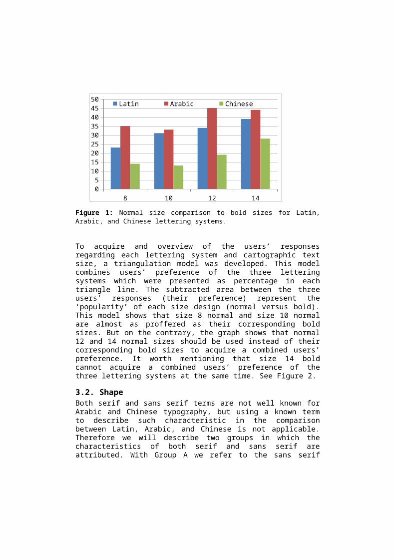
3.1. SizeFour consecutive sizes (8, 10, 12, and 14) were depicted in Arial font for Latin, Tahoma font for Arabic, while Chinese were depicted in (Microsoft JhengHei). To test users’ preference regarding the difference between Latin, Arabic, and Chinese lettering systems size wise, ANOVA test was conducted to test the influence of size differences on users’ preference when bold sizes were compared to normal sizes. The test showed significant influence of letters’ size (normal versus bold) on users’ preference (F=10.230, P=0.005). Therefore Tukey post-hoc test was conducted to explore between which lettering systems the difference was. The test showed significant difference between Latin compared to Chinese users’ preference (F=4.646, P=0.046) and between Arabic compared to Chinese (F=4.646, P=0.004). Figure 1 shows users’ preference of normal sizes compared to bold sizes for the three lettering systems.
8 10 12 1405
101520253035404550
Latin Arabic Chinese
Figure 1: Normal size comparison to bold sizes for Latin, Arabic, and Chinese lettering systems.
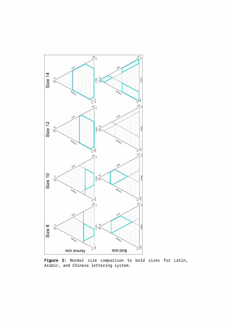
To acquire and overview of the users’ responses regarding each lettering system and cartographic text size, a triangulation model was developed. This model combines users’ preference of the three lettering systems which were presented as percentage in each triangle line. The subtracted area between the three users’ responses (their preference) represent the ‘popularity’ of each size design (normal versus bold). This model shows that size 8 normal and size 10 normal are almost as proffered as their corresponding bold sizes. But on the contrary, the graph shows that normal 12 and 14 normal sizes should be used instead of their corresponding bold sizes to acquire a combined users’ preference. It worth mentioning that size 14 bold cannot acquire a combined users’ preference of the three lettering systems at the same time. See Figure 2.
3.2. ShapeBoth serif and sans serif terms are not well known for Arabic and Chinese typography, but using a known term to describe such characteristic in the comparison between Latin, Arabic, and Chinese is not applicable. Therefore we will describe two groups in which the characteristics of both serif and sans serif are attributed. With Group A we refer to the sans serif fonts or fonts that have similar characteristics (the least strokes the possible), and with group B we refer to serif fonts or fonts that have similar attributes (extra strokes included). Thus, A and B fonts were
applied on each lettering system using normal size 10. Then, a comparison was made for Arial versus Times New Roman for Latin, Tahoma Versus Times New Roman for Arabic and Microsoft JhengHei versus SimSun for Chinese.In parallel, shape A represents the sans serif and its resemblances (Arial, Tahoma, Microsoft JhengHei), and shape B represents the serif font and its resemblances (Times New Roman, and SimSun). ANOVA test showed that users’ preference of shapes was significantly different when comparing between shape A and shape B (F=846.0, P=0.000), as they preferred shape A over shape B. Whereas the difference between users’ preference of the three different lettering system was not significantly different (F=0.000, P=1.000).
3.3. OrientationThe orientation of labels was studied in two phases. The first phase tackled the overall orientation of label in relation to the depicted feature. The second phase tackled the orientation of the letters within the world (italic versus normal).Represented in Figure 3, the trend of users’ preference of cartographic text orientation for Latin, Arabic, and Chinese. The orientation of labels showed no significant difference between Latin, Arabic, and Chinese (F=0.098, P=0.908), when labels were placed horizontally, tilted according to the shape of the labelled area, and finally mixed placement, which combines the two previously mention orientations. When italic labels were compared with straight labels, four sizes were engaged in this comparison (8, 10, 12, and 14). The comparison between straight label design and italic label design along the four tested sizes showed no significant difference between both designs (F=0.173, P=0.911) size wise, when ANOVA test was used. The comparison between the lettering systems using ANOVA test showed a significant difference of using different lettering systems (F=8.945, P=0.007). The post-hoc Tukey test followed to indicate where the difference was between the three lettering systems. The test showed that users’ preference of Latin italics’ was significantly different from users’ preference of both Arabic Italic (F=2.131, P=0.040) and Chinese italic (F=2.131, P=0.007).


Figure 2: Normal size comparison to bold sizes for Latin, Arabic, and Chinese lettering system.
To illustrate how users’ preference of the three lettering systems can be combined, the triangulation model was applied to present the percentage of users’ preference of each lettering systems. The subtracted areas represent the popularity of each design regarding the combination of the three lettering systems. The results show that normal (upright) orientation is more preferred than italic orientation. These results are valid for the four tested sizes. See Figure 4.
horizontal tilted mixed0
5
10
15
20
25
30
35 Latin Arabic Chinese
Figure 3: Users’ preference of Label orientation for the entire lettering system.
3.4. TextureTexture was formed by the combination of two variables at least. Hierarchal texture involves different typographic sizes. To form texture, a comparison between two shapes (serif versus sans serif within hierarchal texture) and weight size (bold versus normal within hierarchal texture) was made.
The first tested textural design was formed by the combination of three hierarchal normal sizes (8, 10, and 12) and two shapes (Arial versus Times New Roman). The second tested texture design was formed by the combination of three hierarchal bold sizes (8, 10, and 12) and the size weight (normal versus bold).
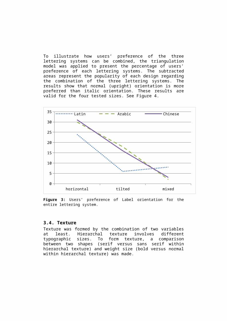
Figure 4: Normal and italic comparison for Latin, Arabic, and Chinese lettering systems.

Labels’ texture will change when the shape of labels changes and when their sizes change as well. The hierarchy representations were studied through the Texture variability, three consecutive size (8, 10, and 12) were used and two different fonts resembling the serif (Shape A) and sans serif (Shape B) for the three lettering systems (as explained earlier). Normal Hierarchy was compared to bold hierarchy for both shape A and shape B, illustrated in Figure 5. When comparing between users’ preference of the presented textural designs, in regard to the three lettering systems, no significant difference was found between users’ preference of Latin, Arabic, and Chinese (F= 0.554, P= 0.624).
A B A B0
5
10
15
20
25
30
35
40
45
50Latin Arabic Chinese
normal sizes bold sizes
Figure 5: Users’ preference of Labels’ texture (normal versus bold) for Latin, Arabic, and Chinese.
4. DiscussionThe research showed that Latin, Arabic, and Chinese have a significant influence on users’ preference. Visual variables (size, shape, orientation, and texture) applications on each lettering systems resulted in different users’ preference. Basically, the significant difference could have resulted because of the differences in lettering systems’ characteristics.

Distinguishable properties are included in each lettering system. For example, Latin letters have fixed contextual shape, unlike Arabic whose letters’ forms differ according to their location in the word (contextual shape). Meanwhile, the ‘letters/words’ in Chinese are pictographically formed. In addition to that, the directionality of writing differs as Latin is written from left to right, Arabic is written from right to left, and Chinese could be written either from left to right or from top to bottom. Many more cultural differences between the lettering systems can be identified. These differences are reasonable causes for the significantly different results in the second stage of the test.During setting the application of Bertin’s variable some important issues were noticed: although letter size is defined by its corresponding point size,
when comparing between five letters toponyms written in the same point size, one is in Arabic and the other is Latin, each consumes different space on the map;
the relation between typographic size and shape is crucial. At a fixed size and within a specific lettering system, different typographic shapes could appear in different sizes, and thus, they would consume different space on mapface;
at a fixed size and for the same shape characteristics, different lettering system could appear in different sizes. This issue was noticed when we studied shape A (sans serif and its resemblances). Arial was applied on Latin, Tahoma was applied on Arabic, and Microsoft JhengHei for Chinese;
Considering shape A and shape B characteristics, their application on Chinese typography did not show noticeable difference when they were depicted in the smallest sizes (8 and 10).
The triangulation model was a good tool to visualize and asses the combination of users’ preference regarding the three lettering system. Drawing the individual lines that represent the percentage of the collected data, resulted in a polygon, which may differ in size according to the positivity of the combination of the three variables (lettering system in our study). The more positive the combination, the larger the polygon is. In the case where the combination of the responses is negative, three disconnected polygons will result, which states that such combination cannot be done (the three lettering system in our study, Figure 2, the last triangle).

5. Conclusion and Future workRegarding Latin, Arabic, and Chinese lettering system, some significant differences occurred when applying the visual variables regarding users’ preference. This issue shows that lettering systems’ characteristics has an influence on users’ preference.As we move towards multilingualism, which become a widespread phenomenon in the economically globalized word, interactions between cultures occur daily. It is important to consider multilingual mapping in future work where further experimental conditions shall be considered, especially the combination of different lettering systems on map to define clearly the conditions of using visual variables for multilingual mapping.
ReferencesBartz, B.S. 1970b. Experimental Use of The Search Task in The Analysis
of Type Legibility in Cartography, The Cartographic Journal, 7(2), pp.103-113.
Bartz, B.S.1970a. An Analysis of the Typographic Legibility Literature, Assessment of Its Applicability to Cartography, The Cartographic Journal, 7(1), pp.6-17.
Bertin, J. 1967. Semiology of Graphics: Diagram, Networks, Maps, Translated by William J. Berg, 2011, California: Esri press.
Board, C. & Taylor, R. M. 1977. Perception and maps: Human factors in map design and interpretation. Transactions of the Institute of British Geographers, pp.19-36.
Deeb, R. & De Maeyer, P. 2010. An Interprative Phenomenological Analysis of The Noise Occuring in Reading Maps.The workshope on IPA methodology, Doctoral School, Ghent University.
Deeb, R., Bonchev, S., Bandrova. T.,& De Maeyer, P., 2014a. How to design users’ friendly multilingual maps? Cyrillic and Latin Labels. 5th International Conference on cartography and GIS. Riviera
Deeb, R., Ooms, K. & De Maeyer, P.,2012. Typography in the Eyes of Bertin, Gender and Expertise Variation. The Cartographic Journal, 49(2), pp. 167-185.
Deeb, R., Ooms, K., Van Etvelde, V. & De Maeyer, P., 2013b. Toward a deeper understanding of cartographic text visualisation: assessment

of user preferences and colour influence. The Cartographic Journal. DOI: http://dx.doi.org/10.1179/1743277413Y.0000000073
Deeb, R., Ooms, K., Vanopbroeke, V. & De Maeyer, P., 2013a. Evaluating the Efficiency of Typographic Design: Gender and Expertise Variation. The Cartographic Journal. 51(1), pp. 75-86.
Kolácný, A. 1969. Cartographic information - A fundamental concept and term in modern cartography. The Cartographic Journal, 6(1), pp.47-49.
Kraak, M. J. & Ormeling, F. 2010. Cartography. Visualization of Spatial Data, 3rd edition, Person Prentic Hall, Harlow.
Phillips, R.J., 1981. Search for Target in a Random Arrangement of Names: an Eye Fixation Analysis, Canadian Journal of Psychology, 35(4), pp.330-346.