Embed Size (px)
Citation preview

Introduction to InfographicsKelly Schultz, Data Visualization Librarian

Agenda• Learning Objectives
• Introduction to Infographics
• Design Process – Best Practices
• Activity: Critique
• Wrap-up

Learning objectives• Participants will be able to:
Recognize what infographics are and when to use them
Critique infographics, using their knowledge of best practices
Be aware of Map & Data Library services where they can go for more help

What are Infographics?

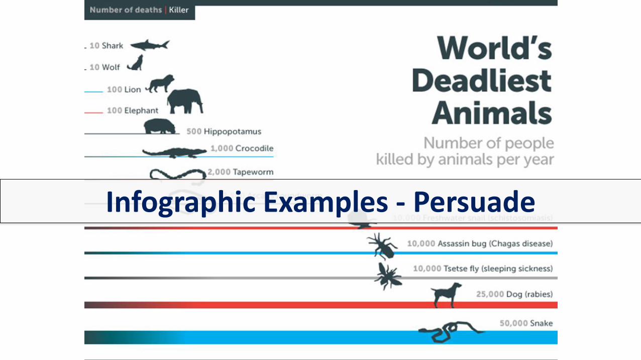
Infographic Example - Inform

Why use Infographics?

Design Process - Best Practices

Audience and Purpose

Storytelling

Common Visuals
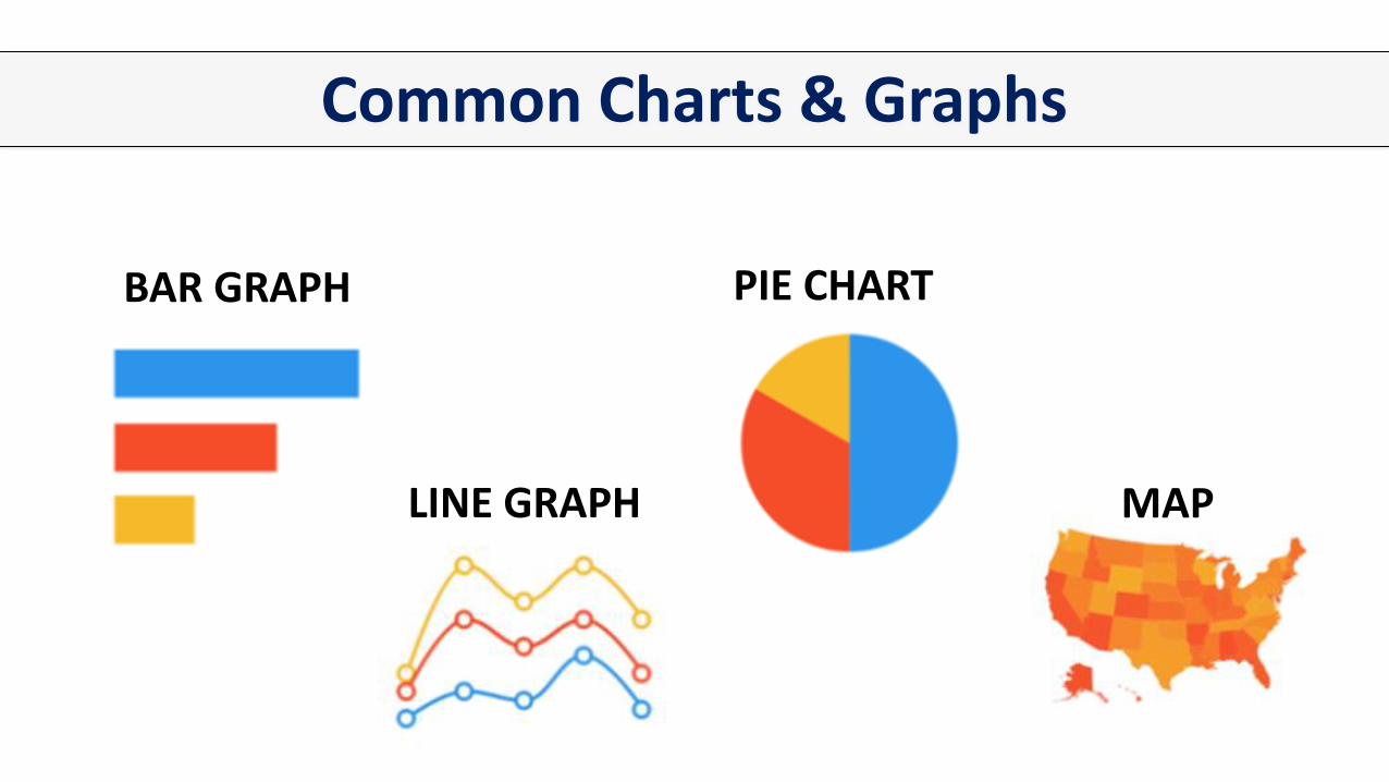
Common Charts & Graphs
BAR GRAPH
LINE GRAPH
PIE CHART
MAP
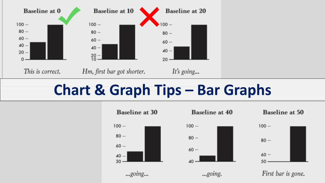
Chart & Graph Tips – Bar Graphs
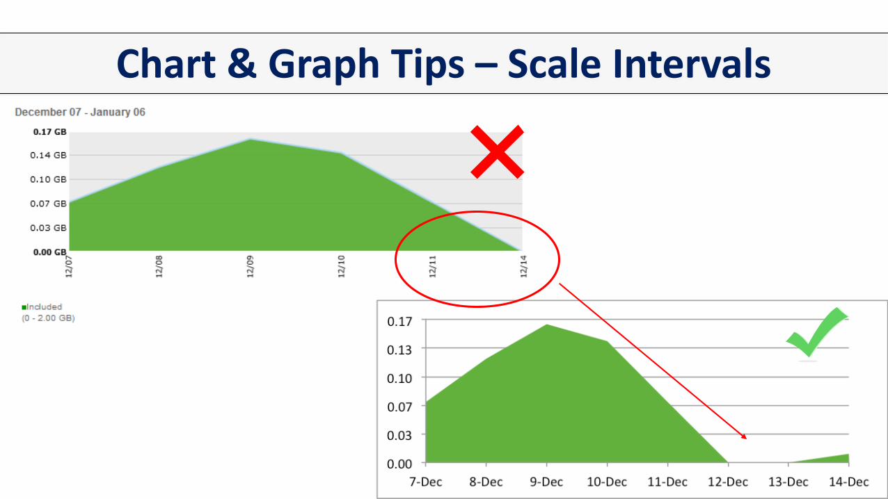
Chart & Graph Tips – Scale Intervals

Chart & Graph Tips – Scale

Chart & Graph Tips – Pie Charts

Chart & Graph Tips – 3D

Chart & Graph Tips – Maps

Clarity vs Creativity
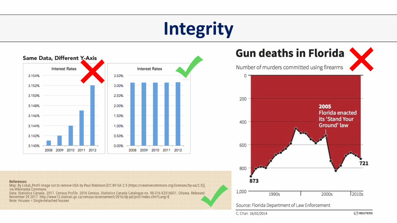
Integrity

Planning

Layout

Hierarchies

Fonts

Colours
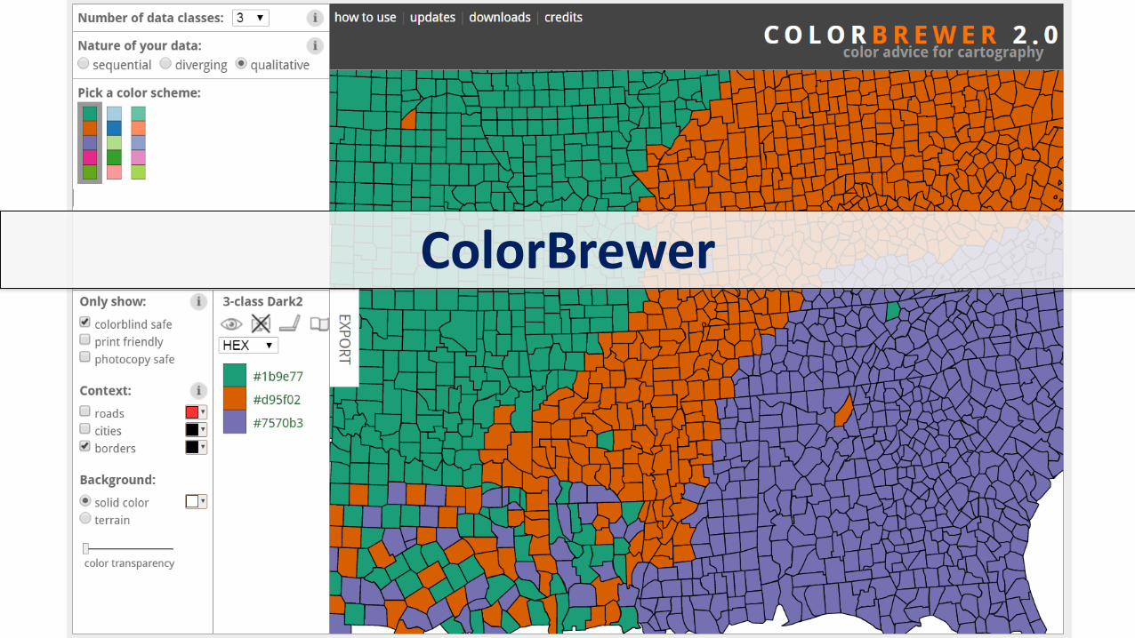
ColorBrewer

Colour Blindness - Coblis

Colour Considerations

Accessibility
Low Contrast High Contrast

Resources• Data Visualization Guide: https://mdl.library.utoronto.ca/dataviz/getting-started
• Design Principles section (with data viz tips): https://mdl.library.utoronto.ca/dataviz/design-principles
• Speciality Visualization Areas section (with map making tips): https://mdl.library.utoronto.ca/dataviz/specialty-visualization-areas
• Research about visual variables and visual perception are found in this section of the data viz design workflow page: https://mdl.library.utoronto.ca/dataviz/workflow#elements
• Data Viz Guide’s Books, Blogs & More page : https://mdl.library.utoronto.ca/dataviz/books-blogs-and-more
• Specific resources supporting the ideas mentioned on why visualization and storytelling are so powerful:
• The Visual Display of Quantitative Information by Edward Tufte: http://go.utlib.ca/cat/4595165
• “Brain Rules: Vision” by Dr. John Medina: http://brainrules.net/vision (also see the accompanying PDF of additional references for more information)
• Useful Fictions: Evolution, Anxiety, and the Origins of Literature by Michael Austin: http://go.utlib.ca/cat/7363935
• Learn more about storytelling with Data Visualization:• Lynda.com course: Data Visualization: Storytelling: https://www.lynda.com/Excel-tutorials/Data-Visualization-
Storytelling-Essentials/435230-2.html

Resources Continued• Modular Scale (for selecting font sizes): http://www.modularscale.com/?12&pt&1.5
• How to Choose Fonts (with sample font pairings): https://venngage.com/blog/how-to-choose-fonts/
• Links about scale and misleading graphs: • Bars and lines: méfiez-vous des morceaux choisis: https://excelcharts.com/of-bars-and-lines/
• Must Zero Be Included on Scales of Graphs? Another Look at Fox News' Graph and Huff's Gee-Whiz Graph: https://www.forbes.com/sites/naomirobbins/2012/08/28/must-zero-be-included-on-scales-of-graphs-another-look-at-fox-news-graph-and-huffs-gee-whiz-graph/#7b440b06259c
• How To Exaggerate Trends in Graphs: https://www.forbes.com/sites/naomirobbins/2012/09/12/misleading-by-changing-the-aspect-ratio-to-hide-variation-or-exaggerate-trends-in-graphs/#1e3d987671f3
• University of North Carolina Chapel Hill Infographic Planning Worksheet: https://guides.lib.unc.edu/ld.php?content_id=33197056
• Piktochart Layout Cheat Sheet: https://piktochart.com/blog/layout-cheat-sheet-making-the-best-out-of-visual-arrangement/
Resources Continued• Infographic examples (books):
• Infographic Designers' Sketchbooks: http://go.utlib.ca/cat/9861504
• Infographics: Designing and Visualizing Data: http://go.utlib.ca/cat/9985210
• Infographics: The Power of Visual Storytelling: http://go.utlib.ca/cat/8722500
• Colour palettes: • Adobe Color CC: https://color.adobe.com/explore/most-popular/?time=all
• Color Brewer: http://colorbrewer2.org/#type=sequential&scheme=BuGn&n=3
• LOLColors: http://www.lolcolors.com
• COLOURlovers: http://www.colourlovers.com/
• Coolers: http://coolors.co/
• Coblis – Color Blindness Simulator: http://www.color-blindness.com/coblis-color-blindness-simulator/

Resources Continued• Books on colour psychology:
• Handbook of color psychology: http://go.utlib.ca/cat/10415098
• Colour hunting: How colour influences what we buy, make and feel: http://go.utlib.ca/cat/8235358
• 40 Facts About How the Psychology of Color Can Boost Your Website Conversions [Infographic]: https://www.marketingprofs.com/chirp/2017/32483/40-facts-about-how-the-psychology-of-color-can-boost-your-website-conversions-infographic
• Inclusive Design: How to Make Your Visuals Accessible to All: https://piktochart.com/blog/inclusive-design-make-visuals-accessible/
• University of North Carolina Chapel Hill Evaluation Rubric for Design of Infographics: https://guides.lib.unc.edu/ld.php?content_id=35032138
• Some Useful Infographic Design Articles:• The Ultimate Infographic Design Guide: 13 Tricks for Better Designs: https://venngage.com/blog/infographic-
design/
• How to Make an Infographic in 5 Steps: https://venngage.com/blog/how-to-make-an-infographic-in-5-steps/
• Infographic Design: https://www.canva.com/learn/how-to-design-infographics/
• Piktochart Design Series: With These 8 Articles You Can Now Design Like a Pro: https://piktochart.com/blog/infographics-design-series-design-your-infographic-like-a-pro/

Infographic Creation Tools• Desktop Tools:
• Adobe Illustrator: https://www.adobe.com/ca/products/illustrator.html
• Microsoft PowerPoint: https://products.office.com/en-ca/powerpoint
• Online Tools:• Piktochart: https://www.piktochart.com/
• Canva: https://www.canva.com/
• Venngage: https://venngage.com/
• Visme: https://www.visme.co/
• Easelly: https://www.easel.ly/
• Infogram: https://infogram.com/

Useful Websites for Free Icons, Images, etc.
• https://www.flaticon.com/
• https://thenounproject.com/
• https://unsplash.com/
• https://pixabay.com/
• https://morguefile.com/
• https://www.flickr.com/commons
• https://commons.wikimedia.org/wiki/Main_Page

Critiquing an InfographicLet’s work together – groups of 2 or 3

Wrap-Up

Image credits• Slide 1: “Catch and Deceased?”, Infographic by Will Hood & Writing by Todd Reubold,
https://ensia.com/infographics/catch-and-deceased/
• Slide 2: Manos, morguefile.com/xololounge, http://mrg.bz/Yda9Is
• Slide 3: Drawing and coloring, FreeImages.com/ Ove Tøpfer, http://www.freeimages.com/photo/drawing-1313453
• Slide 4: “Cigarette Taxes In Photos”, Intuit, Inc., https://blog.turbotax.intuit.com/tax-news/cigarette-taxes-in-photos-7219/; “Working with Infographics”, Lorin Bruckner, workshop run at UNC Chapel Hill Libraries, https://guides.lib.unc.edu/lorinbruckner
• Slide 5: “Diabetes: The silent scourge”, Adolfo Arranz, https://www.behance.net/gallery/37867571/Diabetes-The-silent-scourge
• Slide 6: “The Deadliest Animal in the World”, Bill Gates, https://www.gatesnotes.com/Health/Most-Lethal-Animal-Mosquito-Week
• Slide 7: Binoculars portrait (dscn4659_mod_vign_sm), flickr.com/gerlos, https://flic.kr/p/5KGg5B

Image credits• Slide 8: Photo Editing, bestreviewsbase.com & flickr.com/James Baker,
https://flic.kr/p/WjBc3z
• Slide 9: audience wave, flickr.com/Gavin Tapp, https://flic.kr/p/aqvnet
• Slide 10: Not Fade Away....., flickr.com/Daniel Go, https://flic.kr/p/ayqr9r
• Slide 11: “Education Around the World [Infographic]”, Visualistan, https://www.visualistan.com/2014/03/education-around-world-infographic.html; “Icons and Images : 5 ‘Must-knows’ on how to use them effectively”, See Mei Chow, https://piktochart.com/blog/5-wonderful-tips-to-handle-icons-and-images/; “How to Make an Infographic in 5 Steps”, Midori Nediger, https://venngage.com/blog/how-to-make-an-infographic-in-5-steps/; “How to Create a Timeline Infographic in 6 Easy Steps”, Midori Nediger, https://venngage.com/blog/how-to-create-a-timeline-infographic-in-6-steps/
• Slide 12: “How to Make an Infographic in 5 Steps”, Midori Nediger, https://venngage.com/blog/how-to-make-an-infographic-in-5-steps/
• Slide 13: “Real Chart Rules to Follow”, Nathan Yau, http://flowingdata.com/2015/08/11/real-chart-rules-to-follow/
Image credits• Slide 14: “Chart Dos and Don’ts”, Angela Zoss,
https://guides.library.duke.edu/datavis/topten
• Slide 16: “Real Chart Rules to Follow”, Nathan Yau, http://flowingdata.com/2015/08/11/real-chart-rules-to-follow/
• Slide 17: “Trellis Plot Alternative to Three-Dimensional Bar Charts” by Naomi Robbins from Forbes.com, https://www.forbes.com/sites/naomirobbins/2012/06/07/trellis-plot-alternative-to-three-dimensional-bar-charts/#1f7b276c7dab
• Slide 18: “Canada”, Free SVG Maps, https://www.amcharts.com/svg-maps/?map=canada
• Slide 19: “How to Make Great Charts for Infographics”, See Mei Chow, https://piktochart.com/blog/how-to-make-charts-in-infographics-look-good/; “The Do's And Don'ts Of Infographic Design”, Amy Balliett, https://www.smashingmagazine.com/2011/10/the-dos-and-donts-of-infographic-design/
• Slide 20: “How to Lie with Data Visualization”, Heap Analytics, https://heapanalytics.com/blog/data-stories/how-to-lie-with-data-visualization
• Slide 21: Vincenzo di Maria, flickr.com/Kennisland, https://flic.kr/p/ffJHBz

Image credits• Slide 22: “How to Make an Infographic in 5 Steps”, Midori Nediger,
https://venngage.com/blog/how-to-make-an-infographic-in-5-steps/
• Slide 23: “How to Choose Fonts That Make (Not Break) Your Infographic”, Midori Nediger, https://venngage.com/blog/how-to-choose-fonts/
• Slide 24: “Typography II: 4 Things You Need To Know To Pair Fonts Well”, See Mei Chow, https://piktochart.com/blog/typography-things-you-need-to-know-to-pair-fonts-well/; “How to Choose Fonts That Make (Not Break) Your Infographic”, Midori Nediger, https://venngage.com/blog/how-to-choose-fonts/
• Slide 25: Coolors, https://coolors.co/
• Slides 26: ColorBrewer : http://colorbrewer2.org
• Slides 27 & 28: Coblis — Color Blindness Simulator: http://www.color-blindness.com/coblis-color-blindness-simulator/

Image credits• Slide 29: “Introduction to Web Accessibility”, W3C Web Accessibility Initiative,
https://www.w3.org/WAI/fundamentals/accessibility-intro/#examples; Contrast Rebellion, https://contrastrebellion.com/
• Slide 36: WisCEL_classroom12_7871, flickr.com/college.library, https://flic.kr/p/e8RE6D
• Slide 38: audience wave, flickr.com/Gavin Tapp, https://flic.kr/p/aqvnet
*Special thank you to Lorin Bruckner, UNC Chapel Hill Libraries, for sharing her slides for her “Working with Infographics” workshop – my workshop was inspired and informed by her work