Embed Size (px)
DESCRIPTION
Introduction. The following slides are intended to complement articles that I have been publishing about dynamic graphics. The “printed” articles have a selection of frames from the animations but on this web site you can view the complete animation sequence. - PowerPoint PPT Presentation
Citation preview

Introduction• The following slides are intended to complement articles that I have been
publishing about dynamic graphics. • The “printed” articles have a selection of frames from the animations but on this
web site you can view the complete animation sequence.• All the frames have been calculated and drawn in R (www.r-project.org)• The frames have been put together into an animated GIF file using the software
Animation Shop.• Since the animations are fairly large files you might not see them immediately.
Also on the web they suffer minor problems such as “blank flashes” – still to be resolved,
• An alternative is to download the whole Powerpoint presentation file (an even bigger file) and then watch the show offline, which is much better quality and much faster, once everything is downloaded. The link to that file is:
www.econ.upf.edu/~michael/animations/animations.pps
• I hope you enjoy them!
Michael [email protected]/~michael
IF YOU ARE USING A WEB BROWSER TO VIEW THESE
ANIMATIONS TRY EXPLORER RATHER THAN FIREFOX.
Statistical Animationsby Michael Greenacre
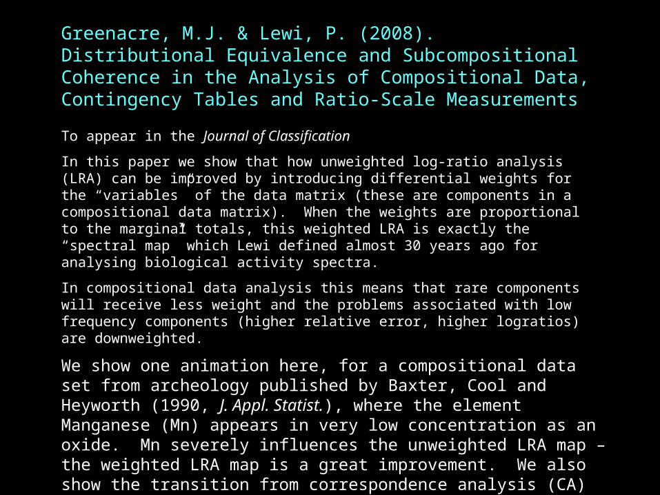
Greenacre, M.J. & Lewi, P. (2008). Distributional Equivalence and Subcompositional Coherence in the Analysis of Compositional Data, Contingency Tables and Ratio-Scale Measurements
To appear in the Journal of Classification
In this paper we show that how unweighted log-ratio analysis (LRA) can be improved by introducing differential weights for the “variables” of the data matrix (these are components in a compositional data matrix). When the weights are proportional to the marginal totals, this weighted LRA is exactly the “spectral map” which Lewi defined almost 30 years ago for analysing biological activity spectra.
In compositional data analysis this means that rare components will receive less weight and the problems associated with low frequency components (higher relative error, higher logratios) are downweighted.
We show one animation here, for a compositional data set from archeology published by Baxter, Cool and Heyworth (1990, J. Appl. Statist.), where the element Manganese (Mn) appears in very low concentration as an oxide. Mn severely influences the unweighted LRA map – the weighted LRA map is a great improvement. We also show the transition from correspondence analysis (CA) to the weighted LRA map – there is a very small difference.
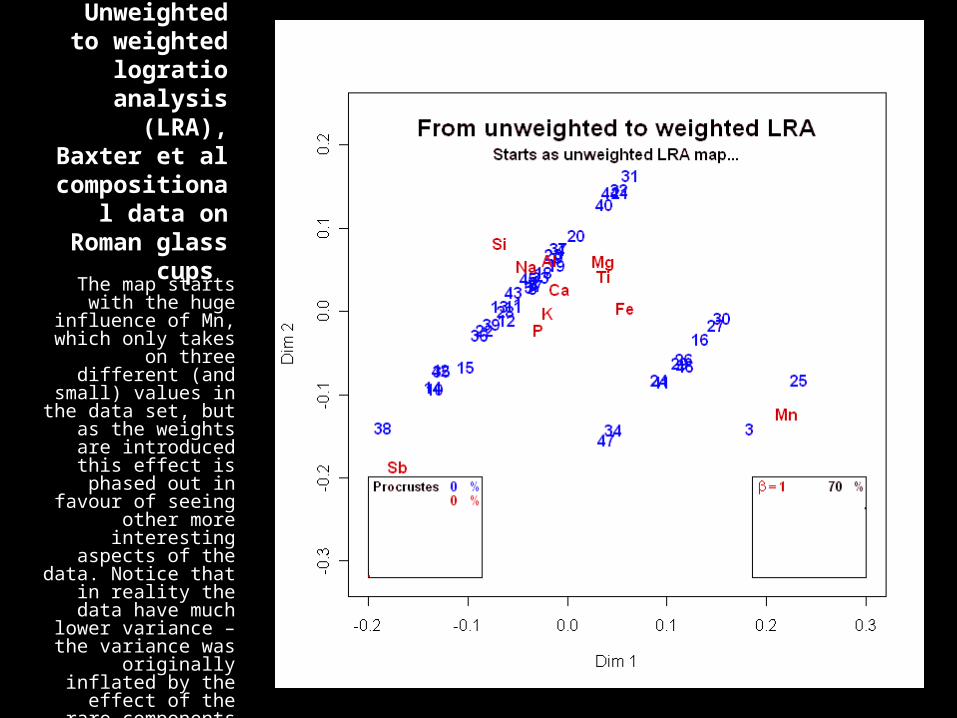
Unweighted to weighted
logratio analysis (LRA),
Baxter et al compositional
data on Roman glass cups
The map starts with the huge influence of Mn, which only takes
on three different (and small) values in
the data set, but as the weights are
introduced this effect is phased out in favour of seeing
other more interesting aspects of the data. Notice
that in reality the data have much
lower variance – the variance was
originally inflated by the effect of the rare components such as
manganese (Mn)
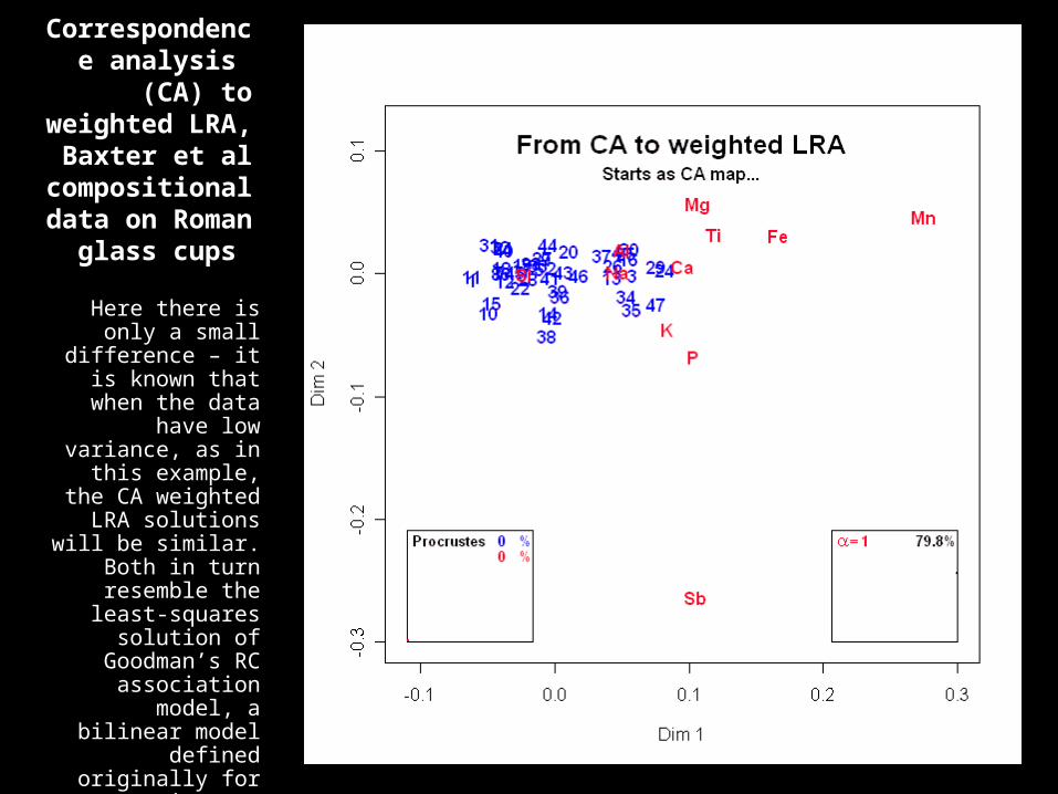
Correspondence analysis (CA) to
weighted LRA, Baxter et al
compositional data on Roman
glass cups
Here there is only a small difference – it is known that when
the data have low variance, as in this
example, the CA weighted LRA
solutions will be similar. Both in turn resemble the least-squares solution of
Goodman’s RC association model, a
bilinear model defined originally for contingency tables.

Pardo, R. and Greenacre, M.J. (2008). Positioning the "middle" categories in survey research: a multidimensional
From keynote address at the European Association of Methodology’s biennial conference in Oviedo, Spain, July 2008.
In this talk we looked at questionnaire data and the position of the “middle” response categories (e.g., “neither agree nor disagree” on a 5-point bipolar scale) across a number of questions.
To compare what we observe in real data with what we would expect in an idealized situation where there was a single underlying response gradient, with the middle categories perfectly “between” agree and disagree, we show the multiple correspondence analysis (MCA) of simulated data.
Animation is used here to show the configuration in three dimensions, where in the first two dimensions the category points form a parabola, the well-known “arch effect” in CA, while with respect to axes one and three the configuration becomes a cubic.
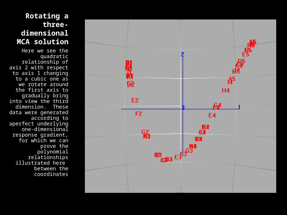
Rotating a three-dimensional
MCA solution
Here we see the quadratic
relationship of axis 2 with respect to axis 1
changing to a cubic one as we rotate
around the first axis to gradually bring into view the third
dimension. These data were generated according to aperfect
underlying one-dimensional
response gradient, for which we can
prove the polynomial relationships
illustrated here between the coordinates
Greenacre, M.J. (2008). Power transformations in correspondence analysis.
To appear in the Special Issue of Correspondence Analysis and Related methods, Computational Statistics and Data Analysis
In this paper I show how power transformations in correspondence analysis (CA) have as a limiting case the method of logratio analysis (LRA).
A straightforward powering of the original data to a power followed by the application of CA with the rescaling of the singular values by 1/ tends to unweighted LRA as tends to 0. In this case the row and column margins depend on and tend to constants (hence the “unweighted”...) .
A powering of the contingency ratios, keeping the row and column margins fixed, and applying the usual CA algorithm, again with the final rescaling by 1/, tends to weighted LRA as tends to 0.
The transition from CA to LRA is illustrated with two data sets: the MN population genetic data set, and the author data.
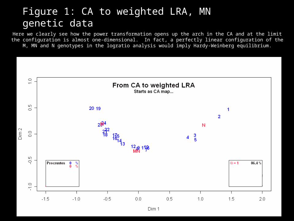
Figure 1: CA to weighted LRA, MN genetic data
Here we clearly see how the power transformation opens up the arch in the CA and at the limit the configuration is almost one-dimensional. In fact, a perfectly linear configuration of the M, MN and N
genotypes in the logratio analysis would imply Hardy-Weinberg equilibrium.

Figure 2: CA to weighted LRA for the author data
This example has very little inertia. The difference between CA and LRA will be very small in this case, as shown by Greenacre & Lewi (2005, to appear in Journal of Classification, 2008)
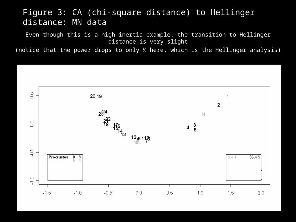
Figure 3: CA (chi-square distance) to Hellinger distance: MN data
Even though this is a high inertia example, the transition to Hellinger distance is very slight
(notice that the power drops to only ½ here, which is the Hellinger analysis)
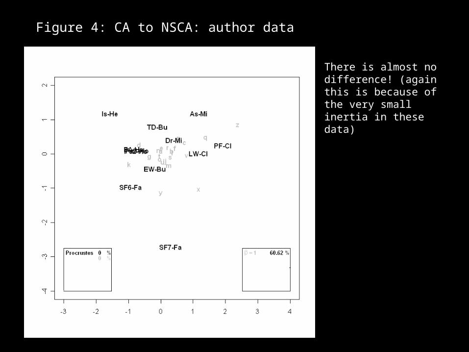
Figure 4: CA to NSCA: author data
There is almost no difference! (again this is because of the very small inertia in these data)
Greenacre, M.J. (2008). Dynamic graphics of parametrically linked multivariate methods used incompositional data analysis Paper presented at the 3rd International Workshop on Compositional Data Analysis, June 2008, Girona , Spain
You can get a PDF of this paper at:
http://www.econ.upf.es/en/research/onepaper.php?id=1082
where there are some dynamic graphics embedded in the file.
Notice, however, that this does not work on all platforms – we are trying to ascertain exactly why this occurs..
In addition to this paper, I presented an animation of the logratio analysis of a large compositional data set (known as “Darssil”) where the large number of zeros in the data were replaced by 0.1 and then in decreasing steps of 0.001, i.e. 0.099, 0.098, until 0.001. This shows graphically where the zero-replacement strategy starts to break down. This is shown on the next slides, first for unweighted LRA, then weighted LRA.
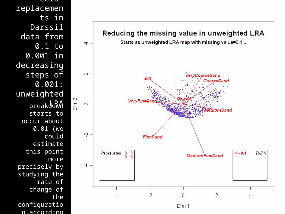
Zero-replacements
in Darssil data from 0.1 to
0.001 in decreasing
steps of 0.001:
unweighted LRA
There is almost no difference! (again this is because of the very small inertia in these data)
breakdown starts to occur
about 0.01 (we could estimate this point more
precisely by studying the
rate of change of the
configuration according to the
Procrustes statistics, for
example)

Zero-replacements
in Darssil data from 0.1 to
0.001 in decreasing
steps of 0.001:
weighted LRA
notice that weighted LRA is
more stable than the
unweighted form on the
previous slide and breakdown starts to occur
much later, when the zero-
replacement value is much
closer to 0