Embed Size (px)
Citation preview
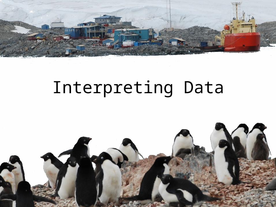
Interpreting Data

Asking questions (for science) and defining
problems (for engineering)
Developing and using models
Planning and carrying out investigations
Analyzing and interpreting data
Using mathematics and computational thinking
Constructing explanations (for
science) and designing solutions (for engineering)
Engaging in argument from evidence
Obtaining, evaluating, and communicating
information

Activity: Nonsense Data
What is it like for learners to work with information that is new and overwhelming?

As you work…• Please note what skills you are using in order to
answer the questions.
• What did you pay attention to?
• How did you arrive at your answers?
• What could you answer? What could you NOT answer?
Handout A then Handout B

Activity Debrief
• Were you able to answer the questions for part A?• What about part B?• Were they difficult or easy?• Where did you find the information you needed? What skills
did you use?• How did you report this information?
• What skills or information would you need to understand any unanswered questions?

Data Visualizations
– Every visualization serves two functions:
• Transmit information accurately
• Allow people to use it as a tool for making meaning and personal sense of the information
– Visualizations without the correct or enough context are meaningless.
– People can make sense of content IF they can make sense of the images.
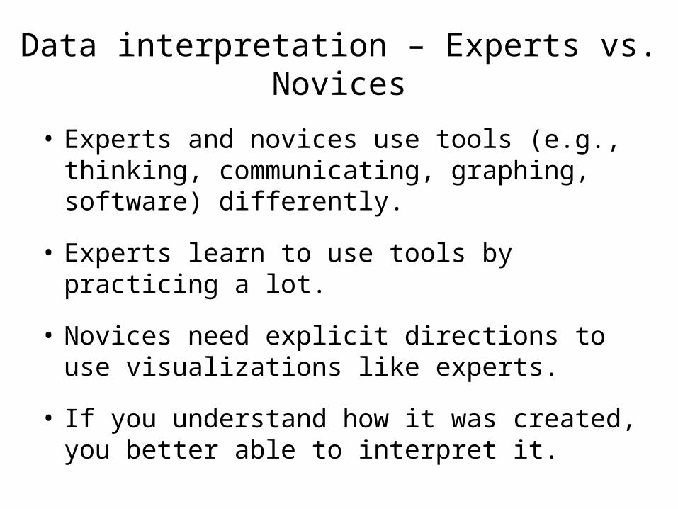
Data interpretation – Experts vs. Novices
• Experts and novices use tools (e.g., thinking, communicating, graphing, software) differently.
• Experts learn to use tools by practicing a lot.
• Novices need explicit directions to use visualizations like experts.
• If you understand how it was created, you better able to interpret it.

Eyes move to access information…
LEGENDS need to point out on the rightBecause people look for given information (what they know)
on the left and for new information (what they need to interpret) on the right.
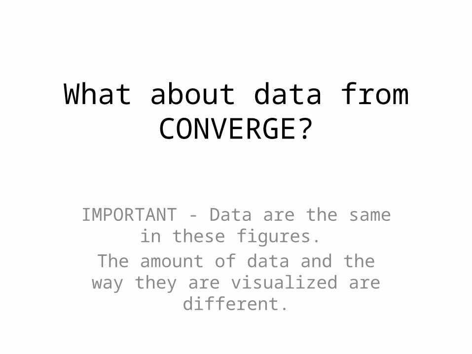
What about data from CONVERGE?
IMPORTANT - Data are the same in these figures.
The amount of data and the way they are visualized are different.

HF Radar Data
CONVERGE Project CONVERGE

HF Radar Data
CONVERGE Project CONVERGE

Glider Data - Temperature
CONVERGE
Project CONVERGE
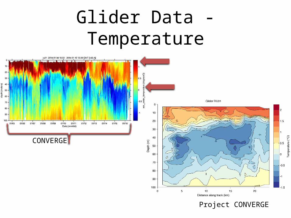
Glider Data - Temperature
CONVERGE
Project CONVERGE

Glider Data - Chlorophyll
CONVERGE
Project CONVERGE
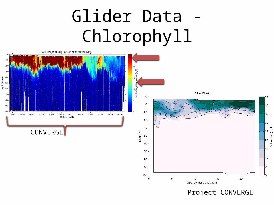
Glider Data - Chlorophyll
CONVERGE
Project CONVERGE