Embed Size (px)
DESCRIPTION
critic about the design
Citation preview
INSTITUT SAINS DAN TEKNOLOGI DARUL TAKZIM
DIPLOMA TEKNOLOGI MAKLUMAT
DIT 1413 / SKK 1313
TECHNOLOGY AND MEDIA DESIGN
ASSIGNMENT 2
REPORT MEDIA DESIGN CRITIQUE
NAME:
ROZITA ABDULLAH (345621)
NURUL SALIHAH BT ZAKARIA
(381928)
ZURINA ASYIKIN BT ISMAIL (383838)
PREPARED FOR :
CIK NOOR FAZLINDA BINTI OTHMAN
DATES SUBMIT:
23 MARCH 2011
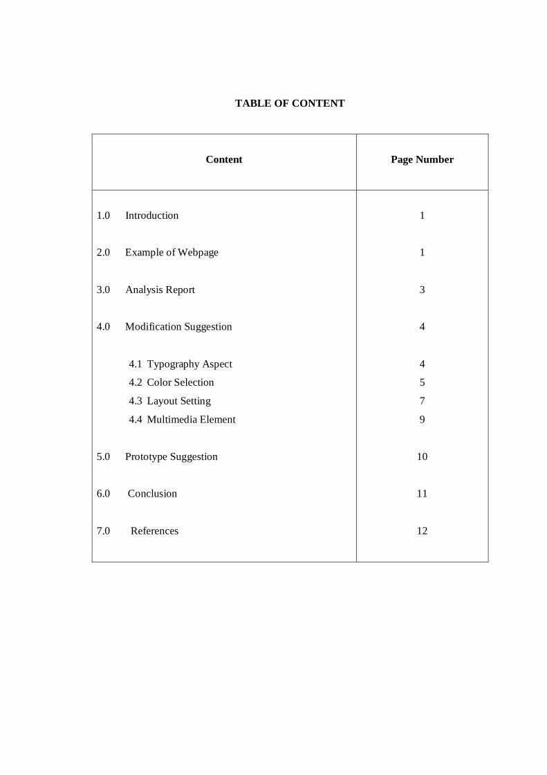
TABLE OF CONTENT
Content
Page Number
1.0 Introduction
2.0 Example of Webpage
3.0 Analysis Report
4.0 Modification Suggestion
4.1 Typography Aspect
4.2 Color Selection
4.3 Layout Setting
4.4 Multimedia Element
5.0 Prototype Suggestion
6.0 Conclusion
7.0 References
1
1
3
4
4
5
7
9
10
11
12
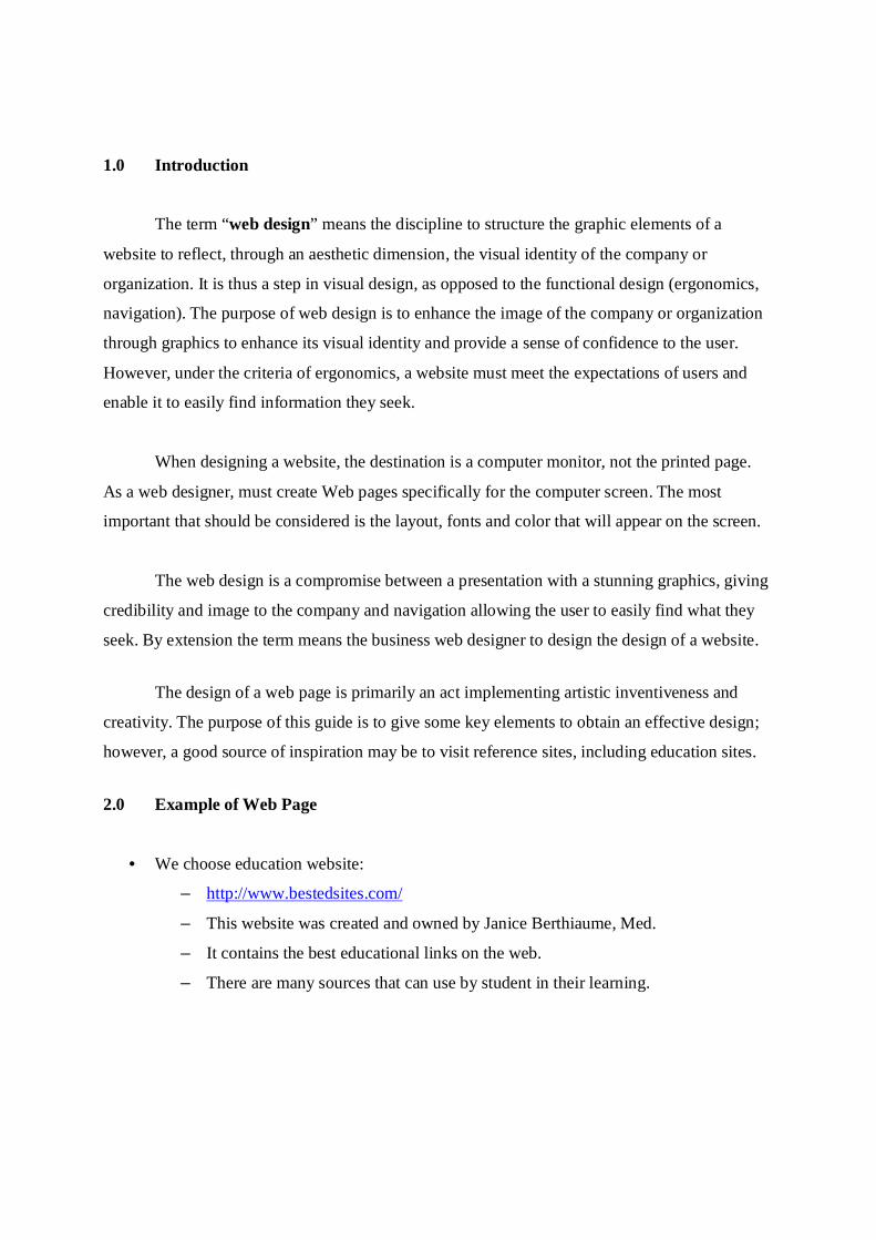
1.0 Introduction
The term “web design” means the discipline to structure the graphic elements of a
website to reflect, through an aesthetic dimension, the visual identity of the company or
organization. It is thus a step in visual design, as opposed to the functional design (ergonomics,
navigation). The purpose of web design is to enhance the image of the company or organization
through graphics to enhance its visual identity and provide a sense of confidence to the user.
However, under the criteria of ergonomics, a website must meet the expectations of users and
enable it to easily find information they seek.
When designing a website, the destination is a computer monitor, not the printed page.
As a web designer, must create Web pages specifically for the computer screen. The most
important that should be considered is the layout, fonts and color that will appear on the screen.
The web design is a compromise between a presentation with a stunning graphics, giving
credibility and image to the company and navigation allowing the user to easily find what they
seek. By extension the term means the business web designer to design the design of a website.
The design of a web page is primarily an act implementing artistic inventiveness and
creativity. The purpose of this guide is to give some key elements to obtain an effective design;
however, a good source of inspiration may be to visit reference sites, including education sites.
2.0 Example of Web Page
• We choose education website:
– http://www.bestedsites.com/
– This website was created and owned by Janice Berthiaume, Med.
– It contains the best educational links on the web.
– There are many sources that can use by student in their learning.

Header Background
Link Menu
Graphic
Animation
Advertisement Designer
Text Colorful
3.0 Analysis Report
There are several elements that should be considered when design the website:
– Typography aspect
– Color Selection
– Layout Setting
– Multimedia Elements (Animation, Graphic, sound, video, interactivity)
a) Typography aspect
Typography is the balance and interplay of letterforms on the page, a verbal and
visual equation that helps the reader understand the form and absorb the substance
of the page content. In this website, typography use for the typeface use is Serif
(Times New Roman) with the font Italic and bold and font size is (28pt).
Typeface Serif is suitable with the print document not the presentation document.
So the suitable use in this website is san Serif. This website also uses mixture of
color for the title and content. There are too many color in website not suitable
because no harmony. The text color uses the red and blue color. When click on
the link no different whether user has been invited that page. User get confuse
with this situation. The size of typeface is too big and use simple links as
navigation. The use of white space gives a sense of spaciousness and overall
neatness to a site. Small capitals use for the text in this website.
b) Layout Setting
In this website, the layout setting:
– No section to separate the header, content, advertisement and menu bar.
– No balance – elements arranged on the screen without regard to the weight on
both sides of the center line.
– Margins and Page Layout more too left side.
– Unclear navigation.

– There is no focal point in this website to draw the readers eye to the important
part of the layout
c) Color Selection
Color selection in this website:
– No different between visited link, active link and unvisited link color.
– No consistency color in this website.
– Use many color for text.
d) Multimedia Elements
In this website, multimedia elements use:
– Animation is annoying and distracting.
– Graphics in this website are meaningless and useless.
– The use of graphic is not effective.
4.0 Modification Suggestion
There is several modifications should be improve in this website based on the principle of
web design. The modification is from typography aspect, color selection, layout setting, suitable
design and others factor.
4.1 Typography aspect
It is strongly against the state to use more than two fonts on a website. The stylized fonts
should be used sparingly (for the title for example) and most of the web page will be made with a
classic police (Arial, Verdana, Helvetica, etc.).To use traditional print, font’s wheelbase (serif)
generally facilitates reading since wheelbases can accompany the eyes of the reader. On the web,
the use of such policies is not recommended because under the definition of the visitors screen,
the wheelbases can very quickly become handwritten embarrassing for reading. Thus, it is
desirable to opt for sans serif fonts (sans serif), plus round. Finally, be aware that texts using
non-standard fonts may not appear correctly on the screens of users. To create titles with such
policies, it is possible to circumvent this restriction by creating transparent images with the text.
Suggestion: For modification in this website, we use the typeface San Serif with the font size
is 18 suitable in this website. This size is not too small both big and suitable to
catch eye of users. In addition, the alignment text for this website is balance. The
text color, we choose black for the content, blue for the link text and red color the
title in that website.
4.2 Color Selection
Website color selection is as important to your website design as your text and graphics!
People see color long before they can absorb anything else on your website. Color sets the mood
and tempo of your website. Select your website color combinations carefully for the message
you want to present on your website. Website color has a psychological effect on people and
how they react to your website. Some colors imply action, others peace and tranquility. The
chart above shows some psychological implications of color.
a) Focus on the Target Audience
When deciding on the appropriate color for a website, consideration should be given to
the target audience. The color used for a product focused on the elderly may not fare well
with teens or younger generations. Also, over use of extremely bright colors like red,
yellow, blue etc causes eye fatigue and could drive visitor away.
b) Background Color
We often find it helpful to have a different color background. By doing this, it
punches the body of the website page forward and keeps the focus on the website itself.
c) Make Your Text Black
When it comes to reading text, people are used to reading black text. It is the easiest on
the eye. There is no need to stray from what people have grown up using.
d) Color should relative to products being highlighted
As stated earlier, it is important to relate your product / service to a color relevant to your
industry.
Red is attractive and powerful and would go well for websites that are focused on
products meant for children and also for inducing a visitor to take action with a “Book
now”, and/or “Reserve now”. Red invokes emotion.
Orange is used in websites that promote food products. It is known to promote positive
thinking and increase creativity. The color also appeals to the younger generation. Many
technical companies use Orange.
Yellow signifies cheerfulness and creativity. It appeals to children and is used in sites that
promote leisure products. Yellow, however, can tend to strain the eyes and should be
used as an accent color in most cases.
Green is pleasing to the human eye and is apt for tourism sites and sites that relate to
nature. Green symbolizes prosperity and wealth. Green also invokes trust and is one of
the most trendy / corporate colors.
Blue is a conservative color with incredibly high trust value and is known to relax the
nervous system. It is suitable for sites offering high- tech products and also for diet
products. Many people mistakenly use blue for text color. This should be avoided as it is
not a standard color for the human eye to read with.
Black is useful for sites that relate to photography and art.
Purple is used in religious sites and vacation sites.
e) Helpful Color Chooser Tools
We all love tools that help make our lives easier. On an earlier blog post about color we
had someone comment about a great color scheme tool. We recommend you have a look
at this one if you need help picking colors that work well together.
f) Don’t Make Your Website a Rainbow
A final note – the temptation with people starting out in web design is to use many
colors. The most impactful websites are the ones that keep the use of color to a
minimum. As a rule, we recommend that your website employ the use of 2 – 3 colors at a
maximum. Often the biggest statement your site can make is in its simplicity.
Suggestion: For modification from color selection aspect, we choose to use white space. This
is because white space allows for easier scanning of a website. It reduces the
amount of text visitors see all at once and makes reading much easier. It allows
for the visual separation of design elements without adding any new elements
such as visible lines or boxes. It is clean, looks professional when used correctly,
and gives a site an uncluttered and fresh feel. We also put some blue color
because is a conservative color with incredibly high trust value and is known to
relax the nervous system. This new modification looks like professional and
suitable with the educational background.
4.3 Layout Setting
Website design is not a onetime activity. Almost all websites alter their layouts to give it
a new and better look. Also with advancement in technology, underlying code also changes
accordingly, adding new possibilities of providing a better layout.
Points to consider while designing a website layout
a) Keep it simple.
A simple website layout is user friendly. Do not create complex navigational links using
complex scripts or images that may not be viewable correctly in different browsers. Also
search engines cannot index the site properly if complex navigation is involved.
Minimize the use of bulky images which take long to load. Use smaller icons to attract
visitor's attention instead.
b) Readable font size and face
Use a standard font size of "-1" (11 or 12 pixels if using styles) so that visitors can read
the content easily. Select a professional looking font face (Verdana, Arial, Helvetica,
sans-serif are very common). Avoid using fancy fonts like Comic Sans
(unless it is a personal website). Use appropriate spacing between lines (12 or more
pixels) to avoid clumsiness.
c) Use web safe eye pleasing colors.
The choice of colors may reflect one's personal taste. Every webmaster or designer wants
the color combination that he/she likes best. However, it is a wise decision to get
feedback from users or friends about what they feel about the color combination
of the website. Use web safe colors whenever possible.
d) Webpage Dimensions:
One important aspect of layout is keeping track of dimensions of a web page. Most
successful commercial websites limit the width and height of the webpage so that the
important content of the webpage lies within the top 600x600 viewable area without
scrolling. To avoid a horizontal scrollbar, set the page layout to expand and shrink with
changes in browser window size. Sometimes this interferes with image and text positions
relative to each other and throws the layout structure out of sync. The best choice is to
limit the width by placing a table with a fixed width of 750 or 775 pixels. See the layout
of this web page for an example. The page height should not be any more than 4 scroll
lengths. Limit the content of the page and if more content needs to be added, move it to a
new web page. Provide a navigational link to the next page and a link back from the
second page. This will also increase your web site's page views (adding more advertising
space).
e) Limit File Size
Webpage size is defined by the total size of text, images and supporting files (including
JavaScript, flash etc.) that is downloaded from the server to view a webpage. Page size is
very critical for high volume websites because of high bandwidth needed. However, it is
also very important for any other site in order to keep loading times to a minimum. Most
of the population on the internet use a slow 56K modem to access the internet. And
smaller page sizes load faster. If you look at some very high volume websites like
Yahoo.com and Google.com, they hardly have any images, making their site load faster.
There is a tradeoff between making your webpage look nicer with lots of graphics and
making it faster to load. The rough target for page size should be below 35K for at least
the cover page. However, for e-commerce sites, it is often not possible because they have
to present multiple product images to attract attention. As a general rule of thumb, a
visitor will leave your site if the loading time is more than 8 seconds.
Suggestion: For modification from layout setting, we decide to make this design is
professional. Then we put the header as the banner for this website. In addition we
make some navigation button to ensure that users can find their way in this
website. Navigation is a key component of a website, relating directly to its
success. Also known as a button bar, website navigation is the gateway into the
different sections of content, and there are some general rules to follow to design
it effectively. Besides that, the effective navigation is putting up good navigation
on your Web sites allows your readers to easily find their way around. There are
several button that is home button for the home page, about us link is about the
designer that make this website, learning button for learning for students,
activities button for the tutorial or games that can use by users, resources button
for some material in education and the last button is how to contact with the
author of this website.
4.4 Multimedia Elements
It is advisable to use symbols or icons to establish a visual signal. Caution still the choice
of symbols because the sense perceived by the user may be different from that attributed to him,
especially if the website has an international vocation. The following symbols are commonly
used:
A magnifying glass usually symbolizes a search function.
Indicates an envelope can contact the webmaster by mail
A question characterizes online help.
A house is a link to the homepage.
A flag indicates the language of the current page or the possibility of changing language
Great design doesn’t need fancy graphics. But poor graphics will definitely hurt a design.
Graphics add to the visual message. Websites like Web Designer Wall have impressive
illustrations, while others are understated. Try to make the graphics go well together, and
make sure they embody the style you are aiming for. We are not all gifted with the same natural
ability, though. You can pick up some things by learning from others, but sometimes you just
have to pick the style.
Suggestion: For modification from multimedia elements, we use simple graphic for the home
page. This picture use can assume that that website is education website. No need
to put many graphic because that can be annoying. There is some audio and
sound use in this website. Video use for the resource where student can follow
their instructor when make some activities. Audio also use for sound button in
games activities.
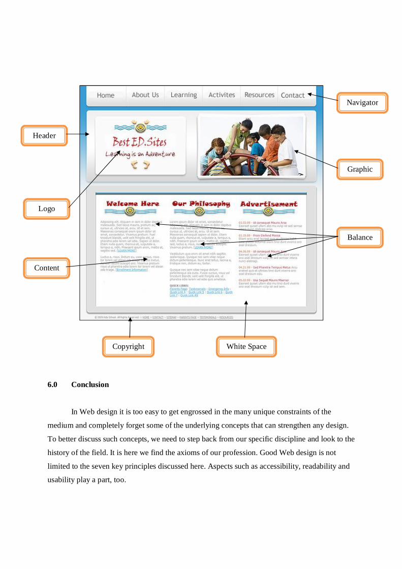
5.0 Modification Suggestion Prototype
A model is a fake website and summary (prototype) with the design of the site and its
navigation. The model allows formalizing the design of the site and is usually the validation
stage of this phase, to move to the implementation phase. The model represents the main pages
of the site (without content) with static pages and can simulate navigation. Thus, the dynamic
elements such as search engine, for example, lead to a page with fake results. The figure below is
show the design after the modification.
6.0 Conclusion
In Web design it is too easy to get engrossed in the many unique constraints of the
medium and completely forget some of the underlying concepts that can strengthen any design.
To better discuss such concepts, we need to step back from our specific discipline and look to the
history of the field. It is here we find the axioms of our profession. Good Web design is not
limited to the seven key principles discussed here. Aspects such as accessibility, readability and
usability play a part, too.
Header
Balance
Graphic
Navigator
Logo
Copyright
Content
White Space
7.0 References
– http://www.bestedsites.com/
- www.wikipedia .com
- www.google.com
- www.yahoo.com
- Principles of web design / Joel Sklar- Australia : Course Technology, 2000
- Developing online content : the principles of writing and editing for the web /
Irene Hammerich, Claire Harrison- New York : John Wiley, 2002
- Web application architecture : principles, protocols and practices / Leon Shklar,
Rich Rosen- Chichester, England ; Hoboken, NJ : Wiley, 2009