Embed Size (px)
Citation preview
Information Visualization and
Visual Analytics roles, challenges, and examples
Giuseppe Santucci
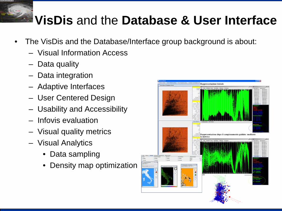
VisDis and the Database & User Interface • The VisDis and the Database/Interface group background is about:
– Visual Information Access – Data quality – Data integration – Adaptive Interfaces – User Centered Design – Usability and Accessibility – Infovis evaluation – Visual quality metrics – Visual Analytics
• Data sampling • Density map optimization
Outline
• Information Visualization – Main issues
• Data overloading – Visual Analytics – Automatic data analysis – Three examples
• Projects and books
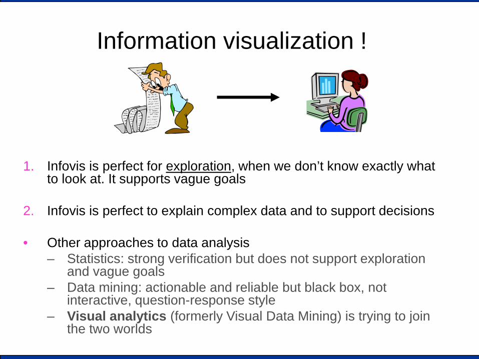
Information visualization !
1. Infovis is perfect for exploration, when we don’t know exactly what
to look at. It supports vague goals
2. Infovis is perfect to explain complex data and to support decisions
• Other approaches to data analysis – Statistics: strong verification but does not support exploration
and vague goals – Data mining: actionable and reliable but black box, not
interactive, question-response style – Visual analytics (formerly Visual Data Mining) is trying to join
the two worlds
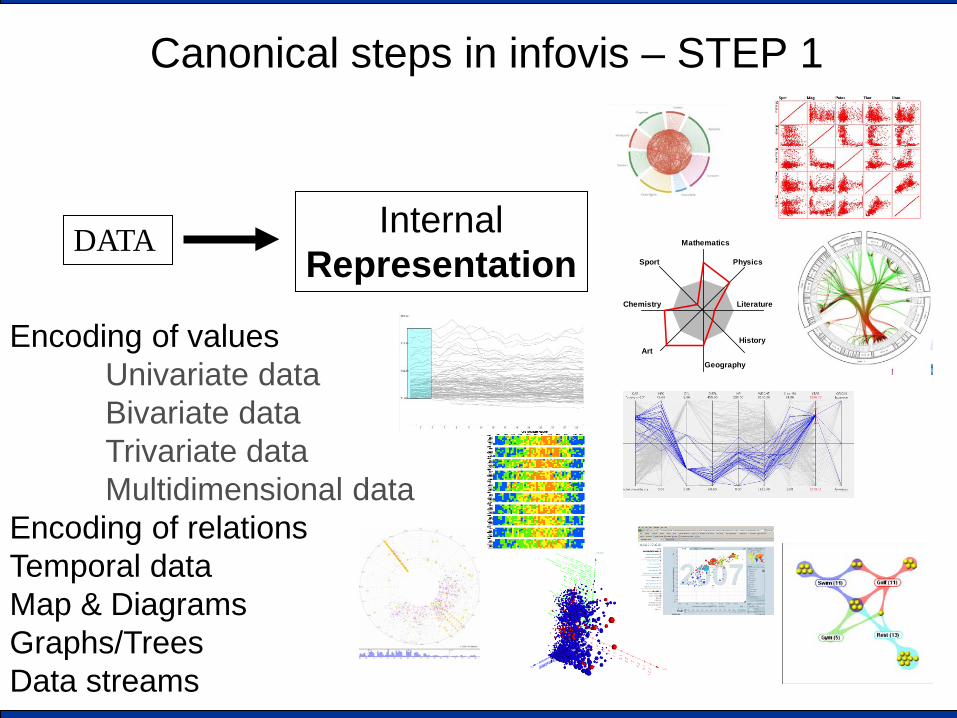
Canonical steps in infovis – STEP 1
DATA Internal Representation
Encoding of values Univariate data Bivariate data Trivariate data Multidimensional data
Encoding of relations Temporal data Map & Diagrams Graphs/Trees Data streams
Sport
Literature
Mathematics
Physics
History
Geography
Art
Chemistry
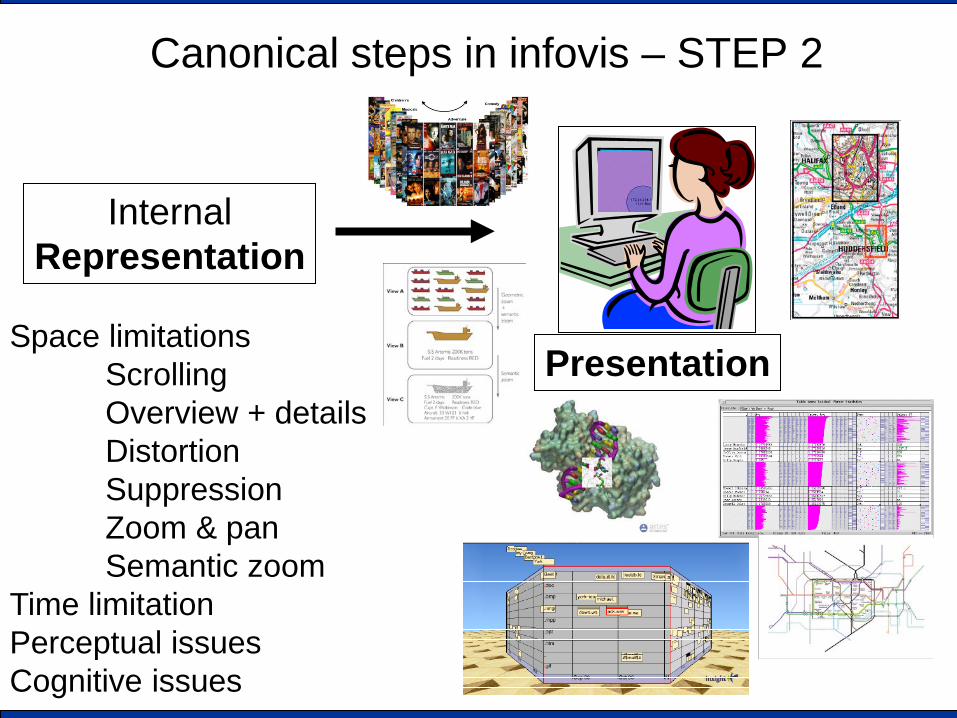
Canonical steps in infovis – STEP 2
Internal Representation
Space limitations Scrolling Overview + details Distortion Suppression Zoom & pan Semantic zoom
Time limitation Perceptual issues Cognitive issues
Presentation

SO WE ARE DONE! (?)

Outline
• Information Visualization • Data overloading
– Visual Analytics – Automatic data analysis – Three examples
• Projects and books and conferences
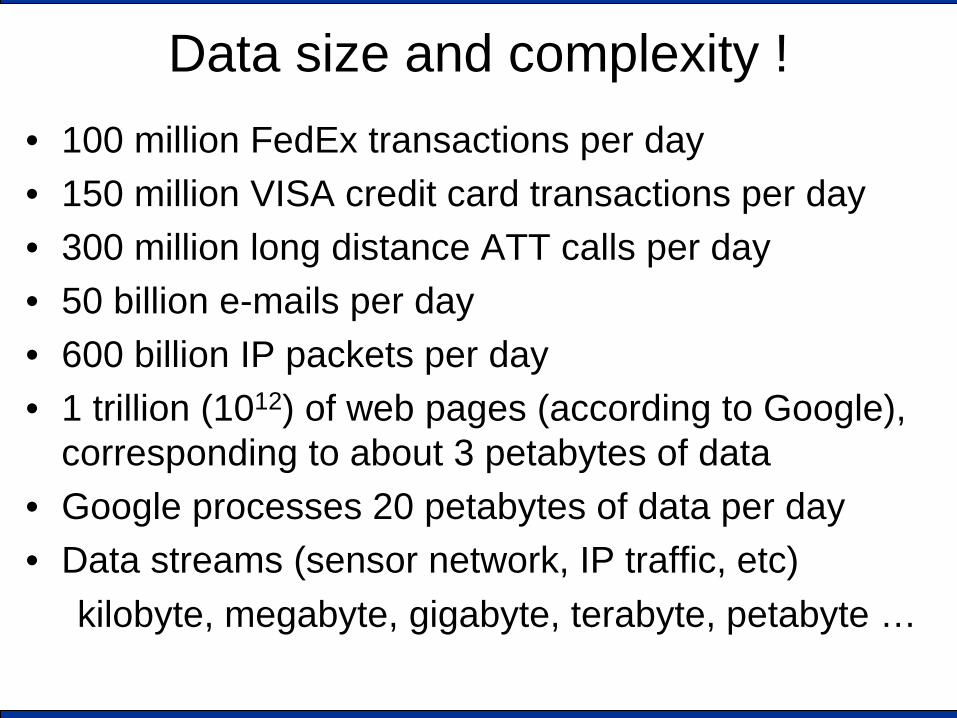
Data size and complexity ! • 100 million FedEx transactions per day • 150 million VISA credit card transactions per day • 300 million long distance ATT calls per day • 50 billion e-mails per day • 600 billion IP packets per day • 1 trillion (1012) of web pages (according to Google),
corresponding to about 3 petabytes of data • Google processes 20 petabytes of data per day • Data streams (sensor network, IP traffic, etc)
kilobyte, megabyte, gigabyte, terabyte, petabyte …
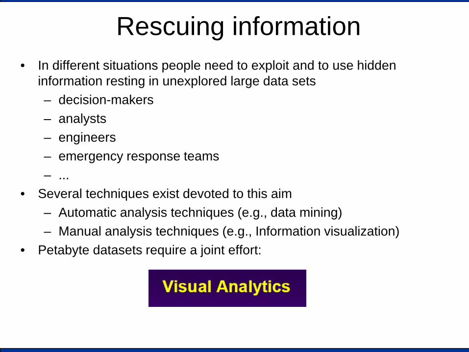
Rescuing information • In different situations people need to exploit and to use hidden
information resting in unexplored large data sets – decision-makers – analysts – engineers – emergency response teams – ...
• Several techniques exist devoted to this aim – Automatic analysis techniques (e.g., data mining) – Manual analysis techniques (e.g., Information visualization)
• Petabyte datasets require a joint effort:
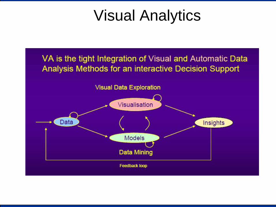
Visual Analytics

VA is highly interdisciplinary
Scientific & Information
Visualisation
Data Management
Data Mining
Spatio-Temporal
Data
Human Perception+Cognition Infrastructure Infrastructure
Evaluation Evaluation
Each component presents challenging issues
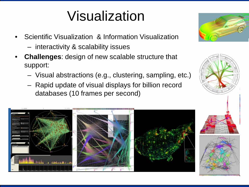
Visualization • Scientific Visualization & Information Visualization
– interactivity & scalability issues • Challenges: design of new scalable structure that
support: – Visual abstractions (e.g., clustering, sampling, etc.) – Rapid update of visual displays for billion record
databases (10 frames per second)
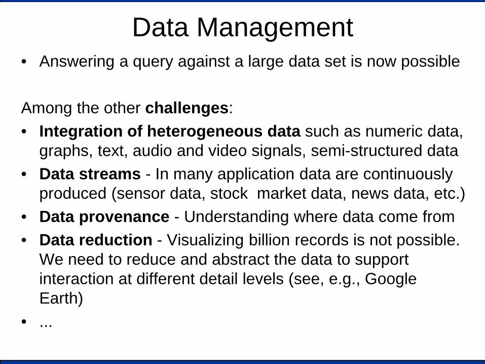
Data Management • Answering a query against a large data set is now possible Among the other challenges: • Integration of heterogeneous data such as numeric data,
graphs, text, audio and video signals, semi-structured data • Data streams - In many application data are continuously
produced (sensor data, stock market data, news data, etc.) • Data provenance - Understanding where data come from • Data reduction - Visualizing billion records is not possible.
We need to reduce and abstract the data to support interaction at different detail levels (see, e.g., Google Earth)
• ...
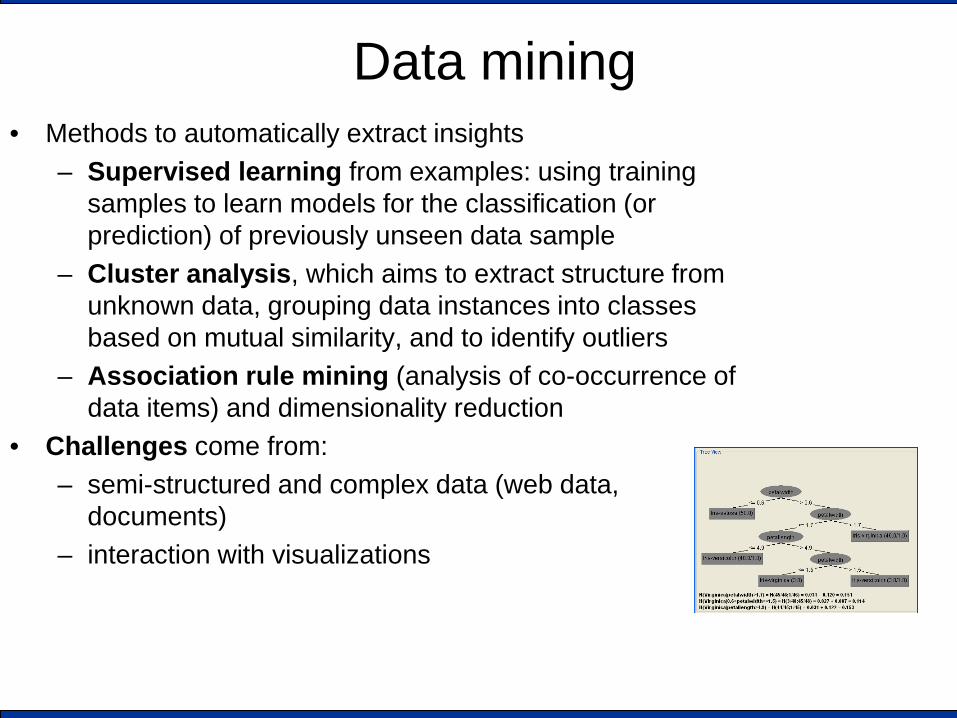
Data mining • Methods to automatically extract insights
– Supervised learning from examples: using training samples to learn models for the classification (or prediction) of previously unseen data sample
– Cluster analysis, which aims to extract structure from unknown data, grouping data instances into classes based on mutual similarity, and to identify outliers
– Association rule mining (analysis of co-occurrence of data items) and dimensionality reduction
• Challenges come from: – semi-structured and complex data (web data,
documents) – interaction with visualizations
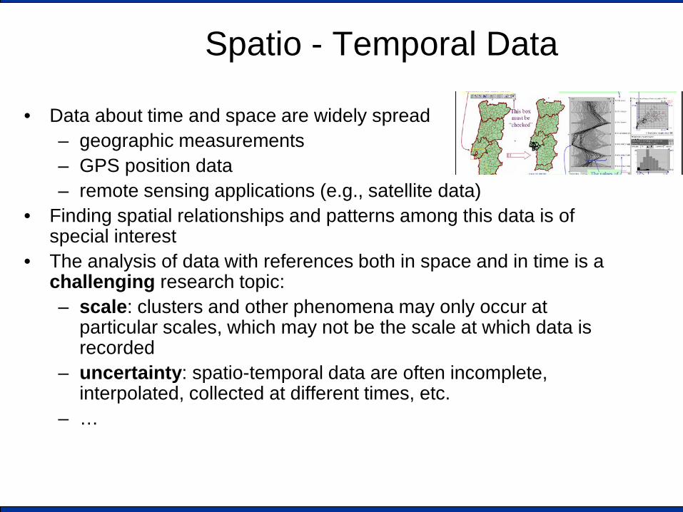
Spatio - Temporal Data
• Data about time and space are widely spread – geographic measurements – GPS position data – remote sensing applications (e.g., satellite data)
• Finding spatial relationships and patterns among this data is of special interest
• The analysis of data with references both in space and in time is a challenging research topic: – scale: clusters and other phenomena may only occur at
particular scales, which may not be the scale at which data is recorded
– uncertainty: spatio-temporal data are often incomplete, interpolated, collected at different times, etc.
– …
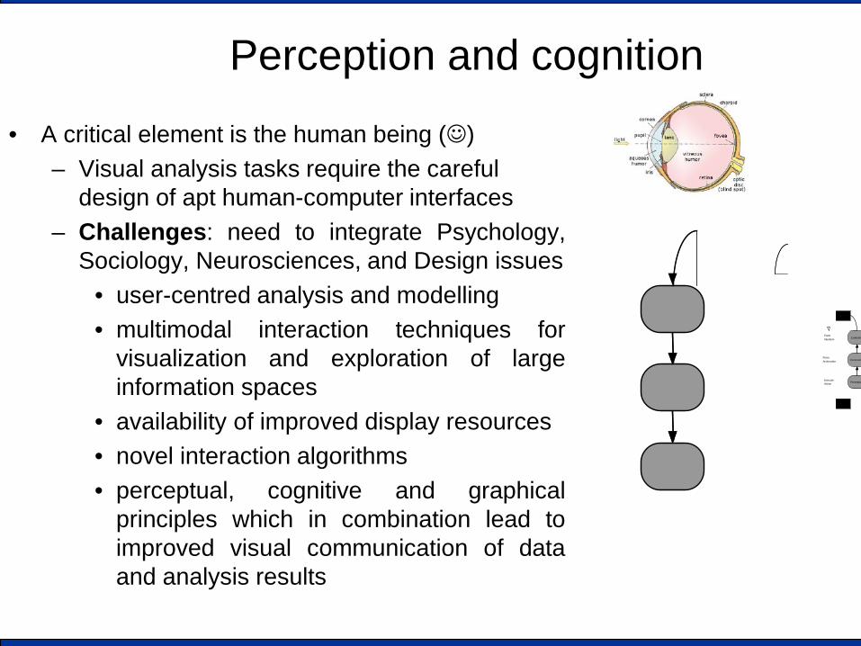
Perception and cognition
• A critical element is the human being () – Visual analysis tasks require the careful
design of apt human-computer interfaces – Challenges: need to integrate Psychology,
Sociology, Neurosciences, and Design issues • user-centred analysis and modelling • multimodal interaction techniques for
visualization and exploration of large information spaces
• availability of improved display resources • novel interaction algorithms • perceptual, cognitive and graphical
principles which in combination lead to improved visual communication of data and analysis results
Form Intention
Form Action plan
ExecuteAction
Evaluatio
Interpretatio
Perception
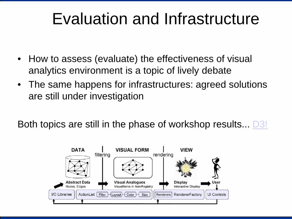
Evaluation and Infrastructure
• How to assess (evaluate) the effectiveness of visual analytics environment is a topic of lively debate
• The same happens for infrastructures: agreed solutions are still under investigation
Both topics are still in the phase of workshop results... D3!
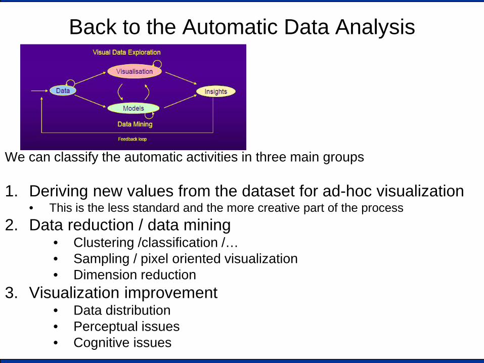
Back to the Automatic Data Analysis
We can classify the automatic activities in three main groups 1. Deriving new values from the dataset for ad-hoc visualization
• This is the less standard and the more creative part of the process 2. Data reduction / data mining
• Clustering /classification /… • Sampling / pixel oriented visualization • Dimension reduction
3. Visualization improvement • Data distribution • Perceptual issues • Cognitive issues
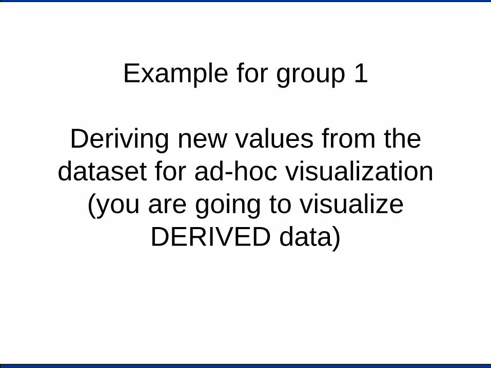
Example for group 1
Deriving new values from the dataset for ad-hoc visualization
(you are going to visualize DERIVED data)
A Visual Analytics example (Group 1) Deriving new values from the dataset for ad-hoc visualization
• How to visually compare J. London and M. Twain books ? • [D. A. Keim and D. Oelke. Literature Fingerprinting: A New Method for
Visual Literary Analysis. 2007 IEEE Symp. on Visual Analytics Science and Technology (VAST '07) ]
1. Split the book in several text block (e.g., pages, paragraph,
sentences) 2. Measure, for each text block, a relevant feature (e.g.,
average sentence length, word usage, etc. ) 3. Associate the relevant feature to a visual attribute (e.g.,
color) 4. Visualize it
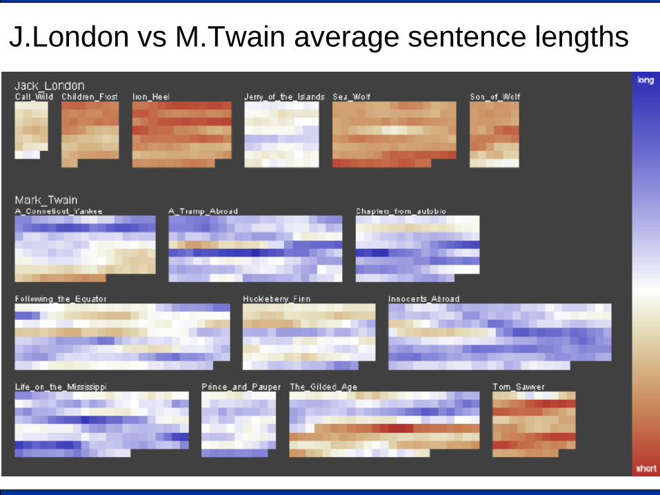
J.London vs M.Twain average sentence lengths

User interaction (a non uniform book?)
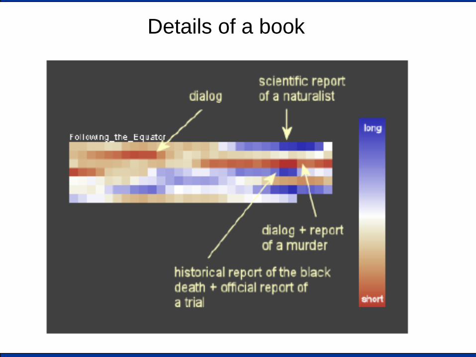
Details of a book
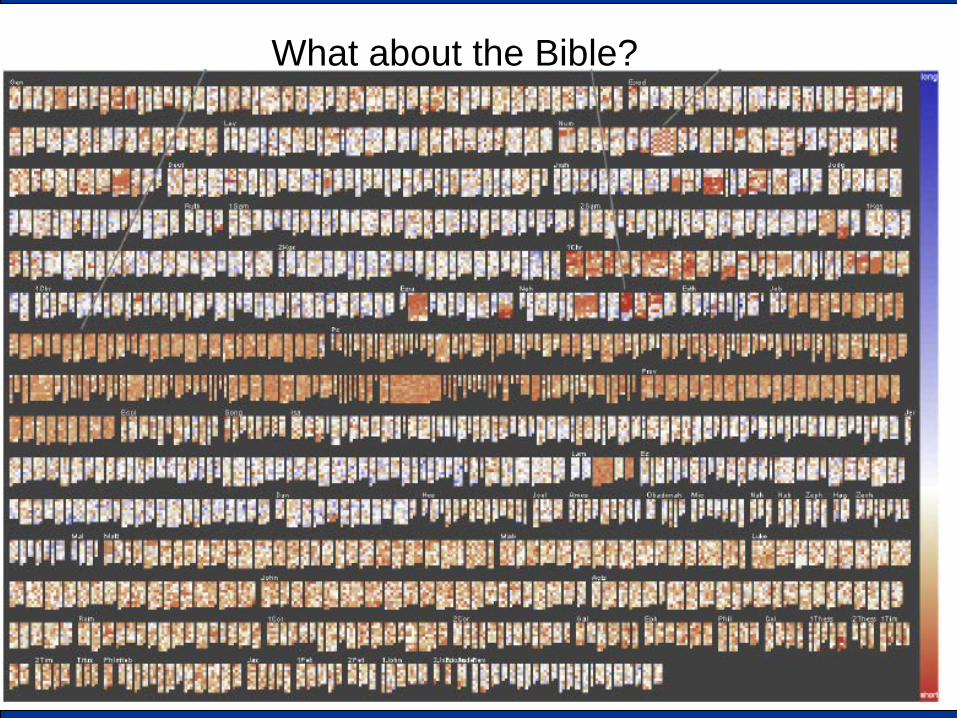
What about the Bible?
Example 2 Data reduction / data mining
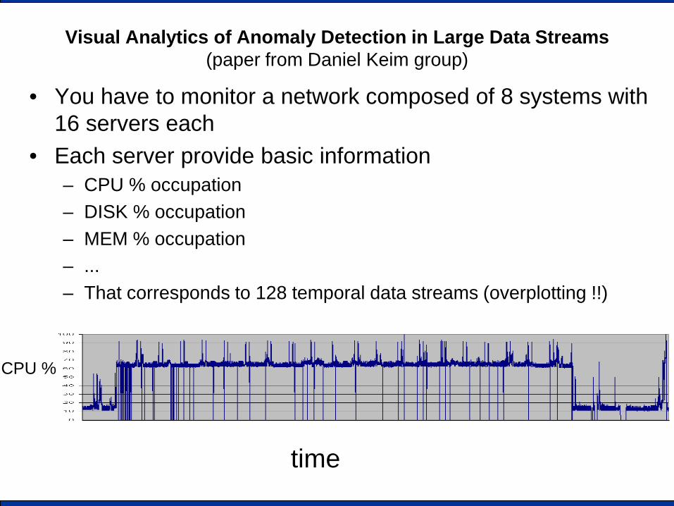
Visual Analytics of Anomaly Detection in Large Data Streams (paper from Daniel Keim group)
• You have to monitor a network composed of 8 systems with 16 servers each
• Each server provide basic information – CPU % occupation – DISK % occupation – MEM % occupation – ... – That corresponds to 128 temporal data streams (overplotting !!)
time
CPU %
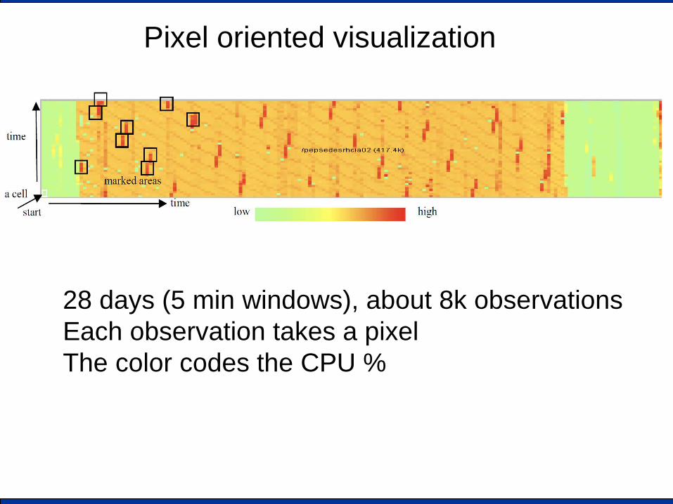
Pixel oriented visualization
28 days (5 min windows), about 8k observations Each observation takes a pixel The color codes the CPU %
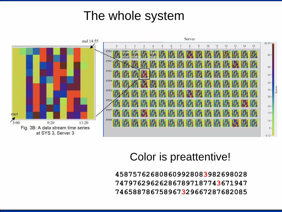
The whole system
Color is preattentive!
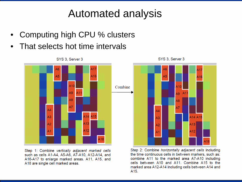
Automated analysis
• Computing high CPU % clusters • That selects hot time intervals

Automated analysis...
• Detecting persistent anomalies
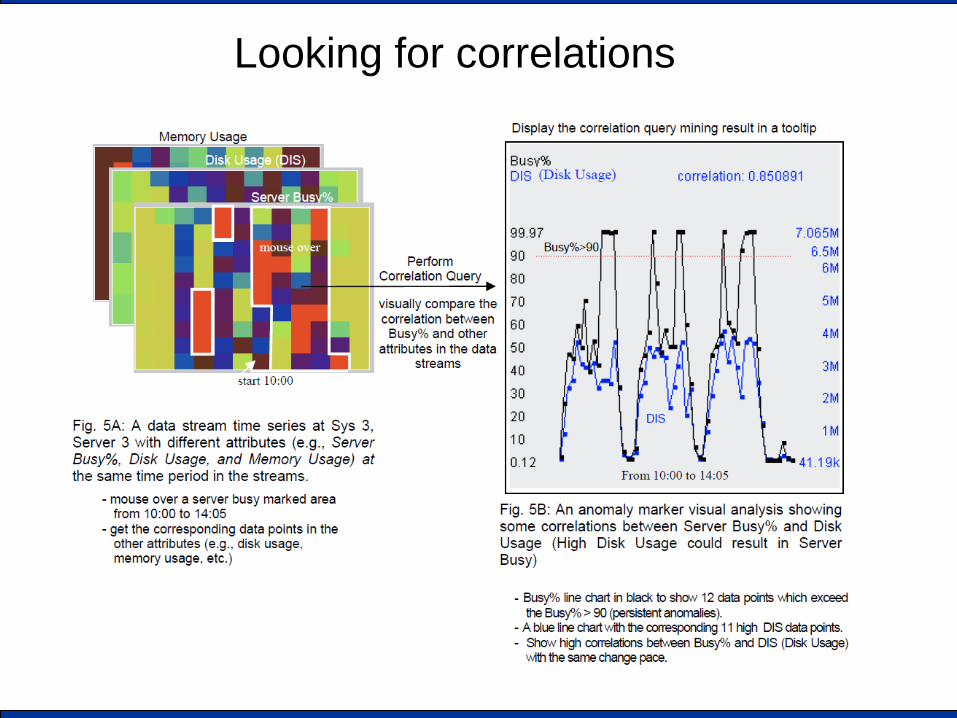
Looking for correlations
Example 3 Visualization improvement
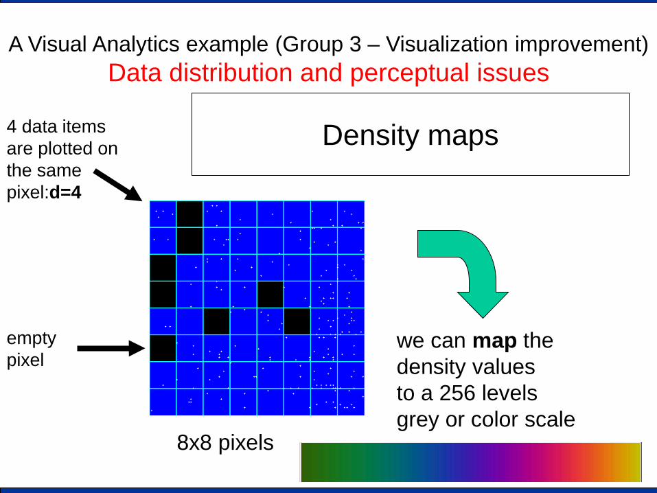
A Visual Analytics example (Group 3 – Visualization improvement) Data distribution and perceptual issues
Density maps
8x8 pixels
empty pixel
4 data items are plotted on the same pixel:d=4
we can map the density values to a 256 levels grey or color scale
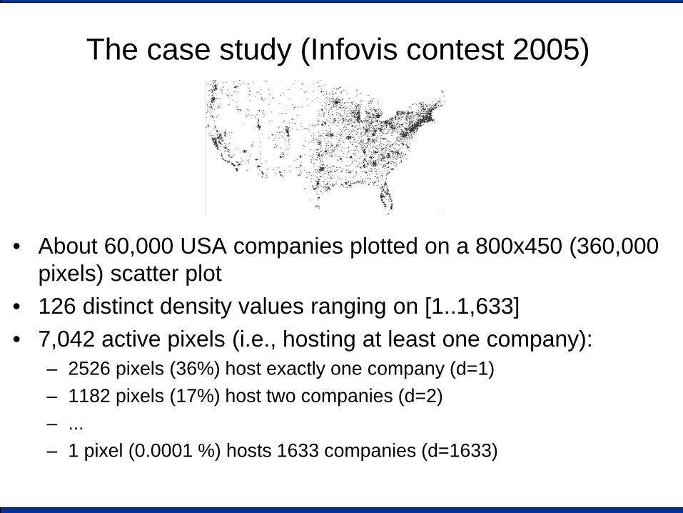
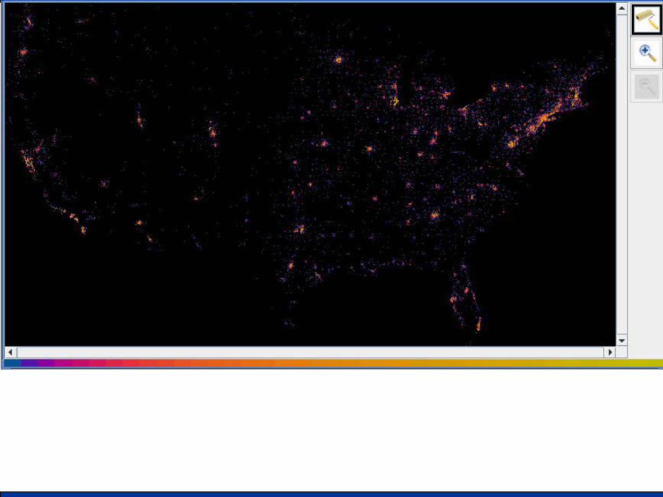
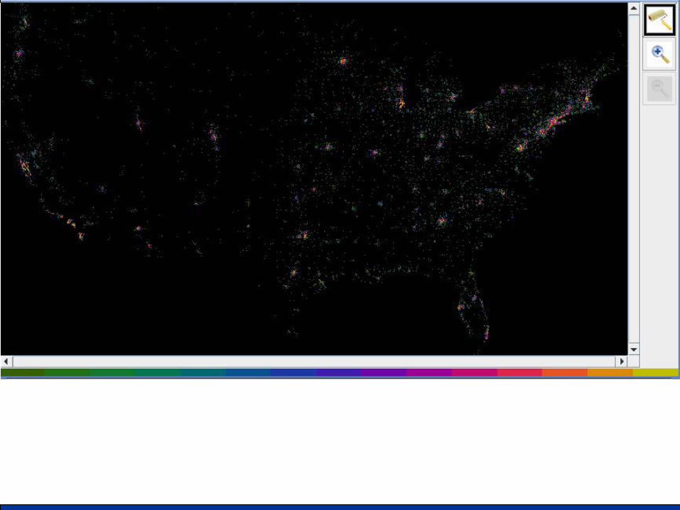
The case study (Infovis contest 2005)
• About 60,000 USA companies plotted on a 800x450 (360,000 pixels) scatter plot
• 126 distinct density values ranging on [1..1,633] • 7,042 active pixels (i.e., hosting at least one company):
– 2526 pixels (36%) host exactly one company (d=1) – 1182 pixels (17%) host two companies (d=2) – ... – 1 pixel (0.0001 %) hosts 1633 companies (d=1633)
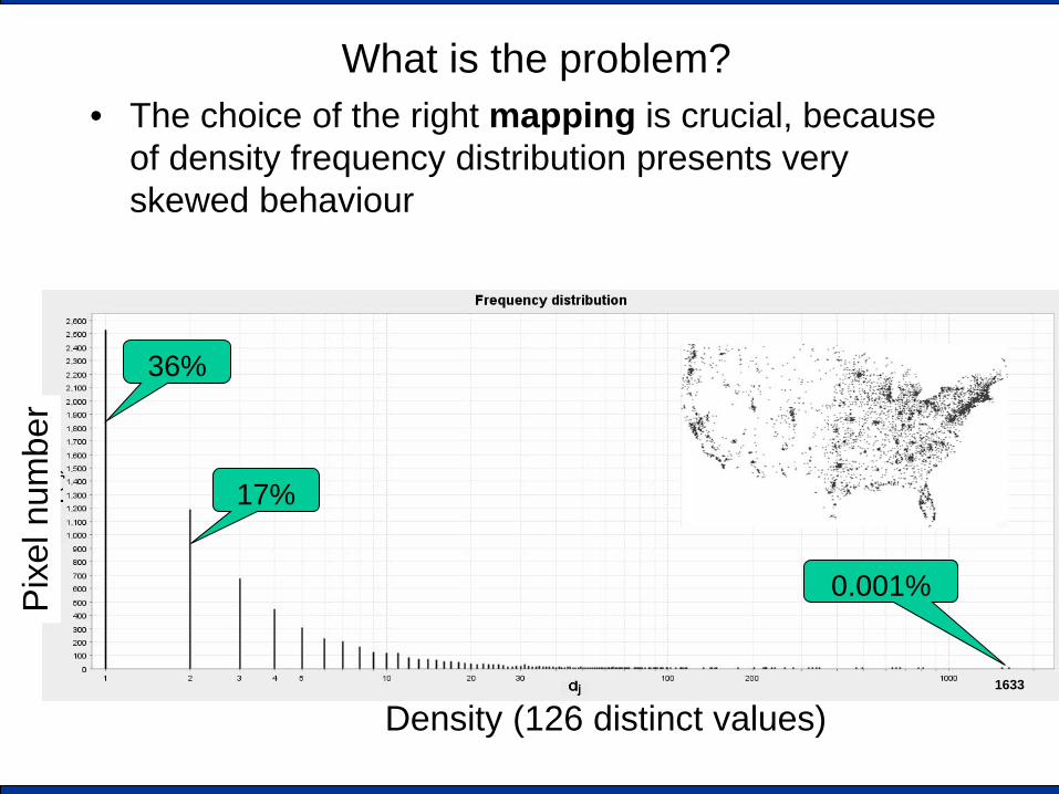
What is the problem? • The choice of the right mapping is crucial, because
of density frequency distribution presents very skewed behaviour
Density (126 distinct values)
Pixe
l num
ber
36%
17%
0.001%
1633
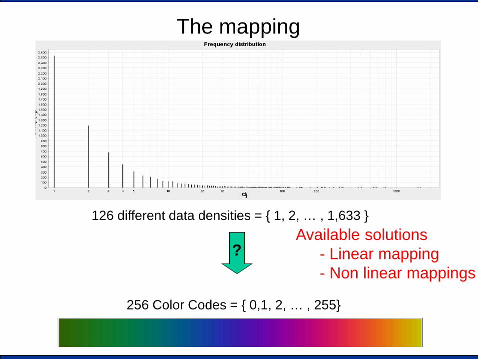
The mapping
126 different data densities = { 1, 2, … , 1,633 }
256 Color Codes = { 0,1, 2, … , 255}
? Available solutions
- Linear mapping - Non linear mappings
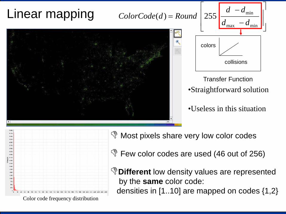
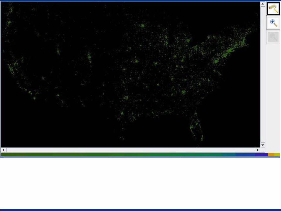
Linear mapping
Most pixels share very low color codes
Few color codes are used (46 out of 256)
Different low density values are represented by the same color code: densities in [1..10] are mapped on codes {1,2}
−
−=
minmax
min255)(dd
ddRounddColorCode
•Straightforward solution
•Useless in this situation
Color code frequency distribution
Transfer Function
collisions
colors
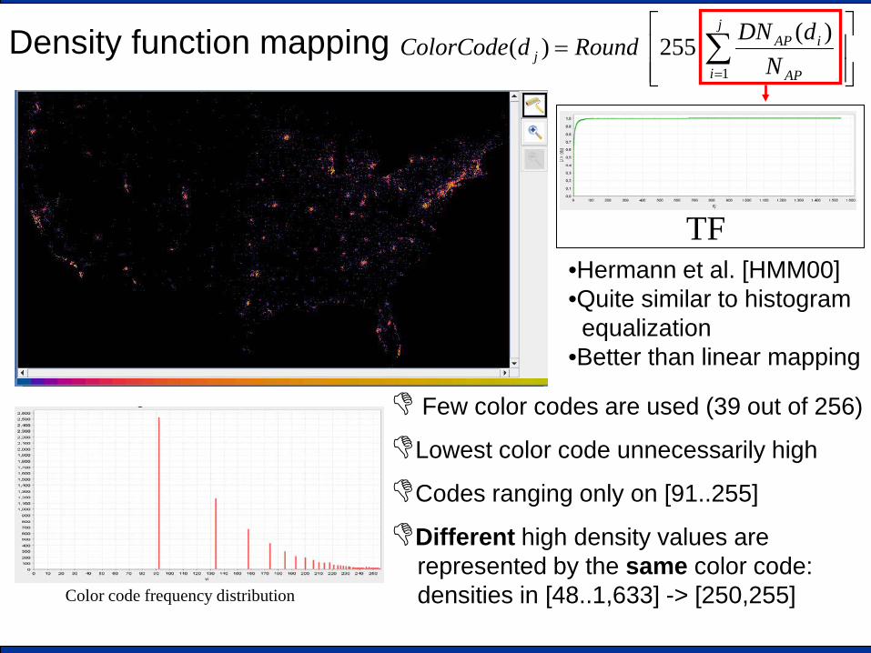
Density function mapping
Color code frequency distribution
TF
= ∑
=
j
i AP
iAPj N
dDNRounddColorCode1
)(255)(
•Hermann et al. [HMM00] •Quite similar to histogram aequalization •Better than linear mapping
Few color codes are used (39 out of 256)
Lowest color code unnecessarily high
Codes ranging only on [91..255]
Different high density values are represented by the same color code: densities in [48..1,633] -> [250,255]

Our proposal We take into account that: • densities and color codes are discrete and finite • too close color codes are hardly distinguishable
(for human beings)
[E. Bertini, A. Di Girolamo, G.Santucci - See what you know: analyzing data distribution to improve density map visualization – Eurovis 2007 conference]

uniform scale mapping We use a reduced color scale, e.g. with 15 codes (NL=15)
0 18 36 55 73 91 109 128 146 164 182 200 219 237 255
1c 2c
…
L
AP
NN
3c NLc
Target color code frequency distribution
This implies that different density values will be necessarily represented by the same color code: to reduce the degradation the mapping is performed through an algorithm that tries to assign to each code the same number of pixels
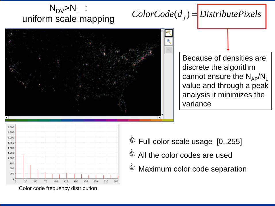
NDV>NL : uniform scale mapping
Color code frequency distribution
Because of densities are discrete the algorithm cannot ensure the NAP/NL value and through a peak analysis it minimizes the variance
Full color scale usage [0..255]
All the color codes are used
Maximum color code separation
PixelsDistributedColorCode j =)(
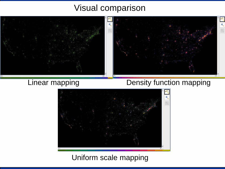
Visual comparison
Linear mapping Density function mapping
Uniform scale mapping
Visual comparison
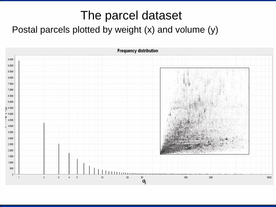
The parcel dataset Postal parcels plotted by weight (x) and volume (y)
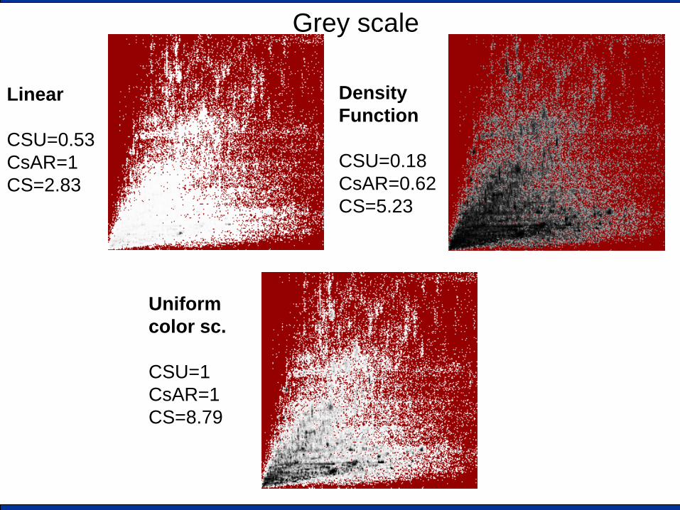
Grey scale
Linear CSU=0.53 CsAR=1 CS=2.83
Density Function CSU=0.18 CsAR=0.62 CS=5.23
Uniform color sc. CSU=1 CsAR=1 CS=8.79
Conclusions • Visual Analytics is a new (exciting) emerging research field • Information visualization is a core component of VA • Automated data analysis could be classified in three main
groups – Deriving new values (more creative) – Data reduction (sometimes creative) – Image improvement (very technical)
• It is highly interdisciplinary and require a collaborative approach
• It is mainly a METHODOLOGY / VISION than a technique • However a collection of available results / proposal is
quickly growing
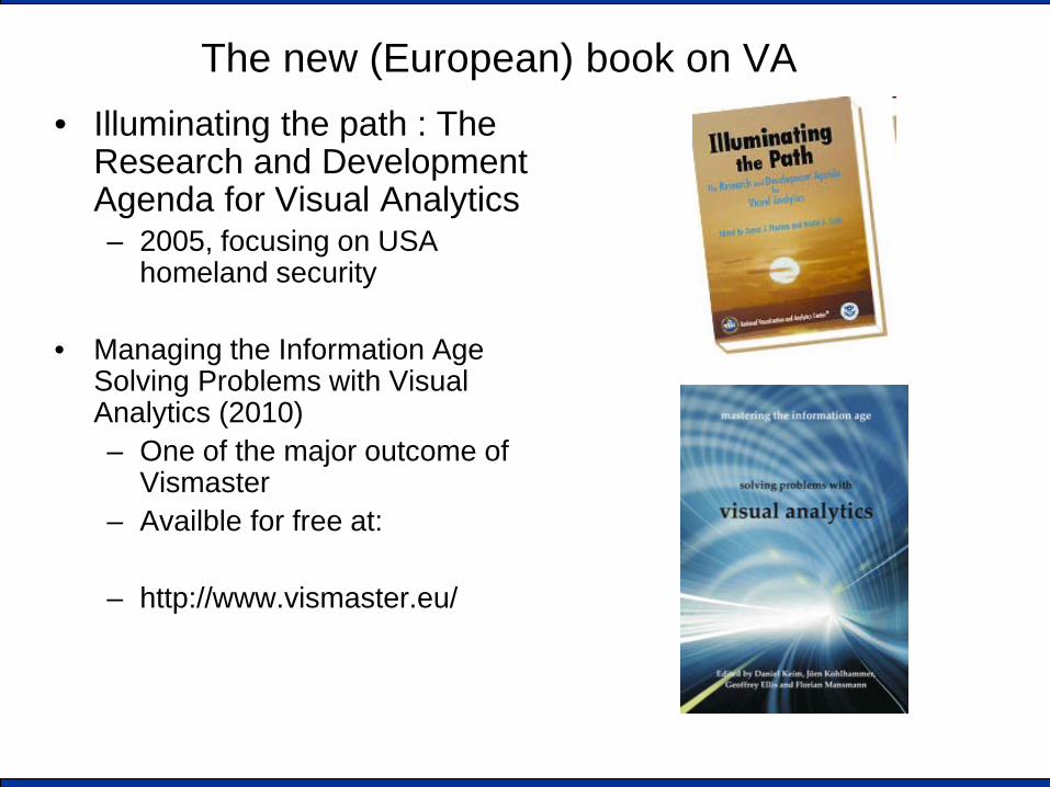
The new (European) book on VA • Illuminating the path : The
Research and Development Agenda for Visual Analytics – 2005, focusing on USA
homeland security
• Managing the Information Age Solving Problems with Visual Analytics (2010) – One of the major outcome of
Vismaster – Availble for free at:
– http://www.vismaster.eu/
5 books you HAVE to read (greedy order)
• Robert Spence - Information Visualization: Design for Interaction (2nd Edition) - Addison-Wesley (ACM Press) - BASIC ISSUES
• Chaomei Chen - Information Visualization - Second Edition - Springer - AN UPDATED OVERVIEW
• Managing the Information Age Solving Problems with Visual Analytics (2010) VISMASTER BOOK
• Colin Ware - Information Visualization, Third Edition: Perception for Design (Interactive Technologies) - Morgan Kaufmann - PERCEPTUAL ISSUES
• Card, Mackinlay, Shneiderman - Reading in Information Visualization - 1999 HYSTORICAL
Visual Analytics projects
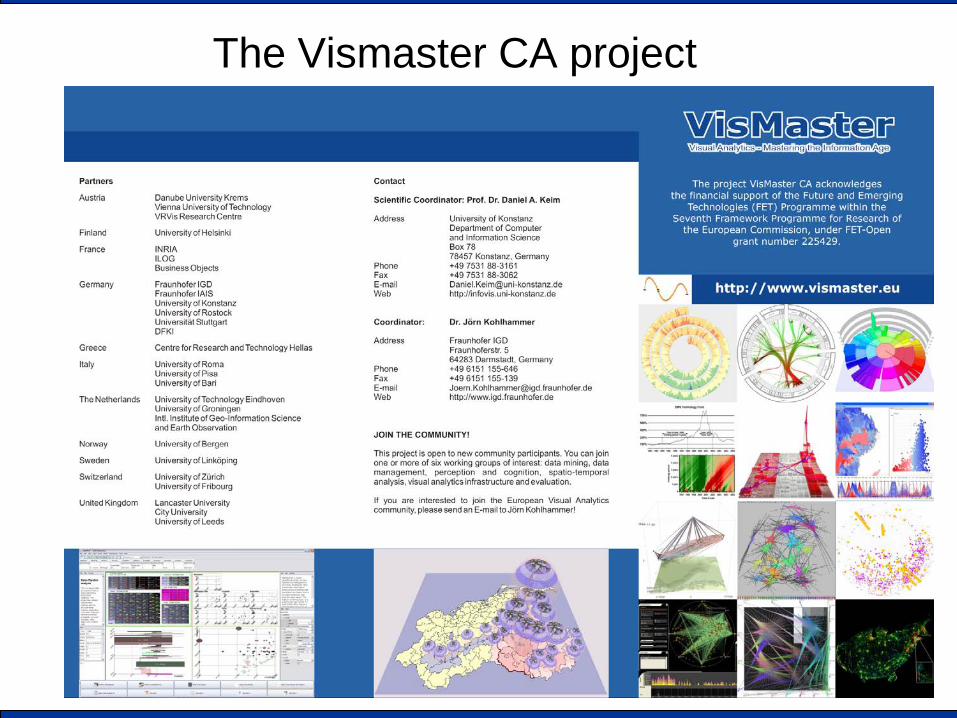
The Vismaster CA project
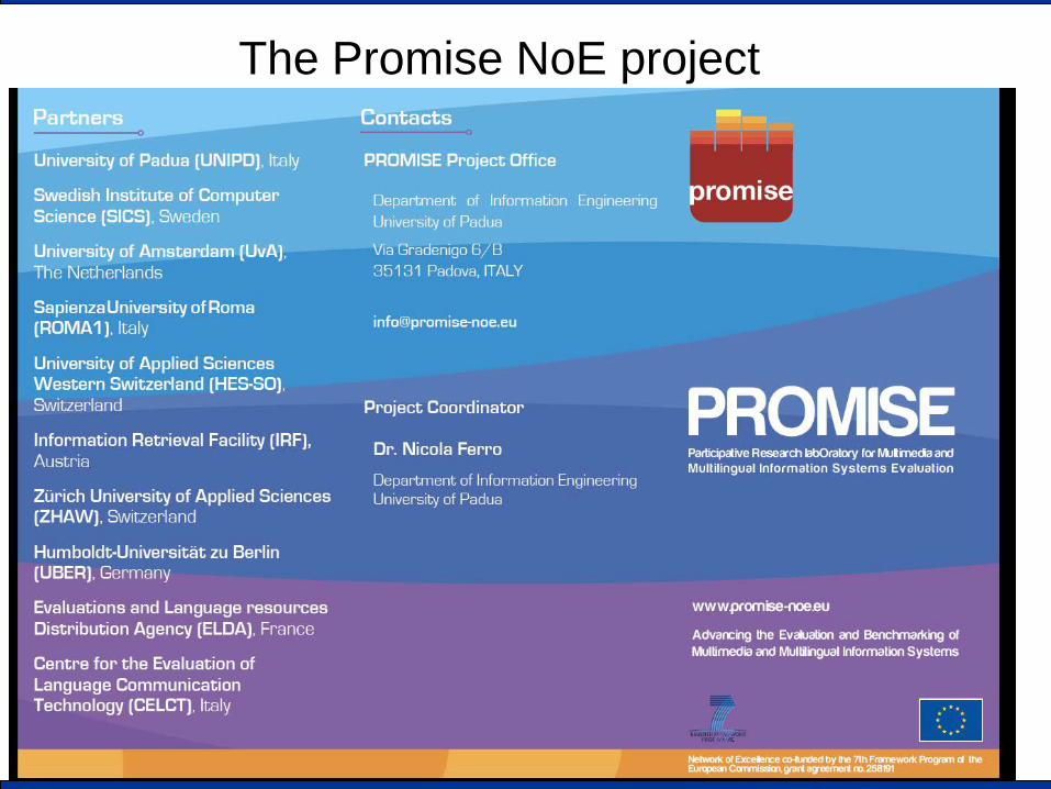
The Promise NoE project
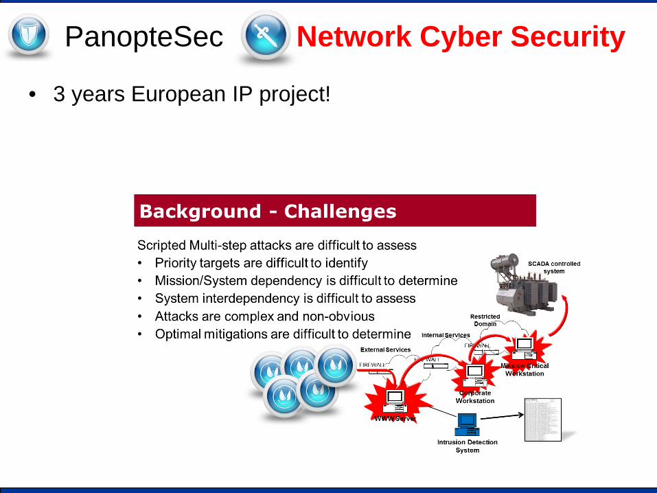
PanopteSec Network Cyber Security
• 3 years European IP project!
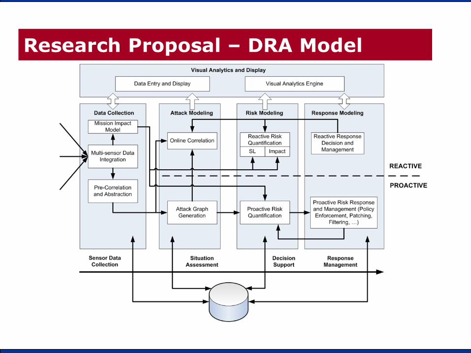
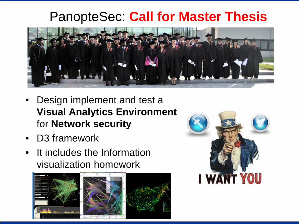
PanopteSec: Call for Master Thesis
• Design implement and test a Visual Analytics Environment for Network security
• D3 framework • It includes the Information
visualization homework