Embed Size (px)
Citation preview

John Hills Income, wealth, poverty and progress Report Original citation: Hills, John (2007) Income, wealth, poverty and progress. In: Utting, David, (ed.) Social advancement: a continuing search for change: essays celebrating the work of Richard Best, to mark his retirement as director of the Joseph Rowntree Foundation. Joseph Rowntree Foundation, York, UK, pp. 75-96. ISBN 9781859355558 This version available at: http://eprints.lse.ac.uk/43818/ Originally available from Joseph Rowndtree Foundation Available in LSE Research Online: June 2012 © 2007 The Author LSE has developed LSE Research Online so that users may access research output of the School. Copyright © and Moral Rights for the papers on this site are retained by the individual authors and/or other copyright owners. Users may download and/or print one copy of any article(s) in LSE Research Online to facilitate their private study or for non-commercial research. You may not engage in further distribution of the material or use it for any profit-making activities or any commercial gain. You may freely distribute the URL (http://eprints.lse.ac.uk) of the LSE Research Online website.

Income, wealth, poverty
and progress

John Hills
I FIRST HEARD of the idea of the Foundation sponsoring a review of what had been dramatic, but at the time underappreciated, changes in the distribution of income at the end of 1991. Richard Best and Janet Lewis, Director of Research, asked if I would review existing evidence and oversee a new research programme. The target was to be a major report by the autumn of 1994 (this eventually took the form of the second volume of the Inquiry Group’s report (Hills 1995)). Taking this on involved balancing Richard’s priorities – a hard-hitting, short report and summary – with those of academic life for a book and journal articles.
Richard reluctantly accepted the book (Hills, 1996) was “part of the academics’ remuneration package”, and let it happen, but on condition that he didn’t see us writing it.
As the programme got underway, another idea emerged from Richard. Unaccountably, he seemed to feel that a research review by academics might not quite have the impact that the material deserved. What was needed was a ‘Great and Good Group’ to review the evidence and say what should be done about it. Its name transmuted into the Income and Wealth Inquiry Group, chaired by Sir Peter Barclay (with members who managed to be both great and good, rather than just one or the other).
Richard’s instincts were right: a group containing both the General Secretary of the Trades Union Congress (TUC) (John Monks) and the Director General of the Confederation of British Industry (CBI) (Howard Davies) could not easily be ignored. When the Inquiry’s report was published in early 1995 it had an immediate impact, not just in Parliament and through extensive media coverage, but on public opinion. As Figure 1 shows, the proportion of the public agreeing that “the gap between those with high income and those with low incomes” was too large peaked at 87 per cent a few months after the report came out.
77

THIS CHAPTER LOOKS at how things have changed since the Inquiry report came out, in terms of both inequality and policy. It draws, among other things, on the recent books One hundred years of poverty and policy (Glennerster et al, 2004) and A more equal society? New Labour, poverty, inequality and exclusion (co-edited with Kitty Stewart, 2005). Both were supported by the Foundation (despite the outputs being books).
Joseph Rowntree Foundation Inquiry into Income and WealthThe Inquiry did not pull its punches. As Sir Peter Barclay (1995) put it in his introduction,
Taken together, [the] findings paint a picture of a dramatic social and economic change in Britain over the 1980s, the scale and consequences of which are probably not yet fully appreciated by policy-makers or by the population at large.
It is worth recalling the main findings:
• Income inequality in the UK grew rapidly between 1977 and 1990, reaching a higher level than recorded since the Second World War (as shown in the Gini coefficient index of inequality, illustrated in Figure 1).
• The pace at which inequality increased was faster than in any other industrialised country, apart from New Zealand.
• Between 1979 and 1992 the poorest 20–30 per cent of the population failed to benefit from economic growth, in contrast to the rest of the post-war period.
• This increase in inequality was driven by causes that included the way low wages had hardly risen at all in real terms since 1978, while high wages grew by 50 per cent; the polarisation between two-earner and no-earner couples; and inequality within the self-employed population.
• Up to 1984, social security benefits served to slow inequality growth compared to market incomes. But between 1984 and 1990
I N C O M E , W E A LT H , P O V E RT Y A N D P R O G R E S S
78

they did not, as price-linked benefit levels fell behind the incomes of the working population.
• The tax system, which might have been expected to slow inequality growth, did not do so. This was due to discretionary tax changes that shifted the burden of taxation from higher to lower and middle-income groups.
• Particular groups – such as certain minority ethnic groups – and particular parts of the country were hardest hit by these changes. The polarisation of income groups by housing tenure showed up on the ground as concentrations of people with low incomes in particular neighbourhoods.
• Until the 1980s wealth inequalities had narrowed rapidly, but they then levelled out, with wealth remaining much more unequally distributed than income.
JRF Investment Portfolio 1988–2006
Figure 1: Inequality and attitudes to income gap, 1977 to 2004
Note: £258.9m at 30 June 2006
RPIRe-based at 31.12.1988
Index of income inequality (left scale)
Respondents agreeing income gap too large (right scale)
300
250
200
150
100
50
0
Gini coefficent (%) % agreeing
9
8
7
6
5
4
3
2
1
0
£ m
illio
n£
mill
ion
87 88 89 90 91 92 93 94 95 96Year
97 98 99 00 01 02 03 04 05
87 88 89 90 91 92 93 94 95 96Year
97 98 99 00 01 02 03 04 05
JRF Expenditure 1988 - 2006
Support and Administration £'m
New Grant Commitments £'m
0
5
10
15
20
25
30
35
40
45
50
1977 1979 1981 1983 1985 1987 1989 1991 1993 1995 1997 1999 2001 20030
10
20
30
40
50
60
70
80
90
100
Data available toInquiry Group
Source: DWP (2006); Park et al. (2005) and earlier equivalents.
J O H N H I L L S
79

The Inquiry argued that the growing gap between rich and poor was “damaging the social fabric” and that increasing inequality could damage the economy, rather than helping economic growth. It expressed particular concern for children being brought up in low-income families, particularly those in neighbourhoods where most other families were poor.
In the words of the report:
Regardless of any moral arguments or feelings of altruism, everyone shares an interest in the cohesiveness of society. As the gaps between rich and poor grow, the problems of the marginalised groups that are being left behind rebound on the more comfortable majority.
What has happened since?In the 11 years since the Inquiry reported, many things have changed. Not least among these is the election in 1997 of a new government, one of whose leading strategists declared that Britain would become “a more equal society” (Mandelson, 1997), and whose Prime Minister set a 20-year target to “end child poverty forever” (Blair, 1999).
Examining the ‘New Labour’ record there can be no doubt that different income groups have benefited from economic growth and rising living standards. The upper panel of Figure 2 shows the pattern of income growth for each tenth of the income distribution between 1979 and 1994/95 (the average of the two financial years, 1994–95 and 1995–96). This was the comparison on which the Inquiry based many of its central conclusions (although the data available then only ran until 1991/92). We can see that – depending on whether the net income measure included or excluded housing costs – people in the middle of the poorest tenth (decile group) of incomes were only slightly better off, or even slightly worse off than their predecessors 16 years earlier. By contrast, the higher up the income distribution you went, the faster incomes had grown. Near the top, in the middle of the highest tenth of incomes, there had been an increase of around two thirds. Moving higher still, the top one per
I N C O M E , W E A LT H , P O V E RT Y A N D P R O G R E S S
80

cent of taxpayers accounted for nearly half the gain for their decile group. Indeed, most of this went to the top half per cent (Hills, 2004, table 2.6, based on Atkinson and Salverda, 2003).
Figure 2: Changes in real net income by income group
(a) 1979 to 1994/95, UK
Overall mean (BHC)
70
60
50
40
30
20
10
0
-10
9
8
7
6
5
4
3
2
1
0
£ m
illio
n
Cha
nge
s in
inco
me
(%)
Poorest 2 3 4 5 6 7 8 9 Richest
Income group – tenth of individuals
87 88 89 90 91 92 93 94 95 96Year
97 98 99 00 01 02 03 04 05
JRF Expenditure 1988 - 2006
Support and Administration £'m
New Grant Commitments £'m
Before housing costs
After housing costs
(b) 1994-95 to 2004-05, GB
Overall mean (BHC)
70
60
50
40
30
20
10
0
-10
Cha
nge
s in
inco
me
(%)
Poorest 2 3 4 5 6 7 8 9 Richest
Income group – tenth of individuals
Source: DWP (2006) and earlier equivalents.
Before housing costs
After housing costs
J O H N H I L L S
81
The lower panel of Figure 2 shows what happened in the 10 years after the report was published. The picture is very different. Income growth has been much more widely spread with, if anything, slightly faster growth near the bottom of the distribution than near the top. Even so, more detailed figures show that the very bottom of the income distribution has continued to fall behind and incomes at the very top have grown faster.
Whichever way one looks at it, the very rapid growth of income inequality has been halted. On the other hand, there has been little reduction in the level that had taken the UK towards the top of the international income inequality league by the early 1990s. On measures that put a lot of weight on the very top and very bottom of the distribution, the distribution is slightly more unequal than it was in the mid-1990s. For instance, the Gini coefficient index shown in Figure 1 reached nearly 34 per cent by 1990 – up by more than 10 percentage points since 1977 – and has since fluctuated around this level. However, on measures that compare those near the top with those near the bottom, the distribution has become slightly less unequal (Brewer et al, 2006, figure 2.9; Sefton and Sutherland, 2005, figure 11.1, comparing those a tenth of the way up the distribution with those nine tenths of the way up).
One of the impacts of this change has been a slow reduction in the proportion of the population defined as living in poverty, using the ‘moving target’ measurement of incomes (adjusted for household size) below particular percentages of mean or median income. Figure 3 illustrates two such measures. Data available to the Inquiry for the proportion of the population with less than half of the mean income suggested that about a tenth of the population were ‘poor’ in the 1960s, falling to 6 per cent in 1977, but rising to more than 20 per cent by 1990 (incomes before deducting housing costs). As the figure shows there was temporary reduction in the mid-1990s. Abolition of the Poll Tax and the progressive impact of tax rises after the 1992 election meant that there was a small growth in living standards at the bottom while average living standards grew little in the mid-1990s. This reduction in poverty rates was reversed in the late 1990s, taking the level back to 20 per cent, before a drop back again to 18
I N C O M E , W E A LT H , P O V E RT Y A N D P R O G R E S S
82

per cent in 2003–04 (the last year for which figures in this form have been published).
The second series in Figure 3 shows the measure on which the government’s own monitoring of progress is focused: the proportion of the population with incomes below 60 per cent of the median – in other words, a measurement that relates poverty to the living standards of the mainstream of the population. Poverty on this measure also grew rapidly in the 1980s. By 1991, it also showed 20 per cent of the population as poor, falling to a plateau of 18 per cent in the late 1990s, and 16 per cent by 2004–05.
This last figure marked the lowest rate of poverty on this measure since before 1987. It reflected a reduction of 1 million in the number counted as poor since 1996–97. Measured by the alternative official measure – calculated after deducting housing costs – the fall was as much as 2.4 million (a decline in the poverty rate from 25 per cent to 20 per cent). Yet the publication of these figures in March 2006 was not greeted by headlines hailing the achievement. Rather, the emphasis was on failure to achieve the more impressive target that
Figure 3: Numbers in relative poverty, 1970 to 2004-05
25
20
15
10
5
0
% o
f po
pula
tion
1970 1975 1980 1985 1990 1995 2000 2005
Year
Below 50% mean
Below 60% median
Source: DWP (2006); Goodman and Webb (1994). Figures are before housing costs.
Data available toInquiry Group
J O H N H I L L S
83
the government had set itself of a reduction in child poverty by a quarter between 1998–99 and 2004–05.
As highlighted by the Inquiry, families with dependent children were disproportionately affected by the increase in poverty in the 1980s. Numbers of children in households with less than 60 per cent of median income peaked at 27 per cent (before housing costs) and 33 per cent (after housing costs) in 1992/93. By 1996–97, the first measure had fallen to 25 per cent, but the latter was still at 33 per cent. Despite being the lowest figures since the late 1980s, the 2004–05 figures of 19 and 27 per cent respectively represented falls of ‘only’ 700,000 children lifted out of poverty since 1998–99, rather than the target of more than a million.
A North American commentator would find the description of these figures as ‘failure’ somewhat bizarre. Using something equivalent to the official poverty line in the US, which is fixed in real terms and does not move with contemporary living standards, the UK figures would show a dramatic fall in poverty, halved for the population as a whole between 1996–97 and 2004–05, and more than halved for children.
However, the use of a relative poverty measurement in the UK does seem to reflect the way the population as a whole thinks of ‘acceptable’ level of minimum incomes or what it takes to pay for the ‘necessities’ for modern life (Gordon et al, 2000; Hills, 2004, chapter 3). As society has become richer, so our view of what constitutes ‘poverty’ has shifted. With strong growth in typical living standards since 1997, this has made poverty reduction harder, although it has also created more resources with which to achieve it. In this respect, UK views appear more European than transatlantic; yet against European standards, our performance on poverty and inequality remains poor, albeit improving. In 1997, European Union figures put the UK’s (relative) child poverty rate at 27 per cent, the worst among the, then, 15 members of the EU (Hills and Stewart, 2005, Ch. 14). (The EU figures involve different ways of comparing household incomes, in particular using an adjustment for household size that puts more weight in the needs of children than those lying behind the Department for Work and Pensions figures shown in
I N C O M E , W E A LT H , P O V E RT Y A N D P R O G R E S S
84
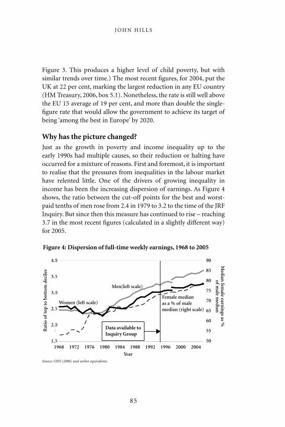
Figure 3. This produces a higher level of child poverty, but with similar trends over time.) The most recent figures, for 2004, put the UK at 22 per cent, marking the largest reduction in any EU country (HM Treasury, 2006, box 5.1). Nonetheless, the rate is still well above the EU 15 average of 19 per cent, and more than double the single-figure rate that would allow the government to achieve its target of being ‘among the best in Europe’ by 2020.
Why has the picture changed?Just as the growth in poverty and income inequality up to the early 1990s had multiple causes, so their reduction or halting have occurred for a mixture of reasons. First and foremost, it is important to realise that the pressures from inequalities in the labour market have relented little. One of the drivers of growing inequality in income has been the increasing dispersion of earnings. As Figure 4 shows, the ratio between the cut-off points for the best and worst-paid tenths of men rose from 2.4 in 1979 to 3.2 to the time of the JRF Inquiry. But since then this measure has continued to rise – reaching 3.7 in the most recent figures (calculated in a slightly different way) for 2005.
Figure 4: Dispersion of full-time weekly earnings, 1968 to 2005
4.0
3.5
3.0
2.5
2.0
1.5
Rat
io o
f to
p to
bot
tom
dec
iles
90
85
80
75
70
65
60
55
50
Median
female earn
ings as %
of male m
edian
1968 1972 1976 1980 1984 1988 1992 1996 2000 2004
Year
Women (left scale)
Men(left scale)
Data available toInquiry Group
Female median as a % of male median (right scale)
Source: ONS (2006) and earlier equivalents.
J O H N H I L L S
85

For women, the increase in earnings dispersion started later, but has also continued since the mid-1990s. Interestingly, too, it is only among women workers that some effect from the introduction of a National Minimum Wage in 1999 can be seen. This is because it was set at too low a level to affect men even only a tenth of the way up the wage distribution. The ‘cut-off ’ for the worst paid tenth of women working full time was 58.3 per cent of the median in 1999, and still only 58.4 per cent of it in 2005. However, the best-paid tenth of women have continued to pull away from the median. At the same time, women working full time have continued their painfully slow catch-up in average wages with men. The deficit fell from 36 per cent in the mid-1970s, to 27 per cent in 1994 and 21 per cent in 2005. Hourly earnings of women in part-time paid work remain far lower than men working full time.
While wage inequality has grown wider within the employed population, it is important to recognise the change of context brought about by a major reduction in unemployment since the mid-1990s. This has fallen from over 10 per cent in 1993 to under 5 per cent in 2005 (on the International Labour Organization measure). The overall employment rate has increased from 70.5 to 74.5 per cent in the same period (HM Treasury, 2006, chart 4.1). Moreover, for lone parents, who are at particularly high risk of poverty, the employment rate has risen from 41 to 57 per cent (HM Treasury, 2006, chart 4.7). More generally, 19 per cent of children were living in a family without income from paid work in 2004–05, compared to 24 per cent in 1994–95 (DWP, 2006, table B3).
In contrast with the 1980s, when nearly all pressures were towards more unequal incomes, these factors – and others, such as the growing importance of private pensions for some retirees, but not others – have pushed the distribution of market incomes in different ways. Figure 5 suggests that there has been something of a stalemate in the distribution of market incomes (in this case between households, rather than individuals as in earlier figures). The inequality index for market incomes rose from 43 per cent in 1977 to 52 per cent in 1992. In the 10 years since then, this figure has fluctuated closely around this level.
I N C O M E , W E A LT H , P O V E RT Y A N D P R O G R E S S
86

Adding in social security benefits (to give ‘gross incomes’) and deducting direct taxes (to give ‘disposable incomes’) serves to reduce inequality by comparison with market incomes. But the influence of both these factors has also fluctuated since the early-1990s, as the figure shows. Again, the picture for most of the decade is something of a stalemate (as it is for ‘post-tax’ income, which adjusts for the impact of indirect taxes), although the 2004–05 single-year figure for disposable income in this series is, at 32 per cent, the lowest since 1986.
Policy influencesThe tide of rising income inequality and poverty has been halted in the 11 years since the Inquiry, but progress in reducing them has been patchy. As an overall characterisation, some parts of the bottom have caught up with the middle – hence notable falls in child and also in pensioner poverty. Those near the top have ceased to pull away from the middle. However, some of those at the very bottom – notably working-age adults without children who are dependent on social security benefits – have continued to fall behind the middle.
Figure 5: Trends in distribution of income between households, 1977 to 2004–05
60
50
40
30
20
10
0
Gin
i coe
ffic
ien
t (%
)
1977 1981 1985 1989 1993 96–97 00–01 04–05
Year
Source: Jones (2006) and earlier equivalents
Data available toInquiry Group
Original
Gross
DisposablePost-tax
J O H N H I L L S
87

Meanwhile, those at the very top have continued to accelerate away from the rest.
This picture, and the difficulty of reducing it to a single index or description, is perhaps unsurprising given the policy mix since Labour came to power in 1997. An instructive comparison can be made between the government’s record and the policy recommendations of the Income and Wealth Inquiry in 1995. More than half the 46 specific measures proposed by the Inquiry were adopted, and only six have clearly not been followed (Glennerster et al, 2004, chapter 7, updated for the policy changes announced in the 2006 pensions White Paper, that were in line with the Inquiry). Notable developments include: the ‘New Deal’ employment measures; more generous tax credits for those in work and for families with children; the National Minimum Wage; measures to ease the transition into work for those on benefits; more generous treatment for the poorest pensioners; restructuring of National Insurance to help the low paid; and a series of measures aimed at helping the prospects of those living in marginalised areas. All of these would have been welcomed by the Inquiry.
Policy has also recognised the multifaceted and interlinked nature of poverty, exclusion and disadvantage, and action has been taken across a broad front. Moreover, the evidence we have on the impact of initiatives taken since 1997 is that they have tended to have positive effects (Hills and Stewart, 2005). So why have there not been clearer signs of progress?
One reason is that some of the polarising pressures have continued unabated (as Figure 4 illustrated for wage inequality). Indeed some of them have become even more entrenched. For instance, educational achievements continue to matter more in the labour market, and those achievements depend even more than in the past on how successful people’s parents were. Secondly, while continuous economic growth for more than a decade has helped relieve some pressures – in particular, unemployment – it has continuously raised the living standards and aspirations of the mainstream. With them, the income levels required to prevent people being left behind or excluded have also risen. As a result, huge efforts have been needed
I N C O M E , W E A LT H , P O V E RT Y A N D P R O G R E S S
88

simply to stand still. Put another way, without the positive policy impacts of the past nine years, things would have got even worse.
But it is also important to recognise the importance of one of the Inquiry’s recommendations that has not been followed. In the Inquiry’s view, indefinite price indexation of social security benefits for those depending on them was not acceptable, and it argued that benefits should rise by more than inflation at a time when living standards in general were rising (Barclay, 1995, p 46). By contrast, the default policy since 1997 was to follow the government’s Conservative predecessors in leaving the value of social security benefits fixed in real terms. Only for favoured groups – such as low-income pensioners and families with children – have benefits been increased in real terms. The consequences can be seen in Figure 6, which shows the value of particular benefits as a percentage of average earnings. Back in the 1970s, a single person received Supplementary Benefit (now Income Support) or flat rate Unemployment Benefit (now Jobseeker’s Allowance) worth around 20 per cent of average earnings. By 2004, the equivalent was worth only 11 per cent of average earnings. In the early 1980s, the basic pension was worth a quarter of average earnings, now its (generally) price-linked value has fallen below 16 per cent of average earnings. Of those shown,
Figure 6: Benefit values in relation to average earnings, 1971 to 2004
30
25
20
15
10
5
0
Per
cen
t
1971 1975 1979 1983 1987 1991 1995 1999 2003
YearSource: DWP (2005).
Basic pension (single)
UB/ JSA (single)
IS (single)
IS (single pensioner)
J O H N H I L L S
89
only Income Support (now the Guarantee Credit) for pensioners has (nearly) regained its relative value of the late 1970s.
Putting this together, what appears to be little change in poverty and inequality in the past decade is in fact the result of a collision of factors pushing hard in opposing directions. Macro-economic success and targeted employment programmes have helped reduce worklessness. Particular initiatives such as the new tax credits or the Pension Credit have meant that low-income families with children and pensioners have gained ground on the population as a whole. Low-income neighbourhoods have benefited from both targeted programmes and from overall economic growth. But at the same time, many of the fundamental drivers of inequality have continued pushing the other way. So, unless they are the beneficiaries of particular changes each year, those who rely on state transfers for large parts of their income will continue to be left behind.
This pattern is set to continue. When constructing its long-term projections of public spending over the coming decades as the population ages, the Treasury has assumed that – with the exception of the Guarantee Credit means-tested minimum for pensioners – all social security benefits will remain price-linked indefinitely, even as earnings are assumed to grow by 2.5 per cent in real terms each year – which would represent a doubling in 28 years (HM Treasury, 2005).
The problems caused by indefinite price indexation of the basic pension were highlighted by the Pensions Commission (2005), of which the author was a member. In response the government’s pensions White Paper promises to return to earnings indexation from 2012 (assuming ‘resources allow’, but in any case in the next Parliament). But the problems extend to the rest of the social security system and the implications for poverty are even stronger. For a single person aged under 25, Income Support rates are currently £45.50 per week. This could be the income (after rent) that a single woman receives through a pregnancy. The assumption built into public spending planning is that this will have reduced to the equivalent, relative to contemporary living standards, of £35.50 by 2016, and just £23 by 2034. Yet the (after housing costs) poverty line for a single person is currently around £110 per week.
I N C O M E , W E A LT H , P O V E RT Y A N D P R O G R E S S
90

For low-income families with children, the government’s medium-term target of halving child poverty by 2010 compared with 1998–99 has led to a promise that the child element of Child Tax Credit will be increased at least in line with earnings until the end of the current Parliament. But other parts of the system of support for low-income families remain price-linked at best – and recently the ‘family element’ of Child Tax Credit has been frozen in cash terms. This means that total family incomes from transfers will continue to slip behind other incomes.
For instance, a couple with two children receiving Income Support would have a total weekly income in 2006–07 of £197.40, of which only a third, £67.70 is earnings-linked. This total is already only about 68 per cent of the (after housing costs) poverty line for a family of this kind, but can be expected to fall to 64 per cent or less by 2010 on current policies. For a couple with low earnings entitled to the maximum Child Tax Credit, current support including Child Benefit would be £107.30 per week – about 37 per cent of what they need to get above the poverty line. By 2010 current policies suggest this help would fall to 35 per cent of what would be needed to escape poverty.
Short of a complete transformation in employment rates, it is a little hard, in these circumstances, to see how poverty rates will be held at their current levels, let alone reduced substantially to meet the government’s target. Indeed, in his review for the Foundation, Donald Hirsch (2006, p 54) concludes that current tax and benefit policies, even combined with welfare to work changes, “are only just enough to prevent [child] poverty from rising again, and not nearly enough to cut it by around a million by 2010” (as required by the government’s next target). On the other hand, a feasible package of measures involving faster increases in the value of Child Tax Credits, particularly for larger families, could achieve this, at an annual cost rising to £4.3 billion compared to current policies (increasing its cost by 0.1 per cent of GDP compared to what would happen with simple earnings indexation).
J O H N H I L L S
91

WealthDespite its name, the distribution of wealth featured less than prominently in the Income and Wealth Inquiry’s final report. This was partly because there were fewer data and research findings available, and less to say about them. It was also because, on the surface, what had happened to the distribution of wealth was relatively dull. Figure 7 shows that after a dramatic reduction in wealth inequality since the first part of the 20th century, the overall distribution of wealth changed little between the mid-1970s and the early 1990s. However, this was a much higher level of inequality than existed for income. For instance, the top tenth of wealth owners accounted for half of all marketable wealth in both 1976 and 1992, compared with just over a quarter of disposable income (Hills, 2004, table 2.5). The Gini coefficient for marketable wealth – 66 per cent in 1992 – was twice the inequality index for income, but had changed little since 1976.
However, the figure shows that this stable pattern ended just as the data available to the Inquiry finished. By 2002, the share of the top tenth had risen from 50 to 57 per cent of marketable wealth, and that of the top one per cent by a third from 18 per cent to 24 per
Figure 7: Distribution of marketable wealth, 1960 to 2003
80
70
60
50
40
30
20
10
0
Per
cen
t
1960 1966 1972 1978 1984 1990 1996 2002
Year
Source: HMRC (statistics, table 13.5, March 2006); Atkinson, Gordon and Harrison (AGH) (1986). 2003 figures are provisional.
Top 1% AGH
Top 10% AGH
Top 1% HMRC
Top 10% HMRC
Gini coefficent
Data available toInquiry Group
I N C O M E , W E A LT H , P O V E RT Y A N D P R O G R E S S
92

cent (although provisional single-year estimates for 2003, after the falls in the stock market, suggest sharp falls to 53 and 21 per cent respectively).
One explanation is that the stable pattern through the 1980s disguised two different effects. As in previous decades, ‘old’ wealth inequality may have continued to decline, but this was offset by an accumulation of ‘new’ wealth by those with massively increased incomes (and savings potential) at the top of the income distribution. Since the early 1990s, the latter effect has dominated – not surprisingly, since those whose incomes increased after 1980 have had 20 years to convert their gains into assets.
Looking to the future, inequalities in wealth may be one of the crucial factors making it harder to equalise life chances. As one example of the advantages conferred by wealth holdings, Gibbons and Machin (2006) have demonstrated how proximity to a well-performing state primary school in London and the South East can add £61,000 to the price of a typical house.
ConclusionLooking back to the mid-1990s, there are several things about today’s situation that would have seemed remarkable 10 years ago. Not least among them is the seriousness with which government has taken problems of poverty, deprivation, and the concept of ‘social exclusion’. The sheer range of policy initiatives taken to tackle them is striking, as are the halting of the dramatic growth of income inequality and the reduction of child poverty by between 20–30 per cent (depending on the measure used) from its peak of the early 1990s. There has been the huge reduction in the level of unemployment (although not of economic inactivity) and a sustained increase in the real incomes of many of those at the bottom of the distribution for the first time since the early 1970s.
But other things would be less surprising: including the continued growth in the gap between those with high earnings and others and the way in which the value of many social security benefits continues to lag behind the living standards of the rest of the population. For those who looked for a fairer, less divided society a decade ago, the fact
J O H N H I L L S
93

that the positive efforts of the past 10 years have only been enough to stem the growth of income inequality, and slowly to reduce poverty, is sobering. The forces pushing towards widening inequality are as strong as ever, making the Joseph Rowntree Foundation’s mission to search out the causes of poverty and social disadvantage as urgent as ever.
ReferencesAtkinson, A.B. and Salverda, W. (2003) Top incomes in the Netherlands and the United Kingdom over the twentieth century (mimeo), Oxford: Nuffield College.
Barclay, Sir P. (chair) (1995) Inquiry into Income and Wealth, Volume 1: Report, York: Joseph Rowntree Foundation.
Blair, T. (1999) ‘Beveridge revisited: a welfare state for the 21st century’, in R. Walker (ed) Ending child poverty: Popular welfare for the 21st century, Bristol: The Policy Press.
Brewer, M. Goodman, A., Shaw, J. and Sibeta, L. (2006) Poverty and inequality in Britain: 2006, Commentary No 101, London: Institute for Fiscal Studies.
DWP (Department for Work and Pensions) (2005) Annual abstract of statistics for benefits, contributions and indices of prices and earnings, 2004 edition, London: DWP.
DWP (2006) Households Below Average Income: An analysis of the income distribution 1994/5-2004/5, Leeds: Corporate Document Services.
Gibbons, S. and Machin, S. (2006) Paying for Primary Schools: Admission Constraints, School Popularity or Congestion Economic Journal, 116, 77-92.
Glennerster, H., Hills, J., Piachaud, D. and Webb, J. (2004) One hundred years of poverty and policy, York: Joseph Rowntree Foundation.
Goodman, A. and Webb, S. (1994) For richer, for poorer: The changing distribution of income in the United Kingdom, 1961-91, London: Institute for Fiscal Studies.
Gordon, D., Adelman, L., Ashworth, K., Bradshaw, J., Levitas, R., Middleton, S., Pantazis, C., Patsios, D., Payne, S., Townsend, P. and Williams, J. (2000) Poverty and social exclusion in Britain, York: Joseph Rowntree Foundation.
Hills, J. (1995) Income and Wealth, Volume 2: A survey of the evidence, York: Joseph Rowntree Foundation.
Hills, J. (ed) (1996) New inequalities: The changing distribution of income and wealth in the United Kingdom, Cambridge: Cambridge University Press.
Hills, J. (2004) Inequality and the state, Oxford: Oxford University Press.
I N C O M E , W E A LT H , P O V E RT Y A N D P R O G R E S S
94

Hills, J. and Stewart, K. (eds) (2005) A more equal society? New Labour, poverty, inequality and exclusion, Bristol: The Policy Press.
Hirsch, D. (2006) What will it take to end child poverty? Firing on all cylinders, York: Joseph Rowntree Foundation.
HM Treasury (2005) Long-term public expenditure projections. London: HM Treasury.
HM Treasury (2006) Red Book 2006. London: HM Treasury.
Jones, F. (2006) ‘The effects of taxes and benefits on household income, 2004-05’ (web only version), London: Office for National Statistics.
Mandelson, P. (1997) Labour’s next steps: Tackling social exclusion, Fabian Pamphlet 581, London: Fabian Society.
ONS (2006) Annual Survey of Hours and Earnings, London: ONS.
Park, A., Curtice, J., Thomson, K., Bromley, C., Phillips, M. and Johnson, M. (eds) (2005) British Social Attitudes: The 22nd report. Two terms of New Labour: The public’s reaction, London: Sage Publications.
Pensions Commission (2005) A new pension settlement for the twenty-first century: Second report of the Pensions Commission, London: The Stationery Office.
Sefton, T. and Sutherland, H. (2005) ‘Inequality and poverty under New Labour’, in J. Hills and K. Stewart (eds) A more equal society? New Labour, poverty, inequality and exclusion, Bristol: The Policy Press.
J O H N H I L L S
95