Embed Size (px)
Citation preview

Example:
Histogram for US household incomes from 2015
Table:
Income level Relative frequency
$0 - $14,999 11.6%
$15,000 - $24,999 10.5%
$25,000 - $34,999 10%
$35,000 - $49,999 12.7%
$50,000 - $74,999 16.7%
$75,000 - $99,999 12.1%
$100,000 - $149,999 14.1%
$150,000 - $199,999 6.2%
$200,000 and over 6.1%
1

Starting with the table of income distribution, we first draw the horizontal
axis...
0 50 100 150 200 250
2015 U.S. Household Income ($1000s)
% p
er $
1000
0.2
0.4
0.6
0.8
1
1.2
... Using a density scale, we draw rectangles over each class interval whose
areas equal the percentages of the families in those intervals.
The height of each rectangle is equal to the percentage of the observations
in the corresponding class interval divided by the length of the class interval
(the width of the rectangle).
2

The end-result should look like this
0 50 100 150 200 250
2015 U.S. Household Income ($1000s)
% p
er $
1000
0.2
0.4
0.6
0.8
1
1.2
The vertical scale here is percent per $1000 – i.e., it is the relative frequency
(percentage) divided by the width of the intervals (which in this case are
measured in $1000s). It’s always a good idea to label the axes.
3

If, for example, we use the relative frequency scale instead of the density
scale, the histogram looks like this:
0 50 100 150 200 250
2015 U.S. Household Income ($1000s)
%
2
4
6
8
10
12
14
16
This histogram reports the information accurately, but it is misleading. The
bins for the higher incomes seem to be much bigger than the bins for the
lower incomes because they are wider.
(*) If bins have different widths — use the density scale.
4

Comment: If all the bins in the distribution table have the same width,
then the appearance of the histogram will be the same for all three scales.
Only the units (and numbers) on the vertical scale will change.
Example: Distribution of coal (by weight) in Christmas stockings of 40
children at Wool’s orphanage.
ounces of coal number of stockings
0− 5 2
5− 10 4
10− 15 8
15− 20 8
20− 25 10
25− 30 4
30− 35 4
5
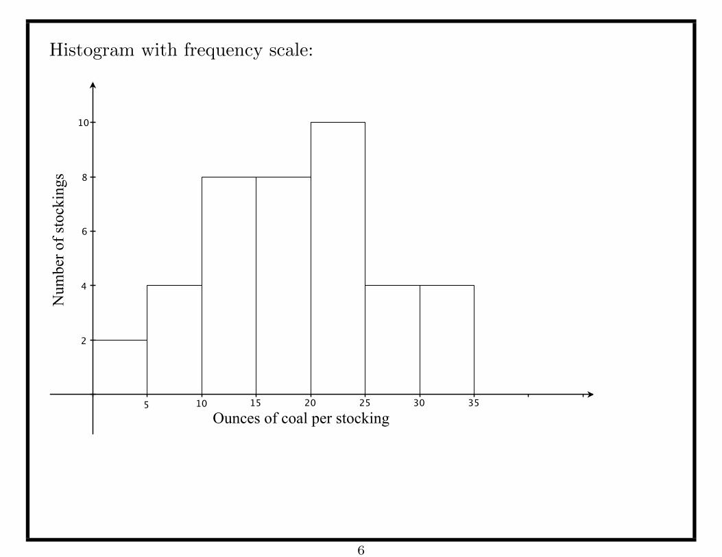
Histogram with frequency scale:
Ounces of coal per stocking
Num
ber o
f sto
ckin
gs
2
6
10
4
8
5 10 15 25 3520 30
6

Histogram with relative frequency scale:
Ounces of coal per stocking
Perc
enta
ge o
f sto
ckin
gs
5%
15%
25%
10%
20%
5 10 15 25 3520 30
7

Histogram with density scale:
Ounces of coal per stocking
Perc
enta
ge p
er o
unce
of c
oal
1
3
5
2
4
5 10 15 25 3520 30
8

Statistics and parameters
Tables, histograms and other charts are used to summarize large amounts
of data. Often, an even more extreme summary is desirable.
• A number that summarizes population data is called a parameter.
• A number that summarizes sample data is called a statistic.
Observations:
• Population parameters are (more or less) constant.
• Sample statistics vary with the sample, i.e., their values depend on
the particular sample chosen. A sample statistic can be thought of as a
variable.
• Sample statistics are known because we can compute them from the
(available) sample data, while population parameters are often unknown,
because data for the entire population is often unavailable.
• One of the most common uses of sample statistics is to estimate
population parameters.
9

Measures of central tendency
The most extreme way to summarize a list of numbers is with a single,
typical value. The most common choices are the mean and median.
• The mean (average) of a set of numbers is the sum of all the values
divided by the number of values in the set.
• The median of a set of number is the middle number, when the numbers
are listed in increasing (or decreasing) order. The median splits the data
into two equally sized sets—50% of the data lies below the median and
50% lies above.
(If the number of numbers in the set is even, then the median is the
average of the two middle values.)
The mean and median are different ways of describing the center of the
data. Another statistic that is often used to describe the typical value is the
mode, which is the most frequently occurring value in the data.
10
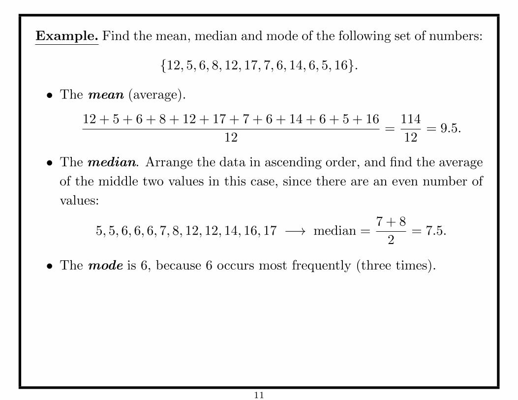
Example. Find the mean, median and mode of the following set of numbers:
{12, 5, 6, 8, 12, 17, 7, 6, 14, 6, 5, 16}.
• The mean (average).
12 + 5 + 6 + 8 + 12 + 17 + 7 + 6 + 14 + 6 + 5 + 16
12=
114
12= 9.5.
• The median. Arrange the data in ascending order, and find the average
of the middle two values in this case, since there are an even number of
values:
5, 5, 6, 6, 6, 7, 8, 12, 12, 14, 16, 17 −→ median =7 + 8
2= 7.5.
• The mode is 6, because 6 occurs most frequently (three times).
11

Comments:
• The mean is sensitive to outliers—extreme values in the data (much
bigger or much smaller than most of the data). Big outliers pull the
mean up and small outliers pull the mean down.
• The median gives a better sense of ‘middle’ when the data is skewed in
one direction or the other.
• The mean is easier to use in mathematical formulas.
• Both the median and the mean leave out a lot of information. E.g., each
one separately tells us nothing about the spread of the data or where we
might find ‘peaks’ (modes) in the distribution, etc.
12

On the other hand, if we know both, then the relative positions of the mean
and median provide some information about how the data is distributed...
In this histogram the mean is bigger than the median.
MeanMedian● ●
50%50%
This is an indication that there are large outliers — the histogram has a
longer tail on the right. We say that the data is skewed to the right.
13

In this histogram the mean is smaller than the median.
Mean Median●●
50%50%
This is an indication that there are small outliers — the histogram has a
longer tail on the left. We say that the data is skewed to the left.
14

If the mean and median are (more or less) equal, then the tails of the
distribution are (more or less) the same, and the data has a (more or less)
symmetric distribution around the mean/median, as depicted below.
MeanMedian
●
50%50%
15

Example: Here is the histogram that we constructed before:
0 50 100 150 200 250
2015 U.S. Household Income ($1000s)
% p
er $
1000
0.2
0.4
0.6
0.8
1
1.2
The histogram is skewed to the right, indicating that the mean will be larger
than the median in this case.
16

(*) The mean income (estimated from the sample data) is about $79,263.
(*) We can find the (approximate) median by reading the histogram.
(*) Remember: the area of each bar represents the percentage of the popula-
tion with income in the corresponding range. We find the areas of the bars,
starting from the leftmost interval (0–15), and stop when we reach 50%.
0 50 100 150 200 250
2015 U.S. Household Income ($1000s)
% p
er $
1000
0.2
0.4
0.6
0.8
1.0
1.2
Mean≈$79,263
15 25 35 75
17

0 50 100 150 200 250
2015 U.S. Household Income ($1000s)
% p
er $
1000
0.2
0.4
0.6
0.8
1.0
1.2
Mean≈$79,263
15 25 35 75
0 to 15: ≈ 0.78 %$1000
× $15000 = 11.7%, 15 to 25: ≈ 1.05 %$1000
× $10000 = 10.5%
25 to 35: ≈ 1 %$1000
× $10000 = 10%, 35 to 50: ≈ 0.85 %$1000
× $15000 = 12.75%
0 to 50: area ≈ 11.7% + 10.5% + 10% + 12.75% = 44.95%... Need another 5%.
50 to 75: area ≈ 0.66 %$1000
× $25000 = 16.5%. Need to go a little less than one
third the way from 50 to 75 to get another 5%...
Median ≈ $57, 500.
18

More precise estimate (using all of the survey data): Median ≈ $56, 516
0 50 100 150 200 250
2015 U.S. Household Income ($1000s)
% p
er $
1000
0.2
0.4
0.6
0.8
1.0
1.2Median≈$56,516
Mean≈$79,263
19

The mean and median describe the middle of the data in somewhat different
ways:
• The median divides the histogram into two halves of equal area: it
divides the data into two equal halves.
1.5%
Percentage of US Households per Income (data from 2006 Economic Survey)
median
1.5
50% of the data 50% of the data
20

• The mean is the ‘balance point’ of the data:1.5%
Percentage of US Households per Income (data from 2006 Economic Survey)
mean
1.5
⨺Balance Point
21

Averages and medians give a snapshot of a set of data. If the data comprises
more than one variable, we can divide the data into categories with respect
to one variable, and study the average/median of another variable in each
category separately.
This allows researchers to discern relationships between different variables.
Example: The following graph comes from the 2005 American Community
Survey of the US Census Bureau. It plots median household income by
state.
22

4 Income, Earnings, and Poverty Data From the 2005 American Community Survey U.S. Census Bureau
$30,000 $35,000 $40,000 $45,000 $50,000 $55,000 $60,000 $65,000
Figure 1.Median Household Income in the Past 12 Months With 90-Percent Confidence Intervals by State: 2005
Source: U.S. Census Bureau, 2005 American Community Survey.
2005 estimate90-percent confidence interval
Kentucky
New Jersey
Maryland
Connecticut
Hawaii
Alaska
MassachusettsNew Hampshire
VirginiaCalifornia
Delaware
Rhode Island
Minnesota
Colorado
Illinois
NevadaWashington
New York
District of Columbia
Utah
Wyoming
Wisconsin
VermontMichigan
United States
GeorgiaPennsylvania
Arizona
Nebraska
Indiana
Iowa
Ohio
Maine
Kansas
Oregon
Florida
TexasMissouri
Idaho
North Dakota
South Dakota
North Carolina
MontanaSouth Carolina
Tennessee
New Mexico
OklahomaAlabama
Louisiana
Arkansas
West VirginiaMississippi
23

Notational Interlude:
• The population mean (a parameter) is denoted by the Greek letter µ
(‘mu’). If there are several variables being studied, we put a subscript
on the µ to tell us which variable it pertains to. For example, if we have
data for population height (h) and population weight (w), the mean
height would be denoted by µh and the mean weight by µw.
• The mean of a set of sample data (a statistic) is denoted by putting a
bar over the variable. E.g., if {h1, h2, h3, . . . , hn} is a sample of heights,
then the average of this sample would be denoted by h.
• The median is usually denoted by m or M , and sometimes by Q2 (more
on this later).
• We can use summation notation to simplify the writing of (long)
sums:
h1 + h2 + h3 + · · ·+ hn =n∑
j=1
hj =∑
hj .
24

For example we can write:
h =h1 + h2 + · · ·+ hn
n
=1
n(h1 + h2 + · · ·+ hn) =
1
n
∑hj .
Comment: The point of summation notation is to simplify expressions
that involve sums with many terms, or in some cases, an unspecified number
of terms. All the usual rules/properties of addition continue to hold. In
particular
(i)∑
(hj ± wj) =∑
hj ±∑
wj
(ii)∑
(a · hj) = a ·(∑
hj
)and
(iii)∑
c = n · c (here n is the number of constant terms).
25

Measuring the spread of the data
The mean and median describe the middle of the data. To get a better sense
of how the data is distributed, statisticians also use ‘measures of dispersion’.
• The range is the distance between the smallest and largest values in
the data.
• The interquartile range is the distance between the value separating
the bottom 25% of the data from the rest and the value separating the
top 25% of the data from the rest. In other words, it is the range of the
middle 50% of the data.
Example: In the histogram describing household income distribution,
about 25% of all households have incomes below $28,000 and about 25% of
all households have incomes above $145,000, so the interquartile range is
$145, 000− $28, 000 = $117, 000.
26

The standard deviation: The standard deviation of a set of numbers
is something like the average distance of the numbers from their mean.
Technically, it is a little more complicated than that.
If x1, x2, x3, . . . , xn are numbers and x is their mean, then one candidate for
measuring spread is the average deviation from the mean:
(x1 − x) + (x2 − x) + · · ·+ (xn − x)
n=
1
n
∑(xj − x).
Potential problem: positive terms and negative terms in the sum can
cancel each other out... How much cancellation?
1
n
∑(xj − x) =
1
n
∑xj −
1
n
∑x
= x−
n︷ ︸︸ ︷x+ x+ · · ·+ x
n
= x−�n · x�n
= x− x = 0
Complete cancellation!
27

Instead, statisticians use the standard deviation, which is given by
SDx =
√1
n
∑(xj − x)2.
In words, the SD is the root of the mean of the squared deviations of
the numbers from their mean.
(*) Squaring the deviations fixes the cancellation problem...
(*) ... but exaggerates both very small deviations (making them smaller)
and very large deviations (making them bigger)...
(*) ... and also changes the scale (e.g., from inches to squared inches).
(*) Taking the square root of the average squared deviation fixes both of
these problems (to a certain extent).
28

(*) If a lot of the data is far from the mean, then many of the (xj − x)2
terms will be quite large, so the mean of these terms will be large and the
SD of the data will be large.
(*) In particular, outliers can make the SD bigger. (Outliers have an even
bigger effect on the range of the data.)
(*) On the other hand, if the data is all clustered close to the mean, then all
of the (xj − x)2 terms will be fairly small, so their mean will be small and
the SD will be small.
To be continued...
29